Topaz 070 by Benjamin Moore
A Gem of a Shade: How This Warm Hue Can Refresh Your Space
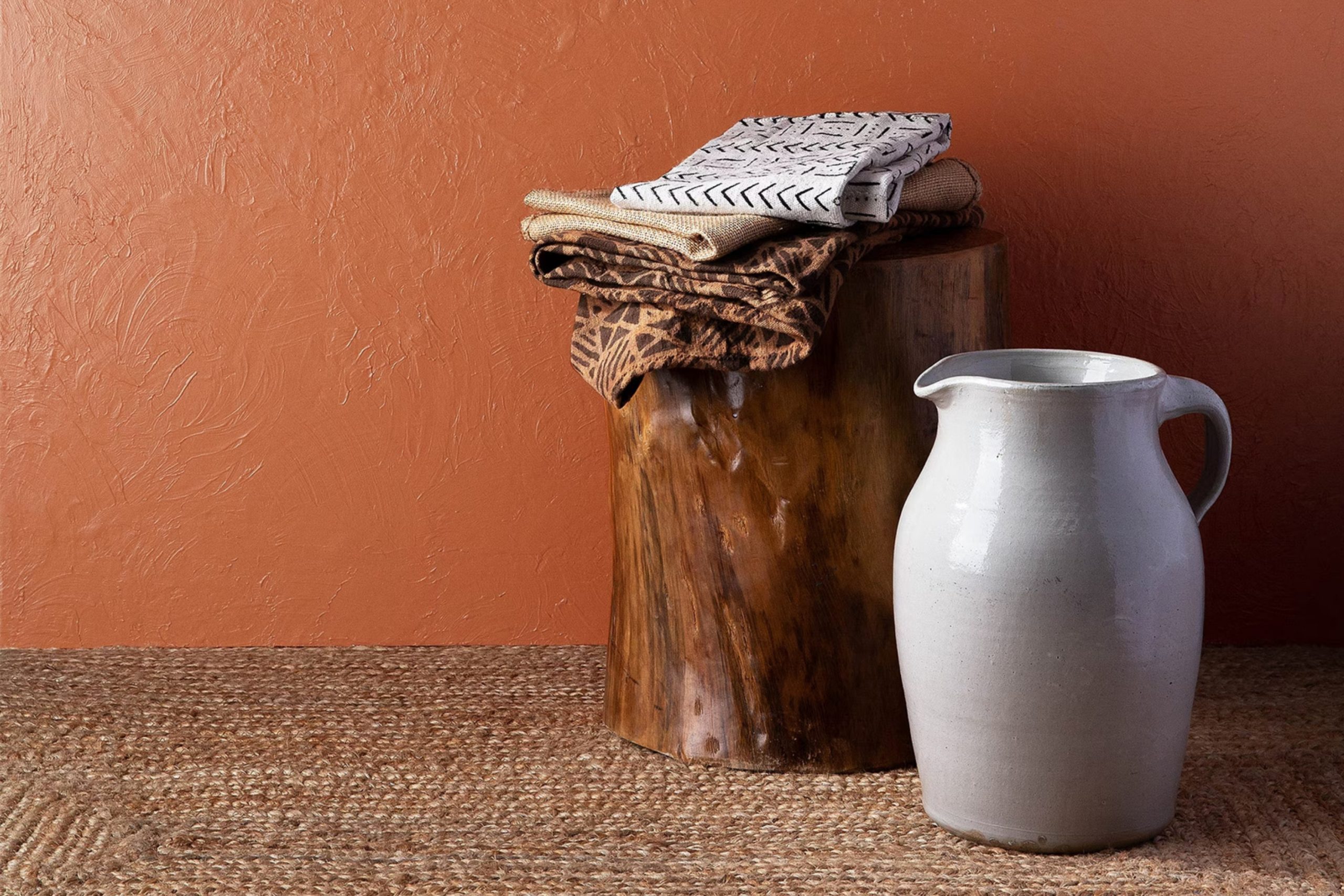
Let’s talk about 070 Topaz from Benjamin Moore. It’s a unique shade that might just be what you need for a subtle yet impactful change in your home or office. Think about the warm, amber hues of topaz, the gemstone; this paint brings the same warmth and richness to walls and trim, creating a cozy atmosphere.
This shade is especially good for those who enjoy a bit of elegance without going over the top. It pairs beautifully with soft whites and deep wood tones, leading to a balanced and inviting space.
Whether you’re refreshing a living room, bedroom, or even the kitchen, 070 Topaz has the potential to add a sophisticated touch to the ambiance.
Perfect for anyone who enjoys a splash of color that’s neither too bold nor too pale, it’s a middle ground that provides heat and light without overwhelming the senses.
So, if you’re ready to update your environment, consider this beautiful option that promises to warm up your surroundings.
via benjaminmoore.com
What Color Is Topaz 070 by Benjamin Moore?
Topaz070 by Benjamin Moore is a rich, vibrant color featuring a blend of deep gold and amber hues that warm up any space. This shade is highly versatile and pairs exceptionally well with natural materials like wood, leather, and linen, enhancing their textures and bringing out their inherent qualities. Its warmth plays nicely against darker woods, adding depth and sophistication.
Topaz070 works particularly well in interior styles that appreciate a touch of traditional elegance or rustic charm. It is perfect for classical-themed rooms or cozy, cottage-style spaces. In modern settings, it can serve as an accent wall to inject warmth and earthiness into otherwise minimalistic and sleek designs.
When combined with metals, Topaz070 is particularly effective. For a luxurious look, pairing it with brass or copper fixtures and decor items adds a reflective quality that showcases the richness of the color. For a softer, more understated approach, combining it with matte textures, like ceramic or stone, yields a harmonious look that beautifully contrasts the paint’s warm tones.
Fabrics in natural colors or with subtle patterns can also complement Topaz070, enhancing the room’s overall aesthetic without overwhelming the senses. This color encourages an inviting atmosphere that makes it ideal for living rooms, dining areas, or any space meant to feel warm and welcoming.
housekeepingbay.com
Is Topaz 070 by Benjamin Moore Warm or Cool color?
Topaz070 by Benjamin Moore is a warm, inviting paint color that makes any room feel more welcoming. This shade of yellow has a gentle gold undertone, which adds a cozy, soft glow to spaces. It works well in living rooms and kitchens because it brings a sunny, cheerful vibe that makes these areas more lively and enjoyable.
Being versatile, Topaz070 pairs nicely with both light and dark furniture, allowing for various decorating styles, from rustic to modern. It also enhances natural light in a room, making small spaces appear larger and brighter.
For those looking to create a more soothing atmosphere, this color coordinates well with neutral tones, giving off a harmonious, balanced look. Ideal for family homes, Topaz070’s warm tones help create a space where everyone feels relaxed and at ease. Painting your walls with Topaz070 can refresh your home’s look while keeping it cozy and inviting.
What is the Masstone of the Topaz 070 by Benjamin Moore?
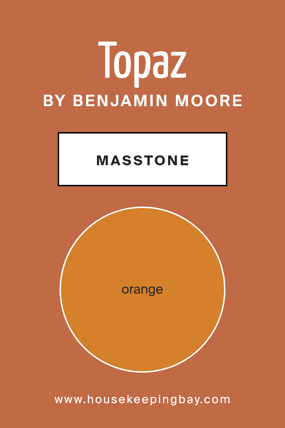
Topaz070 by Benjamin Moore, with the masstone of Orange (#D5802B), is a vibrant and warm hue that lends a welcoming and cozy atmosphere to any room in the home. This shade of orange coordinates well with natural light, making spaces feel more inviting and comfortable.
In living rooms, Topaz070 adds a cheerful ambiance, encouraging lively conversations and gatherings.
In bedrooms, it can be balanced with neutral or earth tones to ensure the environment remains soothing and not too stimulating.
The versatility of Topaz070 allows it to be used in various ways, whether as an accent wall to add a pop of color or as a backdrop that complements furnishings and decor.
For kitchens, this orange hue can make the area feel energetic and conducive to cooking activities. Overall, Topaz070 by Benjamin Moore brings warmth to homes, making them feel lived-in and loved.
housekeepingbay.com
Undertones of Topaz 070 by Benjamin Moore
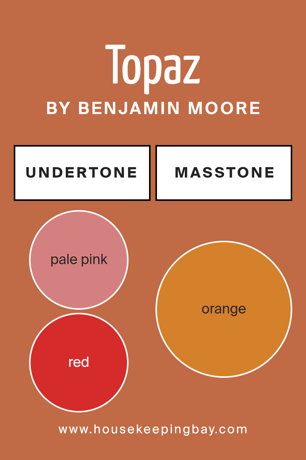
Topaz070 by Benjamin Moore is a complex color with a rich array of undertones that subtly influence its appearance. These undertones include pale pink, red, olive, pink, grey, brown, purple, yellow, pale yellow, light green, and mint. Each of these plays a significant role in how the paint appears under different lighting conditions and when coordinated with other colors.
Undertones are essentially the underlying hues that are not immediately evident but emerge under certain lighting or when placed next to other colors. They can make a color look warmer or cooler, depending on the mix.
For example, pale pink and red undertones add warmth, making a space feel more inviting, while grey and olive bring a cooler tone that can make the color appear more neutral and versatile.
When applied to interior walls, the undertones of Topaz070 affect the room’s ambiance significantly. In natural light, the yellow and pale yellow undertones might make the color look brighter and more vibrant.
Meanwhile, artificial lighting can enhance the grey or brown undertones, giving the walls a more subdued look. The presence of purple and pink undertones adds a subtle vibrancy, enriching the depth of the wall color.
In home decor, recognizing these undertones is crucial for harmonizing with furniture and decorations.
Topaz070 can adapt beautifully across various styles and palettes, contributing to a balanced aesthetic that feels coherent and thoughtfully designed. Thus, whether a room benefits from ample sunlight or relies on artificial light, Topaz070’s undertones can significantly influence the overall mood and visual impact of a space.
housekeepingbay.com
Coordinating Colors of Topaz 070 by Benjamin Moore
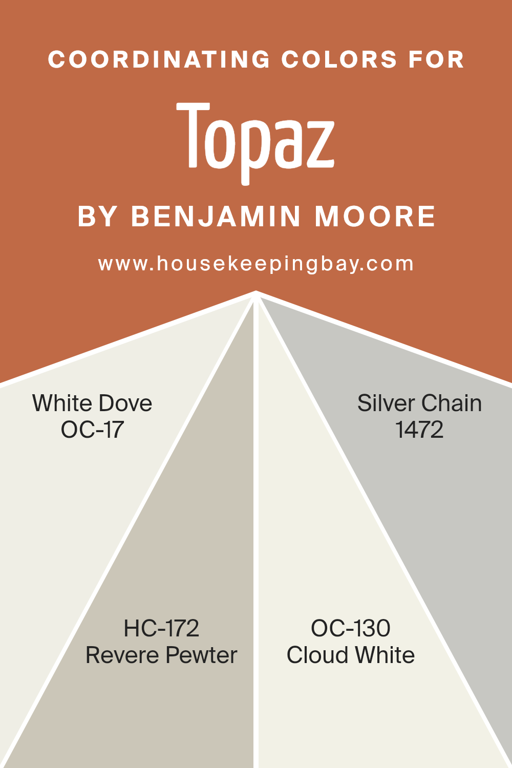
Coordinating colors are chosen to complement each other and work harmoniously within a space to achieve a balanced and aesthetically pleasing look. When selecting coordinating colors, like those that pair well with Topaz 070 by Benjamin Moore, the aim is to find hues that either contrast nicely or blend smoothly with the main color.
This approach ensures that no single color overpowers another, allowing each to contribute to the overall ambiance of a room. A well-coordinated palette can add depth and interest, making the design feel cohesive and thoughtfully curated.
For instance, OC-17 White Dove by Benjamin Moore is a soft, warm white that offers a subtle undertone of gray. It’s gentle and soothing, making it a perfect backdrop for richer colors or a standalone shade for a clean, minimalistic look. HC-172 Revere Pewter, another coordinating color, is a light gray with warm undertones, versatile for pairing with both cool and warm palettes, giving spaces a refined look without being too stark.
Then there’s OC-130 Cloud White, a slightly creamier shade of white than White Dove, providing a touch of warmth that works beautifully in spaces to create a soft, welcoming atmosphere.
Lastly, 1472 Silver Chain is a medium gray that features a balanced, neutral base, ideal for tying together a room’s decor while adding a contemporary edge. These colors play well together or can be used individually to support various design styles from classic to modern.
You can see recommended paint colors below:
- OC-17 White Dove
- HC-172 Revere Pewter
- OC-130 Cloud White
- 1472 Silver Chain
housekeepingbay.com
How Does Lighting Affect Topaz 070 by Benjamin Moore?
Lighting significantly influences how colors appear in an environment, altering the perception and mood a color can convey. Different light sources can change how a color looks; for example, natural light shows the truest color, while artificial light can add yellow or blue tints.
Considering the color Topaz070 by Benjamin Moore, its appearance can shift based on the light source. In artificial light, such as incandescent bulbs which typically emit a warmer glow, Topaz070 might appear richer and slightly more amber, enhancing its cozy and inviting qualities.
Fluorescent lighting, which leans towards the cooler spectrum, might make the same color look slightly greener, potentially diminishing its warmth.
In natural light, Topaz070 will show its true color best, especially in a south-facing room where abundant sunlight can make the color vibrant and lively. The intensity and angle of the light throughout the day can make the color appear different at various times.
Room orientation also affects how Topaz070 is perceived:
– North-Faced Rooms: These rooms get less direct sunlight, making colors appear slightly cooler and more muted. Topaz070 could look more subdued, leaning towards a softer, shadowy hue.
– South-Faced Rooms: With plenty of direct sunlight, Topaz070 will look warm and vivid. The natural brightness will accentuate the depth of the color, making it feel welcoming.
– East-Faced Rooms: Sunlight in the morning is warm and bright, so Topaz070 will start the day looking cheerful and warm, gradually transitioning to a more neutral tone as the light fades.
– West-Faced Rooms: Evening light, which tends to be warmer, will enrich the warmth of Topaz070, making it feel cozy as the day progresses into night.
Understanding these lighting effects helps in choosing the right paint color for a specific room, ensuring that the color matches the intended ambiance.
housekeepingbay.com
What is the LRV of Topaz 070 by Benjamin Moore?
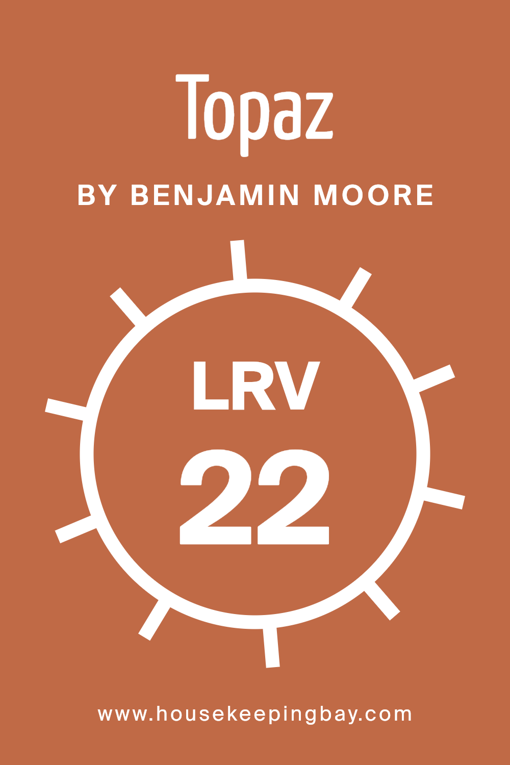
LRV stands for Light Reflectance Value, which measures the percentage of light a paint color reflects back into a room. The scale goes from 0 to 100, with 0 being completely black, absorbing all light, and 100 being pure white, reflecting all light. LRV is crucial in choosing paint colors because it affects how light or dark a color looks on the walls and how it will make the room feel.
Darker colors with low LRV can make a room feel cozier but smaller, while lighter colors can make a space feel more open and airy.
The LRV of Topaz070 by Benjamin Moore is 22.37, which means it is on the darker side of the scale. This low LRV indicates that Topaz070 will absorb more light than it reflects, which can dramatically affect the atmosphere of the room. In spaces with limited natural light, using a color with such a low LRV might make the room appear even darker.
However, in well-lit or large areas, this deep, rich color can add a sense of warmth and sophistication, making it ideal for creating a more intimate and inviting environment.
Always consider the room’s lighting and the desired mood when choosing a paint color with a specific LRV.
housekeepingbay.com
What are the Trim colors of Topaz 070 by Benjamin Moore?
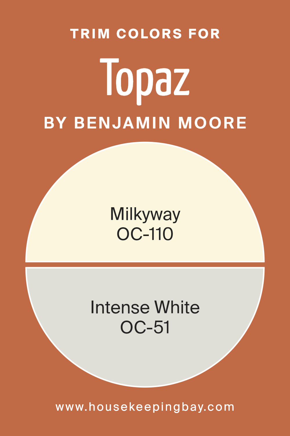
Trim colors are specific shades used to highlight or accentuate architectural details and edges on walls, doors, windows, and moldings in a space. By using trim colors like OC-110 – Milkyway and OC-51 – Intense White from Benjamin Moore, you can create clear visual boundaries and enhance the overall aesthetic appeal of a room.
These trim colors not only frame and define the space but also bring coherence to the interior decoration by linking different elements of a room together. Furthermore, the contrast between the wall colors and trim colors can make the architectural features of a room stand out, adding depth and interest to the space.
OC-110 – Milkyway by Benjamin Moore is a soft, creamy white that offers a gentle warmth to any space, making it ideal as a trim color that doesn’t overwhelm the primary hues but subtly supports them. It works exceptionally well in rooms with natural light, reflecting and amplifying the brightness to create a more inviting space.
OC-51 – Intense White, on the other hand, is a crisp, clear white with just a hint of cool undertones which makes it perfect for a clean and sharp finish.
This color has the ability to make adjoining colors pop while maintaining a seamless look that keeps the decor looking fresh and polished.
You can see recommended paint colors below:
- OC-110 Milkyway
- OC-51 Intense White
housekeepingbay.com
Colors Similar to Topaz 070 by Benjamin Moore
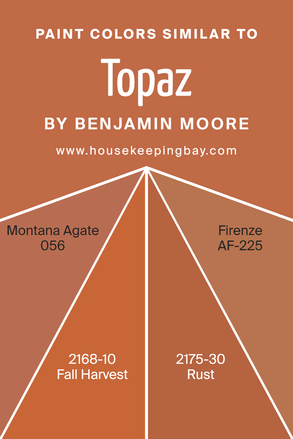
Similar colors are vital in creating a cohesive and harmonious look in any space. By using shades like those close to Topaz070 by Benjamin Moore, such as Montana Agate, Fall Harvest, Rust, and Firenze, one achieves a seamless aesthetic flow. These closely related hues can subtly enhance each other, creating a soft yet dynamic environment.
The use of similar colors allows for gentle transitions between spaces, especially when working within a specific color palette inspired by natural tones like the ones mentioned.
Montana Agate 056 is a mellow, light brown that reflects the warmth and soothing qualities of a natural gemstone. It’s subtle enough to serve as a background yet carries a warm depth. Fall Harvest 2168-10 brings in a bolder, more saturated orange, reminiscent of autumn leaves under a radiant sunset, providing a lively contrast while staying in harmony with earthy tones.
Rust 2175-30 captures the intense hue of oxidized iron, offering a rich, deep color that grounds the surrounding elements.
Lastly, Firenze AF-225 has a robust amber tone that hints at historic elegance and natural beauty, perfect for adding a touch of sophistication. Together, these colors work seamlessly to create a balanced and inviting atmosphere.
You can see recommended paint colors below:
- 056 Montana Agate
- 2168-10 Fall Harvest
- 2175-30 Rust
- AF-225 Firenze
housekeepingbay.com
Colors that Go With Topaz 070 by Benjamin Moore
Colors that harmonize with Topaz 070 by Benjamin Moore are significant because they help to create a cohesive look and feel in any space. When chosen thoughtfully, these coordinating colors can enhance the beauty of Topaz 070, making the ambiance more inviting and visually pleasant.
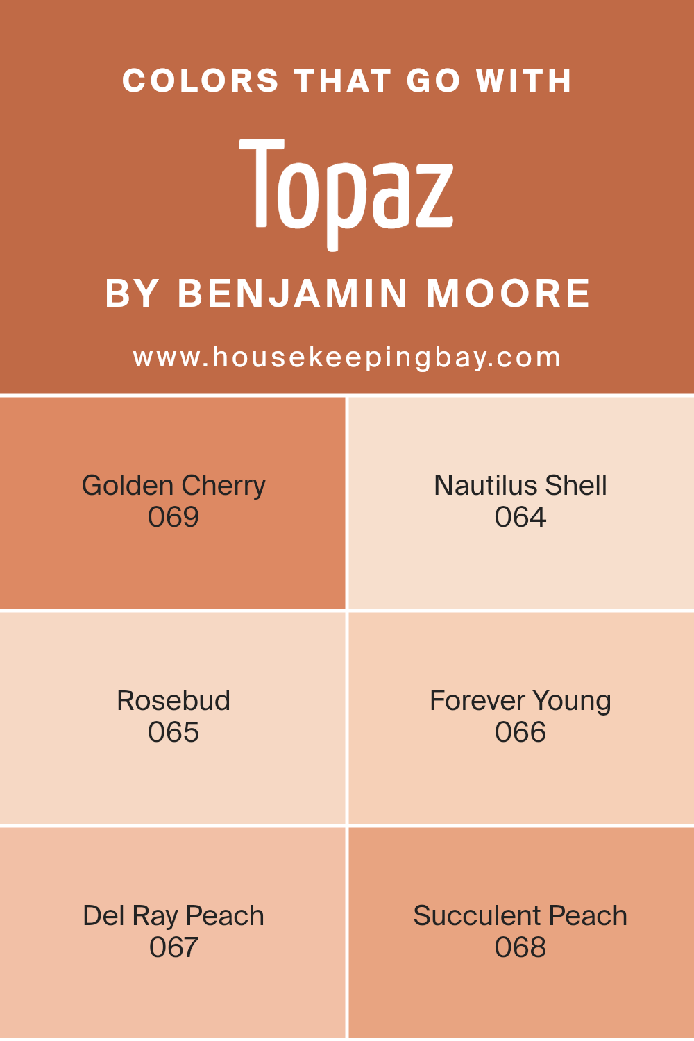
Colors like Golden Cherry, Nautilus Shell, and others in this palette work in harmony to set a specific mood or highlight architectural details of a room. By pairing Topaz 070 with these complementary shades, homeowners and designers can achieve a balanced and harmonious aesthetic.
Golden Cherry 069 is a warm, rich hue that reminds one of autumn leaves, offering a cozy and comforting feel. Nautilus Shell 064 is a soft, pale gray that provides a subtle contrast, making it perfect for a peaceful background or serene setting. Rosebud 065 is a gentle, muted pink that adds a touch of soft romance to the environment.
Forever Young 066 is a deep, vibrant pink with youthful energy that infuses life into any space. Del Ray Peach 067 is a light, creamy orange, evoking a sense of freshness and soft warmth.
Succulent Peach 068, slightly deeper than Del Ray Peach, fills a room with warm, nourishing vibes, perfect for creating a welcoming atmosphere. Together, these colors can beautifully complement Topaz 070, enriching the overall palette of the surroundings.
You can see recommended paint colors below:
- 069 Golden Cherry
- 064 Nautilus Shell
- 065 Rosebud
- 066 Forever Young
- 067 Del Ray Peach
- 068 Succulent Peach
housekeepingbay.com
How to Use Topaz 070 by Benjamin Moore In Your Home?
Topaz 070 by Benjamin Moore is a beautiful, versatile shade of yellow that warms any room. Its golden hues bring a sunny, cheerful feel, perfect for creating a welcoming atmosphere in living areas and kitchens. You can use Topaz 070 to paint walls to make spaces feel more open and bright.
It pairs well with whites and grays, offering a balanced look, or with bold colors for a more dynamic contrast. In a bedroom, using it on an accent wall behind the bed can add a soft backdrop, enhancing a cozy vibe.
It is also a good choice for bathrooms and entryways where you want a burst of warmth as soon as you enter. For those who like DIY projects, Topaz 070 can refresh old furniture, turning a simple piece into a charming focal point. Overall, Topaz 070 is a great choice for adding a hint of cheer and warmth to your home.
Topaz 070 by Benjamin Moore vs Montana Agate 056 by Benjamin Moore
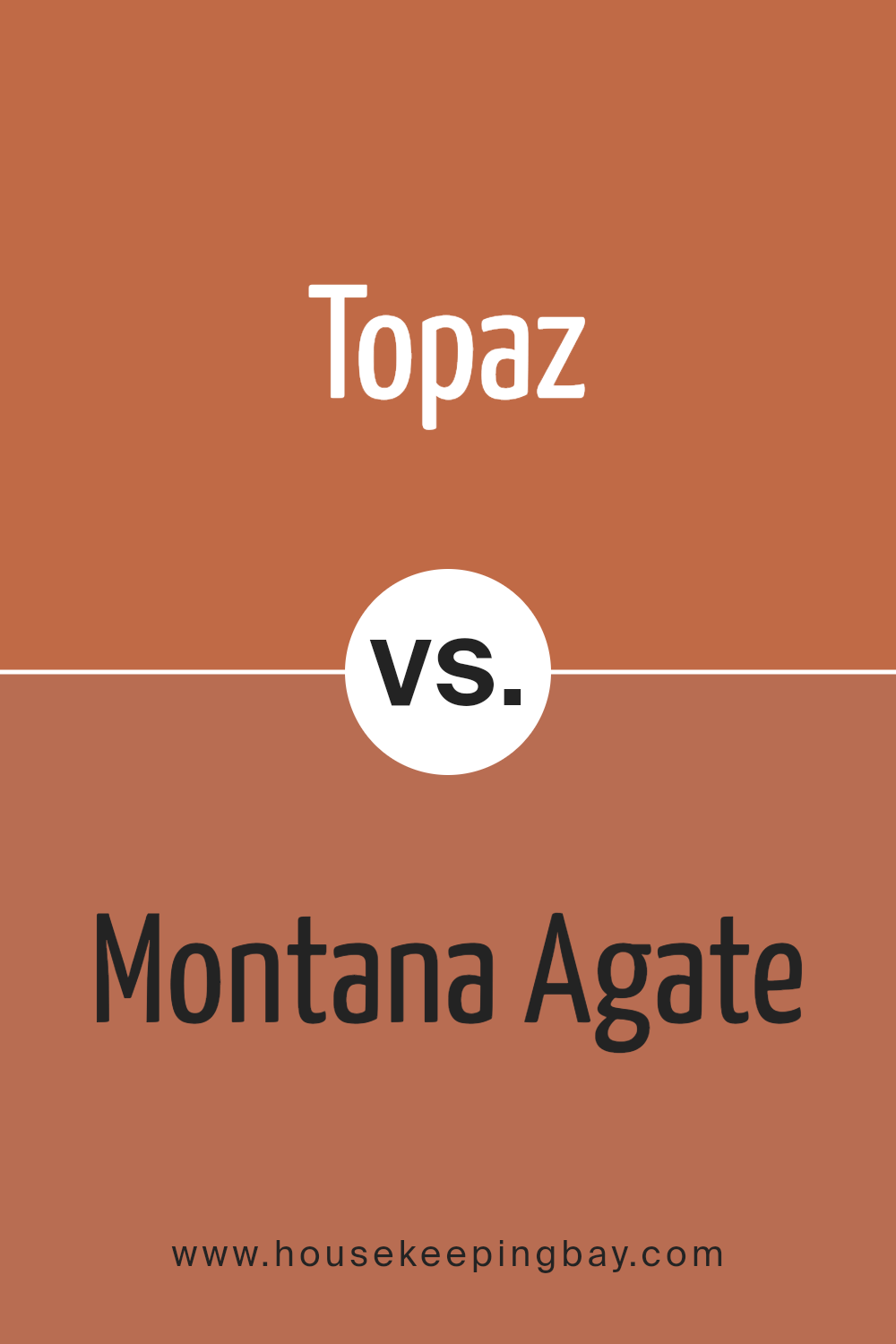
Topaz 070 by Benjamin Moore is a warm, rich yellow with a golden hue that adds a cozy and inviting atmosphere to any room. It has a sunny quality that can brighten up spaces that receive less natural light. This color works well in living rooms, kitchens, or anywhere you want to create a welcoming environment.
Montana Agate 056, also by Benjamin Moore, is more understated compared to Topaz 070. It’s a soft, creamy beige that provides a neutral backdrop for various decor styles. This versatility makes it an excellent choice for areas where you want simplicity and calm, such as bedrooms or offices.
While Topaz 070 infuses warmth and vibrancy, Montana Agate 056 offers a quiet and clean canvas, making them suitable for different purposes in home decorating. Each color has its unique charm and can complement various design elements depending on the mood you wish to achieve.
You can see recommended paint color below:
- 056 Montana Agate
housekeepingbay.com
Topaz 070 by Benjamin Moore vs Firenze AF-225 by Benjamin Moore
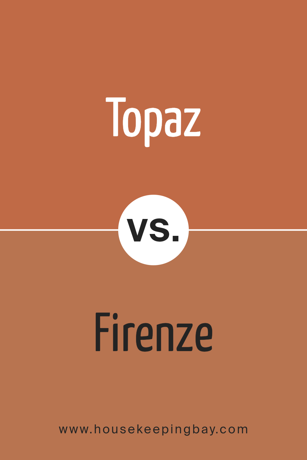
Topaz 070 by Benjamin Moore is a warm amber hue that brings a cozy and inviting atmosphere to any room. It has a subtle vibrancy that can make spaces feel lively yet homelike, ideal for living rooms and kitchens. The golden undertones can help enrich the area, making it welcoming.
Firenze AF-225, also by Benjamin Moore, is a deeper, olive green shade. It’s perfect for adding a touch of sophistication and depth to spaces. This color works well in dining rooms or studies, where its richness can create a more refined and serene environment.
Its earthy quality pairs nicely with natural materials like wood and stone.
Each color serves distinct purposes and moods: Topaz 070 adds warmth and cheer, while Firenze AF-225 brings in elegance and grounding. Both colors offer unique aesthetic benefits, making them suitable for different types of rooms and styles.
You can see recommended paint color below:
- AF-225 Firenze
housekeepingbay.com
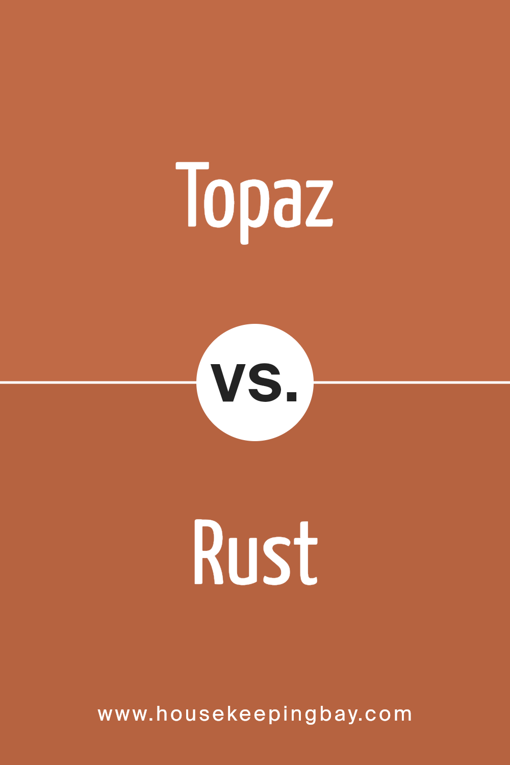
Topaz 070 by Benjamin Moore vs Rust 2175-30 by Benjamin Moore
Main Color – Topaz 070 by Benjamin Moore is a warm, inviting shade that resembles the gemstone topaz. It has a soft, earthy yellow undertone which gives it a cozy, welcoming feel. This color works well in living spaces, creating a bright and airy environment, and can pair nicely with both darker and lighter tones for a balanced look.
Second Color – Rust 2175-30 by Benjamin Moore, as the name suggests, mimics the reddish-brown color of oxidized iron. It’s a bold, rich color with a lot of depth, making it ideal for accent walls or to add a pop of strong color in a room.
It contrasts sharply with lighter, neutral colors, providing a dramatic effect suitable for spaces you want to feel warm and enclosed.
Despite both being earth tones, Topaz 070 and Rust 2175-30 serve very different purposes in decor. Topaz 070 opens up a space, while Rust 2175-30 draws it in, making each unique in creating room ambiance.
You can see recommended paint color below:
housekeepingbay.com
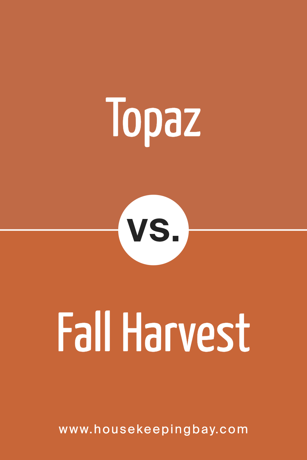
Topaz 070 by Benjamin Moore vs Fall Harvest 2168-10 by Benjamin Moore
Topaz 070 by Benjamin Moore is a light, subtle color that brings a gentle warmth to any room. It has an understated yellow hue that offers a soothing and inviting feel, making it ideal for spaces where you want to relax or socialize comfortably. This color works well in living rooms, kitchens, or bedrooms because it pairs smoothly with both dark and light furniture, helping to create a balanced environment.
Fall Harvest 2168-10, also by Benjamin Moore, is a much bolder choice. It’s a rich, deep orange that can add a sense of vibrancy and energy to any space. This color is perfect for creating focal points in a décor, like an accent wall, or in areas where you want to spark creativity and excitement, such as a home office or dining area.
When comparing both, Topaz 070 is more about softness and versatility, while Fall Harvest 2168-10 brings intensity and a dynamic flair. Each serves different moods and settings.
You can see recommended paint color below:
- 2168-10 Fall Harvest
housekeepingbay.com
Conclusion
The color 070 Topaz by Benjamin Moore is more than just a shade of paint; it’s a bridge to myriad design possibilities. It offers a sophisticated yet cozy ambiance that can enhance any room. The versatility of this hue ensures it can integrate effortlessly with various decor styles, from rustic to modern.
Whether you’re looking to create a bold statement wall or want a gentle, warm backdrop for your home, 070 Topaz is an excellent choice.
Its richness adds depth to spaces, making them feel more inviting and comfortable. I really appreciate how this color adapts to different lighting, subtly shifting its intensity and hue. For anyone considering a new paint color, 070 Topaz provides a balance of warmth and style that can rejuvenate any space.
It’s a shade that consistently reflects beauty and serenity, making it perfect for almost any room.
housekeepingbay.com
