Tarragon SW 9660 by Sherwin Williams
Bringing Nature’s Calm with Lush Greens
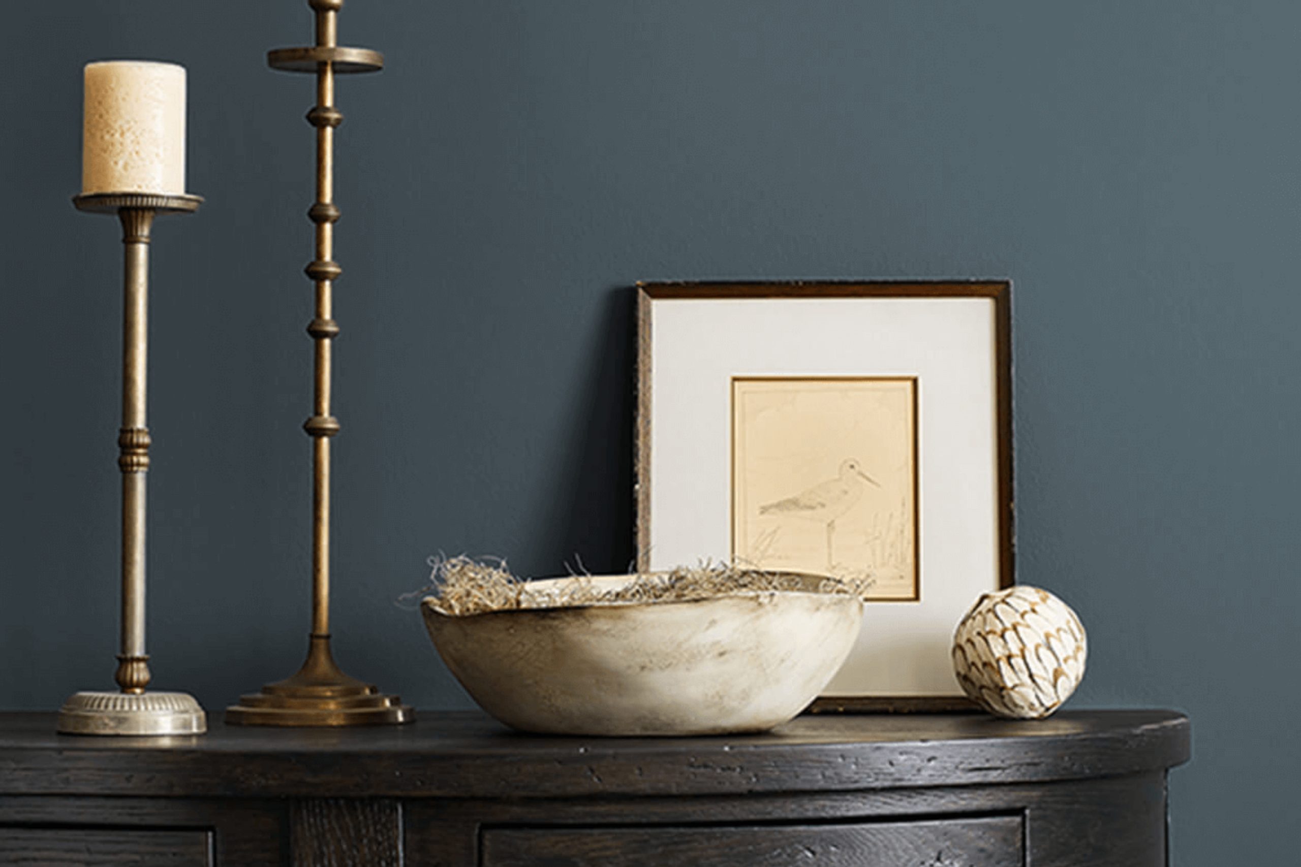
Considering a fresh paint color for your space? You might want to consider SW 9660 Tarragon by Sherwin Williams. This unique shade of green is both soothing and sophisticated, making it a great choice for various rooms in your home or office.
From cozy bedrooms to professional workspaces, Tarragon offers a subtle, organic vibe that complements modern and traditional decor alike.
Whether you’re aiming to refresh your living room or add some personality to your kitchen, Tarragon brings a natural elegance that can really enhance the overall feel of a room. Plus, it pairs beautifully with a wide range of colors and materials, helping you create the perfect look without much hassle.
So, if you’re thinking about giving your walls a new coat of paint, Tarragon by Sherwin Williams could be just what you need to give your space a fresh, stylish update.
via sherwin-williams.com
What Color Is Tarragon SW 9660 by Sherwin Williams?
Table of Contents
Tarragon SW 9660 by Sherwin Williams is a rich, herbal green hue that offers both warmth and sophistication. This color carries a certain earthiness, making it a versatile choice for various interior spaces. It especially shines in rooms that benefit from a connection to the outdoors, reflecting natural elements like plants and trees.
Its depth works well for creating a focal point or accent walls, yet it’s subdued enough to be used as a primary color scheme across entire rooms.
The shade fits seamlessly into interior styles such as rustic, modern farmhouse, and traditional settings, where its natural attributes are harmoniously aligned with organic materials. Tarragon pairs beautifully with materials like warm wood tones, leather, and natural stone, which enhance its earthy quality.
Textures like linen, wool, and distressed wood also complement the color, contributing to a cozy, grounded aesthetic.
In interior spaces, Tarragon can calm or add character depending upon how it’s used. For example, pairing it with soft, creamy whites can lighten the space, whereas combining it with dark grays or blacks can create a more dramatic, cozy feel.
Given its adaptability, Tarragon SW 9660 is a practical choice for those wishing to refresh their home with a touch of natural elegance.
housekeepingbay.com
Is Tarragon SW 9660 by Sherwin Williams Warm or Cool color?
TarragonSW 9660 by Sherwin Williams is a unique paint color that can significantly influence the atmosphere of any home. This shade is a deep, herb-like green that brings a natural and earthy feel to spaces. It’s perfect for those looking to create a cozy, serene environment. Because of its calming nature, TarragonSW 9660 is ideal for bedrooms and living areas where you might want to relax and feel at peace.
In well-lit spaces, this color can appear vibrant and lively, making rooms feel more alive and fresh. In areas with less light, it can create a more intimate and enclosed feeling, ideal for creating a snug nook.
This versatility makes TarragonSW 9660 a practical choice for many homes.
Pairing this color with light woods or creamy whites can enhance its natural qualities, creating a balanced and harmonious look. It’s also a strong stand-alone color for those seeking a bold yet nature-inspired aesthetic in their living space.
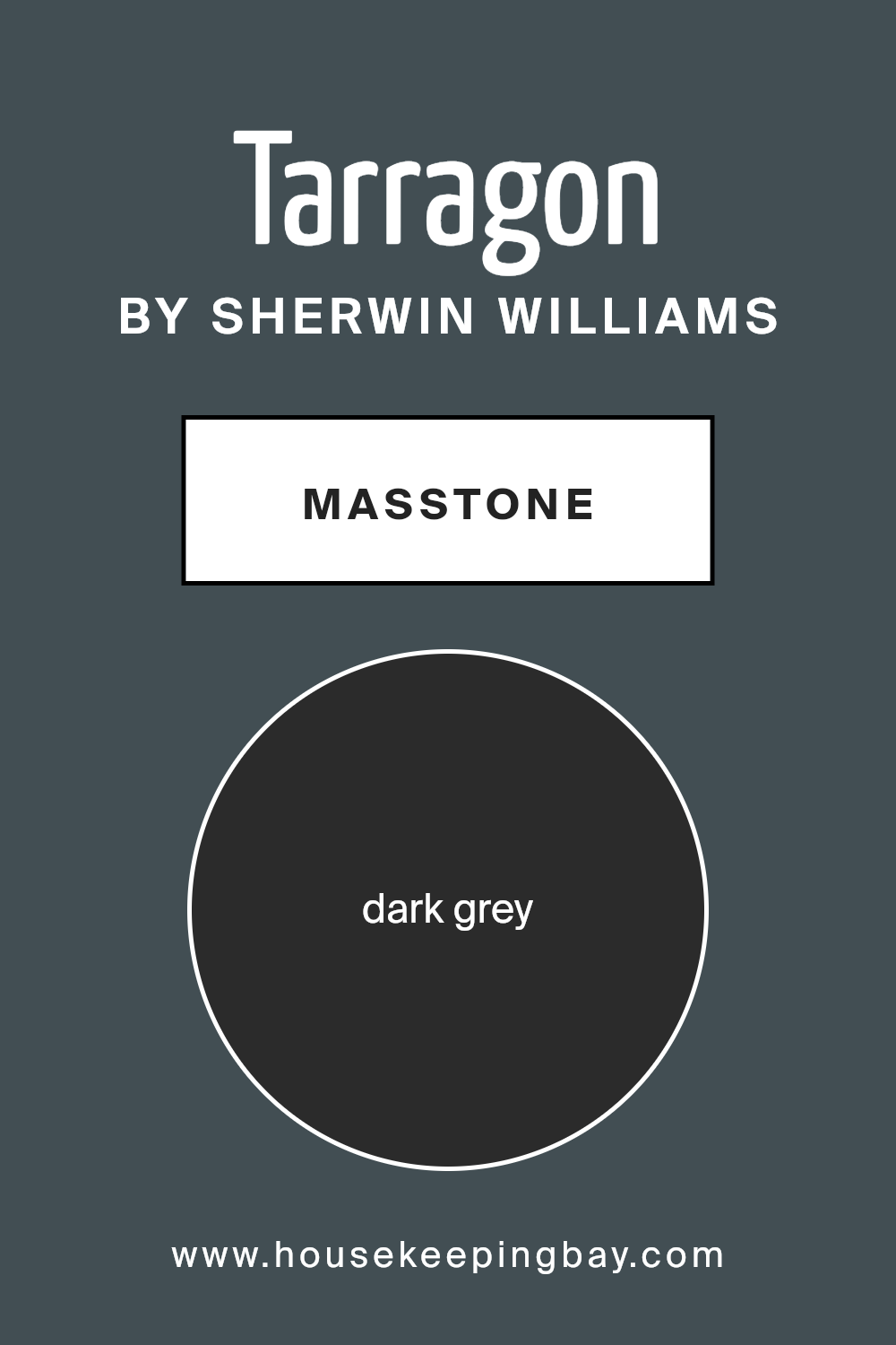
What is the Masstone of the Tarragon SW 9660 by Sherwin Williams?
TarragonSW 9660 by Sherwin Williams, identified by its masstone of dark grey (color code #2B2B2B), offers a robust and versatile option for home interiors. This shade of grey is quite deep, making it a solid choice for creating a strong, grounding effect in a room. The dark grey masstone helps in adding a sense of sophistication and elegance, lending itself well to both modern and traditional spaces.
When used in homes, this dark grey color can serve as an excellent backdrop. It can make brighter colors pop or provide a subtle contrast to lighter neutrals. Given its deep tone, TarragonSW 9660 is particularly effective in larger spaces or rooms with ample natural light to prevent the color from overwhelming the space.
Additionally, dark grey can help to hide imperfections on walls and is relatively low maintenance compared to lighter shades. For homeowners who prefer a chic, understated look, this shade of grey can be a perfect choice, working well in living areas, bedrooms, or even offices.
housekeepingbay.com
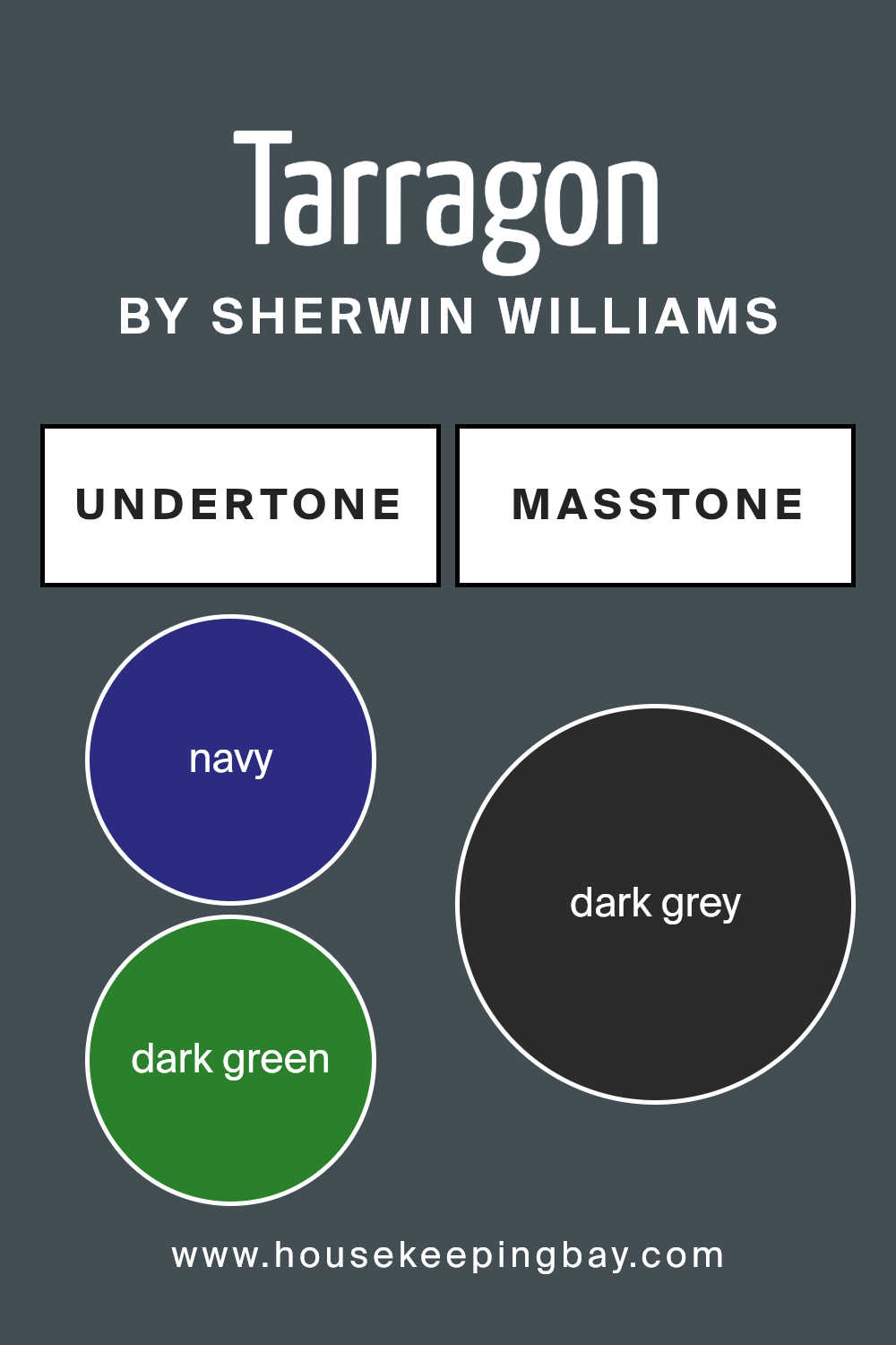
Undertones of Tarragon SW 9660 by Sherwin Williams
TarragonSW 9660 by Sherwin Williams is a complex paint color with a mix of subtle undertones, shifting how the main hue appears depending on the lighting and surrounding colors. With undertones of navy, dark green, dark turquoise, brown, purple, olive, and grey, TarragonSW 9660 has a unique depth that can make any room feel more interesting.
Undertones in a color can influence our perception of it significantly. Since each undertone reflects light differently, a color like TarragonSW 9660 might seem to change at different times of the day or in different lighting conditions.
For example, under bright sunlight, the navy or dark turquoise might make the color appear cooler, while indoor lighting could draw out the brown or olive, giving the paint a warmer feel.
When used on interior walls, these undertones play an important role. In a room with lots of natural light, TarragonSW 9660 might look more vibrant and refreshing due to its cooler undertones.
In contrast, in a room with softer, artificial light, the warmer undertones might make the space feel cozy and welcoming.
The variety of undertones also means the color can complement a wide range of decor styles and colors, making it a versatile choice for many different spaces.
Overall, the multilayered undertones of TarragonSW 9660 can subtly alter the atmosphere of a room, adding an intriguing layer of visual interest.
housekeepingbay.com
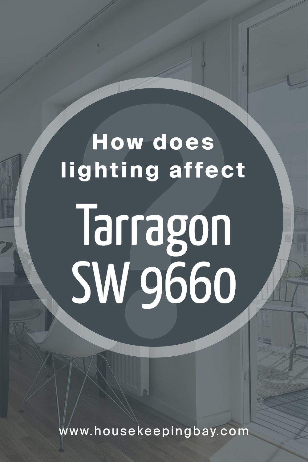
How Does Lighting Affect Tarragon SW 9660 by Sherwin Williams?
Lighting significantly influences how colors appear in different environments, impacting both the intensity and shade of the color. The color TarragonSW 9660 by Sherwin Williams, a sophisticated muted green, demonstrates these variations vividly under different light conditions.
In artificial light, especially warm incandescent bulbs, TarragonSW 9660 tends to appear warmer and more inviting, enhancing the yellow undertones in the green. This makes the color feel softer and cozier, ideal for living spaces where comfort is key.
Fluorescent lighting, cooler and bluer, might bring out more of the green’s crispness, giving it a sharper, more vibrant appearance which can be effective in areas requiring focus and energy.
Natural light brings its own changes to TarragonSW 9660. In a room with ample sunlight, such as one facing south, the color can appear much brighter and livelier, especially during the middle of the day when the sun is at its brightest. The natural daylight complements the green, making it look fresh and cheerful.
In north-facing rooms, which receive less direct sunlight and have a cooler light quality, TarragonSW 9660 might look more subdued and shadowed, with its more muted and darker tones coming forward. This can create a more reserved and calm atmosphere.
In east-facing rooms, the morning light can make TarragonSW 9660 look particularly soft and pleasant, whereas, in the afternoon, the color might lose some of its vibrancy as the natural light diminishes.
Conversely, in west-facing rooms, the color might appear duller in the morning but gain vibrancy in the evening with the setting sun, emphasizing the green’s depth and richness.
Overall, TarragonSW 9660’s appearance is dynamically affected by light, shifting in mood and tone from room to room and throughout the day, adapting beautifully to different settings and lighting conditions.
housekeepingbay.com
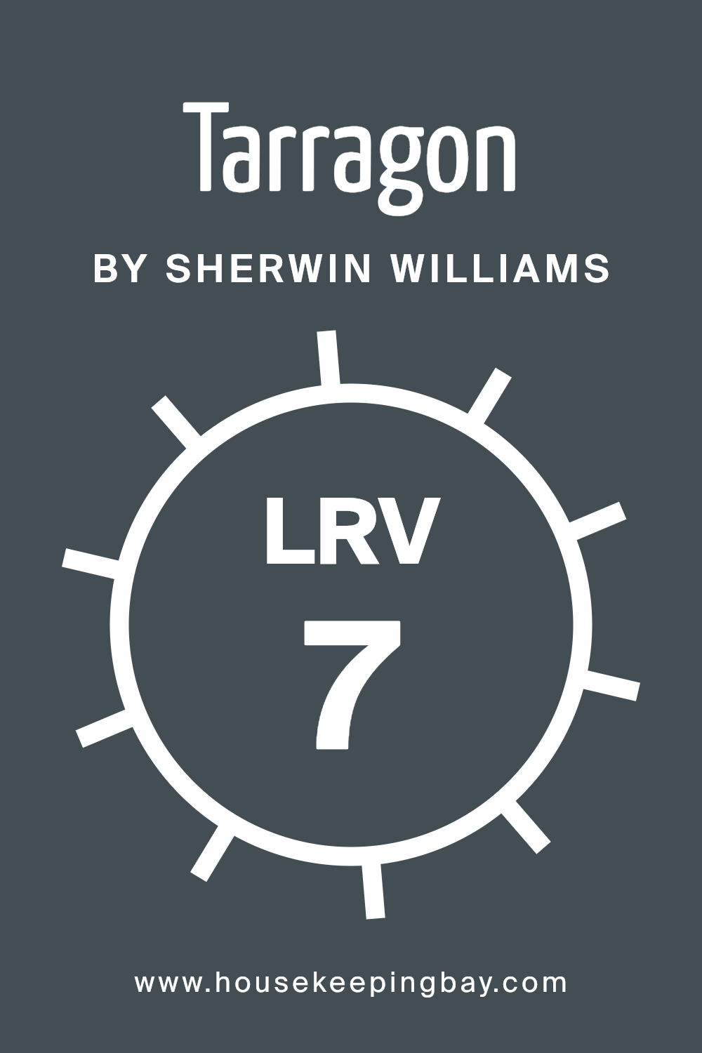
What is the LRV of Tarragon SW 9660 by Sherwin Williams?
LRV stands for Light Reflectance Value, a measure used to describe how much light a color reflects or absorbs. This value ranges from 0 to 100, where 0 means no light is reflected (absolute black), and 100 signifies complete reflection of light (pure white).
Understanding LRV helps in choosing paint colors for different spaces based on how much natural or artificial light the area receives. A higher LRV color makes rooms brighter as it reflects more light, while a lower LRV causes spaces to look darker due to less light reflection.
For TarragonSW 9660 by Sherwin Williams, with an LRV of 7.293, this color is quite dark, absorbing much of the light that hits it rather than reflecting it. In rooms with limited natural light, using TarragonSW 9660 might make the space feel smaller or more enclosed due to its low LRV.
On the other hand, in a well-lit room or a large open space, this color can add a deep, rich backdrop, enhancing the room’s aesthetic without making it feel overly cramped. The choice of lighting and accompanying decor will greatly influence the impact of this color’s low LRV on your space.
housekeepingbay.com
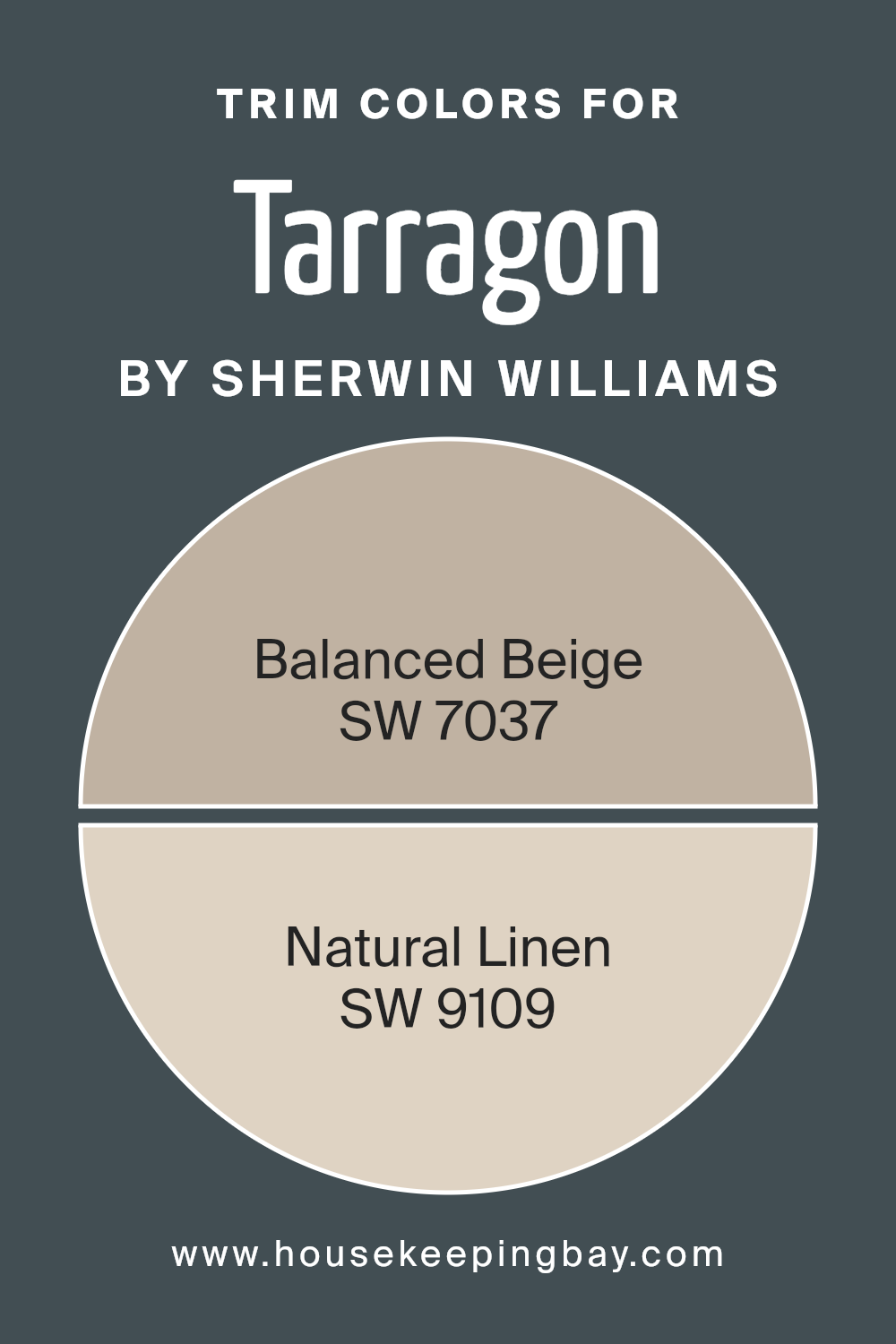
What are the Trim colors of Tarragon SW 9660 by Sherwin Williams?
Trim colors are specific shades used to highlight or accentuate architectural details and boundaries in a space, such as door frames, window frames, moldings, and skirting boards. For TarragonSW 9660 by Sherwin Williams, choosing the right trim colors can significantly impact the overall aesthetic and feel of an environment, balancing and complementing the deeper tone of Tarragon.
SW 7037 – Balanced Beige and SW 9109 – Natural Linen are excellent choices for trim colors because they offer a subtle contrast that can soften the strong character of Tarragon, providing a refined and cohesive look.
Balanced Beige SW 7037 is a warm, neutral beige that provides a soft and inviting backdrop for TarragonSW 9660. Its earthy tone helps create a seamless transition between the boldness of Tarragon and the more understated aspects of the decor, ensuring everything blends harmoniously without overwhelming the senses.
Natural Linen SW 9109, on the other hand, is a lighter, creamy color that imparts a fresh and clean look.
This color works especially well in brightening spaces and adding a light touch to the deep green hues of Tarragon, making the room feel open and airy while still maintaining a sophisticated air.
You can see recommended paint colors below:
housekeepingbay.com
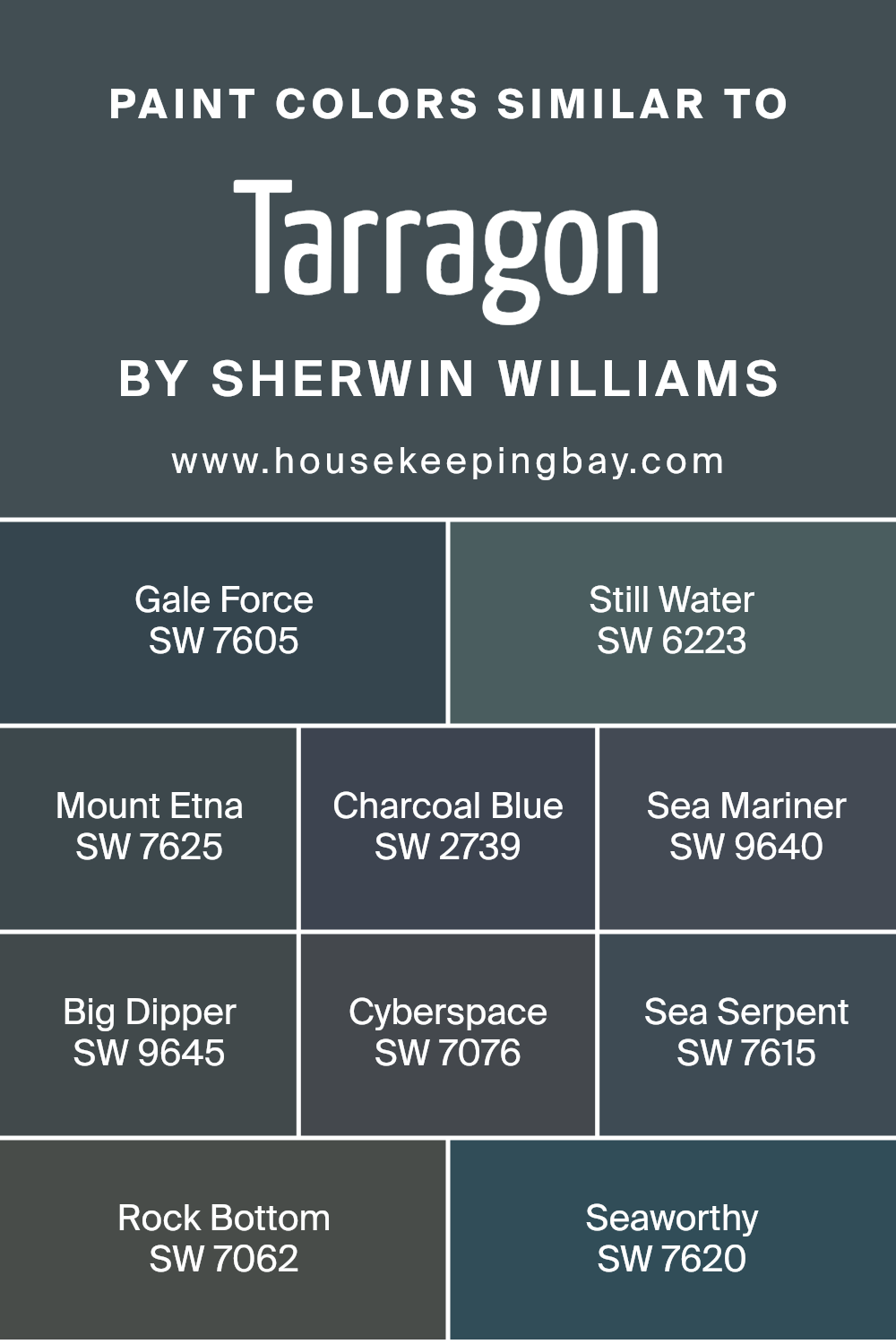
Colors Similar to Tarragon SW 9660 by Sherwin Williams
Utilizing similar colors in design can create a cohesive and harmonious visual experience. Colors that share the same hue or tone, like those similar to Tarragon SW 9660 by Sherwin Williams, help to form a unified aesthetic that is pleasing to the eye.
These colors tend to blend well together, reducing visual clutter and enhancing the overall calmness of a space. For example, Gale Force SW 7605 offers a deep, stormy blue that adds a powerful depth to walls, while Still Water SW 6223 provides a lighter, soothing blue that can soften any area where it is used.
Mount Etna SW 7625 is another impactful color that resembles dark, volcanic ash, suitable for feature walls that need a dramatic flair. Charcoal Blue SW 2739, as the name suggests, combines the darkness of charcoal with the serenity of blue, giving off a refined navy tone that is adaptable to various settings.
Sea Mariner SW 9640 has a hint of maritime vibrance, perfect for spaces aiming for a nautical theme. Big Dipper SW 9645 features a bold, deep blue, which mimics a starry night sky.
Further into the palette, Cyberspace SW 7076 throws a shade darker, nearly black, ideal for modern environments looking for a stark contrast. Sea Serpent SW 7615 uses the mystical allure of deep-sea creatures to inspire its rich, dark teal color that works beautifully in bathrooms and bedrooms.
Rock Bottom SW 7062 provides the solid feel of a stone-like gray with blue undertones, perfect for grounding a space. Lastly, Seaworthy SW 7620 is reminiscent of weathered ship wood, lending an antique charm when applied to walls or furnishings, reflecting the robust spirit of oceanic voyages.
These similar shades ensure that no matter the combination, the scheme remains fluid and coherent, making any interior look well-thought-out and professionally styled.
You can see recommended paint colors below:
- SW 7605 Gale Force
- SW 6223 Still Water
- SW 7625 Mount Etna
- SW 2739 Charcoal Blue
- SW 9640 Sea Mariner
- SW 9645 Big Dipper
- SW 7076 Cyberspace
- SW 7615 Sea Serpent
- SW 7062 Rock Bottom
- SW 7620 Seaworthy
housekeepingbay.com
How to Use Tarragon SW 9660 by Sherwin Williams In Your Home?
Tarragon SW 9660 by Sherwin Williams is a unique shade of green that can add a fresh and lively touch to any home. Because of its subtle yet rich hue, it works well in many areas of a house. You can use it in the kitchen to create a refreshing backdrop that enhances the look of your cabinets and countertops.
In the living room or bedroom, Tarragon can offer a calming, clean look that pairs beautifully with various decors, whether modern or classic.
For those willing to refresh their bathroom, painting the walls with Tarragon can complement natural light and fittings, making the space feel airy and light. Additionally, applying this paint shade in smaller, often overlooked spaces like a hallway or nook can instantly add personality and visual interest without overwhelming the surroundings.
It’s also versatile in style compatibility, matching well with woods, metals, and textured fabrics, making it a practical choice for anyone looking to update their home.
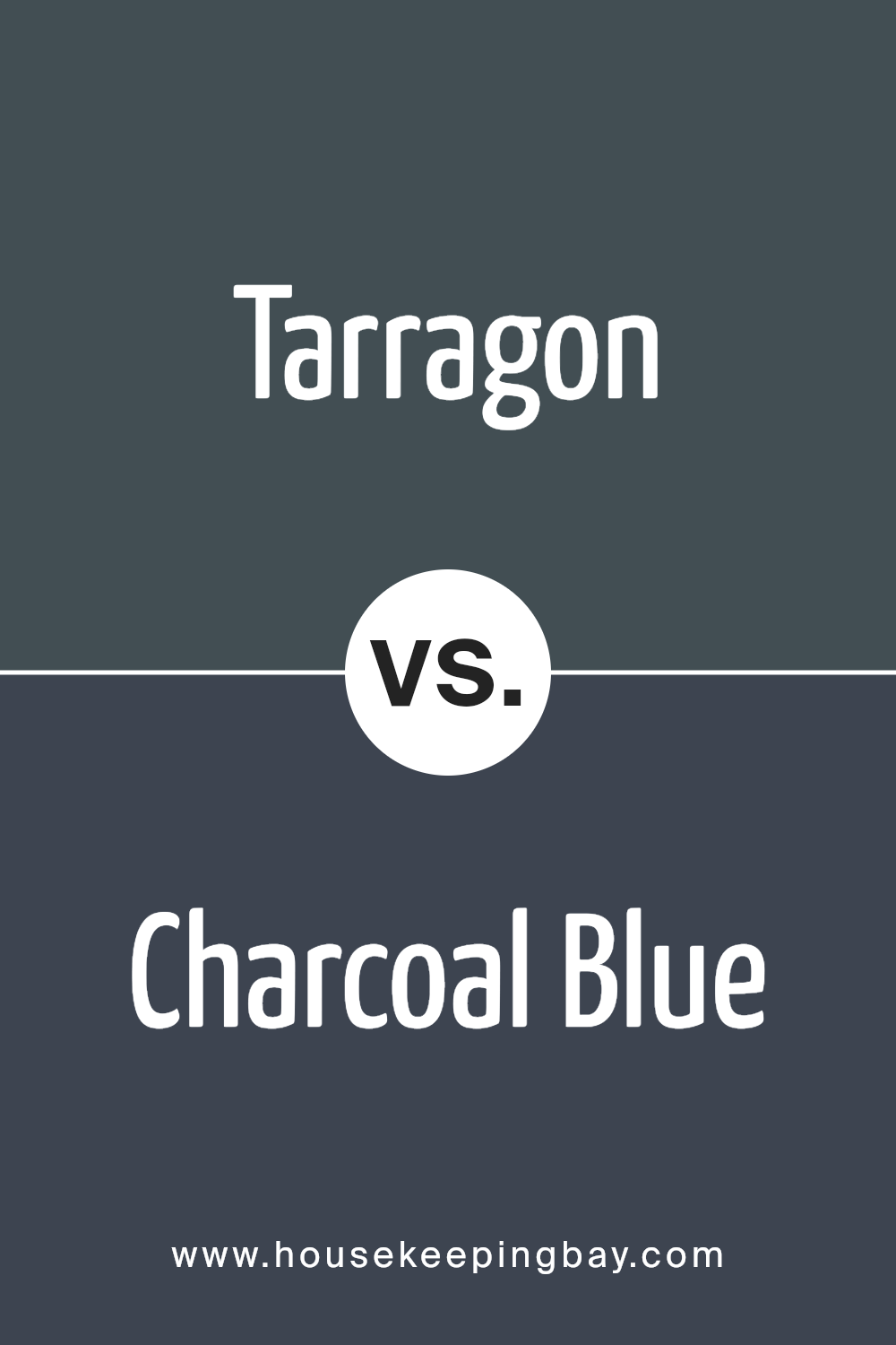
Tarragon SW 9660 by Sherwin Williams vs Charcoal Blue SW 2739 by Sherwin Williams
Tarragon SW 9660 by Sherwin Williams is a warm, earthy green that creates a cozy and welcoming feeling in any space. Its herbal undertones give it a natural vibe that pairs well with both rustic and modern decors. This color is ideal for living areas or bedrooms where a calm, soothing presence is desired.
Contrastingly, Charcoal Blue SW 2739 is a deep blue with hints of gray, giving it a more serious and sophisticated air. It suits formal spaces or accent walls, providing a strong backdrop that makes light-colored furnishings or artwork stand out. This shade adds a dramatic flair to any room, making it appear more refined and tailored.
Both colors are unique in their own right, setting different moods and complementing different styles. While Tarragon brings warmth and calmness, Charcoal Blue offers depth and sophistication.
You can see recommended paint color below:
- SW 2739 Charcoal Blue
housekeepingbay.com
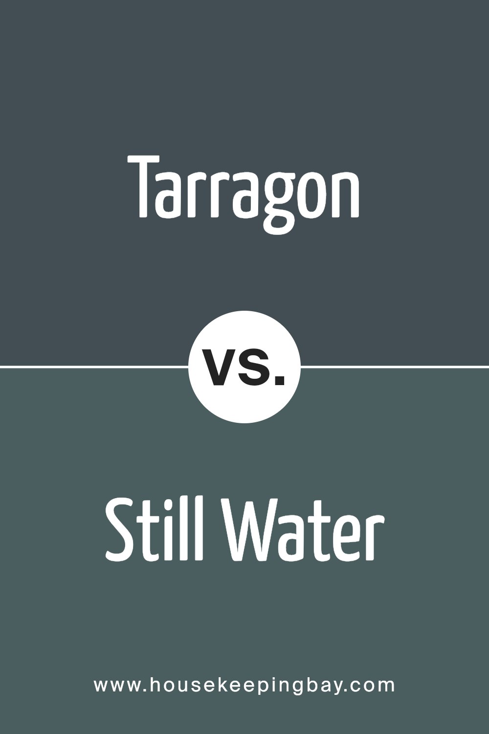
Tarragon SW 9660 by Sherwin Williams vs Still Water SW 6223 by Sherwin Williams
Tarragon SW 9660 by Sherwin Williams is a rich, warm green with earthy tones that can create a cozy and inviting ambiance in any space. It’s perfect for rooms where you want to add a touch of nature and serenity. This color also pairs well with natural wood and could work beautifully in a kitchen, living room, or an entryway to make a welcoming impression.
Still Water SW 6223, by contrast, is a light, soft blue that has a calming effect, making it ideal for bathrooms or bedrooms where a relaxing atmosphere is desired. It reflects light well, helping small spaces appear larger and airier. This shade complements white trim or fixtures for a crisp, clean look.
Both colors bring their distinct vibe—Tarragon leans towards earthiness and richness, suitable for social spaces or areas needing warmth. Still Water offers a soothing, gentle feel, perfect for personal retreats or quiet areas.
Each has its unique charm, suitable for different purposes and aesthetics within a home.
You can see recommended paint color below:
- SW 6223 Still Water
housekeepingbay.com
Tarragon SW 9660 by Sherwin Williams vs Rock Bottom SW 7062 by Sherwin Williams
Tarragon SW 9660 by Sherwin Williams is a fresh, herbal green that brings a vibrant, natural feel to any space. It’s bright enough to add energy yet soft enough to be soothing, making it versatile for kitchens, living rooms, or bedrooms. It pairs well with natural wood tones, whites, and grays, contributing to a lively yet balanced atmosphere.
In contrast, Rock Bottom SW 7062 is a deep charcoal gray with a strong presence. It’s a color that provides a solid, grounding effect, suitable for creating a sophisticated or cozy feel. Rock Bottom works well in modern settings, offering a dramatic backdrop that enhances bold accents like metallics or bright colors.
Both colors serve different aesthetic purposes, with Tarragon providing a light, refreshing vibe, while Rock Bottom offers depth and drama, making them suitable for varied interior styles and preferences.
You can see recommended paint color below:
- SW 7062 Rock Bottom

housekeepingbay.com
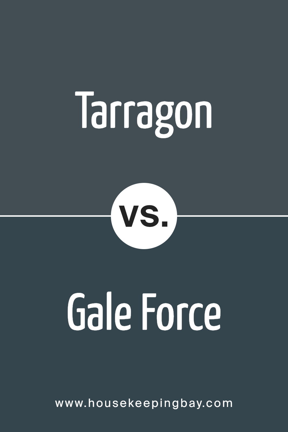
Tarragon SW 9660 by Sherwin Williams vs Gale Force SW 7605 by Sherwin Williams
Tarragon SW 9660 by Sherwin Williams is a soothing, grayish-green hue that adds a gentle touch of nature to any space. Its muted green tones convey a sense of calm and are ideal for creating a serene environment in rooms like bedrooms or offices. The color pairs well with natural elements and soft textiles, providing a harmonious and inviting atmosphere.
In contrast, Gale Force SW 7605 by Sherwin Williams is a much deeper, bolder blue shade that evokes the strength and mystery of the ocean. This color can make a strong statement when used on accent walls or furniture, bringing depth and drama to the space.
Due to its intensity, it works well in areas where a touch of sophistication is desired, such as dining rooms or entryways.
Both colors offer unique vibes—Tarragon is more understated and calming, while Gale Force is dynamic and powerful, making them suitable for different interior moods and styles.
You can see recommended paint color below:
housekeepingbay.com
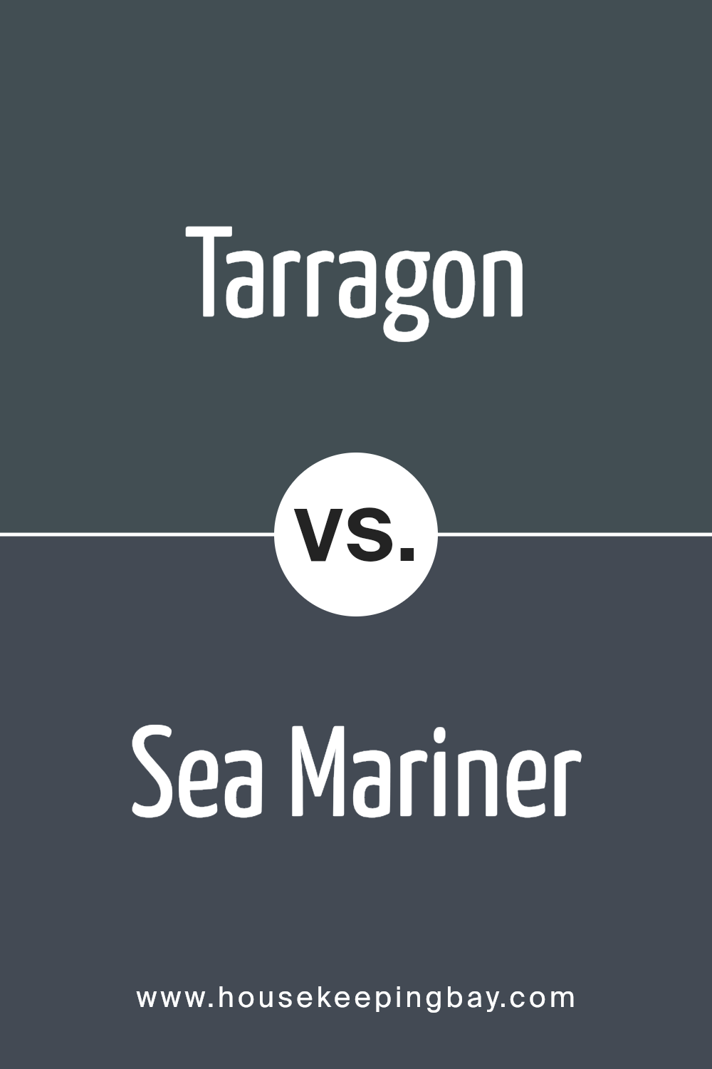
Tarragon SW 9660 by Sherwin Williams vs Sea Mariner SW 9640 by Sherwin Williams
Tarragon SW 9660 by Sherwin Williams is a rich and warm sage green hue that brings a natural and soothing vibe to any space. This color is perfect for creating a cozy and inviting atmosphere, ideal for living rooms or bedrooms where comfort is key.
In contrast, Sea Mariner SW 9640 is a lively and vibrant shade of teal that combines the calm of blue with the freshness of green. It’s a bold choice that injects energy and personality into an area. Perfect for accent walls or spaces where you want to make a statement, like bathrooms or kitchens.
While Tarragon offers a subtle and earthy feel, Sea Mariner stands out with its dynamic and cheerful presence. Tarragon suits spaces aiming for a grounded, neutral backdrop, whereas Sea Mariner is better for places that benefit from a splash of brightness.
Both colors reflect different moods and can dramatically affect the feel of a room depending on what atmosphere you aim to achieve.
You can see recommended paint color below:
- SW 9640 Sea Mariner
housekeepingbay.com
Tarragon SW 9660 by Sherwin Williams vs Mount Etna SW 7625 by Sherwin Williams
Tarragon SW 9660 by Sherwin Williams is a light and gentle green color that brings a soft and subtle atmosphere to any space. It has a fresh feel that pairs well with natural elements and materials like wood and stone. It’s ideal for creating a calm and soothing environment in places like bedrooms or living rooms.
Mount Etna SW 7625, also by Sherwin Williams, presents a significantly darker hue. This deep, charcoal-like blue has a strong presence and adds a bold touch to interior spaces. It’s great for making striking statements, especially on accent walls or in areas where dramatic effect is desired, such as dining rooms or home offices.
Both colors offer unique aesthetic appeals and can transform rooms depending on the desired effect. Tarragon is more about softness and light, while Mount Etna provides depth and intensity. They could also complement each other well in a single space, using Mount Etna for focal points against a backdrop of Tarragon.
You can see recommended paint color below:
- SW 7625 Mount Etna
housekeepingbay.com
Tarragon SW 9660 by Sherwin Williams vs Big Dipper SW 9645 by Sherwin Williams
Tarragon SW 9660 and Big Dipper SW 9645, both by Sherwin Williams, offer unique shades for different preferences. Tarragon presents as a soft, muted olive green, providing a sense of calm and naturalness to spaces. It works well in areas where a touch of nature is desired without overwhelming the setting. This color can blend seamlessly with neutrals and wood tones, making it versatile for living rooms and bedrooms.
Big Dipper is darker, a rich blue-gray that brings a strong but not overpowering presence to a room. It’s perfect for creating a focal point or accenting smaller elements. This shade suits modern decor and pairs effectively with metallic finishes and bright whites for contrast.
Both colors offer distinct vibes; Tarragon leans towards earthy and serene, while Big Dipper leans more towards bold and sophisticated. Each color could dramatically alter the atmosphere of a room depending on what you’re aiming for.
You can see recommended paint color below:
- SW 9645 Big Dipper
housekeepingbay.com
Tarragon SW 9660 by Sherwin Williams vs Sea Serpent SW 7615 by Sherwin Williams
The main color, Tarragon SW 9660 by Sherwin Williams, is a soft and subtle shade, leaning towards a muted green with hints of earthy, herbal tones. It conveys a sense of calm and natural freshness, making it ideal for creating a peaceful and soothing environment. This color works well in spaces aimed at relaxation, such as bedrooms and living areas, bringing a touch of nature indoors.
In contrast, Sea Serpent SW 7615 is a much darker and richer color. It is a deep teal that combines the coolness of blue with the depth of green, resulting in a color that’s both bold and sophisticated.
Sea Serpent SW 7615 complements accents of silver or gray and is perfect for adding dramatic flair and visual interest to any room, particularly in spaces designed for impact and focal points.
Together, Tarragon serves as a gentle backdrop, while Sea Serpent acts as a striking complement, allowing for a dynamic yet harmonious color palette.
You can see recommended paint color below:
housekeepingbay.com
Tarragon SW 9660 by Sherwin Williams vs Seaworthy SW 7620 by Sherwin Williams
Tarragon SW 9660 by Sherwin Williams is a vibrant green shade that brings to mind fresh herbs and nature. It’s a lively color that can add a sense of energy and renewal to any space. This shade works well in kitchens, living areas, or any place where you want to introduce a bright, organic feel.
Seaworthy SW 7620, also from Sherwin Williams, is a deep, rich navy blue. It gives off a strong and confident vibe, making it a great choice for accents or feature walls. This color pairs beautifully with neutral tones, and it can also be used in bedrooms or office spaces to create a more formal or sophisticated atmosphere.
Both Tarragon and Seaworthy offer distinct visual impacts. Where Tarragon is fresh and invigorating, Seaworthy is deep and serene. Depending on the mood you wish to create, Tarragon injects vibrancy, while Seaworthy offers a sense of seriousness and stability.
You can see recommended paint color below:
- SW 7620 Seaworthy
housekeepingbay.com
Tarragon SW 9660 by Sherwin Williams vs Cyberspace SW 7076 by Sherwin Williams
Tarragon SW 9660 by Sherwin Williams is a warm and inviting hue, resembling a muted olive green. This color offers a natural feel, making spaces cozy and serene—perfect for creating a relaxed and welcoming atmosphere in any room. Its earthy tones pair well with natural materials like wood or stone, enhancing the soothing quality of a space.
In contrast, Cyberspace SW 7076, also by Sherwin Williams, is a much darker shade. This deep, charcoal gray evokes a strong and bold feel, ideal for adding drama and sophistication to a space. It serves as an excellent backdrop for metallic accents and vibrant colors, making them pop.
Cyberspace is particularly effective in modern designs where a sleek, impactful look is desired.
Both colors serve distinct purposes and set very different moods in an interior environment, yet each holds its own in terms of versatility and style.
You can see recommended paint color below:
housekeepingbay.com
I personally found this shade to be a sophisticated choice that pairs well with both bold and muted tones, making it a great candidate for various design styles, from modern to traditional.
I also noted Tarragon’s ability to affect the mood of a room, lending a subtle yet impactful presence that can make spaces feel more polished and put together. This can be a fantastic option for those looking to refresh their home without committing to an overly bold color change.
The practical benefits extend beyond its visual appeal, with good coverage and durability that Sherwin Williams is known for.
In choosing paint colors, Tarragon stands out as a strong contender due to its adaptability and elegant vibe. I would certainly consider using it in future projects and recommend others to consider it when planning their next renovation.
It’s a color that promises to bring a fresh yet timeless look to any interior.
housekeepingbay.com
Ever wished paint sampling was as easy as sticking a sticker? Guess what? Now it is! Discover Samplize's unique Peel & Stick samples. Get started now and say goodbye to the old messy way!
Get paint samples


