Tanager SW 6601 by Sherwin Williams
A Burst of Warmth to Brighten Your Space
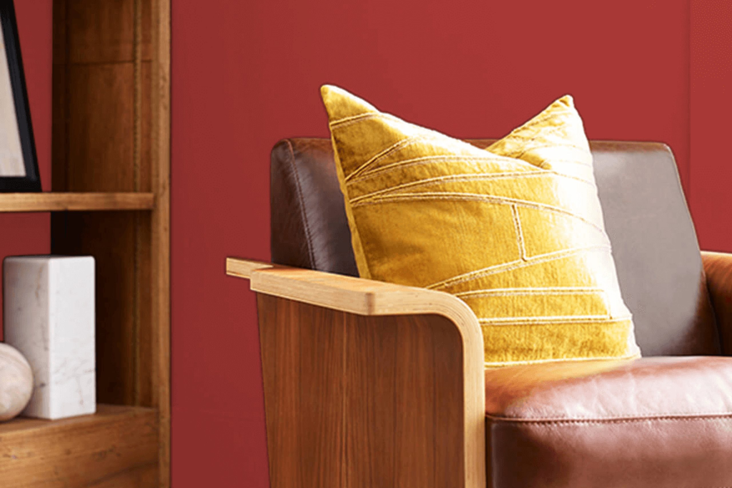
Let me introduce you to SW 6601 Tanager by Sherwin Williams. This color is a rich, vibrant shade that really makes a statement. Whether you’re thinking about freshening up your living room or adding some character to your kitchen, Tanager is a choice you might want to consider.
SW 6601 Tanager isn’t just any red; it has a depth that creates warmth and sophistication in any space. You might appreciate how it pairs with both modern and traditional decors, adding a splash of energy without overwhelming the room. It’s especially beautiful when used on an accent wall or within small decorative elements, creating focal points that draw the eye and give a room personality.
Choosing the right color can sometimes feel tricky, but Tanager offers a blend of coziness and style that could fit various spaces and furniture styles. Whether you have dark wood, metal accents, or sleek white trim, this color can really tie things together.
So, if you’re ready to give your room a fresh new look, consider giving Tanager a spot in your home.
via sherwin-williams.com
What Color Is Tanager SW 6601 by Sherwin Williams?
Tanager SW 6601 by Sherwin Williams is a vibrant, deep red hue with shades of berry and brick. This versatile color brings warmth and energy to any space, making it an excellent choice for creating a lively and inviting atmosphere. Tanager SW 6601 works exceptionally well in traditional, eclectic, and modern interior styles. Its rich tone complements both old and new design elements, offering flexibility in various decorating themes.
In traditional spaces, Tanager SW 6601 pairs beautifully with natural wood finishes, from light oak to dark walnut, enhancing the organic beauty of the wood. Fabrics like velvet and silk in matching or contrasting hues can add a layer of luxury and comfort. For a modern twist, metal accents in brushed nickel or polished chrome provide a sleek contrast to the deep red, creating a fresh and dynamic look.
In eclectic interiors, combining Tanager SW 6601 with global-inspired textiles and artworks introduces a playful mix of colors and patterns that reflect a well-traveled aesthetic. Here, woven textures like wicker or rattan and colorful ceramics enrich the room’s visual interest.
Overall, Tanager SW 6601 is a flexible color choice for those looking to add warmth and character to their living spaces, blending seamlessly with various materials and textures to create a cohesive-looking yet personalized environment.

housekeepingbay.com
Is Tanager SW 6601 by Sherwin Williams Warm or Cool color?
Tanager SW 6601 by Sherwin Williams is a vibrant, deep red hue with warm undertones that add a cozy and inviting feel to any room. This shade is perfect for those wanting to add a bold splash of color in their home without overpowering the space. Tanager SW 6601 works well in living rooms or dining areas where you want to create a strong focal point.
Given its richness, it pairs beautifully with neutral colors like whites, creams, and light grays, allowing the red to stand out while maintaining a balanced look. This color also looks lovely with natural wood tones, which complement its warmth.
Using Tanager SW 6601 in smaller accents, like a single wall or in decorative elements, can effectively introduce color without overwhelming the room. It’s also a great choice for door or cabinet colors if you prefer subtle yet impactful color uses. Tanager SW 6601 can indeed make a room feel more alive and cozy, especially in spaces where family and friends gather.
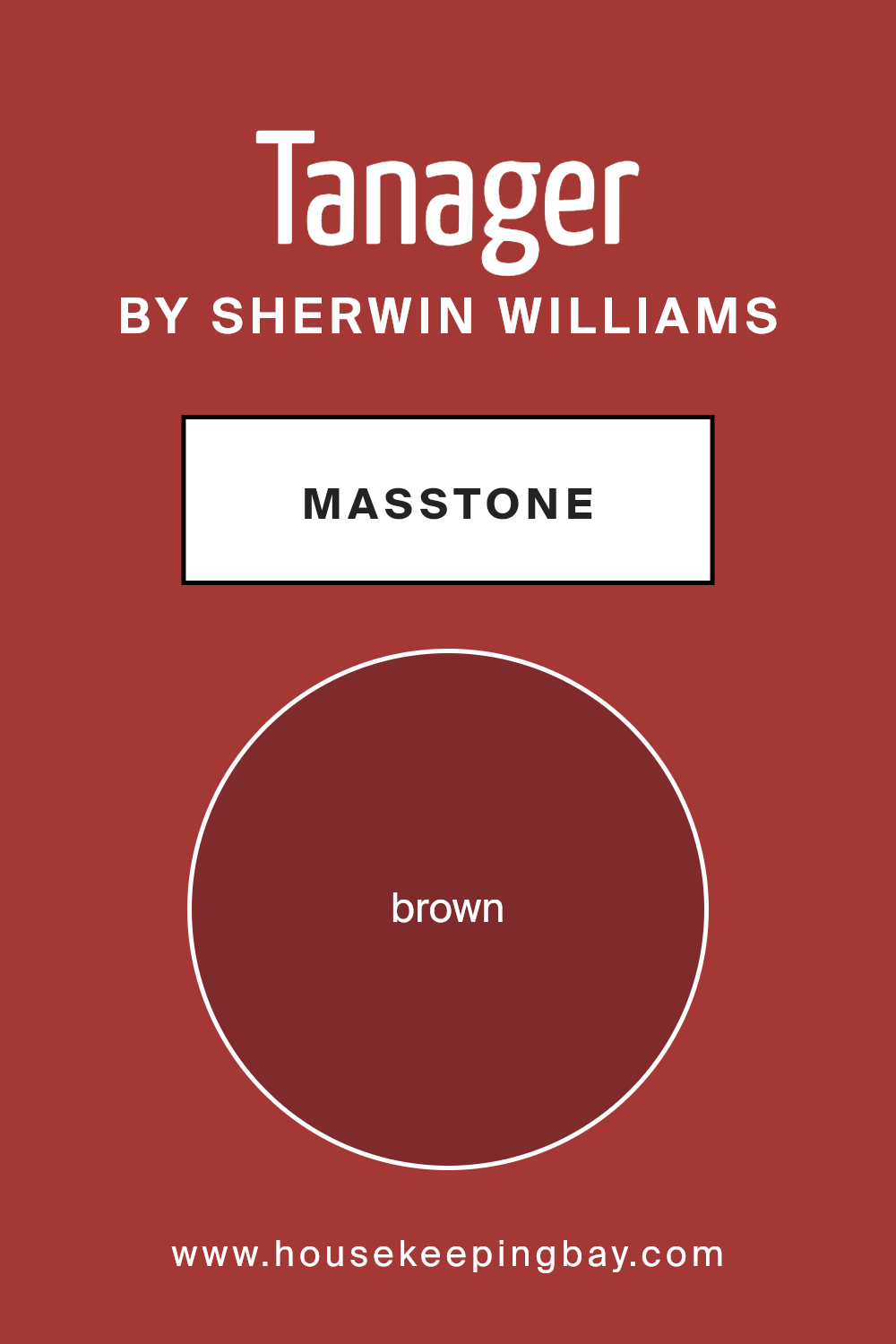
What is the Masstone of the Tanager SW 6601 by Sherwin Williams?
TanagerSW 6601 by Sherwin Williams, with its masstone of Brown (#802B2B), brings a warm, rich hue that is both versatile and comforting. This specific shade of brown creates a cozy atmosphere that can work well in various spaces inside a home.
In living rooms, it adds a sense of warmth, making the area feel inviting and relaxed. For bedrooms, using this color can help in creating a soothing sanctuary where relaxation comes naturally.
Brown is a neutral color, so TanagerSW 6601 pairs well with many other colors, from soft creams and whites to bold and bright shades. This flexibility allows for a wide range of decorating styles, from rustic to modern. In well-lit spaces, the color glows with a warm undertone, while in dimmer areas, it can provide depth and solidity without overwhelming the senses. This balance means that TanagerSW 6601 can adapt to different lighting settings and personal styles, making it a practical choice for many homes.
housekeepingbay.com
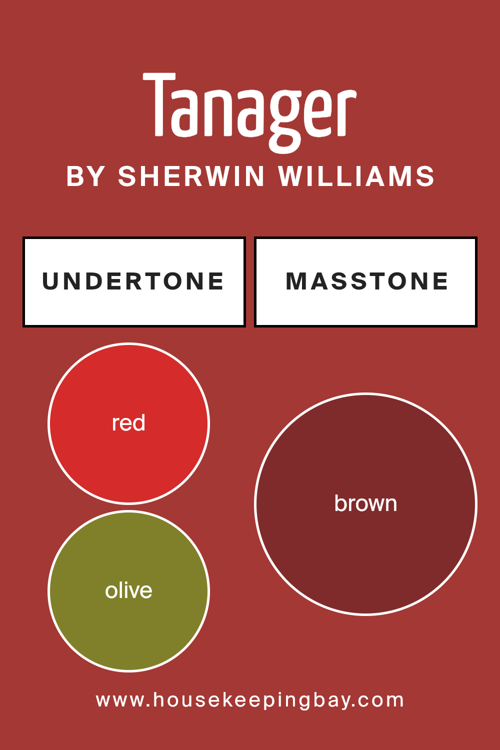
Undertones of Tanager SW 6601 by Sherwin Williams
TanagerSW 6601 by Sherwin Williams is a complex paint color that incorporates multiple undertones, influencing its overall appearance and how it interacts with different settings and lighting conditions. Undertones are subtle hues that can either warm up or cool down a primary color, affecting how colors are perceived and how they blend with other elements in a space.
For TanagerSW 6601, the undertones include red, olive, purple, orange, pink, grey, pale pink, dark grey, dark green, navy, and dark turquoise. Each of these undertones contributes to altering how the base color is seen.
For example, red and orange undertones can add warmth, making the color feel cozier and inviting. Grey and dark grey add neutrality, balancing the intensity of brighter undertones. Dark green and navy provide depth, enhancing sophistication and richness. Meanwhile, purple and pink add a hint of playful brightness, softening the overall feel.
When used on interior walls, TanagerSW 6601 will reflect its various undertones differently, depending on the lighting and surrounding colors. In natural light, the brighter undertones might become more prominent, creating a vibrant and lively effect. Conversely, in dimmer, artificial light, darker undertones like dark grey or navy might stand out, giving the room a more grounded feel.
Properly recognizing and utilizing these undertones allows for more effective color matching and decor planning, ensuring that the walls complement furnishings and other interior elements smoothly. This understanding helps achieve a desired atmosphere, whether aiming for vibrant energy or a more subdued ambiance.
housekeepingbay.com
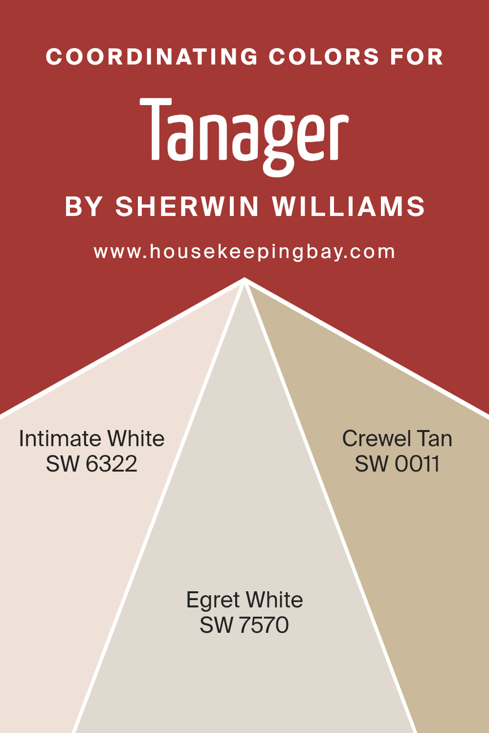
Coordinating Colors of Tanager SW 6601 by Sherwin Williams
Coordinating colors are selected to harmonize with a main color, enhancing the overall aesthetic of a space without overwhelming it. In the case of Tanager SW 6601 by Sherwin Williams, a vibrant color, it’s paired with SW 6322 Intimate White, SW 7570 Egret White, and SW 0011 Crewel Tan to achieve a balanced look. These coordinating colors work by complementing the primary color, ensuring that the design feels cohesive and thoughtfully constructed. Each color brings its own unique qualities to the table, creating a subtle backdrop that allows the main color to shine without clashing.
Intimate White SW 6322 is a soft, muted pink that offers a gentle contrast to the bolder Tanager SW 6601, providing a soothing and soft presence. Egret White SW 7570, on the other hand, is a neutral gray-white that acts as a clean and subtle canvas, amplifying the vividness of more saturated colors.
Lastly, Crewel Tan SW 0011 provides a warm, beige tone that adds depth and warmth, ensuring that the space feels welcoming and grounded. These colors together create a harmonious palette that enhances the environment while allowing individual elements to stand out gracefully.
You can see recommended paint colors below:
- SW 6322 Intimate White
- SW 7570 Egret White
- SW 0011 Crewel Tan
housekeepingbay.com
How Does Lighting Affect Tanager SW 6601 by Sherwin Williams?
Lighting significantly influences how colors appear in a room, impacting both the mood and functionality of the space. The color Tanager SW 6601 by Sherwin Williams is a vivid, deep orange that interacts distinctly with different types of light.
Under artificial lighting, Tanager SW 6601 can vary in appearance. LED or fluorescent lights that mimic daylight will maintain the vibrancy of this orange, keeping it bright and energetic. Warmer-toned bulbs like incandescent lights might enhance the depth of the color, adding a cozy, inviting glow to the space.
Natural light, on the other hand, plays a key role in displaying the true character of Tanager SW 6601. In rooms with exposure to ample natural light, such as those facing south, this color will look vivid and lively throughout the day, reflecting a bright and energetic orange hue that can make the space feel lively and cheerful. As the intensity of the sunlight changes, the shade of orange can shift from a bright, sunlit tone in midday to a richer, deeper hue during sunrise or sunset.
In north-facing rooms, which receive less direct sunlight and generally produce a cooler, bluer light, Tanager SW 6601 may appear slightly muted and less vibrant. This could give the room a softer, more subtle ambiance.
Rooms facing east will see Tanager SW 6601 light up brightly in the morning as they catch the early sun, creating a warm and welcoming feel. As the day progresses, the color will experience a subtle shift and become less intense.
For west-facing rooms, the color will stay relatively neutral during the morning and become progressively warmer and richer towards the evening as it catches the setting sun. Here, Tanager SW 6601 will end the day on a warm, inviting note.
Understanding these interactions between lighting and color can help when choosing paint colors for a space, ensuring that you achieve the desired effect regardless of the room’s orientation or light source. **Tanager SW 6601**’s rich hue makes it versatile under varying lighting conditions, ideal for creating lively spaces.
housekeepingbay.com
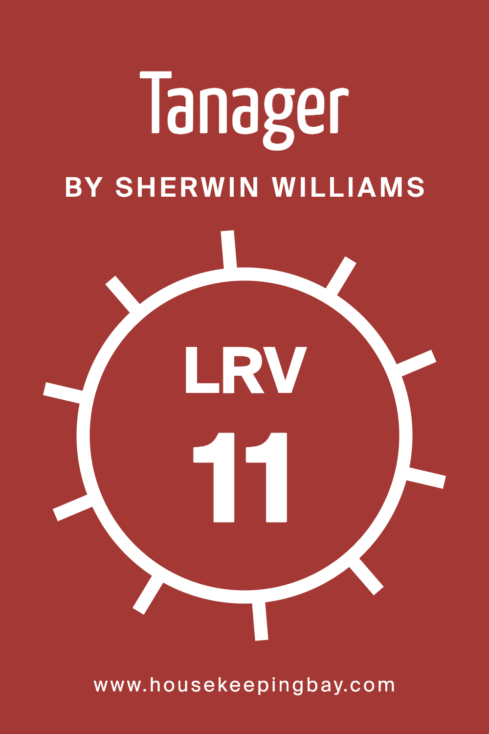
What is the LRV of Tanager SW 6601 by Sherwin Williams?
Light Reflectance Value (LRV) measures the percentage of light a paint color reflects from a surface. This value ranges from 0, which means no light is reflected (absolute black), to 100, indicating total reflection of light (pure white). LRV helps determine how light or dark a color will appear once applied to walls.
It’s an essential tool in design, especially in making sure that spaces feel appropriately bright or cozy. For instance, a higher LRV means a room will look brighter and feel more spacious, as the walls reflect more light around the area.
In the case of TanagerSW 6601 by Sherwin Williams, which has an LRV of 10.977, the color is quite dark. This means it absorbs rather than reflects most of the light. In a practical sense, walls painted in this shade will look richer and potentially make a room feel smaller or more enclosed. This LRV means the color is likely to enhance intimate or cozy atmospheres. When using such a dark color, good lighting and careful consideration of room size and function are important, as the shade can make dramatic changes to the perception of space.
housekeepingbay.com
What are the Trim colors of Tanager SW 6601 by Sherwin Williams?
Trim colors are specific shades used to highlight and accentuate the architectural features of a room, such as door frames, window sills, and baseboards. When used effectively, they create visual boundaries that define and separate spaces while adding a pop to the overall color scheme. In the case of Tanager SW 6601 by Sherwin Williams, a rich and warm hue, pairing it with well-chosen trim colors can enhance its visual appeal and contribute to a cohesive look. For Tanager SW 6601, two suitable trim colors from Sherwin Williams are SW 7006 – Extra White and SW 7042 – Shoji White.
Extra White SW 7006 is a clean and bright white that brings a fresh and crisp finish to any space. Its clear and pure quality makes it a popular choice for a trim, providing a sharp contrast that highlights the vibrant tones of Tanager SW 6601.
On the other hand, Shoji White SW 7042 offers a softer, more nuanced approach with its warm and creamy appearance. This color adds a subtle contrast and a soothing balance, ensuring that the boldness of Tanager SW 6601 stands out without overwhelming the senses. Together, these trim colors work harmoniously to enhance the room’s design and draw attention to its details.
You can see recommended paint colors below:

housekeepingbay.com
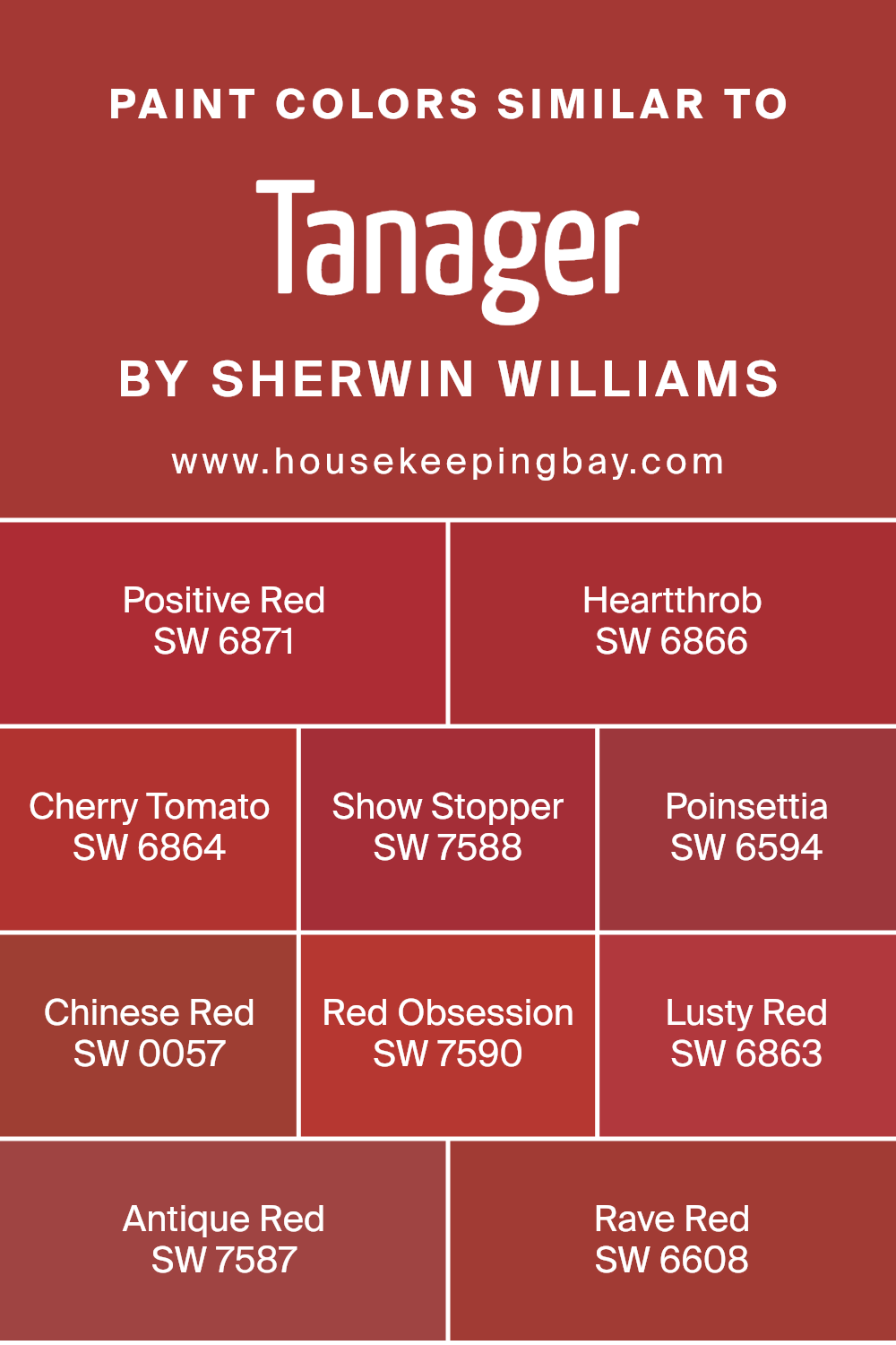
Colors Similar to Tanager SW 6601 by Sherwin Williams
Similar colors, like those akin to TanagerSW 6601 by Sherwin Williams, play a crucial role in design by allowing for subtle variations that complement the environment or set a mood without creating jarring transitions.
These variations can add depth and interest to a space, while maintaining a cohesive and harmonious aesthetic. Sharing similar undertones or intensities, colors like SW 6871 Positive Red or SW 6866 Heartthrob bring vibrant energy to the settings. They oscillate between vivid and deep red, offering rich, eye-catching hues that energize a room.
SW 6864 Cherry Tomato possesses a slightly orange tinge, mirroring the fresh and inviting tone of ripe tomatoes, while SW 7588 Show Stopper and SW 6594 Poinsettia lean towards classic red, but with a hint that might remind one of special occasions and festive moods.
Then there is SW 0057 Chinese Red, which has a traditional vividness commonly seen in cultural motifs, and SW 7590 Red Obsession that exudes a deep, passionate red, perfect for creating focal points.
SW 6863 Lusty Red and SW 7587 Antique Red offer mature, rich variants of red that are excellent for elegant spaces requiring a touch of sophistication. Finally, SW 6608 Rave Red rounds out the collection with its bright and dynamic tone, making it ideal for spaces intended to make a bold statement.
You can see recommended paint colors below:
- SW 6871 Positive Red
- SW 6866 Heartthrob
- SW 6864 Cherry Tomato
- SW 7588 Show Stopper
- SW 6594 Poinsettia
- SW 0057 Chinese Red
- SW 7590 Red Obsession
- SW 6863 Lusty Red
- SW 7587 Antique Red
- SW 6608 Rave Red
housekeepingbay.com
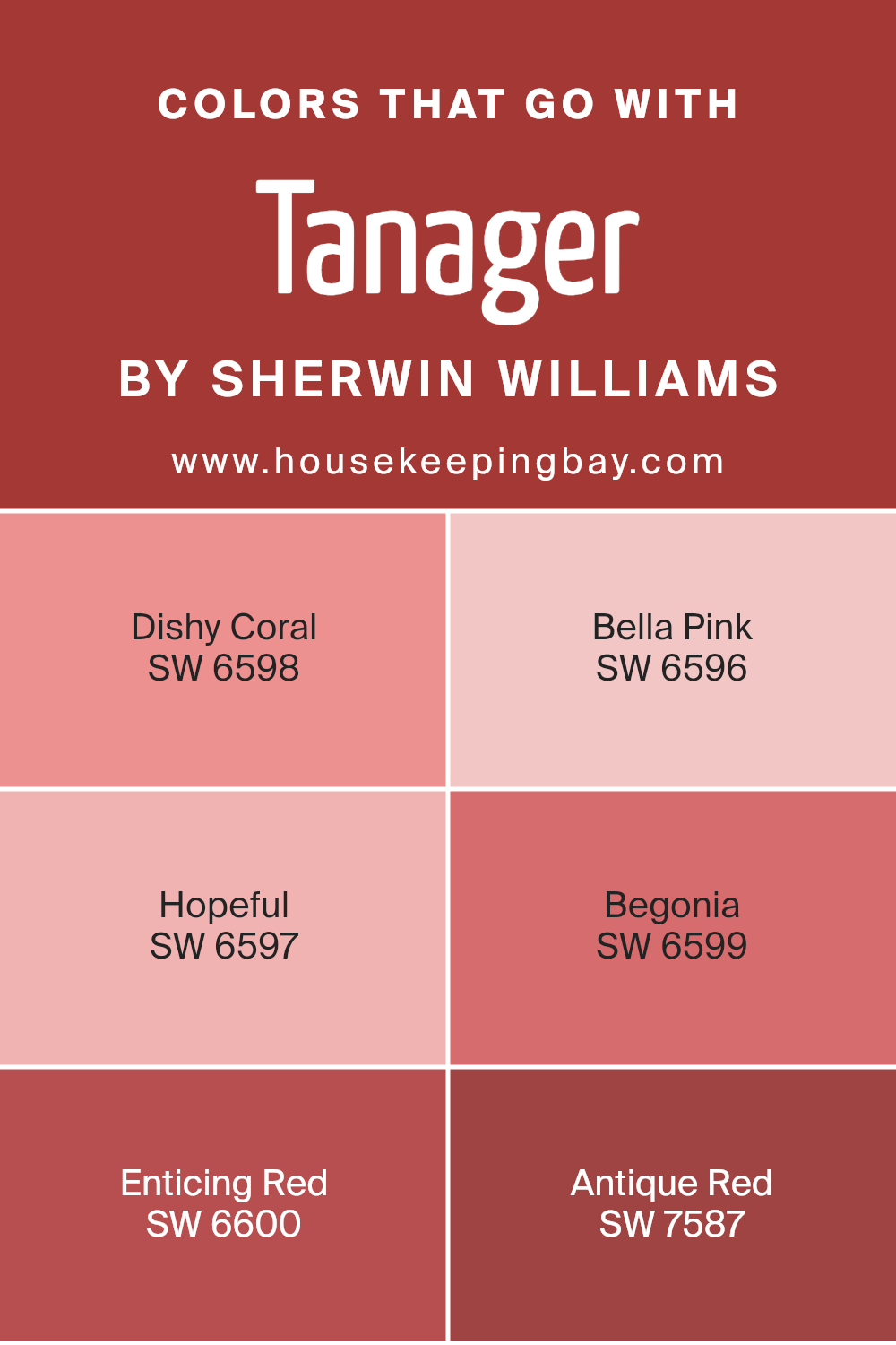
Colors that Go With Tanager SW 6601 by Sherwin Williams
Understanding which colors harmonize with Tanager SW 6601 by Sherwin Williams is crucial for creating a balanced and appealing color scheme in any space. Tanager, a robust and lively red, serves as a strong foundation that pairs effectively with a variety of shades to add richness and warmth. Each coordinating color complements Tanager in a way that allows for dynamic yet cohesive interior or exterior designs.
Dishy Coral SW 6598 provides a softer contrast to Tanager with its subdued, peachy tones, offering a gentle and fresh look that is ideal for creating a soothing atmosphere. Bella Pink SW 6596 is a delicate, muted pink reminiscent of cherry blossoms, perfect for adding a touch of softness to spaces that feature Tanager as a dominant color.
Hopeful SW 6597 is a light, airy pink with a hint of warmth, lending a cheerful vibe to any palette. Begonia SW 6599 is a vibrant, pinkish coral that injects a lively spark into designs, pairing well with the depth of Tanager.
Enticing Red SW 6600 is a powerful red that closely matches the intensity of Tanager, ideal for creating a bold, monochromatic look. Lastly, Antique Red SW 7587 offers a subdued, rustic red that contrasts subtly with Tanager, perfect for adding a vintage or classic feel. Together, these colors provide flexible options for enhancing the depth and appeal of spaces utilizing Tanager as a primary shade.
You can see recommended paint colors below:
- SW 6598 Dishy Coral
- SW 6596 Bella Pink
- SW 6597 Hopeful
- SW 6599 Begonia
- SW 6600 Enticing Red
- SW 7587 Antique Red
housekeepingbay.com
How to Use Tanager SW 6601 by Sherwin Williams In Your Home?
Tanager SW 6601 by Sherwin Williams is a vibrant, rich, and warm red paint color that adds a lively burst of energy to any room. Red colors like Tanager can make a bold statement when used on a feature or accent wall.
This works great in a living room, dining room, or even a bedroom, setting a cozy and inviting tone. For those who prefer something subtler, consider using Tanager for smaller elements such as a door, a piece of furniture, or even inside shelving units for a surprise pop of color.
Combining Tanager with neutral tones like whites, creams, or light grays can balance its richness while maintaining the room’s airy feel. The color also pairs beautifully with darker shades like navy or charcoal, creating a sophisticated contrast. Perfect for anyone looking to add warmth and a personal touch to their home, Tanager SW 6601 can liven up spaces with its cheery hue.
Tanager SW 6601 by Sherwin Williams vs Antique Red SW 7587 by Sherwin Williams
Tanager SW 6601 by Sherwin Williams is a vibrant shade that leans toward a lively mix of pink and coral. It brings a cheerful and bright aura, perfect for spaces looking to have an energetic and inviting atmosphere. This color especially suits areas like living rooms or kitchens where a fresh, playful essence is desired.
Antique Red SW 7587 by Sherwin Williams, in contrast, offers a deeper, more traditional red. This color provides a sense of warmth and sophistication, ideal for settings that aim for a more classic and refined look. Antique Red works well in dining rooms or studies where a rich and elegant environment is preferred.
Both colors add distinct personalities to spaces but cater to different aesthetic tastes and functionalities. Tanager is more about vibrancy and fun, while Antique Red focuses on depth and tradition. Choosing between them depends largely on the mood you want to set in your space.
You can see recommended paint color below:
- SW 7587 Antique Red
housekeepingbay.com
Tanager SW 6601 by Sherwin Williams vs Cherry Tomato SW 6864 by Sherwin Williams
The main color, Tanager SW 6601 by Sherwin Williams, is a vibrant shade of red with a slight hint of coral, giving it a warm and welcoming feel. It’s a versatile color that can add a lively touch to any space, making it ideal for social areas like living rooms or dining areas.
In contrast, Cherry Tomato SW 6864 is a bold, bright red with a noticeable tomato-inspired hue. This color is more intense and energetic, perfect for creating a strong visual impact. It can work well in spaces that aim to stimulate excitement and activity, such as kitchens or playrooms.
Both colors share a red base, but Tanager leans towards a softer, more muted approach, whereas Cherry Tomato stands out with its vivid, eye-catching brightness. Choosing between them depends largely on the mood you want to set and the energy level you wish to achieve in your space.
You can see recommended paint color below:
- SW 6864 Cherry Tomato
housekeepingbay.com
Tanager SW 6601 by Sherwin Williams vs Show Stopper SW 7588 by Sherwin Williams
Tanager SW 6601 by Sherwin Williams is a vibrant coral shade that injects a fresh and lively vibe into any space. This color tends to brighten rooms, making it a great choice for living areas or kitchens where you want to create an upbeat, welcoming atmosphere. It pairs well with both light and dark hues, allowing for versatile design options.
Show Stopper SW 7588, also by Sherwin Williams, is a deep, rich burgundy color. This shade gives off a more dramatic and cozy feel, making it ideal for spaces where a touch of sophistication is desired, such as dining rooms or entryways. It works particularly well in settings with ample lighting, where its depth can truly shine.
Each color serves distinct purposes; Tanager is energetic and lifts spirits, while Show Stopper offers depth and warmth. Both provide unique ways to style and influence the mood of an environment through color.
You can see recommended paint color below:
- SW 7588 Show Stopper

housekeepingbay.com
Tanager SW 6601 by Sherwin Williams vs Red Obsession SW 7590 by Sherwin Williams
Tanager SW 6601 by Sherwin Williams is a vibrant, cheerful shade of orange. It has a lively and energetic feel that can brighten up any space, making it feel more welcoming and warm. This color works well in areas like kitchens and living rooms where you want to create a sense of positivity and social warmth.
In contrast, Red Obsession SW 7590 is a deep, rich red color. It’s much more intense and bold compared to Tanager. Red Obsession possesses a luxurious and somewhat dramatic tone that can add depth and sophistication to a space. This color is perfect for accents or walls in dining rooms or bedrooms where a more formal or cozy atmosphere is desired.
Both colors are effective for making strong visual statements but serve different moods and atmospheres depending on their use. Tanager is more about vibrancy and energy, whereas Red Obsession offers depth and drama.
You can see recommended paint color below:
- SW 7590 Red Obsession

housekeepingbay.com
Tanager SW 6601 by Sherwin Williams vs Positive Red SW 6871 by Sherwin Williams
Tanager SW 6601 by Sherwin Williams is a vibrant orange that brings warmth and energy to a space. It’s a lively color that can make a room feel cozy yet invigorating, perfect for areas where you may want to add a sense of cheerfulness and comfort.
Positive Red SW 6871, also by Sherwin Williams, is a bold, bright red. This color is known for its ability to make a strong statement. It’s an excellent choice for accent walls or areas where you want to draw attention. Positive Red can infuse a room with a sense of passion and drama.
Both colors are assertive and can create dynamic environments, but their effects differ. Tanager offers a more subtle warmth, making it suitable for living spaces or bedrooms, while Positive Red is more intense, ideal for more active areas or as a focal point in decor. Each color can significantly change the mood and perception of a space, depending on how it’s used.
You can see recommended paint color below:
- SW 6871 Positive Red

housekeepingbay.com
Tanager SW 6601 by Sherwin Williams vs Heartthrob SW 6866 by Sherwin Williams
Tanager SW 6601 by Sherwin Williams is a rich teal shade that brings a vibrant yet soothing energy into spaces, making it a superb choice for adding personality to a room. It balances between blue and green tones, providing a refreshing vibe that can effectively brighten areas such as living rooms or bathrooms. This color works well with both light and dark furniture, offering versatile decorating possibilities.
In contrast, Heartthrob SW 6866 is a bold, deep red that commands attention and injects any space with a sense of passion and drama. Ideal for accent walls or decorative elements, this color is particularly effective in dining rooms or bedrooms where you want to create a dynamic and energized atmosphere. It pairs nicely with neutral shades and can act as a focal point in minimalist or contemporary decor.
Both colors are distinctive and striking in their way, each setting a very different mood and catering to different aesthetic preferences. Tanager SW 6601 is serene and cool, whereas Heartthrob SW 6866 is fiery and vibrant.
You can see recommended paint color below:
- SW 6866 Heartthrob

housekeepingbay.com
Tanager SW 6601 by Sherwin Williams vs Poinsettia SW 6594 by Sherwin Williams
Tanager SW 6601 by Sherwin Williams is a vibrant turquoise shade that adds a lively and refreshing feel to any space. This color works well in areas where you want to inject cheerfulness and dynamism, like living rooms or kitchens. It pairs beautifully with neutral tones and can also stand out as an accent wall, providing a cool, inviting backdrop.
Poinsettia SW 6594, also by Sherwin Williams, is a rich, deep red that exudes warmth and coziness. This color is perfect for spaces that seek to offer warmth and a sense of intimacy, such as dining rooms or bedrooms. It complements dark wood furniture and can create a sophisticated ambiance when used in the right decor settings.
Both colors are bold and can define the mood of a room significantly. While Tanager leans towards a refreshing and spirited vibe, Poinsettia leans towards creating a cozy and enveloping environment. Depending on what atmosphere you want to achieve, each color has its unique traits that make them suitable for different spaces and styles.
You can see recommended paint color below:
- SW 6594 Poinsettia
housekeepingbay.com
Tanager SW 6601 by Sherwin Williams vs Lusty Red SW 6863 by Sherwin Williams
Tanager SW 6601 by Sherwin Williams is a soft, welcoming orange hue that can warm up any space, giving it a cozy, inviting vibe. This shade works well in living rooms or bedrooms, creating a relaxed atmosphere.
Lusty Red SW 6863, in contrast, is a bold, vivid red that commands attention and injects a dash of energy and excitement into an area. This dramatic color is perfect for accent walls or decor pieces where you want to make a statement. While Tanager is more subdued and subtle, making it versatile for larger areas, Lusty Red is intense and ideal for spaces that benefit from a splash of vibrancy.
Both colors can greatly influence the mood and style of a room, but where Tanager soothes, Lusty Red stimulates, allowing them to serve different design purposes.
You can see recommended paint color below:
- SW 6863 Lusty Red
housekeepingbay.com
Tanager SW 6601 by Sherwin Williams vs Chinese Red SW 0057 by Sherwin Williams
Tanager SW 6601 from Sherwin Williams is a vivid, cheerful shade of turquoise. This color has a lively, youthful vibe, making it perfect for spaces meant to energize and invigorate. It’s great for kids’ rooms or creative spaces where you want a sense of freshness and vibrancy.
Chinese Red SW 0057, also by Sherwin Williams, is a bold, deep red. This color exudes confidence and warmth, ideal for areas where you want to stimulate conversation and comfort, such as dining rooms or living areas. It pairs well with neutrals and can add dramatic flair to a space.
While Tanager is cooler and tends to lighten up spaces, Chinese Red provides depth and warmth, creating an inviting atmosphere. Depending on the mood you want to set, you might choose the uplifting turquoise of Tanager or the cozy, powerful presence of Chinese Red. Both offer distinct personalities that can significantly alter the feel of a room.
You can see recommended paint color below:
- SW 0057 Chinese Red
housekeepingbay.com
Tanager SW 6601 by Sherwin Williams vs Rave Red SW 6608 by Sherwin Williams
Tanager SW 6601 by Sherwin Williams is a gentle red, with a softness that hints at a coral-like vibe. It’s more subdued and has an almost pinkish undertone, making it ideal for spaces where a touch of warmth is desired without overwhelming the area. This color invites a cozy, welcoming feel, perfect for living rooms or bedrooms where a calm atmosphere is appreciated.
Rave Red SW 6608, also by Sherwin Williams, is a deeper and more vivid red. It carries a robust intensity that grabs attention, which can energize a space or act as a striking accent. Rave Red is bolder and more dramatic, suitable for areas where you want to make a strong statement, like dining areas or entryways.
Comparatively, while both colors share a red base, Tanager is softer and more muted, ideal for a subtle warmth, whereas Rave Red is bold and energetic, great for creating a focal point. This makes them suited for different types of spaces depending on the desired impact and mood.
You can see recommended paint color below:
- SW 6608 Rave Red
housekeepingbay.com
In closing, SW 6601 Tanager by Sherwin Williams is a paint color that impresses with its unique blend of warmth and invigorating energy. This shade stands out as a vibrant choice for anyone looking to inject some lively color into their space without overpowering it. Applying it to the walls of any room can bring a fresh dynamic, making the place feel both cozy and spirited.
I found that Tanager works well in spaces aimed for relaxation and creative stimulation, like living rooms or home offices. Its ability to pair seamlessly with both light and dark furniture, as well as various decor styles, allows for versatile design options. It’s particularly effective in enhancing natural light, adding a glow that enriches the ambiance of a room.
Moreover, the quality of the paint from Sherwin Williams ensures that not only is the color visually pleasing, but it is also durable and long-lasting. The coverage is excellent, helping to ease the application process and maintaining its vibrancy over time. Using Tanager might not just be about changing a color scheme; it’s also about making a lasting addition to the quality and character of your home.
For anyone considering a new paint project, SW 6601 Tanager offers both reliability and a splash of charm, making it a worthwhile consideration.
housekeepingbay.com
