Spring Mint 2040-70 by Benjamin Moore
Fresh Vibes with a Soothing Hue
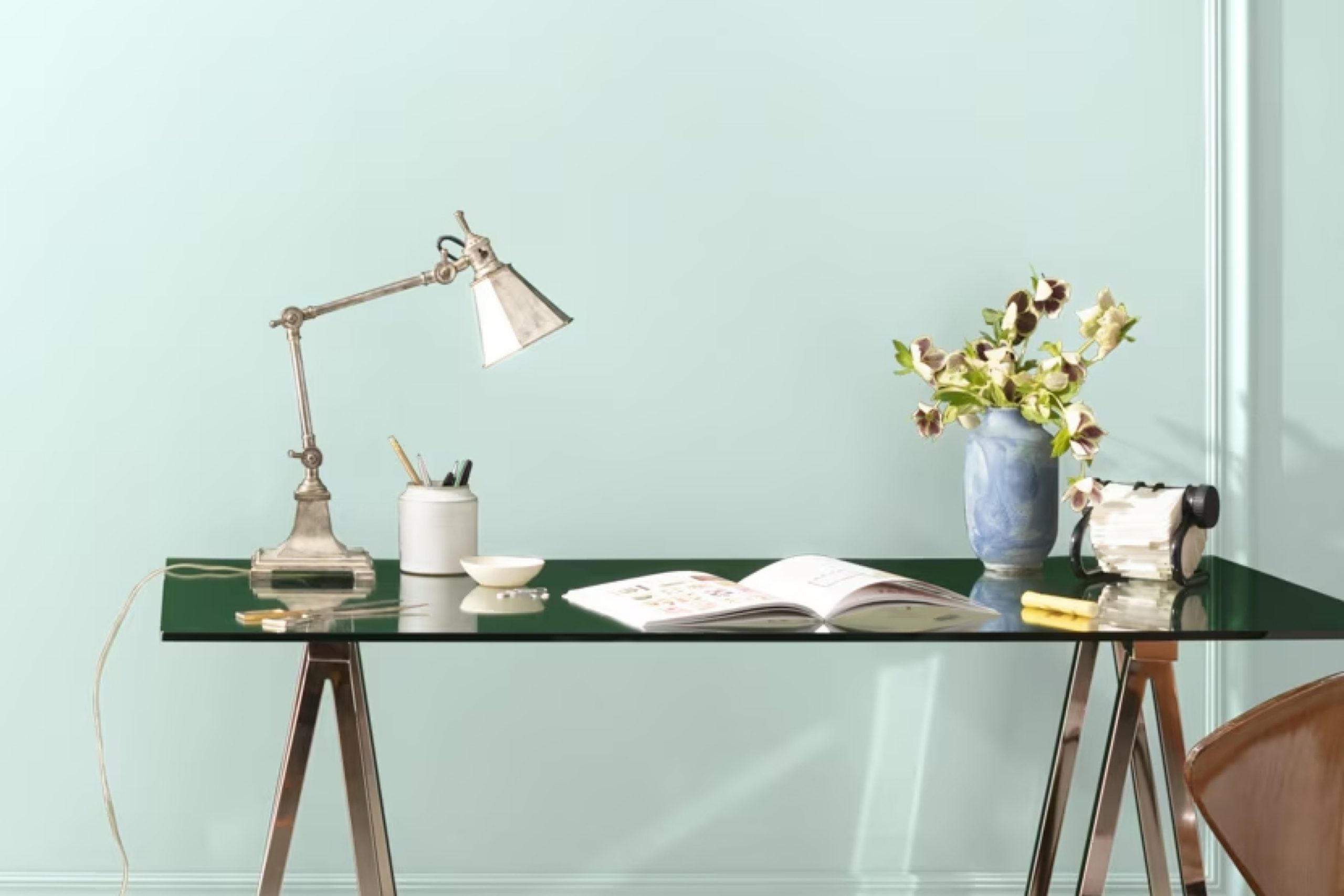
You might be considering a fresh look for your space, and picking the right paint color is a big part of that change. Let me introduce you to 2040-70 Spring Mint by Benjamin Moore. This shade brings a lively yet gentle touch to any room, perfectly balancing brightness with a soothing quality.
If you’re dabbling with the idea of refreshing your walls, Spring Mint offers a light and airy feel that can make your space seem larger and more inviting. It’s particularly great for creating a serene environment in bedrooms or a vibrant backdrop in social areas like your living room or kitchen.
Pairing well with a variety of decor styles and other colors, Spring Mint gives you plenty of room to play around with different accents and furnishings. Whether you’re updating a single room or redoing your entire home, this color can give you a beautiful and coherent look. It’s a choice that’s hard to regret, brightening up your home and lifting your mood every time you walk in.
So, consider Spring Mint for your next painting project and see how it can change the atmosphere of your living spaces!
via benjaminmoore.com
What Color Is Spring Mint 2040-70 by Benjamin Moore?
Table of Contents
The color Spring Mint 2040-70 by Benjamin Moore offers a refreshing and light green hue that instantly brightens up any space. This pale, minty shade evokes the feel of early spring when nature begins to awaken. It is gentle and subtle, making it an excellent choice for creating a peaceful and serene ambiance in any interior.
Spring Mint 2040-70 works best in interior styles that prioritize calm and simplicity, such as Scandinavian, minimalist, and coastal. Its soothing presence makes it suitable for spaces meant for relaxation, such as bedrooms and bathrooms. However, in a lively kitchen or a playful children’s room, this color can also inject a sense of frolic and freshness.
Pairing this delicate shade with natural materials and soft textures can really bring out its beauty. Wood in light oak or white-washed finishes enhances its organic feel, while linens and cotton in white or soft pastel tones complement its purity. For a contemporary edge, pair it with sleek metals like brushed nickel or chrome.
Decor elements like woven rugs, ceramic accessories, and plush throw pillows help create a cozy, inviting atmosphere that resonates with the calming nature of Spring Mint 2040-70.

housekeepingbay.com
Is Spring Mint 2040-70 by Benjamin Moore Warm or Cool color?
Spring Mint 2040-70 by Benjamin Moore is a fresh and vibrant shade of green that injects life into any space. This light, airy color pairs well with both bright accents and neutral tones, making it versatile for any room in a home.
When painted on walls, Spring Mint 2040-70 reflects natural light beautifully, making small spaces seem larger and more open. Its soothing hue creates a relaxed atmosphere, ideal for bedrooms or bathrooms where calm is key.
Additionally, Spring Mint 2040-70 can serve as a backdrop for a variety of decors, from modern to rustic. In living areas, it complements wooden textures and natural fibers, enhancing the organic feel of the space. For those looking to refresh their home with a sense of newness and vitality, Spring Mint 2040-70 offers a balanced blend of warmth and freshness, making it a smart choice for anyone looking to update their interior with a lively yet gentle touch.
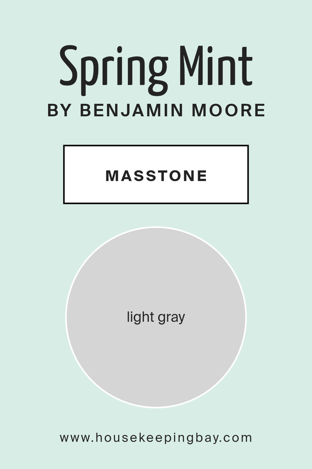
What is the Masstone of the Spring Mint 2040-70 by Benjamin Moore?
Spring Mint 2040-70 by Benjamin Moore has a masstone of Light Gray (#D5D5D5), which delivers a serene and fresh feel to any room in the home. This light gray hue acts as a versatile base, allowing it to pair effortlessly with a variety of decor styles and colors, from bright and bold to soft and subtle.
Its neutrality helps maintain a calm and understated atmosphere, making it an excellent choice for spaces where you want to relax, such as bedrooms and living areas. Additionally, this color reflects natural light beautifully, enhancing smaller spaces by making them appear more open and airy.
This quality is particularly valuable in rooms that don’t receive a lot of sunlight. All in all, Spring Mint 2040-70 offers a blend of functionality and aesthetic appeal, making it a practical yet attractive option for creating a cozy, welcoming home environment.
housekeepingbay.com
Undertones of Spring Mint 2040-70 by Benjamin Moore
Spring Mint 2040-70 by Benjamin Moore is a versatile color that subtly incorporates a variety of undertones, making it a unique choice for home interiors. The undertones in this paint include light blue, pale yellow, light purple, mint, lilac, pale pink, and grey. These undertones contribute to the complexity of the color, affecting how it is perceived in different lighting conditions and settings.
Undertones play a crucial role in the appearance of a color. They can alter the main hue subtly and can be more noticeable under certain lighting conditions. For instance, in a room with plenty of natural light, the light blue and mint undertones of Spring Mint might make the walls look fresher and slightly cooler. In contrast, in a space with warmer, artificial lighting, the pale yellow and pale pink undertones might make the walls appear softer and warmer.
When applied on interior walls, Spring Mint 2040-70 creates a dynamic yet cohesive look. The diverse undertones ensure that this color can complement a wide range of decors and themes. For example, the mint and light blue undertones might pair well with a nautical or coastal theme, whereas the lilac and pale pink undertones would be ideal for a gentle, feminine space. Additionally, the grey undertone helps balance the color, ensuring it does not overwhelm the space but instead provides a calm, cohesive backdrop.
Overall, the variety of undertones in Spring Mint 2040-70 allows it to adapt to various interior styles and preferences, making it a practical choice for those wishing to refresh their walls with a complex, multi-dimensional hue.

housekeepingbay.com
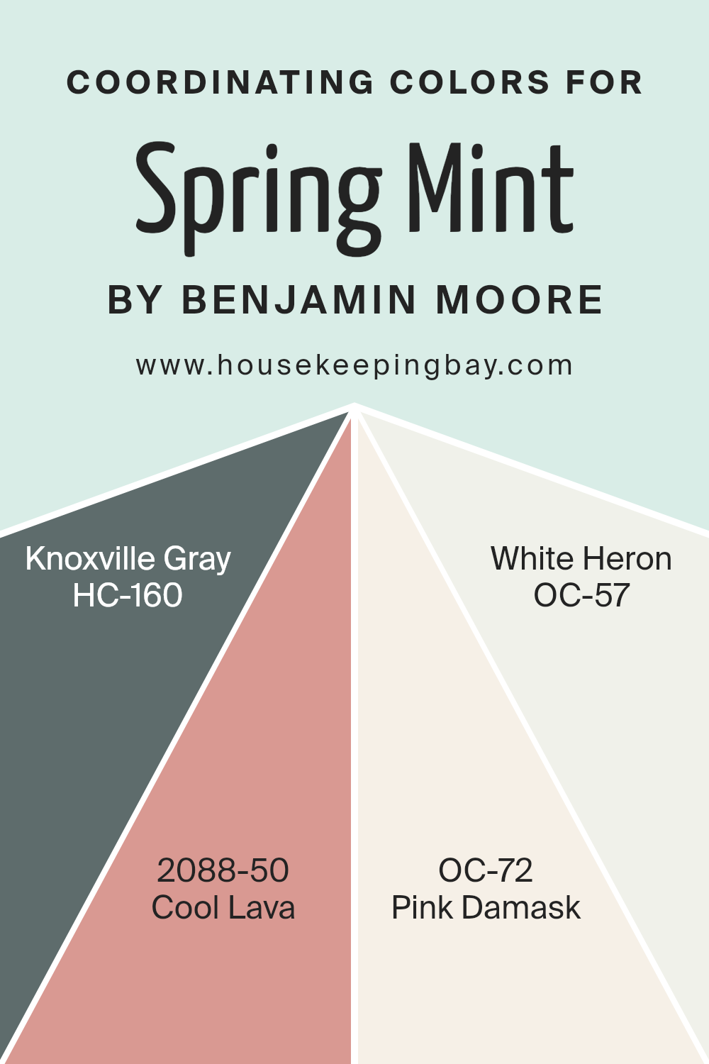
Coordinating Colors of Spring Mint 2040-70 by Benjamin Moore
Coordinating colors are specific shades selected to harmonize well with a primary color, enhancing the overall aesthetic of a space. For example, Spring Mint 2040-70 by Benjamin Moore can be beautifully paired with colors like Knoxville Gray, Cool Lava, Pink Damask, and White Heron. These coordinated colors work together to create a visually appealing palette that adds depth and character to rooms. They also help in balancing the ambiance, ensuring that no one color overwhelms the space but instead complements the setting.
Knoxville Gray HC-160 is a deep, muted hue of gray-green that offers a grounding effect, making it ideal for accents or statement walls that need a touch of sobriety. Cool Lava 2088-50, on the other hand, is a vibrant warm red that injects energy and a playful tone into interiors.
Pink Damask OC-72 is a soft, dusty pink that provides a gentle, soothing feel, perfect for creating a peaceful and inviting area. Lastly, White Heron OC-57 is a crisp, clean white, which acts as a neutral backdrop, amplifying the freshness of Spring Mint and allowing other coordinating colors to pop beautifully. Together, these colors harmonize with Spring Mint to produce a comforting and lively space.
You can see recommended paint colors below:
- HC-160 Knoxville Gray
- 2088-50 Cool Lava
- OC-72 Pink Damask
- OC-57 White Heron
housekeepingbay.com
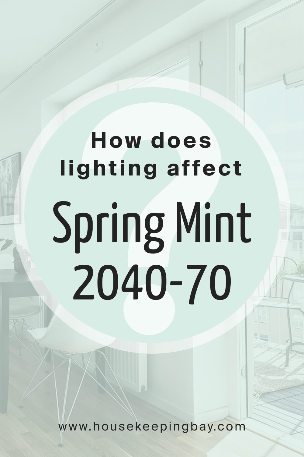
How Does Lighting Affect Spring Mint 2040-70 by Benjamin Moore?
Lighting plays a crucial role in how we perceive the colors of our walls. Different types of light can change how a color looks. For example, the color Spring Mint 2040-70 by Benjamin Moore might look different under various lighting conditions.
In artificial light, Spring Mint2040-70 can appear slightly more vibrant. Incandescent bulbs, which emit a warmer, yellower light, can make this color seem cozier and slightly more subdued. Fluorescent lighting, on the other hand, tends to cast a cooler, bluer light, which can enhance the greenish tones in Spring Mint, making it appear fresher and more lively.
Natural light affects this color based on the direction of the room and the time of day. In a north-faced room, where light is cooler and more consistent but less direct, Spring Mint2040-70 might appear more muted and gentle. This soft appearance can make the room feel calm and soothing.
In south-faced rooms, filled with abundant, warmer sunlight throughout the day, Spring Mint2040-70 can look brighter and more vivid. This can make the room feel lively and energetic, ideal for spaces used frequently during the day.
East-faced rooms receive morning light, which is warm and bright. Here, Spring Mint2040-70 will appear lively and fresh in the morning but may lose some of its vibrancy as the day progresses and the light becomes less intense.
West-faced rooms get afternoon and evening light, which is also warm but can cast longer shadows as the sun sets. In these conditions, Spring Mint2040-70 can shift throughout the day, starting less noticeable in the morning and becoming more dynamic and richer towards the evening.
Thus, the appearance and impact of the color Spring Mint2040-70 are noticeably influenced by the kind of light it is exposed to, making its placement essential depending on the mood and function needed in a room.
housekeepingbay.com
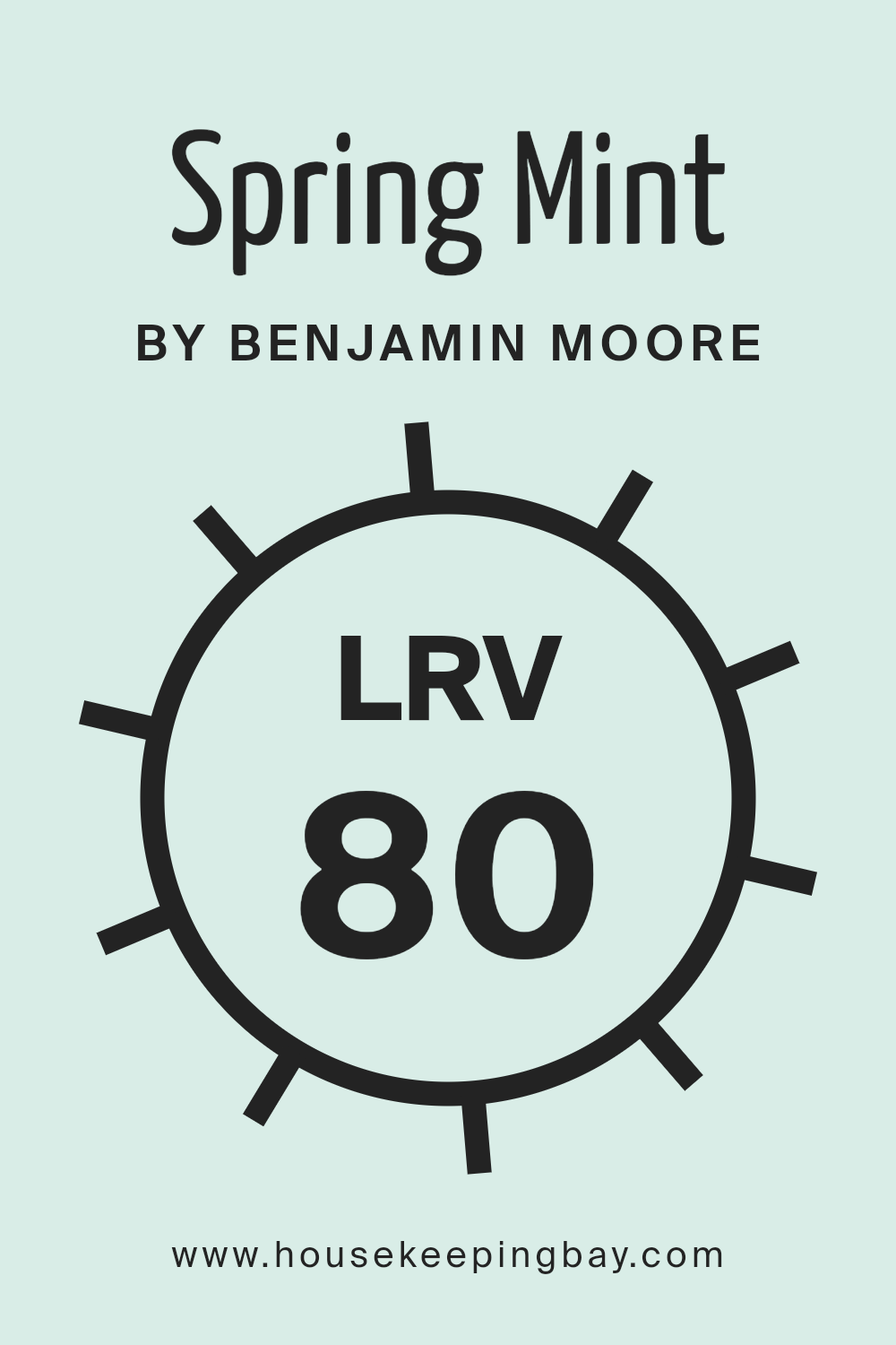
What is the LRV of Spring Mint 2040-70 by Benjamin Moore?
LRV stands for Light Reflectance Value, which is a measure of how much light a color reflects or absorbs when painted on a surface. The LRV scale runs from 0 to 100, with 0 being completely black and absorbing all light, and 100 being pure white and reflecting all light back.
This measurement helps in choosing paint colors that will make a room feel brighter or darker depending on how much natural or artificial light the room receives. A higher LRV can make a small or dark room feel more open and airy, while a lower LRV can make a large or well-lit room feel cozier.
The LRV of Spring Mint 2040-70 by Benjamin Moore is 80.1, meaning it reflects a large amount of light. This high LRV makes Spring Mint a good choice for rooms that need to feel more spacious and illuminated without additional lighting. In spaces with less natural light, this light green shade can help offset the darkness by reflecting artificial light efficiently, thus maintaining a lighter feel even in dim conditions.
The bright, reflective quality of Spring Mint also means that it will significantly influence the mood and perceived size of the space, making it feel fresh and lively.
housekeepingbay.com
What are the Trim colors of Spring Mint 2040-70 by Benjamin Moore?
Trim colors are specific shades used to highlight architectural details like door frames, window sills, baseboards, and crown moldings. By selecting the right trim color, contrasts with the primary wall color are created, enhancing the overall aesthetic appeal and making the architectural features stand out.
In the case of Spring Mint 2040-70 by Benjamin Moore, a refreshing and light hue, the use of complementary trim colors like Chalk White 2126-70 and Cotton Balls OC-122 can subtly frame the rooms, providing a clean and finished look without overwhelming the soft green of Spring Mint.
Chalk White 2126-70 is a soft, pristine white, which offers a gentle contrast that softens the brighter undertones of the primary colors it accents, ensuring a seamless integration within any space. Cotton Balls OC-122, on the other hand, is a warmer white with a touch of creaminess that adds a cozy, soothing feel to any room it enhances. Both colors work harmoniously with Spring Mint 2040-70, contributing to a cohesive and refreshing atmosphere that’s ideal for a bright and airy setting.
You can see recommended paint colors below:
- 2126-70 Chalk White
- OC-122 Cotton Balls

housekeepingbay.com
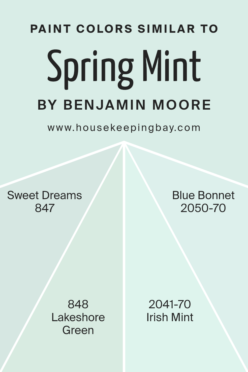
Colors Similar to Spring Mint 2040-70 by Benjamin Moore
Similar colors create a cohesive and harmonious atmosphere in any space, offering subtle variations that enrich the environment without overwhelming it. By choosing hues that are close on the color palette, such as those similar to Spring Mint 2040-70 by Benjamin Moore, one can achieve a balanced and serene ambiance. These colors blend beautifully, enabling designers and homeowners to add visual depth and interest to rooms through complementary shades.
Sweet Dreams 847, a gentle whisper of blue, evokes a soft, soothing presence that mimics the serene sky early in the morning. This color pairs wonderfully with more vibrant greens and blues, providing a restful foundation in any palette. Lakeshore Green 848 carries the vibrant yet soft touch of a lakeside retreat, reflecting the color of water shaded by foliage.
Irish Mint 2041-70 offers a bright and youthful green that brims with the freshness of spring, ideal for adding a lively splash to muted spaces. Lastly, Blue Bonnet 2050-70, with its airy and light feel, recalls the delicate petals of spring blooms, offering a subtle hint of color to elevate a neutral setting. Altogether, these colors contribute to a theme that is cohesive yet diverse, perfect for creating spaces that are both refreshing and calming.
You can see recommended paint colors below:
- 847 Sweet Dreams
- 848 Lakeshore Green
- 2041-70 Irish Mint
- 2050-70 Blue Bonnet
housekeepingbay.com
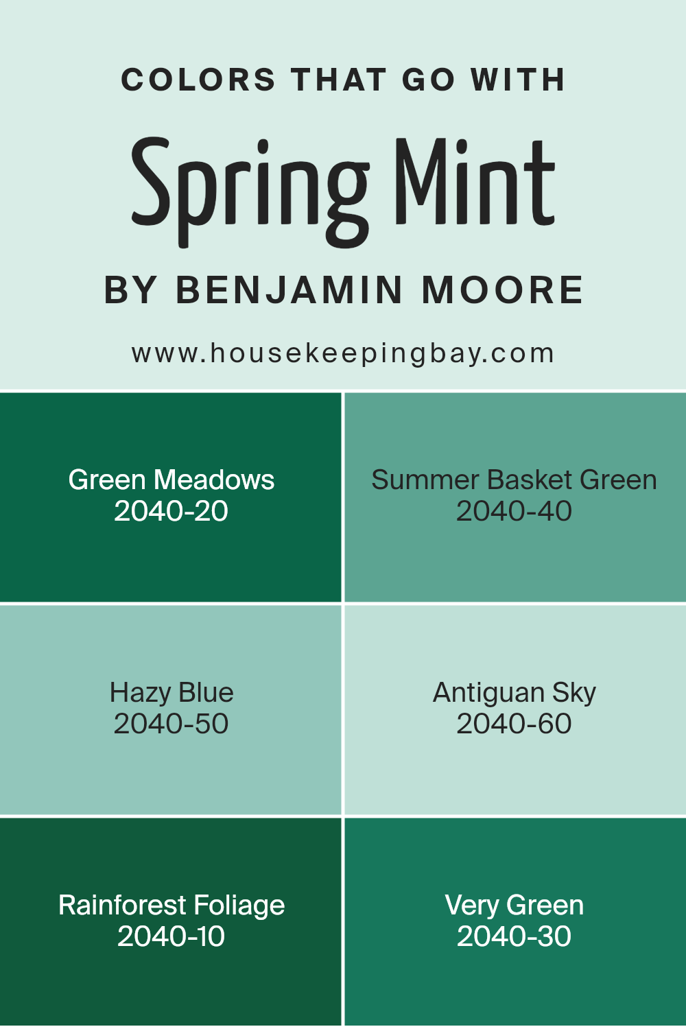
Colors that Go With Spring Mint 2040-70 by Benjamin Moore
Choosing the right colors to complement Spring Mint 2040-70 by Benjamin Moore is crucial because it helps create a cohesive and visually appealing space. Coordinating colors like Green Meadows, Summer Basket Green, and others provide a spectrum to complete or enhance the central hue, allowing for a harmonious and balanced design aesthetic. These color pairings are not just about beauty but about creating a mood and enhancing the feel of the environment, which is vital in spaces where you spend a lot of time.
Green Meadows is a vibrant green that brings a touch of nature’s freshness into any room, invoking the lushness of an open field. Summer Basket Green is lighter, offering a subtle nod to springtime gardens and soft, leafy hues. Hazy Blue reflects a soft, muted blue that mimics a tranquil skyline, perfect for calming any space.
Antiguan Sky is a touch brighter, suggesting the cheerful blue of a sunny Caribbean sky. Rainforest Foliage provides a deep, rich green that suggests the dense colors of a tropical jungle, adding depth and intensity. Finally, Very Green is a bold, dynamic color that recalls the vigorous life of forest canopies, perfect for making a striking statement. Together, these colors support Spring Mint by creating a refreshing palette that suits various tastes and styles.
You can see recommended paint colors below:
- 2040-20 Green Meadows
- 2040-40 Summer Basket Green
- 2040-50 Hazy Blue
- 2040-60 Antiguan Sky
- 2040-10 Rainforest Foliage
- 2040-30 Very Green
housekeepingbay.com
How to Use Spring Mint 2040-70 by Benjamin Moore In Your Home?
Spring Mint 2040-70 by Benjamin Moore is a fresh, vibrant green color that can bring light and a sense of nature into any home. It’s perfect for those looking to add a lively splash of color without overwhelming a space. This shade works beautifully in smaller rooms like bathrooms or hallways, where it can make the area feel more open and airy. In a bedroom, using Spring Mint on one accent wall could help create a calm, refreshing vibe, ideal for relaxation.
This color is also great for furniture pieces. A dresser or a bookshelf painted in Spring Mint can become a cheerful focal point in a room. Pairing this green with soft neutrals like whites, light grays, or beige can balance its vibrancy.
Adding home accessories like cushions, rugs, or curtains in complementary colors can unify the look while keeping the atmosphere light and cheerful. Whether updating an entire room or adding a touch of freshness with smaller changes, Spring Mint 2040-70 offers a versatile option for home decorating.
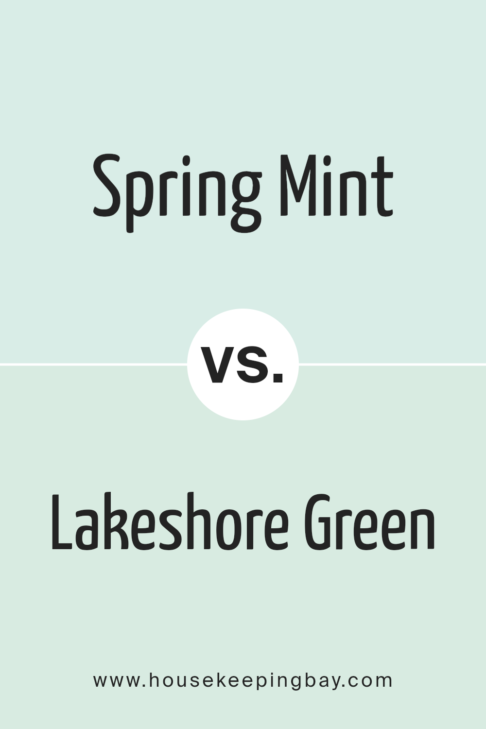
Spring Mint 2040-70 by Benjamin Moore vs Lakeshore Green 848 by Benjamin Moore
Spring Mint 2040-70 by Benjamin Moore is a vibrant, light green shade with a fresh, lively feel. It has a subtle brightness that can make a small room feel larger and more open. This color pairs well with soft neutrals and can add a cheerful touch to any space, like a kitchen or bathroom.
In contrast, Lakeshore Green 848 by Benjamin Moore is a deeper, more saturated hue. This color offers a traditional green look, evocative of natural landscapes and calming forest scenes. It’s perfect for creating a cozy and inviting atmosphere in areas like living rooms or bedrooms. It works well with wood tones and richer colors.
Overall, Spring Mint is lighter and seems more refreshing while Lakeshore Green gives a more grounded, calm vibe. Both colors are versatile but serve slightly different purposes depending on the mood you want to create.
You can see recommended paint color below:
- 848 Lakeshore Green
housekeepingbay.com
Spring Mint 2040-70 by Benjamin Moore vs Sweet Dreams 847 by Benjamin Moore
Spring Mint 2040-70 and Sweet Dreams 847, both by Benjamin Moore, offer soft, soothing vibes but carry distinct tones. Spring Mint 2040-70 presents a light, airy green, resembling fresh spring foliage. This hue infuses spaces with a youthful and rejuvenating feel, perfect for enhancing areas where you want a touch of vibrancy without overwhelming brightness.
Sweet Dreams 847, in contrast, leans towards a muted blue with hints of gray, evoking the calmness of an early morning sky. It’s an ideal choice for creating a peaceful, serene environment, making it suitable for bedrooms or quiet areas in a home.
Both colors are light and can help make small rooms appear larger, but their differing undertones can influence the mood and style of a room. Spring Mint adds a crisp, lively twist, while Sweet Dreams offers a softer, more grounding atmosphere. Choose based on the kind of ambiance you wish to achieve in your space.
You can see recommended paint color below:
- 847 Sweet Dreams
housekeepingbay.com
Spring Mint 2040-70 by Benjamin Moore vs Irish Mint 2041-70 by Benjamin Moore
Spring Mint 2040-70 and Irish Mint 2041-70 by Benjamin Moore are both soft, light greens, but they have subtle differences. Spring Mint 2040-70 is a refreshing, pale green with a noticeably cool undertone, giving it a crisp, airy feel. It’s ideal for creating a serene atmosphere in spaces that benefit from a gentle touch of color, such as bedrooms or bathrooms.
Irish Mint 2041-70, while also light and soft, leans slightly towards a warmer, creamier shade of green. This warmth gives spaces a cozy, welcoming vibe, making it suitable for areas where comfort is key, like living rooms or entryways.
Though both colors are light and can help make small rooms appear larger, the choice between them depends on the desired ambiance: cooler and refreshing with Spring Mint or warmer and comforting with Irish Mint. Both work well with white trim and natural wood elements, enhancing their versatility in interior design.
You can see recommended paint color below:
- 2041-70 Irish Mint
housekeepingbay.com
Spring Mint 2040-70 by Benjamin Moore vs Blue Bonnet 2050-70 by Benjamin Moore
Spring Mint 2040-70 and Blue Bonnet 2050-70 by Benjamin Moore are two light and airy colors. Spring Mint is a soft, pale green that brings a fresh, spring-like feel to any space. It’s perfect for creating a serene and calming environment. Its green undertones can remind you of new leaves or a gentle morning in a lush garden.
Blue Bonnet 2050-70, on the contrary, is a pale blue that evokes the sense of a clear sky on a sunny day. This color has a soothing quality and adds a touch of coolness to a room, making it ideal for a relaxing and peaceful atmosphere.
While both colors are from the same lightness level and give a room a bright and open feel, their hues are distinctively different—one leaning toward green and the other towards blue. This makes Spring Mint more connected with nature and growth, whereas Blue Bonnet relates more to the expansive sky and calm waters. Both are great choices for someone looking to bring a light, refreshing touch into their decor.
You can see recommended paint color below:
- 2050-70 Blue Bonnet
housekeepingbay.com
The color 2040-70 Spring Mint by Benjamin Moore truly stands out as a fresh and lively choice for anyone looking to freshen up their space. Through my own use and observation, I’ve seen how this particular shade adds a vibrant yet soothing touch wherever applied, be it a busy kitchen or a quiet study room. Its light and airy feel promotes a sense of calmness while injecting vitality into the room’s ambiance.
My firsthand experience with Spring Mint has shown that it works harmoniously with both modern and traditional decor. Its versatility is a significant advantage for those who enjoy updating their interiors without committing to extensive overhauls.
Additionally, the quality of Benjamin Moore paints ensures that the color maintains its integrity over time, resisting fading and keeping its dynamic yet soft appearance.
Ultimately, opting for 2040-70 Spring Mint is a smart choice for anyone interested in creating a lively, inviting atmosphere.
Its ability to refresh and liven up a space while maintaining an air of stylish sophistication makes it a go-to paint color. Personally, I recommend trying it out for small accent areas or even larger walls to truly appreciate the positive impact it can make on your overall decor scheme.
Whether you’re renovating or simply giving your space a quick update, Spring Mint offers a perfect blend of freshness and stylishness.

housekeepingbay.com
