Knoxville Gray HC-160 by Benjamin Moore
Sophisticated Hues for Every Space
Have you ever walked into a room and felt instantly at ease? That’s the magic of color, and HC-160 Knoxville Gray by Benjamin Moore is no exception. It’s a shade that combines the depths of charcoal with subtle hints of blue and green, creating an atmosphere of calm sophistication. When you use Knoxville Gray in your space, it feels like wrapping yourself in a soft, cozy blanket.
Think about those quiet, foggy mornings or the peaceful moments just before dusk – that’s what Knoxville Gray brings to your home. It’s not too bold yet far from boring. This color works well in a variety of settings, from a modern open-plan living area to a classic, intimate library or study.
The balanced undertones complement both natural and artificial light beautifully, so it looks great any time of day.
What makes Knoxville Gray truly special is its flexibility. Pair it with crisp whites for a clean, fresh look or deep wood tones for a more traditional vibe.
Whether adding a touch of sophistication to your bedroom or an inviting feel to your living room, Knoxville Gray proves itself a reliable choice for homeowners and designers alike.
So, if you want to bring a sense of comfort and subtle style into your space, consider Knoxville Gray. You might just fall in love with it.
via benjaminmoore.com
What Color Is Knoxville Gray HC-160 by Benjamin Moore?
Table of Contents
Knoxville Gray HC-160 by Benjamin Moore is a sophisticated blend of gray with blue-green undertones. It’s a mid-toned color that exudes warmth and subtle elegance. This versatile shade works well in various interior styles, from modern to classic.
In contemporary spaces, Knoxville Gray adds depth without overwhelming, providing a clean yet bold backdrop. Pair it with sleek metals like chrome or stainless steel for a polished look. In traditional settings, this color adds a touch of modernity without losing classic charm.
Complement it with rich woods such as walnut or mahogany to accentuate its muted elegance.
For those who love rustic or farmhouse aesthetics, Knoxville Gray serves as a grounding element. It enhances natural materials such as reclaimed wood, stone, or brick, creating an inviting atmosphere.
In a coastal-themed room, Knoxville Gray pairs beautifully with natural textures like linen or jute, reflecting the shades of the sea and sky.
Its adaptable nature makes it a great choice for living rooms, dining areas, or bedrooms, where it can change mood based on light. Soft textiles like velvet or wool can add warmth, while cool, smooth materials like glass bring balance.
Knoxville Gray’s unique hue blends seamlessly, enhancing any space with a touch of refined style.
housekeepingbay.com
Is Knoxville Gray HC-160 by Benjamin Moore Warm or Cool color?
Knoxville Gray HC-160 by Benjamin Moore is a versatile color that offers depth and warmth to any space. This color, a rich blend of blue and gray with hints of green, can adapt well to different lighting conditions. In brighter rooms, it appears more blue, while in darker areas, the paint leans towards a deep gray-green.
Knoxville Gray creates a cozy, inviting atmosphere, making it ideal for living rooms and bedrooms. It complements both modern and traditional decor due to its classic undertones.
Pairing Knoxville Gray with white trim can create a clean, polished look, highlighting the room’s architectural features. It also works well with natural wood tones, enhancing their warmth and character. This color offers a neutral yet sophisticated backdrop perfect for showcasing artwork or furniture.
Its adaptable nature makes it a reliable choice for those seeking to add character to their home without overwhelming the senses.
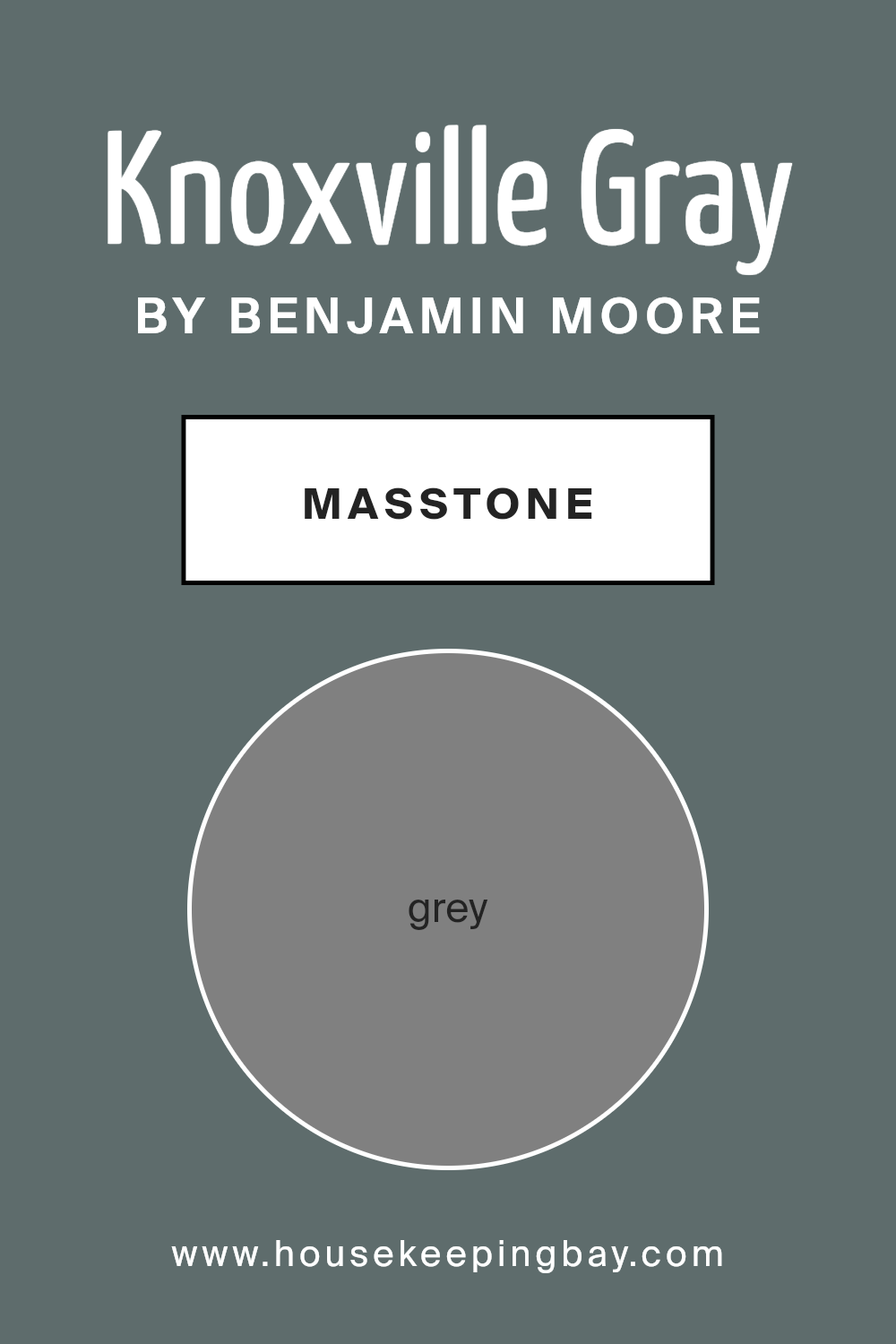
What is the Masstone of the Knoxville Gray HC-160 by Benjamin Moore?
Knoxville Gray HC-160 by Benjamin Moore is a versatile color choice for any home. It has a deep, rich gray tone, which can instantly give a room a sophisticated look. This color, with its gray masstone (#808080), works well in creating a cozy and inviting atmosphere.
Knoxville Gray pairs beautifully with both modern and classic styles. In living rooms, it can enhance the sense of comfort and warmth. In bedrooms, it supports relaxation, helping you wind down after a long day. The neutrality of this gray makes it easy to match with different accent colors, such as whites, blues, or even bold yellows.
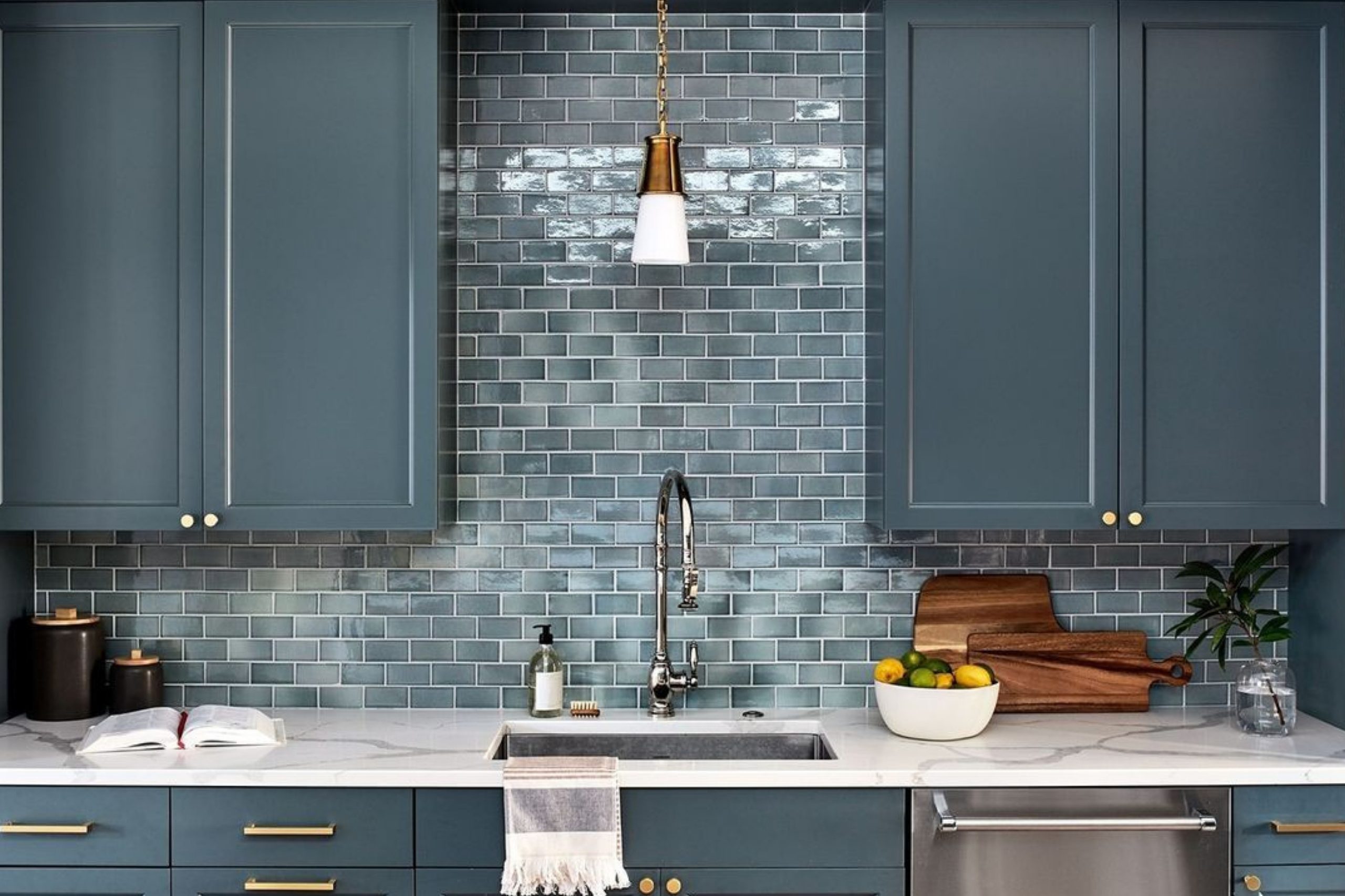
In kitchens, Knoxville Gray can add elegance when used on cabinets or walls. It can give bathrooms a clean and fresh appearance, especially when combined with white fixtures.
Natural light will highlight its depth, adding visual interest to any space.
housekeepingbay.com
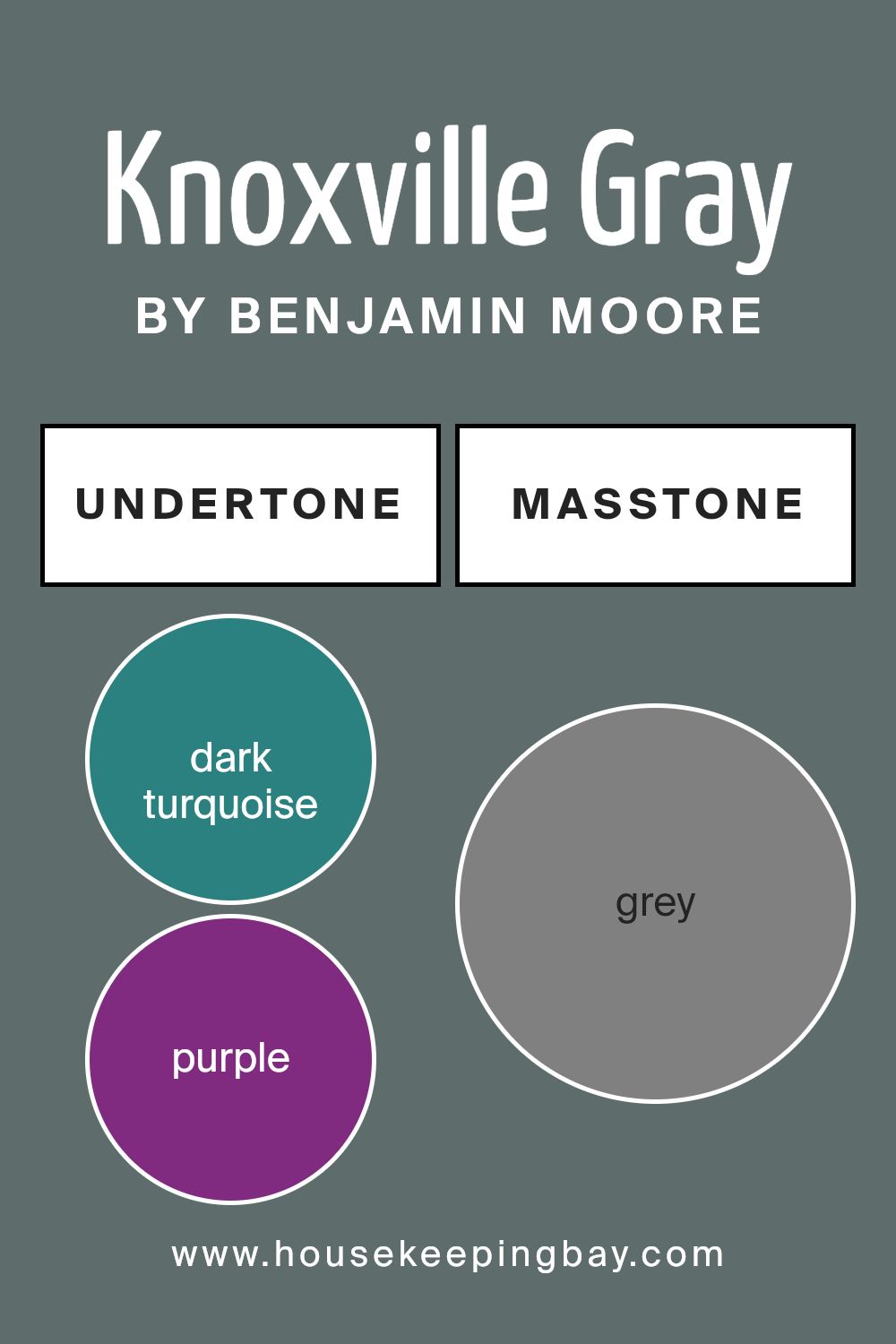
Undertones of Knoxville Gray HC-160 by Benjamin Moore
Knoxville Gray HC-160 by Benjamin Moore is a complex color with fascinating undertones that affect how we perceive it. Undertones are hidden colors mixed into the main color. They can change how a paint color looks under different lighting or next to other colors. Knoxville Gray has undertones of blue, green, and gray. This gives the color a versatile and adaptable quality.
When you apply Knoxville Gray to interior walls, these undertones can make rooms feel calm and soothing. The blue and green undertones, like light turquoise or mint, bring a refreshing and calming vibe. The gray undertones add sophistication and balance.
Depending on the room’s lighting, you might notice different undertones more prominently. In brighter light, the blue undertones might stand out, giving a cooler appearance. In dimmer or warmer light, the green or gray undertones might become more visible, providing a cozy feel.
The mixture of these undertones also means Knoxville Gray pairs well with many other colors. It can complement wooden furniture, bringing out warm browns, or match with metallic accents for a modern touch.
Overall, these undertones make Knoxville Gray a versatile choice for a variety of interior styles and settings.
housekeepingbay.com
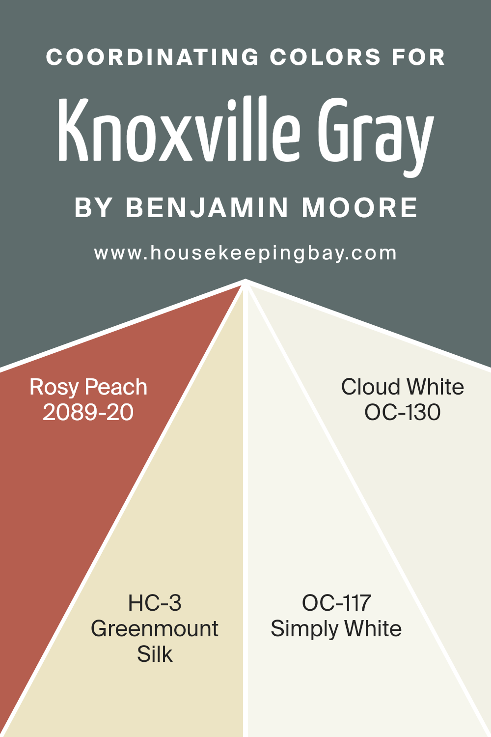
Coordinating Colors of Knoxville Gray HC-160 by Benjamin Moore
Coordinating colors are hues chosen to complement each other within a space, enhancing the overall aesthetic by balancing contrast and harmony. When selecting companions for Knoxville Gray HC-160 by Benjamin Moore, it’s important to consider shades that can add warmth, brightness, or softness to the room.
Rosy Peach 2089-20 introduces a lively and inviting atmosphere. Its warm, cheerful tone contrasts beautifully with the cooler, more subdued Knoxville Gray, creating a sense of balanced liveliness.
Greenmount Silk HC-3 offers a subtle touch of nature, adding a gentle, calming green that works beautifully with the deeper gray tone. This combination brings a serene, balanced feel to any area without overwhelming the senses.
Simply White OC-117 offers a bright, crisp element to the palette, enhancing lightness and adding a fresh, clean look. It can highlight architectural features or act as a radiant backdrop for Knoxville Gray.
Similarly, Cloud White OC-130 provides a warm, creamy touch that adds depth without losing brightness.
When paired with Knoxville Gray, it introduces a sense of warmth and coziness.
Together, these colors come together in an ensemble that complements Knoxville Gray, creating inviting, harmonious spaces that feel both balanced and dynamic.
You can see recommended paint colors below:
- 2089-20 Rosy Peach
- HC-3 Greenmount Silk
- OC-117 Simply White
- OC-130 Cloud White
housekeepingbay.com
How Does Lighting Affect Knoxville Gray HC-160 by Benjamin Moore?
Lighting plays a crucial role in how we perceive colors. The way a color looks can change dramatically under different lighting conditions. Let’s take Benjamin Moore’s Knoxville Gray HC-160 as an example to understand this concept better.
Knoxville Gray is a deep, muted shade that combines gray with green and blue undertones. In natural light, its appearance can shift depending on the direction of the light entering a room. In artificial light, incandescent bulbs can bring out more of the green undertones, making the color feel warmer.
Fluorescent lighting, on the other hand, may make the blue tones stand out more, giving it a cooler feel.
Now, let’s look at how this color might behave in different rooms based on their orientation:
- 1. North-facing rooms: These rooms get soft, indirect light, which often tends to be cooler. In such a setting, Knoxville Gray can appear more blue than green, and slightly darker than it might be in a brighter room. The muted tone of the color can offer a cozy feel, despite the cooler light.
- 2.South-facing rooms: These rooms benefit from warm, bright light for most of the day. Knoxville Gray in a south-facing room will appear lighter and slightly more green due to the abundance of natural light. The warmth of the sunlight can enhance the green undertones, making the room feel welcoming and open.
- 3.East-facing rooms: Morning light in east-facing rooms is fresh and bright, while afternoon light is softer. Knoxville Gray might look brighter and more lively in the morning light but can shift to a calmer, more subdued tone in the afternoon as the light dims.
- 4. West-facing rooms: These rooms receive the most light during the late afternoon and evening. Knoxville Gray will likely look richer and darker as the sun sets, with the evening light enhancing its depth and complexity.
Adjusting the type of artificial lighting in any room can further modulate its tone, providing flexibility in achieving desired aesthetics.
housekeepingbay.com
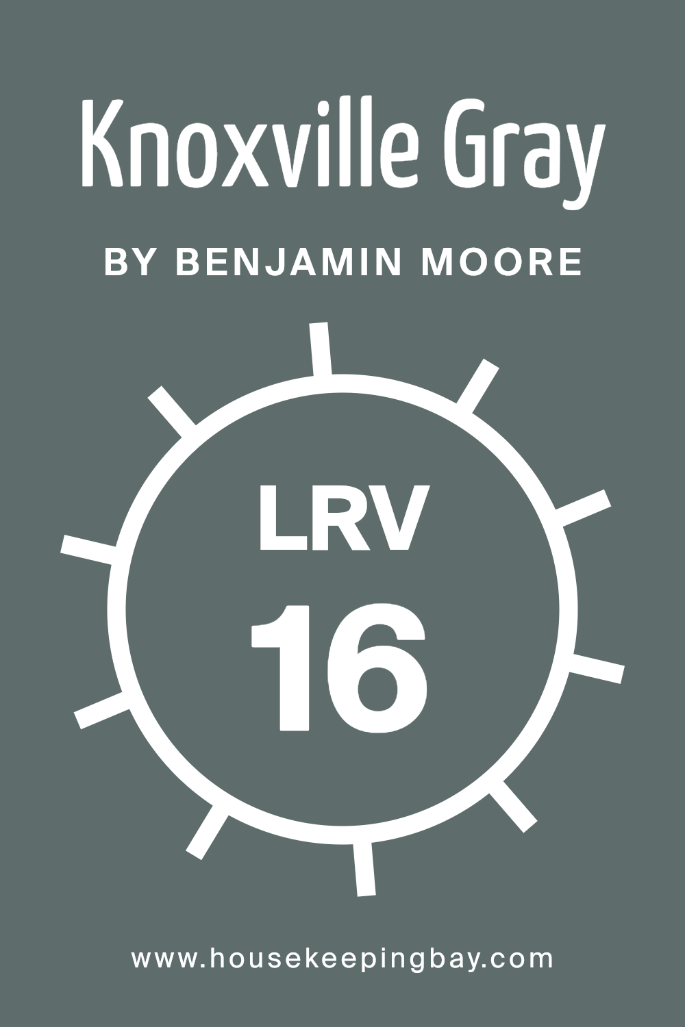
What is the LRV of Knoxville Gray HC-160 by Benjamin Moore?
LRV, or Light Reflectance Value, is a measurement that shows how much light a color reflects. It’s a scale from 0 to 100, where 0 is absolute black, reflecting no light, and 100 is pure white, reflecting all light. When a paint color has a low LRV, it means the color absorbs more light and reflects less, making it appear darker.
On the other hand, colors with high LRV values reflect more light, making them look brighter and lighter in a space. Understanding LRV helps when choosing paint because it influences how a color looks depending on the lighting and size of a room.
Knoxville Gray HC-160 by Benjamin Moore has an LRV of 15.68, which categorizes it as a darker color. This low LRV means that it will absorb most of the light that hits it, giving the color depth and richness on the walls. In a room with a lot of natural light, Knoxville Gray may appear to be a bit lighter and reveal more of its undertones.
In dimly lit rooms, it can feel quite cozy and intimate. This makes it a versatile choice for spaces where you want the walls to add personality without feeling overwhelmingly dark.
However, it’s important to consider that in rooms with limited light, colors with such a low LRV can make the space feel smaller.
housekeepingbay.com
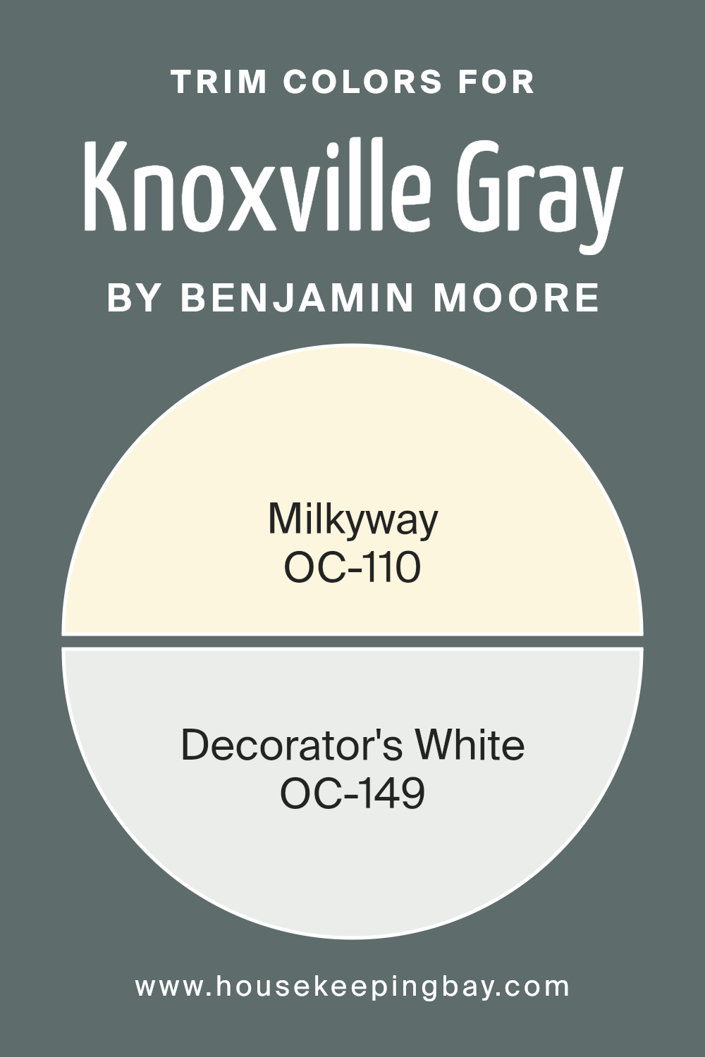
What are the Trim colors of Knoxville Gray HC-160 by Benjamin Moore?
Trim colors refer to the colors used to paint the moldings and frames of windows, doors, and other architectural features within a space. These colors serve to highlight and define the boundaries of a room and create contrast with wall colors, such as Knoxville Gray HC-160 by Benjamin Moore, enhancing their aesthetic appeal.
Trim colors are important for Knoxville Gray HC-160 because they help to bring out the character of this rich, deep color. Knoxville Gray is a versatile shade that combines elements of blue, green, and gray to provide a sophisticated and calming backdrop.
Choosing the right trim color can either subtly complement this shade or create a striking visual contrast that adds character to the overall look.
When considering trim colors, OC-110, Milkyway, is a warm, creamy off-white that pairs beautifully with Knoxville Gray. This color adds a gentle touch that softens the boldness of the gray while maintaining a classic and inviting atmosphere.
On the other hand, OC-149, Decorator’s White, is a clean, crisp white that offers a pronounced contrast against the elegance of Knoxville Gray. Using Decorator’s White as a trim color can create a fresh, modern appearance by making the gray walls stand out more distinctly.
Both Milkyway and Decorator’s White can enhance Knoxville Gray by bringing different moods and effects to a space, depending on the desired look and feel.
You can see recommended paint colors below:
- OC-110 Milkyway
- OC-149 Decorator’s White
housekeepingbay.com
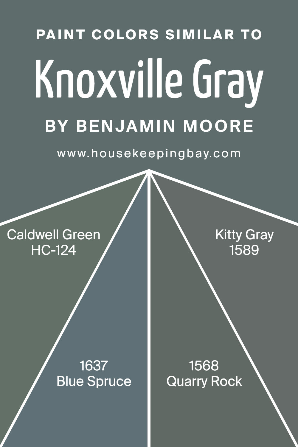
Colors Similar to Knoxville Gray HC-160 by Benjamin Moore
Similar colors play a crucial role in design because they create a harmonious and cohesive look. When colors share characteristics, they can blend seamlessly, resulting in a more unified space. Knoxville Gray HC-160 is a rich, versatile shade that pairs well with several complementary colors.
For example, HC-124 Caldwell Green brings a subtle hint of green, reminiscent of a serene forest, adding a touch of nature to the palette.
It’s a soothing color that balances well with the earthiness of Knoxville Gray, offering a calm atmosphere. Another great partner is 1637 Blue Spruce, a shade that combines the depth of blue and green, similar to the needles on a winter tree, giving your space a cool, refreshing feel.
Adding 1568 Quarry Rock to the mix introduces a darker, more substantial gray that grounds the palette with its depth and solidity. It’s reminiscent of rugged stone, lending a sophisticated and robust finish to any combination. Lastly, 1589 Kitty Gray offers a lighter take, with a soft and gentle appeal that adds brightness and a touch of elegance.
This collection of similar colors enhances the inherent beauty of Knoxville Gray HC-160, creating an environment of balance and visual interest without competing tones.
These shades work together to create spaces that are not only pleasing to the eye but also inviting and well-balanced.
You can see recommended paint colors below:
- HC-124 Caldwell Green
- 1637 Blue Spruce
- 1568 Quarry Rock
- 1589 Kitty Gray
housekeepingbay.com
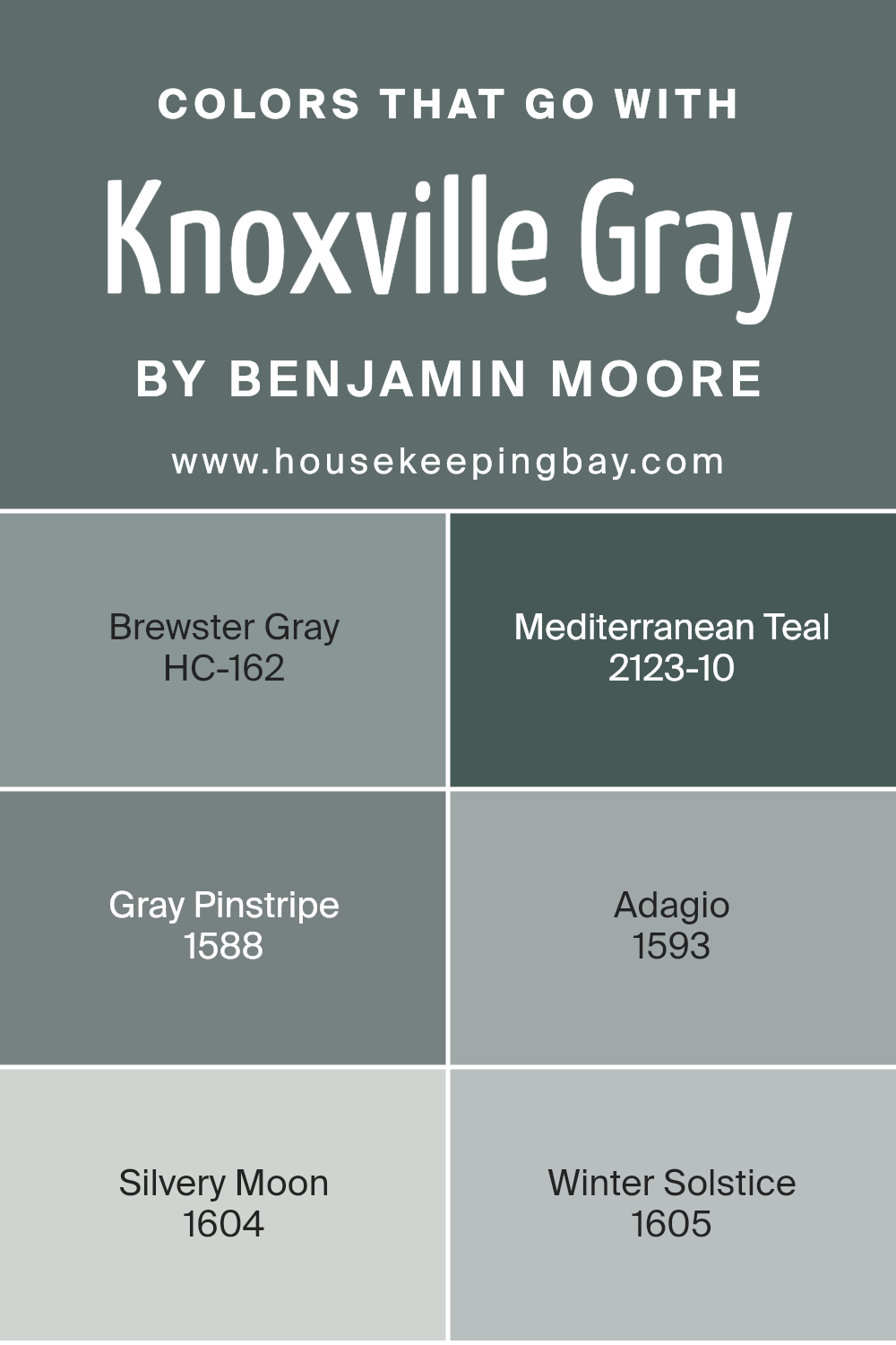
Colors that Go With Knoxville Gray HC-160 by Benjamin Moore
Knoxville Gray HC-160 by Benjamin Moore is a rich, deep gray with blue undertones, offering a sophisticated backdrop for many color schemes. Selecting complementary colors can enhance its elegance and create a harmonious environment. Brewster Gray HC-162, with its soft, gentle undertone, pairs wonderfully, providing a serene and subtle contrast without overwhelming the senses.
Mediterranean Teal 2123-10 introduces a pop of color, with its vibrant blue-green hue adding energy and depth to the palette. This bold choice can work well for accents or feature walls, helping to define and invigorate a space.
On the softer side, Gray Pinstripe 1588 integrates seamlessly as an understated companion to Knoxville Gray. Its clean, cool tones can be used to soften bolder colors, like Mediterranean Teal. Adagio 1593, with its gentle blue-gray, offers a delicate, calming aura, ideal for tranquil spaces.
Silvery Moon 1604 injects a hint of luminosity, blending gracefully without stealing the spotlight, perfect for brightening areas. Lastly, Winter Solstice 1605, a light and airy pale gray, rounds out the palette by providing a crisp, refreshing lightness that balances the heavier tones.
Each of these colors provides a unique complement to Knoxville Gray, contributing depth and variety to any design.
You can see recommended paint colors below:
- HC-162 Brewster Gray
- 2123-10 Mediterranean Teal
- 1588 Gray Pinstripe
- 1593 Adagio
- 1604 Silvery Moon
- 1605 Winter Solstice
housekeepingbay.com
How to Use Knoxville Gray HC-160 by Benjamin Moore In Your Home?
Knoxville Gray HC-160 by Benjamin Moore is a beautiful color that adds a touch of elegance to any room. It’s a rich gray with hints of green, making it versatile and full of character. This color works well in living rooms, creating a cozy and inviting space. Its warmth pairs nicely with both modern and traditional decor.
Knoxville Gray looks great with white trim, giving a clean and fresh appearance. It also complements natural wood tones, highlighting their beauty. If you want a soothing bedroom, consider using Knoxville Gray on the walls; it creates a restful backdrop perfect for relaxation.
In a kitchen, this color can look sophisticated on cabinets against light countertops. It’s also a good choice for an office, providing a calm yet professional environment. Overall, Knoxville Gray is a flexible option that adds depth and interest, suitable for many rooms and decorating styles.
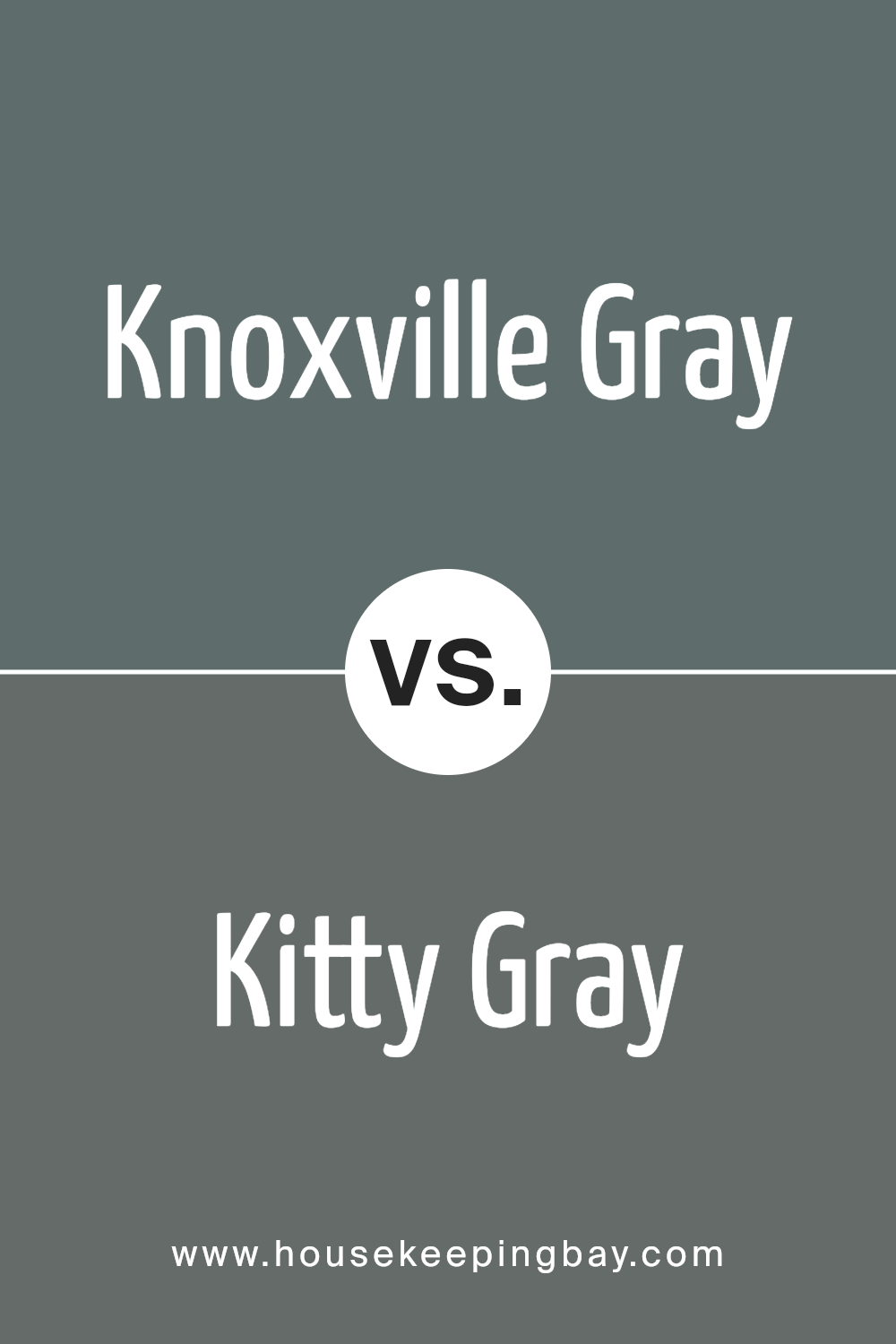
Knoxville Gray HC-160 by Benjamin Moore vs Kitty Gray 1589 by Benjamin Moore
Knoxville Gray HC-160 by Benjamin Moore presents a rich blend of blue and green undertones, producing a bold, deep hue. Its intensity makes it suitable for adding a dramatic touch to any room. Ideal for accent walls or cabinetry, it offers an elegant, timeless feel.
Kitty Gray 1589, another offering from Benjamin Moore, leans towards a softer, cooler side with subtle blue undertones. This shade appears more subdued compared to Knoxville Gray, giving a gentle, calming presence. It’s perfect for spaces seeking a peaceful, soothing ambiance.
While both colors share a gray base, their character differs significantly. Knoxville Gray exudes a darker, more saturated appearance, suited for creating an atmosphere of sophistication. Kitty Gray, with its lightness, works well in smaller spaces, helping them feel airy and open. Choosing between them depends on the desired mood: the boldness of Knoxville Gray or the calm of Kitty Gray.
You can see recommended paint color below:
- 1589 Kitty Gray
housekeepingbay.com
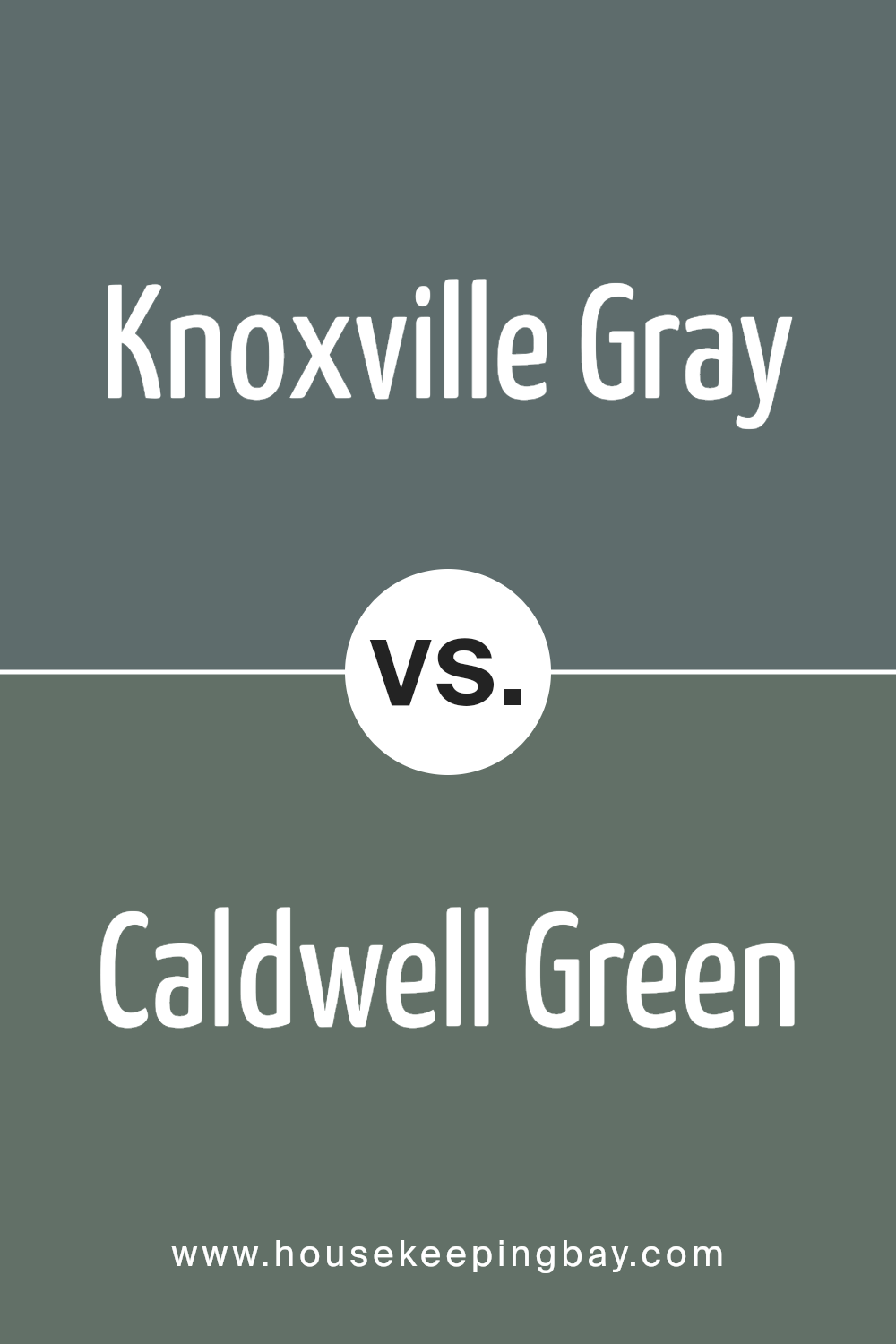
Knoxville Gray HC-160 by Benjamin Moore vs Caldwell Green HC-124 by Benjamin Moore
Knoxville Gray HC-160 by Benjamin Moore and Caldwell Green HC-124 by Benjamin Moore offer different yet harmonious color experiences. Knoxville Gray is a muted, sophisticated gray with blue undertones. It gives spaces a calm, classic feel, ideal for living rooms or studies where a relaxed yet refined atmosphere is desired.
Compared to traditional grays, it adds a touch of personality with its subtle blue hints.
Caldwell Green HC-124, on the other hand, presents a rich, deep green. It feels earthy and vibrant, bringing nature indoors. It’s perfect for creating a cozy, welcoming environment in spaces like kitchens or dining rooms. While Knoxville Gray suggests cool elegance, Caldwell Green brings warmth and energy.
Both colors work well in various settings, but Knoxville Gray leans more towards a contemporary, understated look, while Caldwell Green injects life and warmth. These colors can complement each other nicely when used together in different areas of a home.
You can see recommended paint color below:
- HC-124 Caldwell Green
housekeepingbay.com
Knoxville Gray HC-160 by Benjamin Moore vs Quarry Rock 1568 by Benjamin Moore
Knoxville Gray HC-160 by Benjamin Moore presents a deep, rich tone that blends blue and green with gray undertones. It evokes a classic and sophisticated vibe, making it suitable for both modern and traditional spaces. It creates a sense of depth and coziness, ideal for living rooms or studies.
Quarry Rock 1568, also by Benjamin Moore, offers a slightly warmer and earthier shade. While it also contains gray, its base leans more towards a natural stone look, which can bring warmth and an inviting atmosphere to any room. This makes it a great option for areas where a neutral, yet welcoming, color is desired.
Both colors provide a sense of calm and grounded elegance. Knoxville Gray tilts towards the cooler spectrum with its lovely hints of blue, while Quarry Rock leans into earthy warmth, providing flexibility depending on style preference.
Each brings its own charm, adaptable to various design needs.
You can see recommended paint color below:
- 1568 Quarry Rock
housekeepingbay.com
Knoxville Gray HC-160 by Benjamin Moore vs Blue Spruce 1637 by Benjamin Moore
Knoxville Gray HC-160 by Benjamin Moore is a rich, muted gray with hints of green and blue. It creates a calm, sophisticated atmosphere and works well in both traditional and modern settings. Its understated elegance makes it suitable for living rooms, bedrooms, or even as an exterior color.
Blue Spruce 1637, also by Benjamin Moore, has a deeper, more pronounced blue-green tone. It brings a bold yet cozy feeling to a space. This color is often chosen for bedrooms or study areas where a more intimate environment is desired.
Comparing these two, Knoxville Gray leans more towards a subtle sophistication with its softer, more neutral palette. Meanwhile, Blue Spruce offers a stronger statement with its distinct, darker shade. Knoxville Gray feels versatile and timeless, while Blue Spruce provides a touch of boldness and depth. Each color brings unique warmth and character, influencing the ambiance of a room in its distinctive way.
You can see recommended paint color below:
- 1637 Blue Spruce
housekeepingbay.com
Conclusion
This deep, muted gray offers warmth and depth, making it a perfect choice for those seeking a stylish yet understated look for their space.
Whether used on walls, cabinetry, or accent pieces, Knoxville Gray allows for effortless coordination with various design elements and styles.
This shade works well across different settings, from urban environments to more rustic surroundings. Its neutral tone provides a wonderful backdrop for art, furniture, and décor, allowing each piece to shine without overshadowing the other. The adaptability of Knoxville Gray also makes it suitable for both modern and traditional interiors, offering a timeless appeal that doesn’t easily fade.
I find that Knoxville Gray creates an inviting atmosphere, striking a balance between being bold enough to make a statement and subtle enough to foster a sense of comfort. The hue’s ability to pair with both warm and cool tones adds to its charm, ensuring that it can complement a wide array of color palettes.
In choosing Knoxville Gray, I am opting for a color that is not only visually pleasing but also practical, making any room feel more complete and harmonious.
housekeepingbay.com
Ever wished paint sampling was as easy as sticking a sticker? Guess what? Now it is! Discover Samplize's unique Peel & Stick samples. Get started now and say goodbye to the old messy way!
Get paint samples


