Shagreen SW 6422 by Sherwin Williams
Find Your Next Favorite Shade for a Fresh Look
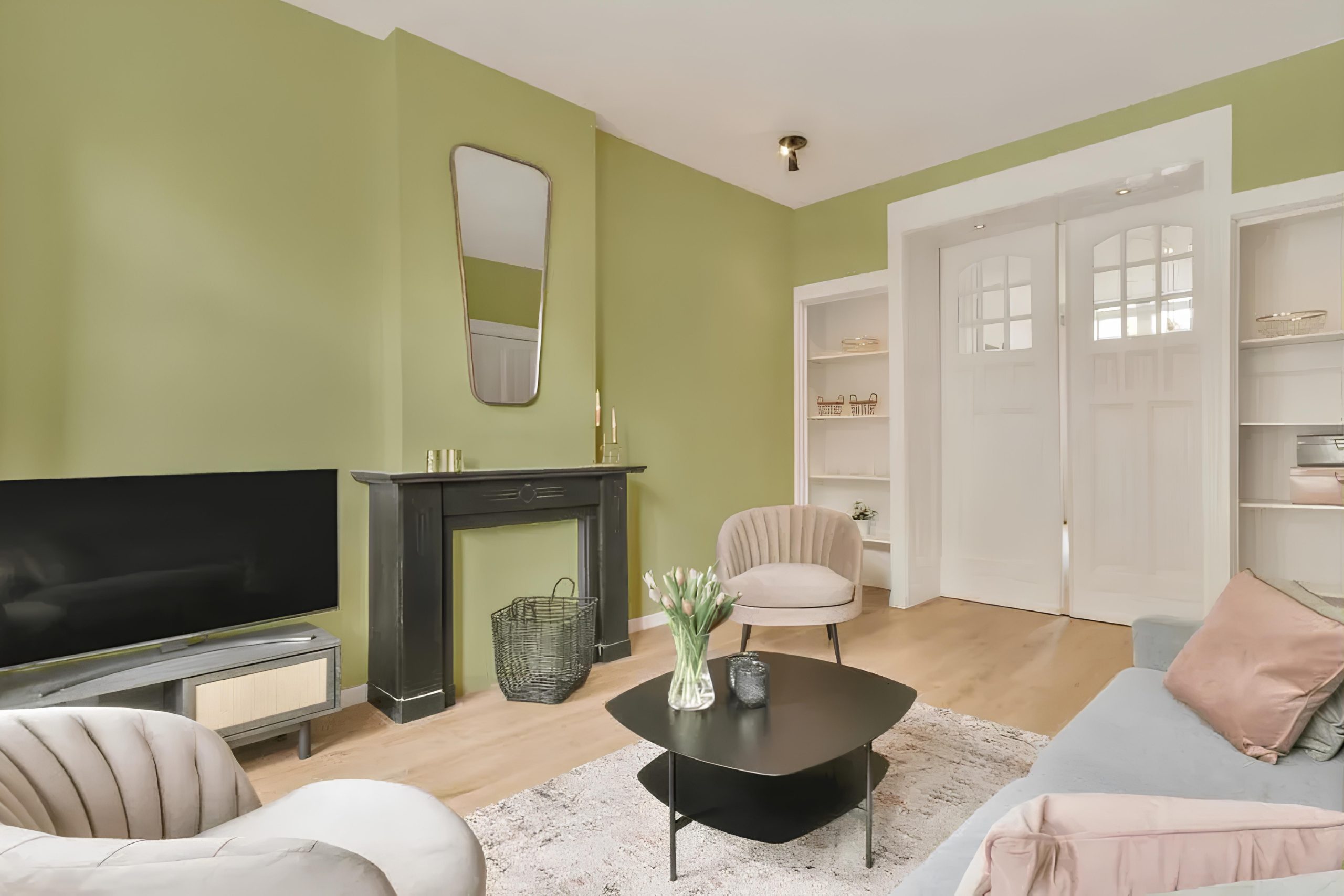
SW 6422 Shagreen by Sherwin Williams is a delightful choice that can seamlessly fit into various settings. With its soothing green undertone mixed with hints of gray, Shagreen offers a refreshing yet gentle ambiance to any room.
You might notice how Shagreen exudes a soft, natural vibe, making it perfect for creating a peaceful atmosphere. It’s an ideal shade for living rooms, bedrooms, or even home offices where relaxation and focus are key.
The muted green hue can also enhance natural light, making smaller spaces feel more open and inviting.
Pairing Shagreen with neutral tones like whites, creams, or soft grays can enhance its calming effect, while darker accents can add depth and contrast. It’s a flexible color that can complement various styles, from modern and minimalist to rustic and traditional.
If you are thinking about updating your space, SW 6422 Shagreen offers a subtle yet effective way to refresh and renew your home.
It’ll be a choice you return to with appreciation each day, as it quietly enhances your surroundings without overwhelming them.
via plan-home.com
What Color Is Shagreen SW 6422 by Sherwin Williams?
Table of Contents
Shagreen SW 6422 by Sherwin Williams is a gentle and versatile green tone. Its soft, earthy hue brings comfort and warmth to a room without overwhelming it. Not too bright, yet refreshing, it strikes a balance between nature’s touch and a neutral aesthetic. This color fits well in living spaces seeking a subtle infusion of green, providing a backdrop that is both calming and inviting.
Shagreen works beautifully in interior styles such as modern farmhouse, where its earthy vibe complements rustic elements, and in Scandinavian designs, where it adds a bit of nature without disrupting minimalist principles. It’s also suitable for transitional spaces by offering a bridge between traditional and contemporary looks.
When it comes to materials, Shagreen pairs effortlessly with natural woods, enhancing their organic feel. Light oak or walnut create a harmonious combination. Textures such as linen, cotton, and woven fabrics enhance its appeal, adding layers of visual interest. Metallic accents in brushed gold or matte black can provide a chic contrast, while ceramics and soft leathers can add depth and character.
Overall, Shagreen SW 6422 embodies a natural elegance that can adapt to various styles, bringing a sense of understated beauty to any space.
housekeepingbay.com
Is Shagreen SW 6422 by Sherwin Williams Warm or Cool color?
Shagreen SW 6422 by Sherwin Williams is a soft, muted shade of green. It blends well with natural, earthy tones, making it an ideal choice for spaces that aim to feel calm and balanced. This color has an understated presence, giving it versatility in different settings. In living rooms, Shagreen can create a welcoming atmosphere, pairing beautifully with beige or cream furnishings. In kitchens, it offers a fresh feel, complementing wooden accents or white cabinetry.
Its gentle hue works well in bedrooms, promoting a sense of restfulness. Bathrooms benefit too, as Shagreen pairs nicely with white for a spa-like appeal. The color is adaptable, playing well with both light and dark elements. This makes it suitable for both small and large spaces.
Additionally, Shagreen can act as a neutral backdrop, allowing other accent colors and decor pieces to stand out without clashing.
What is the Masstone of the Shagreen SW 6422 by Sherwin Williams?
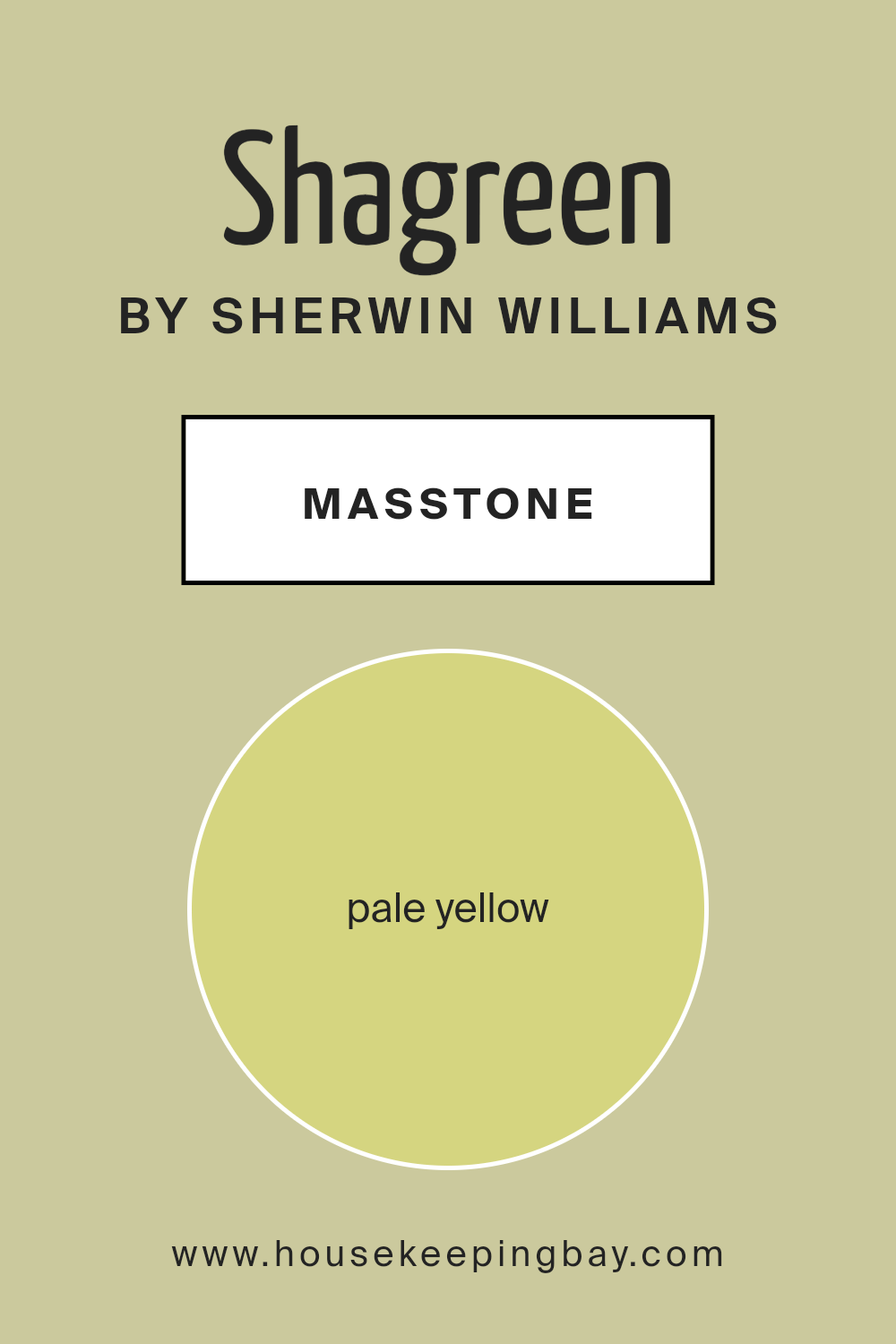
Shagreen SW 6422 by Sherwin Williams is a pleasant pale yellow color, with a masstone of #D5D580. This shade brings a cheerful and warm vibe to any room. Its light tone helps to open up spaces, making them feel larger and more welcoming. This makes it a great choice for small rooms or areas with limited natural light. The soft, pale yellow hue creates an inviting atmosphere, which can enhance the mood within the home.
In living rooms, Shagreen can brighten the space, giving it a refreshing and airy feel. In kitchens, it can add a hint of warmth, balancing well with white or wooden elements. Bedrooms painted with Shagreen feel cozy yet uplifting, promoting a sense of comfort.
Its subtle, neutral undertones mean it pairs well with various colors, such as blues or greens, for a harmonious and balanced look. Overall, Shagreen creates a cheerful yet serene environment.
housekeepingbay.com
Undertones of Shagreen SW 6422 by Sherwin Williams
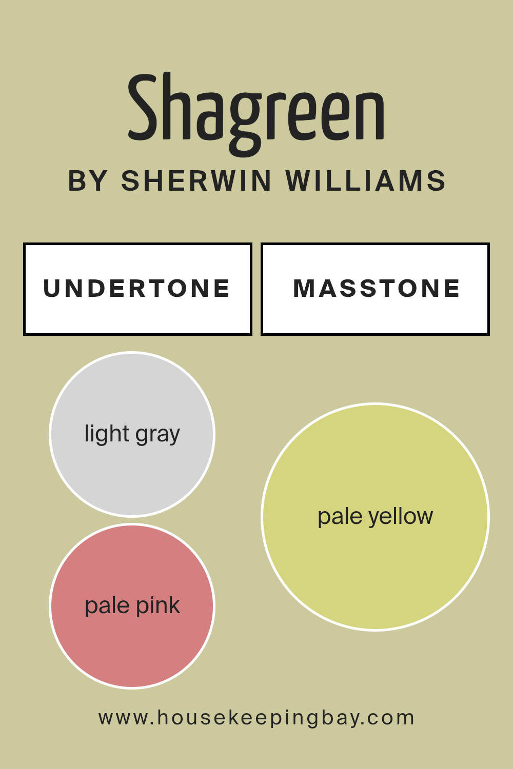
Shagreen SW 6422 by Sherwin Williams presents a soothing green hue, but the undertones it carries add depth and complexity. Undertones are the subtle hints of color beneath the main color. They affect how we perceive each paint color, changing how it looks under varying light conditions or when paired with other colors.
Shagreen’s undertones include light gray, pale pink, mint, light purple, light blue, grey, yellow, lilac, orange, light green, and olive. These undertones can influence how the color appears differently in various settings. Light gray and grey undertones add a touch of sophistication, giving Shagreen a cooler demeanor.
Mint and light green bring a refreshing, lively vibe to this green, making spaces feel airy. Hints of pale pink and light purple soften the green, adding subtle warmth, making it feel more inviting.
Light blue, lilac, and olive infuse Shagreen with versatility. Yellow and orange undertones can add warmth when sunlight hits the walls, making the room feel cozier.
Overall, Shagreen’s undertones work together to create a versatile and adaptable paint that can complement many interior styles, from modern to traditional, always adding a gentle layer of depth and interest to walls.
housekeepingbay.com
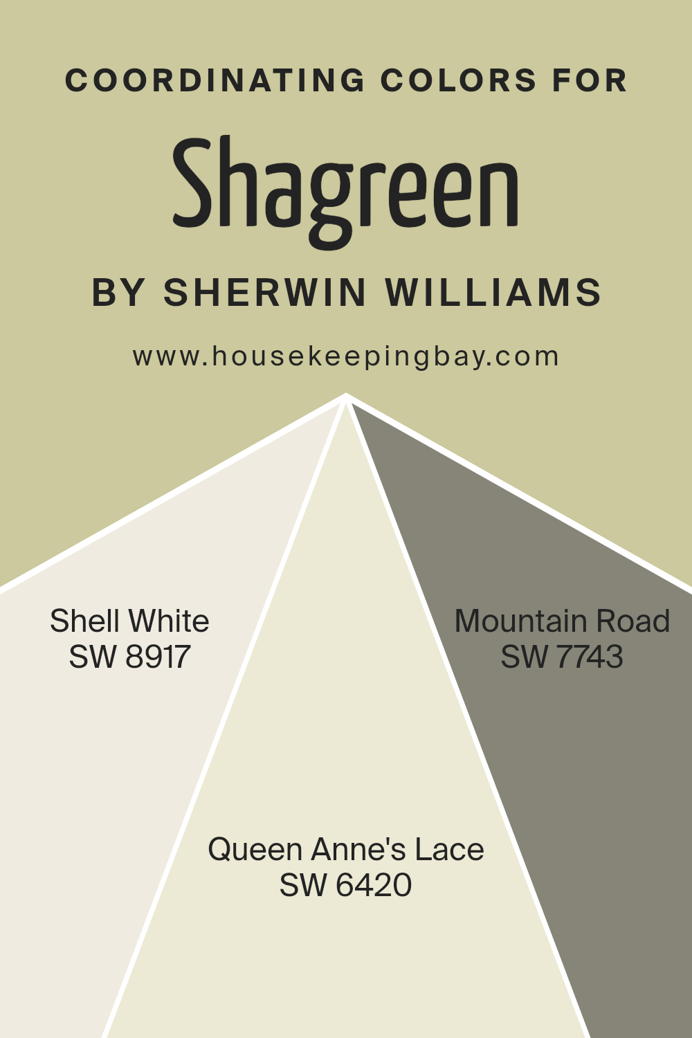
Coordinating Colors of Shagreen SW 6422 by Sherwin Williams
Coordinating colors are specially chosen hues that work well together to create a harmonious look in a space. They enhance the main color by providing balance and contrast, making the entire palette feel cohesive. When using a color like Shagreen SW 6422 by Sherwin Williams, finding the right coordinating shades can accentuate its qualities and create a pleasing visual effect.
Coordinating colors can be applied through different elements in a room, such as walls, furniture, art, or accessories, to pull the look together seamlessly.
For instance, SW 8917 – Shell White is a soft, warm off-white that offers a gentle backdrop to Shagreen, adding lightness without overpowering. SW 6420 – Queen Anne’s Lace brings in a subtle green with yellow undertones, which complements Shagreen while introducing a touch of freshness and vibrancy.
SW 7743 – Mountain Road provides a deeper, rich earthy tone that establishes a grounding contrast, adding depth alongside the lighter hues.
Together, these colors create a versatile and coordinated space that feels complete and inviting, where each shade highlights different aspects of Shagreen while ensuring the overall aesthetic remains balanced and cohesive.
You can see recommended paint colors below:
- SW 8917 Shell White
- SW 6420 Queen Anne’s Lace
- SW 7743 Mountain Road
housekeepingbay.com
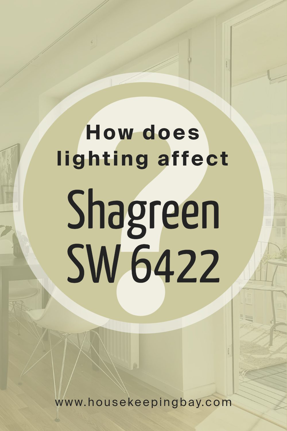
How Does Lighting Affect Shagreen SW 6422 by Sherwin Williams?
Lighting plays a crucial role in how we perceive colors, and Shagreen SW 6422 by Sherwin Williams is no exception. This soft green hue can change dramatically depending on the lighting conditions in a room, whether the light is natural or artificial.
In artificial light, Shagreen can take on a warmer or cooler tone depending on the type of light bulb used. Incandescent bulbs, which emit a warm, yellowish light, might give the color a slightly warmer, cozier feel. On the other hand, LED bulbs, especially those with a cooler temperature range, can make Shagreen appear more muted or even slightly cooler.
Natural light varies throughout the day and according to the room’s orientation. In a north-facing room, which generally has cooler and more consistent light, Shagreen may appear a bit grayer or muted. This is because the cooler light tends to highlight the cool undertones of the color.
In a south-facing room, which typically gets a lot of warm light, Shagreen can look brighter and warmer. The abundant sunshine in these rooms throughout most of the day can really make the color pop, enhancing its subtle green hues.
East-facing rooms get warm, bright light in the morning, which can make Shagreen seem fresher and more lively early in the day. However, as the sun moves and the direct light diminishes, the color can become softer and less intense.
West-facing rooms experience the opposite: cooler light in the morning and warmer light in the afternoon and evening. As the day progresses, Shagreen may seem softer and more subdued in the morning, but it can glow warmly in the later part of the day when the room fills with the sunset light.
Understanding these subtle changes can help you decide where to use Shagreen in your home to achieve the desired effect. Different lighting can transform the color’s appearance, making it essential to test Shagreen in various lights to see how it behaves in your particular space.
housekeepingbay.com
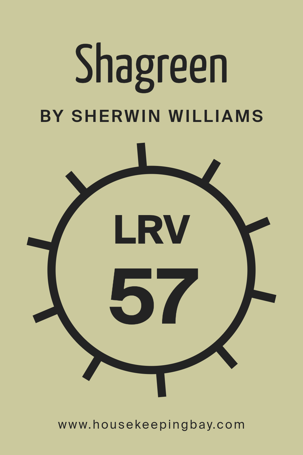
What is the LRV of Shagreen SW 6422 by Sherwin Williams?
Light Reflectance Value (LRV) is a measure that describes how much light a color reflects. It is a scale from 0 to 100, where 0 means no light is reflected (pure black) and 100 means all light is reflected (pure white). The LRV of a paint color affects how bright or dark it will appear in a space.
A higher LRV means the color reflects more light, making it look brighter and potentially making a room feel more open and airy. On the other hand, a lower LRV means the color absorbs more light, which can make a space feel cozier or more intimate.
When thinking about wall colors, considering the LRV helps in determining how the color will behave in different lighting conditions and how it will interact with other elements in the room.
Shagreen SW 6422 by Sherwin Williams has an LRV of 56.983. This LRV is in the middle range, meaning Shagreen reflects a fair amount of light but also absorbs a good portion of it.
This balance makes Shagreen a versatile color for walls, as it can provide a sense of brightness without being too overwhelming. It offers enough depth to add interest and warmth to a space. In well-lit rooms, Shagreen will appear lighter and more refreshing, whereas in darker spaces, it could seem slightly more muted and cozy.
This makes it a flexible choice for various types of rooms and lighting conditions.
housekeepingbay.com
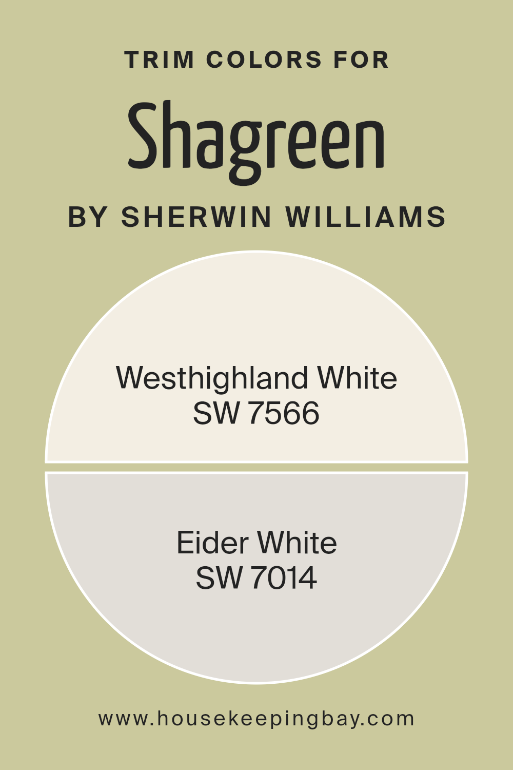
What are the Trim colors of Shagreen SW 6422 by Sherwin Williams?
Trim colors are crucial in home design because they provide a frame or an outline that highlights the main wall color, such as Shagreen SW 6422 by Sherwin Williams. Shagreen is a soft, muted green that offers a calm and earthy vibe. For this shade, selecting the right trim color is essential to create a balanced look.
Trim colors like Sherwin Williams’ Westhighland White SW 7566 and Eider White SW 7014 work well with Shagreen. These colors offer contrast and can define the edges of a room, making the central color stand out while maintaining a cohesive feel.
Westhighland White SW 7566 is a creamy, soft white that brings warmth to any space. It’s not stark, so it creates a gentle transition from wall to trim, perfect for maintaining a cozy atmosphere with Shagreen. Eider White SW 7014, on the other hand, has a slight gray undertone, which gives it a cooler feel.
It pairs nicely with the green hue by adding subtle depth without overpowering the main color. Using these trim colors ensures that the Shagreen walls shine, providing a clean, polished finish to the room.
You can see recommended paint colors below:
housekeepingbay.com
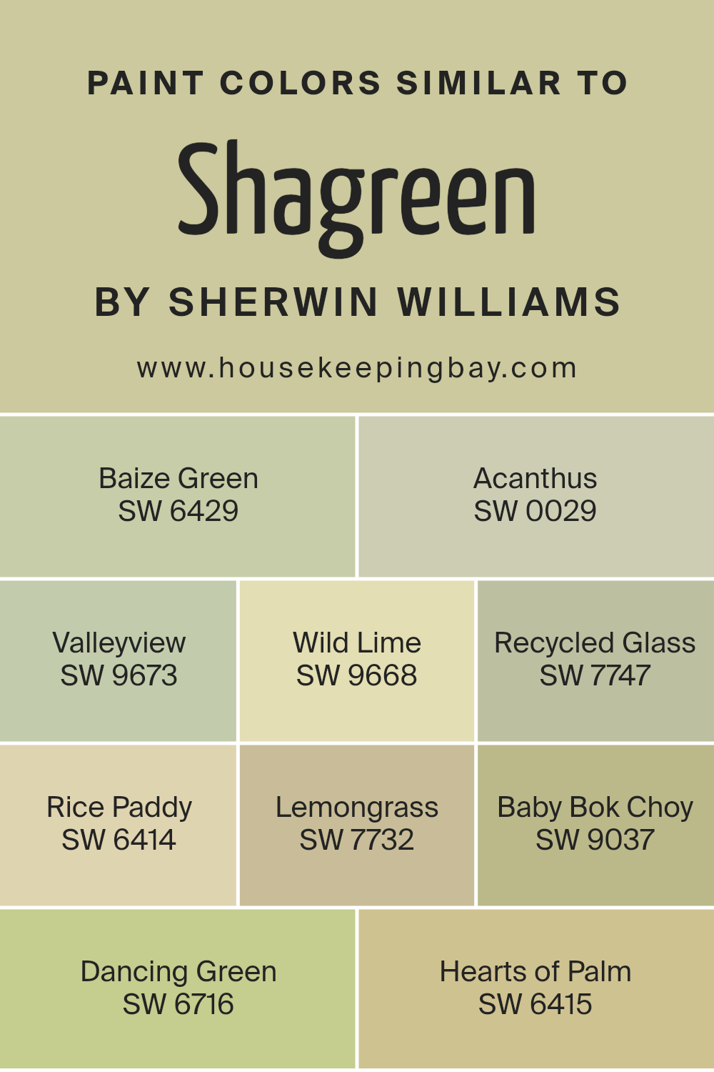
Colors Similar to Shagreen SW 6422 by Sherwin Williams
Similar colors create harmony and balance in design, adding subtle variety without clashing. Shagreen by Sherwin Williams is a beautiful shade of green that pairs well with other nature-inspired greens to achieve a cohesive look. For instance, Baize Green has a rich, earthy tone that adds warmth and depth.
Acanthus, with its subtle grayish-green hue, offers a more classic and sophisticated touch. Valleyview provides a refreshing look that feels cool and inviting. If you’re looking for something bright, Wild Lime brings a lively, energizing vibe with its vibrant yellow-green mix.
For those who lean toward softer shades, Recycled Glass presents a gentle, aqua-inspired color, great for calm and serene spaces. Rice Paddy echoes a light, creamy green, which is perfect for adding freshness without overwhelming. Lemongrass delivers a unique blend of green with a hint of yellow that feels both natural and inviting.
Baby Bok Choy balances a beautiful, soft green tinged with gray, while Dancing Green encapsulates a lively energy, reminiscent of spring leaves.
Lastly, Hearts of Palm stands out with its soothing, muted green, perfectly complementing other tones from nature. Together, these colors create inviting environments that feel both lively and peaceful.
You can see recommended paint colors below:
- SW 6429 Baize Green
- SW 0029 Acanthus
- SW 9673 Valleyview
- SW 9668 Wild Lime
- SW 7747 Recycled Glass
- SW 6414 Rice Paddy
- SW 7732 Lemongrass
- SW 9037 Baby Bok Choy
- SW 6716 Dancing Green
- SW 6415 Hearts of Palm
housekeepingbay.com
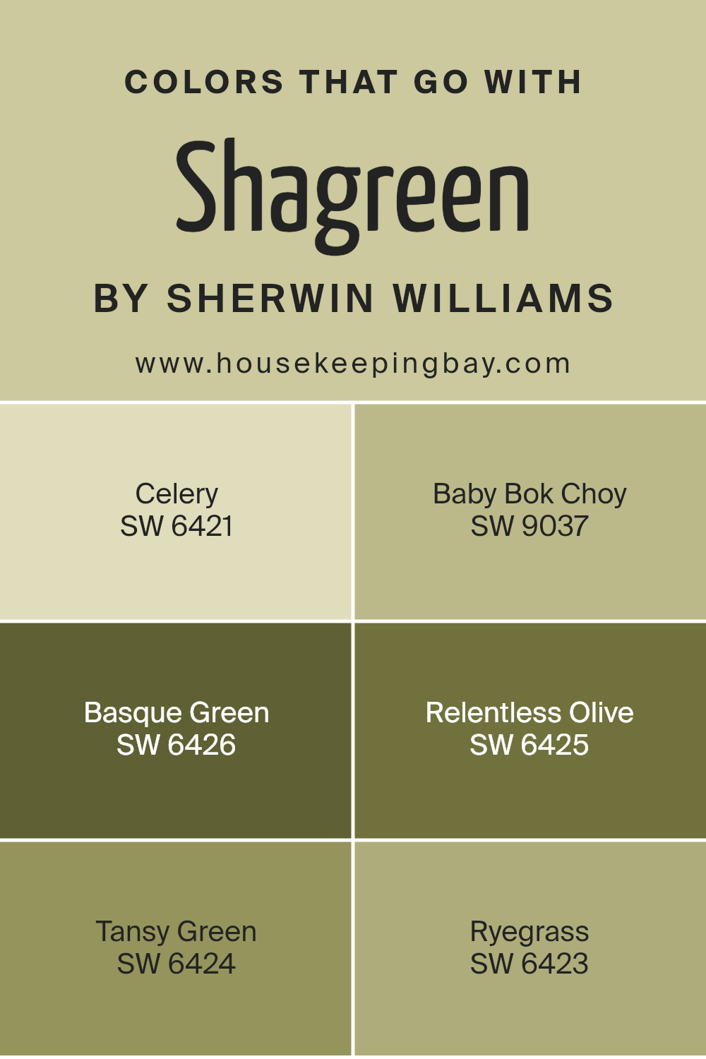
Colors that Go With Shagreen SW 6422 by Sherwin Williams
Colors play a crucial role in creating harmonious and eye-pleasing spaces, especially when paired with a versatile hue like Shagreen SW 6422 by Sherwin-Williams. The right combination can breathe life into a room, evoke certain moods, and lend balance.
Consider pairing Shagreen with Celery SW 6421, a soft and refreshing green that exudes a lively yet soothing vibe. Its lightness contrasts beautifully with Shagreen, making spaces feel open and welcoming.
Baby Bok Choy SW 9037, a more vibrant green, adds a touch of liveliness and energy. It complements Shagreen by adding depth and a sense of playfulness to the palette.
Moving towards deeper shades, Basque Green SW 6426 offers a rich, earthy tone perfect for creating a grounded and cohesive look. It’s a strong companion for Shagreen, as its intensity balances the softer tone.
Similarly, Relentless Olive SW 6425 introduces a deeper, warm green that enhances the soothing quality of Shagreen, adding an element of elegance.
Tansy Green SW 6424 provides a balanced mid-tone green that bridges the lighter and darker shades effortlessly. Lastly, Ryegrass SW 6423 captures a natural vitality, pairing excellently with Shagreen to create a space that’s both refreshing and calm, perfect for any living area.
You can see recommended paint colors below:
- SW 6421 Celery
- SW 9037 Baby Bok Choy
- SW 6426 Basque Green
- SW 6425 Relentless Olive
- SW 6424 Tansy Green
- SW 6423 Ryegrass
housekeepingbay.com
How to Use Shagreen SW 6422 by Sherwin Williams In Your Home?
Shagreen SW 6422 by Sherwin Williams offers a soft, muted green that brings a warm touch to any home. Perfect for creating a cozy atmosphere, this color works well in living rooms, bedrooms, or kitchens. Its earthy tone adds a hint of nature indoors, making spaces feel inviting and comfortable.
Pair Shagreen with neutral colors like white or beige for a clean look, or combine it with darker shades for more contrast. In a bedroom, it can promote relaxation, helping you unwind after a long day. In the kitchen, it harmonizes well with wood finishes and other natural materials.
If you’re looking to refresh furniture, consider using this shade on cabinets or a feature wall to update the space without overwhelming it. As an accent, Shagreen complements plants, enhancing any indoor garden feel. Overall, it’s a versatile color, suitable for various styles whether modern, traditional, or even rustic.
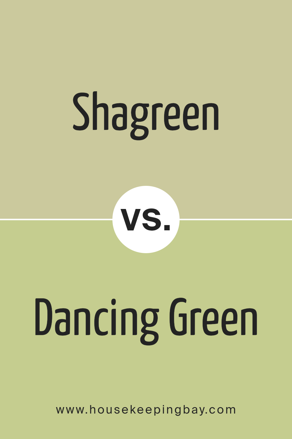
Shagreen SW 6422 by Sherwin Williams vs Dancing Green SW 6716 by Sherwin Williams
Shagreen SW 6422 and Dancing Green SW 6716 by Sherwin Williams are both shades of green, but they have distinct qualities. Shagreen is a muted, earthy green with a hint of yellow. It feels calm and grounded, making it suitable for spaces where a soothing atmosphere is desired. Its subtle tone blends well with natural materials and neutral colors, creating a harmonious environment.
Dancing Green, in contrast, is a brighter and more vibrant shade. It has an energizing, lively quality, with more of a yellow undertone that gives it a sunny vibe. This color can uplift a room, adding a cheerful and refreshing touch. It pairs well with white or light-colored accents, providing a modern and clean look.
While both colors bring the essence of nature indoors, Shagreen has a more subdued, calm presence, and Dancing Green adds a dynamic, lively feel to any space.
You can see recommended paint color below:
- SW 6716 Dancing Green
housekeepingbay.com
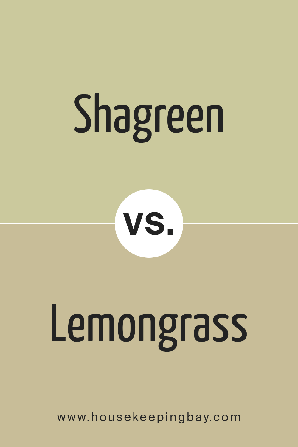
Shagreen SW 6422 by Sherwin Williams vs Lemongrass SW 7732 by Sherwin Williams
Shagreen SW 6422 by Sherwin Williams and Lemongrass SW 7732 both belong to the green family, yet they bring different vibes. Shagreen has more of a muted, softer green tone. It feels natural and calming, perfect for spaces that need a touch of subtle elegance. It pairs well with neutral colors and creates a warm ambiance without being overwhelming.
Lemongrass SW 7732, meanwhile, leans towards a more vibrant and lively green-yellow hue. It feels brighter and more energetic, adding freshness to the room. This color works well in areas where liveliness is welcome, bringing a cheerful feel to kitchens or sunrooms.
Lemongrass is great for spaces that need a pop of energetic color.
While both colors offer green hues, Shagreen offers understated calmness while Lemongrass channels an energizing burst. They can be chosen based on the mood one wants in a space.
You can see recommended paint color below:
housekeepingbay.com
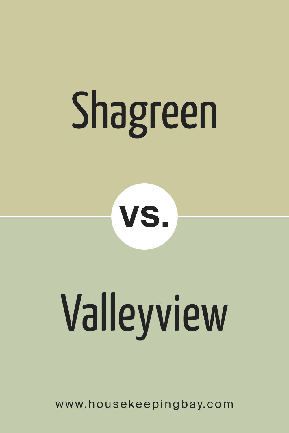
Shagreen SW 6422 by Sherwin Williams vs Valleyview SW 9673 by Sherwin Williams
Shagreen SW 6422 by Sherwin Williams is a soft, muted green that leans towards a sage or olive tone. Its gentle hue provides a calm and natural feeling, making it a versatile choice for spaces aiming for a soothing effect. Shagreen pairs well with neutral colors and is often used in living rooms or bedrooms to create a cozy atmosphere.
Valleyview SW 9673, however, presents a different green vibe. It’s brighter and slightly more vibrant compared to Shagreen. With its refreshing and lively touch, Valleyview can bring energy to any space. It’s a great choice for kitchens or playrooms where a cheerful ambiance is desired.
While Shagreen offers a subtle elegance suitable for creating relaxing environments, Valleyview introduces a pop of freshness and life to interiors. Together, both colors highlight the beauty and versatility of green, each serving different moods and settings within a home.
You can see recommended paint color below:
- SW 9673 Valleyview
housekeepingbay.com
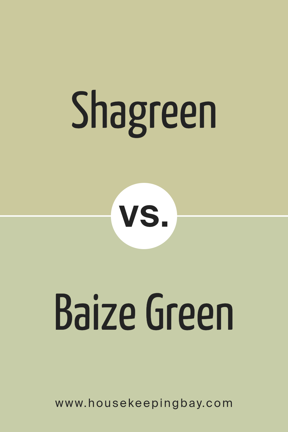
Shagreen SW 6422 by Sherwin Williams vs Baize Green SW 6429 by Sherwin Williams
Shagreen SW 6422 and Baize Green SW 6429 are both greens by Sherwin Williams, yet they have distinct characteristics. Shagreen SW 6422 is a softer, more muted green with a subtle yellow undertone. This makes it feel warm, welcoming, and perfect for spaces where you want a gentle ambiance. Shagreen can work well in living rooms or bedrooms, offering a soothing backdrop without overpowering other elements in the room.
In contrast, Baize Green SW 6429 is a deeper, richer green with a noticeable depth. It leans slightly cooler with a hint of blue. Baize Green projects more energy and boldness, making it an excellent choice for accent walls or areas where you want a more vibrant and dramatic look.
It pairs beautifully with neutrals and works well in creative spaces or dining rooms where a touch of intensity can add character.
Both colors can complement various styles and create inviting environments, but their distinctive shades cater to different moods and settings.
You can see recommended paint color below:
- SW 6429 Baize Green
housekeepingbay.com
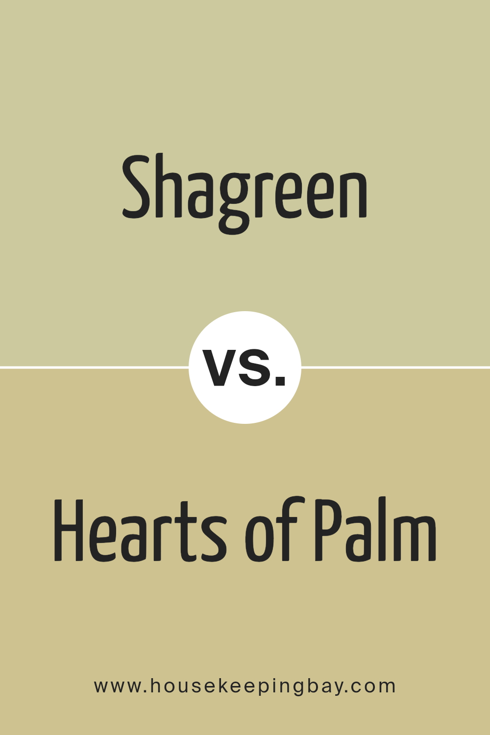
Shagreen SW 6422 by Sherwin Williams vs Hearts of Palm SW 6415 by Sherwin Williams
Shagreen SW 6422 and Hearts of Palm SW 6415, both by Sherwin Williams, present distinct yet connected vibes. Shagreen SW 6422 offers a muted and calm green with subtle gray undertones, making it feel reserved and soothing. It’s a versatile color that complements a neutral palette well, giving rooms an elegant and serene atmosphere.
On the contrary, Hearts of Palm SW 6415 leans towards a brighter, more vibrant green with yellow hints. It injects energy and warmth into a space, making it lively and cheerful. This color works beautifully in spaces that aim for a fresh and welcoming feel, like kitchens or living rooms.
When comparing the two, Shagreen brings understated sophistication, while Hearts of Palm adds lively warmth. Choosing between them depends on the desired atmosphere.
Shagreen suits tranquil, classy spaces, whereas Hearts of Palm enhances spaces with vigor and freshness. Both have their unique beauty, offering different moods to suit varied tastes.
You can see recommended paint color below:
- SW 6415 Hearts of Palm
housekeepingbay.com
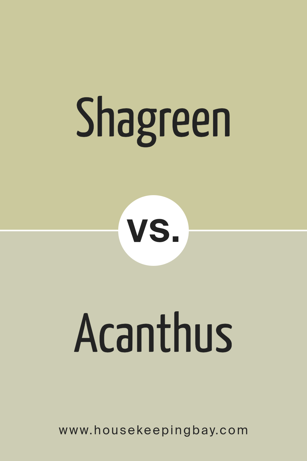
Shagreen SW 6422 by Sherwin Williams vs Acanthus SW 0029 by Sherwin Williams
Shagreen SW 6422 and Acanthus SW 0029 by Sherwin Williams are two distinct shades of green, each offering different vibes and uses. Shagreen is a mild, muted green with a touch of gray, creating a soft and relaxed atmosphere. It feels inviting and works well in spaces where you want to exude calmness and nature’s simplicity, like bedrooms or living rooms. Its subtlety allows it to pair nicely with neutral or light-toned furniture and decor.
Acanthus, a darker, richer green, brings more depth and earthiness. This color feels more traditional and works beautifully in dining spaces or studies, where you want a more dramatic feel. It pairs nicely with warm woods and gold accents, making a space feel cozy yet elegant.
Both colors can transform a room, but the choice between Shagreen’s soft touch and Acanthus’s bold statement depends on the mood or style you’re aiming for in your space.
You can see recommended paint color below:
- SW 0029 Acanthus
housekeepingbay.com
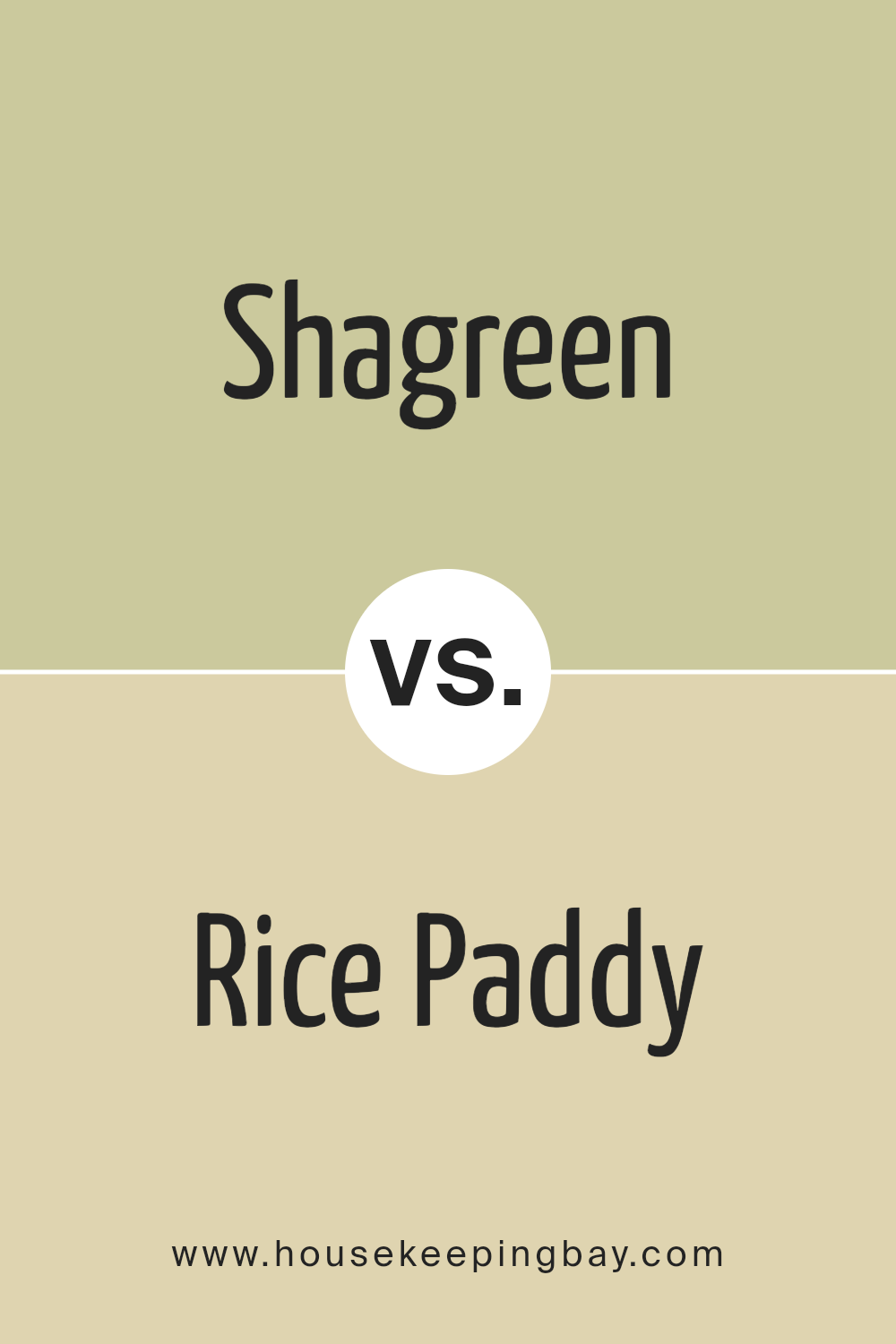
Shagreen SW 6422 by Sherwin Williams vs Rice Paddy SW 6414 by Sherwin Williams
Shagreen SW 6422 by Sherwin Williams is a soft, muted green with a touch of gray, giving it a calming and elegant vibe. It’s a versatile color that works well in various rooms, instilling a sense of calm and understated sophistication. Its gentle tone pairs well with neutral colors and natural materials, making it a solid choice for cozy spaces.
Meanwhile, Rice Paddy SW 6414 offers a slightly warmer feel. It’s a light, fresh green that brings a bit of cheer and lightness compared to the more subdued Shagreen. This color evokes a sense of nature and renewal, perfect for uplifting spaces like kitchens or bathrooms.
Both colors share a green foundation but deliver distinct moods. Shagreen leans toward sophistication and calmness, while Rice Paddy feels light and fresh. Choosing between them depends on whether you prefer the serene elegance of Shagreen or the gentle brightness of Rice Paddy.
You can see recommended paint color below:
- SW 6414 Rice Paddy
housekeepingbay.com
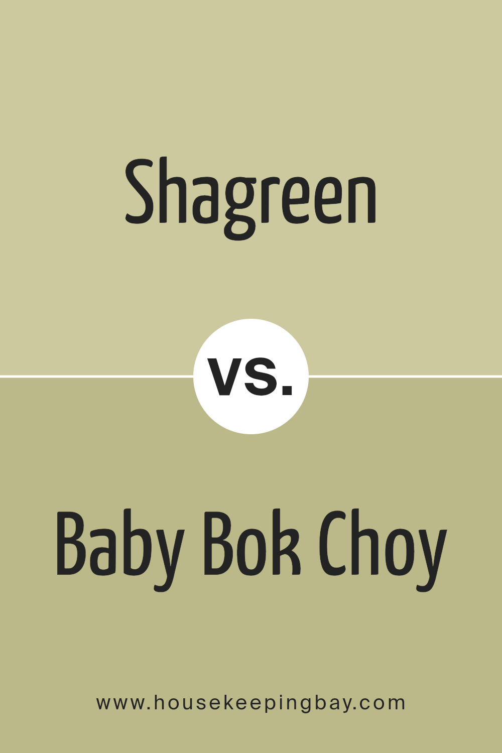
Shagreen SW 6422 by Sherwin Williams vs Baby Bok Choy SW 9037 by Sherwin Williams
Shagreen SW 6422 and Baby Bok Choy SW 9037 by Sherwin Williams offer serene, nature-inspired hues. Shagreen is a soft, muted green with a hint of gray. It’s versatile and creates a calm, balanced atmosphere, perfect for living rooms or bedrooms where relaxation is key.
Baby Bok Choy, lighter and brighter than Shagreen, captures a fresh, lively green reminiscent of new plant shoots. This color brings energy and life to spaces, making it ideal for kitchens or bathrooms, where a splash of vitality enhances the environment.
Both colors work well in combination with whites or neutrals, allowing them to pop gently without overwhelming a room. While Shagreen suits traditional and modern styles alike, Baby Bok Choy leans towards cheerful, casual settings. Both shades celebrate the beauty of nature, providing distinct personalities that allow homeowners to create inviting and harmonious spaces.
You can see recommended paint color below:
- SW 9037 Baby Bok Choy
housekeepingbay.com
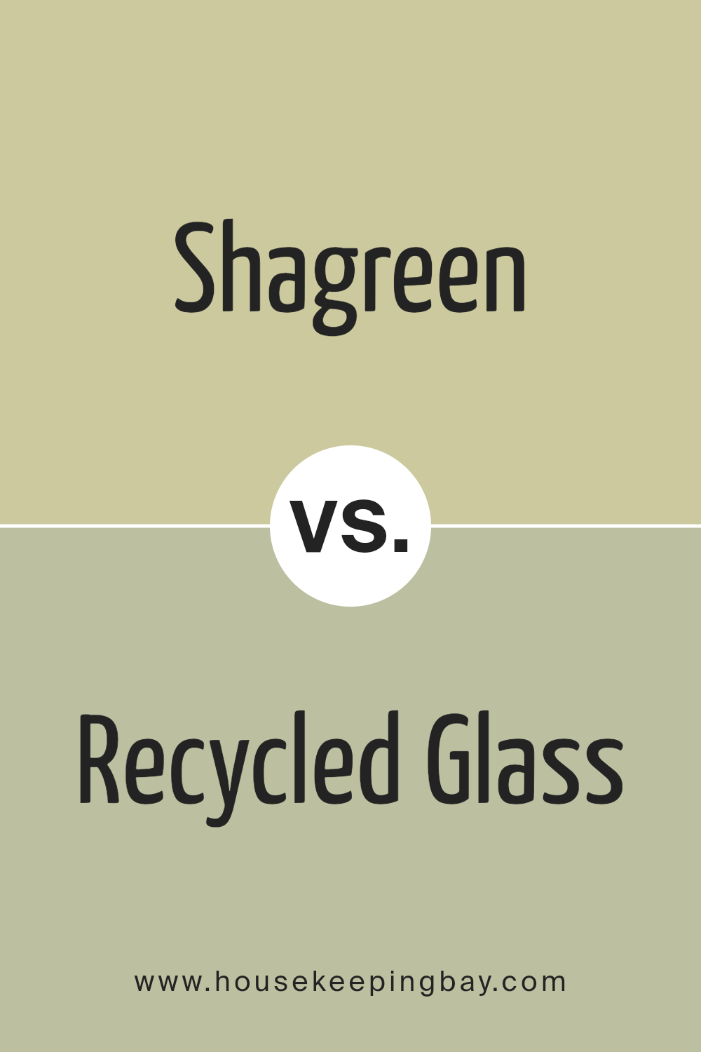
Shagreen SW 6422 by Sherwin Williams vs Recycled Glass SW 7747 by Sherwin Williams
Shagreen SW 6422 by Sherwin Williams is a gentle, soft green that evokes a sense of nature and calm. It’s versatile, working well in different spaces, adding a subtle hint of color without being overpowering. Shagreen infuses rooms with warmth and coziness, making it an excellent choice for living areas or bedrooms. Its earthy undertones connect well with natural materials like wood or stone.
Recycled Glass SW 7747, also by Sherwin Williams, is a lighter green with a more refreshing and airy feel. This color brings a sense of lightness, offering a brighter, more open atmosphere. It pairs beautifully with whites and neutrals, contributing a clean, crisp vibe.
Recycled Glass suits kitchens and bathrooms where you want a breath of freshness and vitality.
Both colors belong to the green family, but Shagreen emphasizes comfort with its deeper, muted tones, while Recycled Glass highlights brightness with its lighter, cooler shade.
You can see recommended paint color below:
- SW 7747 Recycled Glass
housekeepingbay.com
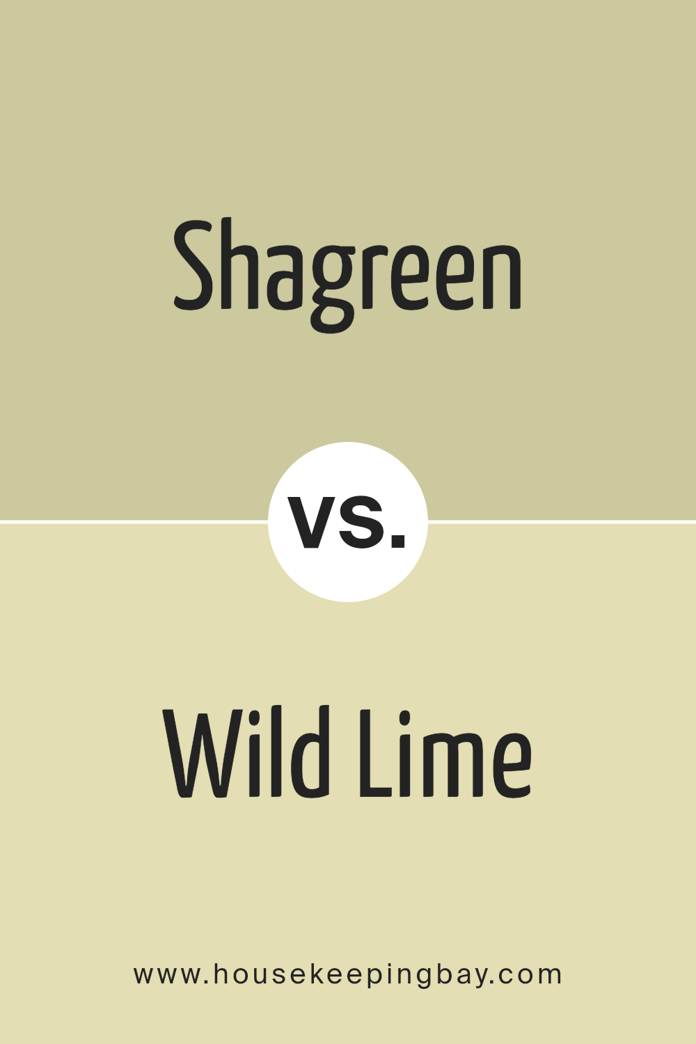
Shagreen SW 6422 by Sherwin Williams vs Wild Lime SW 9668 by Sherwin Williams
Shagreen SW 6422 and Wild Lime SW 9668 by Sherwin-Williams both belong to the green color family, but they offer different vibes. Shagreen presents a muted, soft green with earthy undertones, creating a calming and relaxed ambiance. It’s versatile and works well in various spaces, offering a touch of nature that doesn’t feel overpowering.
Wild Lime SW 9668, in contrast, is a brighter, more vibrant green. It brings energy and liveliness to any room, making it an excellent choice for areas where you want to inspire creativity or conversation. Its boldness can make a statement, turning any space into a lively, upbeat environment.
When choosing between them, consider the mood you want. Shagreen suits those who prefer subtlety and peace, while Wild Lime fits those who enjoy boldness and energy. Both colors have unique qualities that can enhance your space in different ways.
You can see recommended paint color below:
- SW 9668 Wild Lime
housekeepingbay.com
Conclusion
After learning about SW 6422 Shagreen by Sherwin Williams, I see how this paint color offers a calming and versatile option for home interiors. The subtle greenish-gray hue can suit various styles and moods, making it an excellent choice for anyone looking to refresh their living space.
Its muted tone means it can serve as a backdrop, allowing other elements of your design to stand out, or it can be a central feature, bringing a sense of balance and calm into the room.
Shagreen is adaptable and works well with both warm and cool colors, meaning it can fit into existing decor or inspire a new direction for a space. Whether used in a bedroom, living room, or kitchen, it provides a sense of harmony and invites a peaceful ambiance.
In studying this color, I appreciate its ability to change under different lighting conditions, adding a dynamic element to any room.
It can create a soothing and refreshing atmosphere, ideal for relaxation or concentration. Overall, SW 6422 Shagreen acts as a timeless choice for those wanting to bring a subtle yet effective change to their environment, offering both style and comfort.
housekeepingbay.com
Ever wished paint sampling was as easy as sticking a sticker? Guess what? Now it is! Discover Samplize's unique Peel & Stick samples. Get started now and say goodbye to the old messy way!
Get paint samples


