Salamander 2050-10 by Benjamin Moore
Fiery Hues Ignite Your Space
Imagine a color that gracefully bridges the gap between the vibrant world of nature and the calming depths of the ocean. Meet 2050-10 Salamander by Benjamin Moore. It’s a rich, deep green that strikes the perfect balance between boldness and subtlety. Salamander has that special ability to add warmth and elegance to any room, making it both striking and inviting.
With this color on your walls, you’ll feel like you’ve brought a piece of the natural world inside. The beauty of Salamander lies in its adaptability.
Whether your style leans toward the traditional or the modern, it fits right in. Picture it as the backdrop to your living room, setting the stage for cozy gatherings, or perhaps in a study, inspiring focus and creativity.
But it’s not just about aesthetics. Salamander also pairs well with a variety of other colors and textures. Imagine it with soft creams, warm woods, or even vibrant metallics. Each combination offers a different mood, allowing for endless possibilities.
If you’re ready to create a space that feels both vibrant and peaceful, Salamander is a perfect choice.
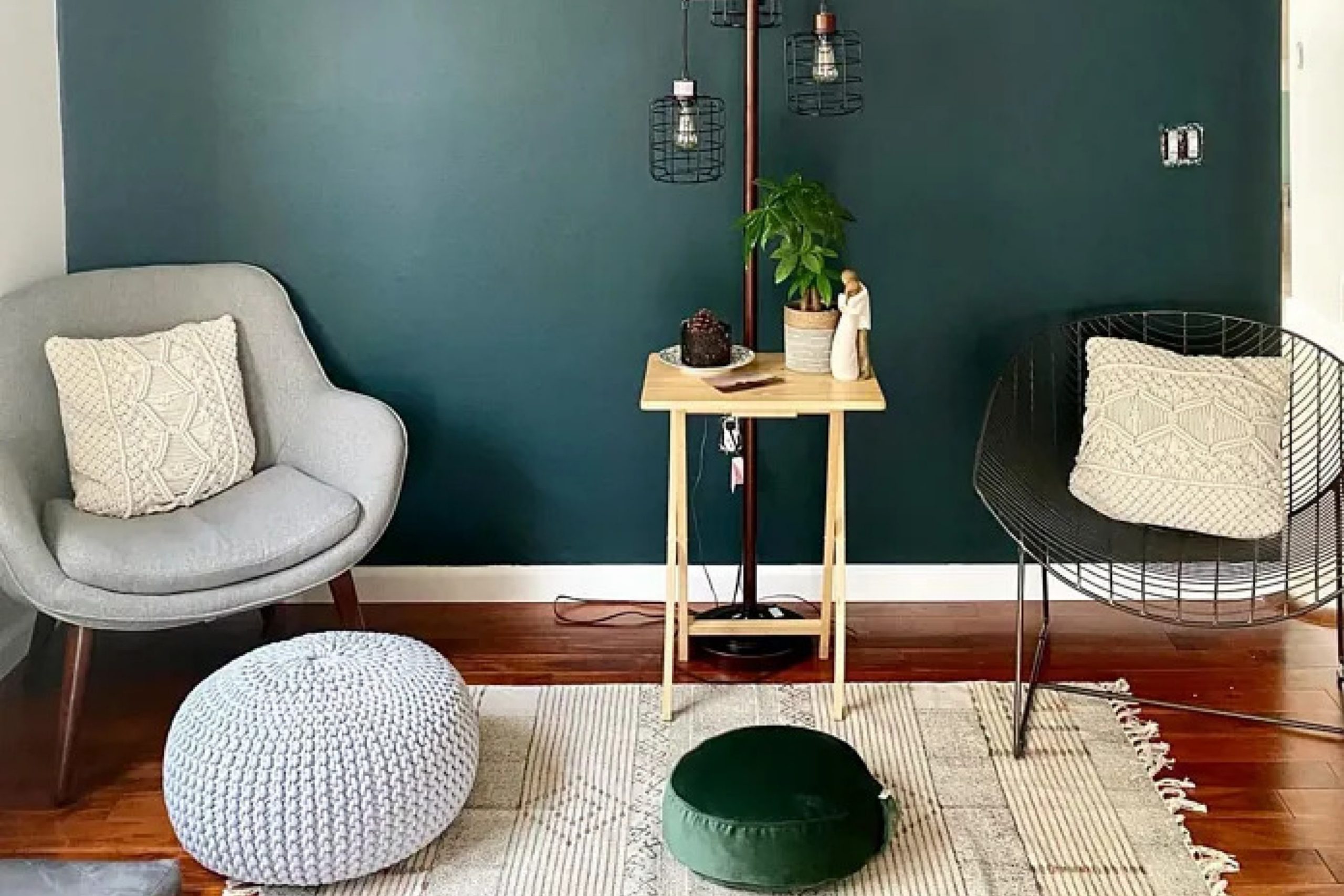
via plan-home.com
What Color Is Salamander 2050-10 by Benjamin Moore?
Salamander by Benjamin Moore is a rich, deep green color with hints of blue undertones. It evokes a feeling of being in a dense, lush forest, making it perfect for those who want to bring a touch of nature into their home. This sophisticated shade works well in various interior styles, including modern, traditional, and eclectic.
In modern interiors, Salamander can be used on accent walls to provide a bold contrast against neutral palettes, bringing depth and interest to the space. In traditional settings, it pairs nicely with warm woods and vintage furnishings, giving a classic yet fresh appearance.
For eclectic spaces, Salamander serves as an excellent backdrop, allowing a mix of patterns and colors to shine.
This color pairs beautifully with a range of materials and textures. It harmonizes with rich wood tones, such as walnut and mahogany, adding warmth and elegance. Metal finishes like gold and brass complement Salamander’s deep hue, providing a luxurious touch. Textures such as velvet and linen enhance its depth, offering a comfortable and inviting atmosphere.
Overall, Salamander is a versatile and timeless color. It can play a dominant role or serve as an elegant background, blending seamlessly with various design elements to create an inviting space.
housekeepingbay.com
Is Salamander 2050-10 by Benjamin Moore Warm or Cool color?
Salamander 2050-10 by Benjamin Moore is a deep, rich green color with hints of blue and black. It creates a bold statement in any room. This color works well in various spaces because it adds depth and warmth. In living rooms, Salamander provides a cozy and inviting atmosphere, perfect for gatherings and relaxation. When used in bedrooms, it offers a serene and calming environment, ideal for restful sleep.
In dining areas, Salamander can establish an elegant and sophisticated mood, complementing a wide range of furniture and décor styles. It pairs beautifully with neutral tones, metallic accents, and natural wood, allowing for versatile design options.
In well-lit rooms, Salamander takes on a more vibrant appearance, while in dimly lit areas, it exudes a more dramatic and intimate vibe. This adaptable color can enhance both traditional and modern homes, making it a versatile choice for anyone looking to add character and depth to their interiors.
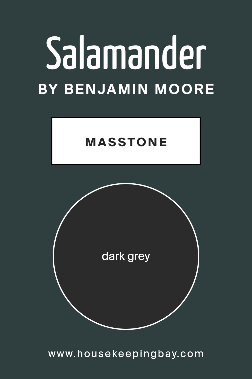
What is the Masstone of the Salamander 2050-10 by Benjamin Moore?
Salamander2050-10 by Benjamin Moore is a deep, dark grey color known for its calming and sophisticated feel. When used in homes, this color adds a sense of depth and warmth to different spaces. Its dark tone can make larger rooms feel cozier, while providing a strong background that highlights other colors and decor pieces.
Dark grey is versatile and works well with various design styles, including modern, industrial, or even traditional interiors. In living rooms or bedrooms, it can create a relaxing environment, perfect for unwinding after a long day.
Pairing Salamander2050-10 with lighter colors, such as whites or pastels, helps create a balanced look, making the space feel open yet inviting.
In areas like kitchens or dining rooms, dark grey can make a bold statement, especially when combined with metallic accents. Overall, this color offers an elegant and timeless touch to any home, enhancing the overall ambiance.
housekeepingbay.com
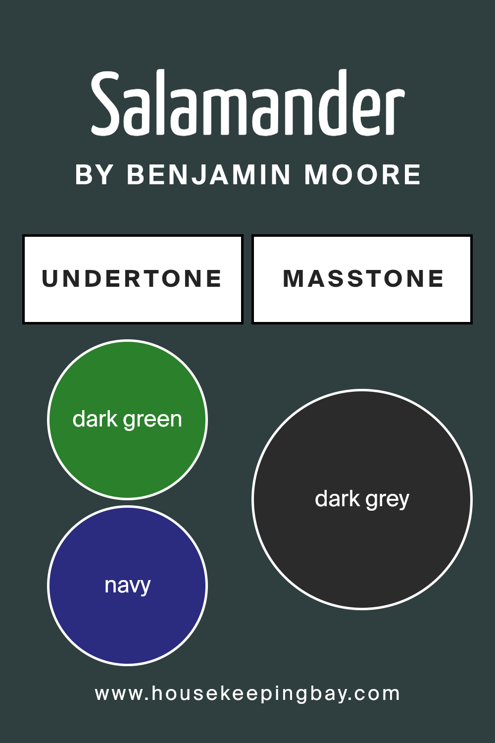
Undertones of Salamander 2050-10 by Benjamin Moore
Salamander 2050-10 by Benjamin Moore stands out for its rich, complex color with multiple undertones. At first glance, you might see a deep green, but a closer look reveals dark green, navy, and subtle brown notes. These undertones influence how Salamander appears in different lighting and settings.
The dark green and navy give Salamander a depth that feels both calming and sophisticated. This can bring a sense of nature indoors, grounding a space. The moment brown sneaks in, warmth enters, adding an inviting aspect to the room.
The dark turquoise and purple undertones contribute a unique, mysterious quality, making the space feel both vibrant and cozy.
Light plays a crucial role in how we perceive colors. Under natural daylight, Salamander may reveal its green dominance, producing an earthy feel. In dim or artificial light, the blue and brown undertones could show up more, impacting the room’s mood.
On interior walls, Salamander acts as a versatile backdrop. The olive and grey undertones help soften the color, making it adaptable to various schemes. It works well as a statement wall without overwhelming the room. Furniture and decor in lighter shades contrast beautifully, enhancing the color’s depth and creating a balanced interior.
housekeepingbay.com
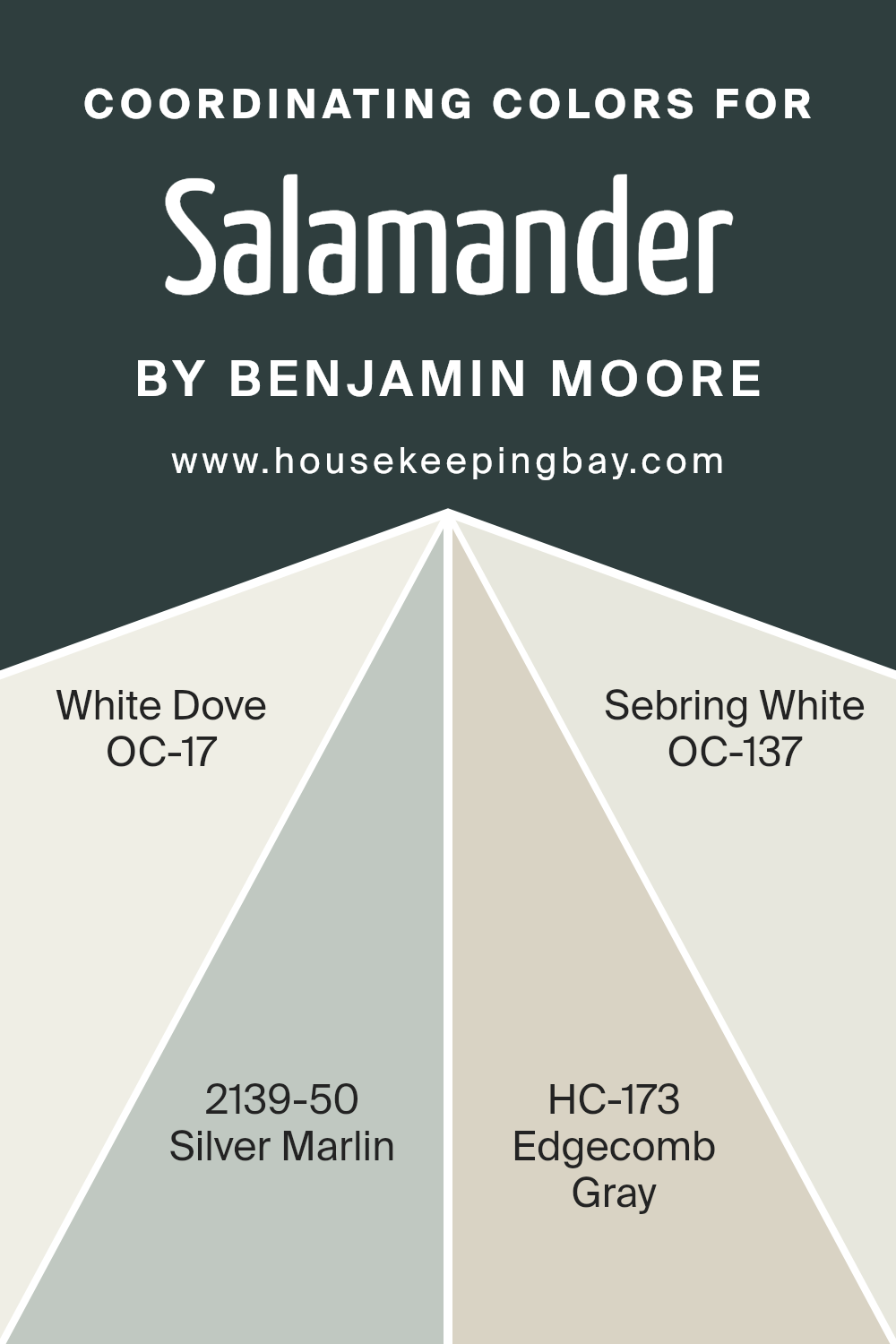
Coordinating Colors of Salamander 2050-10 by Benjamin Moore
Coordinating colors refer to hues that blend harmoniously with each other, creating a visually appealing and balanced palette. These colors complement a primary color—in this case, Salamander 2050-10 by Benjamin Moore, a deep, rich green—by providing contrast or continuity.
Coordinating colors are chosen based on their ability to enhance the primary color’s aesthetic in a space, offering depth and variety without overwhelming it. Each chosen shade plays a role in highlighting different aspects of the main color, yielding a sophisticated and cohesive look.
Together, these colors can define the mood and style of a room, making spaces feel more connected and thoughtfully designed.
White Dove OC-17 offers a gentle, warm white that seamlessly integrates with Salamander’s boldness, offering a crisp yet soft backdrop. Silver Marlin 2139-50 introduces a muted blue-green that ties in with Salamander’s undertones, adding a refreshing touch.
Edgecomb Gray HC-173 brings a warm, neutral gray, lending a subtle earthiness that bridges the colors beautifully. Sebring White OC-137, another soft white, introduces a slightly cooler tone that balances the warmth of the other neutrals.
Together, these hues create a palette that connects each element of a room, making it inviting and harmonious.
You can see recommended paint colors below:
- OC-17 White Dove
- 2139-50 Silver Marlin
- HC-173 Edgecomb Gray
- OC-137 Sebring White
housekeepingbay.com
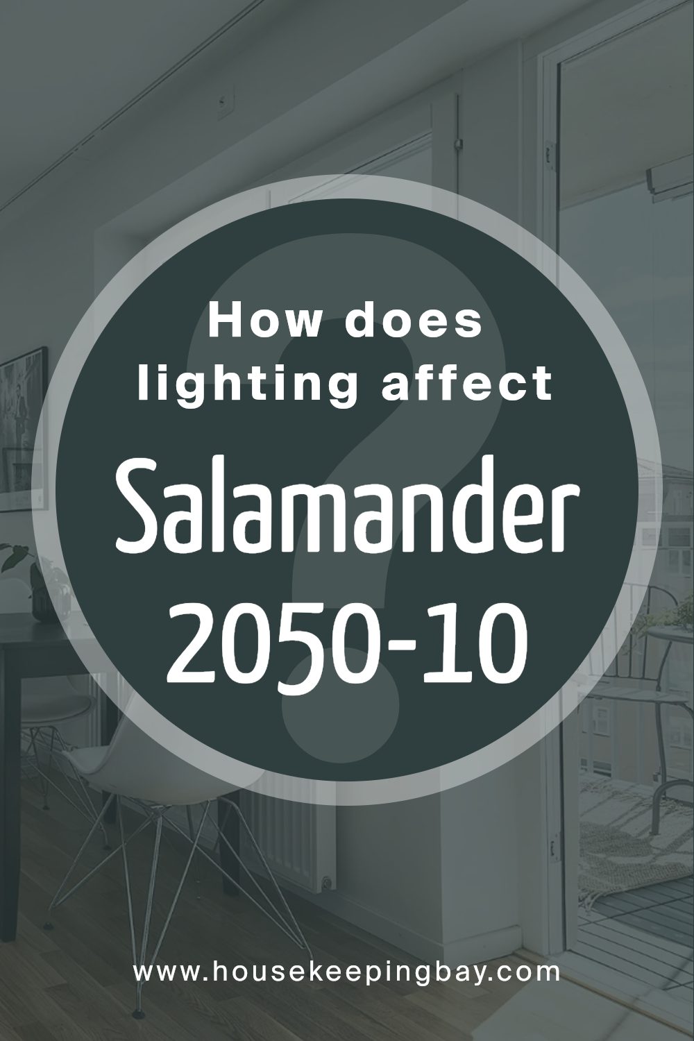
How Does Lighting Affect Salamander 2050-10 by Benjamin Moore?
Lighting plays a significant role in how we perceive colors. Different light sources can alter a color’s appearance, sometimes drastically. For example, natural sunlight tends to show colors in their truest form. However, the angle and intensity of the light change the way we see hues throughout the day.
Artificial light can change colors depending on its type. Incandescent bulbs often add warm, yellow tones, making colors appear warmer. Fluorescent lighting, on the other hand, can add a cooler, bluish tint.
Salamander 2050-10 by Benjamin Moore is a deep, rich green with blue undertones. In natural light, especially daylight, this color’s depth and richness become more evident. It looks lush and sophisticated. But in artificial light, its appearance can shift. Under warm incandescent bulbs, Salamander 2050-10 may seem cozier, with more emphasis on the green tones. Fluorescent lighting might highlight the blue undertones, making the color feel cooler and more modern.
In north-facing rooms, which receive cooler, indirect light, Salamander can appear darker and more subdued. The blue undertones might be more visible, making the room feel cooler.
In south-facing rooms, where the light tends to be warmer and more direct, Salamander 2050-10 will look brighter and more vibrant. The sunlight enhances the green tones, making the room feel inviting and lively.
East-facing rooms get warm morning light. In these rooms, Salamander can look welcoming and fresh in the morning, but as the day progresses and the light shifts, it might become a bit more muted.
In west-facing rooms, the light is softer in the morning and more intense in the afternoon and evening. Salamander will look richer and more intense later in the day when the stronger light enhances its deep green hue.
Understanding these nuances can help when choosing the right lighting and colors for your space.
housekeepingbay.com
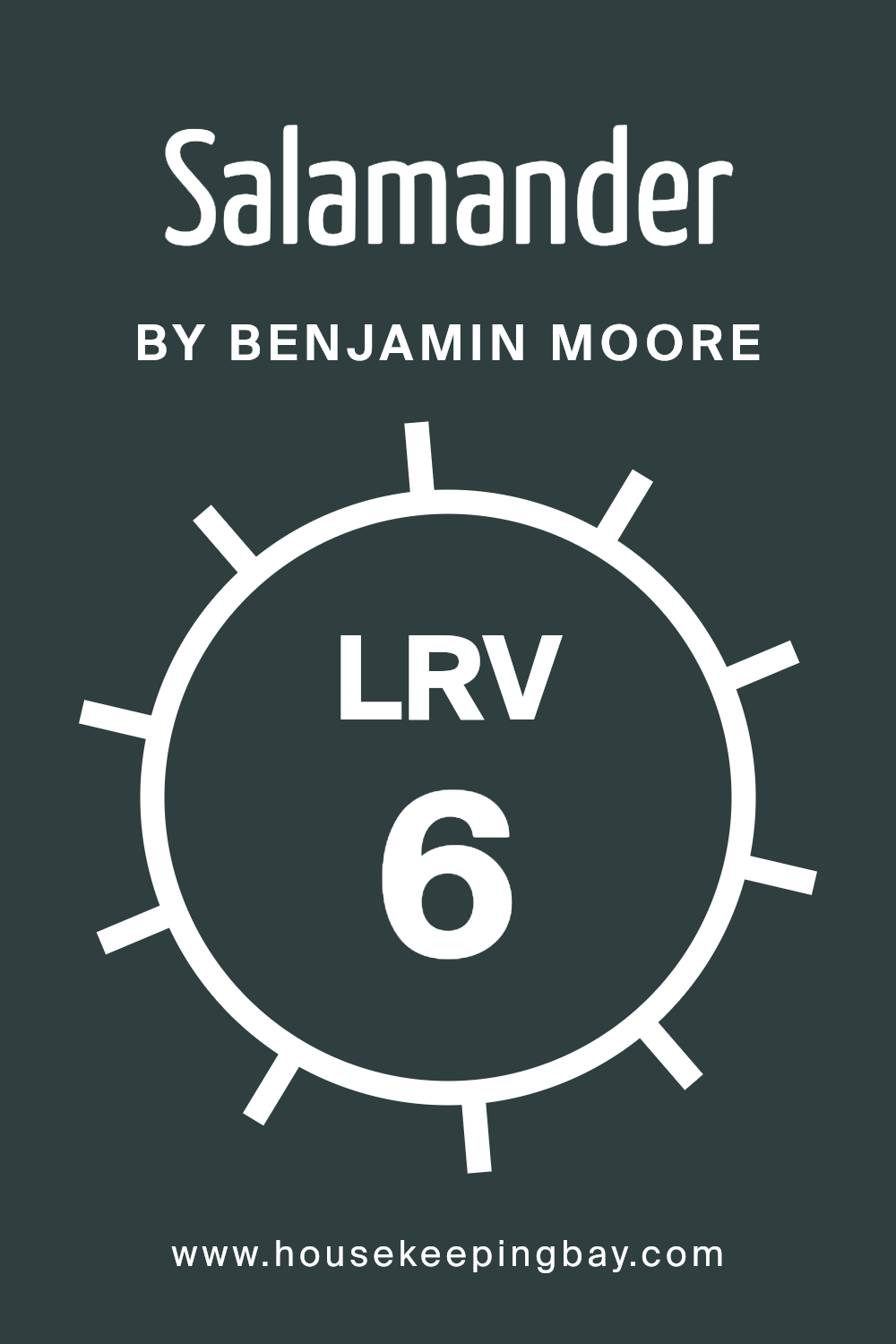
What is the LRV of Salamander 2050-10 by Benjamin Moore?
LRV stands for Light Reflectance Value, and it’s a number that shows how much light a color reflects. The scale runs from 0, which is absolute black and reflects no light, to 100, which is pure white and reflects all the light. The LRV helps you understand how dark or light a color will look on your walls.
If a color has a low LRV, it means it will absorb more light, making rooms feel cozy and darker. Conversely, a high LRV means the color reflects more light, which can make spaces feel brighter and more open.
LRV plays a key role when choosing paints, especially in deciding how a color will interact with both artificial and natural lighting in a room.
Salamander 2050-10 by Benjamin Moore has an LRV of 5.72, placing it very low on the LRV scale. This means the color is quite dark, absorbing a lot of light instead of reflecting it. When applied to walls, Salamander will create an intimate and enveloping atmosphere, suitable for rooms where a cozy or dramatic effect is desired.
The deep, rich nature of this color can significantly influence the mood of a space, making it a popular choice for accent walls or in settings where a bold statement is needed. However, it’s important to consider the natural lighting in the room; in poorly lit spaces, it might make the room feel smaller and darker.
housekeepingbay.com
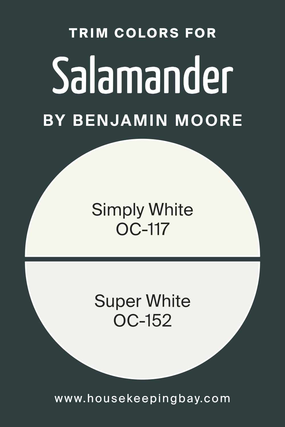
What are the Trim colors of Salamander 2050-10 by Benjamin Moore?
Trim colors are the specific hues used to paint moldings, baseboards, window casings, and doors. They play a crucial role in providing contrast and detail, thereby accentuating the architectural elements of a room. When used with Salamander 2050-10 by Benjamin Moore, which is a deep, rich green, the choice of trim colors can greatly influence the room’s overall ambiance.
Trim colors help to delineate spaces and add a polished, finished look to interiors. Using colors like Simply White and Super White can give the space a fresh, clean appearance, allowing the boldness of Salamander to stand out without the room feeling dark or overwhelming.
OC-117 Simply White is a warm, versatile white that adds a soft and inviting feel, making it an ideal trim color for rooms where Salamander is the primary wall color. Its subtle warmth can bring a touch of coziness that complements the richness of green.
On the other hand, OC-152 Super White offers a crisper, more pristine white that provides a classic and sharp contrast. This can highlight edges and corners, creating a clean, elegant aesthetic.
Both these whites work well as trim options, as they maintain their own character while allowing the deep tones of Salamander to take center stage.
You can see recommended paint colors below:
- OC-117 Simply White
- OC-152 Super White
housekeepingbay.com
Colors Similar to Salamander 2050-10 by Benjamin Moore
Similar colors are important in design because they create harmony and balance. Colors like Salamander by Benjamin Moore, along with Pacific Sea Teal, Midnight, Regent Green, and Blacktop, can work together beautifully to bring a sense of coherence to a space.
When these colors are used alongside one another, they help guide the eye smoothly across a room or design, avoiding any jarring transitions. This can make a space feel more inviting and well-coordinated, which is often what people aim for in their homes or workplaces.
These colors together give a feeling of depth and richness, adding an element of sophistication and comfort to any setting.
Pacific Sea Teal provides a cool, calming tone with its subtle teal hue, offering a fresh, modern appeal that adds a soft touch of color without overwhelming the senses. Midnight, deep and mysterious, evokes a sense of depth and space, serving as an excellent backdrop or accent to bring focus to lighter elements.
Regent Green, with its classic, deep green tone, brings a soothing, natural element to a room, grounding the space with its earthy feel.
Blacktop, a dark charcoal color, gives a strong, elegant look, perfect for creating contrast and adding depth to an overall design scheme. Together, these colors form a cohesive palette that’s both versatile and stylish.
You can see recommended paint colors below:
- 2049-10 Pacific Sea Teal
- 2131-20 Midnight
- 2136-20 Regent Green
- 2135-10 Blacktop

housekeepingbay.com
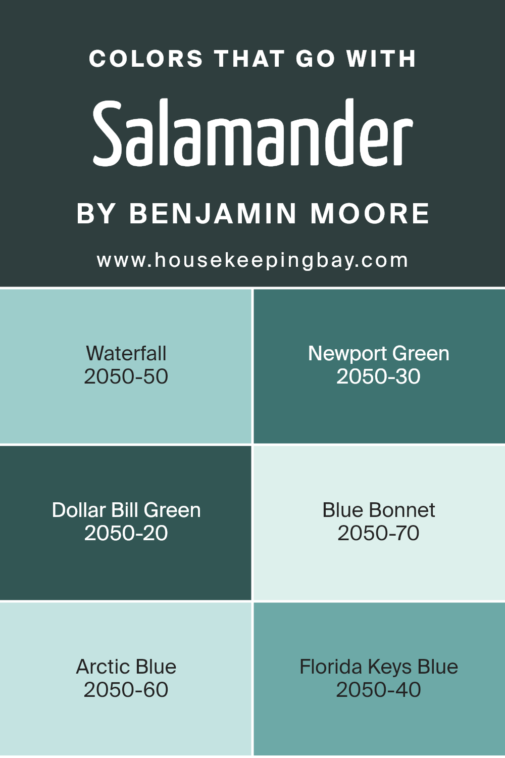
Colors that Go With Salamander 2050-10 by Benjamin Moore
Colors that go well with Salamander 2050-10 by Benjamin Moore are important because they create a balanced and harmonious space. Salamander is a deep, rich shade with green and blue undertones.
The colors Waterfall 2050-50, Newport Green 2050-30, Dollar Bill Green 2050-20, Blue Bonnet 2050-70, Arctic Blue 2050-60, and Florida Keys Blue 2050-40 complement Salamander by providing contrast and depth.
When placed together in a room, these colors can make a space feel both vibrant and inviting, offering visual interest without overwhelming the senses.
Waterfall is a refreshing light aqua that brings a sense of freshness. Newport Green is a medium teal that lights up a room without being overpowering. Dollar Bill Green is earthy and calm, adding a grounded touch.
Blue Bonnet is a soft blue with hints of periwinkle, adding a gentle, calming vibe. Arctic Blue is cool and crisp, creating a feeling of cleanliness and clarity.
Florida Keys Blue is bright and cheerful, evoking sunshine and sea breezes. Together, these colors create a beautiful palette that complements the richness of Salamander, allowing different moods and atmospheres to flourish in a space.
You can see recommended paint colors below:
- 2050-50 Waterfall
- 2050-30 Newport Green
- 2050-20 Dollar Bill Green
- 2050-70 Blue Bonnet
- 2050-60 Arctic Blue
- 2050-40 Florida Keys Blue
housekeepingbay.com
How to Use Salamander 2050-10 by Benjamin Moore In Your Home?
Salamander 2050-10 by Benjamin Moore is a rich, deep green color that adds a bold touch to any room. It’s perfect for those looking to add warmth and elegance to their space. This color works exceptionally well in living rooms and studies, where it can create a cozy and inviting atmosphere.
When used on walls, Salamander can give a room a dramatic and sophisticated look. Pairing it with light-colored furniture or accents like cream or beige can provide a beautiful contrast that brightens the room without overpowering it.
In a bedroom, Salamander can be calming and help create a restful environment. Accessorize with gold or brass accents to add a bit of luxury. For smaller spaces such as a bathroom or hallway, consider using Salamander in combination with lots of white to prevent the space from feeling too dark. Overall, Salamander 2050-10 brings depth and character to different areas of the home.
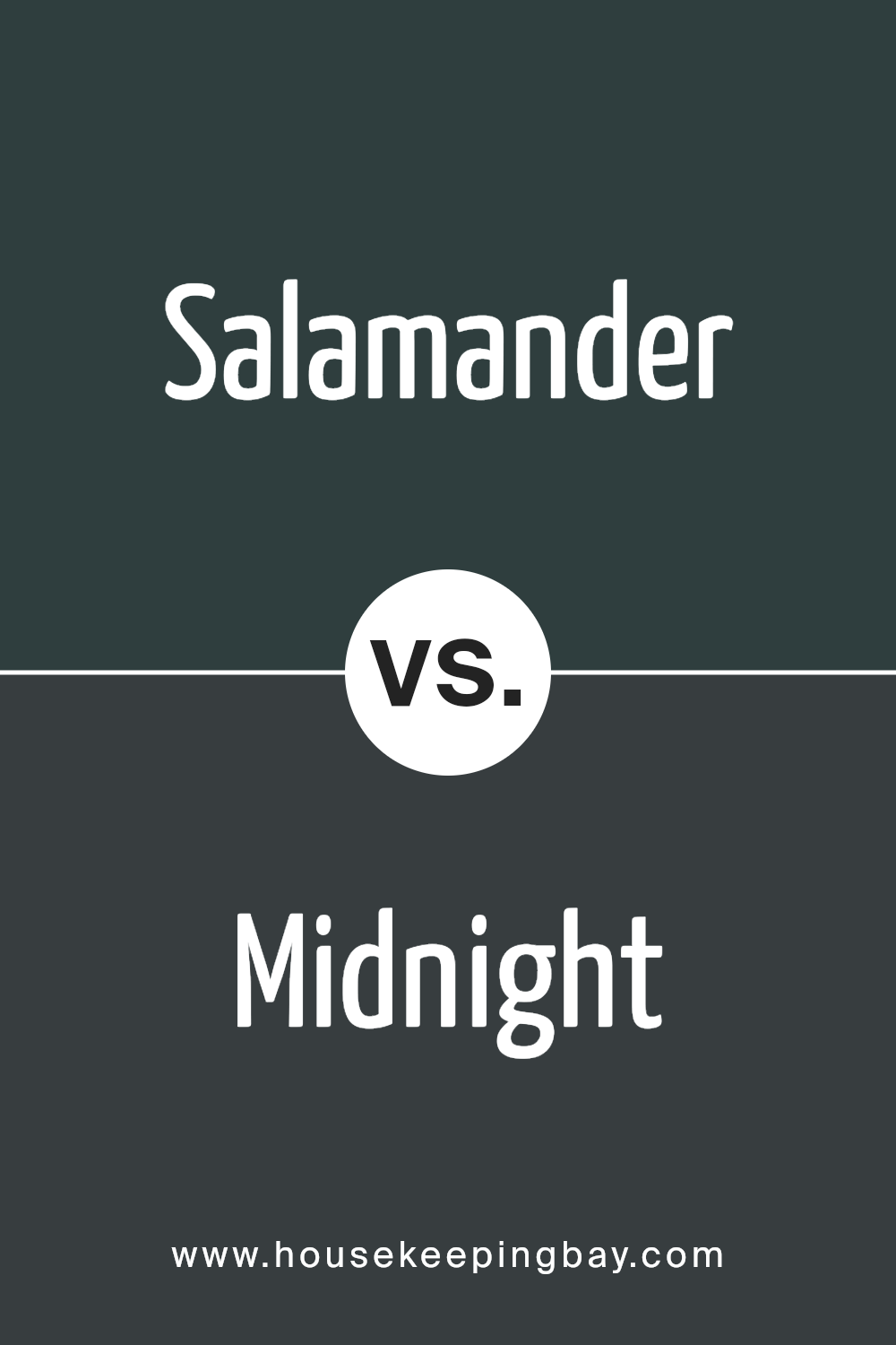
Salamander 2050-10 by Benjamin Moore vs Midnight 2131-20 by Benjamin Moore
Salamander 2050-10 by Benjamin Moore is a rich, vibrant shade of orange. It brings a sense of warmth and energy to a space. This color works well in areas where you want to inspire creativity or foster a lively atmosphere. Its brightness can make a room feel more inviting and enthusiastic.
Midnight 2131-20 by Benjamin Moore, in contrast, is a deep, dark blue. This color creates a sense of calm and sophistication. It is perfect for spaces where relaxation and peace are desired, such as bedrooms or cozy reading areas. Midnight’s depth can add a touch of elegance and can make a room feel more intimate.
While Salamander is vibrant and energizing, Midnight offers a soothing, classy feel. Salamander stands out with its warmth, and Midnight provides a cool, calming presence. Both colors have unique attributes, allowing them to cater to different moods and settings.
You can see recommended paint color below:
- 2131-20 Midnight
housekeepingbay.com
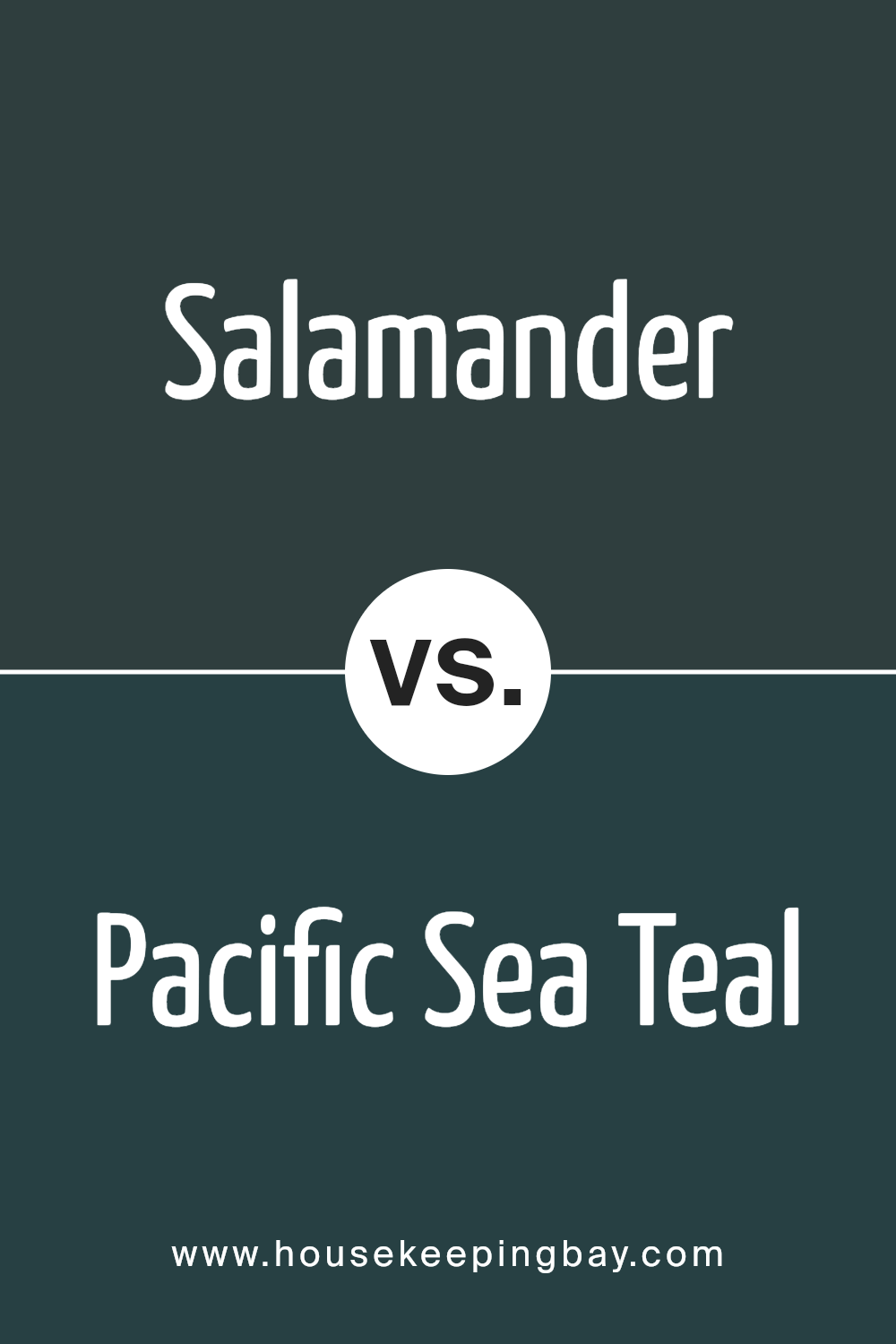
Salamander 2050-10 by Benjamin Moore vs Pacific Sea Teal 2049-10 by Benjamin Moore
Salamander 2050-10 by Benjamin Moore is a deep, earthy color with a rich green base, almost reminiscent of a lush forest. It radiates warmth and provides a cozy, enveloping feel to a room. This shade works well in spaces that benefit from a grounded, natural atmosphere. It can create an intimate setting, making it perfect for a bedroom or a study.
Pacific Sea Teal 2049-10, in contrast, is a vibrant, aquatic tone with a bluish-green hue. This lively color brings a refreshing and energetic vibe to any space. It invokes thoughts of ocean waves and clear skies, adding a sense of openness and airy brightness to interiors.
This color is ideal for spaces meant to feel open and invigorating, such as a bathroom or a living room.
While Salamander’s richness offers a cozy retreat, Pacific Sea Teal provides a burst of brightness and energy, catering to different moods and settings.
You can see recommended paint color below:
- 2049-10 Pacific Sea Teal
housekeepingbay.com
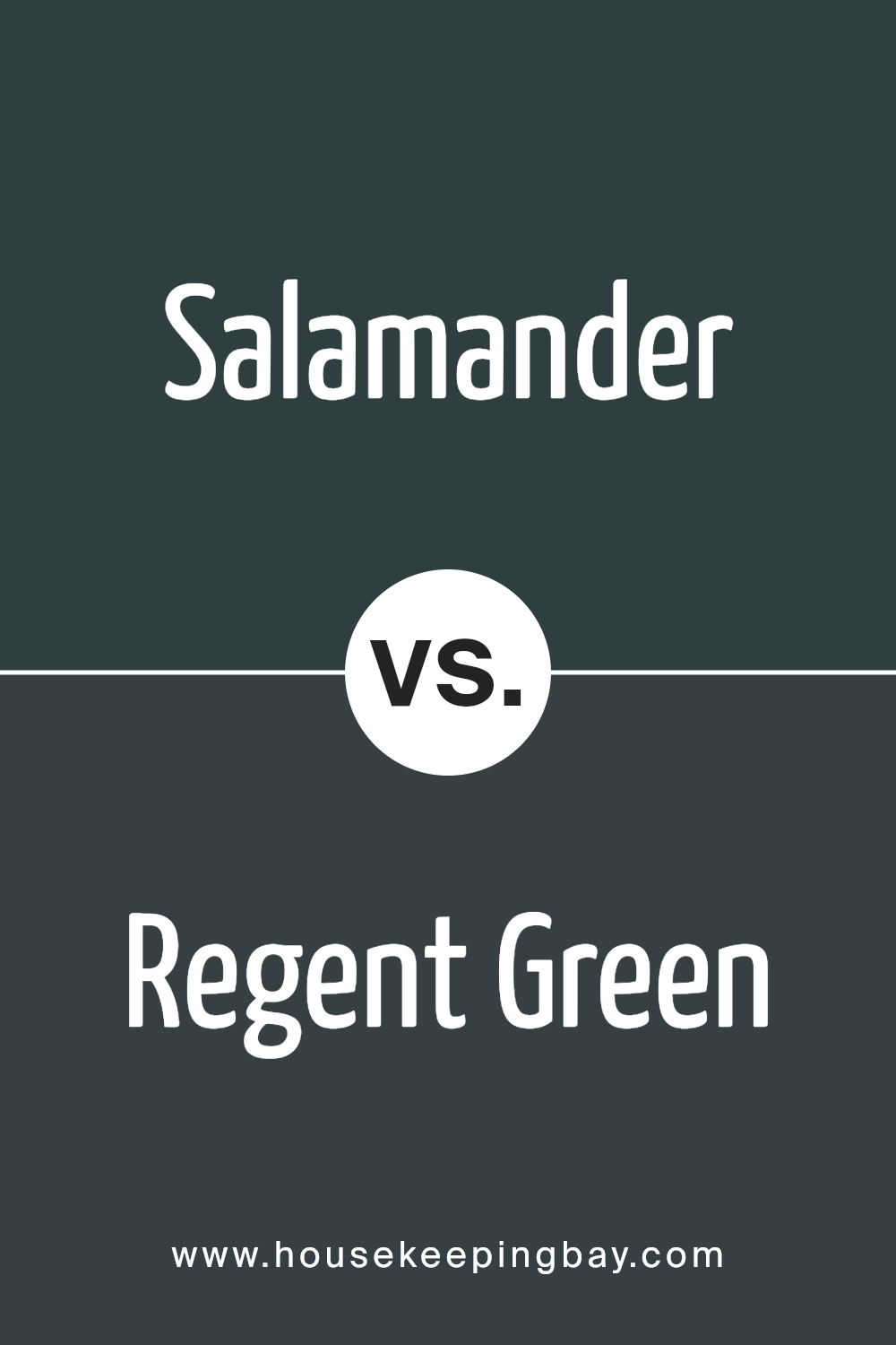
Salamander 2050-10 by Benjamin Moore vs Regent Green 2136-20 by Benjamin Moore
Salamander 2050-10 by Benjamin Moore is a vibrant and warm shade with a mix of orange and red tones, creating a lively atmosphere. It adds energy and brightness to a space, perfect for areas where you want to feel invigorated and inspired. Salamander can make a room feel cozy and inviting due to its warmth.
Regent Green 2136-20 by Benjamin Moore, however, offers a deep, rich green. This color provides a calm and sophisticated feel. It evokes a sense of nature and can make spaces feel more grounded and serene. Regent Green is versatile, functioning well as an accent or a main color for those wanting a more dramatic look.
Pairing these colors together results in an interesting contrast—one being lively and energizing, and the other exuding calm. They can be used creatively to balance a room, with Salamander bringing warmth and Regent Green offering depth and tranquility.
You can see recommended paint color below:
- 2136-20 Regent Green
housekeepingbay.com
Salamander 2050-10 by Benjamin Moore vs Blacktop 2135-10 by Benjamin Moore
Salamander 2050-10 by Benjamin Moore presents a deep, dark green with strong blue undertones. It conjures images of dense forests and mysterious landscapes. Its rich tone adds depth and sophistication to any room, making it an excellent choice for accent walls or spaces where a moody atmosphere is desired.
Blacktop 2135-10 by Benjamin Moore, in contrast, offers a charcoal black with slight gray hints. This neutral yet bold color brings a sleek, modern feel to environments. It’s versatile, effortlessly fitting into different design themes from industrial to minimalist.
When comparing the two, Salamander brings color through its green-blue hue, while Blacktop keeps things grounded with its dark neutral tone. Salamander can evoke feelings of growth and mystery, whereas Blacktop channels strength and simplicity.
Both share depth and intensity but differ in undertones and the emotions they inspire. Salamander leans toward nature-inspired warmth, while Blacktop remains cool and sleek.
You can see recommended paint color below:
- 2135-10 Blacktop
housekeepingbay.com
Conclusion
2050-10 Salamander by Benjamin Moore is a deep, moody green that brings a rich and sophisticated feel to any space. Its earthy undertones add depth and warmth, making it a striking yet inviting choice.
This color works beautifully in both modern and classic interiors, offering a bold statement without feeling overwhelming.
Inspired by nature, Salamander echoes the richness of forest greens and deep shadows, creating a cozy yet refined atmosphere.
Whether used as an accent or a dominant shade, Salamander pairs well with a variety of textures and materials, allowing for endless design possibilities. It anchors a space effortlessly, making it a go-to for those seeking depth and character in their home.
housekeepingbay.com
Ever wished paint sampling was as easy as sticking a sticker? Guess what? Now it is! Discover Samplize's unique Peel & Stick samples. Get started now and say goodbye to the old messy way!
Get paint samples


