Rockport Gray HC-105 by Benjamin Moore
Classic Beauty for Any Room
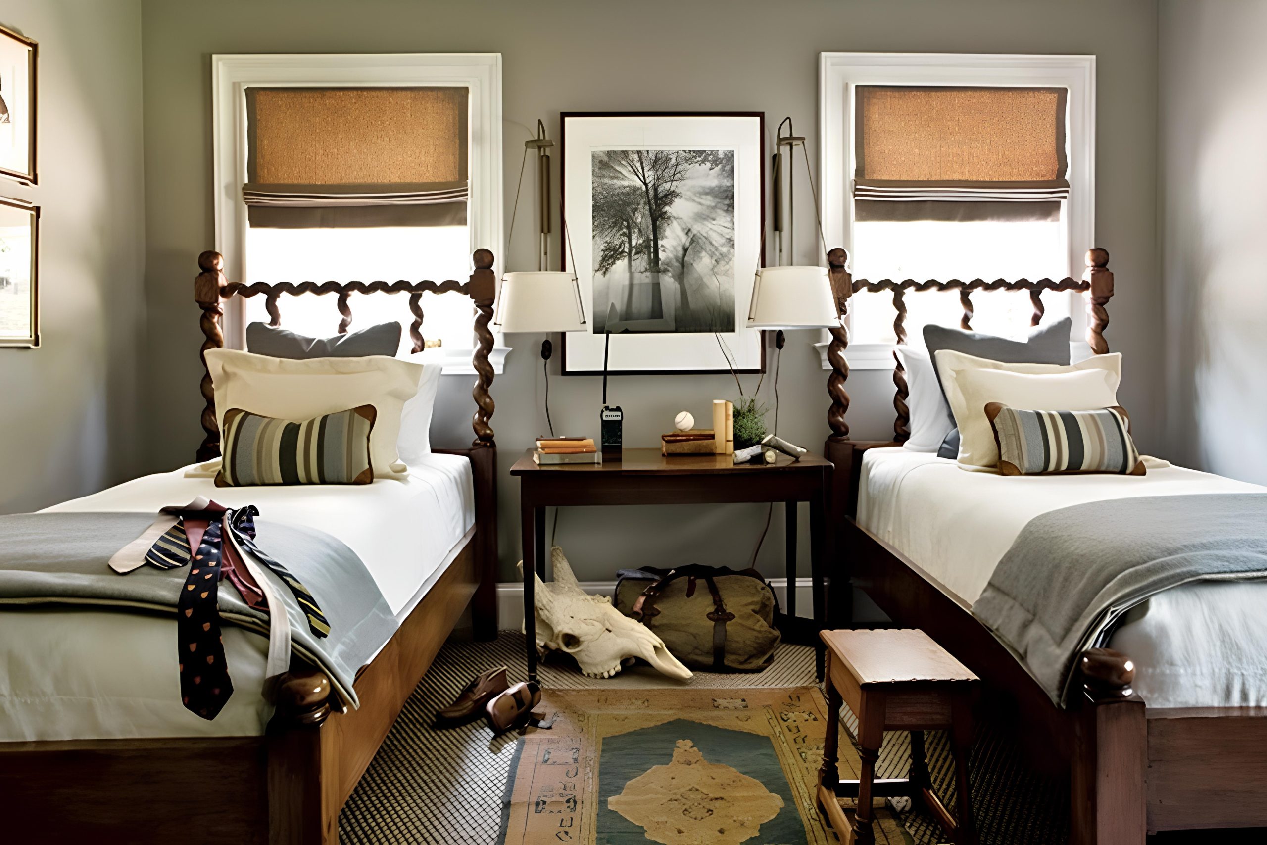
Rockport Gray HC-105 by Benjamin Moore is a paint color that easily fits into various styles and settings. Imagine a shade that isn’t just one-dimensional; it has a blend of warmth and sophistication. This color has a unique way of changing with the light. In bright sunlight, it offers a soft and welcoming aura, while in dimmer settings, it can add serious depth and character to any room.
Think of your living room or kitchen with walls that seem to go with everything. That’s what Rockport Gray brings to your home. It complements both modern and classic looks.
Pair it with light furniture for a clean, airy feel, or mix it with dark wood and leather for a cozier environment.
It’s neutral enough to let other colors stand out but has enough personality tomake a statement on its own.
Whether you’re redecorating a whole room or just adding a feature wall, Rockport Gray provides a great backdrop. It’s a color that feels both relaxing and sophisticated, ideal for someone who wants their home to feel current yet timeless. Think of it as the perfect shade to create a warm, welcoming atmosphere without overwhelming the senses.
via roomlust.wordpress.com
What Color Is Rockport Gray HC-105 by Benjamin Moore?
Rockport Gray HC-105 by Benjamin Moore is a versatile, medium-toned gray with subtle warm undertones, making it an appealing choice for many interior settings. It provides a balanced, neutral backdrop that complements various styles, from traditional to modern. Its warmth helps it suit cozy spaces, while its sophistication adapts well to sleek, contemporary designs.
In traditional interiors, Rockport Gray enhances classic wood finishes and richly textured textiles. Picture it alongside dark wood furniture, vintage rugs, and velvet upholstery, where it grounds the space without overpowering.
In modern settings, the color pairs beautifully with metal accents, minimalist decor, and monochromatic palettes, providing a soft, neutral counterpoint to sharper elements.
This gray shines in living rooms and bedrooms, creating a soothing, welcoming atmosphere. Its adaptability also works in kitchens and bathrooms, seamlessly blending with white cabinets and granite or marble countertops.
For materials, consider pairing Rockport Gray with warm woods, brushed metals, natural stones, and woven textiles. These combinations highlight its warm undertones and add depth to the room.
Rockport Gray HC-105’s adaptability makes it a timeless choice, balancing elegance with modern sensibility, and enhancing any space with comfort and style.
housekeepingbay.com
Is Rockport Gray HC-105 by Benjamin Moore Warm or Cool color?
Rockport Gray HC-105 by Benjamin Moore is a versatile and timeless color choice for homes. This shade, a medium gray with warm undertones, works well in various spaces. It has a subtle, sophisticated look that can help create a cozy atmosphere in living rooms, bedrooms, and kitchens alike.
Unlike cooler grays, Rockport Gray has just enough warmth to make rooms feel inviting, without overpowering with intensity. It pairs beautifully with both neutral and bold colors, allowing homeowners to personalize their decor easily.
For example, white trim or furniture can highlight its depth, while bright accents like orange or teal can offer a lively contrast.
Lighting plays a significant role in how Rockport Gray appears in a room. Natural light tends to bring out its airy side, while dim, artificial lighting can create an intimate, snug vibe.
Overall, Rockport Gray is an adaptable color choice that complements a wide range of styles and moods.
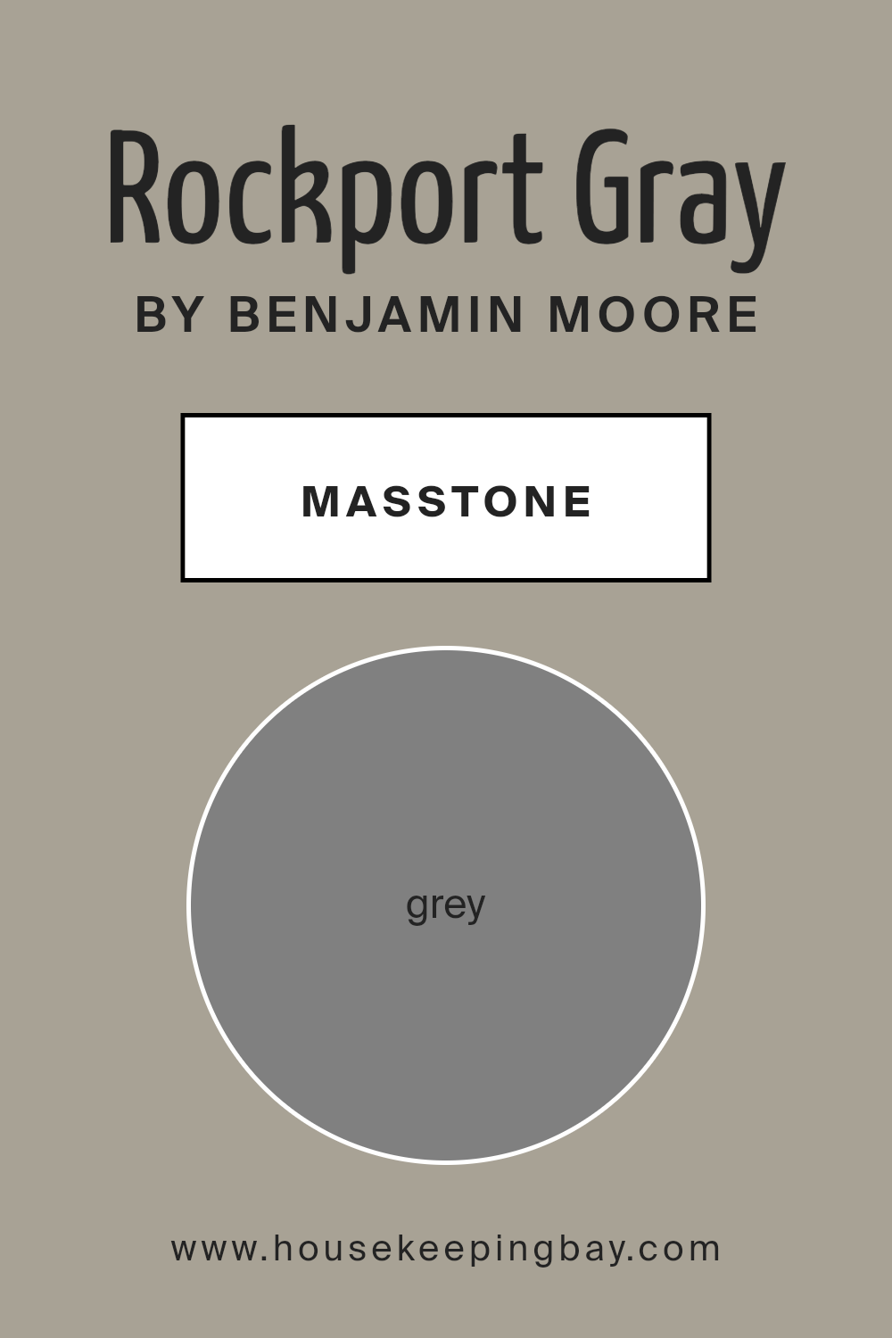
What is the Masstone of the Rockport Gray HC-105 by Benjamin Moore?
Rockport Gray HC-105 by Benjamin Moore is a versatile and contemporary paint color. Its masstone, a perfect gray (#808080), serves as its underlying foundation. This balanced gray color works well in homes because it provides a neutral backdrop for various styles and decor. In your living spaces, Rockport Gray can create a calm and soothing atmosphere, making it ideal for areas where you relax or entertain guests.
In living rooms, it complements both modern and traditional furniture, allowing you to mix pieces while maintaining a cohesive look. In bedrooms, this shade helps with creating a peaceful feeling, conducive to rest and relaxation.
Kitchens and bathrooms benefit from its neutral tone, as it pairs well with both light and dark cabinets, as well as different countertop materials.
Moreover, Rockport Gray can enhance natural light, giving spaces a warm and inviting feel without overwhelming them. This makes it a popular choice for many homeowners seeking a balanced and timeless look.
housekeepingbay.com
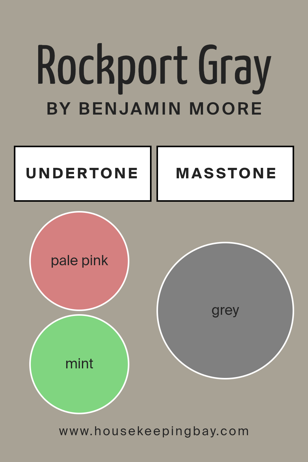
Undertones of Rockport Gray HC-105 by Benjamin Moore
Rockport Gray HC-105 by Benjamin Moore is a sophisticated, versatile color. Its undertones significantly influence how we perceive it. Undertones are subtle hues that lie beneath the main color, affecting how it looks in different lights. For Rockport Gray, undertones include hints of pale pink, mint, pale yellow, light gray, and more.
On interior walls, these undertones can change the mood of a room. The pale pink and light gray undertones bring a warm, cozy feeling, making spaces feel inviting.
Meanwhile, the mint and pale yellow add a fresh and lively touch, which can make a room feel more open and airy. If natural light floods a room, the lilac and light blue undertones might become more noticeable, adding a subtle coolness.
Different lighting conditions can make these undertones stand out. For example, in morning sunlight, the warm undertones might be more visible, creating a soft and soothing effect.
In artificial light, cooler undertones like gray and blue could become dominant, giving the space a calm and relaxed vibe.
Choosing Rockport Gray involves considering how its undertones interact with the room’s lighting and decor. The color’s chameleon-like nature can adapt, creating diverse moods and enhancing overall ambiance.
housekeepingbay.com
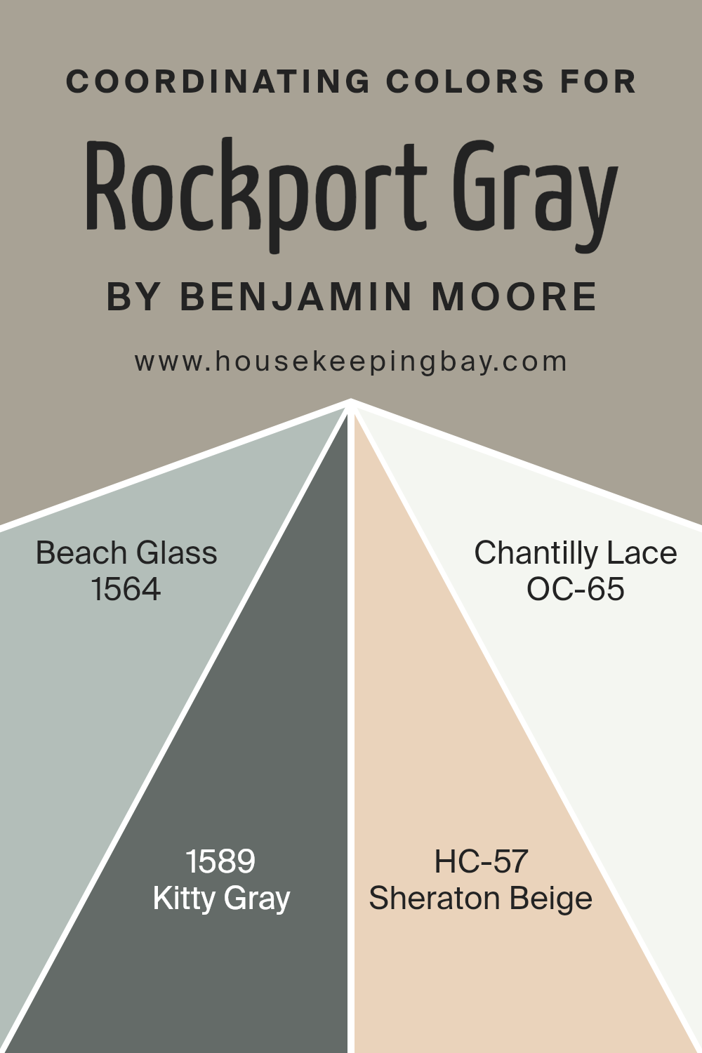
Coordinating Colors of Rockport Gray HC-105 by Benjamin Moore
Coordinating colors are chosen to complement a primary shade, creating a harmonious and visually appealing palette. They often share similar undertones or provide a pleasing contrast to the main color, enhancing the overall aesthetic.
In the case of Rockport Gray HC-105 by Benjamin Moore, several shades can beautifully accompany it. Beach Glass 1564 is a soft, muted blue with a touch of green, reminiscent of a serene seashore. Its soothing presence works well with the grounding effect of Rockport Gray.
Kitty Gray 1589 offers a gentle, neutral gray that pairs effortlessly, providing a clean and subtle backdrop that ensures your spaces feel cohesive.
Sheraton Beige HC-57 adds warmth with its classic sandy hue. This color introduces a sense of earthiness that complements the strong, stable nature of Rockport Gray. It can create inviting spaces that feel both cozy and light. Lastly, Chantilly Lace OC-65 is a crisp, clean white that contrasts beautifully with Rockport Gray.
This bright shade brings a refreshing lightness, enhancing the sophisticated essence of the entire palette. By combining these complementary colors, you can achieve a well-balanced look that adds depth, warmth, and a touch of elegance to your surroundings.
You can see recommended paint colors below:
- 1564 Beach Glass
- 1589 Kitty Gray
- HC-57 Sheraton Beige
- OC-65 Chantilly Lace
housekeepingbay.com
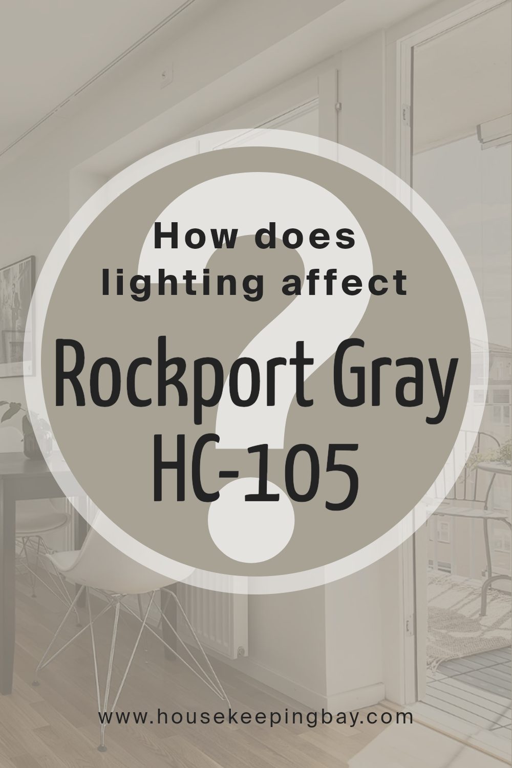
How Does Lighting Affect Rockport Gray HC-105 by Benjamin Moore?
Lighting plays a crucial role in how we perceive colors. It can change the appearance and mood of a room significantly. Rockport Gray HC-105 by Benjamin Moore is a versatile color with a mix of warm and cool undertones that can look different depending on the light.
In natural light, Rockport Gray can appear more neutral and balanced. In artificial light, especially if it’s warm, the gray may seem slightly cozier with hints of beige coming through. Cool artificial light might emphasize its gray-blue tones.
Now, let’s talk about how Rockport Gray looks in different facing rooms:
- 1. North-facing rooms: These rooms usually have cooler, blue-toned light. Rockport Gray might appear cooler in these rooms, with its blue undertones becoming more noticeable. This can create a calm and serene atmosphere, but it might look a bit darker due to the lack of warm light.
- 2.South-facing rooms: These get a lot of natural light throughout the day, often with warmer tones. In such spaces, Rockport Gray can look warmer, as the sunlight brings out its subtle beige undertones. The color tends to brighten up, making rooms feel inviting and comfortable.
- 3.East-facing rooms: Morning light in these rooms is bright and can have some warm qualities. Rockport Gray might look fresh and slightly warmer in the morning. As the day goes on, and natural light decreases, the color can appear to become cooler and somewhat darker.
- 4.West-facing rooms: These rooms receive warmer light in the afternoon and evening. During this time, Rockport Gray may reflect more warmth, which can bring out its taupe undertones. Early in the day, when the light is cooler, it might look more neutral or grayish.
Understanding the impact of lighting can help you decide how Rockport Gray will fit your space, ensuring it achieves the desired look and feel.
housekeepingbay.com
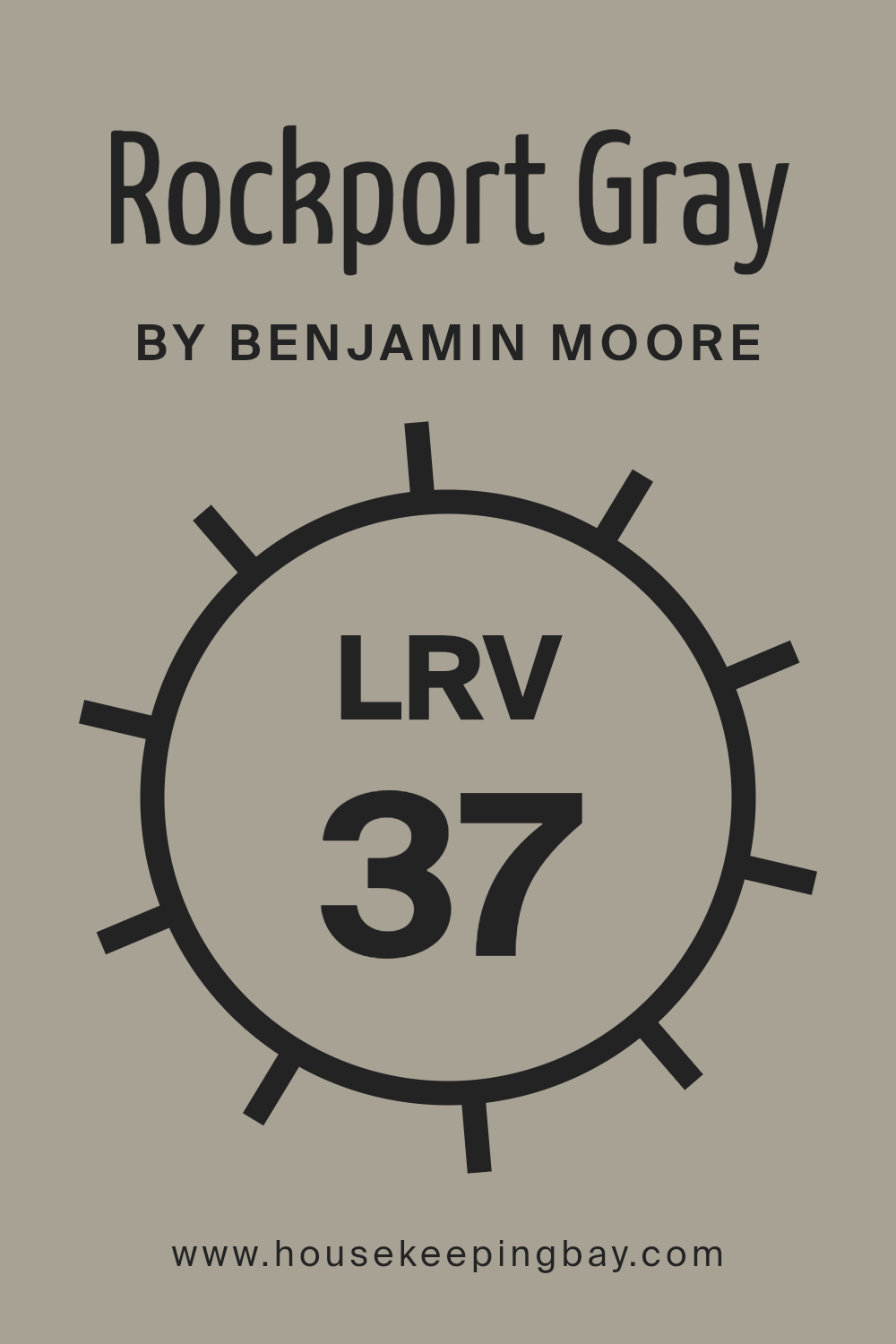
What is the LRV of Rockport Gray HC-105 by Benjamin Moore?
Light Reflectance Value, or LRV, measures how much light a color on a surface can bounce back to our eyes. It uses a scale from 0 to 100, where 0 is completely black, absorbing all light, and 100 is pure white, reflecting all light. If a color has a low LRV, closer to 0, it absorbs more light, making it look darker in a space.
In contrast, a higher LRV means the color reflects more light, appearing brighter. Understanding LRV helps us predict how paint will look on walls, especially in rooms with different lighting. It tells us if a space will feel darker or lighter, based on how much natural or artificial light it gets.
Rockport Gray HC-105, with an LRV of 36.61, reflects a moderate amount of light. This means it’s more on the darker side of the scale, without being too intense like very dark colors. In spaces with lots of light, Rockport Gray balances well, providing warmth without overwhelming brightness.
In dimmer spaces, it creates a cozy, intimate feel since it absorbs more light. Walls painted this color will appear rich and sophisticated, offering a grounded and stable backdrop.
It provides flexibility, working well in both small and large areas, but looks its best when paired with contrasting lighter accents to prevent the space from feeling too enclosed.
housekeepingbay.com
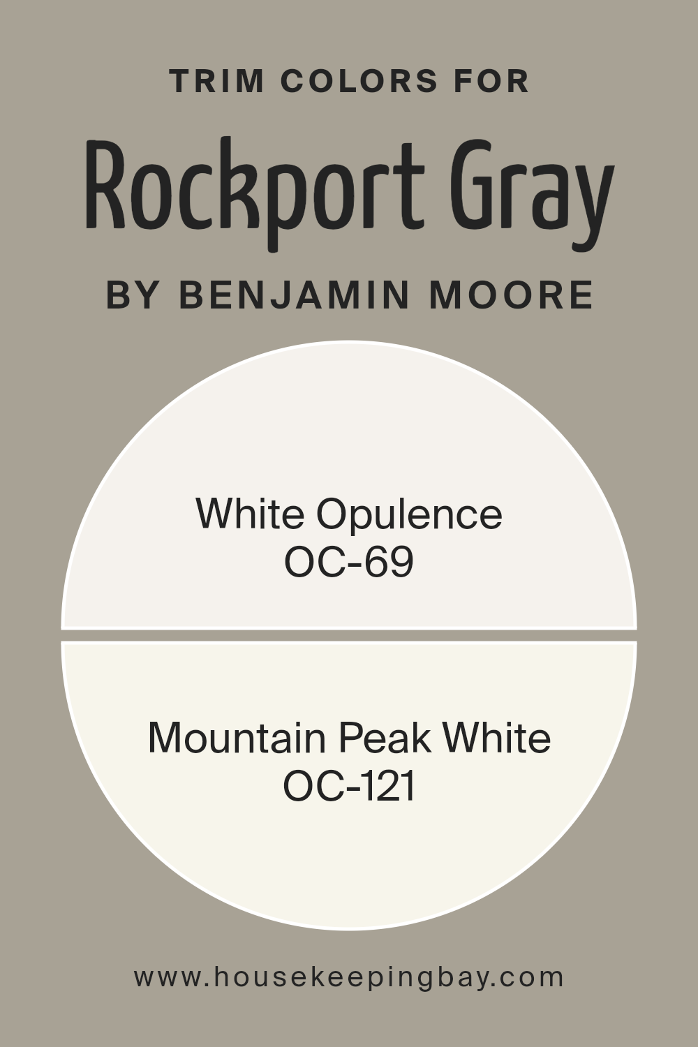
What are the Trim colors of Rockport Gray HC-105 by Benjamin Moore?
Trim colors are the paint colors used on baseboards, moldings, and other details in a room to provide contrast and highlight the main wall color. They help define the boundaries and can enhance or balance the overall look of a space. For Rockport Gray HC-105 by Benjamin Moore, trim colors play a crucial role in emphasizing its warm undertones.
This particular gray has a comforting and sophisticated vibe, and using the right trim can make it stand out even more while maintaining harmony within the room.
Choosing complementary trim colors like OC-69 White Opulence or OC-121 Mountain Peak White can enrich the visual appeal by creating a subtle yet noticeable contrast against Rockport Gray.
OC-69 White Opulence is a soft, warm white that gives a gentle and elegant finish. It is perfect for trimming as it adds a touch of warmth without overshadowing the main wall color. On the other hand, OC-121 Mountain Peak White is a crisp, clean white with a hint of warmth.
It provides a bright and fresh contrast to the more subdued Rockport Gray, enhancing its character while keeping the room feeling open and airy. Both these trim colors work well with Rockport Gray, providing either a soft transition or a crisp delineation, depending on the desired effect.
This careful selection of trim colors is important because it helps to tie the room’s overall aesthetics together while ensuring each color supports and highlights the other.
You can see recommended paint colors below:
- OC-69 White Opulence
- OC-121 Mountain Peak White
housekeepingbay.com
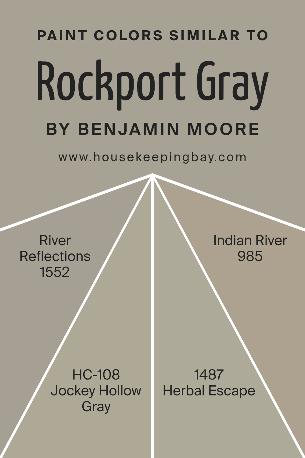
Colors Similar to Rockport Gray HC-105 by Benjamin Moore
Similar colors play an important role in design because they allow for the creation of harmonious and balanced spaces. When colors are close in tone or hue, they blend smoothly, providing a subtle yet cohesive look. This is especially true for neutral shades like Rockport Gray HC-105 by Benjamin Moore.
River Reflections 1552, for example, offers a soft, muted gray with a touch of blue that complements Rockport Gray, adding a gentle, calming effect. Jockey Hollow Gray HC-108 is another similar shade with a slightly warmer undertone, bringing in an earthy quality that pairs seamlessly with its cooler gray counterparts.
These colors can work together to maintain a consistent feel throughout a space without overwhelming the senses.
Herbal Escape 1487 introduces a hint of green, adding a touch of freshness and connecting the space to nature. It works well as an accent or in combination with the other grays to provide a subtle contrast while remaining part of the overall palette.
Indian River 985 rounds out the group with a deeper, richer tone, adding depth and sophistication.
This color provides an anchor that can ground the lighter shades, giving a sense of stability. Together, all these colors complement Rockport Gray and each other, offering flexible options for creating a unified and inviting environment.
You can see recommended paint colors below:
- 1552 River Reflections
- HC-108 Jockey Hollow Gray
- 1487 Herbal Escape
- 985 Indian River
housekeepingbay.com
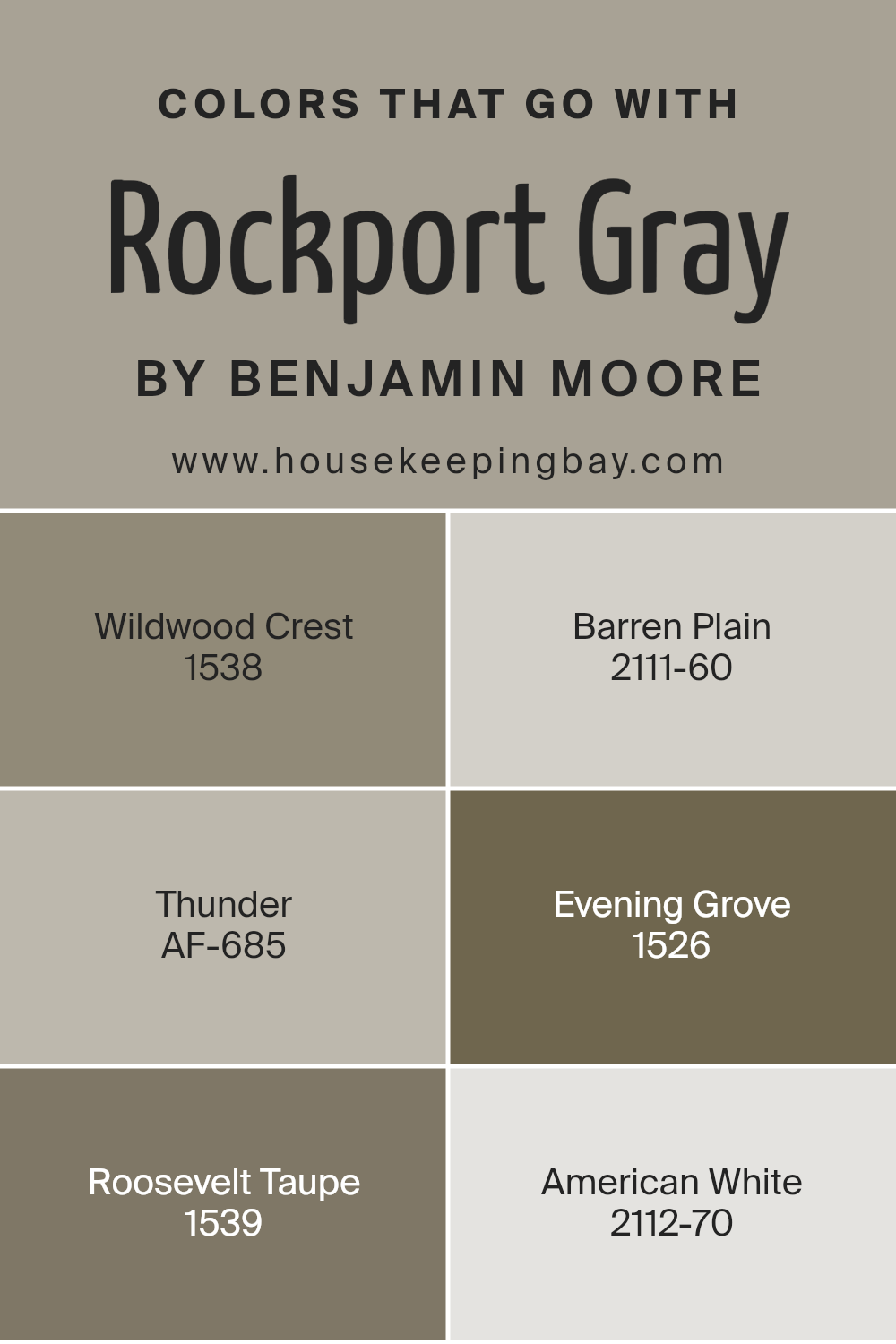
Colors that Go With Rockport Gray HC-105 by Benjamin Moore
Using colors that complement Rockport Gray HC-105 by Benjamin Moore enhances the beauty of any space. Rockport Gray is a versatile shade that provides a sturdy, neutral backdrop, allowing other colors to add dimension and warmth.
For instance, Wildwood Crest (1538) offers an earthy green that provides a touch of nature, creating a harmonious balance with the gray’s grounded feel. Barren Plain (2111-60), a soft and pale gray, adds a light and airy contrast, giving spaces a gentle lift without overwhelming them.
Turning to Thunder (AF-685), its deep, moody gray tones pair seamlessly with Rockport Gray, introducing depth and a cozy, enveloped ambiance. Evening Grove (1526) brings a rich, warm forest color, perfect for adding an element of tranquility and connection to the natural world, making for a soothing environment.
Roosevelt Taupe (1539) enriches any room with its warm, taupe undertones that harmonize with the gray’s sophisticated appeal. Finally, American White (2112-70) adds a touch of brightness and clean elegance, allowing Rockport Gray and its companion colors to shine.
Together, these colors complement Rockport Gray, elevating the overall look and feel of any room, creating spaces that are both inviting and visually satisfying.
You can see recommended paint colors below:
- 1538 Wildwood Crest
- 2111-60 Barren Plain
- AF-685 Thunder
- 1526 Evening Grove
- 1539 Roosevelt Taupe
- 2112-70 American White
housekeepingbay.com
How to Use Rockport Gray HC-105 by Benjamin Moore In Your Home?
Rockport Gray HC-105 by Benjamin Moore stands as a versatile and warm gray paint color. Its subtle undertones make it adaptable to various settings. When considering how to use it at home, think of spaces that benefit from a cozy yet sophisticated ambiance. This gray works well in living rooms or bedrooms, providing a soothing backdrop that complements both modern and traditional decor.
For kitchens, Rockport Gray can accentuate cabinets, creating a stylish and clean look. Pairing it with white trim or accents can add contrast and depth, making the gray pop without overwhelming the room. In dining areas, this hue fosters a welcoming environment, ideal for gatherings or quiet meals.
Additionally, this color suits entryways and hallways, where it introduces warmth without overpowering. Lastly, accessorizing with varied textures or pops of color, like soft blues or earthy tones, can highlight Rockport Gray’s versatility throughout a home.
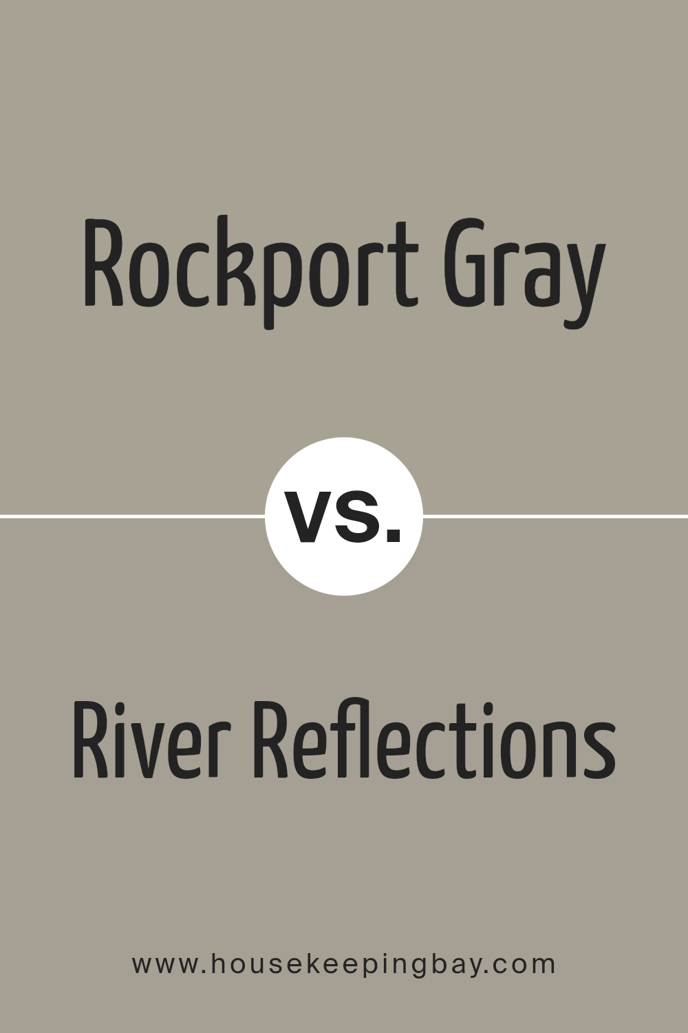
Rockport Gray HC-105 by Benjamin Moore vs River Reflections 1552 by Benjamin Moore
Rockport Gray HC-105 by Benjamin Moore and River Reflections 1552 by Benjamin Moore both offer subtle, neutral tones but with distinct characteristics. Rockport Gray stands as a warm, earthy gray with brown undertones, giving spaces a cozy, inviting atmosphere. It pairs well with softer whites and deeper greens, making rooms feel grounded and harmonious.
River Reflections, though also neutral, leans towards a cooler gray with blue undertones. This hue creates a crisp, clean look, enhancing spaces with a fresh, airy vibe. It’s well-suited for areas needing a bright, refreshing touch, complementing white trim and darker blues.
While both colors fall within the gray spectrum, Rockport Gray adds warmth, suggesting earth and nature, whereas River Reflections brings in a cool, breezy essence. Choosing between them depends on the desired room ambiance: comforting and warm with Rockport Gray, or light and refreshing with River Reflections.
You can see recommended paint color below:
- 1552 River Reflections
housekeepingbay.com
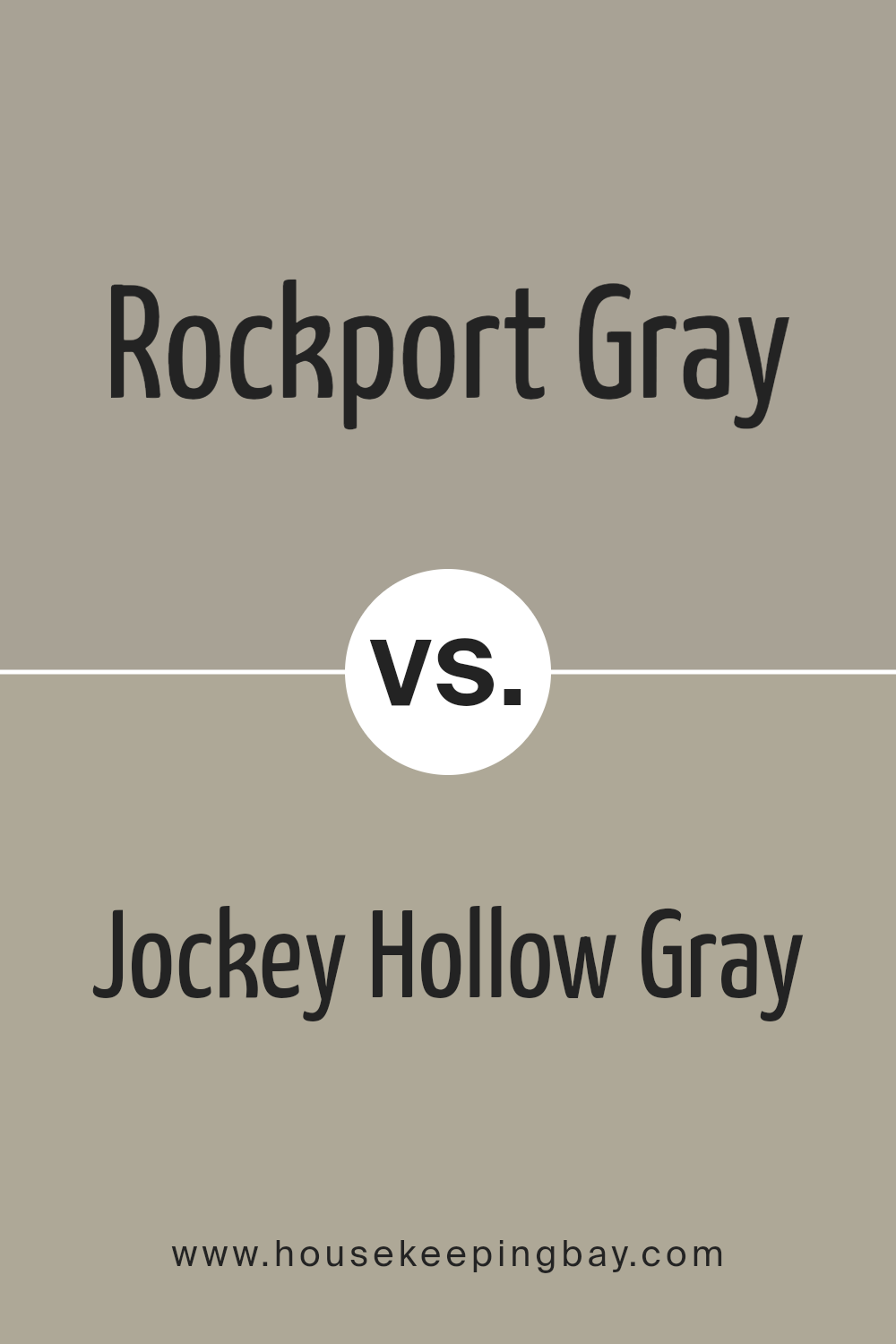
Rockport Gray HC-105 by Benjamin Moore vs Jockey Hollow Gray HC-108 by Benjamin Moore
Rockport Gray HC-105 by Benjamin Moore is a versatile color. It offers a soft, warm look, with slight taupe and brown undertones, giving it a cozy feel. This color works well in spaces where a comforting, neutral backdrop is desired, making it ideal for living rooms or bedrooms. Its warmth adds a touch of sophistication without being overpowering.
Jockey Hollow Gray HC-108, also by Benjamin Moore, presents a different vibe. It has cooler undertones, leaning towards green, which gives it a more classic and grounded feel. This shade is perfect for those who prefer a more muted look.
It suits spaces where a calm and collected ambiance is desired, such as libraries or dens.
Both colors bring a unique personality. Rockport Gray leans warmer with a hint of taupe, while Jockey Hollow Gray exudes coolness with its subtle green undertones. Their differences cater to varied tastes and style preferences.You can see recommended paint color below:
- HC-108 Jockey Hollow Gray
housekeepingbay.com
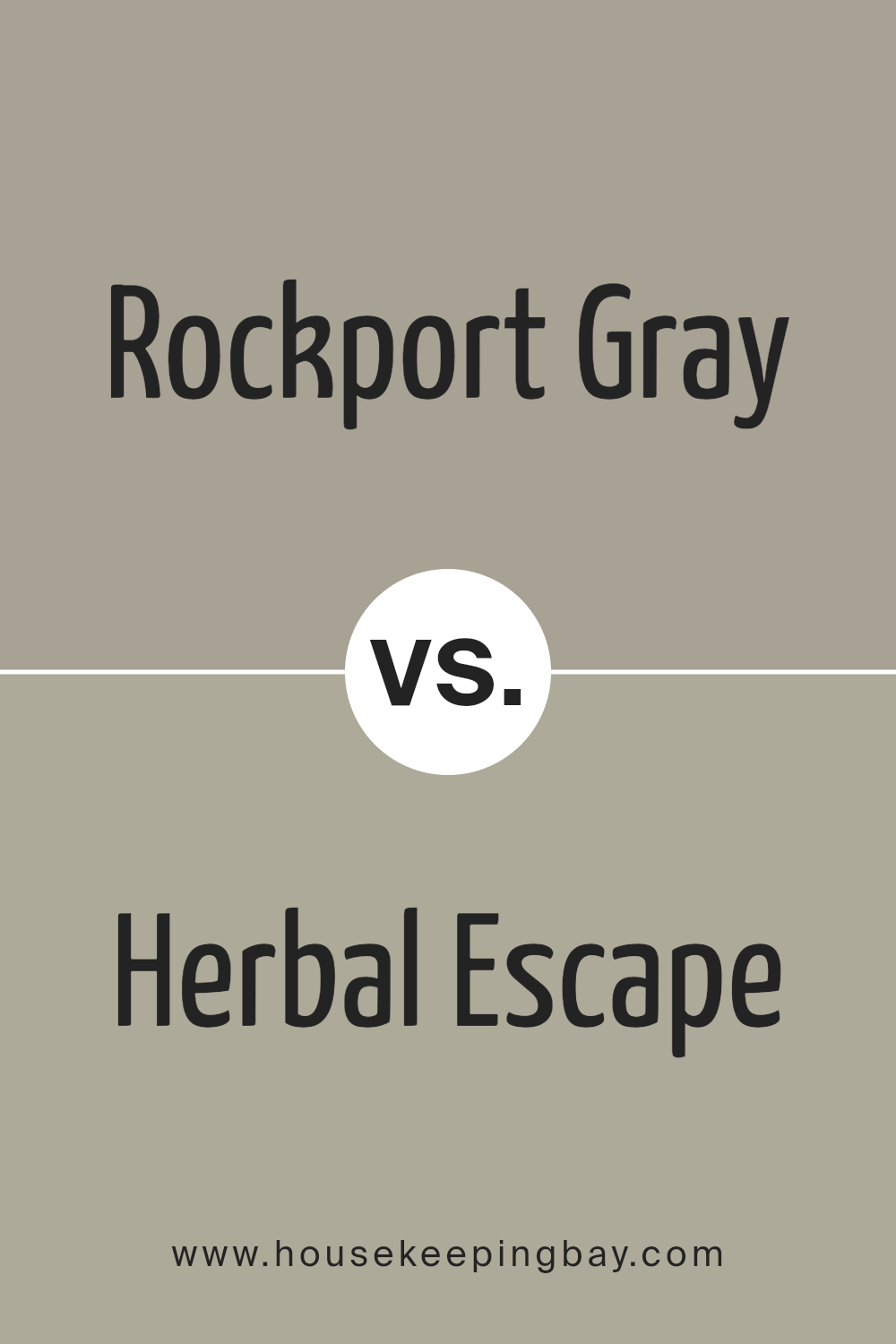
Rockport Gray HC-105 by Benjamin Moore vs Herbal Escape 1487 by Benjamin Moore
Rockport Gray HC-105 by Benjamin Moore presents itself as a neutral, timeless shade combining gray and beige, often referred to as “greige.” It’s versatile, lending itself well to creating calm, sophisticated spaces. People find it easy to pair with varied decor styles, from traditional to modern, due to its muted, earthy undertones, making it great for living rooms or bedrooms seeking a grounded feel.
Herbal Escape 1487, also from Benjamin Moore, offers a completely different vibe with its fresh, leafy green tone. It brings a sense of nature inside. This color can energize a space, making it more lively yet soothing. Ideal for kitchens, bathrooms, or accent walls, it promotes a sense of renewal and freshness.
While Rockport Gray provides a neutral backdrop, Herbal Escape invites nature into the home. Together, they can create a balanced environment, mixing a calming base with a lively touch of greenery.
You can see recommended paint color below:
- 1487 Herbal Escape
housekeepingbay.com
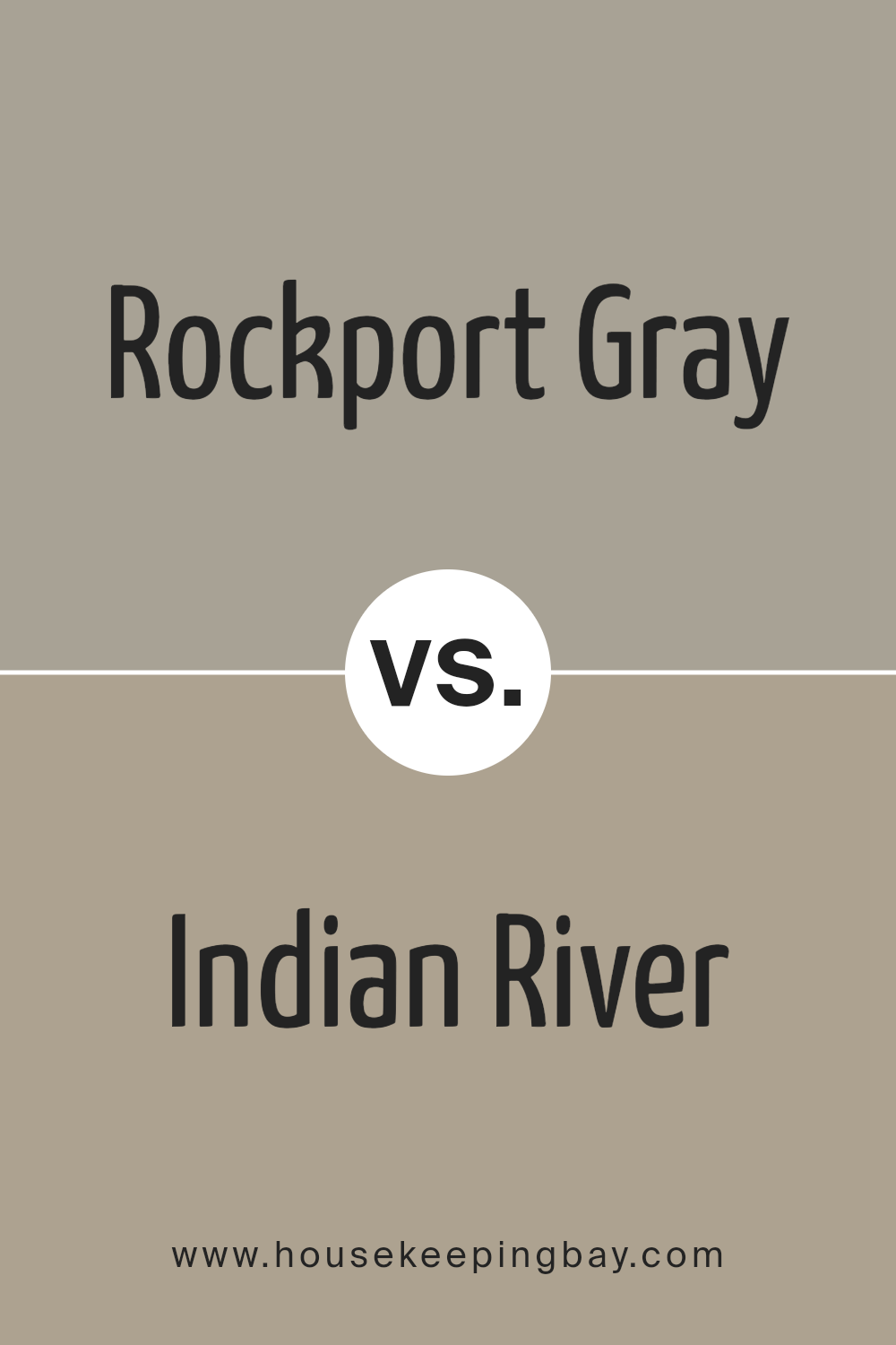
Rockport Gray HC-105 by Benjamin Moore vs Indian River 985 by Benjamin Moore
Rockport Gray HC-105 by Benjamin Moore is a versatile and timeless medium gray with warm undertones. It provides a balanced, neutral backdrop suitable for many settings, making it a favorite choice for living rooms, kitchens, and exteriors. Its warmth adds coziness without overpowering other design elements.
Indian River 985 by Benjamin Moore, on the other hand, leans slightly more towards a taupe shade compared to Rockport Gray. It has a subtle beige undertone, which delivers a warmer and earthier feel.
This color complements traditional and rustic interiors particularly well, offering a sense of comfort and warmth.
So, while Rockport Gray excels in delivering a classic neutral feel with a touch of warmth, Indian River offers a more earthy tone. Both colors work well in various spaces, but their distinct undertones cater to different tastes and interior styles, with Rockport Gray being more neutral and Indian River feeling warmer and cozier.
You can see recommended paint color below:
- 985 Indian River
housekeepingbay.com
Conclusion
Rockport Gray by Benjamin Moore has caught my attention as a beautifully balanced neutral paint color. This shade offers a gentle mix of gray and brown tones, making it versatile for various spaces. When I think about how this color might work in a living room or bedroom, I imagine a calm and cozy atmosphere that feels both timeless and modern.
It’s neither too warm nor too cool, striking a perfect balance that can harmonize with many other colors and styles.
I appreciate how Rockport Gray can change with different lighting, creating a dynamic look. In natural daylight, it reveals a soft, welcoming hue, while under artificial lights, it maintains its elegance and depth. This adaptability makes it a great choice for rooms that serve different purposes throughout the day.
Another thing I like about this color is how it works with a wide range of other shades. Whether paired with bright whites for a clean, crisp look or with richer, darker tones for a more intimate feel, Rockport Gray holds its own.
Its versatility extends to furniture and decor styles, from contemporary to classic.
In my experience, choosing a paint color is about finding something that resonates personally, and Rockport Gray seems like a wonderful option for those seeking a subtle yet sophisticated backdrop for their living spaces.
housekeepingbay.com
Ever wished paint sampling was as easy as sticking a sticker? Guess what? Now it is! Discover Samplize's unique Peel & Stick samples. Get started now and say goodbye to the old messy way!
Get paint samples


