Rayo de Sol SW 9020 by Sherwin Williams
Brightening Spaces with Sun-Inspired Hues
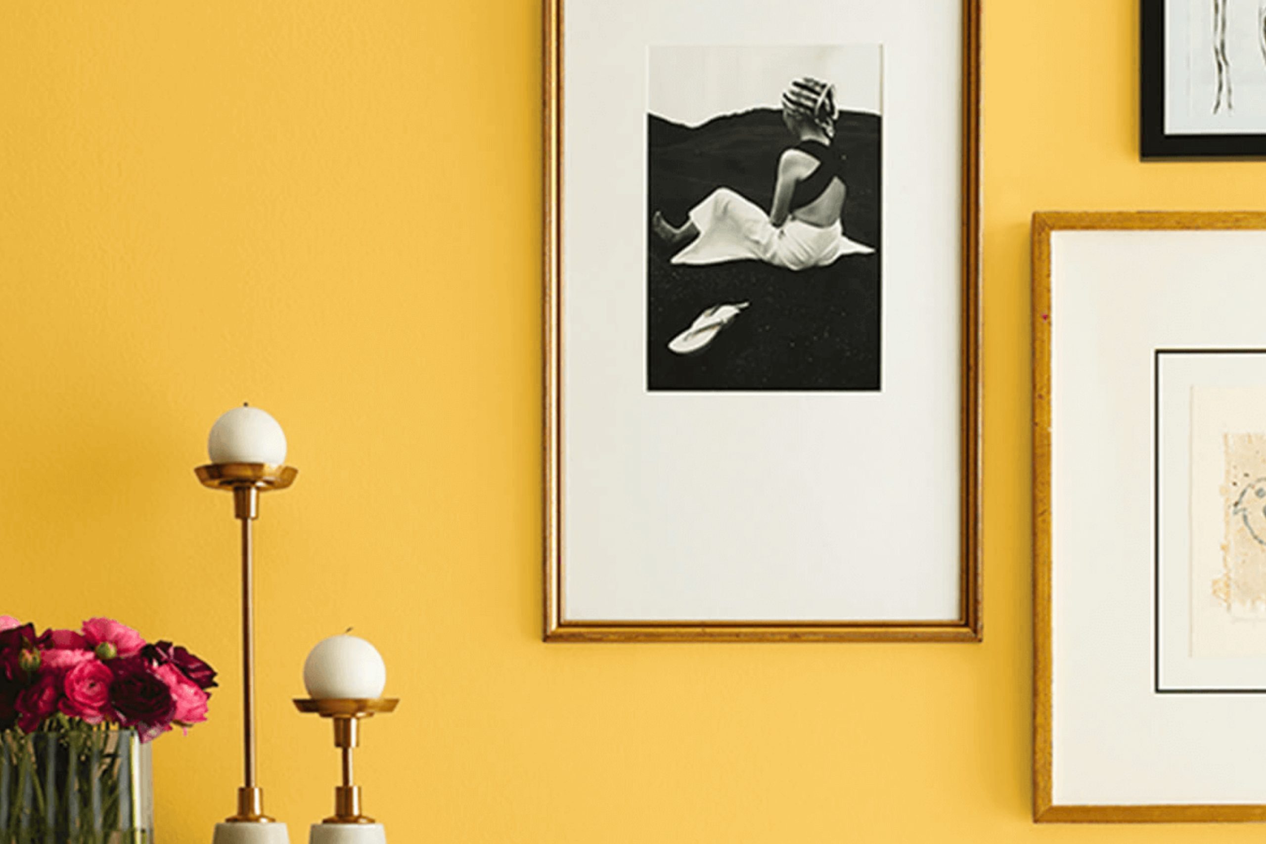
You might be considering a fresh splash of color for your space, and SW 9020 Rayo de Sol by Sherwin Williams could be just the shade you’re searching for. This vibrant yellow hue is like bringing a little piece of sunshine indoors. It’s warm and cheerful, making any room feel more inviting and lively.
Whether you’re thinking about jazzing up your living room, kitchen, or even the entryway, Rayo de Sol has a bright, energetic vibe that can lighten up any area.
Painting with such a bold color might seem a bit daunting at first, but the payoff is a space full of life and positivity.
Yellow tones are known for their ability to lift spirits and enhance mood, and Rayo de Sol does just that. It pairs wonderfully with various colors, from crisp whites to soft grays and even darker hues, allowing for numerous styling options.
If you’re ready to give your home a cheerful makeover, Rayo de Sol by Sherwin Williams is a choice worth considering.
via sherwin-williams.com
What Color Is Rayo de Sol SW 9020 by Sherwin Williams?
Rayo de Sol SW 9020 by Sherwin-Williams is a vibrant, golden-yellow paint color that brings a cheerful and warm ambiance to any space. Its bright hue can evoke feelings of happiness and optimism, making it an excellent choice for areas where energy and enthusiasm are desired.
This particular shade works wonderfully in eclectic interior styles, where it can add a punch of color against contrasting elements. It is also ideal for modern or mid-century modern interiors, offering a retro vibe that complements sleek furniture and classic designs.
Rayo de Sol pairs well with natural materials like wood and leather, enhancing their earthy qualities. For textiles, consider rich textures such as velvet or woven fabrics to create a cozy, inviting feel.
In spaces where natural light is plentiful, Rayo de Sol helps amplify the brightness, making rooms appear more spacious and lively. On the other hand, in dimly lit areas, it can add a needed lift to the surroundings.
For a cohesive look, coordinate Rayo de Sol with neutral tones like soft whites, grays, or even gentle blues to balance its vivacity. This approach allows the bold yellow to stand out without overwhelming the space. Whether it’s a feature wall, a kitchen backsplash, or an accent in the accessories, Rayo de Sol has the capacity to infuse a sense of joy and creativity into your home.

housekeepingbay.com
Is Rayo de Sol SW 9020 by Sherwin Williams Warm or Cool color?
Rayo de Sol SW 9020 by Sherwin Williams is a warm, vibrant yellow paint color that brings a cheerful burst of sunshine into any home. Ideal for spaces where you want to induce a sense of happiness and energy, this color works well in kitchens, dining areas, or playrooms. The lively yellow hue is particularly effective in brightening rooms that don’t receive a lot of natural light, making the space feel more inviting and cozy.
When used in small doses, such as an accent wall or within decorative accessories, Rayo de Sol can add a playful pop of color without overwhelming the senses.
On the other hand, covering all walls in this sunny shade can create a bold, energetic environment that stimulates activity and conversation.
This color pairs beautifully with neutral tones like whites and grays, which help to balance its intensity. Additionally, when matched with blues or greens, Rayo de Sol helps to foster a cheerful yet relaxed atmosphere.
Choosing this Sherwin Williams color means adding a touch of joy and warmth to your living space.
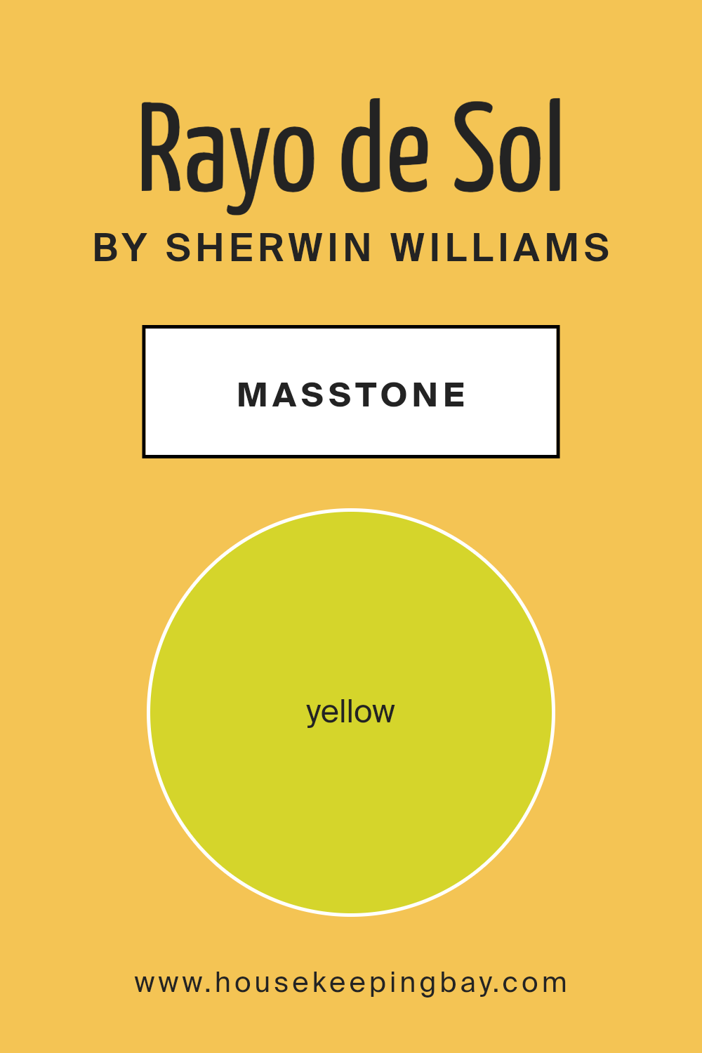
What is the Masstone of the Rayo de Sol SW 9020 by Sherwin Williams?
Rayo de SolSW 9020 by Sherwin Williams features a bold yellow masstone which instantly energizes any room. This yellow tone, similar to mustard, brings cheer and brightness, making it a standout choice for home interiors. When used on walls, it helps spaces appear more vibrant and welcoming.
This can be particularly effective in areas of the home that lack natural light, giving to an illusion of a sunnier atmosphere.
Moreover, Rayo de Sol can also be paired easily with various colors. Neutral shades like whites or grays soften its intensity, while contrasting colors like blues or greens create lively, eye-catching environments. However, using too much yellow in smaller spaces might make them seem oversaturated, so it should be balanced carefully with other hues or used as an accent.
Overall, Rayo de SolSW 9020 brings a playful and lively vibe, perfect for those looking to refresh their living spaces.
housekeepingbay.com
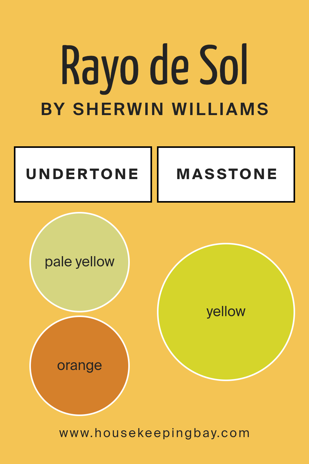
Undertones of Rayo de Sol SW 9020 by Sherwin Williams
Rayo de Sol SW 9020 by Sherwin Williams is a dynamic color with a mix of undertones that greatly influence how it looks in various lights and settings. This paint possesses undertones of pale yellow, orange, pale pink, light green, mint, olive, and grey, making it a versatile choice for interior design.
Undertones play a crucial role in the perception of color. They can subtly shift a color’s appearance based on lighting conditions and surrounding colors.
For example, under bright sunlight, Rayo de Sol might highlight its pale yellow or orange undertones, giving a room a warm and cozy glow.
In artificial or dimmer lighting, the grey or olive undertones might become more pronounced, lending a more subdued and muted look.
When used on interior walls, Rayo de Sol SW 9020 can create a variety of effects. Its pale yellow and orange undertones can make a space feel more inviting and warm, perfect for living rooms or dining areas. The pale pink undertone adds a touch of softness, ideal for bedrooms. Light green and mint undertones bring a fresh, lively feel, which could enhance kitchens or bathrooms. The olive and grey undertones help ground the color, making it suitable for spaces that require a touch of sophistication without being too bold.
Overall, the complex mix of undertones in Rayo de Sol means it can adapt well to different styles and tastes, offering flexibility in interior decorating.
housekeepingbay.com
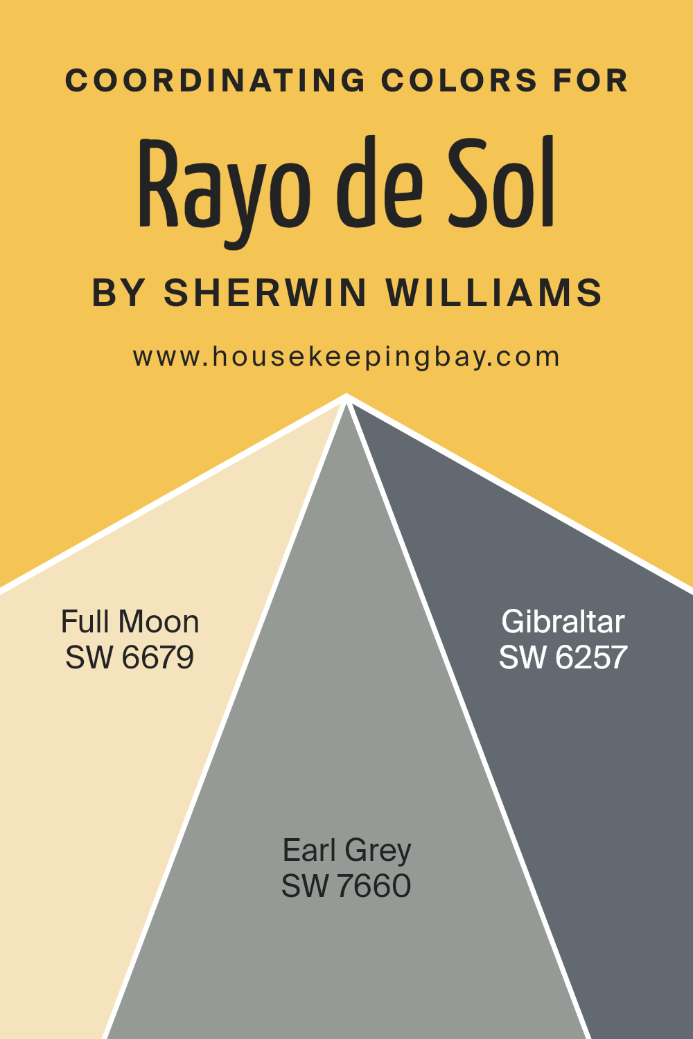
Coordinating Colors of Rayo de Sol SW 9020 by Sherwin Williams
Coordinating colors are selected to harmoniously complement a base color, enhancing the overall aesthetic of a space. In this case, Rayo de Sol SW 9020 by Sherwin Williams acts as the central shade, and to coordinate, other colors like SW 6679 – Full Moon, SW 7660 – Earl Grey, and SW 6257 – Gibraltar are chosen.
These colors work together to create a balanced and visually appealing environment, by either contrasting or subtly aligning with the base shade.
Full Moon SW 6679 is a lively yellow that injects brightness into spaces, pairing well with the sunny tones of Rayo de Sol for a cheerful vibe. Earl Grey SW 7660, on the other hand, is a sophisticated, muted grey that offers a soft but striking contrast to the warmer hues, providing a refined backdrop that allows brighter colors to pop.
Finally, Gibraltar SW 6257 is a strong, steady blue that imparts a sense of calm and solidity, complementing the energy of Rayo de Sol with its grounding presence. These colors work in concert to achieve a cohesive look that enhances the character of each space.
You can see recommended paint colors below:
- SW 6679 Full Moon
- SW 7660 Earl Grey
- SW 6257 Gibraltar
housekeepingbay.com
How Does Lighting Affect Rayo de Sol SW 9020 by Sherwin Williams?
Lighting plays a crucial role in how we perceive colors. The type of light under which a color is viewed can significantly alter its appearance. This is essential to consider when choosing a paint like Rayo de Sol SW 9020 by Sherwin-Williams.
Rayo de Sol is a vibrant, warm, and sunny color that can change its mood depending on the lighting context. In artificial lighting, such as that from incandescent bulbs, Rayo de Sol tends to appear warmer and more inviting.
The yellow hue becomes more pronounced, giving a cozy feeling typical of warm light environments. Under cooler light, such as from fluorescent bulbs, this color might look slightly more washed out and less vibrant.
Natural light, on the other hand, impacts this color differently throughout the day and depending on the room orientation. In north-facing rooms, which receive less direct sunlight, Rayo de Sol might appear slightly muted and subtle.
This is due to the cooler, indirect light common in north-facing spaces.
South-facing rooms get more sunlight, which makes Rayo de Sol look more lively and vivid throughout the day. The color can really show off its brightness and warmth, enhancing an energetic and cheerful ambiance.
East-facing rooms see the morning light, which is generally cooler but bright. Here, Rayo de Sol can provide a soft and gentle awakening in the morning, gradually gaining vibrancy as the day progresses.
In west-facing rooms, the color faces the afternoon and evening light, which tends to be warmer. Rayo de Sol will reflect this warm, golden light, making the room feel warm and inviting towards the end of the day.
Given these varied effects, Rayo de Sol SW 9020 can be a versatile choice, working differently yet effectively across various lighting and orientations. It’s important to consider these lighting factors to effectively utilize this sunny, cheerful hue in any space.
housekeepingbay.com
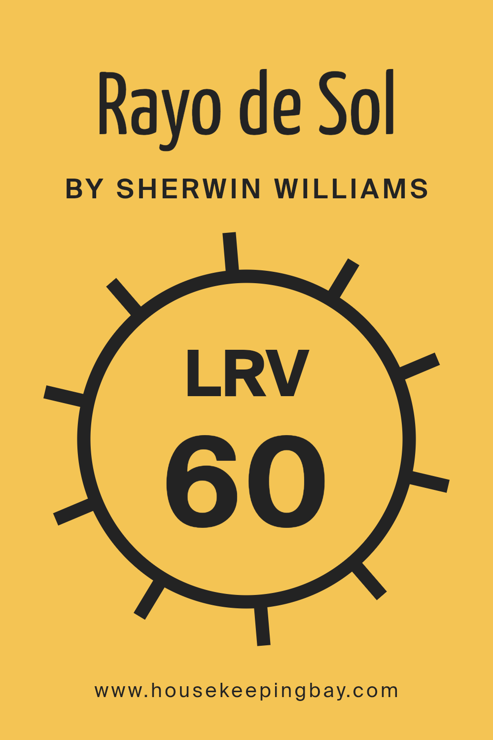
What is the LRV of Rayo de Sol SW 9020 by Sherwin Williams?
LRV stands for Light Reflectance Value, a measurement used to determine how much light a paint color will reflect when applied to a surface. Measured on a scale from 0, which represents pure black that absorbs all light, to 100, indicating pure white that reflects all light, LRV helps in understanding how bright or dark a color will appear under different lighting conditions.
This metric is crucial because it influences the overall feel of a room. A higher LRV means a room will appear lighter and can feel more spacious, while a lower LRV can make a space seem cozier but potentially smaller and darker.
Taking the example of Rayo de Sol SW 9020, which has an LRV of 59.509, this color sits in the middle range of the LRV scale. It won’t make a room feel as open and airy as a color with a higher LRV might, but it also won’t absorb light like darker colors. Instead, Rayo de Sol will offer a balanced amount of brightness and warmth, not overwhelming with brightness but still providing a moderate level of light reflection.
This mid-range LRV makes it a versatile choice for spaces that aim for a balanced feel without tipping too heavily towards overly bright or too dim.
housekeepingbay.com
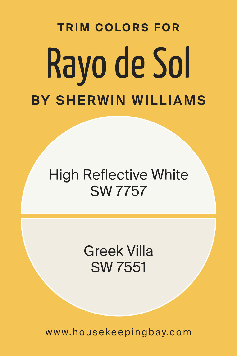
What are the Trim colors of Rayo de Sol SW 9020 by Sherwin Williams?
Trim colors are essentially the hues used for detailing in architecture, enhancing features like door frames, baseboards, crown moldings, and window casings. The choice of trim color can significantly influence the perception of the main wall colors.
When paired with a distinct hue such as Rayo de Sol SW 9020 by Sherwin Williams, which is vibrant and sunny, selecting the right trim color is crucial to create a refined balance.
SW 7757 – High Reflective White and SW 7551 – Greek Villa are excellent options that serve to accentuate the brightness of Rayo de Sol SW 9020, providing a clean and fresh look that highlights the architectural details without overwhelming the primary color.
SW 7757 – High Reflective White is a brilliant, ultra-pure white that brings a crisp lightness to any space, making it feel freshly painted and meticulously maintained. Its ability to reflect light enhances the surrounding colors, making them appear more saturated and vivid.
On the other hand, SW 7551 – Greek Villa offers a softer, slightly warm off-white shade that infuses a cozy, welcoming feel into the environment. This color is less stark than a pure white, promoting a subtle contrast with warmer hues like Rayo de Sol SW 9020, thereby softening the overall effect while still providing a clean visual separation between wall colors and trims.
You can see recommended paint colors below:
housekeepingbay.com
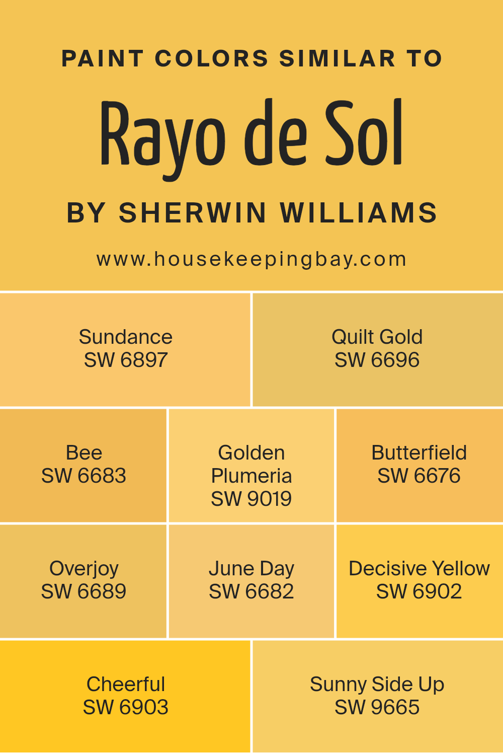
Colors Similar to Rayo de Sol SW 9020 by Sherwin Williams
Similar colors are vital in design because they create a harmonious and soothing visual experience, effectively tying different elements together without overwhelming the senses. When colors are similar, they share common hues but differ slightly in shades or tones, which adds subtle interest and depth to a space.
For instance, colors similar to Rayo de Sol SW 9020 by Sherwin Williams, like Sundance and Quilt Gold, demonstrate this principle beautifully.
Sundance SW 6897 offers a bright, cheerful hue that resembles the early morning sun, adding warmth without being overpowering. Quilt Gold SW 6696 has a deeper yellow tone, reminiscent of autumn leaves, providing a cozy, mature vibe. Bee SW 6683 is lively and vibrant, perfect for spaces needing a burst of energy.
Golden Plumeria SW 9019 leans towards a soft, mellow yellow, excellent for creating a gentle, inviting atmosphere. Butterfield SW 6676 features a more mustard-like tone, great for adding a rustic touch. Overjoy SW 6689 is an intense, vivid yellow, ideal for injecting excitement into any decor.
June Day SW 6682 is a sun-kissed yellow, perfect for brightening up dim areas. Decisive Yellow SW 6902 offers a strong, bold yellow, making a definitive statement in any room. Cheerful SW 6903 is aptly named for its bright, sunny disposition that uplifts the mood instantly.
Lastly, Sunny Side Up SW 9665 presents a soft, creamy yellow, creating a light, fresh look that soothes and welcomes. These similar colors can mix freely or stand alone, each contributing to a cohesive yet distinct palette that enhances the aesthetic appeal of a space.
You can see recommended paint colors below:
- SW 6897 Sundance
- SW 6696 Quilt Gold
- SW 6683 Bee
- SW 9019 Golden Plumeria
- SW 6676 Butterfield
- SW 6689 Overjoy
- SW 6682 June Day
- SW 6902 Decisive Yellow
- SW 6903 Cheerful
- SW 9665 Sunny Side Up
housekeepingbay.com
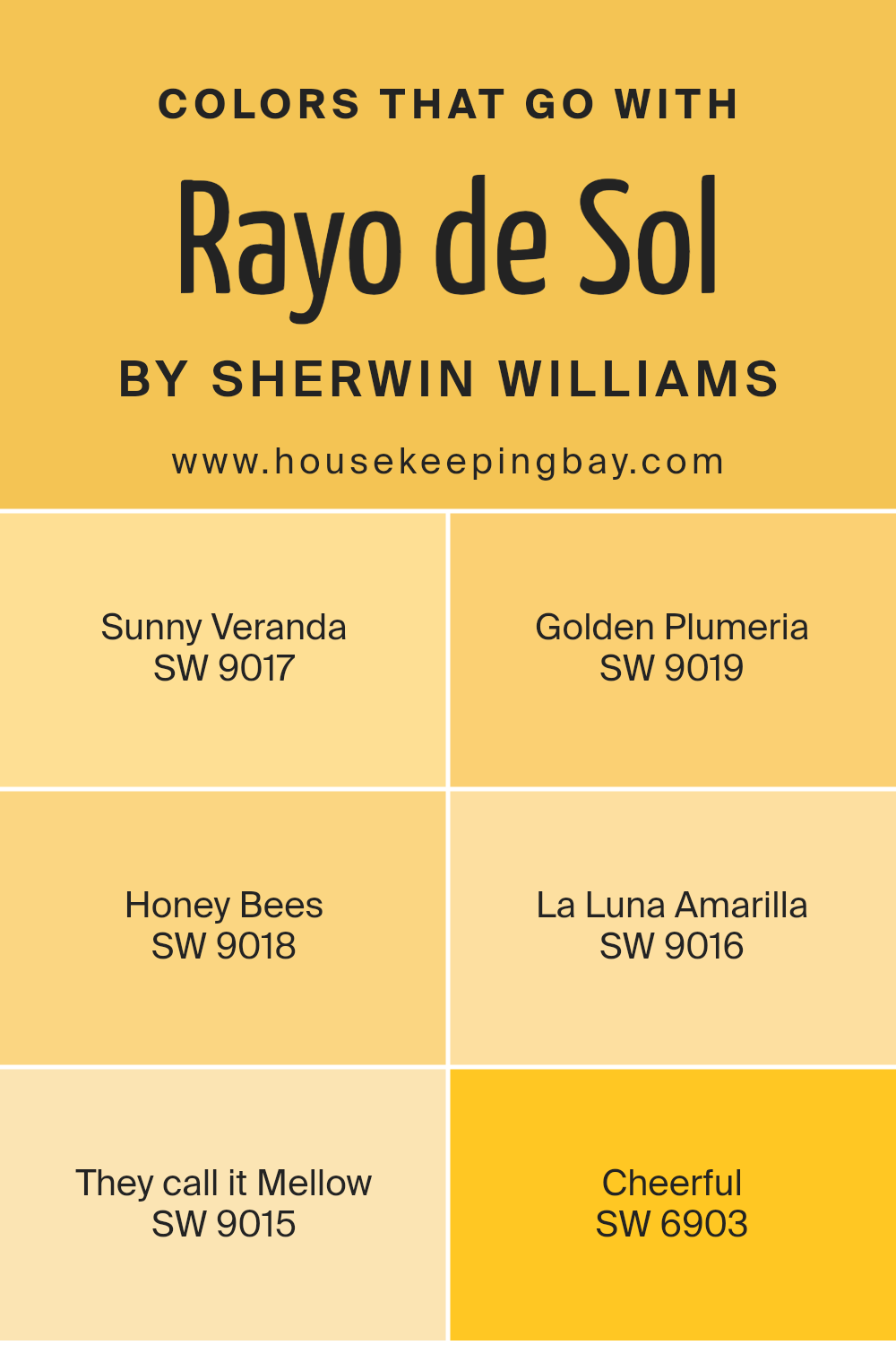
Colors that Go With Rayo de Sol SW 9020 by Sherwin Williams
Choosing the right complementing colors for a shade like Rayo de Sol SW 9020 by Sherwin Williams is crucial for achieving the desired ambience in any space. Rayo de Sol is a vibrant and warm hue that can create a sense of brightness and energy.
The importance of matching it with harmonious colors can’t be overstated, as the right combinations can enhance the aesthetic appeal and mood of a room.
Sunny Veranda SW 9017 pairs well with Rayo de Sol by offering a softer, more subtle shade of yellow, providing a gentle contrast that highlights the warmth of both colors. Golden Plumeria SW 9019, another great companion, carries a deeper yellow tone that can enrich the environment with a feeling of warmth and coziness.
Honey Bees SW 9018 is a light, airy color that adds a playful charm to the mix, injecting a lighter, cheerful note that complements Rayo de Sol wonderfully. La Luna Amarilla SW 9016 gives off a more muted yellow, lending itself to spaces that aim for a calm yet inviting atmosphere.
They Call it Mellow SW 9015 serves as a soothing backdrop for Rayo de Sol, offering a delicate balance between energy and relaxation. Lastly, Cheerful SW 6903 has a spirited, lively character that amplifies the intensity of Rayo de Sol, making it perfectly suited for vibrant, dynamic settings.
All these colors together create a harmonious palette that enhances the overall visual impact, providing various options to craft environments ranging from serene to energized.
You can see recommended paint colors below:
- SW 9017 Sunny Veranda
- SW 9019 Golden Plumeria
- SW 9018 Honey Bees
- SW 9016 La Luna Amarilla
- SW 9015 They call it Mellow
- SW 6903 Cheerful
housekeepingbay.com
How to Use Rayo de Sol SW 9020 by Sherwin Williams In Your Home?
Rayo de Sol SW 9020 by Sherwin Williams is a vibrant, warm yellow paint color that adds cheer and brightness to any space. Ideal for creating a welcoming atmosphere, it works well in kitchens and living rooms where you want to inspire happiness and energy. This shade pairs nicely with both light and dark furniture, allowing for versatile design choices.
Using Rayo de Sol in a small space like a bathroom or an entryway can make the area seem larger and more inviting. It is also perfect for an accent wall to add a pop of color without overwhelming the room.
Complementing it with neutral tones such as whites, grays, or soft browns can balance the brightness and bring a cozy feel to the home.
For those who enjoy a lively and cheerful environment, painting kitchen cabinets or dining chairs in Rayo de Sol can rejuvenate the space, making it perfect for family gatherings and social meals. Whether you wish to liven up a single room or incorporate joyful splashes throughout your home, Rayo de Sol is an excellent choice.
Rayo de Sol SW 9020 by Sherwin Williams vs Sundance SW 6897 by Sherwin Williams
Rayo de Sol SW 9020 by Sherwin Williams is a warm, bright yellow that brings a cheerful vibe to any space. It mirrors the intensity and warmth of sunlight, making it perfect for lively areas like kitchens, living rooms, or any spot needing a burst of energy.
Compared to Sundance SW 6897, which is also a yellow hue, Rayo de Sol appears deeper and more saturated. Sundance, in contrast, has a lighter, softer tone that might be seen as more delicate and subtle.
This makes Sundance better suited for spaces where a gentle and light atmosphere is desired. Both colors can liven up a room, but Rayo de Sol has a more robust presence while Sundance offers a quieter, less intense yellow. Choosing between them depends on the effect you want in your space—vibrant and bold or soft and understated.
You can see recommended paint color below:
- SW 6897 Sundance

housekeepingbay.com
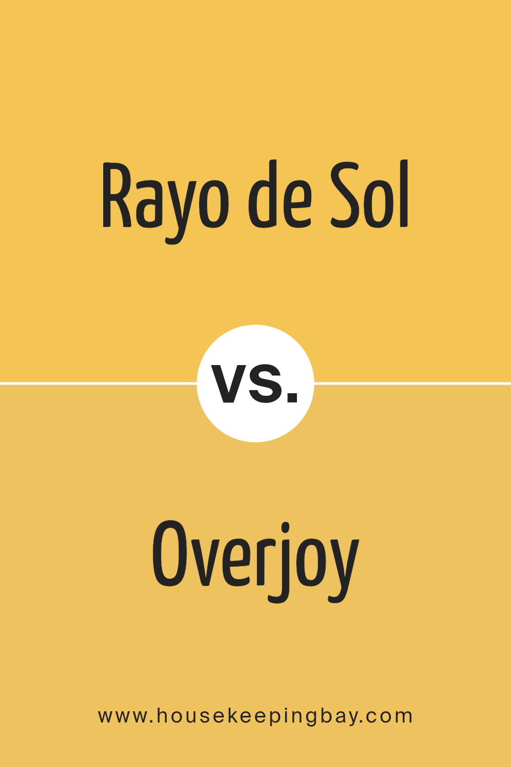
Rayo de Sol SW 9020 by Sherwin Williams vs Overjoy SW 6689 by Sherwin Williams
Rayo de Sol SW 9020 and Overjoy SW 6689, both from Sherwin Williams, showcase vibrant yet distinct hues. Rayo de Sol is a warm, golden yellow that radiates a sunny, cheerful vibe. It is reminiscent of sunlight and evokes a sense of warmth and brightness, making it ideal for spaces where a lively and inviting atmosphere is desired.
Overjoy, on the contrary, is a bright, lemony yellow that is much more vivid and intense. This color is punchier and can energize a space, bringing a lively and playful feel to any room.
Although both colors are yellows, Rayo de Sol’s softer, more golden tone offers a more subdued and cozy feel compared to Overjoy’s sharp, energetic vibrancy. Rayo de Sol works well in living rooms or bedrooms where a softer ambiance is preferred, while Overjoy is perfect for areas that benefit from a burst of energy, like kitchens or exercise rooms. Each color suits different settings depending on the mood or atmosphere you’re aiming to create.
You can see recommended paint color below:
- SW 6689 Overjoy
housekeepingbay.com
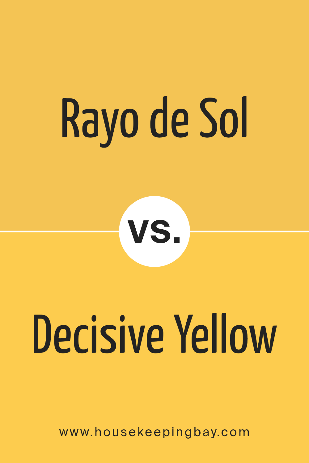
Rayo de Sol SW 9020 by Sherwin Williams vs Decisive Yellow SW 6902 by Sherwin Williams
Rayo de Sol SW 9020 by Sherwin Williams is a warm, muted yellow with subtle earthy undertones, making it a versatile and inviting shade. Its softness allows it to blend seamlessly into a variety of design settings, from cozy traditional spaces to more upbeat, casual rooms. It pairs well with neutral and earth tones, adding a gentle pop of color without overwhelming the senses.
Decisive Yellow SW 6902, in contrast, is a bright, vibrant yellow that commands attention. This bold color is perfect for spaces where you want to create a lively, energetic mood. It works particularly well in areas that benefit from a splash of brightness, such as kitchens or playrooms.
The vividness of Decisive Yellow is great for accent walls or decor items to draw the eye and invigorate a space.
Each color serves a different purpose depending on the atmosphere you wish to create. Rayo de Sol is soft and calming, while Decisive Yellow is cheerful and stimulating. Both offer distinct possibilities for enhancing your home’s ambiance.
You can see recommended paint color below:
housekeepingbay.com
Rayo de Sol SW 9020 by Sherwin Williams vs June Day SW 6682 by Sherwin Williams
Rayo de Sol SW 9020 by Sherwin Williams is a vibrant, sunny yellow that brightens up any space with its warm and cheerful vibe. It’s perfect for creating a welcoming atmosphere in areas like kitchens or living rooms. This color tends to add energy and positivity wherever it’s used, making small spaces feel more open and lively.
June Day SW 6682, also by Sherwin Williams, is a softer, more muted yellow. This shade is gentler on the eyes compared to Rayo de Sol and offers a subtle touch of warmth. It works well in rooms where a calm, soothing presence is desired, such as bedrooms or bathrooms.
June Day can make a room feel cozy without overwhelming it with brightness.
Both colors share a yellow base, but Rayo de Sol is deeper and more intense, suitable for those wanting to make a bold statement. June Day, in contrast, is ideal for softer, more understated decor styles.
Each color creates its own unique feeling and can significantly affect the mood and perception of a space.
You can see recommended paint color below:
- SW 6682 June Day

housekeepingbay.com
Rayo de Sol SW 9020 by Sherwin Williams vs Butterfield SW 6676 by Sherwin Williams
Rayo de Sol SW 9020 and Butterfield SW 6676, both by Sherwin Williams, each offer a unique yellow tone that brightens spaces effectively. Rayo de Sol SW 9020 is a vibrant, sun-inspired yellow with a bold, energizing presence. It brings a strong burst of light into any room, making it ideal for spaces that need some cheer. This shade can create a lively atmosphere in common areas like living rooms or kitchens.
In contrast, Butterfield SW 6676 features a softer, more buttery yellow. It’s less intense, providing a subtle warmth that is comforting and soothing. This color suits rooms where a gentle and welcoming ambiance is desired, perfect for nurseries or restful bedrooms.
Both colors enhance the feeling of light, but Rayo de Sol SW 9020 does so with more intensity, while Butterfield SW 6676 offers a calmer, softer glow. Their individual qualities make them suitable for different purposes based on the mood and function of the intended space.
You can see recommended paint color below:
- SW 6676 Butterfield

housekeepingbay.com
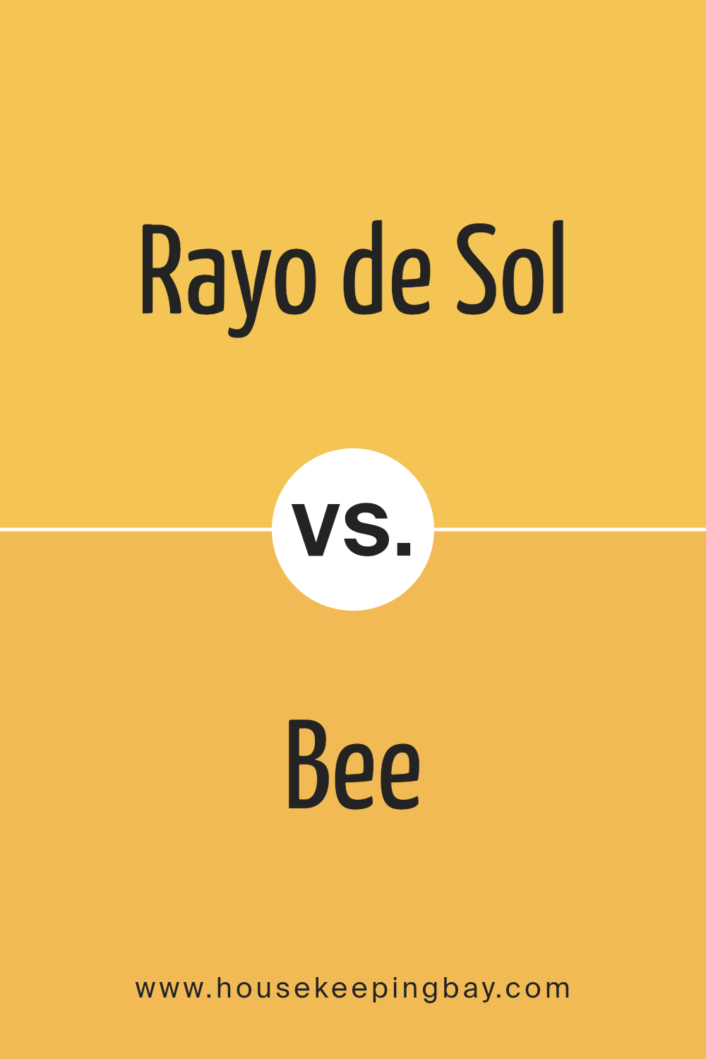
Rayo de Sol SW 9020 by Sherwin Williams vs Bee SW 6683 by Sherwin Williams
“Rayo de Sol SW 9020” by Sherwin Williams is a vibrant, yellow color that beams with warmth and cheerfulness. This sunny hue is perfect for spaces where you want to inspire a sense of energy and positivity. It works well in kitchens, dining areas, or any room that benefits from a bright, welcoming atmosphere.
In contrast, “Bee SW 6683” is another lively shade of yellow, but it has a more mustard-like tone that feels slightly richer and deeper. This color offers a cozy, inviting quality, making it a great choice for living rooms or bedrooms where a comfortable, yet cheerful ambience is desired.
Both colors are effective for adding a splash of brightness to a space, with “Rayo de Sol” being a bit more intense and “Bee” leaning towards a subtler, warmer feel. Depending on the mood you aim to create, either color would enhance the room with its distinct character.
You can see recommended paint color below:
- SW 6683 Bee
housekeepingbay.com
Rayo de Sol SW 9020 by Sherwin Williams vs Sunny Side Up SW 9665 by Sherwin Williams
Rayo de Sol SW 9020 by Sherwin Williams is a vivid, dynamic yellow that brings a burst of sunshine into any space. It’s a bright color that can energize a room and make it feel more inviting and cheerful. This color works well in areas that could use a lift or in spaces where creativity happens, like kitchens or creative studios.
Sunny Side Up SW 9665, another offering from Sherwin Williams, leans towards a softer, more muted yellow. This shade is calmer and can make a space feel light and airy without overwhelming the senses. It’s ideal for bedrooms or quiet sitting areas where a subtle touch of warmth is desired.
Although both colors are yellows, Rayo de Sol is much more intense and lively, ideal for making a strong statement. Sunny Side Up is gentler and better suited for creating a relaxed, soothing environment. Depending on the mood or function of the room, each color offers its own unique benefits and can dramatically affect the room’s ambiance.
You can see recommended paint color below:
- SW 9665 Sunny Side Up
housekeepingbay.com
Rayo de Sol SW 9020 by Sherwin Williams vs Golden Plumeria SW 9019 by Sherwin Williams
Rayo de Sol SW 9020 by Sherwin Williams is a bright, vibrant yellow that brings a cheerful, sunny vibe to any space. It’s a strong color that can make a room feel warm and inviting. This shade works well in spaces where you want to add energy and a sense of positivity. It pairs nicely with both light and dark colors, allowing for versatile design options.
Golden Plumeria SW 9019, also by Sherwin Williams, is a softer yellow with a gentle, soothing quality. It’s less intense than Rayo de Sol and offers a calmer, more subdued look. This color is great for creating a relaxed atmosphere in places like bedrooms or reading nooks.
It matches well with soft neutrals and pastel shades to create a balanced, harmonious environment.
Both colors reflect light well, making rooms appear larger and brighter. However, the choice between them depends on the mood you want to set: lively and energetic with Rayo de Sol or calm and serene with Golden Plumeria.
You can see recommended paint color below:
- SW 9019 Golden Plumeria
housekeepingbay.com
Rayo de Sol SW 9020 by Sherwin Williams vs Cheerful SW 6903 by Sherwin Williams
Rayo de Sol SW 9020 and Cheerful SW 6903 from Sherwin Williams are both vibrant colors, but they offer different vibes due to their hue variations. Rayo de Sol is a warm yellow, resembling sunlight, which makes spaces feel cozy and inviting. It pairs well with natural light, giving rooms an energized, bright look, ideal for kitchens and living rooms.
In contrast, Cheerful is a bright, pure yellow. This shade is more intense than Rayo de Sol and injects a lively, playful energy into a space. It’s a color that can make statement walls pop or add a splash of joy in children’s areas or creative spaces.
While both colors lighten up rooms and create a sense of happiness, Rayo de Sol has a softer, more golden tone, suitable for a subdued look. Cheerful, living up to its name, is bold and dynamic, perfect for adding a touch of fun to any decor.
You can see recommended paint color below:
- SW 6903 Cheerful
housekeepingbay.com
Rayo de Sol SW 9020 by Sherwin Williams vs Quilt Gold SW 6696 by Sherwin Williams
Rayo de Sol SW 9020 by Sherwin Williams is a warm, vibrant yellow with a bright, sunny quality that feels energetic and lively. Its tone is reminiscent of sunlight, making spaces feel open and cheerful. This color can light up a room, giving a sense of happiness and positivity.
It works well in spaces intended for creativity and uplifting spirits.
In contrast, Quilt Gold SW 6696 is a deeper, muted gold that leans more towards an earthy, mustard-like shade. This color provides a cozy, more subdued atmosphere compared to Rayo de Sol. It’s excellent for creating a warm, inviting space. Quilt Gold can serve well in dining areas or living rooms where a cozy, comforting vibe is desired.
Both colors share a base in yellow but offer different moods and effects. Rayo de Sol is brighter and more eye-catching, while Quilt Gold offers a richer, more grounded feel.You can see recommended paint color below:

housekeepingbay.com
Concluding, SW 9020 Rayo de Sol by Sherwin Williams is a delightful choice for anyone aiming to add a warm and inviting atmosphere to their living space. The paint’s sunny hue brings a cheerful touch that can definitely enhance the mood of any room.
I appreciate how it pairs effortlessly with a range of colors and materials, making it versatile for various decor styles. Additionally, its ability to infuse light into even the dimmest of spaces without overwhelming the senses is commendable.
This versatility makes it ideal not only for living rooms and kitchens but also for bedrooms, where it adds a soft, comforting glow. During my time experimenting with Rayo de Sol, I noticed it works well in natural light, changing subtly as the day progresses, which keeps your living space feeling fresh and lively.
It’s an excellent paint choice if you’re interested in creating a welcoming atmosphere in your home or office.
Based on my experiences and the feedback I’ve gathered, SW 9020 Rayo de Sol by Sherwin Williams really does live up to the positive reviews and could be just what you need to give your space a new lease on life.

housekeepingbay.com
Ever wished paint sampling was as easy as sticking a sticker? Guess what? Now it is! Discover Samplize's unique Peel & Stick samples. Get started now and say goodbye to the old messy way!
Get paint samples


