Quilt Gold SW 6696 by Sherwin Williams
Golden Hues Redefined Warmth and Elegance
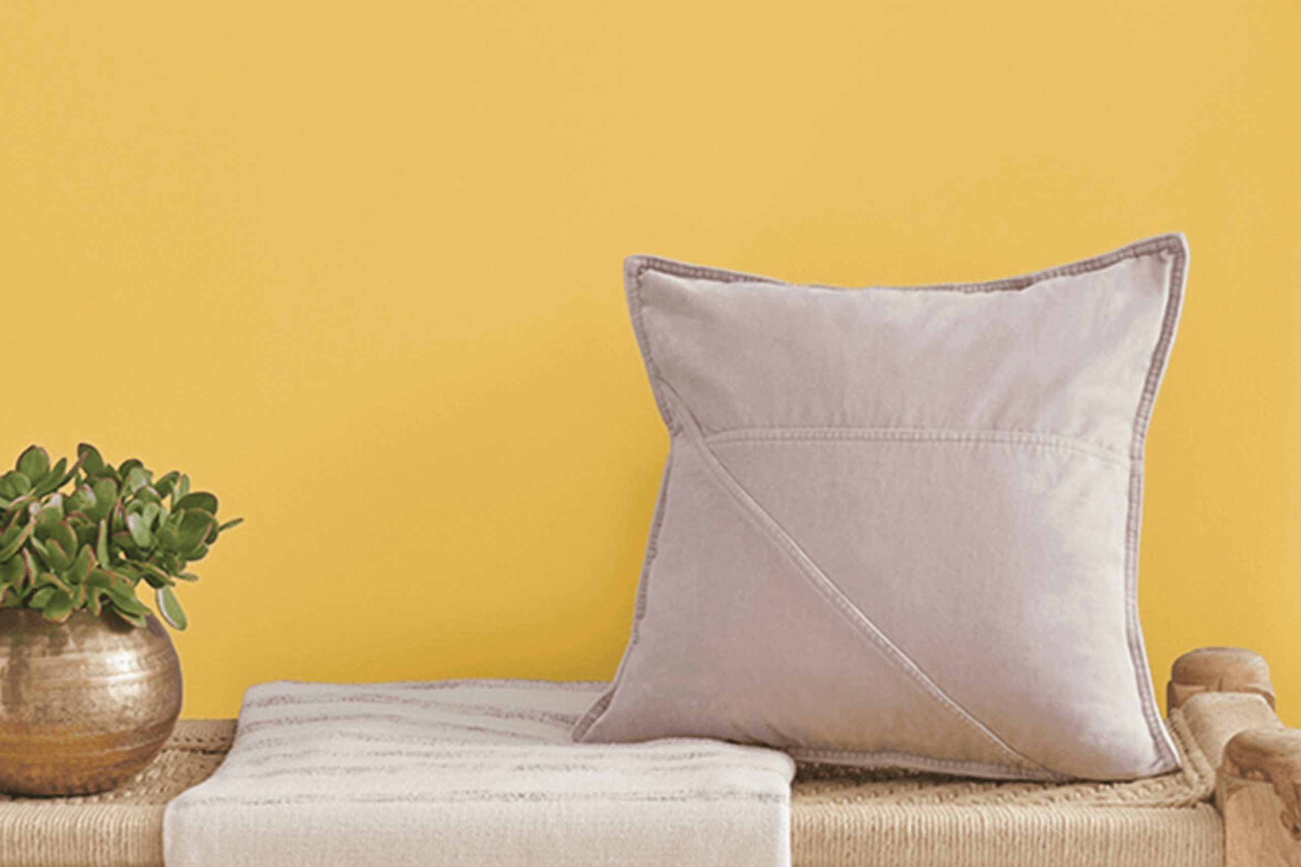
Sherwin Williams’ SW 6696 Quilt Gold is a great choice for adding warmth and cheer to any room. This rich, golden hue brings a cozy, welcoming vibe that works beautifully in spaces meant for gathering, like living rooms and kitchens. You might appreciate how it pairs well with various decor styles, whether you’re into rustic charm or more contemporary looks.
Quilt Gold isn’t just about looks; it also sets a mood. The color can make a room feel more inviting and comfortable, possibly even making those chilly mornings a bit easier. When you use it in a space, it’s like wrapping the room in a soft, sunny blanket.
Think about how it could enhance areas that benefit from a touch of brightness.
When planning your color scheme, Quilt Gold pairs nicely with neutral shades, darker blues, or rich greens, giving you plenty of options for accents and accessories.
It’s an excellent choice for anyone wanting to add a bit of cheerfulness without going too bold. So, if you’re ready to give your space a warm, golden glow, Quilt Gold is worth considering.
via sherwin-williams.com
What Color Is Quilt Gold SW 6696 by Sherwin Williams?
Quilt Gold SW 6696 by Sherwin Williams is a rich, deep yellow with a muted gold undertone, offering warmth and coziness to any space. This color is vibrant yet not overwhelming, making it a versatile choice for various interior designs. It works particularly well in traditional and rustic styles, bringing a sense of comfort and homeliness.
Quilt Gold pairs beautifully with natural materials like wood and leather, enhancing their organic beauty. It also complements textures such as wool, linen, and cotton, contributing to a tactile and inviting environment. For a contrasting look, pairing it with dark greens or navy blues can create a more dynamic and visually interesting space.
For furniture, dark-stained woods or antiqued metal pieces work well with Quilt Gold. This color also supports a backdrop for artwork, particularly pieces with earth tones or subtle pastels.
Whether it’s on a feature wall or used for accent details, Quillet Gold adds warmth to the room without dominating it, and its golden hues catch natural light beautifully, giving a subtle glow that makes spaces feel more uplifting and energized.
It’s a perfect choice for living rooms, kitchens, or any area where you want to add a touch of coziness without sacrificing brightness.

housekeepingbay.com
Is Quilt Gold SW 6696 by Sherwin Williams Warm or Cool color?
Quilt GoldSW 6696 by Sherwin Williams is a rich, warm shade that can create a cozy and inviting atmosphere in any home. This deep mustard yellow has brown undertones, making it a perfect color for those who want to add warmth to their space without overwhelming it with brightness.
Quilt GoldSW 6696 works well in living rooms, kitchens, or dining areas where it pairs beautifully with natural wood elements, dark greens and blues, or neutral tones like whites and grays. The color is versatile enough to adapt to various decor styles, whether you are aiming for a rustic feel or a more modern look.
For a soft contrast, pairing it with soft pastel colors can lighten up a room while maintaining a warm ambiance. This shade is particularly beneficial in rooms with north-facing windows where natural light is cooler, as it helps balance the light with its warm tones.
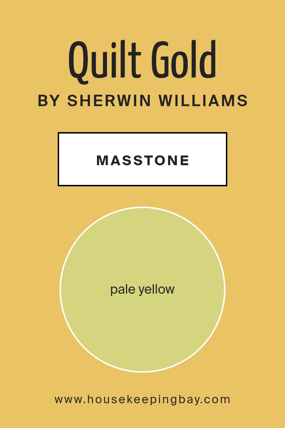
What is the Masstone of the Quilt Gold SW 6696 by Sherwin Williams?
Quilt Gold SW 6696 by Sherwin Williams has a masstone of pale yellow, coded as #D5D580. This subtle and light shade of yellow brings a soft and warm feel to any room. Perfect for spaces where you want to add a touch of brightness without overwhelming the area, Quilt Gold is versatile and can complement many decor styles.
In homes, this color works beautifully in living rooms, kitchens, or nurseries, providing a cozy and welcoming atmosphere.
This pale yellow can make small spaces seem larger and brighter, as it reflects light well. It also pairs nicely with a wide range of colors, from soft neutrals to bolder shades, allowing for flexible design choices. Whether you want a calming area to relax or a cheerful space for socializing, Quilt Gold SW 6696 creates a friendly and inviting environment.
This color is particularly effective when used in well-lit areas or places that could benefit from a perceived increase in space.
housekeepingbay.com
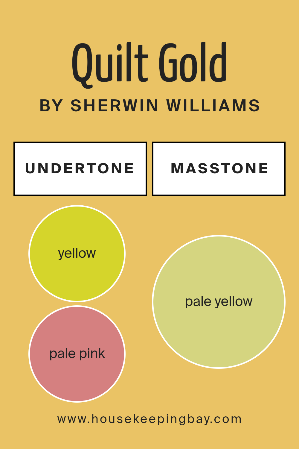
Undertones of Quilt Gold SW 6696 by Sherwin Williams
Quilt Gold SW 6696 by Sherwin Williams is a rich, vibrant color with a complex palette of undertones, including yellow, pale pink, orange, mint, light gray, light green, grey, light purple, olive, light blue, and lilac. These undertones all play a significant role in how this color appears under different lighting conditions and when paired with various interior elements.
Undertones are subtle colors that lurk beneath the surface of a main color. They can shift a color’s appearance and mood. For example, yellow undertones can make a color feel warmer and more inviting, while blue undertones might give a cooler, more calming effect.
In the case of Quilt Gold SW 6696, the mixture of warm and cool undertones creates a dynamic yet cohesive look. The yellow and orange undertones add warmth, making a room feel cozy and welcoming. On the other hand, mint and light blue offer a refreshing splash, balancing the warmth with a hint of coolness. Grey and light gray can help temper the vibrancy, ensuring that the color doesn’t overwhelm a space.
When applied to interior walls, Quilt Gold SW 6696 can produce varying effects depending on the room’s lighting and the other colors present in the decor. Natural light tends to enhance the warmth of the yellow and orange undertones, while artificial lighting might highlight the cooler mint or light blue, creating a beautifully balanced environment.
This versatility makes Quilt Gold SW 6696 a fantastic choice for anyone looking to add depth and character to their living space.
housekeepingbay.com
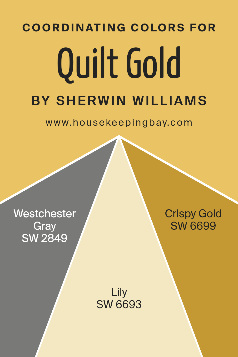
Coordinating Colors of Quilt Gold SW 6696 by Sherwin Williams
Coordinating colors are complementary shades that help balance a primary color, creating a cohesive and appealing look in a space. For instance, with Quilt GoldSW 6696 by Sherwin Williams, which is a warm, inviting yellow, specific coordinating colors can enhance this hue by adding contrast or harmony.
These colors are chosen to either contrast with or complement the main color for accent walls, trim, or decorative accessories, enabling a visually interesting environment without overwhelming the senses.
Westchester Gray SW 2849 provides a sophisticated balance to Quilt Gold. It is a muted gray that offers a subtle, refined backdrop, allowing the bolder yellow of Quilt Gold to stand out without clashing. In combination with gray, Lilly SW 6693 presents a soft, gentle touch of pink that contributes freshness and a slight romantic feel to the palette, enriching the overall warmth of the room.
Lastly, Crispy Gold SW 6699 serves to enhance the intensity of Quilt Gold by adding a deeper, yet bright gold tone that reinforces the richness of the space, making it feel more integrated and thoughtfully curated.
These coordinated colors work together to create an inviting atmosphere that feels balanced and aesthetically pleasing.
You can see recommended paint colors below:
- SW 2849 Westchester Gray
- SW 6693 Lily
- SW 6699 Crispy Gold
housekeepingbay.com
How Does Lighting Affect Quilt Gold SW 6696 by Sherwin Williams?
Lighting plays a crucial role in the way we perceive colors, as it can dramatically change their appearance. The color of light, whether from natural or artificial sources, can enhance or mute colors, affecting our perception of space and design.
Quilt Gold SW 6696 by Sherwin Williams is a rich, warm hue that responds vividly under different lighting conditions. In artificial light, this golden yellow shade tends to look deeper and more saturated, creating a cozy and inviting atmosphere, especially when illuminated by warm white bulbs.
In contrast, under the cooler, bluer light of energy-efficient LEDs, Quilt Gold can appear sharper and slightly less warm, though still maintaining its vibrant character.
In natural light, Quilt Gold’s appearance shifts throughout the day. The quality and angle of natural light varies with the direction a room faces, influencing how this color is perceived:
1. North-Faced Rooms: These rooms receive less direct sunlight, which can make colors appear cooler and somewhat subdued. Quilt Gold in a north-facing room might look less intense, with a softer, muted quality.
2. South-Faced Rooms: These rooms enjoy abundant sunlight, which can make the golden tones in Quilt Gold pop and look exceptionally vibrant and warm. The color tends to stay bright and cheerful throughout the day in south-facing rooms.
3. East-Faced Rooms: Morning light is warm and golden, making Quilt Gold look bright and sunny in the morning, which gradually transitions to a lighter, more delicate shade by noon as the sunlight becomes whiter.
4. West-Faced Rooms: Evening light brings warmth and a red-orange glow, accentuating the cozy warmth of Quilt Gold, making it appear more intense and glowing towards the end of the day.
Understanding how different types of light affect the perception of colors like Quilt Gold SW 6696 can help in making informed choices for painting and decorating spaces to achieve the desired mood and effect.
housekeepingbay.com
What is the LRV of Quilt Gold SW 6696 by Sherwin Williams?
LRV stands for Light Reflectance Value, which measures the percentage of light a paint color reflects from or absorbs into a wall. Ranging from 0 (absolute black, absorbing all light) to 100 (pure white, reflecting all light), this value helps you understand how light or dark a color will look once applied.
Higher LRV colors can make a room feel more open and airy as they reflect more light, while lower LRV colors can make a room feel cozier and smaller because they absorb more light.
Talking about Quilt Gold SW 6696 by Sherwin Williams, which has an LRV of 57.652, this color is moderately reflective, occupying a mid-range position on the LRV scale. This means it neither reflects too much light nor absorbs too much, offering a balanced and versatile hue.
The warmth of the color can add a soft, inviting vibe to a room, making it ideal for living spaces that benefit from a cozy yet moderately light atmosphere.
The specific LRV allows this color to adapt well to different lighting situations, maintaining its beauty and depth whether the room is flooded with natural light or relies on artificial sources.

housekeepingbay.com
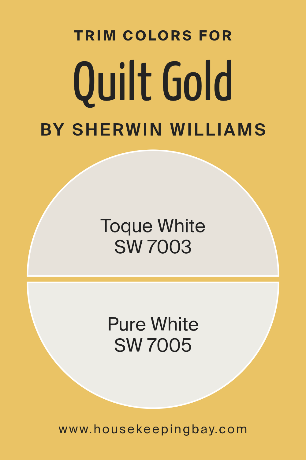
What are the Trim colors of Quilt Gold SW 6696 by Sherwin Williams?
Trim colors are specific shades used to accent or highlight the borders and edges within a room, often applied to moldings, door frames, and window sills. When used effectively, these colors can enhance the architectural features of a space and create a pleasing contrast, helping to define the overall aesthetic.
For a vibrant yellow like Quilt Gold SW 6696 by Sherwin Williams, choosing the right trim color is crucial to ensure the wall color pops without overwhelming the senses.
Light trim colors like SW 7003 – Toque White and SW 7005 – Pure White are excellent choices as they offer a subtle yet effective contrast which can make the warm tones of Quilt Gold SW 6696 appear more refined and vivid.
SW 7003 – Toque White is a soft, neutral white with a hint of gray. This color is gentle and unobtrusive, making it a perfect choice for trim as it provides a clean but soft boundary to richer, more vibrant colors.
On the other hand, SW 7005 – Pure White is a brighter, crisper white that offers a more striking contrast.
It is an excellent option for making any bold color stand out and giving a space a fresh, clean look. Choosing either of these shades as a trim color for the vibrant Quilt Gold SW 6696 can help ensure that the yellow hues do not overpower the space, but rather are showcased elegantly.
You can see recommended paint colors below:
housekeepingbay.com
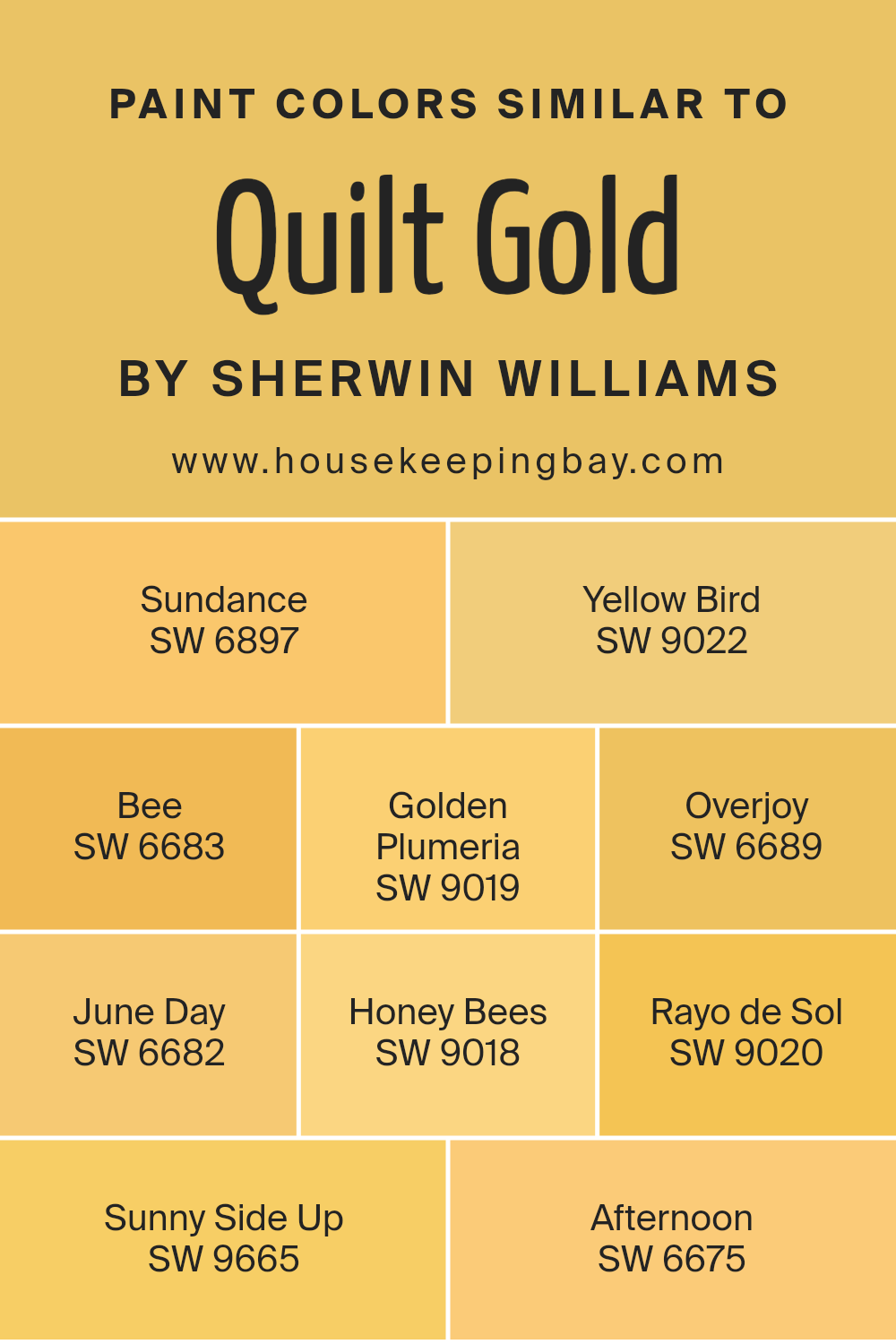
Colors Similar to Quilt Gold SW 6696 by Sherwin Williams
Similar colors are essential because they create a harmonious visual experience and help maintain a cohesive look in design projects or interior decorations. When colors like Quilt Gold SW 6696 by Sherwin Williams and its close shades are used together, they produce a subtle variation that adds depth and interest without overwhelming the senses.
This spectrum of colors works together by sharing common undertones or by being adjacent to each other on the color wheel, making the transitions between them smooth and pleasing to the eye.
For instance, Sundance SW 6897 carries a warm, sunny vibe, similar to a morning sun, while Yellow Bird SW 9022 is slightly brighter, reflecting a cheery, energetic atmosphere. Bee SW 6683 offers a vibrant, vivid hue that reminds one of lively, bustling summer days.
Golden Plumeria SW 9019, with its rich, tropical essence, casts a cozy, inviting feel. Overjoy SW 6689 is particularly lively, ideal for spaces that need a pop of joyous color. June Day SW 6682 has a soft, mellow quality, like gentle sunlight in early summer.
Honey Bees SW 9018 exudes a sweet, serene golden tone, perfect for creating a relaxed ambiance. Rayo de Sol SW 9020, with its radiant glow, can light up any room with positivity. Sunny Side Up SW 9665 brings a fresh, optimistic flair, ideal for starting the day with a positive note.
Lastly, Afternoon SW 6675 evokes the tranquil feeling of a lazy, sunny afternoon, great for spaces meant for unwinding. Together, these colors offer a palette that can enrich spaces with warmth and a sense of unity.
You can see recommended paint colors below:
- SW 6897 Sundance
- SW 9022 Yellow Bird
- SW 6683 Bee
- SW 9019 Golden Plumeria
- SW 6689 Overjoy
- SW 6682 June Day
- SW 9018 Honey Bees
- SW 9020 Rayo de Sol
- SW 9665 Sunny Side Up
- SW 6675 Afternoon
housekeepingbay.com
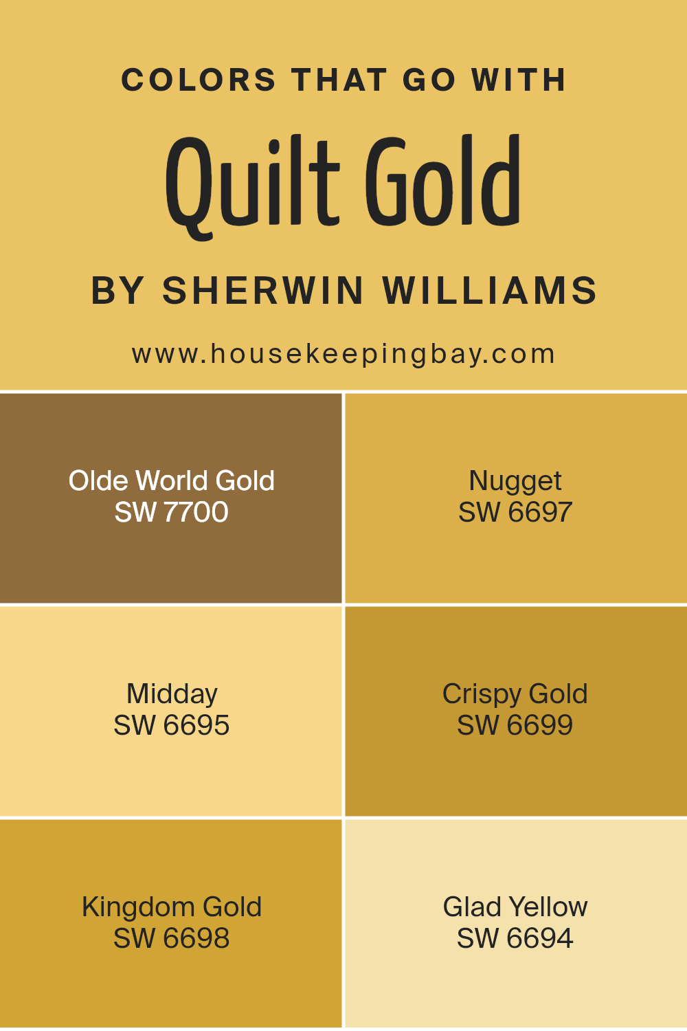
Colors that Go With Quilt Gold SW 6696 by Sherwin Williams
Choosing the right colors to complement Quilt Gold SW 6696 by Sherwin Williams can enhance the overall aesthetics of your space. The colors that pair well with Quilt Gold, such as Olde World Gold SW 7700, Nugget SW 6697, Midday SW 6695, Crispy Gold SW 6699, Kingdom Gold SW 6698, and Glad Yellow SW 6694, work together to create a warm and inviting environment. This can really make a room feel cozy and put together.
Olde World Gold SW 7700 has a deep, muted tone that provides a sophisticated backdrop, enriching the vibrant hues of Quilt Gold. Nugget SW 6697 adds a lively pop with its bright, cheerful shade, balancing the deeper tones around it.
Moving to Midday SW 6695, you get a lighter, sun-kissed appeal that illuminates spaces and brings a light, refreshing touch. Crispy Gold SW 6699, on the other hand, offers a sharp and vivid yellow, stimulating visual interest and making spaces feel more alive.
Kingdom Gold SW 6698 has a regal quality that works wonderfully in more formal or traditional settings, giving a rich depth to the room. Lastly, Glad Yellow SW 6694 is fresh and vibrant, perfect for adding a splash of energy and optimism to any decor.
All these shades harmonize with Quilt Gold, allowing you to create a cohesive yet diverse palette that is both appealing and functional.
You can see recommended paint colors below:
- SW 7700 Olde World Gold
- SW 6697 Nugget
- SW 6695 Midday
- SW 6699 Crispy Gold
- SW 6698 Kingdom Gold
- SW 6694 Glad Yellow
housekeepingbay.com
How to Use Quilt Gold SW 6696 by Sherwin Williams In Your Home?
Quilt Gold SW 6696 by Sherwin Williams is a warm, inviting paint color that can add a cozy feel to any room in your home. Its rich golden hue is perfect for creating a welcoming atmosphere in living areas such as the living room or dining room.
This color works well when paired with natural elements like wooden furniture or woven baskets, enhancing a rustic or farmhouse style.
You can also use Quilt Gold in a kitchen or hallway to bring warmth to spaces that may lack natural light. In bedrooms, this shade pairs nicely with creamy whites or soft grays for a balanced and cozy look. For a bold statement, consider painting an accent wall with Quilt Gold to serve as a backdrop for art or to highlight a particular area of the room.
Overall, Quilt Gold is versatile and can be adapted to various decorating styles, from modern to traditional, making it an excellent choice for adding character and warmth to your home.
Quilt Gold SW 6696 by Sherwin Williams vs Yellow Bird SW 9022 by Sherwin Williams
Quilt Gold SW 6696 by Sherwin Williams is a warm, inviting shade that brings a cozy, sunlit feel to any room. It mimics the golden tones of a late afternoon sun and adds a comforting aura perfect for creating a welcoming space. This color pairs well with dark woods and rich fabrics, making it ideal for traditional or rustic decor styles.
Yellow Bird SW 9022, in contrast, is a brighter, more vibrant yellow. It exudes cheer and energy, making rooms feel lively and bright. This color is particularly effective in spaces that need a lift or in areas that benefit from a playful, spirited vibe.
It’s a great choice for kitchens, children’s rooms, or any place that could use a dash of happiness.
Both colors offer distinct vibes: Quilt Gold provides warmth and comfort, while Yellow Bird offers a punch of energy and cheerfulness. Depending on the atmosphere you want to create, either color can significantly enhance your space.
You can see recommended paint color below:
- SW 9022 Yellow Bird
housekeepingbay.com
Quilt Gold SW 6696 by Sherwin Williams vs Golden Plumeria SW 9019 by Sherwin Williams
Quilt Gold SW 6696 by Sherwin Williams is a warm and vibrant shade that closely resembles the golden hues found in traditional quilts. It has a deep, rich tone that adds a cozy and inviting touch to any space, making it suitable for living rooms or dining areas where a sense of warmth is desired.
Golden Plumeria SW 9019, also by Sherwin Williams, is lighter and more subtle compared to Quilt Gold. This color leans towards a soft, creamy yellow, offering a gentle and soothing effect. It’s a great choice for spaces that require a touch of brightness without overwhelming the senses, like kitchens or bathrooms.
Both colors can add a cheerful atmosphere to a room, but Quilt Gold provides a more pronounced golden warmth, whereas Golden Plumeria offers a softer, more muted presence. Each has its unique appeal depending on the desired ambiance and matching decor elements.
You can see recommended paint color below:
- SW 9019 Golden Plumeria
housekeepingbay.com
Quilt Gold SW 6696 by Sherwin Williams vs Sundance SW 6897 by Sherwin Williams
Quilt Gold SW 6696 by Sherwin Williams is a warm, deep yellow with a touch of coziness, much like the name suggests. This color brings an inviting, rich ambiance to spaces, making it perfect for living areas or bedrooms where a comforting atmosphere is desired. It pairs well with natural wood and darker shades for a balanced look.
Sundance SW 6897 by Sherwin Williams is a brighter, more vibrant yellow. This color is more energetic and lively, ideal for spaces where you want to inject positivity and cheerfulness, such as kitchens, playrooms, or any area that benefits from a sunny uplift. It works well with lighter neutrals and can make small spaces appear larger and more open.
Both colors offer a yellow hue, but while Quilt Gold leans towards a muted, cozy feel, Sundance is all about vibrancy and energy, making them suited for different types of rooms and moods.
You can see recommended paint color below:
- SW 6897 Sundance

housekeepingbay.com
Quilt Gold SW 6696 by Sherwin Williams vs Honey Bees SW 9018 by Sherwin Williams
Quilt Gold SW 6696 by Sherwin Williams is a vibrant, deep yellow with a warm, golden tone that adds a cozy, inviting feel to any space. It’s bold enough to make a statement yet neutral enough to work well in various settings, from traditional to modern. It works beautifully in living rooms or dining areas where a touch of warmth is desirable.
In contrast, Honey Bees SW 9018 by Sherwin Williams is a softer, muted yellow. This color offers a subtle, soothing quality, making it ideal for bedrooms or spaces where a calming atmosphere is preferred. It’s less intense than Quilt Gold, providing a gentle backdrop that complements a wide range of decor styles.
Both colors bring warmth and brightness to interiors, but Quilt Gold packs a stronger punch with its richer hue, while Honey Bees offers a more understated, delicate vibe. Depending on the mood and function of the room, each color has its unique appeal and suitability.
You can see recommended paint color below:
- SW 9018 Honey Bees

housekeepingbay.com
Quilt Gold SW 6696 by Sherwin Williams vs Overjoy SW 6689 by Sherwin Williams
Quilt Gold SW 6696 by Sherwin Williams is a warm, cozy hue with a deep yellow tint, giving spaces a comforting and inviting feel. It’s a beautiful choice for a room where you want to create a snug, welcoming atmosphere, like living rooms or bedrooms. This color pairs well with darker wood furniture and rich fabrics, enhancing the homely vibe.
On the contrary, Overjoy SW 6689 by Sherwin Williams is a brighter, more vibrant yellow. It brings a cheerful and energetic touch to any area, making it perfect for kitchens, playrooms, or any space meant to inspire happiness and activity. Overjoy tends to work best in well-lit areas, where its brightness can truly pop against lighter accents or furnishings.
Both colors are shades of yellow but serve different moods and settings due to their intensity and depth. Quilt Gold sets a more relaxed, traditional tone, while Overjoy adds a punch of liveliness and fun.
You can see recommended paint color below:
- SW 6689 Overjoy

housekeepingbay.com
Quilt Gold SW 6696 by Sherwin Williams vs Bee SW 6683 by Sherwin Williams
Quilt Gold SW 6696 by Sherwin Williams and Bee SW 6683 by Sherwin Williams are both warm hues but serve different visual interests. Quilt Gold is a muted, deeper yellow with an earthy undertone, making it ideal for creating a cozy, subtle ambiance in rooms.
Its richness gives a feeling of warmth and comfort, perfect for spaces where calmness is key. In contrast, Bee SW 6683 is a brighter, more vibrant yellow. This color reflects more light, making it excellent for spaces that aim to be lively and energizing.
It has a freshness that can liven up a room, making it feel inviting and cheerful. Both colors work well in different settings; Quilt Gold suits areas needing a more subdued tone, while Bee excels in spaces where a bright, happy atmosphere is desired.
You can see recommended paint color below:
- SW 6683 Bee
housekeepingbay.com
Quilt Gold SW 6696 by Sherwin Williams vs Sunny Side Up SW 9665 by Sherwin Williams
Quilt Gold SW 6696 by Sherwin Williams is a warm, deep yellow with a touch of mustard, giving it a cozy, golden hue perfect for creating a welcoming atmosphere. It works well in spaces that aim for a rich, comforting vibe, such as living rooms or dining areas. This color pairs nicely with dark woods or a neutral palette to enhance its warm characteristics without overpowering the space.
Sunny Side Up SW 9665, contrastingly, is a brighter, more vibrant yellow. It brings a lively, cheerful feeling to any room, ideal for kitchens, bathrooms, or spaces that benefit from a burst of energy and light. This shade complements white or light gray, creating a fresh and airy environment. Its brightness is particularly effective in smaller or darker spaces where a sense of openness is desired.
Both colors inject warmth and cheer but serve different moods and settings within a home. Quilt Gold lends a more subdued, sophisticated warmth, while Sunny Side Up offers a punchier, energetic vibe.
You can see recommended paint color below:
- SW 9665 Sunny Side Up

housekeepingbay.com
Quilt Gold SW 6696 by Sherwin Williams vs Afternoon SW 6675 by Sherwin Williams
Quilt Gold SW 6696 by Sherwin Williams is a warm, inviting shade. Its deep yellow base offers a cozy, homey feel, perfect for spaces that aim to comfort and offer relaxation. This hue works especially well in living rooms and kitchens where its cheerful glow can create a lively atmosphere.
Afternoon SW 6675, also by Sherwin Williams, is a vibrant, sunny yellow. It’s brighter and more intense compared to Quilt Gold. This color can energize a room, making it an excellent choice for areas that benefit from a burst of freshness like playrooms or creative spaces.
While both colors share a yellow foundation, Quilt Gold leans towards a mellow, muted tone that suggests warmth and comfort. In contrast, Afternoon suggests vibrancy and energy, suitable for stimulating spaces. The choice between them depends on the mood and function you want to enhance in your room.
You can see recommended paint color below:
- SW 6675 Afternoon

housekeepingbay.com
Quilt Gold SW 6696 by Sherwin Williams vs Rayo de Sol SW 9020 by Sherwin Williams
Quilt Gold SW 6696 and Rayo de Sol SW 9020 are both vibrant colors from Sherwin Williams, but they have distinct tones. Quilt Gold is a deep, mustard yellow that provides a warm and cozy feel. This shade is perfect for spaces where you want to add a sense of comfort and traditional elegance. It pairs nicely with dark greens or rich browns, giving an earthy and soothing atmosphere.
Meanwhile, Rayo de Sol is a more intense yellow with bright, sunny undertones. This color is much lighter compared to Quilt Gold and injects energy and cheerfulness into a space. It works well in areas that benefit from a playful and lively vibe, like kitchens or playrooms. Rayo de Sol could be paired with light blues or grays to keep the space airy and vibrant.
While both hues fall into the yellow category, Quilt Gold leans toward a classic, subdued look, whereas Rayo de Sol offers a bold and fresh visual impact. Whether you choose Quilt Gold for its warmth or Rayo de Sol for its cheer, both colors can vividly enhance your space.
You can see recommended paint color below:
- SW 9020 Rayo de Sol

housekeepingbay.com
Quilt Gold SW 6696 by Sherwin Williams vs June Day SW 6682 by Sherwin Williams
Quilt Gold SW 6696 by Sherwin Williams is a warm, rich gold hue that feels cozy and inviting, perfect for creating a comfortable and welcoming atmosphere in any room. It works well to add warmth and can brighten spaces lacking natural light. This shade pairs nicely with dark woods and traditional decor, offering an elegant and timeless look.
June Day SW 6682, also by Sherwin Williams, is a much lighter color, presenting a soft, cheerful yellow. It’s ideal for spaces where you want to promote a sense of lightness and airiness. June Day can make small rooms feel bigger and is excellent for kitchens, bathrooms, or nurseries due to its fresh and uplifting vibe.
Each color serves different purposes depending on the mood and dimensions of the room you are decorating. While Quilt Gold brings depth and warmth, June Day introduces brightness and an energizing atmosphere. Choosing between them depends on the desired effect for your space.
You can see recommended paint color below:
- SW 6682 June Day

housekeepingbay.com
Conclusion
So, after going thoroughly through SW 6696 Quilt Gold by Sherwin Williams, I’m convinced it’s a fantastic choice for anyone looking to infuse their space with warmth and cheer. This shade of gold isn’t just bright and cozy; its inviting hue has the power to make any room feel more welcoming.
Whether you’re aiming to paint an accent wall or revamp your entire living space, Quilt Gold offers a versatile solution that pairs well with various decor styles, from rustic to modern.
I found the paint’s quality impressive as it provides excellent coverage and durability, meaning it can handle the everyday wear and tear of busy areas with ease. This aspect alone makes it a practical pick for both residential and commercial spaces.
Moreover, pairing this rich gold with contrasting colors can really enhance the overall aesthetic of a room. Neutrals like white or gray work beautifully against it, creating a balanced and visually appealing look.
For anyone thinking about a new painting project, SW 6696 Quilt Gold offers a refreshing and vibrant splash of color that’s sure to brighten up any space.
Perfect for anyone who values both aesthetics and functionality in their paint choices.
housekeepingbay.com
Ever wished paint sampling was as easy as sticking a sticker? Guess what? Now it is! Discover Samplize's unique Peel & Stick samples. Get started now and say goodbye to the old messy way!
Get paint samples


