Pleasant Pink 2094-60 by Benjamin Moore
Blush of Warmth and Joy
Choosing the right paint color for a space can sometimes feel like a daunting task. Every room has its own personality, and the color you choose should complement that vibe and enhance the overall atmosphere. With so many options available, how do you decide on the perfect shade?
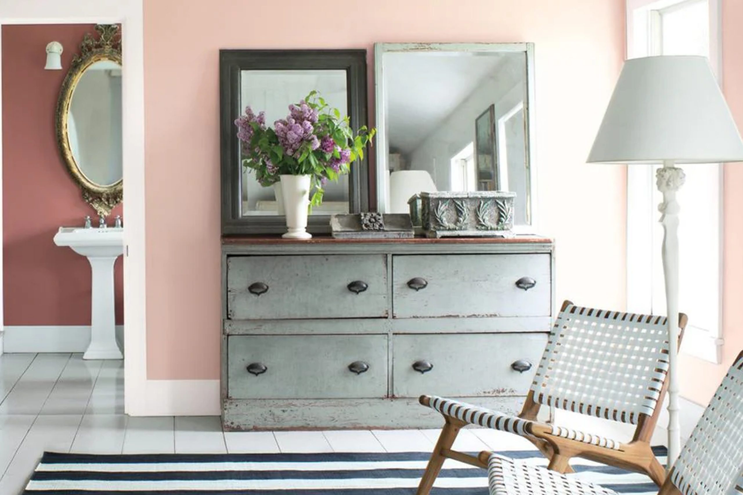
Consider Pleasant Pink by Benjamin Moore. It’s a soft, welcoming hue that adds warmth and charm to any room. This shade isn’t too bold or too subtle. It offers a gentle balance that can make a space feel both cozy and inviting. Whether you’re updating a bedroom or giving your living room a fresh look, Pleasant Pink might just be what you need.
You don’t have to worry about stark contrasts or clashing tones with this shade. It works well with a variety of colors, making it easy to pair with your existing decor. Imagine it as a backdrop that highlights your furniture and art pieces, creating a harmonious visual experience.
Try imagining a room bathed in Pleasant Pink. Think about how it might feel to walk into that space after a long day. The color provides a comforting embrace, offering a peaceful retreat from the hustle and bustle outside.
via clementspaint.com
What Color Is Pleasant Pink 2094-60 by Benjamin Moore?
Pleasant Pink 2094-60 by Benjamin Moore is a soft, warm shade of pink that brings a gentle touch of color to any space. It’s not too bright or bold, making it perfect for creating a light and airy atmosphere. This hue has a subtle, calming quality, adding a hint of coziness without overpowering the room.
Pleasant Pink works beautifully in various interior styles. In a Scandinavian-themed room, it pairs well with crisp whites, light woods, and simple designs, adding a touch of warmth. In a shabby chic setting, this pink can blend effortlessly with vintage furniture, delicate lace, and floral patterns to create a nostalgic, inviting feel.
It also fits into modern designs, offering a subtle, cheerful contrast against sleek materials like glass, metal, and black or gray accents. When thinking about materials and textures, consider pairing Pleasant Pink with light, natural fibers such as linen or cotton for curtains or upholstery. Wooden elements with a light or whitewashed finish can accentuate its softness.
Textured rugs or cushions in neutral shades or even gentle greys will complement this pink beautifully, providing a balanced and harmonious look in almost any room. This versatile shade is fitting for bedrooms, nurseries, or living spaces where a serene atmosphere is desired.
housekeepingbay.com
Is Pleasant Pink 2094-60 by Benjamin Moore Warm or Cool color?
Pleasant Pink 2094-60 by Benjamin Moore is a soft, gentle shade of pink that can bring warmth and comfort to any room. This color creates a cozy atmosphere and adds a touch of sophistication without feeling overwhelming. It’s ideal for spaces where relaxation and calm are desired, like bedrooms or living rooms.
In rooms with plenty of natural light, Pleasant Pink can appear brighter, adding a cheerful note. In dimmer spaces, it takes on a soothing, muted tone, which is perfect for unwinding. It’s also versatile enough to work well with various styles, from traditional to modern. Pairing it with neutral tones like whites or grays can highlight its subtle charm, while combining it with bolder colors can add contrast.
Overall, Pleasant Pink is an inviting color choice that can make any space feel warm and welcoming, making it a popular option for those looking to create a comfortable home environment.
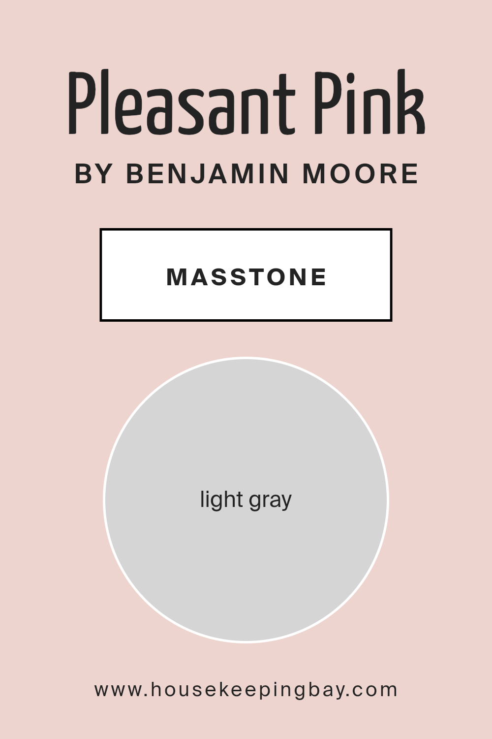
What is the Masstone of the Pleasant Pink 2094-60 by Benjamin Moore?
Pleasant Pink 2094-60 by Benjamin Moore is a soft, gentle color that has a masstone of light gray (#D5D5D5). This gray tint makes the pink feel sophisticated and soothing, rather than overly sweet or vibrant. In homes, this balance helps create spaces that are calming and comfortable to live in.
The light gray undertone allows Pleasant Pink to blend well with various styles and color schemes. It can fit into both modern and traditional interiors, offering a subtle touch of warmth and interest.
When used in living rooms or bedrooms, Pleasant Pink can make the space feel cozy and inviting. It works nicely with natural materials like wood, stone, or linen, enhancing their beauty. Pairing it with whites or soft neutrals can further highlight its delicate nature, while darker accents provide a stylish contrast. In rooms with ample natural light, the color glows softly, adding a warm ambiance without overwhelming the space.
housekeepingbay.com
Undertones of Pleasant Pink 2094-60 by Benjamin Moore
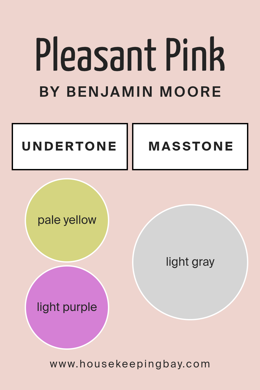
Pleasant Pink 2094-60 by Benjamin Moore is a unique shade that carries various undertones. These subtle hints of other colors can greatly affect how we perceive this pink.
The undertones suggested—pale yellow, light purple, light blue, pale pink, mint, lilac, and grey—each add different feelings and characteristics to the paint. Undertones influence how a color appears under different lighting or next to other colors. They can change the warmth or coolness of a hue and can either blend in or stand out, depending on the environment.
Pale yellow provides warmth, giving the pink a gentle glow in well-lit rooms. Light purple and lilac add a soft elegance, making the pink appear more sophisticated. Light blue and mint cool the pink, offering freshness that might feel balancing in brightly lit spaces. The pale pink undertone enhances the main color, making it richer. Grey tones bring calm and neutrality, offering subtle depth.
On interior walls, these undertones make Pleasant Pink versatile. In a sunlit room, a warm glow may dominate, while artificial light might highlight blue or grey, altering mood. Pair with similar toned decor or contrasting elements for dramatic or soothing space adjustments.
housekeepingbay.com
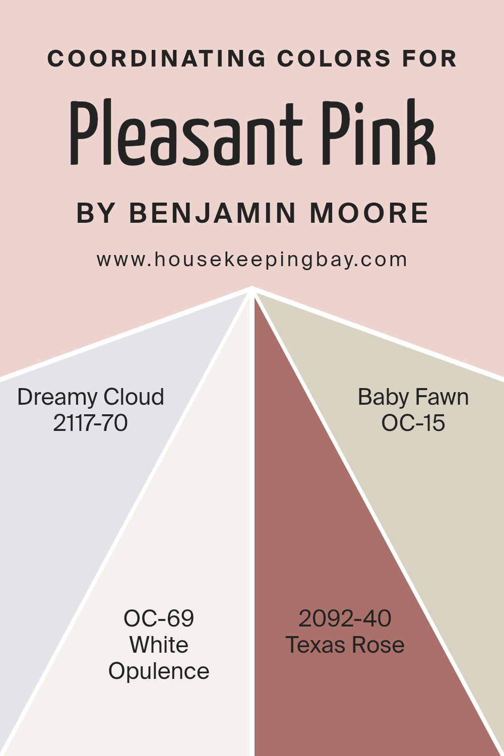
Coordinating Colors of Pleasant Pink 2094-60 by Benjamin Moore
Coordinating colors are hues that complement each other, creating a harmonious look when used together in a space. Pleasant Pink 2094-60 by Benjamin Moore is a soft, subtle pink that can brighten a room without overwhelming it. To enhance this color, you can use Dreamy Cloud 2117-70, which offers a gentle, calming presence with its light, ethereal gray undertones.
It pairs well with pink because it adds a sense of airiness and elegance. White Opulence OC-69 is another wonderful match, providing a clean, fresh backdrop with its warm, creamy undertones that enhance the natural warmth of Pleasant Pink.
Additionally, Texas Rose 2092-40 introduces a lively pop of color with its bold, rich orange hue. It adds just the right amount of energy and can be used as an accent to make the pink feel warmer and more dynamic.
For a more grounded look, Baby Fawn OC-15 is an excellent choice with its soft, taupe-esque appeal offering a gentle, neutral warmth. This color adds depth and sophistication, balancing the lighter tones and creating a cohesive palette. By using these colors together, you can design a room that feels both inviting and balanced.
You can see recommended paint colors below:
- 2117-70 Dreamy Cloud
- OC-69 White Opulence
- 2092-40 Texas Rose
- OC-15 Baby Fawn
housekeepingbay.com
How Does Lighting Affect Pleasant Pink 2094-60 by Benjamin Moore?
Lighting plays a crucial role in how we perceive colors, and the same hue can look quite different under various lighting conditions. “Pleasant Pink 2094-60” by Benjamin Moore is a soft, muted pink that can change its character based on the lighting.
Under natural light, especially in a room with abundant sunlight, Pleasant Pink tends to reveal its warm undertones. However, its appearance will vary depending on the direction the room faces.
In north-facing rooms, which typically have cooler and more consistent light throughout the day, Pleasant Pink might take on slightly cooler tones, appearing a bit more subdued. This is because the natural light coming through north-facing windows has more blue in it, which can counteract the warm tones in the pink.
In south-facing rooms, which benefit from bright, warm light most of the day, Pleasant Pink will likely look warmer and more vibrant. The consistent sun exposure enhances the pink’s warmth and can make it appear a bit more vivid.
East-facing rooms get direct sunlight in the morning, which tends to be warm and can enhance the pink tones early in the day. However, as the sun moves, the room receives indirect and cooler light, which can make Pleasant Pink seem more muted later in the day.
West-facing rooms receive their strongest, warm light in the afternoon and evening. In these rooms, Pleasant Pink can become quite warm and may even take on a slightly orange tone as the day progresses.
In artificial light, the impact depends on the type of lighting used. Incandescent bulbs, known for their warm tones, may enhance the pink’s warmth. In contrast, fluorescent or LED lights, which can range from cool to neutral, might either subdue the warmth or change its tone slightly. It’s essential to test the color in the specific lighting of your space to ensure it meets your expectations.
housekeepingbay.com
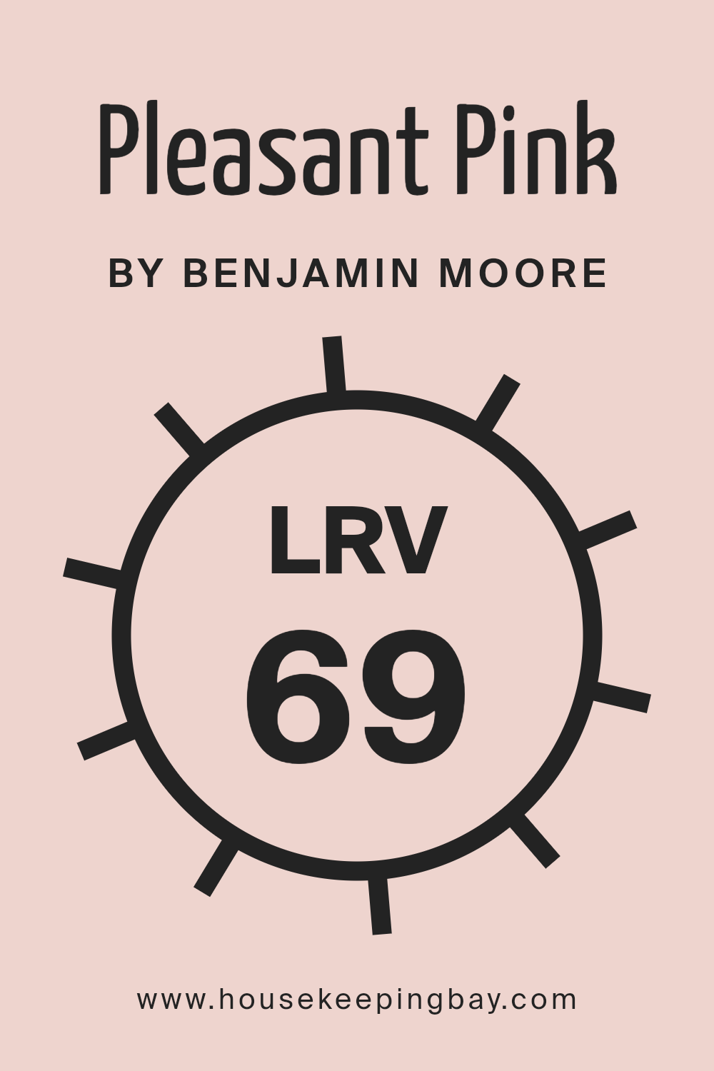
What is the LRV of Pleasant Pink 2094-60 by Benjamin Moore?
The LRV, or Light Reflectance Value, is a measure that tells us how much light a color reflects. It’s given as a percentage from 0 to 100. A color with an LRV of 0 absorbs all light, so it’s very dark, while a color with an LRV of 100 reflects all light, making it very bright, almost like pure white.
When it comes to paint colors, the LRV helps us understand how bright or dark a color will feel in a space. Colors with a high LRV will reflect more light and make a room feel brighter and more open, while colors with a low LRV will absorb light and can make a room feel cozier and smaller.
Pleasant Pink 2094-60 by Benjamin Moore has an LRV of 68.86, which means it reflects a good amount of light. This makes it a fairly light color, so when used on walls, it can help brighten up a room, making it feel airy and spacious.
With its medium-high LRV, Pleasant Pink will reflect light rather than absorb it, so it’s a good choice for spaces that need a little more light, such as rooms without many windows. This light-reflecting quality can also make the pink hue more vibrant, as the color will look lively and fresh in natural or artificial lighting.
housekeepingbay.com
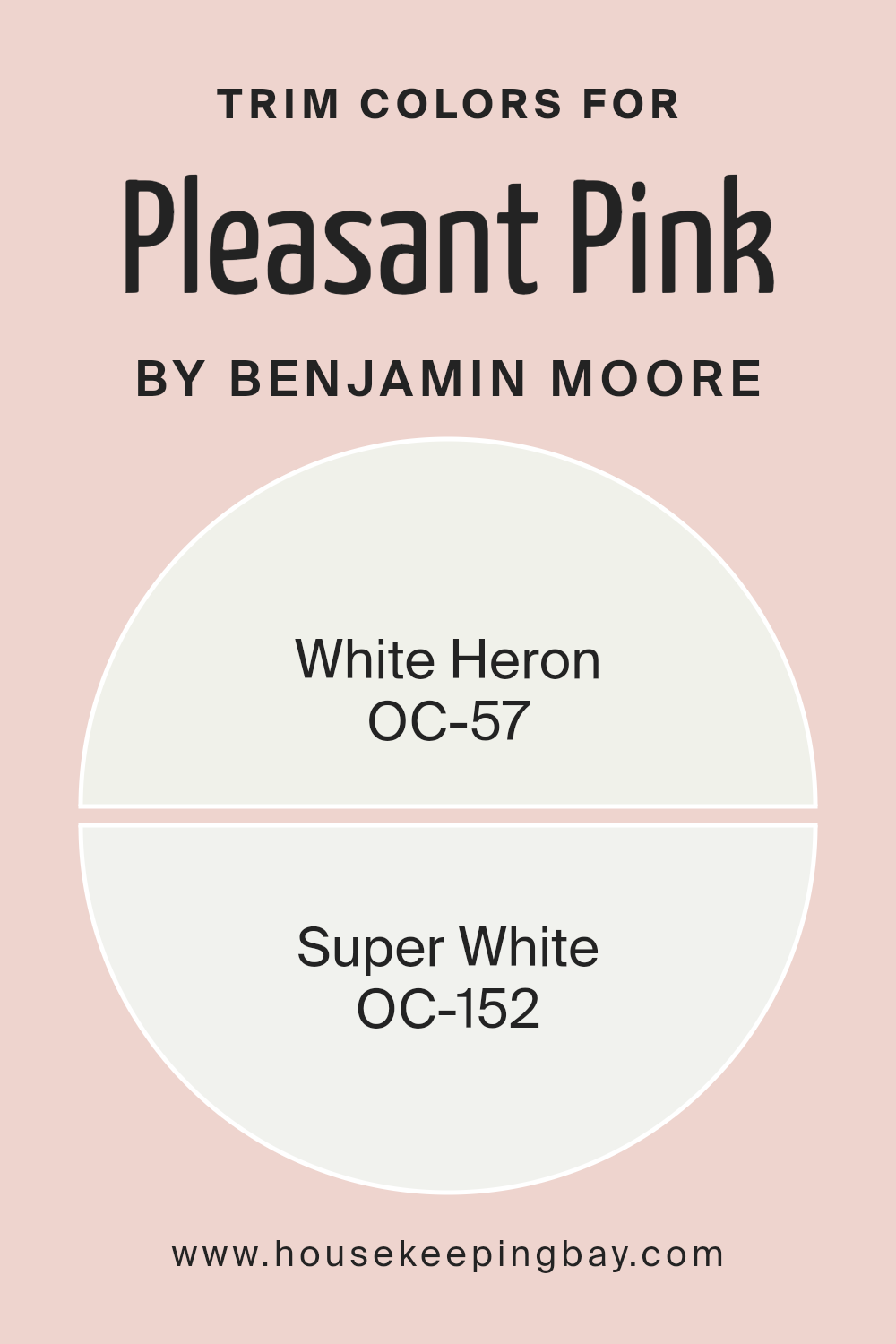
What are the Trim colors of Pleasant Pink 2094-60 by Benjamin Moore?
Trim colors are the hues used on the molding and framework around windows, doors, and other features of a room. They play a crucial role in a room’s visual appeal by outlining key elements and providing contrast to wall colors.
When choosing trim colors for Pleasant Pink 2094-60 by Benjamin Moore, consider how they highlight the pale, cheerful hue of the walls, enhancing the overall look. Trim colors help create depth and can make a room feel complete. The right trim color complements the main color and can make architectural features stand out more clearly.
Using colors like White Heron OC-57 and Super White OC-152 for trim can significantly affect the room’s appearance. White Heron has a gentle and understated warmth, which balances well with the soft tone of Pleasant Pink and gives the room a cozy but fresh feel.
On the other hand, Super White is a brilliant, clean white that provides a sharp, clear border against Pleasant Pink, making the pink appear more vivid and defined. Incorporating these trim colors ensures that Pleasant Pink doesn’t feel flat, adding subtle elegance and simple sophistication to the space.
You can see recommended paint colors below:
- OC-57 White Heron
- OC-152 Super White
housekeepingbay.com
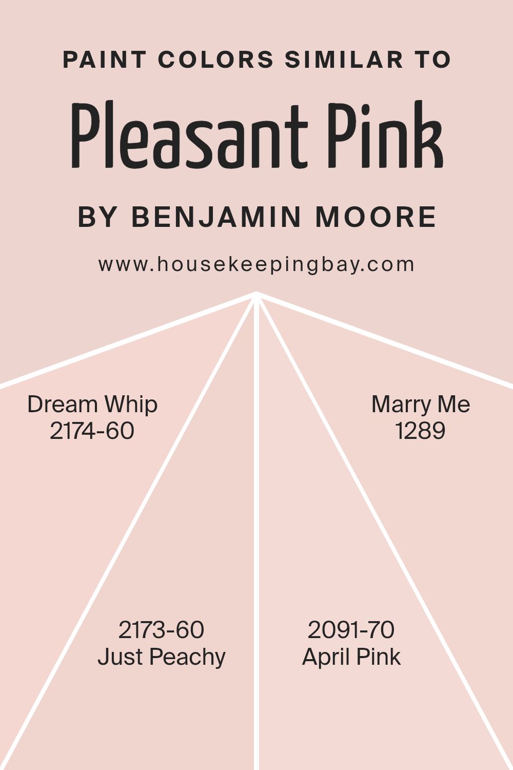
Colors Similar to Pleasant Pink 2094-60 by Benjamin Moore
Using similar colors in design helps create a cohesive and harmonious look. These colors, like siblings in a family, share certain characteristics that tie them together but also have their own unique personalities.
Pleasant Pink by Benjamin Moore is a soft, welcoming hue that sets the stage for a warm and inviting environment. When paired with colors like Dream Whip, Just Peachy, April Pink, and Marry Me, it creates a palette that enhances spaces by adding depth and interest without overwhelming the senses.
Dream Whip is a light and airy shade, offering a creamy background that complements Pleasant Pink. Just Peachy brings a gentle touch of warmth, slightly more vibrant but still understated, offering a cozy, friendly vibe. April Pink has a delicate, romantic feel with a hint of spring freshness, adding a subtle brightness to the mix.
Meanwhile, Marry Me offers a more grounded softness, with a touch of elegance that balances the overall palette. Together, these colors create a seamless yet varied setting, perfect for any space that aims to feel comforting and well-coordinated without resorting to stark contrasts or vibrant, overpowering hues.
You can see recommended paint colors below:
- 2174-60 Dream Whip
- 2173-60 Just Peachy
- 2091-70 April Pink
- 1289 Marry Me
housekeepingbay.com
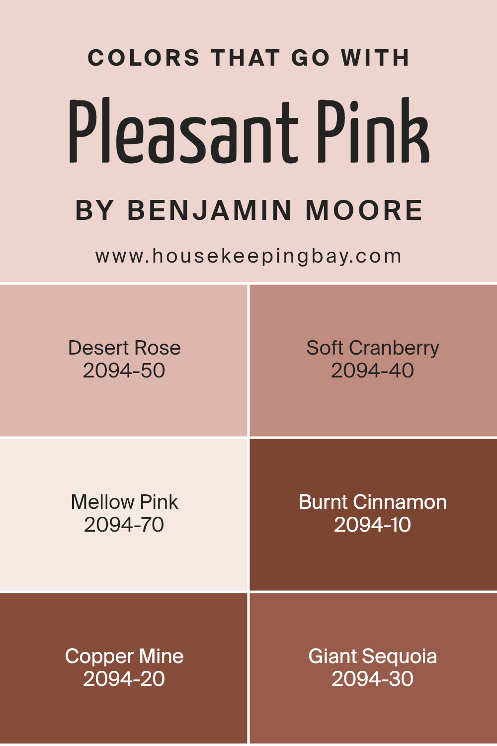
Colors that Go With Pleasant Pink 2094-60 by Benjamin Moore
Choosing colors that complement Pleasant Pink 2094-60 by Benjamin Moore is important because they can create a well-balanced and inviting space. Pleasant Pink is a soft, gentle hue that radiates warmth and comfort, making it an excellent choice for various rooms.
To enhance its beauty, pairing it with Desert Rose 2094-50 can add depth with its slightly muted, earthy pink tone, evoking a calm atmosphere. Soft Cranberry 2094-40 introduces a more vibrant, rich red-pink that can add a lively touch to the space while still harmonizing well with Pleasant Pink.
For a softer approach, Mellow Pink 2094-70 provides a light, airy pink that maintains a subtle and cohesive look, ideal for bedrooms or cozy areas. On the opposite end, Burnt Cinnamon 2094-10 adds a hearty, deep reddish-brown to the palette, creating a bold contrast that can be very striking.
Copper Mine 2094-20 brings in a metallic, warm tone that adds a layer of elegance and sophistication, working well in dining or living areas. Meanwhile, Giant Sequoia 2094-30, with its rich orange-brown shade, can ground the palette, adding a touch of natural earthiness that helps the other colors shine, offering balance and unity in any decor.
You can see recommended paint colors below:
- 2094-50 Desert Rose
- 2094-40 Soft Cranberry
- 2094-70 Mellow Pink
- 2094-10 Burnt Cinnamon
- 2094-20 Copper Mine
- 2094-30 Giant Sequoia
housekeepingbay.com
How to Use Pleasant Pink 2094-60 by Benjamin Moore In Your Home?
Pleasant Pink 2094-60 by Benjamin Moore is a soft, welcoming shade that can add a gentle touch to any room. It’s a muted, light pink that feels warm and inviting, making it perfect for creating cozy and comfortable spaces in your home. Use it in a bedroom to add a calming atmosphere, promoting relaxation and rest. It pairs nicely with whites and light grays, allowing you to create a serene environment.
In a living room, Pleasant Pink can act as an accent wall, bringing a subtle pop of color without feeling overwhelming. Pair it with wooden furniture or neutral tones to balance the look. In a bathroom, this shade can offer a fresh and clean vibe when combined with white tiles and silver fixtures.
Pleasant Pink works beautifully in nurseries or children’s rooms, too, providing a soft backdrop that complements playful, colorful decorations. Its gentle hue is versatile, making it easy to incorporate into various styles and themes.
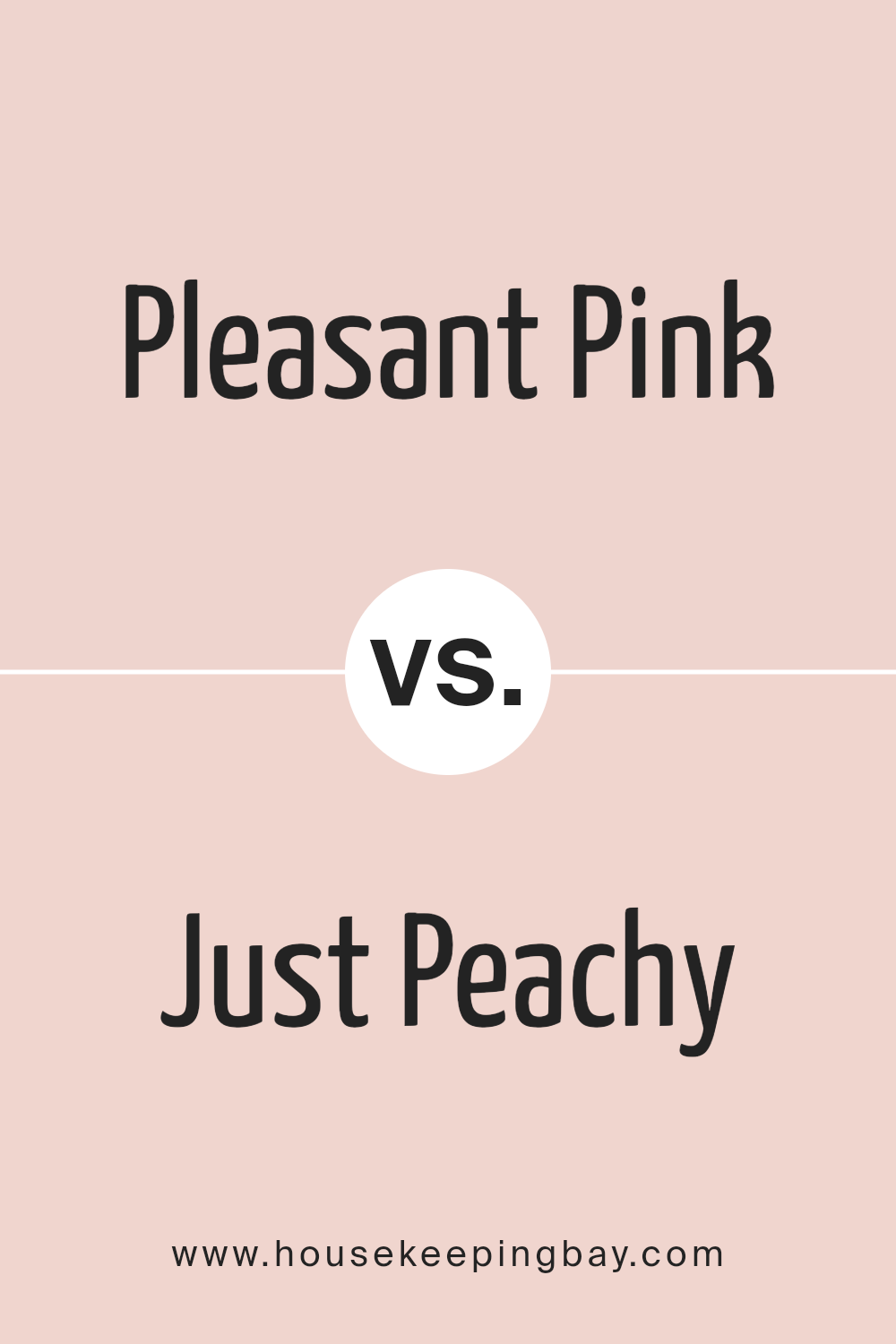
Pleasant Pink 2094-60 by Benjamin Moore vs Just Peachy 2173-60 by Benjamin Moore
Pleasant Pink 2094-60 by Benjamin Moore is a soft, gentle shade of pink that brings a sense of warmth and coziness to a space. It’s like a light blush, offering a soothing and comforting atmosphere. This shade is versatile and works well in bedrooms or living areas where you want to create a calm and inviting environment.
Just Peachy 2173-60, also by Benjamin Moore, leans more towards a peachy tone with hints of orange. This color feels cheerful and lively, adding a bit more energy to a room. It’s perfect for spaces where you want to encourage a friendly and welcoming vibe, such as kitchens or dining rooms.
Both colors offer a sense of warmth but in subtly different ways. Pleasant Pink gives a more muted, delicate feel, while Just Peachy provides a brighter and more vibrant look. Each color brings its unique charm to any space.
You can see recommended paint color below:
- 2173-60 Just Peachy
housekeepingbay.com
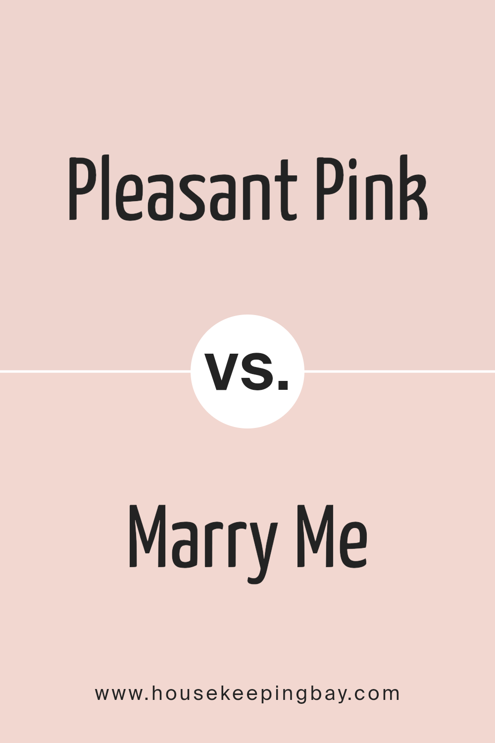
Pleasant Pink 2094-60 by Benjamin Moore vs Marry Me 1289 by Benjamin Moore
Pleasant Pink 2094-60 by Benjamin Moore exudes a soft, gentle vibe. It’s a light shade that feels airy and uplifting. Ideal for spaces where a sense of calm and lightness is desired, Pleasant Pink can brighten a room without overpowering it. Its subtle nature makes it suitable for bedrooms or nurseries, offering a comforting presence.
Marry Me 1289 by Benjamin Moore, in contrast, carries a richer tone. This shade presents a warm, romantic feeling that adds depth to any room. It has a slightly more saturated hue, which can create a cozy, intimate atmosphere. Marry Me works well in living rooms or dining areas where warmth and a welcoming ambiance are preferred.
Together, these two colors can complement each other in a home. Pleasant Pink might serve as a lovely backdrop, while Marry Me could act as an accent, providing balance between softness and warmth.
You can see recommended paint color below:
- 1289 Marry Me
housekeepingbay.com
Pleasant Pink 2094-60 by Benjamin Moore vs Dream Whip 2174-60 by Benjamin Moore
Pleasant Pink 2094-60 by Benjamin Moore is a soft, gentle shade of pink that exudes warmth and comfort. It’s like a whisper of color, adding a touch of subtlety and calmness to any room. This pink carries a sense of sweetness and charm, making spaces feel cozy and inviting without being overpowering.
Dream Whip 2174-60, also from Benjamin Moore, is a more muted, off-white shade with a hint of creaminess. It feels light, airy, and fresh, providing a clean and simple backdrop for any decor. Its understated nature makes it versatile, fitting seamlessly into many design styles while maintaining a sense of brightness and openness.
When comparing these two colors, Pleasant Pink adds warmth and a hint of playful elegance, while Dream Whip brings cleanliness and a refreshing feel. Choosing between them depends on whether you want a room to feel more warm and cozy or light and airy.
You can see recommended paint color below:
- 2174-60 Dream Whip
housekeepingbay.com
Pleasant Pink 2094-60 by Benjamin Moore vs April Pink 2091-70 by Benjamin Moore
Pleasant Pink 2094-60 and April Pink 2091-70 by Benjamin Moore are two soft shades of pink that differ in subtle but notable ways. Pleasant Pink offers a warmer and slightly deeper hue. It leans more towards a rosy shade that can add a cozy and inviting atmosphere to any space. This color can work well in bedrooms or living areas where you want a sense of warmth and comfort.
April Pink 2091-70, in contrast, is a lighter, airier shade with a touch more pastel quality. It appears more muted and can create a gentle, serene environment, making it an excellent choice for spaces where you need calmness and relaxation, such as nurseries or bathrooms.
Both colors share a soothing quality but serve slightly different purposes in design. Pleasant Pink promotes a warmer environment, while April Pink offers a lighter, more delicate touch.
You can see recommended paint color below:
- 2091-70 April Pink
housekeepingbay.com
Final Thoughts
Looking at 2094-60 Pleasant Pink by Benjamin Moore, I find it an inviting shade that offers a warm and gentle atmosphere. It’s a color that brings a sense of coziness to any space. The shade balances well between muted and vibrant, making it versatile for various settings. Whether used in a bedroom to create a soothing retreat or in a living room to add a touch of elegance, this hue adapts beautifully.
Personally, I see Pleasant Pink as an ideal backdrop for creating a welcoming environment. It pairs well with neutral tones, adding depth without overwhelming. In contrast, when combined with bolder colors, it serves as a calming complement. Its flexibility allows for creativity, whether you lean towards modern design or prefer a more traditional approach.
Beyond aesthetics, Pleasant Pink fosters a comforting ambiance. It’s a color that speaks subtly, yet leaves a lasting impression. Its charm lies in its ability to add warmth without overpowering. To me, this shade is more than just a color; it’s a gentle reminder of comfort and style.influence
I truly appreciate how it can the mood of a room and make a space feel like home.
housekeepingbay.com
