Palm Leaf SW 7735 by Sherwin Williams
Embracing Nature's Serene Green
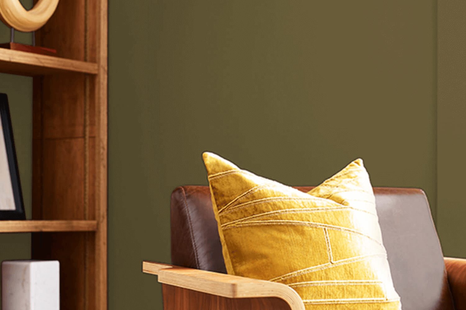
If you’re on the hunt for a fresh and vibrant new shade for your space, you’re in the right place! Today, let’s talk about SW 7735 Palm Leaf by Sherwin Williams. Imagine bringing a touch of nature’s serenity and the lushness of a tropical haven right into your home. That’s exactly the vibe Palm Leaf delivers. It’s not just a color; it’s an experience. This richly saturated green is like a breath of fresh air, infusing life and energy into any room.
This hue isn’t just beautiful; it’s versatile too. Whether you want to create a statement wall that catches every eye or add subtle touches of greenery-inspired charm through accent pieces, Palm Leaf is up to the task. Think of it as your go-to color for crafting a space that feels both rejuvenating and comfortably stylish. It pairs wonderfully with neutrals, adding depth and focus, or for the more adventurous, it can hold its own alongside vibrant tones, sparking creativity.
Choosing Palm Leaf means you’re ready to refresh your environment and inject it with vibrancy. It’s perfect for anyone looking to refresh their living space, office, or even a cozy nook that needs a splash of inspiration. So why not take the leap and transform your surroundings with this lively green? It could be the change you’ve been looking for, bringing a sense of calm and inspiration to your daily life.
by Sherwin Williams
What Color Is Palm Leaf SW 7735 by Sherwin Williams?
Palm Leaf SW 7735 by Sherwin Williams is a unique and vibrant color that instantly brings a touch of nature into any space. This color is like a breath of fresh air, mirroring the lush greenery of a tropical rainforest. It’s a medium-dark shade of green with a lively, yet soothing, vibe. Palm Leaf is perfect for creating an indoor oasis, making it ideal for spaces where you want to relax and recharge.
This color works exceptionally well in interior styles that lean towards the natural and organic, such as boho, tropical, or even a modern farmhouse look. It’s versatile enough to be used as an accent wall or to paint an entire room for a bold, immersive environment. Palm Leaf is all about bringing the outdoors in, creating a bridge between nature and your living space.
When it comes to pairing materials and textures, Palm Leaf shines with natural wood, from light oak to rich walnut, adding warmth and depth to the room. It also looks stunning with natural fibers like jute, rattan, or linen, reinforcing the connection to nature. For a more refined or sophisticated touch, incorporating metals like brass or copper can add a hint of luxury without overpowering the room’s natural vibe.
Creams and soft whites also pair beautifully with Palm Leaf, offering a crisp, fresh contrast that highlights the richness of the green. This combination is perfect for creating a balanced and inviting space where the energy and tranquility of nature are in perfect harmony.
housekeepingbay.com
Table of Contents
Is Palm Leaf SW 7735 by Sherwin Williams Warm or Cool color?
Palm Leaf SW 7735 by Sherwin Williams is a unique and bold color. It brings the fresh feeling of nature right into your home. Imagine the lush, green richness of palm leaves swaying in a gentle breeze; this paint color captures that essence and brings an energetic yet soothing vibe to any room. It’s perfect for creating a statement wall or for adding a touch of nature-inspired beauty to spaces. This color works great in rooms that get a lot of natural light, as the sunlight highlights its vibrant tones, making spaces feel alive and inviting.
However, when using such a strong color, it’s important to balance it with neutral tones like whites, grays, or light woods. This helps to prevent the color from overwhelming the space. Palm Leaf SW 7735 can make small rooms appear more dynamic and lively, but in larger rooms, it’s wise to use it selectively to maintain a harmonious feel. This color is versatile; it can fit with multiple decor styles from tropical to contemporary. Overall, Palm Leaf SW 7735 adds a fresh and vibrant touch to homes, making them feel more welcoming and lively.
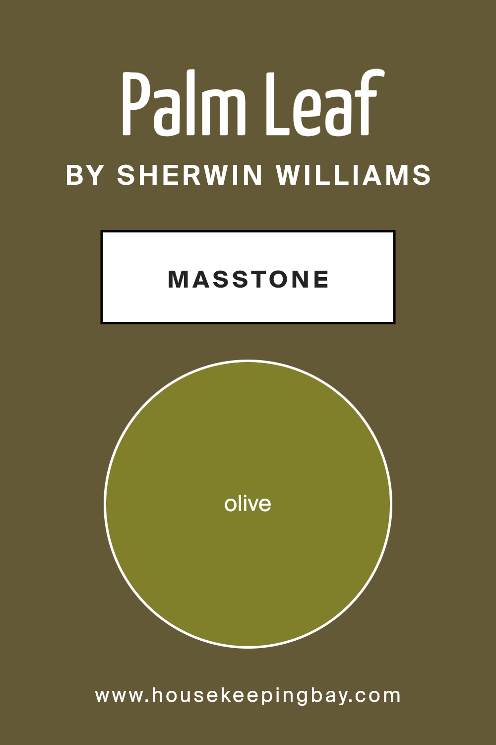
What is the Masstone of the Palm Leaf SW 7735 by Sherwin Williams?
Palm Leaf SW 7735 by Sherwin Williams is a unique paint color with a base tone that can be described as Olive, identified by the color code #80802B. This grounding shade is a mix of earthy green and soft brown, making it a versatile choice for homes. When painted on walls, this color brings a sense of nature and tranquility indoors, creating a cozy and inviting atmosphere. Its masstone, or the primary color you see when you look at the paint, is perfect for those who want to add a touch of the outdoors to their living space without overpowering it with too bright or bold colors.
Palm Leaf works wonderfully in rooms that get a lot of natural light, as the sunlight enhances its earthy tones, making spaces feel more open and airy. In darker rooms, it adds depth and warmth, making the space feel snug and secure. This color matches well with a wide range of decor styles and colors, from natural wood finishes to softer, neutral tones, allowing for adaptability in various home environments. It’s an ideal choice for creating a relaxed, welcoming vibe in any room.
housekeepingbay.com
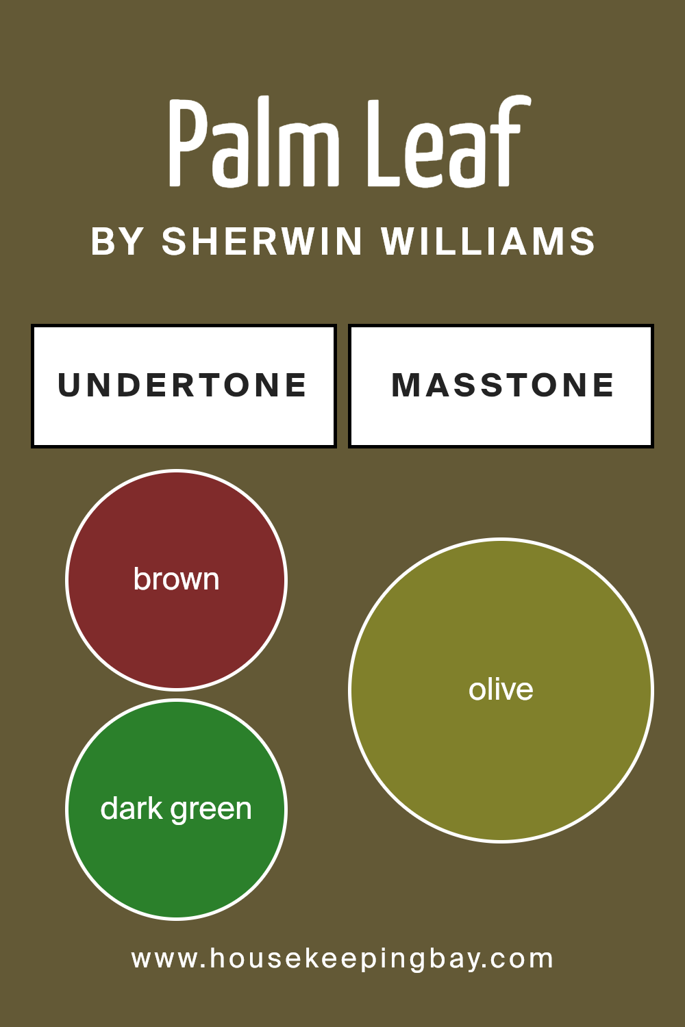
Undertones of Palm Leaf SW 7735 by Sherwin Williams
Palm Leaf SW 7735 by Sherwin Williams is a unique color that has a special charm because of its undertones. Undertones are like hidden colors that can change how we see the main color. Think of them as a secret layer that can make the color look different depending on the light or what other colors are around it. Palm Leaf has undertones of brown, dark green, and even some shades like grey, purple, and orange, among others. This means that in different settings, Palm Leaf might look a bit greener, or sometimes, the grey or brown might stand out more.
When you put Palm Leaf on interior walls, these undertones play a big role in how the room feels. In natural light, the green might look more vibrant, making the room feel fresh and alive, like being in a garden. If the room has a lot of wooden furniture, the brown undertones can make the space feel cozy and warm. On cloudy days, the grey undertones might become more noticeable, giving the room a calm and soothing atmosphere.
Because Palm Leaf has so many undertones, like dark turquoise, navy, and even light green, it can easily match with different colors. This makes it versatile for decorating. In rooms with bright colors, like orange or pink, Palm Leaf can add a touch of nature. With cooler colors, like mint or light turquoise, it can help create a peaceful retreat.
It’s fascinating how these undertones affect the way we see Palm Leaf. They add depth and complexity to the color, making it more than just a simple paint on the wall. They influence the mood of the room, how other colors in the room stand out, and even how we feel when we’re in the space.
housekeepingbay.com
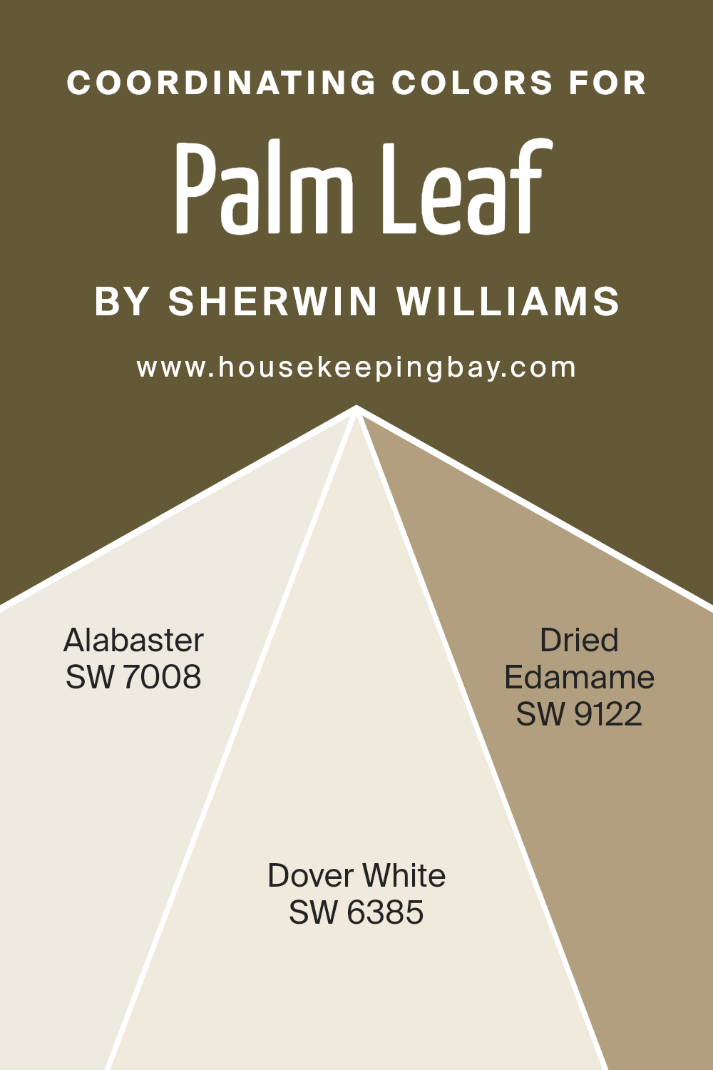
Coordinating Colors of Palm Leaf SW 7735 by Sherwin Williams
Coordinating colors are shades that complement each other and are used together to create a harmonious and visually appealing palette in design. They work by balancing out the visual weight of each color, enhancing the overall aesthetic without overwhelming the senses. When used in interior design, coordinating colors can create a sense of unity and flow from one room to another, making spaces feel more cohesive and thoughtfully put together. With Palm Leaf SW 7735 by Sherwin Williams as the base color, a beautiful green that brings to mind the natural tranquility of foliage, finding the right coordinating colors is key to achieving a balanced look.
- The first coordinating color, Alabaster SW 7008, is a soft, warm white that offers a subtle contrast to the vibrant green of Palm Leaf. It acts as a neutral backdrop, allowing the green to stand out while providing a soothing calmness to the space.
- Dover White SW 6385 gives a creamy, inviting hue that pairs well with the natural tones of Palm Leaf, adding a touch of warmth to any room. It’s a versatile color that bridges traditional and modern design, making it an excellent companion for more vibrant hues.
- Lastly, Dried Edamame SW 9122, with its earthy, muted green, complements Palm Leaf by echoing the natural world, creating a layered, sophisticated palette. It’s perfect for adding depth and interest to the space, rounding out the selection of coordinating colors to enhance Palm Leaf’s natural charm.
Together, these colors create a balanced and inviting environment, proving that with the right coordinating colors, any space can achieve a polished and harmonious look.
You can see recommended paint colors below:
housekeepingbay.com
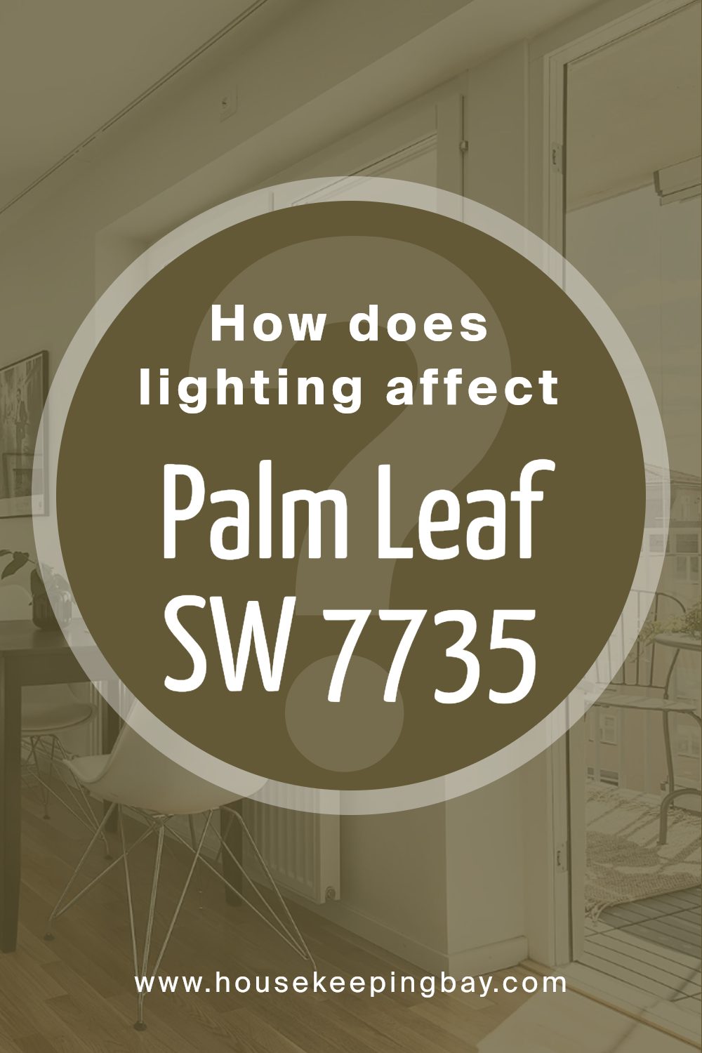
How Does Lighting Affect Palm Leaf SW 7735 by Sherwin Williams?
Lighting plays a crucial role in how we perceive colors. It can make a color look vivid or dull, warm or cool. The color Palm Leaf SW 7735 by Sherwin Williams is no exception to this rule. Understanding how lighting affects this color can help you use it effectively in your space.
- In artificial light, the effect on colors depends on the type of bulbs used. Warm lights can make Palm Leaf look more vibrant and cozy, enhancing its green tones and making the color feel more inviting. On the other hand, cool lights might make it appear slightly muted, emphasizing its subtler, more understated aspects.
- Natural light brings another dimension to Palm Leaf. Its appearance changes throughout the day and depends on the direction the room faces.
- In north-facing rooms, natural light is cooler and more consistent, which can make Palm Leaf look more serene and subtle. The color may feel more muted, with its green tones appearing softer. This makes it ideal for creating a calm and soothing space.
- South-facing rooms get plenty of warm, bright sunlight, which can make Palm Leaf pop with life and energy. The warm light intensifies the green, making it appear more vibrant and lively. This exposure is great for spaces where you want the color to stand out and energize the room.
- East-facing rooms enjoy bright morning light, which can make Palm Leaf look fresh and cheerful as the sun rises. However, as the day progresses and the light diminishes, the color may take on a more subdued quality. This natural cycle makes east-facing rooms versatile, with the color changing character from morning to evening.
West-facing rooms get the late afternoon and evening sunlight, which is warmer. This light can make Palm Leaf glow warmly in the afternoon, creating a cozy and inviting atmosphere ideal for relaxation.
In summary, the way Palm Leaf SW 7735 by Sherwin Williams looks and feels in a room can dramatically shift depending on the lighting it receives. Whether under artificial light or natural sunlight, and depending on the room’s orientation, Palm Leaf can offer a range of atmospheres—from calming and subdued to vibrant and energizing.
housekeepingbay.com
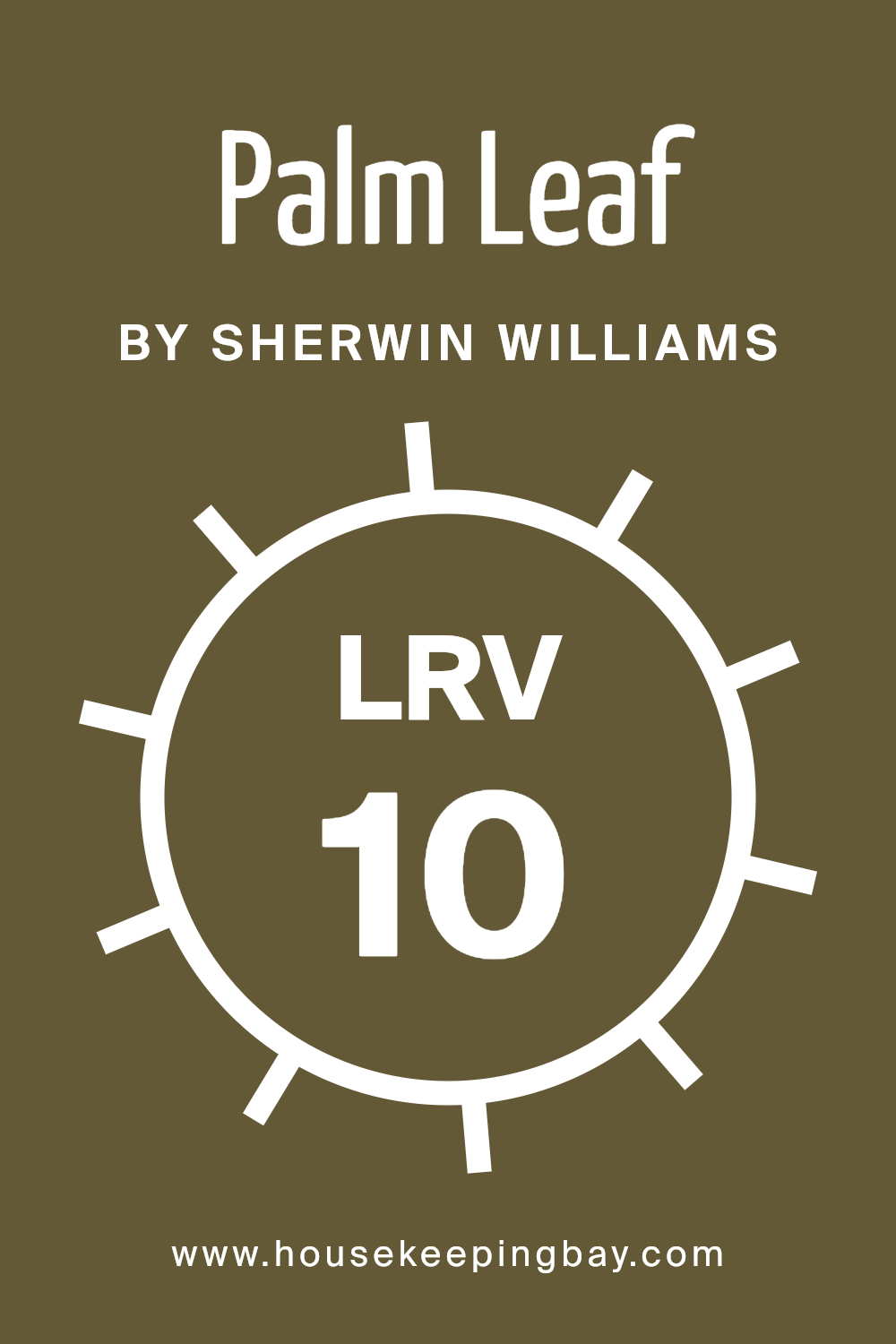
What is the LRV of Palm Leaf SW 7735 by Sherwin Williams?
LRV stands for Light Reflectance Value, a measurement that tells us how much light a color reflects or absorbs. Picture it on a scale from 0 to 100, where 0 is pure black, absorbing all the light, and 100 is pure white, reflecting all the light back. This helps us understand how bright or dark a color will look when painted on a wall. Brighter rooms might need lower LRV colors to make them feel cozier, while darker rooms could benefit from higher LRV colors to lighten them up.
With an LRV of 10.053, Palm Leaf by Sherwin Williams is on the darker side, meaning it absorbs more light than it reflects. This doesn’t mean it’s too dark for your walls, but it’s important to consider the room’s natural and artificial lighting before choosing this color. In a well-lit room with plenty of natural sunlight or strong artificial lighting, Palm Leaf can create a rich, deep atmosphere. However, in a dimly lit room, it might make the space feel smaller or more enclosed. Always think about how the lighting in your room will interact with the color, especially with lower LRV values like this one.
housekeepingbay.com
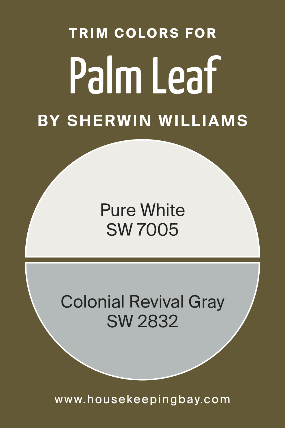
What are the Trim colors of Palm Leaf SW 7735 by Sherwin Williams?
Trim colors are the hues used on the architectural details of a room or a house, such as door frames, window frames, skirtings, and moldings. They play a crucial role in interior and exterior design by framing the spaces, defining the architecture, and complementing the main colors used on walls or facades.
For example, when using a distinctive, rich tone like Palm Leaf SW 7735 by Sherwin Williams, selecting the right trim colors is essential to enhance its beauty and ensure cohesion throughout the space. Ideal trim colors for Palm Leaf, such as SW 7005 – Pure White and SW 2832 – Colonial Revival Gray, have been chosen thoughtfully to highlight its green depth without overwhelming it, ensuring the wall color stands out while maintaining a balanced and inviting atmosphere.
Pure White SW 7005 is a clean, crisp white that offers a stark contrast to Palm Leaf, making the green pop and the room feel more vibrant and lively. It is the perfect choice for creating a fresh and bright look, particularly in rooms that benefit from lots of natural light. On the other hand, Colonial Revival Gray SW 2832 is a soft, warm gray that brings a sophisticated and subtle contrast to the richer and darker Palm Leaf.
It works brilliantly in spaces where a softer, more nuanced transition between the wall color and trim is desired, adding a layer of complexity and elegance to the overall design. Both colors support and elevate Palm Leaf SW 7735, ensuring that it becomes the focal point of any room in a very harmonious and appealing way.
You can see recommended paint colors below:
- SW 7005 Pure White
- SW 2832 Colonial Revival Gray
housekeepingbay.com
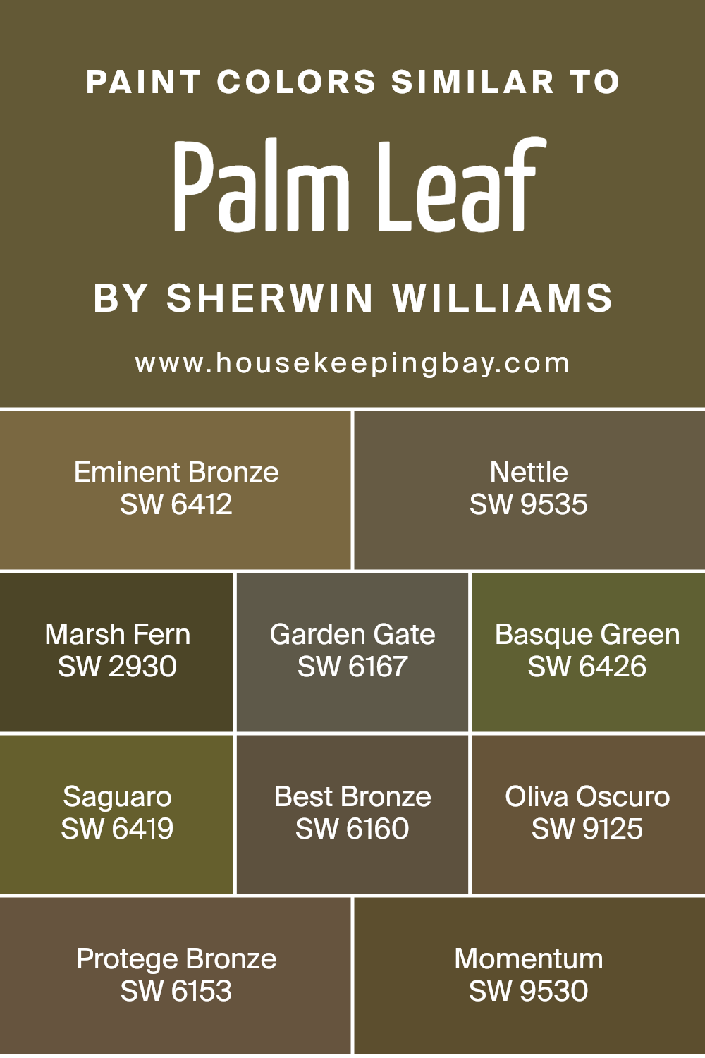
Colors Similar to Palm Leaf SW 7735 by Sherwin Williams
Selecting colors that harmonize well together is a key component in design, providing a seamless and appealing look. Similar colors, such as those in the palette related to Palm Leaf SW 7735 by Sherwin Williams, offer a spectrum of shades that can create a cohesive and natural ambiance in any space. Colors like Eminent Bronze SW 6412 and Best Bronze SW 6160 offer subtle variations of earthy tones, providing a grounding effect that’s both tranquil and sophisticated. Nettle SW 9535 and Basque Green SW 6426, on the other hand, introduce a splash of vibrant green, reminiscent of lush foliage and the great outdoors, yet are close enough in shade to maintain a unified aesthetic.
Marsh Fern SW 2930 and Saguaro SW 6419 lend a deeper dive into the green spectrum, adding depth and interest to the palette, while still aligning with the overall natural vibe. Then there’s Garden Gate SW 6167 and Protege Bronze SW 6153, which edge towards the softer side, offering a bridge between the greens and bronzes for a perfectly balanced look. Oliva Oscuro SW 9125 stands out with its rich, dark tone that can act as a bold contrast or an anchor in a room, tying the lighter and darker shades together beautifully. Lastly, Momentum SW 9530 provides a muted, earthy green that works well as either a background or accent color, ensuring versatility within this harmonious palette.
Together, these colors demonstrate how similar shades can work in concert to create a visually appealing space that feels both connected and effortlessly designed.
You can see recommended paint colors below:
- SW 6412 Eminent Bronze
- SW 9535 Nettle
- SW 2930 Marsh Fern
- SW 6167 Garden Gate
- SW 6426 Basque Green
- SW 6419 Saguaro
- SW 6160 Best Bronze
- SW 9125 Oliva Oscuro
- SW 6153 Protege Bronze
- SW 9530 Momentum
housekeepingbay.com
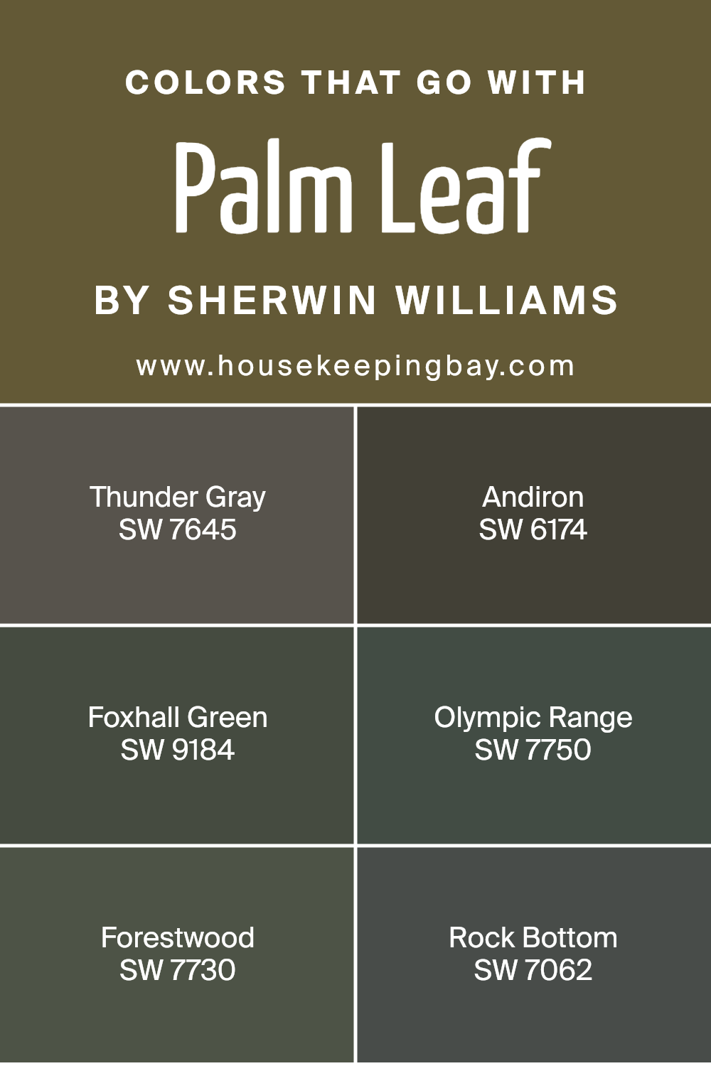
Colors that Go With Palm Leaf SW 7735 by Sherwin Williams
Choosing colors that complement Palm Leaf SW 7735 by Sherwin Williams is crucial for creating harmonious and appealing spaces. Palm Leaf is a vibrant, lush green that can evoke the feeling of nature and tranquility in any room.
When paired with the right colors, it can create a palette that enhances the overall aesthetic of a space, providing balance and bringing out the unique qualities of each color.
- Thunder Gray SW 7645 is a deep, moody gray with undertones that can ground the vivacity of Palm Leaf, offering a sophisticated contrast. It’s like the shadow under a tree, providing depth and coolness.
- Andiron SW 6174 is a darker shade that resembles the color of wrought iron, adding a strong, solid foundation when combined with the green, allowing for a striking yet balanced visual appeal.
- Foxhall Green SW 9184 works beautifully with Palm Leaf by staying in the green family but adding a dusky, more subdued layer to the design, crafting a space full of depth and harmony.
- Olympic Range SW 7750 brings in a breath of fresh air with its cooler, lighter tones, reminiscent of distant mountains covered in mist, it can lift the palette to create a serene and inviting space.
- Forestwood SW 7730, akin to the dark, dense woods, complements Palm Leaf by offering a richer, deeper green that enriches the palette, ensuring that the space feels both cohesive and expansive.
- Lastly, Rock Bottom SW 7062, a solid gray with earthy undertones, anchors the palette, much like the soil under a verdant forest, providing a stable base that makes the vibrant Palm Leaf stand out.
Together, these colors work in harmony to enhance the beauty and versatility of Palm Leaf, creating spaces that are both dynamic and restorative.
You can see recommended paint colors below:
- SW 7645 Thunder Gray
- SW 6174 Andiron
- SW 9184 Foxhall Green
- SW 7750 Olympic Range
- SW 7730 Forestwood
- SW 7062 Rock Bottom
housekeepingbay.com
How to Use Palm Leaf SW 7735 by Sherwin Williams In Your Home?
Palm Leaf SW 7735 by Sherwin Williams is a bold and lively green paint color that brings a touch of nature into your home. Imagine the fresh, vibrant leaves of a palm tree; that’s the essence of Palm Leaf. This color is perfect for anyone looking to add a bit of energy and freshness to their space. You can use it in several ways around your home. For example, painting an accent wall in your living room or bedroom with Palm Leaf can create a stunning focal point. It pairs well with neutral colors, allowing the green to really stand out without overwhelming the room.
If you’re feeling adventurous, consider using it on kitchen cabinets for a chic, modern look. Accessories and decor in this shade can also liven up a space. Think about adding throw pillows, vases, or artwork featuring Palm Leaf to sprinkle color throughout your home. Whether you decide to go big or opt for small touches, Palm Leaf SW 7735 can breathe new life into your living space, making it feel vibrant and full of character.
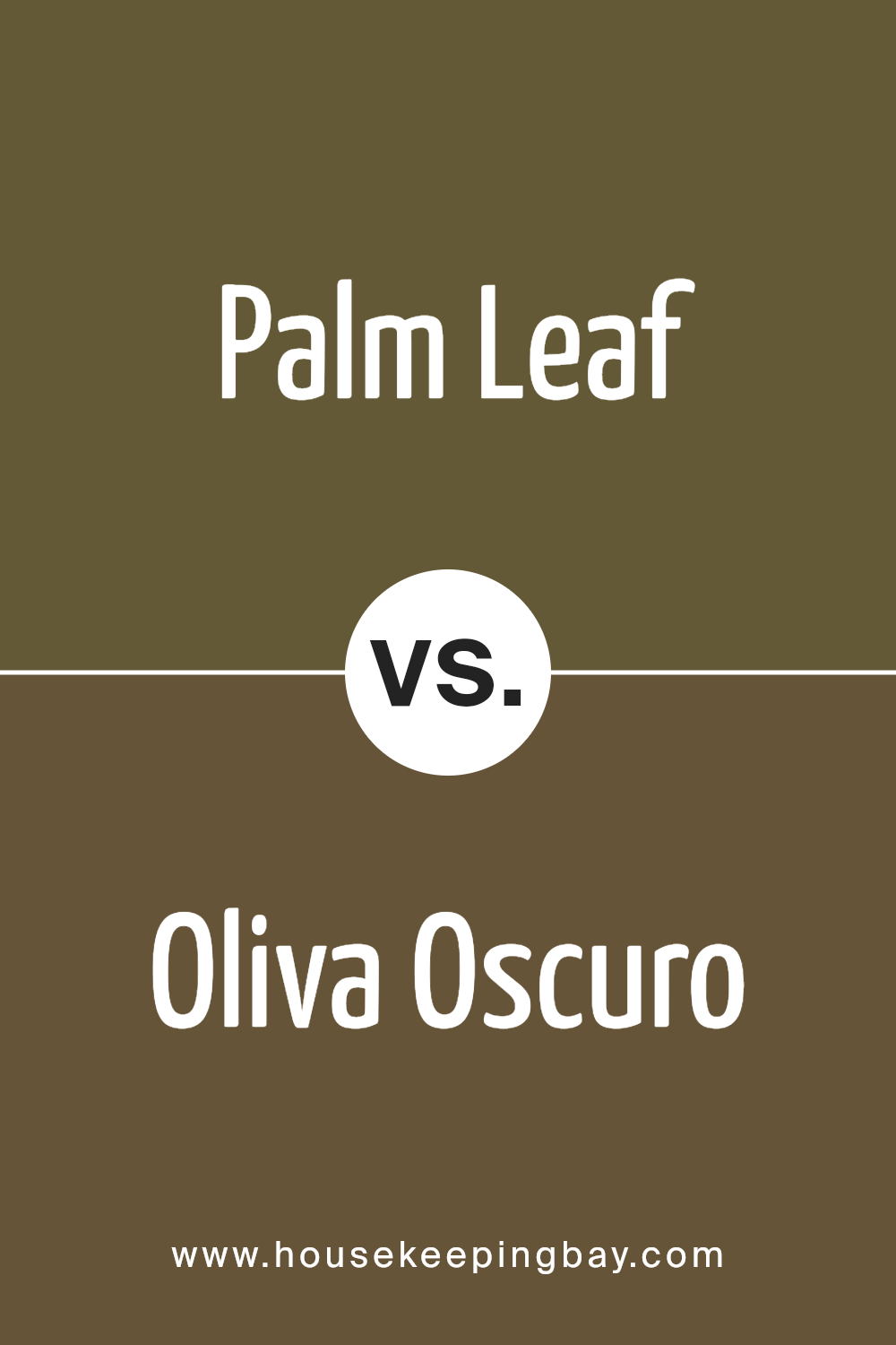
Palm Leaf SW 7735 by Sherwin Williams vs Oliva Oscuro SW 9125 by Sherwin Williams
Palm Leaf SW 7735 by Sherwin Williams is a vibrant, medium-toned green with a fresh and natural vibe, similar to the lush greenery of a garden. It’s a color that brings to mind the brightness of new leaves and has a lively, invigorating feel. On the other hand, Oliva Oscuro SW 9125 is a much darker green, embodying a deeper and more intense atmosphere. This color suggests the richness of an old forest or the depth of shadows under dense foliage. While Palm Leaf has a more upbeat and energetic character, Oliva Oscuro offers a sense of sophistication and mystery with its darker tones.
Despite both being greens, their different shades create distinct looks and moods. Palm Leaf works well in spaces aiming for a fresh, vibrant feel, whereas Oliva Oscuro is suited for areas desiring an aura of elegance and depth.
You can see recommended paint color below:
- SW 9125 Oliva Oscuro
housekeepingbay.com
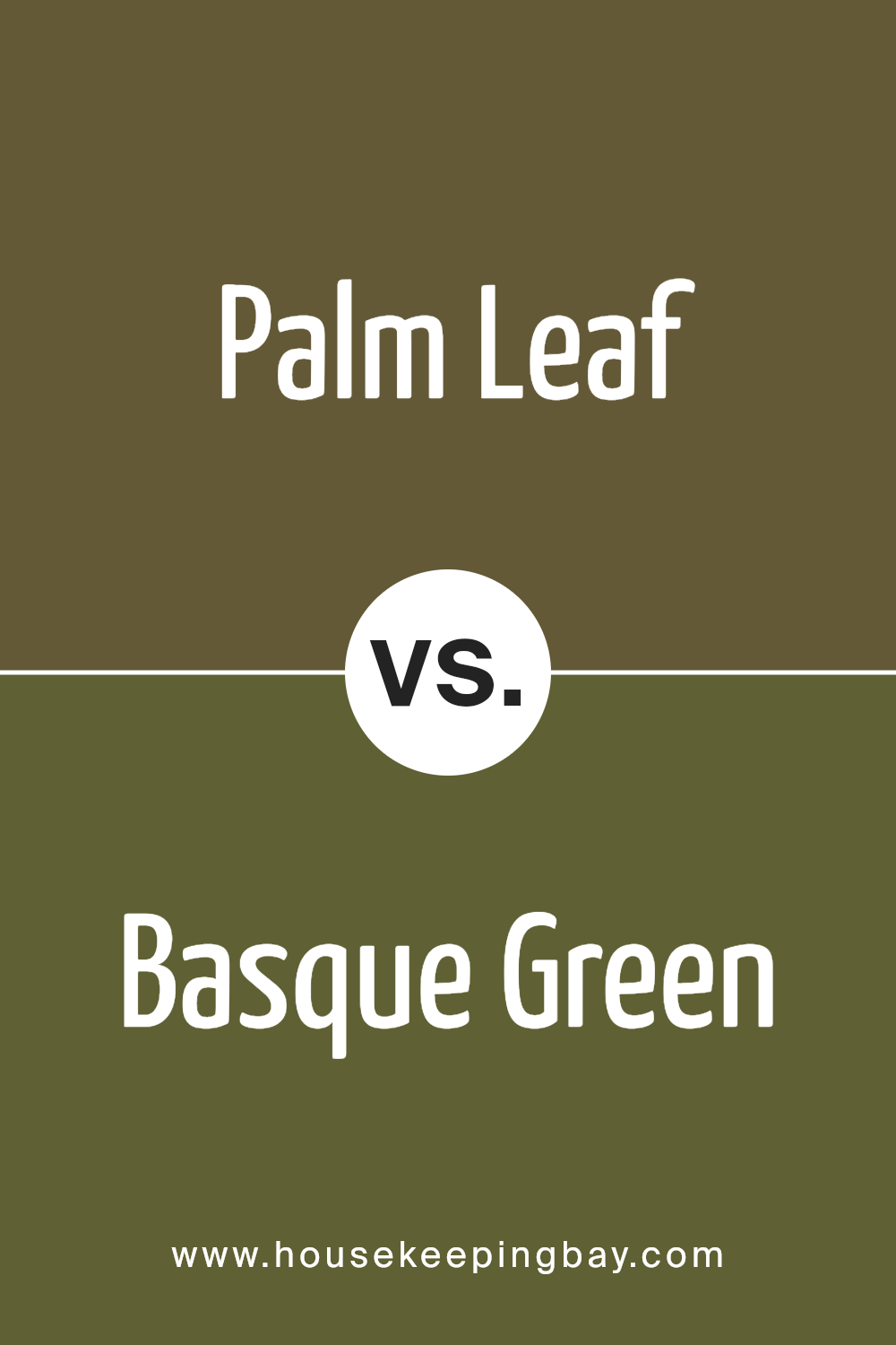
Palm Leaf SW 7735 by Sherwin Williams vs Basque Green SW 6426 by Sherwin Williams
Palm Leaf SW 7735 by Sherwin Williams and Basque Green SW 6426 by Sherwin Williams are two unique colors with their own charm. Palm Leaf is like the soft, light green you see on a young leaf basking in the sunshine. It’s gentle and has a calming vibe, making spaces feel serene and connected to nature.
On the other hand, Basque Green is deeper and richer. Think of the dark, lush leaves in a dense forest or a classic green that adds elegance and depth to spaces. It’s a color that stands out, offering a bold yet refined look to any room it’s used in.
While Palm Leaf brings a breath of fresh air with its lighter tones, Basque Green offers a grounding, sophisticated atmosphere. Depending on what feeling you want to create in a space, these two greens offer different paths to achieving it—Palm Leaf for a soft, natural lightness, and Basque Green for a bold, luxurious depth.
You can see recommended paint color below:
- SW 6426 Basque Green
housekeepingbay.com
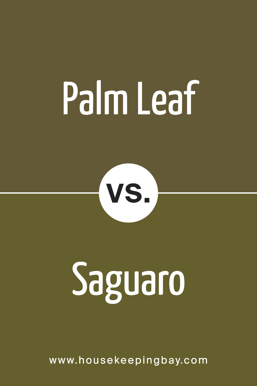
Palm Leaf SW 7735 by Sherwin Williams vs Saguaro SW 6419 by Sherwin Williams
Palm Leaf SW 7735 by Sherwin Williams is a cozy, nature-inspired green with a touch of softness that reminds you of a lush garden. It’s a lighter green, giving a room a fresh and airy feel, perfect for creating a soothing atmosphere. On the other hand, Saguaro SW 6419 by Sherwin Williams is a deeper, darker green.
It draws inspiration from the rich hues found in dense, natural landscapes and brings a sense of warmth and depth to spaces. While Palm Leaf offers a more relaxed and refreshing vibe, Saguaro brings in a strong, earthy presence that can make a room feel more grounded and enveloping. When comparing the two, Palm Leaf works well in spaces where you want to add a light touch of nature without overwhelming the senses, whereas Saguaro is ideal for making bold statements and adding character to an area. Both colors celebrate the beauty of the outdoors but do so in their unique ways.
You can see recommended paint color below:
- SW 6419 Saguaro
housekeepingbay.com
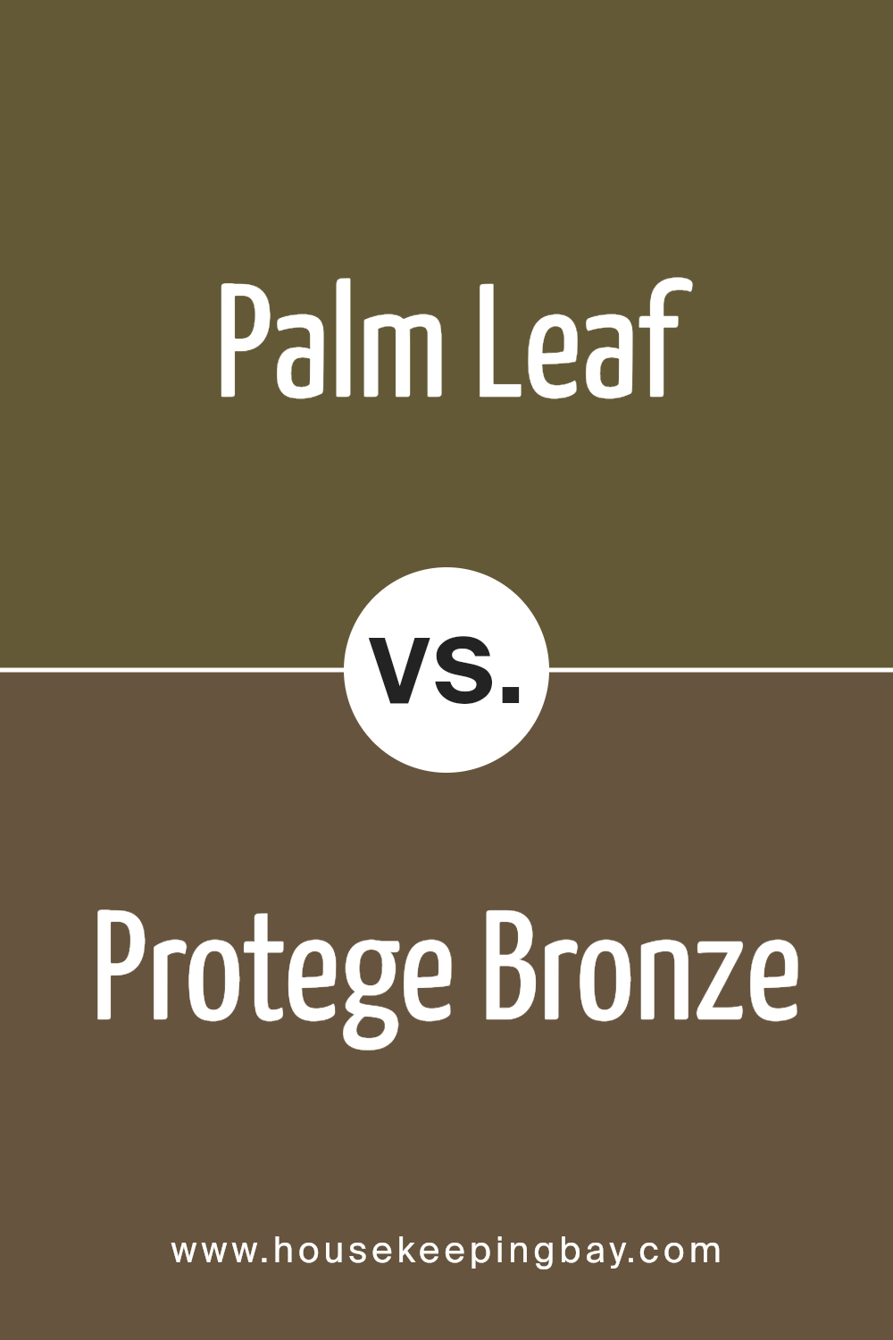
Palm Leaf SW 7735 by Sherwin Williams vs Protege Bronze SW 6153 by Sherwin Williams
Palm Leaf SW 7735 by Sherwin Williams is a soothing, muted green shade that resembles the natural color of a palm leaf. This hue brings to mind the calmness of nature and has a refreshing vibe. It’s a great color for creating a serene and tranquil space, making rooms feel more connected to the outdoors.
On the other hand, Protege Bronze SW 6153 by Sherwin Williams is a warm, rich bronze color. It has a comforting depth to it, reminiscent of autumn leaves or the warm glow of sunset. This shade adds coziness and warmth to any space, making it feel inviting and snug.
When comparing the two, Palm Leaf brings a sense of freshness and outdoorsy calm, ideal for a restful bedroom or a peaceful living area. Protege Bronze, however, adds warmth and sophistication, perfect for creating a welcoming atmosphere in common areas like the living room or dining room. Together, these colors can complement each other beautifully in a home, balancing cool tranquility with warm comfort.
You can see recommended paint color below:
- SW 6153 Protege Bronze
housekeepingbay.com
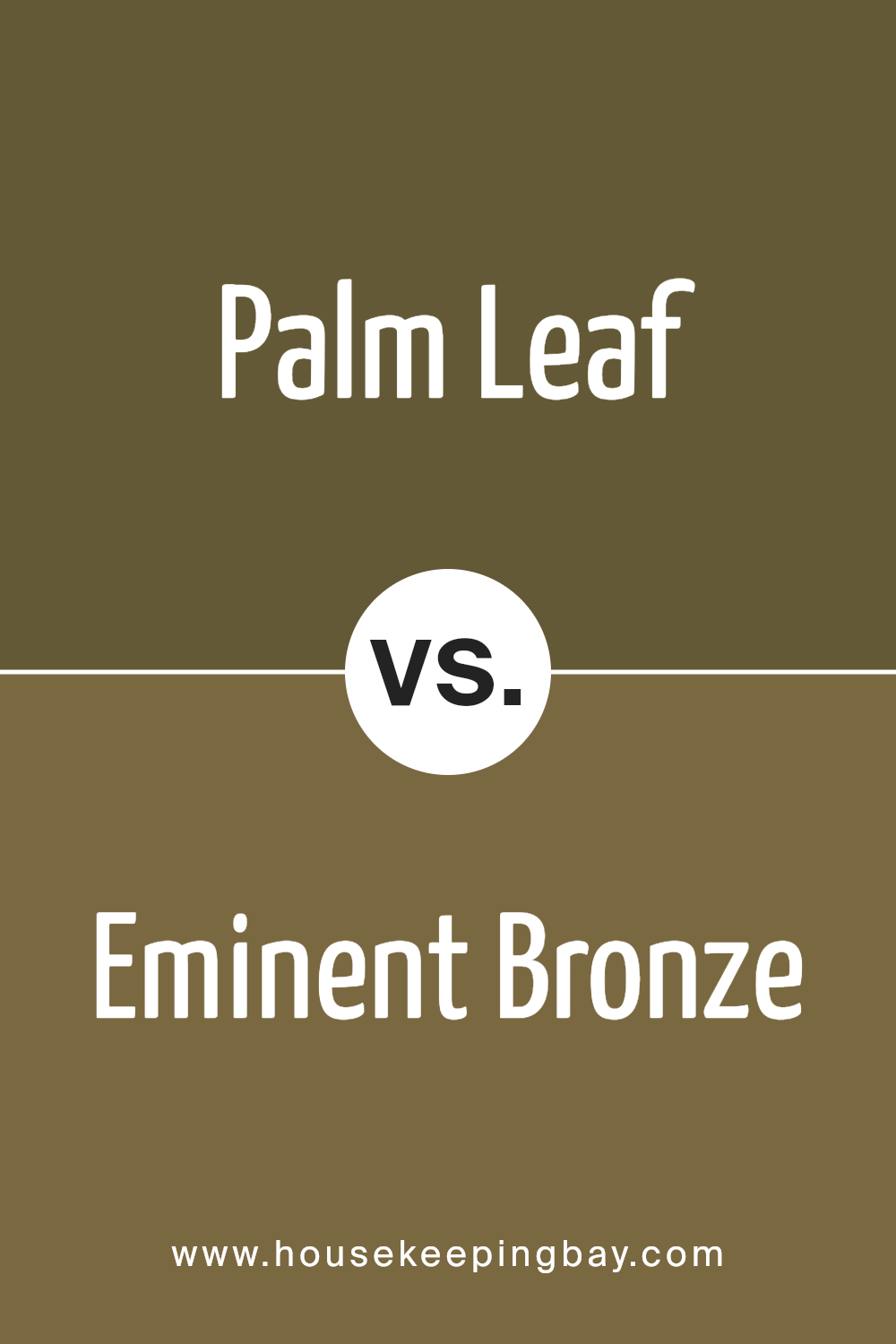
Palm Leaf SW 7735 by Sherwin Williams vs Eminent Bronze SW 6412 by Sherwin Williams
Palm Leaf SW 7735 by Sherwin Williams and Eminent Bronze SW 6412 by Sherwin Williams are two distinct shades. Palm Leaf is a light, soothing green that gives off a natural and refreshing feel, much like the color of fresh foliage or the peaceful vibe of a garden. It’s calming and can bring a sense of tranquility to any space.
On the other hand, Eminent Bronze is a deeper, richer color that leans towards a brown with a subtle hint of red, reminiscent of beautiful autumn leaves or the rustic tones found in nature. This color can add warmth and sophistication to a room, making it feel cozy and inviting.
Together, these colors could complement each other well in a space, with Palm Leaf offering a cool, fresh touch that contrasts nicely against the warmth and depth of Eminent’s Bronze. They cater to different tastes and purposes, one being airy and light, and the other, grounded and rich.
You can see recommended paint color below:
- SW 6412 Eminent Bronze
housekeepingbay.com
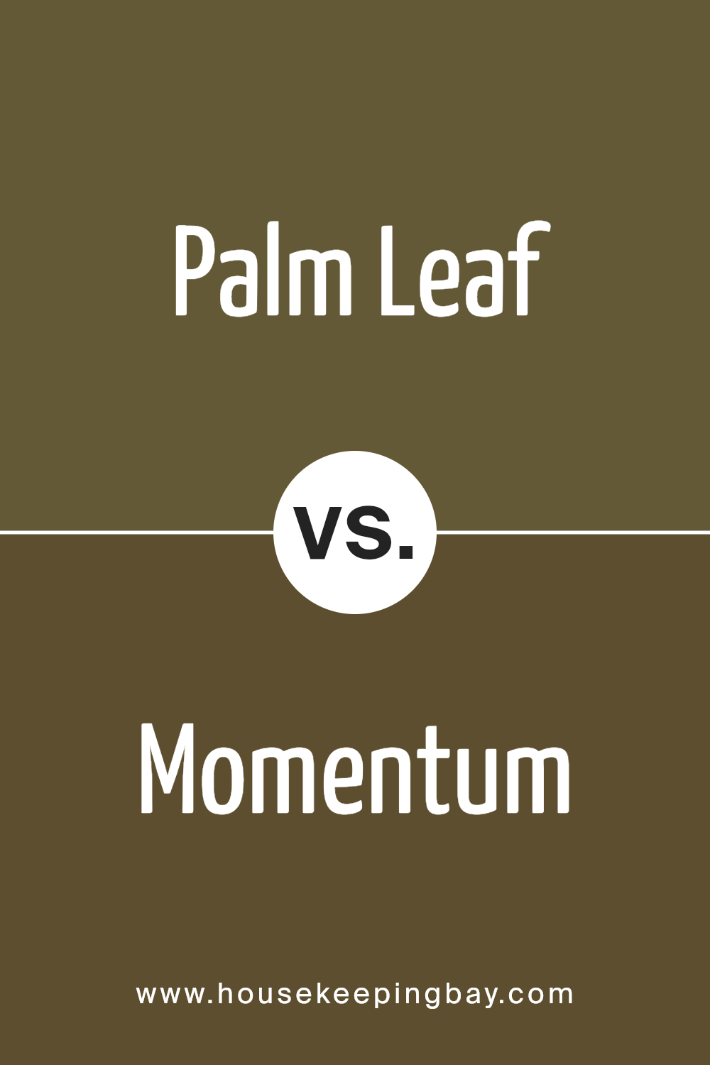
Palm Leaf SW 7735 by Sherwin Williams vs Momentum SW 9530 by Sherwin Williams
Palm Leaf SW 7735 by Sherwin Williams is a soothing, nature-inspired green. It’s like looking at a lush garden or a peaceful, leafy tree. This color brings a fresh and calming feel to any space, making it perfect for creating a relaxing vibe in rooms where you like to unwind or connect with nature.
On the other hand, Momentum SW 9530 by Sherwin Williams is a vibrant and lively blue. It’s reminiscent of a clear sky on a sunny day or the sparkling surface of the ocean. This blue can energize a room, bringing a bright and cheerful atmosphere that’s great for spaces where you want to feel motivated and uplifted.
Both colors are beautiful, but they serve different moods and settings. Palm Leaf works well in areas where comfort and calm are key, while Momentum is better suited for spaces where you want to boost energy and happiness. Together, they could complement each other nicely, balancing energy and tranquility in a home.
You can see recommended paint color below:
- SW 9530 Momentum
housekeepingbay.com
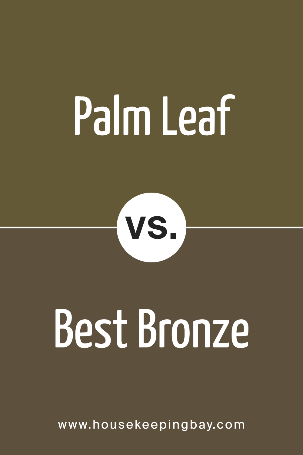
Palm Leaf SW 7735 by Sherwin Williams vs Best Bronze SW 6160 by Sherwin Williams
Palm Leaf SW 7735 by Sherwin Williams is a unique shade that brings to mind the fresh, calming tones of natural foliage. It has a soft, green hue that can easily lighten up any space, making it feel more open and airy. This color works well in rooms where you want to add a touch of nature or create a soothing atmosphere.
On the other hand, Best Bronze SW 6160 by Sherwin Williams is a warm, deep color with a rich, brown tone. It has an elegance that can make a room feel cozy and sophisticated. This color is perfect for spaces where you want to add a sense of comfort and luxury.
Comparing the two, Palm Leaf is lighter and feels more refreshing, while Best Bronze is darker and offers a feeling of warmth and depth. Whether you’re aiming for a serene and natural vibe with Palm Leaf or a cozy and refined atmosphere with Best Bronze, both colors bring their own unique charm to a space.
You can see recommended paint color below:
- SW 6160 Best Bronze
housekeepingbay.com
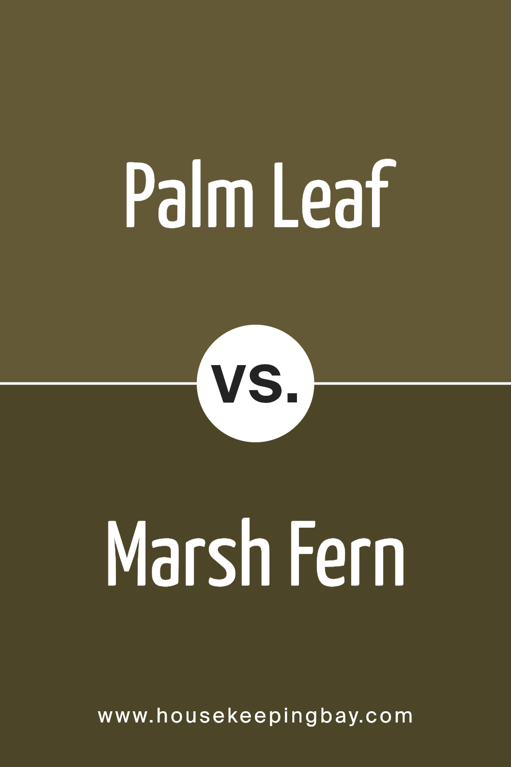
Palm Leaf SW 7735 by Sherwin Williams vs Marsh Fern SW 2930 by Sherwin Williams
Palm Leaf is a calming and cool shade of green. It reminds you of the freshness of a garden in the morning. It’s a bit muted, which makes it perfect for spaces where you want to relax, like bedrooms or living rooms. Its understated elegance brings a sense of peace and connection to nature into your home.
On the other hand, Marsh Fern has a deeper and richer tone. It’s a vibrant color that captures the lushness of a dense forest. Marsh Fern is bolder compared to Palm Leaf and makes a strong statement wherever it’s used. It’s great for adding a pop of color to a room, especially when you want to create a focal point or add some drama.
Both colors are inspired by nature, but they offer different vibes. Palm Leaf is more about softness and tranquility, while Marsh Fern leans towards vitality and richness. Depending on the feel you want for your space, you might choose the gentle touch of Palm Leaf or the vibrant energy of Marsh Fern.
You can see recommended paint color below:
- SW 2930 Marsh Fern
housekeepingbay.com
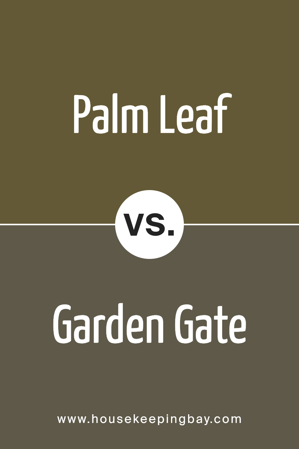
Palm Leaf SW 7735 by Sherwin Williams vs Garden Gate SW 6167 by Sherwin Williams
Palm Leaf SW 7735 by Sherwin Williams and Garden Gate SW 6167 by Sherwin Williams are two unique colors with distinct vibes. Palm Leaf is a refreshing, light green color that brings a touch of nature into a space. It’s like looking at the soft, tender leaves of a tree on a sunny day, full of life and energy. This color can make a room feel more open, airy, and welcoming, perfect for those who want to add a natural charm to their living area or bedroom.
On the other hand, Garden Gate is a darker, more subdued shade. It’s a deep, earthy green that resembles the dense foliage found in a shaded garden or a lush, mysterious forest. This color is great for creating a cozy, intimate atmosphere in a space. It works well in areas where you want to establish a sense of calm and serenity, like a reading nook or a study room.
While both colors are inspired by nature, Palm Leaf offers brightness and a lively flair, whereas Garden Gate provides depth and a tranquil retreat. They cater to different moods and settings, making them versatile for various home decor styles.
You can see recommended paint color below:
- SW 6167 Garden Gate
housekeepingbay.com
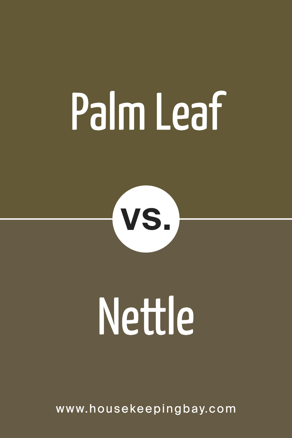
Palm Leaf SW 7735 by Sherwin Williams vs Nettle SW 9535 by Sherwin Williams
Palm Leaf SW 7735 by Sherwin Williams is a rich, green shade that gives off a nature-inspired vibe. It is deep and somewhat muted, making it a great choice for creating a cozy and grounded atmosphere in a room. Think of the lushness of a dense forest; that’s the essence of Palm Leaf. It’s a color that can make a space feel more connected to the outdoors, providing a sense of calm and tranquility.
On the other hand, Nettle SW 9535 by Sherwin Williams is lighter and leans a bit more towards a fresh, spring-like green. It’s a softer color, suggesting new growth or the tender leaves of early spring. Nettle brings a brighter, more airy feel to a space. It can lighten up a room and make it feel more vibrant and energetic, without overwhelming the senses.
Both colors offer a touch of nature, but while Palm Leaf goes for depth and richness, Nettle opts for lightness and freshness. Depending on the atmosphere you’re aiming for, both have their unique appeal – Palm Leaf for a more enveloping, serene environment and Nettle for a cheerful, rejuvenating space.
You can see recommended paint color below:
- SW 9535 Nettle
housekeepingbay.com
Conclusion
In wrapping up our discussion about SW 7735 Palm Leaf by Sherwin Williams, let’s appreciate the charm and versatility this paint color brings to your space. Imagine transforming your room into a refreshing oasis, where each wall serves as a backdrop to your own slice of nature. SW 7735 Palm Leaf isn’t just another green; it’s a unique shade that can breathe life into any area, turning mundane rooms into vibrant, lively spaces.
You’ll find that Palm Leaf is more than capable of complementing a wide range of décor styles, from modern to rustic, making it a fantastic choice for anyone looking to inject some personality into their home. Whether you’re looking to create a tranquil bedroom, a lively living area, or even a stylish and inviting kitchen, this color has got you covered. Its ability to pair well with natural materials, like wood and stone, means that you can easily achieve a cohesive and inviting look throughout your home.
Moreover, the psychological benefits of surrounding yourself with green cannot be overstated. It’s a color that promotes relaxation and rejuvenation, making your home not just a place to stay, but a sanctuary for well-being. By choosing SW 7735 Palm Leaf, you’re not just making a stylistic decision; you’re creating an environment that enhances your mood and invites positivity into your daily life. So, if you’re looking to refresh your space with a touch of nature’s beauty, SW 7735 Palm Leaf is certainly a color worth considering.
housekeepingbay.com
Ever wished paint sampling was as easy as sticking a sticker? Guess what? Now it is! Discover Samplize's unique Peel & Stick samples. Get started now and say goodbye to the old messy way!
Get paint samples


