Iron Mountain 2134-30 by Benjamin Moore
Bold Sophistication for Modern Spaces
Choosing a paint color can be tricky, especially when you want something that’s both stylish and timeless. Iron Mountain, by Benjamin Moore, offers a rich, dark hue that works well in various spaces. It’s a dark gray with warm undertones, giving it a cozy feel without feeling too heavy.
Imagine how it could transform your living room or office into a welcoming space. Iron Mountain can act as a neutral backdrop that enhances other colors in your room. You might find it pairs beautifully with lighter colors and natural wood tones, adding depth and sophistication.
You don’t need to worry about it being too bold. Its subtle warmth makes it an approachable choice for anyone looking to add character to their walls. Whether you’re thinking of a feature wall or painting an entire room, Iron Mountain is versatile enough to fit many styles. It can complement modern, industrial, or even traditional decor.
Consider Iron Mountain if you want a color that feels grounded but not dull. It offers a balance of elegance and comfort, making it perfect for both intimate settings and larger, communal areas.
via benjaminmoore.com
What Color Is Iron Mountain 2134-30 by Benjamin Moore?
Iron Mountain 2134-30 by Benjamin Moore is a rich, deep charcoal hue with an undertone of brown. It brings a sense of warmth and sophistication to any space. This versatile color coordinates seamlessly with a variety of interior styles, including industrial, modern, and rustic designs.
In an industrial setting, Iron Mountain complements exposed brick, metal fixtures, and reclaimed wood. Its dark, moody presence enhances the raw, unfinished look typical of industrial spaces. In modern interiors, this shade works beautifully on accent walls, adding depth and dimension.
Paired with sleek, minimalist furniture in light colors, Iron Mountain creates a striking contrast that highlights clean lines and open spaces. For rustic interiors, this color pairs exquisitely with natural materials like wood, stone, and leather, adding to the cozy, inviting atmosphere.
Materials such as brushed metal, leather, and matte finishes align well with Iron Mountain, as they enhance its boldness while adding texture.
Soft furnishings, like wool or linen in lighter shades, offer a pleasant contrast to its rich tone. For an appealing combination, consider using it alongside creamy whites, soft greys, or muted earth tones.
Iron Mountain beautifully anchors a room, creating a harmonious backdrop that ties various elements together effortlessly.
housekeepingbay.com
Is Iron Mountain 2134-30 by Benjamin Moore Warm or Cool color?
Iron Mountain 2134-30 by Benjamin Moore is a rich, deep gray color with a subtle hint of warmth. It works well in homes, creating a cozy and sophisticated atmosphere. This versatile shade can be used in various rooms, from living areas to bedrooms, giving each space a touch of elegance without being overbearing.
Its depth adds a sense of comfort and security, making it ideal for larger walls where a darker hue can make a room feel more intimate.
When paired with lighter colors, Iron Mountain provides a striking contrast, allowing architectural details or furniture to stand out. It also complements natural wood tones beautifully, enhancing the warmth of wooden elements in a room. Additionally, it provides an excellent backdrop for artwork and accent pieces, allowing them to be highlighted without clashing.
Overall, Iron Mountain is a timeless choice that balances boldness with subtlety, making it a favorite for homeowners seeking enduring style.
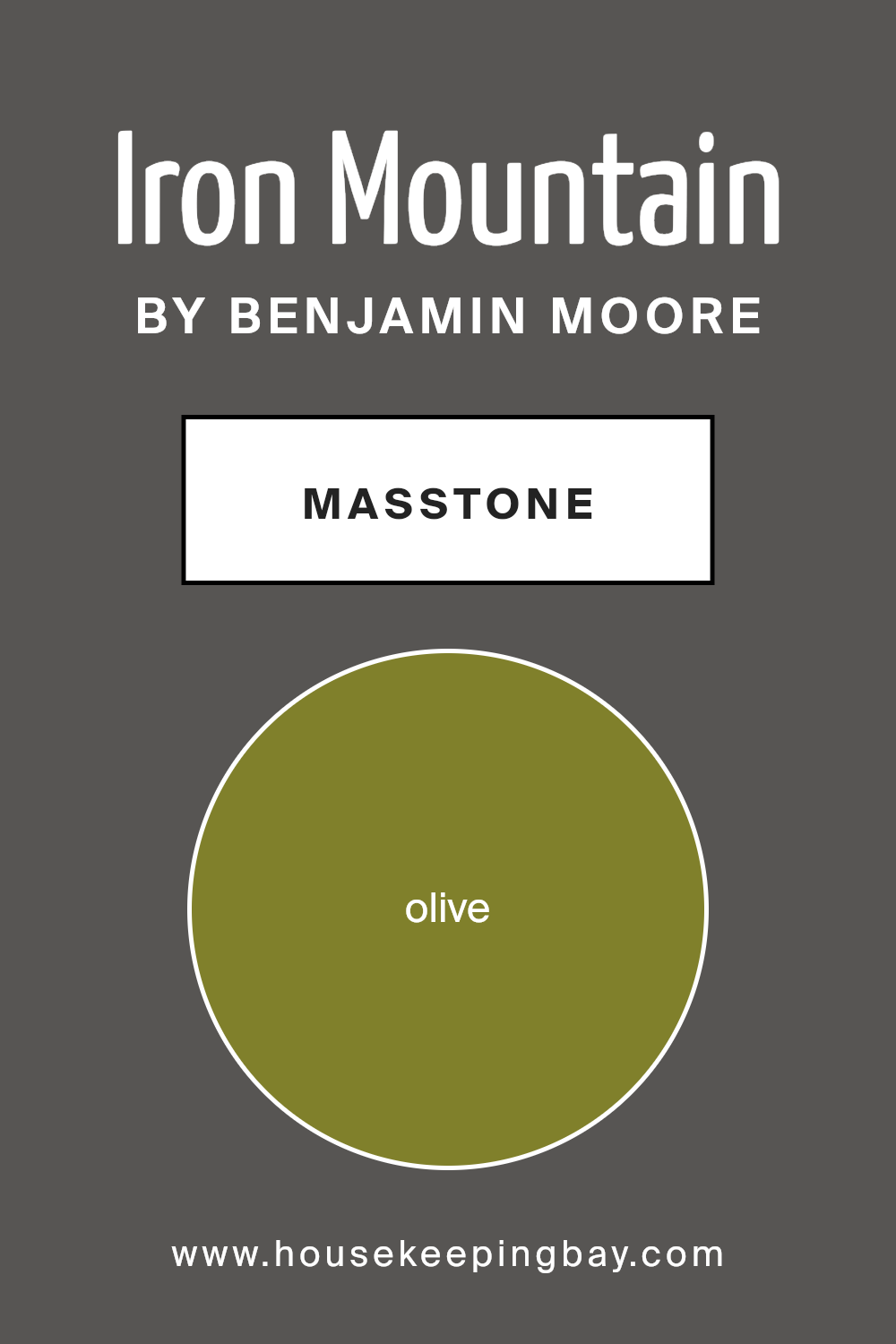
What is the Masstone of the Iron Mountain 2134-30 by Benjamin Moore?
Iron Mountain 2134-30 by Benjamin Moore is a rich, muted olive color (#80802B) that can add warmth and sophistication to any space. This hue works especially well in homes that want a touch of nature inside. As a masstone, its deep and earthy tones are very apparent, making it a great choice for creating a cozy atmosphere.
Olive green is known for its ability to blend with various design styles, whether classic or modern. It pairs beautifully with natural wood, beige, and cream, enhancing a room’s overall feel without being too overwhelming.
In living rooms, it can create a sense of comfort and relaxation, while in kitchens, it adds a unique backdrop that complements stainless steel or brass fixtures.
Additionally, Iron Mountain works as an excellent accent color when used on a single wall or in small spaces like a powder room or study. Its versatility makes it perfect for adding depth and character to any room.
housekeepingbay.com
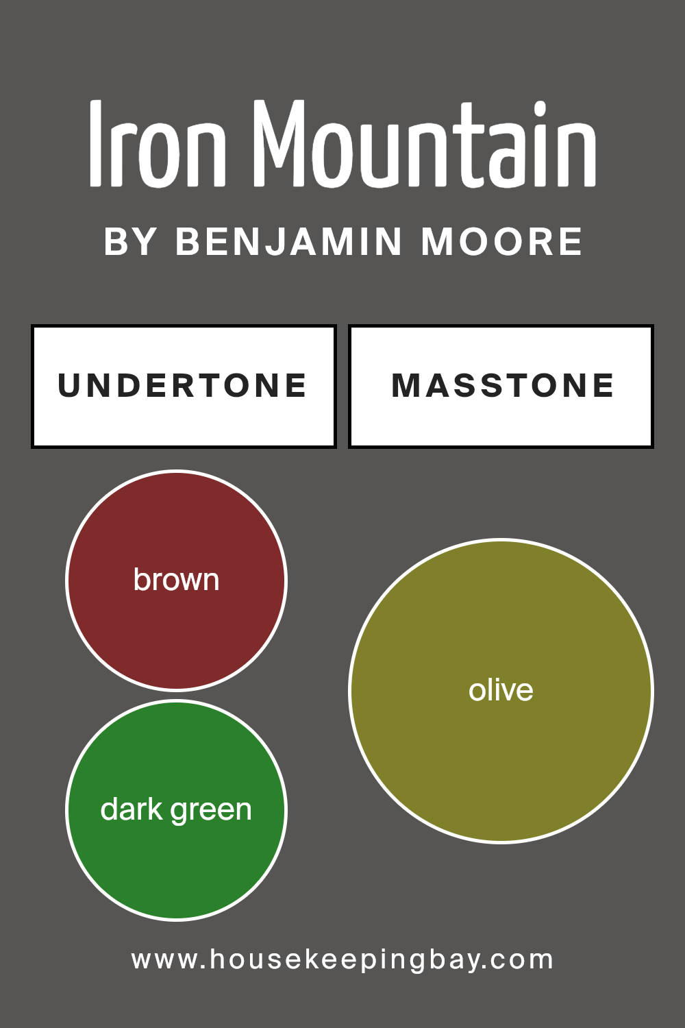
Undertones of Iron Mountain 2134-30 by Benjamin Moore
Iron Mountain 2134-30 by Benjamin Moore is a rich and complex color, influenced by a variety of undertones. Its base is a deep, dark gray. However, the subtleties make it unique. First, brown and dark green undertones add warmth and earthiness.
This combination gives the shade an organic, grounded feel, making spaces feel cozy. Dark gray and navy deepen its intensity, which can create drama in a room.
The touch of purple and red lends a slight vibrancy, introducing an unexpected twist that avoids making the color too flat or cold. These tints can make a wall appear different throughout the day, depending on the lighting. When bathed in natural or soft artificial light, one might notice hints of pink, orange, or even a subtle dark turquoise, which add depth.
Significantly, lighter undertones like pale pink and pale yellow can subtly emerge in brighter lighting, softening the overall tone. This chameleon-like behavior means that Iron Mountain can adapt to various settings and moods. On interior walls, it often enhances architectural features, making them pop.
The mix of undertones ensures that this deep hue feels versatile, blending well with both modern and traditional décor. It can anchor a room, offering depth without overwhelming the space.
housekeepingbay.com
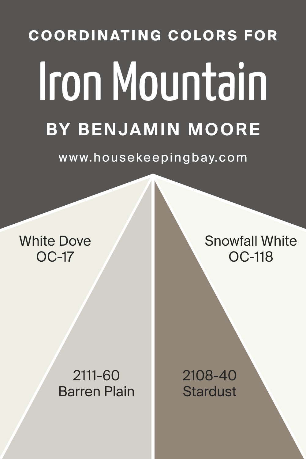
Coordinating Colors of Iron Mountain 2134-30 by Benjamin Moore
Coordinating colors are hues that complement one another in a design or decorating scheme. They work together to create a harmonious look that feels balanced and cohesive. When used effectively, coordinating colors can highlight key elements in a space and provide visual interest without clashing or competing for attention.
Iron Mountain 2134-30 by Benjamin Moore is a rich, deep hue that can lend a room an air of sophistication. Pairing it with coordinating colors like White Dove OC-17, Barren Plain 2111-60, Stardust 2108-40, and Snowfall White OC-118 can beautifully balance its depth.
White Dove OC-17 is a warm, inviting white that adds a touch of lightness and warmth, making spaces feel airy without being too stark. Barren Plain 2111-60 brings soft, cool gray undertones that complement Iron Mountain while providing a serene, neutral backdrop. Stardust 2108-40 introduces a subtle, muted taupe that can add depth and a touch of warmth, creating a cozy yet refined atmosphere.
Lastly, Snowfall White OC-118 is a crisp, clean white that brings a fresh and bright accent, enhancing the clarity and purity of surrounding colors. By using these tones alongside Iron Mountain, you can craft a space that feels both sophisticated and welcoming.
You can see recommended paint colors below:
- OC-17 White Dove
- 2111-60 Barren Plain
- 2108-40 Stardust
- OC-118 Snowfall White
housekeepingbay.com
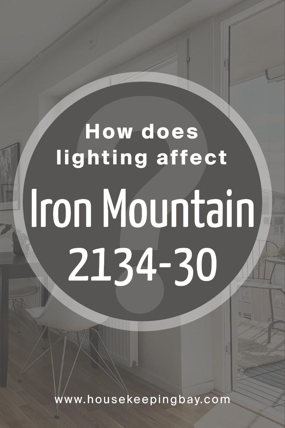
How Does Lighting Affect Iron Mountain 2134-30 by Benjamin Moore?
Lighting plays a crucial role in how we perceive colors. Different types of light can change the way colors look in a room. Natural light, which comes from the sun, changes throughout the day, affecting color appearance. Artificial light, such as bulbs and lamps, also alters color perception but remains constant without natural changes.
Iron Mountain 2134-30 by Benjamin Moore is a deep and rich gray with undertones that can look different depending on lighting conditions.
In natural light, Iron Mountain can appear slightly cooler because natural light often emphasizes blue tones in colors. This gray can take on different characteristics based on the direction the room faces and the time of day.
In north-facing rooms, which have cooler natural light, Iron Mountain will lean more towards its cooler, bluish-gray undertones. This might make the color feel bold and crisp, which can work well with other cool colors in the room.
In south-facing rooms, the light is warmer and more direct, which can soften the coolness of Iron Mountain. Here, the color might appear warmer and more inviting, balancing its depth with a subtle warmth. During midday, when the sun is high, the color may appear brighter.
In east-facing rooms, morning light brings a softer, warm illumination. Here, Iron Mountain may appear lighter and slightly warmer in the morning, but as the day progresses and the sun shifts, the color might revert to cooler tones.
In west-facing rooms, morning light is softer and indirect, making Iron Mountain appear more muted. However, as the sun sets, the light becomes warmer and more intense, potentially making the color appear richer and more dramatic.
Regardless of the room’s orientation, consider the type of artificial lighting used. Warm bulbs can enhance warmer undertones, while cooler bulbs tend to enhance cooler aspects of Iron Mountain, providing flexibility for achieving the desired ambiance.
housekeepingbay.com
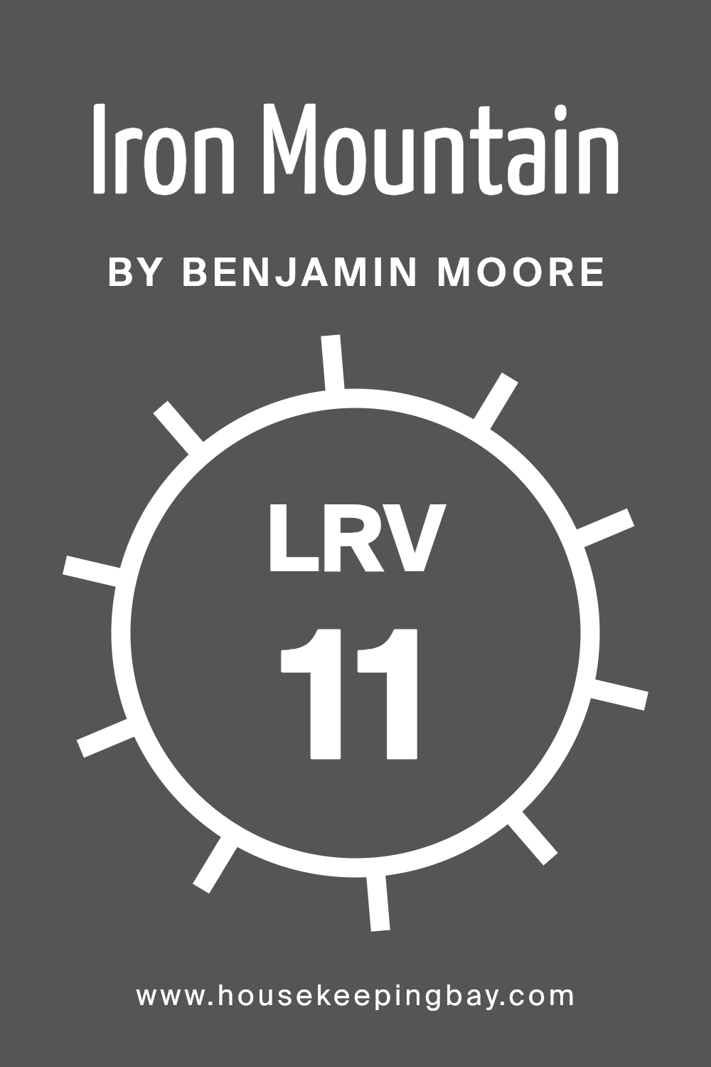
What is the LRV of Iron Mountain 2134-30 by Benjamin Moore?
LRV stands for Light Reflectance Value. It’s a measurement that tells us how much light a color reflects. The scale goes from 0 to 100. A color with an LRV of 0 would reflect no light at all, making it completely black. Conversely, a color with an LRV of 100 would reflect all light, which would be completely white.
A lower LRV means a color will absorb more light, making a space feel cozier or smaller. A higher LRV will reflect more light, potentially making a room feel larger and more open.
When choosing paint colors, knowing the LRV helps in understanding how the color will interact with the light in any particular room.
Iron Mountain 2134-30 by Benjamin Moore has an LRV of 10.96. This low value means the color is quite dark and absorbs most of the light that hits it. In a room with lots of natural light, Iron Mountain might create a sense of depth and warmth because it doesn’t reflect much light.
However, in a space with limited light, this shade could make the room feel even less bright. This makes it a great choice for creating a sophisticated atmosphere or adding contrast in a well-lit space.
But if used in a room with minimal light, it might make the space feel more confined.
housekeepingbay.com
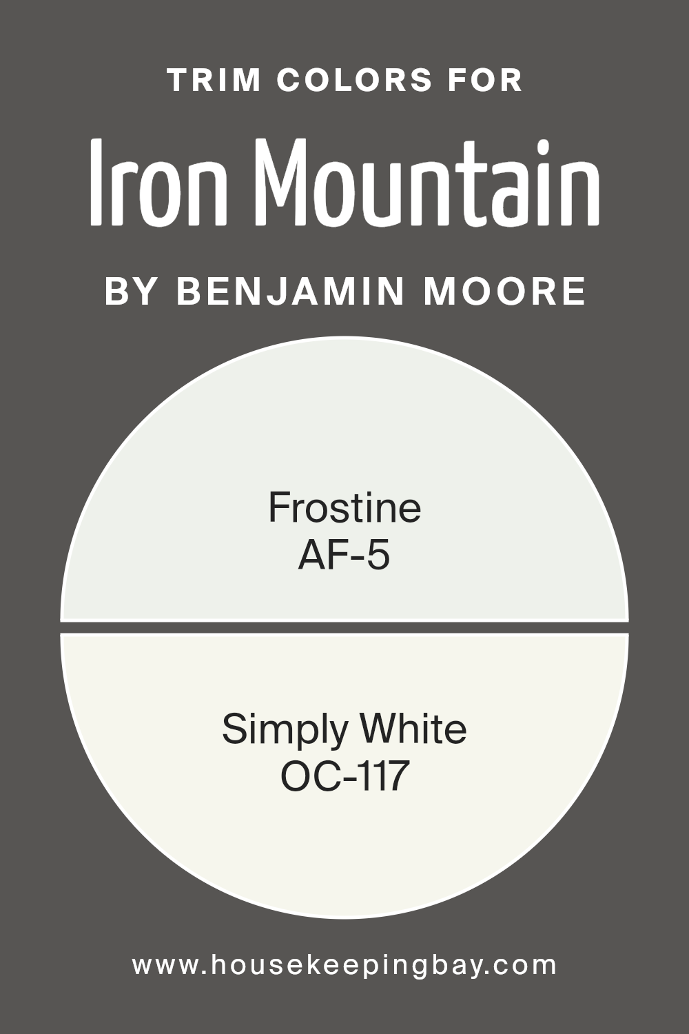
What are the Trim colors of Iron Mountain 2134-30 by Benjamin Moore?
Trim colors are essential in interior design because they define and accentuate the edges of walls, providing contrast and clarity to a room. For Iron Mountain 2134-30 by Benjamin Moore, which is a rich and strong color, selecting the right trim colors can enhance its depth and sophistication.
Trim colors like Frostine AF-5 and Simply White OC-117 work well with Iron Mountain by offering balance. Frostine is a soft, pale gray that adds a touch of coolness, creating a gentle frame around the deeper main color.
Simply White, on the other hand, is a clean, crisp white that offers a bright and fresh contrast, making the space appear more open and inviting.
Using Frostine AF-5 as a trim color introduces a subtle elegance that gently complements Iron Mountain’s boldness without overpowering it. The gray undertones in Frostine ensure the transition between wall color and trim is seamless, maintaining a harmonious feel.
Simply White OC-117 brings a timeless purity and brightness to any space. Its versatility allows it to highlight architectural features, drawing attention to the room’s design elements while enhancing the intense shade of Iron Mountain.
Together, these trim colors offer versatility and style, creating a balanced and well-defined space.
You can see recommended paint colors below:
- AF-5 Frostine
- OC-117 Simply White
housekeepingbay.com
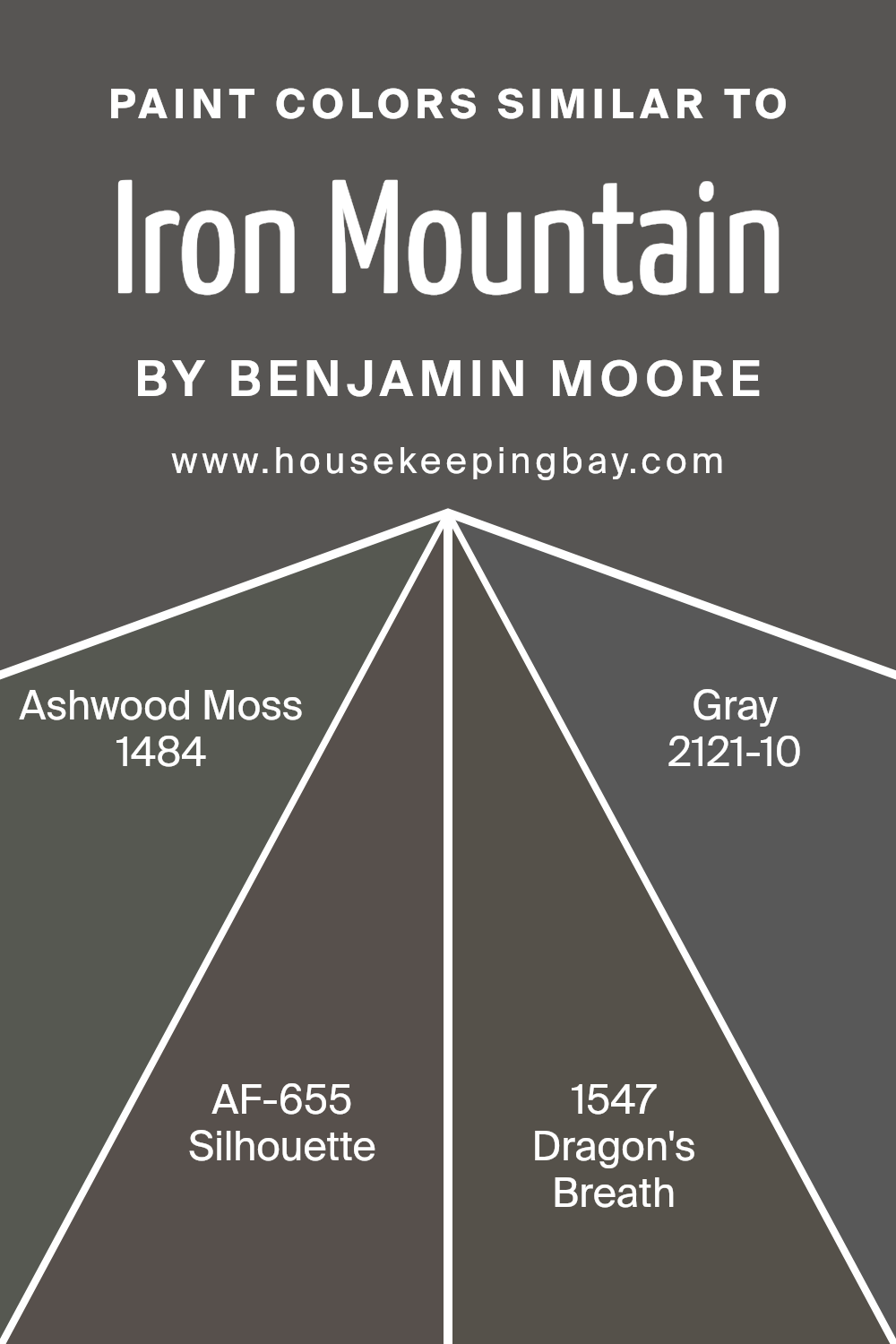
Colors Similar to Iron Mountain 2134-30 by Benjamin Moore
Similar colors are important because they create a sense of harmony and unity in design. When colors are close in tone, like those related to Iron Mountain 2134-30 by Benjamin Moore, they can provide a cohesive look that’s pleasing to the eye. Such colors help in crafting a balanced atmosphere in a space, whether at home, an office, or public places.
Ashwood Moss 1484 offers a deep green that brings the richness of the outdoors inside, adding a natural touch to any decor. Meanwhile, Silhouette AF-655 is a soft charcoal that adds depth and sophistication without overpowering other elements in the room.
Dragon’s Breath 1547, with its robust and warm brown tones, can make a space feel cozy and inviting.
Lastly, Gray 2121-10 is versatile and timeless, offering a cool undertone that pairs seamlessly with both warm and cool palettes.
These colors work well together because they share a common ground in their earthy, muted undertones, making transitions between them feel smooth and effortless. Used together in different proportions, they can highlight architectural features or create intimate corners for relaxation.
Similar colors, like these, allow for subtle contrasts, injecting character and interest without overwhelming the senses. When combined thoughtfully, they turn a collection of spaces into an integrated whole that feels both intentional and naturally appealing.
You can see recommended paint colors below:
- 1484 Ashwood Moss
- AF-655 Silhouette
- 1547 Dragon’s Breath
- 2121-10 Gray
housekeepingbay.com
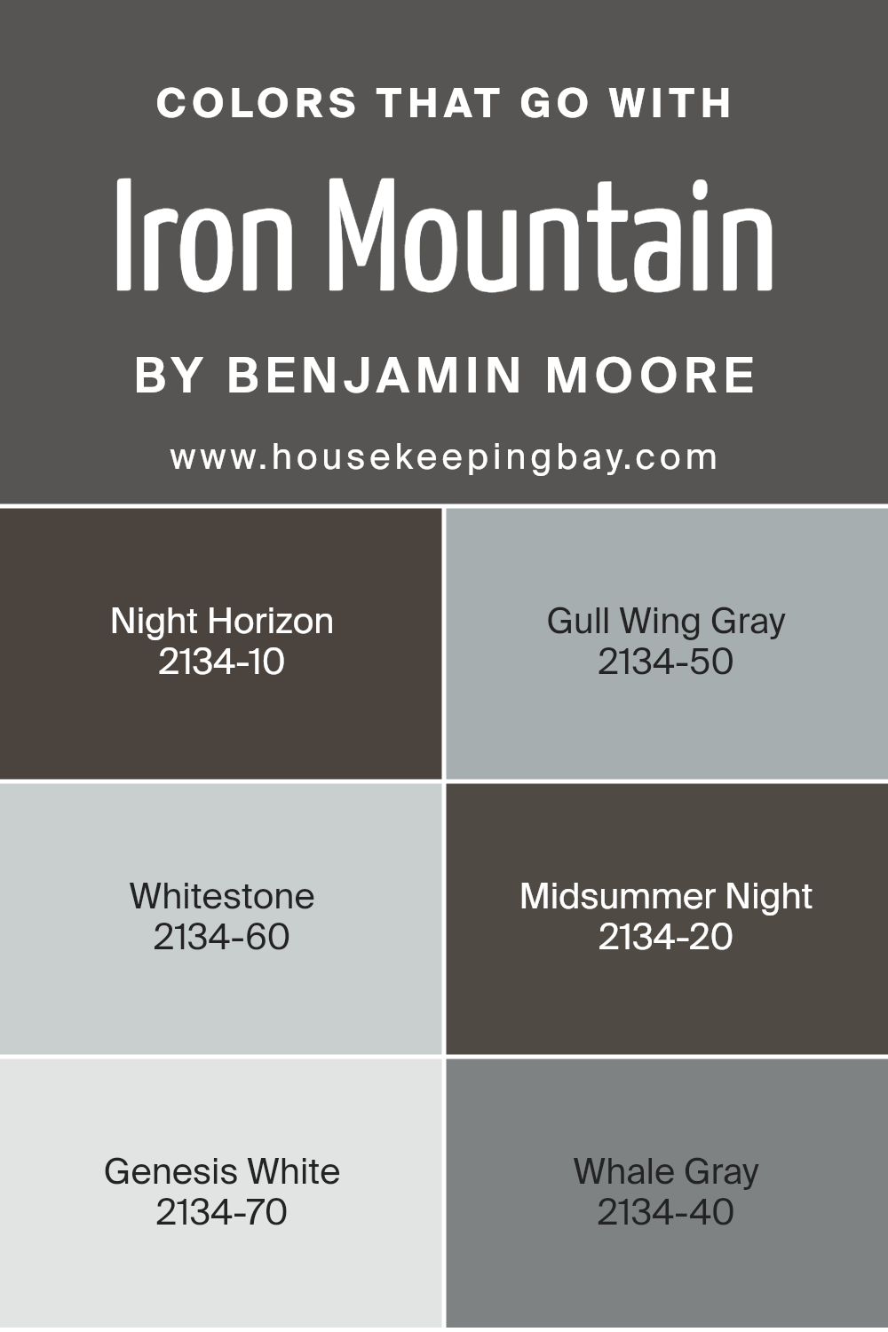
Colors that Go With Iron Mountain 2134-30 by Benjamin Moore
Choosing the right colors to pair with Iron Mountain 2134-30 by Benjamin Moore is essential for creating a harmonious and pleasing environment. Iron Mountain is a deep, rich gray with hints of warmth, making it versatile and elegant. Pairing it with colors like Night Horizon 2134-10, a mysterious dark shade with a cool undertone, can create a dramatic and sophisticated atmosphere.
On the other hand, adding Gull Wing Gray 2134-50, a soft and balanced gray, offers a lighter contrast while maintaining the chic aesthetic.
Whitestone 2134-60 brings brightness with its light gray tone, perfect for adding a touch of softness and increasing the sense of space. Midsummer Night 2134-20 is a deep, almost navy blue that complements Iron Mountain’s depth, adding subtle color and moodiness.
Genesis White 2134-70 is a crisp, clean white that provides excellent contrast, making the darker shades stand out more without overwhelming the space. Lastly, Whale Gray 2134-40 is a medium gray that ties everything together with its balanced tone, providing a smooth transition between colors.
Combining these colors thoughtfully will enhance any room’s aesthetic while maintaining Iron Mountain’s sophistication.
You can see recommended paint colors below:
- 2134-10 Night Horizon
- 2134-50 Gull Wing Gray
- 2134-60 Whitestone
- 2134-20 Midsummer Night
- 2134-70 Genesis White
- 2134-40 Whale Gray
housekeepingbay.com
How to Use Iron Mountain 2134-30 by Benjamin Moore In Your Home?
Iron Mountain 2134-30 by Benjamin Moore is a rich and deep color that brings a sense of elegance to any room. This versatile shade is a mix of dark gray and brown, making it a perfect choice for those who want a strong but neutral look. It works beautifully in living rooms, creating a warm and inviting space.
Use it as an accent wall to add depth without overwhelming the room. It can also serve as a sophisticated backdrop for artwork or furniture.
In the kitchen, Iron Mountain adds a modern touch to cabinets or an island. Its strong yet neutral tone complements stainless steel appliances and wooden elements perfectly. For bedrooms, it offers a cocoon-like feeling, ideal for restful sleep. Pairing it with lighter shades like soft whites or light blues can create a balanced and harmonious aesthetic. Overall, Iron Mountain is a bold yet flexible choice for any home setting.
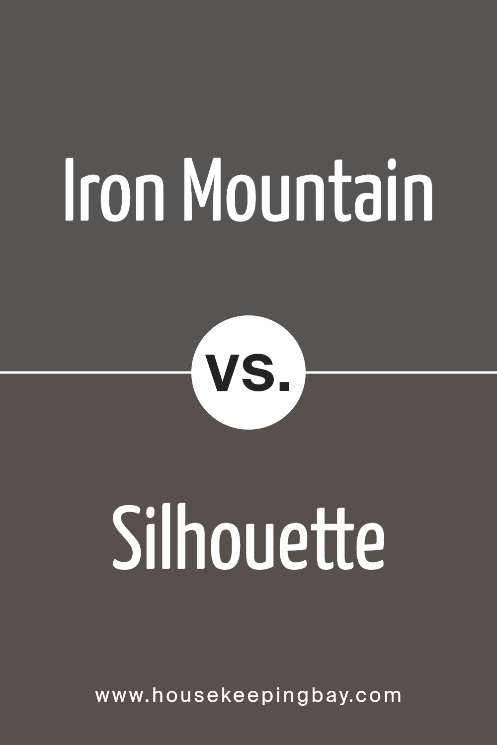
Iron Mountain 2134-30 by Benjamin Moore vs Silhouette AF-655 by Benjamin Moore
Iron Mountain 2134-30 by Benjamin Moore is a deep, bold gray with undertones of brown, creating a rich and sophisticated feel. It’s a versatile color, often used to make a statement in rooms where a touch of drama is desired. This color can pair beautifully with both lighter shades for contrast and darker elements for a cohesive look.
Silhouette AF-655, also by Benjamin Moore, shares some similarities but is distinctly different. It’s a muted, warm gray with purple and brown undertones, offering a softer, more subdued look than Iron Mountain.
This color works well in spaces where a calming, cozy atmosphere is preferred. It pairs nicely with neutral tones and soft accents.
While Iron Mountain serves well in creating a bold backdrop, Silhouette offers subtle warmth. Both colors offer unique qualities, allowing for different moods and settings in home design.
You can see recommended paint color below:
- AF-655 Silhouette
housekeepingbay.com
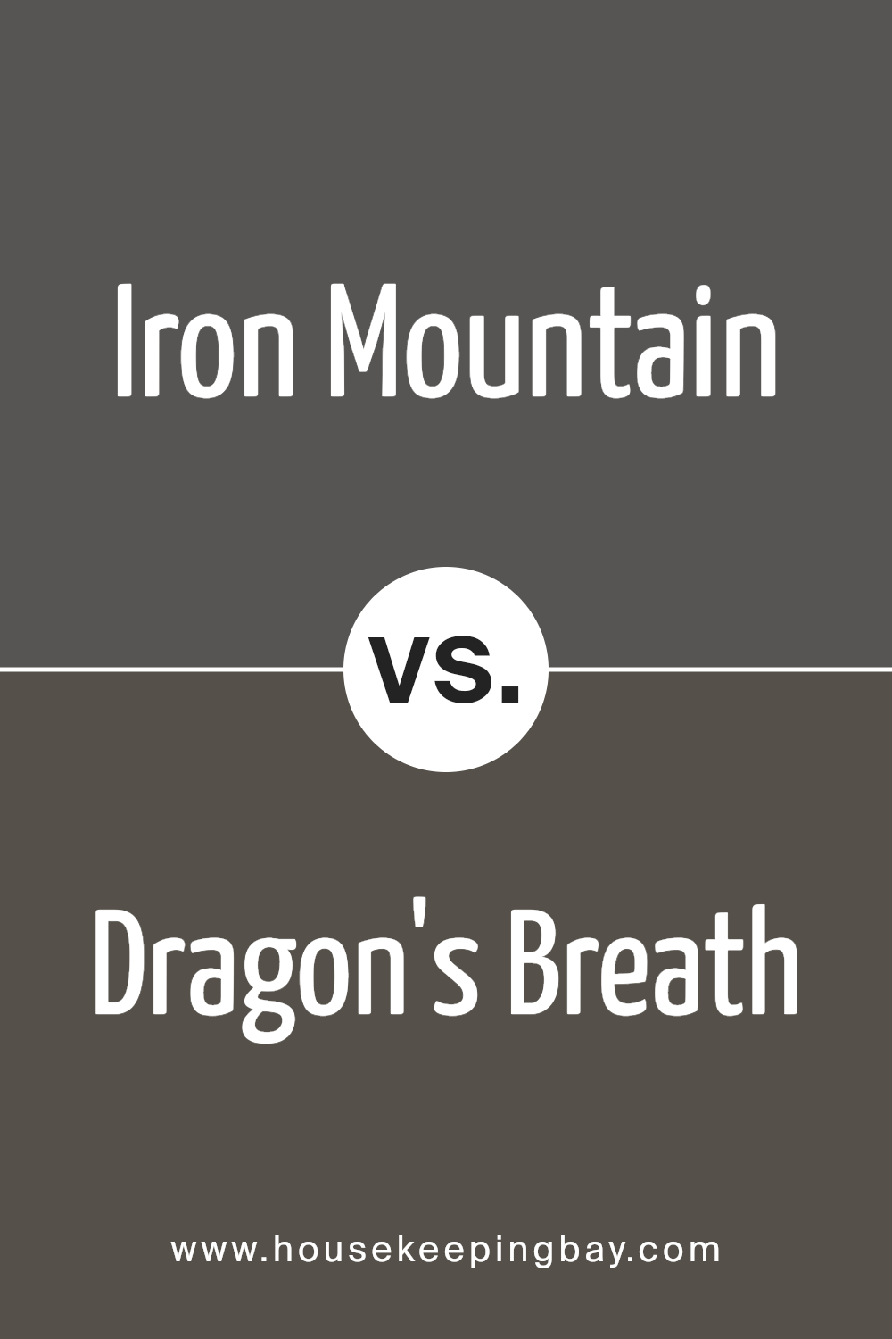
Iron Mountain 2134-30 by Benjamin Moore vs Dragon’s Breath 1547 by Benjamin Moore
Iron Mountain 2134-30 and Dragon’s Breath 1547 by Benjamin Moore are two rich, dark shades with distinct characteristics. Iron Mountain presents a cool, sophisticated dark gray with subtle blue undertones. It offers a sleek, modern vibe, making spaces feel refined and elegant. This color often suits contemporary designs, providing a versatile background that can highlight artwork or décor beautifully.
Dragon’s Breath, however, leans warmer with its deep charcoal brown tone. It brings a cozier, inviting feel to a room. With a hint of warmth, Dragon’s Breath creates an intimate atmosphere, often complementing rustic or traditional styles.
It’s an excellent choice for making a statement, whether as a featured wall or a bold exterior.
Both colors offer depth and richness in different ways. Iron Mountain feels more industrial and modern, while Dragon’s Breath offers warmth and comfort, ideal for a more homely setting.
You can see recommended paint color below:
housekeepingbay.com
Iron Mountain 2134-30 by Benjamin Moore vs Ashwood Moss 1484 by Benjamin Moore
Iron Mountain 2134-30 by Benjamin Moore stands out as a deep, dark gray with subtle hints of brown, adding warmth. It’s strong and sophisticated, making it suitable for bold statements in interior spaces. This color can create a cozy and modern atmosphere, perfect for accent walls or furniture.
In contrast, Ashwood Moss 1484 by Benjamin Moore is a darker green shade with gray undertones. It’s earthy and grounding, offering an organic feel to a room. This color can make spaces feel intimate and connected to nature, suitable for creating a calming environment.
While both colors share depth and sophistication, Iron Mountain leans towards a more industrial and contemporary look with its gray-brown blend. Ashwood Moss, with its green tones, suggests an earthy and natural vibe. Choosing between them depends on whether you prefer a modern industrial aesthetic or a nature-inspired, serene feel.
You can see recommended paint color below:
- 1484 Ashwood Moss
housekeepingbay.com
Iron Mountain 2134-30 by Benjamin Moore vs Gray 2121-10 by Benjamin Moore
Iron Mountain 2134-30 by Benjamin Moore is a deep, rich gray with subtle brown undertones, giving it a warm and cozy feel. This color works well in spaces where you want to create a sense of comfort and elegance. It’s versatile and can complement a variety of design styles, from modern to classic.
Gray 2121-10 by Benjamin Moore is a cooler, more traditional gray. With bluish undertones, it provides a crisp, clean look, making it ideal for contemporary spaces. This shade reflects light beautifully, offering a bright and airy atmosphere while maintaining a neutral backdrop.
Both colors offer unique vibes: Iron Mountain brings warmth and depth, perfect for intimate settings, while Gray 2121-10 offers a cooler, more open feel. Choosing between them depends on whether you want a space that feels cozy and inviting or fresh and modern. Both work beautifully with a wide range of other colors and materials.
You can see recommended paint color below:
- 2121-10 Gray
housekeepingbay.com
Conclusion
Iron Mountain 2134-30 by Benjamin Moore caught my attention with its deep, rich tone. As a color enthusiast, I noticed how it combines elegance and versatility. The dark hue brings a sense of warmth and sophistication to any space.
I can picture it enhancing the character of both modern and traditional settings. Whether on walls, furniture, or accents, it leaves a mark that feels both bold and comforting.
I found its adaptability fascinating. It seamlessly complements a range of other colors, from soft neutrals to vibrant shades. This versatility allows me to experiment with different design ideas without feeling constrained.
I appreciate how it seems to elevate a room, providing a solid backdrop that lets other elements shine while still holding its own.
When considering room decor, Iron Mountain offers a timeless appeal. Its strong presence makes spaces feel intimate and inviting. I imagine it working well in living rooms, dining areas, and cozy corners where one might enjoy unwinding.
With its balance of strength and subtlety, it seems to cater to various tastes and styles, making it a go-to choice for those wanting to make a bold statement without overwhelming a space.
In thinking about future design possibilities, I feel inspired by Iron Mountain’s impactful yet understated charm. It’s a shade that seems to promise depth and character, encouraging creativity while also offering a sense of comfort.
housekeepingbay.com
Ever wished paint sampling was as easy as sticking a sticker? Guess what? Now it is! Discover Samplize's unique Peel & Stick samples. Get started now and say goodbye to the old messy way!
Get paint samples


