Midnight Dream 2129-10 by Benjamin Moore
Check Depths of the Night Sky with This Bold Hue
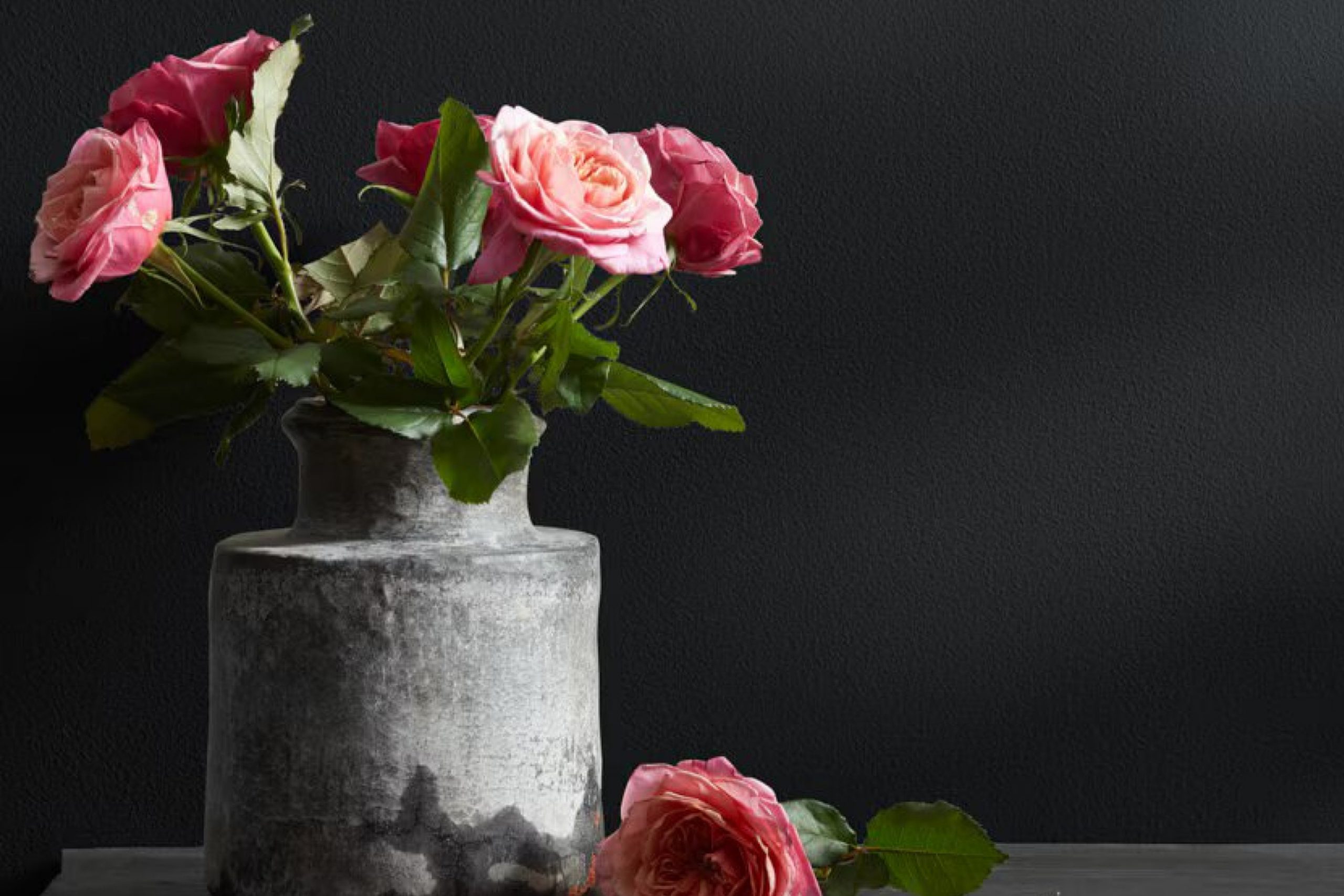
Meet 2129-10 Midnight Dream from Benjamin Moore. This rich, profound blue hue brings a sense of calm and sophistication to any space, making it an excellent choice for bedrooms or cozy reading nooks. Unlike lighter blues that give off a more airy vibe, Midnight Dream leans towards a more serene, inviting feel, offering a cozy retreat from the hustle and bustle of daily life.
You might wonder if a shade this dark could overwhelm your space. However, when balanced with lighter accents and furniture, it creates a beautiful contrast that enhances both elements. Midnight Dream isn’t just for walls—it looks equally striking on cabinetry or as an accent piece.
Pair it with soft whites or grays for a classic look, or make it modern with vibrant yellows or greens to add a unique twist to your decor.
Whether you prefer a traditional style or a more contemporary approach, Midnight Dream can adapt to your taste and bring a fresh look to your home.
via benjaminmoore.com
What Color Is Midnight Dream 2129-10 by Benjamin Moore?
The color Midnight Dream 2129-10 by Benjamin Moore is a deep, rich blue with a hint of teal, reminiscent of a serene night sky. This bold shade can create a sophisticated and cozy atmosphere in any room. Midnight Dream 2129-10 works exceptionally well in modern and contemporary interiors, providing a dramatic backdrop that allows furnishings and art to stand out. Its depth also makes it suitable for a traditional setting, adding a touch of modernity while maintaining a classic feel.
When pairing materials with Midnight Dream 2129-10, consider warm woods like walnut or cherry, which can soften the intensity of the blue while complementing its depth. Metallic accents in brass or gold add warmth and a touch of luxury, creating a stylish contrast.
For textiles, think about incorporating velvet or silk to enhance the luxurious feel of the space. Rougher textures like burlap or linen provide a balance, adding a tactile dimension that prevents the ambiance from feeling too heavy.
Overall, Midnight Dream 2129-10 is versatile, pairing well with both warm and cool tones, and can be used to create a variety of moods depending on the complementing elements chosen. Whether it’s the main color or an accent wall, this shade can breathe life into a space with its rich hue and dramatic presence.
housekeepingbay.com
Is Midnight Dream 2129-10 by Benjamin Moore Warm or Cool color?
Midnight Dream2129-10 by Benjamin Moore is a rich, deep blue shade that brings a bold and sophisticated atmosphere to any room in a home. This color is perfect for creating a strong visual impact, as it can make other colors in the decor stand out sharply. When used on walls, Midnight Dream2129-10 can turn a simple room into a more dramatic and cozy space, ideal for areas where relaxation or concentration is key, such as bedrooms or home offices.
The dark hue of Midnight Dream2129-10 has the unique capability to make small spaces appear larger by adding depth to the walls. In well-lit areas or rooms with ample natural light, this color remains vibrant and lively rather than overwhelming.
Pairing it with lighter colors such as whites or soft grays can balance its intensity, while adding metallic accents or mirrors can enhance its luxurious feel without much effort. This shade works well in modern, traditional, or eclectic interior styles, proving its versatility and timeless appeal.
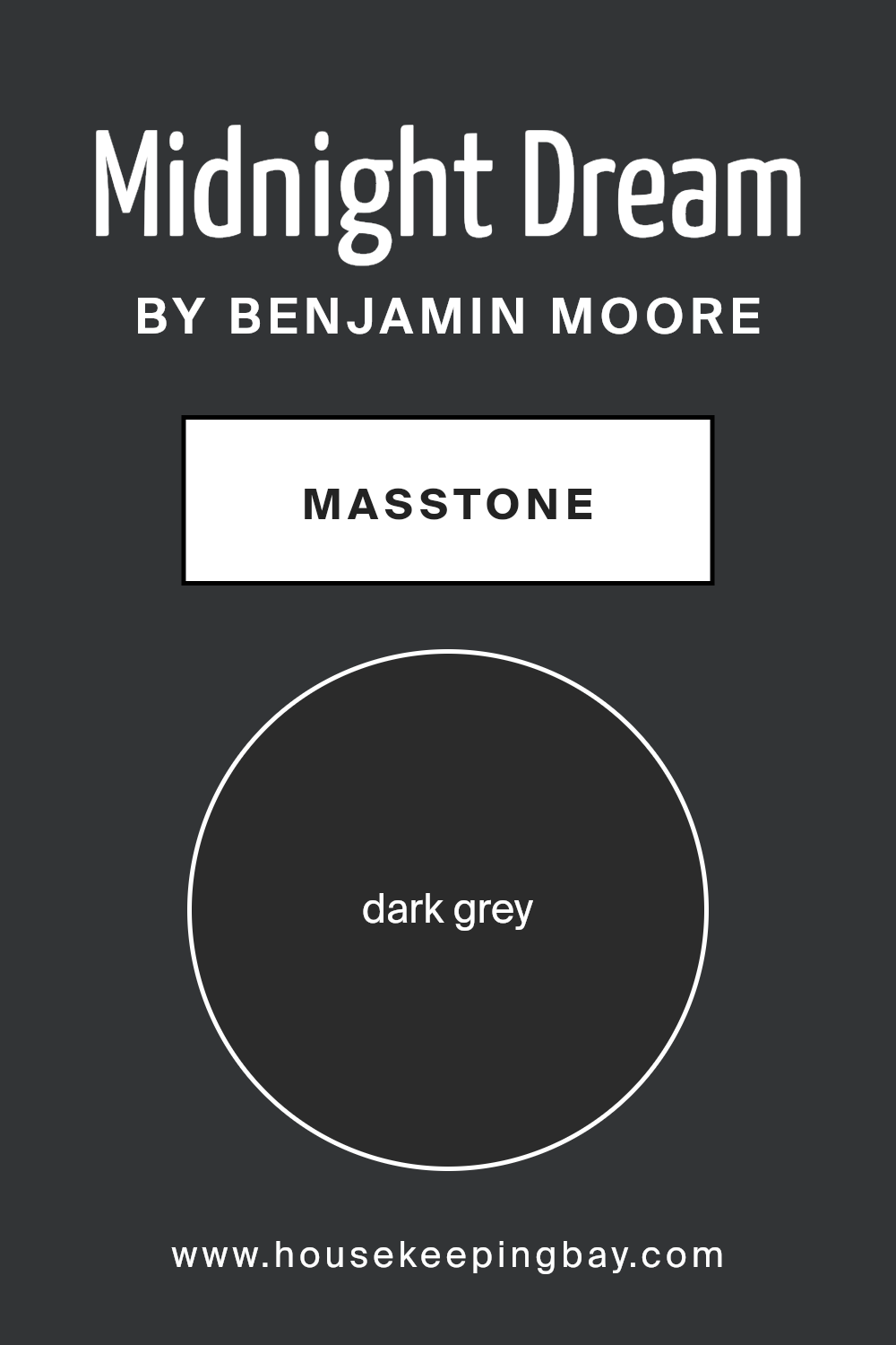
What is the Masstone of the Midnight Dream 2129-10 by Benjamin Moore?
Midnight Dream 2129-10 by Benjamin Moore, identified by the dark grey color code #2B2B2B, offers a robust and versatile hue for home interiors. This masstone is a classic shade of dark grey, providing a solid, neutral backdrop that works well in virtually any room. Its depth adds a sense of sophistication and can make other colors in the room pop, especially when paired with lighter or more vibrant accents.
The beauty of Midnight Dream in its masstone form is its ability to create a soothing, cohesive space. In areas like bedrooms or living rooms, this dark grey can help create a cozy, intimate environment, perfect for relaxing. When used in smaller spaces, such as a bathroom or an accent wall, it can give the illusion of depth, making the space seem larger.
Moreover, this particular shade is practical for everyday living, as it conceals marks and smudges better than lighter colors, reducing the appearance of wear and tear. This makes it an excellent choice for high-traffic areas or family homes where practicality is as crucial as style.
housekeepingbay.com
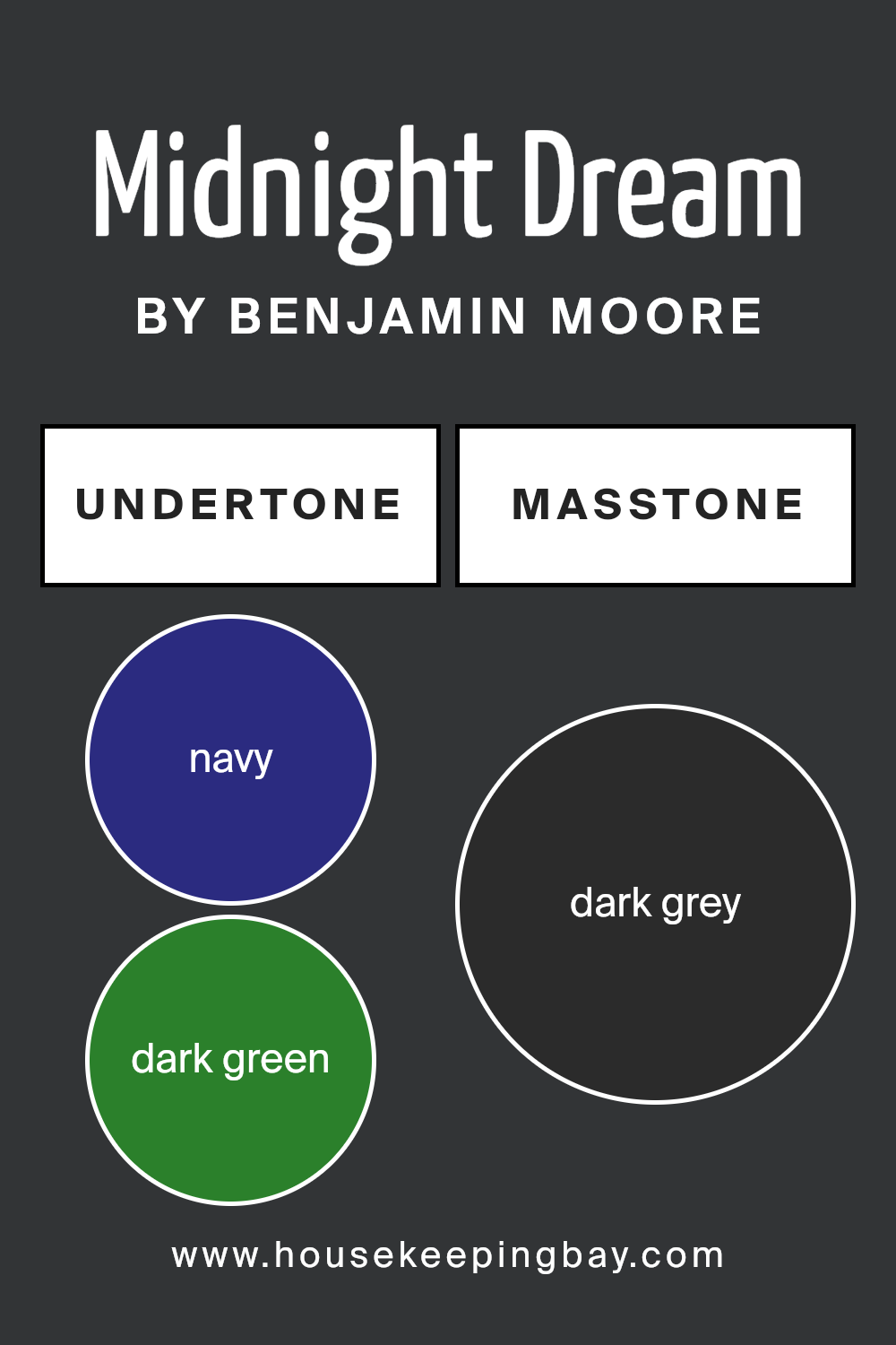
Undertones of Midnight Dream 2129-10 by Benjamin Moore
Midnight Dream2129-10 by Benjamin Moore is a deep, rich color that can dramatically alter the mood of any room. This paint contains a complex mix of undertones including navy, dark green, brown, dark turquoise, purple, olive, and grey. These undertones contribute to the versatility and depth of the color, affecting how it appears under different lighting conditions.
Undertones are subtle colors that lurk beneath the surface of the main hue. They can enhance how warm, cool, or neutral a color appears. For instance, navy and dark green undertones in Midnight Dream2129-10 tend to make the color cooler, which can make a room feel more serene and focused. Brown and olive undertones add warmth, bringing a cozy and welcoming atmosphere.
The presence of dark turquoise and purple can give the color a vibrant yet soothing feel, ideal for spaces that aim for a balance between calmness and energy. The grey undertone helps in calming the intensity of the darker shades, making this color suitable for a modern and sophisticated look on interior walls.
When applied to interior walls, Midnight Dream2129-10 can make a significant impact. Depending on the room’s lighting and accompanying décor, its undertones can make the wall appear more dynamic or muted. In natural light, the cooler undertones might become more prominent, while artificial lighting can enhance its warmer tones.
This interplay of undertones and lighting ensures that the walls painted with Midnight Dream remain intriguing, never flat or one-dimensional.
housekeepingbay.com
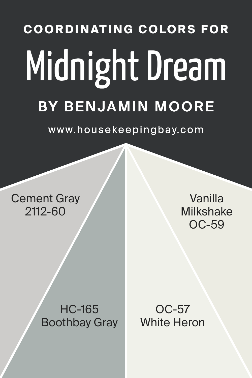
Coordinating Colors of Midnight Dream 2129-10 by Benjamin Moore
Coordinating colors are hues that complement each other and work well together in a color scheme. These colors can enhance the overall aesthetic of a space and ensure visual harmony. When decorating, choosing coordinating colors helps achieve a balanced and cohesive look, encouraging a pleasing atmosphere.
Coordinating colors usually include a mix of primary, secondary, and sometimes neutral shades which can enrich the main color used in a decor, in this case, Midnight Dream 2129-10 by Benjamin Moore.
For the color Midnight Dream 2129-10, a deep and rich shade, four coordinating colors suggested by Benjamin Moore include Cement Gray 2112-60, Boothbay Gray HC-165, White Heron OC-57, and Vanilla Milkshake OC-59. Cement Gray, for instance, is a versatile medium gray that offers a soft backdrop, perfect for areas where balance is needed against stronger shades. Boothbay Gray has a subtle blue undertone that enhances spaces with a serene and composed vibe.
White Heron is a crisp white that brings a fresh and clean look, making it great for trim and ceilings or even full walls to brighten spaces. Vanilla Milkshake is a creamy off-white, warmer than White Heron, that provides a gentle contrast and softens the overall ambiance, perfect for accompanying bolder, darker colors like Midnight Dream in decor.
You can see recommended paint colors below:
- 2112-60 Cement Gray
- HC-165 Boothbay Gray
- OC-57 White Heron
- OC-59 Vanilla Milkshake
housekeepingbay.com
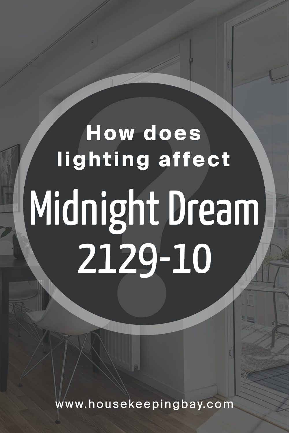
How Does Lighting Affect Midnight Dream 2129-10 by Benjamin Moore?
Lighting plays a significant role in how colors appear in a space. Different light sources can enhance or mute the hues, affecting the overall mood of a room. The color Midnight Dream 2129-10 by Benjamin Moore, a deep, rich blue, is influenced notably by varied lighting conditions.
Under artificial light, Midnight Dream tends to appear more profound and intense. In rooms with cooler LED or fluorescent lights, the blue tones might look sharper, giving a more modern feel. Warmer artificial lights, like those from incandescent bulbs, can add a touch of coziness, making the blue appear slightly more muted and softer.
Natural light, alternatively, shifts the perception of Midnight Dream dramatically throughout the day. In the bright light of midday, the color can look more vibrant and vivid. Near dusk or dawn, it may take on a softer, almost navy tone.
Room orientation relative to the sun also affects how Midnight Dream looks:
– North-faced rooms: These spaces get less direct sunlight, which can make Midnight Dream appear darker and more subdued. The color might seem more uniform throughout the day but generally retains a cooler overtone.
– South-faced rooms: These get abundant sunlight, which brightens and livens up Midnight Dream, allowing its vibrant features to shine. The color might feel lively and more dynamic in these rooms.
– East-faced rooms: Morning light can make Midnight Dream look very bright and fresh. However, as the day progresses and the natural light diminishes, the color might shift to a cooler, darker shade.
– West-faced rooms: Here, the color stays relatively muted during the morning but gains intensity as the sun sets. The rich blue hues become more prominent in the afternoon and evening light.
Knowing these nuances can help in deciding paint colors based on the room’s orientation and the type of artificial lighting used, to achieve the desired effect with Midnight Dream 2129-10.
housekeepingbay.com
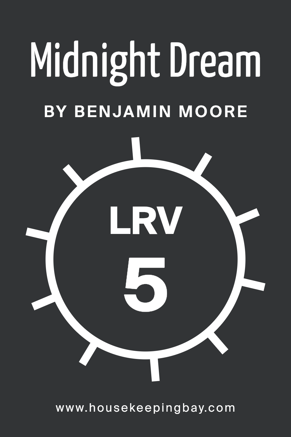
What is the LRV of Midnight Dream 2129-10 by Benjamin Moore?
LRV stands for Light Reflectance Value, which is a measure showing the percentage of light a paint color reflects from or absorbs into a surface. It’s a scale ranging from 0 to 100, where 0 implies that a color absorbs all light (making it a true black), and 100 means it reflects all light (equivalent to a true white).
Understanding this value helps when choosing paint colors since it affects how light or dark a color looks on walls and how it makes the room feel. If a room is small or dimly lit, selecting a paint with a higher LRV can make the space appear brighter and more open, as these colors reflect more light around the room.
The LRV of the color “Midnight Dream 2129-10” by Benjamin Moore is 4.59, indicating it’s a very dark color that absorbs most light rather than reflecting it. This deep, rich color will noticeably darken a room, making it ideal for creating a cozy, intimate ambiance in ample spaces or areas with plenty of natural or artificial lighting.
In smaller or less brightly lit rooms, however, using a color with such a low LRV can make the space feel smaller and more enclosed. This is worth considering if you’re deciding where to use this particular shade, as lighting and room size will significantly impact the overall look.
housekeepingbay.com
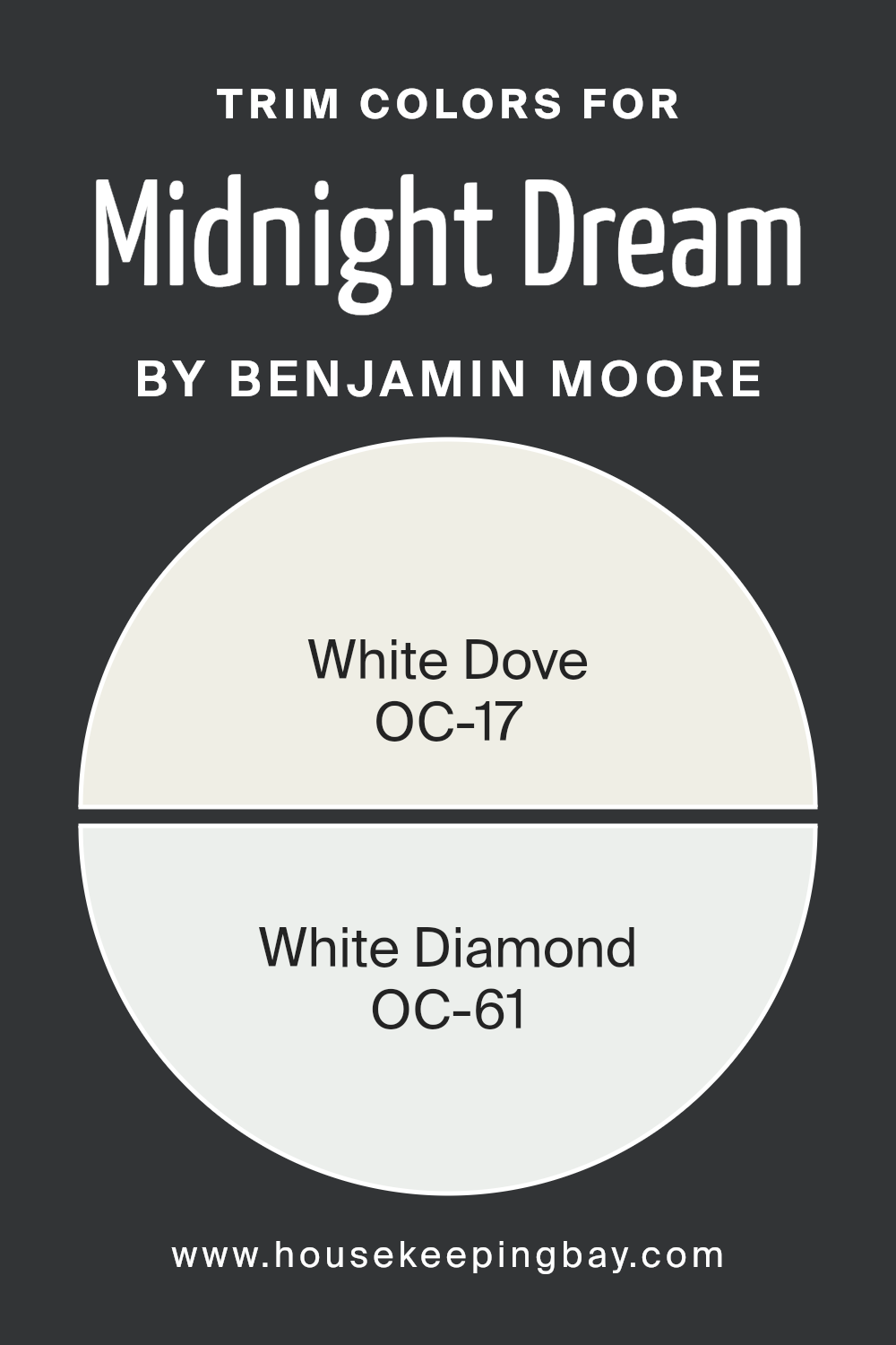
What are the Trim colors of Midnight Dream 2129-10 by Benjamin Moore?
Trim colors are specific shades used to enhance architectural details and accentuate the different elements of a room, such as door frames, baseboards, and crown moldings. When paired with a bold shade like Midnight Dream 2129-10 by Benjamin Moore, trim colors like OC-17 White Dove and OC-61 White Diamond play a critical role in defining spaces and adding a sense of structure and brightness.
These lighter trim colors contrast sharply with the deep tones of Midnight Dream, highlighting the dark hue’s rich depth and providing a visual break that can make small areas appear larger and more inviting.
OC-17 White Dove is a soft yet resilient white with a hint of warmth, making it versatile for any space, providing a gentle contrast without overwhelming the senses. OC-61 White Diamond, on the other hand, offers a slightly cooler tone, reflecting light beautifully to create a crisp and clean look that can help enhance the spacious feel of any room. Both colors are subtle enough to support the dramatic intensity of Midnight Dream 2129-10, ensuring that the darker color stands out as the focal point while the trims contribute to a polished and balanced aesthetic.
You can see recommended paint colors below:
- OC-17 White Dove
- OC-61 White Diamond
housekeepingbay.com
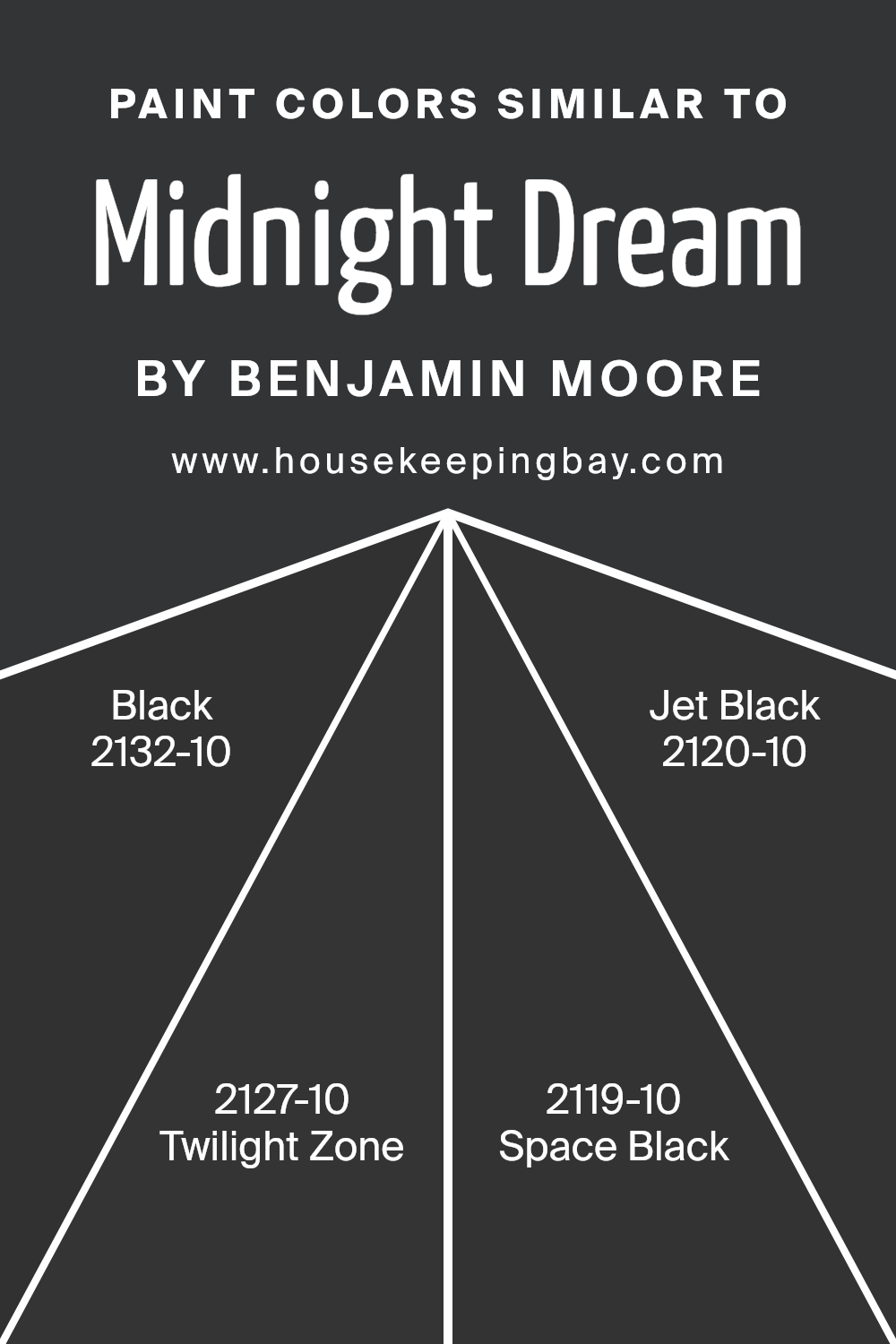
Colors Similar to Midnight Dream 2129-10 by Benjamin Moore
Similar colors play a crucial role in design by creating a sense of harmony and cohesion. When colors closely relate or share a primary hue, they effortlessly blend with each other, providing a soothing effect to the eye. For example, variations of a deep shade like Midnight Dream 2129-10 by Benjamin Moore can add depth and continuity to a space while maintaining a unified look.
Using similar colors such as Black 2132-10, Twilight Zone 2127-10, Space Black 2119-10, and Jet Black 2120-10 works well for creating a graceful and seamless transition in areas where subtle differences in shade are necessary to enhance texture without losing the overall cohesive theme.
Black 2132-10 presents a pure and deep black that offers a bold and contrasting touch, perfect for accentuating details. Twilight Zone 2127-10 brings a unique mix of blue and black hues creating a mysterious and alluring backdrop, ideal for evoking a serene atmosphere in dimly lit spaces. Space Black 2119-10 leans towards a slightly softer black, infused with an ink-like quality that works well in creating a sophisticated yet less intense experience.
Lastly, Jet Black 2120-10 reflects an intense, sharp black that can add significant visual weight and grounding to any décor, making it a versatile choice for both modern and traditional settings. Using these similar colors allows for layering and enhancing visual texture while keeping the color palette streamlined.
You can see recommended paint colors below:
- 2132-10 Black
- 2127-10 Twilight Zone
- 2119-10 Space Black
- 2120-10 Jet Black
housekeepingbay.com
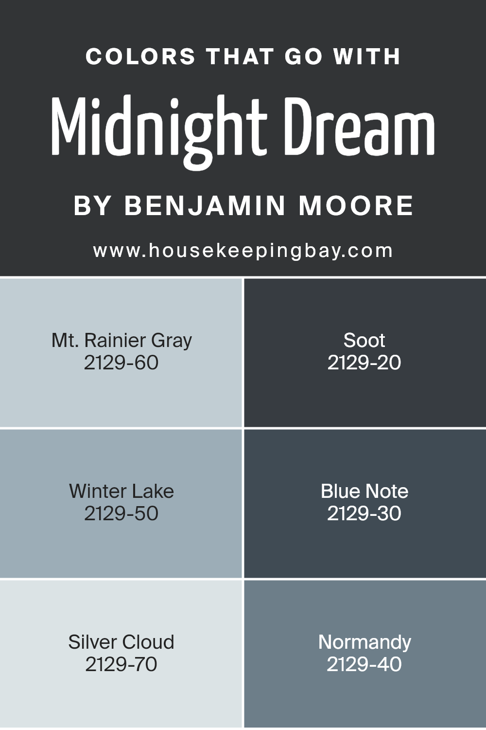
Colors that Go With Midnight Dream 2129-10 by Benjamin Moore
The colors that coordinate with Midnight Dream 2129-10 by Benjamin Moore are integral because they help to create a harmonious and visually appealing palette. When paired correctly, these colors bring balance and contrast to Midnight Dream, a deep, rich navy. This versatile range of coordinating colors ensures flexibility in design, allowing for various moods and styles, be it a serene bedroom or a sophisticated living space.
Each of the coordinating shades has its unique charm. Mt. Rainier Gray 2129-60 is a soft, muted gray that provides a gentle counterbalance to the intensity of Midnight Dream, ideal for creating a seamless transition in open spaces. Soot 2129-20 is a deep, moody gray with a hint of blue; it makes for an excellent accent color, providing depth and grounding in a room.
Winter Lake 2129-50 offers a lighter, softer blue-gray, perfect for those who wish to maintain a subtle color continuity. Blue Note 2129-30, darker than Winter Lake, gives a dramatic flair and pairs wonderfully with Midnight Dream for a monochromatic scheme.
Silver Cloud 2129-70 lightens up spaces with its airy gray, providing a crisp, clean look that contrasts well with deeper tones. Lastly, Normandy 2129-40, a muted blue with gray undertones, offers richness and sophistication that complements Midnight Dream without overpowering it. Together, these colors work seamlessly to enrich and complete any space.
You can see recommended paint colors below:
- 2129-60 Mt. Rainier Gray
- 2129-20 Soot
- 2129-50 Winter Lake
- 2129-30 Blue Note
- 2129-70 Silver Cloud
- 2129-40 Normandy
housekeepingbay.com
How to Use Midnight Dream 2129-10 by Benjamin Moore In Your Home?
Midnight Dream 2129-10 by Benjamin Moore is a rich, deep blue paint color that adds a sense of sophistication and coziness to any space. This shade is perfect for those looking to introduce a bold yet calm atmosphere into their home.
It works wonderfully in a bedroom where a restful, peaceful ambiance is vital. Applying it to one accent wall can create a focal point without overpowering the room. Pair it with soft whites or light grays for a balanced look. In a living room, Midnight Dream can highlight architectural features like fireplaces or built-in bookshelves.
This color also suits well-lit areas, as natural light brings out its dynamic qualities during the day, while artificial lighting makes it cozy at night.
For a more dramatic effect, use it in a small bathroom or on kitchen cabinets for a modern and chic aesthetic. Midnight Dream 2129-10 is versatile, enhancing both traditional and contemporary home styles.
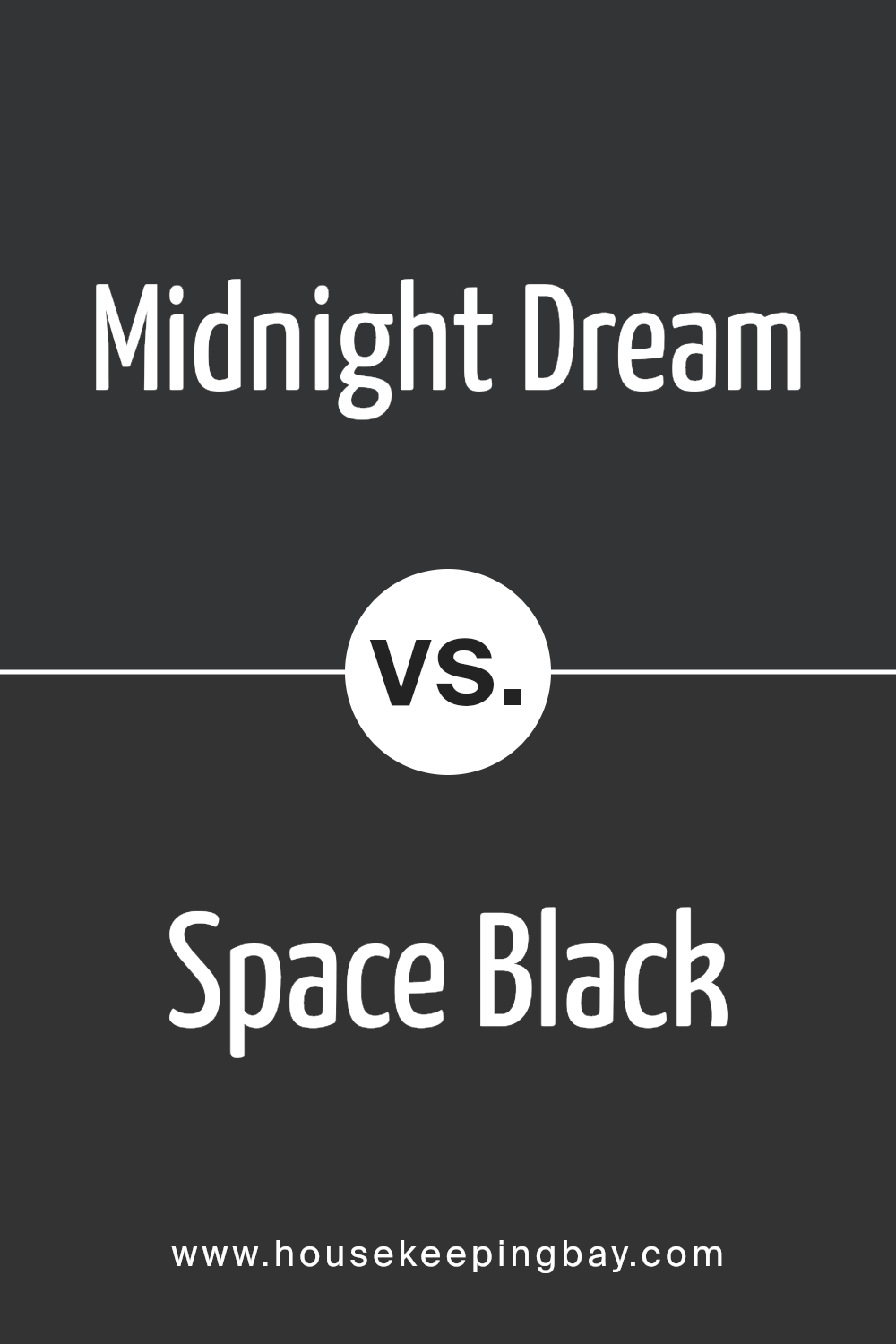
Midnight Dream 2129-10 by Benjamin Moore vs Space Black 2119-10 by Benjamin Moore
Midnight Dream 2129-10 by Benjamin Moore is a deep, rich blue that mimics the sky on a clear night far from city lights. This color has a serene quality with a hint of mystery, ideal for creating a cozy and introspective space. It pairs well with bright whites or soft neutrals, giving a calming contrast that’s beautiful in bedrooms or quiet study areas.
In contrast, Space Black 2119-10 is a pure, intense black that provides a bold statement. This shade is perfect for creating dramatic accents in a space, whether on a feature wall, cabinets, or furniture. It absorbs light, making it useful in spaces where you want to minimize reflection and highlight specific areas through lighting and decor.
Both colors offer distinct vibes: Midnight Dream invites a reflective, soothing atmosphere, while Space Black offers a strong and focused energy, great for modern and minimalist designs.
You can see recommended paint color below:
- 2119-10 Space Black
housekeepingbay.com
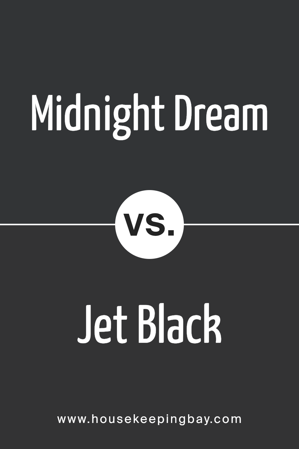
Midnight Dream 2129-10 by Benjamin Moore vs Jet Black 2120-10 by Benjamin Moore
Midnight Dream 2129-10 and Jet Black 2120-10 by Benjamin Moore are both dark colors, yet they have distinct differences. Midnight Dream 2129-10 is a deep blue that could remind you of a dark night sky. It has a slightly moody vibe while still feeling rich and sophisticated.
In contrast, Jet Black 2120-10 is a true, deep black. It provides a classic and very bold look, perfect for making a strong statement in any space. While Midnight Dream offers a hint of color with its blue undertones, Jet Black goes for sheer depth and darkness. This makes Jet Black more versatile for creating contrast with light colors or enhancing modern, minimalistic designs.
Midnight Dream, with its blue tones, is ideal for those looking to add a subtle touch of color while maintaining a dark, soothing atmosphere. Either color could effectively set the mood in a room, depending on what you are aiming for in your design.
You can see recommended paint color below:
- 2120-10 Jet Black
housekeepingbay.com
Midnight Dream 2129-10 by Benjamin Moore vs Twilight Zone 2127-10 by Benjamin Moore
Midnight Dream 2129-10 and Twilight Zone 2127-10 from Benjamin Moore are both deep, dark shades that add sophistication to any space. Midnight Dream 2129-10 is a rich navy blue with a hint of teal, providing a sense of depth and luxury.
It’s perfect for creating a cozy, peaceful atmosphere in a room. In contrast, Twilight Zone 2127-10 leans more towards a charcoal gray with deep blue undertones. This color is ideal for those looking for a modern and sleek look. Both colors are bold and can make dramatic statements when used on walls or as accent features.
However, Midnight Dream has a warmer undertone, making it more inviting, while Twilight Zone offers a cooler feel, ideal for a contemporary setting. Both colors work well in various lighting conditions and can pair nicely with light neutrals or vibrant hues for a balanced decor.
You can see recommended paint color below:
- 2127-10 Twilight Zone

housekeepingbay.com
Midnight Dream 2129-10 by Benjamin Moore vs Black 2132-10 by Benjamin Moore
Midnight Dream 2129-10 and Black 2132-10 by Benjamin Moore are both dark hues but each possesses distinct qualities. Midnight Dream 2129-10 is a deep, profound blue that gives a sense of depth and sophistication. This color can be seen as versatile, ideal for creating a cozy, focused atmosphere in spaces like studies or bedrooms. It pairs well with light, neutral tones or can be used as an accent against brighter colors.
Black 2132-10, however, is a true, strong black that provides a bold statement. It’s perfect for making dramatic contrasts, particularly in modern or minimalist decor. This hue works well in spaces that benefit from a stark, clear definition of colors, such as art galleries or areas with metallic accents.
Both colors offer unique opportunities for interior design. Midnight Dream adds a touch of elegance with its blue undertones, while Black brings crisp clarity and forceful presence. Selecting between them depends on the desired mood and style of the room.
You can see recommended paint color below:
- 2132-10 Black
housekeepingbay.com
Concluding my thoughts on Benjamin Moore’s 2129-10 Midnight Dream, I am genuinely impressed by how effectively this paint color adds depth and sophistication to a room. Often, choosing the right shade can be tricky, but Midnight Dream proves itself as a versatile and rich option. Whether used in a small accent area or a larger wall space, it consistently brings a strong, moody feel without overpowering.
Midnight Dream also pairs beautifully with a wide range of decor styles and complements both modern and traditional furnishings. Its ability to act as both a backdrop and a statement color is quite impressive.
For anyone looking to refresh their space with a shade that offers both classic appeal and a touch of the unexpected, I can confidently recommend 2129-10 Midnight Dream. This color not only enhances the aesthetic of your home but does so with a calm and collected vibe that’s hard to find in more intense shades.
If you’re thinking about updating a room, consider this shade for an effective yet subtle transformation.
housekeepingbay.com
