Mardi Gras 1342 by Benjamin Moore
Celebrate with Vibrant Purple Hues
Are you curious about giving your space a fresh, bold update? You might want to consider 1342 Mardi Gras by Benjamin Moore. This vibrant paint color packs a punch and could be just what you need to bring some energy into your room. Mardi Gras is not just another shade; it is unique and lively, perfectly named after the famous New Orleans festival known for its dynamic and colorful celebrations.
Selecting the right color for your walls can completely change the feel of your room without the need for expensive changes. Whether it’s making your living room pop or adding some personality to your bedroom, Mardi Gras has the potential to lift the atmosphere and add a splash of fun. Plus, it pairs beautifully with a variety of decor styles and colors, allowing you the flexibility to mix and match as you like.
If refreshing your home’s look sounds like something you want, consider dressing your walls up with 1342 Mardi Gras.
It’s a choice that could make your home feel as lively and inviting as the festival it’s named after.
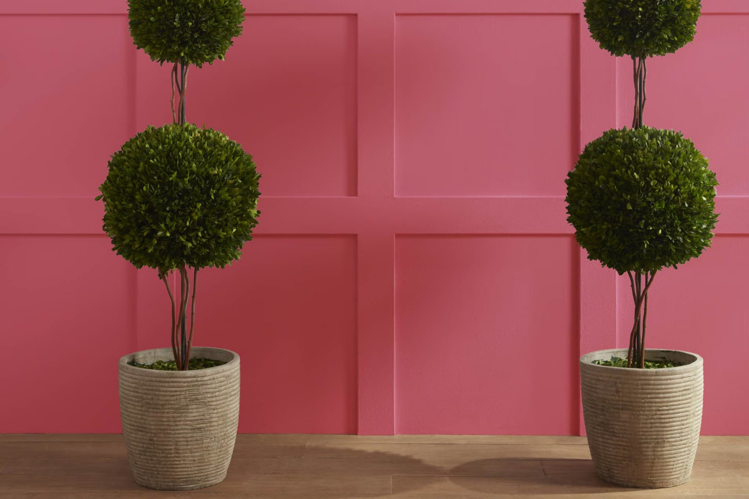
via benjaminmoore.com
What Color Is Mardi Gras 1342 by Benjamin Moore?
Table of Contents
“Mardi Gras 1342” by Benjamin Moore is a rich, deep purple with vibrant energy, perfect for adding a bold touch to any space. Its impressive depth can create a sense of sophistication or a playful ambiance, depending on how it’s used. This color works exceptionally well in contemporary or bohemian interior styles, where its boldness can truly shine without overwhelming the space.
For contemporary settings, “Mardi Gras 1342” pairs beautifully with minimalist furniture, allowing the color to stand out as a focal point. When used in bohemian interiors, it complements eclectic decor and layers of various textures and colors, adding a vibe of creativity and coziness.
This shade is versatile in terms of materials; it goes elegantly with metallic accents such as brass or gold, which help to warm up its cool undertones. Natural wood also works well with this color, providing a grounding effect that balances its vibrancy. Textures like velvet or silk can further enhance the luxurious feel of the color, making it ideal for statement furniture pieces or plush throw pillows that invite a touch of luxury and comfort.
housekeepingbay.com
Is Mardi Gras 1342 by Benjamin Moore Warm or Cool color?
Mardi Gras 1342 by Benjamin Moore is a vivid, dynamic paint color that brings life to any room in a house. This particular shade can vary from a deep purple to a vibrant violet depending on the lighting, making it a versatile option for home decoration.
When used in large areas, such as on walls, Mardi Gras 1342 adds a bold splash of color that can make spaces feel more lively and energetic. It is particularly effective in living rooms or dining areas where a sense of creativity and social interaction is encouraged.
However, because it is a strong color, it works best when balanced with neutral tones like whites, grays, or light woods to avoid overwhelming the space. In smaller doses, like on an accent wall or in decorative accessories, it can also provide a striking contrast that enhances the overall aesthetic of a home. Mardi Gras 1342 is ideal for those looking to inject personality and a bit of fun into their living environment.
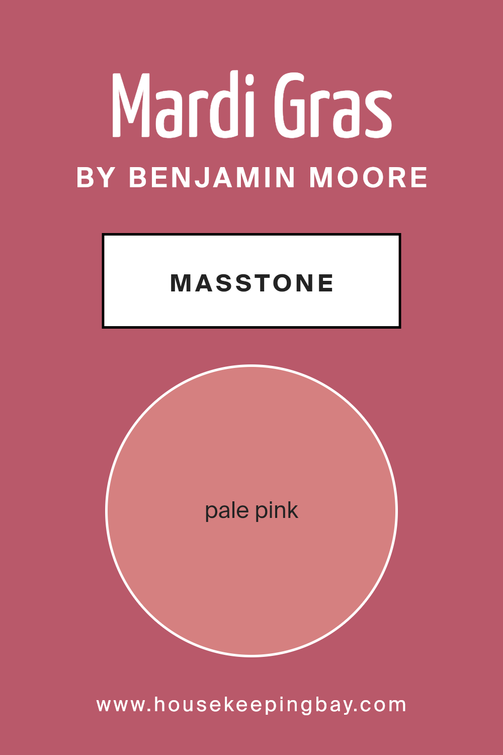
What is the Masstone of the Mardi Gras 1342 by Benjamin Moore?
Mardi Gras 1342 by Benjamin Moore has a masstone of pale pink, specifically #D58080. This gentle shade creates a soothing, warm ambiance in any home. Its subtle pink tone is versatile, making it perfect for various spaces, from bedrooms to living rooms.
This color is soft enough to act as a neutral, pairing well with darker colors like navy or gray, and also complements lighter pastels for a more airy, open feel. The pale pink hue reflects natural light beautifully, making small rooms appear bigger and more inviting.
In well-lit areas, it adds a fresh, cheerful glow, while in rooms with less light, it maintains a cozy and warm atmosphere. This makes Mardi Gras 1342 a great choice for both sunny rooms and spaces needing a touch of brightness. It’s an ideal color for creating a calming, relaxed environment in your home, without overwhelming the space with too much color intensity.
housekeepingbay.com
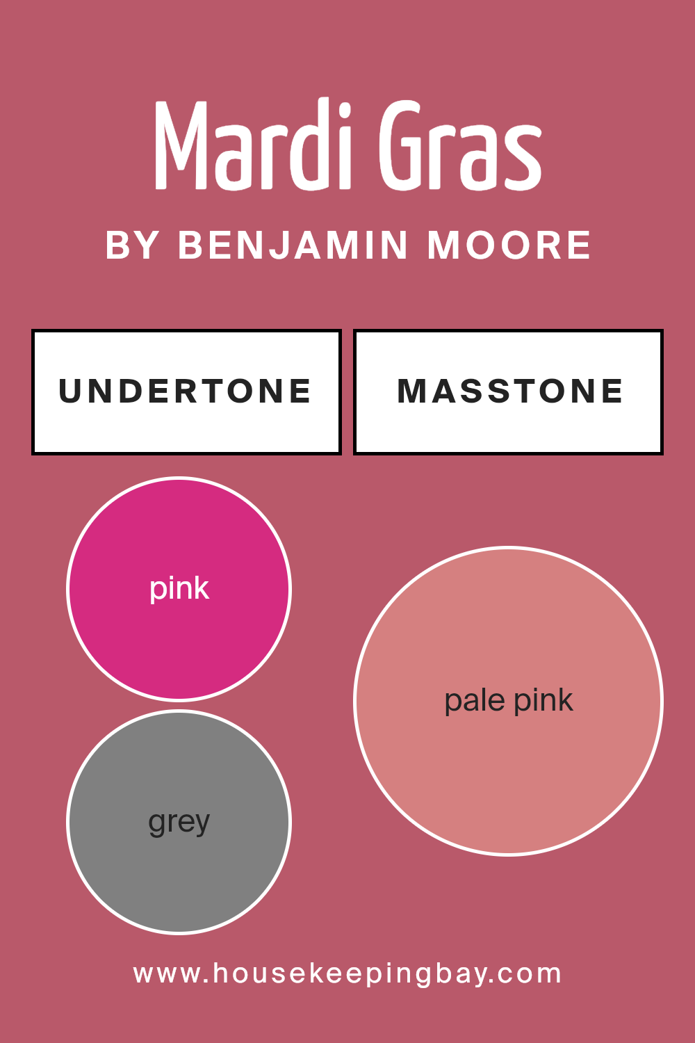
Undertones of Mardi Gras 1342 by Benjamin Moore
Mardi Gras 1342 by Benjamin Moore is a unique paint color with a complex mix of undertones that can significantly impact how it appears on interior walls. The presence of undertones like pink, grey, purple, orange, and red adds a subtle vibrancy and depth to the paint, allowing it to shift in appearance under different lighting conditions. For instance, in natural light, the pink and orange undertones might make the color appear warmer, while the grey and purple could cool it down under artificial lighting.
Using this paint in an interior setting, these undertones can influence the mood and feel of the space. The grey and light grey undertones provide a neutral base, making the color versatile and easy to match with different decor styles. The hints of lively colors like fuchsia, red, and orange give the room a splash of energy, ideal for spaces that benefit from a dynamic and lively atmosphere such as living rooms or dining areas.
In smaller rooms or spaces with limited natural light, the darker undertones like brown and olive might make the paint seem deeper and more saturated, potentially making the room feel more intimate and cozy. Conversely, lighter undertones such as mint, light green, and pale yellow can help to visually expand the space, making it feel brighter and more open.
Overall, the undertones of Mardi Gras 1342 by Benjamin Moore allow for a flexible use in various interior designs, influencing both the aesthetic appeal and the functional feel of the rooms they are used in.
housekeepingbay.com
Coordinating Colors of Mardi Gras 1342 by Benjamin Moore
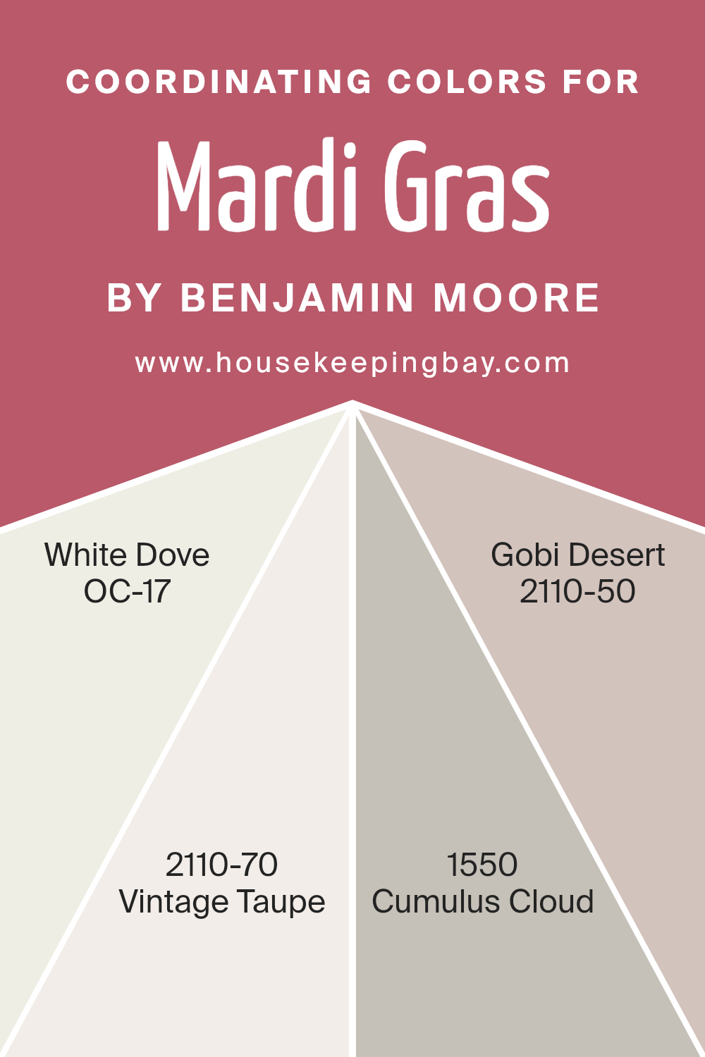
Coordinating colors are chosen to complement each other and enhance the overall appearance of a space. When selecting coordinating colors, the aim is to create a balanced and harmonious palette that ties different elements and moods together. This concept is prominently used in interior design, where colors like those from the Benjamin Moore Mardi Gras 1342 collection offer a versatile range of hues that fit seamlessly together. For instance, each shade in the collection has a specific role in achieving a cohesive look, whether it serves as a primary, accent, or neutral tone.
White Dove (OC-17) is a soft and pure white with a hint of warmth, making it an ideal backdrop for richer colors or as a stand-alone tone for a clean, fresh look. Vintage Taupe (2110-70) provides a gentle blend of beige and gray, offering a subtle complexity that complements both warm and cool tones.
Cumulus Cloud (1550) straddles the line between gray and white, offering a mid-tone that bridges brighter and darker shades beautifully. Lastly, Gobi Desert (2110-50) is a warm, sandy color that adds a cozy, inviting quality to any room, establishing a soothing atmosphere. These colors work together to create settings that are both inviting and balanced, enhancing each other’s beauty to achieve a delightful space.
You can see recommended paint colors below:
- OC-17 White Dove
- 2110-70 Vintage Taupe
- 1550 Cumulus Cloud
- 2110-50 Gobi Desert
housekeepingbay.com
How Does Lighting Affect Mardi Gras 1342 by Benjamin Moore?
Lighting plays a crucial role in how we perceive colors in an environment. The type of light under which a color is viewed can greatly alter its appearance. Different light sources can enhance or mute the hues, and the direction of the room’s exposure to natural light also affects color perception.
“Mardi Gras 1342” by Benjamin Moore is a vibrant color that can change based on the lighting conditions. In artificial light, such as incandescent bulbs, this color might appear warmer and richer, bringing out more of its deep, lively essence. Fluorescent lighting could push it towards a slightly bluer tone, making it appear a bit cooler than it actually is.
In natural light, “Mardi Gras 1342” can look vastly different depending on the time of the day and the room’s orientation:
- North-Faced Rooms: These rooms receive less direct sunlight, which can make the color appear more subdued and slightly darker. The cooler, indirect light might emphasize the blue undertones in “Mardi Gras 1342,” making it look more muted.
- South-Faced Rooms: South-facing rooms get ample sunlight throughout the day. This abundance of natural light can make “Mardi Gras 1342” look brighter and more vivid. The warm sunlight enhances the richness of the color, truly bringing out its vibrancy.
- East-Faced Rooms: East-facing rooms enjoy bright light in the morning with a cooler tone. “Mardi Gras 1342” might look very lively and welcoming in the morning, gradually becoming softer as the day progresses and the natural light diminishes.
- West-Faced Rooms: In west-facing rooms, the color will experience the opposite effect compared to east-facing rooms. The color will be softer in the muted morning light and become more dynamic and richer in the afternoon and evening as it catches the warm, golden tones of the setting sun.
Understanding these variations can help in deciding paint colors based on the room orientation and the desired mood or effect.
housekeepingbay.com
What is the LRV of Mardi Gras 1342 by Benjamin Moore?
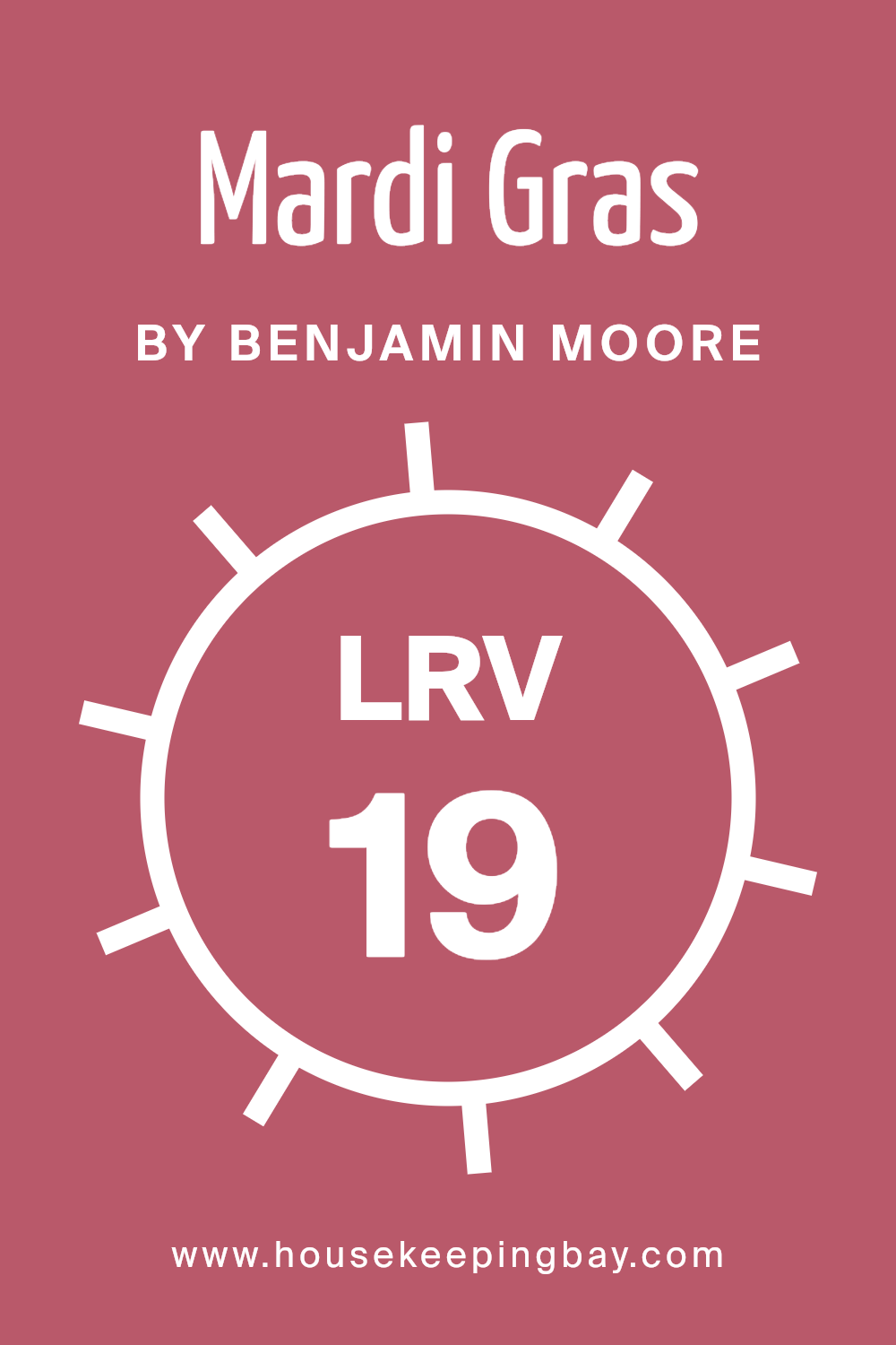
LRV stands for Light Reflectance Value, a measurement indicating how much light a paint color reflects or absorbs. This value ranges from 0, which is completely black and absorbs all light, to 100, reflecting all light back and appearing pure white. LRV is crucial when choosing paint colors because it impacts the brightness and mood of a room.
A higher LRV means a brighter, lighter-looking space, while a lower LRV results in a darker, cozier atmosphere. It helps in selecting the right color based on how much natural or artificial light a room receives, optimizing the feel of the space. Mardi Gras 1342 by Benjamin Moore, with an LRV of 18.87, is on the darker end of the scale.
This means it absorbs more light than it reflects, making it a deep, rich color ideal for creating an intimate and reserved environment. In rooms with limited natural light or smaller spaces, using this color might make the space feel smaller or more enclosed.
However, in well-lit, spacious areas, Mardi Gras 1342 can add a sophisticated touch, especially when balanced with lighter colors and furnishings to prevent the room from feeling too heavy.
housekeepingbay.com
What are the Trim colors of Mardi Gras 1342 by Benjamin Moore?
Trim colors refer to the paint used on the architectural details of a room, such as baseboards, moldings, window casings, and doors. These colors are critical in interior design as they help to define and accentuate the lines and features of a space, creating a neat and finished look.
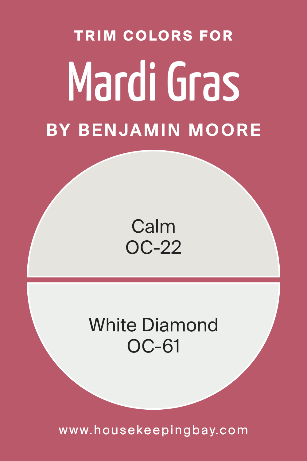
For Mardi Gras by Benjamin Moore, using trim colors like OC-22 – Calm and OC-61 – White Diamond can subtly enhance the environment without overpowering it. These lighter trim tones are great for contrasting with darker or more vibrant wall colors, thereby highlighting the architectural elements of any room effectively.
OC-22 – Calm is a soft, soothing off-white with a subtle cool undertone, ideal for creating a gentle boundary that seamlessly integrates with lighter wall colors. This color provides a breezy and airy feel to any space, helping to complement a serene and cohesive aesthetic. OC-61 – White Diamond is a crisp, clean white that offers a fresh and bright touch. Its radiant quality enhances natural light, making spaces appear larger and more inviting, which is particularly effective in smaller rooms or rooms with less natural light.
You can see recommended paint colors below:
- OC-22 Calm
- OC-61 White Diamond
housekeepingbay.com
Colors Similar to Mardi Gras 1342 by Benjamin Moore
Similar colors play a crucial role in design by creating a sense of harmony and balance. When colors, such as those similar to Mardi Gras 1342 by Benjamin Moore, are used together, they can enhance a space’s aesthetic without overwhelming the eye.
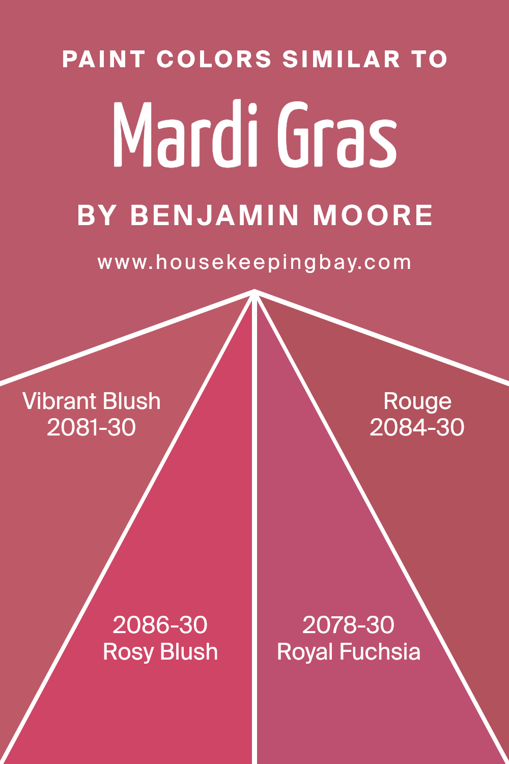
This palette of hues shares a common base tone but varies slightly in depth and intensity, allowing them to interact beautifully and produce a subtle yet cohesive look. Colors that are closely related offer a pleasing visual experience and make it easier to achieve a unified feel in any interior design. Vibrant Blush 2081-30 is a bold, energetic pink with a hint of depth that adds warmth and a lively vibe to any room.
Rosy Blush 2086-30, slightly softer, gives a gentle and inviting appeal with its understated yet warm presence. Royal Fuchsia 2078-30 is a deeper, more striking shade that introduces a regal and confident flair, perfect for creating focal points in a space. Lastly, Rouge 2084-30 presents as a rich, passionate color that brings a cozy and sophisticated atmosphere. Each of these colors enhances the others by staying within a specific color family, fostering a visually appealing scheme that’s both balanced and dynamic. This method allows for room creativity while maintaining a cohesive environment.
You can see recommended paint colors below:
- 2081-30 Vibrant Blush
- 2086-30 Rosy Blush
- 2078-30 Royal Fuchsia
- 2084-30 Rouge
housekeepingbay.com
Colors that Go With Mardi Gras 1342 by Benjamin Moore
Choosing the right colors that complement Mardi Gras 1342 by Benjamin Moore is crucial for creating a coherent and appealing color scheme in any interior space. This attention to color compatibility enhances the overall aesthetic and ensures that no single color overwhelms the others.
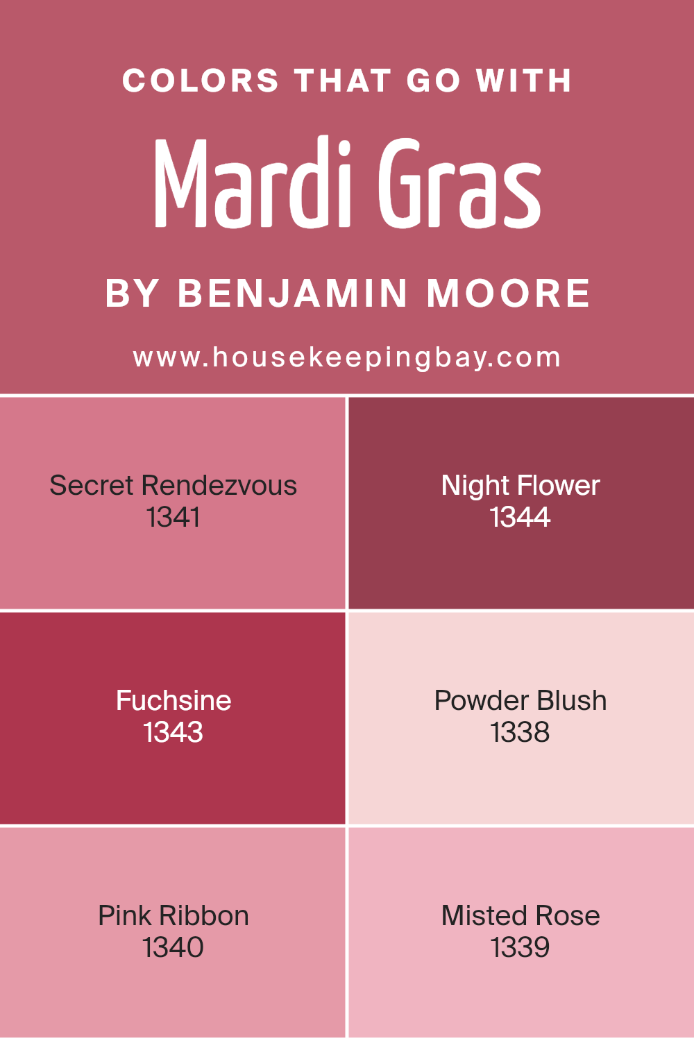
Mardi Gras 1342, a lively and cheerful purple, can be wonderfully paired with hues like Secret Rendezvous and Night Flower. Secret Rendezvous is a soft, muted gray that offers a soothing contrast to the vibrant purple, creating a balanced look. Night Flower, on the other hand, is a deeper purple that reinforces the richness of Mardi Gras 1342 without overpowering it.
Further complementing this palette, shades like Fuchsine and Powder Blush bring in a playful mix of colors that work harmoniously with Mardi Gras 1342. Fuchsine is a bold magenta that injects a splash of brightness, making the space feel more dynamic. Powder Blush is a gentle pink that softens the intensity of the surrounding purples and magentas, providing a subtle transition between strong and soft tones.
Completing this palette, Pink Ribbon and Misted Rose offer variations in intensity and warmth. Pink Ribbon is a clear pink that adds a touch of innocence and cheer, while Misted Rose, a warmer tone of pink, offers a cozy and inviting feel. Collectively, these colors create a diverse and flexible palette that enhances the visual appeal of any room.
You can see recommended paint colors below:
- 1341 Secret Rendezvous
- 1344 Night Flower
- 1343 Fuchsine
- 1338 Powder Blush
- 1340 Pink Ribbon
- 1339 Misted Rose
housekeepingbay.com
How to Use Mardi Gras 1342 by Benjamin Moore In Your Home?
Mardi Gras 1342 by Benjamin Moore is a vibrant, rich paint color that invokes the lively spirit of the famous festival. It’s a deep purple that can add a bold splash to any room, making it feel lively and festive. This color is perfect for someone looking to create a focal point in a space, whether it’s painting one wall as an accent or using it on smaller decorative elements throughout the room.
For the living room or dining area, pairing Mardi Gras 1342 with lighter shades like creams or soft grays can balance its intensity while maintaining a cozy, inviting atmosphere. In a bedroom, using this color for one wall behind the bed can make the space feel more intimate and personal.
This color also works great in creative spaces such as a home office or a studio, where it stimulates a sense of creativity and energy. Accessories like curtains, cushions, or lamps in Mardi Gras 1342 can unify a room’s look without overwhelming it. This shade is versatile and can be adjusted to fit any decorative style, making it easy to use in numerous ways around your home.
Mardi Gras 1342 by Benjamin Moore vs Royal Fuchsia 2078-30 by Benjamin Moore
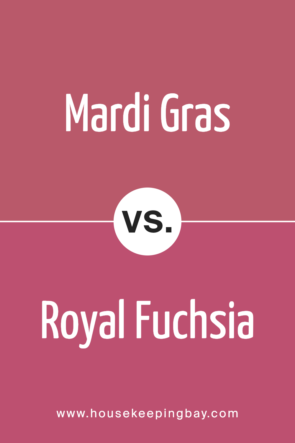
Mardi Gras 1342 by Benjamin Moore is a rich, deep purple that adds a regal and sophisticated touch to any space. It’s a bold color that can make a dramatic statement when used on walls or as an accent in a room. The vibrancy of Mardi Gras 1342 is its standout feature, giving a sense of luxury and depth.
Royal Fuchsia 2078-30 by Benjamin Moore is another vibrant color but leans more towards a bright pink with a distinct vibrancy. It’s a playful and energetic color that can instantly brighten up a space and infuse it with a lively vibe. Royal Fuchsia works well in areas that benefit from a pop of color, bringing a cheerful and youthful energy to interiors.
Both colors are bold and vivid, but while Mardi Gras conveys a more luxurious and intense atmosphere, Royal Fuchsia offers a lighter, more energetic feel. They could complement each other well in a creative, dynamic space, or stand alone to make their individual statements.
You can see recommended paint color below:
- 2078-30 Royal Fuchsia
housekeepingbay.com
Mardi Gras 1342 by Benjamin Moore vs Vibrant Blush 2081-30 by Benjamin Moore
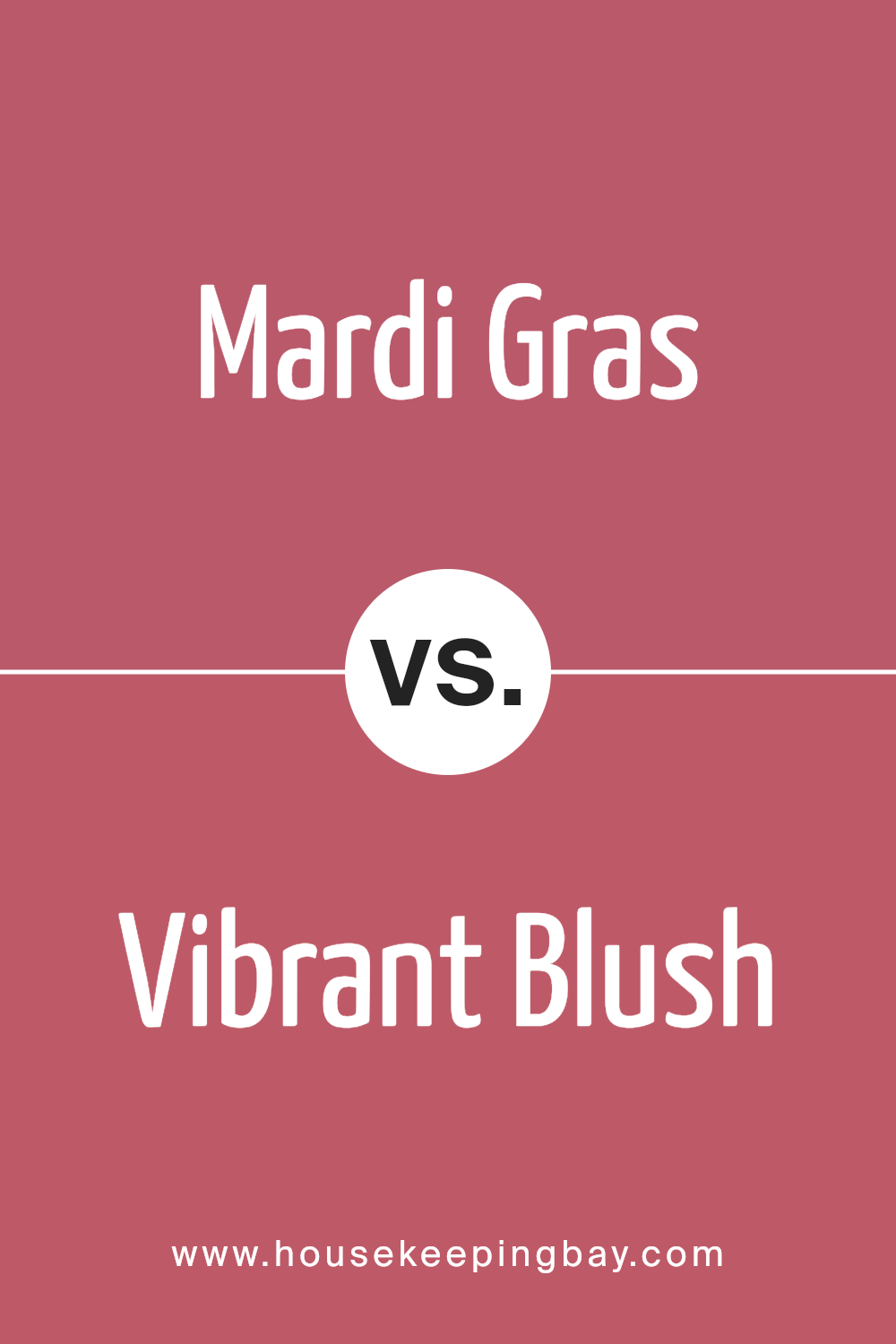
Mardi Gras 1342 by Benjamin Moore and Vibrant Blush 2081-30 both bring lively personalities to any space. Mardi Gras 1342 is a deep, vibrant purple that adds a rich, regal feel, perfect for spaces meant to impress or provide a focal point.
This color can make large rooms feel cozier and more intimate. In contrast, Vibrant Blush 2081-30 is a bold pink hue that injects energy and warmth into a room. It’s ideal for creating a cheerful, inviting atmosphere.
While Mardi Gras 1342 leans towards a more formal and sophisticated vibe, Vibrant Blush 2081-30 offers a sense of fun and spiritedness. Both colors are bold choices but serve different moods and settings. Mardi Gras 1342 works well in a study or dining area, whereas Vibrant Blush 2081-30 is great for a bedroom or creative space.
You can see recommended paint color below:
- 2081-30 Vibrant Blush
housekeepingbay.com
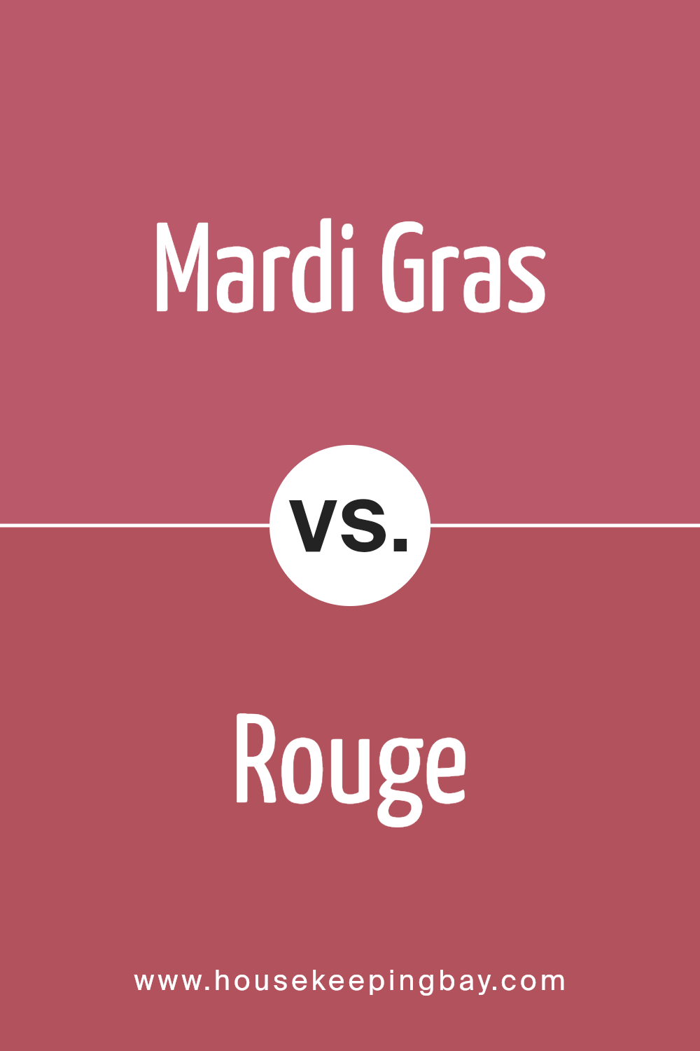
Mardi Gras 1342 by Benjamin Moore vs Rouge 2084-30 by Benjamin Moore
Mardi Gras 1342 by Benjamin Moore is a vibrant, deep purple hue with a rich, regal quality that’s perfect for adding a touch of drama and sophistication to any space. This purple shade can make smaller rooms feel cozy and enveloping or give large rooms a more majestic feel. It pairs well with lighter accents like creams and soft grays, which help to balance its intensity.
Rouge 2084-30, also by Benjamin Moore, is a bold, vivid red color that brings warmth and energy to a space. Its bright tone creates a strong focal point, making it ideal for accent walls or to add pops of color through decor items. Rouge works beautifully with neutral tones and darker shades alike, providing flexibility in design choices.
While Mardi Gras 1342 leans towards a cooler, more composed ambiance, Rouge 2084-30 offers a warmer, more inviting feel. Both colors are excellent choices for someone looking to make a statement in their home or office. The selection between them depends largely on the atmosphere you want to create.
You can see recommended paint color below:
- 2084-30 Rouge
housekeepingbay.com
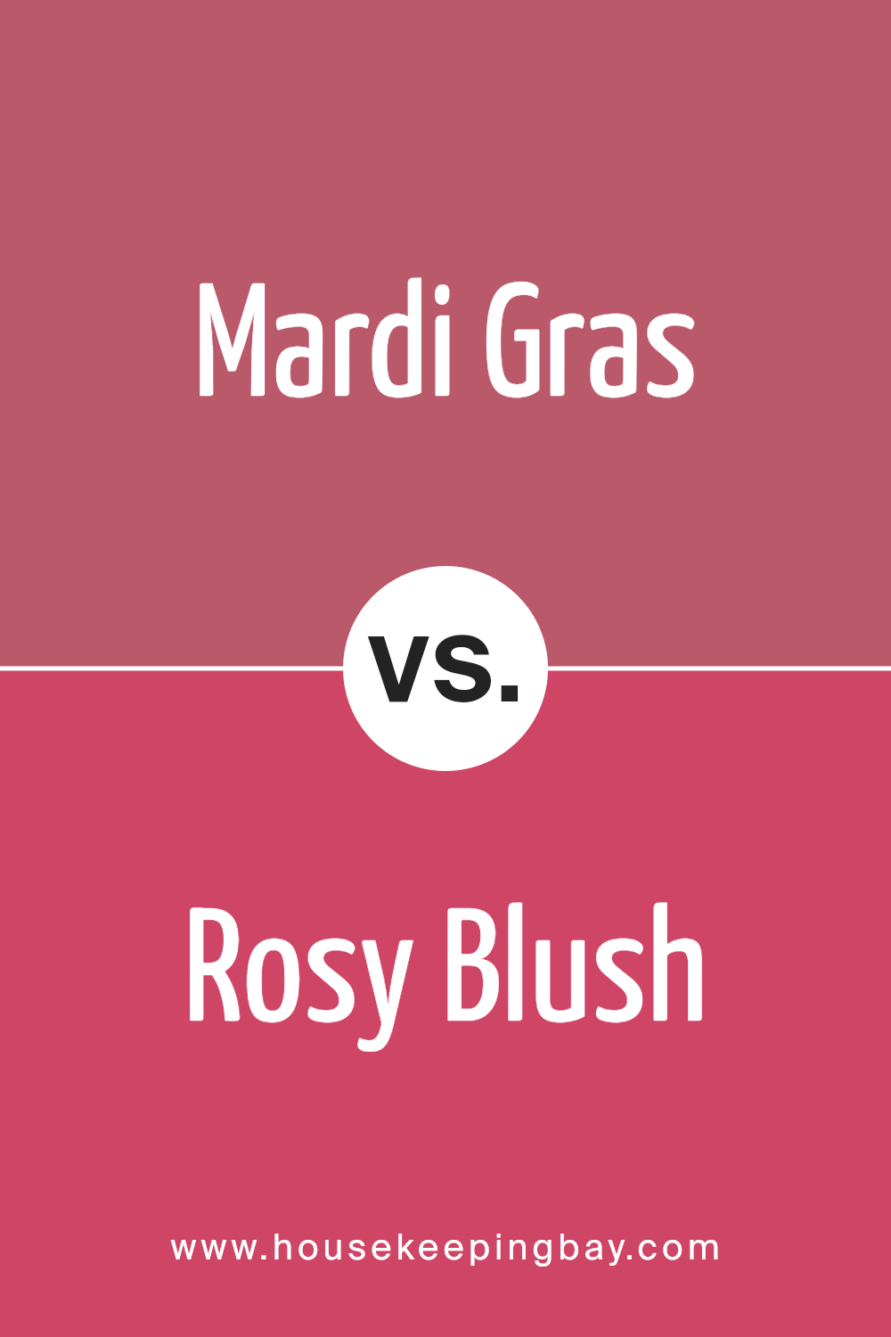
Mardi Gras 1342 by Benjamin Moore vs Rosy Blush 2086-30 by Benjamin Moore
Mardi Gras 1342 by Benjamin Moore is a deep, vibrant purple that can make any space feel lively and full of energy. It’s a bold choice, suited for making a statement in a room or used in accent areas. This color tends to draw attention and works well in creative spaces or as part of a more eclectic decor style.
Rosy Blush 2086-30, also by Benjamin Moore, is a warm, inviting pink with a slightly muted tone. It creates a cozy, soothing atmosphere and is versatile enough to fit in many areas, from living rooms to bedrooms. Rosy Blush is softer, making it easier to blend with a range of decor styles, from contemporary to traditional.
Both colors are distinctive, but while Mardi Gras is about adding a punch of color, Rosy Blush is about adding a gentle warmth. They cater to different tastes and uses in interior design, making each suitable for unique purposes and environments.
You can see recommended paint color below:
- 2086-30 Rosy Blush
housekeepingbay.com
Conclusion
Reviewing 1342 Mardi Gras by Benjamin Moore, I’m reminded of the powerful effect color has on interior environments. Mardi Gras is a dynamic shade that can redefine spaces with its deep, rich hue. Highlighted as a particularly versatile option, it works wonders in adding a sense of sophistication and depth to various rooms, from bedrooms to living areas. This particular tone also pairs nicely with a wide range of decor, making it a practical choice for anyone looking to refresh their home aesthetics.
Utility aside, 1342 Mardi Gras also scores points for its soothing qualities. It creates a cozy atmosphere that encourages relaxation and calm—qualities that are invaluable in any living space. Its adaptability is confirmed through its ability to blend well with different lighting arrangements, ensuring the color maintains its charm and intensity whether bathed in natural light or illuminated by lamps.
For anyone considering a new painting project, I would recommend considering 1342 Mardi Gras. It brings both visual warmth and versatile elegance, making it more than just a paint choice; it’s a lifestyle enhancement that is bound to make any room feel more inviting and richly appointed.
housekeepingbay.com
