Leisure Blue SW 6515 by Sherwin Williams
A Fresh Take on Classic Blue
Imagine refreshing your space with a color that brings a sense of calm and relaxation. SW 6515 Leisure Blue by Sherwin Williams might just be the hue you’re looking for. This shade of blue has a soothing presence that can rejuvenate any room in your home, making it feel like a peaceful retreat.
Whether you’re thinking about giving your living room a fresh coat of paint or wanting to add a serene vibe to your bedroom, Leisure Blue offers a soft, gentle backdrop that pairs beautifully with various decor styles. From modern and minimalist to cozy and traditional, this color complements wood tones, metallic finishes, and vibrant textiles equally well.
You can confidently use Leisure Blue in smaller spaces like bathrooms or studies, where it can make the area feel more open and airy. Or, consider it as an accent wall in larger rooms for a subtle touch of color that doesn’t overpower.
With Leisure Blue, your decorating options are refreshingly straightforward yet effective in creating an inviting atmosphere in your home.

via sherwin-williams.com
What Color Is Leisure Blue SW 6515 by Sherwin Williams?
Table of Contents
Leisure Blue SW 6515 by Sherwin Williams is a soothing, mid-tone blue that has a calm and gentle presence in any space. This color evokes the feel of a clear sky on a peaceful day, making it ideal for creating a relaxed environment. Its balanced saturation allows it to blend beautifully with various decor styles and settings.
Leisure Blue works exceptionally well in coastal and Scandinavian interior styles, where its natural, airy vibe complements light woods and minimalist furniture. This color also fits seamlessly into contemporary spaces, offering a fresh pop of color while maintaining a sleek look.
When pairing materials, Leisure Blue coordinates well with natural elements like light oak or walnut, enhancing the warmth of the wood. Linen and cotton fabrics in white or soft neutral tones help keep the space feeling airy and light. For a touch of luxury, consider using this color with brushed silver or glass accents, which add a sleek, modern contrast to the softness of the blue.
For textures, Leisure Blue pairs effortlessly with soft, plush textiles like velvet or wool, providing a comforting tactile experience. Incorporate woven rugs or throw blankets to add depth and interest to the serene hue of Leisure Blue, making any room feel cozy and inviting.
housekeepingbay.com
Is Leisure Blue SW 6515 by Sherwin Williams Warm or Cool color?
Leisure Blue SW 6515 by Sherwin Williams is a soothing shade that can enhance the ambiance of any home. This color has a peaceful quality that’s akin to looking at a gentle sea under a clear sky. Leisure Blue provides a serene backdrop, perfect for spaces meant for relaxation like bedrooms and living rooms.
It pairs well with both bright and neutral furnishings, allowing for versatile design options. Incorporating this color in a home can make smaller spaces appear bigger and more inviting because of its light and airy feel. When used in well-lit areas, Leisure Blue can feel almost ethereal, adding a subtle vibrancy to the room without overwhelming the senses.
It is particularly effective in achieving a relaxed atmosphere without being too bold or fading into the background. Overall, Leisure Blue SW 6515 offers a unique balance, making it a desirable choice for those wanting to create a peaceful and beautiful home environment.
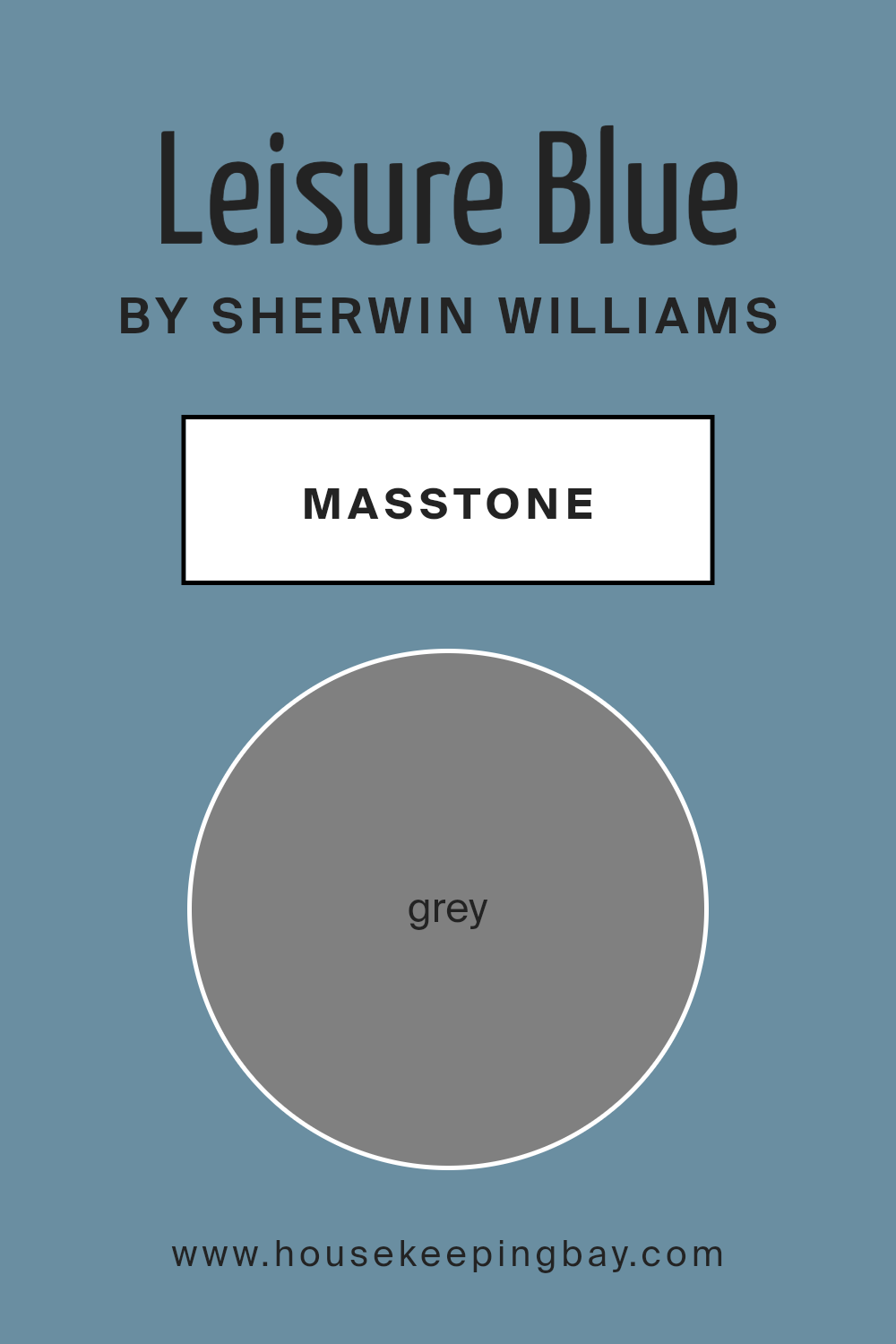
What is the Masstone of the Leisure Blue SW 6515 by Sherwin Williams?
Leisure Blue SW 6515 by Sherwin Williams, when mixed fully to reach its masstone of grey, can blend seamlessly into a home’s décor. This color, with a base of Grey (#808080), is incredibly versatile and acts as a neutral backdrop.
It allows for a lot of freedom when choosing décor items such as furniture, curtains, and accessories because it won’t clash with other colors. This shade makes rooms feel more expansive and airy, contributing to a calm and cohesive atmosphere.
Additionally, the grey masstone of Leisure Blue helps in reducing the overbearing effect that can sometimes come from richer, more saturated colors. This makes it a great choice for individuals who want a subtle yet sophisticated look in their home. It works well in various rooms, from living rooms and kitchens to bedrooms, providing a timeless elegance that adapts to changes in décor styles and preferences. This adaptability and subtle charm make it an excellent choice for many homes.
housekeepingbay.com
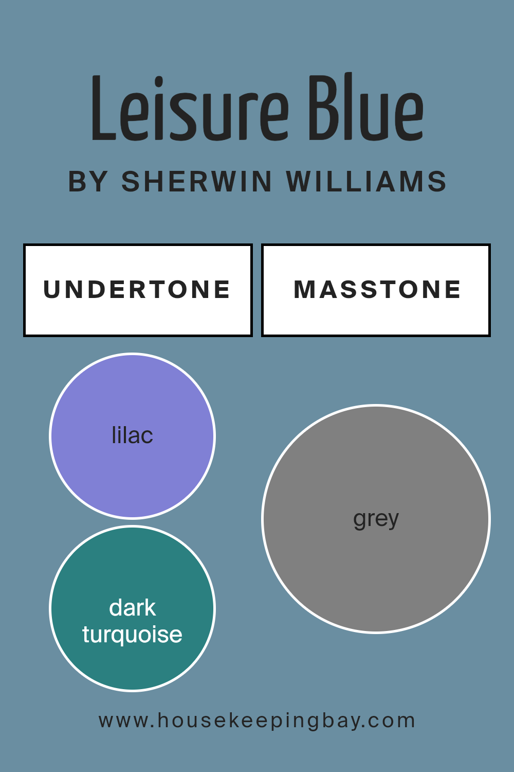
Undertones of Leisure Blue SW 6515 by Sherwin Williams
Leisure Blue SW 6515 by Sherwin Williams is a complex and versatile paint color that features a wide range of undertones. Understanding these undertones is essential in determining how the color will appear once applied to interior walls and how it will interact with different lightings and surrounding colors.
The undertones in Leisure Blue SW 6515 include shades of lilac, dark turquoise, mint, and various blues such as navy and dark blue, which enhance its depth and richness. This mixture creates a dynamic feel, allowing the color to shift subtly depending on the lighting. For instance, in a room with ample natural light, the lighter undertones like light blue, and light turquoise may become more prominent, giving the walls a more vibrant and airy feel.
Conversely, in a space with less natural light, darker undertones like navy and dark green might stand out, giving the walls a more grounded and cozy appearance. This makes Leisure Blue a good choice for both bright and dim rooms, adapting to the mood and function of the space.
The presence of unique undertones such as violet, olive, and pale pink adds a soft complexity, making the walls not just simply blue but having hints of warmth or coolness depending on adjacent colors and home decor. For example, pairing Leisure Blue with neutral furnishings can make the color appear more subdued and sophisticated, while using complementary colors like orange or red may highlight its cooler undertones.
Overall, the range of undertones in Leisure Blue SW 6515 affects how this color is perceived and used, making it a flexible choice for many different interior styles and settings. Its understated yet rich palette can harmonize with a variety of decors, enhancing the overall aesthetic of any room.
housekeepingbay.com
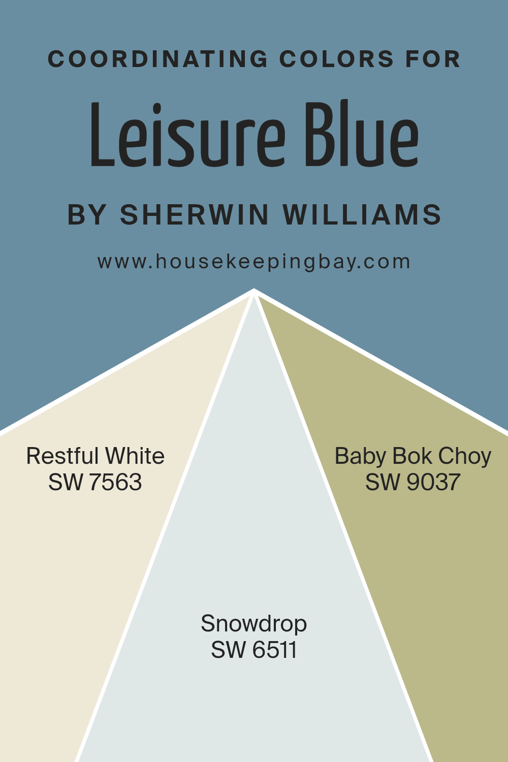
Coordinating Colors of Leisure Blue SW 6515 by Sherwin Williams
Coordinating colors are hues that complement each other on a room’s palette, enhancing the overall aesthetic without overpowering it. When used with a primary color like Leisure Blue SW 6515 by Sherwin Williams, they create a harmonious look. SW 7563 Restful White, SW 6511 Snowdrop, and SW 9037 Baby Bok Choy are chosen specifically to coordinate with Leisure Blue. These colors together can seamlessly integrate to provide a balanced and visually pleasing environment.
Restful White SW 7563 provides a clean and serene backdrop that pairs beautifully with the deeper tone of Leisure Blue. It’s subtle enough to use across an expansive area without overwhelming the senses, making it perfect for creating a light, airy feel.
Snowdrop SW 6511 offers a slightly more pronounced hint of color than Restful White, giving just enough contrast to draw attention while maintaining a soft and gentle presence in the room. Meanwhile, Baby Bok Choy SW 9037 adds an earthy, natural touch that complements the coolness of Leisure Blue, providing a fresh and calming effect. This color can bring life to a space while keeping the atmosphere relaxed and cozy.
You can see recommended paint colors below:
- SW 7563 Restful White
- SW 6511 Snowdrop
- SW 9037 Baby Bok Choy
housekeepingbay.com
How Does Lighting Affect Leisure Blue SW 6515 by Sherwin Williams?
Lighting plays a crucial role in determining how colors appear in a room. Leisure Blue SW 6515 by Sherwin Williams is a prime example, shifting in perception based on the light it’s exposed to.
In artificial light, especially with warm bulbs, Leisure Blue can appear more muted and softer.
The yellow tones in incandescent bulbs can make this blue shade look slightly greener or even a muted gray-blue, providing a cozy feel to the room.
Under natural light, the true color of Leisure Blue is more apparent.
Natural daylight brings out the brightness in the blue, making the space feel airy and fresh. This is because natural light is generally cooler, which enhances blue tones, making them appear crisper and more vibrant.
Room orientation also impacts how Leisure Blue is perceived:
- North-Faced Rooms: These rooms receive less direct sunlight, which can make Leisure Blue look more sober and shadowy. The cooler, indirect light emphasizes the depth of the blue, potentially making the room feel a bit colder.
- South-Faced Rooms: With ample sunlight throughout the day, south-facing rooms brighten up Leisure Blue, making it feel vibrant and lively. The abundant natural light enhances its blue tones, making the walls feel almost oceanic and refreshing.
- East-Faced Rooms: These rooms are lit by the morning sun, which is generally warm and soft. Early in the day, Leisure Blue can appear gentle and soothing. As the day progresses and the natural light diminishes, the blue might pull more towards a starker or cooler shade.
- West-Faced Rooms: Evening light, which tends to be warmer, can make Leisure Blue look richer and more pronounced. As the sun sets, this color might shift towards a more profound and darker blue, adding a touch of drama.
Overall, Leisure Blue’s appearance is significantly impacted by the lighting condition it is placed under, shifting from soothing and soft under warm, artificial light to vibrant and lively under the cool, natural daylight.
housekeepingbay.com
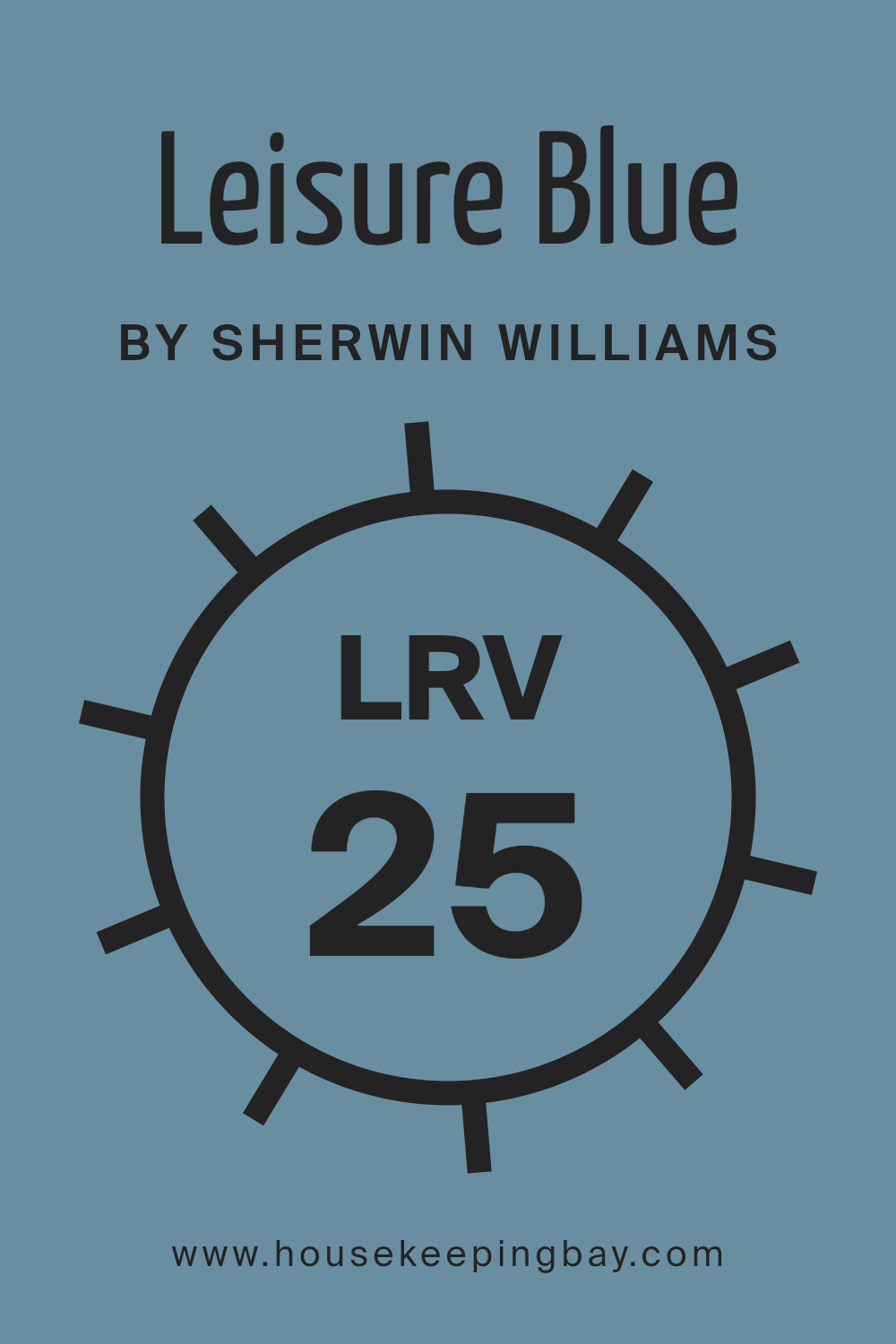
What is the LRV of Leisure Blue SW 6515 by Sherwin Williams?
LRV stands for Light Reflectance Value, a measure ranging between 0 and 100 that indicates how much light a paint color will reflect when applied to a surface. An LRV of 0 means a color reflects no light, appearing as true black, while 100 indicates a color reflects all light, appearing as pure white.
This measurement helps in deciding how a color might make a room feel, either by making it brighter and more open with a high LRV or cozier and more enclosed with a lower LRV. The amount of natural and artificial light in a room should always be considered alongside the LRV to gauge how the paint will appear once applied.
With Leisure Blue SW 6515 having an LRV of 24.862, it falls on the darker end of the spectrum, reflecting a relatively low amount of light. This means it can make spaces appear smaller or more intimate, which might be ideal for creating a soothing ambience in bedrooms or living areas.
However, due to its lower LRV, if used in a poorly lit room, it might make the space feel even smaller or darker. To counter this effect, pairing it with lighter colors or adequate lighting can help balance the dark hue of Leisure Blue and prevent it from overpowering a room.
housekeepingbay.com
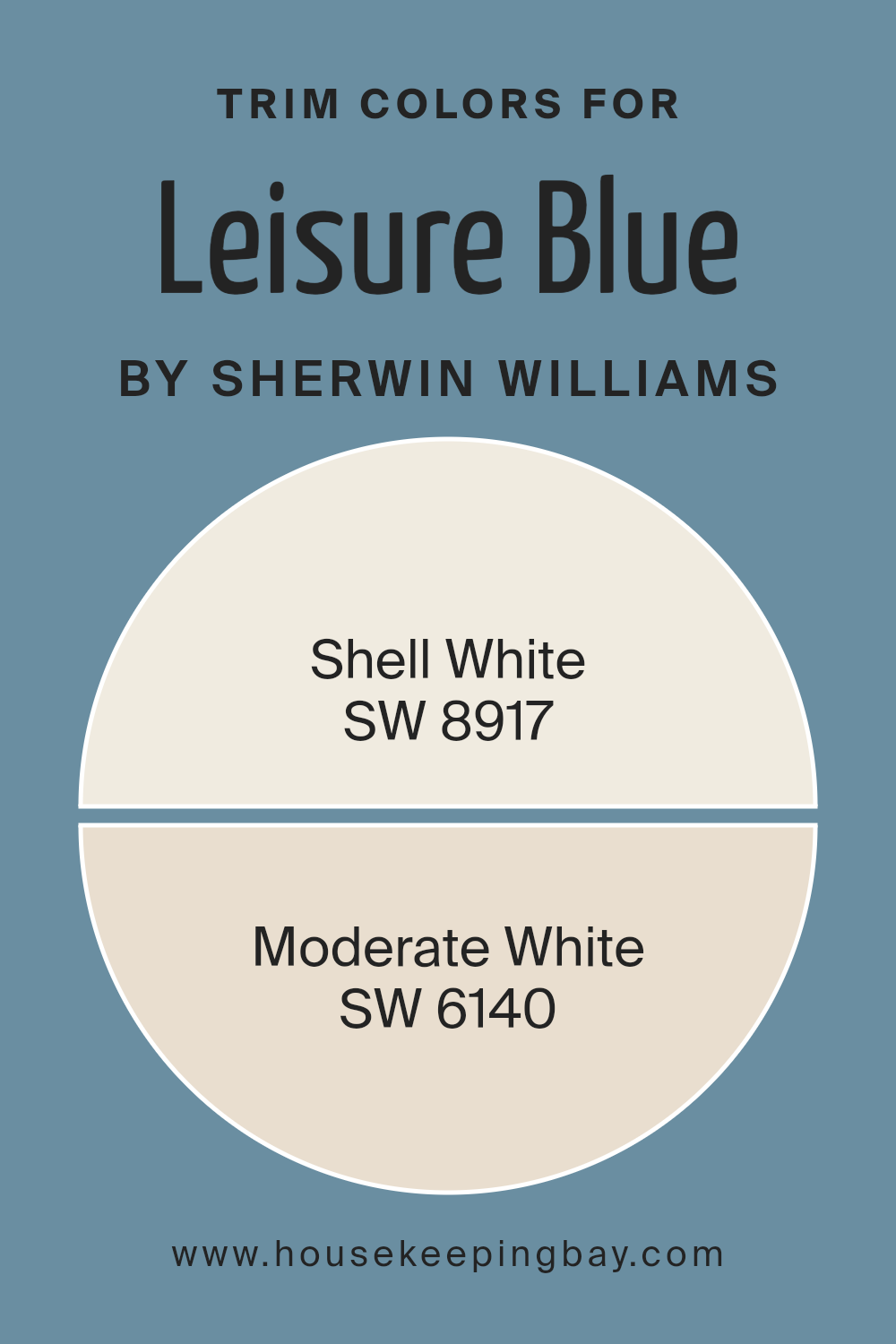
What are the Trim colors of Leisure Blue SW 6515 by Sherwin Williams?
Trim colors are essentially the accent hues that outline and define various architectural features or elements in a home, such as door frames, window sills, and baseboards. Choosing the right trim color can significantly boost the aesthetic appeal of a room by adding contrast and depth, which helps in highlighting the main color scheme.
In the case of Leisure Blue SW 6515 by Sherwin Williams, a soothing and gentle blue shade, pairing it with colors like Shell White SW 8917 or Moderate White SW 6140 can create a clean and harmonious look. These lighter trim colors complement the serene blue by providing a crisp border that enhances the overall design without overwhelming the senses.
Shell White SW 8917 is a soft, creamy white that offers a subtle warmth, making it an ideal choice for trims with Leisure Blue to foster a welcoming and cozy atmosphere. This shade has a gentle vibe that doesn’t clash but rather softly surrounds the bolder tones.
On the other hand, Moderate White SW 6140 has a slightly deeper tone than Shell White, offering a hint of beige undertones that work wonderfully to add a touch of sophistication while still keeping the look light and airy. Moderate White brings a more defined edge to the Leisure Blue, ensuring that the walls stand out gracefully in any room.
You can see recommended paint colors below:
housekeepingbay.com
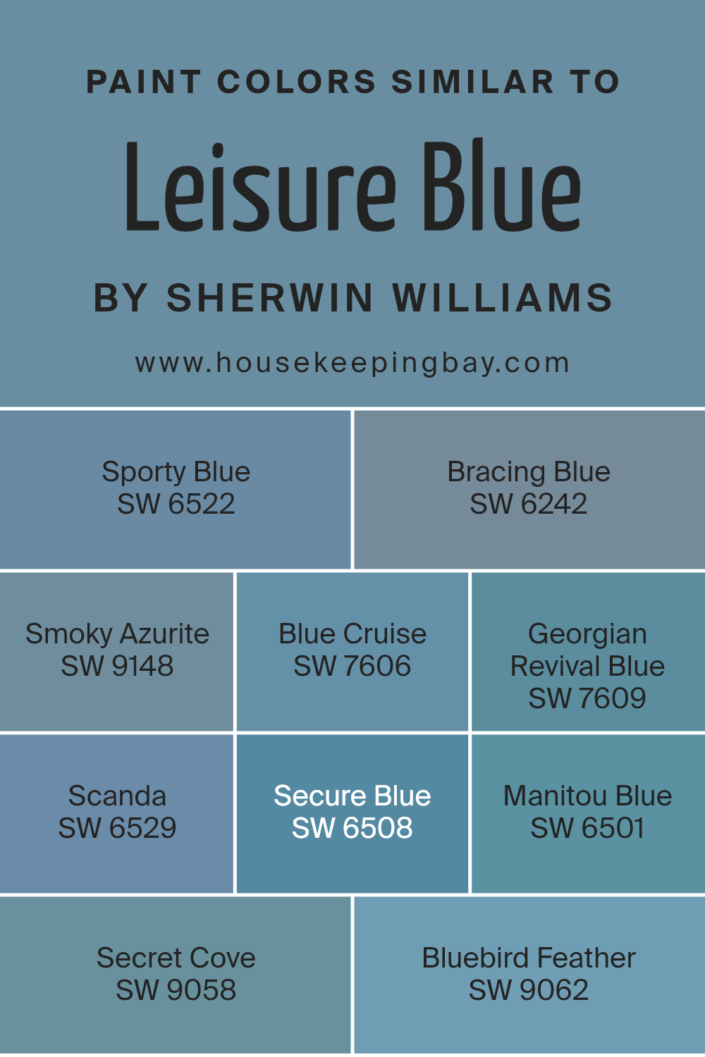
Colors Similar to Leisure Blue SW 6515 by Sherwin Williams
When decorating or designing, using similar colors can create a cohesive and harmonious look. For instance, different shades of blue similar to Sherwin Williams’ Leisure Blue (SW 6515) work together to provide a serene and balanced aesthetic. Similar colors, such as SW 6522 – Sporty Blue and SW 6242 – Bracing Blue, can be used to add subtle contrast while maintaining a unified theme.
Sporty Blue has a vibrant, energetic feel, whereas Bracing Blue offers a cooler, more reserved tone, perfect for creating a soothing atmosphere. Smoky Azurite (SW 9148) possesses a deep, reflective quality, while Blue Cruise (SW 7606) mimics the quietness of the sea, ideal for spaces meant for relaxation.
On the other hand, Georgian Revival Blue (SW 7609) infuses a touch of traditional elegance into any space, and Scanda (SW 6529) provides a light, airy feel with its soft blue hues. Secure Blue (SW 6508) is bold and confident, adding depth, while Manitou Blue (SW 6501) gives off a more rugged, naturalistic vibe.
Secret Cove (SW 9058) and Bluebird Feather (SW 9062) also add distinct characteristics: Secret Cove, with its mysterious depth, and Bluebird Feather, soft and light, ideal for adding a lively yet soothing touch to a room. Each shade, while similar, carries its unique trait, making them versatile for blending yet distinct enough to stand alone in different components of a room’s design.
You can see recommended paint colors below:
- SW 6522 Sporty Blue
- SW 6242 Bracing Blue
- SW 9148 Smoky Azurite
- SW 7606 Blue Cruise
- SW 7609 Georgian Revival Blue
- SW 6529 Scanda
- SW 6508 Secure Blue
- SW 6501 Manitou Blue
- SW 9058 Secret Cove
- SW 9062 Bluebird Feather
housekeepingbay.com
Colors that Go With Leisure Blue SW 6515 by Sherwin Williams
When coordinating colors with Leisure Blue SW 6515 by Sherwin Williams, it’s essential to consider how different hues can complement or contrast with each other to create a visually appealing space. Selecting matching colors helps in achieving a balanced look, which can affect the mood and feeling of a room. Leisure Blue is a versatile shade that pairs well with several other colors that Sherwin Williams offers, allowing for multiple design possibilities.
For instance, Baby Blue Eyes SW 9070 is a gentle light blue that brings a soft and airy feel to interiors, making it a perfect match for the slightly deeper Leisure Blue for a serene environment. Down Pour SW 6516 offers a more substantial, teal-like hue that adds depth and interest when paired with Leisure Blue, ideal for creating a focal point in a room.
Regatta SW 6517, with its vibrant, dynamic blue, introduces energy and vivacity, which complements the calming nature of Leisure Blue. Respite SW 6514, a calm midpoint between sky blue and gray, supports Leisure Blue by providing a subtle, soothing impact. Take Five SW 6513 delivers a light, muted teal that works beautifully with Leisure Blue to produce a peaceful, restful space.
Lastly, Balmy SW 6512 has a touch of gray, softening the overall look when used with Leisure Blue, perfect for achieving a relaxed and comfortable atmosphere. These colors together ensure a range across the spectrum, from soothing and gentle to vibrant and energetic, allowing for customization according to personal taste and room function.
You can see recommended paint colors below:
- SW 9070 Baby Blue Eyes
- SW 6516 Down Pour
- SW 6517 Regatta
- SW 6514 Respite
- SW 6513 Take Five
- SW 6512 Balmy

housekeepingbay.com
How to Use Leisure Blue SW 6515 by Sherwin Williams In Your Home?
Leisure Blue SW 6515 by Sherwin Williams is a soothing shade that can bring a peaceful feel to any room in your home. This soft blue tone resembles the sky on a clear day, making it perfect for creating a calm and relaxing environment. It works well in bedrooms where you want a serene backdrop for rest, or in a bathroom for a spa-like atmosphere.
Leisure Blue can also be used in living areas or a home office. In these spaces, it provides a refreshing contrast to darker colors or a gentle complement to lighter hues. For a cohesive look, you can pair it with light wood furniture or white trim.
This color not only adds beauty but also subtly impacts mood, often promoting feelings of calm and relaxation. It is versatile enough to fit various decorating styles from contemporary to classic. To make the most of this color, consider natural light availability and what mood you hope to achieve in the space.
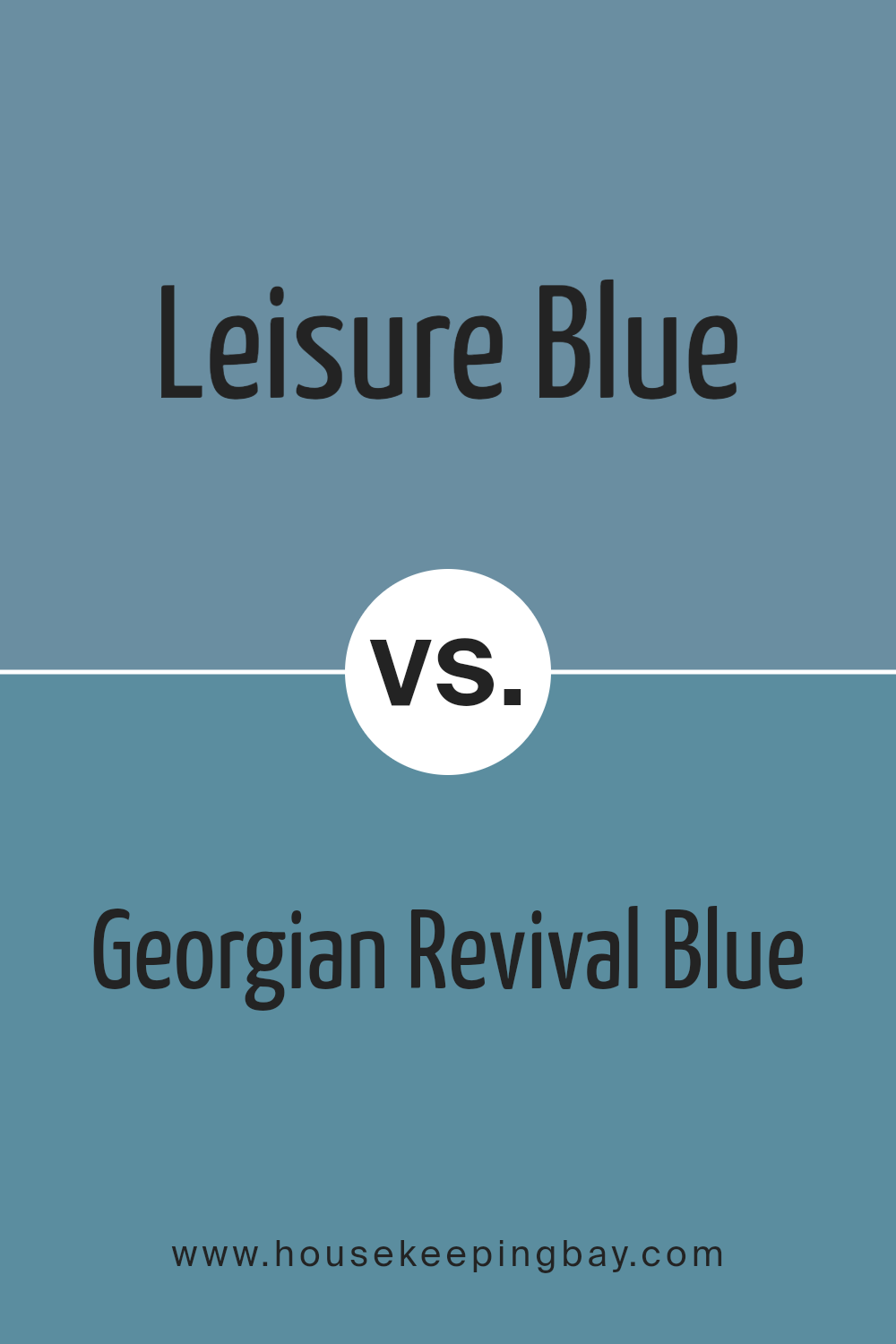
Leisure Blue SW 6515 by Sherwin Williams vs Georgian Revival Blue SW 7609 by Sherwin Williams
Leisure Blue SW 6515 by Sherwin Williams is a soothing, muted blue shade with a gentle gray undertone, making it a great choice for creating a calm and serene environment. It suits spaces where relaxation is key, like bedrooms or bathrooms. This color reflects a subtle beauty that pairs well with soft whites and neutral tones.
In contrast, Georgian Revival Blue SW 7609 is a brighter, more vibrant blue. This color has a hint of teal, giving it a more energetic feel compared to Leisure Blue. It’s perfect for adding a lively splash of color to areas such as kitchens or dining rooms, working beautifully with crisp whites and rich woods to create a fresh, inviting space.
Both colors offer unique vibes – Leisure Blue brings softness and calm, while Georgian Revival Blue provides a cheerful, dynamic atmosphere.
You can see recommended paint color below:
- SW 7609 Georgian Revival Blue
housekeepingbay.com
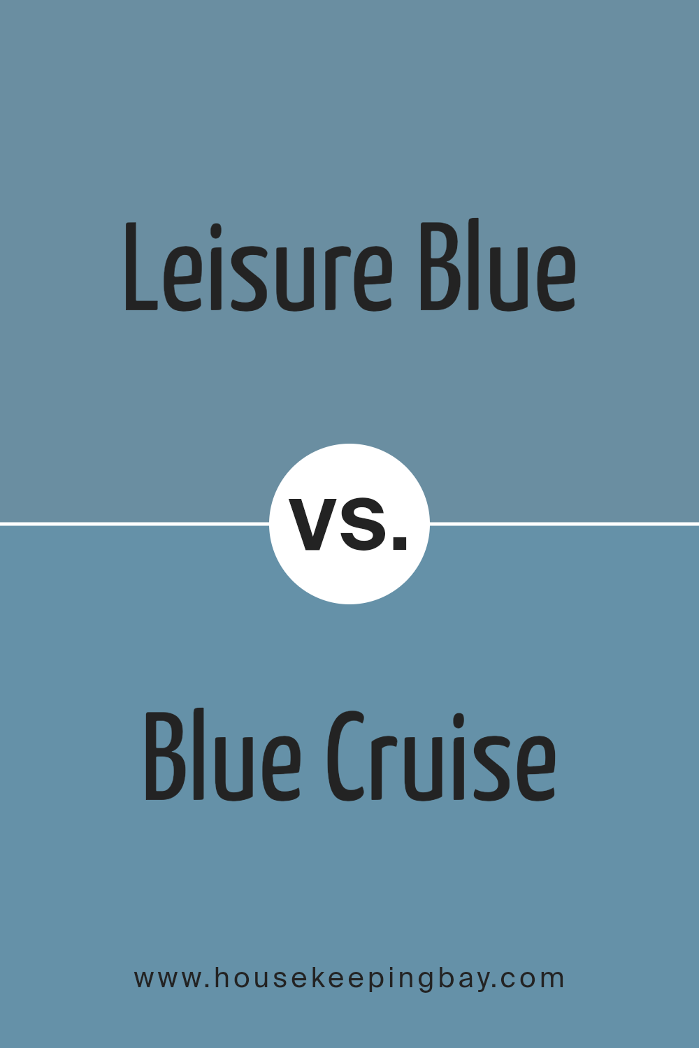
Leisure Blue SW 6515 by Sherwin Williams vs Blue Cruise SW 7606 by Sherwin Williams
Leisure Blue SW 6515 by Sherwin Williams is a vibrant, medium blue shade that adds a cheerful and lively touch to spaces. It has a slight coolness that can make a room feel fresh and airy. This color works well in areas such as bedrooms or living rooms where a calming yet energizing atmosphere is desired.
Blue Cruise SW 7606, on the other hand, is darker and more subdued compared to Leisure Blue. It conveys a sense of sophistication and depth, making it ideal for spaces that aim for a slightly more formal or contemplative feel. Blue Cruise could be perfect for office areas or dens where a more serious tone is preferable.
Overall, Leisure Blue is brighter and feels more light-hearted, while Blue Cruise provides a richer, more grounded ambiance. Depending on the mood or function of the room, each color has its unique charm and utility.
You can see recommended paint color below:
housekeepingbay.com
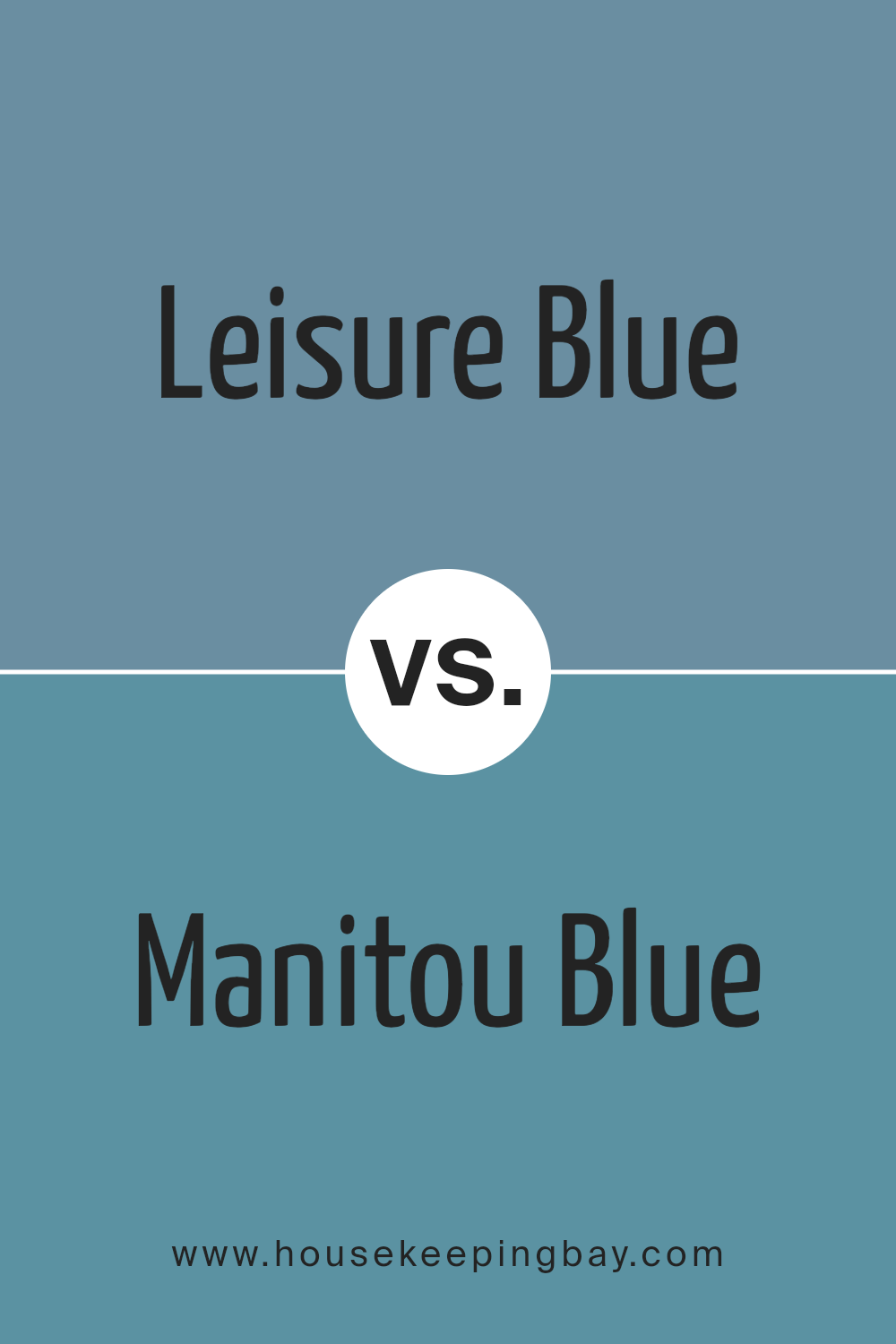
Leisure Blue SW 6515 by Sherwin Williams vs Manitou Blue SW 6501 by Sherwin Williams
Leisure Blue SW 6515 by Sherwin Williams is a soothing, gentle color that brings a sense of calm and relaxation to any space. It falls into a soft, muted palette, making it perfect for creating a peaceful atmosphere in bedrooms or living areas. Its understated vibe pairs well with light woods and minimalist decor.
Manitou Blue SW 6501, by contrast, is a deeper and more vibrant blue. It adds energy and a pop of color to a room, making it ideal for areas where you want to inject personality and dynamism. This shade works well with bold decorations and can also be a great choice for accent walls.
Both colors reflect different moods and can be chosen based on the vibe you wish to create in your space. While Leisure Blue adds subtlety and calmness, Manitou Blue brings vibrancy and liveliness.
You can see recommended paint color below:
- SW 6501 Manitou Blue
housekeepingbay.com
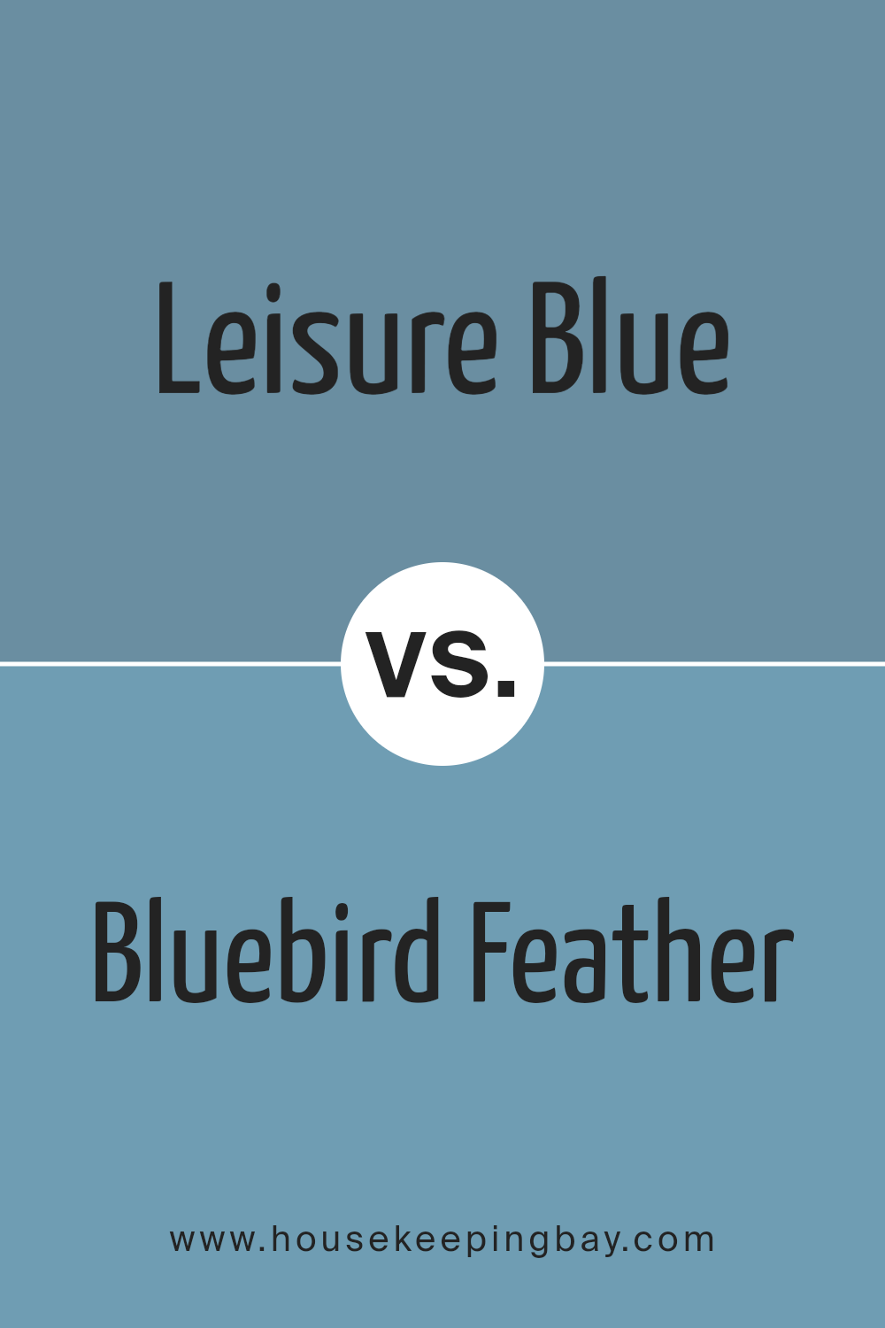
Leisure Blue SW 6515 by Sherwin Williams vs Bluebird Feather SW 9062 by Sherwin Williams
Leisure Blue SW 6515 by Sherwin Williams is a vibrant and rich shade of blue. It brings a lively and bold character to spaces, making it ideal for creating a statement in a room. It has a somewhat traditional feel, which works well in living areas or bedrooms that aim for a cozy yet sophisticated look.
Contrastingly, Bluebird Feather SW 9062 is a softer, more muted blue. This color lends a gentle and calming atmosphere to environments, perfect for spaces that require a subdued or relaxing tone like bathrooms or quiet study areas. Its understated nature makes it versatile for blending with various decor styles, from modern to rustic.
Both colors offer unique vibes: Leisure Blue adds energy and depth, while Bluebird Feather offers softness and a sense of peace. Choosing between them depends on the desired mood and functionality of the space.
You can see recommended paint color below:
- SW 9062 Bluebird Feather
housekeepingbay.com
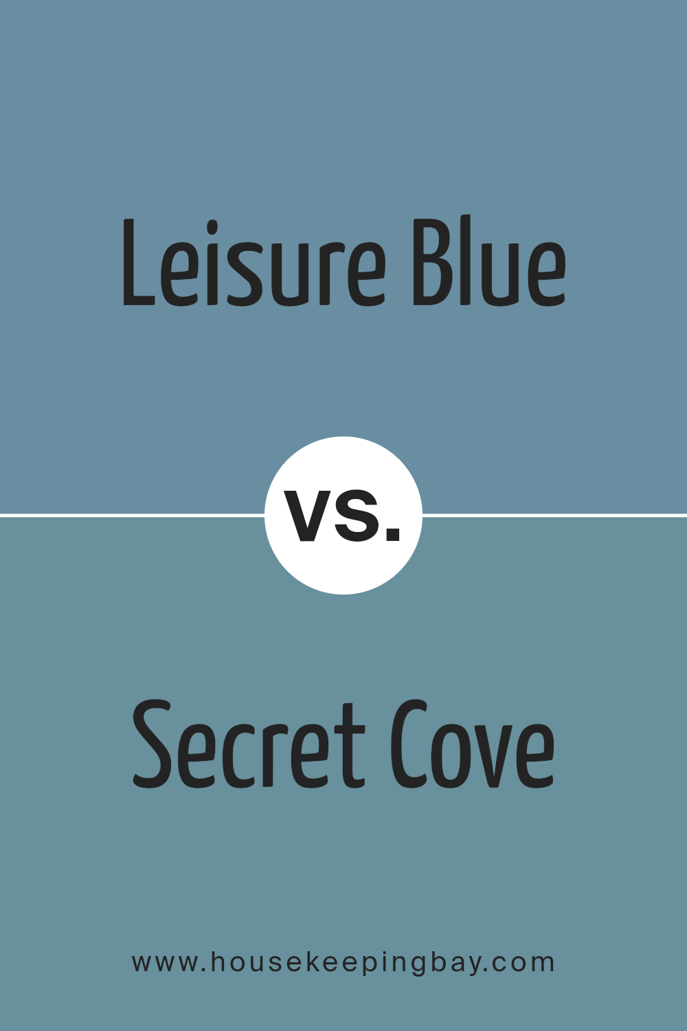
Leisure Blue SW 6515 by Sherwin Williams vs Secret Cove SW 9058 by Sherwin Williams
Leisure Blue SW 6515 by Sherwin Williams is a vibrant, serene shade, perfectly suited for creating a peaceful and inviting atmosphere. Its calming influence is ideal for areas like bedrooms or bathrooms, where relaxation is key. The color has a fresh, clean feel that pairs well with neutral tones and natural materials such as wood or linen.
In contrast, Secret Cove SW 9058 presents a darker, more mysterious blue. It lends a sophisticated touch to any space, making it a great choice for accent walls or cabinets. This color’s richness provides a beautiful backdrop that enhances décor elements, allowing white or light-colored furnishings to pop. Its depth can make small spaces appear cozier and more intimate.
Both colors offer unique vibes—Leisure Blue feels airier and lighter, while Secret Cove brings depth and drama, making them suitable for different uses and moods in home decor.
You can see recommended paint color below:
housekeepingbay.com
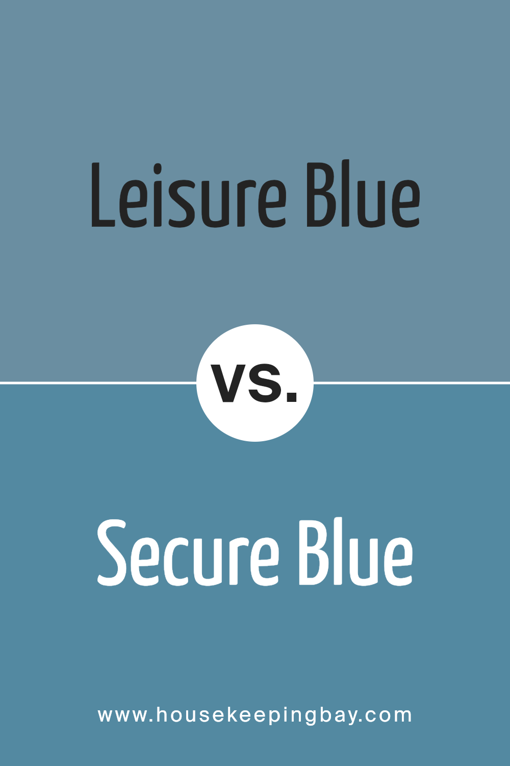
Leisure Blue SW 6515 by Sherwin Williams vs Secure Blue SW 6508 by Sherwin Williams
Leisure Blue SW 6515 by Sherwin Williams is a soft, soothing blue that has a light, airy vibe. It’s perfect for creating a peaceful atmosphere in any room, making it ideal for bedrooms or bathrooms where relaxation is key. This color gives a gentle, calming touch and works well with light, neutral furnishings to maintain a relaxed environment.
Secure Blue SW 6508, by contrast, is a deeper, more intense blue. It carries a stronger presence that can make a bold statement in a space. This shade is excellent for areas where you want to add some drama or anchor the room with a rich, vibrant hue. It pairs well with bright whites or metallic accents for a modern and dynamic look.
Both colors offer unique atmospheres: Leisure Blue enhances calmness and lightness, while Secure Blue injects energy and depth, making them suitable for different interior aims and moods.
You can see recommended paint color below:
- SW 6508 Secure Blue
housekeepingbay.com
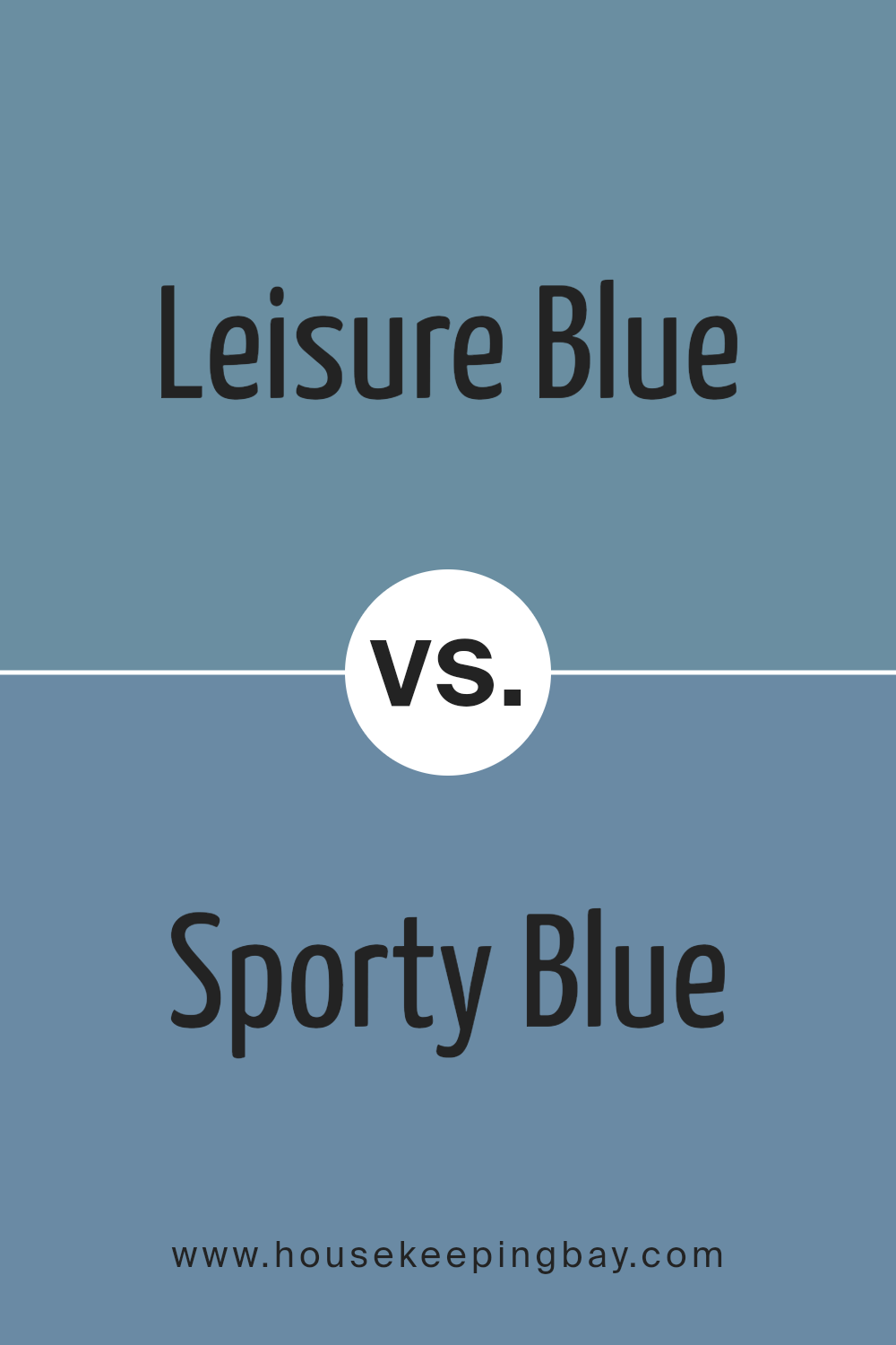
Leisure Blue SW 6515 by Sherwin Williams vs Sporty Blue SW 6522 by Sherwin Williams
Leisure Blue SW 6515 by Sherwin Williams is a soothing, soft blue with a muted, relaxed vibe. It suggests calm and serenity, making it ideal for spaces where you want to promote relaxation and peace, like bedrooms or bathrooms. Its understated quality ensures it pairs well with both bright and neutral accents, offering versatility in decor choices.
Sporty Blue SW 6522 by Sherwin Williams, by contrast, is bolder and more vibrant. This color has a vivid, dynamic feel, suitable for more energetic areas such as playrooms or creative spaces. It’s perfect for injecting a sense of liveliness and excitement into a room, and works well in modern decor schemes where a punch of color can really make the space pop.
Both colors, while sharing a blue base, establish distinctly different moods and can thus cater to varying aesthetic and functional needs in home decorating.
You can see recommended paint color below:
- SW 6522 Sporty Blue
housekeepingbay.com
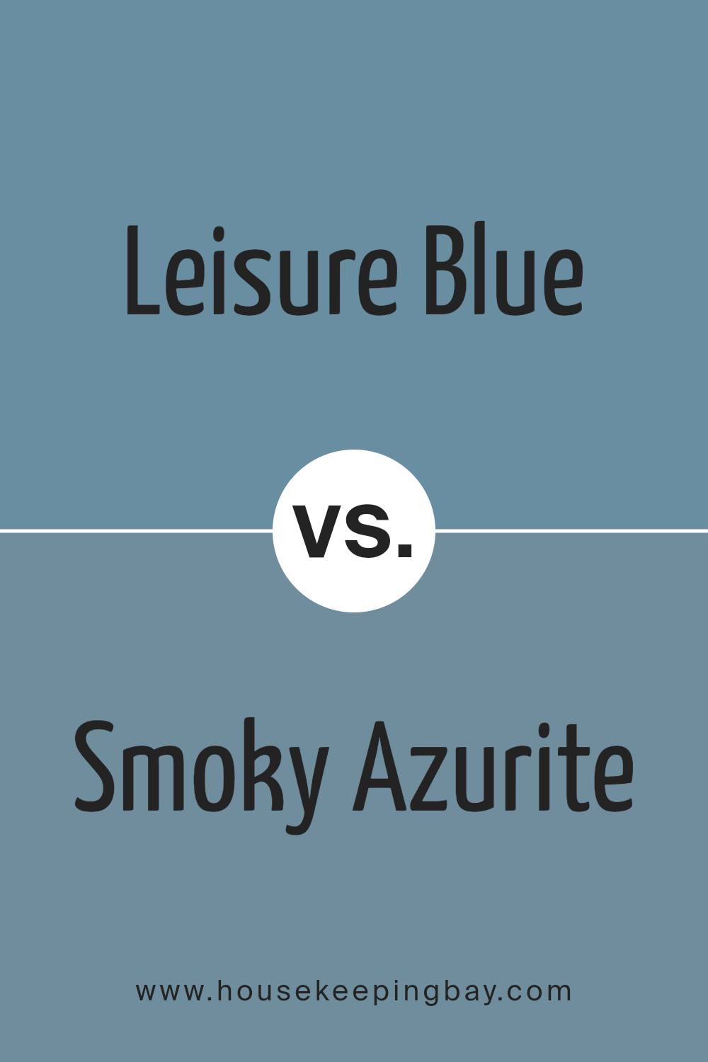
Leisure Blue SW 6515 by Sherwin Williams vs Smoky Azurite SW 9148 by Sherwin Williams
Leisure Blue SW 6515 from Sherwin Williams is a vibrant shade that offers a fresh appearance, leaning towards a playful and lively feel. It’s a light to medium blue with a well-balanced touch of brightness, making it ideal for creating a cheerful and inviting environment. This color works particularly well in spaces aimed to evoke a sense of calm yet energized atmosphere.
In contrast, Smoky Azurite SW 9148 is deeper and more intense. It presents a richer, darker hue that mimics the deep sea or a night sky. While it still retains a part of the blue family’s inherent peacefulness, its darker tone introduces a sense of sophistication and mystery. This makes Smoky Azurite well-suited for areas where a more refined or contemplative mood is desired, such as studies or bedrooms.
Both colors represent different moods and settings within the blue spectrum, with Leisure Blue being more casual and bright, and Smoky Azurite offering depth and drama.
You can see recommended paint color below:
housekeepingbay.com
Leisure Blue SW 6515 by Sherwin Williams vs Scanda SW 6529 by Sherwin Williams
Leisure Blue SW 6515 by Sherwin Williams is a rich, soothing shade that resembles a serene sky or calm sea. It provides a sense of calmness and is a good fit for spaces where you want to feel relaxed, like bedrooms or bathrooms.
Scanda SW 6529, also by Sherwin Williams, is lighter and more subtle compared to Leisure Blue. Scanda leans closer to a soft, pale blue with a gentle vibe, making it perfect for creating a refreshing atmosphere in places such as kitchens and living rooms.
While both colors share a blue base, Leisure Blue is deeper and more pronounced, offering a bold presence in a space. Scanda, with its airy touch, tends to open up a room, making it appear larger and more inviting. Depending on what environment you wish to create, both colors have their unique appeal but serve different aesthetic purposes.
You can see recommended paint color below:
- SW 6529 Scanda
housekeepingbay.com
Leisure Blue SW 6515 by Sherwin Williams vs Bracing Blue SW 6242 by Sherwin Williams
Leisure Blue SW 6515 by Sherwin Williams is a vibrant, soothing shade that leans towards a lighter, more playful blue. It’s perfect for creating a bright and airy feel in a room. This color can effectively lighten up spaces and pairs well with whites and grays for a breezy, modern look.
Bracing Blue SW 6242, also by Sherwin Williams, offers a darker, more subdued version of blue. This color has a rich depth that brings a sense of calmness and serenity to any space. It works well in areas where a more sophisticated, contemplative mood is desired, such as in studies or bedrooms.
Both colors provide a unique atmosphere; Leisure Blue injects a lively, cheerful vibe, while Bracing Blue sets a more reserved, contemplative tone. Although different in brightness and mood, both shades maintain a classic blue appeal that can beautifully complement a variety of decor styles.
You can see recommended paint color below:
- SW 6242 Bracing Blue
housekeepingbay.com
Conclusion
This shade, nestled perfectly between a vivid sky blue and a soft pastel, has a versatility that allows it to adapt to various decor styles and preferences. It’s particularly effective in rooms that aim for a calm and inviting atmosphere, like bedrooms or bathrooms.
What impresses me most about Leisure Blue is its ability to maintain a fresh and lively look without overwhelming the senses, making it a reliable option for those new to interior decorating. It pairs beautifully with crisp whites or rich greys, creating a balanced and harmonious environment. Moreover, its consistency in application and the quality of the finish ensure that aesthetically pleasing results are achievable even for DIY painters.
Ultimately, SW 6515 Leisure Blue has confirmed its position as a top choice for transforming any space with its gentle charm and adaptable nature.
I highly recommend it for those seeking a refreshing yet peaceful color that compliments a variety of decorating themes and personal styles.
housekeepingbay.com
