Lake House 1175 by Benjamin Moore
A Fresh Splash of Charm for Your Home
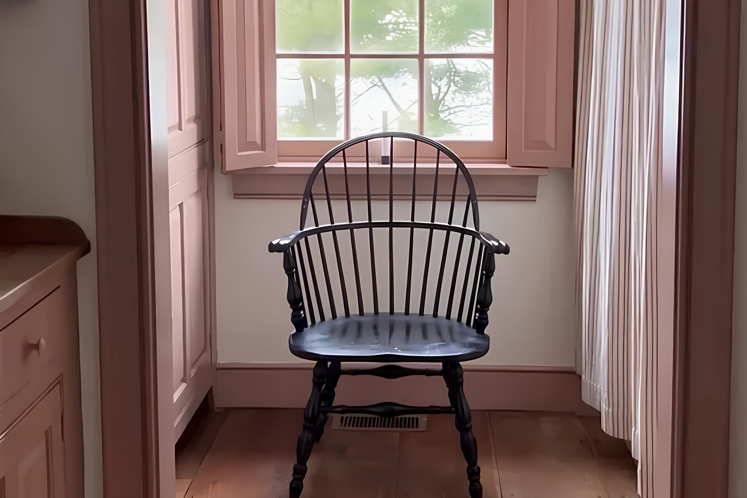
If you’re thinking about giving your home a little update with paint, you might really like 1175 Lake House by Benjamin Moore. It’s a soft color that feels calm and cozy, and it makes any room look a bit nicer without trying too hard.
This color works well with lots of different furniture and styles, so it’s an easy choice if you want your home to feel welcoming and pretty.
Benjamin Moore’s 1175 Lake House brings a breath of fresh air into your space without being too overwhelming. It’s a great choice whether you’re redoing a single room or giving your entire home a fresh coat of paint. Moreover, this color works wonderfully in spaces that receive a lot of natural light, as well as in darker rooms where you want to achieve a feeling of openness and light.
Overall, if you’re considering a new paint color, 1175 Lake House could be the perfect option to give your home a lovely, fresh look while keeping things simple and chic.
Let’s take a closer look at how it can transform your living space for the better!
via plan-home.com
What Color Is Lake House 1175 by Benjamin Moore?
Lake House 1175 by Benjamin Moore is a soft, muted green with a subtle gray undertone that evokes a serene and gentle ambiance. This color, part of Benjamin Moore’s palette, has the versatility to harmonize with various interior styles, particularly those that emphasize a calm and restful atmosphere. It’s ideal for spaces where relaxation is key, such as bedrooms and bathrooms, but also works well in a living room or kitchen setting.
The subtlety of Lake House 1175 makes it compatible with natural materials such as wood, wicker, and linen, enhancing its earthy feel. In rustic or country-style interiors, it pairs beautifully with raw wood textures and handmade pottery, reinforcing a connection to natural elements.
For a more modern approach, it complements materials like brushed steel or glass, providing a soft backdrop that offsets sharper lines and contemporary designs. Lake House 1175 also works effectively with a range of textures. Plush fabrics like velvet or soft cotton throw blankets can create a cozy environment, while smoother textures like leather or polished metal add a touch of sophistication without overwhelming the color’s gentle nature.
Overall, Lake House 1175 by Benjamin Moore is a versatile choice that can create a soothing and aesthetically pleasing environment in various interior designs. Its ability to pair well with both rustic elements and modern touches offers broad appeal for different tastes and styles.

housekeepingbay.com
Is Lake House 1175 by Benjamin Moore Warm or Cool color?
Lake House 1175 by Benjamin Moore is a warm, light beige color that is very versatile for home interiors. This shade has a comforting and soft appearance that makes rooms look inviting and cozy. It can be used in many areas of a house, like living rooms, bedrooms, and kitchens.
Because it’s a neutral color, it pairs easily with various other shades, allowing for flexibility in decorating styles and furniture choices. For instance, pairing Lake House 1175 with bold colors makes them stand out, while combining it with soft pastels can create a gentle, soothing environment.
This color also has a practical benefit: it helps in making small spaces appear larger and brighter. Natural light reflects well off Lake House 1175, enhancing the overall lightness of a room. This can be particularly helpful in homes that do not get a lot of direct sunlight. Overall, Lake House 1175 is a great choice for creating a warm, welcoming space that can adapt to different styles and preferences.
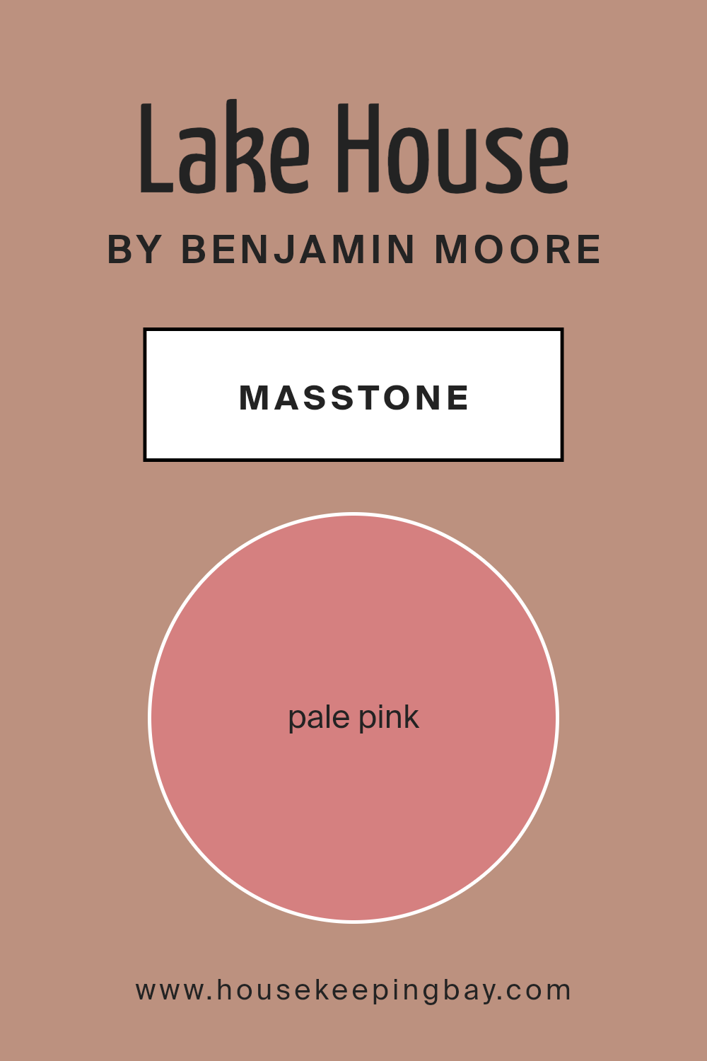
What is the Masstone of the Lake House 1175 by Benjamin Moore?
Lake House 1175 by Benjamin Moore shows a gentle pale pink color with a masstone of Pale Pink (#D58080). This soft, soothing shade brings a warm, inviting feel to any room where it’s used. Perfect for creating a peaceful and relaxing ambiance, its subtle pink tones can make spaces feel cozy and comforting. It’s especially good in bedrooms or living areas where you want a calm, soft mood.
In homes, this color works well because it blends easily with other hues and decor styles. Whether you’re going for a classic look with antique whites and soft beiges or more modern vibes with bold and bright accessories, pale pink can act as a neutral backdrop.
It doesn’t overpower other colors, allowing furniture and artwork to stand out. For those who want a bit of color without overwhelming their space, Lake House 1175 is a fantastic option. It’s especially appealing in spaces with natural light flowing in, enhancing the room’s overall warmth.
housekeepingbay.com
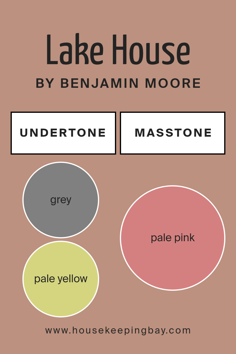
Undertones of Lake House 1175 by Benjamin Moore
Lake House 1175 by Benjamin Moore is a versatile paint color that incorporates multiple undertones, each of which influences how the color is perceived in different settings. The undertones include shades like grey, pale yellow, orange, and others, which subtly alter the main hue depending on lighting and surroundings.
Grey undertones provide a neutral base, making Lake House 1175 adaptable to various decor styles and color schemes. This neutral aspect is important because it means the color can look fresh and fitting with modern or traditional furnishings.
Pale yellow and orange undertones add a slight warmth, making the space feel more welcoming and cozy. This warmth is particularly beneficial in living rooms or bedrooms where a softer, more inviting atmosphere is desired. On the other hand, undertones like mint and lilac inject a hint of cool freshness into the color, offering a subtle contrast to the warmer tones.
This balance between warm and cool gives Lake House 1175 its unique character, which can shift under different lighting conditions. For example, in a room with abundant natural light, the cooler undertones might become more prominent, giving the walls a crisp appearance. In artificial light, warmer undertones might dominate, creating a snug, enveloping feel.
Using Lake House 1175 on interior walls means embracing a color that shifts and reacts with its environment, reflecting different moods throughout the day and across seasons. It is a dynamic choice that responds to both natural and artificial light, continually altering its appearance and impact on a space.
housekeepingbay.com
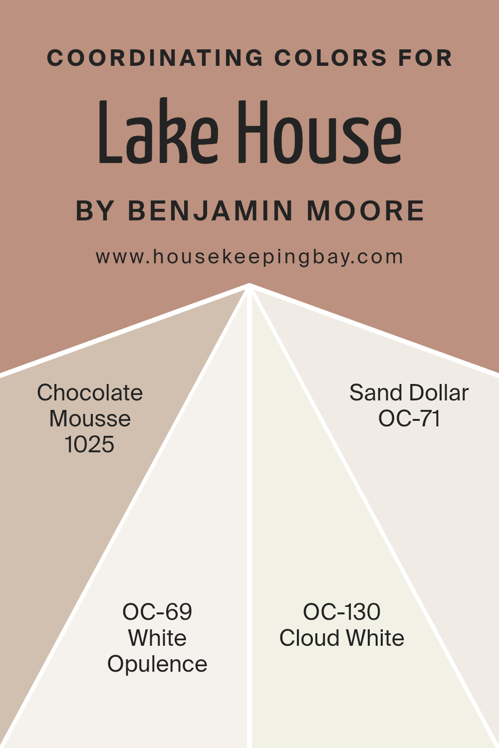
Coordinating Colors of Lake House 1175 by Benjamin Moore
Coordinating colors are chosen to work harmoniously with a main hue, aiming to create a balanced and pleasing color scheme in any space. By using coordinating colors like those paired with Lake House 1175 by Benjamin Moore, you can achieve a cohesive look that adds depth and interest to your decor.
These colors can complement or contrast with the main color, depending on the desired effect, whether you’re looking to create a soothing sanctuary or a lively living space. The right combination can enhance the aesthetics of a room, making it feel more inviting and well put-together.
The color Chocolate Mousse 1025 offers a rich, deep taupe that adds warmth and a touch of sophistication, perfect for creating a cozy atmosphere. White Opulence OC-69 is a clean and airy white, providing a crisp contrast that can help other colors pop or simply offer a fresh, clean look.
Cloud White OC-130, slightly warmer than White Opulence, works well to soften edges and bring a gentle brightness to spaces that need a subtle lift. Lastly, Sand Dollar OC-71 offers a light beige with just enough warmth to make spaces feel inviting without overpowering the senses. Each of these colors contributes to a balanced color palette when combined with Lake House 1175, enhancing the room’s overall appeal.
You can see recommended paint colors below:
- 1025 Chocolate Mousse
- OC-69 White Opulence
- OC-130 Cloud White
- OC-71 Sand Dollar
housekeepingbay.com
How Does Lighting Affect Lake House 1175 by Benjamin Moore?
Lighting plays a critical role in how colors appear in different environments. Whether natural or artificial, the type of light can change the perception of color on walls, furniture, and décor.
The color Lake House 1175 by Benjamin Moore is a versatile shade that can look different depending on the lighting conditions. In artificial light, such as that emitted from light bulbs, Lake House 1175 may appear slightly warmer, giving off a cozy and inviting feel.
The yellow undertones in artificial lighting can make this color seem more muted and subdued.
In natural light, however, Lake House 1175 can show its true color, displaying more depth and richness. Sunlight brings out the brightness and vibrancy of the color, making it appear fresher and more lively.
The orientation of a room also impacts how Lake House 1175 will look:
– North-faced rooms: These rooms get less direct sunlight, which can make Lake House 1175 appear cooler and slightly darker. This can give the room a soothing and calm atmosphere.
– South-faced rooms: With more exposure to direct sunlight, Lake House 1175 will look warmer and brighter. This makes the room feel more welcoming and energetic.
– East-faced rooms: Morning light can make Lake House 1175 look very soft and pleasant. It appears bright and cheerful in the morning, making east-facing rooms feel airy and light early in the day.
– West-faced rooms: In the evening, when the sun sets in the west, this color will glow with warmth and depth, offering a serene backdrop to relax in the late hours of the day.
In conclusion, the lighting, whether artificial or natural, and the direction the room faces significantly influence how Lake House 1175 by Benjamin Moore is perceived, impacting the mood and aesthetic of the space.

housekeepingbay.com
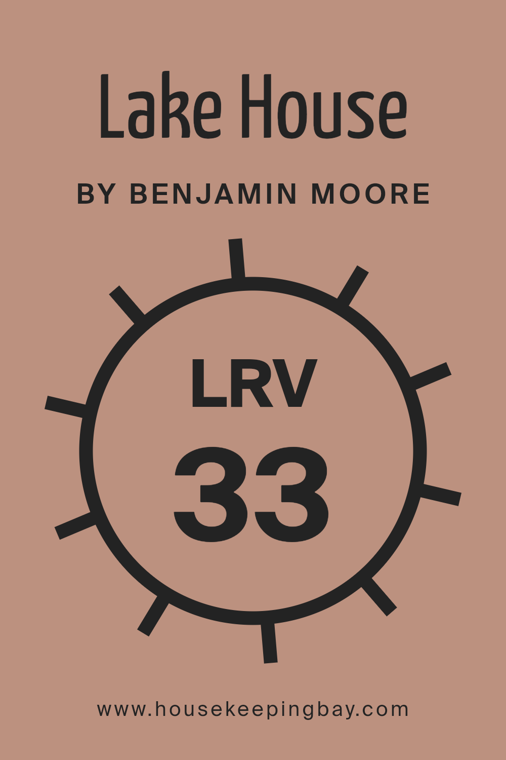
What is the LRV of Lake House 1175 by Benjamin Moore?
LRV stands for Light Reflectance Value, a measure used to describe the percentage of light a paint color reflects from or absorbs into a painted surface. It ranges from 0, which is pure black and absorbs all light, to 100, representing pure white and reflecting all light back.
This value helps in choosing paint colors by indicating how light or dark a color will appear once it’s on your walls. Higher LRVs indicate brighter colors that can make rooms feel more open and airy, whereas lower LRVs give a richer, deeper look but can make a room feel smaller or more enclosed.
For the color Lake House 1175 by Benjamin Moore, with an LRV of 32.61, it falls on the darker side of the spectrum. This means it won’t reflect back much light, absorbing more instead, which adds a depth and intensity to the space. In rooms with plentiful natural light, this color could look vibrant and dynamic, creating a cozy atmosphere.
However, in poorly lit spaces, it might appear even darker, potentially making the space feel smaller or more cramped. This consideration is crucial when deciding if Lake House 1175 is the right choice for a specific room or area in a home.
housekeepingbay.com
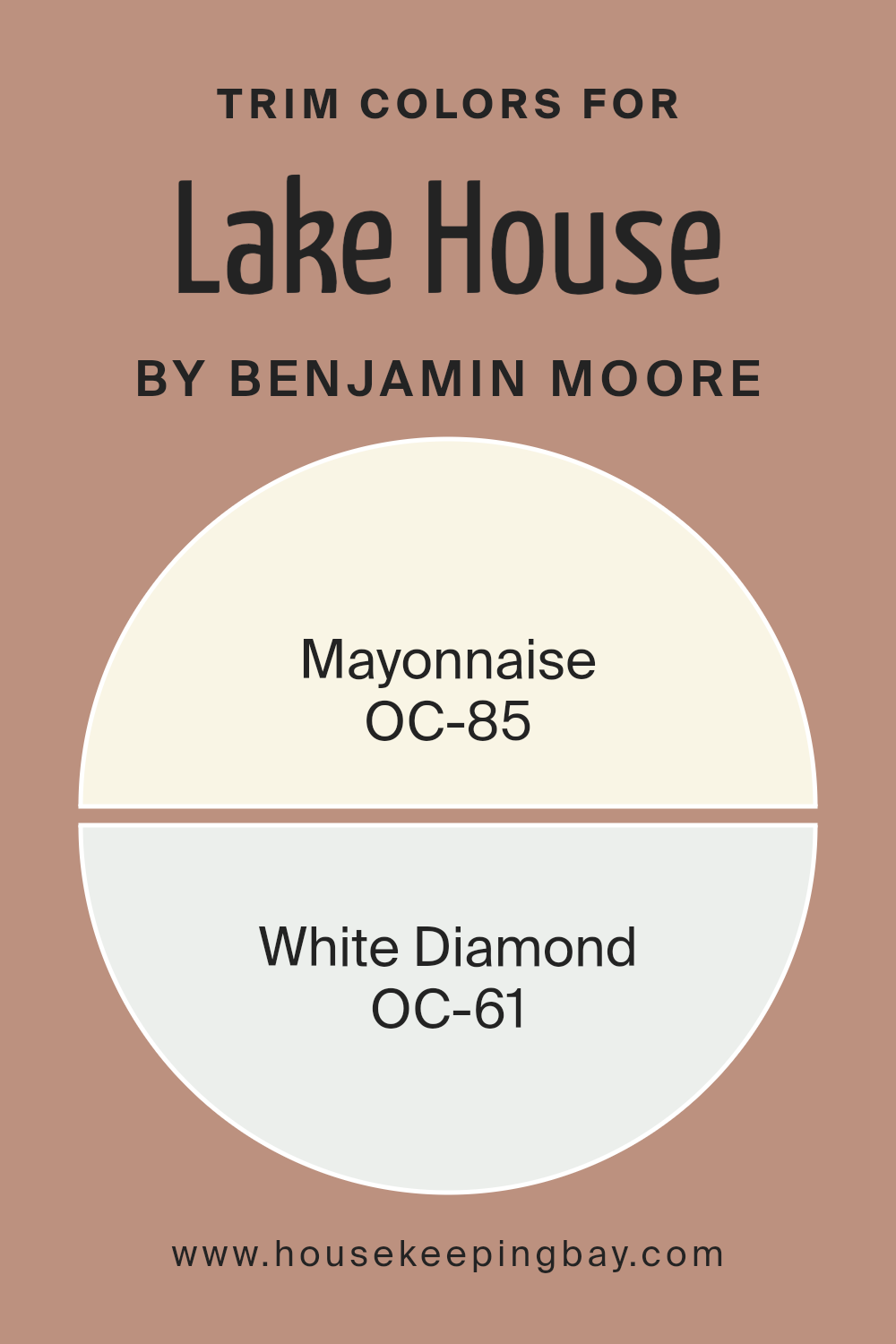
What are the Trim colors of Lake House 1175 by Benjamin Moore?
Trim colors are specific shades used to accentuate the architectural details of a structure, such as door frames, moldings, and window casings. For a lake house, selecting the right trim color is essential to complement the main color palette and enhance the natural surroundings.
Using colors like OC-85 – Mayonnaise and OC-61 – White Diamond by Benjamin Moore can provide a subtle yet impactful contrast that highlights these details without overpowering the primary hues of the home. These choices are particularly charming for a lakeside retreat, offering a fresh and inviting look while keeping a harmonious balance with the environment.
OC-85 – Mayonnaise is a warm, creamy white that evokes a sense of softness and light. This color is versatile enough to brighten up spaces while providing a cozy and gentle feel, making it a fantastic choice for trim, imparting a subtle warmth that is comforting and appealing. OC-61 – White Diamond, on the other hand, is a cleaner, crisper white with a hint of brightness.
It’s an ideal pick for those who prefer a sharper contrast to clearly define architectural elements, yet it still maintains a sleek and refreshing appearance, ensuring that the trim areas are visually distinct but not overwhelming.
You can see recommended paint colors below:
- OC-85 Mayonnaise
- OC-61 White Diamond
housekeepingbay.com
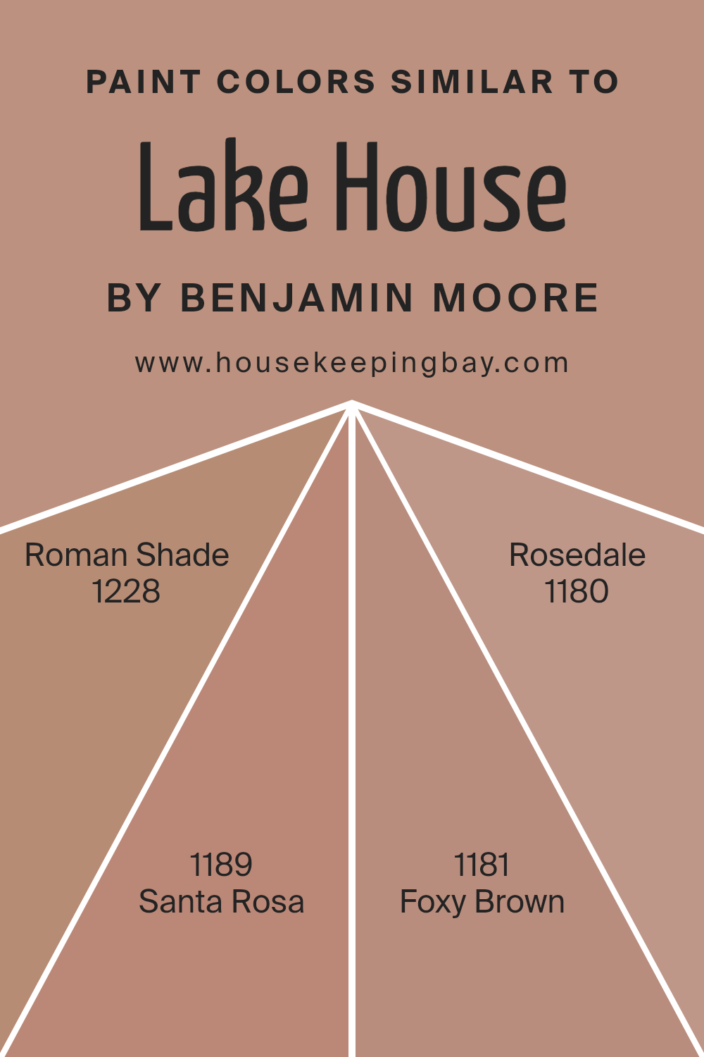
Colors Similar to Lake House 1175 by Benjamin Moore
Using similar colors in a design scheme can create a harmonious and soothing environment, making it appealing for spaces where comfort and continuity are desired. Colors close in hue can seamlessly blend with each other, offering a subtle transition that enhances the overall aesthetic without dominating the space. These hues, when used together, can also amplify the perceived size of a room by blurring hard lines, which helps in making the space feel more expansive and unified.
For instance, “Lake House 1175” by Benjamin Moore provides a serene baseline, ideal for creating a relaxing atmosphere. Similar colors like “Roman Shade 1228” offer a slightly more pronounced gray tone, adding a gentle depth to spaces without overwhelming other design elements.
“Santa Rosa 1189” carries a warmer, beige shade which complements wooden furniture and natural textures beautifully, serving as a soft neutral base. Shifting slightly darker, “Foxy Brown 1181” enriches the palette with its deeper, more intense brown, perfect for accentuating key features or furniture pieces.
Lastly, “Rosedale 1180,” with its hint of earthy red, subtly introduces additional warmth, tying in elements that might benefit from a touch of coziness, thereby completing the look with an inviting feel.
You can see recommended paint colors below:
- 1228 Roman Shade
- 1189 Santa Rosa
- 1181 Foxy Brown
- 1180 Rosedale
housekeepingbay.com
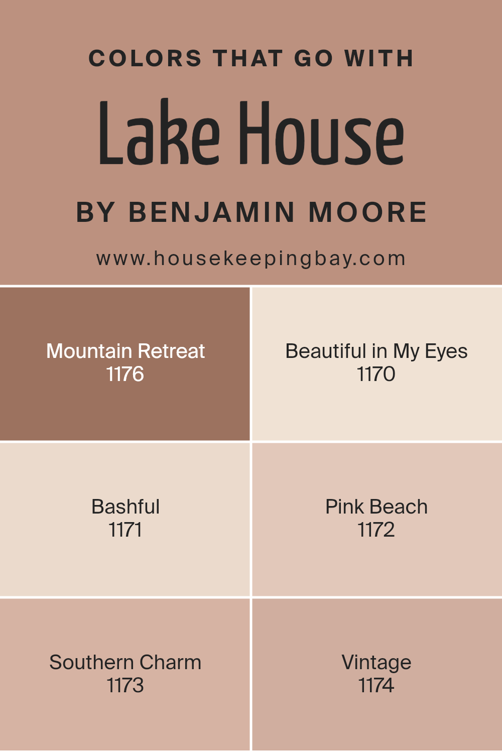
Colors that Go With Lake House 1175 by Benjamin Moore
Choosing the right colors to accompany Lake House 1175 by Benjamin Moore is essential for creating a cohesive and appealing space. The complementary shades provide balance and variety, enhancing different moods and themes that one might want to bring to their home. Pairing Lake House 1175 with colors like Mountain Retreat and Beautiful in My Eyes ensures that the environment remains harmonious while allowing each room to have its character.
For instance, Mountain Retreat 1176 lends a robust and earthy tone that contrasts subtly with the more subdued Lake House, making spaces feel grounded. Beautiful in My Eyes 1170 offers a soft, creamy texture that adds lightness and softens the solidity of darker furniture or decor pieces.
Whether you’re adding a touch of whimsy or seeking a gentle backdrop, colors like Bashful 1171 and Pink Beach 1172 are perfect. Bashful gives a quiet, pale hue that acts almost like a whisper of color, suitable for a peaceful nursery or calm reading nook.
In contrast, Pink Beach brings a hint of playful vibrancy without overwhelming, perfect for bathrooms or a creative’s studio. For those who appreciate a bit of historical or rustic edge, Southern Charm 1173 and Vintage 1174 provide a delightful bridge connecting modern chic with traditional aesthetics.
Southern Charm offers a muted, sophisticated palette that is warm and inviting, fitting well in a cozy dining room or living area. Meanwhile, Vintage 1174 gives a nostalgic vibe with its faded, timeless look that complements antique wooden furniture or classic art pieces.
You can see recommended paint colors below:
- 1176 Mountain Retreat
- 1170 Beautiful in My Eyes
- 1171 Bashful
- 1172 Pink Beach
- 1173 Southern Charm
- 1174 Vintage
housekeepingbay.com
How to Use Lake House 1175 by Benjamin Moore In Your Home?
Lake House 1175 by Benjamin Moore is a versatile and charming paint color, perfect for freshening up any space in your home. With its gentle green hue, it brings a subtle warmth and natural feel, making it ideal for creating a peaceful environment.
You can use Lake House 1175 in multiple areas such as living rooms, bedrooms, and bathrooms. It pairs nicely with both light and dark furnishings, allowing flexibility in decor choices. Applying this color in spaces with ample natural light will highlight its soothing qualities.
Alternatively, in dimmer areas, it can make the space feel cozy and inviting. Lake House 1175 also works well on kitchen cabinets for a soft, updated look. Combine it with neutrals like whites or grays for a balanced and harmonious aesthetic. This color is particularly effective in achieving a serene, homey atmosphere without overwhelming the senses, making any room feel more comfortable and inviting.
Lake House 1175 by Benjamin Moore vs Santa Rosa 1189 by Benjamin Moore
The main color, Lake House 1175 by Benjamin Moore, is a serene, soft blue with a subtle gray tone, giving it a calming effect suitable for spaces meant for relaxation like bedrooms or bathrooms. It reflects a gentle, peaceful vibe that replicates a quiet day by the lake, making any room feel more soothing and restful.
In contrast, Santa Rosa 1189, also by Benjamin Moore, is a deeper, warm beige color that offers a cozy and inviting atmosphere. This versatile shade pairs well with a variety of decor styles and adds a natural, earthy touch to any living space, enhancing areas like living rooms and kitchens with its welcoming warmth.
While Lake House 1175 leans towards a cooler, more muted palette evoking open, airy spaces, Santa Rosa 1189 brings warmth and a comforting ambiance, ideally suited for lively areas and gathering spaces. Each color has its unique aura that can significantly influence the mood and style of a room.
You can see recommended paint color below:

housekeepingbay.com
Lake House 1175 by Benjamin Moore vs Rosedale 1180 by Benjamin Moore
Lake House 1175 and Rosedale 1180 by Benjamin Moore are two colors that offer subtle differences appealing for various settings. Lake House 1175 is a muted teal with a calming, soft vibe, perfect for creating a serene environment. It works well in spaces designed for relaxation, like a bedroom or a cozy reading nook. This color pairs beautifully with light woods and neutral accents to maintain a peaceful air.
Rosedale 1180, in contrast, is a gentle beige with warm undertones, presenting a more neutral base ideal for rooms that need a versatile backdrop. This color is excellent for areas where you want to highlight other decor elements, such as living rooms or hallways, because it blends seamlessly with many styles and colors.
Both paints offer their unique atmospheres: Lake House brings a touch of nature-inspired freshness, while Rosedale provides a classic, understated elegance. Depending on your decor goals and the mood you wish to set, each color has distinct advantages.
You can see recommended paint color below:
- 1180 Rosedale
housekeepingbay.com
Lake House 1175 by Benjamin Moore vs Roman Shade 1228 by Benjamin Moore
The color Lake House 1175 by Benjamin Moore is a warm, soft beige with a calm, inviting vibe. It offers a neutral backdrop that is versatile and easy to pair with different decor styles and colors, making it ideal for living spaces or bedrooms where comfort is key.
Contrasting this, Roman Shade 1228 by Benjamin Moore is a deeper taupe with hints of gray. It provides a slightly more sophisticated and refined look, making it suitable for creating a cozy and serene atmosphere in spaces that require a touch of elegance.
Both colors are neutral, but Lake House leans towards a lighter, creamier tone, giving a brighter feeling to spaces. Roman Shade, with its gray undertones, looks more grounded and subdued, offering a bit more depth and complexity. When deciding between the two, consider the mood and functional use of your space: Lake House for a more open and airy vibe, and Roman Shade for a cozy, intimate setting.
You can see recommended paint color below:
- 1228 Roman Shade
housekeepingbay.com
Lake House 1175 by Benjamin Moore vs Foxy Brown 1181 by Benjamin Moore
Lake House 1175 by Benjamin Moore is a pale, soft blue that carries the serene vibe of a peaceful retreat. It suggests calmness and is great for rooms where relaxation is key, such as bedrooms or bathrooms. This color has a fresh, airy quality that can make small spaces feel larger and more open.
In contrast, Foxy Brown 1181 is a deep, warm brown that gives off an earthy and cozy feel. It is well-suited for areas where you want to create a sense of warmth and intimacy, like living rooms or dining areas. This color can add richness to a space and pairs well with natural materials like wood or leather.
Both colors offer distinct moods and can suit different decor styles. Lake House provides a light, refreshing atmosphere, while Foxy Brown adds depth and comfort. Choosing between them depends on the ambiance you wish to achieve in your space.
You can see recommended paint color below:
- 1181 Foxy Brown
housekeepingbay.com
t’s one of those shades that has a little bit of warmth and brightness mixed in, so it works with a lot of different styles—whether you like modern stuff or more cozy looks. What’s really fun about it is how the color changes a bit during the day, depending on the light. It keeps the room feeling alive without being too bold.
My insights into 1175 Lake House have shown me its potential to not only soothe but also quietly enhance the aesthetic appeal of a home. It’s a paint color that doesn’t overshadow but rather supports and complements the elements around it—be it furniture, art, or natural views. For anyone looking to update their home with a serene yet rich hue, 1175 Lake House comes forward as a robust candidate.
Considering its adaptability and the gentle ambience it fosters, I would confidently recommend this color to friends, family, and readers seeking a subtle but impactful change in their interiors.
It’s clear that with 1175 Lake House, the aura of a room can be softly refined, making it a joy to live in or visit.
housekeepingbay.com
Ever wished paint sampling was as easy as sticking a sticker? Guess what? Now it is! Discover Samplize's unique Peel & Stick samples. Get started now and say goodbye to the old messy way!
Get paint samples


