Irresistible SW 6562 by Sherwin Williams
A Warm Hue That Brings Rooms to Life
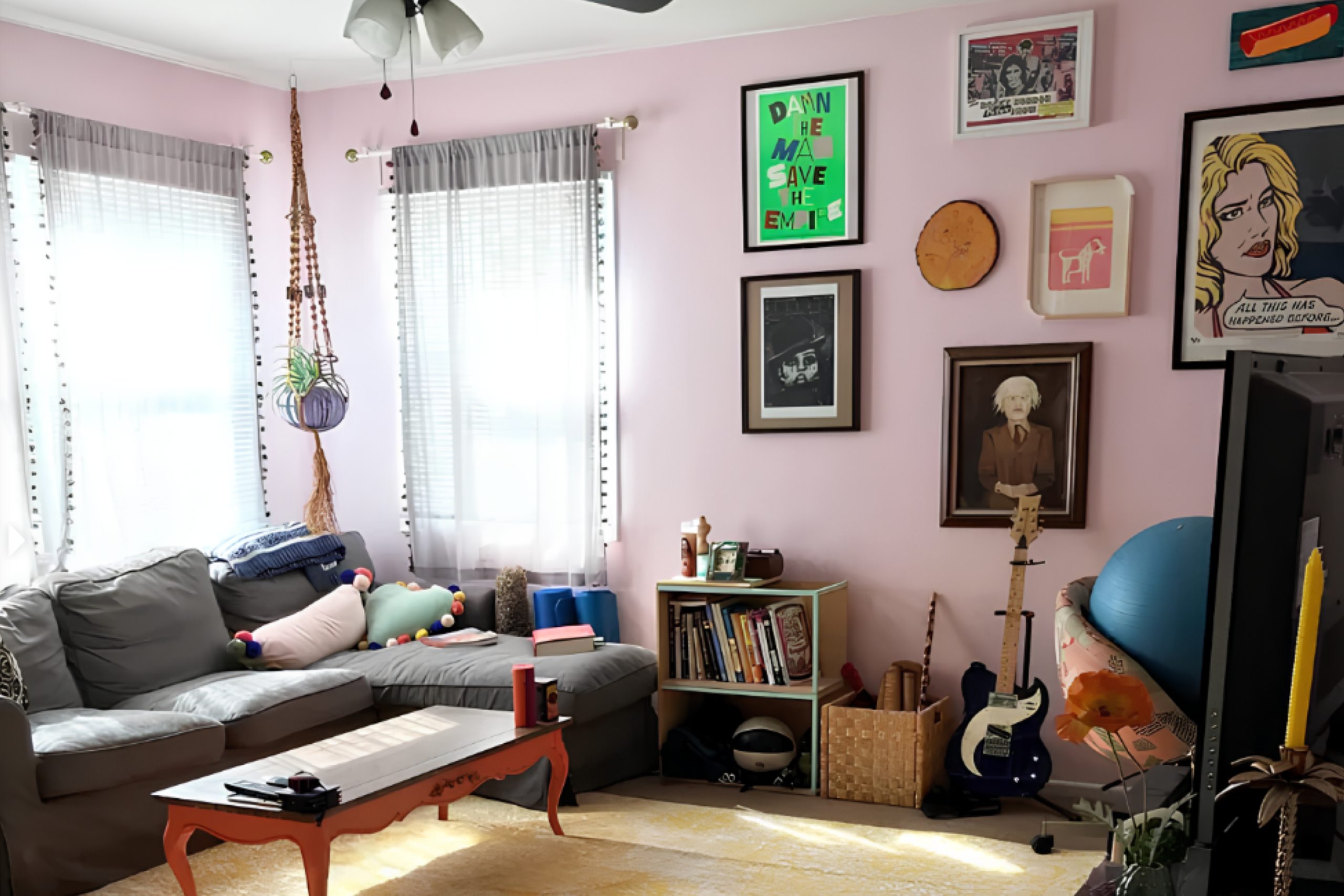
When you want a color that combines warmth and charm, SW 6562 Irresistible by Sherwin Williams might just catch your eye. This hue balances elegance and comfort, offering a soft yet lively touch to any space. It’s perfect for those who appreciate a cozy yet stylish environment without overwhelming the senses.
With its unique mix of undertones, Irresistible can adapt to various design styles, whether you’re refreshing a living room, updating a bedroom, or adding character to a workspace.
Pair it with neutrals for a balanced look, or go bold with contrasting colors to make a statement.
This color appeals to both traditional and modern tastes, adding a touch of sophistication wherever it’s used. It’s not just about painting walls; it’s about setting a mood and creating an inviting atmosphere.
Let Irresistible become the backdrop for your cherished moments, making every day feel a little more special.
Let your creativity flow and see how Irresistible can bring your design dreams to life. Whether you’re updating a single room or rethinking your entire home’s color scheme, this shade offers a delightful way to enhance your space.
via plan-home.com
What Color Is Irresistible SW 6562 by Sherwin Williams?
Table of Contents
Irresistible SW 6562 by Sherwin Williams is a rich, warm shade of red with noticeable pink undertones. This color adds a vibrant and energetic feel to any space, perfect for those wanting a lively atmosphere. It works beautifully in spaces where you want to create a sense of passion and vibrancy.
In terms of interior styles, Irresistible complements eclectic and bohemian interiors exceptionally well. It adds a pop of vivid color that works wonderfully with diverse patterns and bold designs typical of these styles.
For a modern or contemporary setting, this shade can act as an accent wall, bringing warmth to otherwise neutral palettes.
Irresistible pairs well with materials and textures like dark wood, which enhances its warmth, as well as gold or brass metallics, which add sophistication. Velvet and plush fabrics in neutral tones or matching pink-red shades make this color pop, while soft white or cream fabrics can balance its intensity.
Additionally, incorporating natural textures like woven baskets or jute rugs can create a well-rounded, inviting space.
Whether used as a bold accent or throughout an entire room, Irresistible SW 6562 brings energy and warmth, making it a versatile choice for creative interiors.
housekeepingbay.com
Is Irresistible SW 6562 by Sherwin Williams Warm or Cool color?
Irresistible SW 6562 by Sherwin Williams delivers a strong and vibrant pink-red hue, creating a lively and energetic space. It adds character and warmth, making it ideal for spaces needing a bold statement. When used in living rooms, it can encourage lively conversations and interactions.
In dining areas, it enhances visual appeal, creating a cozy atmosphere for meals with family and friends. Bedrooms gain an energetic feel without losing comfort, provided it’s balanced with softer tones or neutral accents.
This shade pairs well with soft whites and light grays, allowing the pink undertones to shine while maintaining harmony. Additionally, it works well in accent pieces like cushions or artwork, providing a pop of color without overwhelming the senses. Overall, Irresistible SW 6562 introduces a vibrant element that can make any space more inviting and dynamic, appealing to those seeking a lively home environment.
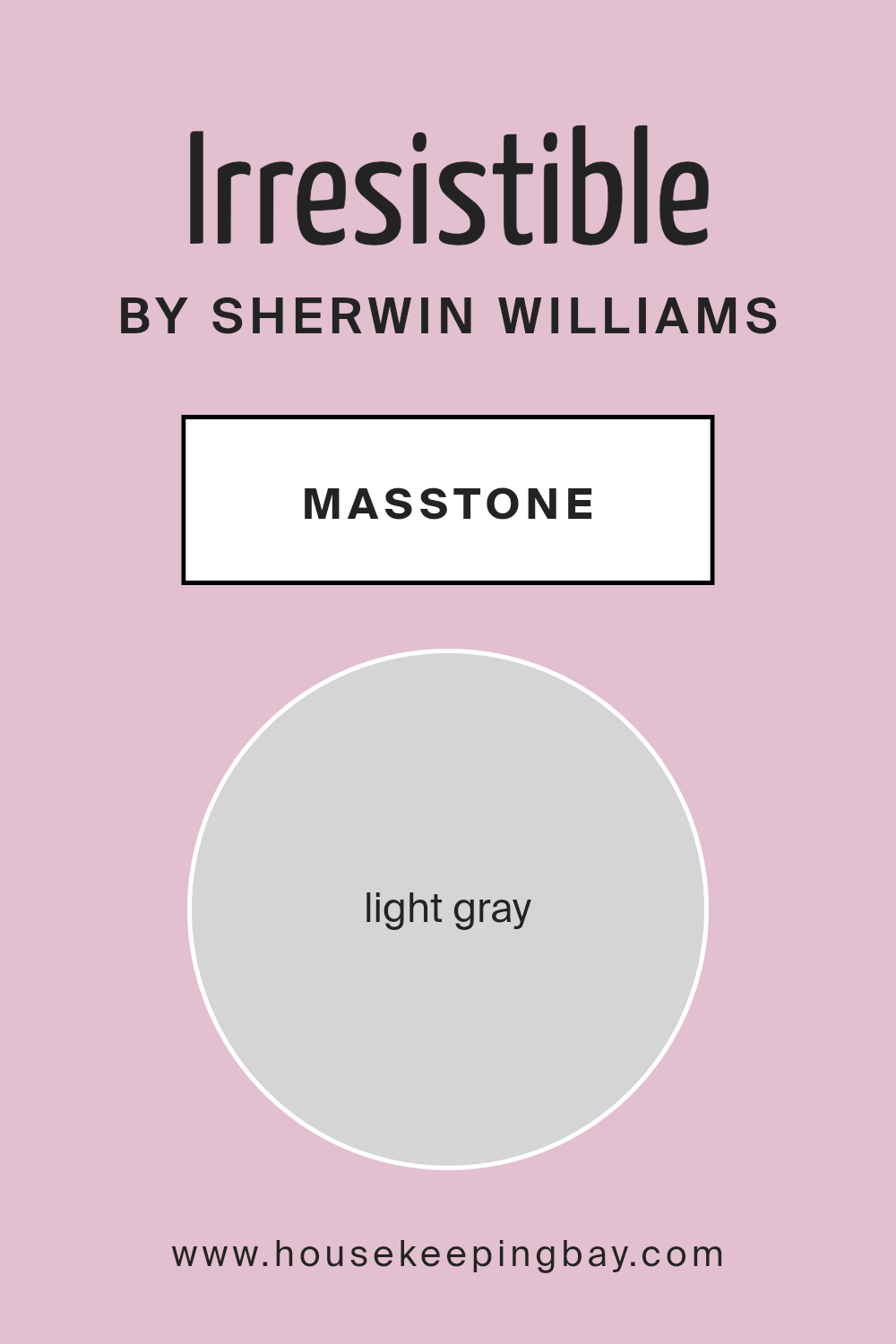
What is the Masstone of the Irresistible SW 6562 by Sherwin Williams?
IrresistibleSW 6562 by Sherwin Williams, with a masstone of light gray (#D5D5D5), offers a versatile and calming color choice for homes. This light gray shade creates an airy and open feel, making spaces appear larger and more inviting. It is subtle yet sophisticated, providing a neutral backdrop that can complement any decor style, from modern to traditional.
In living rooms or bedrooms, this light gray adds a sense of serenity and balance, promoting a peaceful atmosphere ideal for relaxation. It pairs well with bold accent colors, allowing homeowners to add personality without overwhelming the space.
In kitchens or bathrooms, IrresistibleSW 6562’s light tone reflects natural light beautifully, enhancing brightness and cleanliness. It coordinates easily with various countertops, cabinets, and fixtures.
Overall, the light gray masstone of IrresistibleSW 6562 offers flexibility in design, accommodating different tastes while contributing to a harmonious living environment.
housekeepingbay.com
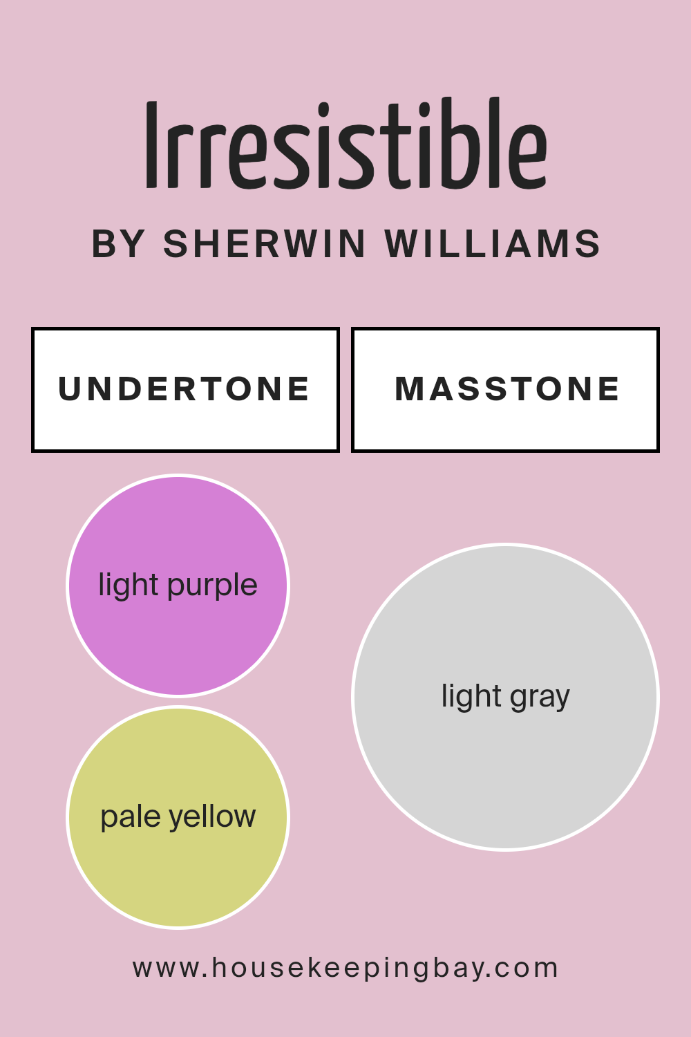
Undertones of Irresistible SW 6562 by Sherwin Williams
Irresistible SW 6562 by Sherwin Williams shows a beautiful blend of pink and red, with subtle undertones adding depth. Undertones influence how we perceive main colors by changing their warmth, coolness, and mood.
Irresistible has a hint of light purple, giving it a cool touch, while pale yellow adds warmth. Light blue cools it down further, offering balance and calmness. Pale pink enhances its softness, making spaces feel welcoming and cozy.
Lilac, an additional purple hue, deepens its relaxed vibe. Mint undertones bring freshness, suggesting a serene environment. Grey adds neutrality, grounding the paint and allowing it to fit seamlessly with diverse color palettes.
Overall, these undertones shape Irresistible into a color suitable for many environments. In a living room, it feels inviting and warm. In a bedroom, it presents a soothing, peaceful ambiance. Cool undertones like light blue and lilac help create a calm and restful space, ideal for relaxation.
The touch of grey ensures neutrality and balance, making it versatile and easily matched with furnishings. This unique color combination makes Irresistible adaptable to various styles, whether modern or classic, enhancing any interior wall with grace and charm.
housekeepingbay.com
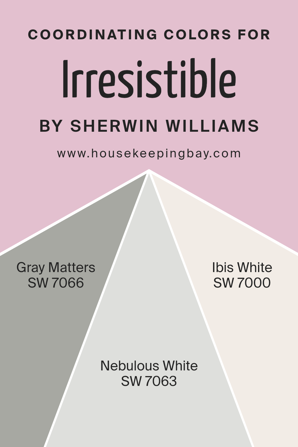
Coordinating Colors of Irresistible SW 6562 by Sherwin Williams
Coordinating colors are color schemes that work well together in a design because they complement and enhance each other. When choosing coordinating colors for a space, it’s important to select shades that not only match the main color but also create a harmonious look.
Sherwin Williams’ Irresistible SW 6562, a deep and vibrant shade of magenta, can be beautifully paired with specific colors to achieve balance and cohesion.
SW 7066 – Gray Matters, for example, offers a cool, medium gray tone that provides a calm and modern contrast to the boldness of Irresistible. This makes it an ideal choice for adding depth to the overall look.
Additionally, coordinating this rich hue with lighter tones like SW 7063 – Nebulous White can add an airy and soft element to a room.
Nebulous White is a gentle off-white with a hint of gray, which pairs perfectly with both the magenta and the gray for a cohesive palette.
Meanwhile, SW 7000 – Ibis White, which is a brighter and more classic white, can be used to lighten the space and create a clean, fresh feeling. Together, these colors work harmoniously, allowing Irresistible to be the focal point while the neutrals balance the vibrancy with subtle elegance.
You can see recommended paint colors below:
housekeepingbay.com
How Does Lighting Affect Irresistible SW 6562 by Sherwin Williams?
Lighting plays a crucial role in how we perceive colors. Different lighting conditions can change the appearance of a paint color drastically. Let’s consider Irresistible SW 6562 by Sherwin Williams.
Under artificial light, colors can look different depending on the light’s warmth. Incandescent bulbs, which emit a warm, yellow light, might make Irresistible SW 6562 appear warmer and more pinkish-red. LED bulbs, especially those with cooler tones, could make this color look sharper and less warm, showing more of its purple undertones.
In natural light, the color’s appearance changes throughout the day. Morning light tends to be cooler, which could enhance the color’s cooler tones. Midday sunlight, being neutral, often shows the color most accurately. As evening sets in, the light becomes warmer, possibly making the color appear deeper and richer.
Room orientation also plays a role in how Irresistible SW 6562 is perceived:
- North-facing rooms receive the least direct sunlight, often resulting in cooler, shadowy light. This can make Irresistible SW 6562 appear muted and grayer as the light brings out any cool undertones in the color.
- South-facing rooms tend to have bright light for most of the day, enhancing the warmer tones in paint colors. In these rooms, Irresistible SW 6562 may appear vibrant and more pink, showing its warmest side.
- East-facing rooms get strong sunlight in the morning, making colors look brighter and cooler. Later in the day, the light becomes softer and might make Irresistible SW 6562 appear more subdued.
- West-facing rooms see sunlight in the afternoon and evening, intensifying warm tones. In such rooms, Irresistible SW 6562 might look bold and rich as the day progresses.
Understanding these interactions helps in making informed choices about where to apply specific paint colors to achieve desired effects.

housekeepingbay.com
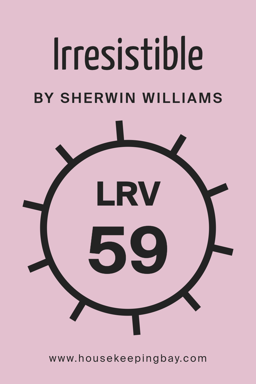
What is the LRV of Irresistible SW 6562 by Sherwin Williams?
LRV stands for Light Reflectance Value. It measures how much light a color reflects or absorbs. The scale ranges from 0 to 100, with 0 reflecting no light (pure black) and 100 reflecting all light (pure white). A higher LRV means the color reflects more light and will generally feel lighter and brighter.
A lower LRV means it absorbs more light, making it look darker and heavier. This value is crucial when choosing paint colors because it determines how the color interacts with light in a room.
A room with a lot of natural light may make a high LRV color look even brighter, while in a dim space, the same color might look more subdued.
For the color Irresistible SW 6562 by Sherwin-Williams, which has an LRV of 58.608, this means it’s on the lighter side of the scale. It reflects a fair amount of light, but not too much. In a bright room, this color will appear quite vibrant and lively, catching the eye without overwhelming.
In dimmer spaces, it will maintain enough lightness to avoid feeling too dark or enclosed. This balance makes it a versatile choice, suitable for both well-lit and less illuminated areas, providing flexibility in design choices. It maintains a sense of warmth and inviting character, performing well across different lighting conditions.
housekeepingbay.com
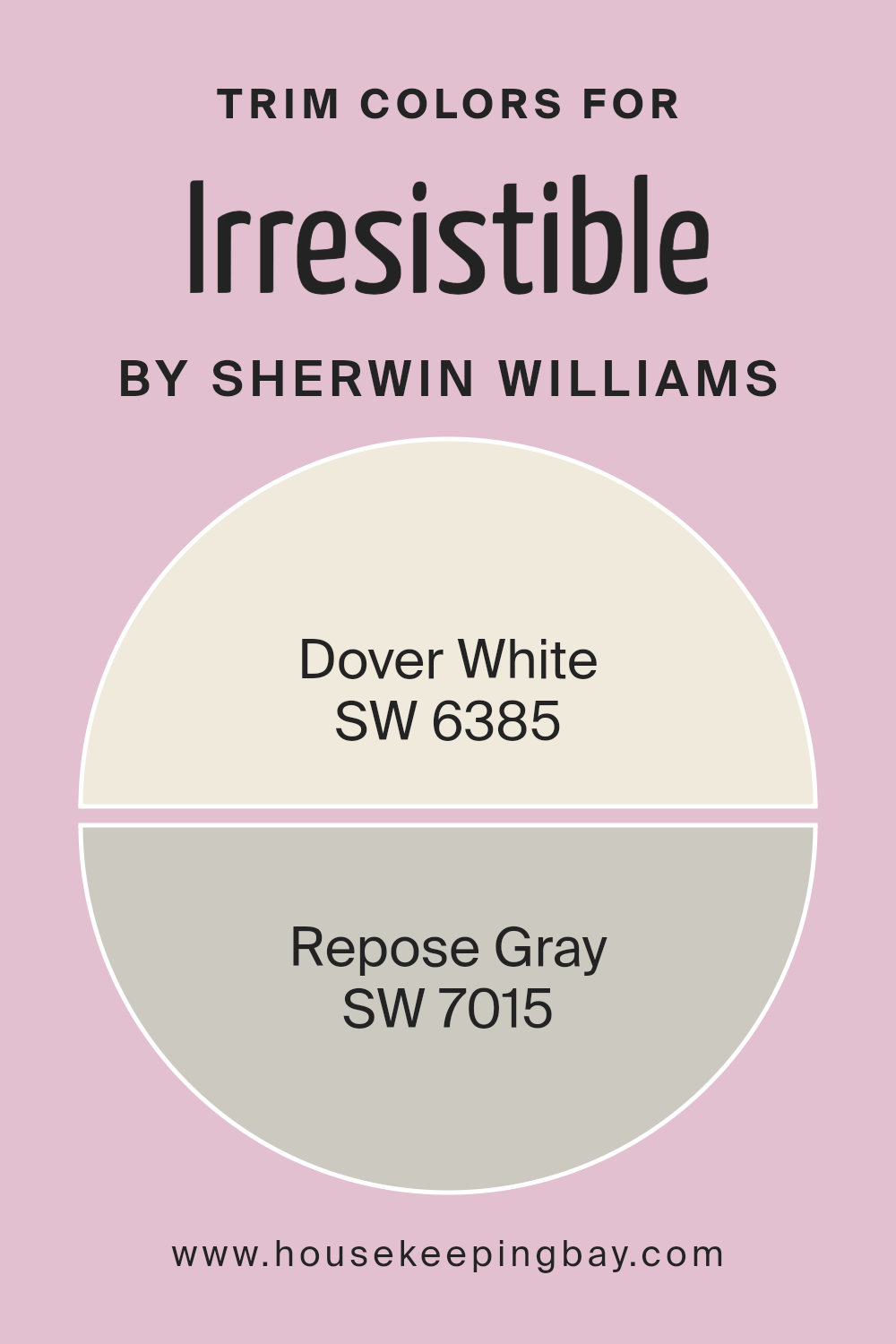
What are the Trim colors of Irresistible SW 6562 by Sherwin Williams?
Trim colors play an important role in any room, adding definition and highlighting architectural details. For Sherwin Williams’ Irresistible SW 6562, using trim colors like SW 6385 – Dover White and SW 7015 – Repose Gray can enhance the overall look and feel of the space.
Trim colors frame the primary wall color, providing contrast or harmony that can change how a room feels. By choosing the right trim, you create visual interest and can emphasize certain aspects of the design.
Irresistible is a rich and vibrant hue, and carefully selected trim colors like Dover White and Repose Gray can either soften or sharpen its intensity, depending on the desired mood.
SW 6385 – Dover White is a warm and inviting shade of white that adds a soft touch to any space. It complements bold colors beautifully, creating a welcoming and cozy environment. Meanwhile, SW 7015 – Repose Gray offers a calm and balanced tone, bringing in subtle sophistication.
This neutral gray pairs well with vibrant colors, ensuring that the room feels both modern and cohesive. Using these trim colors with Irresistible can give the space either a clean, classic look or a modern, understated elegance. Both colors have the ability to frame Irresistible in a way that highlights its dynamic presence without overwhelming the senses.
You can see recommended paint colors below:
- SW 6385 Dover White
- SW 7015 Repose Gray
housekeepingbay.com
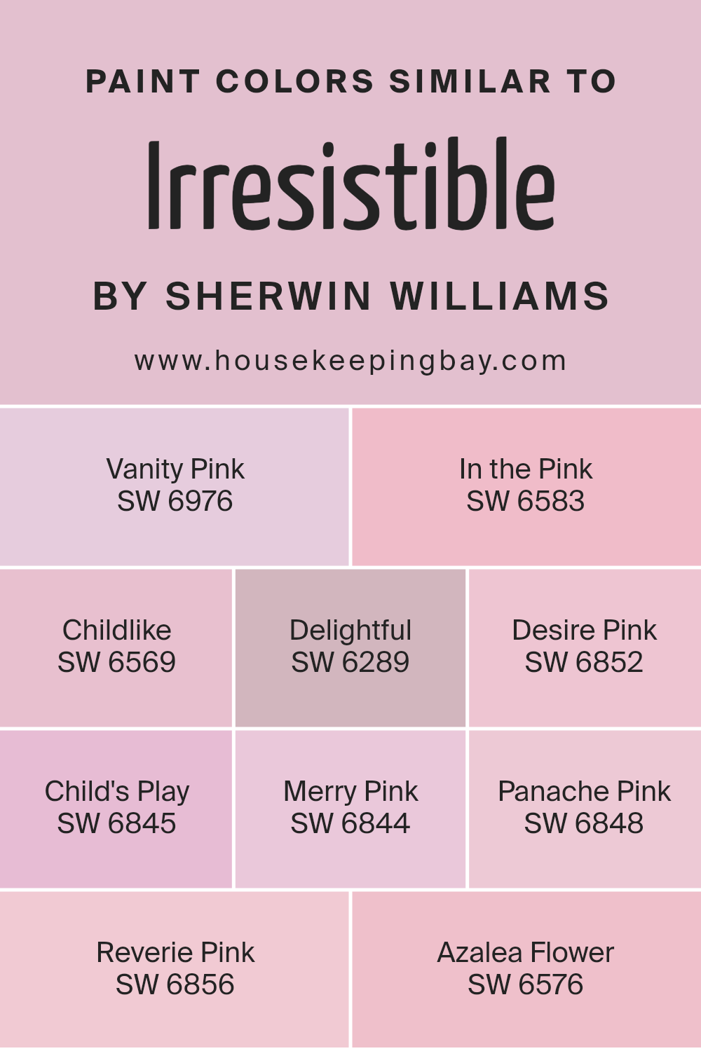
Colors Similar to Irresistible SW 6562 by Sherwin Williams
Similar colors play a crucial role in design and decorating because they create a harmonious and cohesive look. When you choose colors that are close in hue, such as Vanity Pink, In the Pink, Childlike, Delightful, and Desire Pink, they work together seamlessly to create a unified space.
This is important because it avoids clashes and allows for a pleasing visual experience. Irresistible SW 6562 by Sherwin Williams is complemented by these similar shades, each bringing a slightly different vibe but maintaining overall balance.
For instance, Vanity Pink offers a gentle touch with its soft and warm undertones, while In the Pink brings a hint of brightness and cheerfulness.
Childlike brings playful energy into the mix, perfect for adding whimsy to a room. Delightful provides a gentle, comforting pink that soothes and relaxes. Desire Pink is vivid and bold, adding excitement without overwhelming the space. Child’s Play is a fun and lively shade, adding a youthful feel.
Merry Pink brings warmth and coziness, perfect for inviting spaces. Panache Pink adds a sense of elegance and flair, with its subtle sophistication.
Reverie Pink suggests a dreamy atmosphere with its soft and enchanting quality. Lastly, Azalea Flower offers a fresh and lively pink, reminiscent of spring blooms. Together, these colors ensure a space that feels both coordinated and interesting.
You can see recommended paint colors below:
- SW 6976 Vanity Pink
- SW 6583 In the Pink
- SW 6569 Childlike
- SW 6289 Delightful
- SW 6852 Desire Pink
- SW 6845 Child’s Play
- SW 6844 Merry Pink
- SW 6848 Panache Pink
- SW 6856 Reverie Pink
- SW 6576 Azalea Flower
housekeepingbay.com
Colors that Go With Irresistible SW 6562 by Sherwin Williams
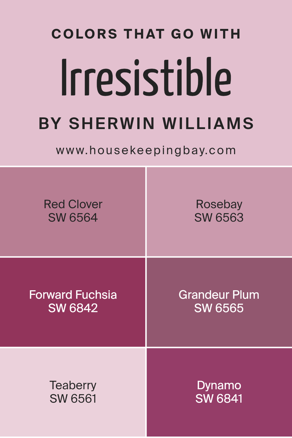
Colors that pair well with Irresistible SW 6562 by Sherwin Williams are crucial because they enhance its charm and make spaces warm and inviting. Using colors like SW 6564 – Red Clover brings a vibrant yet cozy feel, adding depth with its rich, warm tones.
SW 6563 – Rosebay complements with its soft, berry-like hue, offering a gentle contrast that adds liveliness without overwhelming. There’s also the option of SW 6842 – Forward Fuchsia, which is lively and full of energy, creating a bold statement against Irresistible’s backdrop.
Each of these colors works in harmony, enhancing the mood of a room and providing a cohesive look.
On the slightly deeper side, SW 6565 – Grandeur Plum introduces elegance with its deep plum tones, making spaces feel intimate and sophisticated.
SW 6561 – Teaberry has a softer touch, providing a serene balance with its gentle, pinkish notes. Finally, SW 6841 – Dynamo packs a punch with its bright, energetic flair, perfect for adding a touch of fun and excitement. These colors, when used alongside Irresistible SW 6562, create a palette that is both dynamic and harmonious. They lend personality and character to a room, making every space feel uniquely tailored to you.
You can see recommended paint colors below:
- SW 6564 Red Clover
- SW 6563 Rosebay
- SW 6842 Forward Fuchsia
- SW 6565 Grandeur Plum
- SW 6561 Teaberry
- SW 6841 Dynamo
housekeepingbay.com
How to Use Irresistible SW 6562 by Sherwin Williams In Your Home?
Irresistible SW 6562 by Sherwin Williams is a warm, inviting pink that brings a sense of comfort and charm to any space. It’s perfect for adding a touch of coziness to bedrooms or living rooms. This pink can work well as a statement wall, drawing attention without being overwhelming. When paired with neutral colors like white, cream, or light gray, it creates a balanced, soothing environment.
In a child’s room, Irresistible SW 6562 can make the space feel playful and friendly. Adding pastel accents or colorful furniture will enhance its cheerful vibe. For a more sophisticated look, combine it with dark wood furniture or metallic accessories, like gold lamps or silver picture frames.
Using Irresistible SW 6562 in a kitchen can also add warmth, especially when complemented with white cabinetry or tiled backsplashes. This versatile color brings a sense of joy and positivity to any room, making it a wonderful choice for any home.
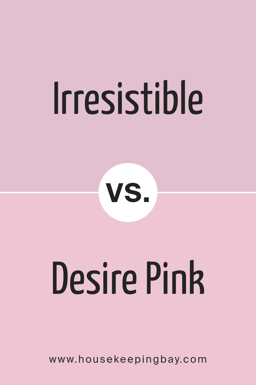
Irresistible SW 6562 by Sherwin Williams vs Desire Pink SW 6852 by Sherwin Williams
Irresistible SW 6562 and Desire Pink SW 6852, both by Sherwin Williams, offer distinct shades of pink, each bringing its unique charm to any space. Irresistible is a rich, deep magenta with a touch of sophistication and boldness. It creates an intense, vibrant atmosphere, perfect for adding energy and warmth to a room.
This shade works well in a living room or a dining area where social interaction is encouraged.
Desire Pink, however, is lighter and softer. It has a playful, cheerful feel, much like a gentle blush. This hue is ideal for spaces where a sense of lightness and joy is desired, such as a bedroom or a child’s playroom.
While Irresistible commands attention with its depth, Desire Pink offers a softer, welcoming feel. Both colors have their place in design, with the choice between them depending on the mood and ambiance one wishes to create in their space.
You can see recommended paint color below:
- SW 6852 Desire Pink
housekeepingbay.com
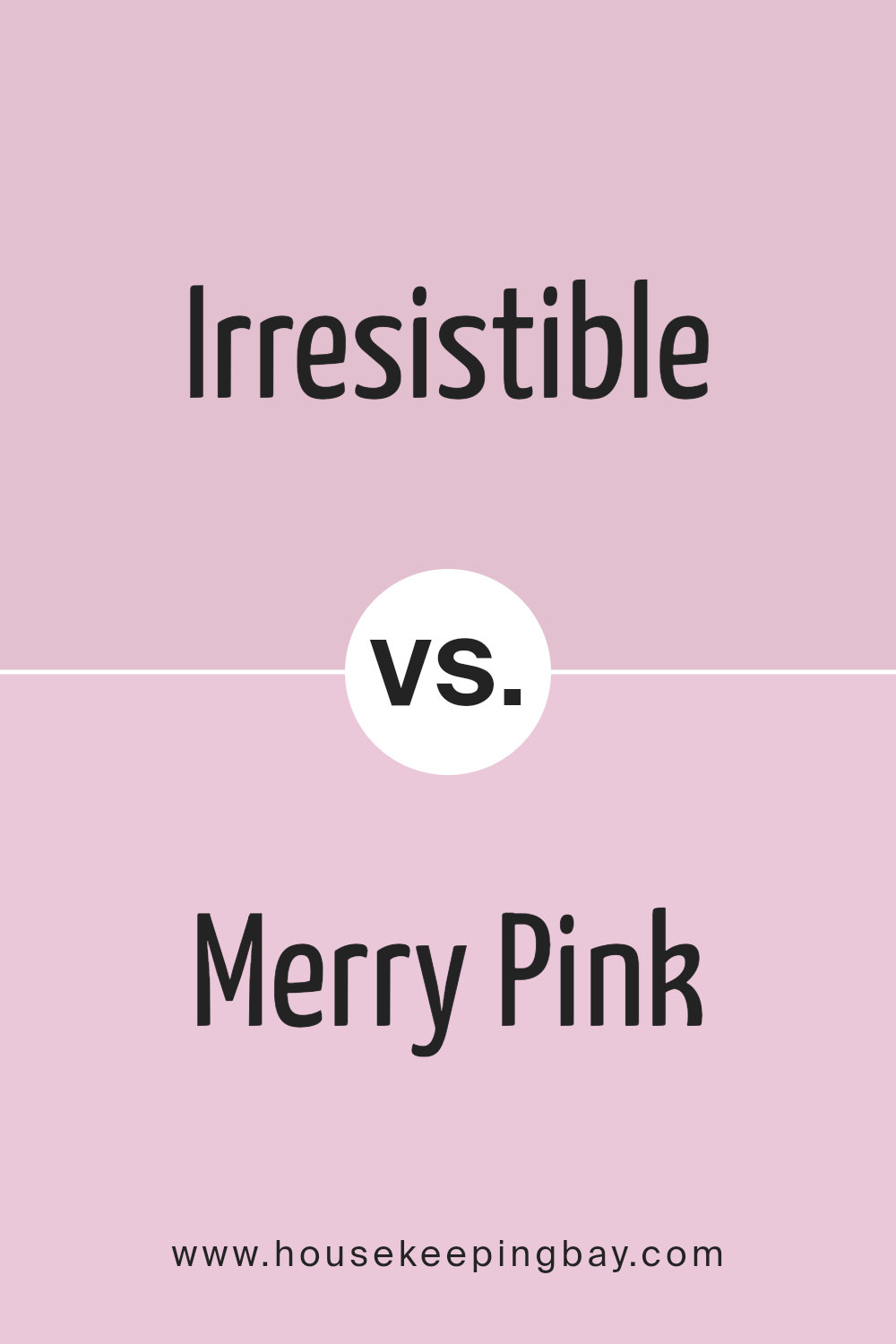
Irresistible SW 6562 by Sherwin Williams vs Merry Pink SW 6844 by Sherwin Williams
Irresistible SW 6562 by Sherwin Williams is a rich, deep magenta. It carries a sense of boldness and confidence, making any room feel vibrant and full of life. This color can dominate a space, so it’s often used for accent walls or to add punch to smaller areas.
Merry Pink SW 6844, also by Sherwin Williams, presents a lighter, softer shade. It exudes a cheerful and welcoming vibe, creating an uplifting atmosphere. This pink is versatile enough for both children’s rooms and more sophisticated settings, offering a playful yet elegant touch.
When comparing these two, Irresistible stands out with its commanding presence and depth. It’s ideal for creating a dramatic look. Merry Pink, meanwhile, offers a brighter, more gentle option, which can make a space feel light and inviting. Choosing between them depends on whether you seek the intensity of Irresistible or the breezy charm of Merry Pink.
You can see recommended paint color below:
- SW 6844 Merry Pink
housekeepingbay.com
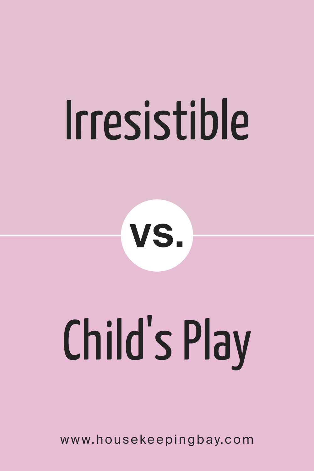
Irresistible SW 6562 by Sherwin Williams vs Child’s Play SW 6845 by Sherwin Williams
Irresistible SW 6562 by Sherwin Williams is a bold, rich magenta. It brings warmth and excitement to any space. This color works well in areas where a lively, passionate atmosphere is desired. Think of vibrant living rooms or artful dining spaces.
Child’s Play SW 6845 by Sherwin Williams is a playful, soft pink. It feels gentle and inviting, making it ideal for children’s rooms or nurseries. The color creates a nurturing and cheerful environment, perfect for spaces where comfort and joy are key.
Comparing the two, Irresistible is dramatic and intense, while Child’s Play provides a softer, more soothing visual. Irresistible can energize a room with its dynamic personality, whereas Child’s Play adds a touch of innocence and gentle warmth. Both colors bring unique charm, with Irresistible offering a sense of boldness and grandeur, and Child’s Play fostering a calming, lighthearted feel.
You can see recommended paint color below:
- SW 6845 Child’s Play
housekeepingbay.com
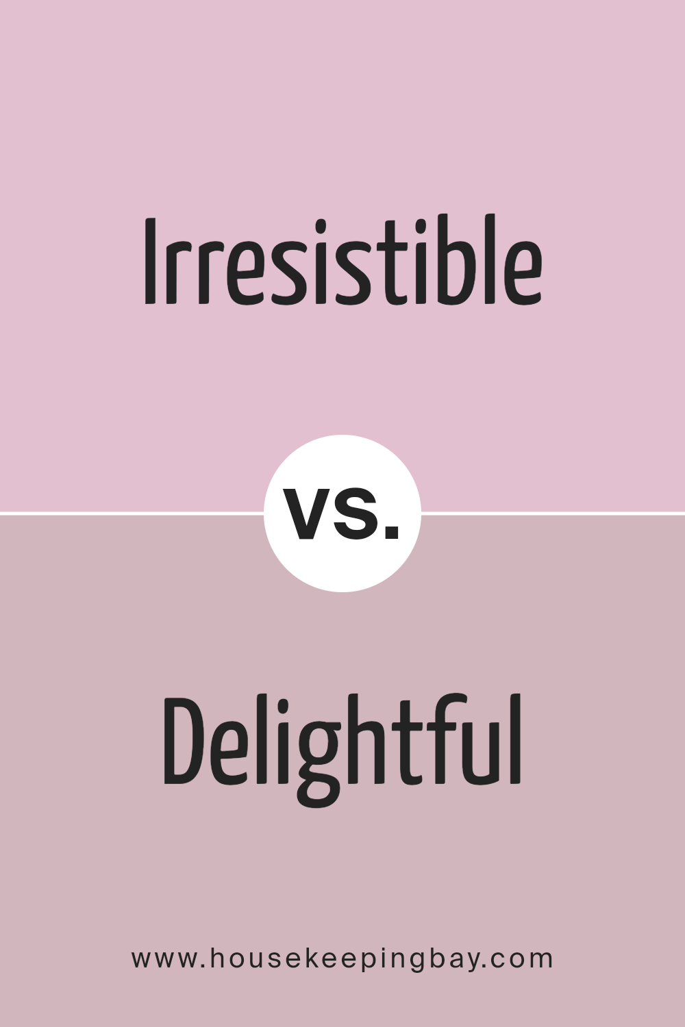
Irresistible SW 6562 by Sherwin Williams vs Delightful SW 6289 by Sherwin Williams
Irresistible SW 6562 by Sherwin Williams exudes a rich, deep magenta hue, presenting a bold and energetic tone. Its vibrant nature makes it an excellent choice for spaces that require a pop of color, creating a lively and spirited atmosphere. This color can make a powerful statement, drawing the eye and adding a sense of personality and charm to any room.
Conversely, Delightful SW 6289 offers a softer, more muted lavender tone. This color provides a calm and serene feeling, making it ideal for spaces where relaxation and peace are desired. Delightful is gentle and soothing, perfect for bedrooms or any area meant to promote comfort and ease.
While Irresistible commands attention with its vivid intensity, Delightful offers a subtle and understated elegance. Both colors bring unique qualities, allowing them to suit different moods and purposes. Where Irresistible is lively and spirited, Delightful is gentle and calming.
You can see recommended paint color below:
- SW 6289 Delightful
housekeepingbay.com
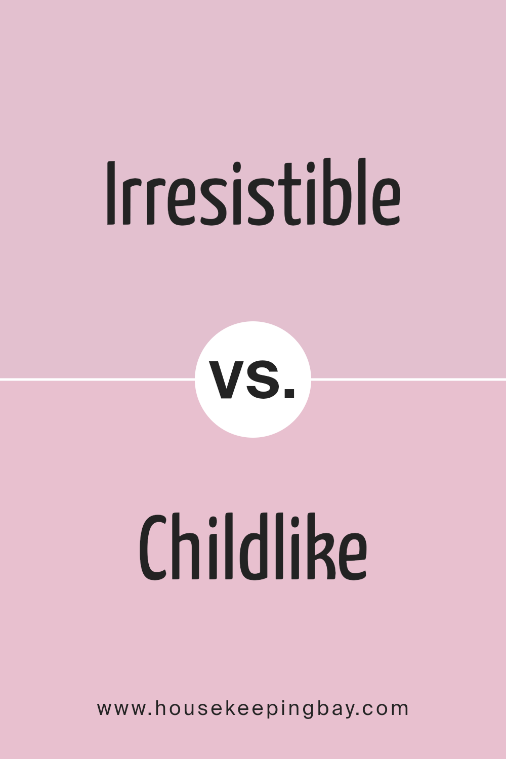
Irresistible SW 6562 by Sherwin Williams vs Childlike SW 6569 by Sherwin Williams
Irresistible SW 6562 by Sherwin Williams is a bold, rich magenta that brings energy and warmth to any space. It’s a striking color that can add depth and drama to a room. The intensity of Irresistible makes it perfect for accent walls, giving a lively flair to dining rooms or living spaces. This color pairs well with neutrals for a modern and sophisticated look.
Childlike SW 6569, also by Sherwin Williams, is a lighter and softer pink shade. It’s cheerful and playful, making it great for brightening up spaces like children’s rooms or nurseries.
Childlike gives off a lighthearted and inviting vibe, perfect for creating an uplifting atmosphere. While it maintains the warmth of a pink hue, it is more subtle and flexible for a variety of design themes.
While both colors bring warmth, Irresistible is bold and intense, whereas Childlike brings a softer, more playful touch.
You can see recommended paint color below:
- SW 6569 Childlike
housekeepingbay.com
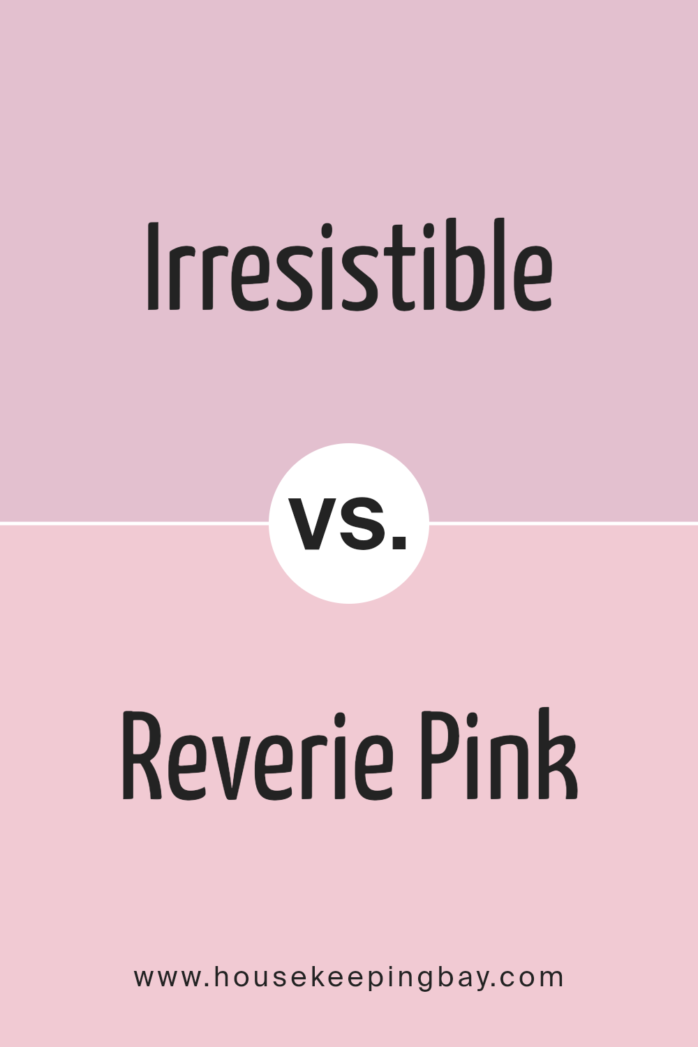
Irresistible SW 6562 by Sherwin Williams vs Reverie Pink SW 6856 by Sherwin Williams
Irresistible SW 6562 and Reverie Pink SW 6856 by Sherwin Williams both display unique charm. Irresistible is a rich, deep magenta shade that adds warmth and boldness to any space. It feels vibrant and lively, making a strong statement wherever used. This color often evokes a sense of passion and energy, suitable for areas where social interaction happens or in spots where you want a bold touch.
Reverie Pink SW 6856 has a softer presence, showcasing a light and gentle pink tone. It exudes softness and sweetness, often creating a calming, soothing atmosphere. This shade pairs well with neutral colors and is ideal for spaces meant for relaxation, like bedrooms or nurseries.
Both colors have distinct personalities yet share a harmonious quality when used together. They complement each other beautifully: the boldness of Irresistible can be balanced by the calmness of Reverie Pink, offering versatility in design choices.
You can see recommended paint color below:
- SW 6856 Reverie Pink
housekeepingbay.com
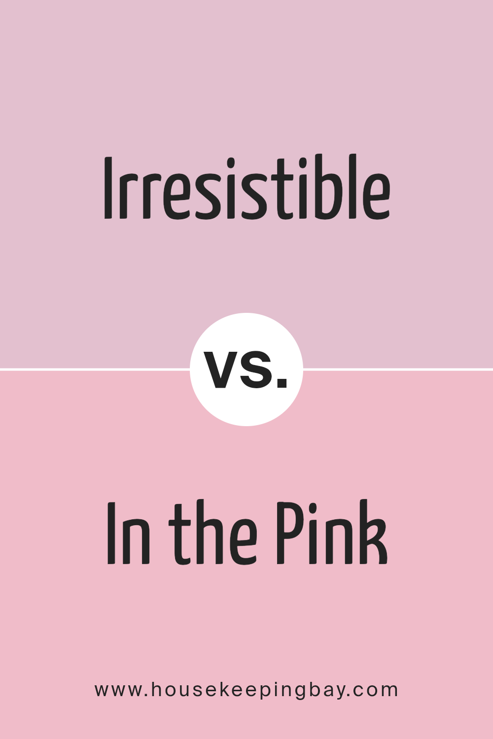
Irresistible SW 6562 by Sherwin Williams vs In the Pink SW 6583 by Sherwin Williams
“Irresistible SW 6562,” a compelling hue by Sherwin Williams, stands out as a deep and rich berry pink. It exudes warmth and sophistication, making it perfect for spaces where you want to create an inviting and cozy atmosphere. Its bold character adds depth and can be the focal point in any room.
Meanwhile, “In the Pink SW 6583” offers a softer and more playful vibe. This lighter shade of pink feels fresh and airy, creating a cheerful ambiance. It’s ideal for spaces you want to feel bright and lively, such as nurseries or playful areas in homes.
Both colors carry a pink essence, with Irresistible offering a more dramatic and mature feel, while In the Pink provides a youthful and light-hearted touch. Depending on the mood and purpose of your space, these colors can uniquely influence the overall aesthetic.
You can see recommended paint color below:
- SW 6583 In the Pink
housekeepingbay.com
Irresistible SW 6562 by Sherwin Williams vs Panache Pink SW 6848 by Sherwin Williams
Irresistible SW 6562 and Panache Pink SW 6848 from Sherwin Williams share a pink base but have distinct personalities. Irresistible offers a deep, rich magenta tone, adding drama and warmth to a room. Its intensity makes it ideal for accent walls or focal points, creating a bold statement. It pairs well with darker or neutral shades, allowing its depth to stand out.
Panache Pink SW 6848, in contrast, presents a lighter, more playful pink. It is softer, exuding a sense of cheerfulness and lightheartedness.
This color works beautifully in spaces meant to feel welcoming and cozy, appealing in nurseries, bedrooms, or living areas where a gentle touch is desired. Panache Pink harmonizes well with whites, creams, or gentle pastel shades, providing a delicate and airy feel.
Choosing between these colors depends on the desired mood: bold and dramatic with Irresistible, or light and cheerful with Panache Pink.
You can see recommended paint color below:
- SW 6848 Panache Pink
housekeepingbay.com
Irresistible SW 6562 by Sherwin Williams vs Azalea Flower SW 6576 by Sherwin Williams
Irresistible SW 6562 and Azalea Flower SW 6576 are two shades of pink by Sherwin Williams that, while similar, offer distinct vibes. Irresistibleis a deeper, richer pink with subtle purple tones. It brings a sense of warmth and coziness to a space, creating an inviting atmosphere. Its moderate intensity makes it versatile for both accents and main elements in a room, working well with neutrals and moody colors alike.
Azalea Flower, in contrast, is a lighter, more playful pink. It features brighter and more vibrant undertones, which make it cheerful and lively. This shade can brighten up any area, adding a touch of joyous energy. It pairs beautifully with whites and other pastels for a fresh, airy look.
Both colors share the common thread of pink but serve different moods: Irresistible for calming comfort and Azalea Flower for spirited optimism.
You can see recommended paint color below:
- SW 6576 Azalea Flower
housekeepingbay.com
Irresistible SW 6562 by Sherwin Williams vs Vanity Pink SW 6976 by Sherwin Williams
Irresistible SW 6562 by Sherwin-Williams is a warm, deep pink that feels rich and inviting. It has a strong presence, with a slightly red undertone that adds depth and makes it feel luxurious. This color can bring warmth and energy to a space, making it ideal for accent walls or vibrant decor pieces.
Vanity Pink SW 6976 by Sherwin-Williams, in contrast, is a lighter and softer pink. This shade has a more playful and gentle feel. It’s a softer hue that creates a sense of lightness and brightness in a room. Vanity Pink adds a cheerful and airy quality, making it suitable for spaces that aim to feel welcoming and fresh.
Together, these colors can create a dynamic and balanced palette, with Irresistible providing bold elegance and Vanity Pink offering a light, uplifting counterpart. Both colors add unique character to any interior setting.
You can see recommended paint color below:
- SW 6976 Vanity Pink
housekeepingbay.com
Conclusion
After spending time with Sherwin-Williams’ SW 6562 Irresistible, I really grasp the impact a color can have on a space. The rich, inviting shade brings warmth and elegance, effortlessly enhancing the mood of any room. Its blend of red and purple hues commands attention without overwhelming, making it a perfect choice for both bold and subtle design choices.
From personal experience, I appreciate how versatile this color proves to be. Whether it’s accenting a living room wall or adding depth to a cozy reading nook, it holds its ground beautifully.
One noteworthy aspect is how it complements various materials and textures, like natural wood or sleek metal, adding character and depth to these elements.
The emotional appeal of Irresistible creates a sense of comfort and creativity, encouraging me to express more of my personal style. This dynamic hue not only beautifies interiors but also invites a lively yet soothing atmosphere, making spaces feel rejuvenated.
In a world where details matter, this color stands out as a memorable choice, continually inspiring new ideas. After engaging with Irresistible, I feel more inspired and confident to incorporate such bold colors into other projects, knowing they can truly enrich and enliven my surroundings.
housekeepingbay.com
Ever wished paint sampling was as easy as sticking a sticker? Guess what? Now it is! Discover Samplize's unique Peel & Stick samples. Get started now and say goodbye to the old messy way!
Get paint samples


