Honeydew SW 6428 by Sherwin Williams
Refreshing Elegance Unleashed: Embrace a Brighter Palette
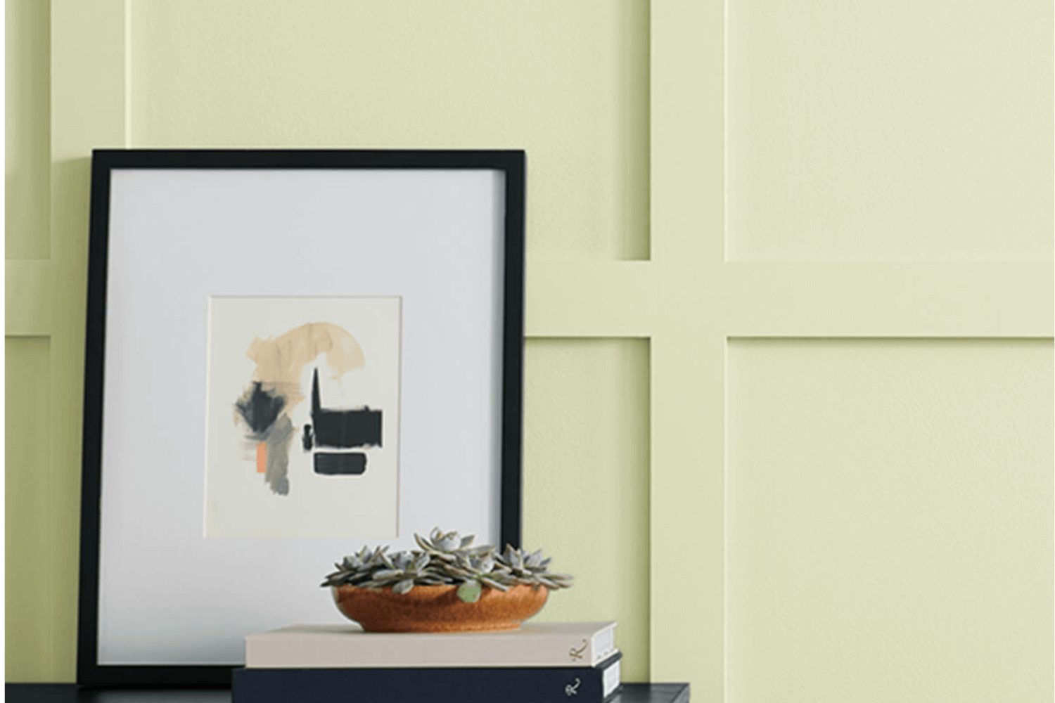
If you’re on the hunt for a paint color that can brighten up your room with a touch of natural freshness, SW 6428 Honeydew by Sherwin Williams might just be what you need. Think of walking through a lush garden on a sunny day – that’s the essence Honeydew brings into your space. This color isn’t just a simple green; it has a unique softness to it, making your room feel cozy and inviting while still adding a burst of cheerful energy.
Imagine painting your walls with Honeydew and noticing how it complements natural light, giving your room an airy vibe. Whether you aim to refresh your living room, bedroom, or even your kitchen, this shade adapts beautifully, creating a soothing environment. It’s perfect for anyone looking to add a hint of nature’s tranquility to their interior without overwhelming the senses.
Choosing the right paint color can transform your space, and Honeydew offers a versatile option that works well with different themes and decorations. You can pair it with whites to keep things crisp and clean or with dark hues for a striking contrast. Let Honeydew inspire you to create a space that feels like your personal retreat, full of calm and positivity.
by Sherwin Williams
What Color Is Honeydew SW 6428 by Sherwin Williams?
Honeydew SW 6428 by Sherwin Williams is a refreshing, light green color that brings a touch of nature’s tranquility indoors. With its faintly sweet undertone, it mimics the inside of a ripe honeydew melon, offering a serene and rejuvenating ambiance. This versatile shade can infuse spaces with a sense of brightness and airiness, making rooms feel more spacious and welcoming.
The softness of Honeydew makes it a fantastic choice for various interior styles, particularly those that benefit from a calm and peaceful atmosphere. It shines in Scandinavian designs, where minimalism and comfort are key, and also complements modern farmhouse aesthetics with its subtle nod to rustic charm. Bohemian interiors, with their eclectic mix of colors and textures, can use Honeydew as a soothing backdrop, letting bolder elements stand out.
When it comes to pairing materials and textures with Honeydew, natural elements work beautifully. Think light woods like bamboo or birch for furniture and flooring, which will maintain the airy feel of the space. Linen and cotton textiles in soft whites or creams can add to the cozy yet sophisticated vibe. For a bit of contrast, incorporate matte black or dark gray metals as accents—these can ground the space without overpowering the gentle nature of Honeydew. Together, these elements create a harmonious and inviting environment that feels both fresh and timeless.
housekeepingbay.com
Table of Contents
Is Honeydew SW 6428 by Sherwin Williams Warm or Cool color?
Sherwin Williams’ HoneydewSW 6428 is a refreshing and light color that brings a sense of calm and relaxation into any space. Imagine the softness of early morning light filtering through the leaves, that’s the vibe Honeydew offers. It’s a subtle green with a hint of a yellow undertone, making it a versatile choice for homes. This color works wonders in areas that need a touch of brightness without overwhelming the senses. Whether you’re painting a whole room or just an accent wall, Honeydew adds a breath of fresh air.
In rooms with limited natural light, Honeydew can make the space feel more open and airy. Its lightness bounces whatever light is available around the room, making everything feel a bit more alive. In well-lit rooms, it adds a layer of tranquility, creating a serene backdrop that complements natural wood tones and a wide range of decor styles. Because it’s such a soft, neutral tone, it pairs nicely with both bold and muted colors, allowing for flexibility in decorating. HoneydewSW 6428 is excellent for creating a peaceful and inviting home environment, perfect for spaces aimed at relaxation and comfort.
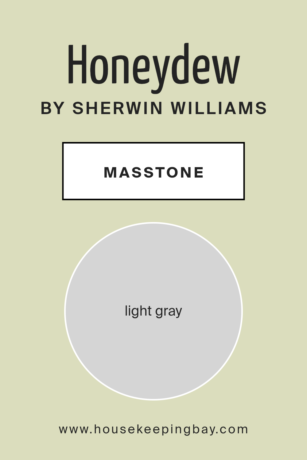
What is the Masstone of the Honeydew SW 6428 by Sherwin Williams?
HoneydewSW 6428 by Sherwin Williams has a masstone often described as Light Gray, with a color code of #D5D5D5. This tone has a soft, gentle feel that brings a calm and relaxing atmosphere to any room. Because of its light gray shade, it’s incredibly versatile and can blend easily with different styles and colors in homes. It’s a kind of color that makes spaces look brighter and bigger, which is a big plus for small rooms or areas lacking in natural light.
This color works well in pretty much any room – from living rooms and kitchens to bedrooms and bathrooms. Its neutrality means you can add colorful decorations and furniture without the worry of clashing colors. For those who prefer a minimalist style, HoneydewSW 6428 provides a clean and subtle background that matches well with white trims, adding a touch of sophistication. Overall, it’s a friendly and adaptable color that suits various decorating tastes, making spaces feel more open, airy, and welcoming.
housekeepingbay.com
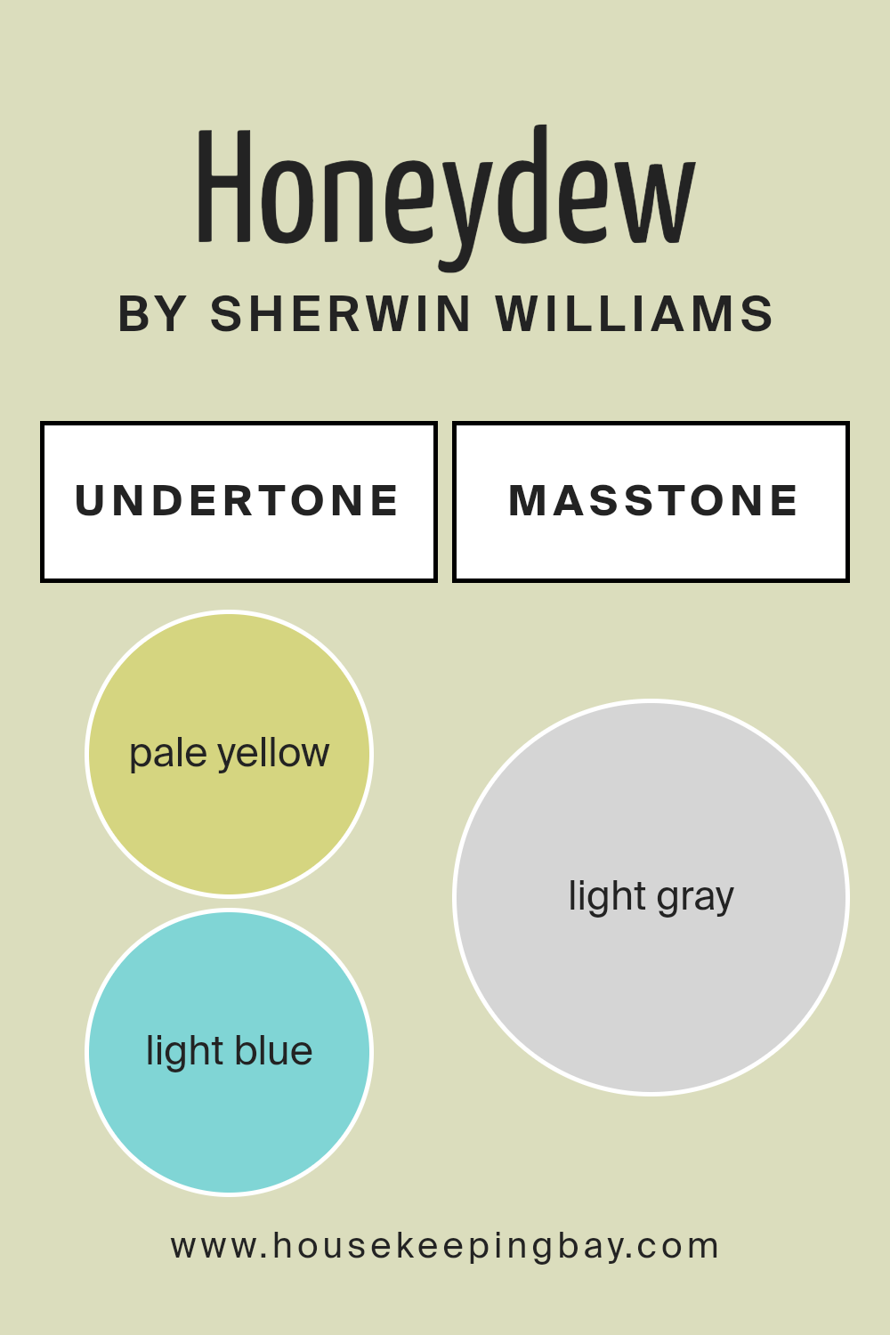
Undertones of Honeydew SW 6428 by Sherwin Williams
Honeydew SW 6428 by Sherwin Williams is a refreshing color that brings a sense of calm and lightness to any room. This color has a unique mix of undertones, including pale yellow, light blue, light purple, mint, pale pink, lilac, and grey. These undertones are subtle hues mixed into the main color, which can affect how we see the color under different lighting and surroundings.
Undertones play a big role in how a color appears. They can either warm up or cool down a color, depending on the mixture of hues. For example, pale yellow and mint bring a warmth to Honeydew, making it feel cozy and inviting. On the other hand, light blue, light purple, and lilac add a cool touch, offering a relaxed and peaceful vibe. Grey and pale pink sit in the middle, providing a neutral balance that makes Honeydew versatile and easy to pair with various decor styles.
When applied to interior walls, Honeydew’s mixture of undertones allows it to adapt to different lighting conditions and times of the day. In natural daylight, the warmer undertones might become more pronounced, giving the room a sunnier and cheerful atmosphere. Meanwhile, in artificial lighting, the cooler undertones might stand out, creating a serene and tranquil space.
Overall, Honeydew SW 6428 is a multi-dimensional color that can transform a room into a welcoming and comfortable space. Its complex undertones ensure it can suit a wide range of interior styles and preferences, making it a popular choice for those looking to freshen up their walls.
housekeepingbay.com
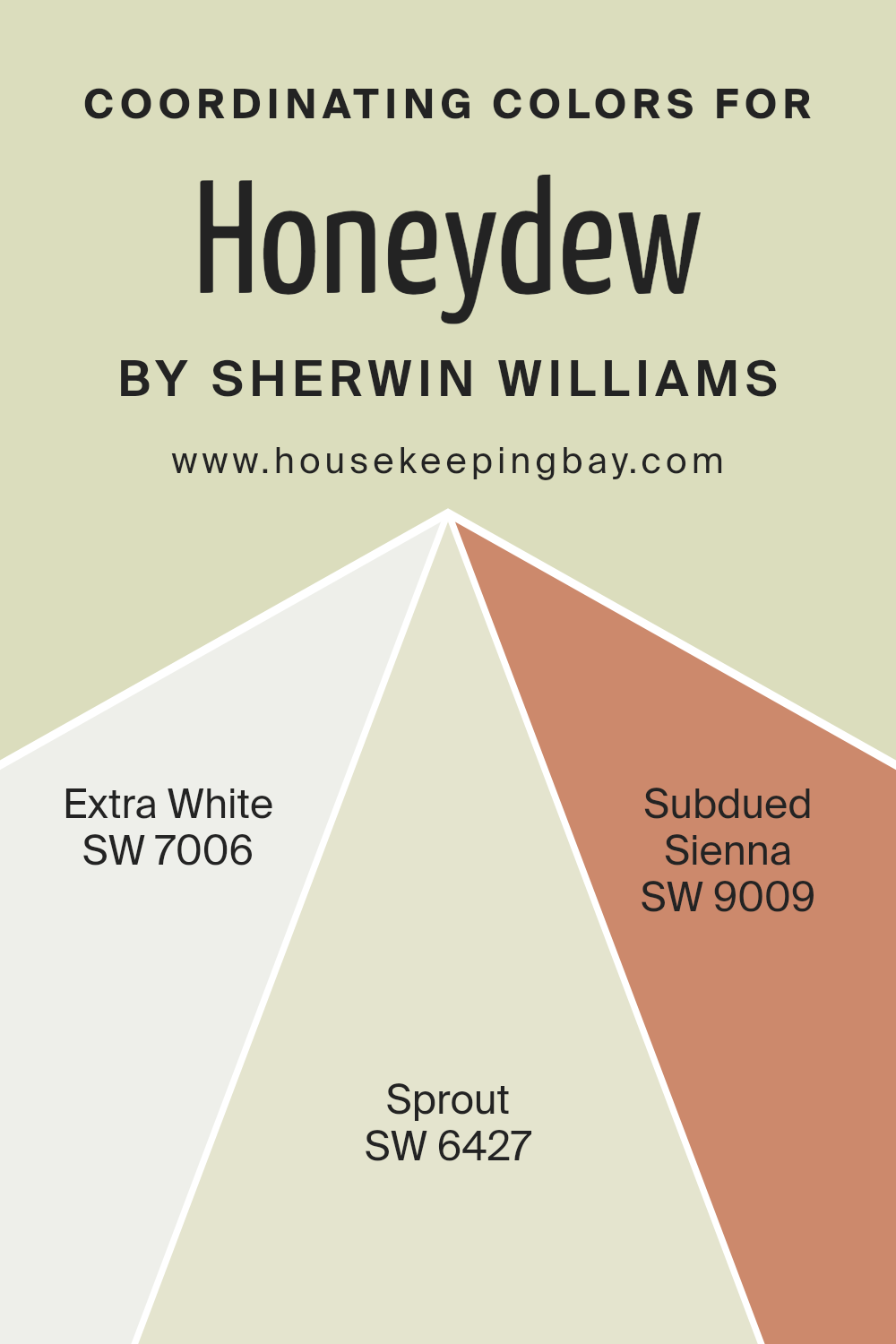
Coordinating Colors of Honeydew SW 6428 by Sherwin Williams
Coordinating colors are those that harmoniously blend with a main color to enhance the overall aesthetic of a space. They are chosen to either complement, contrast, or enhance the primary color, ensuring a cohesive and balanced design. When working with Honeydew SW 6428 by Sherwin Williams, a light and airy green, selecting the right coordinating colors can transform a room into a soothing sanctuary or a vibrant space, depending on the desired effect.
SW 7006 – Extra White offers a crisp and clean contrast to Honeydew’s softness, making any room feel fresh and spacious. It acts as an excellent backdrop, allowing Honeydew to stand out more prominently. SW 6427 – Sprout is a slightly deeper green that enriches the palette, introducing a subtle layer of depth and contrast to Honeydew, making it ideal for creating a nature-inspired theme. SW 9009 – Subdued Sienna brings a warm, earthy tone to the mix, adding a dimension of coziness and warmth that complements Honeydew’s coolness perfectly.
Together, these colors work in harmony to create a visually appealing and balanced space, whether aiming for a calm retreat or a lively gathering spot.
You can see recommended paint colors below:
- SW 7006 Extra White
- SW 6427 Sprout
- SW 9009 Subdued Sienna
housekeepingbay.com
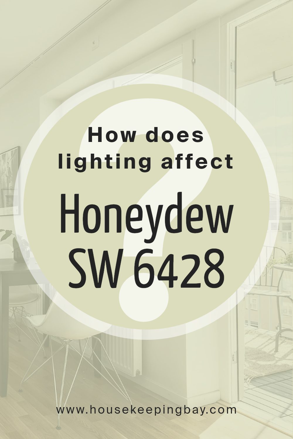
How Does Lighting Affect Honeydew SW 6428 by Sherwin Williams?
Lighting plays a crucial role in how we perceive colors. It can make a color look completely different depending on whether the light is natural or artificial. A perfect example to explore this phenomenon is with the color HoneydewSW 6428 by Sherwin Williams.
- In natural light, HoneydewSW 6428 radiates warmth and freshness. Under the bright sun, this color becomes vibrant and lively, adding a subtle cheerfulness to the space. In a room with plenty of sunlight, it can feel airy and soothing.
- However, under artificial light, the color shifts. With warm artificial lighting, HoneydewSW 6428 can maintain its vibrancy but might lean towards a slightly warmer hue, feeling cozy and inviting. In cooler, artificial lighting, the color might appear a bit more subdued, losing some of its warmth but still providing a calm and clean look.
- The direction of the room also significantly affects how HoneydewSW 6428 is perceived. North-faced rooms get less direct sunlight, which can make the color appear more muted and cooler, perfect for creating a tranquil and serene space. In south-faced rooms, where the light is warmer and more abundant, HoneydewSW 6428 shines brightly, enhancing its warm undertones and making the room feel more vibrant and energetic.
- East-faced rooms see the most change with HoneydewSW 6428, as they are drenched in warm morning light, making the color look very lively and warm. As the day progresses, the intensity of the color can diminish but still retains a gentle warmth. On the other hand, west-facing rooms capture the late afternoon light, which can cast a golden glow on HoneydewSW 6428, bringing out a soft, welcoming atmosphere towards the end of the day.
Overall, the transformative power of lighting on colors like HoneydewSW 6428 showcases the importance of considering light sources when styling spaces. Whether under the sun’s rays or lit by lamps, this color adapts, creating various moods and aesthetics in every room.
housekeepingbay.com
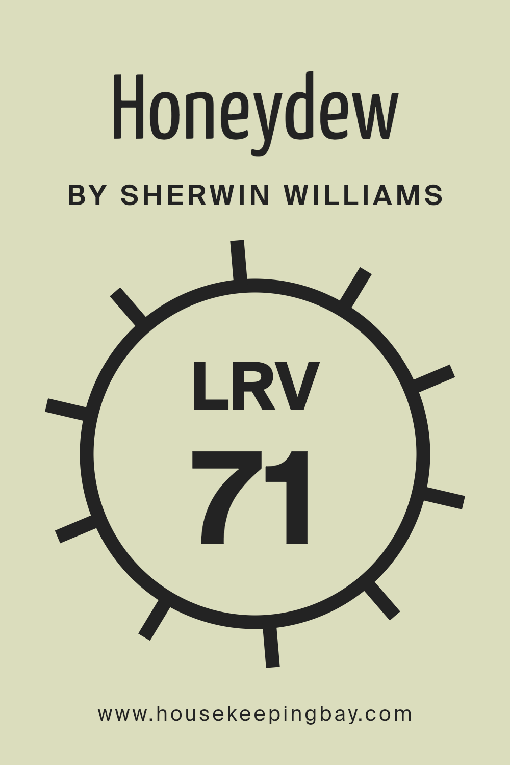
What is the LRV of Honeydew SW 6428 by Sherwin Williams?
LRV stands for Light Reflectance Value, which is a measure of how much light a color reflects or absorbs. Think of LRV as a scale from 0 to 100, where 0 is pure black, absorbing all light, and 100 is pure white, reflecting all light back. This value is crucial when picking paint colors for your room because it affects how light or dark a color will look on your walls. A high LRV means the color reflects a lot of light, making spaces feel bigger and brighter, while a low LRV means the color absorbs more light, creating a cozier or more intimate space.
For the color Honeydew SW 6428 by Sherwin Williams, which has an LRV of 70.697, it’s on the higher end of the scale. This means it’s a relatively light color that will reflect a good amount of light back into the room. In spaces with a lot of natural light, Honeydew will appear even lighter and more vibrant, enhancing the airy feel of the room. In rooms with less natural light, this high LRV can help brighten the space, making it feel more open and inviting. This particular shade of green can add a fresh and lively look to walls without overpowering the room, thanks to its high LRV.
housekeepingbay.com
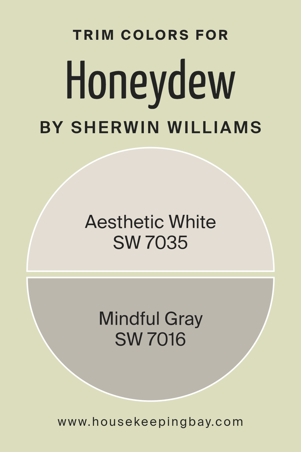
What are the Trim colors of Honeydew SW 6428 by Sherwin Williams?
Trim colors are specialized hues selected to highlight or complement the main color used on walls or exteriors, such as the vibrant Honeydew SW 6428 by Sherwin Williams. These colors can dramatically affect the appearance and feel of a space. They create a visual framework that can either subtly blend with or strikingly contrast against the primary color. When chosen wisely, trim colors enhance architectural details, define lines more crisibly, and can even influence the perceived size and brightness of a room. This makes selecting the right trim color an important step in any painting project to ensure harmonious and appealing outcomes.
For a lively color like Honeydew SW 6428, using SW 7035 Aesthetic White as a trim color offers a soft, bright contrast that can make the walls appear more vibrant without overwhelming the senses. Aesthetic White is a warm shade of white with a hint of beige, making it versatile enough to add a subtle elegance and a sense of spaciousness to the area. On the other hand, SW 7016 Mindful Gray serves as a neutral yet sophisticated choice that grounds the room’s color scheme.
This shade of gray projects a sense of balance and tranquility, providing a smooth transition that can bridge the gap between modern and classic design elements. Together, either Aesthetic White or Mindful Gray can complement Honeydew SW 6428 beautifully, highlighting the hue’s energy while ensuring the space remains inviting and cohesive.
You can see recommended paint colors below:
housekeepingbay.com
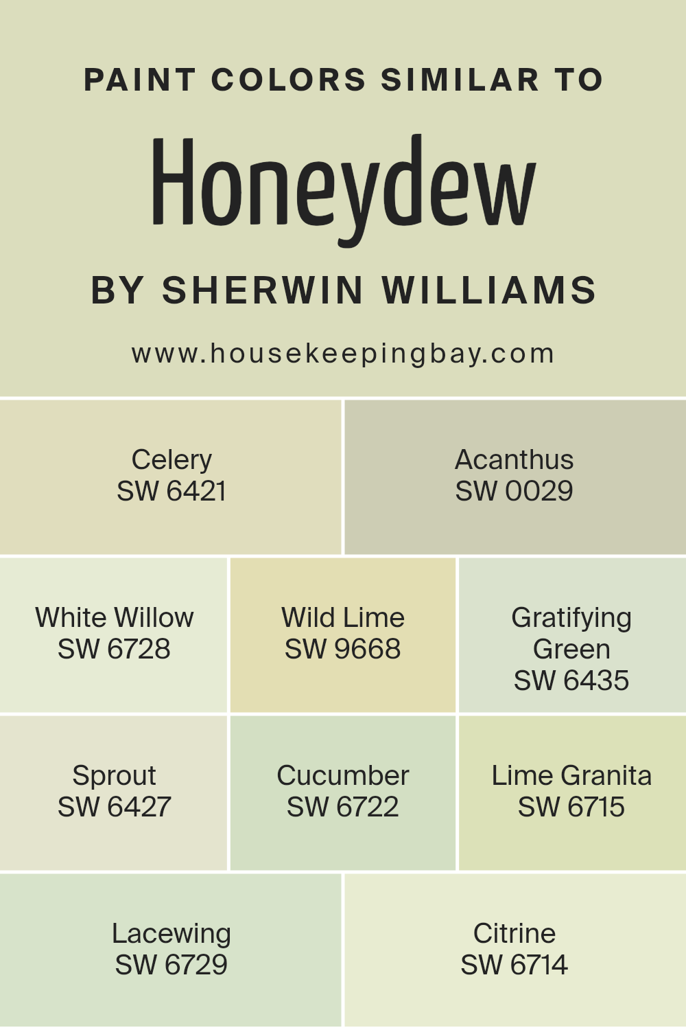
Colors Similar to Honeydew SW 6428 by Sherwin Williams
Selecting similar colors is crucial in designing a space because they create a cohesive and harmonious look. Colors like Honeydew SW 6428 by Sherwin Williams and its similar shades bring a fresh and serene vibe to any area, making it look more inviting and comfortable. These colors belong to a family that easily blends with each other, allowing for a subtle yet impactful transition in spaces that aim for a natural and soft ambiance.
The beauty of using such related colors lies in their ability to complement each as well as the flexibility they offer in design, making them perfect for creating a layered look without overwhelming the senses.
- Starting with Celery SW 6421, it’s a gentle green that gives off a calm and refreshing feel. Acanthus SW 0029, on the other hand, is a deeper hue that adds an earthy touch.
- White Willow SW 6728 introduces a light, airy green, evoking a sense of openness and tranquility. Wild Lime SW 9668 is vibrant, injecting energy and vitality into spaces.
- Gratifying Green SW 6435 is a balanced, soothing green that strikes a perfect middle ground. Sprout SW 6427 has a youthful and lively essence, perfect for adding a dash of cheer.
- Cucumber SW 6722 offers a cool and crisp presence, reminiscent of a serene summer’s day.
- Lime Granita SW 6715 is bright and bold, bringing a dynamic flair. Lacewing SW 6729 whispers with its soft and delicate appeal, ideal for creating a peaceful retreat.
- Lastly, Citrine SW 6714 showcases a warm, sunny glow, enveloping a room in coziness. Together, these colors weave a tapestry of nature-inspired hues that can transform any room into a tranquil haven.
You can see recommended paint colors below:
- SW 6421 Celery
- SW 0029 Acanthus
- SW 6728 White Willow
- SW 9668 Wild Lime
- SW 6435 Gratifying Green
- SW 6427 Sprout
- SW 6722 Cucumber
- SW 6715 Lime Granita
- SW 6729 Lacewing
- SW 6714 Citrine
housekeepingbay.com
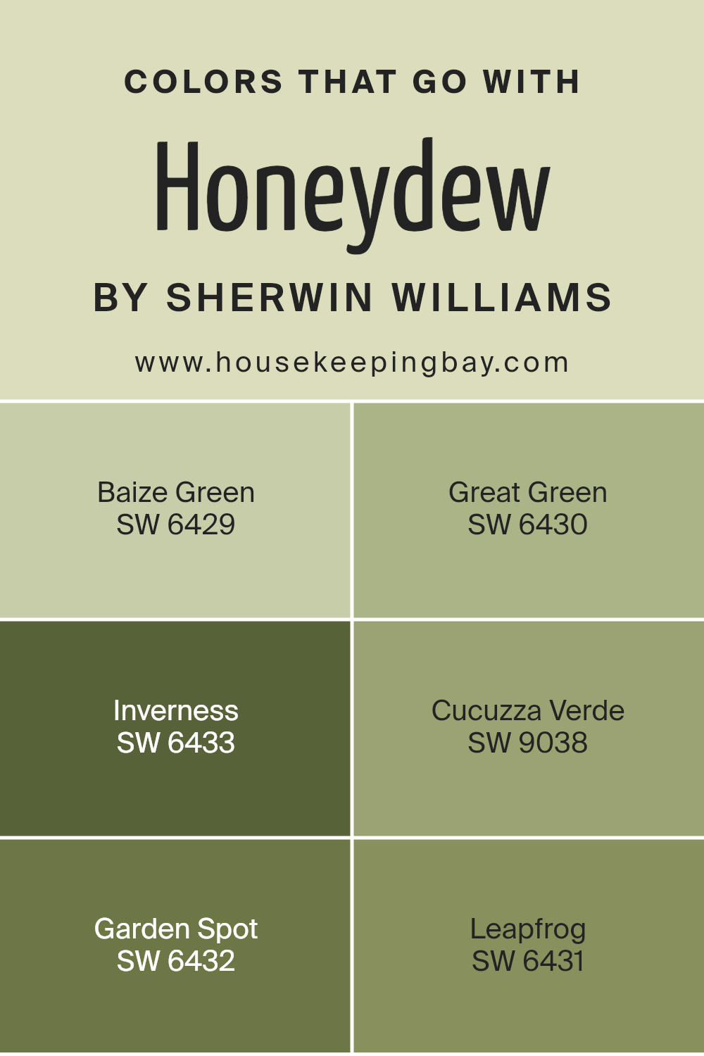
Colors that Go With Honeydew SW 6428 by Sherwin Williams
Choosing the right colors to pair with Honeydew SW 6428 by Sherwin Williams is crucial for creating a cohesive and appealing space. Honeydew is a subtle, refreshing green that can either be the backdrop or the accent in a room. When paired with compatible colors, such as Baize Green, Great Green, Inverness, Cucuzza Verde, Garden Spot, and Leapfrog, it brings out the best in the spaces it adorns. These colors are specifically chosen to work harmoniously with Honeydew, ensuring a balanced and visually pleasing environment.
Baize Green is like the darker shadow of a forest, giving depth and contrast to the lighter, airy feel of Honeydew. Great Green follows, offering a more vibrant, leafy hue that energizes spaces without overwhelming them. Inverness adds a sophisticated, smoky twist, introducing a sense of mystery and elegance to the palette. Meanwhile, Cucuzza Verde has a unique, slightly exotic appeal, leaning towards a more adventurous design choice that stands out yet complements Honeydew. Garden Spot injects a lively, fresh burst of color, reminiscent of spring greenery in full bloom, while Leapfrog brings a playful, cheerful energy, rounding off the palette with its lively spirit. Together, these colors create a versatile and dynamic scheme that enhances the beauty of Honeydew, making it easy to achieve a professional-looking and cohesive interior design.
You can see recommended paint colors below:
- SW 6429 Baize Green
- SW 6430 Great Green
- SW 6433 Inverness
- SW 9038 Cucuzza Verde
- SW 6432 Garden Spot
- SW 6431 Leapfrog
housekeepingbay.com
How to Use Honeydew SW 6428 by Sherwin Williams In Your Home?
Honeydew SW 6428 by Sherwin Williams is a lovely, fresh shade of green that brings a light and airy feel to any space. Think of the softness of early spring or the quiet charm of a well-kept garden. This color is perfect for people looking to add a subtle touch of nature’s tranquility to their home. You can use Honeydew in various ways.
For starters, it’s excellent for painting walls in areas like your living room, bedroom, or bathroom if you want to create a relaxed atmosphere. Because of its soothing tone, it works well in spaces meant for rest or where you wish to unwind. Besides walls, consider painting furniture or cabinets for a refreshing change. It also pairs beautifully with light woods, whites, and even bolder colors if you’re feeling adventurous. Adding accessories or decor in Honeydew can freshen up a room without the need for a total makeover. So, if you’re looking for a way to breathe some new life into your space, Honeydew SW 6428 might just be the perfect choice.
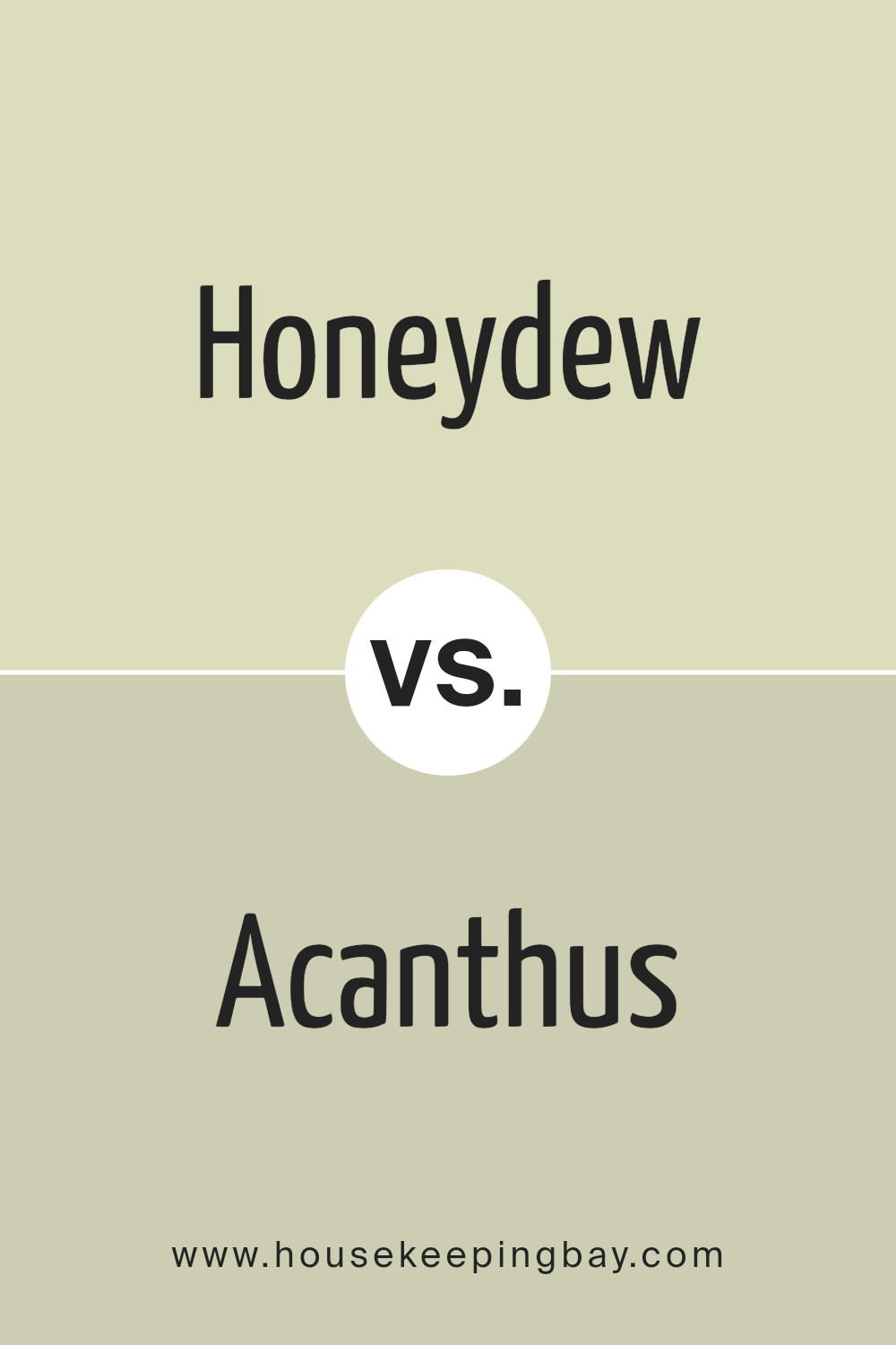
Honeydew SW 6428 by Sherwin Williams vs Acanthus SW 0029 by Sherwin Williams
Honeydew SW 6428 by Sherwin Williams is a soft, refreshing shade that brings to mind the lightness and purity of early spring mornings. It’s a subtle green with a hint of brightness, making spaces feel open and airy. It works wonders in creating a calm and soothing atmosphere, ideal for rooms where relaxation is key.
On the other hand, Acanthus SW 0029 by Sherwin Williams steps into the arena with a more pronounced character. It’s a richer, deeper green, drawing inspiration from the lush leaves of the Acanthus plant. This color adds a touch of elegance and sophistication to any space. Its more intense hue makes it perfect for accent walls or spaces that aim to make a statement.
While both colors share a green base, Honeydew is much lighter and tends to introduce a breezy, fresh vibe. Acanthus, with its depth, offers a bold, dramatic feel. Whether you’re looking to brighten up a room or inject some stately charm, these colors offer distinctive vibes that cater to different tastes and design goals.
You can see recommended paint color below:
- SW 0029 Acanthus
housekeepingbay.com
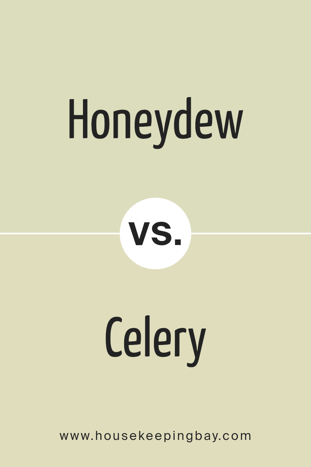
Honeydew SW 6428 by Sherwin Williams vs Celery SW 6421 by Sherwin Williams
Honeydew SW 6428 by Sherwin Williams is a soft, light green color with a refreshing vibe. It’s almost like looking at a very pale, juicy melon. This color brings a gentle and airy feeling to any room, making spaces feel more open and relaxed. It’s great for rooms where you want to chill and feel like you’re taking a breath of fresh air.
On the other hand, Celery SW 6421, also by Sherwin Williams, is a bit darker and has more yellow in it than Honeydew. Imagine the light green of celery sticks; that’s pretty close. Celery gives a room a sunny and warm atmosphere, making it feel cozy and inviting. It’s not too bright, but it definitely adds a cheerful pop of color.
While both colors are in the green family, Honeydew is cooler and lighter, making spaces feel calm and spacious. Celery, with its warmer tones, creates a sense of comfort and joy. Choosing between them depends on the mood you want to set: Honeydew for a breezy, light feel, and Celery for a touch of warmth and energy.
You can see recommended paint color below:
- SW 6421 Celery
housekeepingbay.com
Honeydew SW 6428 by Sherwin Williams vs Cucumber SW 6722 by Sherwin Williams
When comparing Honeydew SW 6428 and Cucumber SW 6722 from Sherwin Williams, think about the feeling of a fresh, bright morning. Honeydew is like the soft, gentle light of dawn. It has a light, almost pastel green that brings a sense of calm and freshness to a space. It’s subtle, not overpowering, making it perfect for creating a serene and inviting home environment.
On the other hand, Cucumber SW 6722 is the more vibrant cousin. Imagine the lush green of garden leaves in summer – that’s Cucumber for you. It’s a bolder, more energetic green that can add a pop of life to any room. Where Honeydew whispers, Cucumber speaks out loud, making it ideal for spaces that could use a lively touch.
Both colors offer a slice of nature but in different tones. Honeydew is about understated elegance, while Cucumber brings an energetic vibe. Depending on what you’re going for – a peaceful retreat or a vibrant space – either color has its unique charm to transform your home.
You can see recommended paint color below:
- SW 6722 Cucumber
housekeepingbay.com
Honeydew SW 6428 by Sherwin Williams vs Lacewing SW 6729 by Sherwin Williams
Honeydew SW 6428 and Lacewing SW 6719, both by Sherwin Williams, are unique colors with distinct vibes. Honeydew presents a soft, muted green with a touch of brightness, creating a fresh and airy ambiance. It’s like the calm, gentle hint of green you see in early spring, offering a sense of renewal and tranquility. This color is great for spaces where you want to encourage relaxation and calmness.
On the other hand, Lacewing steps into the room with a bit more personality. It’s a vibrant, lively green that leans towards being energetic without being overpowering. Lacewing can make a room feel lively and bright, perfect for areas where you want a touch of nature’s vitality. It captures the essence of greenery in full bloom, bringing an invigorating energy to any space.
Comparing the two, Honeydew is more subdued and universally appealing, making it versatile for any room. Lacewing, however, brings a spark of energy, ideal for creating focal points or accent areas. Both colors work beautifully in their own right depending on the atmosphere you’re aiming to achieve in your space.
You can see recommended paint color below:
- SW 6729 Lacewing
housekeepingbay.com
Honeydew SW 6428 by Sherwin Williams vs White Willow SW 6728 by Sherwin Williams
Honeydew SW 6428 by Sherwin Williams is a light, refreshing green with a subtle hint of brightness, offering a calm and soothing vibe to any space. It has a gentle touch of warmth that makes it feel inviting and cozy, perfect for creating a serene atmosphere in rooms where you want to relax or rejuvenate. On the other hand, White Willow SW 6728 is a lively, greenish-white that leans more towards a vibrant, fresh look. It’s lighter and brings a more energetic feel compared to Honeydew. While Honeydew wraps a room in a soft, comforting glow, White Willow illuminates spaces with a crisp, airy brightness, making it ideal for areas that could use a little lift or cheerfulness. Both colors are great for adding a touch of nature indoors but in different ways. Honeydew works wonders in creating a snug, warm ambiance, and White Willow is perfect when you want to brighten up a room and give it a more dynamic feel.
You can see recommended paint color below:
- SW 6728 White Willow
housekeepingbay.com
Honeydew SW 6428 by Sherwin Williams vs Citrine SW 6714 by Sherwin Williams
Honeydew SW 6428 by Sherwin Williams is a light, fresh green that looks like the soft skin of a ripe honeydew melon. It has a subtle, calming vibe that can make any room feel more open and airy. On the other hand, Citrine SW 3096 is a bolder color that brings to mind the bright, zesty yellow of a citrine gem or a lemon. It’s energetic and can really brighten up a space or add a pop of vibrant color.
While Honeydew has a gentle, soothing quality that’s great for creating a peaceful and relaxing atmosphere, Citrine is all about cheerfulness and making spaces feel lively and inviting. If you’re looking to make a room feel cozy and serene, Honeydew is a fantastic choice. However, if you want to inject some fun and brightness, then Citrine is the way to go. Both colors are beautiful in their own right but serve very different purposes depending on the mood you want to achieve.
You can see recommended paint color below:
- SW 6714 Citrine
housekeepingbay.com
Honeydew SW 6428 by Sherwin Williams vs Gratifying Green SW 6435 by Sherwin Williams
The color Honeydew SW 6428 by Sherwin Williams is a light, soft green with a fresh feel to it. It’s the kind of color that brings a subtle hint of nature indoors without overwhelming a space. Think of the light green you might see in a slice of honeydew melon – that’s the vibe it gives off.
On the other hand, Gratifying Green SW 6435 is a bit deeper and richer. It’s still very much a green color, but it has more body to it compared to Honeydew. Gratifying Green offers a more pronounced look that could make a statement in a room. It’s like the color of lush leaves in a summer garden.
Both colors are green, but they serve different moods and settings. Honeydew is softer and more understated, perfect for creating a light and airy feel. Gratifying Green is more vibrant, great for adding a pop of nature-inspired color. Depending on what feel you want for your space, you can choose the calm and gentle Honeydew or the bolder and fuller Gratifying Green.
You can see recommended paint color below:
- SW 6435 Gratifying Green
housekeepingbay.com
Honeydew SW 6428 by Sherwin Williams vs Lime Granita SW 6715 by Sherwin Williams
Honeydew SW 6428 by Sherwin Williams is a light and fresh color, much like the inside of a honeydew melon. It’s soft and soothing, making it perfect for creating a calm and relaxed space in your home. This color brings a sense of brightness without overwhelming the eyes, making it ideal for any room looking to add a touch of freshness without going too bold.
On the other hand, Lime Granita SW 6715 by Sherwin Williams is a vibrant and lively color. It’s much more energetic than Honeydew, drawing inspiration from the zesty and tangy flavors of lime. This color is bold and makes a statement, perfect for spaces that aim to stimulate the senses and add a pop of fun. It’s the kind of color that can breathe life into a dull room or be used as an accent to add a dynamic contrast.
While both colors come from nature-inspired palettes, Honeydew offers a tranquil vibe, and Lime Granita brings energy and excitement. Therefore, your choice between them would depend on the mood and atmosphere you wish to create in your space.
You can see recommended paint color below:
- SW 6715 Lime Granita
housekeepingbay.com
Honeydew SW 6428 by Sherwin Williams vs Sprout SW 6427 by Sherwin Williams
Honeydew SW 6428 and Sprout SW 6427, both by Sherwin Williams, are close cousins in the color world, offering subtle yet distinct vibes for any space. Honeydew is the lighter of the two, presenting a soft, soothing tone that feels airy and refreshing. It leans towards a pale, gently green tint, reminding one of a light, misty morning in spring. This color adds a touch of brightness without overwhelming, making it perfect for creating a relaxed and inviting atmosphere.
On the other hand, Sprout steps in with a slightly deeper and earthier feel. It carries a bit more green, grounding it closer to natural elements like young leaves or the first shoots of grass in early spring. While still in the realm of soft and gentle, Sprout offers a hint more vibrancy, bringing a cozy, warm essence to the room.
Both colors work beautifully together, with Honeydew offering a breezy lift to Sprout’s grounded richness. Whether used side by side or individually, they can transform a space into a haven of peace and natural beauty.
You can see recommended paint color below:
- SW 6427 Sprout
housekeepingbay.com
Honeydew SW 6428 by Sherwin Williams vs Wild Lime SW 9668 by Sherwin Williams
Honeydew SW 6428 by Sherwin Williams is a soft, cool shade of green that brings a hint of freshness and calmness to any space. It mimics the light, pale green of the inner flesh of a honeydew melon, creating a subtle and soothing atmosphere. This color is perfect for making a room feel more open and airy, evoking a sense of tranquility.
On the other hand, Wild Lime SW 9668 by Sherwin Williams is a vibrant, energetic green. It’s bolder and more intense than Honeydew, reminiscent of the lively hues of lime zest. This color adds a pop of brightness and is great for infusing spaces with a playful and lively vibe. It stands out more dramatically compared to the understated elegance of Honeydew.
When comparing the two, Honeydew is more about creating a serene and peaceful environment, while Wild Lime is all about adding energy and vivacity. Depending on the mood you want to set, Honeydew is ideal for a calming retreat, whereas Wild Lime is perfect for spaces that aim to invigorate and inspire.
You can see recommended paint color below:
- SW 9668 Wild Lime
housekeepingbay.com
Conclusion
In conclusion, SW 6428 Honeydew by Sherwin Williams is a vibrant, refreshing choice for anyone looking to bring a splash of energy into their home. Its bright, cheerful shade has the power to instantly lift the mood of any room, making it perfect for spaces where you spend a lot of your day. Imagine walking into a kitchen or living room bathed in Honeydew’s lively glow; it’s like bringing a piece of sunshine indoors.
You’ll find that Honeydew isn’t just about aesthetics; it’s also about creating a positive, uplifting environment. Whether you’re planning to give your entire home a makeover or just want to add some zest to a specific area, this color promises to deliver an invigorating atmosphere. It pairs wonderfully with a wide range of decor styles, from modern minimalism to cozy country, ensuring that you can easily integrate it into your existing home design.
Remember, choosing a paint color is not just about following trends; it’s about expressing your personality and creating a space that feels right to you. Honeydew offers a unique blend of warmth and brightness, making it an excellent choice for bringing life and character to your home. So, if you’re ready for a change, consider giving your space a refreshing update with SW 6428 Honeydew. It’s a simple step that can have a big impact on how your home looks and feels.
housekeepingbay.com
Ever wished paint sampling was as easy as sticking a sticker? Guess what? Now it is! Discover Samplize's unique Peel & Stick samples. Get started now and say goodbye to the old messy way!
Get paint samples


