Greenfield SW 6439 by Sherwin Williams
A New Look at the Beauty of Green
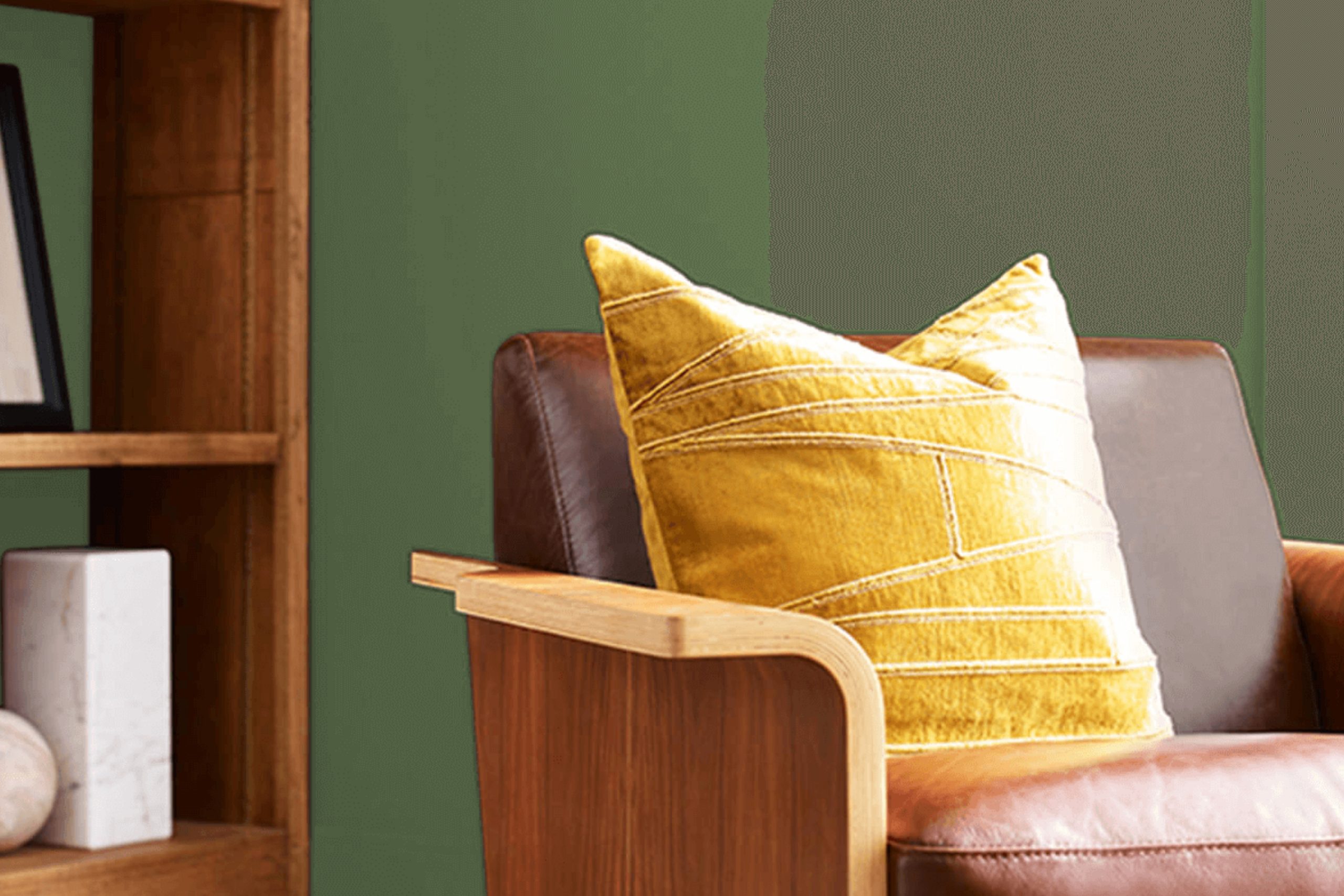
This color pairs beautifully with both light and dark furnishings, offering numerous decorating possibilities whether you’re updating a bedroom, kitchen, or living room.
Not only does it create a welcoming atmosphere, but it also works wonderfully as an accent wall or a main color theme throughout your home.
Let’s examine how Greenfield can revitalize your living space and complement your style.
via sherwin-williams.com
What Color Is Greenfield SW 6439 by Sherwin Williams?
Table of Contents
GreenfieldSW 6439 by Sherwin Williams is a rich, vibrant shade of green that exudes a sense of freshness and the lushness of nature. This deep yet lively color brings a dynamic element to any space, making it ideal for creating focal points or adding a bold splash of color in a room.
This particular green works well in traditional settings where it can be paired with wood elements, particularly in darker tones like mahogany or walnut, which complement its depth and intensity.
In modern and contemporary interiors, Greenfield can add a lively contrast when used with materials like polished concrete, metal accents, or glass, creating a sleek yet warming atmosphere. Textiles like velvet or silk in coordinating shades can also enhance this color’s luxurious feel, particularly in cushions, curtains, or upholstery.
For those inclined towards the rustic or farmhouse styles, Greenfield pairs beautifully with natural textures such as linen, burlap, and unfinished wood, further emphasizing its connection to the outdoors.
This color possesses a versatile quality that can also adapt well to eclectic and bohemian decors. Pairing it with bright, patterned fabrics or various mixed textures can create an engaging and cozy environment. Whether used in a residential or commercial space, GreenfieldSW 6439 delivers an impressive palette that can significantly impact the atmosphere and mood of its surroundings.
housekeepingbay.com
Is Greenfield SW 6439 by Sherwin Williams Warm or Cool color?
GreenfieldSW 6439 by Sherwin Williams is a vibrant green hue that breathes life into any space it adorns. This color pairs well with both modern and rustic decor, making it versatile for various home styles. Its lively nature brings a fresh dynamic to rooms that need a touch of energy, ideal for kitchens or living spaces where families gather.
The brightness of GreenfieldSW 6439 also helps small spaces appear larger and more open, as the color reflects light well. It’s particularly effective in rooms that receive ample natural light, enhancing the airy feel of the space.
Additionally, this shade of green can harmonize with natural elements like wood and stone, helping to create a seamless connection between indoors and the natural world outside.
For bedrooms, using GreenfieldSW 6439 on a feature wall can introduce a calm yet cheerful element, creating a pleasant ambiance for relaxation.
Pairing it with neutral tones like whites, beiges, or soft grays can balance its vibrancy, ensuring the color stands out as a focal point without overwhelming the room.
What is the Masstone of the Greenfield SW 6439 by Sherwin Williams?
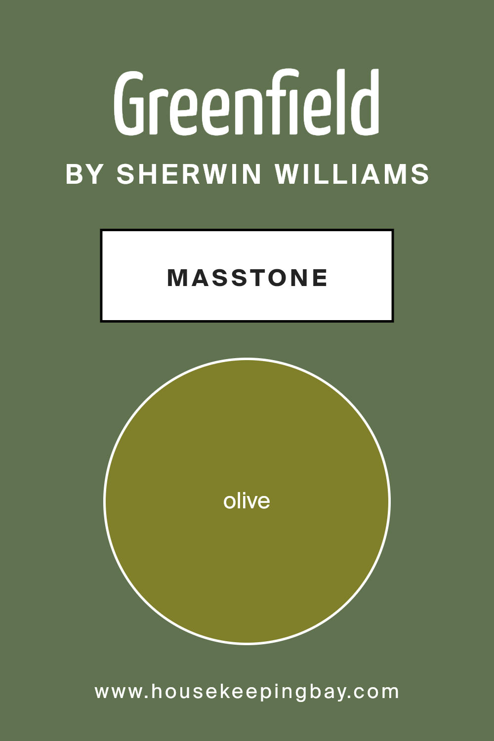
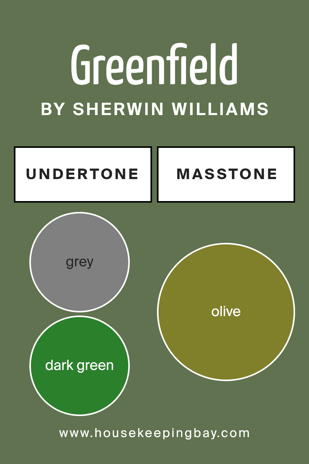
GreenfieldSW 6439 by Sherwin Williams features a masstone known as Olive (#80802B). This unique shade of green brings a rich earthiness into any home. It is a deep, muted color that recalls nature and has a warm, welcoming feel. When used in home decor, it provides a sense of calm and comfort.
Olive works well in many spaces, from kitchens to bedrooms, as it pairs beautifully with both natural materials like wood and stone, and more modern textures such as metal and glass. It’s particularly effective in rooms that get a lot of light, where the brightness reveals the depth and complexity of the color.
Additionally, Olive’s versatility allows it to complement a wide range of other colors, from neutral tones like beige and gray to vibrant hues like burgundy and navy.
This makes GreenfieldSW 6439 a popular choice for those looking to add a refined yet cozy atmosphere to their living spaces. It offers a sophisticated backdrop that can both inspire creativity and promote relaxation.
housekeepingbay.com
Undertones of Greenfield SW 6439 by Sherwin Williams
Greenfield SW 6439 by Sherwin Williams is a versatile color that can subtly shift its appearance depending on its surrounding colors and lighting conditions due to its complex undertones. The primary undertones of Greenfield include grey, dark green, and dark turquoise, which give the color a soothing and natural feel.
However, it also includes hints of more vibrant or deeper colors like brown, purple, and navy, adding depth and flexibility to its use.
Undertones are subtle colors that lie beneath the surface of the main color. They play a crucial role in how we perceive the main color in different settings.
For example, in a room with plenty of natural light, the lighter undertones like light green and mint might become more noticeable, making the walls feel fresh and lively.
In contrast, in a space with limited natural light, the darker undertones like dark grey and dark green might prevail, giving the room a richer and more grounded appearance.
Furthermore, the variety of undertones in Greenfield can help in coordinating with different decor elements. Furniture and decorations in colors like orange, red, or pink can draw out the warmer undertones, while elements in blues and purples can highlight the cooler tones in the paint.
When using Greenfield SW 6439 on interior walls, it’s important to consider these undertones as they significantly impact the overall ambiance of the room. This color can adapt well to many spaces, providing a background that complements various design styles and preferences.
The subtle shifts in its undertones make it a dynamic choice for creating sophisticated and harmonious interiors.
housekeepingbay.com
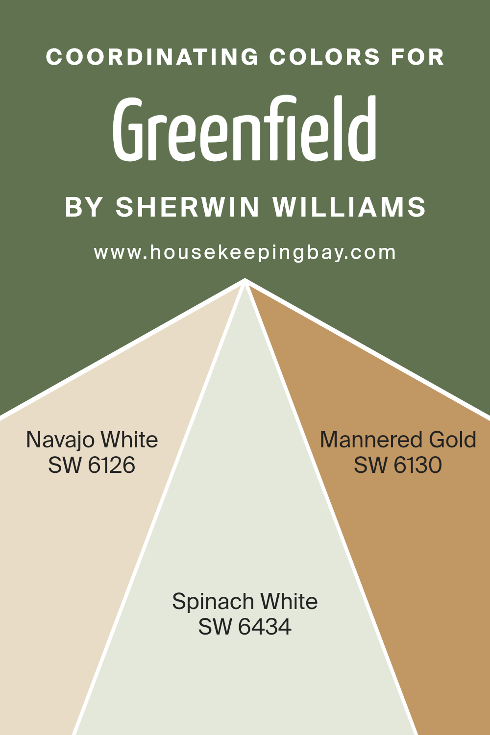
Coordinating Colors of Greenfield SW 6439 by Sherwin Williams
Coordinating colors are chosen to work well together in creating harmonious and pleasing color schemes in spaces. For instance, when using Greenfield SW 6439 by Sherwin-Williams, a bold shade, selecting complementary colors such as SW 6126 – Navajo White, SW 6434 – Spinach White, and SW 6130 – Mannered Gold can enhance the visual impact and balance of the room.
These coordinating colors support the primary color by either providing a striking contrast, a subtle backdrop, or harmonizing accents, which heighten the overall aesthetic coherence of the interior design.
Navajo White SW 6126 is a creamy, soft white that offers a gentle contrast to more vibrant hues, making it a perfect background color that allows other colors to pop while maintaining a warm, inviting tone. Spinach White SW 6434 is a light, earthy green with a subtle neutrality, ideal for bringing a touch of nature indoors without overwhelming with boldness.
Lastly, Mannered Gold SW 6130 is a rich golden hue that contributes a touch of elegance and warmth, serving as a wonderful complement to enhance the depth and richness of primary greens and creating a sophisticated palette when paired with neutral tones.
Together, these coordinating colors create a balanced and appealing color environment.
You can see recommended paint colors below:
- SW 6126 Navajo White
- SW 6434 Spinach White
- SW 6130 Mannered Gold
housekeepingbay.com
How Does Lighting Affect Greenfield SW 6439 by Sherwin Williams?
Lighting plays a crucial role in how we perceive colors in our surroundings. The type of light, whether natural or artificial, can dramatically change how a color looks. For example, Sherwin Williams’ color Greenfield SW 6439 can appear differently depending on the light it’s exposed to.
In artificial light, such as LED or fluorescent lighting, Greenfield SW 6439 may look more vibrant and intense. Artificial lights often enhance the green tones, making the color appear richer than in natural light. This is particularly beneficial in spaces where a sense of vitality and freshness is desired.
In natural light, the appearance of Greenfield SW 6439 can vary throughout the day. During mornings and evenings, when the sunlight has a golden hue, the color might look warmer and softer. Around midday, when the sunlight is brightest, the green can appear sharper and more vivid.
The orientation of a room also influences how Greenfield SW 6439 looks:
1. North-Faced Rooms: Rooms that face north often receive less direct sunlight, making them cooler in tone. Here, Greenfield SW 6439 might appear a bit darker and less saturated, giving a more muted feel.
2. South-Faced Rooms: South-facing rooms get ample sunlight, brightening and enlivening Greenfield SW 6439. The color will likely look lively and vibrant due to the plentiful natural light.
3. East-Faced Rooms: These rooms enjoy bright morning light, which can make Greenfield SW 6439 look fresh and cheerful in the mornings, fading to a softer tone in the afternoon as the light diminishes.
4. West-Faced Rooms: In west-facing rooms, the color will experience a transformation throughout the day. It will start off less noticeable in the morning and become more dynamic and intense in the warm, late afternoon light.
Overall, the effect of lighting on this particular shade of green can greatly influence the mood and ambiance of a space, making it crucial to consider when deciding to use this color in interior design.
housekeepingbay.com
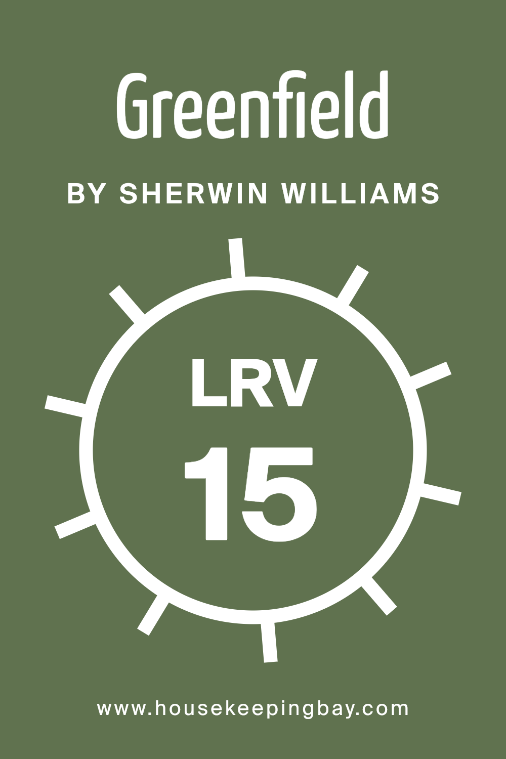
What is the LRV of Greenfield SW 6439 by Sherwin Williams?
LRV stands for Light Reflectance Value, which measures the percentage of light a paint color reflects back into a room. It ranges from 0% to 100%, where 0% means the color absorbs all light (like true black) and 100% reflects all light (like pure white).
Understanding LRV is essential for selecting paint colors as it directly influences how light or dark a color appears on your walls. Higher LRVs make a room feel brighter and open because they reflect more light. Conversely, lower LRV values create a cozier and more enclosed feeling, as they absorb more light.
The LRV of Sherwin Williams Greenfield (SW 6439) is 15.059, signaling it is a darker shade. This lower LRV means it will absorb more light than it reflects, which could make smaller spaces appear even smaller or less illuminated. When used in larger spaces or rooms with plenty of natural light, the depth of Greenfield can add warmth and character, enhancing the room’s aesthetic without making it feel confined.
When considering this color, proper lighting and room size will play critical roles in achieving the desired effect.
housekeepingbay.com
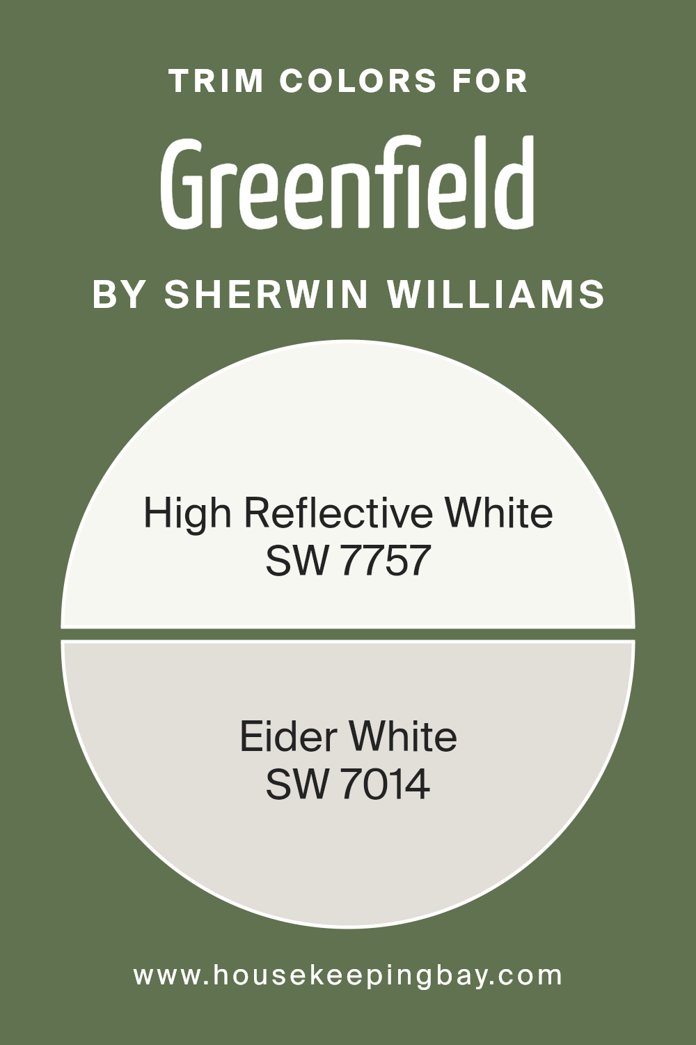
What are the Trim colors of Greenfield SW 6439 by Sherwin Williams?
Trim colors are the shades used on the architectural details such as door frames, window frames, skirting boards, and moldings. Choosing the right trim color can significantly enhance the overall appearance of a room or exterior by adding contrast or cohesion with the main wall color.
For Greenfield SW 6439 by Sherwin Williams, a deep, soothing green hue, trim colors like SW 7757 – High Reflective White and SW 7014 – Eider White are excellent choices. These lighter trim colors offer a fresh pop against the darker green, highlighting the architectural features of the space without overpowering the primary color.
High Reflective White, SW 7757, is a very bright and clean white. This color is ideal for creating a sharp contrast, making it perfect for use with darker tones like Greenfield SW 6439, as it provides a crisp outline to the features it adorns. On the other hand, Eider White, SW 7014, is a softer, warmer white with subtle gray undertones.
This color is particularly beneficial for softening transitions between colors, offering a gentler contrast with Greenfield, and can help achieve a more seamless look in rooms that demand a subtle yet refined aesthetic.
You can see recommended paint colors below:
housekeepingbay.com
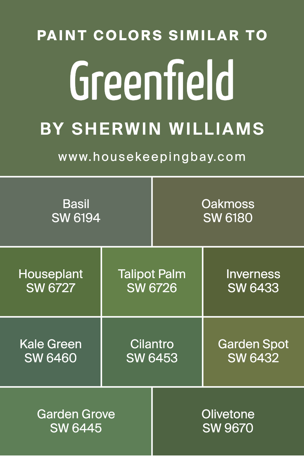
Colors Similar to Greenfield SW 6439 by Sherwin Williams
Similar colors harmonize to create soothing and cohesive aesthetics in design. When decorating a space, using shades like those similar to Greenfield SW 6439 by Sherwin Williams helps achieve a balanced and unified look. Colors such as SW 6194 – Basil and SW 6180 – Oakmoss offer subtle variations that can layer a room with depth without overwhelming with contrast.
Shades like SW 6727 – Houseplant and SW 6726 – Talipot Palm integrate natural green tones that are calming and earthy, blending effortlessly with various decor elements. Meanwhile, SW 6433 – Inverness and SW 6460 – Kale Green introduce cooler and richer hues, perfect for accentuating focal points or adding a refined backdrop.
Continuing the theme, SW 6453 – Cilantro and SW 6432 – Garden Spot inject vibrancy with their fresh, lively tones, ideal for spaces that benefit from a touch of brightness. SW 6445 – Garden Grove and SW 9670 – Olivetone lean towards more muted, olive shades, providing an elegant, understated feel that is versatile for both traditional and modern settings.
These similar colors work together to grant flexibility in design while maintaining a seamless flow throughout the space, ensuring all elements are in visual harmony.
You can see recommended paint colors below:
- SW 6194 Basil
- SW 6180 Oakmoss
- SW 6727 Houseplant
- SW 6726 Talipot Palm
- SW 6433 Inverness
- SW 6460 Kale Green
- SW 6453 Cilantro
- SW 6432 Garden Spot
- SW 6445 Garden Grove
- SW 9670 Olivetone
housekeepingbay.com
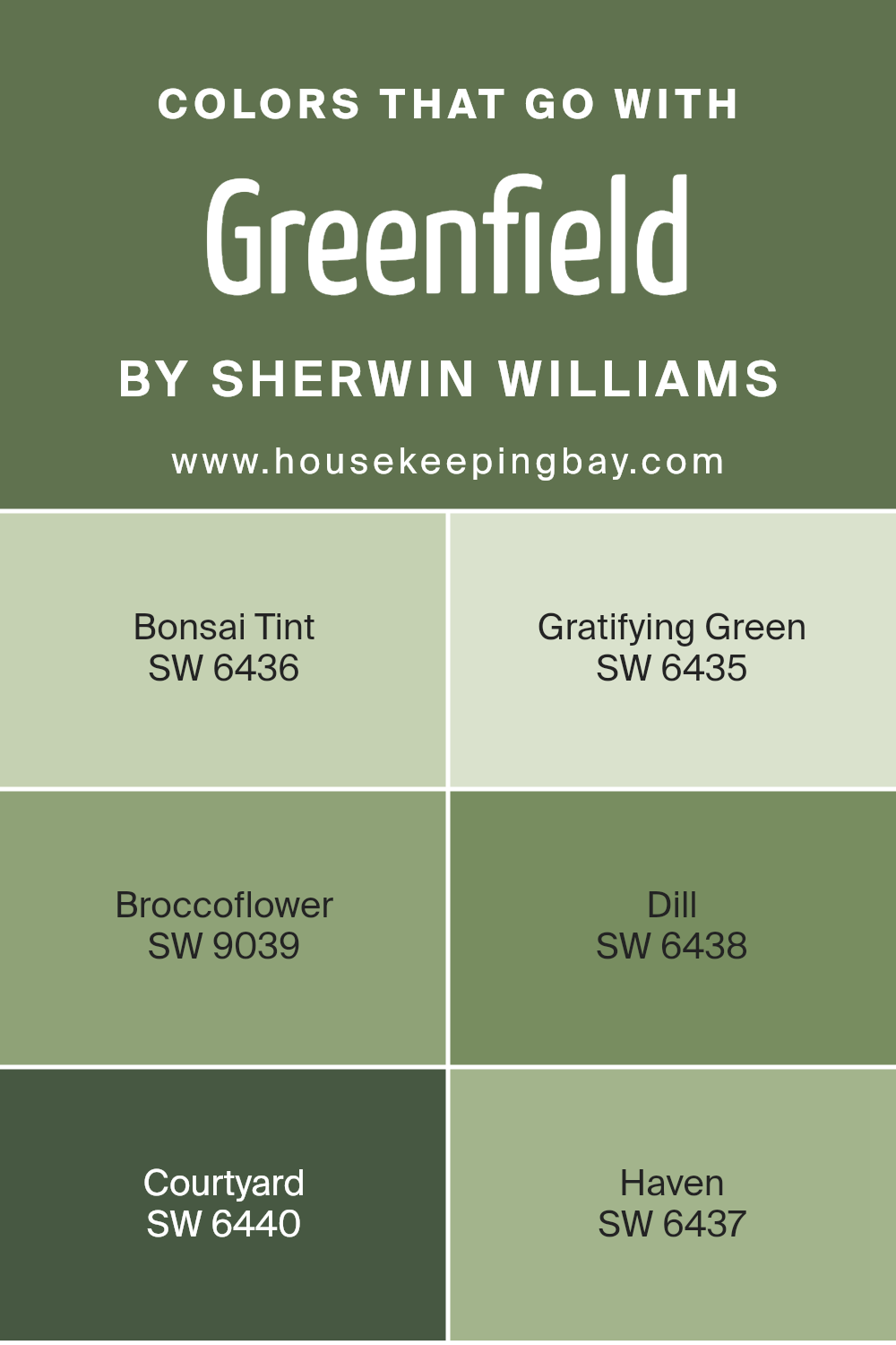
Colors that Go With Greenfield SW 6439 by Sherwin Williams
Choosing the right colors to complement Greenfield SW 6439 by Sherwin Williams is vital as it ensures the space feels cohesive and aesthetically pleasing. Matching colors can enhance the mood of a room and highlight architectural details, making Greenfield—which is a rich, deep green—stand out.
For example, pairing it with colors like Bonsai Tint SW 6436 or Gratifying Green SW 6435 can bring a harmonious and balanced feel to your space. Bonsai Tint is a much lighter green that provides a gentle contrast, while Gratifying Green is a strong, earthy color that enriches the darker tones in Greenfield.
Additionally, colors such as Broccoflower SW 9039, Dill SW 6438, Courtyard SW 6440, and Haven SW 6437 create a full palette that can effectively manage the ambiance of a room. Broccoflower is a muted, almost grayish-green which pairs especially well with Greenfield for a subtle and sophisticated look.
Dill, which comes across as a vibrant, herbal green, injects vibrancy into a space, offering a refreshing pop against the Greenfield backdrop.
Courtyard, a darker and more shadowed green, provides depth and drama, while Haven, a soft, serene green, adds a gentle touch of calm to the lively Greenfield. Together, these color combinations furnish multiple options to enhance your space thoughtfully and beautifully.
You can see recommended paint colors below:
- SW 6436 Bonsai Tint
- SW 6435 Gratifying Green
- SW 9039 Broccoflower
- SW 6438 Dill
- SW 6440 Courtyard
- SW 6437 Haven
housekeepingbay.com
How to Use Greenfield SW 6439 by Sherwin Williams In Your Home?
Greenfield SW 6439 by Sherwin Williams is a rich, deep green paint color with earthy tones that can add a sophisticated and warm feel to any room in your home. This versatile shade works well in both traditional and modern spaces. In a living room or dining area, Greenfield can create a cozy, welcoming atmosphere.
It pairs beautifully with natural wood, adding a rustic charm to furniture or floors. In a bedroom, using Greenfield on a feature wall can make the space feel secure and cocoon-like, which is perfect for relaxing. It’s also ideal in a study or home office, where the color can encourage concentration and calmness.
For those who enjoy a harmonious outdoor-to-indoor transition, Greenfield matches well with plants and botanical themes. Kitchen cabinets painted in this color can update the look without overwhelming the space. Coordinating with light or creamy colors, such as beige or soft yellows, can keep the area bright and inviting.
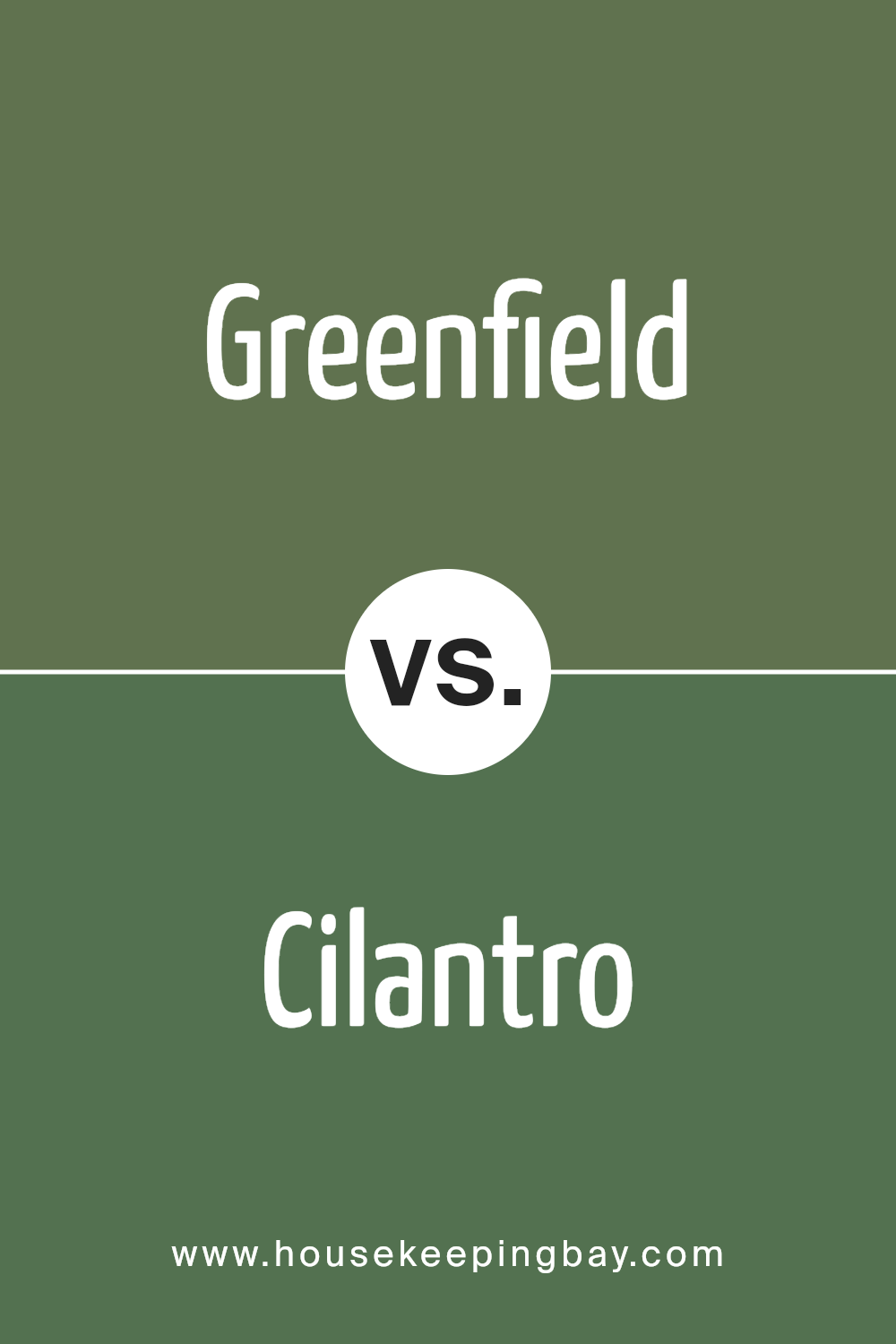
Greenfield SW 6439 by Sherwin Williams vs Cilantro SW 6453 by Sherwin Williams
Greenfield SW 6439 by Sherwin Williams is a deep, rich forest green that brings a sense of grounded elegance to any space. This shade can work well in both traditional and modern decor, providing a strong backdrop that complements natural wood tones and enhancing cozy, dark corners by adding depth.
In contrast, Cilantro SW 6453 is a vibrant, lighter green with a more energizing and fresh feel. It suits spaces that aim for a brighter, more refreshing vibe. This color can invigorate a room, making it feel lively and welcoming. Its vividness works well in areas that benefit from a splash of brightness such as kitchens and bathrooms.
Thus, while Greenfield leans towards a more somber and sophisticated ambiance, Cilantro offers a punchy and fresh look. Both colors, depending on use, can effectively enhance the character and mood of a room, serving distinct visual purposes within a home.
You can see recommended paint color below:
- SW 6453 Cilantro
housekeepingbay.com
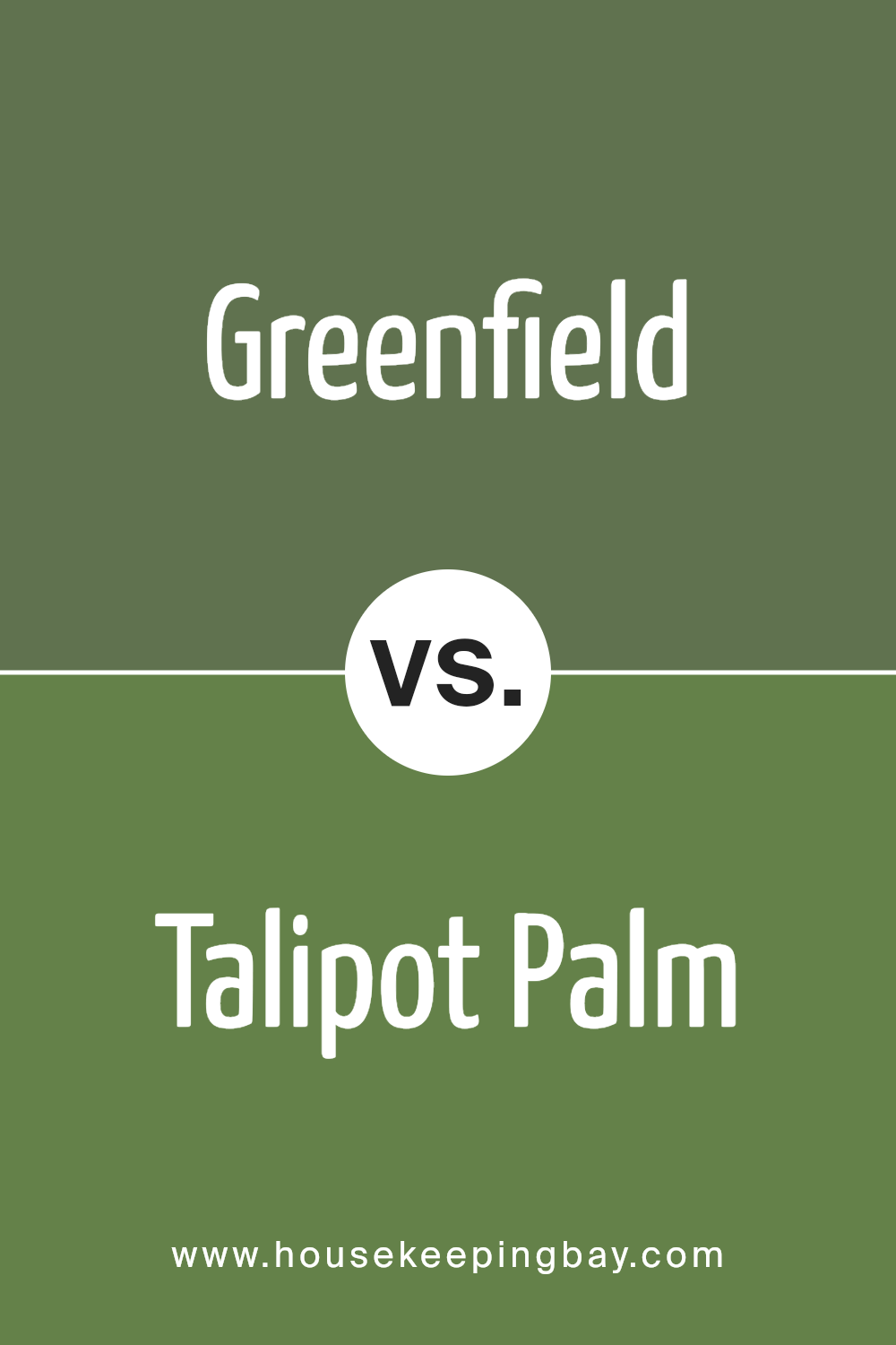
Greenfield SW 6439 by Sherwin Williams vs Talipot Palm SW 6726 by Sherwin Williams
Greenfield SW 6439 by Sherwin Williams is a deep, muted green with earthy undertones, offering a cozy and calming feel. It’s ideal in spaces where a touch of nature is desired without overwhelming brightness. This color works well in living rooms or bedrooms where you might want a relaxed, soothing atmosphere.
Talipot Palm SW 6726, by contrast, is a vibrant, more intense green shade. It’s reminiscent of lush foliage and brings an energetic feel to any room. This color is perfect for adding a bold statement to accent walls or to invigorate a space like a kitchen or a study, where such liveliness might be energizing.
While both shades are in the green family, Greenfield leans towards a more subdued and neutral palette, suitable for broader application across various rooms and design styles. Talipot Palm, more dynamic and bright, suits specific tastes or design goals aiming for a punch of color.
You can see recommended paint color below:
housekeepingbay.com
Greenfield SW 6439 by Sherwin Williams vs Oakmoss SW 6180 by Sherwin Williams
Greenfield SW 6439 and Oakmoss SW 6180, both by Sherwin Williams, offer unique shades of green that cater to different tastes and design needs. Greenfield is a vibrant, grassy green that brings a fresh and lively feel to spaces. Its brightness is ideal for creating an energetic atmosphere, particularly suitable for lively areas in a home or office.
In contrast, Oakmoss SW 6180 leans towards a darker, more muted green with hints of gray. This color provides a more subtle and sophisticated vibe, making it perfect for relaxed and serene environments like bedrooms or studies. Oakmoss’s earthy tones also pair well with natural materials, contributing to a grounded and cozy aesthetic.
In summary, Greenfield works well in spaces where you want to inject vibrancy and life, while Oakmoss is better suited for areas where a calm and grounding effect is desired.
You can see recommended paint color below:
housekeepingbay.com
Greenfield SW 6439 by Sherwin Williams vs Garden Spot SW 6432 by Sherwin Williams
Greenfield SW 6439 by Sherwin Williams is a deep, herbaceous green that resembles a dense forest. This rich color brings a sense of nature and serenity into any space, making it ideal for rooms where you wish to create a calming and grounded atmosphere. It pairs well with natural elements and wood finishes, bringing an outdoor feel indoors.
In contrast, Garden Spot SW 6432 is a brighter, more vibrant shade of green. This color is lively and energetic, perfect for spaces where you want to add a splash of cheerfulness. It works well in areas that benefit from a boost of brightness like kitchens or playrooms. Its vividness energizes the surroundings, differing from Greenfield’s more subdued and natural tone.
Both colors reflect love for nature but serve different moods and settings: Greenfield establishing a more tranquil, sheltered feel, while Garden Spot introduces a more dynamic and cheerful vibe.
You can see recommended paint color below:
- SW 6432 Garden Spot
housekeepingbay.com
Greenfield SW 6439 by Sherwin Williams vs Inverness SW 6433 by Sherwin Williams
Greenfield SW 6439 by Sherwin Williams and Inverness SW 6433 by Sherwin Williams are two distinct shades from the same color family. Greenfield is a deeper, more saturated hue, similar to a forest green. It has a richness that makes it ideal for creating a cozy and grounding atmosphere in a space. This color works well in areas where you want to foster a sense of comfort and stability.
In contrast, Inverness is a lighter, softer green with hints of gray. It has a more subtle, soothing feel, making it perfect for spaces intended to be calm and restful. This shade is great for bedrooms or bathrooms where a gentle and relaxing environment is desired.
Both colors offer a way to incorporate green into your decor, but the choice between them depends on the mood you aim to create. Greenfield, with its depth, brings warmth and enclosure, whereas Inverness offers a lighter, airier feel.
You can see recommended paint color below:
- SW 6433 Inverness
housekeepingbay.com
Greenfield SW 6439 by Sherwin Williams vs Olivetone SW 9670 by Sherwin Williams
Greenfield SW 6439 by Sherwin Williams is a deep, earthy green that carries a vibe of lush forests and natural landscapes. It has a rich and soothing quality, perfect for creating a cozy and grounded atmosphere in any room. This color pairs well with natural wood finishes and other earth tones, making it versatile for various design styles from rustic to modern.
Comparatively, Olivetone SW 9670 is a lighter, more muted green with a subtle gray undertone. It offers a softer look, ideal for creating a gentle and calming environment. Because of its subdued nature, Olivetone works well in spaces aiming for a more understated or minimalist aesthetic. It’s excellent for rooms that get a lot of sunlight, as the lighter shade can help keep the space feeling bright and airy.
Both colors bring their unique touches to a space, with Greenfield providing depth and richness, while Olivetone offers a quieter, more tranquil appeal.
You can see recommended paint color below:
- SW 9670 Olivetone
housekeepingbay.com
Greenfield SW 6439 by Sherwin Williams vs Kale Green SW 6460 by Sherwin Williams
Greenfield SW 6439 by Sherwin Williams is a vibrant, earthy green hue, perfect for creating a sense of freshness and vitality in any space. It has a lively feel that can invigorate a room’s atmosphere, making it ideal for areas where you want to add a burst of natural energy.
Kale Green SW 6460, contrasting with Greenfield, is a deeper, more subdued shade of green. This color has a rich, luxurious quality, leaning more towards a forest green, which can help in bringing a calming and grounding feel to interiors. It is well-suited for spaces where a more relaxed, serene environment is desired.
Both colors, while distinctly green, serve different purposes based on their intensity and depth. Greenfield SW 6439 injects more brightness and cheer, whereas Kale Green SW 6460 offers depth and sophistication. Each color can significantly enhance the mood and character of a room, depending on the desired effect.
You can see recommended paint color below:
- SW 6460 Kale Green
housekeepingbay.com
Greenfield SW 6439 by Sherwin Williams vs Basil SW 6194 by Sherwin Williams
Greenfield SW 6439 and Basil SW 6194, both by Sherwin Williams, offer distinct shades of green that can dramatically affect the ambiance of a room. Greenfield is a deep, rich green with a hint of blue undertones, making it a bold choice that can add a sense of elegance and sophistication to a space. It works well in areas where you want to make a strong visual impact, such as accent walls or statement pieces of furniture.
Basil SW 6194, however, is a lighter, softer green with more yellow undertones. This color feels fresher and more natural, reminiscent of garden foliage. It’s particularly suited for spaces where a calm and soothing atmosphere is desired, like bedrooms or bathrooms. Being lighter, Basil also helps to brighten a room and can make smaller spaces appear larger.
Both colors reflect different moods and styles, with Greenfield leaning towards a more dramatic and classic look, and Basil offering a refreshing and relaxing vibe.
You can see recommended paint color below:
housekeepingbay.com
Greenfield SW 6439 by Sherwin Williams vs Houseplant SW 6727 by Sherwin Williams
Greenfield SW 6439 by Sherwin Williams is a deep, rich green that gives off an earthy vibe, perfect for creating a cozy and welcoming atmosphere. It’s a versatile color that works well in many areas, such as living rooms or dining spaces, where you want to add a sense of warmth and comfort. This color pairs nicely with neutral tones and wood finishes, enhancing the natural aesthetics of a space.
Houseplant SW 6727, another choice from Sherwin Williams, is a brighter and more vibrant green. It tends to inject more energy into a space, making it ideal for areas such as kitchens or any spot where you want to promote freshness and vitality. Because of its lively hue, it pairs well with crisp whites and other light colors, which can help make a room feel more open and airy.
Both Greenfield and Houseplant offer distinct vibes; Greenfield is moodier and more subdued, while Houseplant is fresh and lively, each bringing their unique character to a space.
You can see recommended paint color below:
- SW 6727 Houseplant
housekeepingbay.com
Greenfield SW 6439 by Sherwin Williams vs Garden Grove SW 6445 by Sherwin Williams
Greenfield SW 6439 by Sherwin Williams is a vibrant, deep green, reminiscent of lush fields and dense forests. It provides a sense of nature’s freshness and vitality, making it a great choice for spaces where you want to add a lively yet soothing atmosphere. This color pairs well with natural wood tones and earthy materials.
In contrast, Garden Grove SW 6445 by Sherwin Williams is a lighter, more muted green. It has a softer vibe, suitable for creating a calm and relaxing environment. It’s ideal for rooms that aim to be serene retreats or peaceful areas in a home. This shade goes well with light fabrics and delicate decor elements.
Both colors promote a connection to nature but offer different levels of intensity and mood. While Greenfield injects more energy due to its deeper tone, Garden Grove invokes a gentle and peaceful ambiance. They can work beautifully in different areas depending on the feel you want to achieve.
You can see recommended paint color below:
- SW 6445 Garden Grove
housekeepingbay.com
Conclusion
Concluding my thoughts on Sherwin Williams’s SW 6439 Greenfield, I’m genuinely impressed by the versatility and depth this shade of green offers. Ideal for creating a serene atmosphere, it works incredibly well whether I want to paint an entire room or just add an accent wall.
What stands out is how Greenfield manages to strike a balance between being vibrant yet soothing, making it a top choice for anyone looking to refresh their space.
This paint color pairs nicely with neutral tones, wood finishes, and metallic accents, which means I have plenty of room to play around with different designs and decor styles. I’ve found it particularly effective in bedrooms and living spaces where a calm ambiance is key.
Using Greenfield might also prove beneficial not just for aesthetic appeal, but it can potentially increase the attractiveness of a home to prospective buyers, given its modern yet timeless feel.
All told, my experience with SW 6439 Greenfield by Sherwin Williams has been extremely positive, and I would recommend it to anyone looking to give their home a fresh but tranquil vibe without going too bold or overpowering.
housekeepingbay.com
Ever wished paint sampling was as easy as sticking a sticker? Guess what? Now it is! Discover Samplize's unique Peel & Stick samples. Get started now and say goodbye to the old messy way!
Get paint samples


