Gratifying Green SW 6435 by Sherwin Williams
Refresh Your Space with This Invigorating Hue
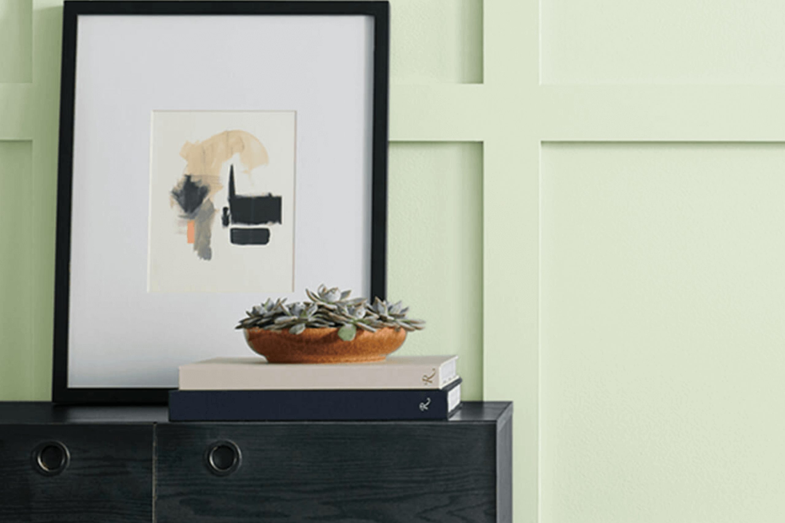
When you want to bring a touch of nature indoors, you can’t go wrong with Gratifying Green by Sherwin Williams. This color is part of a palette that radiates calm and serenity. Imagine the gentle whisper of leaves in a forest or the soothing shadows of a quiet garden. Gratifying Green creates this atmosphere effortlessly in any room.
Choosing this shade can make your space feel fresh and alive. Whether you’re planning to repaint your living room, kitchen, or bedroom, Gratifying Green provides a perfect balance of vibrancy and subtlety. It offers a sense of comfort without overpowering other elements in your decor.
Think about the way light plays on green foliage during a sunny afternoon walk. Gratifying Green captures that feeling, making your home feel like a warm embrace. It pairs well with neutrals and can be a striking backdrop for bolder accents.
Turn your home into a haven where you can unwind, relax, and feel at peace. Gratifying Green is more than a color; it’s a mood, an aura that can gently change the way you experience your surroundings.
Give it a try and watch how it transforms your space into a personal sanctuary.
via sherwin-williams.com
What Color Is Gratifying Green SW 6435 by Sherwin Williams
Table of Contents
Gratifying Green SW 6435 by Sherwin Williams is a calming and fresh shade of green. It brings a sense of the outdoors right into your living space. This color has a soft, muted tone that doesn’t overwhelm the senses, making it a versatile choice for many different styles. It sits comfortably between pastel and dark greens, offering a balanced feel.
In terms of interior styles, Gratifying Green works exceptionally well in spaces aiming for a natural, earthy vibe. It’s a great fit for modern farmhouse, rustic, or bohemian styles. In such settings, it adds a gentle pop of color while still offering a sense of calm.
Pairing Gratifying Green with other materials can enhance its beauty. It goes beautifully with natural woods, from light oak to deeper walnut, enhancing its earthy appeal. Adding textures like linen or cotton helps create a soft, inviting space.
This color also pairs nicely with matte black metal accents or soft gold fixtures, adding contrast and warmth without losing its serene touch.
On walls, it serves as a perfect backdrop for plants or artwork, while in furniture or accessories, it provides a subtle yet distinct color point that can unify a room’s design. It’s both fresh and comfortable, making it a reliable choice for various home settings.
housekeepingbay.com
Is Gratifying Green SW 6435 by Sherwin Williams Warm or Cool color?
Gratifying Green SW 6435 by Sherwin Williams brings a fresh and calming vibe to any home. This soft, muted green reflects nature’s peaceful aspects, helping create a soothing atmosphere. Its gentle tone makes rooms feel open and airy, while adding a hint of color without overpowering the space.
In living rooms, this color can provide a relaxing environment, perfect for unwinding after a busy day. It works well with natural materials like wood and stone, complementing rustic or modern styles alike.
In kitchens, it offers a crisp, clean backdrop that pairs beautifully with white cabinets or stainless steel appliances, adding a bit of warmth and character.
Bedrooms painted in Gratifying Green promote restful sleep. Its serene quality can make the room a perfect sanctuary.
This green also works well in home offices, promoting focus and creativity without causing distraction. Overall, Gratifying Green enhances homes by bringing a touch of nature inside.
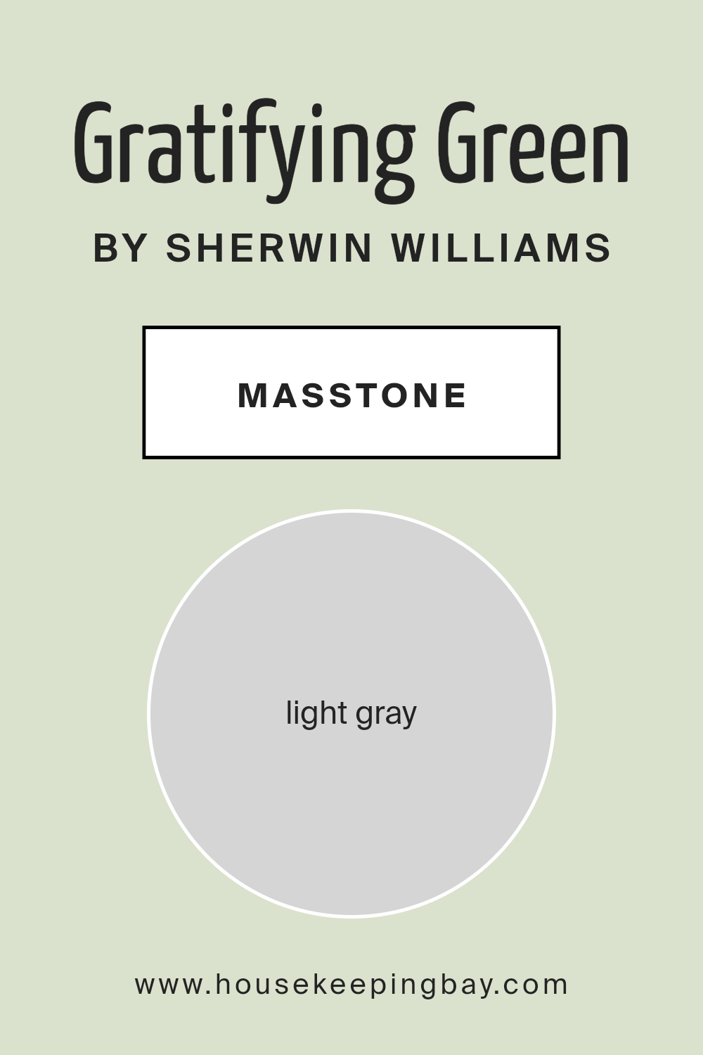
What is the Masstone of the Gratifying Green SW 6435 by Sherwin Williams?
Gratifying Green SW 6435 by Sherwin Williams is a gentle, light green with a soft gray undertone. This masstone of light gray (#D5D5D5) gives the color a calm and balanced feel, making it a versatile choice for many homes. It pairs beautifully with natural elements like wooden furniture and stone, bringing an earthy touch to any room.
In living spaces, this shade creates a peaceful atmosphere that’s perfect for unwinding. It works well in bedrooms, promoting rest and relaxation. Its understated elegance makes it easy to match with both warm and cool tones, allowing for flexibility in decor.
In kitchens, it complements stainless steel or white appliances, giving a clean and fresh look. The soft tone brightens up bathrooms, adding a sense of cleanliness and openness. This adaptable color suits various styles, from modern to traditional, making it a popular choice for interior designers and homeowners alike.
housekeepingbay.com
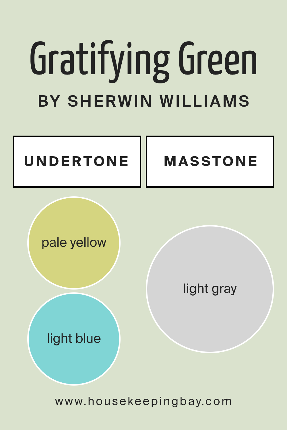
Undertones of Gratifying Green SW 6435 by Sherwin Williams
Gratifying Green SW 6435 by Sherwin Williams is more than just a green paint. Its unique undertones give it additional depth and character. When looking at a color like this, the undertones can subtly influence how we perceive it. These underlying hints can make a color feel warmer, cooler, softer, or bolder.
For Gratifying Green, the mixture of pale yellow, light blue, and mint brings freshness and a touch of nature into a room. This makes the green appear welcoming and friendly.
The light purple and lilac undertones add a hint of softness and sophistication. They can make the green appear more elegant, adding a subtle warmth. Pale pink adds a gentle coziness to the shade, making it versatile for different types of spaces.
Meanwhile, the touch of grey in the undertones introduces a neutral balance. This prevents the green from becoming overpowering, allowing it to blend easily with various decor styles. When applied on interior walls, Gratifying Green can make spaces feel calming yet stylish.
It pairs nicely with natural light, enhancing its lively yet calm demeanor, making rooms feel inviting without overwhelming them. This makes it suitable for living rooms, bedrooms, and any space seeking colorful flair mixed with serenity.
housekeepingbay.com
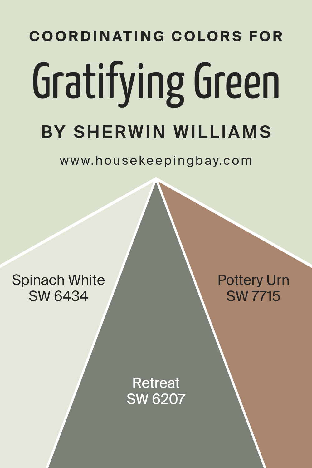
Coordinating Colors of Gratifying Green SW 6435 by Sherwin Williams
Coordinating colors are hues that complement each other, creating a balanced and visually appealing space. When used together, they bring a sense of harmony and flow to a room.
Gratifying Green SW 6435 is a vibrant and fresh shade that pairs well with colors like Spinach White, Retreat, and Pottery Urn from Sherwin Williams. Each of these colors adds its unique touch while ensuring a cohesive look.
Spinach White SW 6434 is a soft, creamy hue that offers warmth and subtlety when paired with the lively Gratifying Green.
It allows for a gentle backdrop, which can help the green stand out without overwhelming a space. Retreat SW 6207, on the other hand, offers a calming influence.
It is a muted and slightly deeper shade that brings depth and a sense of calm. Pottery Urn SW 7715 gives a warm, earthy tone that blends seamlessly, adding a touch of coziness and grounding the brighter colors in the palette.
Together, these colors create a well-rounded and inviting atmosphere, making any space feel cohesive and pleasant.
You can see recommended paint colors below:
- SW 6434 Spinach White
- SW 6207 Retreat
- SW 7715 Pottery Urn
housekeepingbay.com
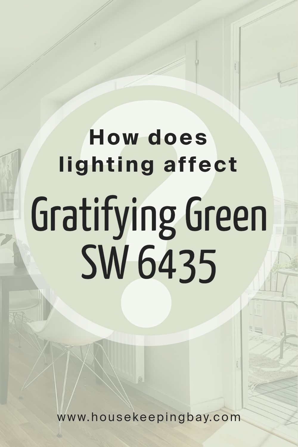
How Does Lighting Affect Gratifying Green SW 6435 by Sherwin Williams?
Lighting plays a crucial role in how we perceive colors. The amount and type of light can change how colors appear to our eyes. ‘Gratifying Green’ by Sherwin Williams is a soft, subdued green with a touch of warmth. Understanding how this color looks in various lighting situations can help you decide where to use it in your home.
In natural light, ‘Gratifying Green’ looks different depending on the room’s orientation. North-facing rooms typically have cooler, softer light. In these rooms, ‘Gratifying Green’ might appear a bit more muted, as the cool light can dull the warmth in the paint. It can take on a more grayish-green tone, which is calming but might feel less vibrant.
South-facing rooms receive warm light throughout the day, making ‘Gratifying Green’ appear richer and more lively. The natural warmth in the sunlight enhances the color, bringing out its warmth and giving the room a cozy, welcoming feel.
East-facing rooms get bright, crisp light in the morning, which can make ‘Gratifying Green’ look fresh and lively early in the day. As the day goes on and the light becomes less direct, the color might become softer and more relaxed.
West-facing rooms bask in warm, golden light in the afternoon and evening. In these rooms, ‘Gratifying Green’ will appear warm and inviting, with the evening light enhancing its subtle yellow undertones.
Under artificial lighting, the color also changes. Incandescent bulbs give off warm light, which can enhance the color’s warmth.
LED lights tend to be cooler, which might make ‘Gratifying Green’ appear slightly more subdued or neutral. Always test paint samples in your home to see how they look under different lighting throughout the day.
housekeepingbay.com
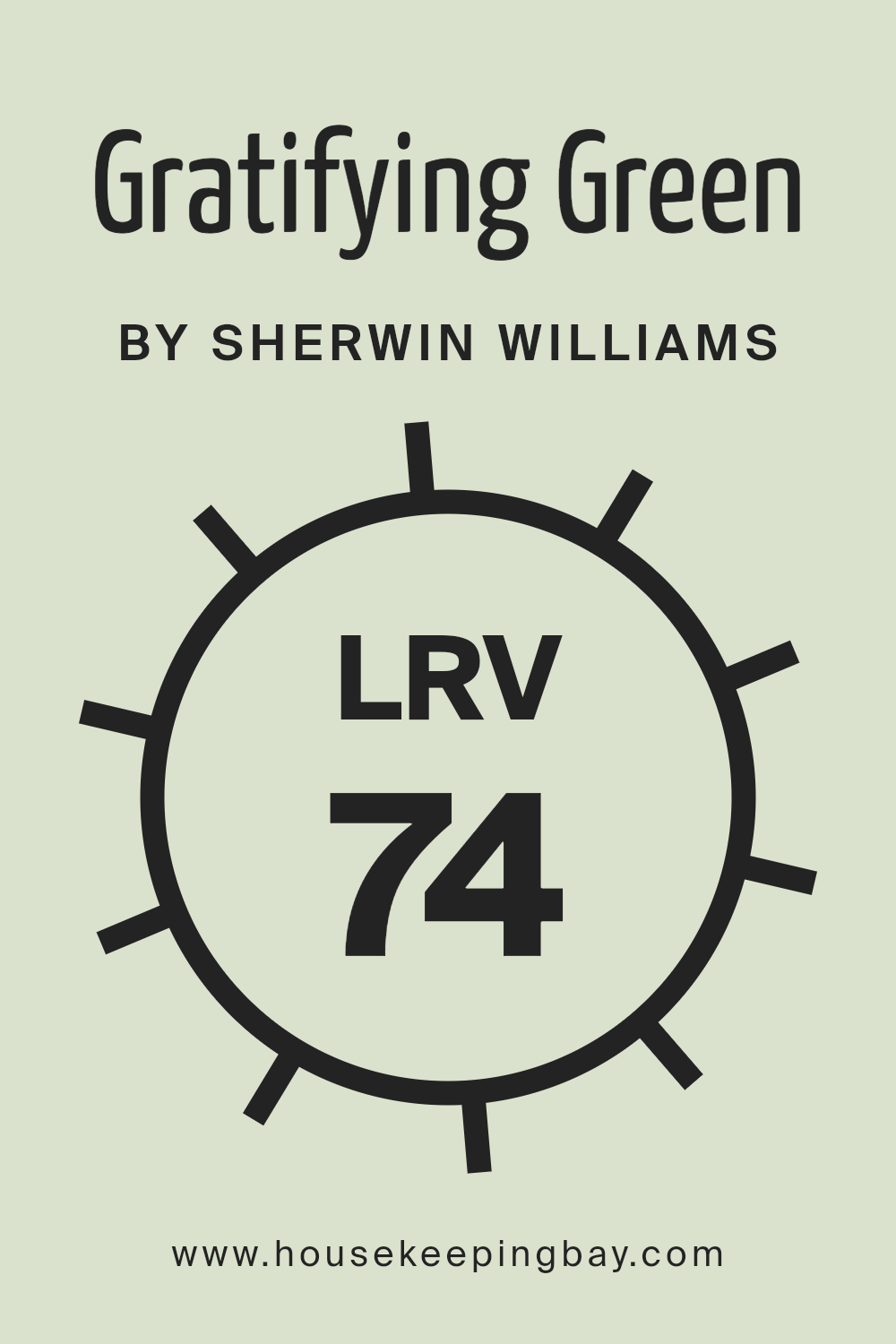
What is the LRV of Gratifying Green SW 6435 by Sherwin Williams?
LRV stands for Light Reflectance Value, which is a measure of how much light a color reflects or absorbs. The scale goes from 0 to 100, with 0 meaning the color absorbs all light (like black) and 100 meaning it reflects all light (like white).
Understanding LRV is important when choosing paint colors because it affects how bright or dark a color will look on your walls. Higher LRV values mean the color reflects more light, making it seem brighter and more spacious. Lower LRV values mean the color absorbs more light, appearing darker and cozier.
For Gratifying Green SW 6435 by Sherwin-Williams, the LRV is 73.994. This means it reflects a high amount of light, which makes it a brighter and lighter green. In a room with plenty of natural light, this color will help make the space feel open and airy.
In dimly lit rooms, it will still hold its brightness and keep the space from feeling too dark. Overall, the high LRV of Gratifying Green ensures the color feels fresh and inviting, especially in spaces where you want to maintain a light and cheerful atmosphere.
housekeepingbay.com
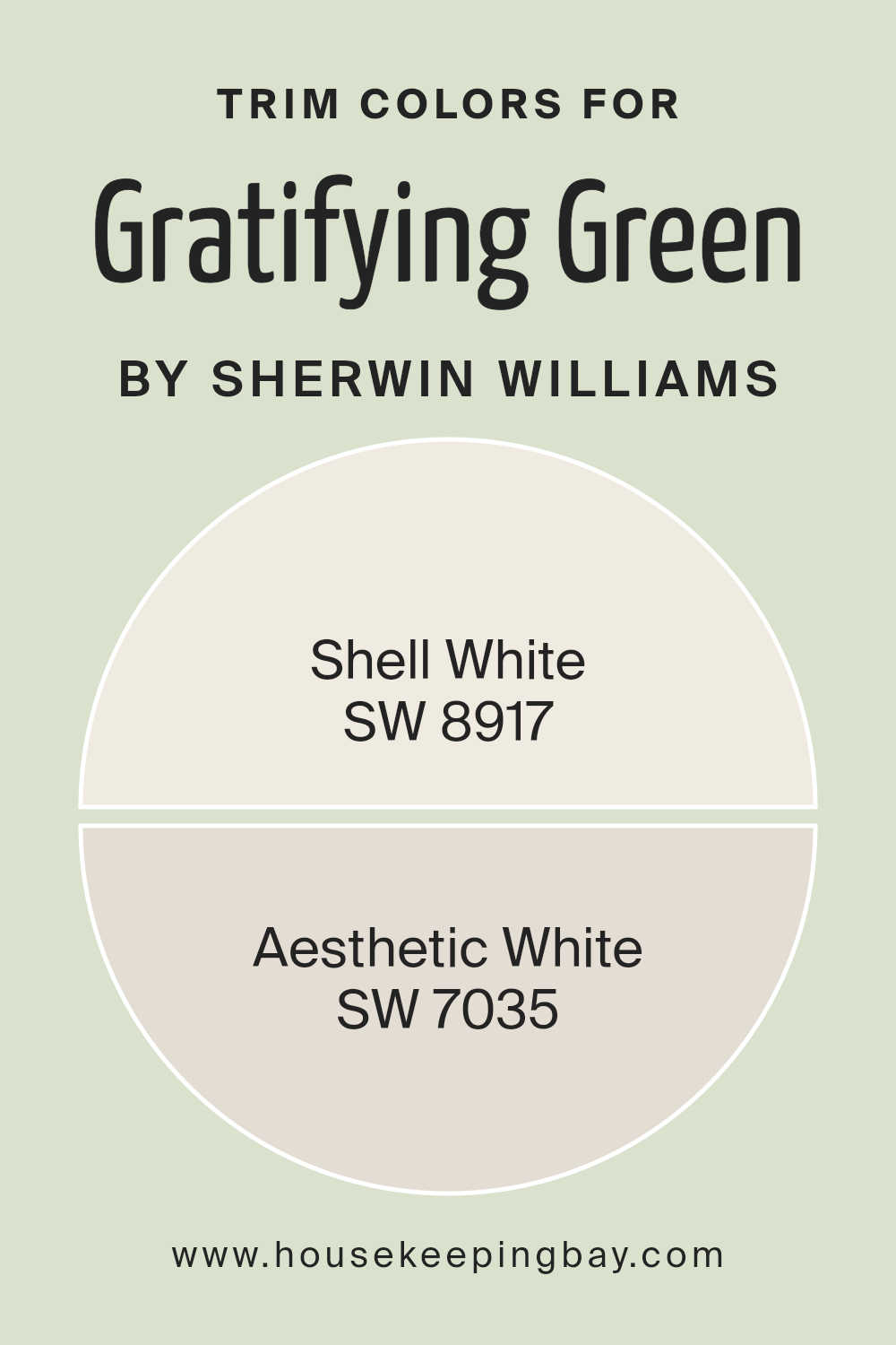
What are the Trim colors of Gratifying Green SW 6435 by Sherwin Williams?
Trim colors are the shades used on the edges and borders of walls, windows, and doors to highlight or complement the main wall color. For Gratifying Green SW 6435 by Sherwin Williams, trim colors play an important role in achieving a balanced and harmonious look.
Trim colors can help define spaces and create contrast that enhances the main color. Choosing the right trim shade can draw attention to architectural details and provide a polished finish.
It can tie together various elements in a room, making them feel cohesive and complete.
SW 8917 – Shell White is a soft, warm white with a hint of creaminess, adding a gentle contrast to the rich green without overwhelming it.
It offers a subtle glow that complements darker hues beautifully. On the other hand, SW 7035 – Aesthetic White offers a cool, clean backdrop with a touch of gray undertone.
It provides a modern look that pairs well with Gratifying Green’s earthy tone, creating a sophisticated ambiance. Both of these trim colors enhance the overall aesthetic by providing balance and definition against the comforting depth of Gratifying Green.
You can see recommended paint colors below:
housekeepingbay.com
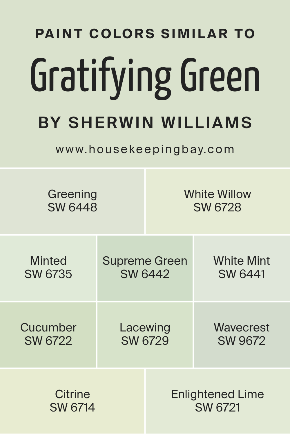
Colors Similar to Gratifying Green SW 6435 by Sherwin Williams
Similar colors play an important role in design because they help create a harmonious and cohesive look. Colors that are close to Gratifying Green, such as those from Sherwin Williams, work together without clashing, enhancing the overall feel of a space.
For instance, Greening SW 6448 is a lively shade of green that brings a sense of freshness. White Willow SW 6728 balances its richness with a softer tone. Minted SW 6735 offers a bright, cheerful touch, while Supreme Green SW 6442 is bold and full of life.
Together, these colors can make a room feel vibrant and welcoming without overwhelming the senses.
Other similar shades like White Mint SW 6441 give a cool and calming effect, contrasting with Cucumber SW 6722, which is refreshing and crisp. Lacewing SW 6729 has a natural, earthy feel, while Wavecrest SW 9672 provides a subtle hint of blue undertone for added depth.
Citrine SW 6714 is a sunny, cheerful hue, and Enlightened Lime SW 6721 offers a light, pastel version of green that lifts the mood.
By using these colors together, one can create a well-balanced environment that feels natural and inviting, maximizing the beauty of each hue.
You can see recommended paint colors below:
- SW 6448 Greening
- SW 6728 White Willow
- SW 6735 Minted
- SW 6442 Supreme Green
- SW 6441 White Mint
- SW 6722 Cucumber
- SW 6729 Lacewing
- SW 9672 Wavecrest
- SW 6714 Citrine
- SW 6721 Enlightened Lime
housekeepingbay.com
Colors that Go With Gratifying Green SW 6435 by Sherwin Williams
Colors that complement Gratifying Green SW 6435 by Sherwin-Williams bring harmony and balance to spaces, enhancing the green’s natural beauty. Each hue has its own unique role in creating a coherent and inviting environment. SW 6436 – Bonsai Tint is a soft, muted color that adds a gentle backdrop to Gratifying Green, offering subtle contrast without overwhelming the senses.
SW 9039 – Broccoflower, with its lively and vibrant tone, injects energy and freshness into a room, making spaces feel alive and welcoming. These complementary shades work together to create a dynamic yet serene space.
Meanwhile, SW 6439 – Greenfield introduces a deeper, more grounded green, adding depth to the palette and providing a rich foundation for other colors to shine. SW 6438 – Dill carries a slightly earthy undertone, lending warmth and coziness to any area, making it suitable for creating a comforting atmosphere.
SW 6440 – Courtyard adds a touch of tradition and charm with its classic, timeless appeal, enhancing the elegance of Gratifying Green.
Lastly, SW 6437 – Haven brings an air of calm with its soothing, muted qualities, perfect for spaces that aim for relaxation and peace. Together, these colors create a balanced and inviting setting where Gratifying Green can truly flourish.
You can see recommended paint colors below:
- SW 6436 Bonsai Tint
- SW 9039 Broccoflower
- SW 6439 Greenfield
- SW 6438 Dill
- SW 6440 Courtyard
- SW 6437 Haven
housekeepingbay.com
How to Use Gratifying Green SW 6435 by Sherwin Williams In Your Home?
Gratifying Green SW 6435 by Sherwin Williams provides a calm and soothing vibe to any room. This soft, muted green has a natural feel, perfect for creating a peaceful home environment. Consider using it in a living room or bedroom to bring a touch of nature indoors.
Pairing it with neutral colors like beige or white can make the green stand out without overwhelming the space. Gratifying Green can also work well in a kitchen, giving the room a fresh and clean look. Try adding wooden accents or plants to enhance the natural feel.
For a creative approach, use it as an accent wall to add interest without repainting the entire room. In bathrooms, this shade can provide a spa-like experience, promoting relaxation. Overall, Gratifying Green offers versatile options for those wanting a bit of nature-inspired calmness and elegance in their home decor.
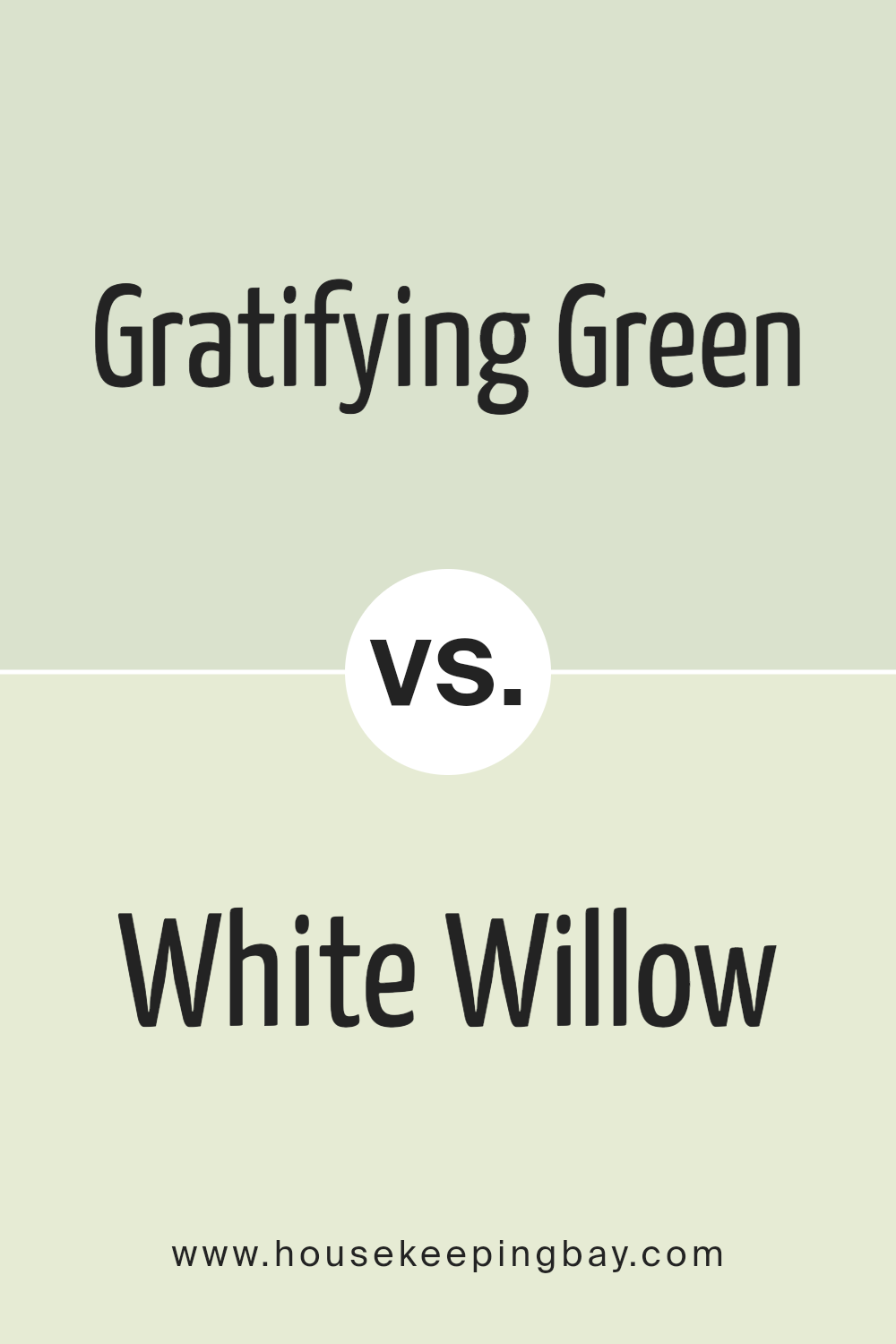
Gratifying Green SW 6435 by Sherwin Williams vs White Willow SW 6728 by Sherwin Williams
Gratifying Green SW 6435 and White Willow SW 6728 by Sherwin Williams both bring nature-inspired vibes but differ in distinct ways. Gratifying Green is a rich, deep green, often associated with a sense of calm and balance. This color can create cozy, inviting spaces. It works well in areas where a strong, comforting presence is ideal, like living rooms or dining areas.
White Willow, on the other hand, is a lighter, more muted green. It tends to evoke a sense of freshness and airiness, making smaller or darker spaces feel more open and bright. It’s a great choice for kitchens or bathrooms where a light and refreshing atmosphere is desired.
Together, these colors complement each other well. Gratifying Green grounds and anchors a room, while White Willow brings in lightness and a modern feel. Both colors celebrate elements of nature but offer different moods and impacts in a space.
You can see recommended paint color below:
- SW 6728 White Willow
housekeepingbay.com
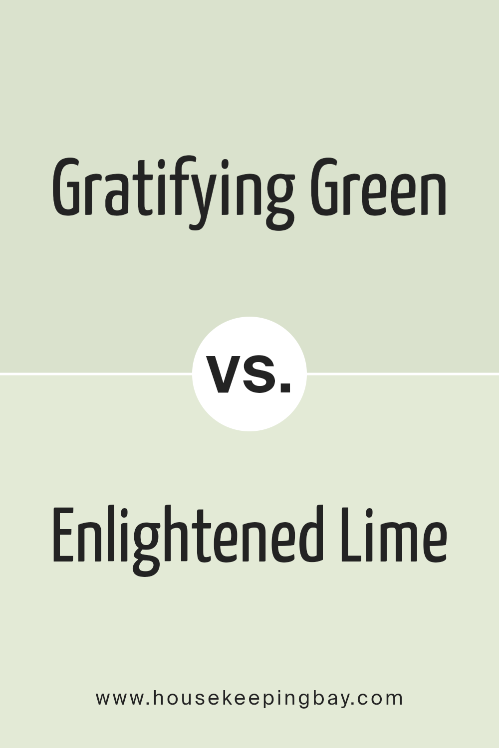
Gratifying Green SW 6435 by Sherwin Williams vs Enlightened Lime SW 6721 by Sherwin Williams
Gratifying Green SW 6435 and Enlightened Lime SW 6721, both by Sherwin Williams, offer distinct experiences through their unique shades. Gratifying Green presents a rich, deep green that grounds spaces with a soothing, earthy atmosphere. Its slightly muted tone makes it versatile for both modern and classic settings, creating a calm, comfortable environment.
Enlightened Lime SW 6721, however, introduces a lively, energetic vibe. Its bright, vivid hue infuses a room with refreshing energy and cheeriness. This color pairs well with contemporary designs and adds a playful, invigorating touch to spaces.
Side by side, Gratifying Green feels more reserved and understated, making it ideal for relaxed areas like living rooms or bedrooms. In contrast, Enlightened Lime stands out with its vibrant character, perfect for creative spaces or areas where you want to add a burst of color. Both colors can complement each when used thoughtfully, establishing balance in interior settings.
You can see recommended paint color below:
- SW 6721 Enlightened Lime
housekeepingbay.com
Gratifying Green SW 6435 by Sherwin Williams vs Lacewing SW 6729 by Sherwin Williams
Gratifying Green SW 6435 by Sherwin Williams is a warm, nature-inspired shade that evokes a sense of growth and renewal. It offers a balanced blend of yellow and green tones, creating a welcoming and cozy feeling. This color works well in spaces where you want to feel connected with nature, bringing a sense of calm and energy to any room.
Lacewing SW 6729, in contrast, introduces a lighter, more vibrant hue. This shade leans towards a brighter green, with hints of freshness and liveliness. It’s an excellent choice for brightening up spaces and adding a cheerful touch.
Lacewing pairs well with neutral colors and can lift the atmosphere in any setting.
When comparing the two, Gratifying Green tends to be more subdued and earthy, ideal for creating a grounded and serene environment.
Lacewing offers a lively and energetic vibe, perfect for spaces where light and freshness are desired. Each color has its charm, catering to different moods and preferences.
You can see recommended paint color below:
- SW 6729 Lacewing
housekeepingbay.com
Gratifying Green SW 6435 by Sherwin Williams vs Minted SW 6735 by Sherwin Williams
Gratifying Green SW 6435 is a rich, warm green that brings a sense of nature and comfort into a space. It is a versatile shade that can work well in both traditional and contemporary settings. Its depth and warmth create a cozy atmosphere, making it suitable for living rooms or bedrooms where a calming environment is desired.
Minted SW 6735, however, is a lighter, more vibrant green with a fresh and airy feel. This color has a subtle minty hue that adds a touch of brightness to any room. It is ideal for spaces where a fresh, energetic vibe is wanted, such as kitchens or bathrooms.
While Gratifying Green provides a grounding, earthy feel, Minted offers a lively and invigorating touch. Both colors evoke a sense of nature, but Gratifying Green leans more toward warmth and coziness, whereas Minted brings lightness and vibrancy.
You can see recommended paint color below:
- SW 6735 Minted
housekeepingbay.com
Gratifying Green SW 6435 by Sherwin Williams vs Cucumber SW 6722 by Sherwin Williams
Gratifying Green SW 6435 by Sherwin Williams is a warm, muted shade that brings a natural and calming vibe to a space. It’s a versatile color, suitable for both cozy living rooms and serene bedrooms. Its gentle undertones create a sense of harmony, making it blend seamlessly with natural wood accents or creamy whites.
Cucumber SW 6722, another offering from Sherwin Williams, is a lighter, more vibrant green. It feels fresh and lively, reminiscent of a sunny garden or a fresh-cut cucumber. This color adds a spirited touch to kitchens or bathrooms, creating an invigorating atmosphere.
While Gratifying Green leans towards a more subdued and earthy feel, Cucumber invigorates with its brightness and zest. Both colors capture different aspects of nature, with Gratifying Green offering warmth and softness, while Cucumber delivers a crisp, invigorating splash of energy. Together, they cater to varied tastes, from peaceful retreats to lively environments.
You can see recommended paint color below:
- SW 6722 Cucumber
housekeepingbay.com
Gratifying Green SW 6435 by Sherwin Williams vs Supreme Green SW 6442 by Sherwin Williams
Gratifying Green SW 6435 and Supreme Green SW 6442 both belong to the same family of greens from Sherwin Williams, yet they offer unique vibes. Gratifying Green presents a soft, muted tone that is calm and soothing. It feels gentle, making spaces appear welcoming and peaceful. Perfect for bedrooms or living areas, it adds subtle color without overwhelming.
Supreme Green, however, takes a bolder approach. It is richer and more vibrant, adding energy and liveliness to a room. Ideal for accent walls or areas needing a pop of color, it grabs attention and creates a lively atmosphere.
While Gratifying Green might appeal to those seeking relaxation, Supreme Green suits those looking for vibrant and energizing surroundings. The choice depends on the mood you want to set. Both colors are versatile and can complement various design styles, offering options that cater to different tastes and preferences.
You can see recommended paint color below:
- SW 6442 Supreme Green
housekeepingbay.com
Gratifying Green SW 6435 by Sherwin Williams vs Citrine SW 6714 by Sherwin Williams
Gratifying Green SW 6435 by Sherwin-Williams presents a deep, natural shade of green reminiscent of lush forests. It feels calm and grounding, making it popular for spaces aiming for a peaceful atmosphere. This green pairs nicely with earthy tones and neutral shades, fitting well in living rooms or bedrooms where a serene feel is desired.
Citrine SW 6714 by Sherwin-Williams, however, bursts with a vibrant yellow-green hue, much like the gemstone it’s named after. It radiates energy and positivity, perfect for lively spaces like kitchens or children’s playrooms. Its brightness can uplift moods and bring a cheerful vibe to any area.
While Gratifying Green exudes calmness and nature-inspired tranquility, Citrine packs a punch with its spirited and upbeat energy. Both offer unique qualities that can dramatically alter the feel of a room; Gratifying Green soothes, while Citrine invigorates.
Selecting between them depends on whether a calming or energizing atmosphere suits your needs better.
You can see recommended paint color below:
- SW 6714 Citrine
housekeepingbay.com
Gratifying Green SW 6435 by Sherwin Williams vs White Mint SW 6441 by Sherwin Williams
Gratifying Green SW 6435 by Sherwin Williams is a warm, earthy shade that exudes a sense of calm and harmony. It often reminds people of nature and lush landscapes, making spaces feel cozy and inviting. This green is versatile and works well in living rooms, bedrooms, or any space where relaxation is a priority. Its soothing tone pairs beautifully with natural wood and neutral accents.
White Mint SW 6441, on the other hand, offers a fresh and airy vibe. This light green shade has a minty undertone, which adds a hint of coolness to any room.
White Mint creates a breezy, rejuvenating atmosphere, perfect for kitchens or bathrooms where a sense of cleanliness and openness is desired. It pairs nicely with whites, soft blues, and pale grays, enhancing its crisp and refreshing character.
Together, these colors provide a balanced, nature-inspired palette suitable for any home.
You can see recommended paint color below:
- SW 6441 White Mint
housekeepingbay.com
Gratifying Green SW 6435 by Sherwin Williams vs Greening SW 6448 by Sherwin Williams
Gratifying Green SW 6435 and Greening SW 6448 by Sherwin Williams both capture the essence of natural green, yet each brings a distinct atmosphere. Gratifying Green SW 6435 offers a softer, muted shade, creating a relaxed and refreshing feel. It’s a versatile color that works well in spaces where peace is desired. This green pairs beautifully with earth tones or soft whites, enhancing a serene environment.
Greening SW 6448, by contrast, is a more vibrant, lively shade. It has a brighter, more energetic presence, easily waking up any room with its joyful green hue. This color is perfect for spaces that aim to inspire creativity and energy.
Pair it with bold colors or darker shades to make a statement.
Both colors reflect nature’s calming influence, but while Gratifying Green leans towards calm and subtlety, Greening brims with life and energy, offering solutions for various moods and settings.
You can see recommended paint color below:
- SW 6448 Greening
housekeepingbay.com
Gratifying Green SW 6435 by Sherwin Williams vs Wavecrest SW 9672 by Sherwin Williams
Gratifying Green SW 6435 by Sherwin Williams presents a warm, inviting tone. It’s a softer shade of green that evokes nature, promoting peace and comfort within a space. Gratifying Green works well in rooms aiming to create a grounded atmosphere, thanks to its earthy undertones.
Wavecrest SW 9672, in contrast, leans more towards a cooler, serene blue-green shade. It brings a fresh, airy feel, making it ideal for refreshing a room. Wavecrest can inspire feelings of calmness, akin to a gentle sea breeze.
While both colors belong to the green family, Gratifying Green tends toward yellow undertones, while Wavecrest dances with blue. Gratifying Green can feel cozy and nurturing, suitable for living areas or bedrooms. Wavecrest, however, fits well where you want a more crisp and open vibe, like bathrooms or kitchens. Both perform exceptionally well in their own niches, each adding its unique charm to any space they inhabit.
You can see recommended paint color below:
- SW 9672 Wavecrest
housekeepingbay.com
Conclusion
SW 6435 Gratifying Green by Sherwin Williams is a color that seems to bring nature’s essence into any space. When I look at this shade, it feels vibrant yet calming, offering a perfect balance that fits well in different settings. The hue is rich but not overpowering, creating a sense of freshness that cheers up a room and a soft undertone that calms the mind.
I find Gratifying Green to be versatile enough for both modern and traditional decor. It’s a great choice for living rooms, kitchens, and bedrooms, adding a touch of vitality without being too bold.
In spaces filled with natural light, it plays along beautifully, reflecting light in a way that makes the room feel open and airy. In dimmer areas, it offers a cozy vibe.
For those who like to switch things up, this color works well with various shades—be it neutrals, pastels, or even deeper colors. Accessories in whites or creams can highlight its natural feel, while wood tones can enhance its earthy charm.
In essence, SW 6435 Gratifying Green has qualities that make it a go-to color for creating an inviting and refreshed atmosphere. For me, it’s a color that aligns well with a mood of renewal and serenity, making spaces feel both alive and comfortable.
housekeepingbay.com
Ever wished paint sampling was as easy as sticking a sticker? Guess what? Now it is! Discover Samplize's unique Peel & Stick samples. Get started now and say goodbye to the old messy way!
Get paint samples


