Fruity Cocktail 147 by Benjamin Moore
Bright Blends for Fun Vibes
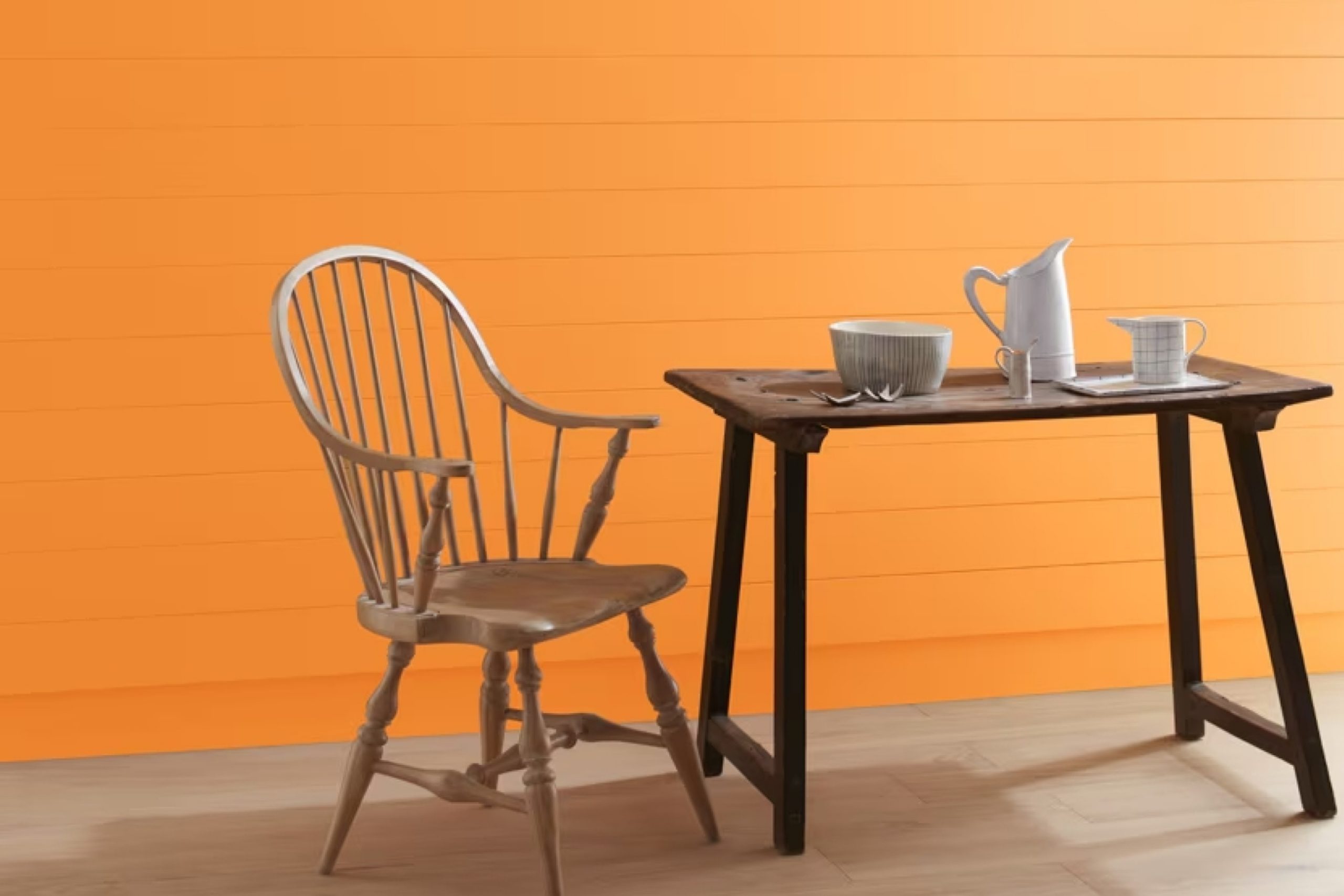
Have you ever stumbled upon a paint color that just resonates with your style and vibe? Let me tell you about 147 Fruity Cocktail by Benjamin Moore. It’s a vibrant, uplifting shade that can instantly brighten up any room. Perfect for adding a splash of energy, this color has a playful charisma that works wonderfully in spaces meant for relaxation and fun.
The alluring quality of 147 Fruity Cocktail makes it a great choice for transforming mundane spaces into areas bursting with personality. Whether you’re looking to freshen up your living room, kitchen, or even the bathroom, this shade has the potential to invigorate your home in an instant.
Moreover, it pairs beautifully with a variety of decor styles. Imagine it in a modern minimalist setting or a cozy, eclectic space—it adapts effortlessly, allowing your furniture and décor to stand out. Also, it’s just as effective in small doses, like on an accent wall or within your artwork, as it is painting an entire room.
You’ll see how this color can influence the mood and style of your environments in unique and dynamic ways.
via benjaminmoore.com
What Color Is Fruity Cocktail 147 by Benjamin Moore?
Table of Contents
“Fruity Cocktail 147” by Benjamin Moore is a lively, vibrant pink hue that adds a playful touch to any room. This color captures the essence of fun and femininity and is perfect for creating a cheerful atmosphere. The bright tone of Fruity Cocktail 147 makes it ideal for feature walls in living areas or bedrooms, where it can act as an eye-catching backdrop to everyday living.
The versatility of this pink allows it to blend seamlessly with various interior styles, especially modern contemporary and eclectic designs. In a contemporary setting, Fruity Cocktail 147 can be balanced with neutral colors like soft grays and whites, which help to tone down its intensity while maintaining its lively character. For an eclectic style, pairing it with contrasting colors such as teals or deep blues can enhance its playful nature.
When considering materials and textures, Fruity Cocktail 147 pairs wonderfully with light woods and metallic finishes like brass or copper, adding a touch of sophistication. Soft textures like velvet or silk in upholstery also complement this color, providing a luxurious feel. Additionally, incorporating clear glass or acrylic elements can keep the space feeling open and airy, allowing the boldness of the color to stand out without overwhelming the room.
This hue works well with natural light, accentuating its warmth and making spaces feel inviting.
housekeepingbay.com
Is Fruity Cocktail 147 by Benjamin Moore Warm or Cool color?
Fruity Cocktail 147 by Benjamin Moore is a vibrant and cheerful color that can brighten up any space in a home. This shade, with its playful mix of pink and orange hues, brings a sense of warmth and energy to rooms that might otherwise feel dull or lifeless. It’s especially effective in living areas and kitchens where families gather, injecting a sense of happiness and vitality.
When used in small spaces, like a bathroom or a hallway, Fruity Cocktail 147 can make the area seem more inviting and lively without overwhelming it. In larger rooms, this color can be balanced with neutral tones or used as an accent wall to create a focal point without dominating the space.
It also pairs well with light wood furniture and natural fibers, adding a modern yet cozy touch to the decor. Whether looking to add a pop of color or create a warm, energetic vibe, Fruity Cocktail 147 is a versatile choice that can enhance the aesthetic of a home beautifully.
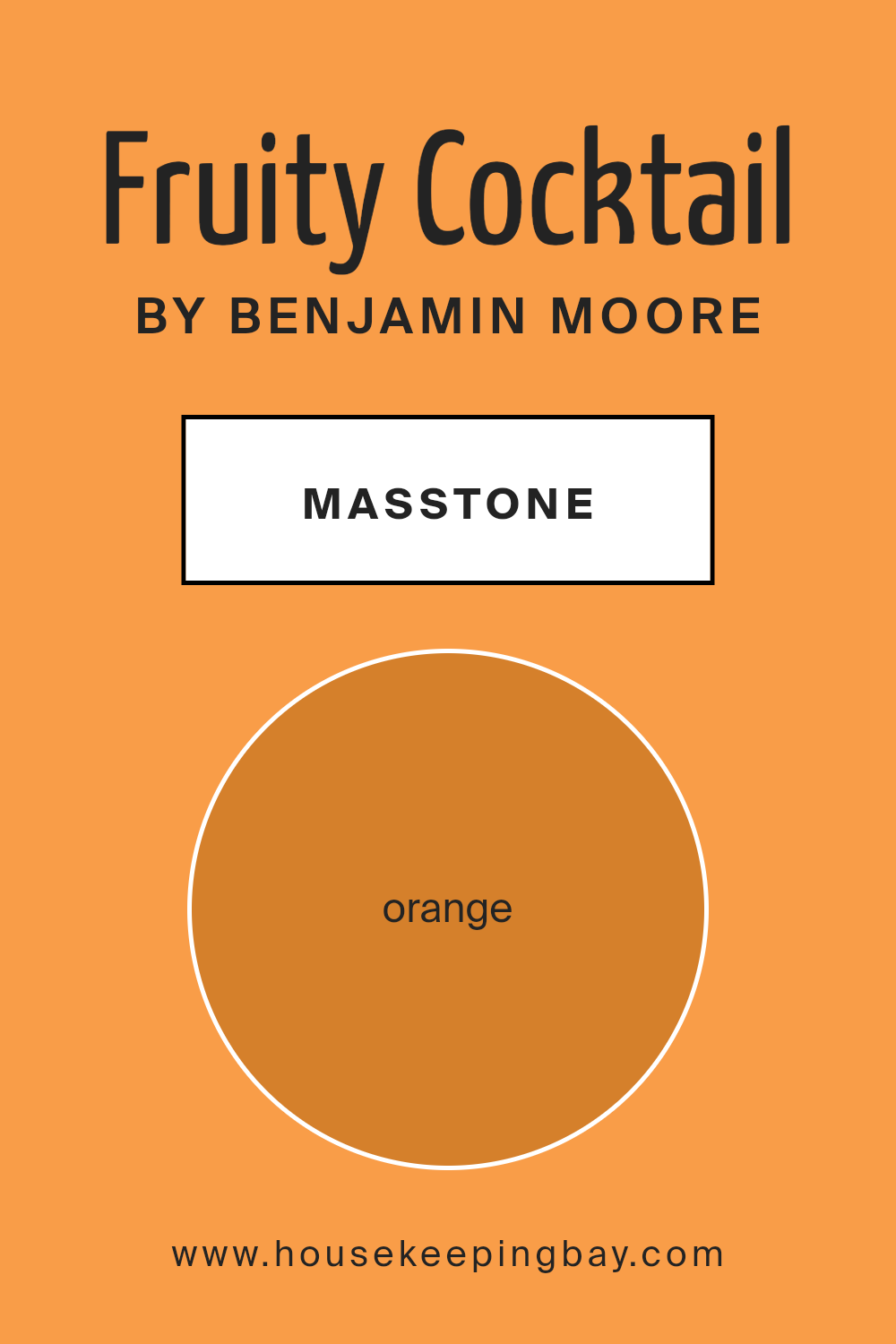
What is the Masstone of the Fruity Cocktail 147 by Benjamin Moore?
Fruity Cocktail 147 by Benjamin Moore is a vibrant, orange color with the masstone Orange(#D5802B). In home interiors, this shade brings a sense of warmth and energy, making rooms feel cozy and welcoming.
It’s an excellent choice for spaces where you want to foster a social atmosphere, such as living rooms or dining areas. This color can also stimulate appetite, which makes it great for kitchens. However, because it is quite bold and vibrant, it’s important to use it thoughtfully to avoid overwhelming a space. It pairs well with neutral shades like whites or grays, which help balance its intensity.
By using it on an accent wall or in decorative accessories, Fruity Cocktail 147 can add a lively splash of color without dominating the room. This makes the color versatile and adaptable to various decorating styles, from modern to traditional.
housekeepingbay.com
Undertones of Fruity Cocktail 147 by Benjamin Moore
Fruity Cocktail 147 by Benjamin Moore is a vibrant paint color with a complex array of undertones that include yellow, pale pink, pale yellow, red, olive, pink, grey, light green, mint, brown, and purple. Each undertone plays a crucial role in how this color appears under different lighting conditions and when paired with various decor elements.
Undertones are subtle hues that influence the primary color, affecting how we perceive it in different environments. For instance, yellow and pale yellow undertones give Fruity Cocktail 147 a brighter, more energetic feel, making it lively and cheerful. In contrast, grey and olive can tone down the intensity, providing a more muted and sophisticated look.
When applied to interior walls, Fruity Cocktail 147’s rich undertones interact with both natural and artificial light, shifting its appearance throughout the day. This makes the color highly versatile and adaptable to various interior styles. Light green and mint undertones can create a fresh and airy feel in a space, ideal for kitchens and bathrooms, while the warmer red and pink undertones can make a living room or dining area feel more welcoming and cozy.
Moreover, because of its complex undertones, Fruity Cocktail 147 can harmonize with a wide range of furnishings and accents, from modern metallic and glass elements to more traditional wood and fabric. This adaptability makes it a popular choice for those looking to add personality and depth to their living spaces.

housekeepingbay.com
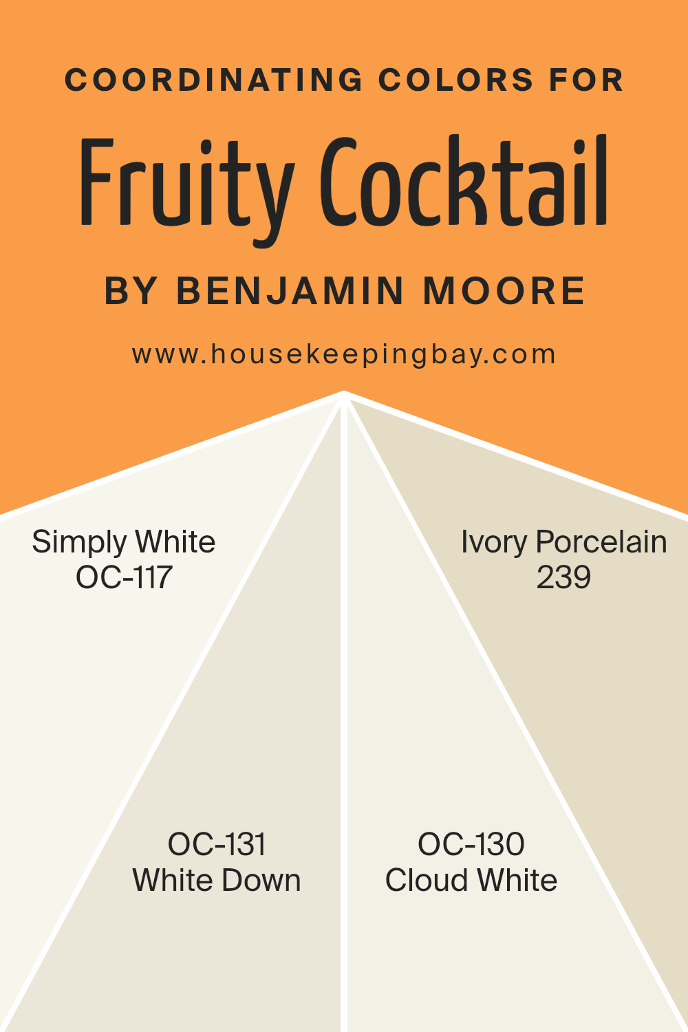
Coordinating Colors of Fruity Cocktail 147 by Benjamin Moore
Coordinating colors are shades that complement a primary color, helping to create a balanced and harmonious color scheme in a space. In the case of Fruity Cocktail 147 by Benjamin Moore, coordinating colors include Simply White OC-117, White Down OC-131, Cloud White OC-130, and Ivory Porcelain 239.
These shades are carefully selected to enhance the vividness of the primary color while providing a soft backdrop that allows the main hue to stand out. Using coordinating colors can add depth and interest to your decor, making the environment both inviting and visually appealing.
Simply White OC-117 is a clean, bright white that projects freshness and simplicity, making it a perfect choice for trim and ceilings that need a crisp contrast. White Down OC-131 offers a warmer hue, adding a cozy and slightly off-white tone that complements richer colors without overwhelming them. Cloud White OC-130 strikes a balance with a subtle, creamy white that works beautifully on walls, providing a soft, seamless transition between vibrant and neutral tones.
Lastly, Ivory Porcelain 239 is a delicate off-white with a hint of warmth, ideal for creating a soothing atmosphere while still keeping the space light and airy. Together, these coordinating colors provide a versatile palette that supports Fruity Cocktail 147 in making any room feel complete.
You can see recommended paint colors below:
- OC-117 Simply White
- OC-131 White Down
- OC-130 Cloud White
- 239 Ivory Porcelain
housekeepingbay.com
How Does Lighting Affect Fruity Cocktail 147 by Benjamin Moore?
Lighting plays a significant role in how we perceive colors. It can dramatically change the appearance of a paint color, like Fruity Cocktail 147 by Benjamin Moore. In different light conditions, this vibrant hue might look quite different, impacting the mood and ambiance of a room.
Artificial Light: Under artificial lighting, Fruity Cocktail 147 can appear warmer and more intense.
This is because most indoor lights, such as incandescent bulbs, emit a yellowish glow that can enhance the red and orange undertones in the paint, making the room feel cozy and inviting.
Natural Light: In natural light, the true color of Fruity Cocktail 147 is more evident. Sunlight provides a balanced light source that can make this color appear brighter and truer to its original shade.
The quality of sunlight changes throughout the day, which means the color will subtly shift from vibrant in the morning to softer towards the evening.
Room Orientation:
– North-Faced Rooms: North-facing rooms get less direct sunlight, which can make colors appear slightly cooler and more muted. In such rooms, Fruity Cocktail 147 might lose some of its warmth, appearing more subdued and less intense.
– South-Faced Rooms: These rooms receive ample sunlight, brightening up the Fruity Cocktail 147 to its fullest, vibrant potential. The color can appear lively and dynamic, enhancing the room’s overall cheerfulness.
– East-Faced Rooms: In east-facing rooms, morning light can make Fruity Cocktail 147 look very bright and fresh. As the day progresses and the natural light decreases, the color may take on a softer tone.
– West-Faced Rooms: West-facing rooms benefit from the warm, golden tones of the afternoon and evening light. Here, Fruity Cocktail 147 can appear particularly warm and welcoming, glowing richly toward the end of the day.
Overall, how Fruity Cocktail 147 looks can vary greatly depending on the lighting conditions and the room’s orientation. This variability must be considered when deciding on colors for a space to ensure the desired effect is achieved throughout the day.
housekeepingbay.com
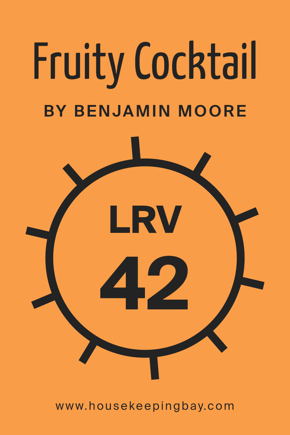
What is the LRV of Fruity Cocktail 147 by Benjamin Moore?
LRV stands for Light Reflectance Value, which measures the percentage of light a paint color reflects back into a room. Ranging from 0% (absorbing all light, resulting in black) to 100% (reflecting all light, perceived as white), this value helps in determining how light or dark a color will appear once applied on walls.
A higher LRV makes a room feel more open and brighter as more light bounces around the space, while a lower LRV can make a space feel more enclosed and cozy because it absorbs more light. For the shade “Fruity Cocktail 147” by Benjamin Moore with an LRV of 42.39, this sits in the middle of the scale, suggesting that it is a moderately light color but won’t brighten a room as much as a color with a higher LRV.
It reflects a fair amount of light but still retains some depth and richness, making it a versatile choice that can add warmth without darkening a room significantly. This balanced LRV means “Fruity Cocktail 147” is suitable for spaces that aim for a cozy yet moderately illuminated ambiance, potentially making it a good match for living rooms, bedrooms, or studies.
housekeepingbay.com
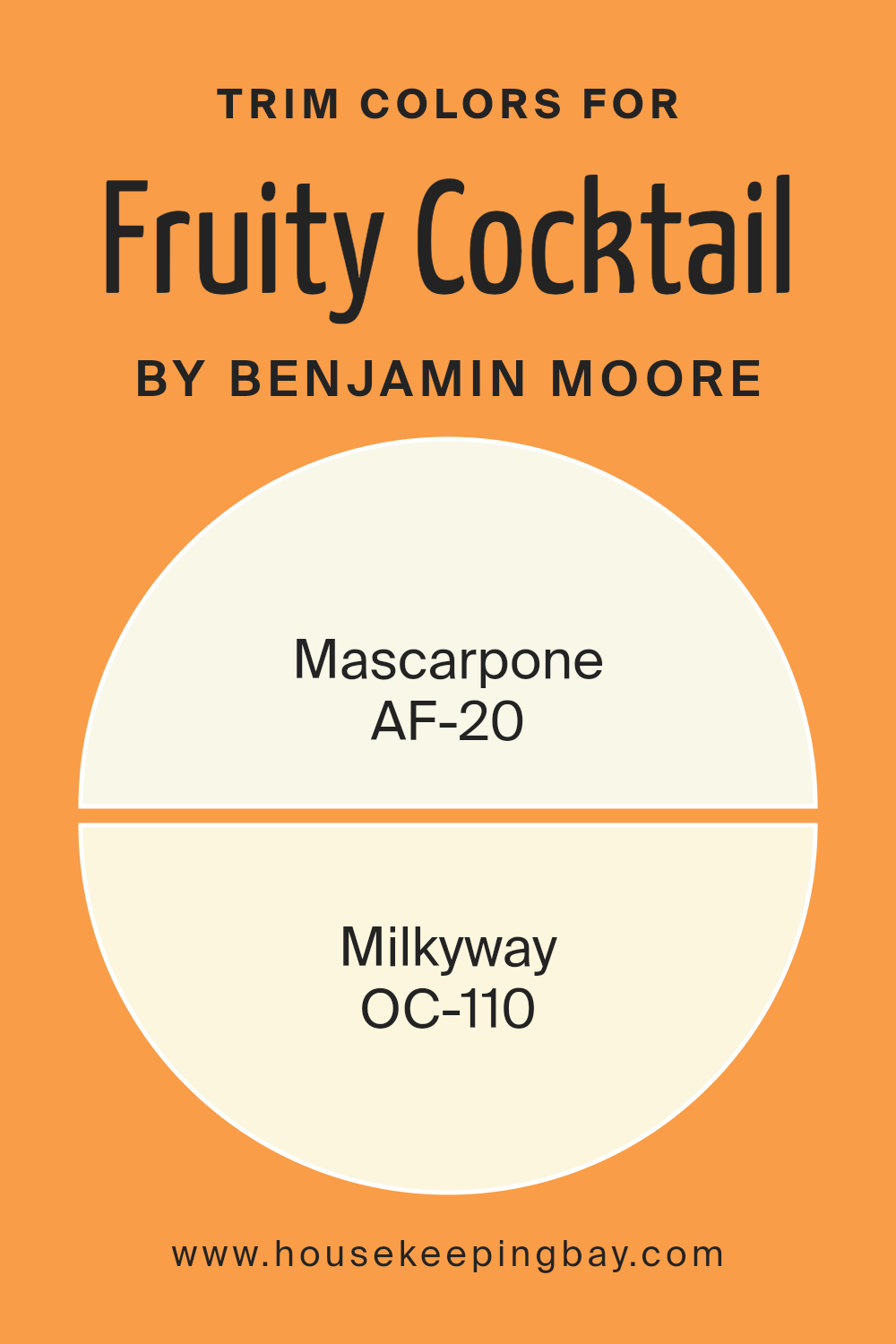
What are the Trim colors of Fruity Cocktail 147 by Benjamin Moore?
Trim colors are the accents applied to elements like door frames, window sills, skirting, and molding, contrasting with or complementing the primary wall colors. Specifically, for a lively shade like Fruity Cocktail147 by Benjamin Moore, selecting the right trim colors can enhance the visual appeal and create a more refined appearance.
Trim colors like AF-20 – Mascarpone and OC-110 – Milkyway have been recommended to pair with such vibrant hues because they offer a subtle balance that can prevent the brighter wall color from overwhelming the space.
AF-20 – Mascarpone is a soft, creamy white that provides a gentle contrast without clashing with the boldness of Fruity Cocktail147. Its light and airy feel can help in making the room appear larger and more open. On the other hand, OC-110 – Milkyway is a warmer, near-white shade that brings a cozy and soothing effect, which complements the energy and freshness of Fruity Cocktail147. Both colors work together to create a harmonious environment, allowing the primary color to shine vividly while maintaining an elegant overall design.
You can see recommended paint colors below:
- AF-20 Mascarpone
- OC-110 Milkyway
housekeepingbay.com
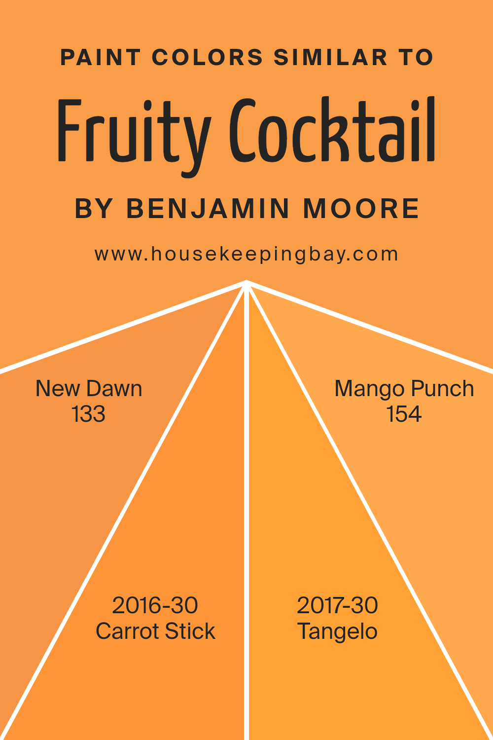
Colors Similar to Fruity Cocktail 147 by Benjamin Moore
In home decor, using similar colors can create a harmonious and cohesive look that is pleasing to the eye. When colors like those similar to Fruity Cocktail 147 by Benjamin Moore are used together, there’s a smooth visual flow without harsh contrasts, making a space feel more put together. This cohesion allows for a seamless transition from one area of the room to another, making smaller spaces appear larger and giving an overall more polished look.
New Dawn 133, a subtle and soft hue, offers a gentle backdrop that complements more vibrant tones, creating a balanced visual experience. Carrot Stick 2016-30 adds a zestful orange that injects life and energy into spaces, warming up the environment.
Tangelo 2017-30, with its cheerful and bright disposition, brings in a splash of invigorating color that brightens rooms. Finally, Mango Punch 154, rich and inviting, adds a touch of tropical warmth, making any space more welcoming and cozy. Together, these colors work to enhance each other’s beauty and fill a room with vibrant yet harmonious energy.
You can see recommended paint colors below:
- 133 New Dawn
- 2016-30 Carrot Stick
- 2017-30 Tangelo
- 154 Mango Punch
housekeepingbay.com
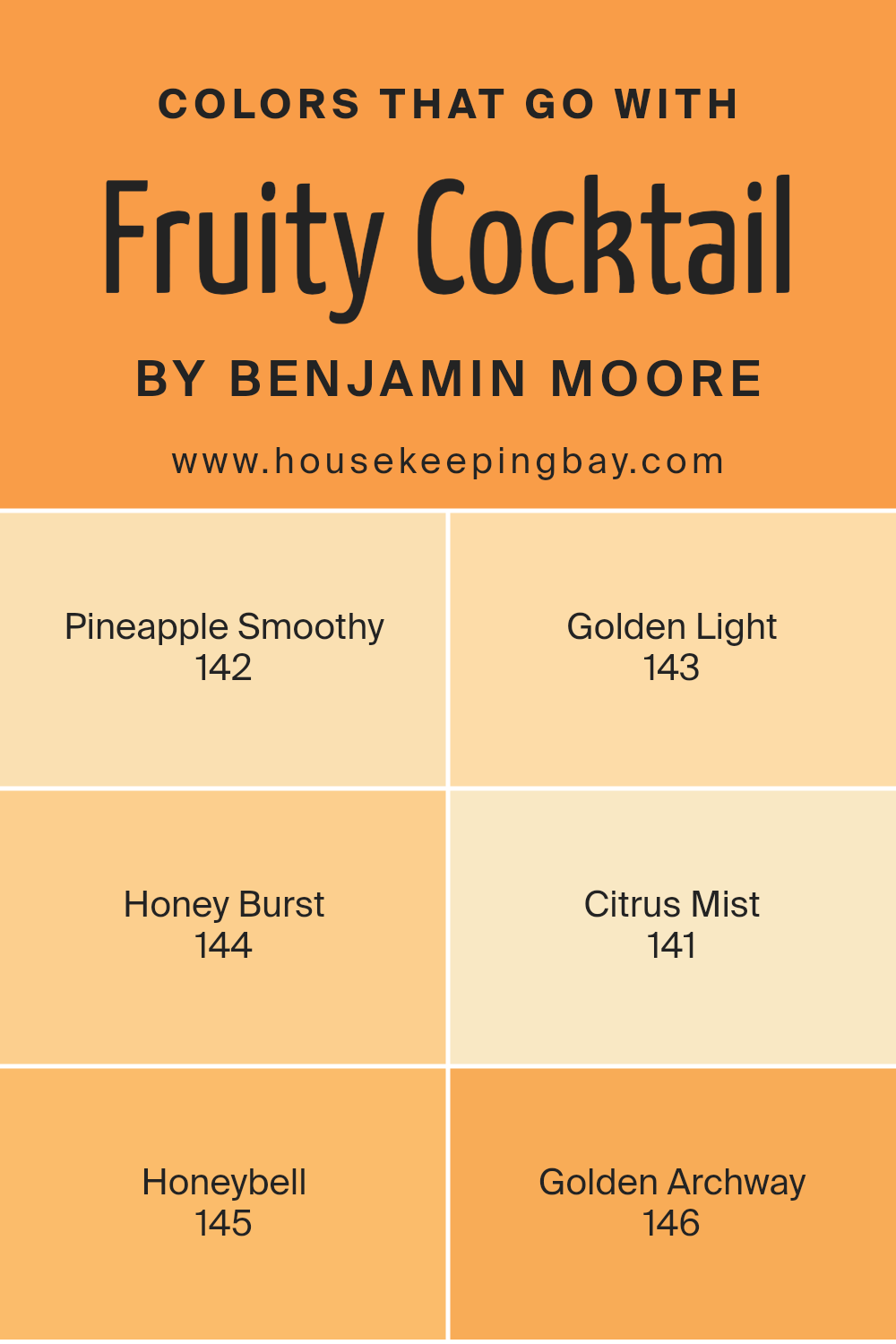
Colors that Go With Fruity Cocktail 147 by Benjamin Moore
Choosing the right colors to complement Fruity Cocktail 147 by Benjamin Moore is vital for creating a cohesive and appealing aesthetic in your home. These complementary colors are harmoniously curated to ensure that they enhance the vibrant energy of Fruity Cocktail without overwhelming it. For a room that feels both inviting and dynamic, blending these colors can really make a space pop.
Pineapple Smoothy 142 offers a soft, subtle yellow that brings a touch of brightness without overpowering. It’s like a gentle hint of sunrise that works beautifully in spaces aiming for a calming yet cheerful vibe. Golden Light 143 has a warm, soothing quality, reminiscent of sunlight bathing a room in the late afternoon.
It pairs nicely with darker hues, providing a perfect balance. Honey Burst 144, as the name suggests, bursts with a richer, deeper yellow. It adds depth to a palette and is ideal for accent walls or decor elements. Citrus Mist 141 is a lighter, almost ethereal yellow. It provides a fresh, airy feel to the environment, making it perfect for small spaces or ceilings.
Honeybell 145 echoes the vibrancy of a freshly cut orange, bringing an energetic punch that can liven up any room. Finally, Golden Archway 146 radiates with a classic golden tone that can give a noble and refined look to entryways or formal areas. Together, these colors create a spectrum that complements the vivacity of Fruity Cocktail 147 while maintaining a balance that is visually satisfying and warmly inviting.
You can see recommended paint colors below:
- 142 Pineapple Smoothy
- 143 Golden Light
- 144 Honey Burst
- 141 Citrus Mist
- 145 Honeybell
- 146 Golden Archway
housekeepingbay.com
How to Use Fruity Cocktail 147 by Benjamin Moore In Your Home?
Fruity Cocktail 147 by Benjamin Moore is a lively and vibrant paint color perfect for adding a splash of brightness to any room in a home. This shade, which seems to capture the zest and lively spirit of a tropical fruit drink, can really help to make a space feel warm and inviting.
Homeowners can use Fruity Cocktail 147 in various ways. It’s an excellent choice for a feature wall in a living room or bedroom, providing a cheerful contrast to neutral tones. In a kitchen, this color could energize the walls or be used on cabinets for a fresh, fun look. It’s also great for a kids’ room or play area because the color is bold and playful.
Moreover, Fruity Cocktail 147 works well outside as well. It can brighten up a front door or add a pop of color on garden furniture, welcoming guests with a joyful tone.
Because it’s so vivid, it pairs nicely with lighter shades, like whites or creams, ensuring balance in your color scheme without overpowering smaller spaces.
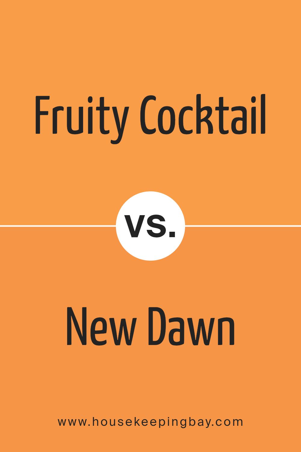
Fruity Cocktail 147 by Benjamin Moore vs New Dawn 133 by Benjamin Moore
The “Fruity Cocktail 147” by Benjamin Moore is a vivid, energetic pink. This daring shade adds a playful, cheerful vibe to any room, making it ideal for spaces meant to inspire fun and creativity. It’s particularly well-suited for kid’s rooms or an accent wall that needs to pop with personality.
In contrast, “New Dawn 133” is a lot quieter and subtler. This color is a soft, pale blue that conveys a calm and peaceful atmosphere. It works wonderfully in bedrooms or bathrooms where a soothing environment is desired. Its understated elegance allows it to blend seamlessly with different decors and styles.
While both colors share a durability and quality characteristic of Benjamin Moore paints, their uses and impacts are distinctly different. Fruity Cocktail 147 brings life and brightness, whereas New Dawn 133 offers a gentle backdrop, fostering a serene setting.
You can see recommended paint color below:
- 133 New Dawn
housekeepingbay.com
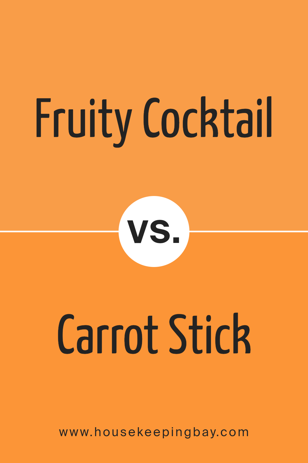
Fruity Cocktail 147 by Benjamin Moore vs Carrot Stick 2016-30 by Benjamin Moore
Fruity Cocktail 147 by Benjamin Moore is a vibrant pink shade with strong energy and a playful feel. It stands out in a space and brings a lively and cheerful atmosphere to any room. This color is great for spaces that aim to inspire creativity and happiness.
Carrot Stick 2016-30, also by Benjamin Moore, is a bold orange hue that’s warm and inviting. It creates a cozy environment and pairs well with natural elements and neutral tones. This color works wonderfully in areas where a sense of comfort and warmth are desired.
While both colors are bright and energetic, Fruity Cocktail tends to lean towards a more youthful and fun vibe, suitable for kids’ rooms or creative spaces. Carrot Stick, with its earthier tone, tends to offer a feeling of warmth and can be ideal for social areas like living rooms or kitchens. Both colors are great ways to add personality and mood to a room, depending on what sort of atmosphere you wish to achieve.
You can see recommended paint color below:
- 2016-30 Carrot Stick
housekeepingbay.com
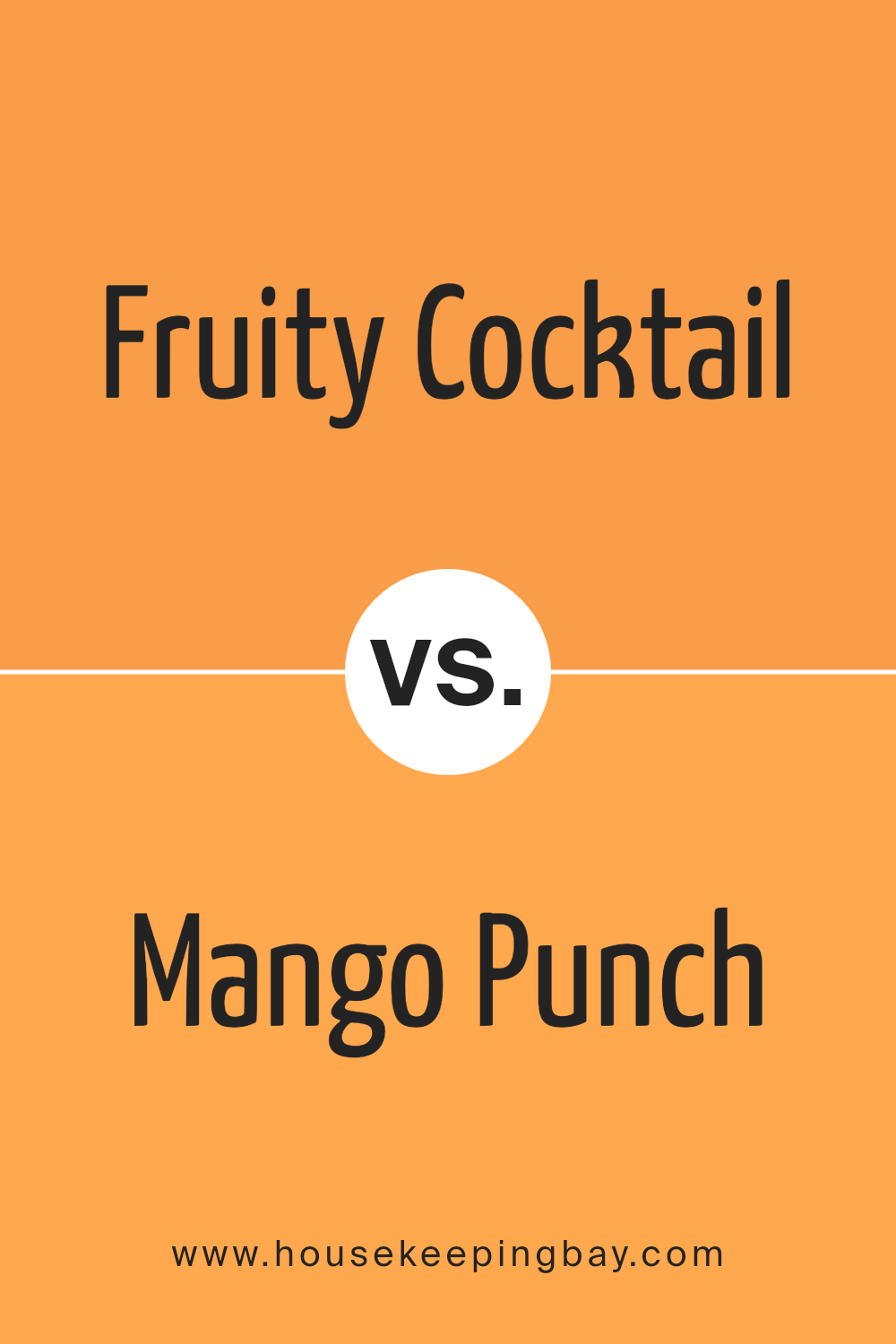
Fruity Cocktail 147 by Benjamin Moore vs Mango Punch 154 by Benjamin Moore
“Fruity Cocktail 147” by Benjamin Moore is a vibrant and playful pink shade, full of cheerfulness and brightness, which makes it perfect for adding a punch of personality to any space. It’s particularly well-suited for lively areas like children’s rooms or creative spaces. It has a youthful vibe that feels inviting and warm.
“Mango Punch 154,” also by Benjamin Moore, is a bold, energetic orange color. This shade has a tropical feel that can instantly brighten a room and inject a sense of joy. It’s ideal for areas where you want to create a fun, social atmosphere, such as kitchens or dining areas.
Both colors are lively and can create positive, dynamic energy in a space. “Fruity Cocktail 147” leans towards a softer expression with its pink hues, while “Mango Punch 154” offers a more intense visual impact with its radiant orange. Each of these colors can work well to create vibrant, cheerful environments, though their differing tones might suit different tastes or room functions.
You can see recommended paint color below:
- 154 Mango Punch
housekeepingbay.com
Fruity Cocktail 147 by Benjamin Moore vs Tangelo 2017-30 by Benjamin Moore
The Fruity Cocktail 147 by Benjamin Moore is a captivating orange-pink shade. This color has a bright, cheerful vibe, perfect for lively spaces or accent walls that need a pop of energy. It gives off a playful yet sophisticated aura, making rooms feel welcoming and warm.
Tangelo 2017-30, also by Benjamin Moore, is a vivid, pure orange color. It’s bolder and more intense compared to Fruity Cocktail 147. Tangelo’s strong presence can energize a space, making it ideal for areas where you want to foster excitement and enthusiasm.
While both colors share a base in the orange family, Fruity Cocktail 147 leans towards pink, softening its impact and adding a hint of delicate charm. In contrast, Tangelo 2017-30 is unapologetically bold, offering a more straightforward burst of color. Depending on the mood you want to set, either could be a great choice, with Fruity Cocktail being subtler and Tangelo more dominant.
You can see recommended paint color below:
- 2017-30 Tangelo
housekeepingbay.com
Conclusion
The exploration of the color 147 Fruity Cocktail by Benjamin Moore reveals it as a vibrant choice for anyone looking to add a fresh splash of energy to their space. Through experimenting with this color in various settings, from lively kitchen backsplashes to comforting bedroom walls, its versatility is evident. The playful yet sophisticated hue adapts well, whether aiming for a refined atmosphere or a more casual vibe.
This personal journey with 147 Fruity Cocktail has allowed me to appreciate how a single change in color can redefine an area. Its impact on mood and ambiance underscores the power of color in interior design. I’ve found that it pairs beautifully with both light woods and darker accents, offering myriad design possibilities that suit various tastes and styles.
As I continue my own decorating adventures, 147 Fruity Cocktail remains a top contender for spaces that require a hint of zest without overwhelming the senses. For anyone considering a refresh or starting anew, I recommend considering the lively yet balanced character of this color. It could just be the update your space needs to feel inviting and alive.
housekeepingbay.com
