Friendly Yellow SW 6680 by Sherwin Williams
Bringing Sunshine Indoors: A Guide to Warmth and Positivity
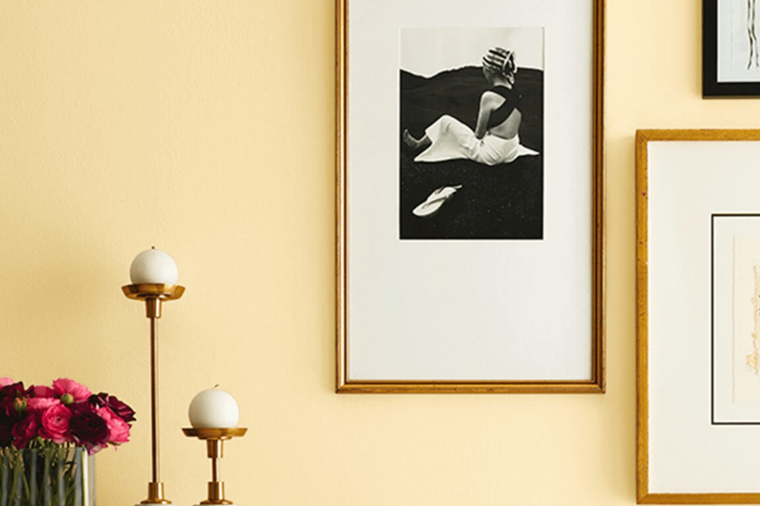
Introducing SW 6680 Friendly Yellow by Sherwin-Williams, a paint color that truly lives up to its name. Imagine walking into a sunlit room, where the walls radiate warmth and comfort, creating an inviting atmosphere that uplifts your mood. That’s the charm of Friendly Yellow, a hue that transforms any space into a bright and cozy haven.
Perfect for anyone looking to add a splash of cheerfulness to their home, Friendly Yellow isn’t just a color; it’s a mood booster. This vibrant shade has the power to make your rooms feel more spacious, welcoming, and full of life. Whether you’re painting your kitchen, living room, or even a home office, you’ll notice how this lively color encourages positivity and creativity.
Choosing the right paint color can sometimes feel overwhelming, but Friendly Yellow makes it easy. It pairs beautifully with a wide range of colors, from soft neutrals to bold tones, allowing you to express your personal style effortlessly. Plus, Sherwin-Williams’ quality ensures that your walls not only look great but also stand the test of time.
If you’re ready to transform your space into a cheerful oasis, Friendly Yellow is your go-to. It’s not just about the color; it’s about creating a home that feels just right. So, go ahead and let Friendly Yellow bring a touch of sunshine into your life.
by Sherwin Williams
What Color Is Friendly Yellow SW 6680 by Sherwin Williams?
Friendly Yellow SW 6680 by Sherwin Williams is a vibrant, cheerful shade of yellow that truly lives up to its name. It carries an essence of sunshine and warmth, making any space feel more inviting and lively. This particular yellow hue has the power to brighten up rooms, even on the cloudiest days, providing a natural glow that brings a positive energy into your home.
This color works incredibly well in various interior design styles, particularly in country, coastal, or any design theme that favors bright, open spaces. It’s perfect for kitchens, living rooms, or even hallways where the goal is to create an uplifting atmosphere. Friendly Yellow can also be a great choice for children’s rooms or play areas, adding a sense of joy and creativity.
When it comes to pairing materials and textures with Friendly Yellow, think natural and light. Woods with a lighter stain, such as pine or oak, complement this color beautifully, enhancing its warm tones. For accessories and fabrics, consider textures that are soft and cozy, such as cotton, linen, or soft wool, in neutral shades to balance the brightness of the yellow. White or cream ceramics, natural stone, or clear glass also pair nicely, creating a fresh and airy feel that allows this sunny shade to stand out without overwhelming the space.
By incorporating Friendly Yellow into your home, you’re guaranteed to create a space that feels welcoming and full of life.
housekeepingbay.com
Is Friendly Yellow SW 6680 by Sherwin Williams Warm or Cool color?
Friendly Yellow SW 6680 by Sherwin Williams is a warm and welcoming color that brings a burst of sunshine into any home. This cheerful hue has the power to brighten up spaces, making rooms feel more open and airy. When painted on walls, Friendly Yellow infuses energy and warmth, making it perfect for creating a cozy and inviting atmosphere. This color works well in rooms that get a lot of natural light, enhancing the light’s natural beauty and making the space feel vibrant.
In homes, Friendly Yellow can help boost moods, offering a sense of happiness and optimism. It’s great for living areas, kitchens, and dining rooms where families gather and spend a lot of time. This color pairs well with whites and grays, providing a fresh and modern look while still keeping the vibe relaxed and welcoming. However, since it’s a bold color, it’s a good idea to consider the room’s size and lighting before painting the whole room. In smaller rooms or those with less light, using it as an accent color might be a better choice. Friendly Yellow is all about adding a touch of cheerfulness to your home.
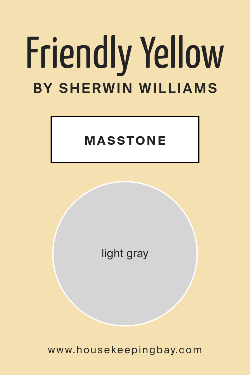
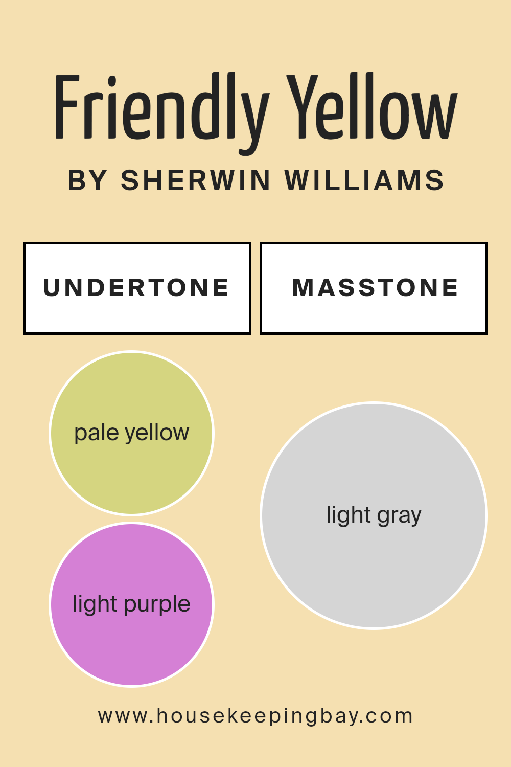
What is the Masstone of the Friendly Yellow SW 6680 by Sherwin Williams?
Friendly Yellow SW 6680 by Sherwin Williams is a unique color because its masstone, which is the color you see when the paint is applied thickly, actually looks like light gray (specifically #D5D5D5). This might sound surprising because when you think of yellow, you usually imagine a bright, sunny shade. Yet, the light gray masstone has a special role when it comes to decorating homes with Friendly Yellow.
This interesting mix means that in different lighting, Friendly Yellow can appear more nuanced and subdued compared to a typical bright yellow. Its light gray undertone helps the color blend more smoothly into various spaces, making it versatile for any room. Whether you’re painting a bedroom, living room, or kitchen, this color provides a soft, gentle backdrop that’s easy on the eyes.
Because of its unique masstone, Friendly Yellow comes across as soothing rather than overwhelming, making spaces feel light and airy. It pairs well with a wide range of décor, from modern to rustic, providing a hint of warmth without dominating the atmosphere. This versatile nature is what really helps Friendly Yellow shine in homes, turning any room into a cozy, welcoming space.
housekeepingbay.com
Undertones of Friendly Yellow SW 6680 by Sherwin Williams
Friendly Yellow SW 6680 by Sherwin Williams is a lively and vibrant color that brightened up any space. However, what makes this shade so unique and versatile are its undertones. Undertones are like secret ingredients that influence how we see the main color. For Friendly Yellow, these undertones include pale yellow, light purple, pale pink, light blue, mint, lilac, and grey.
Each of these undertones contributes in different ways. Pale yellow enhances the warmth, making the space feel cozy and inviting. Light purple and pale pink add a touch of softness, which can make a room feel more relaxing and comfortable. Light blue and mint bring in a refreshing and clean vibe, perfect for creating a calming atmosphere. Lilac adds a subtle hint of playfulness, and grey gives the yellow a more sophisticated edge, making it easier to match with different decors.
When applied to interior walls, these undertones allow Friendly Yellow to adapt to various lighting conditions and decorations. In natural light, the warmer undertones like pale yellow and pale pink might stand out more, making the room feel sunny and cheerful. In artificial light, cooler undertones like light blue, mint, and lilac might become more noticeable, providing a calming effect.
The grey undertone ensures that Friendly Yellow doesn’t overwhelm the space but instead offers a balanced, soft backdrop. This makes it an excellent choice for anyone looking to create a warm, welcoming space without sacrificing elegance. So, the undertones of Friendly Yellow SW 6680 significantly affect how this color transforms and adapts to different spaces, influencing the overall mood and atmosphere of any room.
housekeepingbay.com
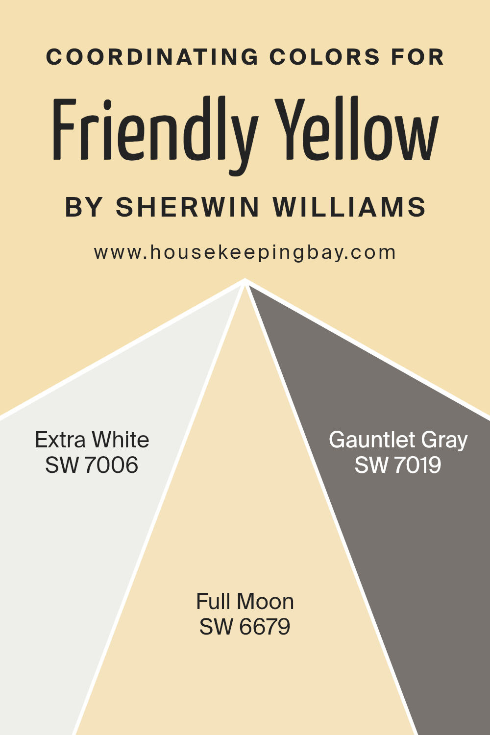
Coordinating Colors of Friendly Yellow SW 6680 by Sherwin Williams
Coordinating colors are shades that complement each other perfectly, working together to create a cohesive look within a space. They can enhance the atmosphere of a room, accentuating the main color, in this case, Friendly Yellow SW 6680 by Sherwin Williams, without overwhelming it. These coordinating shades, when chosen thoughtfully, can bring balance, contrast, and harmony to an environment, making it more visually appealing and comfortable.
For instance, SW 7006 – Extra White is a crisp, clean hue that can brighten a room and serve as a perfect backdrop, allowing Friendly Yellow to stand out and infuse warmth into the space. Then, there’s SW 6679 – Full Moon, a subtly radiant color that offers a gentle compliment to Friendly Yellow, softening the overall look with its understated charm.
Lastly, SW 7019 – Gauntlet Gray brings a sophisticated edge to the palette. Its rich, neutral tone provides a grounding effect, adding depth and a contemporary twist to spaces dominated by the cheerfulness of Friendly Yellow. Together, these coordinating colors blend seamlessly, each playing its part to achieve a beautiful, balanced aesthetic.
You can see recommended paint colors below:
- SW 7006 Extra White
- SW 6679 Full Moon
- SW 7019 Gauntlet Gray
housekeepingbay.com
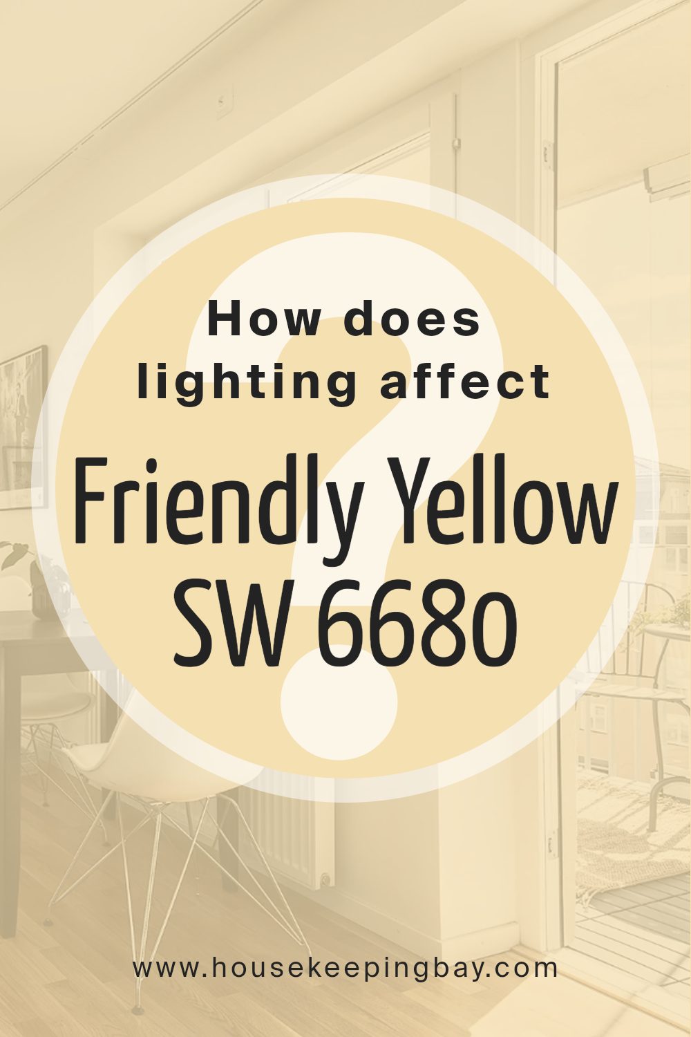
How Does Lighting Affect Friendly Yellow SW 6680 by Sherwin Williams?
Lighting has a big influence on how we see colors. Imagine you’ve picked a beautiful color like Friendly Yellow SW 6680 by Sherwin Williams. This cheerful shade can look different depending on the light. Let’s talk about how lighting changes its appearance.
- Artificial light can affect colors in various ways. It depends on the type of bulbs you use. For instance, a warm, soft white bulb can make Friendly Yellow look more cozy and inviting. It brings out the warmth of the color, making spaces feel snug. But under cool, bright LED lights, the same yellow might look sharper and more vivid. This makes the color pop more, perfect for areas where you want a lively vibe.
- Natural light also plays a cool role in how colors look. It’s all about the direction your room faces.
- North-faced rooms can be tricky because they get less direct sunlight. This means colors can appear cooler or slightly dimmer. Friendly Yellow might look more muted and subtle in these rooms, giving a gentle hint of warmth without overwhelming the space.
- South-faced rooms are the sun magnets. They get a lot of bright, warm light throughout the day. Here, Friendly Yellow vibrates with energy and warmth, appearing bright and sunny. It’s pretty perfect for creating a cheerful and inviting atmosphere.
- East-faced rooms catch the morning sun. This early light is warm and soft, making Friendly Yellow look glowing and vibrant in the morning then quieter as the day goes on. It’s a nice way to start the day with energy and calm down as evening approaches.
- West-faced rooms get the evening light. As the sun sets, the warm tones intensify. Friendly Yellow in these rooms will feel deeply warm and cozy, especially during the golden hour. It’s perfect for living spaces where you relax at the end of the day.
So, lighting isn’t just about making a room bright. It’s about playing with shades like Friendly Yellow to make your spaces feel just right. Whether it’s the type of bulb or the direction of sunlight, lighting can transform the same color into many moods.
housekeepingbay.com
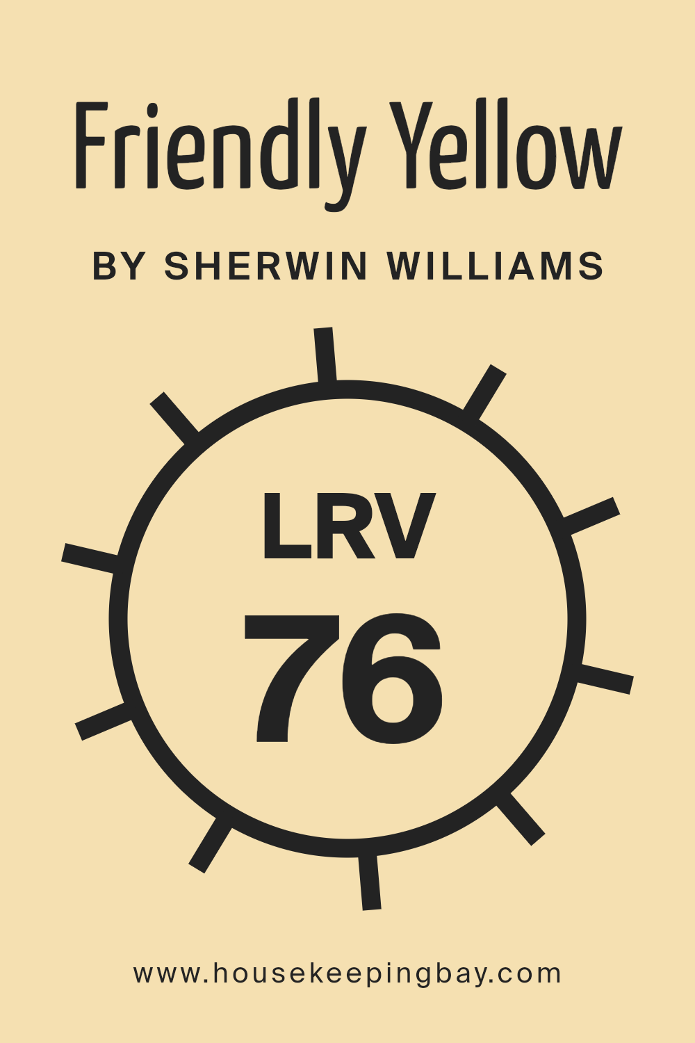
What is the LRV of Friendly Yellow SW 6680 by Sherwin Williams?
LRV stands for Light Reflectance Value, which is a measure from 0 to 100 that tells you how much light a color reflects or absorbs; 0 means it reflects no light, acting like a true black, and 100 means it reflects all light, similar to a perfect white. This concept is really useful when picking paint colors because it gives you a clear idea of how bright or dark a color will appear once it’s up on your walls.
The LRV helps you understand if the color will make a room feel smaller and cozier or larger and airier based on how much light it reflects. Lighter colors with higher LRVs reflect more light, making spaces look more open and bright, whereas colors with lower LRVs absorb more light, which can make a space feel more intimate or enclosed.
Given that Friendly Yellow by Sherwin Williams has an LRV of 75.97, it falls on the lighter end of the spectrum, meaning it’s quite a reflective color. This high LRV suggests that Friendly Yellow is capable of making rooms feel more alive and spacious by bouncing a lot of light around. In spaces with plenty of natural light, this color will appear even brighter and more vibrant, enhancing the feeling of openness and airiness. In less well-lit areas, it can help counteract the lack of light and make the space feel warmer and more welcoming. So, choosing a color like Friendly Yellow with a high LRV is a great choice if you’re aiming to give a room a cheerful and expansive vibe.
housekeepingbay.com
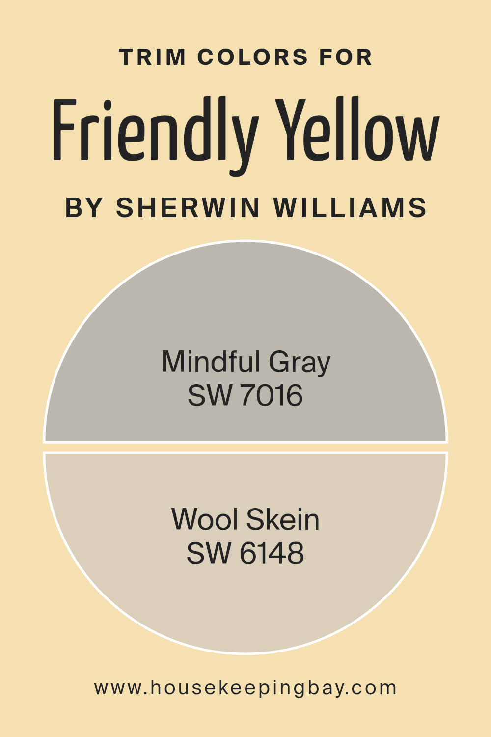
What are the Trim colors of Friendly Yellow SW 6680 by Sherwin Williams?
Trim colors are shades used on the edges, borders, and detailing of walls, doors, windows, and other architectural features in a room or exterior of a building. When choosing trim colors for Friendly Yellow SW 6680 by Sherwin Williams, it’s essential to pick hues that complement or contrast nicely with the main color to highlight the architectural details and bring a cohesive look to the space. Trim colors can significantly impact the overall appearance by defining the lines and features of the room or facade, enhancing the architectural charm, and creating a finished look that ties the design elements together.
For Friendly Yellow SW 6680, a light and cheerful shade, using SW 7016 – Mindful Gray as a trim color provides a sophisticated contrast. Mindful Gray is a warm, neutral gray that balances well with the brightness of Friendly Yellow, grounding the space with its soothing and refined presence. On the other hand, SW 6148 – Wool Skein, a soft, muted beige with warm undertones, complements the sunny disposition of Friendly Yellow by adding a subtle, natural contrast that enhances the welcoming feel of the room. Both colors offer a way to frame Friendly Yellow beautifully, making the main color pop and ensuring the space feels thoughtfully designed and harmonious.
You can see recommended paint colors below:
- SW 7016 Mindful Gray
- SW 6148 Wool Skein
housekeepingbay.com
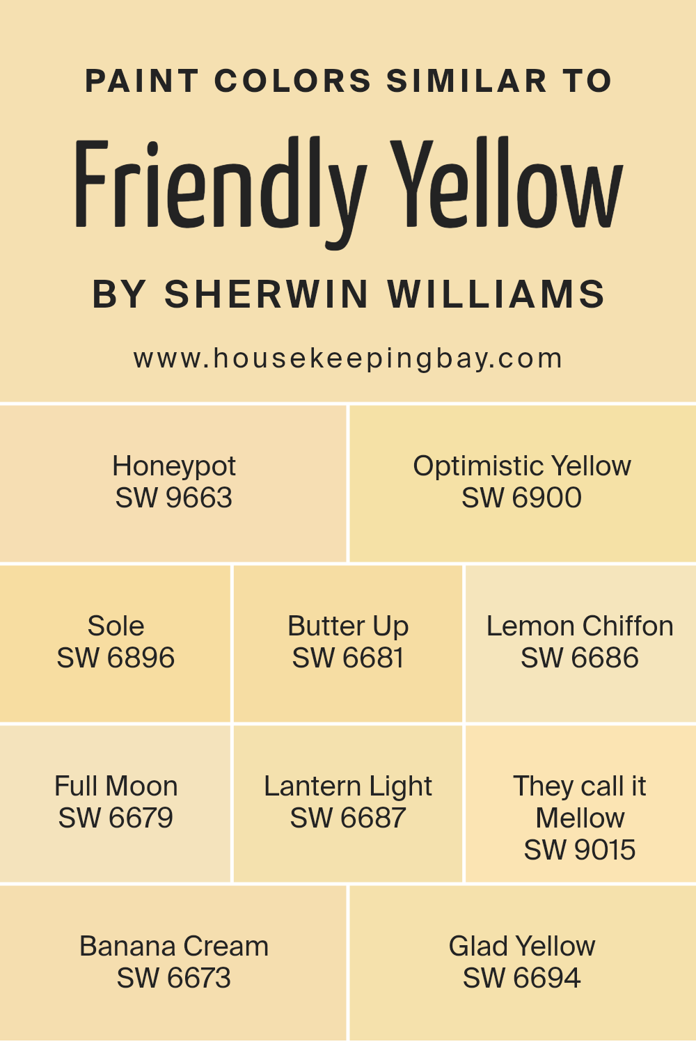
Colors Similar to Friendly Yellow SW 6680 by Sherwin Williams
Similar colors play a significant role in design and decor by creating harmonious and visually appealing spaces. When colors closely resemble each other, such as those similar to Friendly Yellow SW 6680 by Sherwin Williams, they can seamlessly blend together, establishing a cohesive look that’s pleasing to the eye. These shades carry the essence of warmth and happiness, emanating an inviting atmosphere. For instance, colors like Honeypot and Optimistic Yellow offer a touch of brightness that mimics the cheerful vibe of a sunny day. They are perfect for spaces where you want to instill a sense of energy and positivity.
On the other hand, softer tones such as Sole, Butter Up, and Lemon Chiffon provide a lighter, airy feel, reminiscent of the gentle morning light. These colors are ideal for creating a soothing environment that feels open and welcoming. Darker shades like Full Moon and Lantern Light anchor the color scheme with a bit more depth, adding a layer of sophistication. Meanwhile, accents like They Call It Mellow, Banana Cream, and Glad Yellow introduce subtle variations that keep the overall palette interesting and dynamic. Each color, with its unique name and hue, contributes to a spectrum that’s both vibrant and harmonious, proving that similar colors can indeed work together to form beautiful, uplifting spaces.
You can see recommended paint colors below:
- SW 9663 Honeypot
- SW 6900 Optimistic Yellow
- SW 6896 Sole
- SW 6681 Butter Up
- SW 6686 Lemon Chiffon
- SW 6679 Full Moon
- SW 6687 Lantern Light
- SW 9015 They call it Mellow
- SW 6673 Banana Cream
- SW 6694 Glad Yellow
housekeepingbay.com
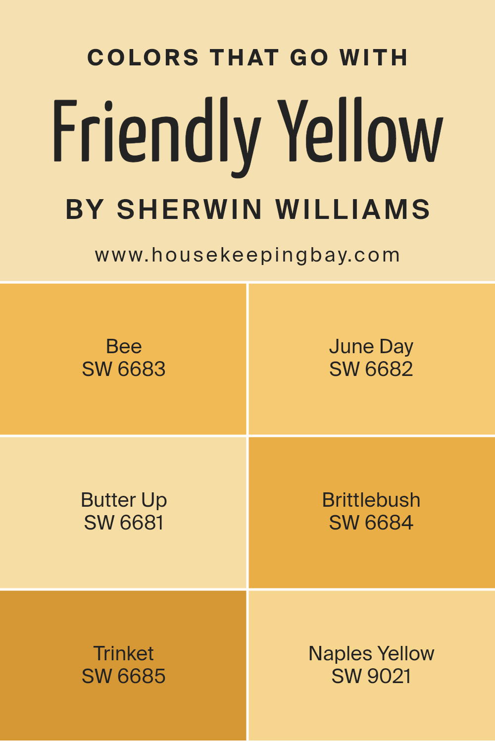
Colors that Go With Friendly Yellow SW 6680 by Sherwin Williams
Choosing colors that complement Friendly Yellow SW 6680 by Sherwin Williams is essential for creating a harmonious and inviting space. Pairing Friendly Yellow with the right colors can enhance the warmth and brightness of a room, evoking a sense of comfort and cheerfulness. Colors like Bee SW 6683 and June Day SW 6682 are perfect examples. Bee is a soft, muted hue that brings a gentle contrast to Friendly Yellow, creating a soothing blend that’s easy on the eyes. June Day, on the other hand, is a bit brighter, offering a sunny vibrancy that complements Friendly Yellow, making spaces feel energetic and lively.
Moving along the color spectrum, Butter Up SW 6681 adds a creamy, soft touch that pairs marvellously with Friendly Yellow, enriching the room’s cozy feel. Brittlebush SW 6684 steps in with a slightly earthier tone, grounding the brightness of Friendly Yellow with its subtle, natural vibe.
Trinket SW 6685 introduces a unique sparkle, adding a dash of playful luminosity that works wonders in enhancing the dynamic quality of Friendly Yellow. Lastly, Naples Yellow SW 9021 closes the circle with its rich, ochre warmth, creating a timeless elegance when paired with Friendly Yellow, making any space feel more welcoming and cherished. Together, these colors complement Friendly Yellow SW 6680 perfectly, each contributing its character to create rooms that are as beautiful as they are comfortable.
You can see recommended paint colors below:
- SW 6683 Bee
- SW 6682 June Day
- SW 6681 Butter Up
- SW 6684 Brittlebush
- SW 6685 Trinket
- SW 9021 Naples Yellow
housekeepingbay.com
How to Use Friendly Yellow SW 6680 by Sherwin Williams In Your Home?
Friendly Yellow SW 6680 by Sherwin Williams is a warm and inviting color that can easily make your home feel brighter and more welcoming. This shade of yellow has just the right amount of cheer without being too overwhelming. It’s perfect for adding a pop of color to spaces that need a little boost of energy or sunshine. Think about using it in your kitchen or breakfast nook to create a cozy, happy atmosphere that makes your mornings more enjoyable. It’s also great for a child’s playroom or bedroom, offering a lively backdrop for creativity and fun.
If you want to add a subtle hint of warmth to your living room or entryway without painting the entire room, consider using Friendly Yellow for an accent wall. This approach can refresh your space in a simple yet effective way. Pairing it with neutral colors such as whites, grays, or even softer blues can balance its vibrancy, ensuring your home feels both joyful and relaxing at the same time.
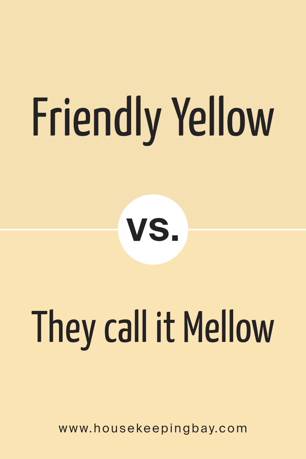
Friendly Yellow SW 6680 by Sherwin Williams vs They call it Mellow SW 9015 by Sherwin Williams
Let’s look at two colors from Sheriwin Williams: Friendly Yellow SW 6680 and They Call It Mellow SW 9015. Friendly Yellow is a bright, sunny color. It’s like the kind of yellow you see on a sunny day, energetic and full of life. It has a lively vibe that can make a space feel happy and inviting. On the other hand, They Call It Mellow is a softer, more relaxed shade. It’s still yellow but with a laid-back, calming feel.
Imagine the soft light of early morning or late afternoon when the sun is gentle. This color would make a room feel cozy and peaceful. While Friendly Yellow adds a pop of cheer and can wake up a space, They Call It Mellow is more about creating a chill, soothing atmosphere. Both are yellow, but they bring different moods to a room – one is all about bold happiness, and the other is about quiet relaxation.
You can see recommended paint color below:
- SW 9015 They call it Mellow
housekeepingbay.com
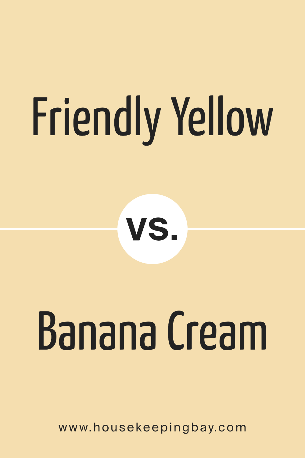
Friendly Yellow SW 6680 by Sherwin Williams vs Banana Cream SW 6673 by Sherwin Williams
Friendly Yellow and Banana Cream, both by Sherwin Williams, are inviting colors that brighten up any space. Friendly Yellow is a vivid, cheerful color. It’s a bit more saturated, making it pop in a room. It reminds you of sunshine and happiness, perfect for creating a lively and warm atmosphere.
On the other hand, Banana Cream has a softer, more subdued hue. It’s lighter than Friendly Yellow, offering a gentler vibe. Think of the creamy part of a banana – that’s Banana Cream. It’s excellent for spaces where you want a touch of sunshine without overpowering the room. While both colors bring warmth and joy, Friendly Color stands out with its boldness, whereas Banana Cream offers a quieter, more understated charm. They are both great for making a place feel welcoming, but your choice depends on how bright or soothing you want the room to feel.
You can see recommended paint color below:
- SW 6673 Banana Cream
housekeepingbay.com
Friendly Yellow SW 6680 by Sherwin Williams vs Sole SW 6896 by Sherwin Williams
Friendly Yellow SW 6680 by Sherwin Williams is a warm and comforting shade of yellow. It brings to mind sunlight and happiness, perfect for creating a cheerful and inviting atmosphere in any room. This color is great for living areas and kitchens where you want to add a bit of brightness and warmth.
On the other hand, Sole SW 6896 by Sherwin Williams is a bold and vibrant yellow. It’s more intense than Friendly Yellow, almost like the color of a bright lemon. Sole is a great choice if you’re looking to make a strong statement or add a pop of color to a space. It works well in areas that could use a lively boost, such as playrooms or creative spaces.
While both colors share a base in the yellow family, Friendly Yellow offers a softer, more subdued feel, which creates a cozy and welcoming vibe. Sole, with its zesty and vivacious hue, is all about energy and excitement. Depending on the mood you want to set, each color has its own unique appeal.
You can see recommended paint color below:
- SW 6896 Sole
housekeepingbay.com
Friendly Yellow SW 6680 by Sherwin Williams vs Glad Yellow SW 6694 by Sherwin Williams
Friendly Yellow SW 6680 by Sherwin Williams is a bright and inviting hue that brings a sense of warmth to any space. It has a cheerful ambiance that can lighten up a room, making it feel more welcoming and cozy. This color tends to be soft enough not to overwhelm, making it versatile for use in many areas of a home, from kitchens to bedrooms.
On the other hand, Glad Yellow SW 6694 is a more vibrant and energetic shade of yellow. It’s a bit bolder than Friendly Yellow, providing a punch of brightness that can stimulate and energize a space. This hue is perfect for creating a focal point or adding a spark of joy to any room.
While both colors are from the yellow family, Friendly Yellow leans towards a softer, more muted tone that offers warmth and comfort. Glad flip, has a stronger, more vivid appearance that can make a statement. Depending on the mood you want to set in a room, both these colors offer distinct vibes – Friendly Yellow for a softer appeal, and Glad Yellow for a more dynamic energy.
You can see recommended paint color below:
- SW 6694 Glad Yellow
housekeepingbay.com
Friendly Yellow SW 6680 by Sherwin Williams vs Honeypot SW 9663 by Sherwin Williams
Friendly Yellow SW 6680 by Sherwin Williams is a bright and lively color. It reminds you of sunshine and can make any room feel warm and inviting. This color is really good for spaces where you want a cheerful vibe, like a kitchen or a playroom. It’s bold and gets your attention but in a pleasant way, not too overwhelming.
On the other hand, Honeypot SW 9663 is also a warm color but has a deeper, richer tone. It feels more like the golden hours of a late summer afternoon. It’s cozy and has a bit of a sophisticated touch, making it a great choice for areas where you want a bit of elegance without losing the welcoming feel, such as a dining room or a cozy reading nook.
Both colors have their own charm. Friendly Yellow is more about making spaces bright and lively, while Honeypot offers warmth and a bit more depth, bringing a cozy elegance to any space.
You can see recommended paint color below:
housekeepingbay.com
Friendly Yellow SW 6680 by Sherwin Williams vs Butter Up SW 6681 by Sherwin Williams
Friendly Yellow SW 6680 by Sherwin-Williams is a bright and cheerful color that stands out for its ability to make spaces feel warm and welcoming. It has a vibrant tone that can light up a room and bring a positive energy to any space. This shade of yellow works well in living areas and kitchens where you want to create a cozy, yet lively atmosphere.
Butter Up SW 6681 by Sherwin-Williams, on the other hand, is a softer and creamier yellow. It leans more towards a light, buttery color that can make rooms feel calm and relaxed. It’s a subtle shade of yellow, perfect for those looking to add a hint of brightness without overwhelming a space. Butter Up is great for bedrooms and bathrooms where a softer, more soothing vibe is desired.
In comparison, Friendly Yellow is more dynamic and energetic, ideal for more active areas, while Butter Up is gentler and more laid-back, suited for creating a peaceful retreat. Both colors add a sunny disposition to interiors but in distinctly different tones and moods.
You can see recommended paint color below:
- SW 6681 Butter Up
housekeepingbay.com
Friendly Yellow SW 6680 by Sherwin Williams vs Optimistic Yellow SW 6900 by Sherwin Williams
Friendly Yellow and Optimistic Yellow, both by Sherwin Williams, offer their unique take on the sunny hue. Friendly Yellow has a softer, more subdued tone that feels warm and welcoming. It’s like the gentle morning light that fills a room, creating a cozy and comforting atmosphere. This color is perfect for spaces where you want to relax and feel at ease, like living rooms or bedrooms.
On the other hand, Optimistic Yellow is brighter and more vibrant. It’s the kind of yellow that grabs your attention and brings a burst of energy into a space. Imagine the cheerful color of sunflowers or a lemon’s zest. It’s ideal for areas where you want to lift spirits and inject a sense of excitement, such as kitchens, dining areas, or any space that could use a little sunshine.
Although both colors share the same yellow base, their different shades offer distinct feelings – Friendly Yellow brings warmth and calm, while Optimistic Yellow adds cheer and vitality.
You can see recommended paint color below:
- SW 6900 Optimistic Yellow
housekeepingbay.com
Friendly Yellow SW 6680 by Sherwin Williams vs Lemon Chiffon SW 6686 by Sherwin Williams
Friendly Yellow SW 6680 by Sherwin Williams and Lemon Chiffon SW 6686, also by Sherwin Williams, are both inviting, warm shades of yellow, but they have some distinctions. Friendly Yellow has a rich, sunny quality that feels like a warm hug in a room. It’s bold and vibrant, making spaces feel alive and cozy. This color works well in living areas and kitchens where you want a cheerful atmosphere.
On the other hand, Lemon Chiffon is lighter and softer, giving off a calm and soothing vibe. It’s closer to a pastel, making it perfect for creating a subtle, airy, and bright space. It works beautifully in bedrooms, bathrooms, or any area of the house where a gentle touch of color is desired to lighten up the room without overwhelming it.
Although both colors share a base of yellow, Friendly Yellow leans towards a more pronounced and energetic hue, while Lemon Chiffon offers a lighter, more tranquil feel. Each color serves different moods and settings, depending on the environment you want to create.
You can see recommended paint color below:
- SW 6686 Lemon Chiffon
housekeepingbay.com
Friendly Yellow SW 6680 by Sherwin Williams vs Lantern Light SW 6687 by Sherwin Williams
Friendly Yellow SW 6680 by Sherwin-Williams is a bright and cheerful color. It brings to mind the warmth of the sun and has a lively feeling to it. This shade of yellow can make a room feel inviting and full of light, perfect for creating a cozy and happy space.
Lantern Light SW 6687, also by Sherwin-Williams, is another yellow tone, but it’s lighter and softer. It’s like the gentle glow of a lantern on a summer evening. This color is more subtle and has a calming effect, making it great for spaces where you want to relax and wind down.
While both colors share the warmth and positivity of yellow, Friendly Yellow has more energy and vibrancy, making it a great choice for spaces that need a pop of brightness. Lantern Light, on the other hand, is better suited for areas where a gentle and soothing atmosphere is desired. Whether you choose the boldness of Friendly Yellow or the softness of Lantern Light depends on the mood you want to set in your space.
You can see recommended paint color below:
- SW 6687 Lantern Light
housekeepingbay.com
Friendly Yellow SW 6680 by Sherwin Williams vs Full Moon SW 6679 by Sherwin Williams
Friendly Yellow SW 6680 and Full Moon SW 6679 by Sherwin Williams are two interesting colors. Friendly Yellow is bright and cheerful. It’s the kind of yellow you might see in a sunlit kitchen, bringing warmth and a sense of happiness. It’s a bold color that makes spaces feel inviting and cozy.
On the other hand, Full Moon SW 6679 is very light and subtle. It’s almost like a soft white but with a hint of yellow. It’s perfect for those who want just a whisper of color in their room without overpowering it. Full Moon can make small spaces appear bigger and brighter because of its lightness.
If you’re deciding between the two for a room, think about the mood you want to set. Friendly Yellow adds energy and a positive vibe, well-suited for active areas like living rooms or kitchens. Full Moon, with its gentle touch, is great for creating a peaceful and calm space, ideal for bedrooms or bathrooms. Both colors work well in their own right, depending on the effect you’re aiming for.
You can see recommended paint color below:
- SW 6679 Full Moon
housekeepingbay.com
Conclusion
In summary, the color Friendly Yellow SW 6680 by Sherwin Williams is a vibrant and welcoming shade that can transform any space into a cheerful and inviting area. Its bright hue brings a sense of warmth and positivity, making it a perfect choice for areas where you want to create a friendly and uplifting atmosphere. Its versatility allows it to be used in various settings, from kitchens and living rooms to bedrooms, demonstrating its ability to complement different decors and styles seamlessly.
Moreover, Friendly Yellow SW 6680 is not just about aesthetics; it also has the potential to influence mood and create a lively environment. Its sunny nature can energize a room, encouraging creativity and happiness. Whether you’re looking to brighten up a dull space or add a splash of joy to your home, this color proves to be an excellent option, offering both beauty and a welcoming vibe. It’s clear that Sherwin Williams’ Friendly Yellow SW 6680 has the capability to enhance any interior with its delightful charm and vibrant energy.
housekeepingbay.com
Ever wished paint sampling was as easy as sticking a sticker? Guess what? Now it is! Discover Samplize's unique Peel & Stick samples. Get started now and say goodbye to the old messy way!
Get paint samples


