Florida Orange 152 by Benjamin Moore
Brighten Your Day with a Splash of Sunshine
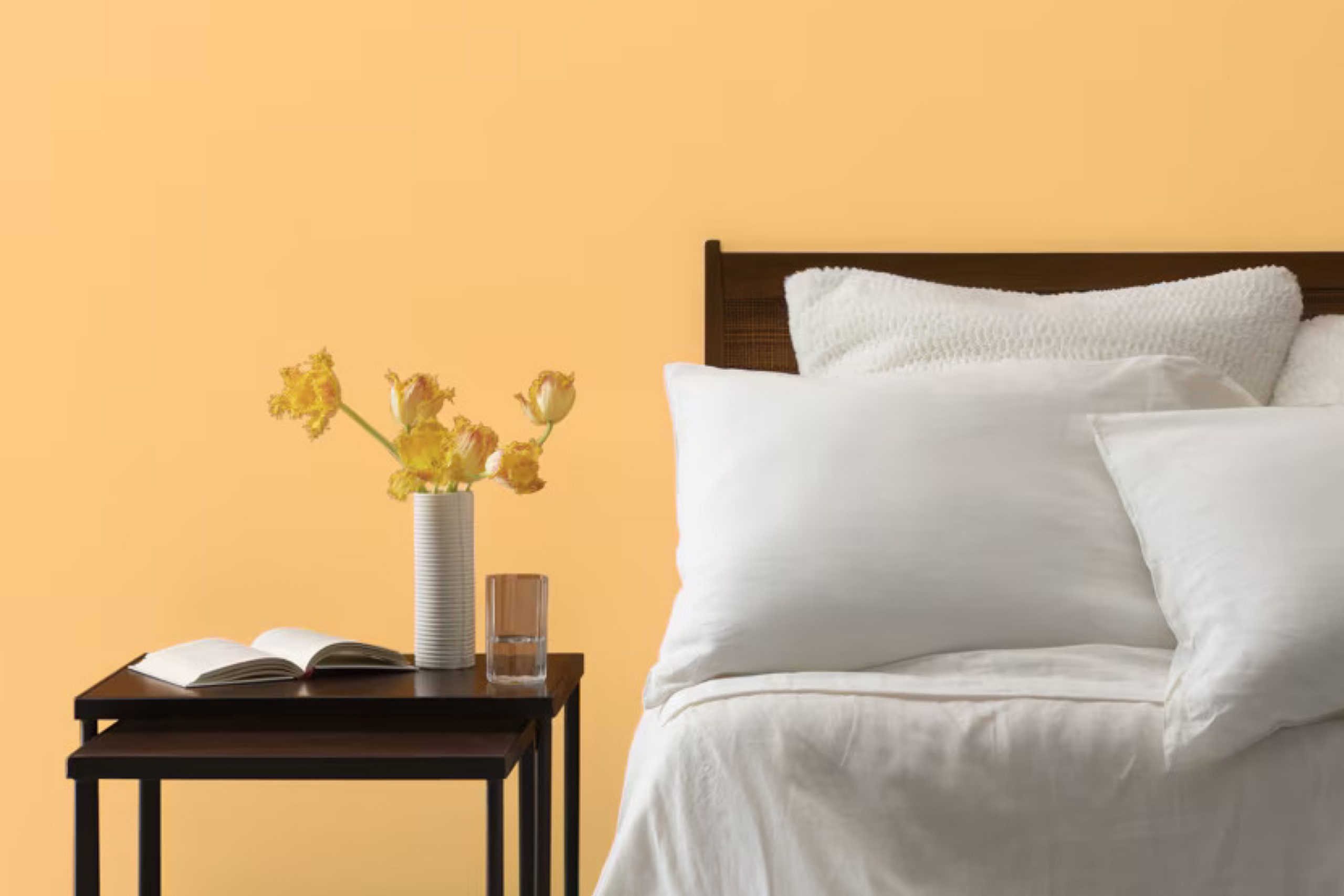
You might want to consider refreshing your space with a bright and cheerful color like 152 Florida Orange by Benjamin Moore. This vibrant orange hue can add a lively touch to any room, illuminating it with a warm and inviting glow. Whether you’re thinking about brightening up your living room, kitchen, or even a small accent area, Florida Orange offers a fresh pop of color that can make any space more enjoyable.
Using Florida Orange can bring a sense of energy and positivity to your environment. It pairs well with both light and dark neutrals, and you can use it to create a variety of looks depending on the accessories and furniture you choose.
If you’re curious about how this shade will look in your home, you might consider testing it out with some samples to see how it transforms the area under different lighting conditions.
Is Florida Orange the right choice for your next project?
It just might be the perfect way to freshen up your space with a splash of color that’s both lively and inviting.
via benjaminmoore.com
What Color Is Florida Orange 152 by Benjamin Moore?
Florida Orange 152 by Benjamin Moore is a vibrant, warm hue reminiscent of orange groves and sunsets. This rich, cheerful orange adds a zestful charm and lively spirit to any space. Its intensity can create a focal point in a room or inject playful energy throughout an area.
This color works particularly well in interior styles that benefit from a boost of warmth and brightness, such as eclectic, modern, and bohemian decors.
Its vivid nature makes it a great choice for accents like walls in a dining area or a backsplash in a kitchen, enriching spaces typically used for gathering and lively interaction.
When it comes to pairing materials, Florida Orange 152 coordinates beautifully with natural elements that soften its vibrancy without overshadowing its presence.
Wood, with its natural grains, complements the boldness of the orange, while lighter, muted textiles like linens and soft cottons can add balance.
For textures, smooth matte surfaces allow the color to stand out, whereas incorporation of some metallic accents in copper or gold can subtly enhance the warmth of the shade without competing for attention.
Overall, Florida Orange 152 is ideal for invigorating a space with positivity and warmth, making it more welcoming and energetically vibrant.
housekeepingbay.com
Is Florida Orange 152 by Benjamin Moore Warm or Cool color?
Florida Orange 152 by Benjamin Moore is a vibrant, cheerful paint color that brings a sunny, warm atmosphere to any room in a home. This bright orange hue is perfect for adding a lively touch to spaces that might otherwise feel dull or lifeless. Because of its boldness, Florida Orange 152 works well as an accent wall or for highlighting key architectural features. It can also energize a kitchen or dining area, making these spaces feel more inviting and fun.
However, because Florida Orange 152 is quite intense, it’s wise to balance it with more neutral colors like white, gray, or beige. These colors help soften the bold orange, ensuring that the room doesn’t feel overwhelming
. Additionally, Florida Orange pairs nicely with blues and greens, providing a refreshing contrast that can make a home feel vibrant yet cozy.
Using Florida Orange 152 is a simple way to add a splash of personality and warmth to your living environment, making it feel more alive and welcoming.
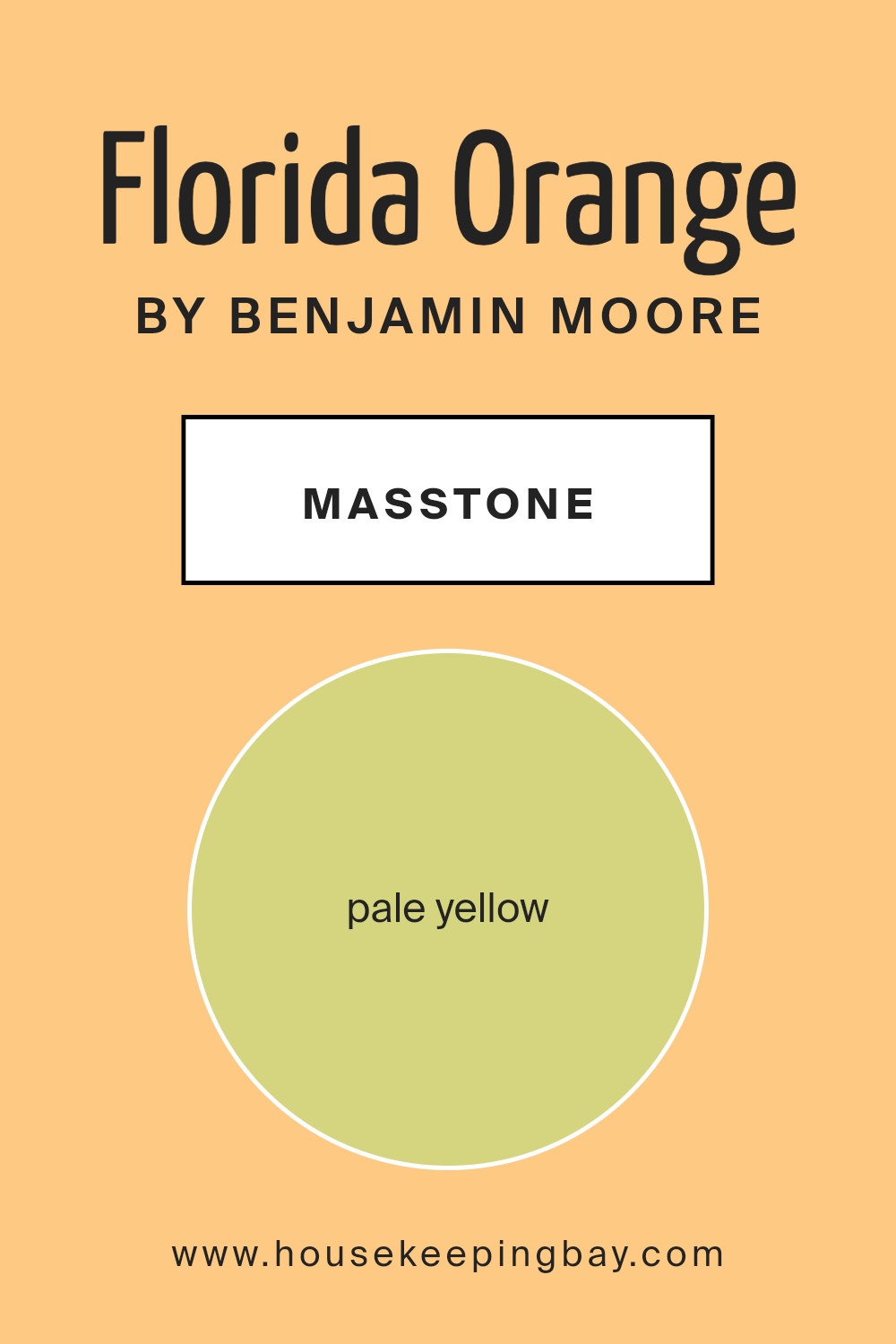
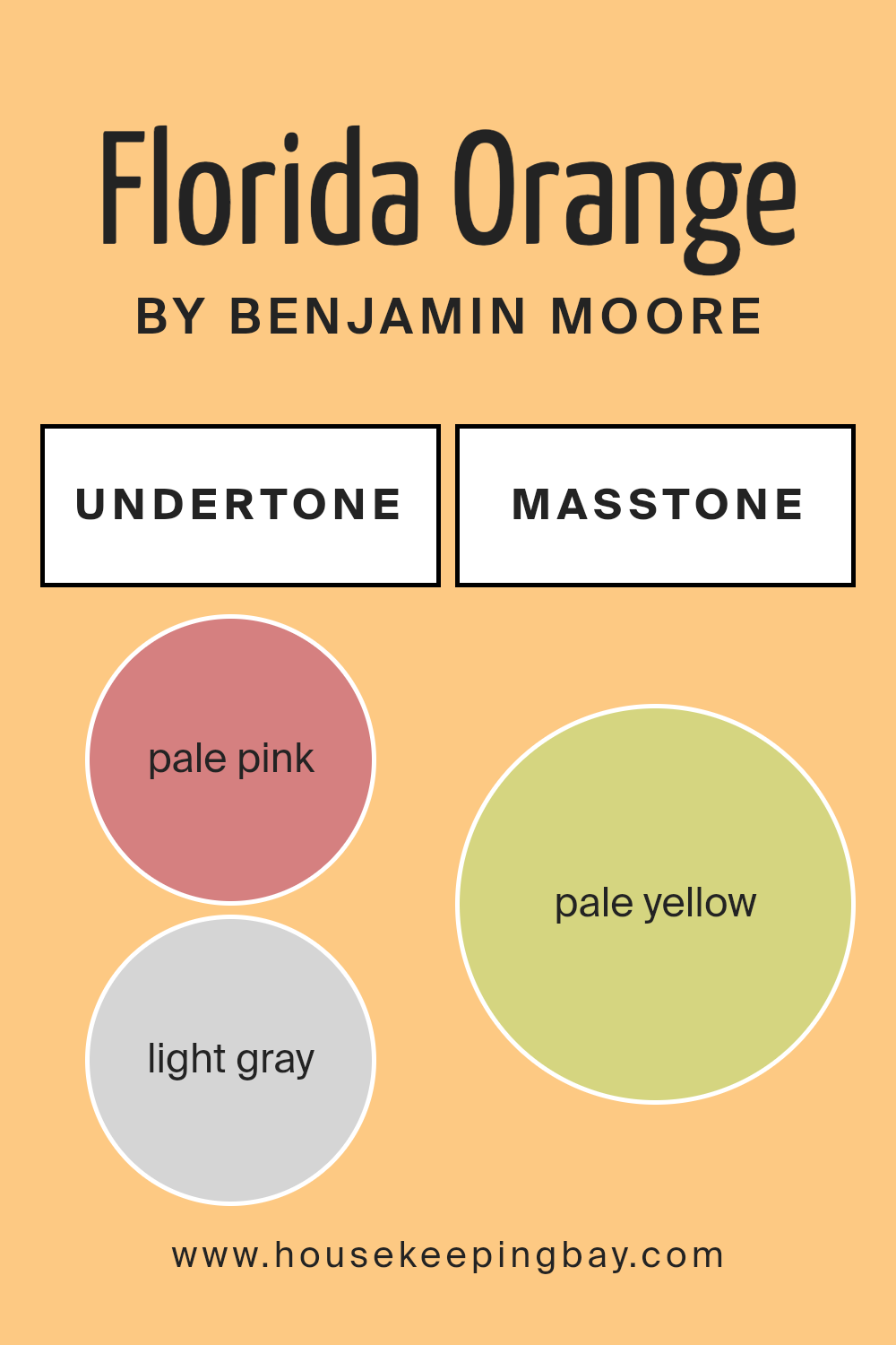
What is the Masstone of the Florida Orange 152 by Benjamin Moore?
Florida Orange 152 by Benjamin Moore in its masstone of pale yellow (#D5D580) has a subtle yet inviting appeal that fits perfectly in home settings. This specific shade of pale yellow brings a light and airy feel to rooms, making them appear more spacious and welcoming. It works well in areas like living rooms or kitchens where a touch of cheerfulness is beneficial.
Being a pale yellow, this color helps in reflecting light, which can make a room look brighter without being overwhelming. This aspect is particularly helpful in homes that receive limited natural light. Its soft tone allows it to blend easily with various decor styles and other colors, ranging from neutral shades to more vibrant hues.
Florida Orange 152 is versatile and functions as a pleasant background color that adds warmth to a space while maintaining a calm atmosphere. This makes it a great choice for creating a relaxed environment in your home, fostering a setting where you and your family can feel comfortable and at ease.
housekeepingbay.com
Undertones of Florida Orange 152 by Benjamin Moore
The paint color Florida Orange 152 by Benjamin Moore is a vibrant, rich shade, but its impact on a room can vary significantly depending on its undertones. Undertones are subtle colors that influence the main hue. In the case of Florida Orange 152, these undertones include pale pink, light gray, yellow, light purple, orange, mint, grey, light blue, light green, lilac, and olive. Each of these adds a unique dimension to the primary orange color.
In interior walls, these undertones play a crucial role in how the paint interacts with light and other elements in the space. For instance, the pale pink and light purple undertones can add a soft, warm touch, making the room feel cozier.
On the other hand, undertones like light gray and grey might mute the brightness somewhat, giving a more subdued appearance. Yellow and light green undertones can make the orange appear fresher and more vibrant, which could energize a space.
The way natural and artificial light hits the painted walls can also affect how these undertones are perceived. In bright sunlight, yellow and light green undertones may become more pronounced, enhancing the room’s lively feel. In contrast, in dimmer light, grey or light blue might become more noticeable, cooling down the overall effect.
When choosing Florida Orange 152, consider the room’s lighting, the size of the space, and the mood you want to create. These factors, along with the complex undertones, will influence the final look and feel of the room.
housekeepingbay.com
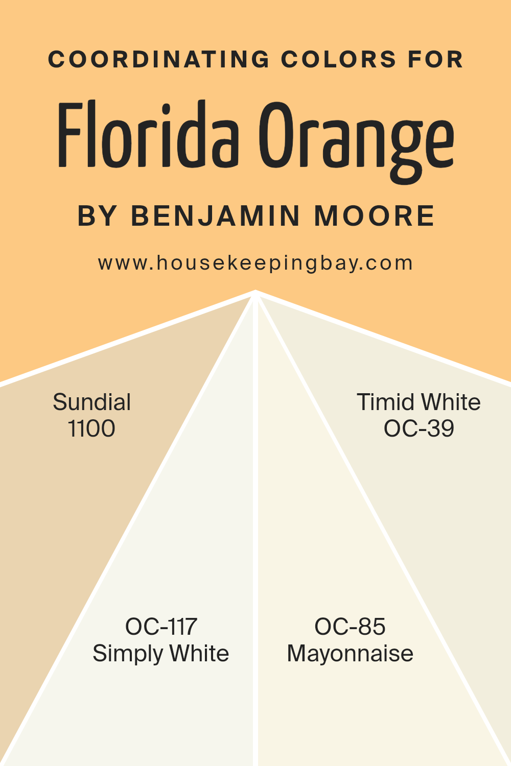
Coordinating Colors of Florida Orange 152 by Benjamin Moore
Coordinating colors are selected to complement a primary color, ensuring harmonious visual appeal in a space. For Florida Orange, a vibrant paint by Benjamin Moore, colors like 1100 – Sundial, OC-117 – Simply White, OC-85 – Mayonnaise, and OC-39 – Timid White, serve as coordinating nuances. These shades work well together by balancing the warmth of Florida Orange with their milder tones, creating a pleasant atmosphere.
Sundial adds a soft, sandy touch that gently tones down the intensity of a bold orange, making the combination comfortable for various settings. Simply White offers a crisp and clean contrast that can brighten up a room while allowing Florida Orange to remain the focal point.
Mayonnaise, with its subtle creamy character, blends smoothly with Florida Orange, providing a soothing effect that is both refreshing and easy on the eyes. Timid White offers a hint of warm undertones, making it a perfect match to draw out the coziness of Florida Orange while ensuring the room feels light and airy. Together, these colors harmonize to produce pleasing environments that feel both cheerful and relaxed.
You can see recommended paint colors below:
- 1100 Sundial
- OC-117 Simply White
- OC-85 Mayonnaise
- OC-39 Timid White
housekeepingbay.com
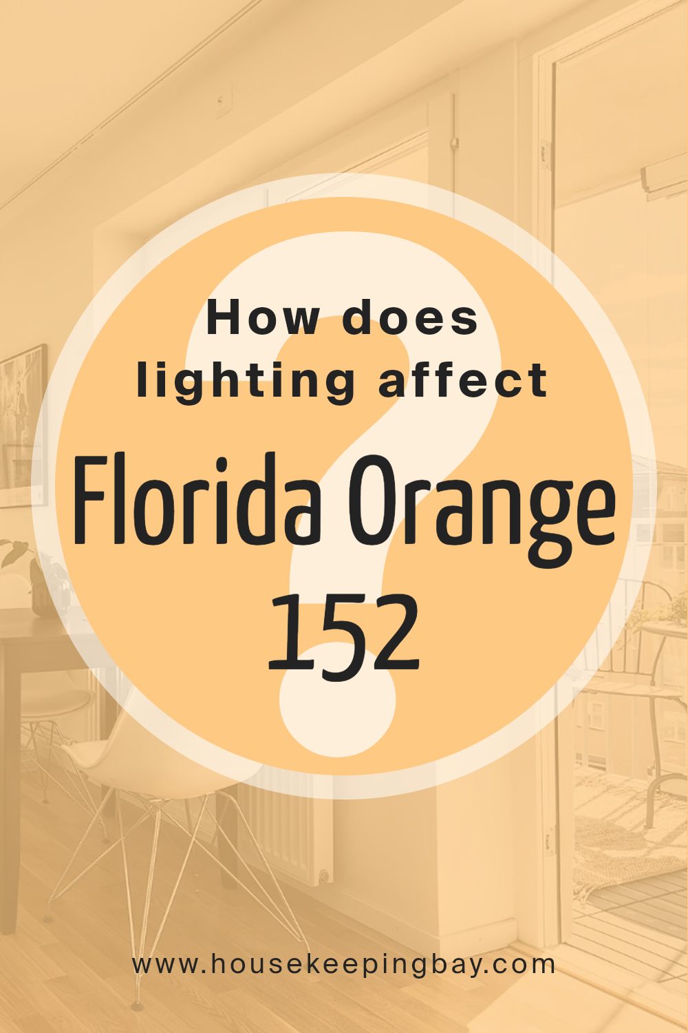
How Does Lighting Affect Florida Orange 152 by Benjamin Moore?
Lighting plays a crucial role in how we perceive colors. The type of light can make a color look different at various times of the day or under different light sources. Let’s look at how Benjamin Moore’s Florida Orange 152 appears under various lighting conditions.
In natural light, Florida Orange 152 displays its truest form. This vibrant, cheerful orange radiates warmth and can invigorate a space with sunlight. In rooms that face north, however, natural light is cooler and less direct which can make Florida Orange 152 appear slightly more muted and less intense. It still adds warmth to the room but with a softened vigor compared to brighter lit areas.
South-facing rooms benefit from ample sunlight throughout the day. Here, Florida Orange 152 will appear lively and vivid, maintaining its radiant quality as sunlight shifts from morning to evening. This orientation enhances the paint’s ability to warm up the space, making it feel cozy and welcoming.
In east-facing rooms, the morning light can make Florida Orange 152 look particularly bright and fresh. As the day progresses and the natural light diminishes, this color might lose some of its potency but retain a warm glow well into the afternoon.
West-facing rooms receive intense light in the late afternoon to evening, which can amplify the richness of Florida Orange 152, making it appear more dynamic and bold during sunset hours. This effect creates a lively and energetic environment suitable for living spaces that see more activity towards the evening.
Artificial lighting affects Florida Orange 152 differently. Under warm artificial lights, such as incandescent bulbs, the color will look richer and more intense, enhancing its warm traits. Fluorescent lighting, however, casts a cooler hue that might skew Florida Orange 152 towards looking flatter and less vibrant.
In conclusion, Florida Orange 152 by Benjamin Moore reacts variably to different lighting conditions, affecting the mood and feel of each room it is used in. Choosing the correct lighting can maximize the impact of this color, taking advantage of its lively essence.
housekeepingbay.com
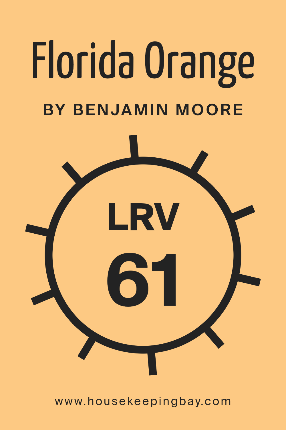
What is the LRV of Florida Orange 152 by Benjamin Moore?
LRV stands for Light Reflectance Value, a measurement that indicates how much light a paint color reflects back into a room compared to how much it absorbs. The scale ranges from 0, which is completely black and absorbs all light, to 100, which is pure white and reflects all light back into the room.
This value is crucial when choosing paint colors because it helps predict how light or dark a color will look on your walls depending on the amount of natural or artificial light your space receives.
A higher LRV means the color will appear lighter and can make a room feel more open and airy, while a lower LRV can make a space feel cozier but smaller.
With an LRV of 61.42, Florida Orange 152 by Benjamin Moore is on the lighter side, meaning it will reflect a good amount of light and make spaces feel brighter and more lively. This particular shade of orange has a cheerful and warm hue, enhancing the illumination in a room, especially in spaces that receive a decent amount of natural light.
The specific LRV of this color means it is versatile enough to be used in various lighting conditions, maintaining its vibrancy without overwhelming the space. It’s important to consider this when planning room decor, as the brightness will influence the overall atmosphere and how other colors in the room interact with it.
housekeepingbay.com
What are the Trim colors of Florida Orange 152 by Benjamin Moore?
Trim colors are specific shades used to accentuate or highlight the architectural details and edges of walls, door frames, window frames, and moldings in a space. Selecting the right trim color can enhance the overall appearance of a room and define its character.
For instance, when using a vibrant hue like Florida Orange 152 by Benjamin Moore, choosing an appropriate trim color is crucial to creating a balanced look.
The recommended trim colors for this vibrant orange are OC-17 (White Dove) and OC-152 (Super White) by Benjamin Moore, which can provide a crisp, clean contrast that makes the wall color pop and ensures the room feels well-coordinated and fresh.
White Dove (OC-17) by Benjamin Moore is a soft, warm white with a hint of grey. It’s a versatile color that pairs beautifully with deeper, saturated colors like Florida Orange, softening the overall effect and lending a subtle sophistication to the space.
On the other hand, Super White (OC-152) is a brighter, purer white that offers a more striking contrast with strong colors, making the architectural details in a room stand out sharply against bolder backgrounds. Using Super White as a trim color can help to make the main color look even more vibrant and lively, enhancing the energy of the room.
You can see recommended paint colors below:
- OC-17 White Dove
- OC-152 Super White

housekeepingbay.com
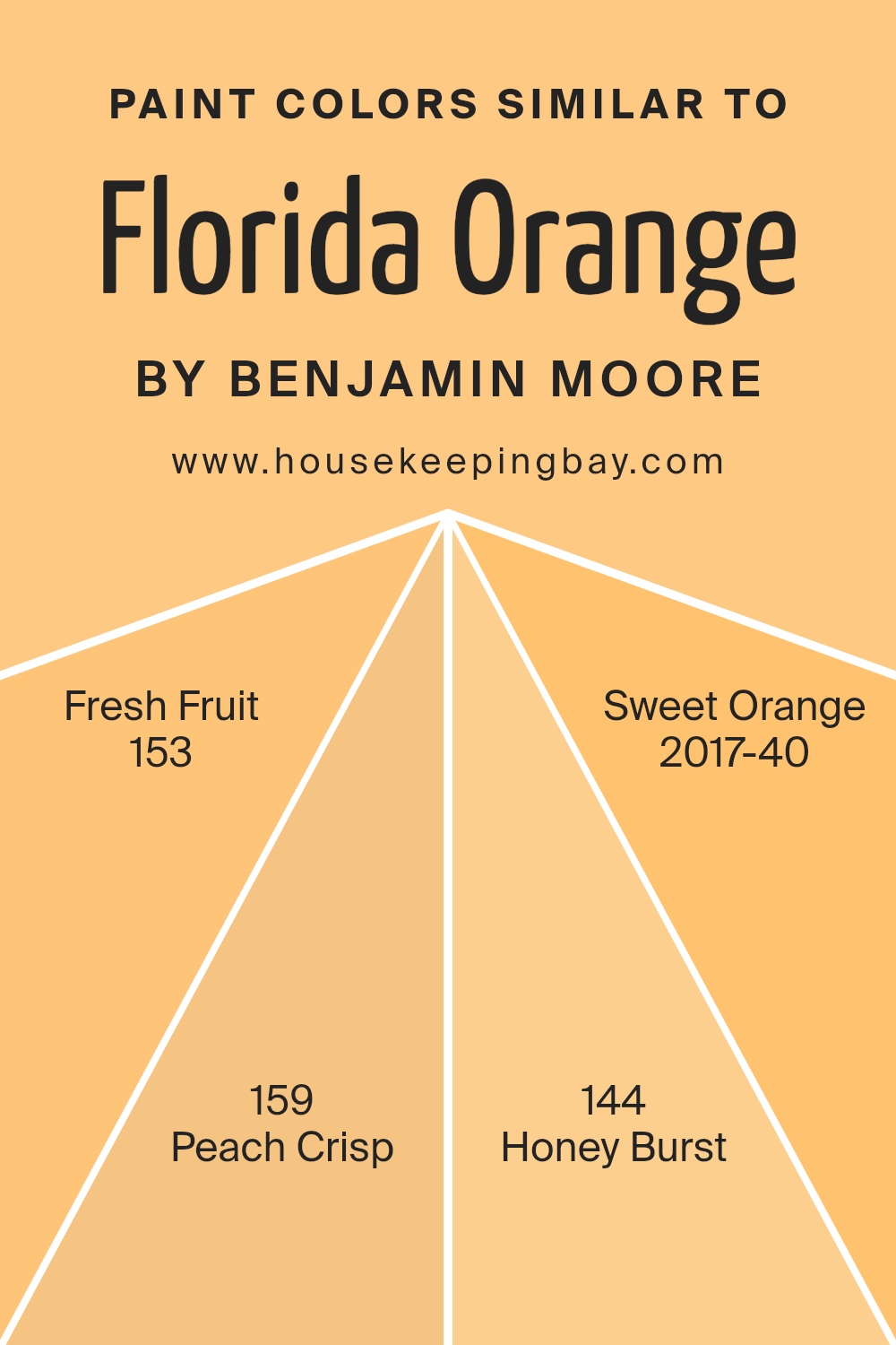
Colors Similar to Florida Orange 152 by Benjamin Moore
Similar colors play a crucial role in creating a cohesive and harmonious look in any design or decor. For instance, different shades of orange such as Florida Orange 152 by Benjamin Moore can be paired with tones like Fresh Fruit 153, Peach Crisp 159, Honey Burst 144, and Sweet Orange 2017-40 to achieve a balanced and visually appealing ambiance.
These colors align well because they share a common base hue, yet each offers a slight variation that can enhance the depth and interest of a space. Using similar colors helps in creating a seamless color flow, which can make a room feel more unified and thoughtful.
Florida Orange 152 by Benjamin Moore is a vibrant and rich shade that lends a warm and welcoming feel. Fresh Fruit 153 offers a lighter and more subtle touch, perfect for spaces that need a hint of brightness without overpowering. Peach Crisp 159 adds a soft, almost pastel-like quality to the palette, ideal for creating a gentle and soothing impression.
Honey Burst 144 has a deeper, golden tone that brings a sun-kissed warmth to interiors, making it great for areas that crave a cozy atmosphere.
Lastly, Sweet Orange 2017-40 presents a cheerful and lively orange that can inject a playful and energetic vibe into any setting. Together, these colors work harmoniously to enrich the visual experience of a space while maintaining a consistent theme centered around orange hues.
You can see recommended paint colors below:
- 153 Fresh Fruit
- 159 Peach Crisp
- 144 Honey Burst
- 2017-40 Sweet Orange
housekeepingbay.com
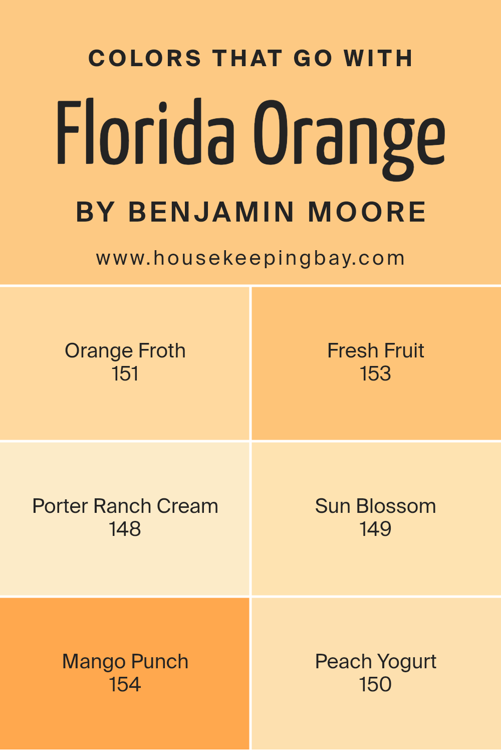
Colors that Go With Florida Orange 152 by Benjamin Moore
Choosing complementary colors for Florida Orange 152 by Benjamin Moore is important because it helps create a cohesive and balanced look in any space. Whether you’re aiming for a vibrant, energetic vibe or a soft, nurturing atmosphere, pairing this bold orange with its complementary hues can achieve the desired effect.
For instance, pairing with Orange Froth, a lighter and subtly creamy shade, softens the intensity of Florida Orange, providing a gentle transition in spaces that aim for a bright yet soothing ambiance. Fresh Fruit takes a slightly zestier approach with its vivid, citrusy tone that complements the deep vibrancy of Florida Orange, ideal for areas where energy and vitality are desired.
On the other hand, Porter Ranch Cream offers a muted, earthy beige that grounds the brightness of Florida Orange, making it perfect for more subdued or sophisticated settings. Sun Blossom introduces a cheerful, sunny yellow that injects joy and liveliness, pairing wonderfully with Florida Orange for a sunny, inviting environment.
Mango Punch continues in a bold direction with its deep, rich coral hue that resonates with warmth and excitement, enhancing the dynamic nature of Florida Orange.
Lastly, Peach Yogurt offers a softer, pastel counterpart that creates a smooth, harmonious look, perfect for relaxing and welcoming spaces. Together, these colors provide versatile options that can cater to varied aesthetic goals and room functions.
You can see recommended paint colors below:
- 151 Orange Froth
- 153 Fresh Fruit
- 148 Porter Ranch Cream
- 149 Sun Blossom
- 154 Mango Punch
- 150 Peach Yogurt
housekeepingbay.com
How to Use Florida Orange 152 by Benjamin Moore In Your Home?
Florida Orange 152 by Benjamin Moore is a vibrant and cheerful paint color that can add a splash of brightness to any room in your home. This particular shade of orange is lively and can create a welcoming atmosphere, perfect for spaces where you gather with family and friends. You might consider using it in the kitchen for a warm, cozy feeling, or in a dining area where lively conversations happen. It also works well in a playroom or creativity space because the color can inspire energy and enthusiasm.
If you’re unsure about committing to painting an entire room with Florida Orange, you can start by painting just one accent wall. This approach adds a pop of color without overwhelming the space.
Coordinating it with neutral colors like white, gray, or beige can balance the intensity of the orange and make the room feel harmonious. Adding accessories or decorations in similar or complementary shades can pull the look together beautifully.
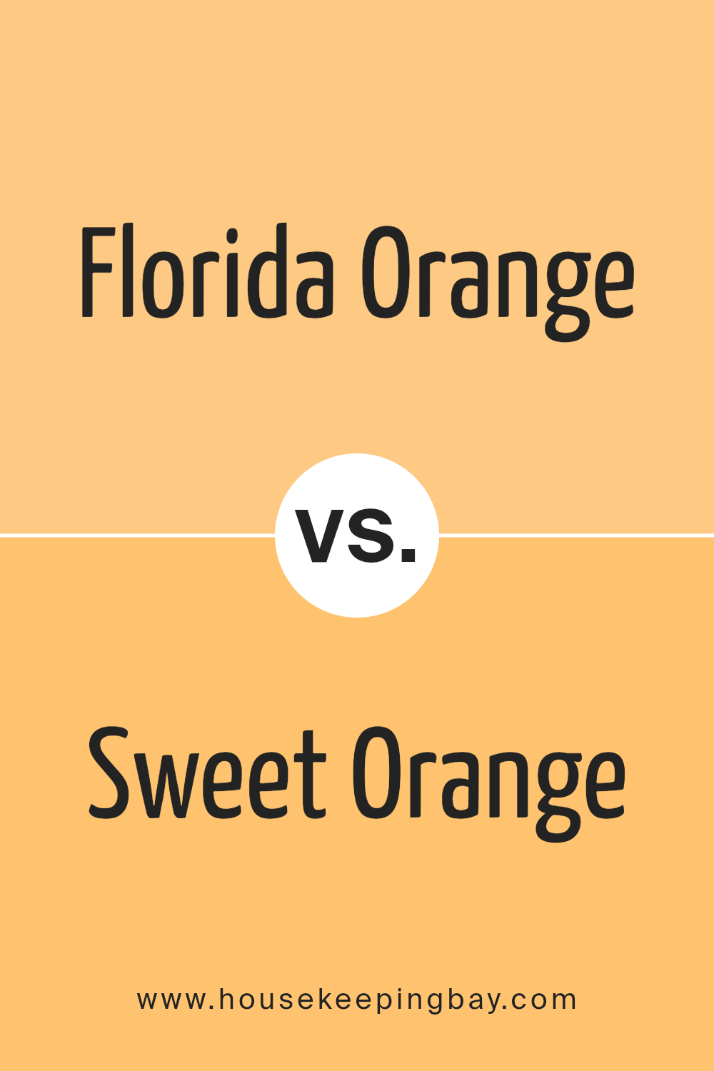
Florida Orange 152 by Benjamin Moore vs Sweet Orange 2017-40 by Benjamin Moore
Florida Orange 152 by Benjamin Moore is a vibrant, lively shade of orange. It brings a bold, energizing vibe to any space, perfect for areas where you want to add a sense of enthusiasm and fun. This color is quite intense, making it ideal for accent walls or areas where you want to make a strong visual impact.
Sweet Orange 2017-40 by Benjamin Moore, in comparison, is a softer, more muted orange. It offers a warm and inviting feel, excellent for creating a cozy and comfortable atmosphere in rooms like living areas and bedrooms. This shade is more subdued, which makes it easier to pair with a variety of decor styles and colors.
Both colors provide a cheerful touch, but Florida Orange 152 stands out more dramatically, whereas Sweet Orange 2017-40 blends more softly into its surroundings. Depending on the mood you want to set, both have their unique appeal in enhancing room aesthetics.
You can see recommended paint color below:
- 2017-40 Sweet Orange
housekeepingbay.com
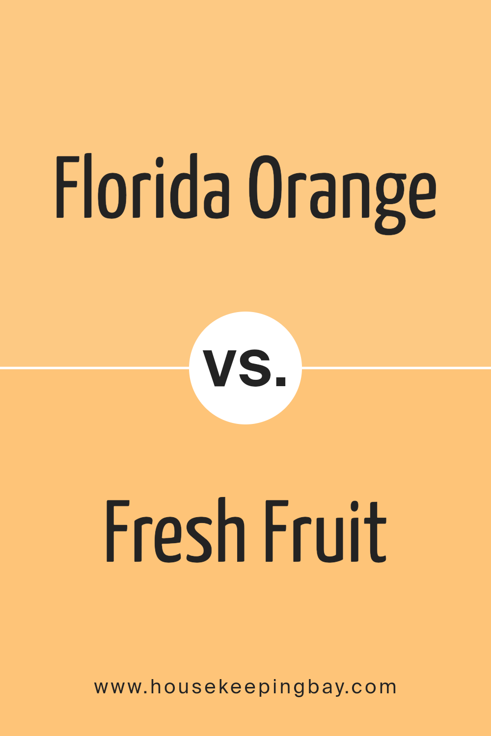
Florida Orange 152 by Benjamin Moore vs Fresh Fruit 153 by Benjamin Moore
Florida Orange 152 by Benjamin Moore is a vibrant, energetic orange shade that brings a lively and cheerful touch to any space. It’s great for adding a pop of color and is bold without being overwhelming. It has a warm, inviting quality, perfect for creating a cozy and friendly atmosphere in areas like living rooms or kitchens.
In contrast, Fresh Fruit 153 by Benjamin Moore is also a bright color, but with a softer, more subdued yellow tone. It gives off a light, airy feel, making it ideal for making small spaces appear larger and more open.
Fresh Fruit 153 works well in rooms that get a lot of sunlight, complementing the natural light to enhance the room’s overall brightness.
Overall, while both colors are great for adding freshness and vitality, Florida Orange 152 leans towards a more dynamic, striking look, whereas Fresh Fruit 153 offers a gentler, more relaxed vibe. Each color serves well in environments where you want to inject some life and energy, but the choice depends on the mood and atmosphere you aim to achieve.
You can see recommended paint color below:
housekeepingbay.com
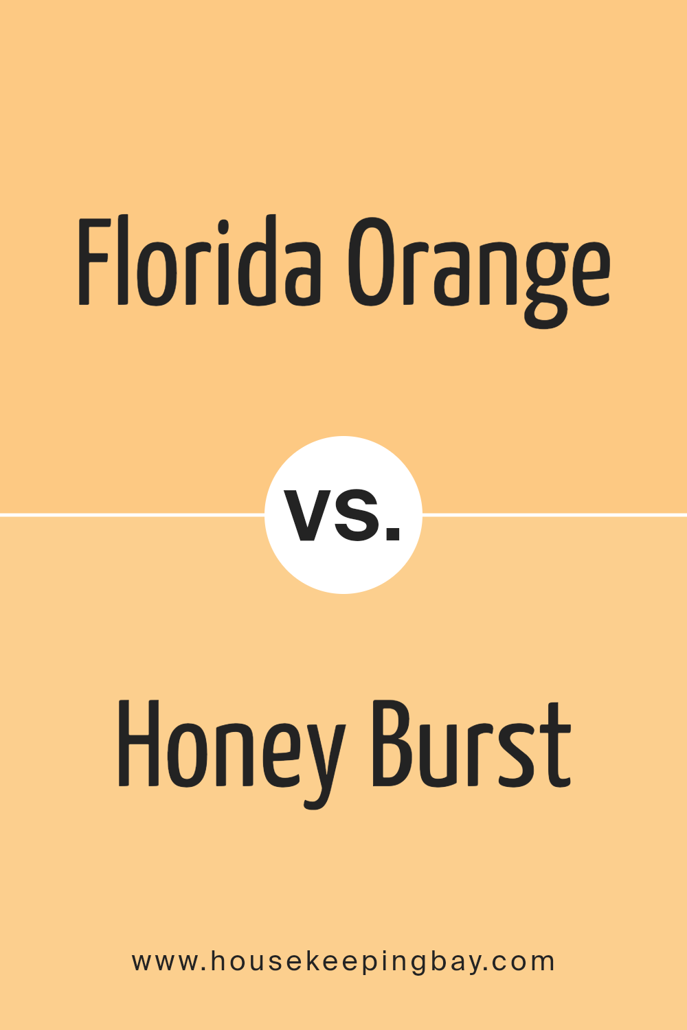
Florida Orange 152 by Benjamin Moore vs Honey Burst 144 by Benjamin Moore
Florida Orange 152 by Benjamin Moore is a vibrant, energetic shade. Its bold, citrus hue infuses spaces with a lively and cheerful atmosphere, making it a great choice for areas where you want to add a sense of enthusiasm and fun. This color works well in kitchens, playrooms, or any space that benefits from a boost of brightness.
In contrast, Honey Burst 144 by Benjamin Moore offers a softer, more subdued look. This color has a warm, inviting quality, reminiscent of golden sunlight. It’s perfect for creating a cozy, comforting environment in spaces like living rooms or bedrooms where a peaceful, soothing ambiance is desired.
Both colors bring their unique qualities to an interior. While Florida Orange is more about energy and vibrancy, Honey Burst focuses on warmth and comfort. Depending on the mood you wish to create in a room, either color could be the right choice.
You can see recommended paint color below:
- 144 Honey Burst
housekeepingbay.com
Florida Orange 152 by Benjamin Moore vs Peach Crisp 159 by Benjamin Moore
Florida Orange 152 by Benjamin Moore is a vibrant, cheerful orange hue that adds warmth and energy to any space. This color is bolder and can be ideal for creating a focal point in a room. It works well when used in a kitchen, dining area or a playroom, offering a lively and inviting atmosphere.
Peach Crisp 159 by Benjamin Moore, in contrast, is a softer, more subdued shade. This color leans towards a gentle peach tone, providing a calm and soothing presence. It’s excellent for bedrooms, bathrooms, or spaces where a relaxing, gentle ambiance is desired.
While both colors share a warm base, Florida Orange 152 is noticeably brighter and more intense, whereas Peach Crisp 159 offers a lighter, more restrained peach tone. Each color serves different moods and settings, with Florida Orange bringing more energy and Peach Crisp promoting a gentle, soothing environment.
You can see recommended paint color below:
- 159 Peach Crisp
housekeepingbay.com
Conclusion
I’m glad I took the time to review 152 Florida Orange by Benjamin Moore because it really shed light on how a bold color choice can enhance our living spaces. This particular shade of orange injects warmth and energy into any room, proving itself as a versatile option not just for creative spaces but for any area looking to add a touch of cheerfulness.
The review highlighted how Florida Orange stands out against both neutral and dark backgrounds, making it a highly effective choice for anyone wanting to add a vibrant pop of color without overwhelming the space. It’s not just about aesthetics, either. The reflective quality of this shade can alter the perception of space and light, potentially making smaller rooms feel larger and more inviting.
Given its impact and flexibility, I can see Florida Orange being an excellent option for someone wanting to freshen up their decor. From a practical standpoint, the durable nature of Benjamin Moore paints ensures that the lively color remains impressive over time, proving to be a good investment.
I would recommend others considering a new project or refresh to consider how this particular shade of orange could complement their decor. It seems ideal for creating focal points or for adding warmth to the places where family and friends gather.
housekeepingbay.com
Ever wished paint sampling was as easy as sticking a sticker? Guess what? Now it is! Discover Samplize's unique Peel & Stick samples. Get started now and say goodbye to the old messy way!
Get paint samples


