Sundial 1100 by Benjamin Moore
Brightening Your Space with a Splash of Sunshine
Choosing the right paint color can be a challenge, but 1100 Sundial by Benjamin Moore makes it a bit easier. This shade offers a calm and inviting ambiance that can refresh any space in your home.
Whether you’re updating your living room, bedroom, or kitchen, Sundial’s warm undertones create a cozy atmosphere that’s perfect for relaxing and entertaining. What sets Sundial apart is its ability to blend with various decor styles and settings.
It complements both modern and traditional designs, making it a great choice for anyone looking to refresh their home without committing to an extensive redesign.
As you think about the perfect color for your next project, consider how Sundial might enhance your space with its gentle warmth and appealing neutrality.
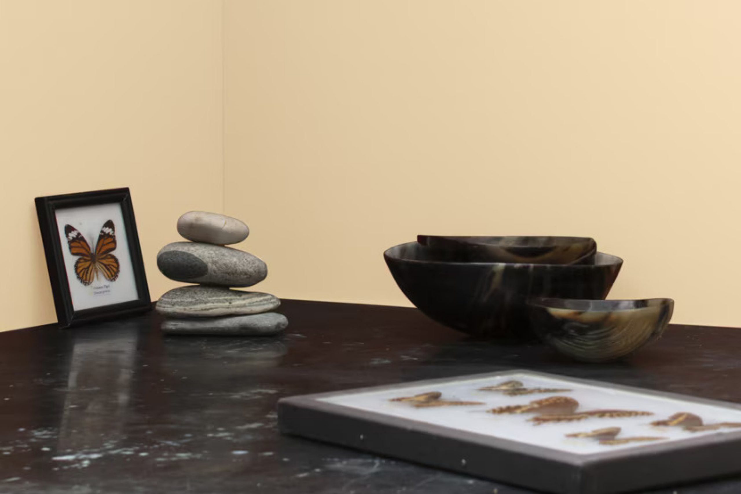
via benjaminmoore.com
What Color Is Sundial 1100 by Benjamin Moore?
Table of Contents
Sundial1100 by Benjamin Moore is a gentle and soothing beige tone that brings a sense of warmth and comfort to any room. This color boasts versatile appeal, sitting perfectly between the richness of earth tones and the softness of neutral pastels. It possesses a calming quality without becoming too cold, making it ideal for creating a cozy atmosphere.
Sundial1100 works beautifully in a variety of interior styles. It’s particularly effective in minimalist designs, where its subtle warmth complements the simplicity and clean lines. This color also fits seamlessly into traditional spaces, adding a fresh, contemporary twist while maintaining a classic feel. For a rustic or farmhouse style, Sundial1100 pairs well with natural elements like wood and stone, enhancing their inherent rustic charm.
When it comes to materials, Sundial1100 coordinates excellently with natural textures. Think linen, cotton, and wool for soft furnishings which can soften the overall aesthetic. For furniture and fixtures, wood with visible grains and knots can add character when painted with this shade.
Additionally, incorporating elements like rattan or wicker can accentuate its earthy qualities, making interiors feel grounded and balanced.

housekeepingbay.com
Is Sundial 1100 by Benjamin Moore Warm or Cool color?
Sundial1100 by Benjamin Moore is a warm, inviting color that lends a cozy atmosphere to any room. This soft beige shade has subtle undertones, making it incredibly versatile for different decorating styles and spaces within homes. It especially shines in living areas and bedrooms where a calming, neutral backdrop is essential for a variety of furniture and accents.
Sundial1100 reflects natural light beautifully. In rooms with ample sunlight, it appears lighter and can give the illusion of more space. In dimmer spaces, it adds depth without overwhelming the room’s overall ambiance. For homeowners who prefer timeless colors instead of fluctuating trends, Sundial1100 offers an excellent choice.
It pairs well with both bright hues and darker shades, allowing for easy coordination with existing decor or when planning a new room layout. Practical for everyday living, Sundial1100 by Benjamin Moore also excels in masking minor wall imperfections, making it ideal for busy households.
It’s a reliable choice for creating a comfortable, homely feel in many types of homes.
What is the Masstone of the Sundial 1100 by Benjamin Moore?
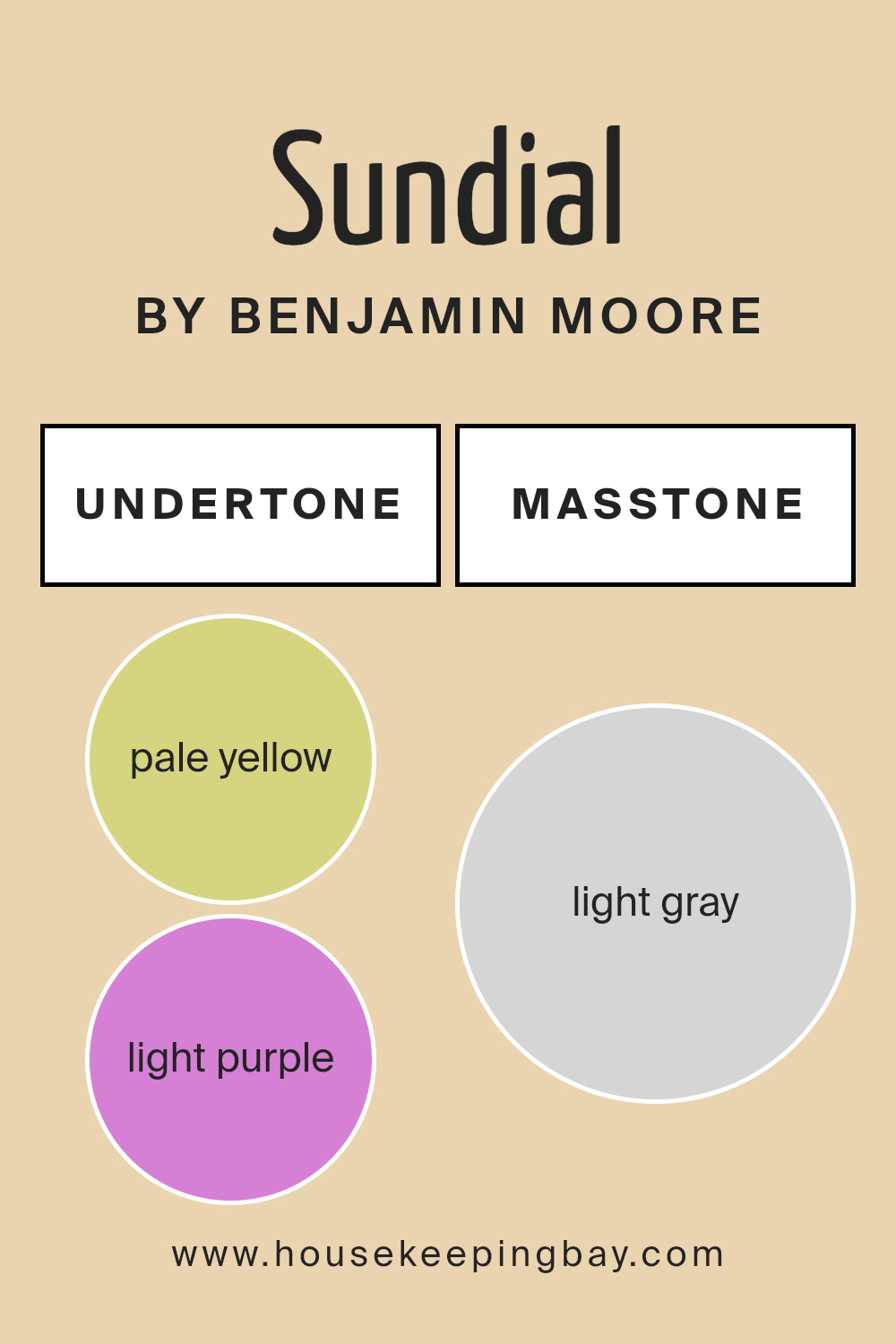
Sundial1100 by Benjamin Moore in its masstone, Light Gray (#D5D5D5), offers a gentle neutrality to any room. This color is highly versatile, easily blending with various decor styles, from modern to traditional.
Its light gray shade acts almost like a quiet backdrop, supporting a range of other colors without overpowering the space. In a room, this shade helps to create a sense of calm and cleanliness, making the area feel more spacious and airy. In homes, Light Gray can be particularly useful in rooms that either have small windows or lack natural light. It has the ability to reflect available light, helping to brighten the space.
Using Sundial1100 on walls, it can soothe and soften the overall atmosphere, making it ideal for bedrooms and living areas where a peaceful environment is desired. It’s also practical because it hides minor imperfections well and maintains a fresh look longer than darker shades.

housekeepingbay.com
Undertones of Sundial 1100 by Benjamin Moore
Sundial1100 by Benjamin Moore is a complex color with a palette that includes undertones of pale yellow, light purple, pale pink, light blue, mint, lilac, and grey. These undertones play a crucial role in how the color appears under different lighting conditions and can dramatically impact the mood and feel of a space.
When painting interior walls with Sundial1100, the variety of undertones can cause the color to shift appearances throughout the day. For example, the pale yellow can make a room feel warmer under natural light, creating a soft, welcoming atmosphere. In contrast, the light blue and mint undertones might give a cooler feel in fluorescent lighting, making a space feel fresh and calm.
The light purple and lilac undertone introduces a subtle vibrancy that can add depth and complexity to the walls, enriching the visual experience. On the other hand, the pink undertones bring a gentle, soothing quality to rooms, ideal for creating a restful environment. Lastly, the grey undertone in Sundial1100 helps ground the color, ensuring it remains sophisticated and balanced, preventing it from becoming too loud or overwhelming.
In summary, the unique blend of undertones in Sundial1100 by Benjamin Moore can significantly affect the visual impact and the atmosphere of any interior space, making it versatile for various rooms and styles.
housekeepingbay.com
Coordinating Colors of Sundial 1100 by Benjamin Moore
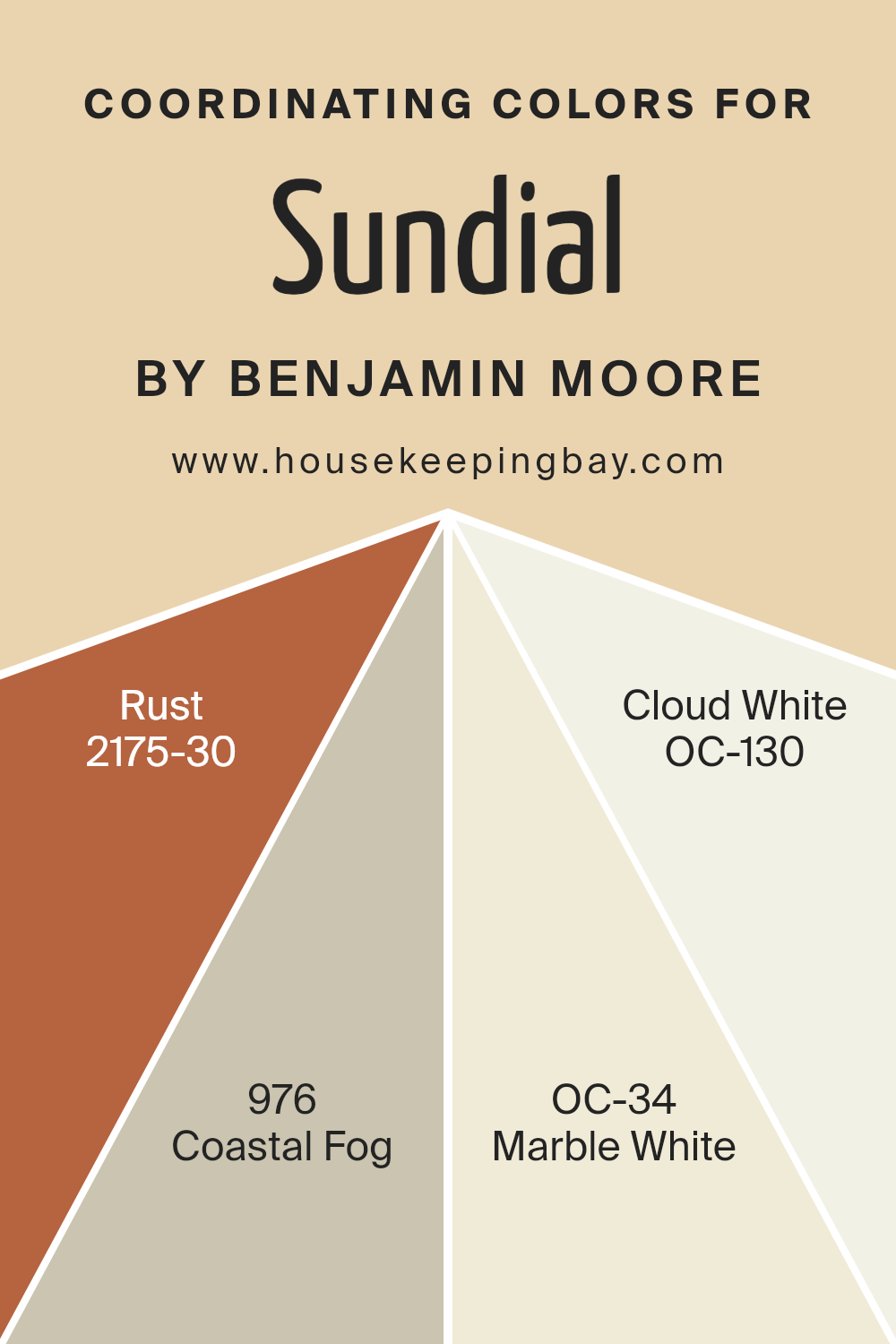
Coordinating colors are hues that complement each other and create a harmonious look when used together in a space. These colors are often used to achieve a balanced and visually appealing environment. Each coordinating color can either enhance or subtly balance the main color in a decor scheme. By carefully selecting coordinating colors, you can create an atmosphere that either contrasts vibrantly or blends smoothly.
For instance, “Rust” (2175-30) is a bold, deep orange with earthy underpinnings that works well to add warmth and a sense of coziness to a room. Pairing it with a cool neutral like “Coastal Fog” (976), a muted, grayish taupe, adds balance and sophistication to spaces.
“Marble White” (OC-34) is a soft white with a touch of gray, perfect for creating a clean, open feeling that doesn’t overpower the other tones in the room. Completing this palette, “Cloud White” (OC-130) is a pure, crisp white, ideal for trim or ceiling to help lift and lighten any space, making it feel more airy and spacious.
You can see recommended paint colors below:
- 2175-30 Rust
- 976 Coastal Fog
- OC-34 Marble White
- OC-130 Cloud White
housekeepingbay.com
How Does Lighting Affect Sundial 1100 by Benjamin Moore?
Lighting significantly influences how we perceive colors due to the way light sources have different color temperatures and intensities. A specific color might appear in various hues under different types of light.
For instance, the paint color Sundial1100 by Benjamin Moore can look different under artificial light compared to natural sunlight.
Artificial Light vs. Natural Light:
Under artificial lighting, Sundial1100, which is a subtle shade, might appear warmer and richer. Artificial lights, especially with a warm color temperature, can add a golden hue, softening the color. By contrast, in natural light, particularly in clear, midday light, Sundial1100 might reveal its true color depth and undertones more accurately. This natural illumination generally provides a faithful representation of the color, making it appear crisper.
Room Orientation:In north-faced rooms which receive less direct sunlight and often have a cooler, bluer light, Sundial1100 might look slightly muted and cooler. This could make the room feel calmer but smaller.
In south-faced rooms, which enjoy abundant, warm light for most of the day, this color can appear vibrant and lively. The sun’s rays intensify the tones in Sundial1100, making the space appear warm and welcoming.
East-faced rooms enjoy bright sunlight in the mornings when the sun rises. Here, Sundial1100 will look warmer and more cheerful in the morning but could turn cooler as the day progresses and natural light diminishes.
West-faced rooms receive intense evening sunlight. Sundial1100 in these rooms will feel slightly muted during the morning but will appear richer and warmer in the evening as the sunlight pours in.
In summary, Sundial1100 by Benjamin Moore adapts uniquely to different types of lighting and room orientations, showing the versatile effect of lighting on perceived color. Understanding this can help in deciding where to use specific colors based on room orientation and available lighting to achieve desired effects in interior spaces.
housekeepingbay.com
What is the LRV of Sundial 1100 by Benjamin Moore?
LRV stands for Light Reflectance Value, a measure used to indicate how much light a paint color reflects or absorbs when applied to a surface. This value is expressed on a scale from 0 to 100, where 0 means the color absorbs all light (black), and 100 reflects all light (white).
Understanding the LRV can help in choosing the right paint color for a room based on how bright or dark you want the space to feel. Higher LRVs can make rooms appear lighter and more open, while lower LRVs can make spaces feel cozier and more intimate.
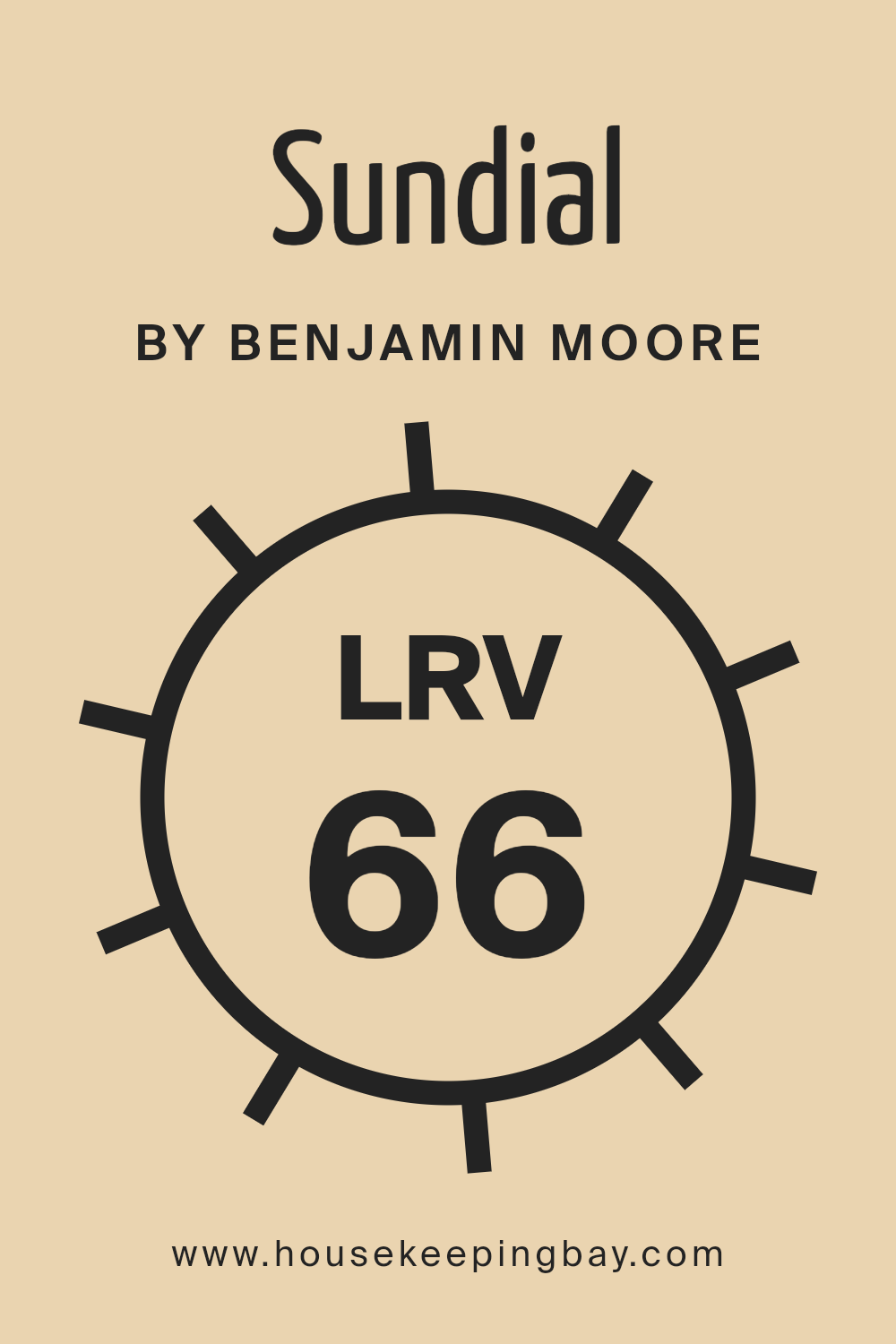
The color Sundial1100 from Benjamin Moore has an LRV of 66.05, placing it in the lighter spectrum of colors. With this relatively high LRV, Sundial1100 will reflect a good amount of light, making it a great choice for spaces where you want to enhance brightness and create a sense of spaciousness. This light beige color is versatile, working well in various settings and complementing different decor styles. Additionally, it can help in making a room appear larger and more inviting by reflecting natural and artificial light effectively.
housekeepingbay.com
What are the Trim colors of Sundial 1100 by Benjamin Moore?
Trim colors are specific shades used for the detailing on building exteriors and interiors such as door frames, window sills, baseboards, and crown moldings. By selecting a trim color that complements or contrasts with the wall colors, you can enhance the architectural features of a space and create a more polished look.
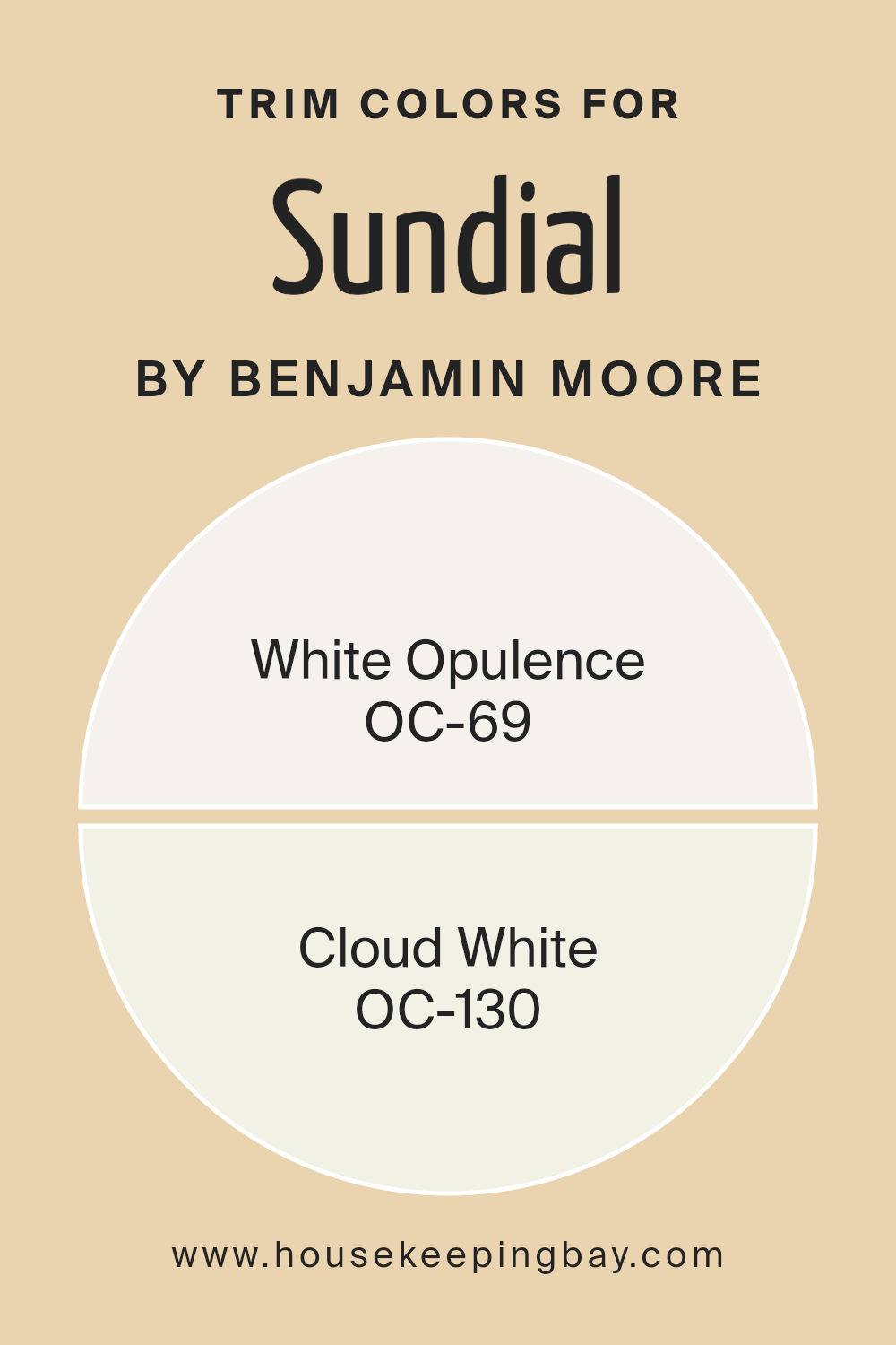
For Sundial 1100 by Benjamin Moore, selecting suitable trim colors like OC-69 White Opulence and OC-130 Cloud White can effectively highlight the beauty of the main color, defining spaces clearly and adding a visual appeal that draws the eye naturally to the craftsmanship of the building.
White Opulence (OC-69) is a soft, airy white with a hint of warmth making it ideal for trims, as it provides a gentle contrast that can help other colors in a room appear more vibrant and crisp. On the other hand, Cloud White (OC-130) is a classic favorite with a touch of creaminess that pairs beautifully with a variety of colors, adding a subtle richness to the trims. This versatility makes Cloud White a dependable choice for achieving a cohesive look that enhances the overall ambiance of any room.
You can see recommended paint colors below:
housekeepingbay.com
Colors Similar to Sundial 1100 by Benjamin Moore
Similar colors play a crucial role in interior design because they help create a cohesive and harmonious atmosphere. Colors that are alike, such as Sundial 1100 by Benjamin Moore and its similar shades, facilitate a smooth visual flow from one area of a space to another, making environments feel more connected and seamless.
When colors like these are used together, they can enhance the overall aesthetic without causing abrupt transitions that might jar the eye. This subtle blend can also amplify the perception of space, making rooms appear larger and more open.
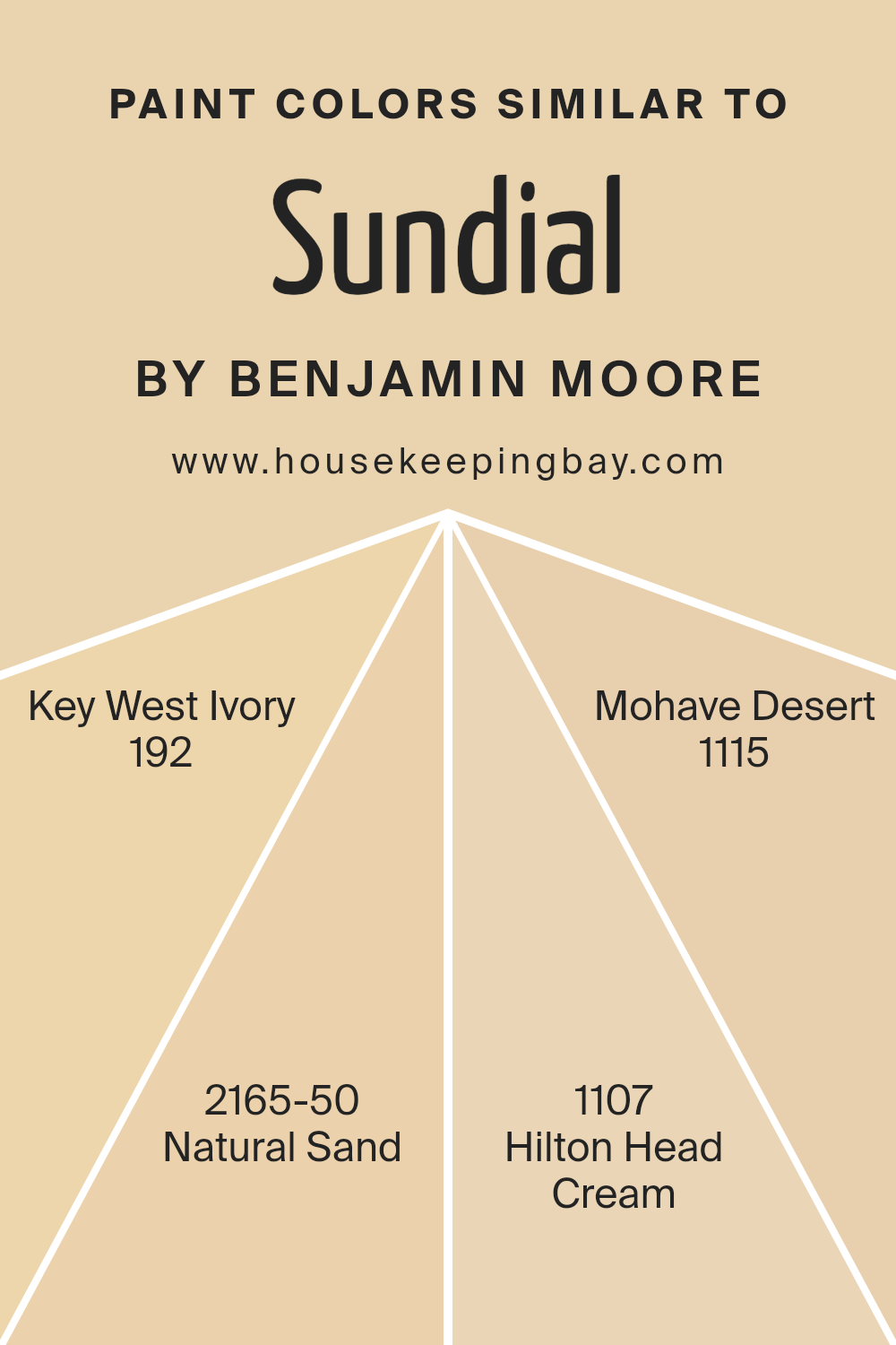
For example, the color 192 – Key West Ivory offers a soft, creamy hue that brightens spaces gently, giving them a warm and inviting feel. Similarly, 2165-50 – Natural Sand provides a neutral base, mimicking the quiet and serene vibe of a sandy beach, thus setting a calm tone in any room. The shade 1107 – Hilton Head Cream has a richer, deeper tone, akin to slightly weathered plaster, which adds a touch of warmth, ideal for spaces intended for relaxation and comfort.
Lastly, 1115 – Mohave Desert has an earthy, muted quality that echoes the quiet and vast expanses of a desert, perfect for creating a soothing and grounded environment. These examples illustrate how using similar colors can subtly enhance the space without overwhelming the senses.
You can see recommended paint colors below:
- 192 Key West Ivory
- 2165-50 Natural Sand
- 1107 Hilton Head Cream
- 1115 Mohave Desert
housekeepingbay.com
Colors that Go With Sundial 1100 by Benjamin Moore
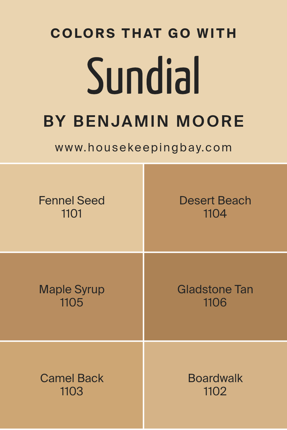
Choosing the right colors to pair with Sundial 1100 by Benjamin Moore is key for achieving a balanced and appealing ambiance in any room. Sundial 1100 offers a warm, neutral base that can be beautifully complemented by shades like Fennel Seed or Desert Beach. Each accompanying color can modify the atmosphere, making your space cozy, inviting, or more opened up, depending on the combinations used.
Fennel Seed is a subtle green that brings a touch of nature’s calmness into the room, perfect for creating a relaxed vibe. Desert Beach, a gentle beige, offers a soft, sandy feel that pairs seamlessly with the light tones of Sundial 1100, enhancing the natural light in your space.
Meanwhile, Maple Syrup adds a golden hue that warms up the environment, great for a welcoming living area. Gladstone Tan is a deeper neutral that provides depth and contrast without overwhelming the eye. Camel Back, a richer shade of beige, adds sophistication and pairs nicely with darker furniture and decor. Finally, Boardwalk is a muted gray that acts as a cooling counterpart to Sundial 1100, ideal for achieving a modern and balanced aesthetic.
You can see recommended paint colors below:
- 1101 Fennel Seed
- 1104 Desert Beach
- 1105 Maple Syrup
- 1106 Gladstone Tan
- 1103 Camel Back
- 1102 Boardwalk
housekeepingbay.com
How to Use Sundial 1100 by Benjamin Moore In Your Home?
Sundial 1100 by Benjamin Moore is a versatile paint color that can add warmth and a calming effect to any room in your home. This shade features a subtle, soft yellow hue that works exceptionally well in spaces where natural light is abundant, as it enhances the brightness and gives a cozy, inviting atmosphere.
Perfect for living rooms, kitchens, or bedrooms, Sundial 1100 pairs well with both dark and light furniture, allowing for flexibility in decorating styles. You can use Sundial 1100 on all walls for a uniform look or on a feature wall to create a gentle focal point. It complements white trim or molding beautifully, which helps to define the space crisply.
For those who like a bit of contrast, combining it with cooler tones like soft blues or greens can bring balance to your interiors. Overall, Sundial 1100 is a great choice for creating a warm, welcoming environment in your home.
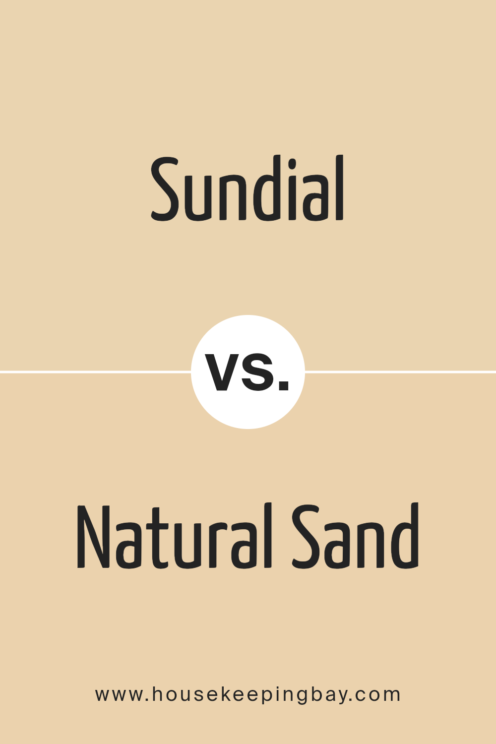
Sundial 1100 by Benjamin Moore vs Natural Sand 2165-50 by Benjamin Moore
The main color, Sundial 1100 by Benjamin Moore, is a warm and inviting shade with creamy undertones. It evokes a sense of coziness and can easily brighten up a space without feeling overpowering. It’s ideal for creating a relaxed and welcoming atmosphere.
In contrast, Natural Sand 2165-50, the second color from Benjamin Moore, is a lighter shade compared to Sundial. It has a more neutral tone that feels clean and airy. This color pairs well in spaces that aim for a subtle elegance and a fresh, modern look.
While Sundial 1100 brings warmth and richness to a room, making it perfect for living areas or bedrooms, Natural Sand 2165-50 offers a calming effect, suitable for spaces that want a more understated and minimalist aesthetic. Both colors complement each other well, allowing for versatility in design and décor options across various settings.
You can see recommended paint color below:
- 2165-50 Natural Sand
housekeepingbay.com
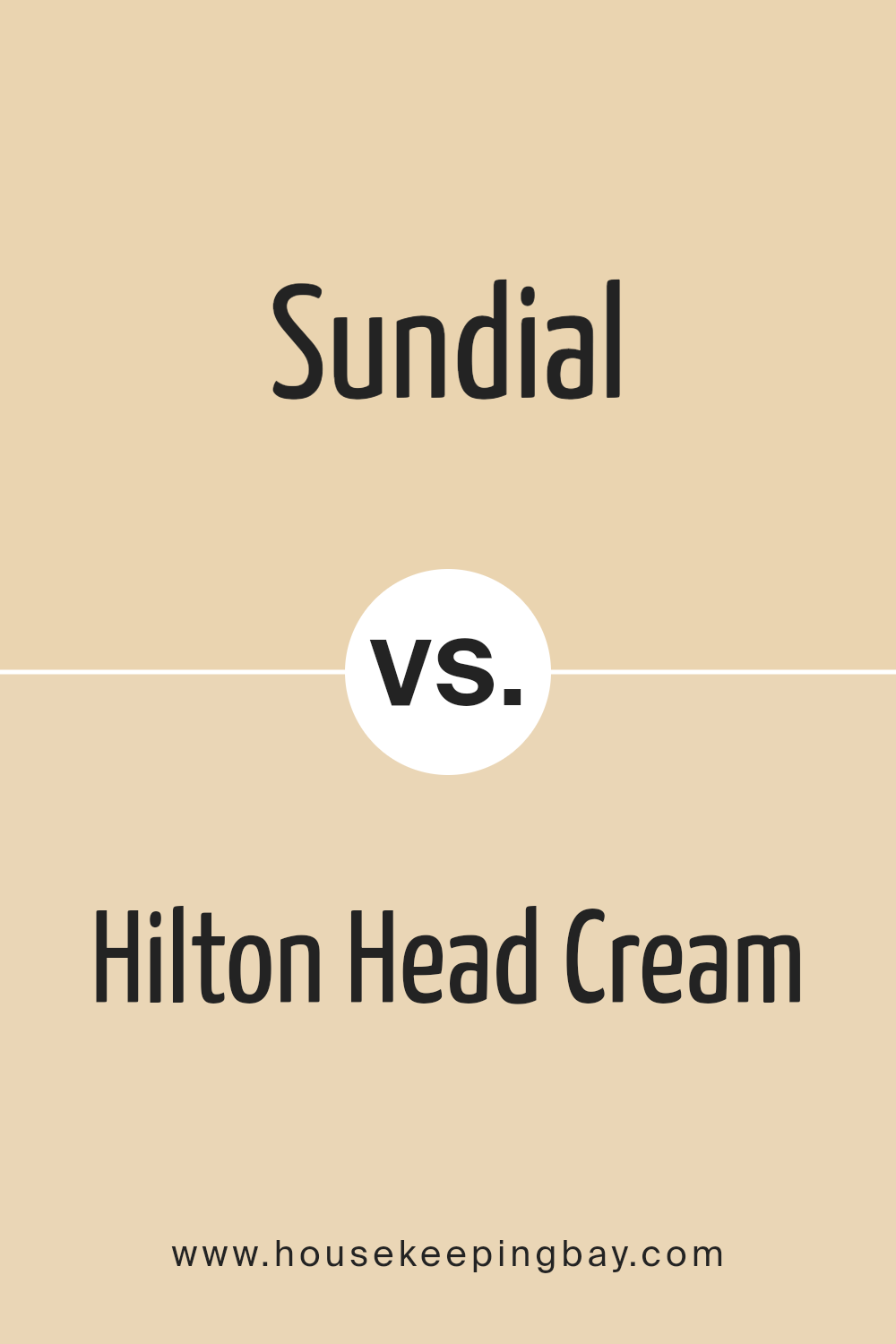
Sundial 1100 by Benjamin Moore vs Hilton Head Cream 1107 by Benjamin Moore
Sundial 1100 by Benjamin Moore is a warm, creamy beige that adds a soft and cozy feel to any room. It is a versatile color that pairs easily with darker or lighter colors, bringing warmth to spaces without overwhelm. This makes Sundial 1100 a reliable choice for living areas and bedrooms where a calm and inviting atmosphere is desired.
Hilton Head Cream 1107 also by Benjamin Moore, is slightly darker and richer compared to Sundial 1100. It exudes a subtle earthiness, resembling a beige with a touch of amber. This color works well in spaces that aim for a classic or rustic feel. It is particularly effective in rooms with natural light, as the light enhances its depth and warmth.
Both colors provide a neutral palette, ideal for those who want their furniture and decor to take center stage. Sundial 1100 is lighter, making small rooms appear more spacious. Hilton Head Cream 1107, denser in tone, can fuel a more traditional look. Each offers distinct advantages depending on the style and size of the room.
You can see recommended paint color below:
- 1107 Hilton Head Cream
housekeepingbay.com
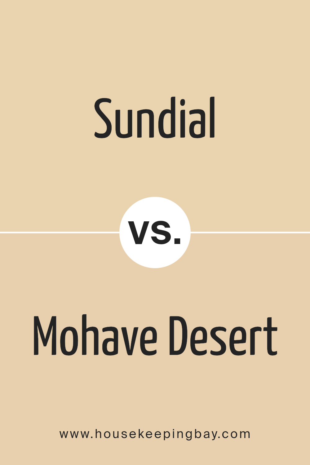
Sundial 1100 by Benjamin Moore vs Mohave Desert 1115 by Benjamin Moore
Sundial 1100 and Mohave Desert 1115, both by Benjamin Moore, showcase distinct tones that can significantly influence the mood and aesthetics of a space. Sundial 1100 is a soft, muted yellow, bringing a subtle brightness and warmth to rooms, making them feel cozy and inviting. This color works well in spaces where you want to add a touch of light without overwhelming the senses.
Mohave Desert 1115, in contrast, is a deeper beige with hints of brown. It offers a more grounded, earthy vibe, ideal for areas where you want to instill a sense of calm and stability. This color is excellent for larger rooms or spaces that could benefit from a richer, more robust hue to prevent them from feeling too stark.
Both colors provide unique atmospheres: Sundial 1100 is light and airy, ideal for energizing a space, while Mohave Desert 1115 is more about setting a tranquil, secure environment. Choosing between them depends on the desired emotional and visual impact for the space.
You can see recommended paint color below:
- 1115 Mohave Desert
housekeepingbay.com
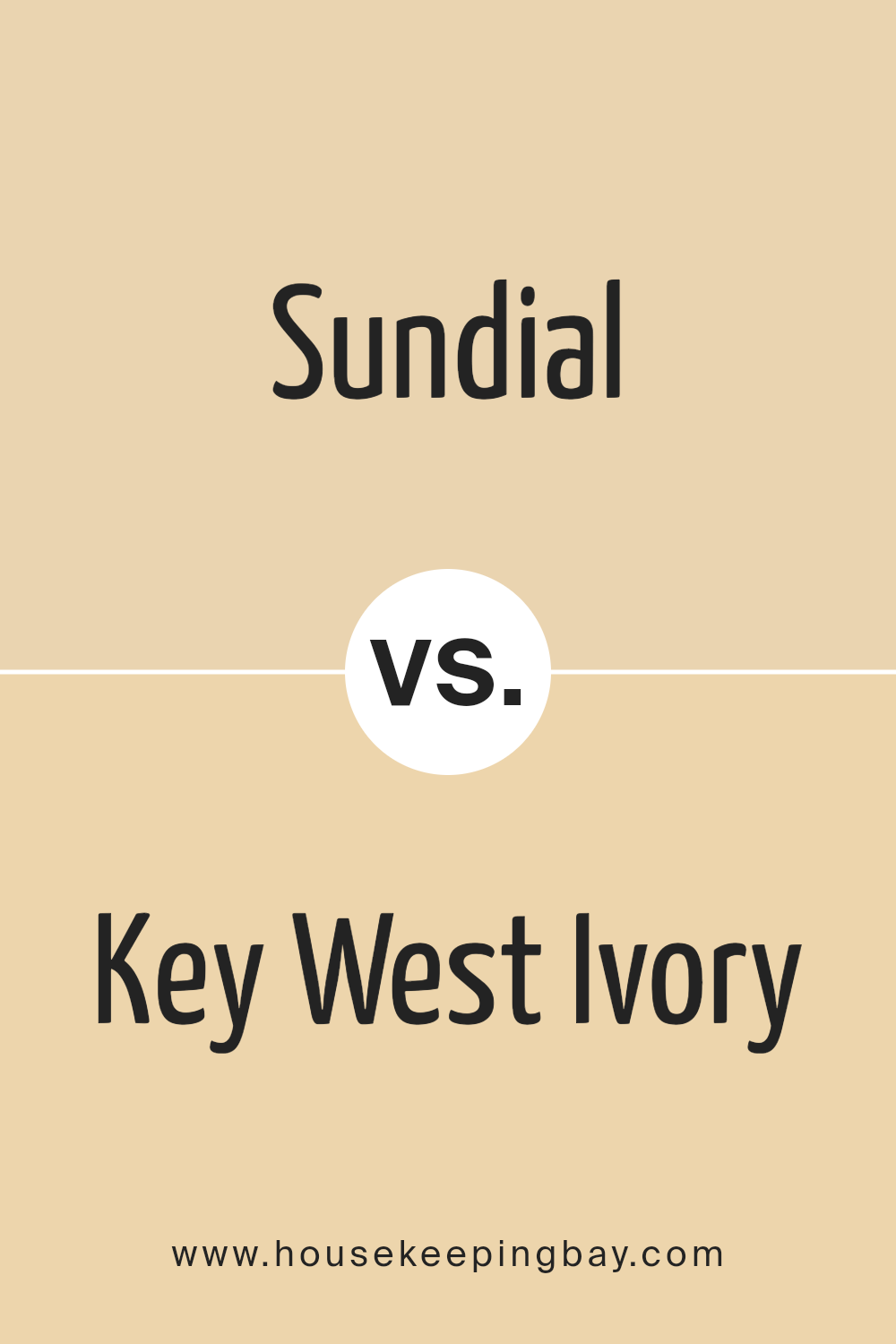
Sundial 1100 by Benjamin Moore vs Key West Ivory 192 by Benjamin Moore
Benjamin Moore’s Sundial 1100 and Key West Ivory 192 are two unique colors that can create different ambiences in a space. Sundial 1100 is a muted yellow with a warm, sunny quality that can make rooms feel inviting and cozy. It works well in spaces where you want to add a soft brightness, such as living rooms or kitchens.
Key West Ivory 192, meanwhile, is a subtle ivory shade. It is lighter and has a neutral tone, making it versatile for various settings. This color can help make small rooms appear larger and brighter, and it pairs easily with almost any decor style.
While Sundial 1100 adds warmth and a hint of cheerfulness, Key West Ivory 192 offers a clean, calm backdrop. Both colors can be used effectively to craft a desired mood in your home, depending on whether you wish to inject warmth or create a more open, airy feel.
You can see recommended paint color below:
- 192 Key West Ivory
housekeepingbay.com
Conclusion
After reviewing 1100 Sundial by Benjamin Moore, I can confidently say that this color offers a unique balance that can refresh any space. It has the subtlety to blend with various decor styles, from modern to traditional, and its soothing tone creates a calm atmosphere in rooms where tranquility is desired.
The color’s versatility also stretches to exteriors, providing a charming backdrop that complements natural landscapes or urban settings. It’s an excellent choice for anyone looking to mix a touch of serenity with contemporary appeal.
Moreover, the depth of 1100 Sundial makes it an intelligent choice for accent walls or complete room makeovers. It pairs well with bold and neutral shades, allowing for creative color combinations that can personalize any area.
Whether you’re updating a single room or revamping your entire home, 1100 Sundial offers a sophisticated palette that’s sure to enhance your environment and reflect your style. In conclusion, Benjamin Moore’s 1100 Sundial is a versatile color that can aid in creating inviting spaces while maintaining a stylish edge.
housekeepingbay.com
