Downing Straw SW 2813 by Sherwin Williams
Elevate Your Space with This Sunny Hue
Let’s talk about an amazing paint color that can really transform your space: SW 2813 Downing Straw by Sherwin Williams. Imagine the warm, soft glow of early morning sunlight gently filling up a room. This color brings that cozy, inviting atmosphere right into your home. Whether you’re thinking about bringing new life into your living room, bedroom, or even your kitchen, Downing Straw has a magical way of making spaces feel welcoming and lively.
Choosing the right paint color can sometimes feel overwhelming with all the options out there, but if you’re looking for something that screams warmth and comfort without being too bold, Downing Straw might just be the perfect pick for you.
It has this beautiful ability to pair well with a variety of decor styles and colors, making it a versatile option for any renovation project you have in mind.
So, if you’re ready to give your home a fresh, cozy appeal, consider SW 2813 Downing Straw by Sherwin Williams. It’s not just a paint color; it’s a way to create a space where you’ll love to spend time, unwind, and make memories. Let’s get your home looking its absolute best with a touch of Downing Straw.
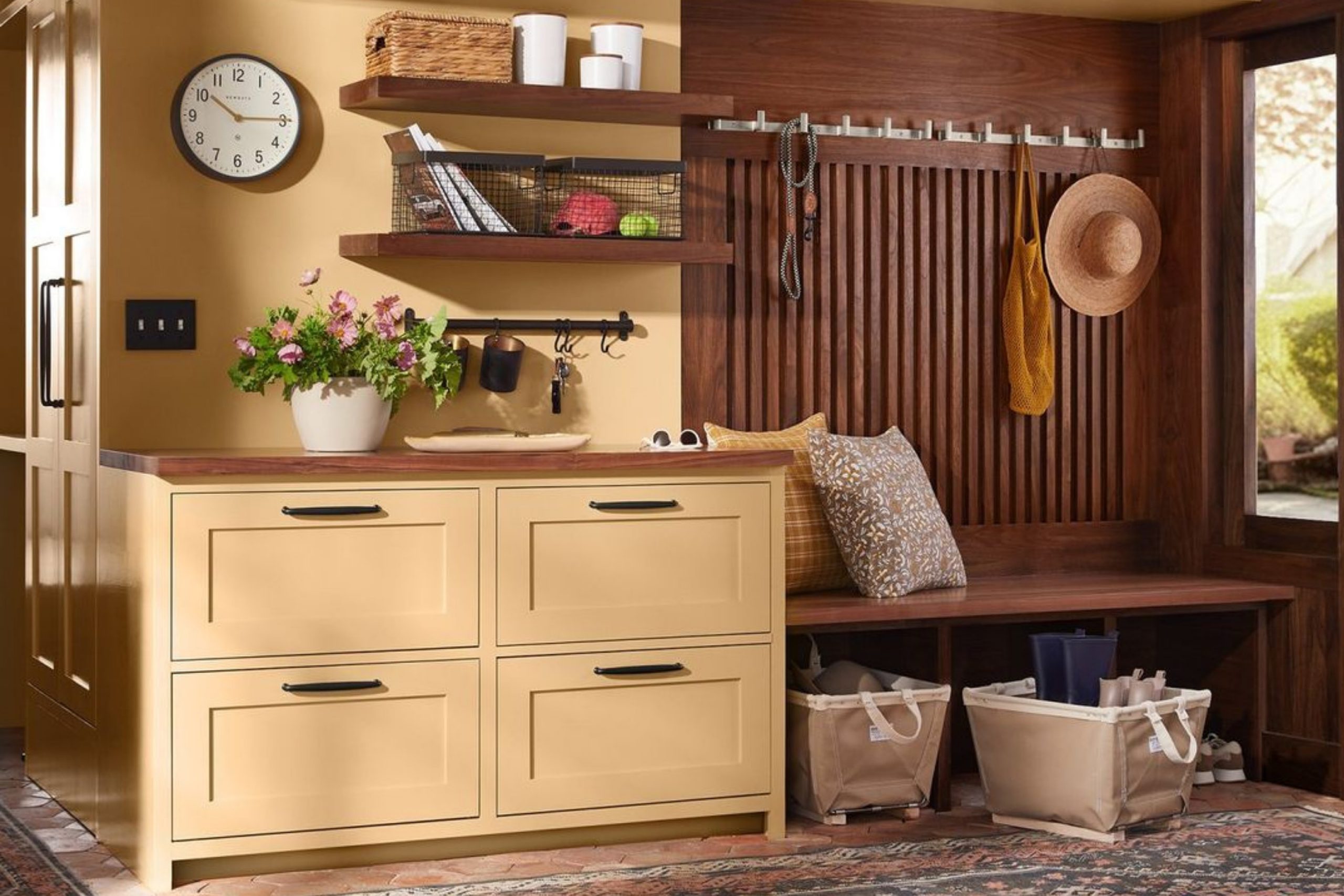
via insta @rejuvenation
What Color Is Downing Straw SW 2813 by Sherwin Williams?
Downing Straw SW 2813 by Sherwin Williams is a warm and inviting color that carries the essence of a cozy, sunlit field. It’s a soft, muted yellow with a touch of earthiness, making it pleasant and soothing to the eye. This color isn’t loud or flashy; instead, it brings a subtle cheerfulness to any space, creating an atmosphere of warmth and comfort.
The versatility of Downing Straw makes it an excellent choice for various interior styles. It shines particularly well in country, farmhouse, and rustic environments, where its natural earthy tone complements wood elements and handmade textiles.
However, its understated elegance also allows it to fit beautifully within more modern or minimalistic settings, where it can add a gentle pop of color without overwhelming the senses.
When it comes to pairing materials and textures, Downing Straw is highly accommodating. It goes well with natural wood, from pale oak to rich walnut, enhancing the warmth of the wood. Textiles like cotton, linen, and wool in neutral or soft pastel tones can complement its softness, while adding layers of texture.
For a bit of contrast, metallic accents in copper or bronze can introduce a sophisticated touch, and stone elements, such as marble or granite, can add a cool balance to its warm hue. Overall, Downing Straw is a versatile choice that brings a sense of calm and positivity to any room.
housekeepingbay.com
Is Downing Straw SW 2813 by Sherwin Williams Warm or Cool color?
Downing Straw SW 2813 by Sherwin Williams is a warm, inviting paint color that can make any room in a house feel cozy and welcoming. This shade of yellow is soft and gentle, not too bright or overpowering, making it easy to work with when decorating. It can bring a sense of sunlight and warmth into spaces that don’t get a lot of natural light, making these rooms feel brighter and more cheerful.
Since Downing Straw is a versatile color, it pairs nicely with a wide range of other colors, from earthy tones like brown and green, to more vibrant hues like blues and reds. This means it’s a great choice for living rooms, kitchens, and even bedrooms, where it can help create a relaxed, comfortable atmosphere.
Applying this color on walls can also make small rooms appear larger and more open, adding to the sense of space in a home. It’s a wonderful way to add a soft touch of color without overwhelming a space, making it highly effective for creating a cozy and inviting home environment.
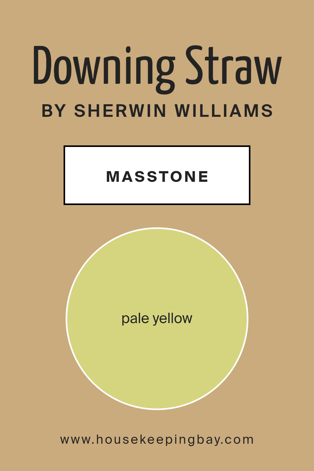
What is the Masstone of the Downing Straw SW 2813 by Sherwin Williams?
Downing Straw SW 2813 by Sherwin Williams has a masstone, or base color, that’s a pale yellow. This light and airy yellow color isn’t too bright, making it a great choice for bringing a subtle warmth into homes. It works wonders in spaces that could use a touch of sunshine without overwhelming the room. Think of it like the soft glow of morning light, gentle and inviting.
This pale yellow can make small rooms feel bigger and more open, because light colors tend to make spaces seem larger. In rooms with a lot of natural light, Downing Straw adds a cheerful vibe, making the room feel cozy and happy. It’s versatile, too, and can fit with many styles, from modern to rustic.
Because it’s not a strong, bold color, it’s easy to match with other colors. It pairs well with whites for a clean, classic look, or with grays and blues for a more sophisticated, calming atmosphere. Furniture and decor in natural wood or earth tones will also look great against this pale yellow, creating a welcoming, comfortable space.
housekeepingbay.com
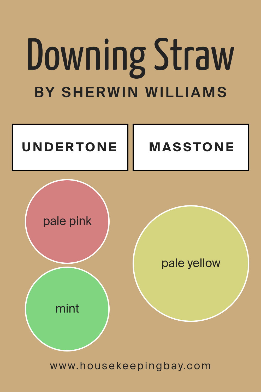
Undertones of Downing Straw SW 2813 by Sherwin Williams
Downing Straw SW 2813 by Sherwin Williams is a unique color that carries a mix of undertones which can significantly impact how it looks in different settings. Undertones are like hidden colors within the main color that can become more apparent under certain lighting or when paired with specific colors.
They include pale pink, mint, grey, yellow, orange, light gray, light purple, light green, olive, light blue, and lilac. These undertones contribute to making Downing Straw a versatile color, but they also require consideration to ensure they complement your space.
When the light hits Downing Straw, the different undertones can pop out. In bright, natural light, for instance, the yellow and orange undertones might make the color appear warmer and more vibrant. In artificial lighting, the grey or light gray might become more dominant, giving the color a cooler and more muted feel.
The presence of green undertones can bring a subtle freshness to the room, while the pink and lilac can add a soft, welcoming vibe.
On interior walls, the undertones in Downing Straw can significantly influence the room’s atmosphere. For rooms with a lot of natural light, the warmer undertones can make the space feel cozy and inviting. Conversely, in a room with less natural light, the cooler undertones might become more noticeable, which could give the walls a more sophisticated and calm appearance.
It’s important to consider these undertones when choosing decor and accents, as they can either complement or clash with the wall color, affecting the overall harmony of the space. Thus, understanding and considering the undertones of Downing Straw can help achieve the desired effect on interior walls, making the space feel just right.
housekeepingbay.com
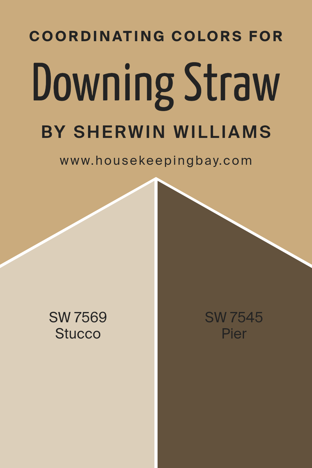
Coordinating Colors of Downing Straw SW 2813 by Sherwin Williams
Coordinating colors are shades that pair well with a primary color to create harmonious and pleasing aesthetics. These complementary colors, when used together, enhance the overall appearance of a space, offering depth and contrast while still maintaining a cohesive look.
For instance, when we look at Downing Straw SW 2813 by Sherwin Williams, finding the right coordinating colors can make all the difference in the ambiance of a room. This warm, inviting hue serves as an excellent base that pairs beautifully with a variety of colors to achieve a balanced and appealing design.
Two colors that work well with Downing Straw SW 2813 are SW 7569 – Stucco and SW 7545 – Pier. Stucco is a gentle, warm beige that mirrors the softness of sunlit sand. This color complements Downing Straw by offering a subtle contrast that is neither overwhelming nor underwhelming.
It’s perfect for creating a serene and welcoming environment. On the other hand, Pier is a deeper, earthy tone with an essence of clay baked under the sun.
This color adds a solid grounding effect and enriches the space by introducing a more pronounced contrast with Downing Straw SW 2813, yet it maintains the warmth and comfort essential for cozy living spaces. Both Stucco and Pier work in tandem with Downing Straw to create spaces that feel coordinated, soothing, and thoughtfully designed.
You can see recommended paint colors below:
- SW 7569 Stucco
- SW 7545 Pier
housekeepingbay.com
How Does Lighting Affect Downing Straw SW 2813 by Sherwin Williams?
Lighting plays a significant role in how we perceive colors. The same color can look different depending on whether it’s under natural or artificial light. This is important to consider when choosing paint colors for a room, such as Downing Straw SW 2813 by Sherwin Williams.
In artificial light, Downing Straw can appear warmer and richer, creating a cozy and inviting atmosphere. This is because most artificial lighting, like incandescent bulbs, has a yellowish tint, which enhances warm hues. So, in rooms that rely mostly on lamps or overhead lighting, Downing Straw will give off a snug, welcoming vibe.
Under natural light, the color can look quite different. Natural light is ever-changing throughout the day and influences how we see colors. Downing Straw tends to look brighter and more vivid in rooms with plenty of sunlight. This makes spaces feel lively and fresh, which is a beautiful way to complement the natural lighting.
The direction your room faces also affects how Downing Straw looks. North-faced rooms receive less direct sunlight, making them cooler in tone. In these rooms, Downing Straw might appear more muted and subdued, yet still creating a warm effect against the cooler, indirect light. South-faced rooms bask in abundant sunlight, making Downing Straw look vibrant and cheerful, enhancing its warm tones even more.
In east-faced rooms, the morning light can make Downing Straw look very bright and welcoming, a perfect start to the day. However, as the day progresses, the color might lose some of its vibrancy but still maintain a soft, warm glow. West-faced rooms have the opposite effect, with the color becoming increasingly warm and rich towards the evening as the sunlight becomes redder.
Overall, Downing Straw’s appearance significantly depends on the lighting, changing from warm and cozy under artificial light to lively and vibrant in natural light, with variances throughout the day and depending on room orientation.
housekeepingbay.com
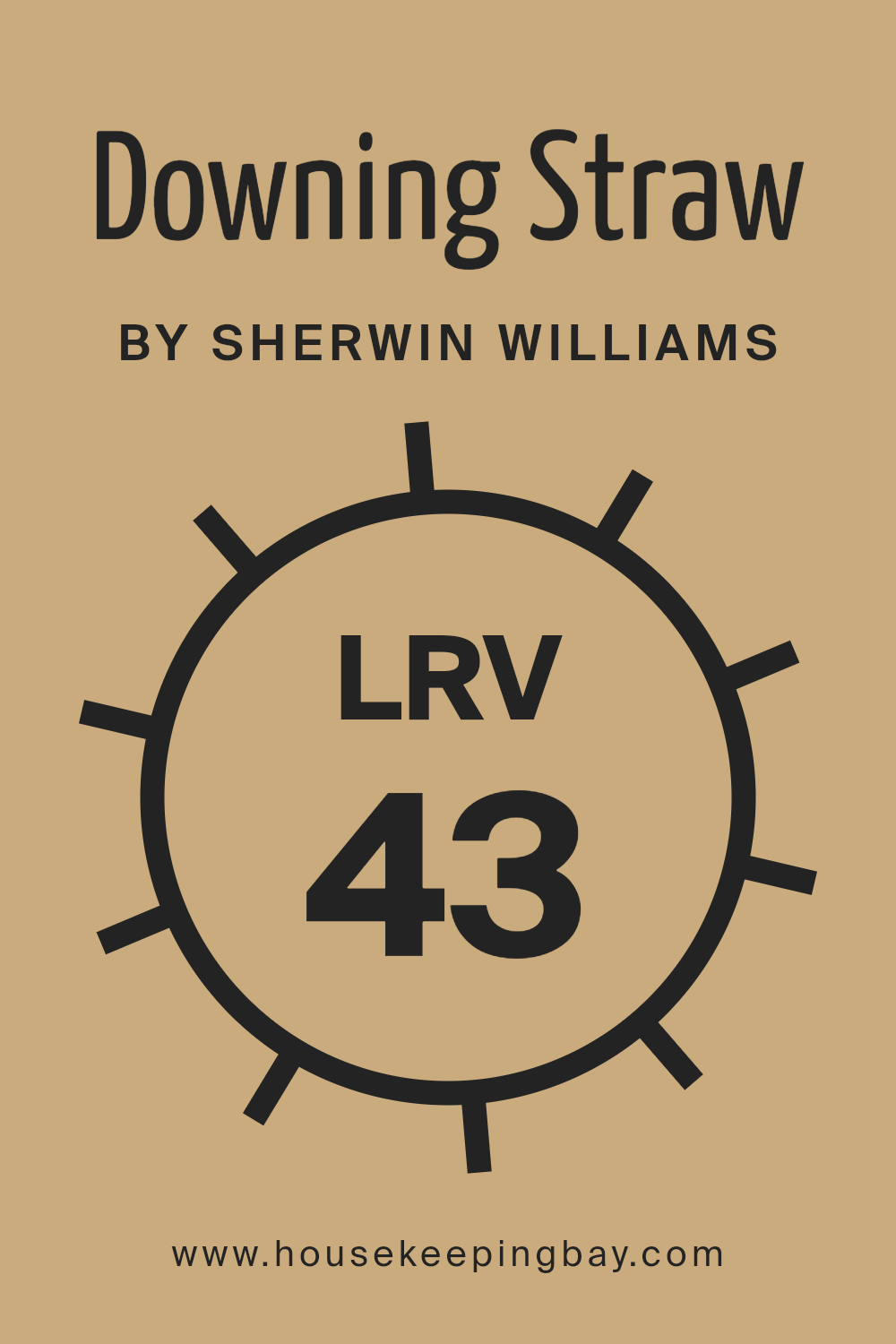
What is the LRV of Downing Straw SW 2813 by Sherwin Williams?
The LRV helps you understand how light or dark a color will look once it’s on your walls. It’s important for choosing paint colors because it affects how bright or cozy a room feels. For example, a higher LRV makes a room feel more open and airy, while a lower LRV can make a space feel more intimate and snug.
Downing Straw SW 2813 by Sherwin Williams, with an LRV of 43.301, sits in the middle range. This means it neither reflects nor absorbs light too much, creating a balanced and versatile backdrop. In rooms with a lot of natural light, this particular LRV will help the color stay true to its hue, without getting washed out or looking too dark.
In spaces with less natural light, Downing Straw will still maintain its warmth and richness, without making the room feel closed in. This LRV makes Downing Straw a great choice for achieving a cozy yet luminous atmosphere in a variety of spaces.
housekeepingbay.com
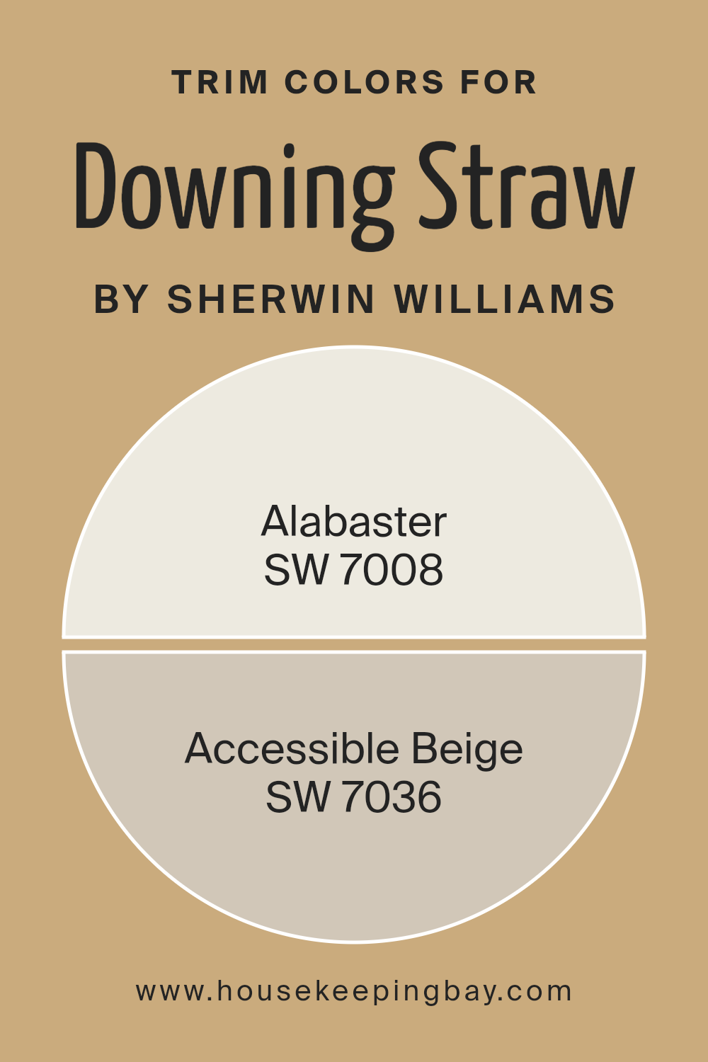
What are the Trim colors of Downing Straw SW 2813 by Sherwin Williams?
Trim colors refer to the shades selected for the architectural elements of a room or exterior, like door frames, window sills, baseboards, and crown molding. Choosing the right trim color is vital because it frames the space and defines the overall aesthetic appeal. With Downing Straw SW 2813 by Sherwin Williams as your main color, which is a warm, welcoming hue, it becomes essential to pick trim colors that complement it perfectly, making the room’s features pop while ensuring a cohesive look.
For a harmonious pairing with Downing Straw SW 2813, Alabaster SW 7008 offers a soft, almost creamy white that brings a light and airy feel to the surroundings. It’s especially effective in adding a subtle contrast that highlights the warm undertones of Downing Straw without overwhelming the senses.
On the other hand, Accessible Beige SW 7036 acts as a neutral backdrop; it’s a mid-tone beige that blends seamlessly with Downing Straw, creating a soothing transition between the wall color and trim. This approach ensures that the trim colors enhance the beauty and balance of the space, adding depth and character in a soft, understated manner.
You can see recommended paint colors below:
housekeepingbay.com
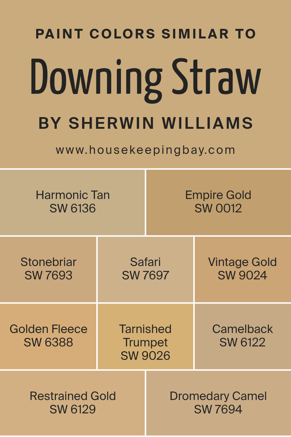
Colors Similar to Downing Straw SW 2813 by Sherwin Williams
Similar colors play a significant role in creating a harmonious and inviting atmosphere in any space. These hues, all akin to Downing Straw SW 2813 by Sherwin Williams, share a warm and cozy vibe that brings comfort and elegance to interiors.
Utilizing shades like Harmonic Tan SW 6136, which offers a soft, muted warmth, or Empire Gold SW 0012, with its rich, sunny glow, allows for a seamless blend or contrast within a room, enriching the overall aesthetic without overpowering it.
Colors such as Stonebriar SW 7693 introduce a subtle, earthy feel, reminiscent of clay, whereas Safari SW 7697 lends a deeper, adventurous warmth, mimicking the vast savannahs.
Vintage Gold SW 9024, slightly antiqued, evokes a sense of historic charm and sophistication, while Golden Fleece SW 6388 brings in a lighter, cheerful brightness, perfect for creating a welcoming environment. Tarnished Trumpet SW 9026 adds a muted, almost nostalgic gold tone that complements wood finishes beautifully. Camelback SW 6122, with its neutral, sandy undertone, offers versatility in pairing with various decor elements.
Restrained Gold SW 6129, a subdued version of the hue, works well in spaces seeking a touch of warmth without overwhelming color. Lastly, Dromedary Camel SW 7694, embodying the essence of desert sands, provides a strong foundation for a space, grounding it with its robust, earthy presence.
These similar colors, by offering a range of warmth and depth, enable designers and homeowners to craft spaces that feel coordinated and thoughtful, with each color contributing to a unified visual story.
You can see recommended paint colors below:
- SW 6136 Harmonic Tan
- SW 0012 Empire Gold
- SW 7693 Stonebriar
- SW 7697 Safari
- SW 9024 Vintage Gold
- SW 6388 Golden Fleece
- SW 9026 Tarnished Trumpet
- SW 6122 Camelback
- SW 6129 Restrained Gold
- SW 7694 Dromedary Camel
housekeepingbay.com
How to Use Downing Straw SW 2813 by Sherwin Williams In Your Home?
Downing Straw SW 2813 by Sherwin Williams is a warm, inviting paint color that can make any room in your home feel cozy and welcoming. Its golden yellow hue is soft enough to bring light into a space without overwhelming it.
This makes Downing Straw a great choice for living rooms or dining areas where you want to create a pleasant, cheerful atmosphere.
If you’re thinking about refreshing your home’s look, donning your walls with Downing Straw can add a touch of warmth. It pairs beautifully with natural elements, like wooden furniture or green plants, enhancing a room’s overall feel. In bedrooms, it can help in creating a snug and comfortable space, perfect for relaxation.
Even in smaller spaces, such as a bathroom or hallway, Downing Straw can add a bright and airy feel, making the area seem larger and more inviting.
Using Downing Straw is a simple way to bring a cozy, warm vibe into your home, making it a popular choice for many homeowners.
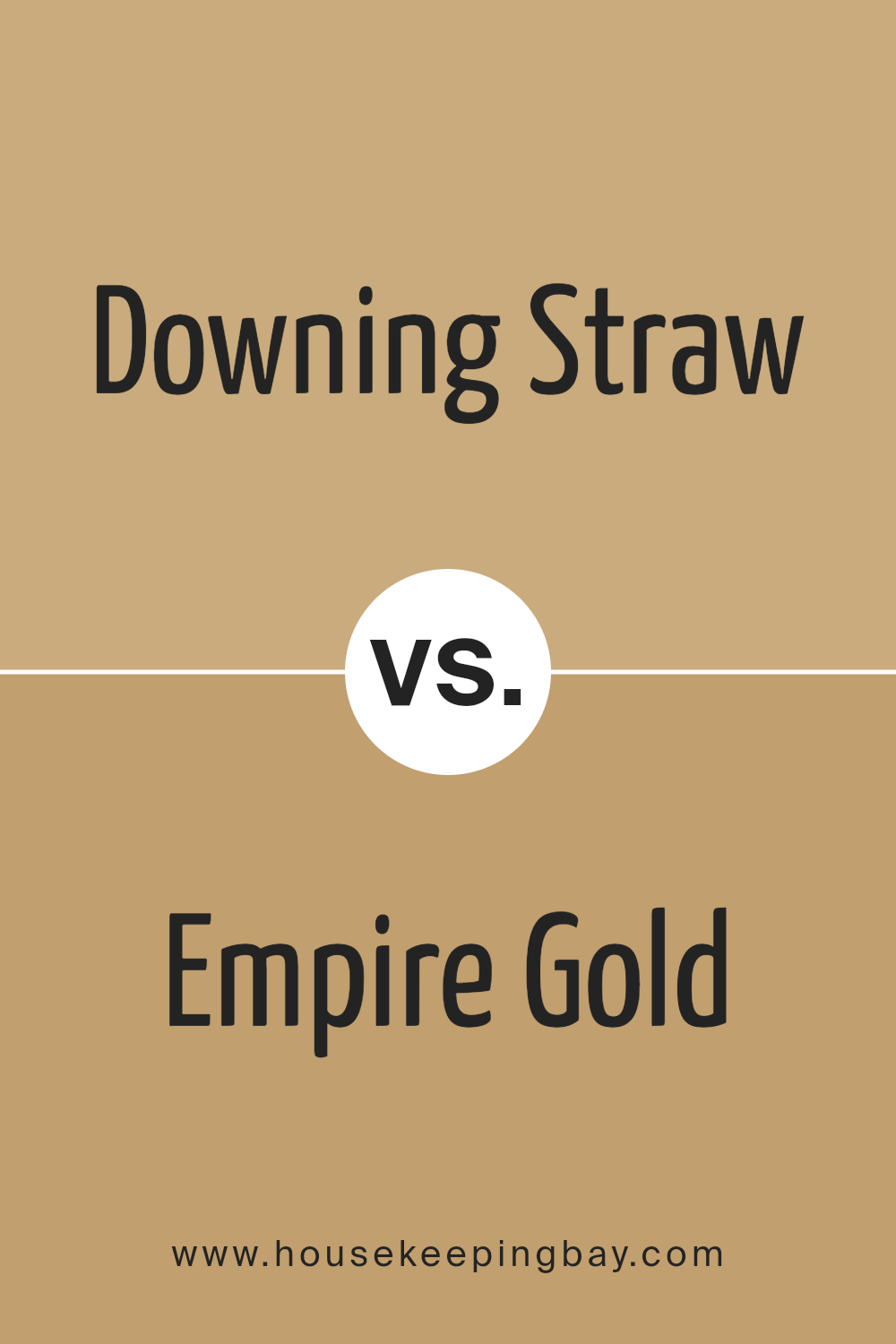
Downing Straw SW 2813 by Sherwin Williams vs Empire Gold SW 0012 by Sherwin Williams
Downing Straw SW 2813 and Empire Gold SW 0012 by Sherwin Williams are two notable colors, but they have their own unique vibes. Downing Straw is like a soft, muted yellow that feels warm and cozy, kind of like the sunlight in the afternoon.
It’s perfect if you want a room to feel relaxed and welcoming. Empire Gold, though, is a bolder choice. It’s a brighter, more vivid yellow that really stands out. This color screams energy and can instantly make a space feel more lively and vibrant. So, if you’re going for a subtle and soothing atmosphere, Downing Straw is your go-to.
But if you want to make a statement and add a punch of brightness, Empire Gold is the way to go. Each color brings its own personality to the table, making them great for different reasons.
You can see recommended paint color below:
- SW 0012 Empire Gold
housekeepingbay.com
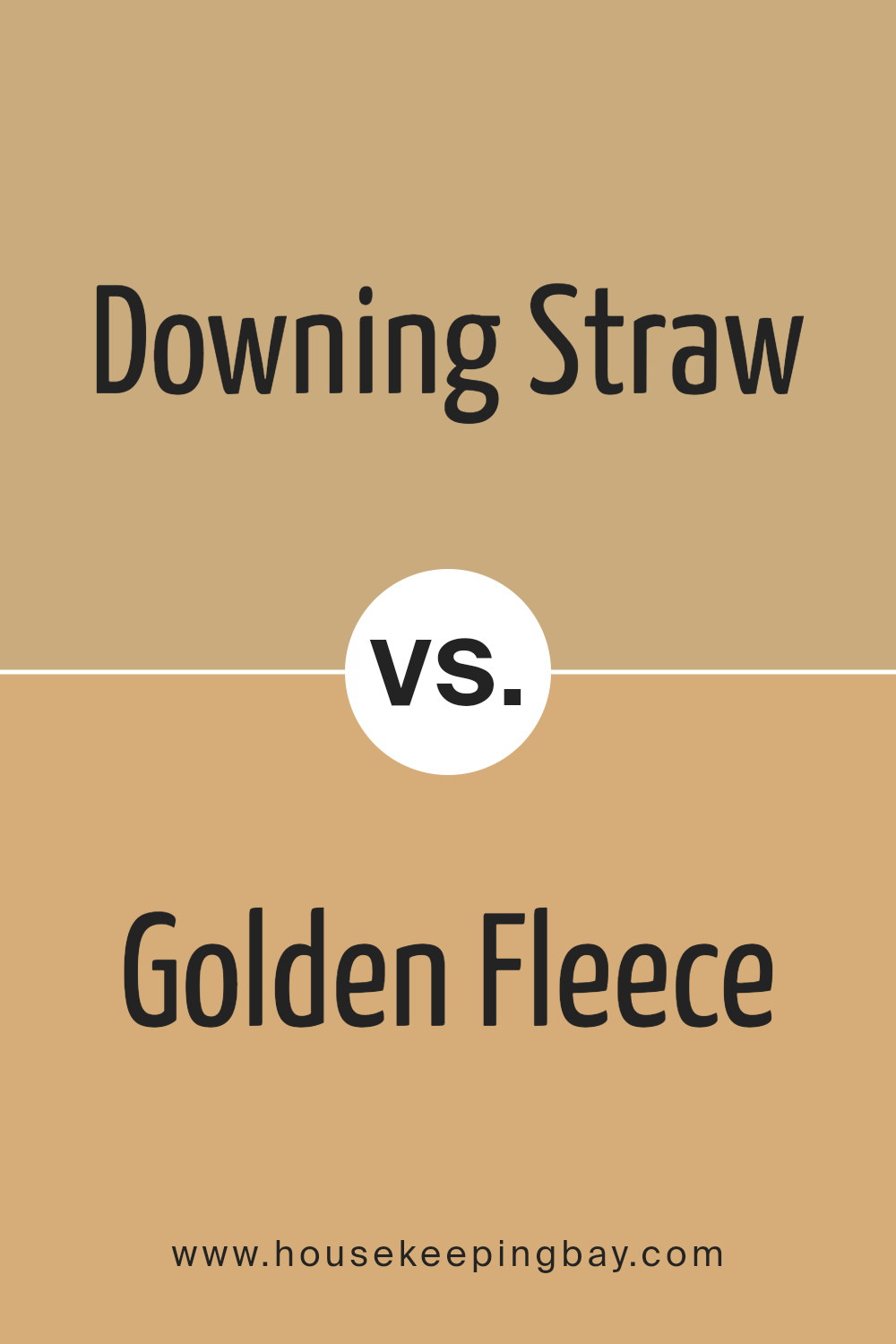
Downing Straw SW 2813 by Sherwin Williams vs Golden Fleece SW 6388 by Sherwin Williams
Downing Straw SW 2813 and Golden Fleece SW 6388, both from Sherwin Williams, offer unique vibes for any space. Downing Straw has a mellow, cozy feel, like a soft blanket on a chilly morning. It’s a soothing color, perfect for bedrooms or living rooms where calm is key. It brings a light, airy touch, making spaces feel open and relaxing.
In contrast, Golden Fleece stands out with its brighter, bolder shade. It’s like the warm glow of sunlight on a beautiful day, bringing energy and cheerfulness into a room. This color pops more, making it a great choice for areas where you want to add a splash of vibrancy, like in kitchens or dining areas.
Although both colors share a warmth and can complement a variety of decors, Downing Straw leans towards a subtler, more understated look, while Golden Fleece offers a lively burst of sunshine. Whether you’re going for gentle calmness or vibrant warmth, these colors have distinct personalities to match different tastes and spaces.
You can see recommended paint color below:
- SW 6388 Golden Fleece
housekeepingbay.com
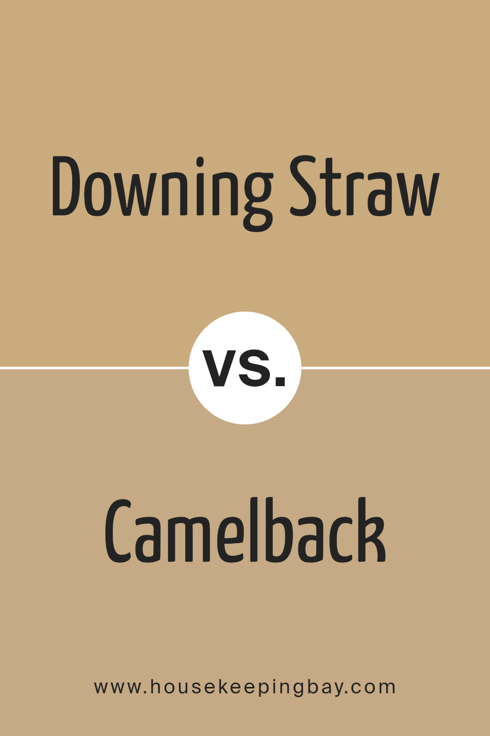
Downing Straw SW 2813 by Sherwin Williams vs Camelback SW 6122 by Sherwin Williams
Downing Straw SW 2813 and Camelback SW 6122, both by Sherwin Williams, offer unique vibes for any space. Downing Straw is like a bright summer day, full of warmth and light. It carries a vibrant yet soft yellow tone, making rooms feel cozy and inviting. Think of it shining gently in a sunny breakfast nook, bringing a welcoming warmth.
Camelback, in contrast, offers a more subdued, earthy feel. It’s a mix of beige and gray, creating a neutral backdrop that’s incredibly versatile. This color can make spaces feel grounded and calm, perfect for creating a serene bedroom or a focused home office.
Both colors stand out for their ability to create different moods. Downing Straw adds energy and cheer, while Camelback brings a peaceful and solid foundation. Depending on the room and the atmosphere you want to create, either could be the perfect choice. Whether seeking brightness and warmth or a subtle, calming vibe, these colors offer great options.
You can see recommended paint color below:
- SW 6122 Camelback
housekeepingbay.com
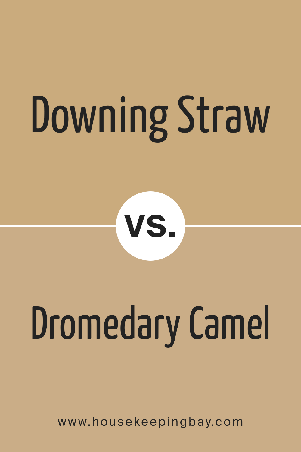
Downing Straw SW 2813 by Sherwin Williams vs Dromedary Camel SW 7694 by Sherwin Williams
Downing Straw SW 2813 by Sherwin Williams is a comforting, light golden-yellow hue, giving off a bright, airy feel. It’s perfect for spaces where you want to bring in some cheerfulness without overwhelming the room. This color shines in natural light, making it a great pick for living rooms or kitchens where a sunny atmosphere is desired.
Dromedary Camel SW 7694, on the contrary, is a much richer, deeper tan color. It brings a sense of warmth and coziness to any space, ideal for creating a snug and inviting environment. This shade works well in areas where you want to add a bit of sophistication and depth, like dining rooms or studies.
While both colors come from the same family of warm tones, Downing Straw is lighter and feels more refreshing, and Dromedary Camel is darker, providing a more enveloping warmth. Each color has its unique charm, with Downing Straw brightening spaces and Dromedary Camel adding a luxuriously warm touch.
You can see recommended paint color below:
- SW 7694 Dromedary Camel
housekeepingbay.com
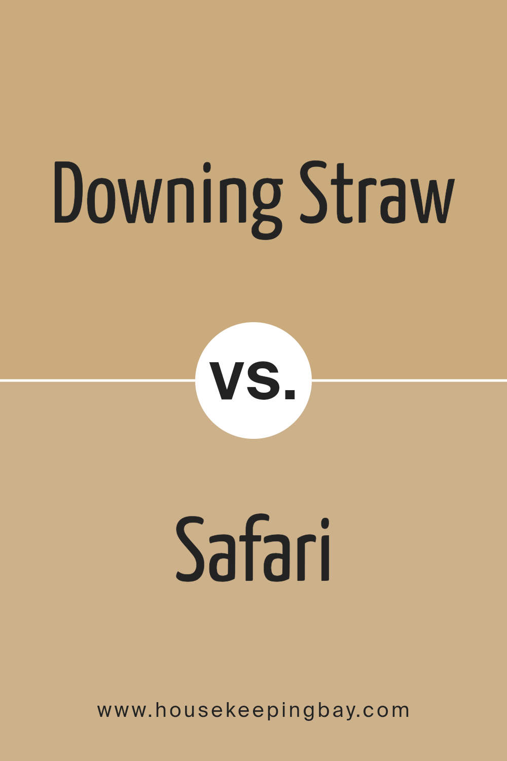
Downing Straw SW 2813 by Sherwin Williams vs Safari SW 7697 by Sherwin Williams
Downing Straw SW 2813 and Safari SW 7697 are two colors by Sherwin Williams with their own unique qualities. Downing Straw is a warm, inviting yellow with a hint of earthiness, suggesting the cozy feel of straw under the summer sun. It has a brightness that brings light into a space, making it seem welcoming and cheerful. This color works well in rooms where you want a touch of warmth without overwhelming brightness.
Safari, on the other hand, is a deeper, more subdued color. It leans towards a rich beige or light brown, evoking the image of vast, open landscapes and natural elements. Safari is versatile; it adds a sophisticated and neutral background, perfect for spaces where you prefer a more… grounded or elegant vibe.
When comparing these two, Downing Straw brings more light and energy into a room, suitable for creating a vibrant, happy atmosphere. Safari offers a more understated elegance, making a room feel calm and collected. Both colors have their places depending on the mood you want to create.
You can see recommended paint color below:
- SW 7697 Safari
housekeepingbay.com
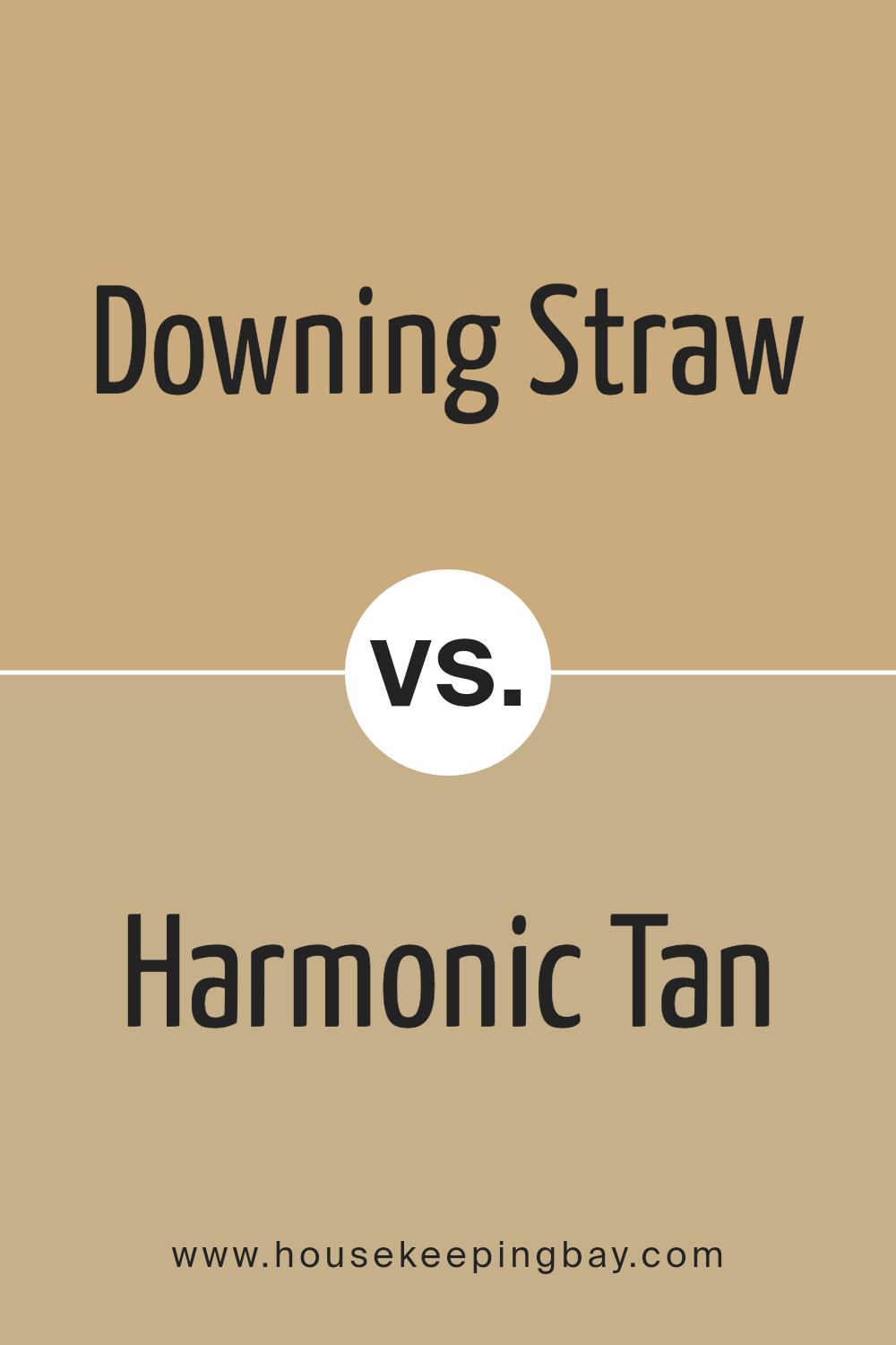
Downing Straw SW 2813 by Sherwin Williams vs Harmonic Tan SW 6136 by Sherwin Williams
Downing Straw SW 2813 from Sherwin Williams is a warm, inviting color that reminds you of a sunny day in the countryside. Its bright, cheerful vibe can make any space feel cozy and welcoming. It’s the perfect choice if you’re looking to add a touch of sunshine to your home without overwhelming it with too much brightness. This color would work well in a living room or kitchen, creating a friendly and inviting atmosphere.
In contrast, Harmonic Tan SW 6136 is a more subdued and earthy color. While it still belongs to the warm spectrum, it leans towards a neutral palette, offering a sense of calm and balance. It’s a great option for spaces where you want to promote relaxation and tranquility, like bedrooms or bathrooms.
Though quieter than Downing Straw, Harmonic Tan still provides warmth to a room but in a more understated way.
Both colors offer warmth, but while Downing Straw brings energy and vibrancy, Harmonic Tan offers serenity and a subtle elegance, making them excellent choices for different moods and settings.
You can see recommended paint color below:
- SW 6136 Harmonic Tan
housekeepingbay.com
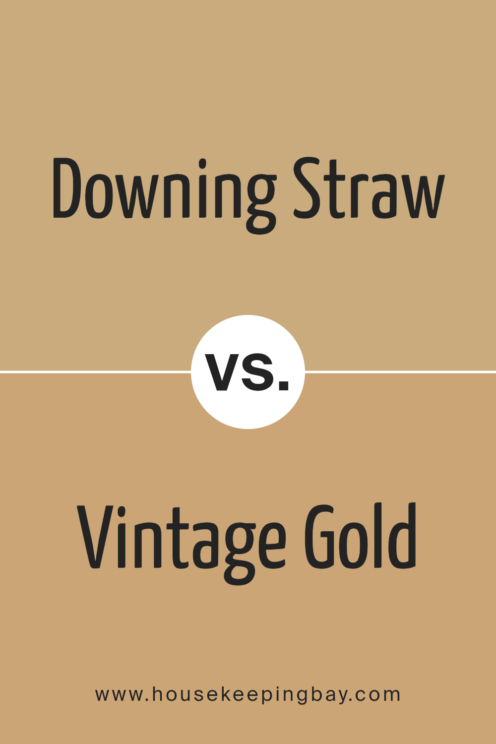
Downing Straw SW 2813 by Sherwin Williams vs Vintage Gold SW 9024 by Sherwin Williams
Downing Straw SW 2813 by Sherwin Williams is a warm, inviting shade. It recalls the golden tones of a wheat field under the sun, adding a cozy, welcoming feel to any space. This color has a soft, muted quality, making it perfect for creating a calming and comfortable atmosphere in your home. It’s versatile, fitting well in living rooms, kitchens, or bedrooms, and pairs nicely with both bright and subdued accents.
Vintage Gold SW 9024, also by Sherwin Williams, is richer and more vibrant. It draws inspiration from the precious metal, offering a luxurious and sophisticated touch. This shade is bolder, making a statement wherever it’s used.
It suits spaces that aim for a bit of drama or opulence, like dining rooms or accent walls. Vintage Gold works well with dark woods and rich textures, adding depth and elegance.
While both colors share a golden hue, Downing Straw is softer and more understated, whereas Vintage Gold is bolder and more dramatic. Each brings its unique mood and can transform a space depending on the desired effect.
You can see recommended paint color below:
- SW 9024 Vintage Gold
housekeepingbay.com
Downing Straw SW 2813 by Sherwin Williams vs Tarnished Trumpet SW 9026 by Sherwin Williams
Downing Straw SW 2813 and Tarnished Trumpet SW 9026, both from Sherwin Williams, have their unique appeal. Downing Straw is a warm, welcoming color that can make spaces feel cozy and bright. It’s like a soft sunlight on a relaxed afternoon, perfect for rooms where you want to unwind. Think of a gentle hug in the form of color; that’s Downing Straw for you.
Tarnished Trumpet, however, carries a deeper, richer tone. It’s a bold choice, reminiscent of autumn leaves or a sunset’s golden hour. This color adds a touch of sophistication and drama, making it ideal for creating focal points or accent walls. It’s like adding a dash of spice to a room – it brings energy and character.
Comparing the two, Downing Straw offers a tranquil vibe, whereas Tarnished Trumpet brings intensity and warmth. Both can beautifully transform a space, depending on the mood you want to set. Whether you prefer the soft and serene or the bold and dynamic, these colors have something special to offer.
You can see recommended paint color below:
- SW 9026 Tarnished Trumpet
housekeepingbay.com
Downing Straw SW 2813 by Sherwin Williams vs Restrained Gold SW 6129 by Sherwin Williams
Downing Straw SW 2813 and Restrained Gold SW 6129, both from Sherwin Williams, are two warm and inviting colors, though they have their unique characteristics. Downing Straw has a lighter, more muted tone that feels airy and soothing, perfect for creating a soft, cozy atmosphere in a room. It’s the kind of color that brightens up space without overwhelming it, making rooms feel larger and more open.
On the contrary, Restrained Gold is richer and more pronounced. It carries a deeper, golden hue that adds a luxurious warmth to any space. This color has the power to make a statement without being too bold, offering a sense of elegance and sophistication. It works well in spaces where you want to add a touch of class without sacrificing the welcoming ambiance.
Both colors offer their own version of warmth, with Downing Straw providing a lighter, breezier feel, and Restrained Gold offering depth and richness. Depending on the desired mood and feel of a room, either color could be the perfect choice, but they cater to slightly different aesthetic preferences and impacts on space.
You can see recommended paint color below:
- SW 6129 Restrained Gold
housekeepingbay.com
Downing Straw SW 2813 by Sherwin Williams vs Stonebriar SW 7693 by Sherwin Williams
Downing Straw SW 2813 from Sherwin Williams is a warm hue, kind of like the light shade you see on wheat fields under the sun. It’s light and has a comforting feel, making spaces look cozy and welcoming. This color can brighten up a room and make it feel more open and airy.
Stonebriar SW 7693, also by Sherwin Williams, is darker and reminds you more of earthy tones. Think of the color you see on clay pots or the soil in a sunlit garden. It has a strong, solid feel to it and adds a touch of nature to any space. This color works well in rooms where you want to feel grounded and connected to the outdoors.
While both colors bring warmth to a space, Downing Straw is lighter and can make a room feel larger and more inviting. Stonebriar, with its deeper, richer tone, offers a sense of stability and comfort. Both are great choices, but their effects on a room’s mood and size can be quite different.
You can see recommended paint color below:
- SW 7693 Stonebriar
housekeepingbay.com
Conclusion
Wrapping things up, SW 2813 Downing Straw by Sherwin Williams is more than just a paint color — it’s a warm hug for your walls that transforms any room into a cozy, welcoming space. Imagine walking into a room bathed in the soft, golden glow of a late summer afternoon.
That’s the magic Downing Straw brings into your home. It’s like the comfort of a well-loved book or your favorite warm beverage on a chilly day; it wraps around you, making spaces feel instantly more inviting and lived-in.
This color works wonders in brightening up rooms that lack natural light, giving them a cheerful, sunny vibe even on the gloomiest days. It pairs beautifully with a wide range of colors, from whites and neutrals to bold hues, allowing you the flexibility to create interiors that reflect your personality and style.
Whether you’re looking to add a splash of warmth to your living room, create a comforting ambiance in your bedroom, or give your kitchen a cozy, vibrant makeover, Downing Straw is up to the task.
Remember, the right color can transform any space, and SW 2813 Downing Straw by Sherwin Williams does just that. It’s perfect for anyone looking to inject a touch of warmth and character into their home. So, why not give your walls the golden touch they deserve?
housekeepingbay.com
Ever wished paint sampling was as easy as sticking a sticker? Guess what? Now it is! Discover Samplize's unique Peel & Stick samples. Get started now and say goodbye to the old messy way!
Get paint samples


