Cornsilk 198 by Benjamin Moore
A Warm Touch of Natural Charm
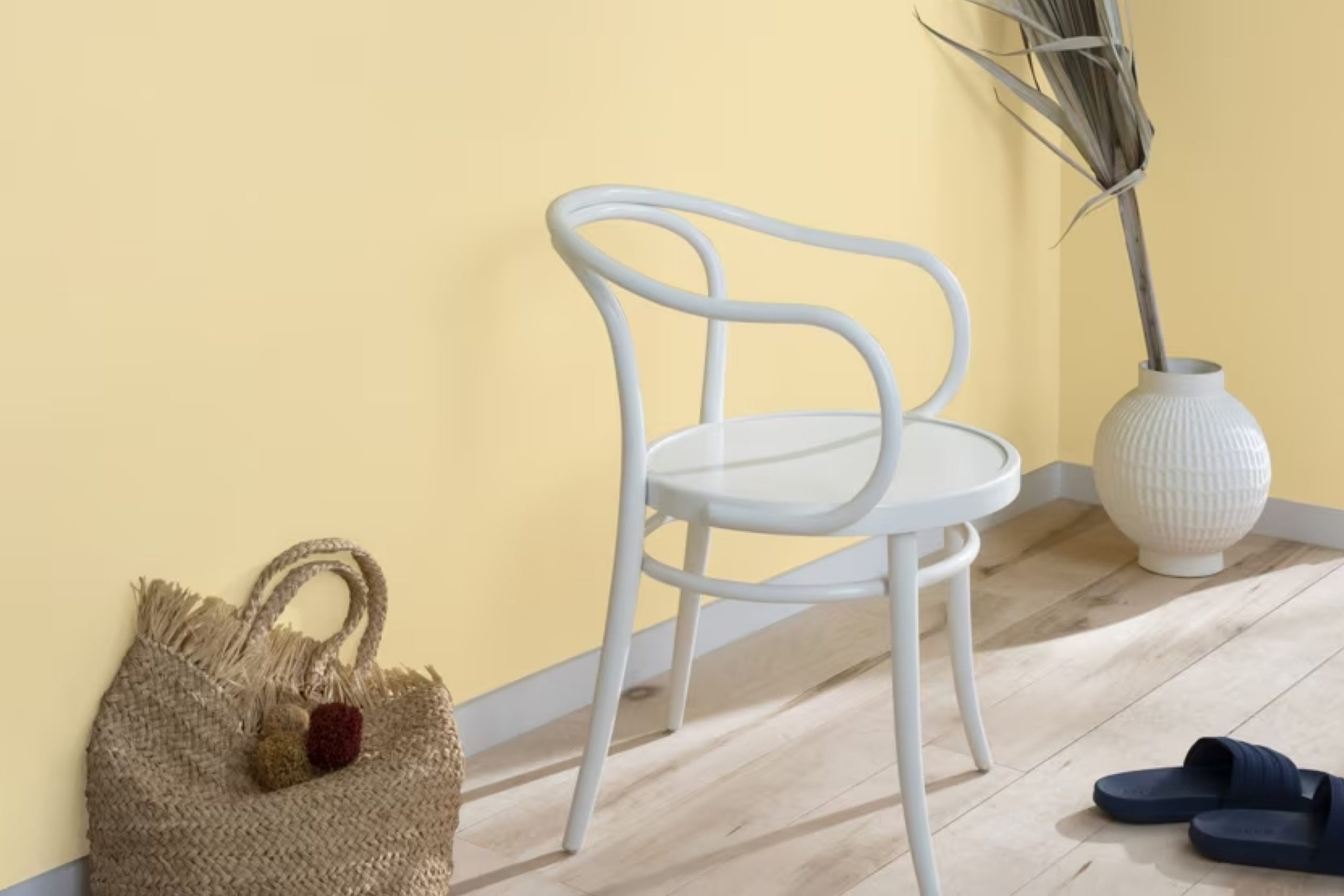
When you think about refreshing your living space, the choice of color plays a crucial role. One color that stands out is 198 Cornsilk by Benjamin Moore. It offers a soft, creamy hue that can brighten any room. This shade works well in spaces where you want to create a sense of warmth and comfort.
Imagine the gentle glow it can give your kitchen in the early morning or the cozy feel it brings to a bedroom at any time of the day.
Cornsilk pairs beautifully with natural materials like wood and stone, and it complements a variety of design styles, from traditional to modern. Its subtlety allows it to work as a main wall color or a complementary accent.
Choosing Cornsilk is about more than just adding color; it’s about setting the mood. Whether you want your space to feel more inviting or simply softer, this color can assist in achieving that goal.
You’ll notice how it gently reflects light, adding depth without overwhelming the senses. Let 198 Cornsilk guide you in creating a peaceful and harmonious home environment.
via benjaminmoore.com
What Color Is Cornsilk 198 by Benjamin Moore?
Table of Contents
Cornsilk198 by Benjamin Moore is a soft, pale shade that exudes warmth and comfort. Offering a gentle yellow hue, this color sits comfortably between cream and butter. Its subtle undertones make it a versatile choice for many interior styles. Cornsilk brings a welcoming and cozy atmosphere, perfect for living rooms, bedrooms, and kitchens.
This color shines in traditional or cottage-style interiors, where its soft presence complements rustic elements. Pair it with white trims to highlight clean lines and create contrast.
In farmhouse settings, Cornsilk198 works well with natural wood tones, enriching the wood’s warmth and enhancing the room’s inviting feel.
For materials and textures, Cornsilk198 pairs beautifully with light to medium wood grains, like oak or ash, adding warmth without overpowering. Textiles such as linen and cotton can complement this hue, providing a casual, relaxed vibe. Add woven baskets or jute rugs for texture, bringing a touch of nature indoors.
In modern spaces, use Cornsilk198 as an accent against darker, industrial elements like steel or concrete, softening the overall look. Overall, Cornsilk198 by Benjamin Moore proves to be a flexible color choice that brings warmth and understated elegance to a variety of interiors.
housekeepingbay.com
Is Cornsilk 198 by Benjamin Moore Warm or Cool color?
Cornsilk198 by Benjamin Moore is a soft, creamy yellow color that brings warmth and comfort to any room. This color resembles the light golden hue of corn husks, creating a cozy and inviting atmosphere. Cornsilk198 works well in various spaces like kitchens, living rooms, or bedrooms, as it adds a touch of sunny brightness without being overwhelming.
Its subtle undertones make it versatile enough to pair with different colors, from cool blues and greens to rich browns and reds. In rooms with plenty of natural light, Cornsilk198 can help enhance the brightness, making spaces feel open and airy.
In areas with less light, it can add warmth and a touch of cheerfulness.
Using Cornsilk198 on walls can make a room feel more welcoming, while accenting with this shade on trim or furniture can bring out the best in other colors and elements in the space.
Overall, this color provides a balanced blend of warmth and subtlety, making it suitable for many home styles.
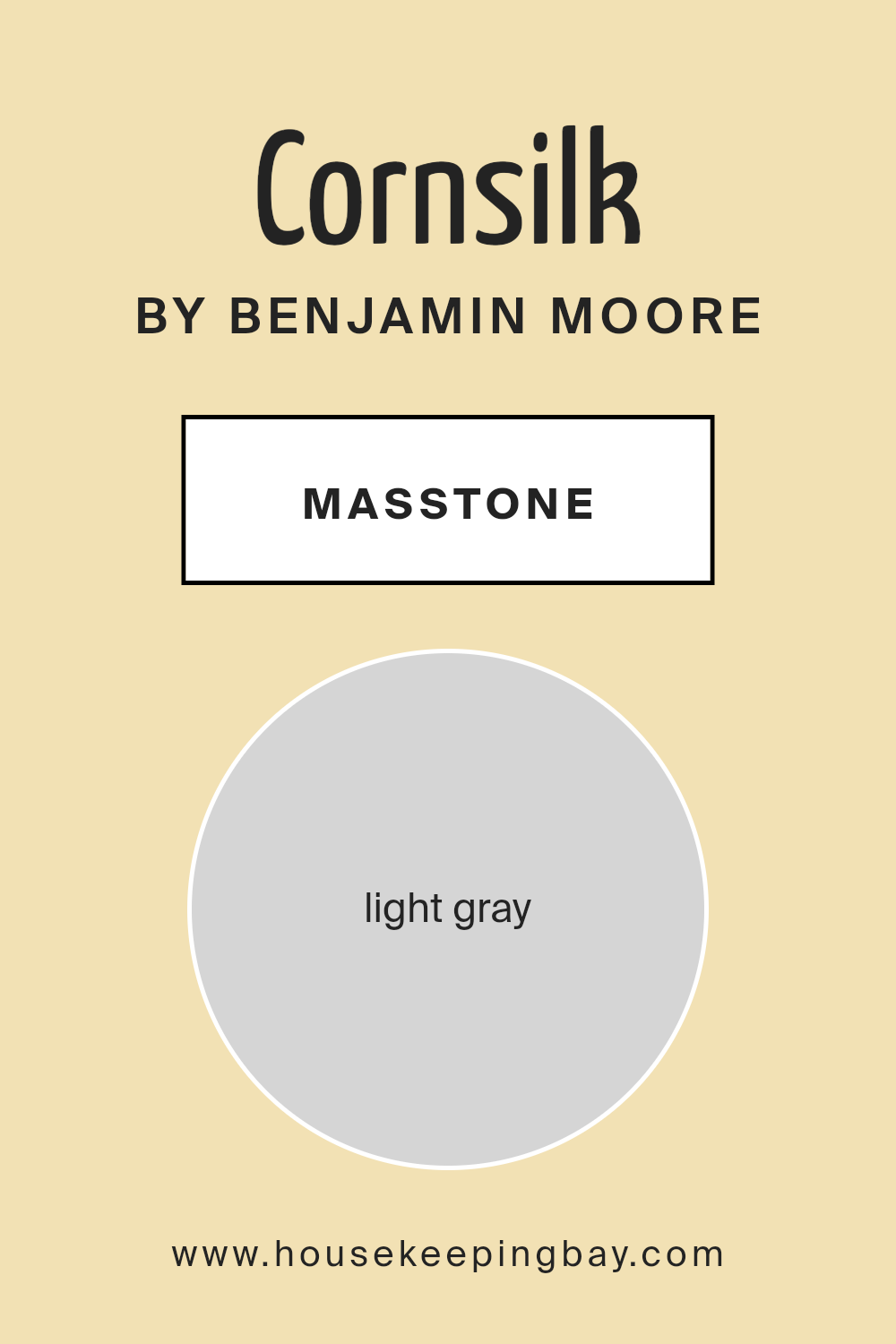
What is the Masstone of the Cornsilk 198 by Benjamin Moore?
Cornsilk198 by Benjamin Moore, often described as a light gray (#D5D5D5), offers a subtle yet elegant touch to interiors. The light gray tone makes it an ideal choice for creating a calming and soothing atmosphere in rooms. Its neutral quality ensures it pairs well with other colors, making furniture and décor selection easier.
When used on walls, Cornsilk198 provides a fresh, airy feel, making spaces appear larger and more open. This hue works perfectly in living rooms, bedrooms, and kitchens, bringing a clean and modern look to these areas.
Its minimalistic nature does not overpower rooms, allowing other design elements to shine.
Cornsilk198 also complements both traditional and contemporary styles. Whether accented with bold colors or paired with other neutrals, this light gray offers versatility.
Homeowners appreciate its ability to adapt, providing a stylish backdrop that supports various designs and personal tastes, all while maintaining a welcoming ambiance.
housekeepingbay.com
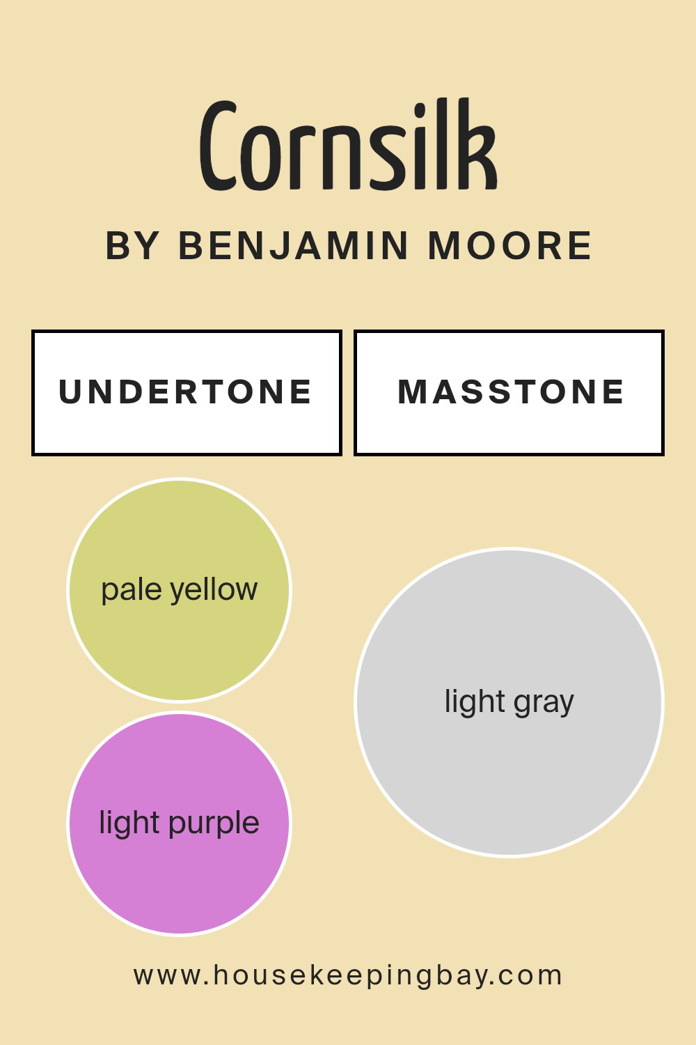
Undertones of Cornsilk 198 by Benjamin Moore
Cornsilk198 by Benjamin Moore is a nuanced color, containing a range of subtle undertones including pale yellow, light purple, pale pink, light blue, mint, lilac, and grey. These undertones influence how we perceive Cornsilk198, affecting its appearance and interaction with other colors.
In general, undertones play a crucial role in color perception. They add depth and complexity, sometimes more noticeable in different lighting conditions or paired with specific decor. For Cornsilk198, each undertone can subtly shift its look, making it versatile.
On interior walls, Cornsilk198’s pale yellow undertone can add warmth and a sunlit feel, while the light purple and lilac bring a gentle, soothing quality. The pale pink enhances coziness, making a space feel welcoming, while light blue offers a crisp, fresh vibe. Mint undertones contribute a hint of nature, adding a refreshing touch. Meanwhile, grey undertones can make Cornsilk198 appear more neutral, balancing warmth with coolness.
These undertones make Cornsilk198 adaptable for various rooms, as it can complement different styles and moods. In bright, natural light, certain undertones may become more pronounced, while in dim lighting, others may subtly emerge, creating a dynamic atmosphere that shifts throughout the day.
housekeepingbay.com
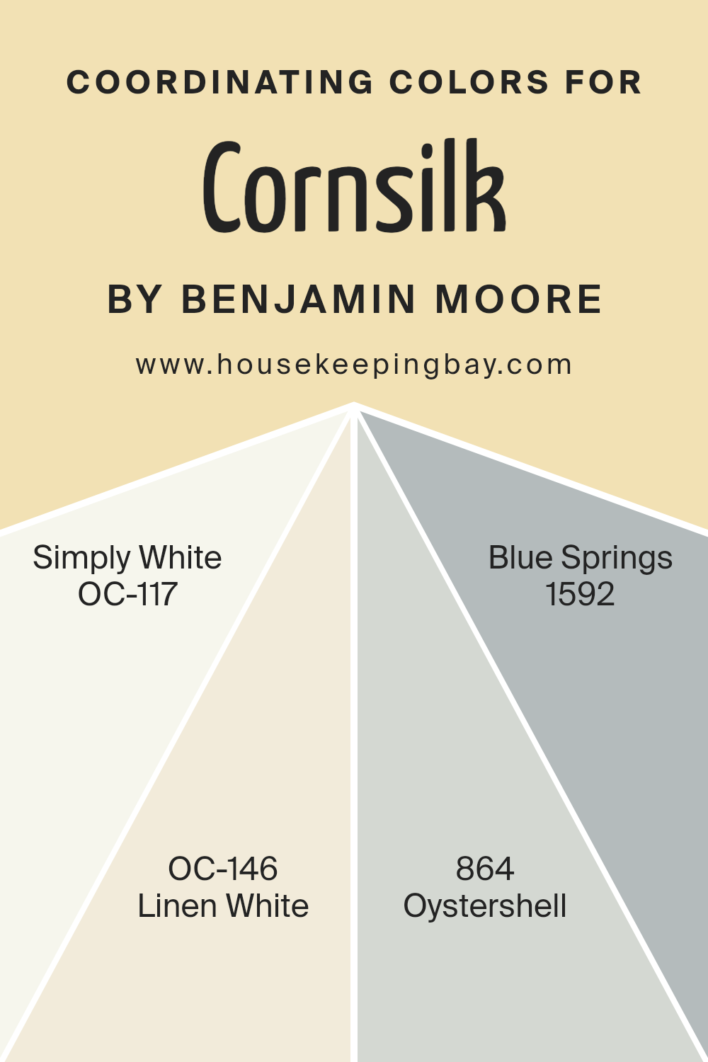
Coordinating Colors of Cornsilk 198 by Benjamin Moore
Coordinating colors are hues that complement each other, creating a harmonious look when used in a space together. When you pair coordinating colors with Cornsilk198 by Benjamin Moore, you achieve an inviting and balanced environment.
The warm, creamy tone of Cornsilk198 serves as a versatile base, and its compatible colors enhance its gentle appeal.
Simply White (OC-117) brings a clean, bright touch that lightens and refreshes any room. Its crispness contrasts beautifully with Cornsilk198, adding a sense of openness. Linen White (OC-146), on the other hand, offers a soft, warm off-white tone that wraps the space in coziness, echoing the warmth of Cornsilk198.
Oystershell (864) carries a muted gray-beige hue that provides a subtle depth, linking other colors into a seamless flow.
Finally, Blue Springs (1592), a serene blue, introduces a soothing coolness, offering a gentle counterpoint to the warm undertones of Cornsilk198. Together, these colors work to create a balanced and inviting atmosphere in any room.
You can see recommended paint colors below:
- OC-117 Simply White
- OC-146 Linen White
- 864 Oystershell
- 1592 Blue Springs
housekeepingbay.com
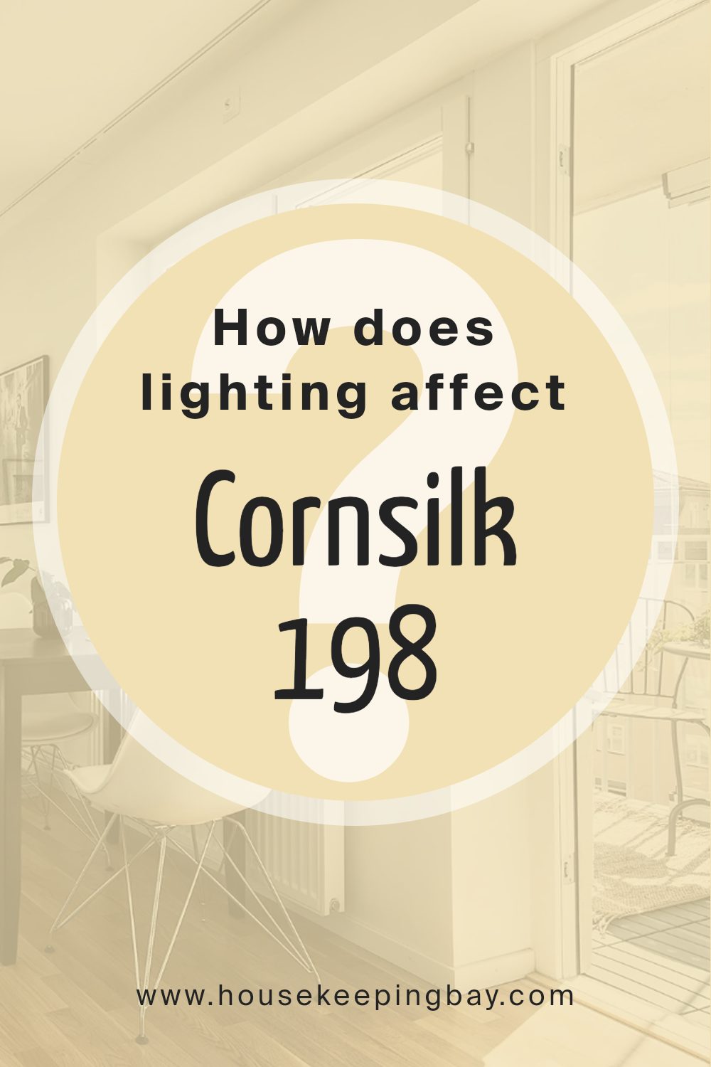
How Does Lighting Affect Cornsilk 198 by Benjamin Moore?
Lighting plays a key role in how we perceive colors. Both natural and artificial light can change the appearance of paint colors on walls. Let’s talk about the color Cornsilk198 by Benjamin Moore and how it behaves under different lighting conditions.
In artificial light, bulbs can have warm or cool tones. Warm bulbs, like incandescent ones, emit a yellowish light which can make Cornsilk198 appear warmer and more yellow.
Cool bulbs, like many LEDs, tend to have a blueish tone, which might make Cornsilk198 look slightly more muted or less warm. It’s essential to note the type of artificial lighting in a room to predict how the color will look.
In natural light, the effect changes based on the time of day and room orientation. In a north-facing room, which tends to receive cooler and more consistent light throughout the day, Cornsilk198 may appear a bit subdued and possibly take on a grayer tone because the light is less direct and has a blue hue. This cooler light can neutralize the warmth of Cornsilk198 slightly.
In a south-facing room, there is ample sunlight for most of the day. This type of light is warm, enhancing the soft, warm undertone of Cornsilk198, making it look more vibrant and cozy. Sunlight from the south is strong and warm, which suits this color well.
An east-facing room receives direct sunlight in the morning. Here, Cornsilk198 will look brighter and warmer in the morning hours, but as the day goes on and the sunlight diminishes, it may begin to cool down and look more neutral.
In a west-facing room, the sunlight is strongest in the late afternoon and evening. Cornsilk198 might look more muted during the morning but will intensify and feel warmer and richer as the day progresses and the light becomes stronger.
Understanding lighting can help achieve the desired effect of paint colors in a space, ensuring Cornsilk198 by Benjamin Moore fits beautifully.
housekeepingbay.com
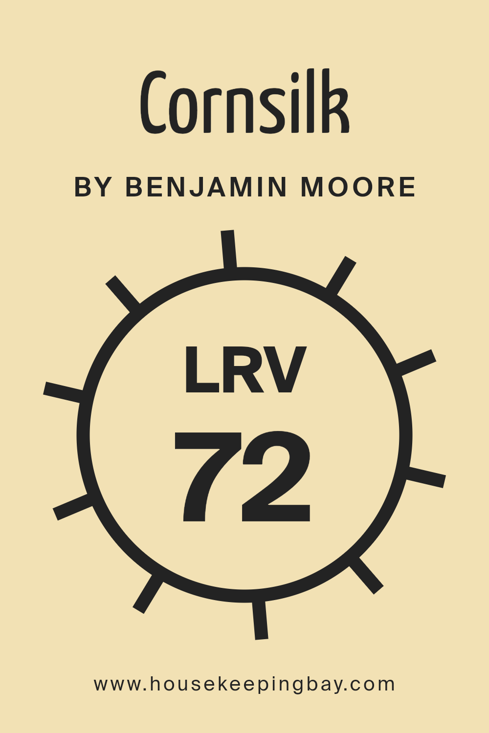
What is the LRV of Cornsilk 198 by Benjamin Moore?
LRV stands for Light Reflectance Value, which is a measure of how much light a color reflects or absorbs. The scale ranges from 0 to 100, where 0 is absolute black, absorbing all light, and 100 is pure white, reflecting all light.
When it comes to choosing paint for walls, understanding LRV can help predict how a color will look in different lighting. A higher LRV means the color will reflect more light, making a room feel brighter and more open.
Conversely, a lower LRV means the color will absorb more light, creating a cozier and perhaps more intimate space. LRV is important because the same color can look quite different depending on the amount of natural or artificial light in a room.
For Cornsilk 198 by Benjamin Moore, with an LRV of 72.25, it sits on the lighter side of the scale.
This means Cornsilk will reflect a good amount of light, helping to make rooms look airy and spacious. This lightness can make small rooms feel larger and prevent them from feeling cramped. The color can also work well in rooms that lack natural light, as its reflectiveness will bring a sense of brightness and warmth to the space.
However, because it reflects so much light, it can look different at various times of the day, depending on the light coming in. It’s a versatile color, creating a gentle and welcoming atmosphere without overwhelming the senses.
housekeepingbay.com
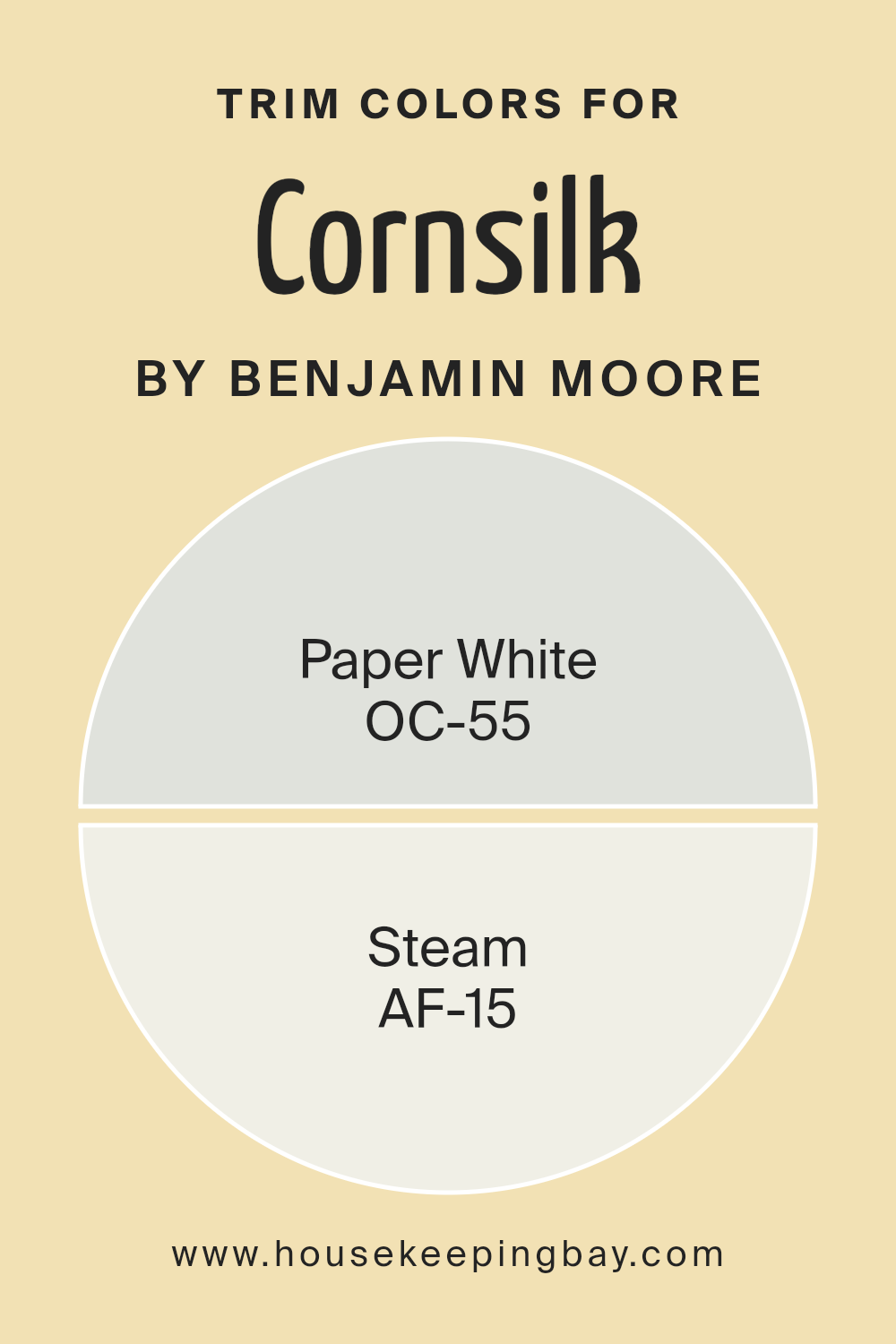
What are the Trim colors of Cornsilk 198 by Benjamin Moore?
Trim colors are colors used for painting the edges and borders of walls, doors, windows, and architectural details within a room. They help define spaces, add contrast, and accentuate features. For Cornsilk198 by Benjamin Moore, using effective trim colors can enhance the overall aesthetic of a space.
Cornsilk198 is a warm, creamy yellow, and pairing it with the right trim color makes the room look more balanced and inviting. Choosing a complementary trim color adds depth and highlights the architectural details, creating a cohesive look.
OC-55 Paper White is a soft, subtle off-white that tends towards a cool undertone, providing a serene, clean contrast when placed next to Cornsilk198’s warm tone. It allows the primary color to stand out while bringing a sense of openness and clarity to the room.
On the other hand, AF-15 Steam, with its gentle warmth and slightly muted character, harmonizes smoothly with Cornsilk198, providing a gentle transition between trim and wall color.
Utilizing these trim colors can add to the overall impact and feel of a space, either by enhancing the vividness of Cornsilk198 or by creating a subtle, cohesive environment.
You can see recommended paint colors below:
housekeepingbay.com
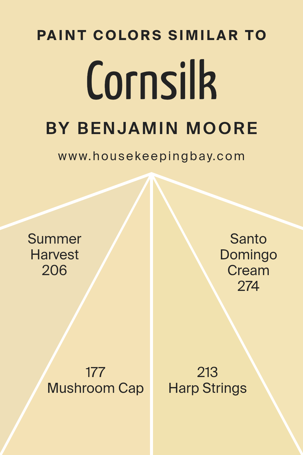
Colors Similar to Cornsilk 198 by Benjamin Moore
Similar colors provide harmony and balance in design, making spaces feel cohesive yet dynamic. Cornsilk 198 by Benjamin Moore is a soft, warm yellow that evokes the gentle glow of natural light. When paired with colors like 206 – Summer Harvest and 177 – Mushroom Cap, the palette remains warm and inviting.
Summer Harvest is a richer yellow than Cornsilk, reminiscent of golden fields at sunset. It adds a lively touch while complementing the softness of Cornsilk. Mushroom Cap, with its earthy beige tone, grounds the yellows, creating a stable base that ties the warmth together elegantly.
The inclusion of 213 – Harp Strings, a light, muted cream with a hint of yellow, highlights the gentle undertone of Cornsilk, enhancing the soothing atmosphere without overpowering it.
On the other hand, 274 – Santo Domingo Cream brings a slightly more saturated creaminess, reminiscent of aged plaster or sunlit stucco walls, offering depth.
Combining these similar shades ensures a seamless flow between different elements in a space. They work together to create an environment that feels both bright and calm. This thoughtful use of similar colors not only makes a space visually appealing but also evokes a sense of comfort and welcome.
You can see recommended paint colors below:
- 206 Summer Harvest
- 177 Mushroom Cap
- 213 Harp Strings
- 274 Santo Domingo Cream
housekeepingbay.com
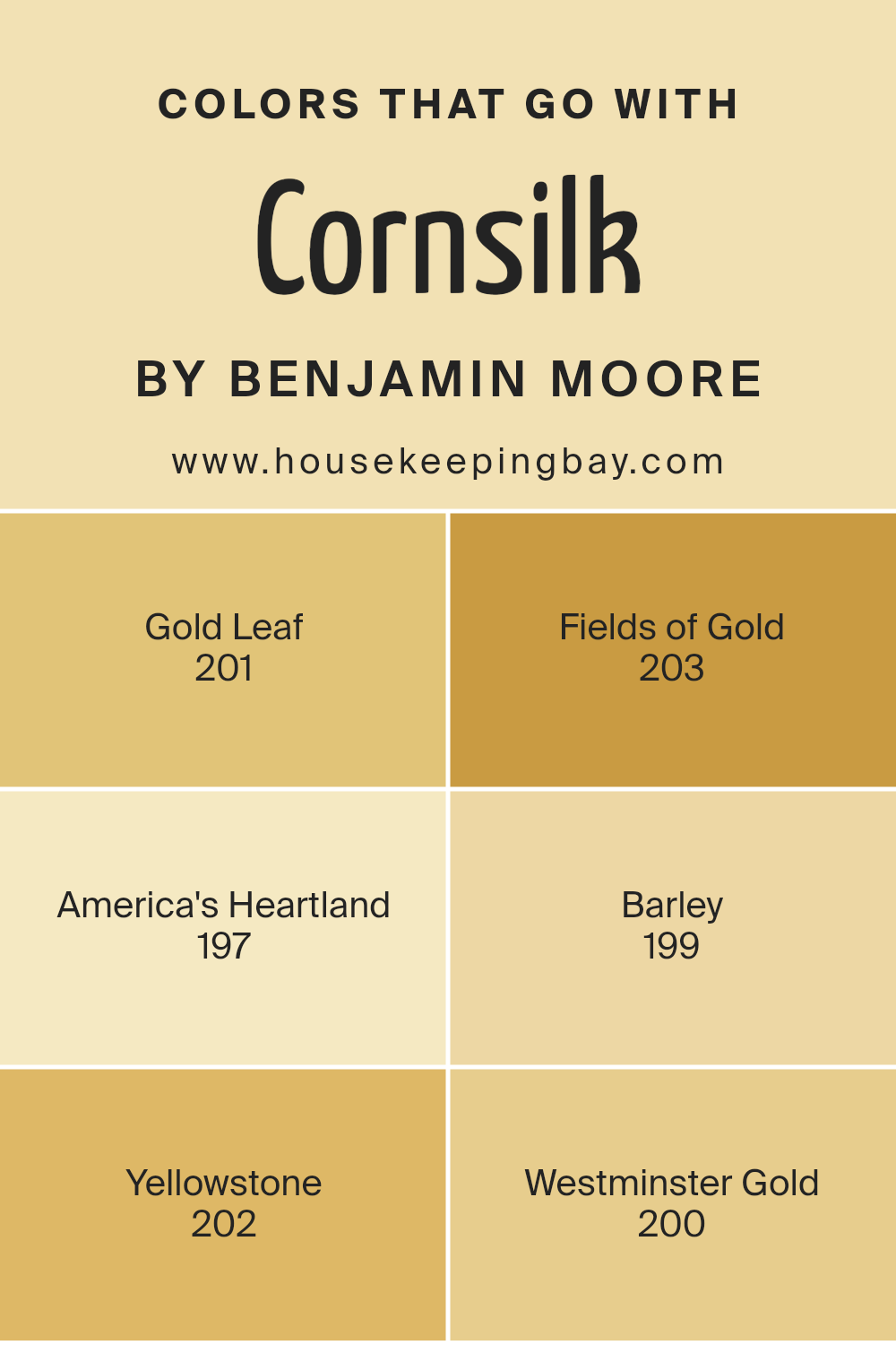
Colors that Go With Cornsilk 198 by Benjamin Moore
When using Cornsilk 198 by Benjamin Moore, choosing colors that complement it can make a space look harmonious and inviting. Cornsilk, with its light and warm tone, pairs well with other warm hues. Gold Leaf 201 adds a rich, luxurious touch, enhancing Cornsilk’s subtle elegance.
Fields of Gold 203, a softer tone, introduces a gentle warmth, making the room feel cozy and welcoming. America’s Heartland 197, with its earthy depth, anchors the space, creating balance and depth.
Barley 199, a mellow, golden hue, seamlessly blends with Cornsilk, adding to its comforting vibe without overpowering. Yellowstone 202, a more vibrant yellow, injects a lively yet balanced energy that complements Cornsilk’s understated charm.
Westminster Gold 200, with its muted richness, contrasts nicely with Cornsilk, enriching the overall atmosphere without clashing. Together, these colors work in unison, creating a soothing and visually appealing environment.
They enhance the unique quality of Cornsilk 198 while adding layers of depth and warmth. This combination appeals to those seeking a harmonious and pleasant color scheme that stands the test of time.
You can see recommended paint colors below:
- 201 Gold Leaf
- 203 Fields of Gold
- 197 America’s Heartland
- 199 Barley
- 202 Yellowstone
- 200 Westminster Gold
housekeepingbay.com
How to Use Cornsilk 198 by Benjamin Moore In Your Home?
Cornsilk 198 by Benjamin Moore is a warm and inviting off-white paint color with a hint of creamy yellow. It’s perfect for creating a cozy and welcoming atmosphere in any home. This shade works well in various rooms, from living areas to kitchens. It can make spaces feel brighter and more open, reflecting natural and artificial light beautifully.
In the living room, Cornsilk 198 pairs nicely with wooden furniture, adding a touch of warmth and comfort. In the kitchen, it complements white cabinets and stainless steel appliances, adding a subtle warmth without overwhelming.
Use it in a bedroom for a calm and relaxing feel, helping you unwind after a long day.
For those who love neutral tones but want something with a bit more character, Cornsilk 198 offers that perfect balance. It matches various styles and decors, making it a versatile choice for anyone looking to refresh their home.
Cornsilk 198 by Benjamin Moore vs Santo Domingo Cream 274 by Benjamin Moore
Cornsilk 198 by Benjamin Moore is a light, warm shade that brings a touch of gentle sunlight into any space. Its soft, pastel undertone makes it feel airy and welcoming, like a subtle whisper of cream. Cornsilk can fit perfectly into bedrooms or living rooms where a soothing vibe is desired. It complements other pastel colors and even soft grays or blues, providing a serene base that doesn’t overwhelm.
Santo Domingo Cream 274 by Benjamin Moore is also a warm, creamy color but carries a slightly richer and deeper undertone than Cornsilk. This shade offers a hint of warmth with a tad more depth, giving rooms a cozy, inviting atmosphere.
The color works well in living spaces and dining areas, teaming nicely with wood tones and earthy accents.
Both colors create warmth and comfort but do so at different levels of intensity. Cornsilk is lighter and more breezy, while Santo Domingo Cream adds warmth with its slight depth.
You can see recommended paint color below:
- 274 Santo Domingo Cream

housekeepingbay.com
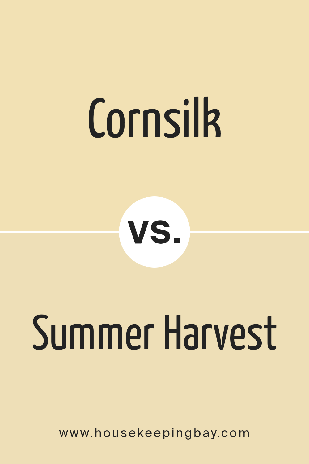
Cornsilk 198 by Benjamin Moore vs Summer Harvest 206 by Benjamin Moore
Comparing Cornsilk 198 and Summer Harvest 206 by Benjamin Moore reveals two distinct shades. Cornsilk 198 exudes warmth with its soft, creamy yellow tone. It gives a cozy, inviting feel, making spaces look brighter and more cheerful. This color is versatile, suiting various settings from kitchens to living rooms, adding a gentle pop without overwhelming.
Summer Harvest 206, in contrast, presents a more robust yellow hue. It carries a richer, earthier undertone, resembling the color of ripe wheat fields under the sun. This shade brings a sense of comfort and vitality, creating an energizing environment.
While Cornsilk offers a subtle, elegant touch ideal for expanding perceived space, Summer Harvest provides a fuller, more grounded presence. Both colors work well with natural materials and complement warm-toned furnishings. Choosing between them depends on whether you want a gentle uplift with Cornsilk or a more vibrant ambiance with Summer Harvest.
You can see recommended paint color below:
- 206 Summer Harvest
housekeepingbay.com
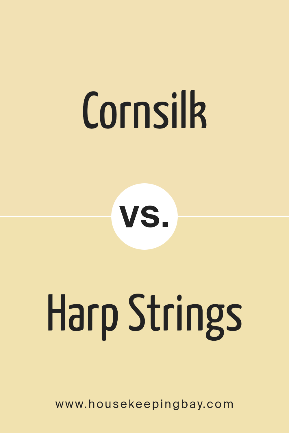
Cornsilk 198 by Benjamin Moore vs Harp Strings 213 by Benjamin Moore
Cornsilk 198 by Benjamin Moore offers a soft and warm shade that reminds one of gently toasted grains, providing a cozy, inviting feel to spaces. Its mild golden undertone makes rooms feel brighter and more welcoming. It’s a versatile color that works well in both traditional and modern settings, lending comfort and elegance.
Harp Strings 213, also by Benjamin Moore, presents a more neutral and cooler alternative. Its subtle beige-gray hue introduces a calm and balanced atmosphere.
This color tends to complement a wide array of design elements due to its understated presence, allowing other decor elements to shine.
While Cornsilk 198 leans warmer with hints of yellow, evoking warmth, Harp Strings 213 feels cooler, promoting a serene environment.
Cornsilk’s vibrancy subtly uplifts a room, whereas Harp Strings adds sophistication through its subdued tone. Both colors have unique qualities that contribute to different aesthetic goals within a space.
You can see recommended paint color below:
- 213 Harp Strings
housekeepingbay.com
Cornsilk 198 by Benjamin Moore vs Mushroom Cap 177 by Benjamin Moore
Cornsilk 198 by Benjamin Moore presents a light, creamy hue with a soft yellow tint. It evokes warmth, suggesting comfort and subtle glow, making spaces feel inviting. Its pale nature allows it to work well in brightening rooms without overwhelming them. The color resembles the delicate hue of cornsilk threads, offering a gentle backdrop for varied decor styles.
Mushroom Cap 177, also by Benjamin Moore, leans towards a warm beige tone with hints of brown. It creates a cozy and earthy feel, reminiscent of natural landscapes. This color carries a bit more depth than Cornsilk, adding richness to interiors. Its neutrality makes it versatile, pairing well with both bold and muted colors.
While Cornsilk exudes a sunny brightness, Mushroom Cap offers a grounded, warm neutrality. Both colors provide flexibility in design but cater to different atmospheres, one airy and light, the other warm and earthy.
You can see recommended paint color below:
- 177 Mushroom Cap
housekeepingbay.com
This amazing color offers a gentle balance that can create a comforting atmosphere, making it suitable for various rooms, whether a cozy bedroom or a welcoming living area.
The color’s natural elegance pairs well with numerous design styles and complements other shades with ease, enhancing the overall aesthetic without overwhelming the senses.
When thinking about potential applications, I can envision Cornsilk providing a neat backdrop for vibrant art pieces or acting as a soft contrast against darker wood furnishings. Its versatility ensures it has ample potential to adapt to personal tastes and design goals, catering both to modern sensibilities and classic tastes alike.
In my opinion, 198 Cornsilk stands out for its ability to infuse spaces with a harmonious blend of subtlety and warmth. On its own or as part of a broader palette, it has a quiet charisma that can introduce an inviting and comforting atmosphere.
housekeepingbay.com
Ever wished paint sampling was as easy as sticking a sticker? Guess what? Now it is! Discover Samplize's unique Peel & Stick samples. Get started now and say goodbye to the old messy way!
Get paint samples


