Constellation SW 9629 by Sherwin Williams
Navigating the Depths of a Midnight Blue
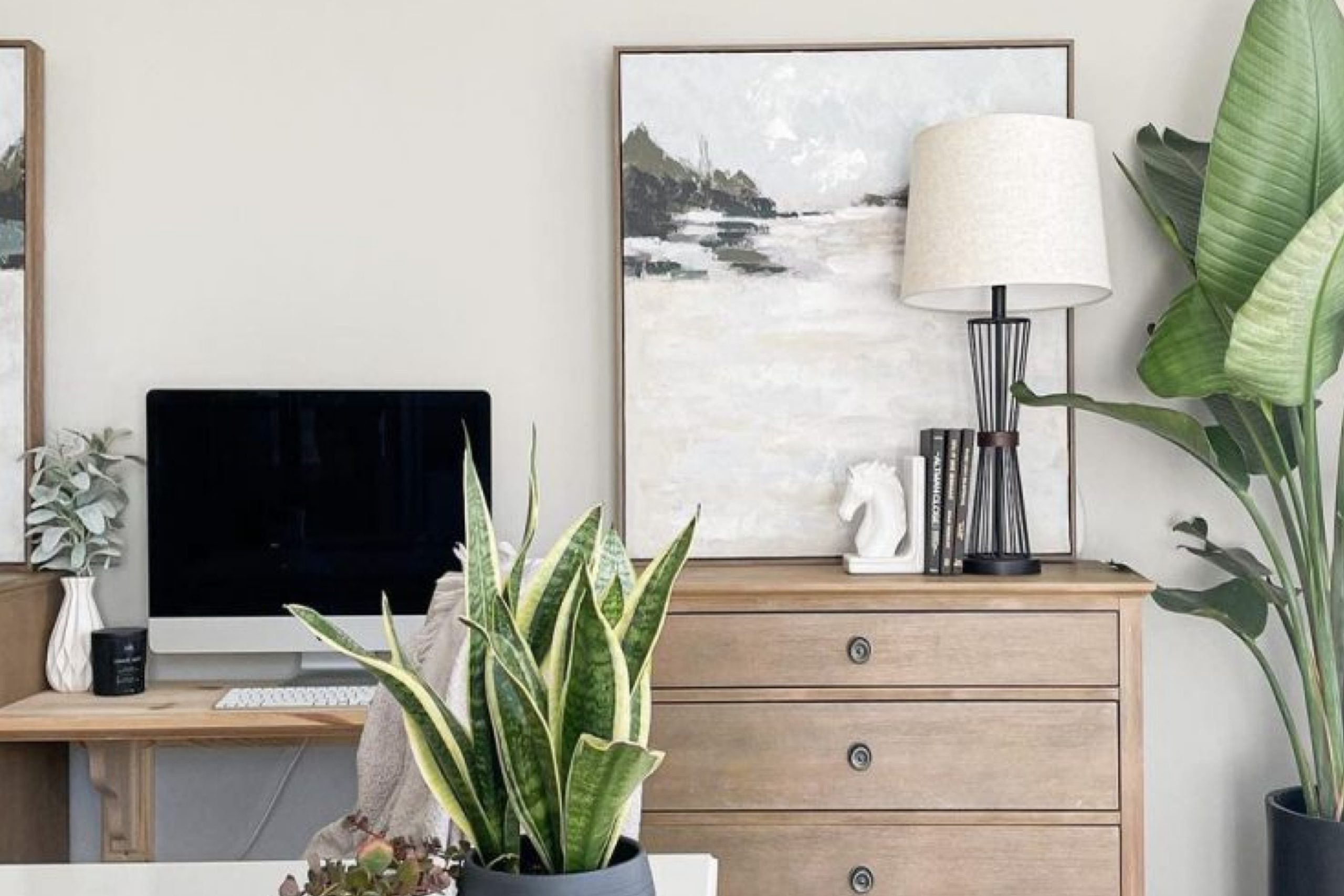
When you’re thinking about giving your space a fresh coat of paint, SW 9629 Constellation by Sherwin Williams could be the perfect choice. This paint color brings a soothing yet fresh energy to any room. As I started planning to repaint my room, I wanted something that felt calming but still had enough character to make an impact.
Constellation stood out with its subtle charm, making it an ideal backdrop for both relaxation and creativity.
As you look for a color that adapts to various lighting and complements different decor styles, Constellation proves itself versatile. In my experience, it pairs well with muted tones for a soft look or bold colors for a dynamic contrast.
The paint applies smoothly, and its durable finish means it holds up well over time, keeping your walls looking great. Choosing this shade might breathe new life into your space, whether you’re updating a bedroom, office, or living area.
Choosing the right paint color can shift the feel of a room, and with Sherwin Williams SW 9629 Constellation, you get a dependable quality with a delightful aesthetic impact. Whether you’re covering up old colors or starting on a new canvas, this shade meets the mark with its stylishly understated vibe.
via sherwin-williams.com
What Color Is Constellation SW 9629 by Sherwin Williams?
Constellation SW 9629 by Sherwin Williams is a gentle, grayish-blue hue, subtle yet sophisticated, evoking the feel of an early morning sky. This color carries a serene, soft quality that pairs effortlessly with various interior styles, particularly fitting for modern and coastal designs.
Its understated elegance works well in spaces aiming for a clean, airy look, such as living rooms, bedrooms, and bathrooms.
In modern interiors, Constellation can create a sleek, minimal backdrop. It matches beautifully with materials like polished marble, stainless steel, and glass, allowing for a crisp, cohesive aesthetic. The softness of this color complements the hard edges and shiny surfaces typically found in modern decor, bringing balance and a touch of warmth.
For a coastal style, use Constellation to mirror the calming qualities of the seaside. It pairs exquisitely with natural textures such as light woods, linens, and woven rattan, enhancing the laid-back, breezy vibe of beach-inspired spaces.
Adding accessories in white, beige, or soft pastel tones can further accentuate the airy feel, making any room feel more open and inviting.
Overall, Constellation SW 9629 is a versatile choice, lending itself to a wide range of decorative styles and materials, enhancing each with its gentle charm.
housekeepingbay.com
Is Constellation SW 9629 by Sherwin Williams Warm or Cool color?
ConstellationSW 9629 by Sherwin Williams is a distinctive paint color that brings a fresh and airy feel to any room. This shade is a soft, light blue with hints of gray, making it a perfect choice for those wishing to create a calm and serene environment in their homes.
The beauty of ConstellationSW 9629 lies in its versatility. It pairs well with various decor styles, from contemporary to traditional.
When used in small spaces, such as a bathroom or entryway, ConstellationSW 9629 can make the area seem more spacious and open. In larger rooms, such as living rooms or bedrooms, it provides a soothing backdrop that complements bold accents and furniture. This color also works well with natural light, enhancing the space with a vibrant, yet gentle glow.
Furthermore, ConstellationSW 9629 adapts well with different textures and materials, from wood to metal, adding to its flexibility in interior design. This makes it a practical choice for anyone looking to refresh their home’s look and feel.
What is the Masstone of the Constellation SW 9629 by Sherwin Williams?
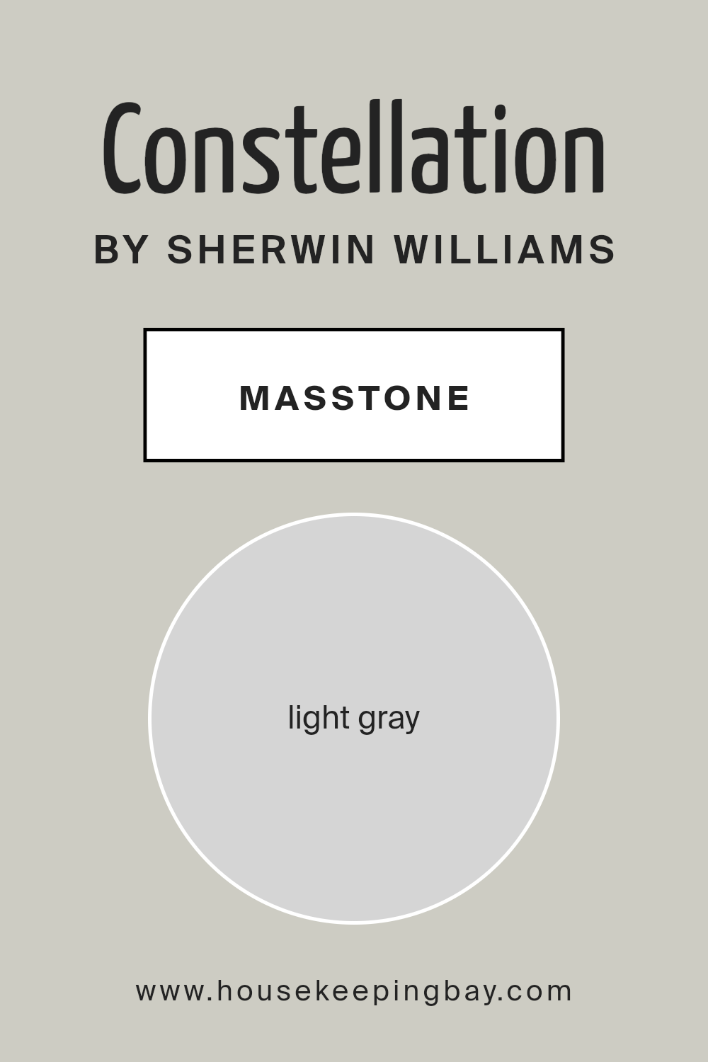
ConstellationSW 9629 by Sherwin Williams is a soothing light gray color with a hex code of #D5D5D5. This masstone, being a very neutral shade, offers a clean and understated look that works beautifully in homes.
Its light gray appearance provides a versatile backdrop for any room, allowing furniture and decor to stand out. This color is particularly effective in smaller spaces where you want to create a sense of openness and airiness. It reflects light well, helping to make rooms appear larger and more inviting.
In busy areas like living rooms or kitchens, ConstellationSW 9629 can help maintain a calm and orderly feel, minimizing visual clutter. It’s also an excellent choice for bedrooms, where its gentle hue contributes to a peaceful atmosphere, conducive to relaxation and rest. Moreover, light gray pairs effortlessly with a wide range of other colors, making it easy for homeowners to integrate into their existing color schemes or design styles.
Whether your home features modern, minimalist, or traditional decor, this versatile shade of gray fits right in.
housekeepingbay.com
Undertones of Constellation SW 9629 by Sherwin Williams
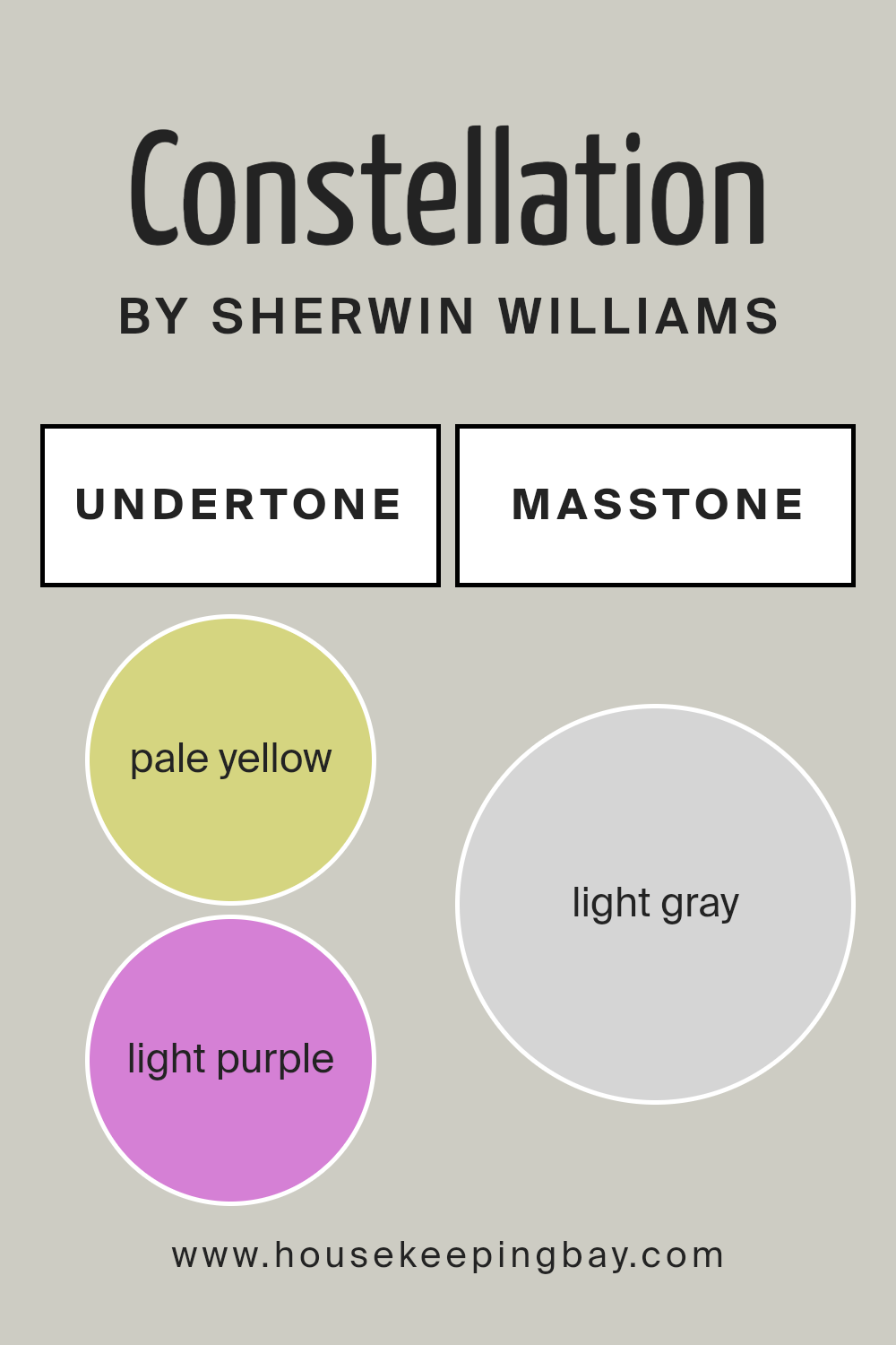
ConstellationSW 9629 by Sherwin Williams is a complex color enriched with a variety of undertones including pale yellow, light purple, light blue, pale pink, mint, lilac, and grey. These undertones play a crucial role in how we perceive the color, as they can subtly influence the feel and atmosphere of a space.
Undertones can either warm up or cool down a color, affecting how it complements other hues and elements in a room. For example, pale yellow and mint provide a hint of warmth, making the space feel more welcoming.
The light purple and lilac undertones, however, add a cooler, more soothing quality. Grey and pale pink give it a neutral balance, ensuring that the color blends beautifully with different decor styles.
On interior walls, the undertones of ConstellationSW 9629 can greatly influence the mood and visual temperature of a room. In natural light, the cooler undertones might become more pronounced, giving the room a fresher look. In artificial light, warmer undertones could dominate, creating a cozy ambiance.
This adaptability makes ConstellationSW 9629 an excellent choice for those looking to add depth and interest to their living spaces without committing to a distinctively warm or cool hue.
housekeepingbay.com
How Does Lighting Affect Constellation SW 9629 by Sherwin Williams?
Lighting plays a critical role in how colors are perceived in an interior space, influencing mood and aesthetic appeal. ConstellationSW 9629 by Sherwin Williams is a fascinating example, as its appearance can significantly change under different lighting conditions.
In artificial light, such as from LED or incandescent bulbs, ConstellationSW 9629 tends to appear slightly more vibrant and can bring a fresh vibe to a room. This becomes advantageous in rooms that rely heavily on artificial lighting, as the color can maintain a dynamic presence.
Under natural light, the character of ConstellationSW 9629 shifts throughout the day depending on the sun’s position and intensity. Its soft, subtle hue can reflect natural light in a way that amplifies a sense of peacefulness and softness within a space.
In north-facing rooms, natural light tends to be cooler and more consistent, which can make ConstellationSW 9629 appear slightly more muted and subdued. This helps maintain a sleek, polished look in the space without overwhelming it with brightness.
South-facing rooms receive the most intense and warm light, especially in the afternoon. Here, ConstellationSW 9629 can shine brightly, creating a lively and inviting environment. It adapts well to the ample sunlight, maintaining its integrity without fading.
East-facing rooms experience bright light in the morning, which then softens as the day progresses. ConstellationSW 9629 can look particularly refreshing and clean in the morning light, making it ideal for bedrooms or breakfast nooks where a calm, gentle atmosphere is favorable in the morning.
West-facing rooms get an influx of stronger, warmer light in the latter part of the day. ConstellationSW 9629 can provide a soothing counterbalance to the intense afternoon glow, ensuring the room feels balanced and comfortable during sunset hours.
Understanding how ConstellationSW 9629 interacts with various light sources and room orientations helps in making informed decisions on where to apply this color for optimal impact and satisfaction.
housekeepingbay.com
What is the LRV of Constellation SW 9629 by Sherwin Williams?
LRV, or Light Reflectance Value, is a measurement that indicates how much light a paint color reflects or absorbs when applied to a surface. It is represented on a scale from 0 to 100, where 0 means the color absorbs all light (completely black) and 100 signifies that it reflects all light (pure white).
This value helps in selecting paint colors for interior or exterior use by giving a clear idea of how bright or dark a color will appear once applied to the walls. A higher LRV can make a room feel more open and airy as more light is reflected around the room.
The LRV of ConstellationSW 9629 by Sherwin Williams is 60.232, which places it in the lighter spectrum of colors. This means it has a good ability to reflect natural and artificial light, making it an excellent choice for making smaller or darker spaces appear brighter and more spacious. When this color is used in rooms with less natural light, it can help in brightening the space without resorting to very pale or white shades.
Therefore, this particular LRV value indicates that ConstellationSW 9629 can add a sense of lightness and space to a room, enhancing the overall ambiance in a subtle yet effective way.

housekeepingbay.com
What are the Trim colors of Constellation SW 9629 by Sherwin Williams?
Trim colors are the additional paint colors used to accentuate or highlight architectural features and edges such as door frames, window trims, skirting boards, and moldings within a space. Opting for the right trim color can greatly enhance the overall aesthetic and cohesion of interior decor.
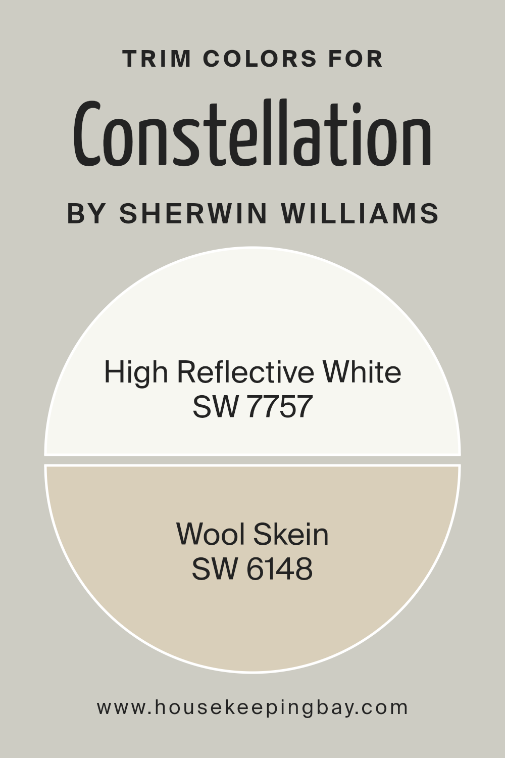
For ConstellationSW 9629 by Sherwin Williams, which is a distinct shade, using suitable trim colors like SW 7757 – High Reflective White and SW 6148 – Wool Skein can play a crucial role.
These trim colors help in defining the space visually by providing a contrasting or complementary outline that can make the primary color stand out or seamlessly blend the transitions between walls and other architectural elements.
SW 7757 – High Reflective White is an extremely pure and bright white shade. Its high reflectivity makes spaces appear larger and more open, offering a crisp contrast that helps sharper colors like ConstellationSW 9629 pop.
On the other hand, SW 6148 – Wool Skein is a soft, subtle beige that exudes a warm and cozy feel. This color works beautifully to soften the visual impact of bolder hues, ensuring a smooth and harmonious interior palette that enhances the environment without overpowering it. Both colors provide flexibility in styling and can significantly influence the perception of the space.
You can see recommended paint colors below:
housekeepingbay.com
Colors Similar to Constellation SW 9629 by Sherwin Williams
Similar colors play a crucial role in creating a cohesive and soothing atmosphere in any space. Colors like Constellation SW 9629 by Sherwin Williams and its counterparts like Aloof Gray or Conservative Gray help in achieving a subtle, harmonious look without overwhelming the senses.
These shades are close to one another on the color spectrum, ensuring that they complement each other perfectly, providing an understated elegance that enhances the aesthetic appeal of a room significantly. Using shades like On the Rocks and Antimony can add a touch of sophistication while maintaining a fluid visual experience.
These variations of gray serve as a steady base, allowing for cohesive interior design choices.
For example, Aloof Gray brings a soft, understated vibe to spaces, making it ideal for a calm, serene ambiance. Similarly, Conservative Gray offers a slightly bolder hue but remains gentle enough to blend seamlessly with other colors. On the Rocks is a lightweight gray that delivers a clean and fresh appearance, creating an airy feel in any room.
Antimony is muted yet carries enough depth to make spaces feel well-rounded without overpowering. Front Porch and Skipping Rocks both offer a touch of neutrality, making them versatile for various decorating styles. Lattice is a bit richer, providing a hint of warmth to balance cooler tones in the palette.
Repose Gray stands out for its adaptability, fitting effortlessly into numerous color schemes. Create contributes a modern flair that is subtle yet impactful, while Sweater Weather adds a cozy, comforting quality that makes it perfect for relaxed environments.
These colors together ensure that interior spaces are not only beautifully coordinated but also inviting and harmonious.
You can see recommended paint colors below:
- SW 6197 Aloof Gray
- SW 6183 Conservative Gray
- SW 7671 On the Rocks
- SW 9552 Antimony
- SW 7651 Front Porch
- SW 9551 Skipping Rocks
- SW 7654 Lattice
- SW 7015 Repose Gray
- SW 9646 Create
- SW 9548 Sweater Weather

housekeepingbay.com
How to Use Constellation SW 9629 by Sherwin Williams In Your Home?
Constellation SW 9629 by Sherwin Williams is a soft, gentle gray that carries a hint of blue, making it an ideal choice for rooms where calm and serenity are desired. This color works exceptionally well in bedrooms and bathrooms where a soothing atmosphere can assist in relaxation. Its subtle hue blends seamlessly with various decor styles, from modern minimalism to cozy traditional.
For a cohesive look throughout your home, consider using Constellation in high-traffic areas like living rooms and kitchens. Its neutral tone provides a versatile backdrop, allowing decorative elements to shine. Pair it with brighter colors for a vibrant contrast or keep things understated with whites and other neutrals.
In addition to walls, this paint color can be used on cabinetry or furniture for a fresh, updated look. It’s particularly effective in smaller spaces or rooms with limited natural light, as its light-reflective qualities can help make a space feel larger and more open. Think of it as a simple yet effective way to refresh your home’s look while maintaining a calm, collected atmosphere.
Constellation SW 9629 by Sherwin Williams vs Repose Gray SW 7015 by Sherwin Williams
Constellation SW 9629 and Repose Gray SW 7015 by Sherwin Williams are two different shades that provide distinct vibes to any space. Constellation is a deep, moody blue with a hint of gray, perfect for creating a sophisticated and intimate atmosphere in a room. This color is ideal for accent walls or rooms where you want a sense of drama and focus.
Repose Gray SW 7015, on the other hand, is a light, warm gray that has a calming effect, making it suitable for almost any room in the house. Its versatility allows it to blend seamlessly with various decor styles and colors, providing a neutral backdrop that is both serene and inviting.
Both colors offer unique aesthetic appeals and can be used effectively depending on the desired mood and function of the space. While Constellation leans towards a bolder, more striking look, Repose Gray offers a softer, more adaptable approach.
You can see recommended paint color below:
- SW 7015 Repose Gray

housekeepingbay.com
Constellation SW 9629 by Sherwin Williams vs Sweater Weather SW 9548 by Sherwin Williams
Constellation SW 9629 by Sherwin Williams is a deep, rich navy blue that gives a feeling of sophistication and calm. This color is perfect for spaces where a strong, statement shade is needed, such as accent walls or cabinetry. It pairs well with lighter tones to create a balanced look.
Sweater Weather SW 9548, meanwhile, is a soft, warm gray that offers a subtle and cozy vibe. This color is versatile, fitting well in almost any room, whether you want to achieve a modern or traditional aesthetic. It works excellently with bolder colors as it serves as a neutral backdrop that doesn’t overpower.
Both colors have their unique appeal with Constellation adding drama and depth, while Sweater Weather provides a soothing and inviting atmosphere. Choosing between them would depend on the mood and style you wish to achieve in your space.
You can see recommended paint color below:

housekeepingbay.com
Constellation SW 9629 by Sherwin Williams vs On the Rocks SW 7671 by Sherwin Williams
The main color, Constellation SW 9629 by Sherwin Williams, is a rich, deep navy blue that conveys a sense of sophistication and boldness. It can bring a strong, serene feeling to any space, making it ideal for accent walls or rooms where a touch of drama is desired. This color works well in both modern and traditional settings, adding a timeless elegance.
In contrast, On the Rocks SW 7671 by Sherwin Williams presents a light, neutral grey that offers a soft and subtle backdrop for any room. It’s very versatile, making it easy to pair with a wide range of decor styles and colors.
This shade is perfect for creating a calm, unobtrusive foundation in a space, suitable for living areas, bedrooms, and offices where a soothing atmosphere is beneficial.
Together, these colors could complement each other well in a space, with Constellation adding a striking element and On the Rocks providing a gentle balance.
You can see recommended paint color below:

housekeepingbay.com
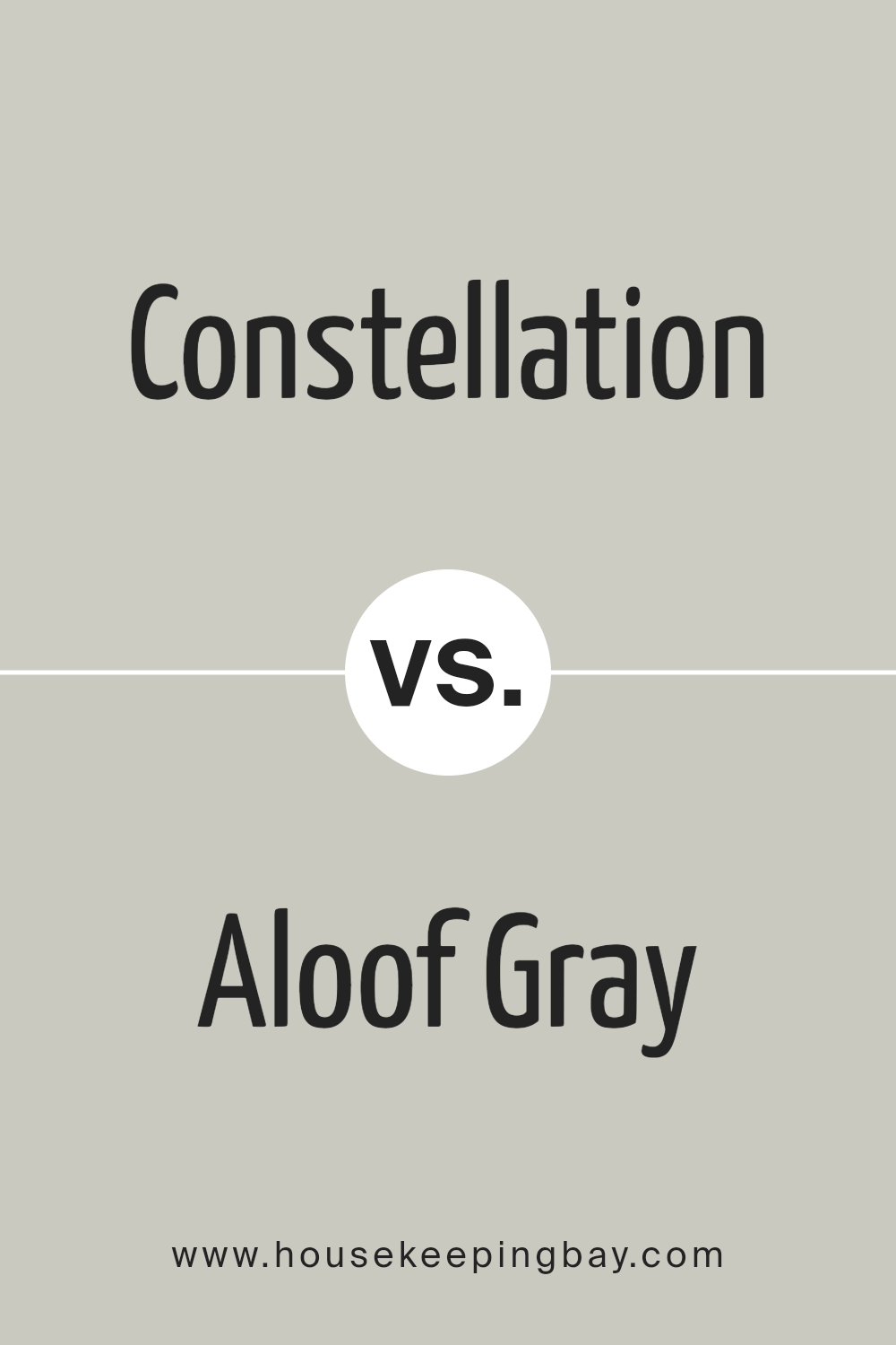
Constellation SW 9629 by Sherwin Williams vs Aloof Gray SW 6197 by Sherwin Williams
Constellation SW 9629 by Sherwin Williams is a dark, rich navy blue that adds a bold and sophisticated touch to any space. This color is perfect for creating a strong focal point in a room, and works well in spaces that benefit from a dramatic flair, such as living rooms or dining areas. Being a deeper shade, it can make a room feel more intimate and cozy.
In contrast, Aloof Gray SW 6197 by Sherwin Williams is a much lighter color. It’s a soft, neutral gray that provides a calm and soothing backdrop for any interior. This color is versatile and pairs well with a wide range of decor styles, from modern to traditional. It’s ideal for spaces where you want to promote a sense of calmness, like bedrooms or home offices.
Both colors offer distinct vibes—Constellation with its boldness and drama, and Aloof Gray with its quiet and serene atmosphere—making them fit for different purposes in home decorating.
You can see recommended paint color below:
- SW 6197 Aloof Gray
housekeepingbay.com
Constellation SW 9629 by Sherwin Williams vs Create SW 9646 by Sherwin Williams
Constellation SW 9629 and Create SW 9646 by Sherwin Williams are two distinct colors with unique visual impacts. Constellation SW 9629 is a deep, rich navy blue that evokes a sense of strength and reliability. It’s perfect for creating a bold, classic look in a space, particularly striking when used in living areas or bedrooms. This color tends to absorb light, giving a cozy, enveloping feel to rooms.
In contrast, Create SW 9646 is a vibrant, energetic green. It’s lighter and brings a lively and fresh vibe to any room, ideal for spaces that aim to promote positivity and creativity, like kitchens or home offices. Create reflects more light, making it excellent for making smaller spaces appear larger and more inviting.
In summary, while Constellation offers depth and drama with its dark blue hue, Create offers freshness and energy with its bright green tone. Each color serves different aesthetic and functional purposes depending on the atmosphere you want to achieve.
You can see recommended paint color below:
- SW 9646 Create

housekeepingbay.com
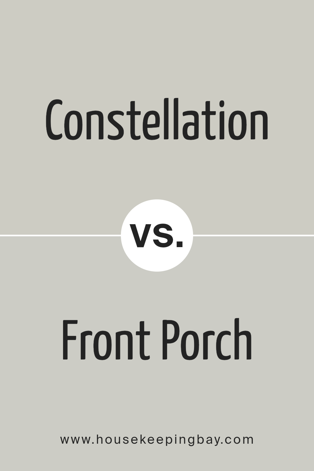
Constellation SW 9629 by Sherwin Williams vs Front Porch SW 7651 by Sherwin Williams
Constellation SW 9629 by Sherwin Williams is a rich, dark navy blue with a strong presence, ideal for creating bold statements in spaces. This deep hue can add sophistication and depth to rooms, making it perfect for accent walls or furniture pieces. It pairs well with bright whites or metallic accents for a crisp contrast.
In contrast, Front Porch SW 7651 by Sherwin Williams is a light grey with blue undertones, providing a softer, more serene feel. This color is versatile and works well in various settings, such as bedrooms and living areas, promoting a calm and relaxing atmosphere. It is particularly effective in spaces that aim for a fresh, airy look.
While Constellation brings drama and intensity to interiors, Front Porch offers a gentle and soothing environment. Both colors have their unique appeal and can be utilized effectively depending on the desired mood and style of a room.
You can see recommended paint color below:
- SW 7651 Front Porch
housekeepingbay.com
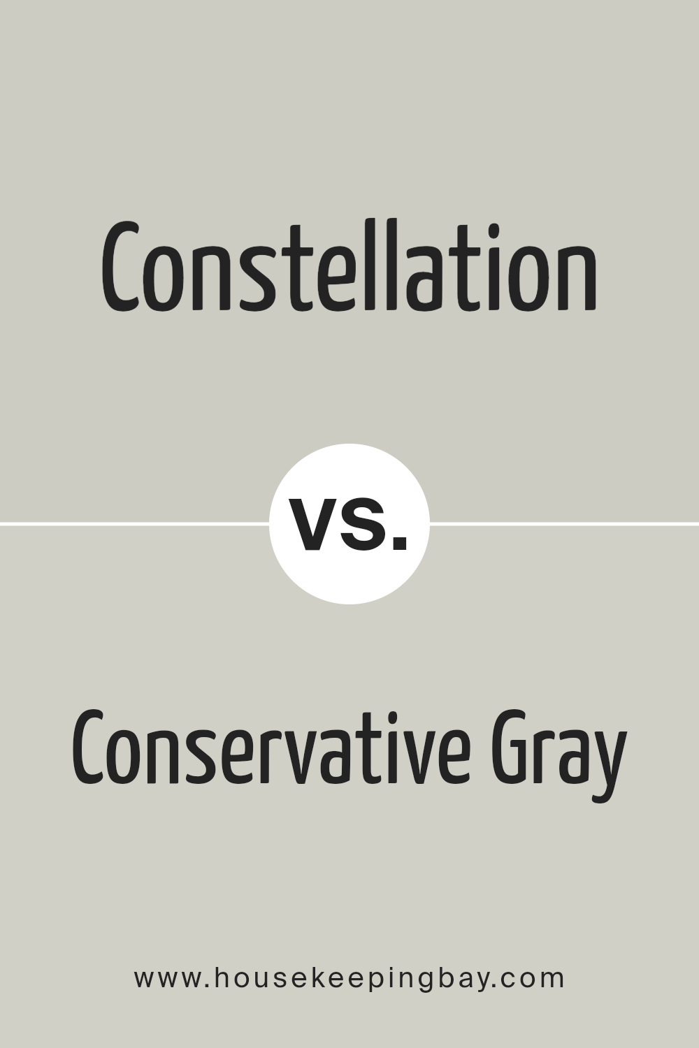
Constellation SW 9629 by Sherwin Williams vs Conservative Gray SW 6183 by Sherwin Williams
Constellation SW 9629 by Sherwin Williams is a dark, rich navy blue that offers a strong presence in any space. It’s perfect for creating a bold statement and can give a room a feeling of sophistication and depth. Its deep blue hue can make it an ideal choice for accent walls or for rooms where a touch of drama is desired.
Conservative Gray SW 6183, also by Sherwin Williams, is a light, subtle gray. It provides a neutral backdrop that’s versatile and easy to work with in various design settings. This color can help to open up a space, making it feel airier and more spacious. It works well in areas that aim for a calm and understated look.
Despite both being from the same brand, these two colors serve different purposes in interior design. Constellation, with its deep blue, is more dramatic and focal, while Conservative Gray offers a gentle and broadening effect, suited for a quieter, more fluid transition between spaces.
You can see recommended paint color below:
housekeepingbay.com
Constellation SW 9629 by Sherwin Williams vs Lattice SW 7654 by Sherwin Williams
Constellation SW 9629 by Sherwin Williams is a deep, moody navy blue with a touch of sophistication that can add a strong, classic feel to any space. It works well in areas where a bold, impactful color is needed to create a focal point or to bring about a feeling of coziness and comfort, such as in living rooms or bedrooms.
Lattice SW 7654, also by Sherwin Williams, is a lighter, soft gray color with subtle blue undertones. It is versatile and neutral, making it suitable for any room in the house. It provides a calm, soothing backdrop that pairs well with a variety of decor styles, enhancing other colors and features in the space.
While both colors come from the same manufacturer and share a hint of blue, their applications and the moods they set are quite distinct. Constellation, being a rich navy, offers depth and drama, whereas Lattice, being a pale gray, introduces lightness and a serene atmosphere.
You can see recommended paint color below:
- SW 7654 Lattice

housekeepingbay.com
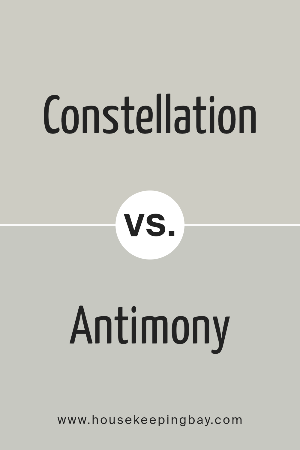
Constellation SW 9629 by Sherwin Williams vs Antimony SW 9552 by Sherwin Williams
Constellation SW 9629 by Sherwin Williams is a subtle and soothing light blue-gray shade. This color is quite versatile, lending a soft, airy feel to any room, making it appear more spacious and calming. It’s an excellent choice for bedrooms or living areas where a peaceful atmosphere is desired.
In contrast, Antimony SW 9552 is a darker, more intense color with a deep teal blue tone. This shade adds a bold and dramatic flair to spaces, suitable for creating a focal point or accent walls. It works well in areas that benefit from a touch of sophistication and depth, such as dining rooms or home offices.
While both colors come from the same blue family, Constellation is lighter and more understated, promoting a serene environment. Antimony, with its richer teal hue, offers a more striking and energetic vibe. Depending on your space and style preferences, either color can significantly enhance your home’s aesthetic.
You can see recommended paint color below:
housekeepingbay.com
Constellation SW 9629 by Sherwin Williams vs Skipping Rocks SW 9551 by Sherwin Williams
Constellation SW 9629 by Sherwin Williams is a deep, vivid blue that evokes feelings of a night sky filled with stars. This color can make quite a statement when used on walls or as an accent. It has a bold presence that can add depth and intrigue to a space, making it feel rich and expansive.
Skipping Rocks SW 9551, also by Sherwin Williams, presents a contrast as a serene gray. It’s a softer, more understated shade that lends a soothing feel to any room. This color is versatile and pairs well with various decor styles, providing a calming backdrop that complements both bright and muted tones.
Both colors offer unique atmospheres: Constellation creates a dynamic and enveloping feel, while Skipping Rocks offers a peaceful and grounding effect. Each can be used effectively to achieve different aesthetics in interior spaces, depending on the mood one wishes to create.
You can see recommended paint color below:
- SW 9551 Skipping Rocks

housekeepingbay.com
Conclusion
In summary, SW 9629 Constellation by Sherwin Williams proved to be an excellent choice for my recent home renovation project. This paint color brought a soothing influence to my living spaces, offering a calm yet sophisticated ambiance that I was aiming for.
The subtle blue shade works beautifully to create a serene environment, which is exactly what I wanted in my home to combat the often hectic days.
From a practical standpoint, I found the paint to be of high quality. It applied smoothly, providing great coverage with just a couple of coats. This aspect was truly a relief as it saved me time and effort during the application process. Moreover, I noticed that the color has a versatile appeal, complementing various decor styles and furnishings effortlessly.
It acts as a perfect backdrop that enhances other colors and design elements in the room.
Personally, choosing SW 9629 Constellation added a refreshing touch to my home that I enjoy daily. Whether I’m relaxing with a book or hosting friends, the color sets a calm and welcoming tone. For anyone considering a new paint color that combines aesthetic flexibility with soothing qualities, SW 9629 Constellation is a worthwhile consideration.
housekeepingbay.com
Ever wished paint sampling was as easy as sticking a sticker? Guess what? Now it is! Discover Samplize's unique Peel & Stick samples. Get started now and say goodbye to the old messy way!
Get paint samples
