Clay Pot SW 2917 by Sherwin Williams
Warm, Earthy Hues for Every Space
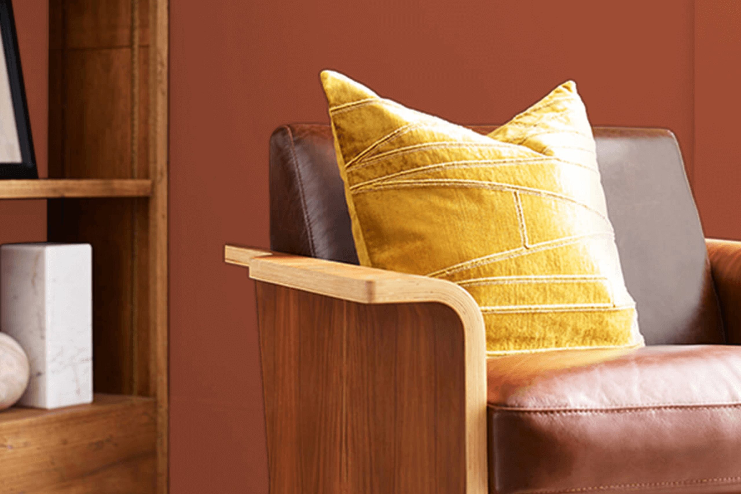
Choosing the right paint color can transform a room, making it feel more inviting and personalized. SW 2917 Clay Pot by Sherwin Williams is a rich, warm hue that can add a cozy and appealing touch to your space. Imagine a color that conveys the earthiness and warmth of sun-soaked clay, providing a comforting backdrop to any room.
When you consider Clay Pot for your walls, you’re opting for a color that is both bold and comforting. It has the ability to make a statement while still offering a sense of calm.
This shade pairs beautifully with neutral furnishings and can be complemented by natural materials like wood and stone.
You also have the flexibility to match it with a variety of accent colors, from deep greens to soft creams, depending on the mood you want to create.
Think about how light hits your room throughout the day. Clay Pot can take on different tones under varied lighting conditions. In natural daylight, it offers a warm glow, while under softer lighting, it can bring out a more muted and intimate feel.
This adaptability makes it a great choice for multiple areas in your home, such as the living room or a cozy den.
via sherwin-williams.com
What Color Is Clay Pot SW 2917 by Sherwin Williams?
Clay Pot SW 2917 by Sherwin Williams is a warm, earthy hue that captures the rich color of terracotta. This shade is reminiscent of sun-baked earth, offering a cozy and nurturing atmosphere. Its warm undertones create a welcoming environment, making it ideal for living rooms, kitchens, or dining areas.
Clay Pot works beautifully in rustic or Mediterranean-inspired interiors. It complements spaces with a bohemian flair, adding a grounded, organic feel.
Pairing this color with natural materials enhances its effect. Think wooden furniture, rattan accents, or wicker baskets. The warmth of Clay Pot is offset beautifully by lighter, neutral shades such as cream or beige. Adding some green plants can create a lively contrast, while metallic finishes in bronze or copper can elevate the space with a touch of elegance.
Textures like rough linen, soft wool, or plush velvet pair harmoniously with Clay Pot SW 2917. These materials add depth, making a room feel layered and inviting.
A jute rug can provide a natural base, while clay or terracotta pots further tie the theme together. Overall, this color is versatile, creating spaces that feel both stylish and comfortably lived-in.

housekeepingbay.com
Is Clay Pot SW 2917 by Sherwin Williams Warm or Cool color?
Clay Pot SW 2917 by Sherwin Williams brings a warm, earthy tone to the home. This color, with its terracotta influence, adds a cozy and inviting feel to any space. It’s a versatile shade that works well in living rooms, kitchens, or even bedrooms. The earthy nature of Clay Pot makes it an excellent backdrop for wooden furniture or natural textiles, creating a harmonious environment.
This color tends to make rooms feel comfortable and grounded. When paired with plants or neutral tones, Clay Pot can enhance a room’s natural warmth. Lighting also plays a key role; it can look slightly richer in softer, more diffused light, offering a snug ambiance.
In brighter light, it maintains its earthiness while being lively. Overall, Clay Pot SW 2917 suits those looking to bring a bit of nature indoors, offering a balanced blend of warmth and earth tones.
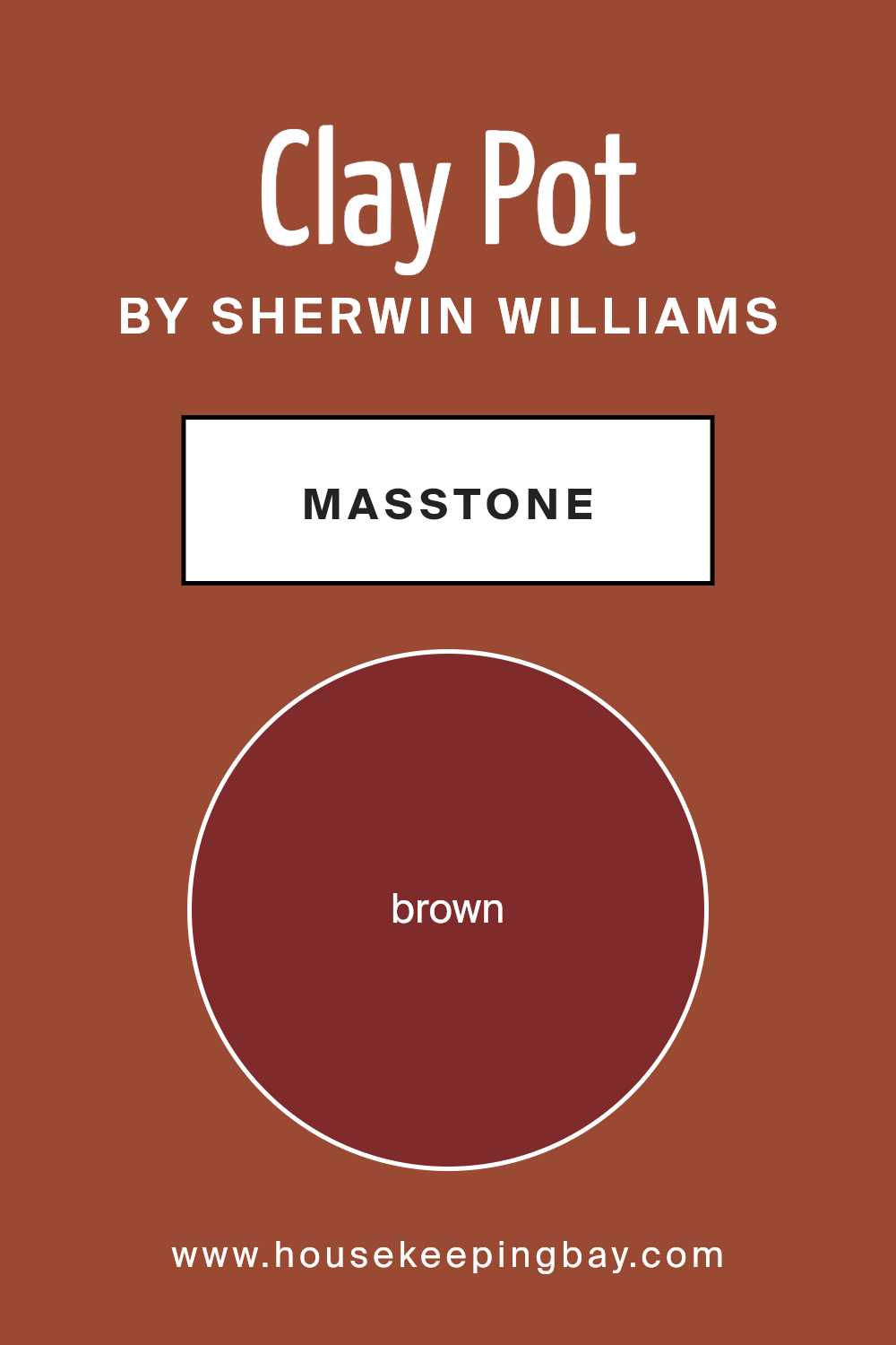
What is the Masstone of the Clay Pot SW 2917 by Sherwin Williams?
Clay Pot SW 2917 by Sherwin Williams is a warm, earthy brown with the masstone of Brown (#802B2B). This shade brings a cozy and natural vibe to homes. It can make spaces feel welcoming and grounded, creating an inviting atmosphere. Often used in living rooms or kitchens, it adds a touch of nature to indoor spaces.
This color pairs well with other warm tones, like beige or cream, which enhance its natural feel. It also complements green or blue accents, adding a bit of contrast. In rooms with lots of natural light, Clay Pot can take on a lighter hue, softening the room while still maintaining its warmth.
Using Clay Pot on walls or furniture can create a cohesive look. Its earthy tone is perfect for those who appreciate a rustic or organic style. It holds a timeless appeal, making it a popular choice for cozy, comfortable homes.
housekeepingbay.com
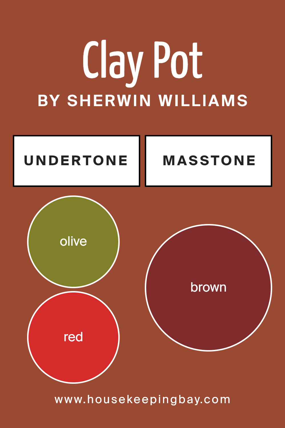
Undertones of Clay Pot SW 2917 by Sherwin Williams
Clay Pot SW 2917 by Sherwin Williams is a rich and complex color that carries a variety of undertones, influencing how we perceive it. These undertones include olive, red, orange, purple, grey, pink, pale pink, dark grey, dark green, navy, and dark turquoise. Undertones are subtle hues beneath the main color that can change how we perceive it based on lighting and surroundings.
Olive and dark green undertones add a natural, earthy feel to the color, while red and orange bring warmth and vibrancy. Purple and pink introduce a softer, more sophisticated touch. Grey and dark grey contribute a grounding, neutral aspect that stabilizes the color.
Navy and dark turquoise add depth and a cool contrast, balancing warm undertones.
When Clay Pot SW 2917 is used on interior walls, its undertones interact with the room’s lighting. In warm lighting, the red and orange stand out, giving a cozy and inviting atmosphere. Under cooler lighting, the greys, navy, and dark turquoise become more apparent, creating a calmer, more balanced feel.
These shifting undertones mean the color can look different at different times of day, making Clay Pot a versatile choice for various settings and moods. Its complex undertones allow it to complement many design styles, from traditional to modern.
housekeepingbay.com
Coordinating Colors of Clay Pot SW 2917 by Sherwin Williams
Coordinating colors are hues that work well together, creating harmony and balance in a space. They complement the main color, enhancing the overall aesthetic and mood of a room. For Sherwin Williams’ Clay Pot SW 2917, excellent coordinating choices include SW 7008 – Alabaster and SW 2739 – Charcoal Blue.
These colors, when used together, can produce a sophisticated and inviting atmosphere. Clay Pot is a warm, earthy tone reminiscent of natural terracotta, perfect for bringing warmth and character into a space.
Alabaster SW 7008 is a soft, creamy white that offers a gentle and calming effect. It serves as a versatile backdrop, allowing the other colors in a room to stand out without overwhelming the senses. Charcoal Blue SW 2739, on the other hand, adds depth and a touch of elegance with its deep, rich blue tone.
It pairs nicely with the warmth of Clay Pot, providing a balanced contrast that is both visually appealing and dynamic.
Together, these colors create a cohesive and inviting look, suitable for any living area or bedroom, where warmth and relaxation are desired.
You can see recommended paint colors below:
- SW 7008 Alabaster
- SW 2739 Charcoal Blue

housekeepingbay.com
How Does Lighting Affect Clay Pot SW 2917 by Sherwin Williams?
Lighting plays a huge role in how we perceive colors. The color of an object can appear vastly different under artificial light compared to natural light. This is because artificial light often has a different color temperature and intensity, impacting the way our eyes see colors.
The color Clay Pot SW 2917 by Sherwin Williams is a warm, earthy hue reminiscent of terracotta. Let’s see how it behaves under different lighting conditions and in various room orientations.
Under artificial light, Clay Pot SW 2917 can appear cozier than in natural light. The warmth of the color stands out under incandescent bulbs, which emit a yellowish light. This makes the color seem richer and more comforting. Under fluorescent or LED lights, especially those with cool tones, the color might seem a bit duller or muted due to the blue or white light affecting the warmth of the shade.
In north-facing rooms, which receive cooler, indirect light, Clay Pot SW 2917 may look more subdued. The northern light can make warm colors like this appear slightly less vivid, giving the room a calm feel.
In south-facing rooms, which get ample natural sunlight, the effect is quite different. The color tends to glow warmly as sunlight enhances its rich tones. This vibrant sunlight can make the room feel welcoming and lively.
East-facing rooms benefit from the soft, gentle light of the morning. Clay Pot SW 2917 in these rooms starts the day looking bright and warm, but as the sun moves, the color might seem softer and more subtle in the afternoon.
West-facing rooms catch the warm light in the afternoon and evening. This golden-hour light brings out the richness of Clay Pot SW 2917, making spaces feel cozy and inviting as the day ends.
Overall, Clay Pot SW 2917 adapts well to various lighting conditions, offering warmth and character to any space.

housekeepingbay.com
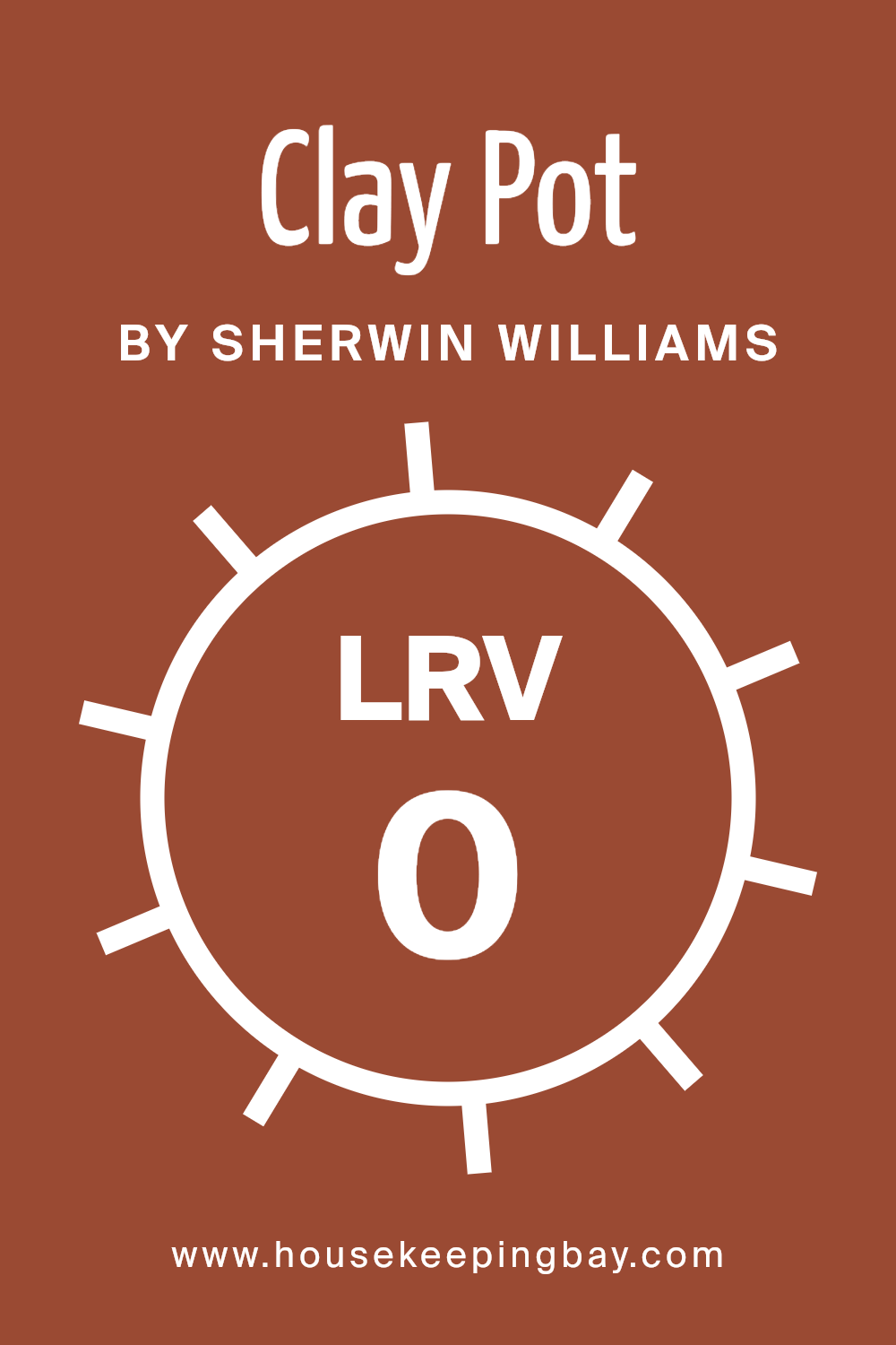
What is the LRV of Clay Pot SW 2917 by Sherwin Williams?
LRV stands for Light Reflectance Value. It’s a measurement used by paint manufacturers to indicate how much light a color reflects. The scale goes from 0 to 100, where 0 means the color absorbs all light and reflects none, and 100 means the color reflects all light and absorbs none.
Colors with higher LRV are lighter and brighter because they reflect more light. In contrast, colors with a lower LRV are darker and absorb more light, making rooms appear smaller and cozier.
Understanding LRV helps in choosing the right paint color for a room, as it affects how bright or dark a space will feel.
The color Clay Pot SW 2917 by Sherwin Williams has an LRV of 0, meaning it doesn’t reflect any light and absorbs it all. This makes the color extremely dark, creating a very deep and intimate atmosphere on walls. In spaces with plenty of natural or artificial light, a color with such a low LRV can evoke warmth and depth.
Without enough light, though, it might make the room feel closed in and smaller. Choosing this color means accepting its bold nature, which can dramatically change how a space feels, depending on the lighting and room features.
housekeepingbay.com
What are the Trim colors of Clay Pot SW 2917 by Sherwin Williams?
Trim colors refer to the hues used specifically for the edges, borders, and outlines of walls, doors, and windows, creating a frame for the main wall color. They are important for offering contrast or complementing the primary wall color, which in this case is Clay Pot SW 2917 by Sherwin Williams.
This soft, earthy tone pairs beautifully with lighter trim to create a balanced and inviting space. Using the right trim color enhances the room’s overall look, emphasizing architectural features and adding depth.
Westhighland White (SW 7566) is a crisp and clean white with a soft undertone, perfect for highlighting Clay Pot’s warmth without clashing. Canvas Tan (SW 7531), on the other hand, offers a relaxed, neutral beige that gently complements Clay Pot without overpowering it.
Both colors as trim can create a cozy and harmonious atmosphere, accentuating the natural warmth of Clay Pot and making the space feel cohesive and well-delineated.
These two shades add subtle sophistication, ensuring the room feels inviting and well-designed.
You can see recommended paint colors below:

housekeepingbay.com
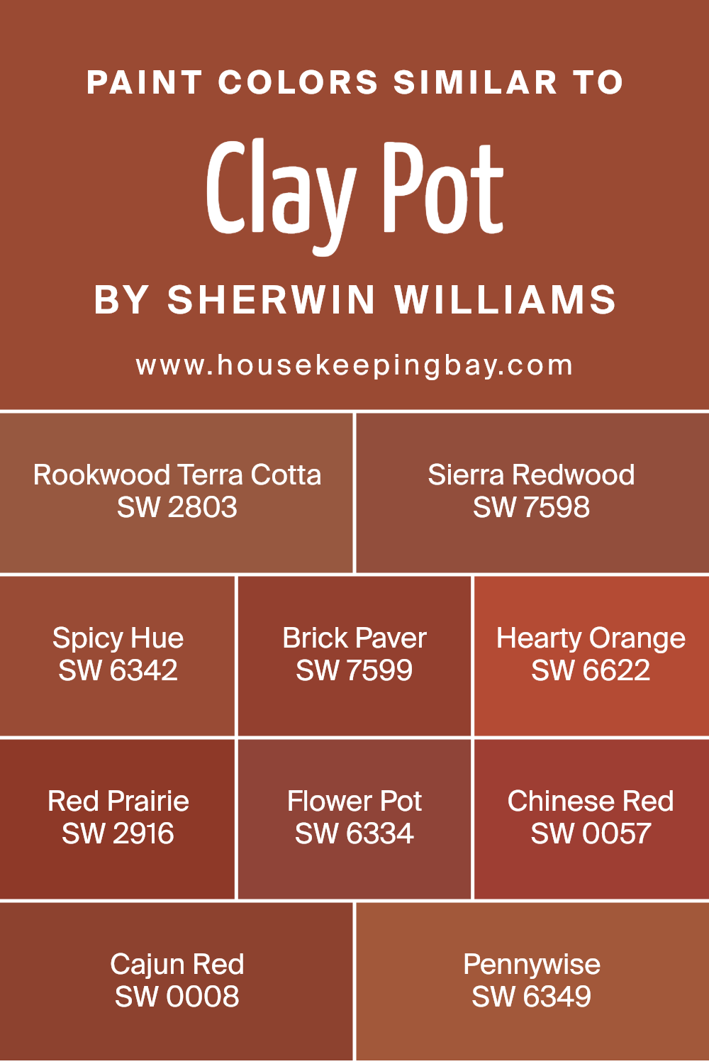
Colors Similar to Clay Pot SW 2917 by Sherwin Williams
Using similar colors is important because they create harmony and balance in design. For Clay Pot SW 2917 by Sherwin Williams, similar shades provide depth while maintaining a cohesive look. Rookwood Terra Cotta SW 2803 is a rich, warm color that feels grounded and earthy.
Sierra Redwood SW 7598 brings a slightly deeper, redder tone, reminiscent of tree bark in a dense forest. Spicy Hue SW 6342 offers a splash of brighter red-orange energy, like a burst of late summer sun. Brick Paver SW 7599 has the steady warmth of old bricks, giving a sense of endurance and stability.
Hearty Orange SW 6622 introduces a lively and spirited orange, reminiscent of a vibrant sunset. Red Prairie SW 2916 leans more toward a subtle, aged red, evoking open fields at dusk. Flower Pot SW 6334 is a mellow, softer red-brown, like clay pots freshly turned in the earth.
Chinese Red SW 0057 carries a bold and classic red, full of tradition and expressive energy. Cajun Red SW 0008 is deeper and spicier, a nod to rich cultural kitchens and zesty flavors.
Pennywise SW 6349 finishes this palette with a warm coppery tint, offering a hint of metallic sheen, like treasured coins glinting in the light. These colors collectively create a rich, inviting atmosphere.
You can see recommended paint colors below:
- SW 2803 Rookwood Terra Cotta
- SW 7598 Sierra Redwood
- SW 6342 Spicy Hue
- SW 7599 Brick Paver
- SW 6622 Hearty Orange
- SW 2916 Red Prairie
- SW 6334 Flower Pot
- SW 0057 Chinese Red
- SW 0008 Cajun Red
- SW 6349 Pennywise
housekeepingbay.com
How to Use Clay Pot SW 2917 by Sherwin Williams In Your Home?
Clay Pot SW 2917 by Sherwin Williams is a warm, earthy color that brings the outdoors inside. It is a rich terracotta hue that works well in various settings. Ideal for living rooms or kitchens, it creates a cozy and inviting atmosphere.
Pair it with neutral colors like beige or cream for a balanced look or with dark brown accents for a more dramatic feel. In a bedroom, use it on a feature wall for a sense of comfort and relaxation.
Combining it with natural materials like wood or stone enhances the earthy vibe. In a dining room, this color can create a warm and welcoming space perfect for family gatherings.
For those wanting a small change, try using Clay Pot on furniture pieces like a cabinet or a chair. No matter how it is used, Clay Pot SW 2917 adds warmth and depth to any home.
Clay Pot SW 2917 by Sherwin Williams vs Pennywise SW 6349 by Sherwin Williams
Clay Pot SW 2917 and Pennywise SW 6349 are warm, earthy hues offered by Sherwin Williams. Clay Pot SW 2917 presents a grounded, terracotta tone that reminds one of natural clay materials. Its rich, reddish-brown appearance adds a sense of warmth and coziness to any space. This color works well in rustic or bohemian settings, offering a sense of stability and comfort.
Pennywise SW 6349, in contrast, has a more vibrant and lively personality. It leans toward a bold orange with hints of copper that can brighten a room with energy and warmth. This color can create focal points in a space, making a bold statement.
Both colors bring warmth and charm, but Clay Pot offers a more subdued, earthy feel, while Pennywise provides a lively, energetic presence. Choice would depend on whether you seek calm and comfort or vibrancy and boldness for your setting.
You can see recommended paint color below:
- SW 6349 Pennywise

housekeepingbay.com
Clay Pot SW 2917 by Sherwin Williams vs Hearty Orange SW 6622 by Sherwin Williams
Clay Pot SW 2917 by Sherwin Williams exudes a warm, earthy tone, reminiscent of terracotta. It has a grounded feel, making it versatile for various settings, from rustic kitchens to cozy living rooms. Its muted nature allows it to pair well with other natural colors, providing a serene backdrop.
Hearty Orange SW 6622 brings a vibrant, rich hue into focus. It’s bold, lively, and full of life. This color can inject energy and warmth into a room, making it ideal for areas where you want to foster conversation and activity.
Comparing the two, Clay Pot offers a calmer, more subdued presence, evoking a sense of comfort and natural beauty. Its subtlety can serve as a neutral anchor in a space. Hearty Orange, in contrast, demands attention with its vivid intensity. It creates a lively atmosphere, perfect for spaces designed to inspire and energize. Both colors have unique charm but cater to different design goals and moods.
You can see recommended paint color below:

housekeepingbay.com
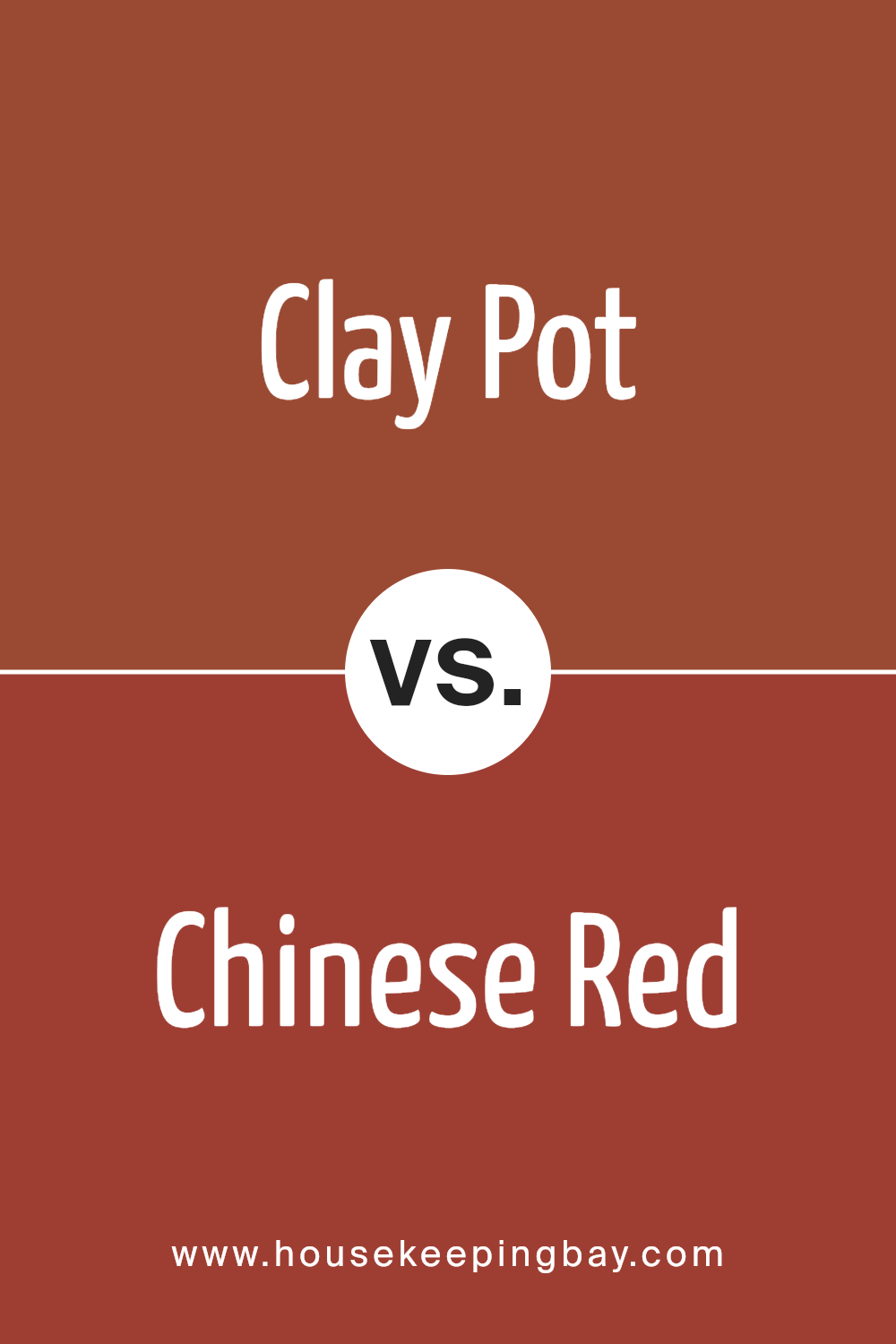
Clay Pot SW 2917 by Sherwin Williams vs Chinese Red SW 0057 by Sherwin Williams
Clay Pot SW 2917 by Sherwin Williams and Chinese Red SW 0057 by Sherwin Williams are both warm colors but have distinct personalities. Clay Pot SW 2917 is a rich, earthy terracotta hue. It exudes warmth and blends seamlessly into natural-themed spaces. Think of it as reminiscent of sun-baked pottery with an understated elegance.
On the flip side, Chinese Red SW 0057 is a bold, pure red. It packs energy and makes a strong statement in any room. While Clay Pot feels grounded and cozy, Chinese Red feels vibrant and daring.
Chinese Red might be a perfect choice to create an accent wall that stands out, while Clay Pot is better suited for bringing in warmth without overpowering.
Both colors reflect warmth, but their intensity and impact on a space vary significantly. They cater to different moods and aesthetics but can complement when used thoughtfully together.
You can see recommended paint color below:
- SW 0057 Chinese Red
housekeepingbay.com
Clay Pot SW 2917 by Sherwin Williams vs Spicy Hue SW 6342 by Sherwin Williams
Clay Pot SW 2917 and Spicy Hue SW 6342 are both warm, earthy tones by Sherwin Williams, yet they offer distinct vibes. Clay Pot SW 2917 has a rich, terracotta shade reminiscent of sunbaked clay, providing a comforting and natural effect. It works well in spaces where you want a grounded feel, offering a sense of warmth and coziness.
Spicy Hue SW 6342, however, leans towards a bold burnt orange with red undertones. It’s more vibrant, bringing energy and liveliness to a room. While Clay Pot feels subdued and muted, Spicy Hue stands out with its bright intensity.
Using Clay Pot could make rooms feel calm and stable, ideal for living rooms or offices aiming for a balanced atmosphere.
In contrast, Spicy Hue injects excitement, suitable for spaces like dining areas or accent walls where you want to create a lively, inviting presence. Each color adds warmth, but their impact differs in tone and vivacity.
You can see recommended paint color below:
- SW 6342 Spicy Hue

housekeepingbay.com
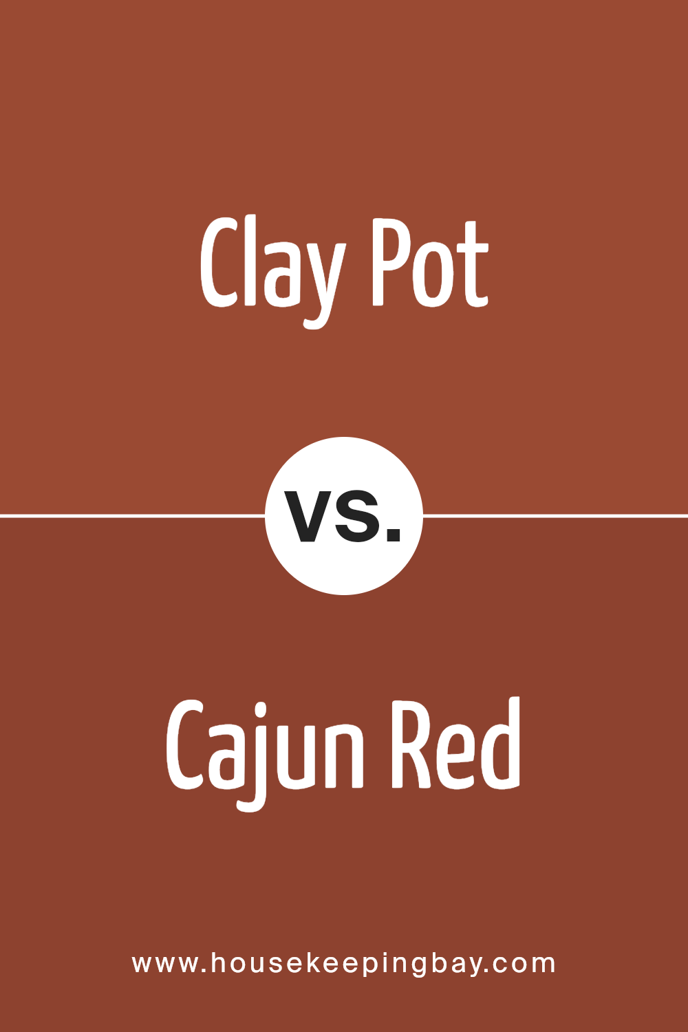
Clay Pot SW 2917 by Sherwin Williams vs Cajun Red SW 0008 by Sherwin Williams
Clay Pot SW 2917 is a warm, earthy tone reminiscent of terracotta. It has an inviting, grounded feel, often associated with comfort and warmth. It pairs well with natural materials like wood and stone, enhancing a rustic or Mediterranean-inspired space. Its muted quality makes it versatile for various settings, providing a calm backdrop that complements many other colors.
Cajun Red SW 0008, however, is a bold, robust color. It evokes a sense of energy and spice, reflecting its name’s connection to lively Cajun culture. This deep red can create a dramatic focal point in a room, adding intensity and passion.
When used in moderation, it can significantly enhance a space’s vibrancy.
Both colors bring warmth but in distinct ways: Clay Pot offers subtlety and understated charm, while Cajun Red brings intensity and dynamism.
Each color can define a space uniquely, depending on the desired mood and atmosphere.
You can see recommended paint color below:
- SW 0008 Cajun Red
housekeepingbay.com
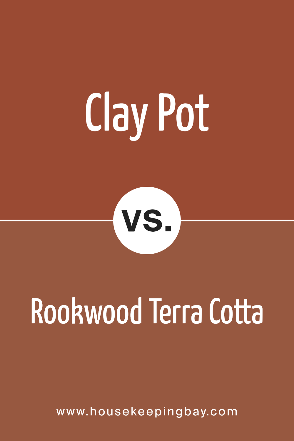
Clay Pot SW 2917 by Sherwin Williams vs Rookwood Terra Cotta SW 2803 by Sherwin Williams
Clay Pot SW 2917 and Rookwood Terra Cotta SW 2803, both by Sherwin Williams, bring warm, earthy tones with distinct characteristics. Clay Pot SW 2917 offers a sunbaked orange hue, evoking images of desert landscapes and rustic pottery. It’s bold, vibrant, and infuses spaces with energy and warmth.
Rookwood Terra Cotta SW 2803, also a warm terracotta shade, leans more towards muted earthiness. It resembles the classic, natural tones found in historic brickwork and aged terracotta tiles. This color has a timeless appeal, lending a more understated, sophisticated vibe to interiors.
While Clay Pot is vivid and energizing, Rookwood Terra Cotta provides a calmer, more restrained warmth. Both colors work great in creating cozy, inviting spaces, but the choice between them depends on whether you seek a lively, spirited backdrop or a subtler, more classic ambiance. They each have unique charm and can suit different tastes and settings effectively.
You can see recommended paint color below:
- SW 2803 Rookwood Terra Cotta
housekeepingbay.com
Clay Pot SW 2917 by Sherwin Williams vs Sierra Redwood SW 7598 by Sherwin Williams
Certainly! Clay Pot SW 2917 by Sherwin Williams is a warm, earthy orange. It feels comforting and grounded, just like clay. It carries hints of brown, giving it a subtle, muted look without being too bright or overpowering. Ideal for creating cozy and inviting spaces, this color works well in living rooms or kitchens.
Sierra Redwood SW 7598, also by Sherwin Williams, is a richer, deeper red with hints of brown. This shade reflects the strength and depth of natural redwood trees. It brings warmth and a touch of elegance, making it a good match for accent walls or dining rooms.
While both colors belong in the warm family, Clay Pot leans more towards orange, while Sierra Redwood presents a stronger red tone.
Together, they provide a harmonious yet distinct palette that brings warmth and interest to any space.
You can see recommended paint color below:
housekeepingbay.com
Clay Pot SW 2917 by Sherwin Williams vs Red Prairie SW 2916 by Sherwin Williams
Clay Pot SW 2917 and Red Prairie SW 2916, both from Sherwin Williams, present warm, earthy tones suitable for any cozy setting. Clay Pot showcases a terracotta hue, exuding warmth and an inviting nature. Its muted, clay-like appearance brings a rustic charm, reminiscent of natural landscapes. This color provides a soft, comfortable feeling, ideal for living rooms or spaces aiming for a cozy atmosphere.
Red Prairie, slightly deeper than Clay Pot, leans towards a stronger, more vibrant red. It possesses more intensity, adding energy and boldness to a room. Red Prairie’s rich tone commands attention, making it suitable for spaces that aim to inspire creativity or conversation.
While both colors belong to the earth-toned family, Clay Pot offers a subtle, grounded feel, perfect for relaxation. Red Prairie takes on a bolder role with added vibrancy, energizing and enlivening spaces. Both colors can complement natural materials like wood, enhancing their earthy qualities.
You can see recommended paint color below:
- SW 2916 Red Prairie

housekeepingbay.com
Clay Pot SW 2917 by Sherwin Williams vs Brick Paver SW 7599 by Sherwin Williams
Clay Pot SW 2917 by Sherwin Williams is a warm, earthy tone that resembles the soft, natural hue of terracotta. It has a gentle balance of brown and red, giving spaces a cozy and inviting feel. This color works well in homes where you want to create a sense of warmth and comfort, fitting especially well with rustic or Mediterranean styles.
Brick Paver SW 7599, meanwhile, is a deeper, richer red. It evokes the classic appearance of a red-brick path or wall, offering a more bold and defined presence in rooms. It’s stronger in its impact and can add a touch of classic elegance or a dramatic backdrop.
While Clay Pot brings warmth and earthiness, Brick Paver gives boldness and definition. Clay Pot softens a room, making it feel relaxed and homely, while Brick Paver’s strong tones highlight features or create focal points in a space.
You can see recommended paint color below:
- SW 7599 Brick Paver
housekeepingbay.com
Clay Pot SW 2917 by Sherwin Williams vs Flower Pot SW 6334 by Sherwin Williams
Clay Pot SW 2917 and Flower Pot SW 6334 by Sherwin Williams are warm, earthy colors with distinct differences. Clay Pot SW 2917 features a muted, terracotta hue, evoking the grounded look of a natural clay vessel. This color has a slightly subdued tone, offering a cozy and understated backdrop, perfect for creating a serene and welcoming atmosphere in any space.
In contrast, Flower Pot SW 6334 provides a bolder, more vibrant red-orange shade. With its lively and energetic presence, Flower Pot adds a sense of warmth and cheerfulness to a room.
It’s an excellent choice for those looking to add excitement and personality to a space, drawing attention and infusing areas with a lively ambiance.
Both colors live in the same warm family but serve different purposes. Clay Pot is soothing and subtle, while Flower Pot brings vibrancy and energy.
Whether you prefer a calm or lively environment, these colors offer unique qualities to suit your needs.
You can see recommended paint color below:
- SW 6334 Flower Pot
housekeepingbay.com
Conclusion
SW 2917 Clay Pot by Sherwin Williams offers a warm, earthy hue that complements a wide range of design choices. When I first came across this color, I felt it brought a sense of coziness that can transform any space. Its rich, terracotta shade gives a natural and comforting vibe, perfect for creating a welcoming atmosphere.
Clay Pot pairs beautifully with neutral tones, such as creams and beiges, allowing for a balanced and harmonious aesthetic. I appreciate how it can also stand out as an accent color against cool blues or greens, bringing a touch of warmth and character.
Whether used in a living room, kitchen, or even an outdoor space, it seems to wrap areas in a soft, nurturing glow.
When deciding on a color palette, Clay Pot’s versatility is something I find really appealing. It bridges modern and traditional styles effortlessly, making it suitable for a variety of tastes.
In my experience, using this color can help create a space that feels both grounded and stylish.
Overall, I perceive SW 2917 Clay Pot as more than just a color; it delivers a sense of comfort and elegance. It’s a choice that adds depth and personality, enriching any environment with its timeless appeal.

housekeepingbay.com
Ever wished paint sampling was as easy as sticking a sticker? Guess what? Now it is! Discover Samplize's unique Peel & Stick samples. Get started now and say goodbye to the old messy way!
Get paint samples


