Hearty Orange SW 6622 by Sherwin Williams
Igniting Spaces with Vivid Warmth
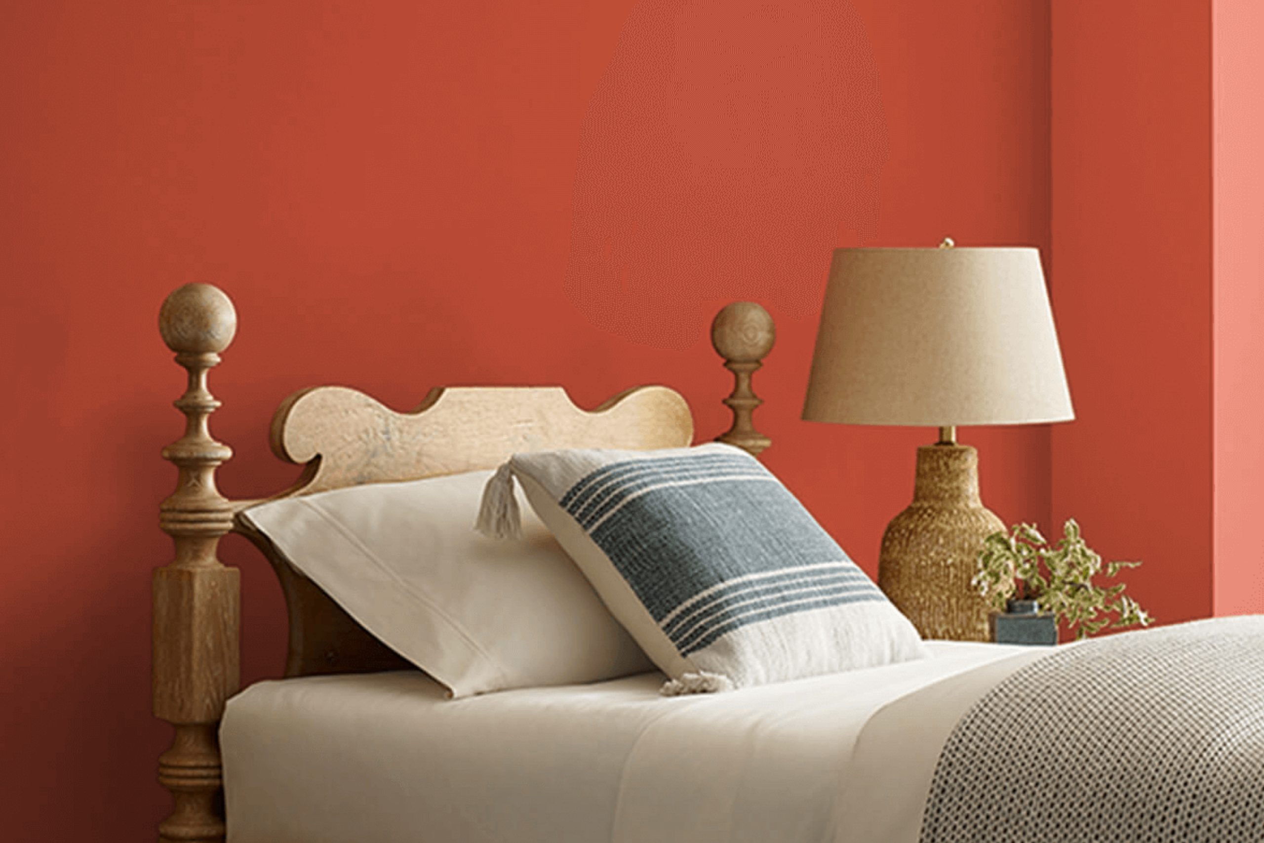
You might find yourself drawn to the warm, welcoming shade of SW 6622 Hearty Orange by Sherwin Williams. If you’ve ever wanted to add a splash of life and energy to your space, this vibrant color could be just what you need. Hearty Orange has a radiant glow that makes any room feel more inviting.
Whether you’re thinking about jazzing up your kitchen, living room, or even adding a fun pop of color to your hallway, this shade brings a cheerful vibe that’s hard to ignore.
Painting your walls with Hearty Orange is like adding a dose of sunshine, regardless of the weather outside. Imagine coming home to a space that feels alive and joyous — that’s the effect this color can have. It pairs beautifully with neutral tones, allowing you to balance its warmth with softer whites or elegant grays.
If you’re considering a makeover for your home, Hearty Orange might just be the spark of inspiration you need.
Plus, using a bold color like this can be a simple way to express your personality through your home’s interior.
via sherwin-williams.com
What Color Is Hearty Orange SW 6622 by Sherwin Williams?
Hearty Orange SW 6622 by Sherwin Williams is a vibrant, warm shade of orange that brings a cozy, welcoming vibe to any space. This bold color has a playful yet sophisticated aura, making it a versatile choice for a variety of decorating themes.
Perfect for adding a splash of energy, Hearty Orange works well in eclectic, bohemian, and contemporary interiors. It pairs beautifully with neutral tones like soft whites and grays, ensuring that it stands out without overwhelming the senses.
For a chic, modern look, consider matching Hearty Orange with navy or deep blue accents. This color also complements natural materials, such as wood, leather, and woven textures, enhancing its earthy qualities.
In rooms that receive plenty of natural light, Hearty Orange radiates warmth, making spaces feel more intimate and inviting. However, in smaller or dimly lit areas, it’s wise to use this color in moderation, such as an accent wall or decorative accessories, to avoid an overly intense effect.
Overall, Hearty Orange SW 6622 is a great choice for anyone looking to inject personality and warmth into their home. Its ability to pair with a range of materials and complement various interior styles makes it a highly adaptable and appealing option.

housekeepingbay.com
Is Hearty Orange SW 6622 by Sherwin Williams Warm or Cool color?
Hearty Orange SW 6622 by Sherwin Williams is a vibrant, rich shade that injects warmth and energy into any room. This bold orange hue is perfect for those looking to add a lively splash of color in their living spaces. In well-lit areas, Hearty Orange radiates a cozy and inviting glow, making it ideal for living rooms or dining areas where family and friends gather. In smaller or less naturally-lit spaces, its intensity adds depth and dimension, particularly when used as an accent wall or paired with neutral tones such as whites, beiges, or soft greys.
Using Hearty Orange in home decor is not only about adding color, but also about creating a dynamic environment. The color pairs well with wooden elements, bringing out their natural textures, and complements green plants, enhancing their vibrant colors.
Whether aiming for a modern or rustic look, Hearty Orange SW 6622 offers versatility and a cheerful ambiance to any space.
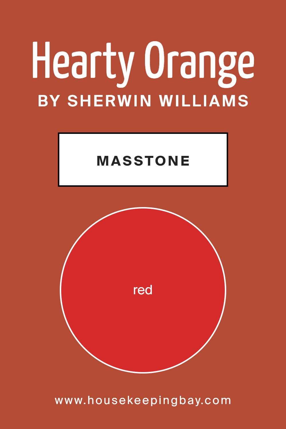
What is the Masstone of the Hearty Orange SW 6622 by Sherwin Williams?
Hearty Orange SW 6622 by Sherwin-Williams has a vibrant masstone that is close to a pure red, specifically Red (#D52B2B). This energetic color, when used in homes, brings a lively and warming presence to any room. Hearty Orange adds a burst of vitality, making it perfect for spaces where you want to inspire activity and enthusiasm, such as kitchens or dining areas.
It’s especially effective for creating a welcoming and cozy atmosphere in spaces meant for gathering.
When this shade is applied to walls, it can make the room feel smaller and more intimate, which is great for creating a snug environment. However, because it is so vivid, it’s wise to use it in moderation. Pairing Hearty Orange with neutral tones or using it on a feature wall can balance its intensity.
This approach helps to prevent the color from overwhelming the space, while still allowing it to inject energy and warmth into the home’s decor.
housekeepingbay.com
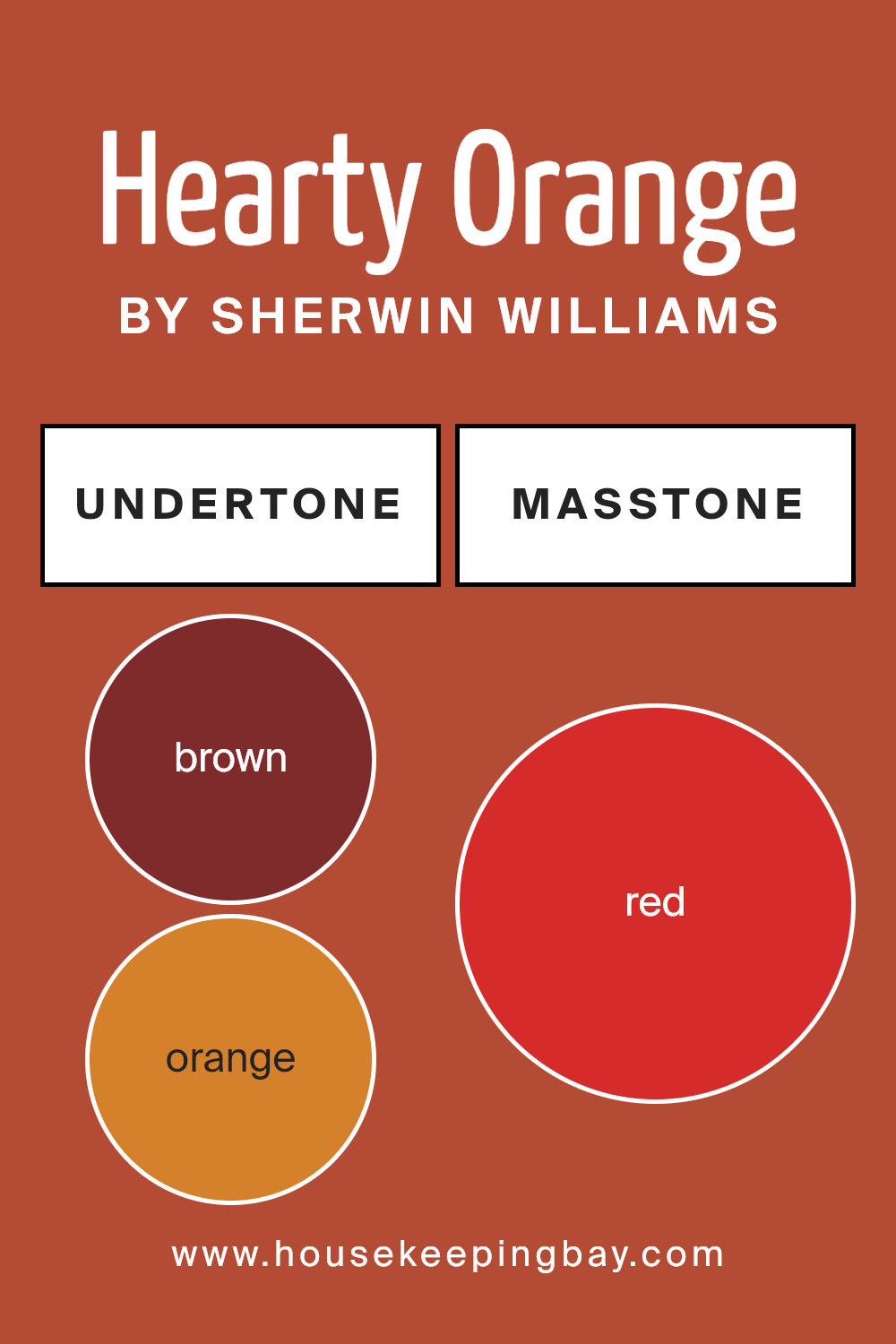
Undertones of Hearty Orange SW 6622 by Sherwin Williams
Hearty Orange SW 6622 by Sherwin Williams is a vibrant, warm hue that can bring life to any space. The main color might seem straightforward, but its effects on room aesthetics are greatly influenced by its undertones. Like notes in a complex perfume, these undertones can subtly alter the color’s presence under different lighting conditions.
The undertones of Hearty Orange include shades of brown, orange, olive, pink, purple, pale pink, and grey. These underlying colors add depth and complexity, making the orange appear richer and more nuanced.
For instance, brown and olive undertones give Hearty Orange a grounded, earthy feel, making it welcoming in spaces that need a touch of coziness.
On the other hand, the pink and purple undertones can inject a hint of playfulness and sophistication, making the color more flexible to style.
In an interior setting, the varied undertones of Hearty Orange will interact with the room’s lighting and surrounding colors. During daylight, the brighter orange and pink undertones might become more pronounced, creating a lively ambiance. In artificial lighting, the deeper brown and purple undertones could come to the fore, providing a soothing, warm atmosphere suited for relaxing evenings.
As lighting changes throughout the day, the color will subtly shift, keeping the space feeling dynamic and fresh. This characteristic makes Hearty Orange a versatile choice for walls, adapting well across various room types and lighting conditions.
The overall effect of these undertones is a rich, adaptable color that feels personal and engaging in any space.
housekeepingbay.com
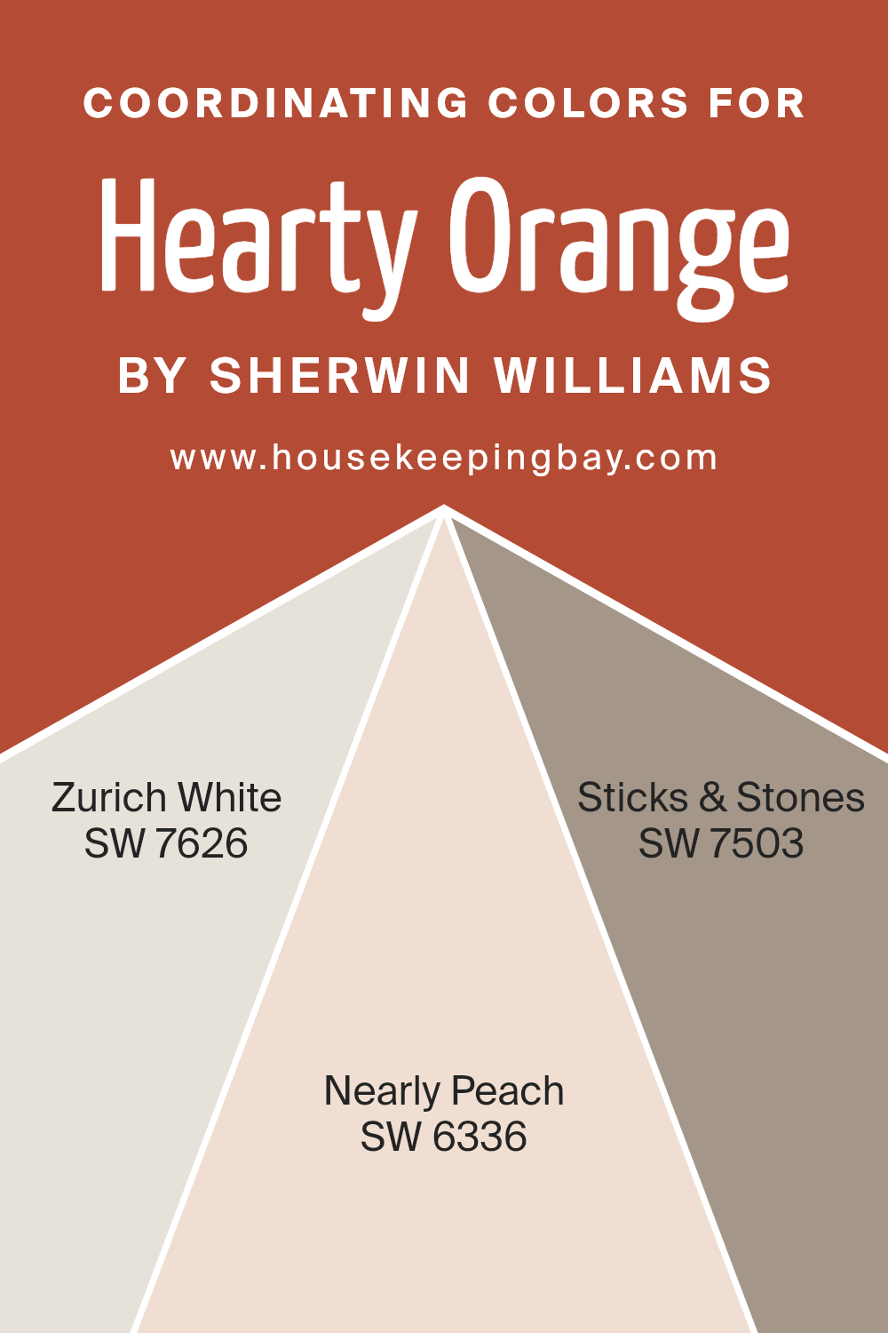
Coordinating Colors of Hearty Orange SW 6622 by Sherwin Williams
Coordinating colors are those that complement each other when used together in a design or color scheme, enhancing the overall aesthetic appeal without overpowering each element. For example, Hearty Orange SW 6622 by Sherwin Williams can be beautifully coordinated with colors like Zurich White SW 7626, Nearly Peach SW 6336, and Sticks & Stones SW 7503.
Each of these coordinating colors has unique characteristics that work harmoniously with Hearty Orange.
Zurich White SW 7626 is a soft, creamy white that provides a soothing contrast to the vibrant Hearty Orange, adding a light and airy feel to the space. It’s an excellent choice for trim or ceilings, creating a subtle backdrop that allows bolder colors to shine.
Nearly Peach SW 6336, with its gentle blush tint, infuses a warm, subtle radiance that complements the deeper tones of Hearty Orange, perfect for a cozy nook or a serene bedroom setup.
Sticks & Stones SW 7503 is a robust neutral shade that grounds the fiery pops of Hearty Orange, balancing the color palette with its earthy, muted brown tone, ideal for creating a balanced, inviting space.
You can see recommended paint colors below:
- SW 7626 Zurich White
- SW 6336 Nearly Peach
- SW 7503 Sticks & Stones
housekeepingbay.com
How Does Lighting Affect Hearty Orange SW 6622 by Sherwin Williams?
Lighting plays a critical role in how we perceive colors in our environment. Different light sources can change how a color looks, whether it’s painted on a wall or used in fabrics. Specifically focusing on the color Hearty Orange SW 6622 by Sherwin Williams, it’s interesting to see how this vibrant shade shifts under various lighting conditions.
Artificial Light: Under artificial lighting, Hearty Orange SW 6622 can appear warmer and more vivid. In environments lit by incandescent bulbs, which typically emit a warmer, yellow-toned light, Hearty Orange tends to look richer and deeper, creating a cozy and inviting atmosphere.
Conversely, fluorescent lighting, which is cooler and bluer, might make this orange seem slightly lighter and less intense.
Natural Light: Natural lighting brings out the truest form of Hearty Orange. In sunlight, the color is bright and energetic, reflecting a lively orange hue that can energize a space.
Its vibrancy is showcased beautifully under clear, natural light, making rooms feel fresh and dynamic.
Room Orientation:
– North-Faced Rooms: North-facing rooms receive less direct sunlight, often resulting in cooler, more subdued light. In such rooms, Hearty Orange SW 6622 can appear slightly muted and less intense, sometimes needing additional lighting to brighten the space and enhance the color’s warmth.
– South-Faced Rooms: Rooms facing south benefit from abundant sunlight for the most part of the day, making Hearty Orange look vibrant and lively. The natural brightness highlights the depth of the color, making it a perfect choice for lively living areas or kitchens.
– East-Faced Rooms:With morning sunlight, east-facing rooms can make Hearty Orange SW 6622 look bright and cheerful in the morning, gradually transitioning to a softer tone as the day progresses. This dynamic change can add an interesting character to spaces used mainly in the morning.
– West-Faced Rooms:In west-facing rooms, the late afternoon and evening sunlight can intensify Hearty Orange, making it appear warmer and more glowing as the sun sets. This can create a striking effect, ideal for spaces used more during the evening.
Understanding how Hearty Orange SW 6622 behaves under different lighting conditions helps in making informed decisions about where and how to use this color effectively in interior spaces.
housekeepingbay.com
What is the LRV of Hearty Orange SW 6622 by Sherwin Williams?
LRV stands for Light Reflectance Value, a measure indicating how much light a paint color reflects or absorbs. Ranging from 0 (absolute black, absorbing all light) to 100 (pure white, reflecting all light), LRV helps in determining how light or dark a color will appear once applied to the walls.
Lighter colors with higher LRVs make rooms feel more open and airy because they reflect more light. Conversely, darker colors with lower LRVs tend to absorb light, which can make a space feel smaller or cozier.
For Hearty Orange SW 6622 by Sherwin Williams, with an LRV of 14.988, this is a relatively dark color that absorbs a good amount of light. In practice, this means it can significantly influence the ambience of a room. Using it on large wall areas can make a space feel more intimate and enclosed.
This darker shade may be best used in well-lit or spacious rooms to avoid a heavy feel. Additionally, lighting plays a crucial role when using darker colors like this one; artificial or natural light sources can affect how the color is perceived in different settings.

housekeepingbay.com
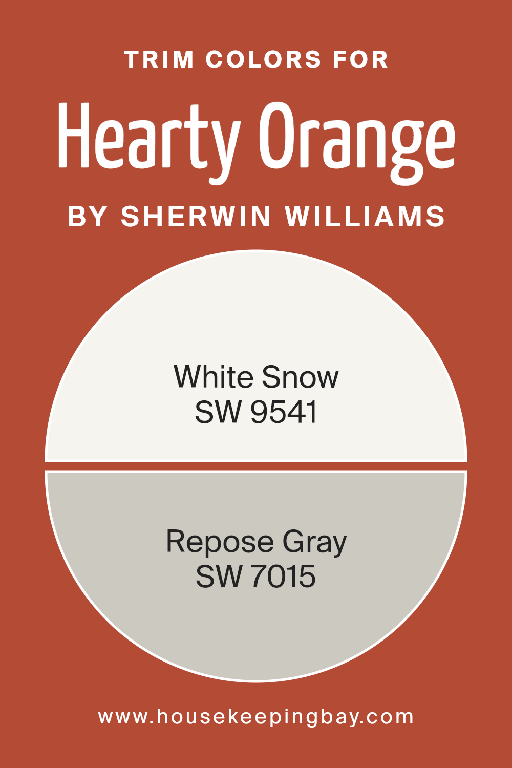
What are the Trim colors of Hearty Orange SW 6622 by Sherwin Williams?
Trim colors are contrasting or complementary hues applied to architectural details like window frames, door frames, and moldings to accentuate these features. For a bold shade like Hearty Orange SW 6622 by Sherwin Williams, choosing the right trim color is crucial because it helps define the spaces distinctly, enhancing the overall look of a room or exterior.
When using a vibrant shade such as Hearty Orange, selecting trim colors like SW 9541 – White Snow or SW 7015 – Repose Gray can provide a clean and balanced look.
These colors can soften the intensity of Hearty Orange or frame it beautifully, ensuring that the powerful statement of the wall color doesn’t overwhelm the space.
SW 9541 – White Snow is a crisp, clear white that brings a fresh and airy feel to any space. It pairs wonderfully with Hearty Orange by providing a sharp contrast that highlights the rich, warm tones of the orange.
On the other hand, SW 7015 – Repose Gray offers a soothing, neutral gray tone that can temper the energy of Hearty Orange, delivering a sophisticated backdrop and allowing the orange to stand out without clashing.
Each trim color, in its way, supports creating a harmonious environment while maintaining a strong visual interest spawned by Hearty Orange, making them valuable choices for a cohesive interior design.
You can see recommended paint colors below:
- SW 9541 White Snow
- SW 7015 Repose Gray
housekeepingbay.com
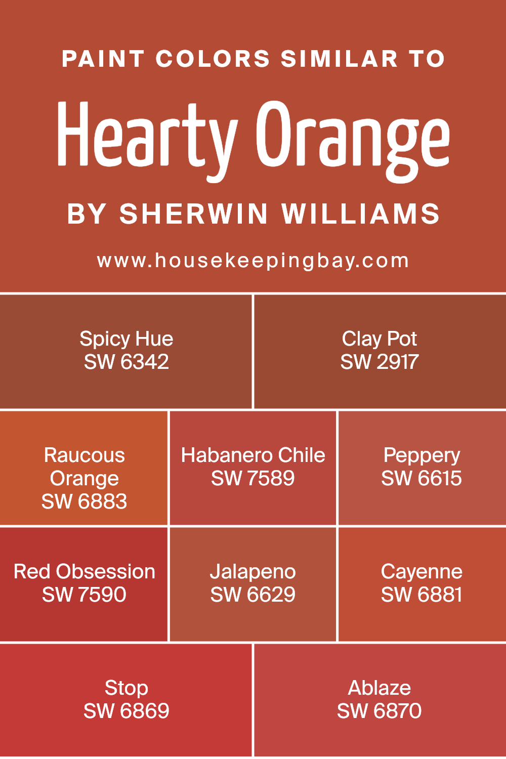
Colors Similar to Hearty Orange SW 6622 by Sherwin Williams
Similar colors work together to create a sense of harmony and balance, making them crucial in both interior design and art. Choosing shades like those similar to Hearty Orange SW 6622 by Sherwin Williams helps achieve a cohesive look without making the space appear too uniform.
This range of colors brings warmth and vibrancy, perfect for spaces where you want to add a touch of personality and energize the surroundings.
Colors such as SW 6342 Spicy Hue boasts a robust and spirited orange that livens up any room. SW 2917 Clay Pot offers an earthier, subdued tone, reminiscent of traditional terra cotta. Raucous Orange SW 6883 injects a bold, playful spirit, ideal for an accent wall. Habanero Chile SW 7589 is a fiery red that adds a spicy zest to spaces.
Peppery SW 6615, as the name suggests, adds a sharp, zesty orange pinch. Red Obsession SW 7590 brings a deep, intense red, enriching spaces with sophistication. Jalapeno SW 6629 offers a lively, garden-fresh greenish hue, while Cayenne SW 6881 provides a hot, impactful blast of red.
Ablaze SW 6870 is another striking option, combining heat and brightness to invigorate any area. By selecting similar colors like these, you create a warm, inviting environment that’s both exciting and visually appealing.
You can see recommended paint colors below:
- SW 6342 Spicy Hue
- SW 2917 Clay Pot
- SW 6883 Raucous Orange
- SW 7589 Habanero Chile
- SW 6615 Peppery
- SW 7590 Red Obsession
- SW 6629 Jalapeno
- SW 6881 Cayenne
- SW 6869 Stop
- SW 6870 Ablaze
housekeepingbay.com
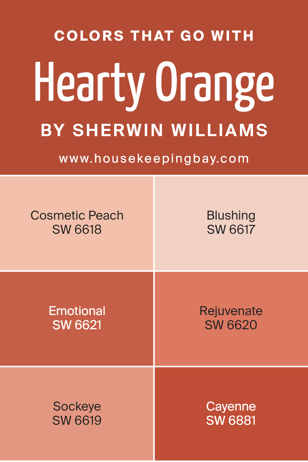
Colors that Go With Hearty Orange SW 6622 by Sherwin Williams
Pairing other colors with Hearty Orange SW 6622 by Sherwin Williams is essential to create a balanced and aesthetically pleasing palette in any room. When Hearty Orange is matched with complementary shades like Cosmetic Peach SW 6618 or Blushing SW 6617, the overall effect can soften or intensify the warmth of the space.
These softer hues add a gentle charm and a subtle contrast, making the more vigorous Hearty Orange stand out as a focal point without overwhelming the senses.
For a more vibrant interplay, matching Hearty Orange with shades like Emotional SW 6621 or Rejuvenate SW 6620 brings a dynamic energy to a room, perfect for areas that benefit from a lively atmosphere such as living rooms or kitchens. Meanwhile, both Sockeye SW 6619 and Cayenne SW 6881 lean towards a reddish spectrum, enriching the environment with a deep, rich warmth that complements the robust nature of Hearty Orange.
Using these colors in combination allows flexibility in design, whether the goal is to create a comforting, soft space or a room brimming with vitality and warmth. Each color pair enhances the space in its unique way, promoting a harmonious but distinct interior design.
You can see recommended paint colors below:
- SW 6618 Cosmetic Peach
- SW 6617 Blushing
- SW 6621 Emotional
- SW 6620 Rejuvenate
- SW 6619 Sockeye
- SW 6881 Cayenne
housekeepingbay.com
How to Use Hearty Orange SW 6622 by Sherwin Williams In Your Home?
Hearty Orange SW 6622 by Sherwin Williams is a vibrant and warm shade of orange. This color can bring a cozy and inviting atmosphere to any room in your home. In the kitchen or dining area, Hearty Orange can create a cheerful space where family and friends like to gather. It pairs well with creamy whites or soft grays, which can help balance its intensity.
In a living room, adding accessories like pillows or curtains in Hearty Orange can make the area feel more welcoming and lively. If you’re feeling bold, consider painting one accent wall with this color to add a focal point without overwhelming the space.
For a bedroom, use Hearty Orange in smaller doses, such as in artwork or a throw blanket, to add a touch of warmth without disrupting the calming feel typically preferred in sleeping areas.
Additionally, combining Hearty Orange with natural elements like wood or green plants can enhance the coziness of the environment, making any space feel more comfortable and harmonious.
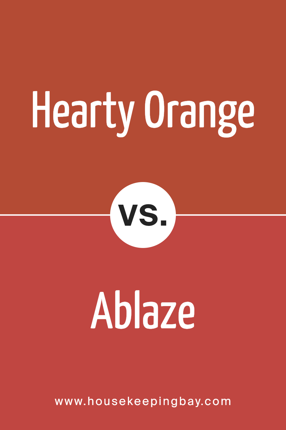
Hearty Orange SW 6622 by Sherwin Williams vs Ablaze SW 6870 by Sherwin Williams
Hearty Orange SW 6622 by Sherwin Williams is a warm, inviting shade deeply rooted in a red-orange hue that provides a comforting and cozy atmosphere. It’s perfect for spaces where a touch of coziness is needed, helping to make rooms feel more welcoming and lived-in.
Ablaze SW 6870, by contrast, is a vibrant and bold color. It has a more vivid, fiery look that grabs attention. This makes it ideal for areas where you want to make a strong impression or highlight a particular aspect of the room with a splash of energy and enthusiasm.
Both colors bring warmth to any space but serve different purposes based on their intensity and depth. Hearty Orange is more subdued and can blend easily with other tones, making it flexible for various decorating schemes. Ablaze, being brighter and more impactful, works well as an accent color, adding drama and flair where it’s used.
You can see recommended paint color below:
- SW 6870 Ablaze
housekeepingbay.com
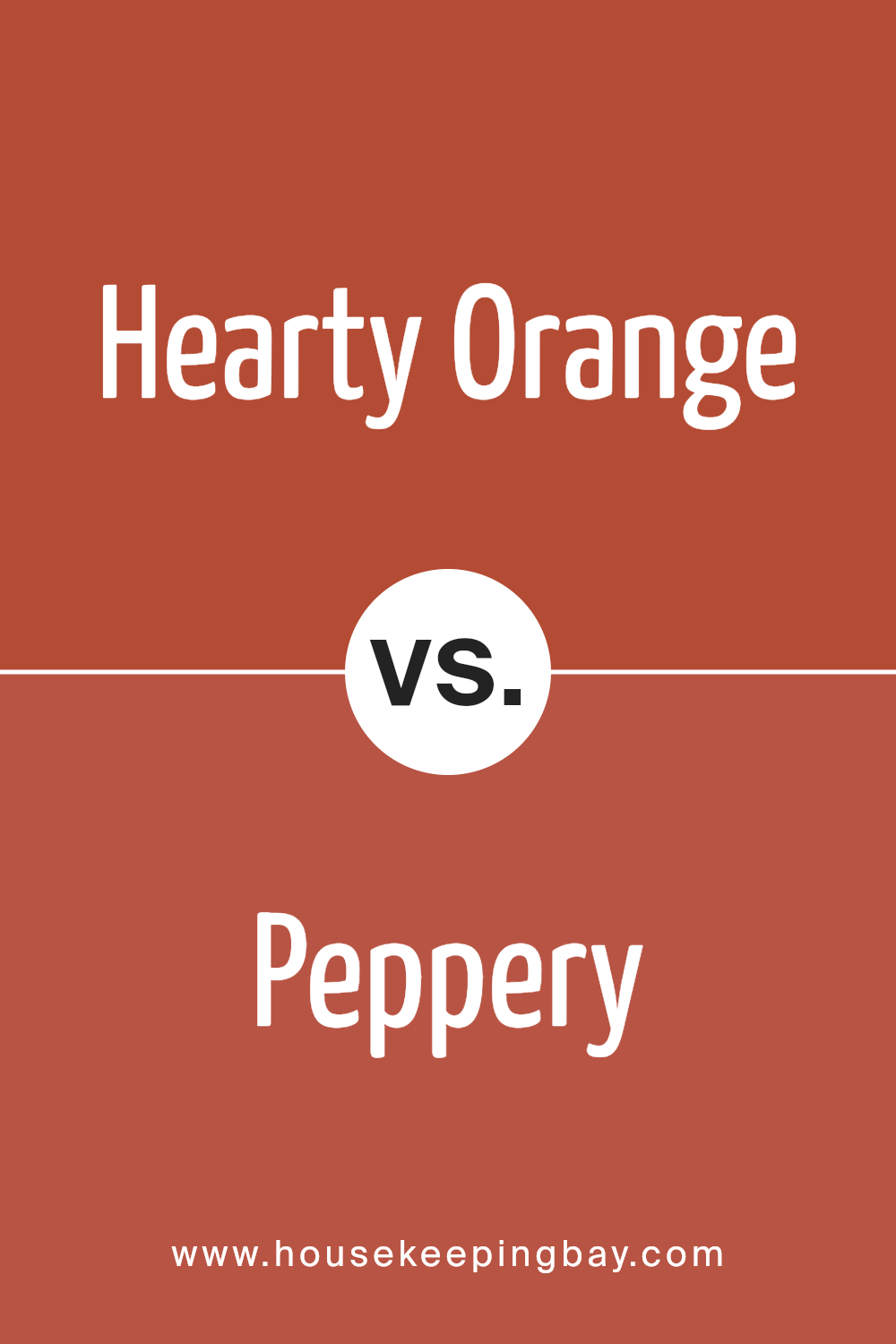
Hearty Orange SW 6622 by Sherwin Williams vs Peppery SW 6615 by Sherwin Williams
Hearty Orange SW 6622 by Sherwin Williams is a warm, vibrant shade. The robust orangish tones bring energy and coziness to any space, making it ideal for areas like living rooms or dining areas where a welcoming atmosphere is desired. It pairs well with neutral and earthy tones, enhancing the overall warmth of interiors.
Peppery SW 6615, also by Sherwin Williams, is a darker, more subdued color. This shade leans towards a deep, spicy red that can add sophistication and a hint of mystery to spaces. It’s perfect for creating focal points or accentuating décor elements without overwhelming a room’s ambiance.
Both colors offer unique vibes: Hearty Orange infuses spaces with cheerfulness and liveliness, while Peppery lends depth and an elegant touch. When choosing between them, consider the mood and functionality of your room to achieve the desired effect.
You can see recommended paint color below:
- SW 6615 Peppery
housekeepingbay.com
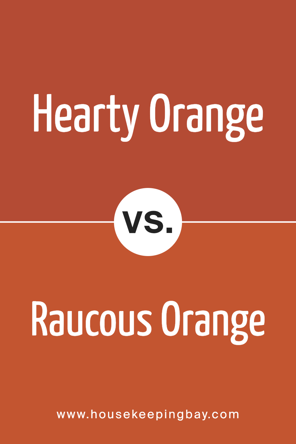
Hearty Orange SW 6622 by Sherwin Williams vs Raucous Orange SW 6883 by Sherwin Williams
Hearty Orange SW 6622 and Raucous Orange SW 6883 by Sherwin Williams are vibrant shades that each bring their unique flair. Hearty Orange has a warm, welcoming feel, echoing the coziness of autumn leaves and gentle sunsets. It’s softer and more muted, which makes it versatile for spaces that aim for a cozy or less intense ambiance.
In contrast, Raucous Orange is bolder and more vivid. This color packs a punch and is ideal for those who want to make a strong statement. Its brightness captures the energy and liveliness of a summer day, perfect for accent walls or areas meant to invigorate and energize a room.
Both colors can add personality and warmth to a space, but the choice between them depends on the desired impact and the mood you wish to set in the space.
You can see recommended paint color below:
- SW 6883 Raucous Orange
housekeepingbay.com
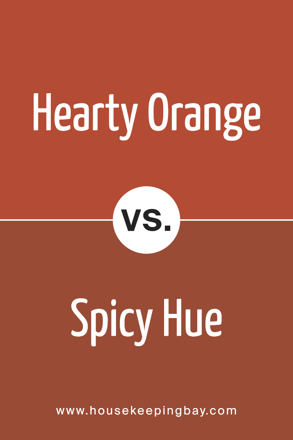
Hearty Orange SW 6622 by Sherwin Williams vs Spicy Hue SW 6342 by Sherwin Williams
Hearty Orange SW 6622 by Sherwin Williams is a warm, vibrant shade that brings a cozy and inviting atmosphere to any space. This color has a lively character that makes it perfect for areas where you want to add a sense of energy and cheerfulness, such as living rooms or kitchens.
Spicy Hue SW 6342, also by Sherwin Williams, is another warm color but with a deeper, more subdued tone. It leans towards a richer, earthier orange that offers a sophisticated feel. This shade is ideal for creating a subtle, yet impactful ambiance, making it suitable for dining rooms or home offices where a more refined look is desired.
While both colors share an orange base, Hearty Orange is brighter and more vivid, contributing to a more energetic vibe. In contrast, Spicy Hue provides a more muted elegance, making it versatile for different decorating styles. Both colors are excellent choices for adding warmth and personality to a room.
You can see recommended paint color below:
- SW 6342 Spicy Hue
housekeepingbay.com
Hearty Orange SW 6622 by Sherwin Williams vs Red Obsession SW 7590 by Sherwin Williams
Hearty Orange SW 6622 by Sherwin Williams is a vibrant and warm shade. It reflects a cheerful and inviting ambiance, making it perfect for spaces where you want to foster a sense of friendliness and enthusiasm. This color pairs well with both light accents for a softer look and dark tones for more contrast.
Red Obsession SW 7590 by Sherwin Williams is a deep, intense red. It offers a bold and dramatic flair, suitable for areas where a statement is desired. This color works brilliantly in spaces that benefit from a touch of sophistication and energy, like dining rooms or entryways.
While Hearty Orange is more about warmth and approachability, Red Obsession provides depth and passion. Both colors are bold but serve different moods and settings. Hearty Orange can lighten up a room, whereas Red Obsession adds a layer of profound impact.
You can see recommended paint color below:
- SW 7590 Red Obsession

housekeepingbay.com
Hearty Orange SW 6622 by Sherwin Williams vs Habanero Chile SW 7589 by Sherwin Williams
Hearty Orange SW 6622 by Sherwin Williams is a vibrant and warm color that adds a cozy and welcoming feel to any space. It is a bright orange with a hint of earthiness, making it versatile for living areas or places where a cheerful atmosphere is desired.
In contrast, Habanero Chile SW 7589 is also a bold orange but comes with a richer and deeper tone. This color has a fiery edge that suggests energy and excitement, making it perfect for accents or rooms where you want to make a strong statement.
Both colors are from the orange family but differ in mood and impact. Hearty Orange brings a softer, more muted effect, suitable for a broad application, whereas Habanero Chile’s deeper, intense shade is ideal for dramatic focal points or dynamic decor. Each has its charm and application, depending on the vibe you wish to achieve in a room.
You can see recommended paint color below:
- SW 7589 Habanero Chile

housekeepingbay.com
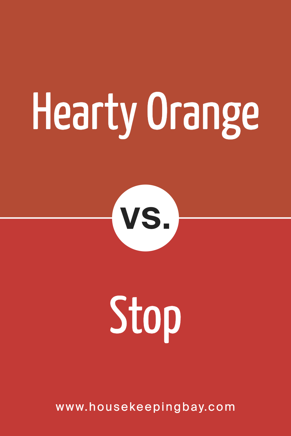
Hearty Orange SW 6622 by Sherwin Williams vs Stop SW 6869 by Sherwin Williams
Hearty Orange SW 6622 by Sherwin Williams is a warm, inviting shade that brings to mind autumn leaves and cozy settings. It has a subdued yet rich quality that makes it versatile for use in living rooms or dining areas where a welcoming atmosphere is desired. This color pairs well with earth tones and wood finishes, adding a touch of rustic charm to any space.
In contrast, Stop SW 6869 is a vibrant, bold red that packs a punch. It’s a true red that demands attention, making it perfect for accent walls, doors, or anywhere you want to make a statement. This shade works well in modern or contemporary decor, and it can effectively energize a room or create a focal point due to its striking hue.
Both Hearty Orange and Stop are powerful in their own right but cater to different aesthetic tastes and uses within home decor. While Hearty Orange offers warmth and subtlety, Stop brings an energetic and dynamic flare.
You can see recommended paint color below:
- SW 6869 Stop
housekeepingbay.com
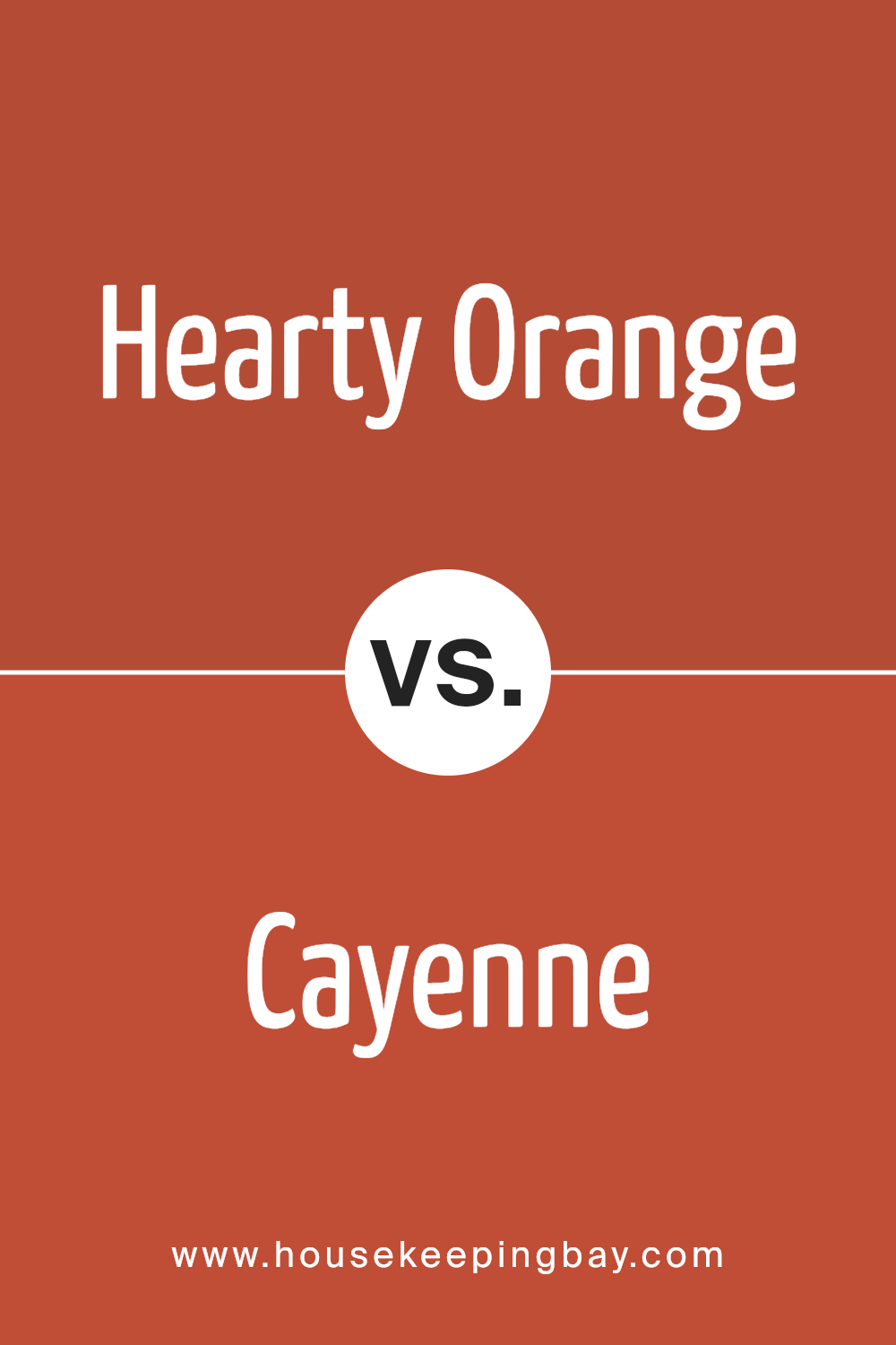
Hearty Orange SW 6622 by Sherwin Williams vs Cayenne SW 6881 by Sherwin Williams
Hearty Orange SW 6622 by Sherwin Williams is a vibrant and warm shade that instantly brings a sense of coziness and cheer to a space. It’s a versatile orange that pairs well with earthy tones and neutrals, making it ideal for living rooms or dining areas where a welcoming atmosphere is desired.
In contrast, Cayenne SW 6881 is a bolder, more intense color. This shade has a fiery red-orange hue that adds a punch of energy and personality to any area. It’s perfect for accent walls or decorative elements that need to stand out. Cayenne is particularly effective in spaces where a dynamic and lively vibe is the goal.
Both colors are striking and can create different moods in a room. Hearty Orange projects warmth and comfort, while Cayenne offers a vivid and spirited feel. Depending on the ambiance you want to achieve, each color has its unique charm and effect.
You can see recommended paint color below:
- SW 6881 Cayenne
housekeepingbay.com
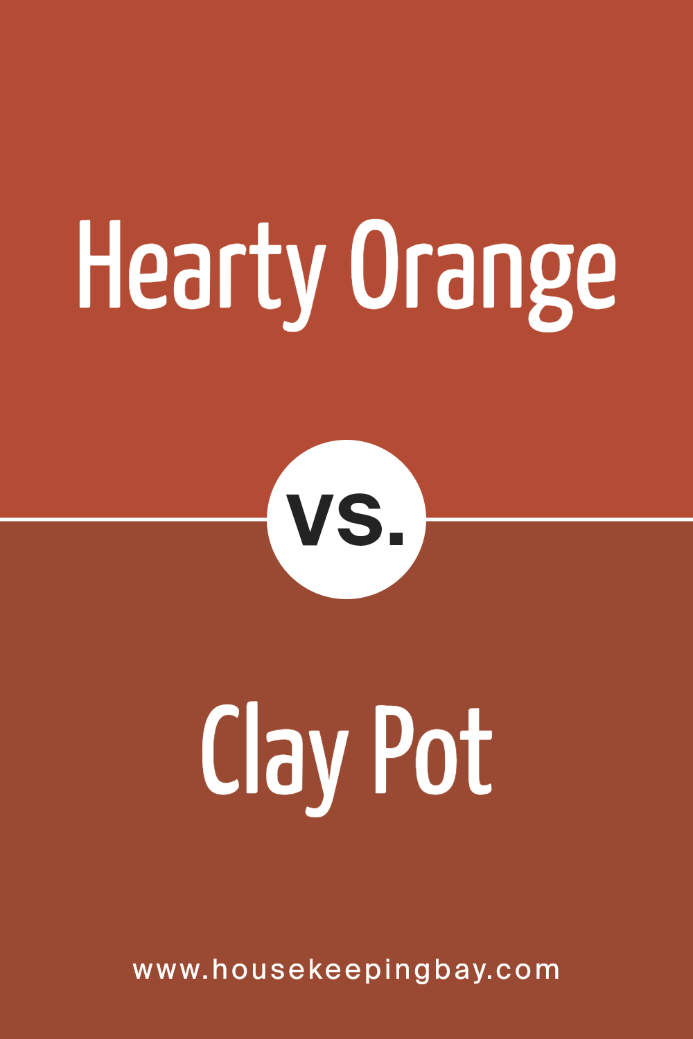
Hearty Orange SW 6622 by Sherwin Williams vs Clay Pot SW 2917 by Sherwin Williams
Hearty Orange SW 6622 by Sherwin Williams is a vibrant, energetic color that adds warmth and cheer to any space. It has a bright, inviting tone that can make a room feel cozy yet lively. This shade is ideal for creating a focal point or adding a playful touch to interiors.
Clay Pot SW 2917 is a richer, deeper orange with a subtle brown undertone, giving it an earthy, grounded feel. It’s less intense than Hearty Orange but still warm, making it great for spaces where a soothing yet cozy atmosphere is desired.
This color works well in areas that seek a hint of sophistication without being too bold.
Both colors bring warmth and energy to a room, but Hearty Orange is more vibrant and lively, while Clay Pot offers a more muted and refined approach.
Their respective tones can significantly influence the mood and style of a space, depending on what feeling you want to achieve.
You can see recommended paint color below:
- SW 2917 Clay Pot
housekeepingbay.com
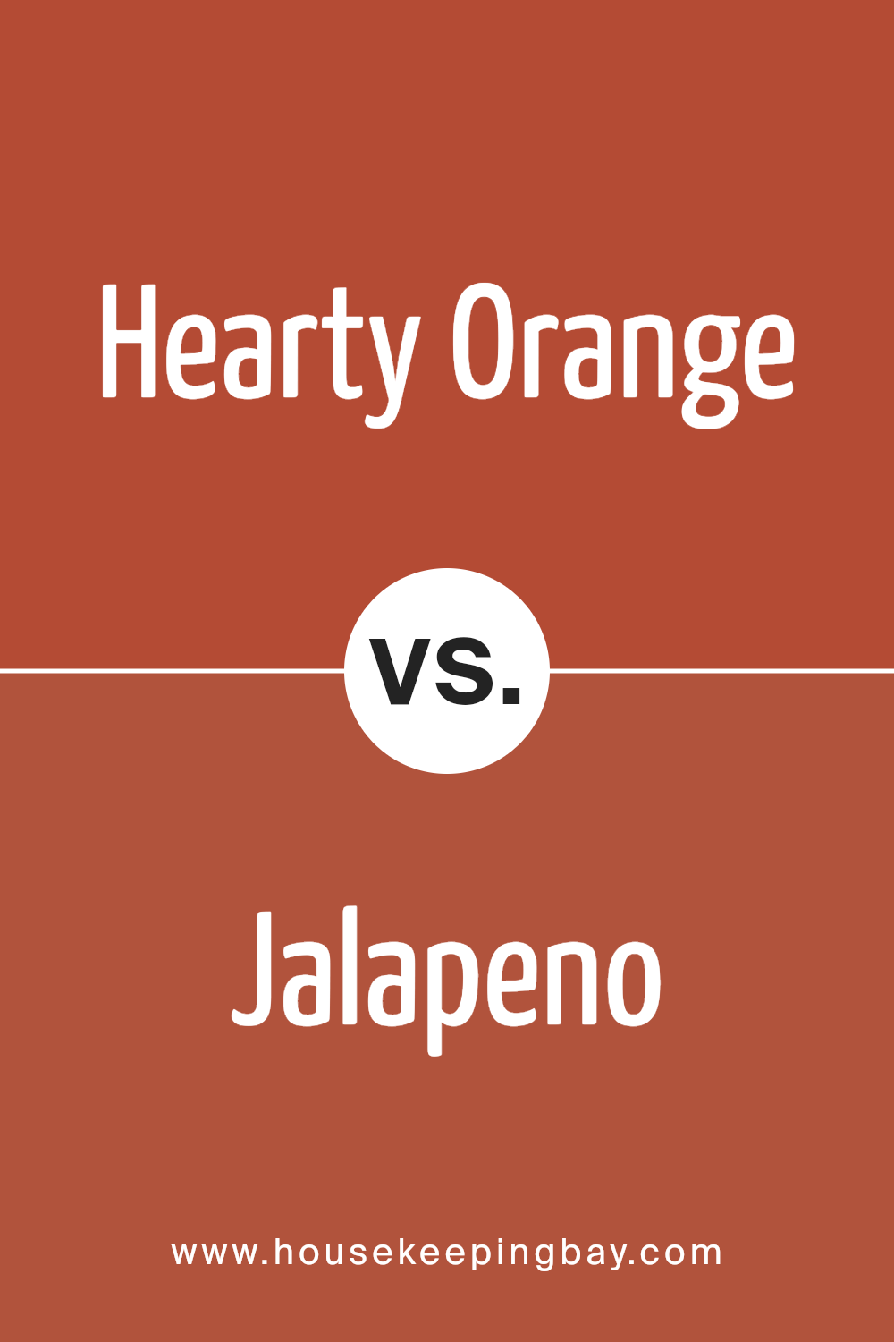
Hearty Orange SW 6622 by Sherwin Williams vs Jalapeno SW 6629 by Sherwin Williams
Hearty Orange SW 6622 by Sherwin Williams has a rich, warm tone that feels cozy and inviting. This color is bright and vibrant, making any room feel cheerful and lively. It pairs well with neutral shades like white or beige, providing a fresh pop of color to spaces.
On the flip side, Jalapeno SW 6629 presents a spicier, more intense hue. This shade of green has an earthy quality, contributing to a natural and calming environment. While also vibrant, Jalapeno leans towards a more subdued effect compared to the boldness of Hearty Orange.
Both colors work well in spaces that could use a dash of energy, yet they evoke different moods. Hearty Orange might be preferable for a playful, dynamic setting, whereas Jalapeno suits those seeking a touch of rejuvenation with a more grounded feel.
You can see recommended paint color below:
- SW 6629 Jalapeno
housekeepingbay.com
Conclusion
I find SW 6622 Hearty Orange by Sherwin Williams incredibly inviting and warm, making it an excellent choice for anyone looking to add vibrancy and energy to their space. The hue offers a bold splash of color, yet it maintains a sense of comfort that works well in a variety of settings such as living rooms, kitchens, and even exteriors.
Its versatility extends to various decor styles, from modern to rustic and everything in between.
In choosing this color, I expect it will revive any room by adding a lively burst of color that’s both cozy and refreshing. It pairs well with neutral tones and materials like exposed wood and metallic finishes, providing a balance that’s visually appealing.
For those hesitant about introducing such a powerful color, incorporating Hearty Orange through accents and accessories can be a subtle yet effective approach.
Overall, Hearty Orange by Sherwin Williams is more than just a paint color; it’s a means of creating a vibrant, welcoming environment. It doesn’t overwhelm but instead creates a perfect backdrop that complements a wide range of textures and styles.
Considering its adaptability and the positive atmosphere it fosters, it undoubtedly presents a robust option for anyone ready to refresh their living space with a dose of cheer and warmth.

housekeepingbay.com
Ever wished paint sampling was as easy as sticking a sticker? Guess what? Now it is! Discover Samplize's unique Peel & Stick samples. Get started now and say goodbye to the old messy way!
Get paint samples


