Bryce Canyon 098 by Benjamin Moore
Experience the Warmth of Nature's Palette
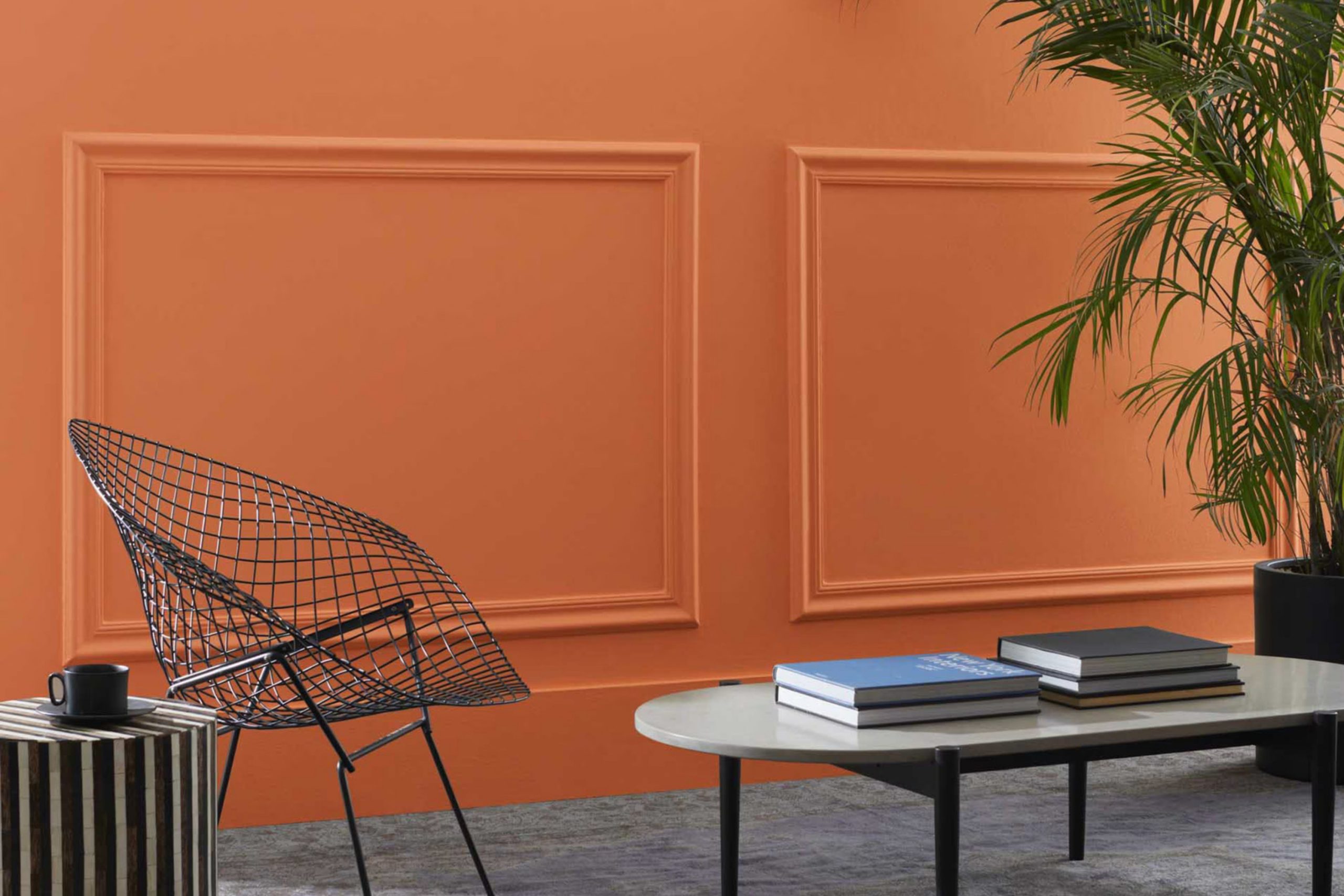
When it comes to choosing paint for your home, the color you pick has a significant impact on the mood and style of your space. Today, I want to talk about a unique shade: 098 Bryce Canyon by Benjamin Moore. Named after the breathtaking national park, this color brings warmth and a natural earthy feel into any room. Imagine the rich hues of a sunset reflecting off a canyon wall; that’s what Bryce Canyon can do for your living space.
Ideal for adding a cozy, welcoming vibe to a living room or creating a snug atmosphere in a bedroom, this paint color is fantastic for those who appreciate nature-inspired elements indoors. It matches well with a variety of decors, enhancing wooden furnishings and natural fabrics beautifully.
If you’re considering a new look for your home and want a color that offers both beauty and a sense of serenity, Bryce Canyon might just be the perfect choice.
Let’s look into how this shade can effectively bring warmth and a natural elegance to your home.
via benjaminmoore.com
What Color Is Bryce Canyon 098 by Benjamin Moore?
Bryce Canyon098 by Benjamin Moore is a warm, earthy orange hue, reminiscent of autumn leaves or a sunset. This color has a welcoming aura that adds coziness to any space. It complements natural light beautifully, glowing softly in sunlit rooms and offering warmth under artificial lighting. Bryce Canyon098 fits well in Scandinavian and rustic interior styles, where its natural tone enhances wood elements and other organic materials.
In a Scandi setting, pair this color with light woods, white accents, and minimalistic decor to create a clean, airy feel. Soft, neutral textiles like wool or cotton can balance its vibrancy. For rustic interiors, Bryce Canyon098 works well with exposed beams, distressed wood furniture, and rich leather, enhancing the homey and comfortable atmosphere characteristic of this style.
This color also pairs excellently with various materials. Consider combining it with slate or terracotta tiles for a touch of earthiness. Textures like burlap or linen add depth and interest, while metallic accents in copper or bronze can introduce a refined touch.
In rooms that use Bryce Canyon098, incorporate ample greenery to harmonize with its natural vibe, enhancing the overall aesthetic and feel of the space.

housekeepingbay.com
Is Bryce Canyon 098 by Benjamin Moore Warm or Cool color?
Bryce Canyon is a paint color from Benjamin Moore, known for its warm, earthy orange tone. Inspired by the natural beauty of Bryce Canyon National Park, this hue gives a cozy, welcoming feel to any room. It can make large spaces feel more intimate and smaller areas appear warmer.
This color works well in living rooms or dining areas, where it adds a cheerful glow and fosters a sociable atmosphere. In homes, the softness of Bryce Canyon allows for versatile use. It pairs well with neutral shades like whites or grays, which helps to balance its warmth.
Additionally, it can be an effective background for natural wood furniture or green plants, enhancing the organic feel of a space. This color is particularly useful in rooms with lots of natural light, where it can appear lively and vibrant. In dimmer spaces, it keeps its warmth, preventing the room from feeling cold or stark.
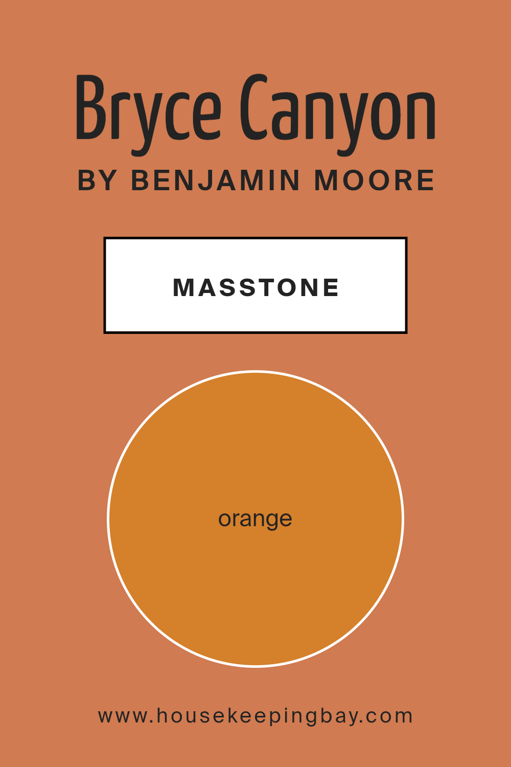
What is the Masstone of the Bryce Canyon 098 by Benjamin Moore?
Bryce Canyon 098 by Benjamin Moore is a vibrant shade of orange, resembling the natural beauty of Bryce Canyon itself. With its masstone Orange(#D5802B), this color carries a warm and inviting feel, making it an excellent choice for homes that want to add a touch of coziness and joy. When used in living rooms or dining areas, it creates a cheerful ambiance that encourages conversation and togetherness.
This particular shade works well with natural light, glowing radiantly in sunny rooms, which enhances its welcoming vibe. In smaller spaces, using it on an accent wall can add depth without overwhelming the room with too much color.
Bryce Canyon 098 also pairs beautifully with earth tones and natural textures like wood or leather, further enriching its warm qualities. Moreover, this rich orange shade can add a lively contrast when used alongside cooler tones such as blues and greens, offering a balanced and harmonious look.
It’s a versatile color, great for adding personality and warmth to any home.
housekeepingbay.com
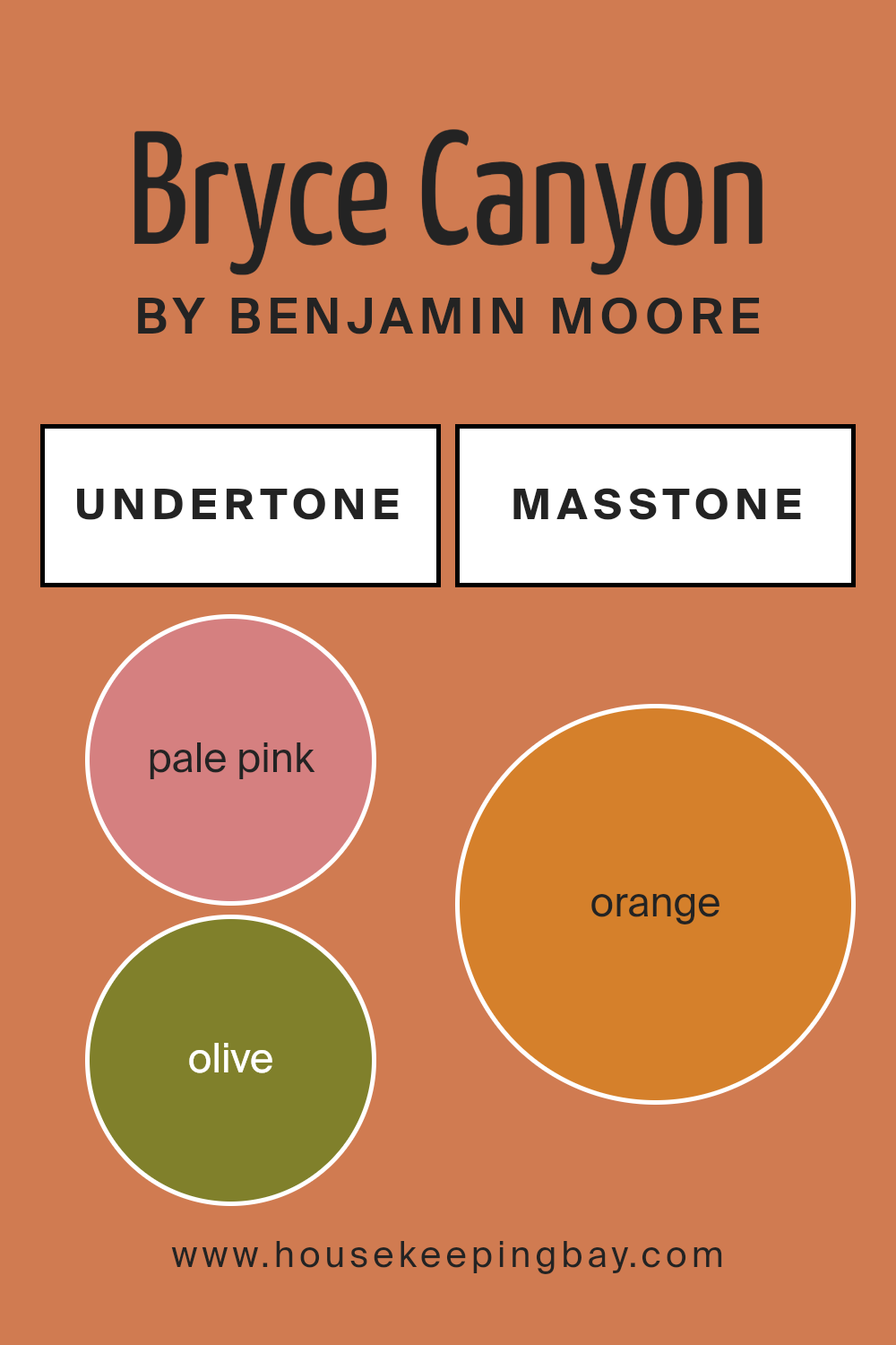
Undertones of Bryce Canyon 098 by Benjamin Moore
Bryce Canyon 098 by Benjamin Moore is a unique paint color often chosen for its warm and inviting nature. This versatility is largely due to its complex undertones. Undertones are subtle colors that lie beneath the surface of the primary color, influencing its overall hue and how it reacts under different lighting conditions. For Bryce Canyon 098, these undertones include shades like pale pink, olive, red, grey, pink, yellow, pale yellow, brown, purple, light green, and mint.
These assorted undertones mean that the paint can appear differently depending on the time of day or the type of artificial light in the room. For example, during the day, natural light might highlight its pale pink or light green undertones, giving the room a softer, more natural feel. In the evening under warmer artificial lighting, the red or brown undertones might become more dominant, making the room feel cozy and warm.
When used on interior walls, the complexity of Bryce Canyon 098 allows it to adapt to various decor styles and themes. It can complement natural materials like wood and stone thanks to its earthy undertones like olive and brown. Similarly, its cooler undertones like grey and mint can match well with modern, metallic elements.
This adaptability makes Bryce Canyon 098 a practical choice for many spaces, enhancing the overall atmosphere without overwhelming it with color. In essence, whether the room receives ample sunlight or relies on artificial lighting, this paint can shift in mood and complement the interior, preserving its aesthetic appeal through varying conditions.
housekeepingbay.com
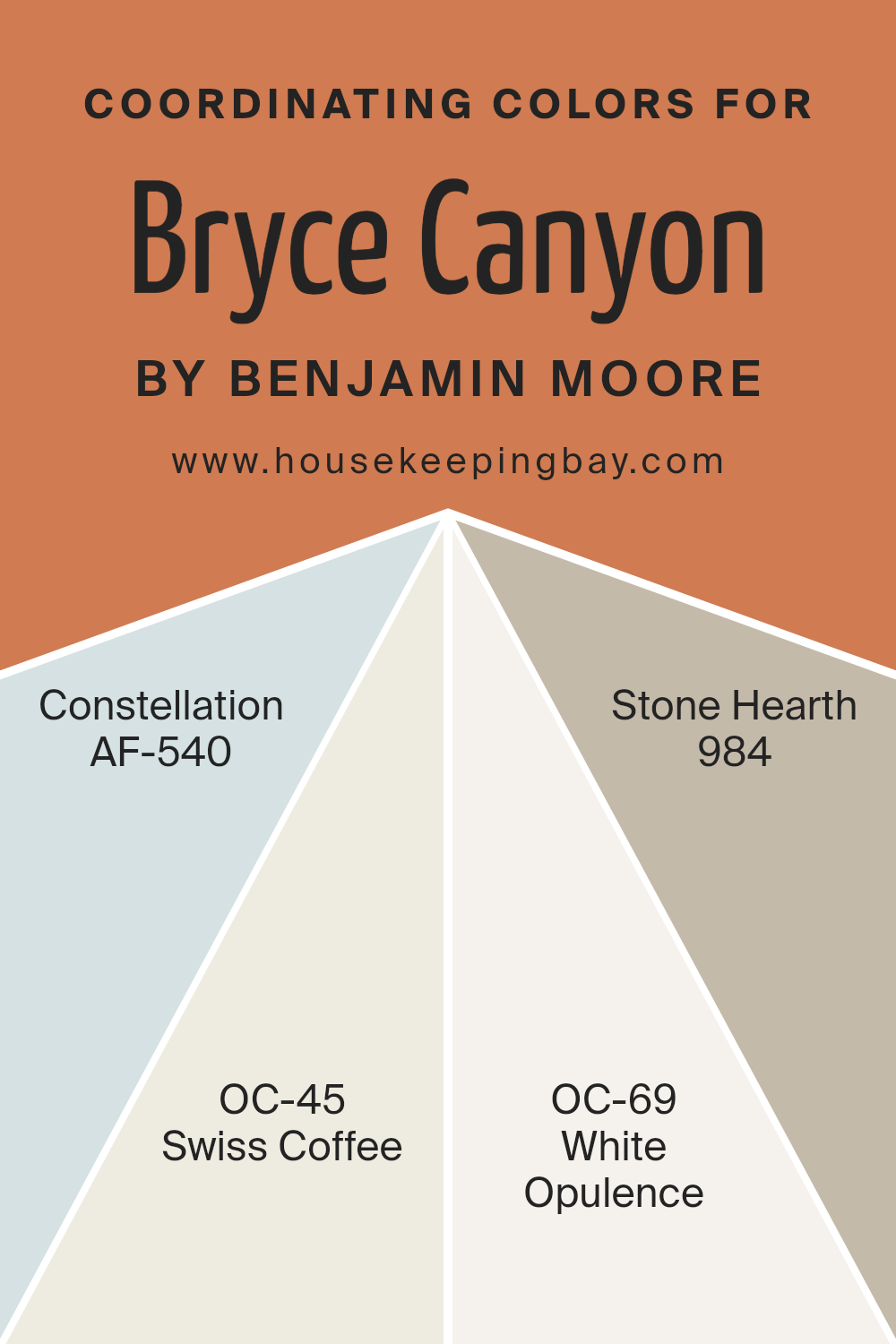
Coordinating Colors of Bryce Canyon 098 by Benjamin Moore
Coordinating colors are hues that harmonize well when used together, either due to their positions on the color wheel or their tonal similarities. For instance, when decorating a space, choosing coordinating colors like AF-540 – Constellation, OC-45 – Swiss Coffee, OC-69 – White Opulence, and 984 – Stone Hearth by Benjamin Moore can help create a cohesive and pleasant aesthetic.
These colors complement each other, enhancing the overall look without overwhelming the senses. This method allows for a balanced visual flow, making a room appear more put-together and appealing.
AF-540 – Constellation by Benjamin Moore is a soft and airy blue that imparts a sense of calm and freshness to any space, ideal for creating a serene environment. OC-45 – Swiss Coffee offers a warm, inviting off-white tone that works beautifully to brighten spaces and serve as a versatile backdrop for any interior. OC-69 – White Opulence has a crisp and clean presence that brings a lift and spaciousness to rooms, perfect for adding a brisk and refined touch.
Lastly, 984 – Stone Hearth features a rich, welcoming greige that blends gray and beige, providing depth and warmth, making it a perfect choice for adding a cozy, grounding element to a room. Together, these colors offer a flexible palette for enhancing any living space.
You can see recommended paint colors below:
- AF-540 Constellation
- OC-45 Swiss Coffee
- OC-69 White Opulence
- 984 Stone Hearth
housekeepingbay.com
How Does Lighting Affect Bryce Canyon 098 by Benjamin Moore?
Lighting significantly influences how we perceive colors, as different light sources can change a color’s appearance. Natural light and artificial light highlight different aspects and tones of colors. Taking the color Bryce Canyon098 by Benjamin Moore as an example, the effects of various lighting conditions can be quite distinct.
In artificial light, such as from LED or incandescent bulbs, Bryce Canyon098 tends to show a warmer tone.
This color can feel cozier and more welcoming under yellow or warm white bulbs because they enhance its red and orange undertones.
In natural light, this effect can vary considerably throughout the day. Morning light, which is softer and often cooler, can make Bryce Canyon098 look more muted and soften its warmth.
As the sun shifts and the light becomes more direct, especially around noon, the color may appear brighter and truer to its swatch.
Room orientation affects how Bryce Canyon098 is perceived because of the different qualities of light each direction receives. In north-facing rooms, light is typically cooler and more consistent throughout the day.
This can make Bryce Canyon098 appear slightly more subdued and less warm, emphasizing its neutral base rather than its vibrant undertones. South-facing rooms, however, receive more intense, warmer light, which can make the color appear brighter and more vivid, truly highlighting its warm, inviting qualities.
East-facing rooms benefit from the morning sun, which can make Bryce Canyon098 look very inviting and fresh in the mornings but cooler and more shadowed in the afternoon. Conversely, west-facing rooms might have a more neutral appearance of this color in the morning light, but it will warm up significantly towards the evening as the sun sets.
Understanding these differences can help in deciding where to apply the color for the desired effect, whether seeking a bolder impact or a more subtle ambiance.
housekeepingbay.com
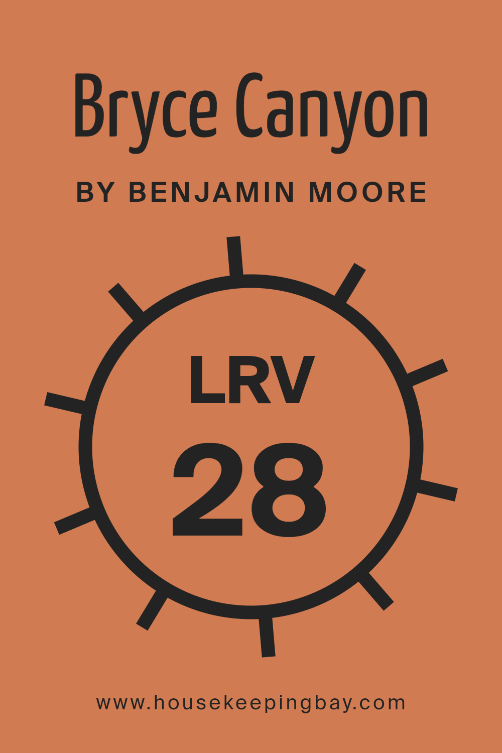
What is the LRV of Bryce Canyon 098 by Benjamin Moore?
LRV stands for Light Reflectance Value, which measures the percentage of light a paint color reflects back into a room. It is a scale from 0 to 100, where 0 absorbs all light and appears completely black, and 100 reflects all light, appearing totally white.
This measurement helps in choosing paint colors since it indicates how light or dark a color will look once applied to the walls. Higher LRV values make rooms feel brighter and more open because they reflect more light, while lower LRV values create a cozier and more enclosed feeling as they absorb more light.
The LRV of Bryce Canyon 098 by Benjamin Moore is 27.93, which is relatively low. This means that the color is on the darker side and will not reflect much light back into the room. In practical terms, using Bryce Canyon 098 in a small or poorly lit room might make the space feel smaller and darker because it absorbs more light.
If used in a larger, well-lit area, the color can add depth and warmth, enhancing the room’s aesthetic without making it feel cramped. For rooms with limited natural light, balancing this color with lighter colors or reflective surfaces can help mitigate its light-absorbing properties.
housekeepingbay.com
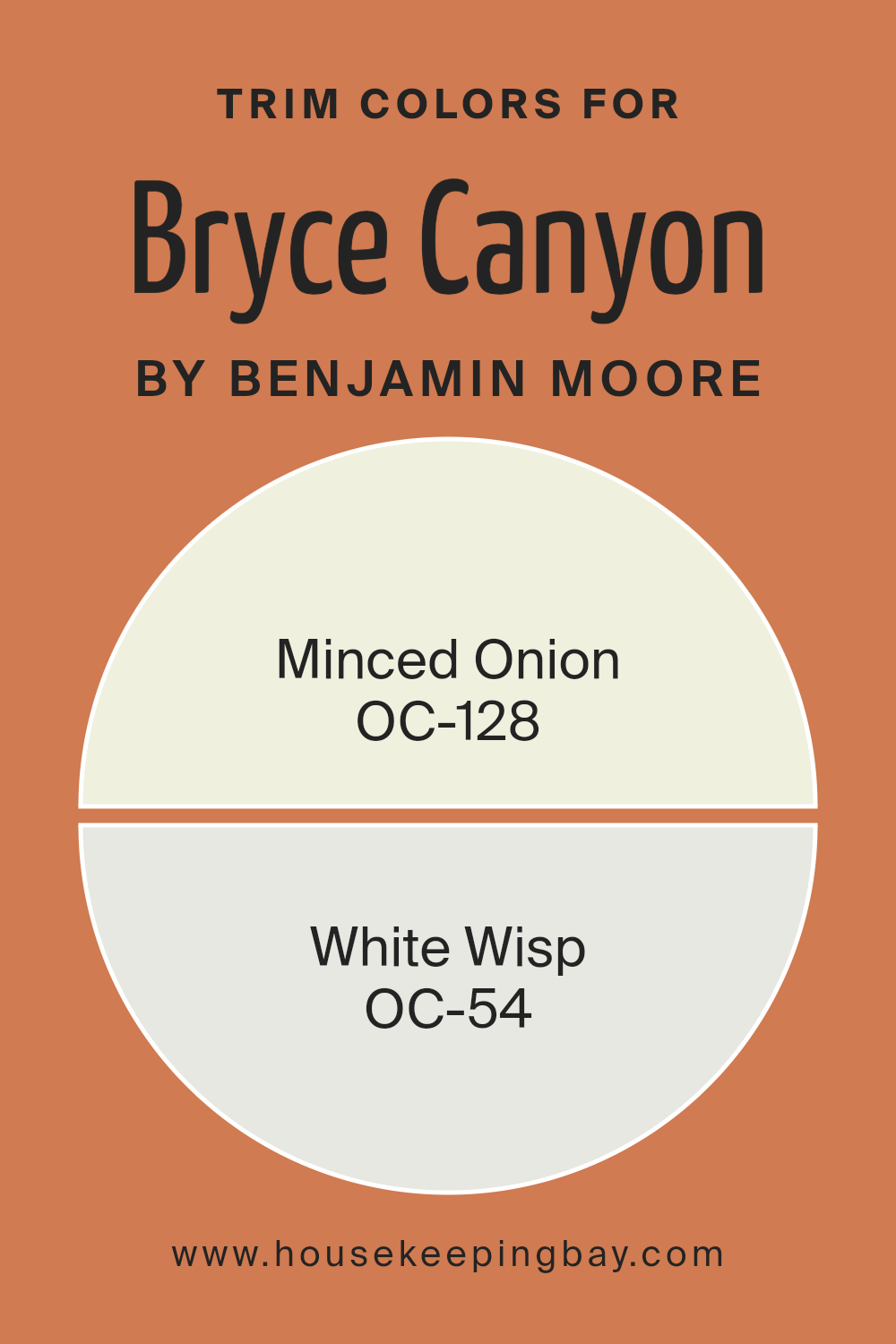
What are the Trim colors of Bryce Canyon 098 by Benjamin Moore?
Trim colors, such as those offered by Benjamin Moore for Bryce Canyon, play a crucial role in defining the visual boundaries and enhancing the architectural features of a room or exterior. By selecting the right trim color, you can subtly highlight the edges around doors, windows, and baseboards, making them stand out against the main wall color.
Trim colors are also essential in creating a cohesive look that ties the different elements of a space together. They can either contrast with or complement the primary wall colors to add depth and dimension to a room, making the overall aesthetic more appealing and polished.
Benjamin Moore’s OC-128 Minced Onion is a soft, gentle hue with a hint of warmth that brings a light and airy feel to spaces. It works well in maintaining a subtle and soothing atmosphere when used as a trim color, contributing to a neat and refined appearance.
On the other hand, OC-54 White Wisp is a fresh, clean color with a slightly cool undertone, ideal for brightening and creating a crisp boundary that can make surrounding colors pop. When used as a trim, it provides a sharp, clear delineation that enhances spatial clarity and a sense of order.
You can see recommended paint colors below:
- OC-128 Minced Onion
- OC-54 White Wisp
housekeepingbay.com
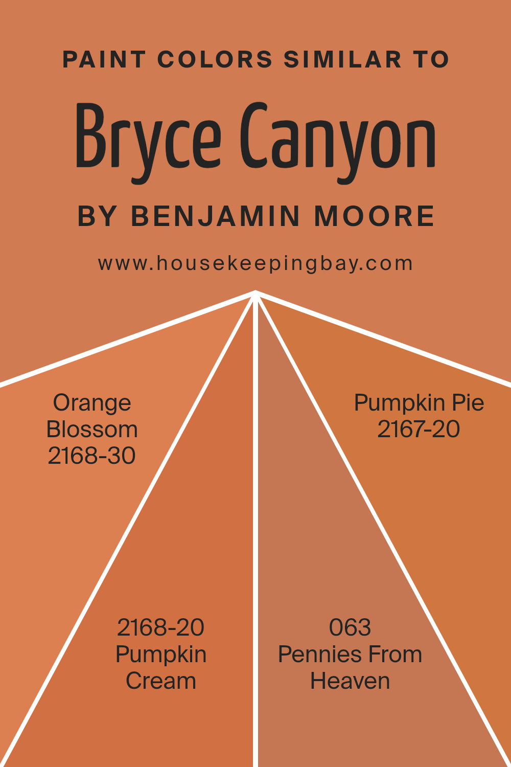
Colors Similar to Bryce Canyon 098 by Benjamin Moore
Similar colors work well together to create a cohesive and harmonious look in any space. By using shades and variations within the same color family, like those found in similar colors to Bryce Canyon 098 by Benjamin Moore, you create a smooth visual flow. Colors such as Orange Blossom, Pumpkin Cream, Pennies From Heaven, and Pumpkin Pie share a common warmth that makes them easy to integrate with each other, enhancing the atmosphere without overwhelming the senses with contrast.
Orange Blossom is a vibrant, energetic shade that adds a punch of vivacity to a room. Pumpkin Cream has a softer, more subdued hue, providing a gentle and inviting warmth. Pennies From Heaven is a deeper, richer tone that brings a sense of sophistication and depth, while Pumpkin Pie offers a classic autumnal warmth that feels both cozy and familiar.
Together, these colors reflect variations in saturation and brightness, allowing for flexible design choices that can adapt to different themes and preferences within the same palette. This approach ensures that each room maintains a sense of unity even when various shades are used.
You can see recommended paint colors below:
- 2168-30 Orange Blossom
- 2168-20 Pumpkin Cream
- 063 Pennies From Heaven
- 2167-20 Pumpkin Pie
housekeepingbay.com
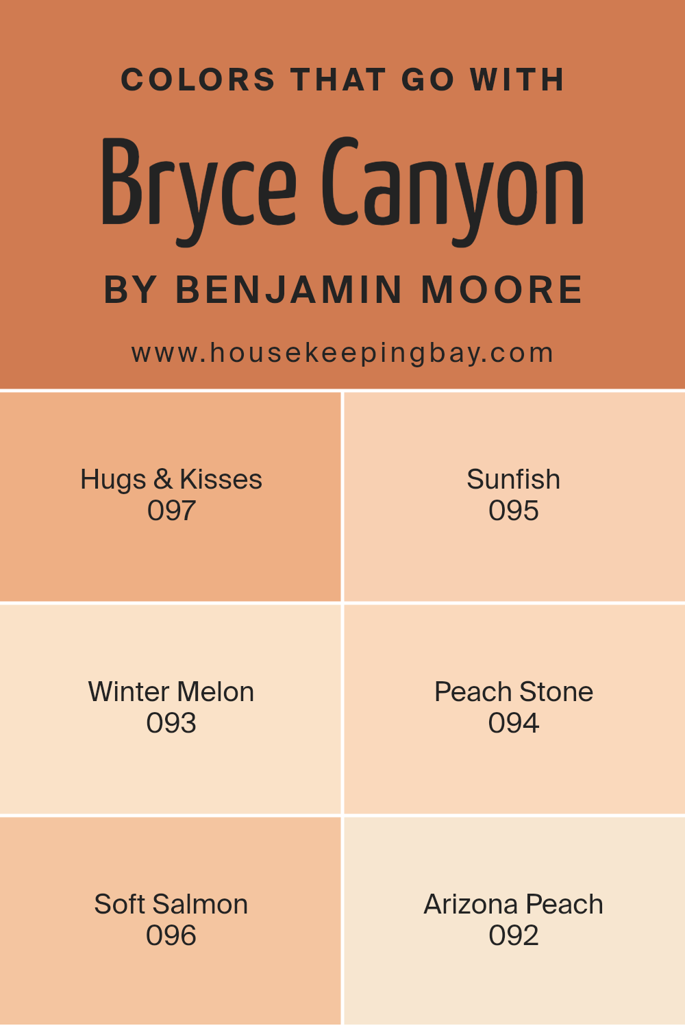
Colors that Go With Bryce Canyon 098 by Benjamin Moore
Selecting the right colors to complement Bryce Canyon 098 by Benjamin Moore can dramatically affect the ambiance and mood of a space. When chosen wisely, such companion colors can create a smooth visual flow and enhance the overall aesthetic appeal of your room.
Colors like Hugs & Kisses 097 and Sunfish 095, for instance, play a crucial role in achieving this harmony. Hugs & Kisses is a gentle pink that softens the robustness of Bryce Canyon 098, adding a soothing touch to interiors, while Sunfish offers a refreshing splash of yellow, instilling a cheerful radiance that brightens the room and offers a lively contrast.
The selection continues with other harmonious hues; Winter Melon 093 and Peach Stone 094 contribute their unique tones to the palette. Winter Melon provides a subtle hint of green that complements the earthy red of Bryce Canyon, setting a relaxed and welcoming atmosphere.
Peach Stone, on the other hand, echoes the warm undertones of Bryce Canyon with its soft, peachy tint, ensuring a cohesive look throughout the space. Additionally, Soft Salmon 096 and Arizona Peach 092 complement Bryce Canyon with touches of understated elegance.
Soft Salmon infuses spaces with a gentle, rosy glow, while Arizona Peach brings a slightly bolder peach nuance that enriches the visual experience, proving how an intelligent selection of auxiliary colors can proficiently accentuate the beauty of a primary shade like Bryce Canyon 098.
You can see recommended paint colors below:
- 097 Hugs & Kisses
- 095 Sunfish
- 093 Winter Melon
- 094 Peach Stone
- 096 Soft Salmon
- 092 Arizona Peach
housekeepingbay.com
How to Use Bryce Canyon 098 by Benjamin Moore In Your Home?
Bryce Canyon 098 by Benjamin Moore is a warm, inviting paint color that brings a rich, earthy tone into your home. This hue resembles the natural beauty of red rock landscapes, making it perfect for creating a cozy and grounded atmosphere. Bryce Canyon 098 works well in living rooms or dining areas where you want to introduce warmth and a sense of welcoming.
Pairing this deep, terracotta color with neutral shades like sandy beiges or creamy whites can make your space feel balanced and harmonious. It’s also ideal for accent walls to add a subtle yet impactful splash of color without overwhelming the room. For a rustic look, consider using Bryce Canyon 098 alongside natural materials like wood or stone.
Using this color in areas that receive a lot of light can highlight its depth and variations, enhancing the overall ambiance. This makes it a great choice for rooms where you gather, relax, or entertain, effectively making the space feel more intimate and comfortable.
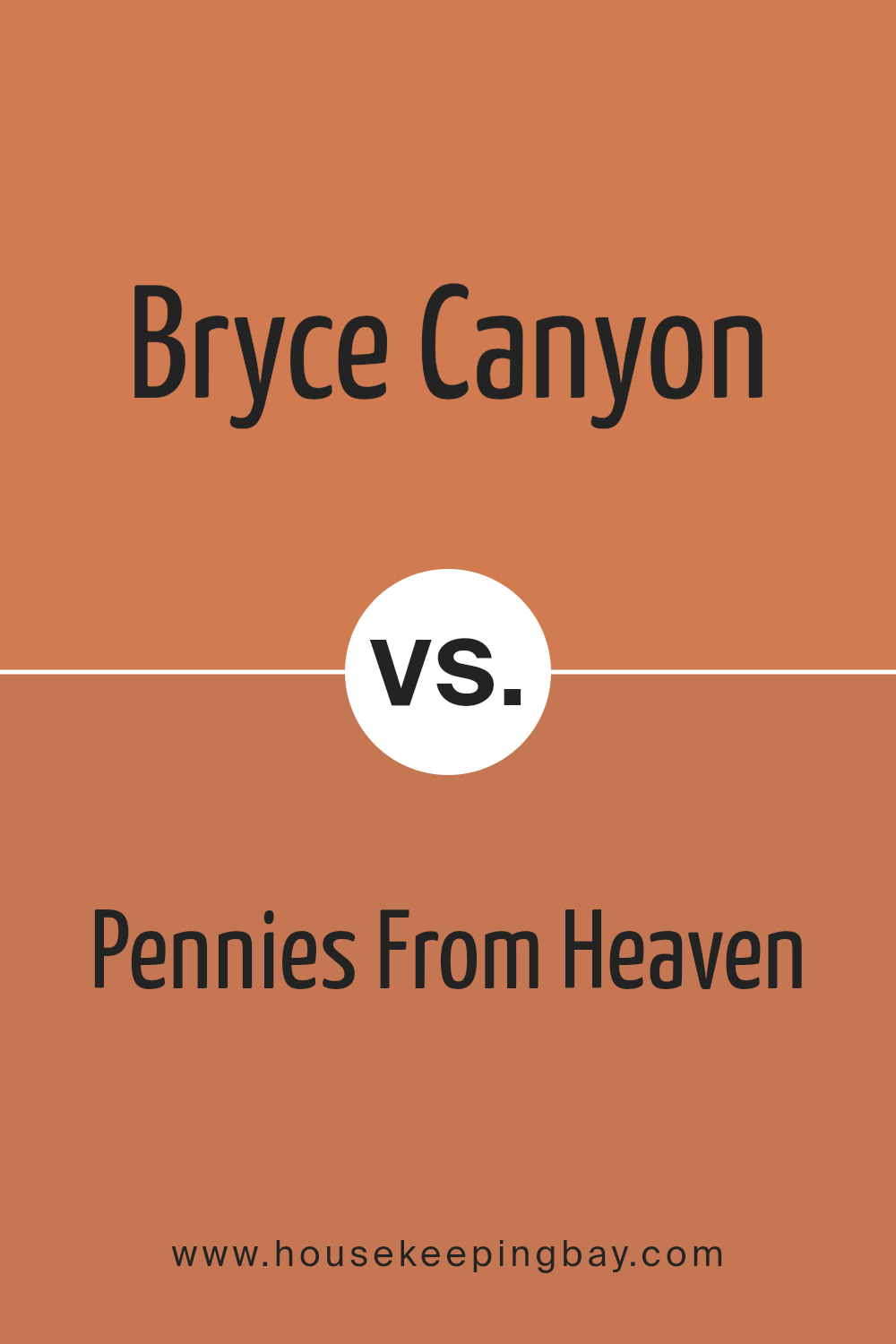
Bryce Canyon 098 by Benjamin Moore vs Pennies From Heaven 063 by Benjamin Moore
“Bryce Canyon 098” by Benjamin Moore is a warm, deep orange that resembles the natural colors found in its namesake national park. This rich hue brings vibrant energy into a space, making it feel cozy and inviting. It’s an excellent choice for areas where you want to add a touch of warmth.
“Pennies from Heaven 063,” on the contrary, is a subtle, dusky rose shade. Its soft, muted quality can help create a soothing, relaxed atmosphere, ideal for bedrooms or spaces meant for unwinding.
While Bryce Canyon 098 adds vibrancy and a lively spirit with its bold orange tones, Pennies from Heaven 063 offers a gentle, calming presence with its understated pink. Each color sets a very different mood, making them suitable for distinct purposes or rooms based on the ambiance you wish to achieve.
You can see recommended paint color below:
- 063 Pennies From Heaven
housekeepingbay.com
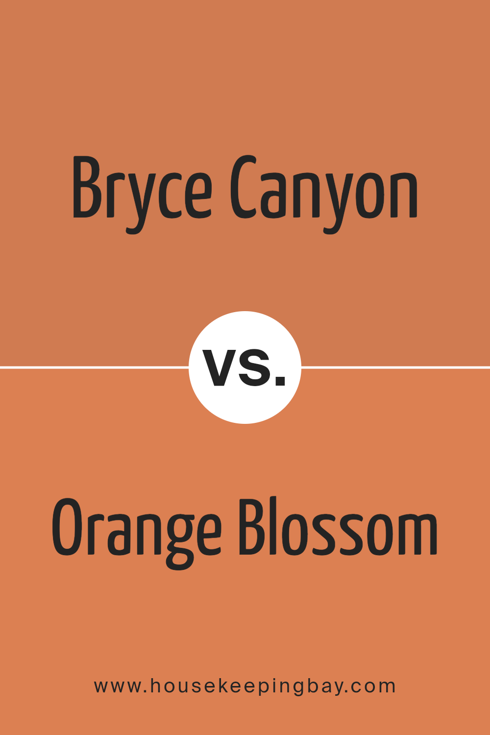
Bryce Canyon 098 by Benjamin Moore vs Orange Blossom 2168-30 by Benjamin Moore
The color Bryce Canyon 098 by Benjamin Moore is a rich, deep rust hue that draws its inspiration from the naturally occurring shades found in its namesake national park. This warm tone exudes a cozy and inviting atmosphere, making it ideal for spaces where comfort is key, such as living rooms or reading areas.
On the contrary, Orange Blossom 2168-30 is a vibrant, energetic orange. It is brighter and more saturated, offering a lively splash of color that can instantly brighten up a space. This hue works well in areas that benefit from a playful, cheerful accent, such as kitchens, playrooms, or any space needing a pop of enthusiasm.
While Bryce Canyon 098 lends a more subdued and earthy vibe, Orange Blossom 2168-30 brings an exciting burst of energy. Each color serves different aesthetic purposes and can significantly influence the mood and style of a room.
You can see recommended paint color below:
- 2168-30 Orange Blossom
housekeepingbay.com
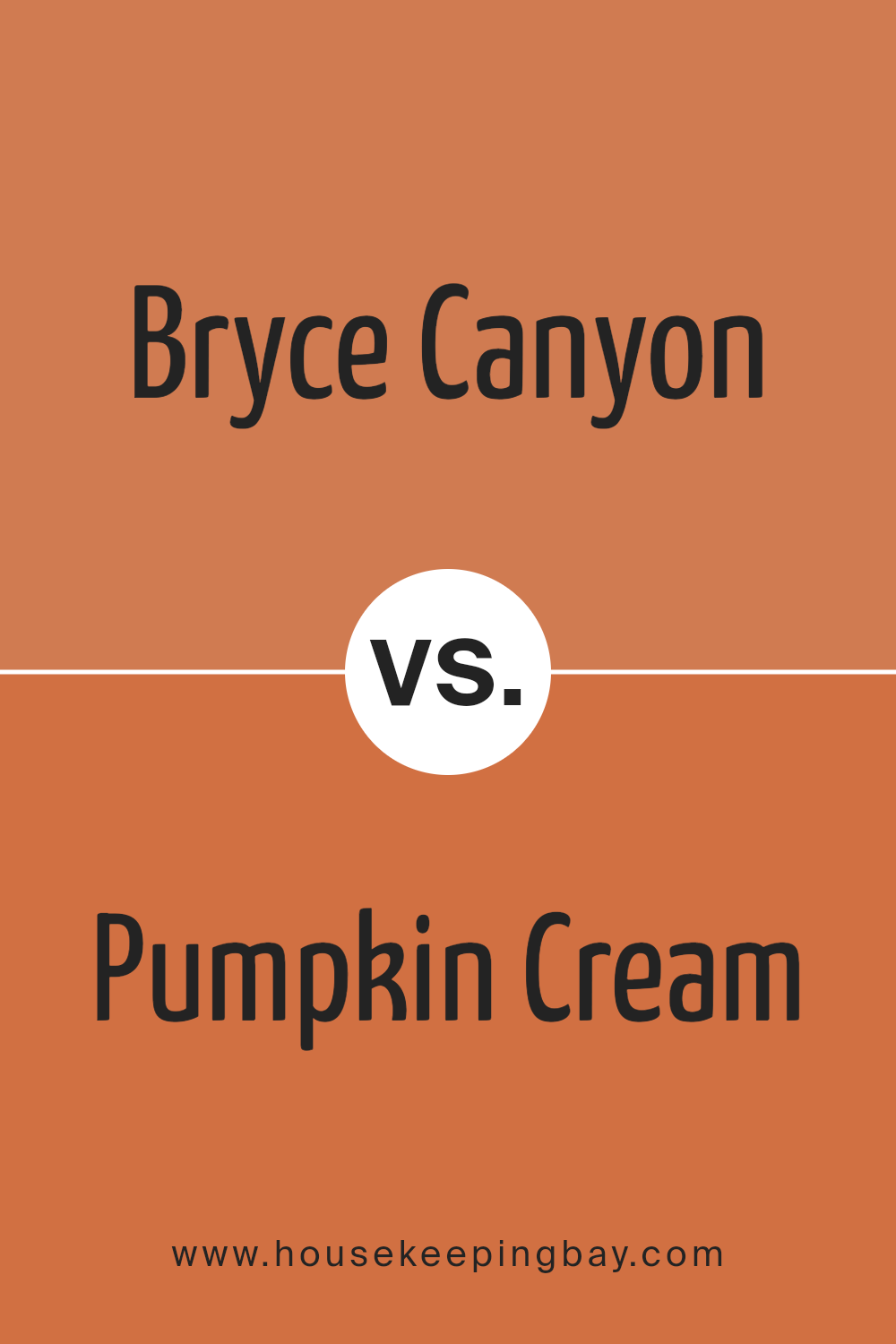
Bryce Canyon 098 by Benjamin Moore vs Pumpkin Cream 2168-20 by Benjamin Moore
Bryce Canyon 098 and Pumpkin Cream 2168-20, both by Benjamin Moore, offer warm, inviting hues; however, they have distinct undertones and brightness levels. Bryce Canyon 098 presents a deeper, richer red-orange that resembles the natural rock formations found in its namesake park. It’s a bold choice, likely to make a strong statement in any space.
In contrast, Pumpkin Cream 2168-20 is a vibrant, lighter orange. It mimics the cheerful color of autumn pumpkins, providing a sense of warmth and coziness. This hue is softer and more versatile for various settings compared to the intense depth of Bryce Canyon 098.
Both colors can create a welcoming atmosphere, but their impact differs significantly depending on the room’s size, lighting, and intended mood. Bryce Canyon 098 works well in spaces where you want to create a focal point or evoke drama, while Pumpkin Cream 2168-20 is better suited for creating a light, airy feel.
You can see recommended paint color below:
- 2168-20 Pumpkin Cream
housekeepingbay.com
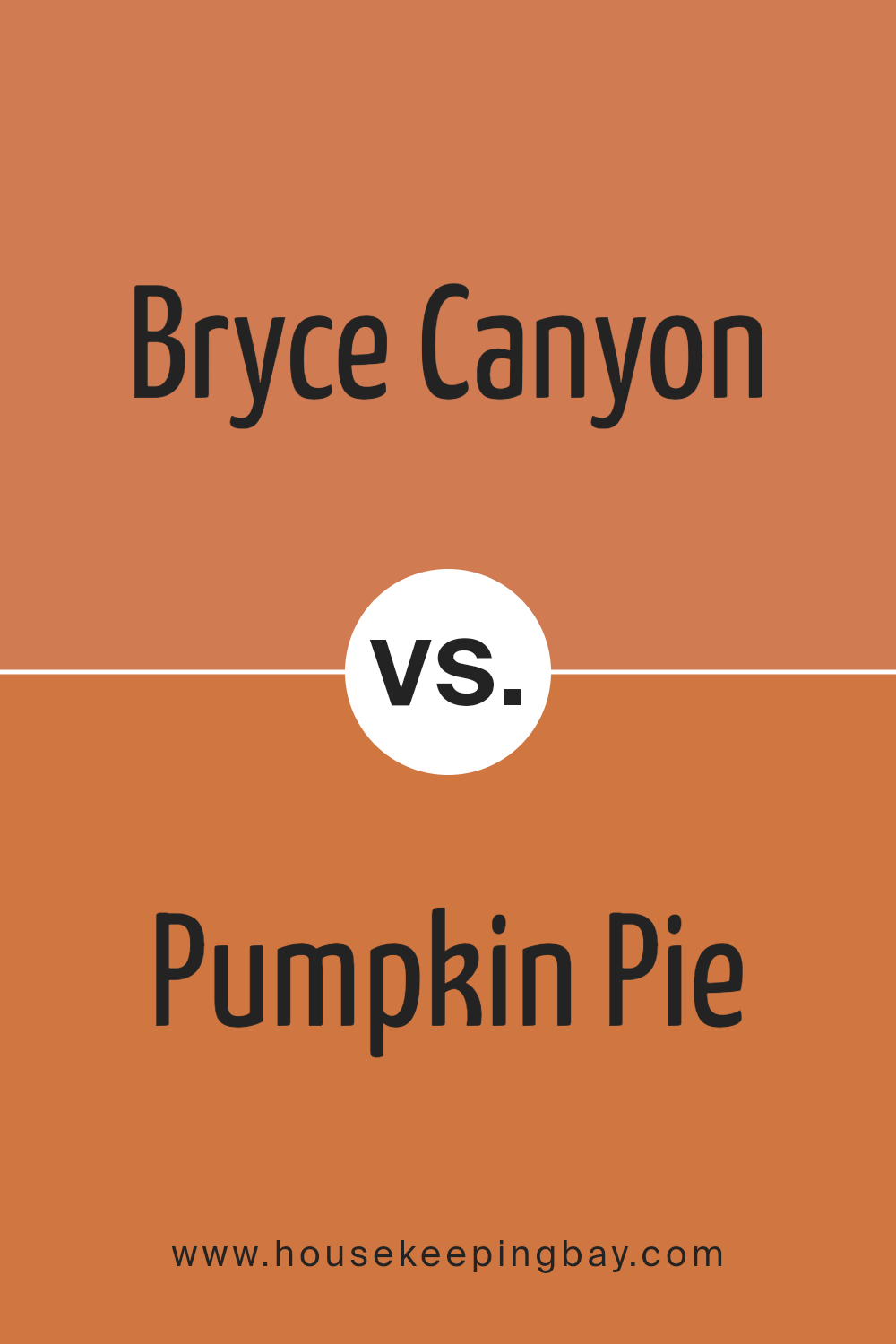
Bryce Canyon 098 by Benjamin Moore vs Pumpkin Pie 2167-20 by Benjamin Moore
Bryce Canyon 098 by Benjamin Moore is a warm terracotta shade that subtly invokes the natural beauty of its namesake. This color has a soft, earthy feel that is welcoming and soothing, making it great for spaces where comfort is key, such as living rooms or bedrooms. It pairs well with natural materials like wood and leather.
Pumpkin Pie 2167-20, also by Benjamin Moore, is a bolder choice. It is a vibrant, deep orange that radiates warmth and energy. This shade is perfect for creating a focal point in a space or adding a pop of color in an otherwise neutral setting. It works well in areas that benefit from a sense of enthusiasm, like kitchens or dining areas.
Both colors offer warmth, but where Bryce Canyon is soft and subtle, Pumpkin Pie is lively and assertive. Depending on your decor goals—whether you aim for a gentle backdrop or a spirited statement—either color could enhance your space beautifully.
You can see recommended paint color below:
- 2167-20 Pumpkin Pie
housekeepingbay.com
As I wrap up my thoughts on the article about Benjamin Moore’s 098 Bryce Canyon paint, I want to share a few final reflections. This paint shade is not just another addition to Benjamin Moore’s extensive palette; it represents a thoughtful choice for anyone wishing to bring a sense of warmth and nature into their home. The subtle tones found in Bryce Canyon can create a cozy atmosphere, ideal for spaces where comfort is paramount, like living rooms and bedrooms.
What really stands out for me is how versatile this color is. Whether you’re aiming for a rustic feel or an elegant look, Bryce Canyon has the flexibility to fit within various styles and aesthetics. It pairs beautifully with a wide range of decor elements, from wood finishes to modern metals, allowing for personal creativity in decorating.
For those who appreciate a paint that reflects the natural world and offers a timeless appeal, Bryce Canyon by Benjamin Moore could be a perfect choice. It offers a unique blend of warmth that is often sought but not always found in interior paints. Whether you’re redoing a single room or planning a larger renovation, consider how this inviting hue could enhance your space.
In conclusion, 098 Bryce Canyon is more than just a color; it’s an opportunity to create a space that feels both welcoming and inspired by the natural world. It’s definitely a paint color worth considering on your next visit to the paint store.
housekeepingbay.com
