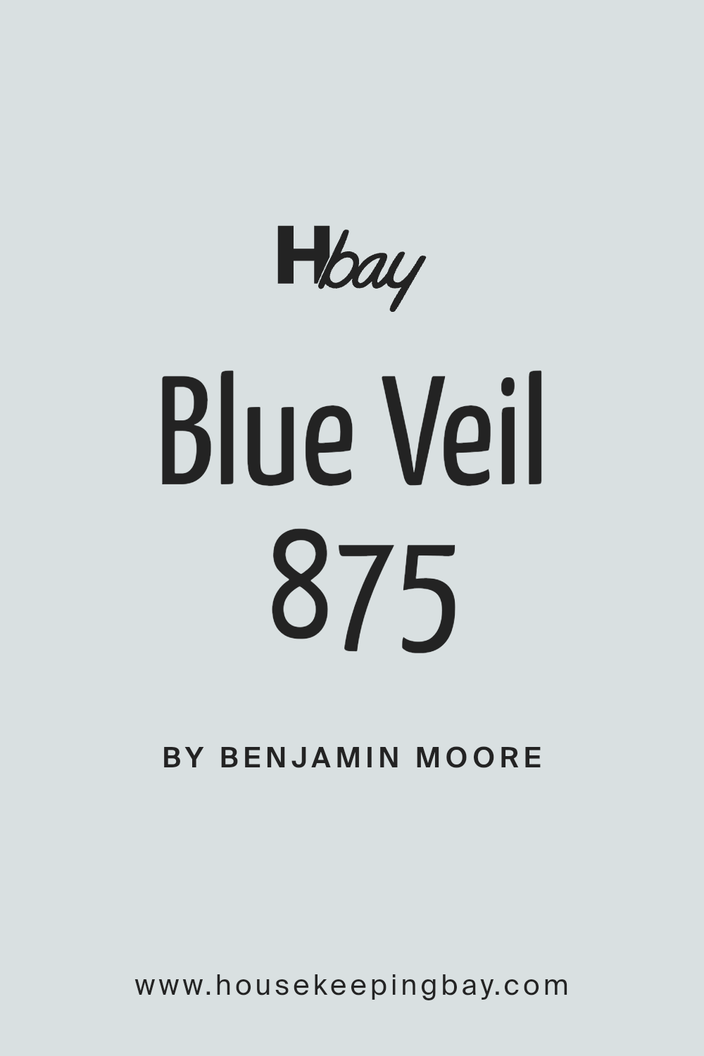
Blue Veil 875 by Benjamin Moore
Unlock the Magic of Your Favorite New Shade
When you think about finding finally the new paint color, you might feel a bit overwhelmed by all the choices out there. Let me introduce you to a shade that could be just what you’re looking for: 875 Blue Veil by Benjamin Moore.
This color has a soft, subtle presence that brings a calm and gentle atmosphere to any space. It’s like a breath of fresh air for your walls, making it perfect for creating a relaxing vibe in rooms like your bedroom or living room. Whether you have a modern aesthetic or lean towards a more traditional style, Blue Veil has a way of fitting in seamlessly.
It pairs beautifully with a wide range of decor, from sleek and contemporary pieces to rustic, vintage charms. Plus, it works well with various accents and furnishings, allowing you to maintain a cohesive look effortlessly.
Give it a try, and see how it can rejuvenate your space with its gentle charm.
via benjaminmoore.com
What Color Is Blue Veil 875 by Benjamin Moore?
Blue Veil 875 by Benjamin Moore is a soft, pastel shade of blue that exudes a gentle serenity. This subtle, airy hue carries an ethereal quality, making it perfect for creating a peaceful and inviting atmosphere in any space. It pairs beautifully with light, natural materials such as linen, cotton, and light woods, enhancing its breezy quality.
This color works exceptionally well in interior styles that prioritize a calming and restful environment. Coastal, Scandinavian, and minimalist designs can all benefit from the inclusion of Blue Veil 875, as it aligns with their aesthetics of simplicity and lightness. It is particularly effective in areas meant for relaxation such as bedrooms and bathrooms, where its soothing effect is most appreciated.
Additionally, Blue Veil 875 can be effectively combined with gentle textures and materials. Soft wool throws, plush cushions, and delicate ceramics complement its subtle nature, helping to create a cohesive look. For a contrasting effect, pairing this light blue with dark woods or metallic finishes like brass or copper can introduce an appealing visual balance, making any room feel well-rounded and thoughtfully designed.
With its versatile appeal, Blue Veil 875 is a dependable choice for adding a breath of fresh air to any interior project.
housekeepingbay.com
Is Blue Veil 875 by Benjamin Moore Warm or Cool color?
Blue Veil 875 by Benjamin Moore is a soft, subtle shade that adds a serene and peaceful touch to a room. This light blue color has a hint of gray, making it versatile and easy to pair with various decor styles.
Blue Veil 875 helps create a calming atmosphere, ideal for spaces like bedrooms and bathrooms where relaxation is key. Its muted tone also means it serves as an excellent background color; it doesn’t overpower the room but instead complements other features and colors, such as furniture and art.
Because of its crisp and airy feel, Blue Veil 875 can make small spaces appear larger and more inviting. It works well with natural light, reflecting it to brighten the environment gently. This color also pairs well with crisp whites and rich wood tones, offering balance and a soothing aesthetic without feeling cold or too stark. It’s a smart choice for those wishing to achieve a peaceful and balanced home environment.
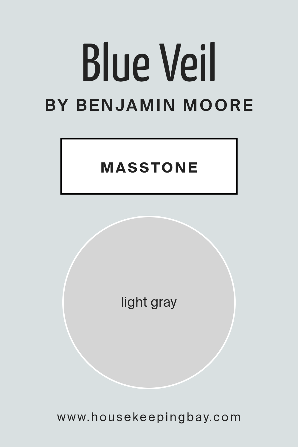
What is the Masstone of the Blue Veil 875 by Benjamin Moore?
Blue Veil 875 by Benjamin Moore is a gentle shade with a masstone of light gray, coded as #D5D5D5. This subtle gray hue gives it a soft and soothing presence in any room. Due to its light and neutral base, Blue Veil 875 seamlessly blends with a wide array of decor styles and colors.
It’s an excellent choice for creating a calm and relaxed environment in homes. Whether used in living rooms, bedrooms, or bathrooms, this color provides a quiet backdrop that complements furnishings and artwork without overwhelming them.
Its lightness helps to make small spaces appear larger and more open, which is particularly beneficial in homes with limited square footage. Additionally, the neutrality of Blue Veil 875 means it’s versatile through all seasons, accommodating any changes in decor with ease. This paint color is ideal for homeowners looking for a peaceful and adaptable color scheme.
housekeepingbay.com
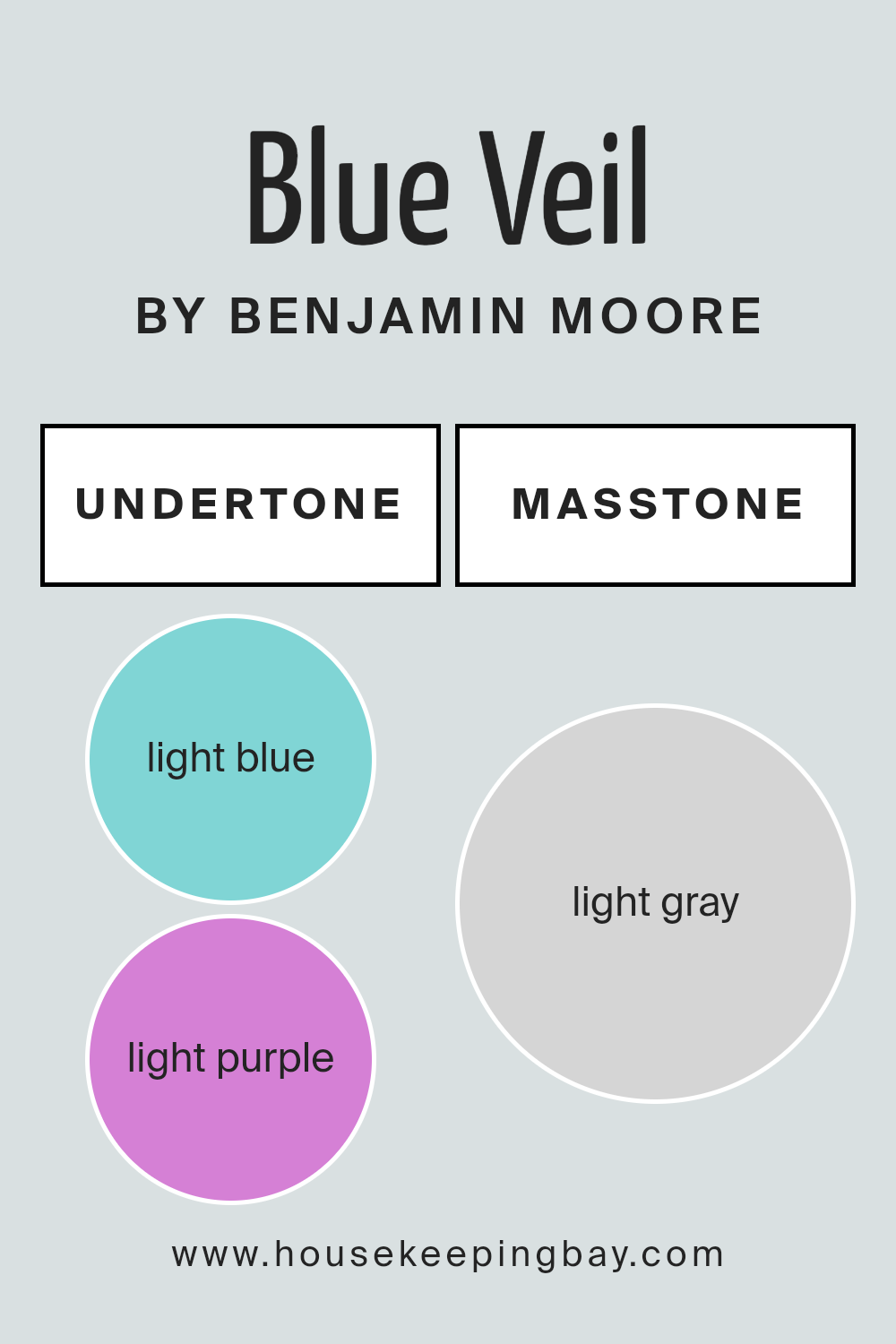
Undertones of Blue Veil 875 by Benjamin Moore
Blue Veil 875 by Benjamin Moore is a complex color with a palette of cool and soft undertones that subtly influence its appearance in different lighting conditions. Understanding the undertones—light blue, light purple, pale yellow, lilac, mint, pale pink, and grey—is key to using this paint color effectively in home décor.
Undertones are underlying hints of color that, despite being subtle, significantly impact the overall look of the paint once applied to walls. For example, in natural light, Blue Veil 875 might lean towards its light blue or lilac undertones, giving a soothing cool effect, ideal for creating a peaceful bedroom or bathroom.
In artificial lighting, the pale yellow or pale pink undertones might become more noticeable, making the room feel warmer. The variety of undertones also means that Blue Veil 875 can interact differently with other colors and furnishings in a room. For instance, if the room has lots of natural light and light wood furniture, the mint and light blue undertones might make the space feel airy and open. Conversely, in rooms with less light or darker furniture, the grey undertone can be more pronounced, giving a more grounded, calm feel.
Thus, considering the undertones of Blue Veil 875 is crucial when planning your interior spaces, as it allows for a more informed decision on how this color will integrate with the rest of your decor elements, influencing the atmosphere of the room.
housekeepingbay.com
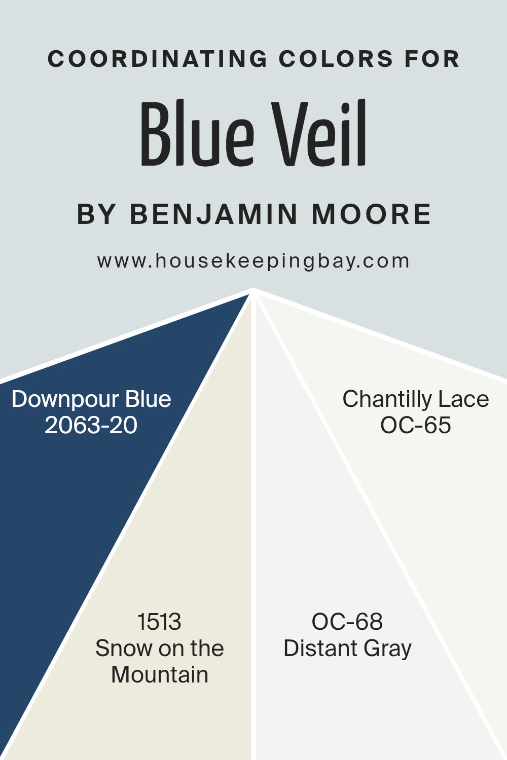
Coordinating Colors of Blue Veil 875 by Benjamin Moore
Coordinating colors are hues that complement each other when used together in a space, creating a harmonious and balanced look. These special tones can either contrast or closely match a primary color to achieve dynamic or subtle room ambiance.
For instance, when working with a soft primary color, such as Blue Veil 875 by Benjamin Moore, the palette can be coordinated with shades that balance its cool subtlety. By choosing the right coordinating hues, the overall effect in any room becomes cohesive and visually appealing.
Downpour Blue 2063-20 is a deeper, more saturated hue that beautifully offsets the lightness of Blue Veil 875, providing a sophisticated touch when used in accents or feature walls. Snow on the Mountain 1513 serves a softer role, offering a slight variation with its muted green undertone that pairs effortlessly with blue shades. Distant Gray OC-68 is nearly neutral, but it carries a faint undertone of blue to keep the connection with Blue Veil 875, thus ideal for creating a gentle gradient in color themes.
Lastly, Chantilly Lace OC-65 is a bright, clean white that serves as a crisp contrast to Blue Veil 875, effectively making the space feel more open and airy. These combinations work together to set a desired tone and mood in any room.
You can see recommended paint colors below:
- 2063-20 Downpour Blue
- 1513 Snow on the Mountain
- OC-68 Distant Gray
- OC-65 Chantilly Lace
housekeepingbay.com
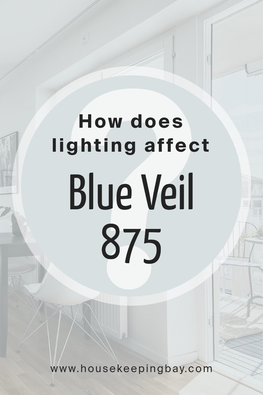
How Does Lighting Affect Blue Veil 875 by Benjamin Moore?
Lighting significantly impacts how we perceive colors. The type of light, whether natural or artificial, can change how a color appears in different environments. For instance, Blue Veil 875 by Benjamin Moore might show varied tones depending on the light exposure in a room.
In natural light, colors can look very different throughout the day. Blue Veil 875 under natural light appears softer and more delicate. It reflects the natural brightness, giving the room a gentle and open feel. This shift is especially noticeable as the daylight changes from dawn to dusk.
Artificial light, such as LED or incandescent bulbs, can alter how Blue Veil 875 is viewed. Warmer lights tend to add a yellowish tint, making the blue appear slightly greener. Cooler lights, however, keep the blue more true to its original hue, maintaining a crisp and fresh look.
Room orientation also affects the appearance of this color:
– North-faced rooms: These rooms get less direct sunlight, which can make Blue Veil 875 look more muted and shadowy. The cooler, indirect light may make the paint appear slightly darker than expected.
– South-faced rooms: These rooms benefit from abundant sunlight most of the day, which can brighten Blue Veil 875, making it look vibrant and lively. The natural light enhances the paint’s true color.
– East-faced rooms: Morning light in these rooms is bright and warm, making Blue Veil 875 look very inviting in the morning while turning slightly cooler as the day progresses.
– West-faced rooms: Evening light brings warmth and richness to Blue Veil 875, highlighting warmer tones as the sun sets.
Using Blue Veil 875 in different settings requires considering the quality of light each space receives to maintain the color’s true essence and impact.
housekeepingbay.com
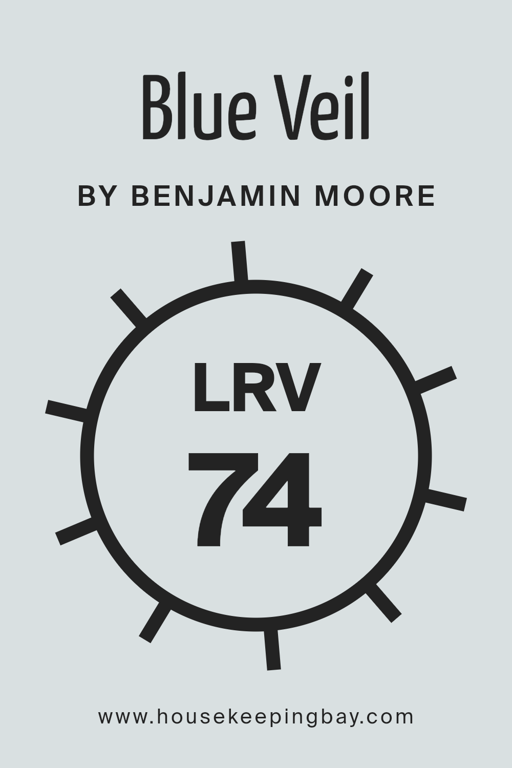
What is the LRV of Blue Veil 875 by Benjamin Moore?
LRV stands for Light Reflectance Value, a measurement indicating the amount of visible and usable light that reflects from or absorbs into a painted surface. Essentially, it measures the brightness of paint once it’s on your wall. LRV values range from 0 to 100, where 0 is pure black, absorbing all light, and 100 is pure white, reflecting all light back.
This metric helps in choosing paint colors that will make your rooms feel larger or cozier depending on the value; higher LRVs can make spaces appear more open and airy, while lower LRVs tend to make them feel smaller and more intimate.
Specifically, regarding the color Blue Veil 875 by Benjamin Moore with an LRV of 73.8, this high value suggests a light color that will reflect much of the light hitting it. This means that the color will help keep the room feeling bright and spacious.
Using such a color in smaller or darker spaces can be particularly beneficial, as it aids in creating an illusion of a larger, brighter space. Moreover, the light and reflective quality of Blue Veil 875 can help in hiding smudges and marks, which might be more visible on darker, lower LRV colors.
housekeepingbay.com
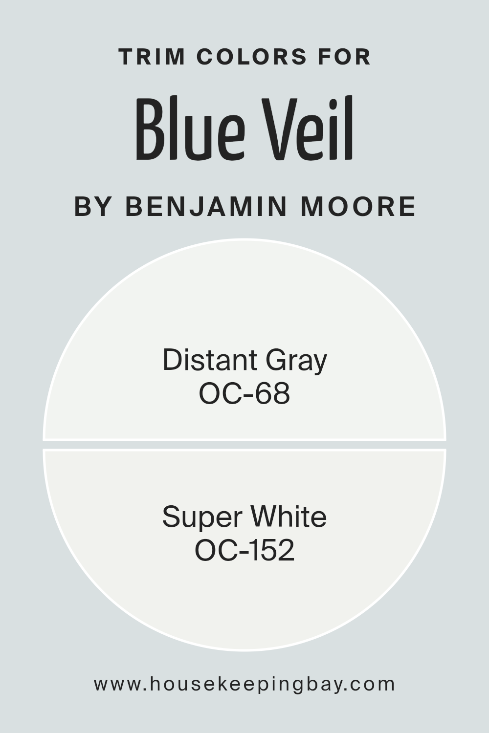
What are the Trim colors of Blue Veil 875 by Benjamin Moore?
Trim colors are specific shades used for detailing around features like windows, doors, and baseboards in a space to accentuate and complement the wall colors. In the case of Blue Veil 875 by Benjamin Moore, selecting the right trim color is essential to highlight its subtle tones and ensure that the walls stand out properly.
OC-68 Distant Gray and OC-152 Super White are great options for trim colors when paired with Blue Veil 875. These colors help frame the walls, making the room appear more polished and cohesive.
OC-68 Distant Gray offers a gentle, muted tone that harmonizes well with the softness of Blue Veil 875. This color is light enough not to overpower the main hue but still defines the space effectively, providing a subtle boundary that enriches the overall aesthetic of the room.
On the other hand, OC-152 Super White is a crisp, clean shade that brings a fresh and vibrant contrast. This brighter trim option creates a clear delineation between the walls and trim, giving a lively lift to the serene backdrop provided by Blue Veil 875.
You can see recommended paint colors below:
- OC-68 Distant Gray
- OC-152 Super White
housekeepingbay.com
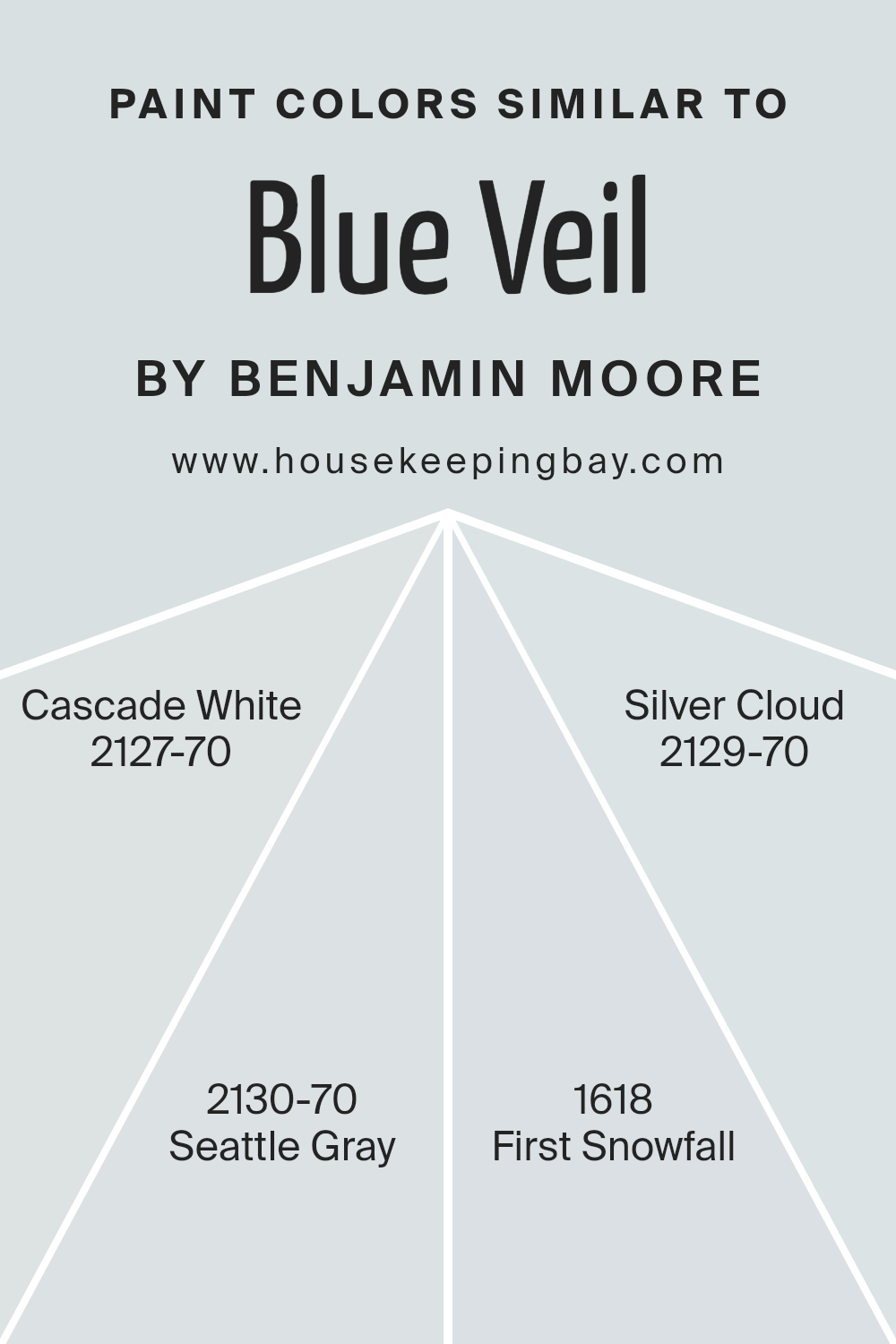
Colors Similar to Blue Veil 875 by Benjamin Moore
Choosing similar colors can greatly enhance the cohesiveness and aesthetic appeal of a space. When colors like Blue Veil 875 by Benjamin Moore are paired with closely related shades, the overall effect is both soothing and harmonious.
Similar colors, such as Cascade White, Seattle Gray, First Snowfall, and Silver Cloud, belong to a unified palette that shares common undertones, making them ideal for creating a subtle yet impactful visual flow in any room. These colors work together by subtly varying saturation and brightness, which allows for a visually layered approach without the risk of clashing.
Cascade White 2127-70 offers a gentle hint of color, very light and airy, providing a soft backdrop that complements the deeper tones of Blue Veil 875. Seattle Gray 2130-70 brings a slightly more pronounced gray hue, offering a neutral base that enriches spaces with a serene feeling.
First Snowfall 1618 has a fresh, crisp quality, reminiscent of a bright winter day, making it perfect for brightening spaces while maintaining a unified look with Blue Veil 875.
Lastly, Silver Cloud 2129-70 offers a touch of silver, lending an airy lightness that can make any room feel more open and inviting. The use of these similar colors ensures a fluid visual experience, promoting a sense of continuity and balance throughout the space.
You can see recommended paint colors below:
- 2127-70 Cascade White
- 2130-70 Seattle Gray
- 1618 First Snowfall
- 2129-70 Silver Cloud
housekeepingbay.com
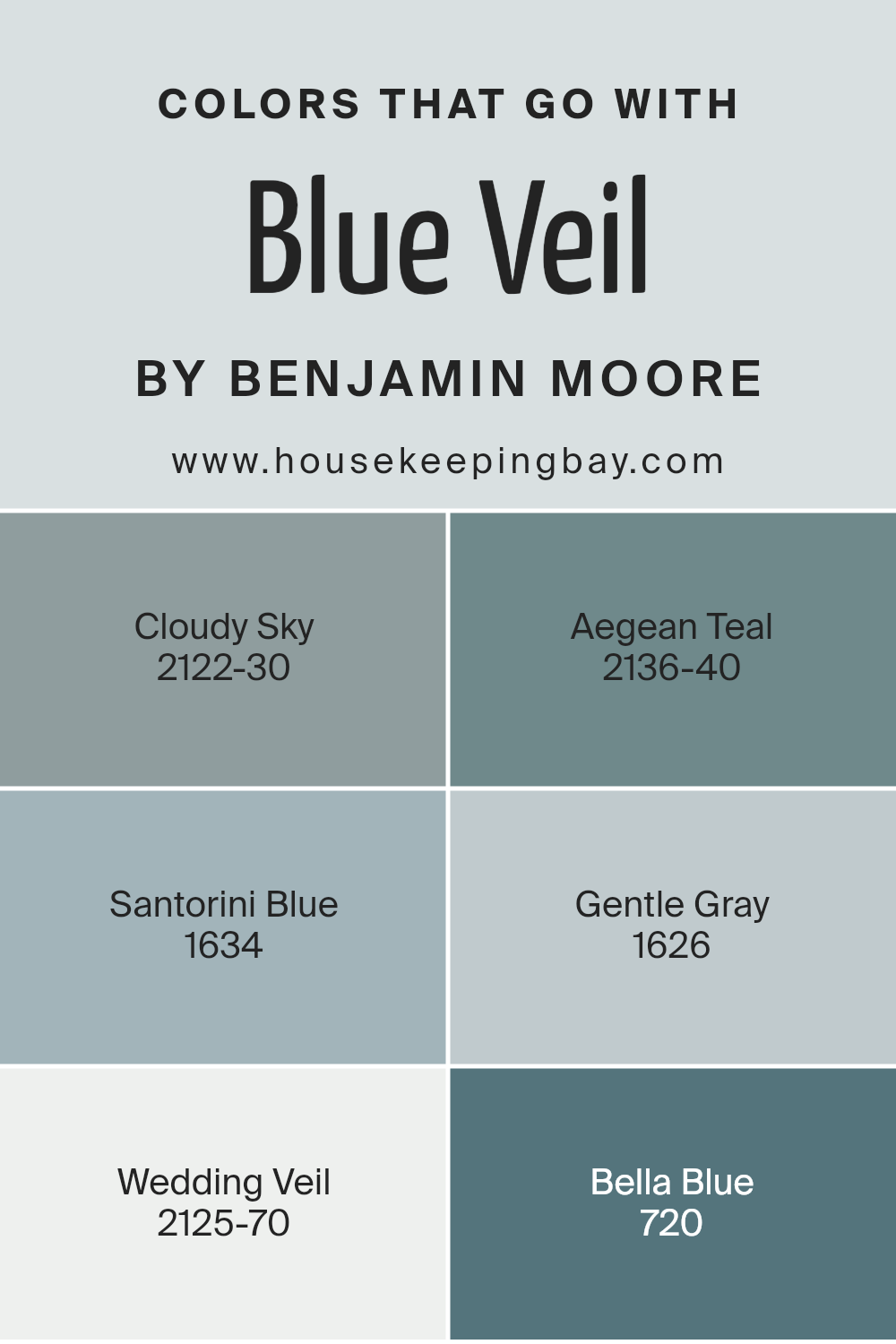
Colors that Go With Blue Veil 875 by Benjamin Moore
Choosing the right colors that pair harmoniously with Blue Veil 875 by Benjamin Moore is essential because they set the mood and tone of a space. Complementary colors can enhance the overall aesthetic and create a cohesive look.
One such color, Cloudy Sky 2122-30, brings a robust and dynamic gray that can offer a solid foundation for Blue Veil, making it stand out without overwhelming the senses. Aegean Teal 2136-40 adds a touch of sophistication with its rich, deep hue that combines blue and green, providing a refreshing contrast that is both soothing and lively.
Santorini Blue 1634 has the charm of the deep Grecian seas, providing a vibrant but serene backdrop that pairs nicely with the soft tones of Blue Veil. Gentle Gray 1626 offers a light and airy feel, its subtle tones creating a serene harmony that complements the softness of Blue Veil without creating a stark contrast. Wedding Veil 2125-70 is another excellent counterpart that acts almost like a spotlight, its very light, almost white hue accentuating the cooler tones of Blue Veil, thus enhancing the space with a feel of openness.
Lastly, Bella Blue 720 steps in with a slightly dusky persona that can add depth and interest, making the room feel more inviting and warm. These colors, when used together, can craft an inviting atmosphere that feels both personalized and balanced.
You can see recommended paint colors below:
- 2122-30 Cloudy Sky
- 2136-40 Aegean Teal
- 1634 Santorini Blue
- 1626 Gentle Gray
- 2125-70 Wedding Veil
- 720 Bella Blue
housekeepingbay.com
How to Use Blue Veil 875 by Benjamin Moore In Your Home?
Blue Veil 875 by Benjamin Moore is a soothing shade of blue that carries a sense of calm and subtlety. It’s a versatile color that fits beautifully in various parts of a home. In a bedroom, Blue Veil offers a peaceful backdrop, promoting a restful atmosphere ideal for relaxation and sleep. In living rooms, this color can help create a serene space, perfect for unwinding after a busy day. Bathrooms also benefit from Blue Veil’s airy vibe, making morning routines feel less hectic.
For those wanting a subtle touch of color, it can serve as an accent wall, paired with neutral tones like whites or grays, allowing furniture and decor pieces to stand out. Moreover, for a cohesive look throughout the house, pairing it with soft pastel colors like light pink or a gentle yellow can maintain a light, cheerful atmosphere.
Overall, Blue Veil 875 is a fantastic choice for anyone looking to introduce a peaceful blue into their home design, adaptable and gentle across many applications.
Blue Veil 875 by Benjamin Moore vs First Snowfall 1618 by Benjamin Moore
Blue Veil 875 and First Snowfall 1618 by Benjamin Moore are both calming colors but have distinct tones. Blue Veil 875 is a soft, muted blue with hints of gray, resulting in a peaceful and serene ambiance in any room. It reflects a soothing feel, making it perfect for areas where relaxation is key, such as bedrooms or bathrooms.
First Snowfall 1618, in contrast, is a very light gray with a touch of blue. This color is much lighter compared to Blue Veil and brings an airy and open feeling to spaces. It is ideal for making smaller rooms appear larger and brighter.
Overall, Blue Veil adds a more defined blue tone for a calming effect, while First Snowfall offers a lighter, more neutral backdrop that works well in various settings. Both colors can help to create a relaxed atmosphere but do so in slightly different ways, catering to personal preferences for shade intensity.
You can see recommended paint color below:
- 1618 First Snowfall
housekeepingbay.com
Blue Veil 875 by Benjamin Moore vs Silver Cloud 2129-70 by Benjamin Moore
Blue Veil 875 by Benjamin Moore is a soft, muted blue with a gentle, airy feel, reminiscent of a serene sky. It brings a calming effect to any space, ideal for bedrooms or bathrooms where relaxation is key. It pairs well with light, neutral furnishings, enhancing a clean and peaceful ambiance.
Silver Cloud 2129-70, also by Benjamin Moore, leans more towards a light gray, with a sleek and modern vibe. It serves as a versatile backdrop that complements both vibrant and subdued color palettes, making it suitable for living rooms or offices. This color delivers an understated elegance that works well with contemporary decor.
Both colors offer unique atmospheres; Blue Veil adds a whisper of color, while Silver Cloud provides a neutral canvas. Each color has its distinct charm, making them great choices for different purposes and spaces within a home.
You can see recommended paint color below:
- 2129-70 Silver Cloud
housekeepingbay.com
Blue Veil 875 by Benjamin Moore vs Seattle Gray 2130-70 by Benjamin Moore
Blue Veil 875 by Benjamin Moore is a soft, light blue that offers a serene and gentle feeling, perfect for creating a relaxed atmosphere in spaces aiming for calmness. Its airy quality can make small rooms feel larger and more open. The pale nature of Blue Veil makes it versatile for pairing with both dark and light accents, helping other colors in a room stand out.
Seattle Gray 2130-70 by Benjamin Moore, despite its name, presents a very subtle gray with hints of lavender, making it unique and slightly warmer than a typical gray. This color works well in areas that benefit from a sophisticated, yet cozy touch. It can serve as a neutral backdrop that complements bolder colors or works harmoniously with other soft tones for a more cohesive look.
Both colors offer their own distinct mood-setting capabilities with Blue Veil leaning towards a breezier feel, while Seattle Gray provides a subtle warmth, making each suitable for different decorating styles and preferences.
You can see recommended paint color below:
- 2130-70 Seattle Gray
housekeepingbay.com
Blue Veil 875 by Benjamin Moore vs Cascade White 2127-70 by Benjamin Moore
Blue Veil 875 by Benjamin Moore is a soft, muted blue with a hint of gray, giving it a soothing and gentle appearance. This color works well in spaces intended for relaxation, like bedrooms or bathrooms, as it promotes a calm and peaceful atmosphere. Its subtle tone pairs nicely with various decor styles, from contemporary to traditional.
In contrast, Cascade White 2127-70 by Benjamin Moore is a light, almost ethereal white with a touch of gray. It’s a versatile color that brightens up any room, making spaces appear larger and more open.
Ideal for living rooms or kitchens, it serves as a fresh, clean backdrop that complements more vibrant colors or can stand alone for a minimalist look.
Both colors promote a serene environment but offer different vibes. Blue Veil leans towards a cool, comforting blue shade, while Cascade White provides a neutral, expansive feel.
They work well together, offering balance and light when used in the same palette.
You can see recommended paint color below:
- 2127-70 Cascade White
housekeepingbay.com
The gentle hues of Blue Veil provide a fresh and airy feel to rooms, making it an ideal choice for those aiming to refresh their living environment. It’s particularly effective in spaces where calm and clarity are desired, such as bedrooms and bathrooms, where its soft presence fosters a soothing atmosphere.
Moreover, the adaptability of Blue Veil can’t be overstated. It pairs beautifully with various decor styles and color palettes, making it a versatile option for both modern and traditional homes. Whether used as a main color or an accent, it maintains its delicate charm without overwhelming surrounding elements.
Additionally, the quality of Benjamin Moore paints ensures that the color lasts, keeping its vibrancy and depth over time. This durability makes 875 Blue Veil not just a visually appealing choice but also a practical one for long-term interior planning.
To conclude, incorporating 875 Blue Veil into your home’s color scheme is more than just a change of shade; it’s a step toward creating a more serene and welcoming environment. Leveraging its potential can truly enhance the aesthetic and feel of your living spaces.
housekeepingbay.com
Ever wished paint sampling was as easy as sticking a sticker? Guess what? Now it is! Discover Samplize's unique Peel & Stick samples. Get started now and say goodbye to the old messy way!
Get paint samples


