Santorini Blue 1634 by Benjamin Moore
Calm Coastal Beauty in Every Shade
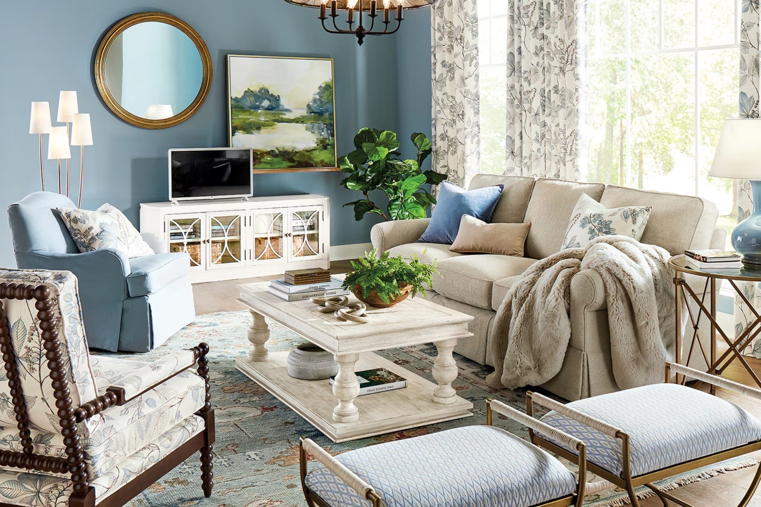
There’s something about the color blue that brings a sense of peace and calm. When I first encountered 1634 Santorini Blue by Benjamin Moore, I immediately felt that serene vibe. It reminds me of clear skies and gentle seas, creating a soothing atmosphere wherever it’s used.
This particular shade is not too bold, yet not too muted; it hits the perfect balance.
One of the things I appreciate about Santorini Blue is how adaptable it is. Whether I’m imagining it in a bedroom for a restful night’s sleep, in a living room for a relaxed environment, or even in a bathroom to create a spa-like retreat, it fits just right.
This blue pairs wonderfully with neutral tones like white or beige, as well as with warmer accents like yellows or creams.
Using Santorini Blue in a space feels like bringing a touch of nature indoors. It reminds me of the beauty of the natural world, like the gentle waves of the sea or a cloudless summer sky. If you’re trying to create a peaceful and inviting space, consider how this lovely shade can contribute.
It’s amazing how a color can evoke such positive feelings and memories, and Santorini Blue certainly does that for me.
via ballarddesigns.com
What Color Is Santorini Blue 1634 by Benjamin Moore?
Santorini Blue 1634 by Benjamin Moore is a serene and refreshing color. It resembles the calming hues of the Aegean Sea, offering a subtle blend of blue and gray. This creates a soothing backdrop for interiors, making it a versatile choice for any home.
In terms of interior styles, Santorini Blue works beautifully in coastal and nautical themes. It brings a light and airy feeling to a room, reminiscent of ocean breezes and seaside retreats. Additionally, this shade fits seamlessly into modern farmhouse designs, providing a soft contrast to rustic elements.
Its gentle tone also harmonizes with Scandinavian interiors, where simplicity and minimalism are key.
When it comes to pairing with materials and textures, Santorini Blue complements natural woods such as oak or pine, highlighting their warmth. It also pairs well with white-washed or distressed wood, creating a vintage or beachy vibe. Metals in matte or brushed finishes, like silver or pewter, look refined alongside this color.
Fabrics such as linen, cotton, or light wool blend beautifully, adding layers of comfort and coziness. For a bolder statement, accessories in mustard yellow or coral red can add a vibrant pop against this calm blue backdrop. Overall, Santorini Blue brings a peaceful and inviting energy to any space.
housekeepingbay.com
Is Santorini Blue 1634 by Benjamin Moore Warm or Cool color?
Santorini Blue 1634 by Benjamin Moore is a soft, calming shade of blue that can bring a serene feel to a home. This color, inspired by the beautiful views of Santorini, offers a gentle tone that can create a soothing atmosphere in any room.
When used in living spaces, Santorini Blue can make the area feel open and airy, giving a light and fresh vibe. It pairs well with neutral colors, such as whites, grays, and beiges, allowing it to blend seamlessly into various design styles. In bedrooms, this shade adds a peaceful touch, helping to create a restful environment.
In bathrooms, Santorini Blue can remind one of the sea, enhancing the soothing character of the space. Overall, this color brings a sense of calm and clarity, making it a good choice for anyone looking to add a touch of comfort and relaxation to their home decor.
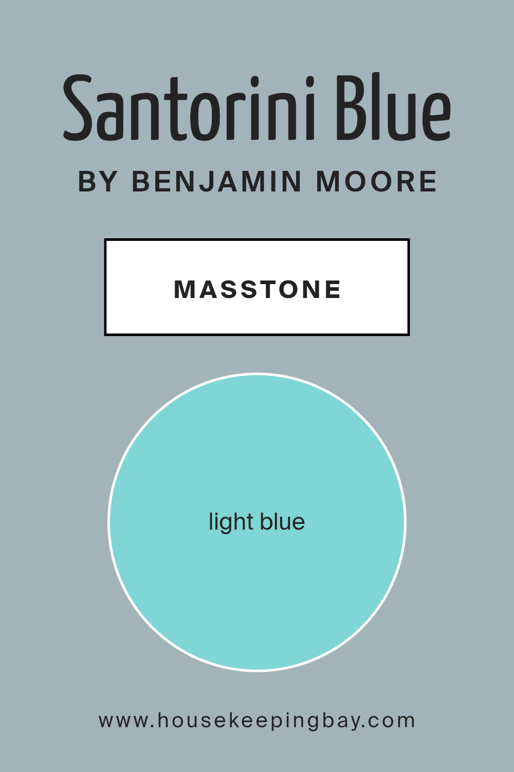
What is the Masstone of the Santorini Blue 1634 by Benjamin Moore?
Santorini Blue1634 by Benjamin Moore is a light blue color that brings a refreshing feel to any home. Its bright, airy tone can make a room feel open and cheerful. This color works well in spaces that need a touch of coziness and calmness without feeling engulfed.
The masstone of this color is light blue (#80D5D5), which provides a clear and vibrant appearance. It helps in spaces where you want to create a serene atmosphere, like bedrooms, bathrooms, or even living rooms. It pairs well with neutral colors, like whites, creams, or greys, adding a sense of balance.
Using this shade on walls can make small spaces seem larger, giving them an open and airy look. It can also reflect natural light beautifully, creating a soft glow during the day.
Santorini Blue1634 is versatile, uplifting the mood of any room while keeping it peaceful and inviting.
housekeepingbay.com
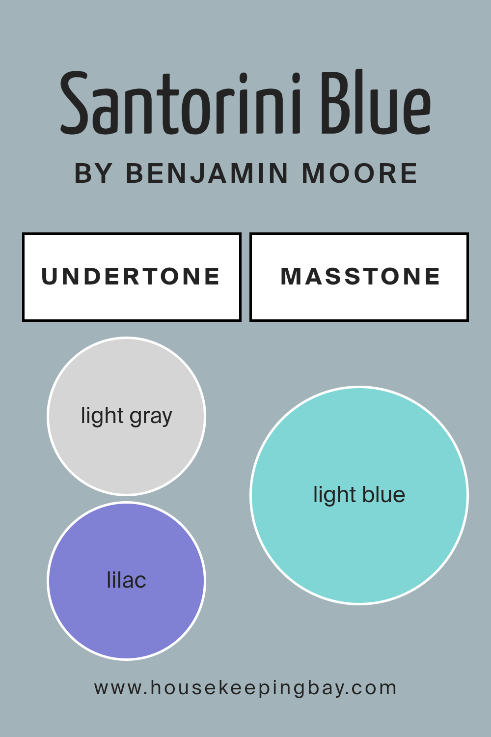
Undertones of Santorini Blue 1634 by Benjamin Moore
Santorini Blue 1634 by Benjamin Moore is a complex color with a rich array of undertones. It consists of light gray, lilac, mint, light purple, pale yellow, gray, pale pink, turquoise, blue, light turquoise, and dark turquoise. These subtle hints change how we perceive the color under different lighting conditions and when paired with other colors.
Undertones are the underlying colors that can impact the main hue. They can make a color appear warmer, cooler, more vibrant, or softer. For example, the presence of light gray and gray within Santorini Blue adds a neutral, calming effect.
Lilac and light purple infuse a slight soft warmth, while mint and pale yellow bring a subtle freshness. The touches of turquoise and blue contribute to its depth and vibrance, making it feel refreshing.
On interior walls, Santorini Blue can beautifully shift based on the surroundings. Natural sunlight can highlight its blue and turquoise undertones, giving spaces a lively feel. In contrast, subdued artificial lighting might draw out the presence of gray and lilac, creating a more sophisticated and muted look.
This dynamic nature allows it to suit various styles and moods in a home, from lively and fresh to calm and neutral.
housekeepingbay.com
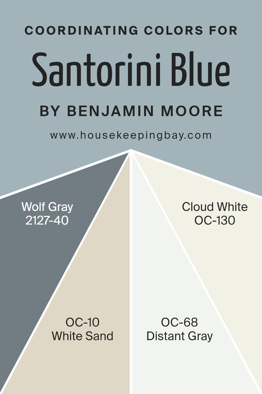
Coordinating Colors of Santorini Blue 1634 by Benjamin Moore
Coordinating colors work together to create a harmonious look in a space. They complement the main shade by either matching its tone or providing a subtle contrast. When paired with Santorini Blue 1634 by Benjamin Moore, these coordinating colors provide a balanced and cohesive design.
Santorini Blue is a refreshing and calming shade reminiscent of serene waters, making it a beautiful choice for a central color theme. Coordinating colors like Wolf Gray, White Sand, Distant Gray, and Cloud White add depth and interest without overwhelming the primary hue, creating a well-rounded palette.
Wolf Gray 2127-40 is a strong, medium gray with blue undertones, making it a perfect companion for Santorini Blue. It adds a touch of sophistication while maintaining a cool undertone. White Sand OC-10 offers a warm, beige-like quality that balances the cooler tones of the blue, adding warmth and coziness.
Distant Gray OC-68 is a crisp, clean white with a hint of softness, ideal for highlighting architectural features or trim without overpowering the main colors.
Finally, Cloud White OC-130 is a gentle, soft white that provides a versatile backdrop, enhancing the overall light and airy feel of the space.Together, these colors ensure a unified and inviting atmosphere.
You can see recommended paint colors below:
- 2127-40 Wolf Gray
- OC-10 White Sand
- OC-68 Distant Gray
- OC-130 Cloud White
housekeepingbay.com
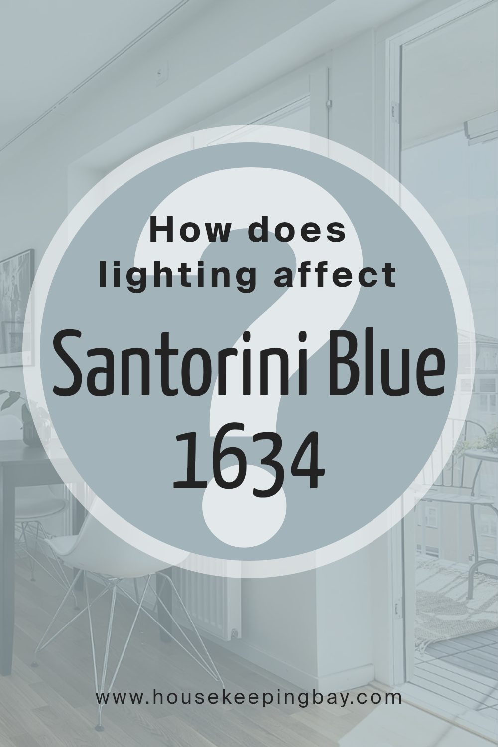
How Does Lighting Affect Santorini Blue 1634 by Benjamin Moore?
Lighting plays a big role in how we see colors. Different lights can make the same color look different. This is true for a paint color like Santorini Blue 1634 by Benjamin Moore.
In natural light, colors often look their most accurate. Natural light changes throughout the day. In a north-facing room, natural light is cool and soft. This can make Santorini Blue 1634 look a bit duller and cooler, giving off a more muted shade of blue. It might have a slight gray undertone, and can feel subtle and calm.
South-facing rooms get lots of direct sunlight. This light is warm and bright. In such spaces, Santorini Blue 1634 can feel brighter and more vibrant. The warm light can make the blue seem lively and rich.
East-facing rooms get bright, warm light in the morning. As the day goes on, the light becomes more subdued. In the morning, Santorini Blue 1634 might appear fresh and cheerful. In the afternoon, it turns softer and cooler.
West-facing rooms get the warmest light in late afternoon and evening. Here, Santorini Blue 1634 can start looking warmer and more dynamic later in the day. The light makes it feel cozy and inviting as the sun sets.
Artificial light, like LED or incandescent bulbs, can also change how Santorini Blue 1634 appears. Incandescent lights give off warm light, adding warmth to the color and making it feel cozier.
LED lights can be warm or cool. Cool LEDs might make the blue seem sharper and more refined, while warm LEDs add a comforting touch.
When picking a paint color, considering lighting is important. It affects how colors transform across different times and settings. Testing Santorini Blue 1634 in your space can help you see how the lighting affects it.
housekeepingbay.com
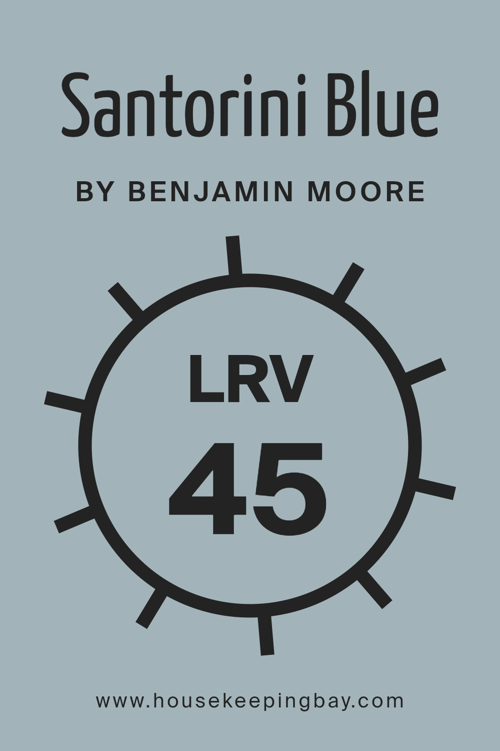
What is the LRV of Santorini Blue 1634 by Benjamin Moore?
LRV, or Light Reflectance Value, measures how much light a color reflects or absorbs. It’s on a scale from 0 to 100, where 0 means the color absorbs all light (black) and 100 means it reflects all light (white). Knowing the LRV helps predict how a color looks in different lighting.
Colors with high LRV make a room feel brighter and more spacious, while low LRV colors give a cozy, intimate feeling. Understanding LRV can guide you in picking colors that work well in your space, considering how much natural or artificial light you have.
For Santorini Blue 1634 by Benjamin Moore, with an LRV of 44.67, it sits near the middle of the scale. This means it reflects a moderate amount of light. In a room with lots of natural light, this color will look brighter and more vibrant. In a dimly lit room, it may appear a bit darker and more subdued. The LRV can help anticipate the effect Santorini Blue will have on your walls, ensuring that the mood you want to create aligns with the light available in your space.
It’s important to consider this balance so that the color feels just right in your home.
housekeepingbay.com
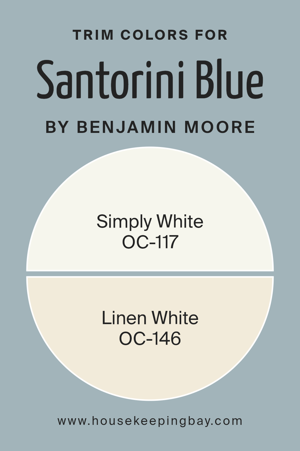
What are the Trim colors of Santorini Blue 1634 by Benjamin Moore?
Trim colors refer to the paint colors used on moldings, door frames, window casings, and other architectural details in a room. These colors complement and enhance the main wall color by providing contrast or a harmonious match. For a color like Santorini Blue 1634 by Benjamin Moore, choosing the right trim colors is essential to emphasize its vibrant and refreshing qualities.
Santorini Blue is reminiscent of clear skies and sea, and using trim colors like Simply White and Linen White helps to balance this bold hue. Simply White OC-117 brings a crisp, clean look that highlights the vividness of Santorini Blue, creating an airy and open feel.
On the other hand, Linen White OC-146 offers a softer touch with its warm undertones, adding a cozy vibe to the sharpness of Santorini Blue. It gently frames the blue, providing warmth and subtlety. Both trim colors serve to enhance Santorini Blue without overpowering its unique charm.
By selecting the appropriate trim colors, one can achieve a balanced, cohesive aesthetic that accentuates the architectural features and creates an inviting space. The right trim colors not only support the main color but also contribute to the overall mood and style of a room.
You can see recommended paint colors below:
housekeepingbay.com
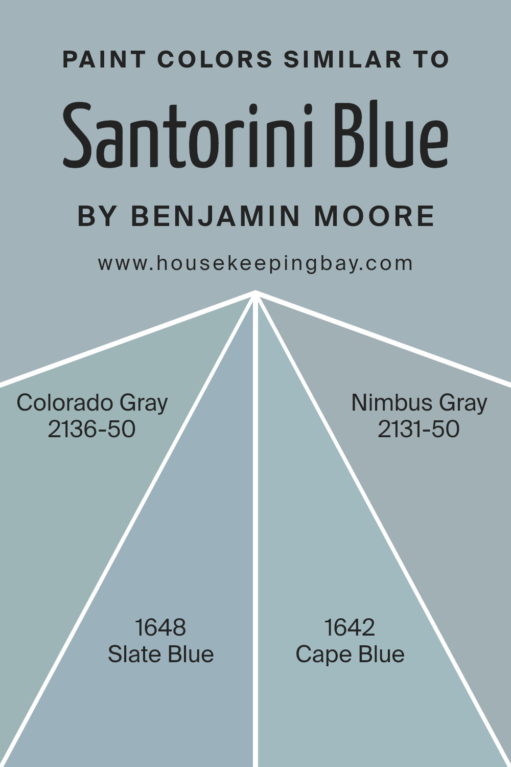
Colors Similar to Santorini Blue 1634 by Benjamin Moore
Similar colors play a key role in creating harmonious and balanced spaces. They work together to create a pleasing visual effect, ensuring a room feels cohesive and inviting. Colors that are close on the color wheel, like those similar to Santorini Blue 1634 by Benjamin Moore, offer subtle variations that enhance a design without causing overwhelming contrast.
Using these tones together can add depth and interest while maintaining a soothing atmosphere. It helps in crafting an environment that feels naturally put together, whether it’s for a calming bedroom, a focused office, or a serene living space.
Take, for instance, Colorado Gray 2136-50, which carries a soft, muted blue-gray tone. It radiates calmness without feeling cold. Then there’s Slate Blue 1648, which leans more towards gray while keeping a touch of blue, offering a balanced and elegant feel. Cape Blue 1642 offers a hint more vibrancy, with its rich, buoyant blue that feels lively yet comforting.
Lastly, Nimbus Gray 2131-50 beautifully marries blue with a deeper gray, creating a sophisticated and versatile backdrop. By mixing these similar colors, spaces gain a layered and textured appearance, which feels both unified and dynamic.
You can see recommended paint colors below:
- 2136-50 Colorado Gray
- 1648 Slate Blue
- 1642 Cape Blue
- 2131-50 Nimbus Gray
housekeepingbay.com
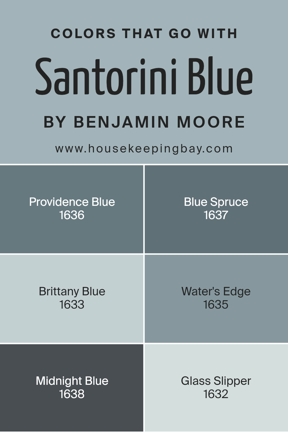
Colors that Go With Santorini Blue 1634 by Benjamin Moore
Choosing colors to go with Santorini Blue 1634 by Benjamin Moore makes a space feel harmonious and well-coordinated. Colors that complement Santorini Blue can enhance its beauty and create different moods in a room. Providence Blue 1636, for instance, provides a cool and soothing look with its gentle depth.
It partners beautifully with Santorini Blue, making it feel relaxing and serene. Meanwhile, Blue Spruce 1637 adds richness and warmth with its earthy tones, offering a natural balance to the lighter Santorini Blue.
Brittany Blue 1633 brings a touch of brightness and vitality, helping spaces feel fresh and vibrant when paired together.
Water’s Edge 1635 flows seamlessly alongside Santorini Blue, with its soft, watery tones that add a peaceful ambiance. For spaces looking to add a touch of sophistication or drama, Midnight Blue 1638 can be an excellent match, providing a deep, striking contrast that highlights the lighter blues.
Lastly, Glass Slipper 1632 offers a hint of whimsy and lightness, with its airy and delicate hue, making rooms feel open and cheerful. Together, these colors work with Santorini Blue to create a palette that is versatile and appealing, suitable for numerous settings and styles.
You can see recommended paint colors below:
- 1636 Providence Blue
- 1637 Blue Spruce
- 1633 Brittany Blue
- 1635 Water’s Edge
- 1638 Midnight Blue
- 1632 Glass Slipper
housekeepingbay.com
How to Use Santorini Blue 1634 by Benjamin Moore In Your Home?
Santorini Blue 1634 by Benjamin Moore is a calming shade that brings a sense of relaxation to any space. Its hue, reminiscent of the clear sea and sky, makes it perfect for creating a peaceful environment at home. One way to use Santorini Blue is by painting the walls of a bedroom or living room.
This soft blue can help promote rest and relaxation, making it a great choice for rooms where unwinding takes place.
In a kitchen, Santorini Blue can add a refreshing touch when used on cabinets or as a backsplash. Pair it with white or light gray accents for a clean, fresh look. In bathrooms, this shade creates a spa-like atmosphere, working well with natural elements like wood or stone.
Accessories such as throw pillows, rugs, or curtains in Santorini Blue can also enhance existing decor without overwhelming the palette. With its versatility, this color brings a serene and inviting feel to a variety of settings.
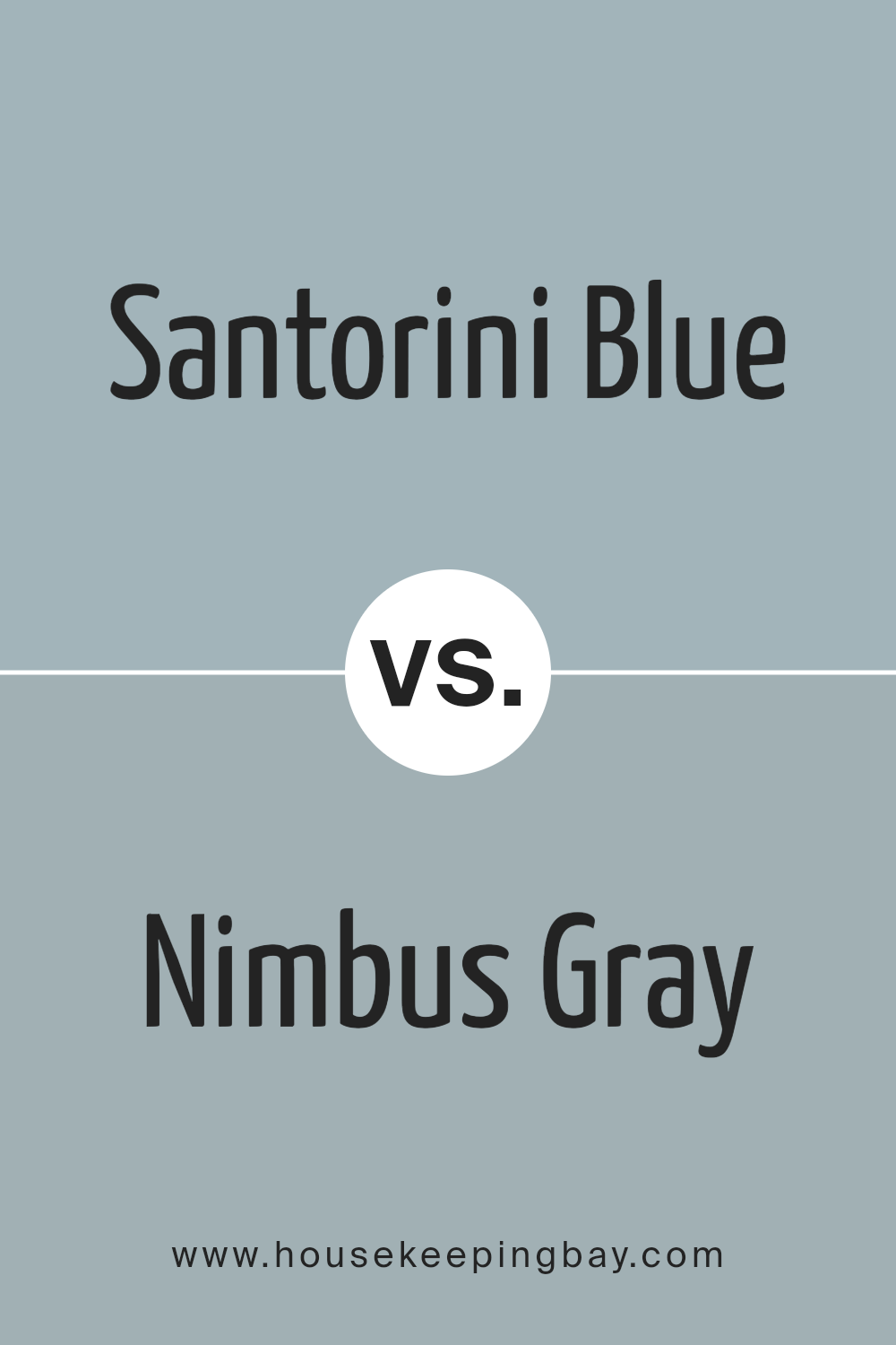
Santorini Blue 1634 by Benjamin Moore vs Nimbus Gray 2131-50 by Benjamin Moore
Santorini Blue 1634 by Benjamin Moore is a vibrant, fresh shade that evokes the coolness and energy of the ocean. It’s a mid-tone blue with a hint of green, making it lively yet not too overpowering. This color works well in spaces where you want to add a bit of brightness and personality, such as kitchens or bedrooms. It can make a room feel more open and airy.
Nimbus Gray 2131-50, also by Benjamin Moore, has a much softer and calmer feel. It’s a muted shade of gray with blue undertones, giving it a more subtle appearance compared to Santorini Blue.
Nimbus Gray is a sophisticated choice for spaces where a quiet and relaxing atmosphere is desired, such as living rooms or offices.
It pairs well with both bold and neutral colors and can serve as a perfect backdrop in a room, allowing other elements to stand out.
You can see recommended paint color below:
- 2131-50 Nimbus Gray
housekeepingbay.com
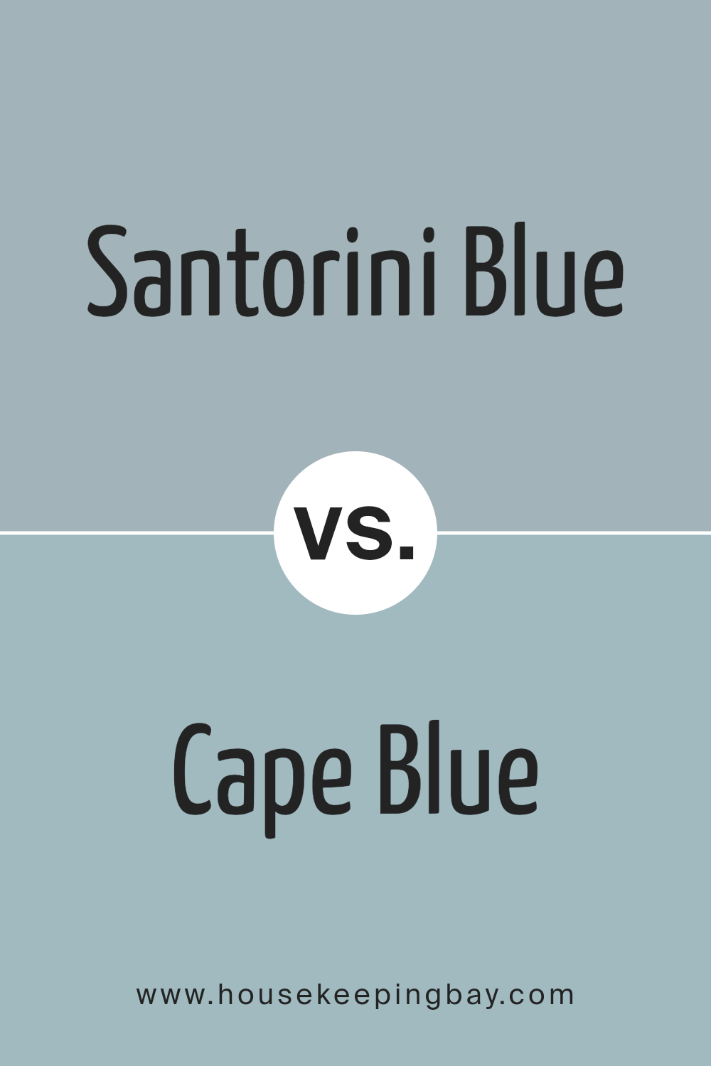
Santorini Blue 1634 by Benjamin Moore vs Cape Blue 1642 by Benjamin Moore
Santorini Blue 1634 and Cape Blue 1642 by Benjamin Moore both bring a calming, coastal vibe to any room, yet they each have unique characteristics. Santorini Blue is a soft, muted blue with subtle gray undertones, creating a serene, airy feel. It’s like gazing at a gentle sky or the lovely waters near Greek islands. This color works well in spaces where a light, fresh touch is desired.
Cape Blue 1642, although also a blue shade, presents a slightly deeper and richer look. It carries a touch more depth and perhaps a hint of complexity, making it feel cozier and more enveloping. Picture a calm, clear sea during twilight hours—it possesses that type of calm intensity.
Both shades bring a sense of peace and versatility, suitable for various room styles and settings, yet their tonal differences allow unique moods to emerge within any space they grace.
You can see recommended paint color below:
- 1642 Cape Blue
housekeepingbay.com
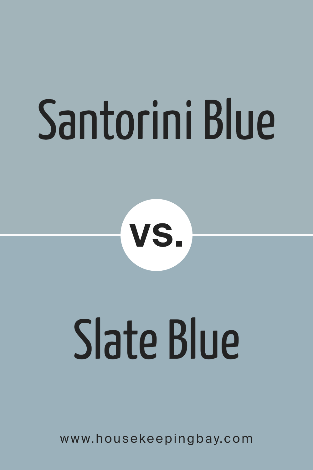
Santorini Blue 1634 by Benjamin Moore vs Slate Blue 1648 by Benjamin Moore
Santorini Blue 1634 and Slate Blue 1648 are two shades by Benjamin Moore that offer different vibes. Santorini Blue 1634 is light and airy, reminiscent of a clear sky over the Greek islands. It offers a sense of calm and openness, making rooms feel spacious and bright. It’s versatile for spaces needing a fresh and welcoming feel.
Slate Blue 1648, on the other side, is deeper and more muted. It carries a hint of gray, providing a sophisticated and grounded appearance. This color can create a cozy and soothing atmosphere, perfect for spaces like bedrooms or study areas where relaxation is key.
While both belong to the blue family, Santorini Blue brings an uplifting, breezy quality, and Slate Blue adds depth and elegance to a room. Choosing between them depends on whether you want a light and airy atmosphere or something more intimate and serene.
You can see recommended paint color below:
- 1648 Slate Blue
housekeepingbay.com
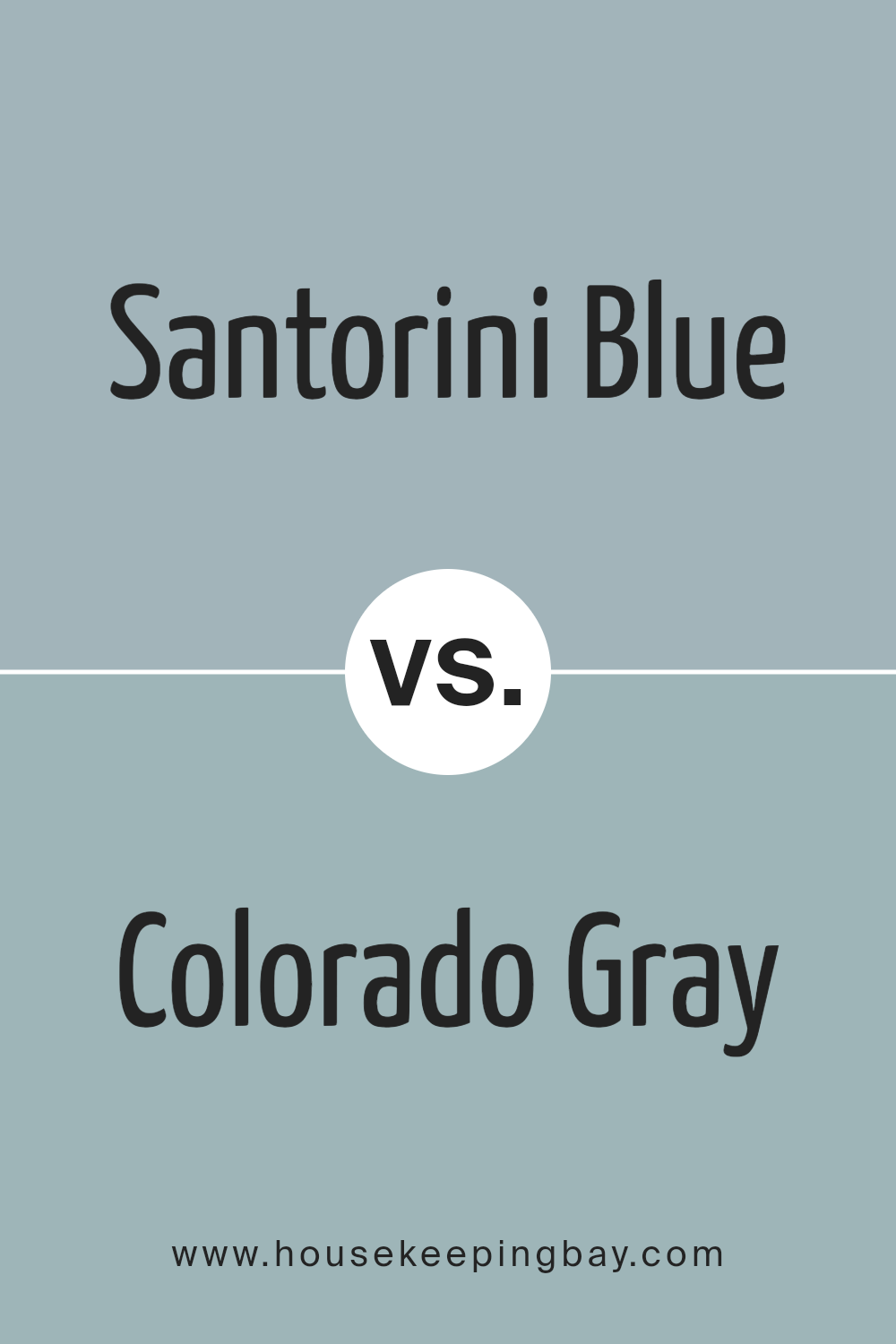
Santorini Blue 1634 by Benjamin Moore vs Colorado Gray 2136-50 by Benjamin Moore
Santorini Blue 1634 by Benjamin Moore is a fresh, vibrant shade. It’s reminiscent of clear, sunny skies and bright Greek coastlines. This color feels energetic and lively, making spaces feel open and inviting. It’s a lively blue, full of personality and brightness.
Colorado Gray 2136-50, also by Benjamin Moore, presents itself as a more muted, subtle shade. Although labeled as gray, it carries a hint of blue-green, creating a soft, calming effect. This color suits spaces where a gentle, soothing atmosphere is desired, offering a quiet elegance.
Both colors bring unique qualities; Santorini Blue is bright and cheerful, while Colorado Gray brings a calming, understated charm. Santorini Blue might suit spaces where energy and vibrancy are needed, whereas Colorado Gray fits well in areas meant for relaxation and subtle sophistication. Choosing between them depends on the mood and feeling you want for the space.
You can see recommended paint color below:
- 2136-50 Colorado Gray
housekeepingbay.com
Conclusion
1634 Santorini Blue by Benjamin Moore is more than just a shade of paint; it brings a feeling of calm and relaxation to any room. The color blends the soothing qualities of blue with a hint of green, creating an inviting atmosphere. It feels like I am bringing a piece of the serene Santorini landscape into my home.
This paint color works well in various spaces, adapting beautifully to different lighting and room styles. Whether it’s in a living room, bedroom, or kitchen, 1634 Santorini Blue adds a refreshing touch without being overwhelming.
It pairs well with neutral tones, bringing out the best in whites, grays, and even some earthy shades.
I’ve noticed that this soft blue-green works great as a backdrop, allowing furniture and decor to stand out while maintaining a harmonious look. It’s versatile and timeless, never going out of style. Using 1634 Santorini Blue gives my space a gentle character.
Overall, I’ve found that 1634 Santorini Blue offers a simple way to update and refresh my living spaces. It’s a choice that doesn’t just paint walls but also provides a calming influence in my daily life.
housekeepingbay.com
Ever wished paint sampling was as easy as sticking a sticker? Guess what? Now it is! Discover Samplize's unique Peel & Stick samples. Get started now and say goodbye to the old messy way!
Get paint samples


