Blue Flower 2057-60 by Benjamin Moore
Fresh and Fun Vibes with This Cool Hue
Are you thinking about refreshing a room or perhaps adding a splash of color to your home? Consider 2057-60 Blue Flower by Benjamin Moore. This shade is a soft, gentle blue that could bring a calm and soothing atmosphere to any space. It’s subtle enough not to overwhelm, yet it provides enough color to make a noticeable and pleasant difference in your room.
Blue Flower is perfect if you want to create a serene sanctuary in your bedroom or a peaceful backdrop in your office. It pairs beautifully with light, neutral tones for a fresh, airy look, or with darker shades for a bit more drama.
Whether you’re painting a wall, a piece of furniture, or adding accents, Blue Flower has the potential to rejuvenate your space with its charming hue.
Feel free to use Blue Flower in various lighting conditions; it adapts beautifully, maintaining its charm and appeal. Happy painting!

via benjaminmoore.com
What Color Is Blue Flower 2057-60 by Benjamin Moore?
Table of Contents
Blue Flower 2057-60 by Benjamin Moore is a soothing and soft blue hue that brings a gentle touch to any space. This color’s lightness allows it to spread across walls smoothly, creating a serene atmosphere reminiscent of a clear sky on a pleasant day.
Blue Flower pairs excellently with whites and grays, enabling it to fit seamlessly into color schemes that favor a calm and cohesive look. Ideal for interior styles such as Scandinavian, coastal, and country, Blue Flower enhances spaces with its subtle vibrancy without overwhelming the senses.
In a Scandinavian setting, combine it with light woods, clean lines, and organic textures like wool or linen to maintain a minimalist yet warm environment. For coastal styles, match it with sandy tones or soft beige to mirror the natural elements found along a beachside, accented with light, distressed wood furniture to complete the relaxed seaside feel. Blue Flower also works exceptionally well with natural materials.
Think of pairing it with brushed steel fixtures or accessories, marble countertops, or ceramic tiles to incorporate a modern twist. Soft fabrics like cotton, velvet, or plush textiles can also complement this color, enhancing the comfort and inviting nature of your living spaces.
Whether used as a main color or an accent, Blue Flower 2057-60 is a versatile choice that enriches the home with a peaceful yet fresh ambiance.
housekeepingbay.com
Is Blue Flower 2057-60 by Benjamin Moore Warm or Cool color?
Blue Flower 2057-60 by Benjamin Moore is a vibrant, refreshing shade of blue that brings a calm and soothing atmosphere to any room. This light blue hue has a slightly airy vibe, making it perfect for creating a serene space in homes. Ideal for bedrooms and bathrooms, Blue Flower adds a subtle touch of color without overwhelming the senses. This color works well in spaces that get plenty of natural light, where it can enhance the airy feel of the room.
Moreover, Blue Flower pairs beautifully with neutral tones like whites and grays, as well as with darker furniture, helping to balance out the overall aesthetic. Its versatility allows homeowners to use it in various styles, from contemporary to traditional.
Applying this color on an accent wall can also rejuvenate a space, making it feel more open and inviting. Overall, using Blue Flower 2057-60 can help create a peaceful ambiance, making it a popular choice for those looking to add a fresh pop of color in their homes.
What is the Masstone of the Blue Flower 2057-60 by Benjamin Moore?
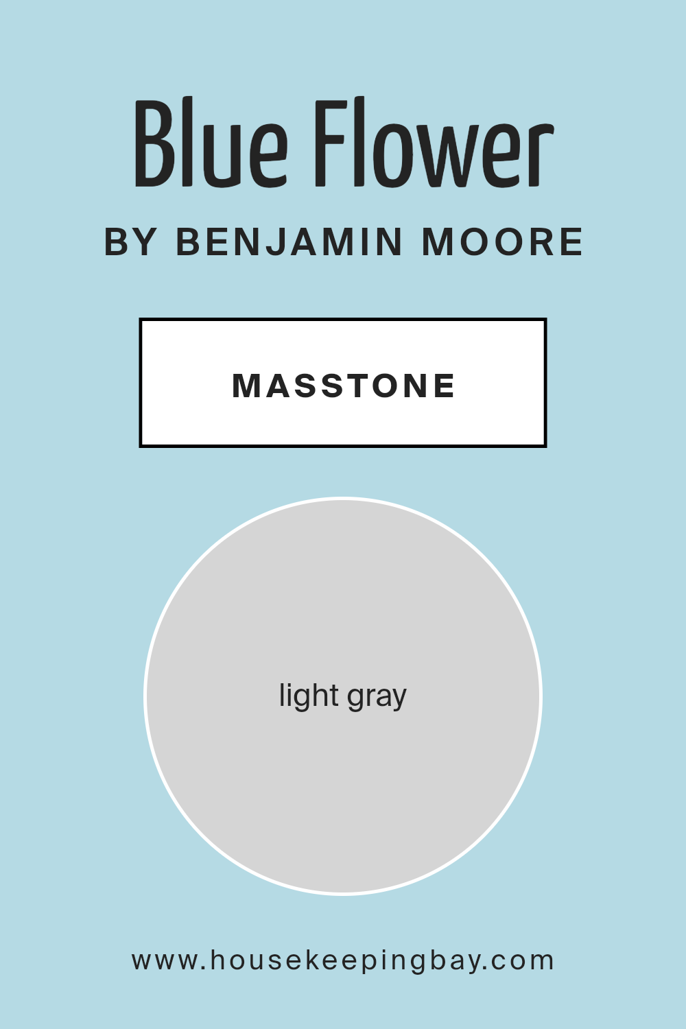
Blue Flower 2057-60 by Benjamin Moore has a masstone that appears as light gray, holding a hexadecimal value of #D5D5D5. When used in home interiors, this color gives off a soft, neutral vibe, making rooms feel open and airy. Its versatility means it can work beautifully in various spaces, whether it’s a bustling kitchen or a quiet bedroom.
Since the color isn’t overpowering, homeowners can freely pair it with a wide array of decor styles and colors. Whether one prefers bold, vibrant accents or more subdued hues, Light Gray serves as a calm backdrop. This subtle quality of the color also allows it to seamlessly unify different elements and textures present in a room.
Light Gray is practical for those looking to create a space that feels both peaceful and modern without making drastic changes. Its ability to disguise smudges and light dirt makes it a sensible choice for frequently used areas. Its reflective quality can help make small spaces appear slightly larger and more inviting.
housekeepingbay.com
Undertones of Blue Flower 2057-60 by Benjamin Moore
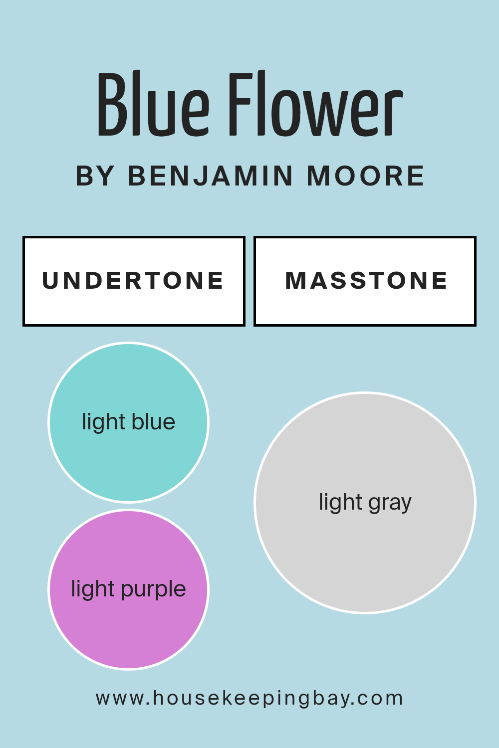
Blue Flower 2057-60 by Benjamin Moore is a dynamic color that presents a subtle complexity due to its variety of undertones. With hints of light blue, light purple, pale yellow, lilac, mint, pale pink, and grey, this shade can significantly influence the ambiance of a room.
Undertones impact our perception of color because they subtly emerge under different lighting conditions. In the case of Blue Flower 2057-60, the primary blue is softened or altered by its hidden hues, leading to different experiences of the color in diverse environments. For instance, the light blue and mint undertones might make the color appear cooler, contributing to a serene and soothing atmosphere ideal for bedrooms or bathrooms.
In contrast, lilac and light purple can add a touch of warmth, making the space seem more inviting. Pale yellow and pale pink undertones provide a gentle lift to the overall hue, often making the room feel more alive. This effect is especially useful in spaces without much natural light, as it can counteract the potential dullness of the primary blue. In interior walls, the complexity of Blue Flower 2057-60 allows it to interact interestingly with furnishings and decor.
Depending on the room’s lighting and accompanying colors, its diverse undertones can either recede into a soft background or play a more prominent role, offering flexibility in designing a mood and style. Lastly, the grey undertone helps anchor the color, ensuring it remains sophisticated without overwhelming the space.
housekeepingbay.com
Coordinating Colors of Blue Flower 2057-60 by Benjamin Moore
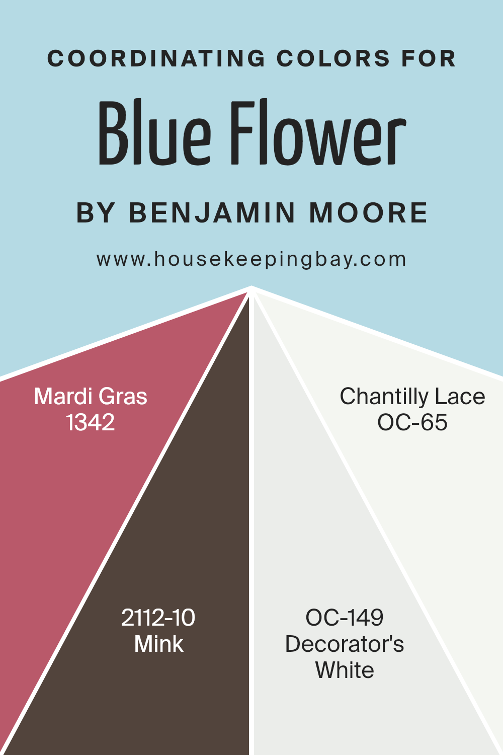
Coordinating colors are hues that complement or enhance each other when used together in a space. They can create balance and harmony in a design by linking different colors smoothly. When using coordinating colors with something like Blue Flower 2057-60 by Benjamin Moore, the goal is to select colors that either contrast with or complement the main hue to establish a visually appealing palette. It’s all about finding combinations that work well together to support the aesthetic you aim to achieve.
For example, Mardi Gras 1342 is a dynamic and bold color with a vibrant feel, perfect for accentuating details or for use in an area where a pop of energy is desired. On the other hand, Mink 2112-10 offers a striking contrast as a deep, rich brown that lends sophistication and grounding to the light and airy blue of Blue Flower.
As for the lighter shades, Decorator’s White OC-149 and Chantilly Lace OC-65 are both variations of crisp, clean whites. Decorator’s White is subtle and has a nuanced ivory undertone, making it a wonderful choice for trim and ceilings for a seamless look. Chantilly Lace appears brighter with a slight luminous quality that beautifully reflects light, enhancing spaces with a fresh and open feeling, especially when paired with cooler tones like Blue Flower.
You can see recommended paint colors below:
- 1342 Mardi Gras
- 2112-10 Mink
- OC-149 Decorator’s White
- OC-65 Chantilly Lace
housekeepingbay.com
How Does Lighting Affect Blue Flower 2057-60 by Benjamin Moore?
Lighting significantly influences how colors appear in different environments. The perception of a color can change based on the type of light it is exposed to—natural or artificial. Specifically, let’s look at the color Blue Flower 2057-60 by Benjamin Moore and how different lighting conditions affect its appearance.
In artificial light, Blue Flower 2057-60 may vary depending on the light bulb’s color temperature. Under warm lighting, this blue shade can appear more muted and softer, potentially giving off a cozy feel. In contrast, cooler LED lights can highlight its vibrant tones, making the blue more lively and pronounced.
Under natural light, the appearance of Blue Flower 2057-60 shifts throughout the day. During early morning or late afternoon when sunlight has a golden hue, the paint may look warmer and less intense. On the other hand, during midday when sunlight is brightest, the blue will appear clearer and more true to its palette.
Regarding room orientation:
– North-faced rooms: These rooms receive less direct sunlight, which may cause Blue Flower 2057-60 to look more subdued and shadowy. The cooler and softer light might make this color appear slightly darker than usual.
– South-faced rooms: With ample sunlight, south-facing rooms can make Blue Flower 2057-60 look very vibrant and bright. The abundant light can enhance the depth of the color, making it lively and cheerful.
– East-faced rooms: Morning light from the east can make this blue feel fresh and bright in the morning but may turn to a cooler tone as the day progresses, given less direct light in the afternoon and evening.
– West-faced rooms: Evening light from the west means this color will appear softer and more neutral in the morning but gains intensity and looks more dynamic in the late afternoon as it catches the warmer sun.
Each room orientation and lighting type brings out a different facet of Blue Flower 2057-60, affecting the mood and visual impact of the space.
housekeepingbay.com
What is the LRV of Blue Flower 2057-60 by Benjamin Moore?
LRV stands for Light Reflectance Value, a measure that indicates how much light a paint color reflects or absorbs when applied to a surface. It is scaled from 0 to 100, where 0 means the color absorbs all light (appearing very dark) and 100 means it reflects all light (appearing very bright).
This value helps in choosing the right paint color for your space based on how bright or dark you want the room to feel. For instance, colors with a higher LRV make a room feel airier and larger, while lower LRV colors can make spaces feel cozier and more enclosed.
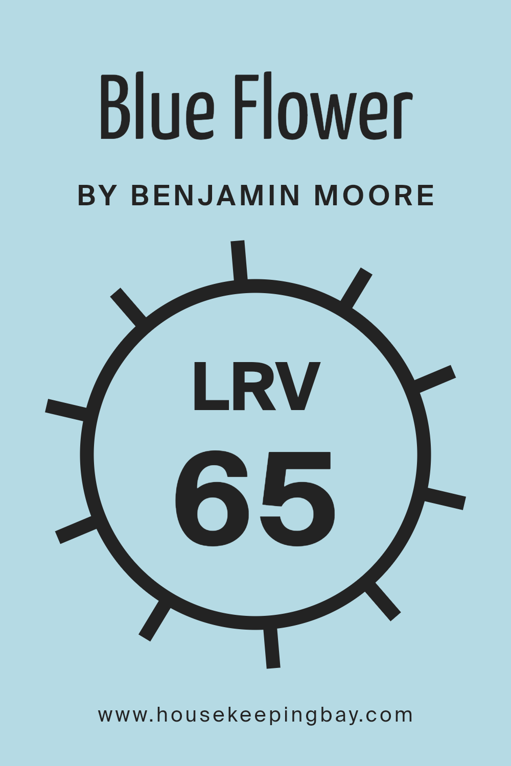
For the color Blue Flower 2057-60 by Benjamin Moore, with an LRV of 64.52, it falls into the category of lighter blues. This means it reflects a good amount of light, making spaces feel open and soothing without being overwhelmingly bright. This moderate LRV makes it versatile for various settings, whether aiming for a calm mood in a bedroom or a refreshing vibe in a living space.
It can also help in spaces that don’t receive a lot of natural sunlight, as the higher LRV will help in making the room appear brighter than it actually is.
housekeepingbay.com
What are the Trim colors of Blue Flower 2057-60 by Benjamin Moore?
Trim colors are the hues used on the architectural details of a room like door frames, baseboards, crown moldings, and window casings. Choosing the right trim color can significantly enhance the overall look of a space by providing contrast or coherence with the main wall colors.
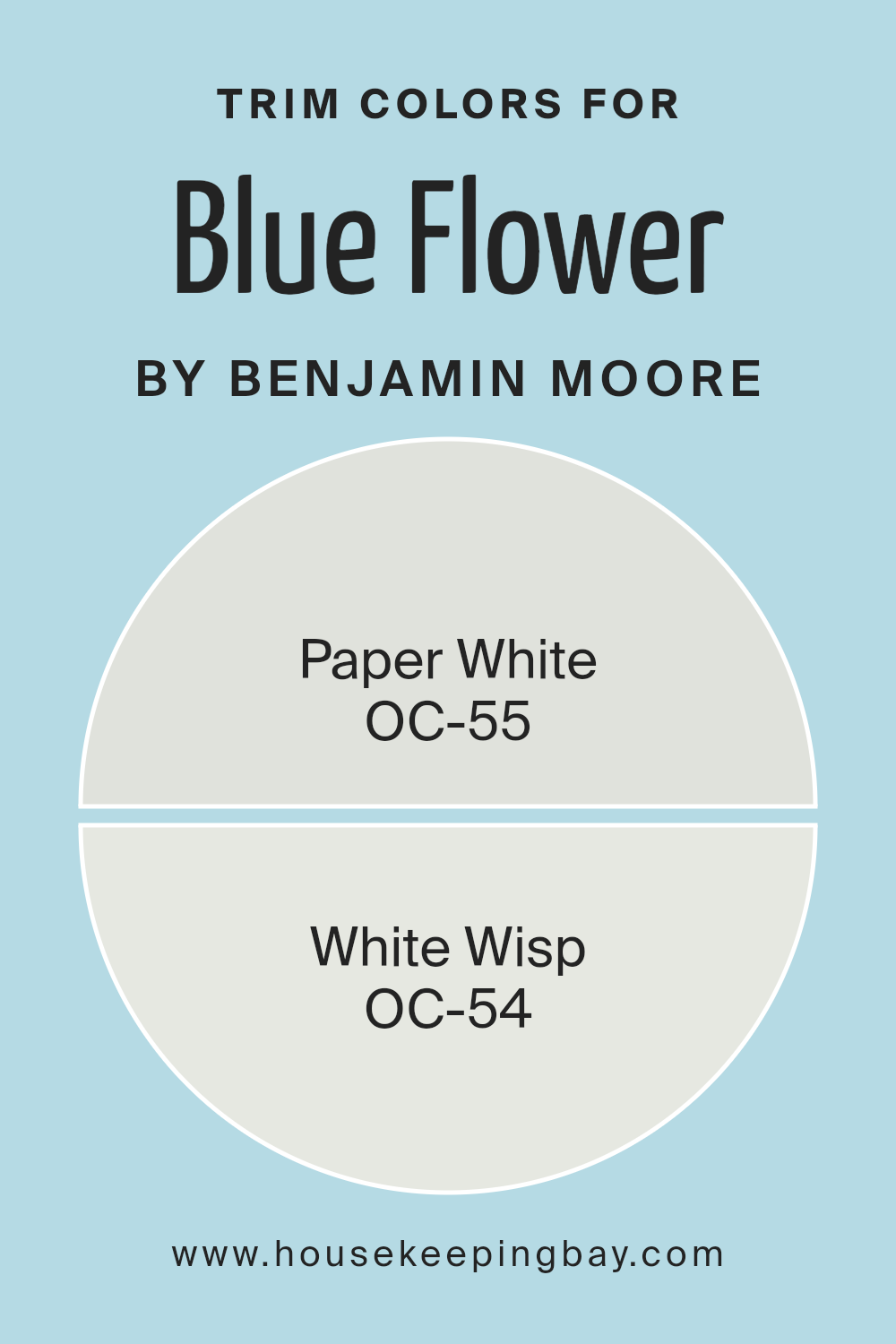
For the paint Blue Flower 2057-60 by Benjamin Moore, which features a pleasant blue tone, using lighter trim colors like OC-55 – Paper White and OC-54 – White Wisp can create a subtle yet effective distinction that highlights the architectural features without overwhelming the blue. These trim colors help to define the spaces clearly and add a polished finish to the rooms, complementing the soothing nature of Blue Flower 2057-60.
OC-55 – Paper White is a fresh and clean white color that offers a crisp contrast to richer hues. It works particularly well to draw attention subtly to the trim without competing with the main color. OC-54 – White Wisp, on the other hand, carries a hint of gray that softens the transition between the blue of Blue Flower 2057-60 and the trim, making it ideal for those seeking a harmonious and cohesive look. Both colors support the blue by creating a refined framework around the room’s elements.
You can see recommended paint colors below:
- OC-55 Paper White
- OC-54 White Wisp
housekeepingbay.com
Colors Similar to Blue Flower 2057-60 by Benjamin Moore
Understanding similar colors, especially when decorating, is vital because it helps create a harmonious and cohesive look. Using shades like Blue Flower 2057-60 by Benjamin Moore as a base, homeowners can accurately select complementary colors that have a subtle variance but maintain a consistent theme.
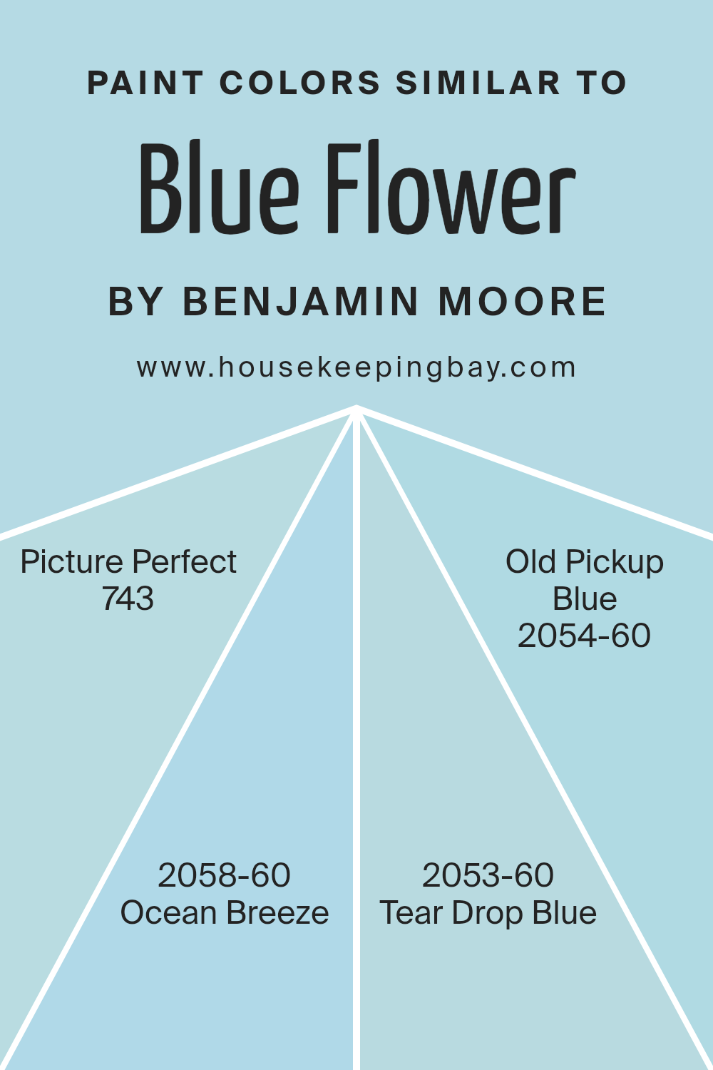
Colors such as 743 – Picture Perfect, 2058-60 – Ocean Breeze, 2053-60 – Tear Drop Blue, and 2054-60 – Old Pickup Blue work well together as they derive from the same color family, offering a seamless visual transition from one to the other within a space. This approach allows for a soothing and balanced visual impact, making the environment more appealing and comfortable.
743 – Picture Perfect is a soft, airy blue that echoes a clear sky, giving a sense of calm and freshness to any room. Ocean Breeze 2058-60 offers a slightly more aquatic hint, invoking the gentle feel of a serene sea which can lighten up spaces with a cool and breezy touch. Tear Drop Blue 2053-60 is deeper, adding a touch of sophistication with its muted, yet rich hue, perfect for creating a focal point without overwhelming the senses.
Lastly, Old Pickup Blue 2054-60 has a vintage charm, subtly shifting towards a more playful and laid-back vibe, ideal for spaces aiming for a nostalgic touch. Together, these colors provide multiple decorating options while maintaining aesthetic unity.
You can see recommended paint colors below:
- 743 Picture Perfect
- 2058-60 Ocean Breeze
- 2053-60 Tear Drop Blue
- 2054-60 Old Pickup Blue
housekeepingbay.com
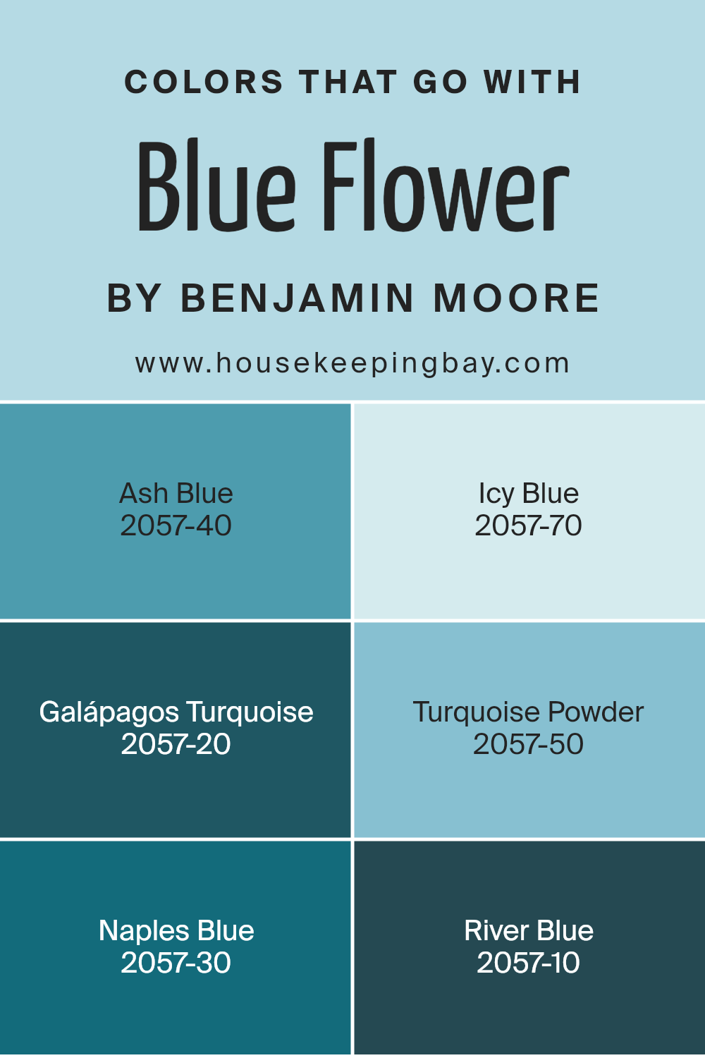
Colors that Go With Blue Flower 2057-60 by Benjamin Moore
Colors that pair well with Blue Flower 2057-60 by Benjamin Moore are essential because they allow for a harmonious and visually appealing palette, making any space feel coherent and thoughtfully designed. When selecting coordinating colors, it’s important to consider how they will influence the mood and perception of the room.
For example, Ash Blue 2057-40 is a subtle color that blends seamlessly with Blue Flower, making it perfect for spaces that aim for a soft and serene atmosphere. On the other hand, Icy Blue 2057-70 provides a lighter contrast that results in a refreshing and airy vibe, ideal for brightening up areas.
Moving towards the deeper end of the spectrum, Galápagos Turquoise 2057-20 offers a rich, oceanic feel that adds a bold pop of color that is both inviting and relaxing. Turquoise Powder 2057-50 is slightly more subdued yet enriches any design with its gentle whisper of color, perfect for creating a soothing environment without overwhelming the senses.
Naples Blue 2057-30, with its slightly green undertone, presents a unique twist to typical blues and works wonderfully in spaces that seek a hint of vibrancy. Lastly, River Blue 2057-10 leans towards a darker shade, compelling yet grounding, suitable for accent walls or decor elements, providing depth and focus. Choosing the right colors to complement Blue Flower enhances the overall design, making the environment more cohesive and pleasing to the eye.
You can see recommended paint colors below:
- 2057-40 Ash Blue
- 2057-70 Icy Blue
- 2057-20 Galápagos Turquoise
- 2057-50 Turquoise Powder
- 2057-30 Naples Blue
- 2057-10 River Blue
housekeepingbay.com
How to Use Blue Flower 2057-60 by Benjamin Moore In Your Home?
Blue Flower 2057-60 by Benjamin Moore is a vibrant and cheerful blue paint color, perfect for adding a touch of brightness to any room. This shade is light enough to make small spaces appear larger and has a calming effect, which makes it ideal for bedrooms or bathrooms.
It pairs well with white trim and furniture, creating a fresh and clean look. Blue Flower 2057-60 also works nicely in a child’s room or play area, bringing in a playful yet soothing atmosphere.
For those who prefer modern themes, this blue can serve as an accent wall in a living room or dining area, contrasting nicely with darker colors or wood finishes, offering a lively visual focus. Additionally, when used in a kitchen, it can complement white cabinets or metallic fixtures, giving the space a crisp and inviting feel. Benjamin Moore’s Blue Flower 2057-60 is a versatile color that can help refresh and brighten any home’s interior.
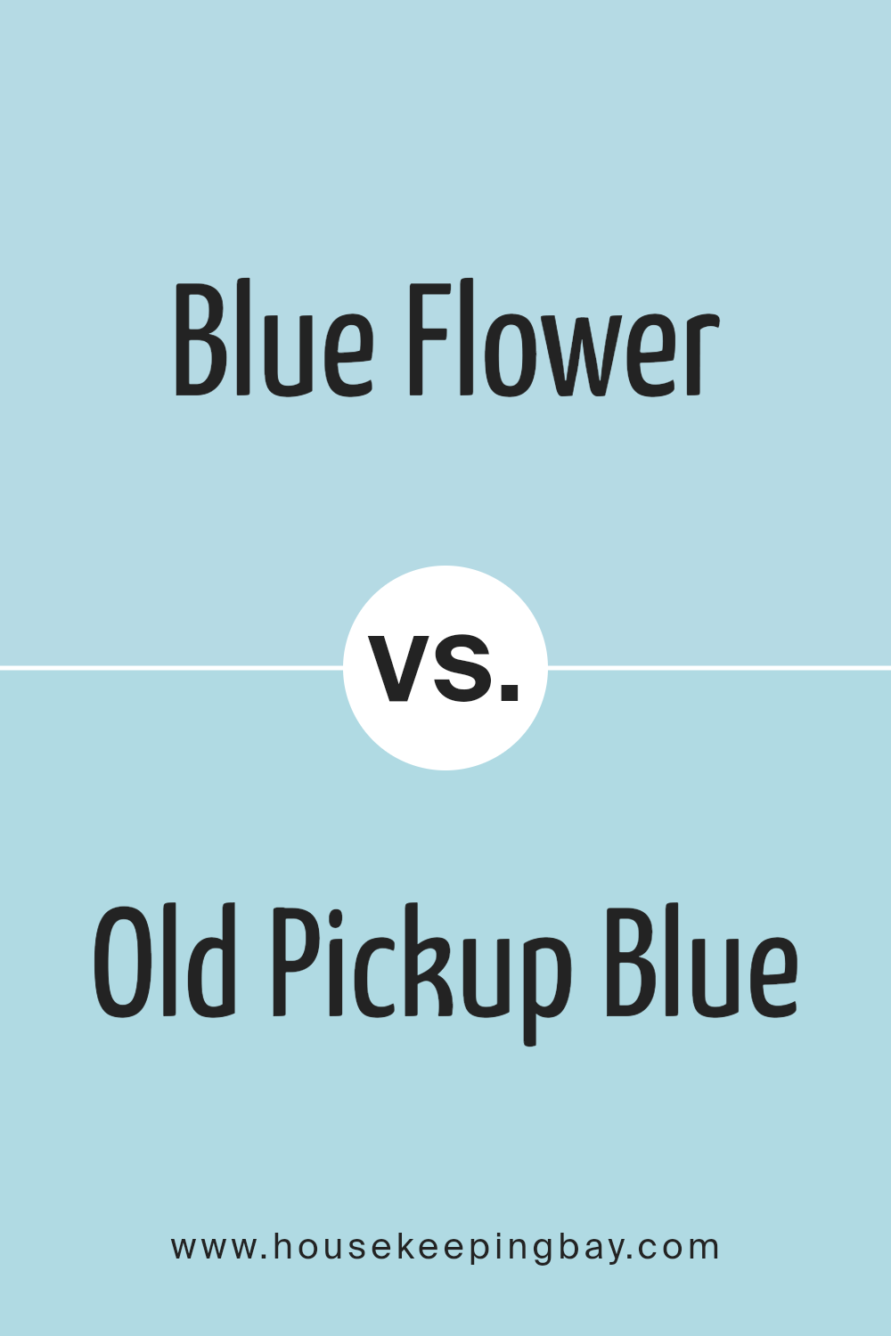
Blue Flower 2057-60 by Benjamin Moore vs Old Pickup Blue 2054-60 by Benjamin Moore
The color Blue Flower 2057-60 by Benjamin Moore is a soft, airy blue with a hint of lavender, giving it a gentle and soothing aura. This shade suits spaces intended for relaxation and can make rooms feel larger and more open.
On the flip side, Old Pickup Blue 2054-60 from Benjamin Moore evokes a slightly more traditional blue tone that resembles clear, blue skies. This color has a crisp freshness that can invigorate a space, making it ideal for areas that benefit from an energizing atmosphere, like kitchens or active living rooms.
While both colors promote a sense of calm, Blue Flower with its lavender undertones feels warmer and more comforting, perfect for bedrooms or quiet areas. Old Pickup Blue presents a cooler, more straightforward blue that radiates a lively energy better suited for communal and high-energy areas. Each color offers a distinct vibe but maintains the versatility to blend smoothly with various decor styles and color schemes.
You can see recommended paint color below:
- 2054-60 Old Pickup Blue
housekeepingbay.com
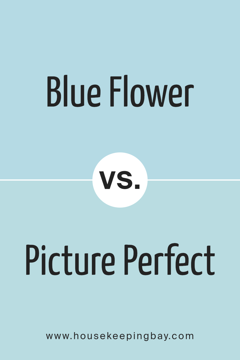
Blue Flower 2057-60 by Benjamin Moore vs Picture Perfect 743 by Benjamin Moore
Both “Blue Flower 2057-60” and “Picture Perfect 743” by Benjamin Moore present soothing blue shades. “Blue Flower 2057-60” offers a light, almost airy blue that can make a room feel fresh and open. This color works well in spaces designed for relaxation such as bedrooms and bathrooms. Its subtle tones help in creating a peaceful environment that feels both comfortable and serene.
In comparison, “Picture Perfect 743” leans more towards a milder and slightly muted blue. This color is quite versatile and fitting for different settings, from living rooms to kitchens. It has the capacity to add a soft, gentle vibe to any space, promoting a cozy and welcoming atmosphere.
Both colors provide a hint of calmness but in varying intensities and shades. While “Blue Flower” can be seen as more vibrant due to its lighter and brighter hue, “Picture Perfect” offers a sense of warmth due to its understated presence. Choosing between them would depend on the desired mood and the specific function of the room.
You can see recommended paint color below:
- 743 Picture Perfect
housekeepingbay.com
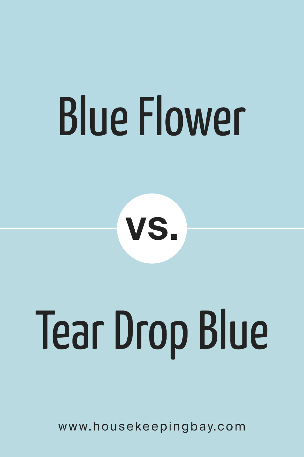
Blue Flower 2057-60 by Benjamin Moore vs Tear Drop Blue 2053-60 by Benjamin Moore
Blue Flower 2057-60 by Benjamin Moore is a light and gentle shade of blue, giving a soft and soothing atmosphere to any space. It reflects calmness and is ideal for creating a peaceful aura in settings such as bedrooms or bathrooms.
Tear Drop Blue 2053-60, also by Benjamin Moore, shares a similar lightness but leans slightly towards a cooler, more muted blue tone. This makes it excellent for spaces that seek a fresh, airy feel without overwhelming the senses.
Both colors offer a serene vibe, but Blue Flower 2057-60 tends to warm up a room slightly more compared to the crisper feel of Tear Drop Blue 2053-60. Although close in hue, their subtle differences could affect the mood and perceived temperature of a room, with Blue Flower 2057-60 feeling somewhat cozier and Tear Drop Blue 2053-60 providing a more refreshing touch. Choosing between them depends on the specific ambiance and style you want to achieve in your space.
You can see recommended paint color below:
- 2053-60 Tear Drop Blue
housekeepingbay.com
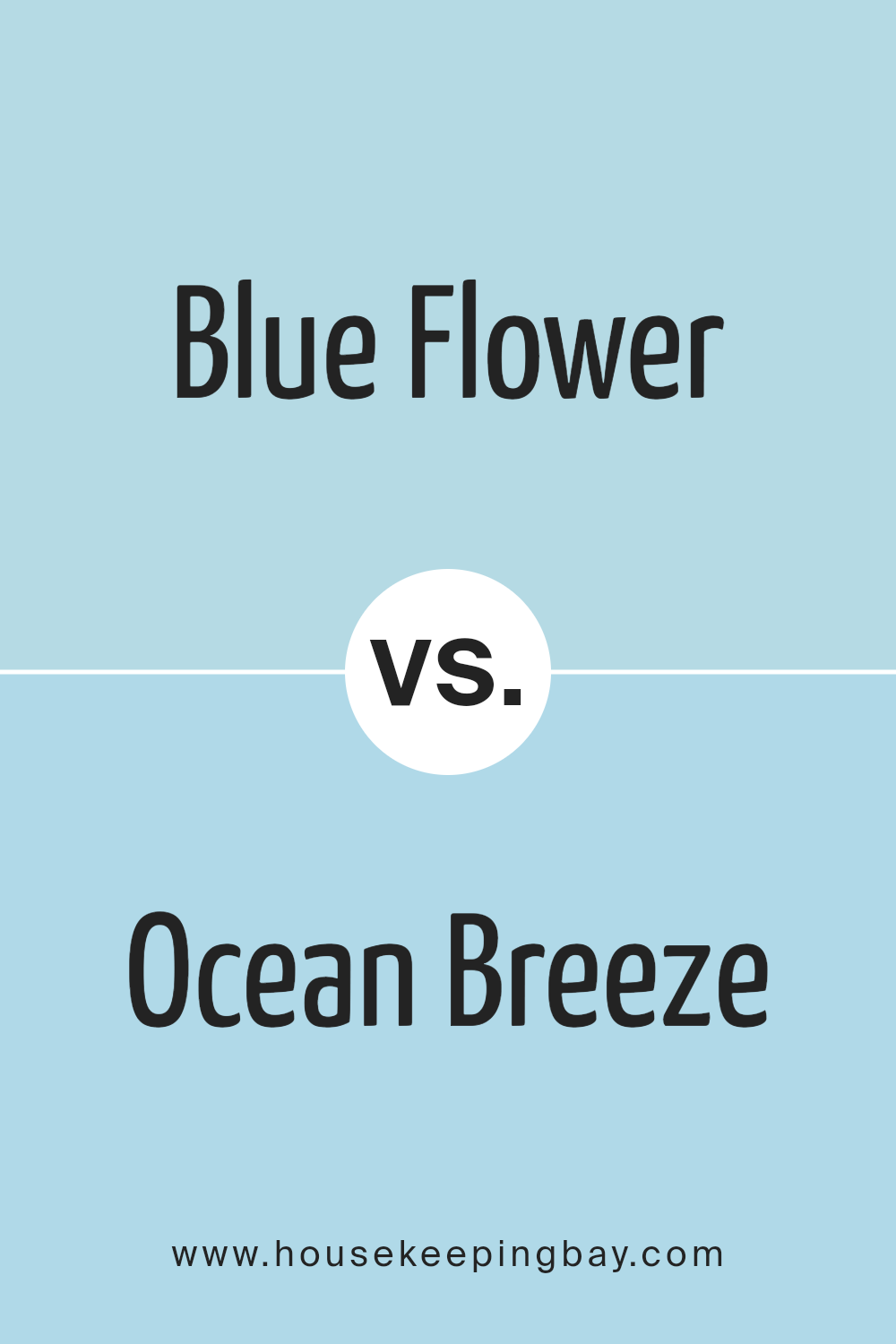
Blue Flower 2057-60 by Benjamin Moore vs Ocean Breeze 2058-60 by Benjamin Moore
Blue Flower 2057-60 by Benjamin Moore is a soft, light blue with a calming and gentle aura. It resembles a clear sky on a sunny day, bringing a serene vibe to any room. This color is ideal for creating a peaceful space, perfect for bedrooms or bathrooms where relaxation is key.
Ocean Breeze 2058-60, also by Benjamin Moore, leans slightly towards a teal hue, infusing a bit more energy and vibrancy than Blue Flower. It gives a refreshing feel reminiscent of the ocean, which can liven up a space while still maintaining a sense of calm. This color works well in areas like kitchens or living rooms where a refreshing feel is desirable.
Both shades are pale and subtle, yet Ocean Breeze offers a touch more color intensity, making it more lively than the softer Blue Flower. Each brings its unique mood to interiors, with Blue Flower providing a more tranquil atmosphere and Ocean Breeze adding a splash of freshness.
You can see recommended paint color below:
- 2058-60 Ocean Breeze
housekeepingbay.com
Conclusion
Concluding my thoughts on 2057-60 Blue Flower by Benjamin Moore, I must say that this paint color provides a gentle and calming touch to any space. My exploration of its hue revealed how effectively it coordinates with diverse décor and furniture styles, making it an excellent choice for someone looking to freshen up their surroundings without the need for drastic design changes.
The soft blue has a subtle elegance and its ability to create a soothing atmosphere is definitely a high point discussed. What strikes me most is its versatility. Whether applied in a busy kitchen, a quiet bedroom, or even an office space, Blue Flower maintains its serene influence, making it not only visually appealing but also psychologically beneficial.
An added benefit well worth noting is the paint’s quality. Benjamin Moore has consistently delivered durable and high-quality paints that stand the test of time, and Blue Flower is no different. Its resilience, combined with its aesthetic appeal, assures that the walls will look fresh for years to come.
It serves as a timeless choice for anyone keen on creating a gentle yet vibrant space. Overall, my review of 2057-60 Blue Flower suggests it’s a viable option for anyone aiming for a serene, yet beautiful living or working environment.
housekeepingbay.com
