Bayberry 2080-50 by Benjamin Moore
Fresh Vibes with a Hint of Mystery
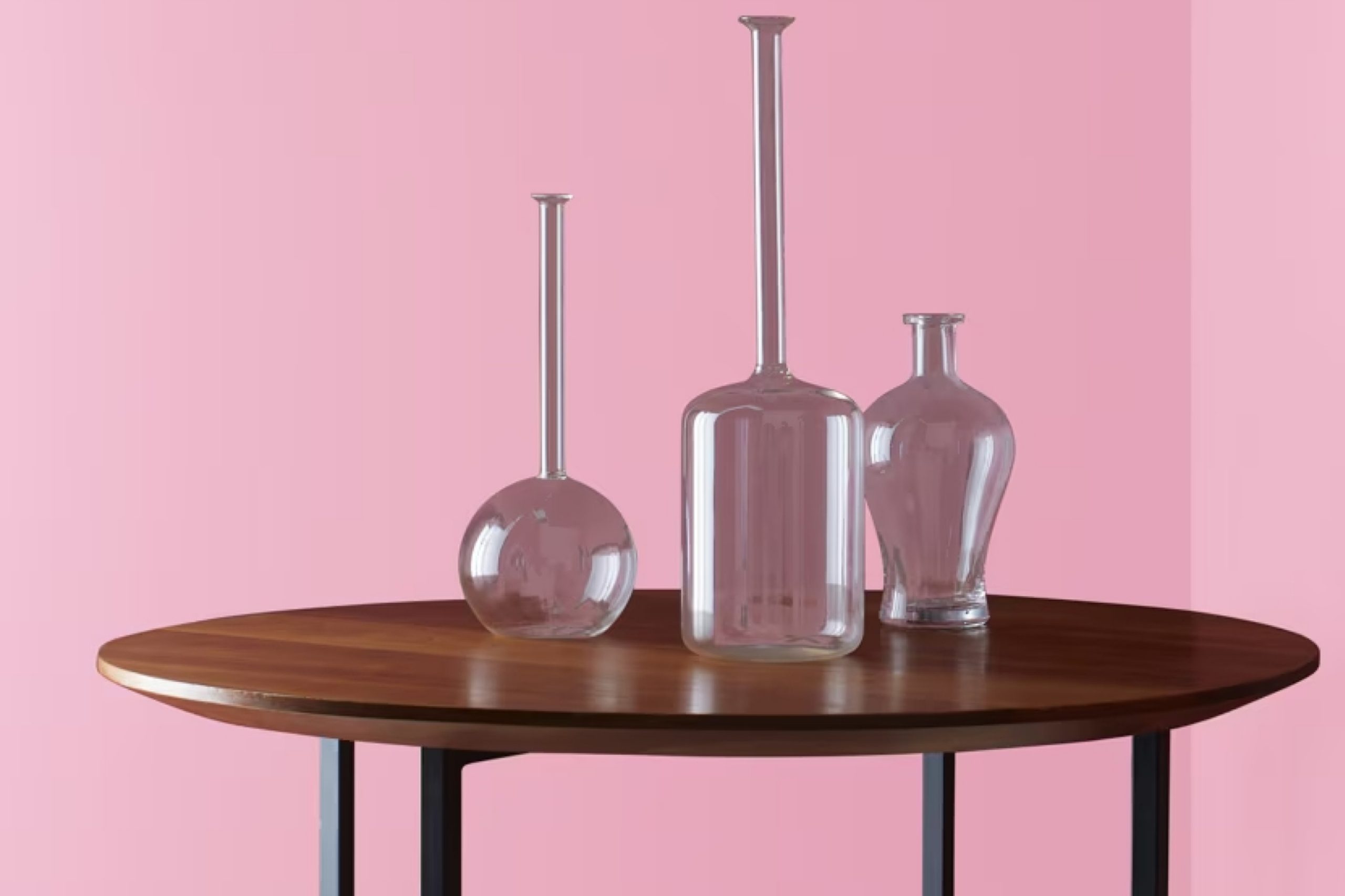
When choosing the perfect paint color for your space, you might want to consider 2080-50 Bayberry by Benjamin Moore. This paint shade offers a unique blend of warmth and freshness, making it ideal for creating a cozy yet lively atmosphere in any room. Whether you’re thinking about refreshing your living room, bedroom, or kitchen, Bayberry brings a hint of nature indoors with its subtle green undertones.
This color particularly shines in spaces that get a lot of natural light, where its true beauty and subtle complexity are highlighted. If you’re not sure how it would look in your home, I recommend testing it out on a small area or using a peel-and-stick sample to see how the color changes at different times of the day.
Bayberry is more than just a beautiful color; it’s also a practical choice. Its soothing hue works well with a variety of decor styles and furniture finishes, from modern to traditional.
Whether you’re updating a single room or planning a larger renovation, Bayberry could be the refreshing change you need.
via benjaminmoore.com
What Color Is Bayberry 2080-50 by Benjamin Moore?
Bayberry 2080-50 by Benjamin Moore is a vibrant, dusty blue-green shade that brings to mind the lush foliage of a forest. This soothing hue has a slightly muted tone that makes it a versatile choice for interior spaces. It’s particularly effective in promoting a serene atmosphere without being too bold or overpowering.
This color works exceptionally well within coastal-inspired interior styles, where its natural tones complement themes of beaches and the sea. It also suits Scandinavian designs due to its simplicity and the way it harmonizes with minimalistic, functional aesthetics. For a contemporary look, pairing Bayberry with modern furnishings creates a dynamic yet cohesive space.
Material-wise, Bayberry pairs beautifully with light woods such as oak and maple to highlight its earthy base. Textiles like cotton and linen in neutral colors also blend well, adding a layer of softness to the overall decor. Elements of brushed steel or glass can introduce a slight contrast and freshness that punctuates the color’s calmness beautifully.
For those looking to create a peaceful yet visually interesting space, Bayberry 2080-50 offers just enough color to make a statement while maintaining an air of calm and comfort. It’s a smart choice for anyone wanting to introduce natural elements into their home seamlessly.
housekeepingbay.com
Is Bayberry 2080-50 by Benjamin Moore Warm or Cool color?
Bayberry2080-50 by Benjamin Moore is a vibrant, rich green shade. It infuses rooms with a fresh and lively feeling, making it a popular choice for homeowners looking to add some vibrancy to their space.
This color pairs well with both modern and traditional decor, giving it a versatile appeal that can enhance various home styles. Due to its bold nature, Bayberry2080-50 works well as an accent wall or in smaller doses, such as on trim or in decorative elements, to inject a pop of color without overwhelming the space.
Rooms with good natural light can make this color look more vivid and dynamic, while in dimmer areas, it can provide a cozy, more subdued ambiance. It also acts as a complementary backdrop for natural materials like wood and stone. Bayberry2080-50 is not just a paint color but a way to bring a piece of nature inside, creating a lively yet harmonious environment in your home.
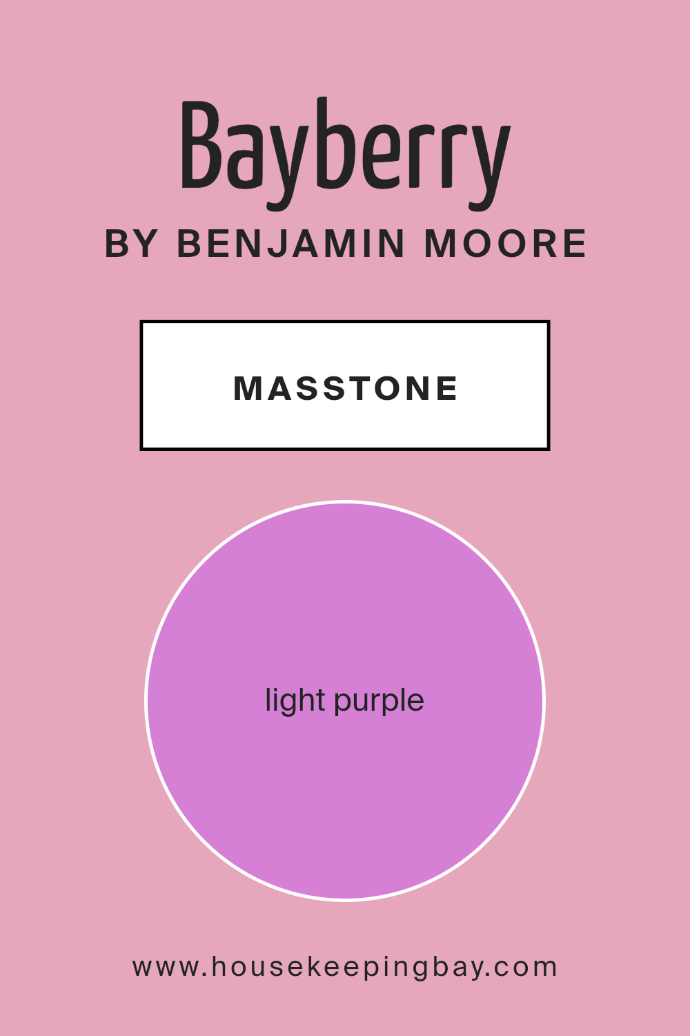
What is the Masstone of the Bayberry 2080-50 by Benjamin Moore?
Bayberry2080-50 by Benjamin Moore is a lovely shade of light purple, officially designated as #D580D5. This gentle hue adds a soft, welcoming touch to any room, making it a fantastic choice for creating a peaceful and inviting atmosphere. The masstone, the pure color before it’s applied to walls, reflects a serene vibe that can help soften a space and make it more relaxing.
In homes, this light purple tone works marvelously in bedrooms and living areas where calm is often sought after. It pairs well with light neutrals like whites or grays, which can enhance its gentle nature without overwhelming the senses. The lightness of Bayberry2080-50 makes it a versatile option, able to visually enlarge smaller spaces and add a touch of brightness without being too bold.
Moreover, this color can easily be accessorized with various textures and complementary colors like soft greens or muted pinks, adding layers of aesthetic without sacrificing the peaceful feel. Whether as a primary color palette or in accent details, Bayberry2080-50 lends a cozy, modern touch to any home environment.
housekeepingbay.com
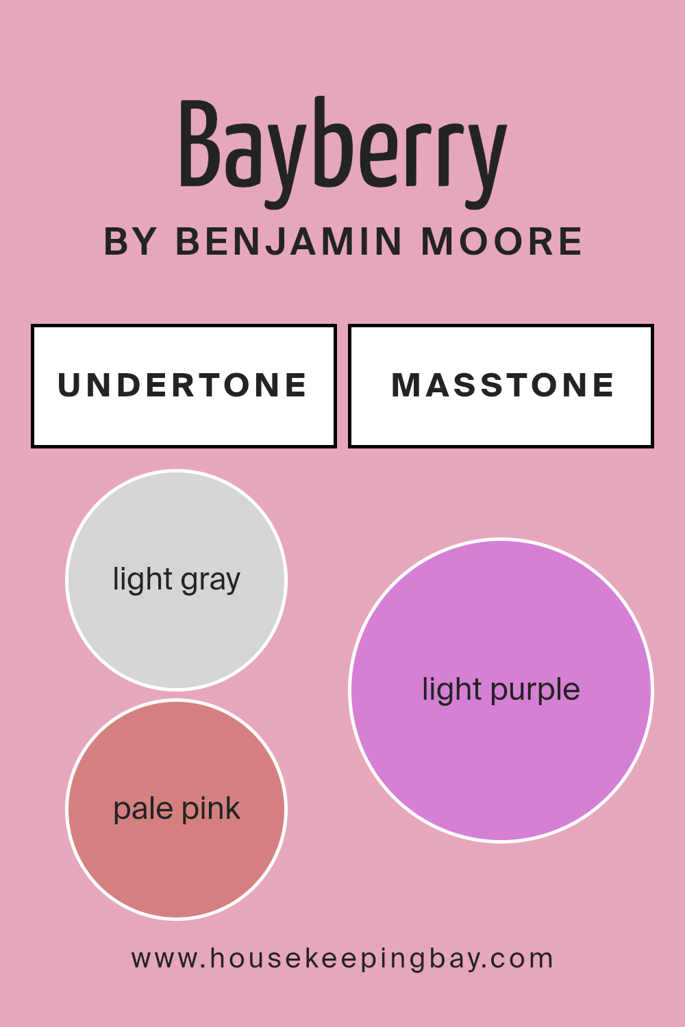
Undertones of Bayberry 2080-50 by Benjamin Moore
Bayberry2080-50 by Benjamin Moore is a versatile color that includes a rich blend of undertones. These undertones include light gray, pale pink, pale yellow, lilac, light blue, grey, mint, fuchsia, pink, violet, and purple. Each of these undertones plays a critical role in how the color is perceived in different lighting conditions.
Undertones are subtle hues mixed into the main color and they can significantly influence the overall appearance of the paint. For instance, light gray can tone down the color, making it feel more muted and neutral. Conversely, undertones like fuchsia or pale pink add a hint of warmth, creating a welcoming and gentle atmosphere.
When applied to interior walls, Bayberry2080-50’s complexity provides a unique character to each room. Depending on the lighting, the walls may reflect more of one undertone than another, giving the room a dynamic feel throughout the day. In natural light, you might notice the color shifts slightly, showing off its cooler undertones like lilac or light blue. In artificial lighting, warmer tones like pale yellow or mint might become more apparent, adding coziness to the space.
Overall, the extensive range of undertones in Bayberry2080-50 by Benjamin Moore offers a sophisticated palette that can suit various interior styles and preferences. It gives decorators a flexible foundation to build upon, accommodating different furniture styles and accessory colors.
housekeepingbay.com
Coordinating Colors of Bayberry 2080-50 by Benjamin Moore
Coordinating colors are a set of hues that work well together to enhance the aesthetic appeal and balance of a space. They are chosen based on their ability to complement each other while creating a harmonious visual experience. When using a main color like Bayberry 2080-50 by Benjamin Moore, a rich and vibrant shade, selecting the right coordinating colors is key to achieving a stylish look. Colors like White Dove OC-17, White Opulence OC-69, Gravel Gray 2127-30, and Classic Gray OC-23 serve this purpose beautifully.
White Dove OC-17 is a soft, warm white that offers a gentle contrast to deeper tones, making it perfect for trim and ceilings when using darker wall colors. White Opulence OC-69, another light and airy color, has a slightly cooler undertone, ideal for brightening spaces and adding a subtle lift.
Gravel Gray 2127-30 is a bold and deep gray that can ground a room or serve as a statement wall, effectively balancing lighter surrounding colors. Classic Gray OC-23, as the name suggests, is a timeless gray with a warm base which effectively softens the overall look and pairs comfortably with a wide range of colors. Each of these colors supports the main hue without overpowering it, ensuring the room feels coordinated and polished.
You can see recommended paint colors below:
- OC-17 White Dove
- OC-69 White Opulence
- 2127-30 Gravel Gray
- OC-23 Classic Gray

housekeepingbay.com
How Does Lighting Affect Bayberry 2080-50 by Benjamin Moore?
Lighting can significantly impact how colors appear in a space. Different light sources can change how we perceive the hue, intensity, and mood created by a color.
Take Bayberry 2080-50 by Benjamin Moore, for example. This vibrant shade changes its appearance depending on whether it is under natural or artificial light. Under natural light, this color tends to show its true depth—a lively and vivid green that can energize a room.
However, when lit artificially, especially with warm light, Bayberry can appear slightly subdued, turning into a softer, more muted green. This change can make the room feel more relaxed than vibrant.
The orientation of a room also plays a crucial role in how Bayberry looks. In north-faced rooms, which often lack direct sunlight, Bayberry can feel cooler and darker. This could make the room appear more shaded and calm, albeit perhaps not as lively as intended. North-facing rooms might benefit the most from adding artificial light sources to balance the color’s appearance.
In south-faced rooms, where sunlight is abundant for most of the day, Bayberry will look its brightest and most true-to-color. The ample natural light will pull out the lively characteristics of the green, making the room feel fresh and vibrant throughout the day.
East-faced rooms receive sunlight in the morning when the light is warmer. This morning light can make Bayberry look particularly vibrant and fresh in the morning, slowly turning into a calmer shade as the day progresses.
Conversely, west-faced rooms get sunlight in the late afternoon when the light is warmer. This means Bayberry will start the day cooler and gradually warm up, becoming more dynamic towards the evening.
The varying effects of light on this color make it versatile but dependent on its environment, potentially necessitating different lighting solutions to achieve a consistent look.
housekeepingbay.com
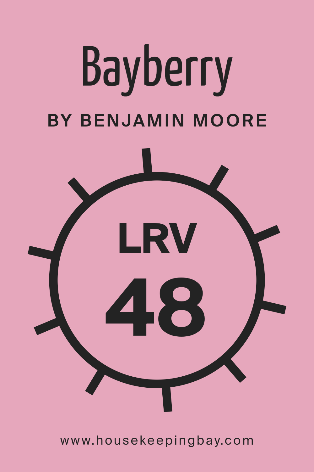
What is the LRV of Bayberry 2080-50 by Benjamin Moore?
LRV, or Light Reflectance Value, refers to the percentage of light a paint color reflects back into the room as opposed to absorbing it. This value ranges from 0 (absorbs all light, giving off no reflection, like pure black) to 100 (reflects all light, like pure white).
A higher LRV means the color reflects more light, making spaces appear larger and brighter, while a lower LRV can make a room feel cozier and somewhat smaller because it absorbs more light.
For Bayberry 2080-50 by Benjamin Moore, with an LRV of 48.1, this color sits near the middle of the scale. It won’t make a room feel as open and airy as a color with a higher LRV might, but it also won’t make it feel as snug as darker shades would.
This moderate LRV makes Bayberry 2080-50 versatile, suitable for spaces that need a balance of warmth and light. It’s a good choice for rooms that have moderate natural lighting and where neither a stark brightness nor too much coziness are desired.
housekeepingbay.com
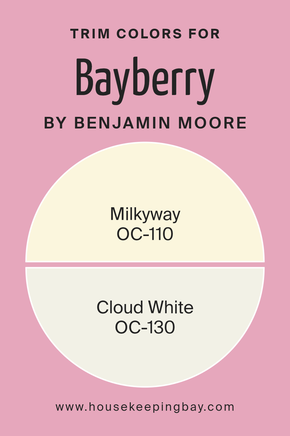
What are the Trim colors of Bayberry 2080-50 by Benjamin Moore?
Trim colors are specific shades used to accentuate architectural features such as moldings, door frames, and window casings. These colors play a crucial role in defining and highlighting the structural elements of a space, providing a visual contrast that can enhance the overall aesthetic of a room.
For instance, when using a deeper shade like Bayberry 2080-50 by Benjamin Moore on the walls, selecting lighter trim colors such as OC-110 Milkyway or OC-130 Cloud White can create a sharp, clean outline that makes the wall color pop and adds a sense of dimension and cleanliness to the room.
OC-110 Milkyway is a soft, off-white with a comforting warmth that subtly brightens up a space without overwhelming it. This color works well in a variety of lighting conditions, making it a versatile choice for many spaces. On the other hand, OC-130 Cloud White offers a slightly brighter and crisper look, providing a fresh and airy feel to any room.
It reflects light beautifully, ensuring that spaces feel more open and light-filled, which can be particularly effective in smaller or darker areas. Both colors complement the rich tone of Bayberry, enhancing its beauty without stealing the spotlight.
You can see recommended paint colors below:
- OC-110 Milkyway
- OC-130 Cloud White
housekeepingbay.com
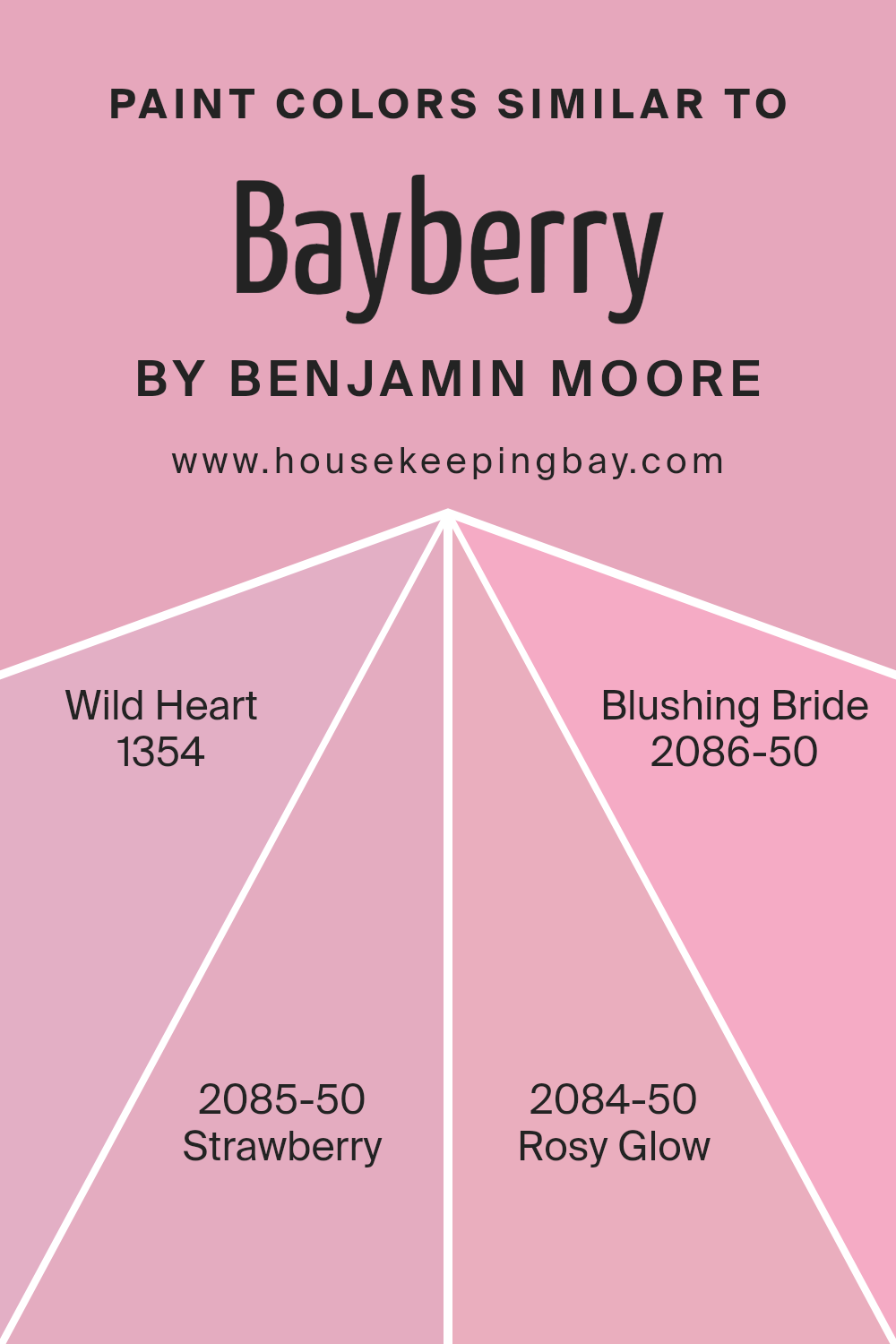
Colors Similar to Bayberry 2080-50 by Benjamin Moore
Similar colors play a vital role in creating a harmonious and soothing atmosphere in a space, enhancing visual appeal without being overwhelming. Colors like Wild Heart, Strawberry, Rosy Glow, and Blushing Bride all share a certain closeness to Bayberry by Benjamin Moore, which allows for a cohesive look while still offering slight variations to add interest and personality to a room.
Wild Heart is a gentle and welcoming shade that carries a hint of playfulness, making it ideal for spaces that aim to be both cozy and lively. Strawberry is a slightly bolder hue that conjures images of a ripe, juicy strawberry, perfect for adding a dash of cheer in any corner.
Rosy Glow has a warm, tender blush tone that radiates calmness, suitable for areas where relaxation is a priority. Lastly, Blushing Bride offers a soft, delicate pink that infuses a touch of romance and softness, ideal for creating a peaceful retreat in your home. Each of these colors contributes to creating a visual palette that is both refreshing and comforting, perfect for anyone looking to enhance their living environment subtly and beautifully.
You can see recommended paint colors below:
- 1354 Wild Heart
- 2085-50 Strawberry
- 2084-50 Rosy Glow
- 2086-50 Blushing Bride
housekeepingbay.com
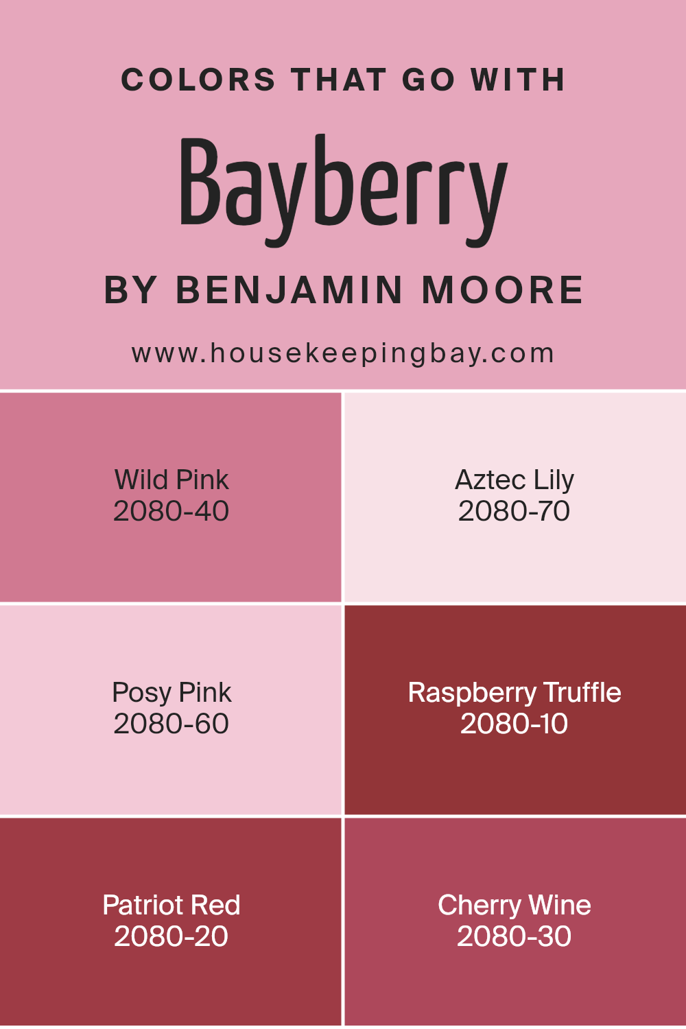
Colors that Go With Bayberry 2080-50 by Benjamin Moore
Choosing the right colors to complement Bayberry 2080-50 by Benjamin Moore is crucial for creating a cohesive and appealing aesthetic in any space. Bayberry itself is a vibrant and lively shade that can serve as a fantastic background or accent color. Pairing it with well-chosen hues enhances the overall look by adding depth and interest to your décor.
Wild Pink 2080-40 is a soft and gentle color that adds a touch of sweetness, making it ideal for balancing the boldness of Bayberry. Aztec Lily 2080-70 offers a lighter, more whimsical pink that injects a fresh burst of brightness into rooms, which helps in lifting the mood of darker spaces.
Posy Pink 2080-60 is another light-hearted pink that pairs nicely with Bayberry, offering a charming backdrop that’s both youthful and cheerful. On the other hand, Raspberry Truffle 2080-10 provides a rich, deep contrast that is perfect for creating a more sophisticated or dramatic effect when combined with Bayberry.
Patriot Red 2080-20 is a vivid red that brings a strong dash of energy and warmth, complementing Bayberry’s natural vivacity. Lastly, Cherry Wine 2080-30 exudes a deep, luxurious vibe that matches beautifully with the freshness of Bayberry, perfect for an elegant and refined environment. Together, these colors work harmoniously to enrich and enliven spaces, making them more inviting and personal.
You can see recommended paint colors below:
- 2080-40 Wild Pink
- 2080-70 Aztec Lily
- 2080-60 Posy Pink
- 2080-10 Raspberry Truffle
- 2080-20 Patriot Red
- 2080-30 Cherry Wine
housekeepingbay.com
How to Use Bayberry 2080-50 by Benjamin Moore In Your Home?
Bayberry 2080-50 by Benjamin Moore is a warm and cheerful paint color that resembles rich berries. This lively hue can add a vibrant pop of color to any space in your home. Ideal for adding personality to your living room or bringing energy to a kitchen, Bayberry can make small spaces seem more inviting and dynamic. You could paint an accent wall in this shade to create a focal point in a room, or use it to paint a piece of furniture for a quick and easy update.
Bayberry is also a great choice for bedrooms when paired with softer tones, as it provides a pleasant contrast that’s not too overwhelming. In bathrooms, this color can make your mornings brighter.
This shade works well with natural light but can also function beautifully in rooms with limited natural light, bringing warmth and depth. For a cohesive look, combine Bayberry with neutral colors like soft whites or light grays in your décor and textiles.
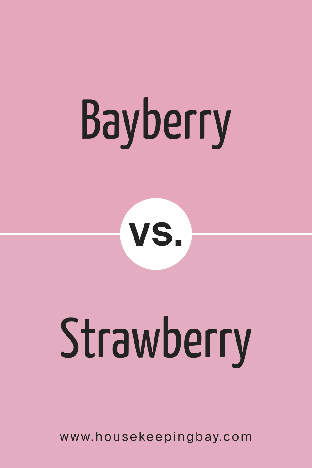
Bayberry 2080-50 by Benjamin Moore vs Strawberry 2085-50 by Benjamin Moore
“Bayberry 2080-50” by Benjamin Moore is a deep, serene shade that blends green and blue hues to create a soothing presence. It’s a color that can act as both a bold statement or a calm background, depending on its application in the room. This versatility makes it suitable for spaces where a touch of nature’s calmness is desired.
Conversely, “Strawberry 2085-50,” also by Benjamin Moore, is a lively and cheerful pink that brings a touch of warmth and brightness to any space. This pink is vibrant without being overwhelming, making it perfect for areas that need a pop of color to energize the room. It works exceptionally well in spaces intended to be fun and inviting.
Both colors offer unique atmospheres: Bayberry introduces a natural and grounding feel, while Strawberry adds a playful and welcoming vibe. Choosing between them depends on the desired emotional impact for the space.
You can see recommended paint color below:
- 2085-50 Strawberry
housekeepingbay.com
Bayberry 2080-50 by Benjamin Moore vs Rosy Glow 2084-50 by Benjamin Moore
The main color, Bayberry 2080-50 by Benjamin Moore, is a vibrant green with a cool undertone that creates a vivid, refreshing feel in any space. This color is perfect for those looking to bring the essence of nature indoors, providing an energetic yet balanced atmosphere.
The second color, Rosy Glow 2084-50 by Benjamin Moore, contrasts Bayberry as it is a soft pink hue. Rosy Glow offers a gentle and soothing vibe, making it ideal for rooms where a calm, nurturing environment is desired. It pairs well with warm lighting and can be used to soften a space that needs a touch of tenderness.
When comparing these two, Bayberry brings a zest of life and is more invigorating, while Rosy Glow lends a serene and cozy feel. Each can dramatically alter a room’s mood, depending on what you’re aiming for—vivid and lively with Bayberry or calm and soothing with Rosy Glow. Perfect for different preferences and room uses.
You can see recommended paint color below:
- 2084-50 Rosy Glow

housekeepingbay.com
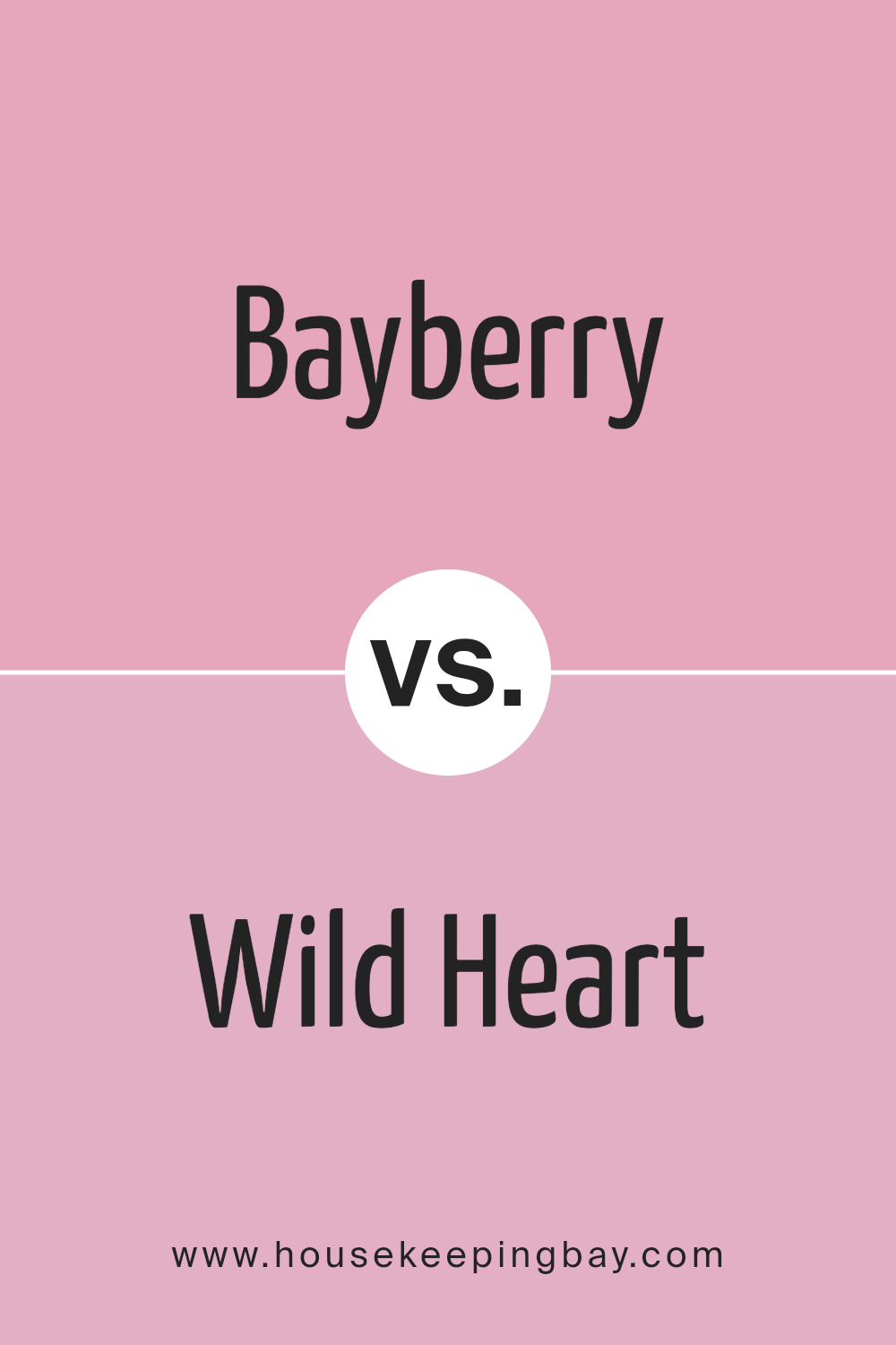
Bayberry 2080-50 by Benjamin Moore vs Wild Heart 1354 by Benjamin Moore
Bayberry 2080-50 by Benjamin Moore is a vibrant green with a strong presence of blue, giving it a fresh, cool tone. This color can brighten up a space while maintaining a soothing atmosphere. It’s ideal for places where you want to add energy without overwhelming the senses.
Wild Heart 1354 by Benjamin Moore, in comparison, leans towards a deeper, rich pink hue. This color offers a sense of warmth and coziness, which makes it great for living areas or bedrooms where a comforting ambiance is desired.
While both colors bring their unique moods to a room, Bayberry’s cool tones provide a contrasting backdrop to Wild Heart’s warm touch. Collectively, they could create a balanced environment when used together in home décor. Where Bayberry brings a refreshing airiness, Wild Heart introduces a soft, enveloping feel, each enhancing the mood in their respective ways.
You can see recommended paint color below:
- 1354 Wild Heart
housekeepingbay.com
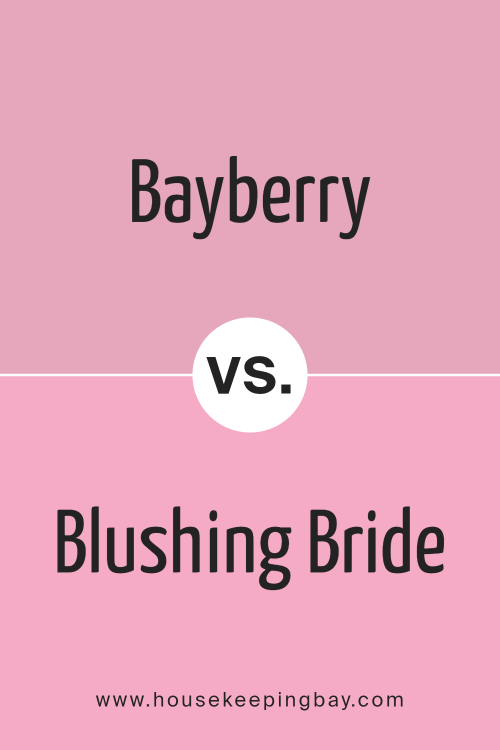
Bayberry 2080-50 by Benjamin Moore vs Blushing Bride 2086-50 by Benjamin Moore
Bayberry 2080-50 and Blushing Bride 2086-50 by Benjamin Moore are two distinct colors with unique vibes. Bayberry 2080-50 is a rich, vibrant green that can create a fresh and energetic atmosphere in any space. It’s a color that simulates the lushness of natural greenery, making it ideal for spaces where you want to add a touch of nature’s vitality.
Blushing Bride 2086-50, in contrast, is a soft, gentle pink that brings a warm and inviting feeling to a room. This color is understated yet sweet, perfect for areas where you want to encourage relaxation and comfort. It’s particularly fitting for bedrooms or bathrooms where a calming influence is desired.
When deciding between the two, consider the mood you wish to set. Bayberry 2080-50 injects life and energy due to its boldness, while Blushing Bride 2086-50 offers a soothing touch with its muted tones. Both colors provide beautiful options but serve different aesthetic goals depending on the space and the ambiance you aim to achieve.
You can see recommended paint color below:
- 2086-50 Blushing Bride
housekeepingbay.com
Conclusion
I’ve found that 2080-50 Bayberry by Benjamin Moore is a paint color that suits those who prefer subtle yet unique wall colors in their living spaces or offices. The gentle mix of green and blue hues offers a fresh and soothing feel, making any room seem more welcoming and comfortable. This color works beautifully in various settings, adapting well to both traditional and modern decors.
From my experience, Bayberry goes well with natural light, enhancing the space with a lively yet calm atmosphere. It pairs nicely with light woods, white trim, and can even hold its own against darker furniture, providing a lovely contrast. For those considering a new paint color, Bayberry could definitely be a worthy option.
It’s versatile, not too bold or overpowering, and it gives the room a touch of nature’s serenity without being too intense. Ultimately, choosing a paint color like 2080-50 Bayberry can really refresh your home’s style and feel.
Whether you’re looking to repaint a single room or redesign your entire home interior, the peaceful yet fresh vibe of Bayberry might just be what you need to create a more enjoyable and stylish environment. So, if you are keen on giving your space a new look, consider giving Bayberry a chance. I think you’ll be pleased with the fresh and gentle atmosphere it brings.
housekeepingbay.com
