Alfresco 1672 by Benjamin Moore
Fresh Charm for Your Spaces
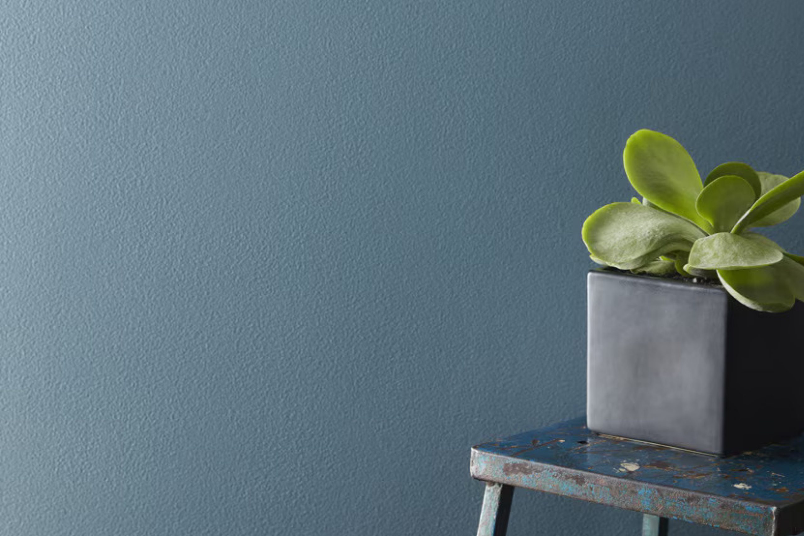
This paint color offers a calm and pleasant vibe that can instantly refresh any room in your home. Perfect for creating a serene atmosphere, it’s a top pick if you’re planning to update your living room, bedroom, or even your kitchen.
1672 Alfresco by Benjamin Moore is not just another blue shade; it has a unique quality that helps create a soft, welcoming feel. Its ability to infuse a sense of peace and freshness into any space makes it a great option for those who value a soothing environment.
Whether you’re revamping a small area or painting a whole house, Alfresco provides a smooth finish that works wonderfully with a variety of decorating styles, making your decorating process a breeze. Easy to apply and blend with other hues, Alfresco can help you achieve the ideal look you’ve been wanting.
So, if you’re ready to refresh your space with a new coat of paint, consider Alfresco for a gentle yet effective transformation.
via benjaminmoore.com
What Color Is Alfresco 1672 by Benjamin Moore?
Alfresco 1672 by Benjamin Moore is a soothing blue hue with gray undertones, offering a serene vibe to any space. The gentle balance between blue and gray makes this color versatile enough to act as either a neutral base or a subtle pop of color. Because of its calming qualities, Alfresco 1672 is ideal for bedrooms and bathrooms, where relaxation is key. It also works well in living areas and kitchens, providing a fresh, airy feel.
This color fits effortlessly into various interior styles such as Scandinavian, coastal, and modern. Its understated elegance is particularly suited to minimalist and contemporary themes, where clean lines and uncluttered spaces take precedent.
When considering materials and textures to pair with Alfresco 1672, think natural elements. Light woods like oak and birch complement its earthy base, enhancing the tranquil feel of the room. In terms of textures, linen and soft, woven fabrics can add warmth, making the environment feel welcoming and cozy.
For a bit of contrast, incorporate metals like brushed nickel or stainless steel, which provide sleek, modern accents without overpowering the room’s subtle aesthetic.
housekeepingbay.com
Is Alfresco 1672 by Benjamin Moore Warm or Cool color?
Alfresco 1672 by Benjamin Moore is a calming shade of blue that feels refreshing and soothing. This color brings a sense of peace and quiet simplicity to any room. It is light enough to make small spaces appear bigger and can also give a fresh look to larger rooms.
This shade works well in areas that get a lot of sunlight, where it reflects the light beautifully, creating an airy feel. Alfresco 1672 fits perfectly in bedrooms, bathrooms, and living spaces, providing a neutral backdrop that complements various decor styles and furniture colors.
It pairs nicely with whites, grays, and even some pastel colors, allowing for versatile design options. Moreover, this paint is durable and hides imperfections on walls quite well, making it a practical choice for busy households. The calming effect of Alfresco 1672 makes it an ideal choice for creating a soothing home environment where you can relax and unwind.
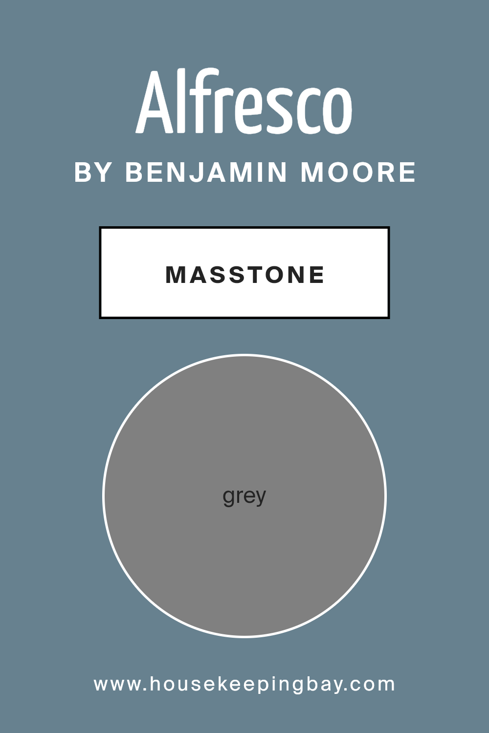
What is the Masstone of the Alfresco 1672 by Benjamin Moore?
Alfresco1672 by Benjamin Moore is a classic grey shade with a masstone of Grey (#808080). This color provides a neutral backdrop that works well in various home styles. The strength of this grey allows it to stand alone as a primary color in rooms or act as a complementary shade to brighter or darker colors.
Grey is a versatile color that can create a calming atmosphere in a busy home. The neutrality of Alfresco1672 helps in making spaces look more spacious and clean, which is ideal for smaller rooms or apartments. It fits naturally in modern decor schemes, thanks to its timeless elegance, but can also look great in traditional settings when paired with wood finishes and soft textiles.
Because it doesn’t lean too cold or warm, Alfresco1672 is excellent for rooms that get any amount of natural light, maintaining its true color throughout the day. This adaptability makes it a popular choice for common areas like living rooms and kitchens, as well as private spaces like bedrooms and home offices.
housekeepingbay.com
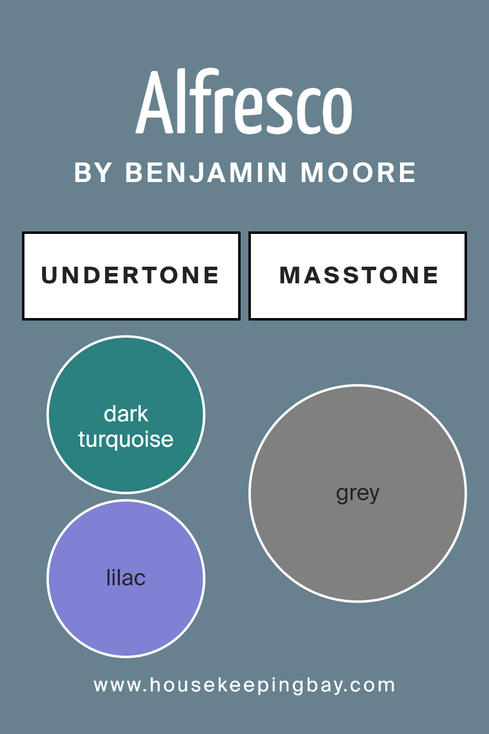
Undertones of Alfresco 1672 by Benjamin Moore
Alfresco1672 by Benjamin Moore is a complex color with a mix of various undertones that can significantly influence the feel and appearance of a room. This paint contains undertones like dark turquoise, lilac, mint, and many more, adding depth and richness to the primary color. Each undertone plays a role in how the paint reacts to different lighting and surrounding colors.
For example, dark turquoise and light turquoise can give a sense of freshness and coolness, making a space feel more open and airy. On the other hand, shades like brown and dark grey can ground the color, providing a sense of stability and warmth. Undertones like pale pink and lilac can soften the appearance of the walls, contributing to a more soothing and gentle atmosphere.
When applied on interior walls, Alfresco1672’s undertones interact with the room’s lighting and other colors present in the decor. In natural light, cooler undertones like light blue and violet may become more pronounced, enhancing a calming effect. In artificial lighting, warmer undertones like orange or brown might become more noticeable, creating a cozy and welcoming space.
Thus, the various undertones in Alfresco1672 can affect the mood and character of a room. Understanding these undertones will help in choosing compatible furniture and decorations to achieve a harmonious interior design.
housekeepingbay.com
Coordinating Colors of Alfresco 1672 by Benjamin Moore
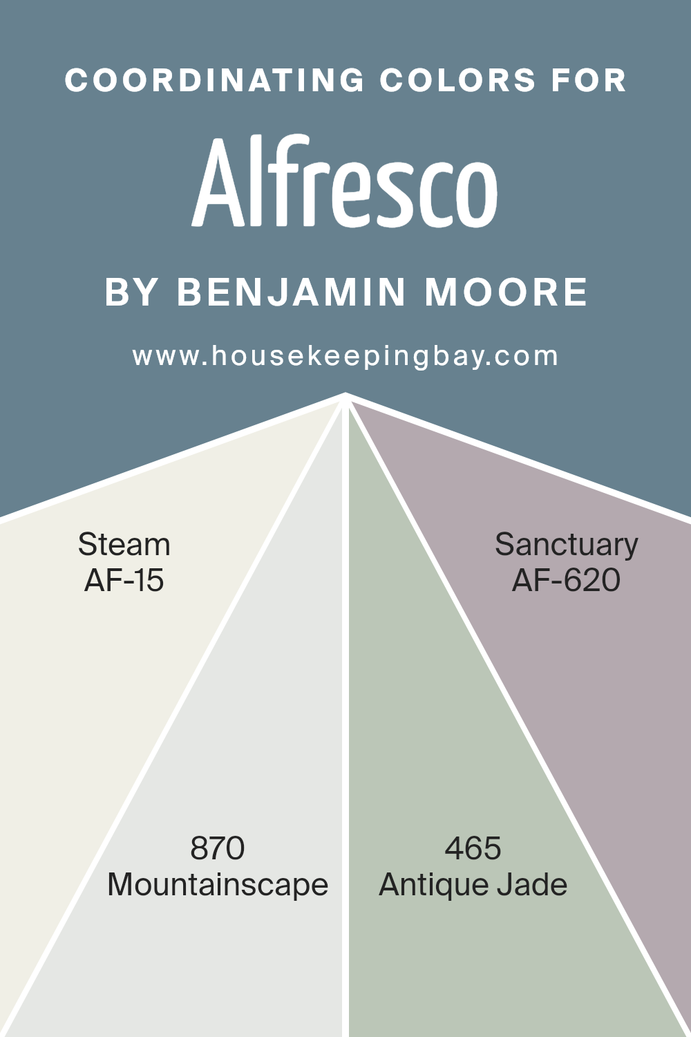
Coordinating colors are those that harmoniously complement each other when used in tandem, making them ideal for creating visually appealing and balanced spaces. For instance, the color palette from Benjamin Moore includes Alfresco 1672, a pairing that involves shades like AF-15 – Steam, 870 – Mountainscape, 465 – Antique Jade, and AF-620 – Sanctuary. These colors work together by balancing each other’s tones; some are neutral while others add depth and interest.
AF-15 – Steam is a gentle, soft white that serves perfectly as a backdrop, giving other shades a chance to shine. It’s subtle, making it a seamless foundation for any theme. 870 – Mountainscape offers a medium-dark gray with blue undertones, providing a strong, solid presence that can anchor a room’s scheme.
Up next, 465 – Antique Jade presents a vibrant mid-tone green with a hint of blue, injecting a fresh and lively mood into the space. Finally, AF-620 – Sanctuary, a soft, muted taupe, contributes a soothing, warm touch, rounding out the ensemble by blending smoothly with both the lighter and darker hues. These coordinating colors together inspire creativity in home decorating, allowing for a range of combinations that can suit various tastes and styles.
You can see recommended paint colors below:
- AF-15 Steam
- 870 Mountainscape
- 465 Antique Jade
- AF-620 Sanctuary
housekeepingbay.com
How Does Lighting Affect Alfresco 1672 by Benjamin Moore?
Lighting plays a crucial role in how we perceive colors, significantly influencing their appearance in different environments. The color perception can vary under natural light compared to artificial light. For instance, Alfresco 1672 by Benjamin Moore may appear differently depending on the light source due to its unique undertones and saturation level.
In natural light, Alfresco 1672 tends to show its true color.
Natural light, especially from the sun, provides a balanced spectrum that allows colors to be seen as they are.
In artificial light, such as from LED or incandescent bulbs, the same color might shift slightly. LEDs can make Alfresco 1672 look more vibrant and sharper, while incandescent bulbs can give it a warmer and softer appearance.
The orientation of the room also affects how Alfresco 1672 looks. North-faced rooms receive less direct sunlight, which can make the color appear more muted and cooler, emphasizing its subtler blue or gray undertones. This may give the room a calm and soothing feel but can make the color appear somewhat shadowy, especially in the corners of the room.
In south-faced rooms, Alfresco 1672 receives ample sunlight, which can brighten the color, making it look more lively and true to its intended shade. The richness of the color comes to life in these conditions, often giving the space a more cheerful and inviting feel.
East-faced rooms see the most change in color perception throughout the day. Morning light can make Alfresco 1672 look soft and welcoming, whereas the color might start looking cooler and more reserved as the day progresses.
West-faced rooms get intense evening light, which could make Alfresco 1672 look dramatically different. In bright, direct afternoon light, it might look warmer and more dynamic, but as the sun sets, it might settle into a deeper, more tranquil shade.
Thus, Alfresco 1672’s appearance can be quite dynamic, changing throughout the day and with varying lighting conditions, impacting the atmosphere of the room.
housekeepingbay.com
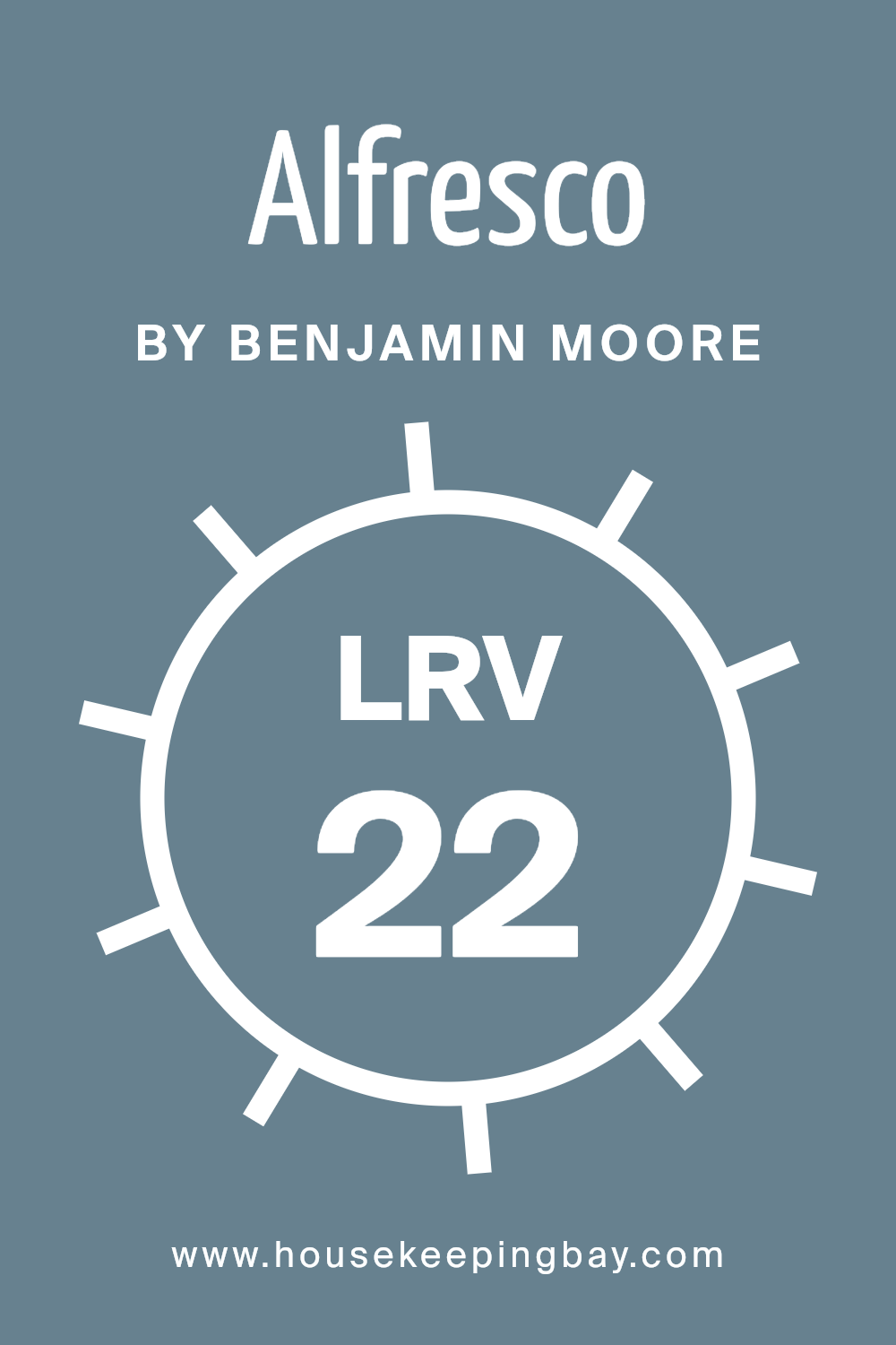
What is the LRV of Alfresco 1672 by Benjamin Moore?
LRV stands for Light Reflectance Value, a measure indicating how much light a paint color reflects back into a room. It ranges from 0 to 100, where 0 absorbs all light and 100 reflects all light. Lighter colors usually have higher LRVs and make rooms feel more open and brighter because they reflect more light. The darker the color, the lower its LRV, causing it to absorb more light, which can make a space feel cozier but smaller and darker.
Looking specifically at Alfresco 1672 by Benjamin Moore, which has an LRV of 21.68, it’s on the darker side of the scale. This means it will not reflect much light, absorbing more instead. In rooms with less natural light or smaller spaces, using a color like Alfresco 1672 might make the area feel more enclosed.
However, in a well-lit or large room, this color can add depth and warmth, creating a more intimate atmosphere. Remember, the perception of the color can change depending on lighting conditions, so it’s important to consider the room’s light sources when choosing this shade.
housekeepingbay.com
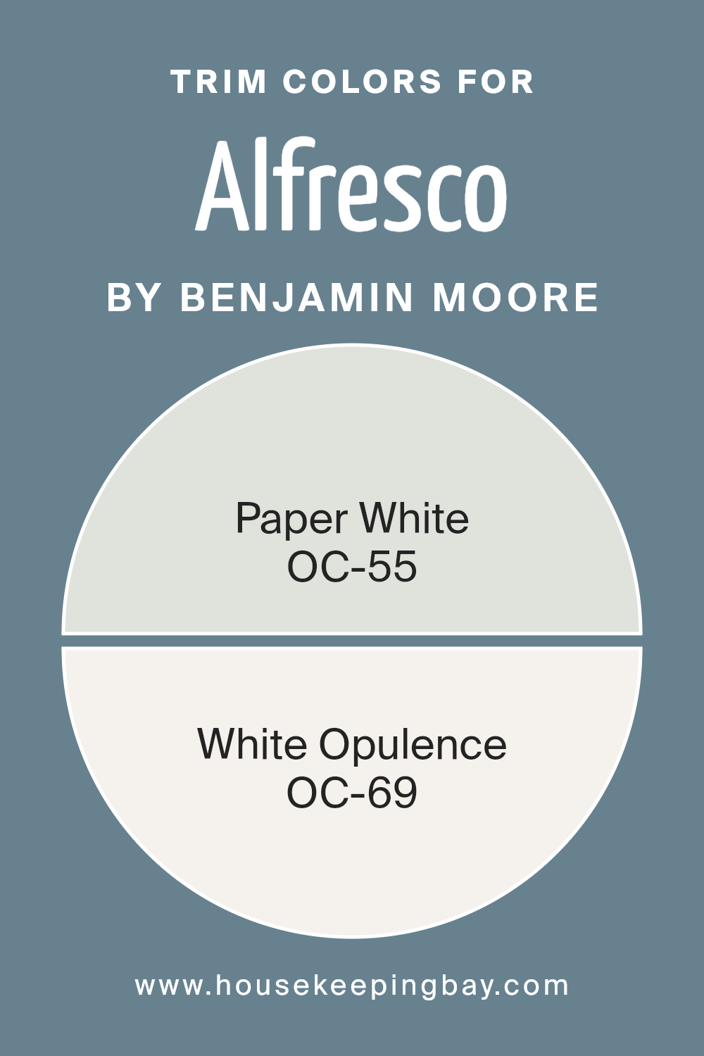
What are the Trim colors of Alfresco 1672 by Benjamin Moore?
Trim colors refer to the shades used on the architectural elements of a space, like door frames, window frames, crown moldings, and baseboards, that differ from the main wall color. In the case of Alfresco 1672 by Benjamin Moore, choosing trim colors such as OC-55—Paper White and OC-69—White Opulence can significantly enhance the aesthetic appeal and visual cohesion of a room.
These colors can create a subtle yet effective contrast that highlights and defines the architectural features, ensuring that they do not blend too seamlessly into the walls. Properly selected trim colors can frame spaces in your home, much like a picture, adding layers and depth to the overall ambiance.
OC-55—Paper White is a gentle off-white that has a soft and airy feel to it, making it a versatile option for trim, bringing a fresh and clean look that complements the more pronounced tones of Alfresco 1672. OC-69—White Opulence is another white tone but with a hint of warmth that adds a welcoming and soothing touch to the surroundings. It pairs beautifully with deeper hues, providing a mild but definite lift to the entire color scheme without overwhelming the primary color. Both colors serve to subtly highlight the room’s dimensions and details.
You can see recommended paint colors below:
housekeepingbay.com
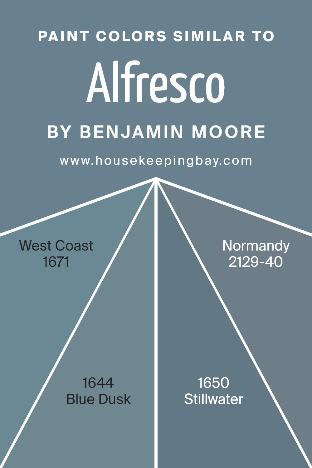
Colors Similar to Alfresco 1672 by Benjamin Moore
In the palette of interior design, similar colors play a crucial role in creating an atmosphere that is cohesive and soothing. Colors like Alfresco 1672 by Benjamin Moore and its close relatives (West Coast 1671, Blue Dusk 1644, Stillwater 1650, and Normandy 2129-40) provide a harmonious blend that can unify a space without stark contrasts, offering a gently flowing visual experience. These shades, nestled closely on the color wheel, facilitate a smooth transition from one area to another in a room, making the environment feel larger and more open.
West Coast 1671 is a soft gray with blue undertones that evokes a sense of calm ocean mornings. Blue Dusk 1644, a cooler shade, hints at the quiet mystery of twilight skies. Stillwater 1650 slightly deepens the mix with its reflection of serene waters, adding a touch of depth to the palette.
Normandy 2129-40, the strongest among them, brings in a richer, more pronounced blue that recalls the stately charm of its historic namesake. These variations allow for flexibility in design, providing options to use as primary hues for walls or as accent colors, ensuring a fluid theme throughout the space.
You can see recommended paint colors below:
- 1671 West Coast
- 1644 Blue Dusk
- 1650 Stillwater
- 2129-40 Normandy
housekeepingbay.com
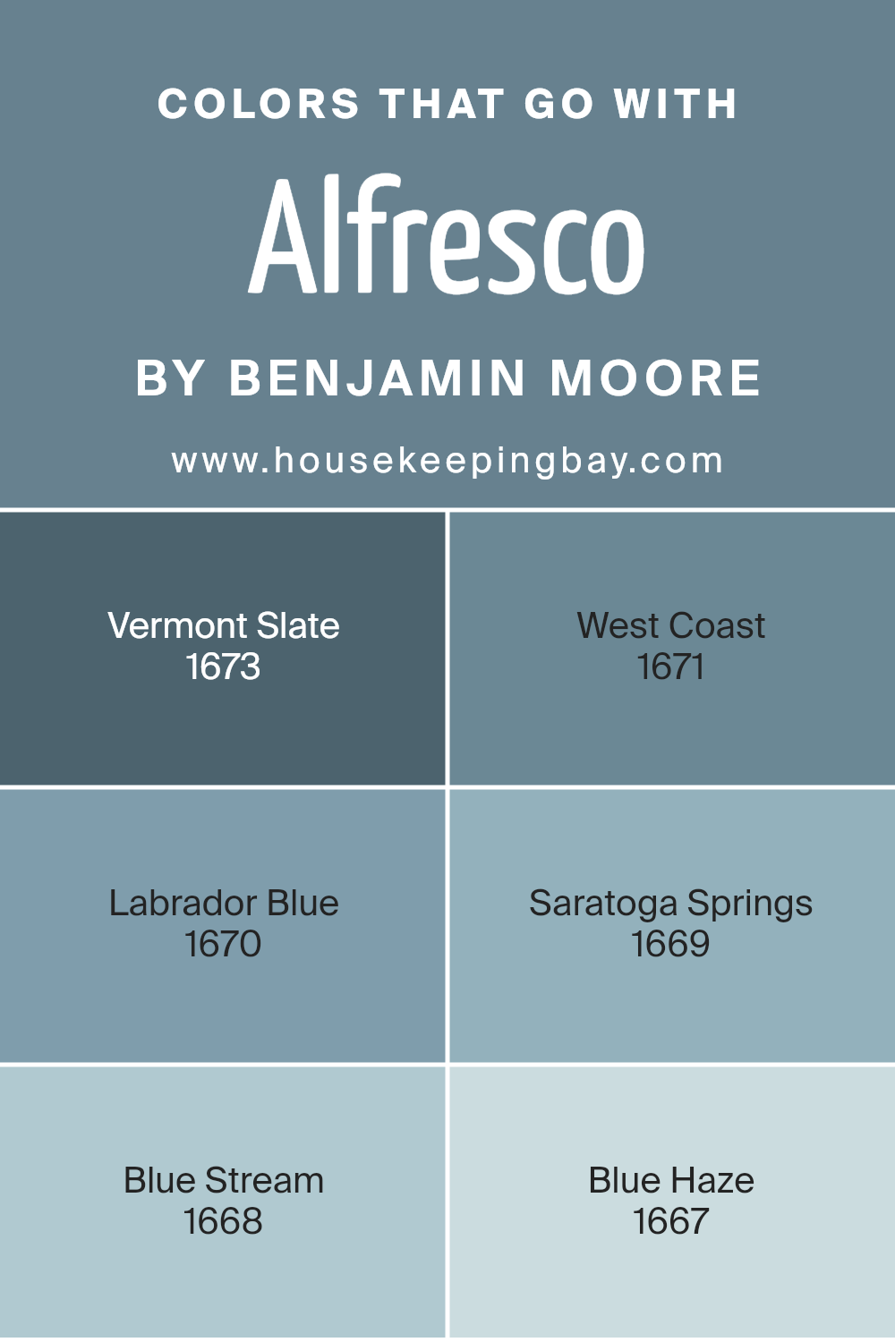
Colors that Go With Alfresco 1672 by Benjamin Moore
Selecting complementary colors for Alfresco 1672 by Benjamin Moore is key to achieving a harmonious and appealing look in any space. These colors, ranging from vibrant blues to subtle greys, offer a broad palette to enhance the main hue without overwhelming it. When paired correctly, they can enrich the atmosphere of a room, adding depth and character.
For example, Vermont Slate 1673 brings in a strong yet soothing grey that coordinates perfectly with Alfresco 1672, setting a serene mood. West Coast 1671, a lighter shade, offers a gentle contrast that softens spaces with its airy feel.
Laborador Blue 1670 adds an enlivening splash of blue that energizes the more muted Alfresco 1672. It’s ideal for creating focal points in rooms without becoming too bold. Saratoga Springs 1669 introduces a darker, subtler blue that grounds the environment, providing a solid contrast to the lighter tones in the palette.
Blue Stream 1668 has a vibrant, refreshing touch that rejuvenates interiors, making it perfect for livelier spaces. Lastly, Blue Haze 1667 offers a dustier version of blue, excellent for those wishing to maintain a calm yet colorful ambiance. These colors, when used alongside Alfresco 1672, ensure that interior spaces not only feel cohesive but also express a refined color story.
You can see recommended paint colors below:
- 1673 Vermont Slate
- 1671 West Coast
- 1670 Labrador Blue
- 1669 Saratoga Springs
- 1668 Blue Stream
- 1667 Blue Haze
housekeepingbay.com
How to Use Alfresco 1672 by Benjamin Moore In Your Home?
Alfresco 1672 by Benjamin Moore is a soothing blue paint that can refresh any room in your home. Ideal for creating calm atmospheres, this shade suits bedrooms and bathrooms perfectly, where a peaceful vibe is often desired. The soft, airy quality of Alfresco 1672 pairs well with light woods and white accents for a clean, modern look, or it can be matched with darker furniture for a more classic feel.
In living spaces, such as family rooms or dining areas, Alfresco 1672 adds a subtle touch of color without overwhelming the senses. It works beautifully as an accent wall to highlight a particular area, or when used on all walls for a cohesive effect. For those who enjoy DIY projects, this color can rejuvenate old furniture and give cabinets a fresh, new look.
Alfresco 1672 is versatile, lending itself well to various decorating styles—from contemporary to traditional—making it quite practical for any home.
Alfresco 1672 by Benjamin Moore vs Stillwater 1650 by Benjamin Moore
The two colors, Alfresco 1672 and Stillwater 1650 from Benjamin Moore, offer distinct vibes. Alfresco 1672 is a serene, light blue with a soft, airy feel, great for creating a peaceful atmosphere in any room. It reflects a lot of light, making spaces appear larger and more open.
In contrast, Stillwater 1650, while also blue, leans towards a deeper, moodier tone. This color can add a touch of sophistication to spaces and is perfect for accent walls or furniture pieces for a more pronounced statement.
Both colors work well in designs aiming for calm and soothing themes, but the choice between them depends on the desired intensity and impact of the color in the room. While Alfresco 1672 brightens and opens up spaces, Stillwater 1650 offers a grounded, richer presence.
You can see recommended paint color below:
- 1650 Stillwater

housekeepingbay.com
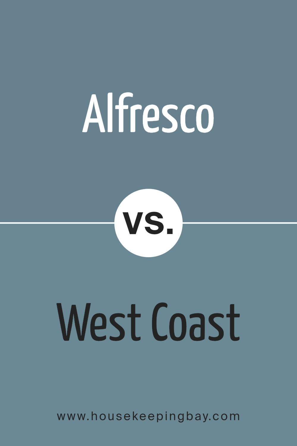
Alfresco 1672 by Benjamin Moore vs West Coast 1671 by Benjamin Moore
The colors Alfresco 1672 and West Coast 1671 from Benjamin Moore are both unique but share a comforting vibe. Alfresco 1672 is a deep, rich blue with a calming effect and a hint of sophistication. It could remind you of a serene evening sky. This color is perfect for spaces where relaxation is key, like bedrooms or reading areas.
West Coast 1671, however, has a lighter, more airy feel. It leans towards a soft gray with subtle blue undertones, which makes it very versatile. It’s great for making smaller spaces appear bigger and can be used almost anywhere in the home for a fresh, modern look.
Both colors can help create a peaceful environment but in different ways. Alfresco leans towards a more dramatic flair, whereas West Coast offers a gentle backdrop that blends effortlessly with various decor styles. Choosing between them depends on the mood and space you want to create.
You can see recommended paint color below:
- 1671 West Coast
housekeepingbay.com
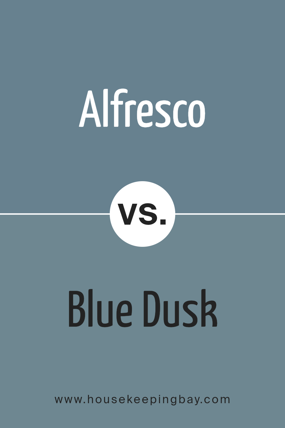
Alfresco 1672 by Benjamin Moore vs Blue Dusk 1644 by Benjamin Moore
The color Alfresco 1672 by Benjamin Moore is a vibrant sky blue with a fresh and lively feel to it. It has the brightness that can add a sense of cheer and airiness to any space. This shade is great for rooms where you want to create an upbeat and inviting atmosphere.
In contrast, Blue Dusk 1644 by Benjamin Moore offers a darker, moodier tone. This color resembles the deep shade of twilight, giving it a more subtle and serene presence. It works well in areas where you prefer a more subdued or sophisticated look, such as bedrooms or offices.
Overall, while both colors belong to the blue family, Alfresco 1672 injects energy and brightness, making spaces feel more open and vibrant. Blue Dusk 1644, with its deeper tone, provides a quieter and more introspective vibe that suits spaces designed for relaxation and contemplation. Choosing between them depends on the mood and function you want for your room.
You can see recommended paint color below:
- 1644 Blue Dusk
housekeepingbay.com
Alfresco 1672 by Benjamin Moore vs Normandy 2129-40 by Benjamin Moore
Alfresco 1672 by Benjamin Moore is a light and airy blue that gives off a fresh and clean vibe, perfect for creating a soothing atmosphere in any room. Its gentle tone can help make small spaces feel larger and more open. This color works well in bedrooms and bathrooms, where a calming effect is often desired.
In contrast, Normandy 2129-40 by Benjamin Moore is a much deeper, grayish-blue that carries a more dramatic and bold feel. This color is ideal for those looking to make a strong statement in their space. It is particularly suited for accent walls or rooms where you want to add a sense of sophistication and depth.
While both colors belong to the blue family, Alfresco 1672 is significantly lighter and can be used to achieve a serene and breezy look, whereas Normandy 2129-40 is better for adding a touch of elegance and drama. The choice between the two will depend on the mood and style you want to create in your space.
You can see recommended paint color below:
- 2129-40 Normandy
housekeepingbay.com
This color works wonders in rooms that need a touch of softness, making it an excellent choice for bedrooms or spaces meant for relaxation. The subtle blue tones offer a refreshing vibe without overwhelming the senses, which is essential for creating a space that feels both inviting and restful.
I found that this paint is not only practical but also versatile. It pairs beautifully with a wide range of decor styles, from modern minimalist to rustic farmhouse. This makes 1672 Alfresco a smart pick for anyone looking to update their interiors with a color that will likely stand the test of time.
In terms of application, the paint goes on smoothly, and coverage is top-notch. A few coats are enough to achieve a consistent look. Durability is another plus, with the finish holding up well against daily wear and tear. This makes it suitable for high-traffic areas as well.
Overall, for anyone considering a new paint color, I highly recommend 1672 Alfresco by Benjamin Moore. It combines aesthetic appeal with practical benefits, making it an all-around solid choice for any painting project. Whether you’re aiming to freshen up a single room or revamp your entire home, this color could very well be the perfect fit.
housekeepingbay.com
