Yorkshire Tan HC-23 by Benjamin Moore
Warm Elegance in Every Stroke
Are you thinking about freshening up your space with a new paint color? You might want to consider HC-23 Yorkshire Tan by Benjamin Moore. It’s a warm, inviting hue that can add a cozy touch to any room in your home. Yorkshire Tan is more than just a basic beige; it has undertones that can bring a subtle richness to your walls, working well in spaces with both natural and artificial light.
This shade is ideal if you’re aiming to create a comforting atmosphere without the room feeling too dark. It pairs beautifully with a wide range of decor styles, from rustic to modern, making it a great choice for living rooms, bedrooms, and even kitchens. Whether you’re refreshing old paint or starting from scratch, Yorkshire Tan could be the perfect backdrop for your interior transformations.
Plus, it’s a color that tends to complement various types of furniture and accents, so you likely won’t have trouble matching it with your existing pieces.
Think of it as a canvas, ready to support whatever unique stylistic details you want to layer on. With Yorkshire Tan, you’re setting up a solid foundation for creating a warm, welcoming environment.
via benjaminmoore.com
What Color Is Yorkshire Tan HC-23 by Benjamin Moore?
Table of Contents
Yorkshire Tan HC-23 by Benjamin Moore is a warm, inviting beige with subtle undertones of yellow and brown. This mid-tone color provides a cozy, earthy feel to any room, making it a versatile choice for various spaces within a home. As part of the Historical Collection, Yorkshire Tan bridges traditional charm with modern appeal, ensuring it works well in both classic and contemporary settings.
In terms of interior styles, Yorkshire Tan shines in rustic and country designs but is equally at home in transitional and modern farmhouse decors. Its warm hue complements natural materials like wood, helping to highlight its rich tones, from pine to mahogany. When paired with stone, whether in accessories or architectural features, it underscores the organic beauty of these elements.
Textures that go well with Yorkshire Tan include linen, burlap, and knit throws, adding layers of comfort and visual interest. This color supports a range of metal finishes too, from the warmth of copper and brass to the coolness of brushed nickel, providing flexibility in choosing decor accents.
Overall, Yorkshire Tan HC-23 offers a balanced backdrop for a cozy, harmonious living environment, adaptable enough to fit various tastes and preferences in both color pairings and material interaction.
housekeepingbay.com
Is Yorkshire Tan HC-23 by Benjamin Moore Warm or Cool color?
Yorkshire Tan HC-23 by Benjamin Moore is a rich, warm hue from their Historical Collection, often chosen for its cozy and inviting feel. This shade of tan blends beautifully with a variety of decor styles and adds a touch of warmth to any room.
It’s particularly effective in living rooms and bedrooms where a muted, comforting atmosphere is desired. The color works well with natural light, softening the space during the day with a gentle and welcoming glow. In homes, Yorkshire Tan can serve as a neutral backdrop, making it easy to pair with bolder colors in furniture and accents.
It does not overpower the senses, which makes it a practical choice for those wishing to maintain a subtle and relaxing environment. Moreover, this shade harmoniously complements wood finishes, enhancing the natural beauty of wooden furniture and flooring. Yorkshire Tan HC-23 is versatile, helping create a seamless flow between rooms in a home.
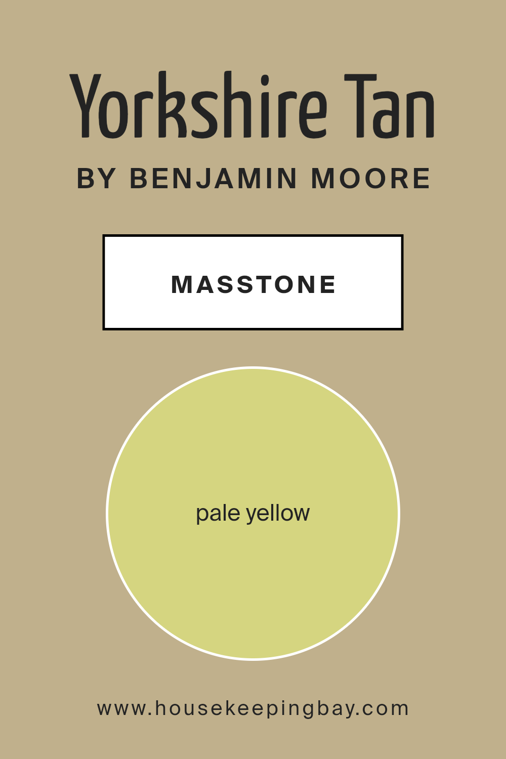
What is the Masstone of the Yorkshire Tan HC-23 by Benjamin Moore?
Yorkshire Tan HC-23 by Benjamin Moore has a masstone of pale yellow, designated by the color code #D5D580. When used in homes, this subtle and warm hue creates a cozy and inviting atmosphere, making spaces feel more open and bright. It is a versatile color that can easily blend with various decor styles, from classic to modern.
This pale yellow is particularly effective in rooms that are smaller or have limited natural light, as it helps reflect light, making the room appear larger and more airy. Additionally, the soothing qualities of Yorkshire Tan can help set a relaxed mood in spaces like bedrooms and living rooms.
The color is neutral enough to serve as a backdrop, allowing for flexibility in decorating with other colors and patterns, making it an excellent choice for walls. Overall, Yorkshire Tan HC-23 is a practical option for adding warmth and light to any home.
housekeepingbay.com
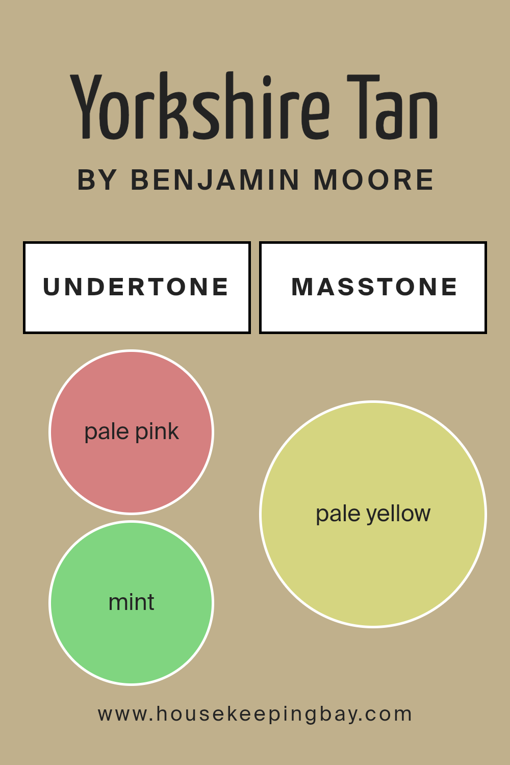
Undertones of Yorkshire Tan HC-23 by Benjamin Moore
Yorkshire Tan HC-23 by Benjamin Moore is a complex color with a rich array of undertones that subtly influence its appearance under different lighting conditions. These undertones include pale pink, mint, grey, light gray, light purple, light blue, yellow, lilac, orange, light green, and olive. Each undertone adds a unique depth and character to the color, impacting how it is perceived in various settings.
Undertones are subtle hues that can enhance or modify the main color. For example, grey and light gray can neutralize the color, making it more subdued and versatile. In contrast, undertones like orange and yellow can warm up the color, giving it a cozier feel. Pale pink and lilac introduce a soft, almost imperceptible flush of color, adding a hint of complexity.
When applied to interior walls, Yorkshire Tan HC-23’s complexity becomes its strength. The variety of undertones allows the color to adapt to different furniture styles and accessories. In a room flooded with natural light, the lighter undertones like mint and light blue might become more visible, creating a fresh and airy feel.
In artificial or dimmer light, darker undertones like olive might emerge, lending the room a more grounded, earthy vibe. This adaptability makes Yorkshire Tan HC-23 a versatile choice for interior spaces, easily fitting into various decor themes and personal tastes without overwhelming the senses.
housekeepingbay.com
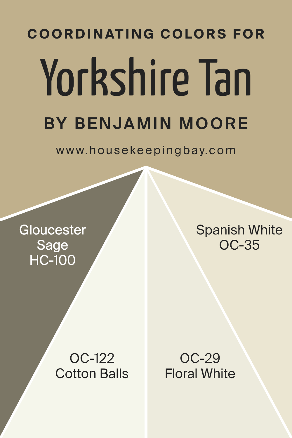
Coordinating Colors of Yorkshire Tan HC-23 by Benjamin Moore
Coordinating colors are shades that complement each other when used together in an interior design scheme, enhancing the overall aesthetic without overshadowing. These colors are selected based on their ability to create balance and harmony, tying various design elements together to achieve a cohesive look. Typically, these colors either contrast or blend smoothly with the main color, in this case, Yorkshire Tan HC-23 by Benjamin Moore, a warm neutral hue.
Yorkshire Tan pairs beautifully with HC-100 Gloucester Sage, a muted green that brings a subtle touch of nature into any space, creating a soothing atmosphere. OC-122 Cotton Balls, a clear and bright off-white, adds a fresh, clean look to the palette, offering excellent contrast to the deeper tones of Yorkshire Tan.
OC-29 Floral White is another soft white with a hint of warmth that ensures the space feels inviting without becoming too stark. Lastly, OC-35 Spanish White has a neutral base with a delicate hint of beige, enriching the environment it’s used in by providing depth and warmth, harmonizing seamlessly with the earthy undertones of Yorkshire Tan. Together, these coordinating colors give any room a polished and refined look, making it easy to mix and match design elements.
You can see recommended paint colors below:
- HC-100 Gloucester Sage
- OC-122 Cotton Balls
- OC-29 Floral White
- OC-35 Spanish White
housekeepingbay.com
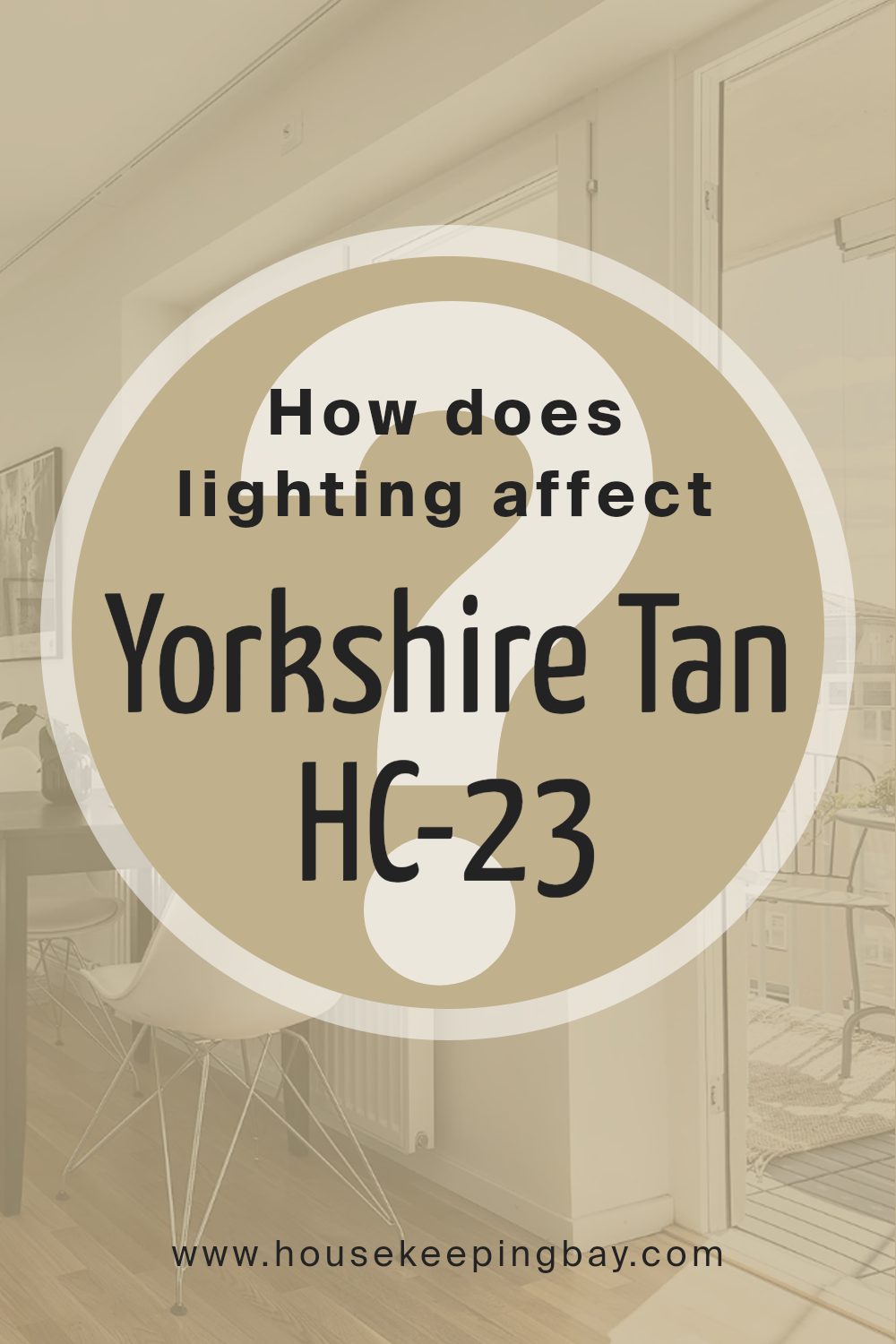
How Does Lighting Affect Yorkshire Tan HC-23 by Benjamin Moore?
Lighting plays a crucial role in how we perceive colors in a space, affecting mood and ambiance. Whether you’re working with a specific paint color like Yorkshire Tan HC-23 by Benjamin Moore, the type and direction of light can change how the color appears on your walls.
Natural light varies throughout the day and depending on the direction your room faces. In a north-facing room, light tends to be cooler and somewhat subdued, which can make Yorkshire Tan HC-23 appear slightly paler and cooler, enhancing its beige tones. In south-facing rooms, where the sunlight is warmer and more abundant, this color will look warmer and richer, bringing out creamy undertones that create a cozy and welcoming feel.
East-facing rooms receive light in the morning when it’s cooler, making Yorkshire Tan HC-23 look soft and neutral, ideal for bedrooms or breakfast nooks where gently welcoming light can enhance mornings. As the day progresses, the intensity of the light diminishes, which can influence the color to revert to a more neutral state without the warm morning glow.
West-facing rooms get the evening light, which is warmer. Yorkshire Tan HC-23 will look particularly warm and inviting in the afternoon and evening, accentuating its tan and warm beige hues, making the space feel lively and comfortable during these times.
Artificial lighting, such as LED or incandescent bulbs, also affects how colors are perceived.
LED lighting, which can range from cool to warm tones, will alter the appearance of Yorkshire Tan HC-23 similarly to natural light, depending heavily on the selected temperature of the bulb. The warmer the light, such as that from incandescent bulbs, the richer and more welcoming the color will appear, enhancing the color’s earthy qualities.
In summary, Yorkshire Tan HC-23’s perception shifts with different lighting conditions. This variability can be used to your advantage when planning interior spaces, ensuring that rooms not only fulfill their functional purposes but also appeal visually and emotionally throughout different times of the day and under different lighting conditions.
housekeepingbay.com
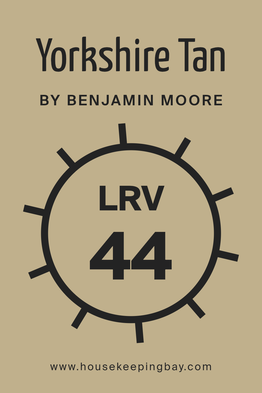
What is the LRV of Yorkshire Tan HC-23 by Benjamin Moore?
LRV stands for Light Reflectance Value, a measure that indicates how much light a paint color can reflect back into a room. It scales from 0, which is pure black and absorbs all light, to 100, which is pure white and reflects all light. This value is crucial when choosing paint colors because it influences how bright or dark a room will appear.
Colors with higher LRV make rooms look more spacious and airy as they reflect more light. In contrast, colors with lower LRV absorb more light, making spaces feel cozier or smaller. The LRV of Yorkshire Tan HC-23 by Benjamin Moore is 43.93, which means it is a mid-tone color. It reflects almost half of the light that hits it.
In practical terms, Yorkshire Tan is versatile enough to bring warmth to a room without making it feel too cramped or dark. This balance makes it a good choice for rooms without a lot of natural light or larger spaces where you want to maintain a feeling of coziness without using a very dark color. When choosing accents or trim colors, consider this LRV to ensure they complement each other well, enhancing the overall ambiance of your space.
housekeepingbay.com
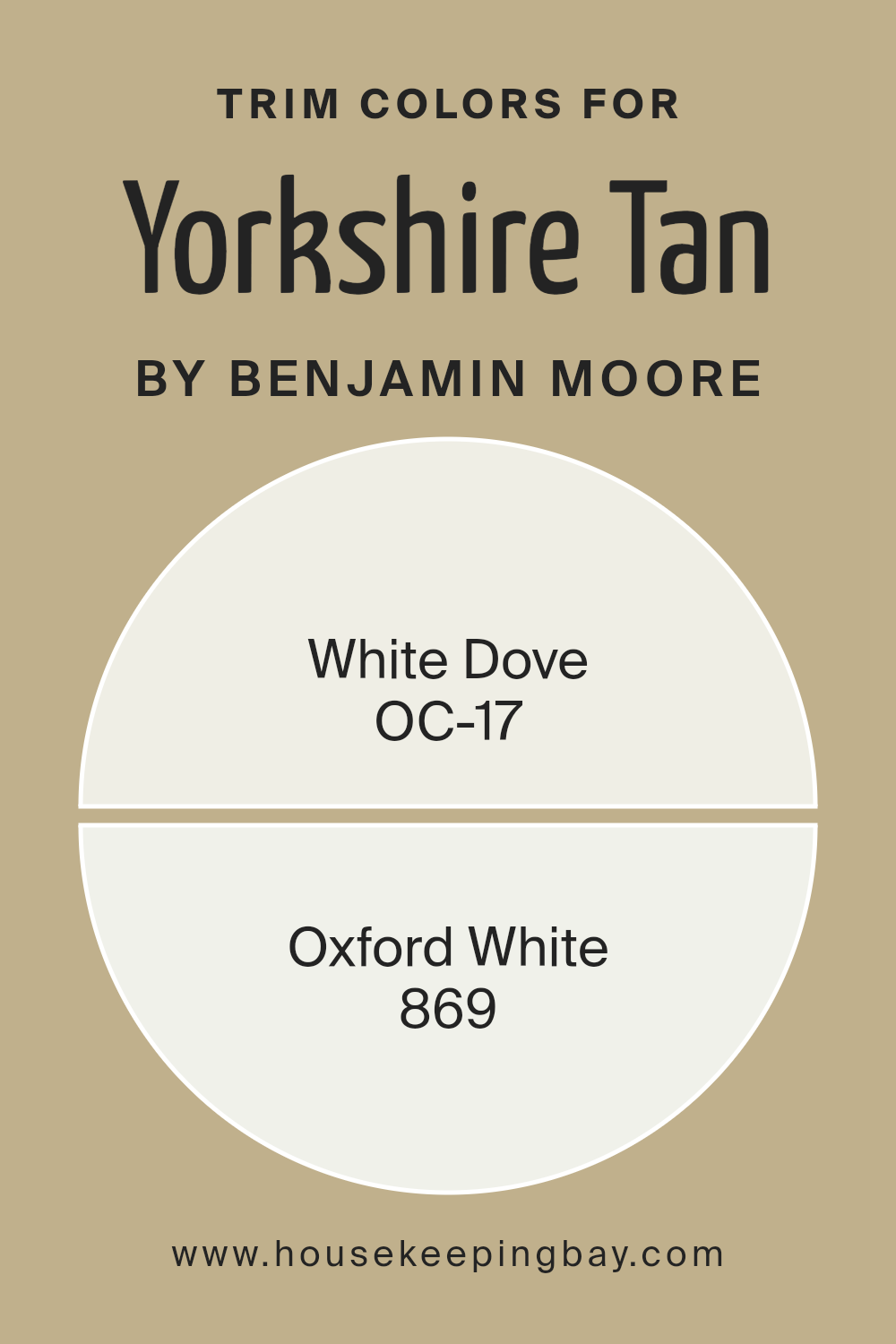
What are the Trim colors of Yorkshire Tan HC-23 by Benjamin Moore?
Trim colors are selected to complement or contrast with the main paint color on walls, enhancing the overall aesthetic of a room. For instance, when paired with Yorkshire Tan HC-23 by Benjamin Moore, trim colors help define doorways, windows, and other architectural features, making them stand out.
Using a trim color like OC-17 White Dove or 869 Oxford White can greatly impact the visual balance and crispness of the space, adding a neat and tidy border that cleanly separates the color zones. OC-17 White Dove is a soft and warm white, providing a gentle contrast that highlights the rich depth of Yorkshire Tan without overwhelming it.
This subtle nuance in White Dove makes it ideal for creating a relaxed yet sophisticated atmosphere. On the other hand, 869 Oxford White offers a brighter, crisp white tone, giving a sharper delineation against darker hues such as Yorkshire Tan. Its vivid crispness creates an effect that can make the adjacent colors pop beautifully, perfect for a more dramatic and fresh appearance.
You can see recommended paint colors below:
housekeepingbay.com
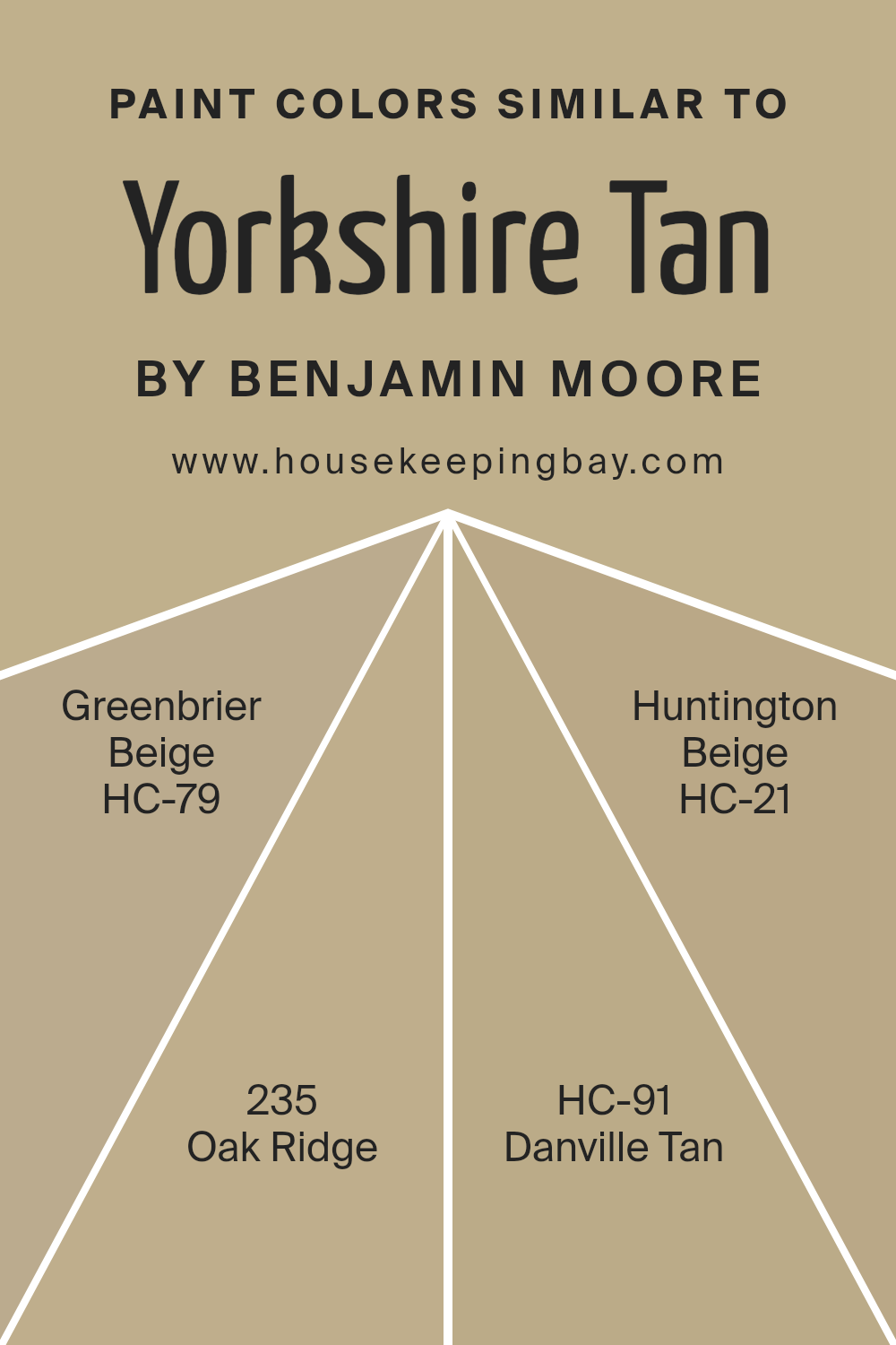
Colors Similar to Yorkshire Tan HC-23 by Benjamin Moore
Using similar colors in design can create a cohesive and harmonious look that brings together different elements of a room smoothly. When colors like Yorkshire Tan HC-23 by Benjamin Moore and its similar shades are employed, they help in crafting an environment that feels unified and soothing, without stark contrasts that might disrupt the flow of the space.
These variations of tans and beiges can also manipulate the perception of space, making rooms appear larger and more open. Yorkshire Tan HC-23 is a warm, inviting hue with a comforting presence perfect for creating a cozy atmosphere. Its counterpart, Greenbrier Beige HC-79, leans slightly more towards a soft, sandy beige, providing a neutral backdrop that’s both versatile and easy to work with.
Oak Ridge 235 introduces a deeper, earthier tone akin to wet clay, adding depth and warmth to spaces needing a stronger color impact. Danville Tan HC-91 offers a muted, understated elegance with its quiet, subdued shades of tan that blend seamlessly with various decor. Lastly, Huntington Beige HC-21 offers a slight grayish tinge, making it ideal for those looking for a classic beige with a modern twist, offering neutrality with just enough difference to stand out subtly. These colors work together to create a fluid visual narrative in any space they are used.
You can see recommended paint colors below:
- HC-79 Greenbrier Beige
- 235 Oak Ridge
- HC-91 Danville Tan
- HC-21 Huntington Beige
housekeepingbay.com
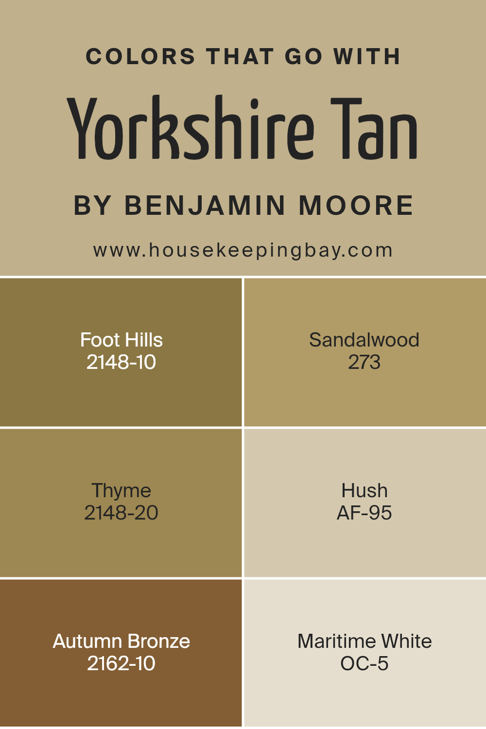
Colors that Go With Yorkshire Tan HC-23 by Benjamin Moore
Colors that harmonize with Yorkshire Tan HC-23 by Benjamin Moore emphasize the importance of creating an aesthetic balance in any space, enhancing the overall mood and coherence. Yorkshire TanHC-23, a rich and creamy tan hue, sets a warm, approachable foundation that is versatile in any design scheme.
When paired with complementary colors, such as Foot Hills or Sandalwood, the room gains a layered depth. Foot Hills is a deep green-brown that adds a natural, earthy element, while Sandalwood is a gentle beige that provides a soft, neutral complement, increasing the space’s visual warmth. On the other hand, Thyme offers a dark, muted green which provides a robust contrast to Yorkshire Tan that is subtle and soothing.
Hush, a light gray with a hint of warmth, works perfectly to soften any room without overwhelming the senses, acting as a quiet background color. Autumn Bronze is a commanding brown with red undertones, adding a feeling of cozy opulence, ideal for accentuating focal points. Lastly, Maritime White is a clean, bright white, great for trim and ceilings, ensuring that the tan and its complementing colors pop without losing their visual appeal. Together, these shades help create environments that are both inviting and harmonically balanced, fulfilling different design needs with elegance and functionality.
You can see recommended paint colors below:
- 2148-10 Foot Hills
- 273 Sandalwood
- 2148-20 Thyme
- AF-95 Hush
- 2162-10 Autumn Bronze
- OC-5 Maritime White
housekeepingbay.com
How to Use Yorkshire Tan HC-23 by Benjamin Moore In Your Home?
Yorkshire Tan HC-23 by Benjamin Moore is a warm, inviting paint color that adds a subtle touch of elegance to any room in your home. This shade belongs to the Historical Color collection, which is inspired by America’s historic landmarks and offers hues that have stood the test of time. Yorkshire Tan works exceptionally well in living rooms, dining rooms, and entryways, creating a cozy, welcoming atmosphere.
One great way to use Yorkshire Tan is as a main color for your walls, providing a neutral backdrop that pairs beautifully with various other colors and decor styles, from traditional to modern. It’s also an excellent choice for painting accent walls if you want to add depth to a room without overpowering it with a bold color.
Additionally, Yorkshire Tan can be used on kitchen cabinets or furniture to warm up the space and give it a fresh look. Pairing this shade with brighter or darker colors can bring balance and harmony to your interiors, making it versatile for various decorating projects.
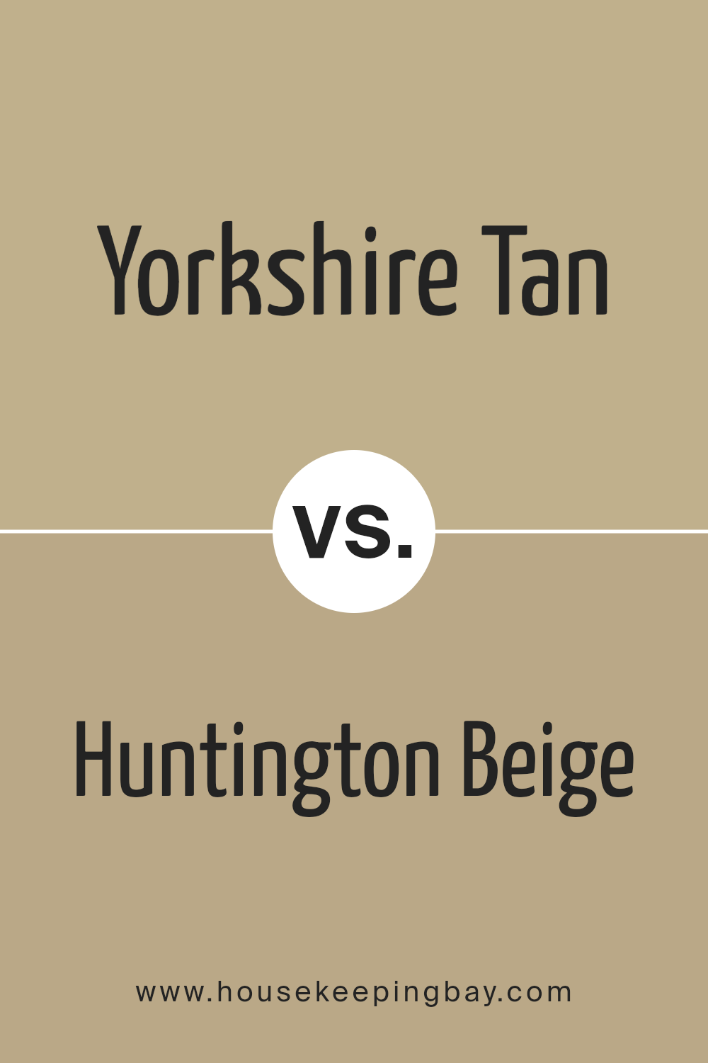
Yorkshire Tan HC-23 by Benjamin Moore vs Huntington Beige HC-21 by Benjamin Moore
Yorkshire Tan HC-23 by Benjamin Moore is a warm, earthy tone that evokes a sense of cozy comfort. This color is slightly richer and darker, giving it a robust presence in any room. It pairs beautifully with natural elements like wood and stone, ideal for creating a welcoming atmosphere.
Comparatively, Huntington Beige HC-21 is a lighter, more neutral beige. It provides a subtle, elegant backdrop that is extremely versatile for various decorating styles. This color tends to brighten spaces while maintaining a soft warmth, making it perfect for rooms that aim for a more understated yet inviting feel.
Both colors share a base warmth that makes them exceptionally pairable and suited for spaces where a sense of calm and comfort is desired. Yorkshire Tan leans towards a more defined, impactful look, while Huntington Beige offers flexibility and a lighter touch.
You can see recommended paint color below:
- HC-21 Huntington Beige
housekeepingbay.com
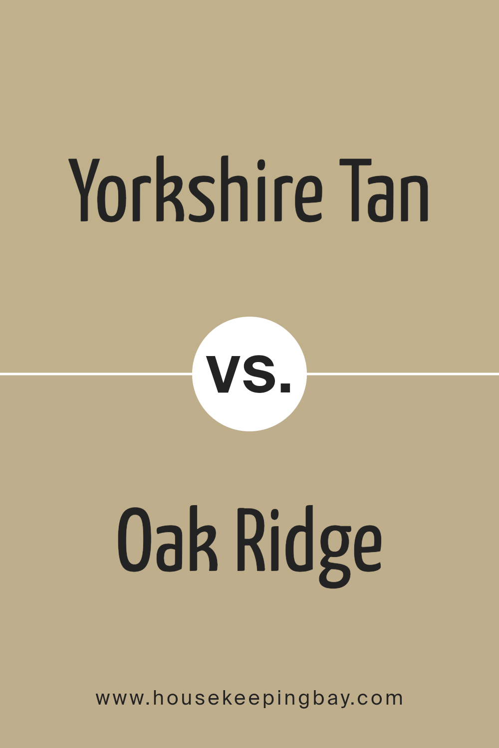
Yorkshire Tan HC-23 by Benjamin Moore vs Oak Ridge 235 by Benjamin Moore
The Yorkshire Tan HC-23 by Benjamin Moore is a warm, neutral hue that brings a comforting and cozy vibe to spaces. This color has a soothing earthiness, making it a great choice for areas where you want to relax and feel at home. Its versatility allows it to pair well with both bright accents and darker furnishings, providing a balanced look that isn’t too overpowering.
Oak Ridge 235, also by Benjamin Moore, is darker and more intense than Yorkshire Tan. It leans more towards a rich, deep brown, giving a robust presence to any room. This color is ideal for creating a focal point or adding depth, especially in larger spaces or rooms with ample natural light. Oak Ridge can lend a sense of sophistication and warmth, ideal for studies, dining rooms, or living areas.
Both colors offer unique advantages depending on your space and design goals, with Yorkshire Tan being lighter and softer, and Oak Ridge presenting a more pronounced and hearty feel.
You can see recommended paint color below:
- 235 Oak Ridge
housekeepingbay.com
Yorkshire Tan HC-23 by Benjamin Moore vs Greenbrier Beige HC-79 by Benjamin Moore
Yorkshire Tan HC-23 by Benjamin Moore is a warm, rich beige with subtle yellow undertones, giving it a cozy, welcoming feel. It’s a versatile color that pairs well with a variety of decor styles and can make spaces feel more inviting. Because of its depth, Yorkshire Tan is excellent for living rooms, dining areas, or any space where a sense of warmth is desired.
Greenbrier Beige HC-79, also by Benjamin Moore, tends more toward a neutral beige with a soft green undertone. This color offers a subtle nod to nature, making it ideal for creating a serene and grounded environment. It works beautifully in rooms that get a lot of natural light, highlighting its unique undertones and providing a calming effect.
Both colors are part of the Historical Collection, designed to work harmoniously with both traditional and modern decor. While Yorkshire Tan injects warmth into a room, Greenbrier Beige provides a softer, more earthy vibe. Each brings its own unique ambiance to a space, making them great choices for someone looking to create a specific mood in their home.
You can see recommended paint color below:
housekeepingbay.com
Yorkshire Tan HC-23 by Benjamin Moore vs Danville Tan HC-91 by Benjamin Moore
Yorkshire Tan HC-23 by Benjamin Moore is a warm, rich beige with a subtle, inviting depth, ideal for creating a cozy atmosphere in any room. Its earthy tones bring a natural, soothing feel, making it perfect for living areas and bedrooms where a calm ambience is desired.
Danville Tan HC-91, also by Benjamin Moore, is slightly lighter compared to Yorkshire Tan. It presents a more neutral beige that leans towards an understated elegance. This color works well in spaces that require a light, airy feel without sacrificing warmth.
Both colors belong to the Historical Collection, known for hues that offer a timeless quality. Yorkshire Tan provides a deeper, more pronounced warmth, suitable for those who prefer a bolder, more embracing color. Danville Tan, meanwhile, is ideal for achieving a subtle, sophisticated backdrop. Both paints coordinate well with a wide range of décors, highlighting natural materials like wood and stone effectively. Choosing between them depends on the desired intensity and mood of the room.
You can see recommended paint color below:
- HC-91 Danville Tan
housekeepingbay.com
Concluding my thoughts on HC-23 Yorkshire Tan by Benjamin Moore, I find this paint color to be a versatile and warm choice suitable for various living spaces. Its rich tan hue has a welcoming feel, making it perfect for rooms where comfort is key, such as living rooms or bedrooms. When paired with the right decor, Yorkshire Tan offers a cozy backdrop that enhances both traditional and modern furnishings.
This shade also works well in spaces that receive a lot of natural light, where it can show its depth throughout the day as the lighting changes. I noticed that it pairs beautifully with whites and deep blues, providing a balanced look that’s neither too stark nor too somber. Its understated elegance makes it a top pick for those who want a paint that doesn’t overwhelm but instead creates a gentle, warm atmosphere.
Overall, HC-23 Yorkshire Tan by Benjamin Moore is a reliable choice if you’re aiming for a chic, yet inviting environment. Whether you’re sprucing up a single room or revamping your entire home, this color ensures a stylish yet approachable ambiance. I would certainly consider using it in future decorating projects for its adaptability and timeless appeal.
housekeepingbay.com
