Wispy Pink 2005-70 by Benjamin Moore
Soft Touches for a Lively Space
Choosing the perfect paint color can often feel overwhelming with so many options out there. However, if a soft, soothing hue is what you have in mind, then 2005-70 Wispy Pink by Benjamin Moore might just be the shade for you.
This lovely color is a gentle pink with just enough brightness to keep your room feeling light and airy but subtle enough to serve as a neutral, blending seamlessly with various decor styles. Whether you’re thinking about freshening up your living room, bedroom, or even a bathroom, Wispy Pink offers a delicate charm that can make your spaces feel warm and inviting.
Pair it with soft whites or rich, dark fabrics for a look that can adapt to both contemporary and traditional aesthetics. The beauty of Wispy Pink lies in its ability to provide a backdrop that’s both refreshing and gentle on the eyes, making it an ideal choice for anyone wanting to add a touch of softness to their interior without overwhelming it with color.
Consider how this shade could transform your favorite room into a serene retreat or a cheerful nook.

via benjaminmoore.com
What Color Is Wispy Pink 2005-70 by Benjamin Moore?
Table of Contents
Wispy Pink 2005-70 by Benjamin Moore is a soft, subtle shade of pink that brings a gentle warmth to any space. This color is light enough to serve as a neutral, allowing for versatile decor options. The color balances sweet yet sophisticated hues, making it ideal for creating a peaceful yet chic environment.
Wispy Pink works exceptionally well in interior styles that prioritize softness and light. This includes Scandinavian interior designs, where simplicity and minimalism are key. It also fits perfectly into modern contemporary settings that feature clean lines and occasional pops of color. Additionally, traditional and shabby chic decors, known for their classic and romantic aesthetics, respectively, also benefit from this soft pink tone.
This delicate pink pairs beautifully with natural materials like light woods which help maintain the airy feel of a room. Textiles like linen or cotton in white or other light shades create a crisp, fresh look. Soft metallics like brushed gold or silver can add a hint of luxury without overpowering the subtle beauty of Wispy Pink.
In conclusion, Wispy Pink 2005-70 is a versatile color that matches well with a range of materials and enhances several interior design styles, offering a gentle backdrop that supports a range of design choices.
housekeepingbay.com
Is Wispy Pink 2005-70 by Benjamin Moore Warm or Cool color?
Wispy Pink 2005-70 by Benjamin Moore is a gentle, soft pink that brings a light, airy feel to any room in the home. This color is perfect for creating a soothing atmosphere, especially in bedrooms and bathrooms where calm is essential.
Its subtle tone works well as a base, allowing other colors or decor items to stand out without overpowering them. Wispy Pink can make small spaces appear larger and brighter, as its light-reflective qualities add a sense of openness. It’s versatile enough to pair with bold colors or work as part of a muted palette.
Additionally, this shade complements natural light beautifully, giving rooms a fresh, clean look throughout the day. Ideal for anyone looking to add a touch of softness and warmth to their home, Wispy Pink enhances the feeling of comfort and relaxation.
What is the Masstone of the Wispy Pink 2005-70 by Benjamin Moore?
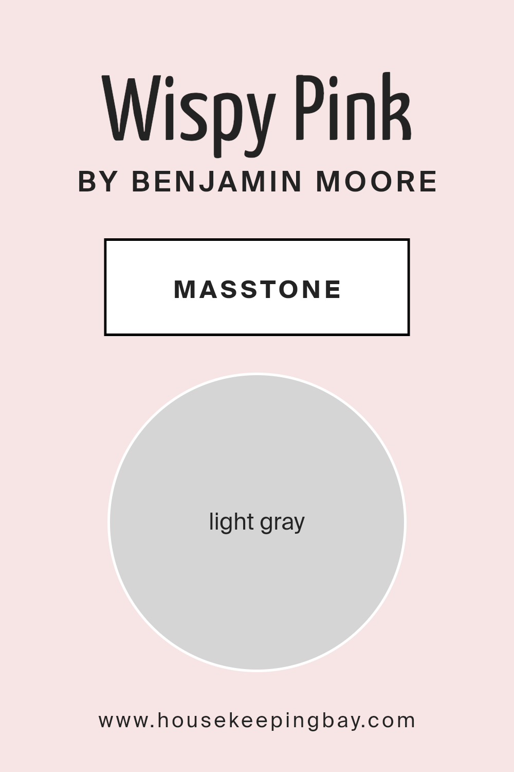
Wispy Pink 2005-70 by Benjamin Moore has a masstone that is a light gray. This neutral shade, identified by the color code #D5D5D5, is very adaptable and this adds to its practicality in home decor.
Its light gray hue makes it a perfect fit for various rooms, helping create a soft, soothing environment. Since the color isn’t too bold or overwhelming, it serves as an excellent background that allows furniture and art pieces to stand out. Its versatility also means it can easily match with other colors and materials, making it a great choice for anyone wanting to keep their walls fairly neutral while adding pops of color through accessories or furniture.
Additionally, light gray helps to reflect light, making smaller spaces appear bigger and more open. This quality is particularly useful in apartments or smaller homes, where maximizing the sense of space is important.
housekeepingbay.com
Undertones of Wispy Pink 2005-70 by Benjamin Moore
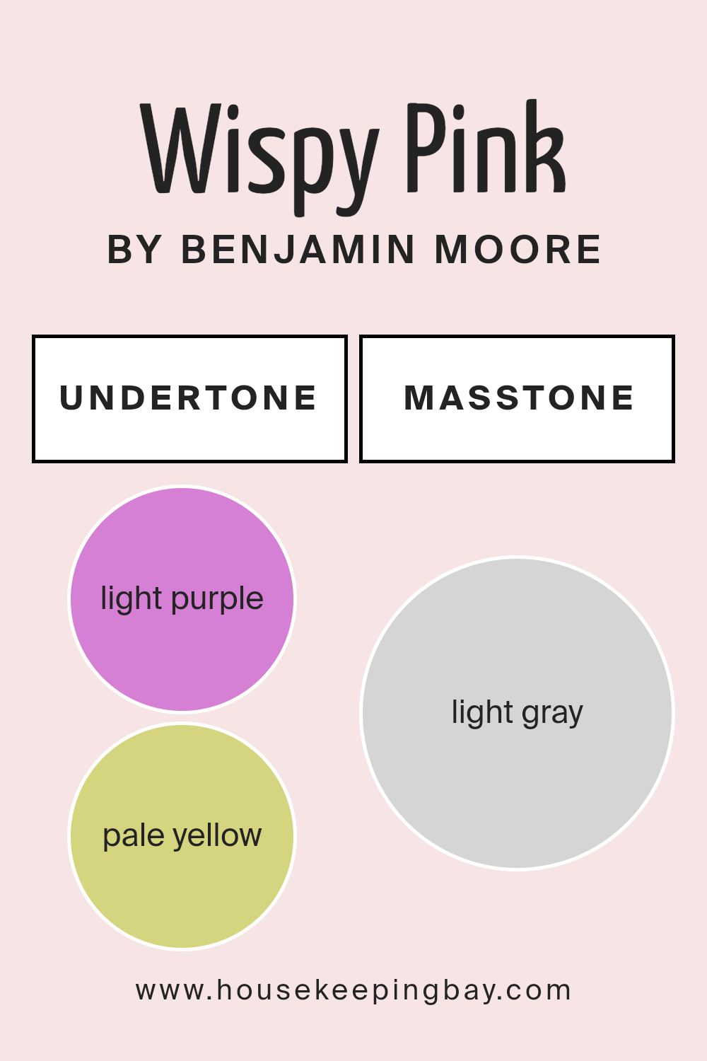
Wispy Pink 2005-70 by Benjamin Moore is a complex color with a variety of undertones that subtly influence its overall appearance. Undertones are like hidden colors that emerge under different lighting conditions, affecting how we perceive the main color. In the case of Wispy Pink, the undertones include light purple, pale yellow, light blue, pale pink, lilac, mint, and grey.
These undertones play a crucial role in how the paint looks once applied to interior walls. For instance, light purple and lilac can give the pink a cooler feel, making the room seem more serene. The pale yellow and pale pink undertones can add a soft warmth to the space, creating a welcoming environment.
Light blue and mint undertones bring a fresh and airy quality to the room, which can make it feel more open. The grey undertone helps to balance the brightness, ensuring the color isn’t too overpowering. As light changes throughout the day, these undertones might become more apparent or recede, altering the wall color’s appearance.
This can make Wispy Pink feel dynamic and adaptable to different settings and decor styles. When considering this paint for rooms, it’s important to test it under various lighting conditions to understand how these undertones will behave. This ensures that the color complements the living space in all types of lighting.
housekeepingbay.com
Coordinating Colors of Wispy Pink 2005-70 by Benjamin Moore
Coordinating colors are shades that work well together and complement each other, enhancing the overall aesthetic of a space. When used thoughtfully, coordinating colors can create a cohesive and harmonious look. For instance, Wispy Pink 2005-70 by Benjamin Moore can be coordinated with a selection of other colors that bring out its soft, gentle essence.
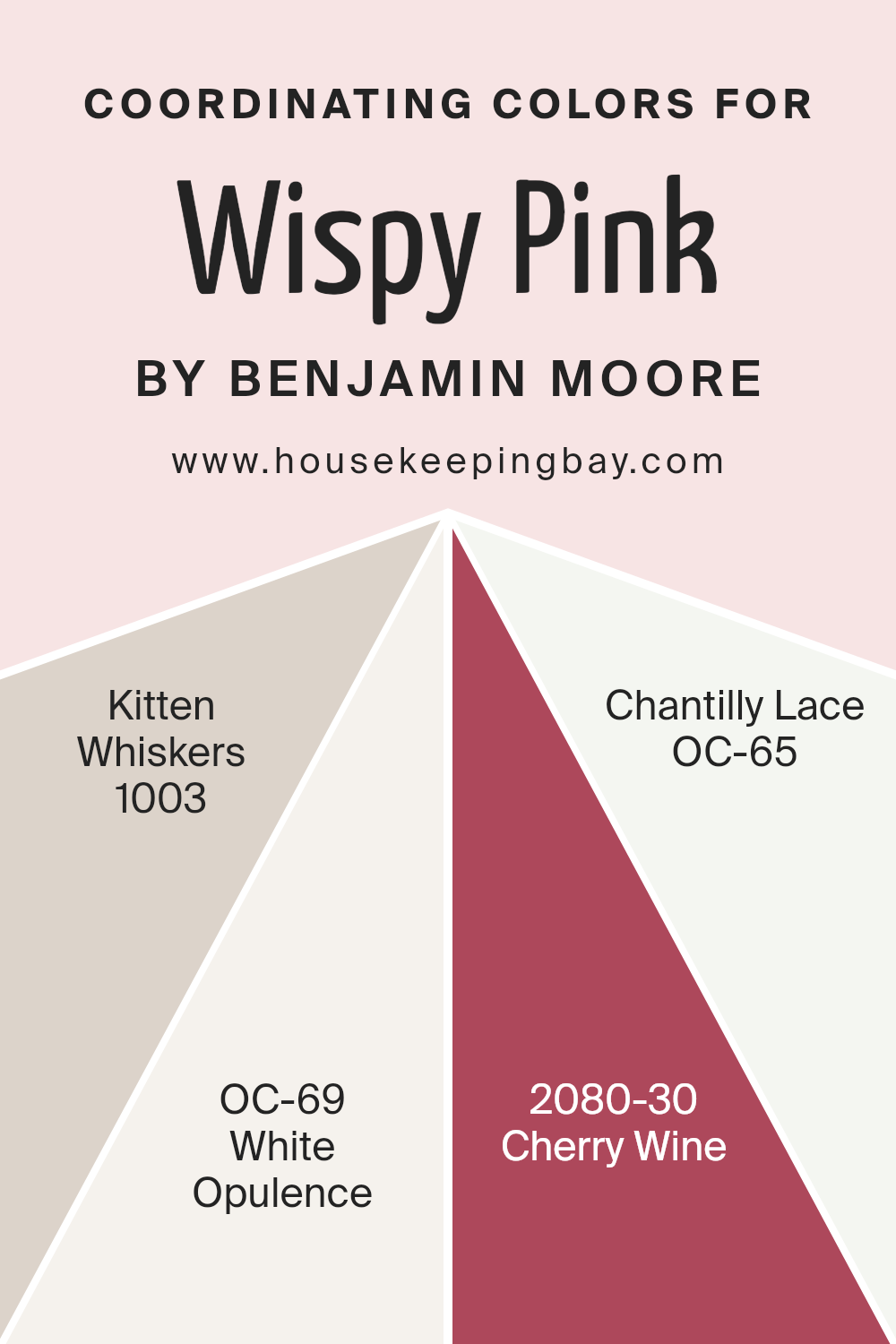
Kitten Whiskers 1003 is a subtle gray with warm undertones that pairs nicely with the softness of Wispy Pink, providing a grounding effect to the light airiness of the pink. White Opulence OC-69 offers a clean and crisp backdrop that allows colors like Wispy Pink to pop without overwhelming the space, effectively highlighting its delicate tone.
Cherry Wine 2080-30 is a deep, rich red that contrasts beautifully with Wispy Pink, offering a bold visual impact that adds depth and interest to a room. Lastly, Chantilly Lace OC-65 is an almost pure white that reflects light and complements the brighter and bolder shades, ensuring the room feels open and light-filled. Together, these colors can create a refined and inviting space that remains balanced and visually pleasing.
You can see recommended paint colors below:
- 1003 Kitten Whiskers
- OC-69 White Opulence
- 2080-30 Cherry Wine
- OC-65 Chantilly Lace
housekeepingbay.com
How Does Lighting Affect Wispy Pink 2005-70 by Benjamin Moore?
Lighting plays a crucial role in how we perceive colors. The same paint shade can appear differently under various light conditions due to the light’s color and intensity. For example, the color “Wispy Pink2005-70” by Benjamin Moore can have varying appearances in different lighting environments.
Artificial Light:Under artificial lighting, “Wispy Pink2005-70” may appear warmer and deeper, especially if the light bulbs have a yellow or warm tone.
Fluorescent lights, which are a bit cooler, might make this pink shade look slightly more muted, reducing its warmth.
Natural Light: In rooms with ample natural light, “Wispy Pink2005-70” will show its true color best during the middle of the day when the sunlight is brightest.
Natural light tends to reveal the truest color, so the delicate pink will be vivid and lively.
Room Orientation and Color Perception:
1. North-Faced Rooms:
In north-facing rooms, light is typically cooler and can make colors appear more shadowy. “Wispy Pink2005-70” could look a bit more subdued and less warm in a north-facing room.
2. South-Faced Rooms:
South-facing rooms receive the most intense light throughout the day. This strong, warm light can make “Wispy Pink2005-70” appear brighter and more vibrant, enhancing its cozy feel.
3. East-Faced Rooms:
East-facing rooms get strong light in the morning, which is warm and bright. During these hours, “Wispy Pink2005-70” will look lively and vibrant. As the day progresses and the natural light fades, the color may appear softer and more delicate.
4. West-Faced Rooms:
In west-facing rooms, the evening light brings warmth, making “Wispy Pink2005-70” appear rich and welcoming in the afternoon and evening, while potentially looking more muted in the morning light.
Understanding how light affects color can help in selecting the right paint color for your space, ensuring that it looks good at all times of the day under different lighting conditions.

housekeepingbay.com
What is the LRV of Wispy Pink 2005-70 by Benjamin Moore?
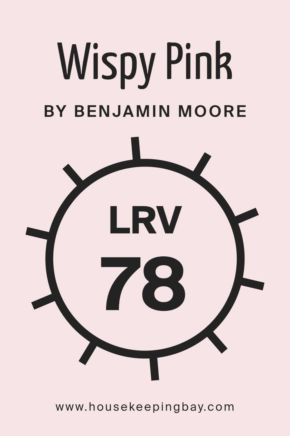
LRV stands for Light Reflectance Value, which measures the percentage of light a paint color reflects back into a room. This value ranges from 0 to 100, with 0 being completely black and 100 being pure white. Colors with higher LRVs make rooms feel brighter because they reflect more light. This is especially useful in spaces that don’t receive much natural light.
In contrast, colors with lower LRVs absorb more light, which can make a room feel cozier but smaller and darker. For the color Wispy Pink 2005-70 by Benjamin Moore, its LRV is 78.39, quite high on the scale. This means it’s a light color that will reflect a lot of light, making spaces appear more open and airy. The light pink hue will add a gentle, soothing touch to a room without overpowering it.
In rooms with limited natural light, Wispy Pink can help make the space feel inviting and warm due to its high light reflectance. This is particularly advantageous for smaller rooms or areas with darker furnishings, as it can help balance the overall light distribution.
housekeepingbay.com
What are the Trim colors of Wispy Pink 2005-70 by Benjamin Moore?
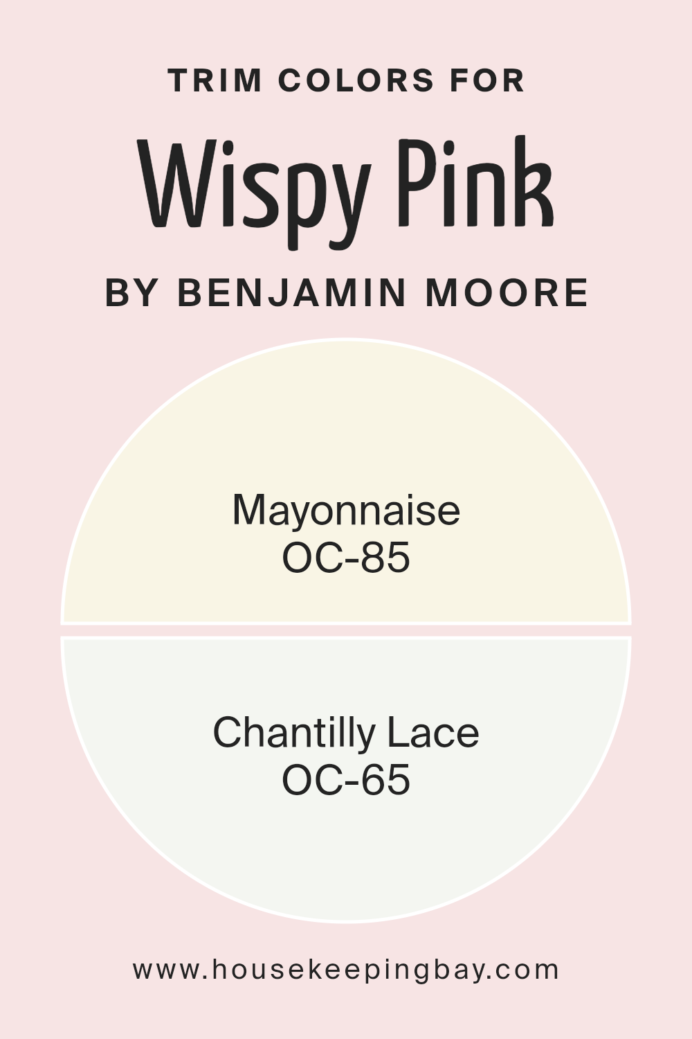
Trim colors are specific shades chosen to accentuate or complement the main color on a wall, often used on moldings, door frames, window frames, and other architectural features. When using Wispy Pink 2005-70 from Benjamin Moore as the primary color, selecting the right trim color can create a cohesive and aesthetically pleasing look.
Opting for a lighter trim color such as Mayonnaise OC-85 or Chantilly Lace OC-65 can provide a subtle yet effective contrast that highlights the delicate tones of Wispy Pink without overwhelming its gentle hue. Mayonnaise OC-85 is a warm and creamy white that provides a soft complement to the more pastel nature of Wispy Pink. This color is ideal for bringing out a welcoming and cozy feel in any space.
On the other hand, Chantilly Lace OC-65 is a crisp and clean white, offering a sharper contrast that can make the architectural details in a room pop against a backdrop of Wispy Pink. Its clarity and brightness help to refine and define the edges and corners of walls, making it a great choice for a fresh and polished look.
You can see recommended paint colors below:
- OC-85 Mayonnaise
- OC-65 Chantilly Lace
housekeepingbay.com
Colors Similar to Wispy Pink 2005-70 by Benjamin Moore
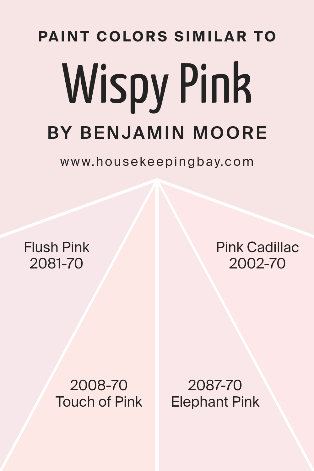
Choosing similar colors, such as Wispy Pink 2005-70 by Benjamin Moore, serves an essential role in blending and harmonizing the aesthetics of a space. When colors like Flush Pink 2081-70, Touch of Pink 2008-70, Elephant Pink 2087-70, and Pink Cadillac 2002-70 are used together or separately within similar environments, they create a sense of unity and flow.
These colors have subtle variations that can either soothe or gently uplift the visual appeal of a room without causing a drastic shift in the mood. This similarity allows for versatile design choices, letting one switch between shades depending on the lighting, furniture, and decor elements being used, whilst maintaining a cohesive look.
Flush Pink 2081-70 offers a mild and almost ethereal blush that gently infuses spaces with a touch of warmth. Touch of Pink 2008-70, slightly deeper, incorporates a barely-there hint of rosiness that catches the eye with its understated charm. Moving on to Elephant Pink 2087-70, it envelops a space in a muted, dusty rose that hints at nostalgia and softness. Finally, Pink Cadillac 2002-70 strikes with a hint more vibrancy, recalling the classic flair of its namesake without overpowering. All these shades allow for a delicate shift from one ambience to another, making them perfect partners in crafting a serene and inviting environment.
You can see recommended paint colors below:
- 2081-70 Flush Pink
- 2008-70 Touch of Pink
- 2087-70 Elephant Pink
- 2002-70 Pink Cadillac
housekeepingbay.com
Colors that Go With Wispy Pink 2005-70 by Benjamin Moore
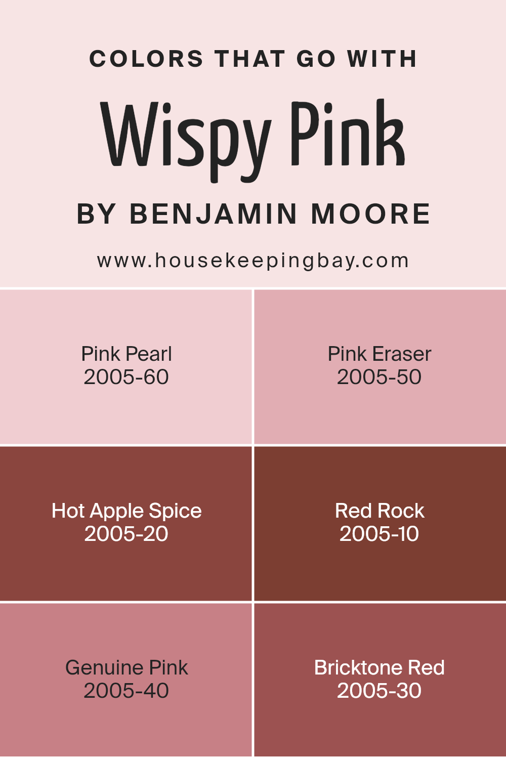
Choosing the right colors to complement Wispy Pink 2005-70 by Benjamin Moore can significantly enhance the aesthetics of any room. Wispy Pink is a gentle, soothing hue that lends a soft and serene atmosphere, making it crucial to select colors that harmonize well with this tone. These complementary colors help create a balanced and cohesive look that can make the spaces more inviting and visually appealing.
Pink Pearl 2005-60 is a subtle, warmer tone of pink that echoes the softness of Wispy Pink while adding a hint of depth. Pink Eraser 2005-50 provides a slight contrast with its brighter and slightly more saturated pink tone, giving a lively pop to the overall palette.
For a dramatic and rich pairing, Hot Apple Spice 2005-20 offers a deep, warm red that brings a cozy and robust energy to the mix. Similarly, Red Rock 2005-10, with its earthy red shade, grounds the lighter pinks, linking the palette to natural elements. Genuine Pink 2005-40 adds vibrancy with its clear and cheerful pink, energizing the space without overwhelming it.
Bricktone Red 2005-30 serves as the boldest counterpart, with its deep red-brown shade that can act as a strong focal color or an accent to add depth and sophistication. Together, these colors complement and enhance Wispy Pink, allowing for a range of expressions from subtle and soft to vibrant and bold.
You can see recommended paint colors below:
- 2005-60 Pink Pearl
- 2005-50 Pink Eraser
- 2005-20 Hot Apple Spice
- 2005-10 Red Rock
- 2005-40 Genuine Pink
- 2005-30 Bricktone Red
housekeepingbay.com
How to Use Wispy Pink 2005-70 by Benjamin Moore In Your Home?
Wispy Pink 2005-70 by Benjamin Moore is a soft, pale pink shade that adds a gentle warmth to any room. This color suits well in spaces aiming for a calm, soothing vibe, like bedrooms or bathrooms. Its muted tone pairs beautifully with white trims, bringing out a delicate contrast that enhances the overall aesthetic of the room.
For those who prefer subtle decor, Wispy Pink creates a cozy backdrop without overpowering the space. It’s particularly useful in small rooms, where it can make the area feel airier and more open. In children’s rooms, this color works perfectly to craft a peaceful yet cheerful environment.
You can also use Wispy Pink in living areas. Combine it with light gray or soft blue accents for a fresh and modern look. Furniture in natural wood tones goes well with this color, providing a touch of organic appeal. Moreover, this shade is versatile; it fits well with both contemporary and classic home styles, making it a practical choice for updating your space.
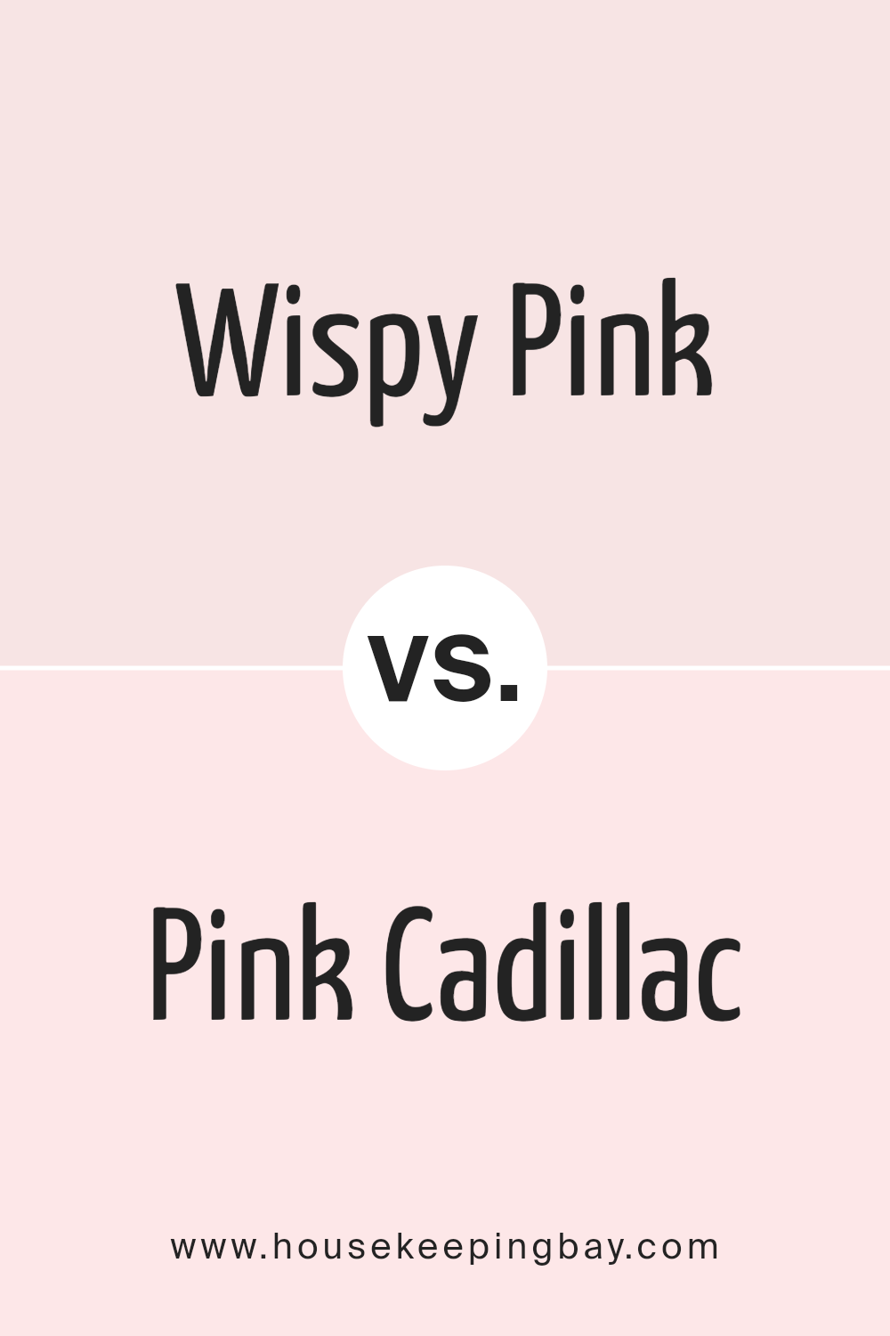
Wispy Pink 2005-70 by Benjamin Moore vs Pink Cadillac 2002-70 by Benjamin Moore
Wispy Pink 2005-70 by Benjamin Moore is a delicate, airy shade of pink with a subtle, almost ethereal quality. It has a gentle touch of softness that makes it perfect for creating a soothing and peaceful environment. Its lightness allows it to blend seamlessly into spaces intended for relaxation and calm.
Contrastingly, Pink Cadillac 2002-70 by Benjamin Moore is a brighter, more vibrant pink. This color has a playful and cheerful tone, which injects more energy and liveliness into a space. It’s bolder than Wispy Pink, making it ideal for areas where you want to make a statement or add a burst of positivity.
Both colors bring their own unique vibe to interiors, with Wispy Pink leaning more towards serenity and softness, while Pink Cadillac adds a splash of fun and brightness. Depending on what atmosphere you aim to create, each color offers its own special charm.
You can see recommended paint color below:
- 2002-70 Pink Cadillac
housekeepingbay.com
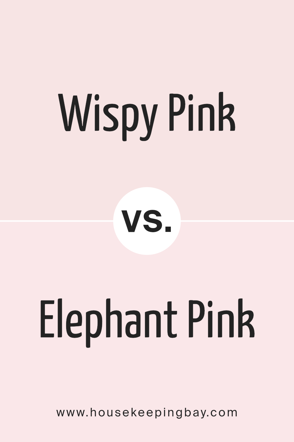
Wispy Pink 2005-70 by Benjamin Moore vs Elephant Pink 2087-70 by Benjamin Moore
Wispy Pink 2005-70 by Benjamin Moore is a light, airy shade of pink. It has a delicate feeling, resembling a soft blush on a clear morning. This color gives a room a gentle and subtle touch, not overpowering but rather creating a pleasant backdrop.
On the contrary, Elephant Pink 2087-70 also by Benjamin Moore, while also light in tone, leans more towards a neutral pink with a touch of beige. This hue is subtle yet has enough warmth to add coziness to a space. It can be seen as more versatile, blending well with various decor styles and other colors.
Both colors are quite light and serve well in spaces aiming for a soft, serene feeling. Wispy Pink is more purely pink, offering a sense of freshness, whereas Elephant Pink is warmer and earthy, potentially making a space feel more grounded and calm. Both are excellent choices for creating a peaceful and inviting environment.
You can see recommended paint color below:
- 2087-70 Elephant Pink
housekeepingbay.com
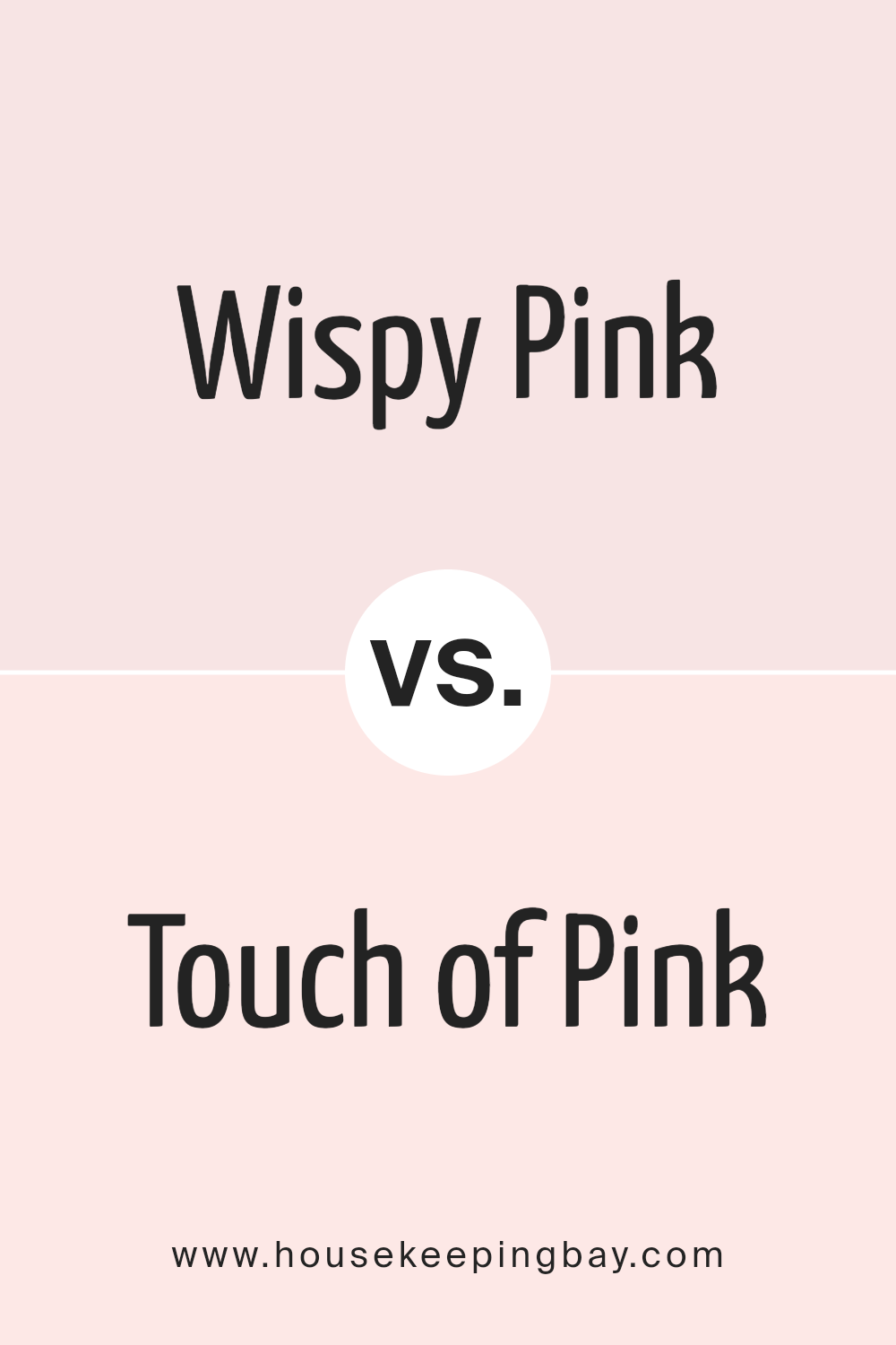
Wispy Pink 2005-70 by Benjamin Moore vs Touch of Pink 2008-70 by Benjamin Moore
Wispy Pink 2005-70 and Touch of Pink 2008-70 by Benjamin Moore are both soft, gentle pink colors, but they have subtle differences. Wispy Pink 2005-70 is a very pale, almost ethereal pink that leans towards a neutral tone. It has a delicacy that makes it perfect for creating a serene, soothing atmosphere in any room. This color is ideal for those who prefer a hint of color without overwhelming the senses.
In contrast, Touch of Pink 2008-70 has a slightly warmer and richer tone than Wispy Pink. Though still light and soft, it carries a bit more depth, giving it a cozy, welcoming feel. This makes Touch of Pink more vibrant and present, drawing a bit more attention compared to the understated nature of Wispy Pink.
Both colors provide a fresh, clean look, but Touch of Pink offers a warmer presence, while Wispy Pink is perfect for achieving a minimalist, airy feel.
You can see recommended paint color below:
- 2008-70 Touch of Pink
housekeepingbay.com
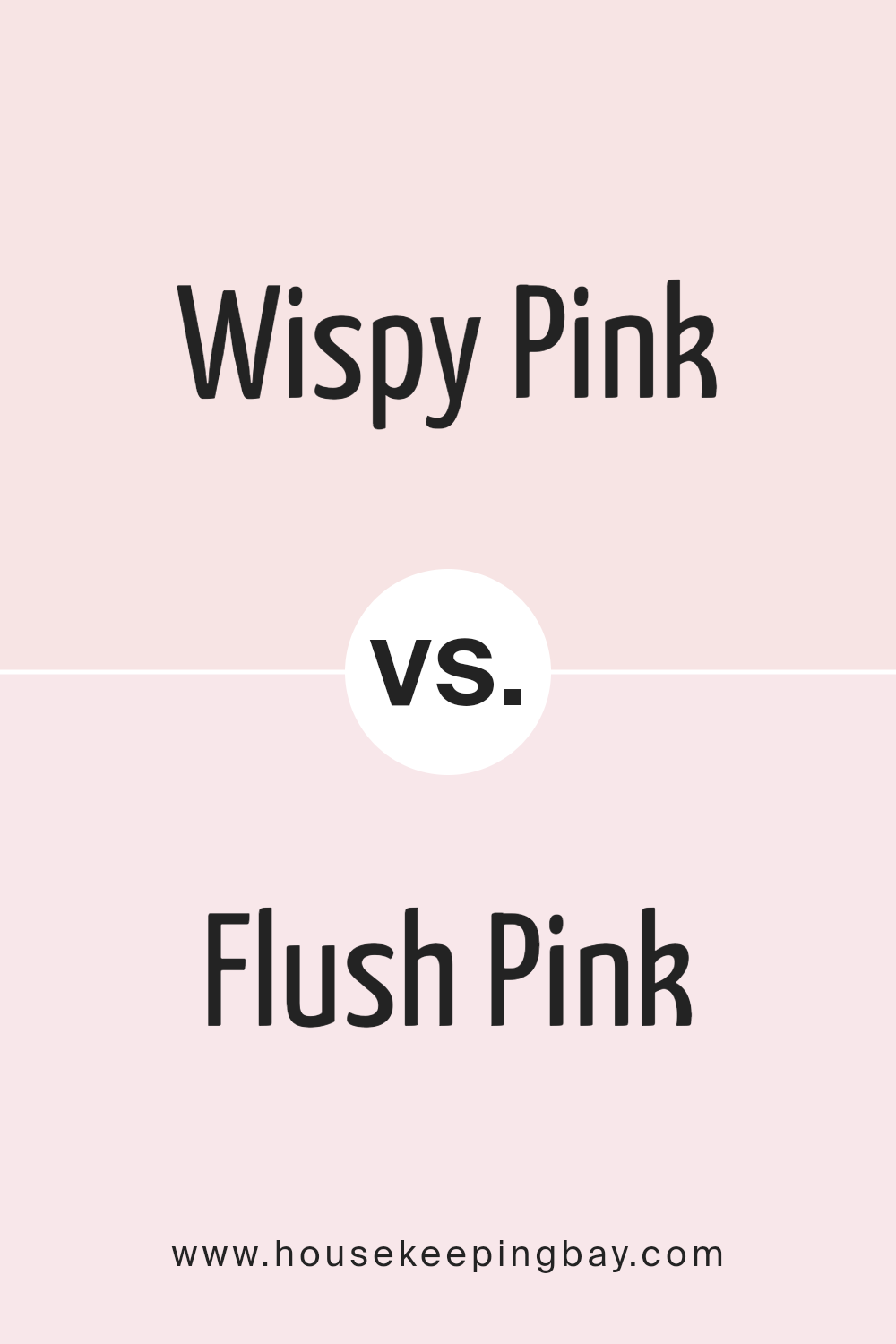
Wispy Pink 2005-70 by Benjamin Moore vs Flush Pink 2081-70 by Benjamin Moore
Wispy Pink 2005-70 by Benjamin Moore is a delicate, soft pink with a subtle essence that leans towards a neutral tone. This makes it versatile for use in various spaces, providing a gentle backdrop that complements a wide range of decor styles. Wispy Pink is ideal for creating a soothing, serene environment, well-suited for bedrooms or quiet areas where calmness is appreciated.
Flush Pink 2081-70, also by Benjamin Moore, is slightly bolder compared to Wispy Pink despite its similarly light shade. It has a cleaner, more vibrant tone that brings a fresh and airy feel to spaces. This color works well in areas that benefit from a touch of brightness, like bathrooms or small, potentially dim spaces needing a lift.
While both colors are in the realm of light pinks, Wispy Pink offers a more muted, understated vibe, while Flush Pink adds a bit more energy due to its clearer, more pronounced pink hue. This gives decorators and homeowners flexibility depending on their aesthetic goals and room function.
You can see recommended paint color below:
- 2081-70 Flush Pink
housekeepingbay.com
Conclusion
As I reflect on the qualities of Benjamin Moore’s 2005-70 Wispy Pink, I appreciate its subtle charm that effortlessly enhances the mood of any space. This shade isn’t just another pink; it’s a refined option that brings a soft and warming presence, making it perfect for rooms where calm and comfort are priorities. Its lightness does wonders in smaller spaces, giving a sense of more area and brightness without overwhelming with color.
I find that Wispy Pink pairs well with a variety of decor styles and colors, from natural wood accents to more modern greys and blues. This versatility is a significant advantage for anyone looking to use this color in diverse settings, from a nursery to a home office. The paint’s quality, typical of Benjamin Moore products, ensures a smooth application and a durable finish that resists fading over time.
For anyone considering a new paint color, I confidently recommend 2005-70 Wispy Pink. Whether aiming to refresh a single room or revamp a whole house, this shade provides a gentle backdrop that enhances existing furnishings and invites new possibilities for accessory colors and fabrics. Its ability to infuse a space with a peaceful aura, while maintaining a chic and inviting look, makes it a top choice in my book.
Overall, my experience with 2005-70 Wispy Pink has been overwhelmingly positive, and I look forward to seeing how it performs in different spaces and lighting situations.
housekeepingbay.com
Ever wished paint sampling was as easy as sticking a sticker? Guess what? Now it is! Discover Samplize's unique Peel & Stick samples. Get started now and say goodbye to the old messy way!
Get paint samples
