Pink Pearl 2005-60 by Benjamin Moore
Soft Touches for a Sweet Space
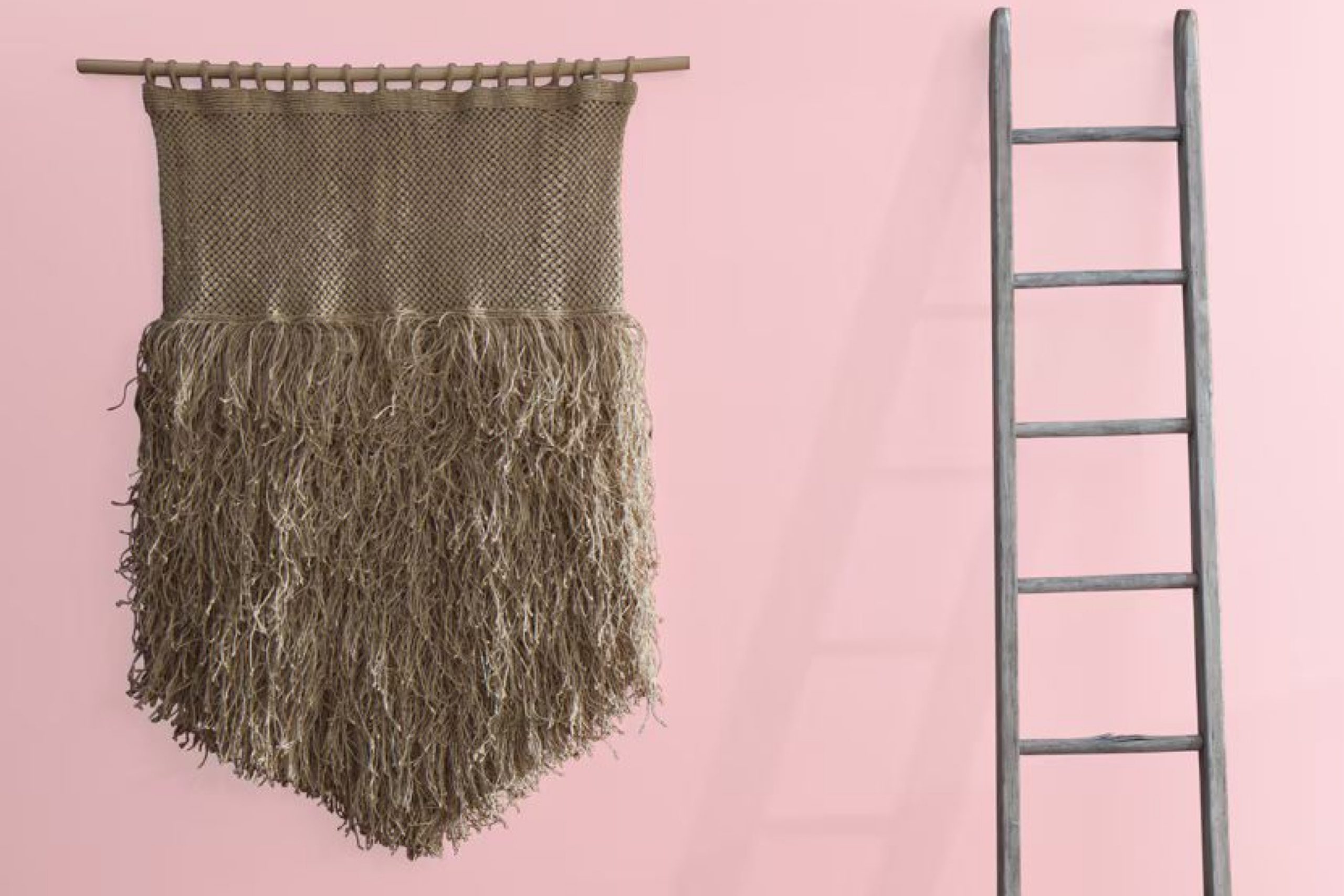
Are you thinking about giving your space a fresh, new look? A great color to consider is 2005-60 Pink Pearl by Benjamin Moore. This delightful shade of pink brings a soft and gentle feel to any room, making it perfect for creating a soothing atmosphere. Whether you’re updating your living room, bedroom, or even a bathroom, Pink Pearl adds just the right touch of warmth and cheerfulness.
The color works beautifully with a wide range of decor styles, from modern to traditional, giving you the flexibility to use it in various ways throughout your home. Pair it with light neutrals like whites and beiges for a calm, airy vibe, or combine it with bolder hues for a more dynamic and inviting look.
Plus, it’s not just about looks—using a quality paint like Benjamin Moore ensures that the color stays true over time, resisting fading and maintaining its charm.
So, if you’re ready to refresh your home’s look, Pink Pearl may just be the perfect choice to add that soft splash of color you’ve been wanting.
via benjaminmoore.com
What Color Is Pink Pearl 2005-60 by Benjamin Moore?
Pink Pearl 2005-60 by Benjamin Moore is a soft, gentle shade of pink that radiates warmth and serenity. This color adds a subtle touch of femininity to a space without overwhelming it. It’s a versatile hue that works beautifully in a variety of settings, from traditional to modern interiors.
This light pink shade is perfect for creating a soothing atmosphere in bedrooms and bathrooms where comfort is paramount. It pairs exceptionally well with delicate textures such as silk and linen, adding a layer of softness to the room’s aesthetic. Combine it with light woods like birch or maple to maintain an airy and light ambiance, or introduce darker woods like walnut for a more grounded, sophisticated look.
Materials like brushed brass or copper fixtures can also complement Pink Pearl 2005-60 effectively, contributing to a chic and polished interior design. For those who prefer a contemporary style, combining this color with concrete or metallic accents can create an interesting contrast that still retains harmony.
Overall, Pink Pearl 2005-60 by Benjamin Moore is ideal for anyone looking to introduce a gentle pop of color into their home. It’s particularly suited for spaces that aim for a fresh, inviting feel, blending well with both soft and sharp textures to achieve aesthetic balance.
housekeepingbay.com
Is Pink Pearl 2005-60 by Benjamin Moore Warm or Cool color?
Pink Pearl 2005-60 by Benjamin Moore is a soft, gentle hue perfect for adding a touch of warmth to any room. This color blends the playful charm of pink with a subtle sophistication, making it versatile for both living areas and bedrooms.
It pairs nicely with neutrals like whites and grays, which helps in creating a balanced, inviting space. Since Pink Pearl is not overwhelmingly bright, it can help small rooms appear bigger and more open. Homeowners find this shade ideal for nurseries due to its calming and soothing qualities. It’s also effective in bathrooms and spaces needing a soft touch without overpowering the senses.
When used in well-lit areas, Pink Pearl reflects and maximizes natural light, enhancing the overall airy feel of the room. This color works well with natural materials such as wood and stone, adding a fresh, clean look to any home’s interior.
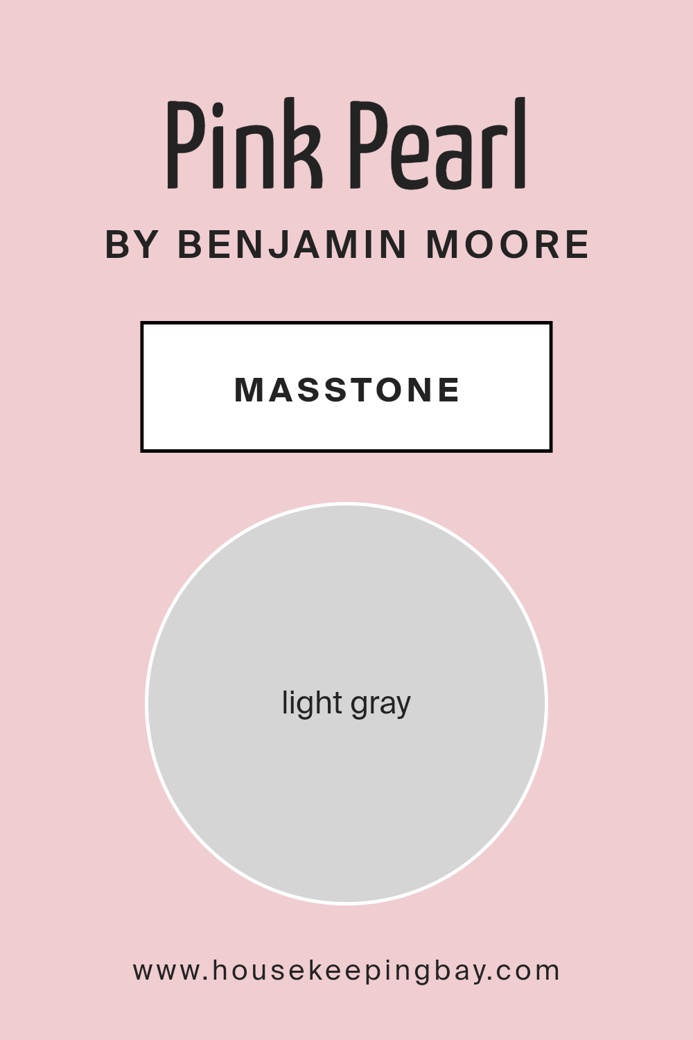
What is the Masstone of the Pink Pearl 2005-60 by Benjamin Moore?
Pink Pearl 2005-60 by Benjamin Moore has a masstone of Light Gray, represented by the color code #D5D5D5. This light gray serves as a neutral base that makes Pink Pearl highly versatile for use in home interiors.
The softness of this gray allows the color to blend well with various decor styles and palettes, making it easy to match with furniture and accessories. It creates a gentle backdrop in rooms, providing a calm and soothing atmosphere without overwhelming the space. This feature makes it ideal for areas where a peaceful vibe is desired, such as bedrooms and living rooms.
Additionally, its lightness helps to reflect natural light, making spaces appear brighter and more open. This can be particularly beneficial in smaller rooms or areas with limited sunlight. Overall, Pink Pearl 2005-60’s light gray masstone helps to establish a fresh and airy feel, making it a practical choice for creating inviting home environments.
housekeepingbay.com
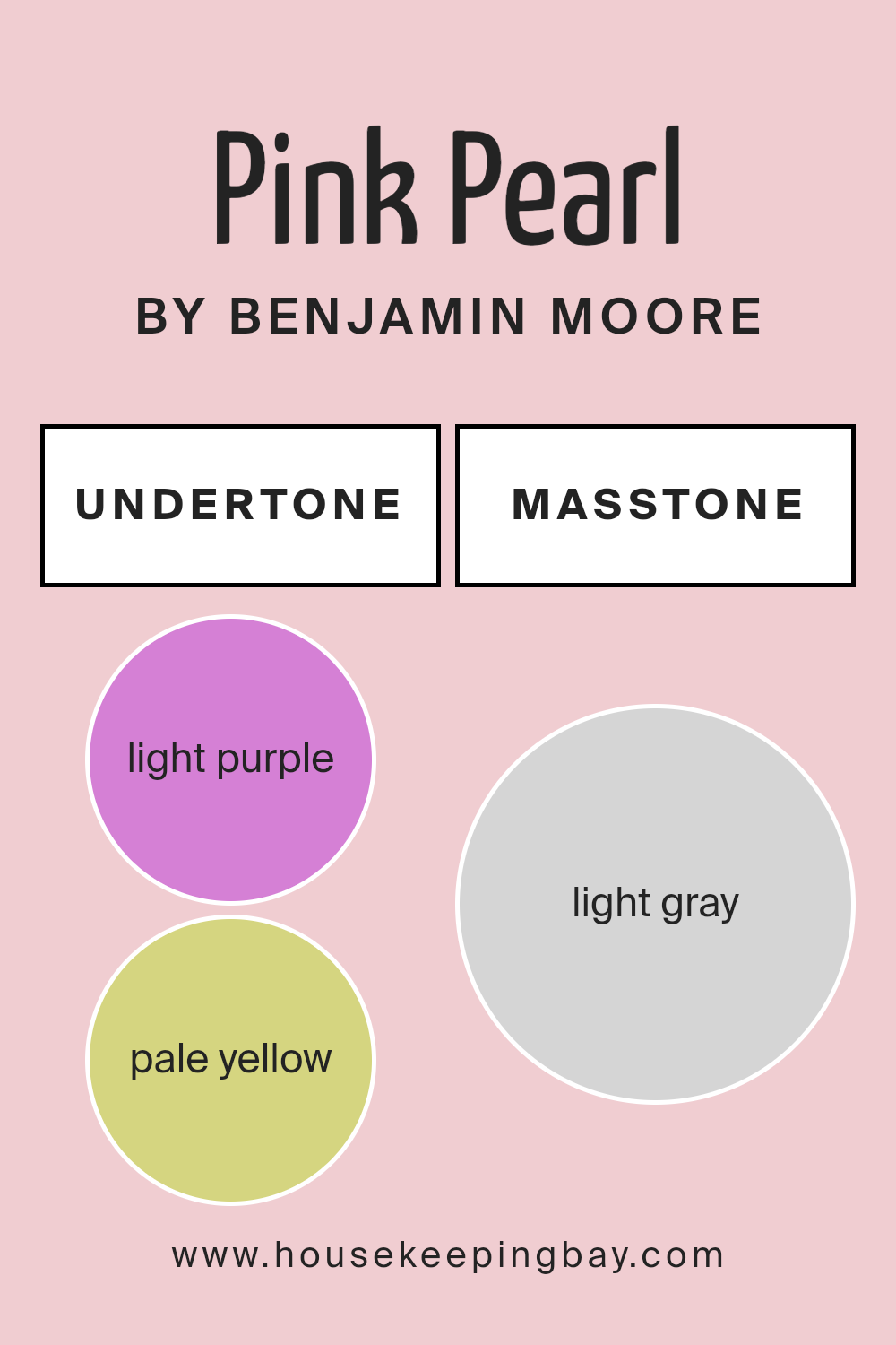
Undertones of Pink Pearl 2005-60 by Benjamin Moore
Pink Pearl 2005-60 by Benjamin Moore has a soft, gentle tone that is versatile for different spaces and lighting conditions. The color, seemingly simply pink at first glance, actually holds a complex mix of undertones which influence how it appears in any given space.
The light purple and lilac undertones in Pink Pearl add a subtle hint of coolness, providing a fresh and airy feel which can make small rooms appear slightly more spacious. Pale yellow and pale pink undertones, on the other hand, add a warmth that can make the color feel more inviting and cozy. This makes Pink Pearl a good choice for living areas or bedrooms where a soft, warm ambiance is desired.
Light blue and mint undertones bring a crisp, clean quality to the color, which can be especially appealing in bathrooms or kitchens for a bright and hygienic look. The undertones can react differently depending on natural light levels, time of day, and other colors in the room.
Furthermore, the grey undertone acts as a balancing agent, helping to ground the color and prevent it from feeling too vibrant or overwhelming. This quality makes Pink Pearl an excellent choice for larger wall spaces or as a base color in a room, providing a sophisticated backdrop that allows furniture and decor to stand out.
In summary, the unique blend of undertones in Pink Pearl by Benjamin Moore makes it an adaptable and appealing choice for interior walls, affecting both the mood and perception of spaces in subtle yet significant ways.
housekeepingbay.com
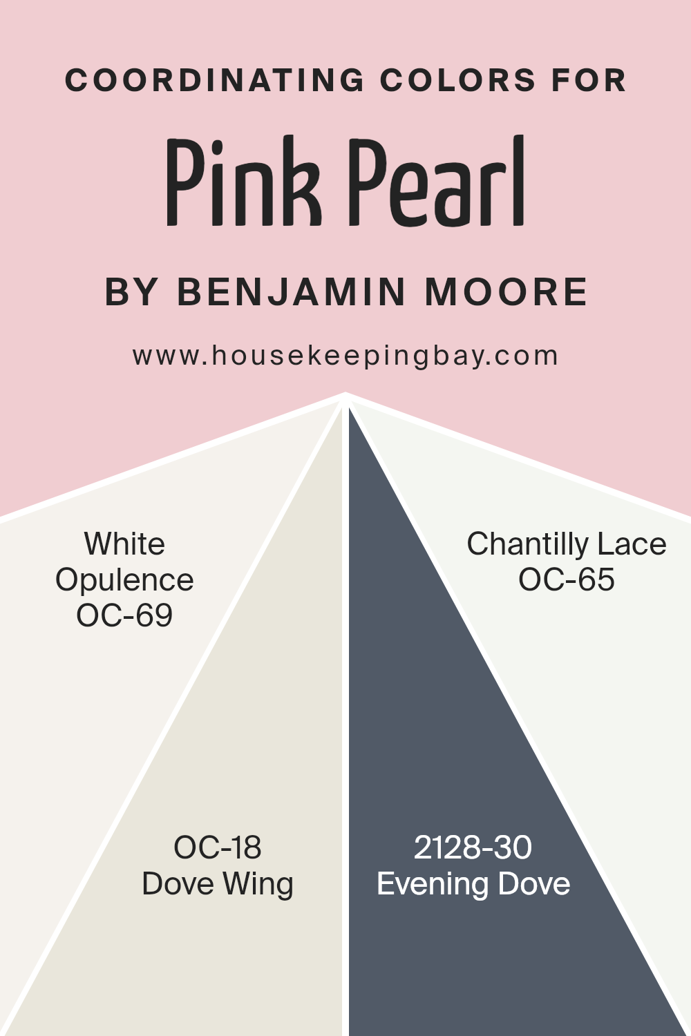
Coordinating Colors of Pink Pearl 2005-60 by Benjamin Moore
Coordinating colors are selected to create harmony in a design by complementing the main color, in this case, Pink Pearl by Benjamin Moore. When choosing coordinating colors, designers look for shades that balance each other, ensuring that no single color overpowers another. The idea is to enhance the visual appeal and create a pleasing aesthetic.
Pink Pearl, a gentle shade of pink, pairs beautifully with soft neutrals like White Opulence, a crisp and clean white that adds a fresh burst of brightness to any space. Dove Wing, a slightly deeper off-white, offers a subtle contrast, enriching the environment without overwhelming the senses with too much saturation.
For a stronger accent, Evening Dove provides a rich, deep blue that contrasts sharply with Pink Pearl, adding depth and interest to the palette. Lastly, Chantilly Lace is another pure white, similar to White Opulence but with a slightly different undertone, providing a clean backdrop that allows the other colors to shine. Together, these colors create a balanced and harmonious look, ideal for spaces aiming for a soft and soothing atmosphere.
You can see recommended paint colors below:
- OC-69 White Opulence
- OC-18 Dove Wing
- 2128-30 Evening Dove
- OC-65 Chantilly Lace
housekeepingbay.com
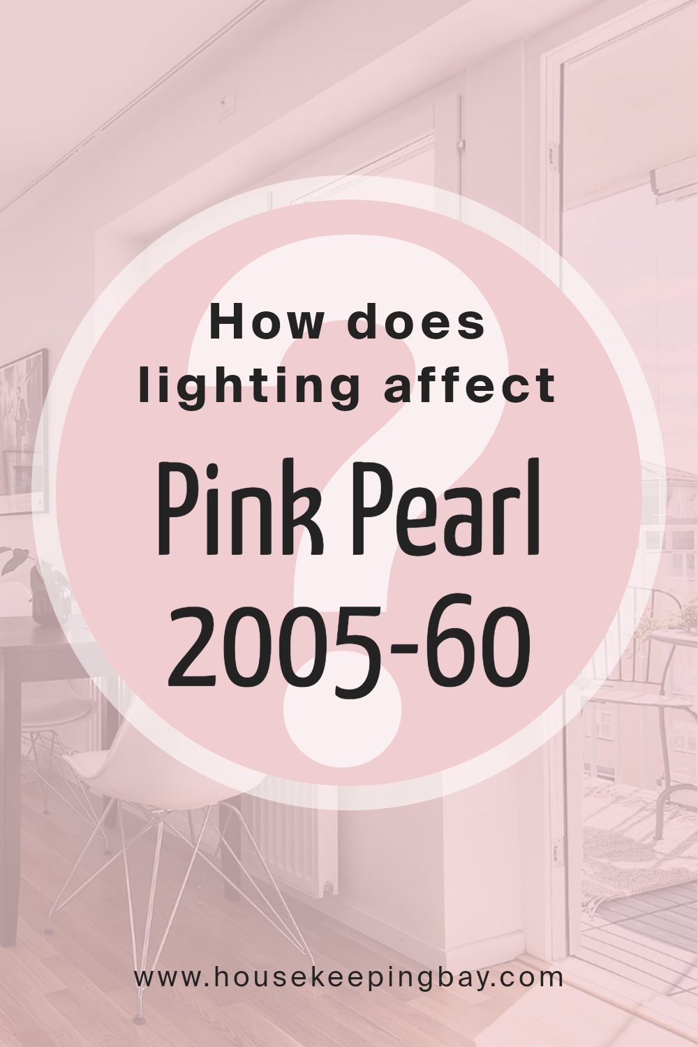
How Does Lighting Affect Pink Pearl 2005-60 by Benjamin Moore?
Lighting significantly influences how we perceive colors. Different light sources can change the way a color appears in a room. For Benjamin Moore’s Pink Pearl 2005-60, an off-white hue with a hint of pink, lighting plays a crucial role in determining its impact and feel in any space.
In artificial light, Pink Pearl 2005-60 may take on a warmer tone, depending on the type of bulbs used. Incandescent lighting could enhance its pinkish glow, making the room feel cozy and inviting.
In contrast, fluorescent lighting tends to give off a bluer light, which can diminish the warmth of the pink, making it appear more subdued and neutral.
In natural light, Pink Pearl 2005-60 reflects light beautifully, looking vibrant and lively. The quality and angle of sunlight, however, affect its appearance throughout the day.
In rooms facing north, which receive less direct sunlight, this color might look more muted, reflecting a soft and subtle hue that maintains a calm atmosphere even without bright sunlight.
South-facing rooms get the most sunlight, so here Pink Pearl 2005-60 shines brightly. The ample sunlight can make the color look more radiant and dynamic, enhancing the room’s overall warmth. This direction often showcases the color at its most brilliant, particularly during the middle of the day.
East-facing rooms receive strong sunlight in the morning. This early bright light brings out the warmth in Pink Pearl 2005-60, making spaces feel fresh and lively in the morning, while turning softer as the natural light diminishes towards the afternoon and evening.
West-facing rooms are the opposite, with minimal morning light but an increase in intensity during the late afternoon and evening. In these rooms, Pink Pearl 2005-60 transitions throughout the day —from a cooler, softer shade in the morning to a warmer, glowing hue by evening.
Thus, how Pink Pearl 2005-60 looks can significantly depend on the room’s orientation and the type of light it receives, affecting the mood and atmosphere of the space.
housekeepingbay.com
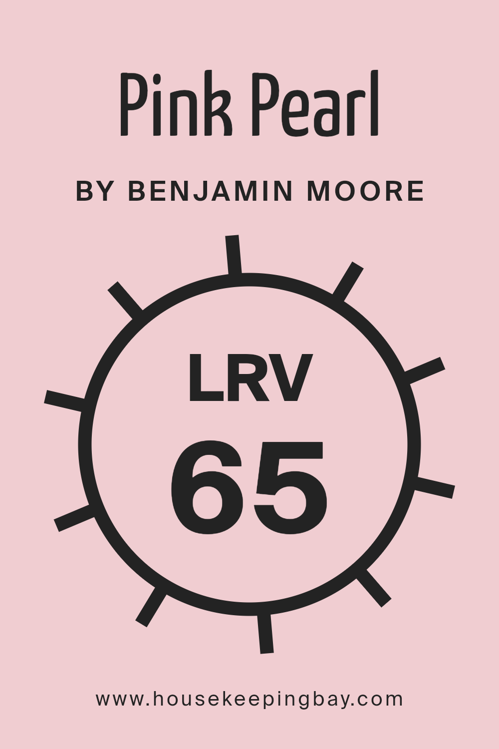
What is the LRV of Pink Pearl 2005-60 by Benjamin Moore?
Light Reflectance Value (LRV) measures the percentage of light a paint color reflects back into a room. It ranges from 0%, which absorbs all light, to 100%, which reflects all light. Colors with higher LRV make spaces appear bigger and brighter because they reflect more light.
Conversely, colors with a lower LRV can make a room feel smaller and cozier due to their light-absorbing qualities. This metric is crucial in choosing the right paint shade for your room, depending on how light or dark you want the space to feel. The LRV of Pink Pearl (2005-60) by Benjamin Moore is 64.88, meaning it has a relatively high ability to reflect light.
This characteristic makes Pink Pearl an excellent choice for rooms that might need brightening, such as a north-facing room or a space without ample natural sunlight. The light pink hue will reflect a significant portion of available light, making the space feel luminous and airy. This paint would be less suitable for a very bright room where one might want to minimize glare, as its high reflectivity could potentially enhance brightness to an uncomfortable level.
housekeepingbay.com
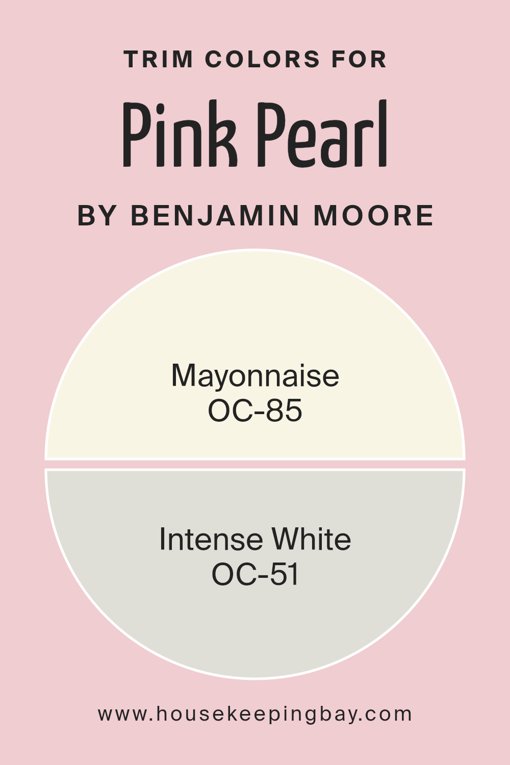
What are the Trim colors of Pink Pearl 2005-60 by Benjamin Moore?
Trim colors are specific shades used to accentuate or complement the main color on walls, bringing out architectural details such as door frames, baseboards, cornices, and window frames. For a paint like Pink Pearl 2005-60 by Benjamin Moore, selecting the right trim colors can enhance its visual appeal without overpowering it.
Using neutral trim colors like OC-85 – Mayonnaise and OC-51 – Intense White balances out the vibrant tones of Pink Pearl, creating a subtle, polished look. These shades are versatile enough to blend smoothly with other hues, providing a clean, refined finish that highlights the lighter, softer quality of the pink.
OC-85 – Mayonnaise is a soft, creamy white that has a warm undertone, making it a great choice for trims as it offers a gentle contrast that is neither too stark nor too bland, helping to create a cozy and inviting atmosphere. OC-51 – Intense White, on the other hand, is a slightly cooler shade that brings a crisp freshness to spaces, complementing the warmer tones of Pink Pearl with a harmonious balance that maintains the room’s airy feel. Both of these colors add a touch of sophistication and can help in making the Pink Pearl pop, ensuring it stands out as the focal point of a room.
You can see recommended paint colors below:
- OC-85 Mayonnaise
- OC-51 Intense White
housekeepingbay.com
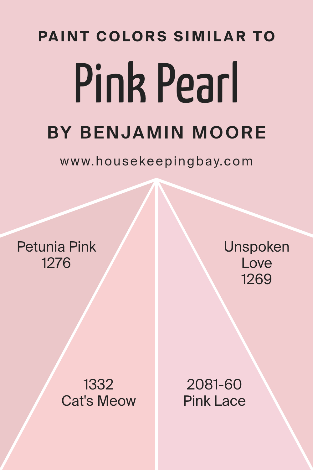
Colors Similar to Pink Pearl 2005-60 by Benjamin Moore
Similar colors are crucial in design because they help create a cohesive and harmonious look. When colors, such as those similar to Pink Pearl 2005-60 by Benjamin Moore, are used together, they lead to a visually pleasing ambiance and a seamless transition between spaces. These similar shades can subtly differ in tone or intensity, which allows for a layered approach to decorating.
For example, when you combine colors like Petunia Pink and Cat’s Meow with Pink Lace and Unspoken Love, it provides a gradient of intensity that can enhance the depth and interest of a room without the harsh contrasts that often come from using highly diverse colors.
Petunia Pink is a soft, cheerful hue that adds a light-hearted touch, making it ideal for spaces intended to foster a friendly, inviting atmosphere. Cat’s Meow strikes a deeper chord, offering a slightly more sophisticated, yet still soft appearance suitable for areas where a touch of elegance is desired.
Pink Lace is even lighter than Petunia Pink, presenting a delicate, almost ethereal quality. This makes it perfect for crafting serene nooks or child-friendly spaces that are soothing to the senses. Lastly, Unspoken Love offers a muted tone that resembles a whisper of pink, ideal for spaces that aim for a subtle yet romantic vibe. These colors, when used together, ensure a well-rounded palette that supports both visual interest and emotional comfort.
You can see recommended paint colors below:
- 1276 Petunia Pink
- 1332 Cat’s Meow
- 2081-60 Pink Lace
- 1269 Unspoken Love
housekeepingbay.com
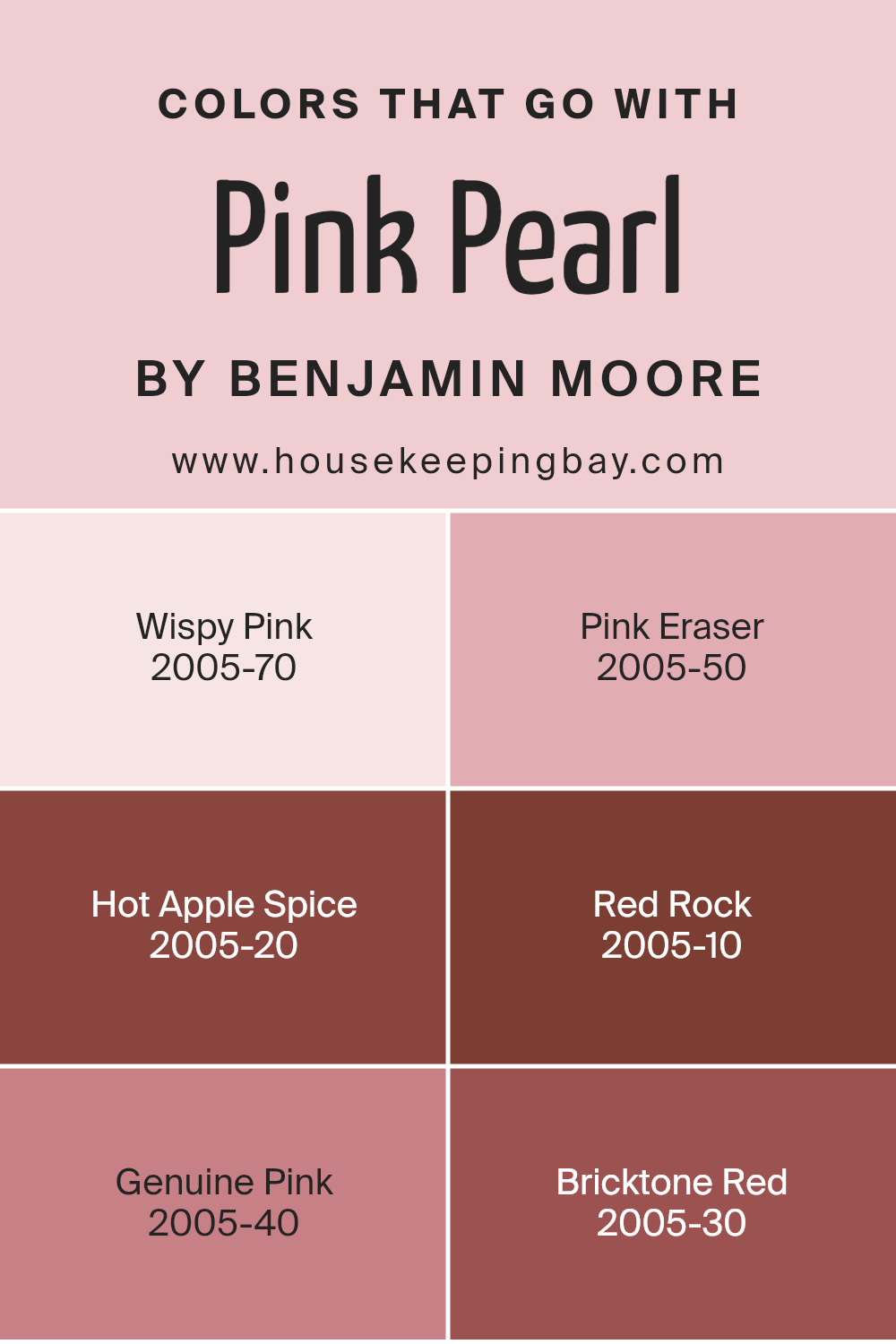
Colors that Go With Pink Pearl 2005-60 by Benjamin Moore
Choosing colors that complement Pink Pearl 2005-60 by Benjamin Moore is crucial because it ensures that the shade stands out without clashing with other hues in your space. When colors harmonize well, they create a visually appealing environment that enhances the overall mood of a room.
For instance, Wispy Pink, a gentle, pale blush tone, offers a subtle contrast that is soothing to the eye when paired with Pink Pearl. Pink Eraser, slightly richer and dustier, works seamlessly with Pink Pearl to establish a soft, serene atmosphere. This is particularly effective in bedrooms or living areas where a calm, gentle palette is desired.
Deeper tones like Hot Apple Spice, a warm, deep cinnamon color, add a rich, cozy feel to the space, complementing the lightness of Pink Pearl with its robust depth. Red Rock is a vibrant, earthy red that injects energy and passion into the room, making Pink Pearl appear more dynamic.
For an elegant and refined look, Genuine Pink offers a rosy hue that subtly blends with Pink Pearl for a touch of sophistication. Alternatively, Bricktone Red, with its deep, muted shade, pairs well with Pink Pearl for those looking to incorporate a traditional vibe with a modern twist, presenting an array of options for creative interiors.
You can see recommended paint colors below:
- 2005-70 Wispy Pink
- 2005-50 Pink Eraser
- 2005-20 Hot Apple Spice
- 2005-10 Red Rock
- 2005-40 Genuine Pink
- 2005-30 Bricktone Red
housekeepingbay.com
How to Use Pink Pearl 2005-60 by Benjamin Moore In Your Home?
Pink Pearl 2005-60 by Benjamin Moore is a gentle pink shade that offers a soft and soothing vibe, ideal for creating a calming space in any home. This particular color is versatile and can be used in various rooms to add a touch of warmth and comfort.
In a bedroom, Pink Pearl provides a peaceful backdrop, perfect for relaxation and rest. It can also illuminate a bathroom, adding a fresh and clean look when combined with white fixtures and natural light. In living areas, applying Pink Pearl on an accent wall can soften the overall ambiance without overwhelming the space with bold colors.
It pairs beautifully with neutral tones like grays and beiges, as well as with darker colors like navy or black for a modern contrast. For a cohesive home design, consider using Pink Pearl in accessories like throw pillows or curtains to subtly include this soothing pink shade throughout the house.
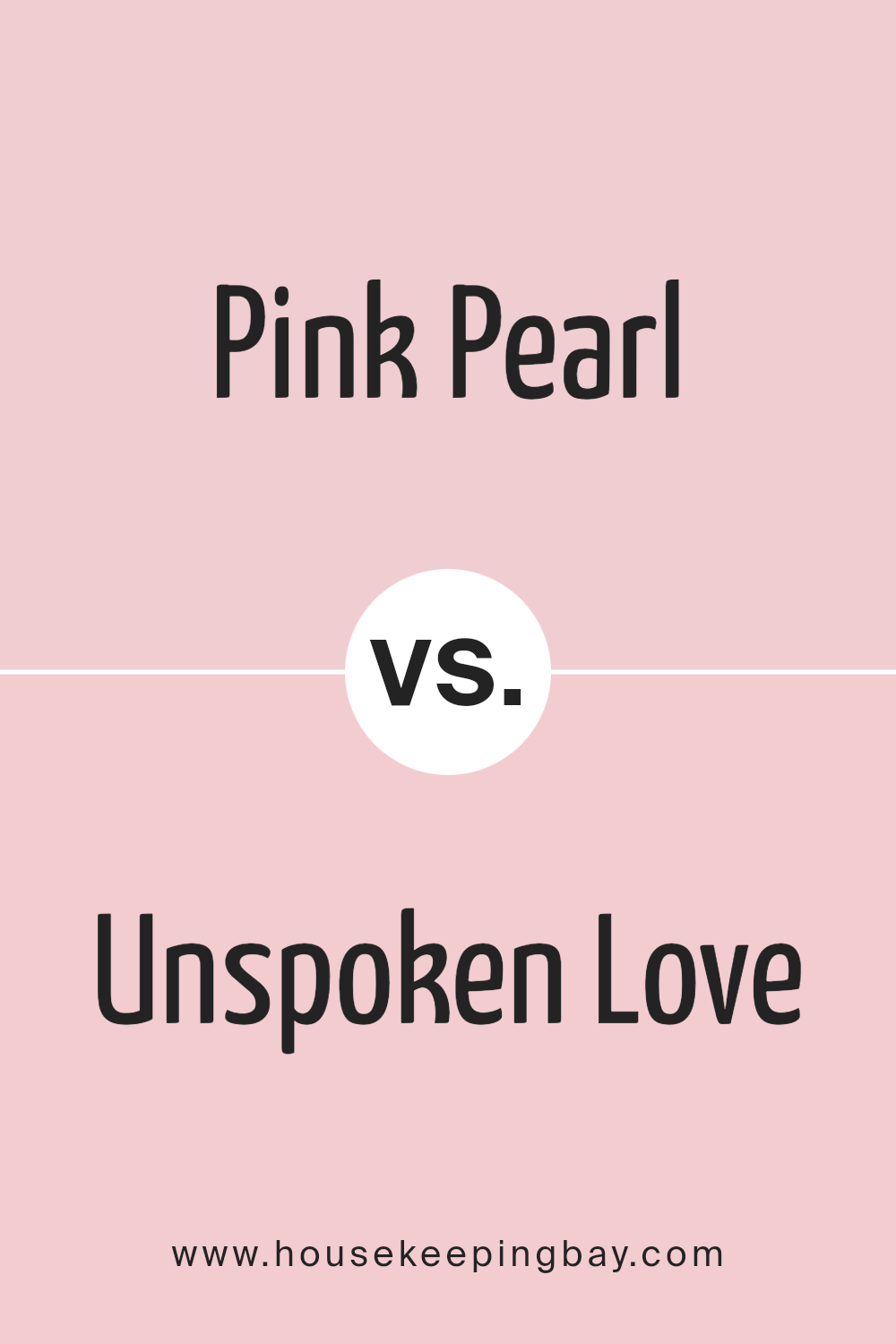
Pink Pearl 2005-60 by Benjamin Moore vs Unspoken Love 1269 by Benjamin Moore
The color Pink Pearl 2005-60 by Benjamin Moore is a soft, light pink with subtle warmth, giving it a gentle and soothing appearance. It reflects a delicate femininity and works well in spaces intended to have a calm, serene vibe. This color is ideal for nurseries, bathrooms, or anywhere you want a touch of understated charm.
Unspoken Love 1269, also by Benjamin Moore, is a richer, deeper pink with a hint of mauve. This shade is warmer and more assertive than Pink Pearl, offering a sense of sophistication and depth. It’s perfect for creating a cozy, inviting space, such as a living room or a bedroom where you want color to play a significant but not overwhelming role.
In comparison, while both colors share a pink base, Pink Pearl is lighter and more airy, promoting a tranquil atmosphere. Unspoken Love provides more visual impact with its deeper, more saturated hue, making it suitable for a variety of decorative styles that require a bolder pink.
You can see recommended paint color below:
- 1269 Unspoken Love
housekeepingbay.com
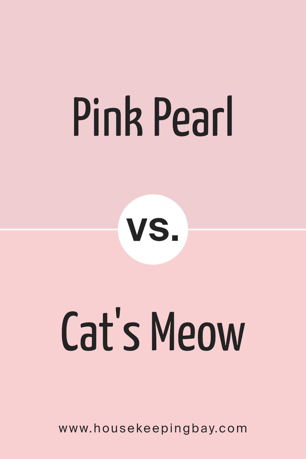
Pink Pearl 2005-60 by Benjamin Moore vs Cat’s Meow 1332 by Benjamin Moore
Pink Pearl 2005-60 by Benjamin Moore is a soft and delicate shade of pink, giving a light and airy feel to any room. It’s gentle enough to be used widely across walls without overwhelming the space, making it ideal for creating a soothing atmosphere. This color pairs well with white trim or soft gray accents for a fresh, elegant look.
In contrast, Cat’s Meow 1332 from Benjamin Moore is a much deeper, muted shade of purple with gray undertones. It offers a dramatic and sophisticated vibe, making it suitable for accent walls or spaces where a touch of elegance is desired. This color works well in modern decor schemes, especially when combined with metallic fixtures or dark wood furniture.
Both colors serve different purposes in interior design: Pink Pearl is suited for light refreshing themes, while Cat’s Meow lends itself to bold, chic styling.
You can see recommended paint color below:
- 1332 Cat’s Meow
housekeepingbay.com
Pink Pearl 2005-60 by Benjamin Moore vs Petunia Pink 1276 by Benjamin Moore
Pink Pearl 2005-60 by Benjamin Moore is a soft, gentle shade that leans towards a light, creamy pink. It creates a soothing and calm atmosphere in any room, making it perfect for spaces intended for relaxation such as bedrooms or bathrooms. The mild tone helps to reflect light beautifully, giving the room a brighter appearance.
Petunia Pink 1276 by Benjamin Moore, however, is a deeper, more saturated hue. This color is reminiscent of the vibrant petals of a blooming petunia. It adds more energy and vividness to a space, ideal for areas where a lively, cheerful vibe is desired. This pink shade has a youthful quality and can be an excellent choice for adding a pop of color to a child’s room or a creative space.
While both colors share the basic quality of being pink, Pink Pearl is subtler and more understated, while Petunia Pink is bolder and more dynamic. Each color would suit different decorating styles and personal preferences depending on the mood one aims to achieve.
You can see recommended paint color below:
- 1276 Petunia Pink
housekeepingbay.com
Pink Pearl 2005-60 by Benjamin Moore vs Pink Lace 2081-60 by Benjamin Moore
Benjamin Moore’s Pink Pearl 2005-60 and Pink Lace 2081-60 are two shades of pink that present subtly different tones. Pink Pearl 2005-60 is a soft, muted pink with a touch of warmth that gives it a cozy, welcoming feel. This color is perfect for creating a gentle, soothing ambiance in a room.
In contrast, Pink Lace 2081-60 is lighter and airier than Pink Pearl. It has a more delicate, almost ethereal quality to it, making it ideal for spaces that aim to be serene and light-filled. Pink Lace tends to reflect more light, giving a room a more open and fresh feel.
Both colors share a feminine vibe but achieve distinct moods because of their intensity and depth differences. Pink Pearl, with its richer hue, might be suited for areas that require a bit more warmth and personality, while Pink Lace works well in spaces that benefit from a subtle, breezy touch.
You can see recommended paint color below:
- 2081-60 Pink Lace
housekeepingbay.com
Conclusion
What stands out about Pink Pearl is its ability to infuse a room with a gentle warmth without overwhelming the senses, which is crucial for creating a balanced aesthetic. Its adaptability across various design styles also makes it an exceptional candidate for different rooms, whether it’s a lively living area or a peaceful bedroom.
Furthermore, the detailed discussion on the complementary colors and design scenarios in the article highlights how Pink Pearl can serve as a subtle base or a contrasting highlight, providing designers and home renovators with numerous creative avenues. From my perspective, considering this shade for your next project could offer a refreshing yet calm atmosphere that enhances the overall mood of any environment.
Overall, the article solidified my appreciation for 2005-60 Pink Pearl as more than just a paint color; it’s a potential centerpiece for thoughtful and inspiring interior design projects.
Whether you’re a professional decorator or a DIY enthusiast, Pink Pearl is definitely worth considering for your next transformation.
housekeepingbay.com
