Water’s Edge 1635 by Benjamin Moore
Creating Coastal Calm in Your Space
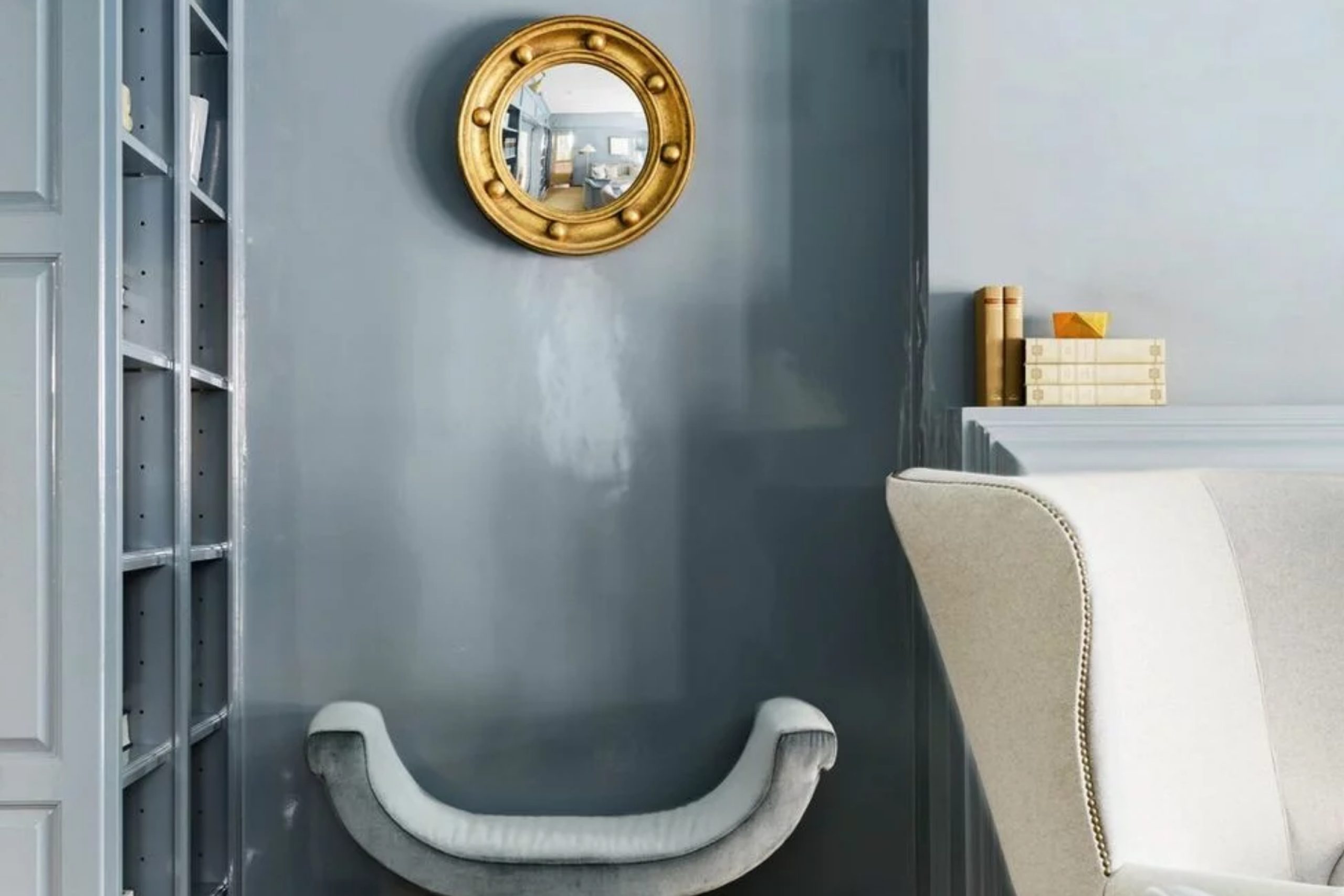
When you think of paint, the color 1635 Water’s Edge by Benjamin Moore can be a fantastic choice. This shade offers a cool and calming blue that can easily bring a sense of peace to any room in your home. Imagine walking into a space where the walls whisper of calm seascapes and gentle breezes. That’s the feeling 1635 Water’s Edge can give you.
It’s a shade that works beautifully in areas where you spend a lot of time relaxing, like a living room or bedroom. The blue tone isn’t too bold, so it doesn’t overwhelm a space. Instead, it creates a gentle backdrop that pairs well with a variety of other colors.
You might pair it with whites and grays for a more classic look, or maybe add a splash of coral or mustard for a bit of contrast.
What makes 1635 Water’s Edge special is its ability to make a room feel both fresh and timeless. It’s a color that seems to always stay in style, striking just the right balance between contemporary and classic.
Consider trying it in your next home project if you’re aiming to create a serene and inviting environment.
via benjaminmoore.com
What Color Is Water’s Edge 1635 by Benjamin Moore?
Table of Contents
Water’s Edge 1635 by Benjamin Moore is a soft, calming shade that blends blue with subtle gray undertones. This versatile color evokes the soothing feel of gentle waves and quiet, misty mornings, making it perfect for rooms where a peaceful atmosphere is desired.
Water’s Edge works wonderfully in coastal and nautical-themed interiors, where it reflects the essence of the sea. It’s also fitting in modern and Scandinavian designs, enhancing minimalist aesthetics with its understated elegance.
In terms of materials, Water’s Edge pairs beautifully with natural wood tones, whether light oak or richer walnut. These combinations enhance the organic feel. When used with crisp white trims, it creates a clean, fresh look that brightens spaces while maintaining a serene vibe.
Incorporate textures like woolen throws, linen curtains, or jute rugs to add warmth and depth. Metallic accents, such as brushed nickel or matte brass, complement its sophisticated, subtle characteristics, providing a touch of refinement.
In bedrooms, Water’s Edge promotes relaxation, offering a perfect backdrop for restful sleep.
In living areas, it can serve as an inviting canvas that harmonizes with various decorative elements and furnishings, offering a timeless backdrop that supports both cozy and elegant settings.
housekeepingbay.com
Is Water’s Edge 1635 by Benjamin Moore Warm or Cool color?
Water’s Edge 1635 by Benjamin Moore offers a soothing blue-gray hue that can bring a sense of calm into any room. Its cool tone can make spaces feel more open and airy, perfect for smaller rooms or areas needing relaxation, like bedrooms or bathrooms. This shade pairs well with natural materials, such as wood or stone, creating a timeless, inviting look.
In living rooms, Water’s Edge can provide a soft backdrop that enhances other colors without overpowering them. Its versatility shines in homes aiming for a coastal or modern style.
When combined with whites or creams, the shade stands out while remaining subtle enough to not dominate the design.
This color also interacts beautifully with different lighting—natural light enhances its lighter elements, while indoor lighting gives it a cozier feel. Whether on an accent wall or across an entire room, Water’s Edge 1635 gently influences the ambiance of a home.
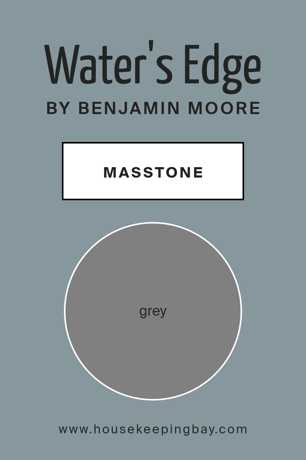
What is the Masstone of the Water’s Edge 1635 by Benjamin Moore?
Water’s Edge 1635 by Benjamin Moore offers a serene and calming shade that blends grey with subtle hints of blue. As a masstone, this grey (#808080) serves as the underlying base that defines the color’s appearance. In homes, this color can create a peaceful and balanced atmosphere.
Its neutral quality allows it to complement various styles and décors, offering flexibility in design.
The color’s calmness makes it suitable for bedrooms and living areas, where relaxation is key. It also provides a perfect backdrop for brighter accents, allowing other colors in a room to stand out without overwhelming the space. Water’s Edge can enhance the sense of openness in smaller rooms, making them appear larger and more inviting.
Its versatile nature means it pairs well with both warm and cool tones, making it an excellent choice for homeowners looking for a timeless and adaptable look in their interiors.
housekeepingbay.com
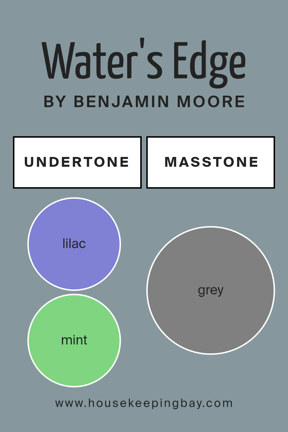
Undertones of Water’s Edge 1635 by Benjamin Moore
Water’s Edge 1635 by Benjamin Moore presents an intriguing blend born from its undertones. Primarily a light blue, this color draws influence from an array of subtle hues. The lilac and light purple tones lend a gentle, soothing quality, creating a calming atmosphere.
Mint and light green hints add freshness, evoking thoughts of nature and open spaces. An infusion of light gray keeps Water’s Edge neutral, making it versatile for different spaces.
When these undertones are combined, the result is a hue that changes based on the lighting. In bright, natural light, the hints of pale yellow and pale pink can become more apparent, giving the color warmth and inviting a soft and cheerful environment.
Darker undertones like navy, dark turquoise, and dark blue add depth, making the color feel cooler and more composed in low light or evening.
On interior walls, Water’s Edge 1635 acts as a chameleon, adapting to its surroundings. Cool undertones give it a refreshing feel, perfect for bathrooms or bedrooms, promoting relaxation. Meanwhile, warmer undertones, such as orange and pink, can make living spaces feel cozy and welcoming.
Overall, the blend of these undertones ensures that Water’s Edge remains interesting, adaptable, and perfect for versatile design concepts.
housekeepingbay.com
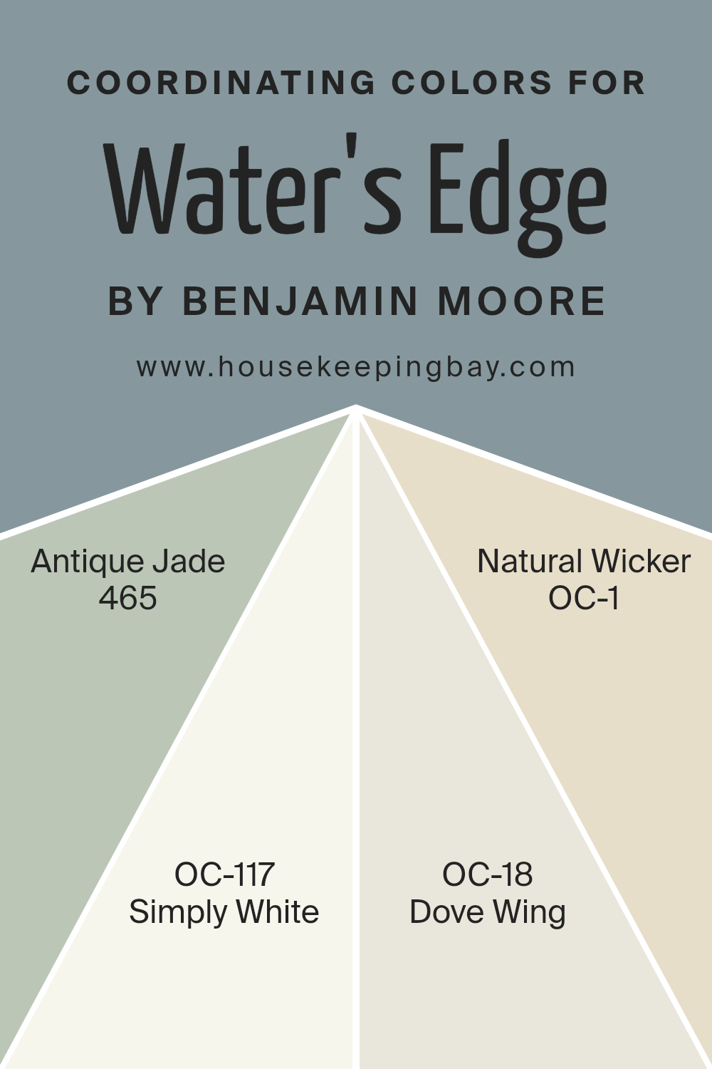
Coordinating Colors of Water’s Edge 1635 by Benjamin Moore
Coordinating colors are hues that complement and enhance a primary color, creating a harmonious look in a space. When applied thoughtfully, they work together to produce a balanced and pleasing aesthetic. Water’s Edge 1635 by Benjamin Moore presents a serene shade, and choosing the right coordinating colors can highlight its qualities beautifully.
Using colors like Antique Jade 465, Simply White OC-117, Dove Wing OC-18, and Natural Wicker OC-1 alongside Water’s Edge can create a cohesive and inviting environment.
Antique Jade 465 adds a subtle touch of green that pairs well with the calmness of Water’s Edge, giving a gentle nod to nature. Simply White OC-117 brings in a crisp and clean feel, providing a fresh backdrop against which other colors can shine.
Dove Wing OC-18 offers a soft, warm gray that introduces a layer of depth into the mix without overshadowing other elements.
Natural Wicker OC-1 is a warm beige that exudes comfort and sophistication, seamlessly tying different colors together. Together, these hues create a balanced palette, each enhancing the others’ attributes—a true testament to how coordinating colors can transform a room’s atmosphere.
You can see recommended paint colors below:
- 465 Antique Jade
- OC-117 Simply White
- OC-18 Dove Wing
- OC-1 Natural Wicker
housekeepingbay.com
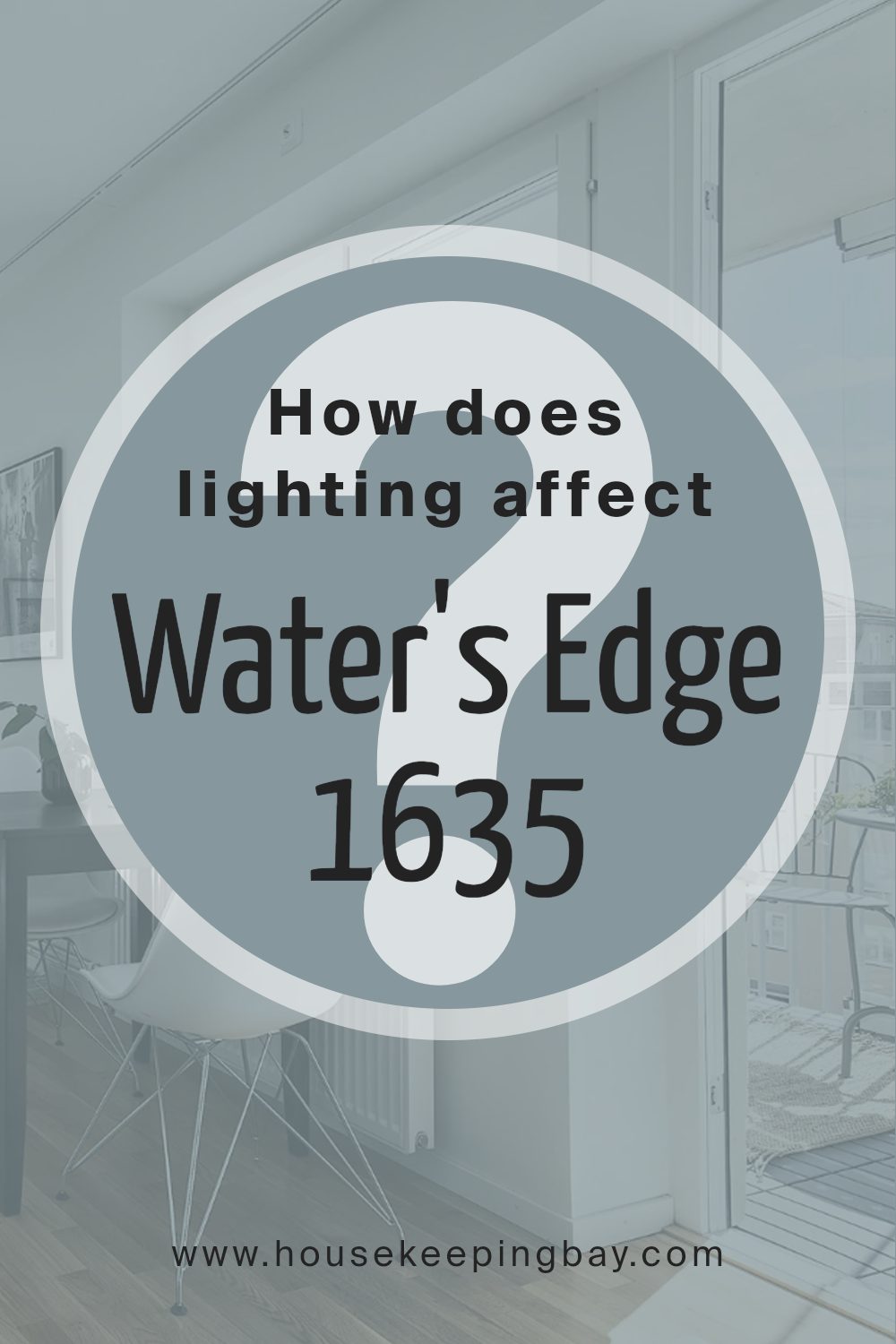
How Does Lighting Affect Water’s Edge 1635 by Benjamin Moore?
Lighting plays a big role in how we see colors. Natural light changes throughout the day, affecting how colors appear. Artificial light, on the other hand, can have different effects based on its type. Let’s look at the color Water’s Edge 1635 by Benjamin Moore and see how it behaves under different lights.
In natural light, colors can look different depending on the direction the room faces. North-facing rooms get cool, indirect sunlight. This tends to make colors look muted. Water’s Edge, which is a soft blue-gray, may appear cooler and more muted in these rooms.
In south-facing rooms, which get warm, direct sunlight, colors can look brighter. Here, Water’s Edge might appear more vibrant and warmer due to the sunlight.
East-facing rooms get sunlight in the morning, which is soft and sometimes golden. In these rooms, Water’s Edge might look slightly warmer and brighter in the morning and cooler as the day progresses. West-facing rooms get sunlight in the afternoon and evening.
The color may appear warmer and more intense under this light, especially in the late afternoon and evening.
Under artificial light, the type of bulb also affects how a color looks. Incandescent bulbs tend to give off a warm, yellow light, which can make Water’s Edge appear warmer and slightly more greenish. Fluorescent lights, which can be cooler, might make the color look more muted or slightly bluish. LED lights can vary; warm LEDs might enhance the warmth in the paint, while cool LEDs might bring out the gray tones more.
Overall, Water’s Edge is versatile but sensitive to different lighting conditions. It’s important to test it in the space with the lighting you’ll be using to make sure it gives the feeling you want.
housekeepingbay.com
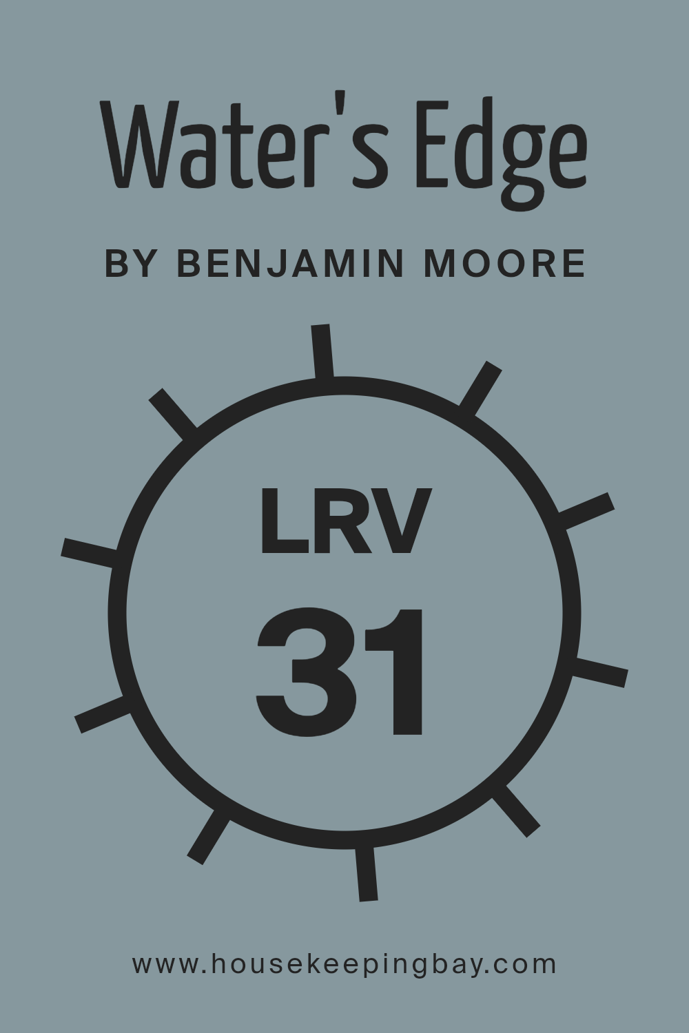
What is the LRV of Water’s Edge 1635 by Benjamin Moore?
LRV stands for Light Reflectance Value. It measures how much light a color reflects or absorbs, using a scale from 0 to 100. A color with an LRV of 0 is pitch black and absorbs all light, while a color with an LRV of 100 is pure white and reflects all light.
The higher the LRV, the more light the color reflects, and the brighter and lighter a room will appear. On the flip side, colors with lower LRV numbers absorb more light, making spaces seem darker and more cozy.
LRV is important when choosing paint, as it helps determine how a color will look in different lighting conditions.
When we talk about Water’s Edge 1635 by Benjamin Moore, its LRV is 31.48, making it a mid-tone color. It reflects a moderate amount of light, meaning it won’t lighten up a room as much as a color with a higher LRV would. Instead, Water’s Edge will add a rich, calming mood to a space, making it suitable for areas where you want to create a sense of serenity.
It’s not too dark, so it won’t make a room feel closed in, but its lower LRV indicates it won’t make a space look as large or open as lighter colors might.
If used in a room with lots of natural light, Water’s Edge will maintain its beautiful hue without appearing washed out.
housekeepingbay.com
What are the Trim colors of Water’s Edge 1635 by Benjamin Moore?
Trim colors are the subtle hues used on the edges of walls, such as baseboards, window frames, and door frames. They provide contrast and definition to a room’s main wall colors, making architectural features stand out. In Water’s Edge 1635 by Benjamin Moore, selecting the right trim color is essential for creating a balanced and cohesive look.
OC-68 Distant Gray and OC-51 Intense White are excellent choices that complement and enhance the primary colors in a room. These trim colors are important because they subtly highlight the shape and detail of spaces, offering a polished, finished look.
Distant Gray OC-68 is a soft shade that blends easily with various color palettes, providing just a hint of warmth without overpowering the primary color schemes. Its gentle presence makes rooms feel brighter without drawing too much attention. Intense White OC-51 offers a barely-there white with a touch of warmth.
It adds a touch of elegance and works well with both bright and neutral color selections, making the space feel more welcoming and cohesive.
Together, these trim colors can contribute to an inviting atmosphere while maintaining a timeless appeal.
You can see recommended paint colors below:
- OC-68 Distant Gray
- OC-51 Intense White

housekeepingbay.com
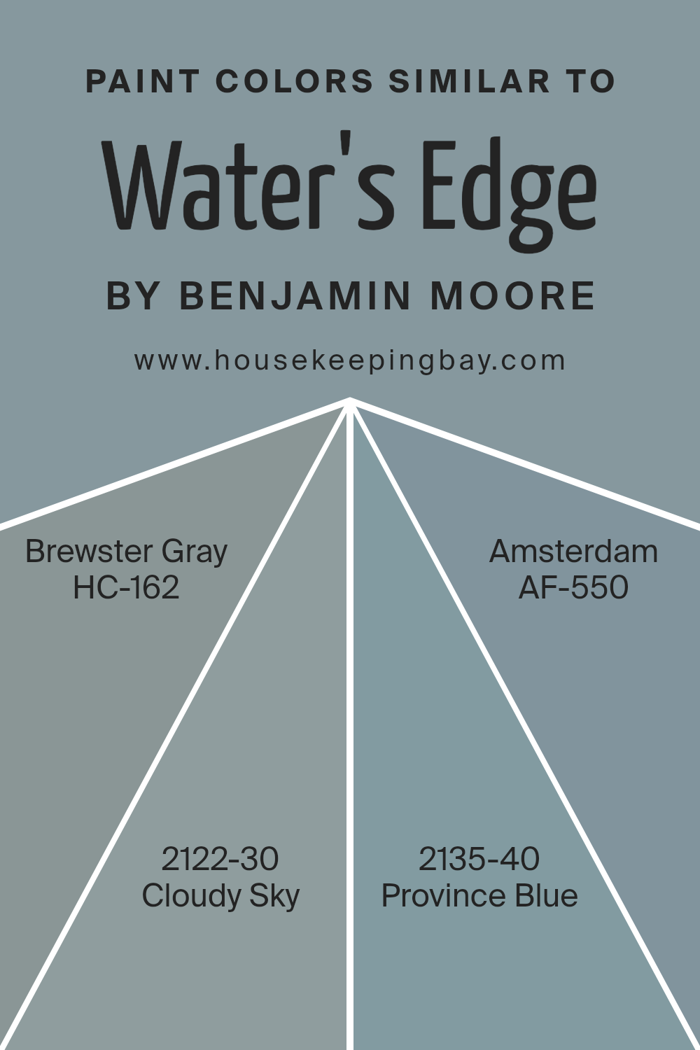
Colors Similar to Water’s Edge 1635 by Benjamin Moore
Similar colors play a crucial role in design, offering a harmonious and cohesive look. Colors like Brewster Gray, Cloudy Sky, Province Blue, and Amsterdam, closely aligned with Water’s Edge by Benjamin Moore, can create balanced and calming environments.
Brewster Gray (HC-162) is a soft, muted gray that gently whispers elegance and subtlety. It pairs well with light and dark accents, making a space feel both sophisticated and cozy.
Cloudy Sky (2122-30) provides a deeper, more moody tone with hints of blue undertones, perfect for adding depth and richness to any room without overwhelming it.
Province Blue (2135-40) is a beautiful, mellow blue with a hint of green that soothes the eyes, reminiscent of tranquil waters. It can evoke calmness and clarity, making it a great choice for spaces intended for reflection and relaxation. Amsterdam (AF-550), on the other hand, offers a deep, robust shade with a hint of teal, giving rooms a touch of dramatic flair.
Together, these colors create a visually pleasing palette that can make a space feel unified and peaceful, while still providing individual character and charm through their subtle differences and similarities.
You can see recommended paint colors below:
- HC-162 Brewster Gray
- 2122-30 Cloudy Sky
- 2135-40 Province Blue
- AF-550 Amsterdam
housekeepingbay.com
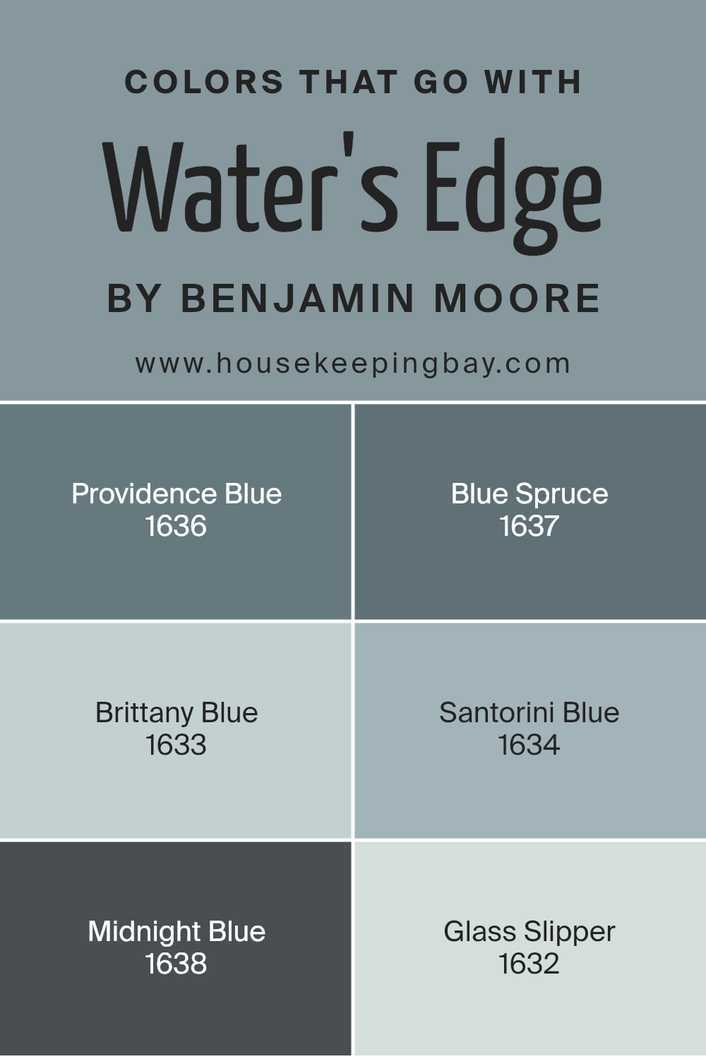
Colors that Go With Water’s Edge 1635 by Benjamin Moore
When choosing colors to pair with Water’s Edge 1635 by Benjamin Moore, it’s important to understand how each shade complements and enhances the atmosphere of a space. Water’s Edge is a serene blue that works well with a range of similar tones to create a cohesive and calming environment.
Providence Blue 1636 offers a richer blue that provides depth and sophistication, while Blue Spruce 1637 delivers a touch of greenish-blue, adding a natural element that can remind one of lush forests.
Brittany Blue 1633 is a softer, more muted shade that brings a gentle, calming effect, perfect for creating a soothing ambiance in a bedroom or living room.
Santorini Blue 1634 introduces a brighter, more vibrant blue, which can energize a space and add a lively touch. Midnight Blue 1638 is a darker, more intense option, ideal for creating a sense of coziness and intimacy.
Lastly, Glass Slipper 1632 is a pale, ethereal blue that provides a subtle contrast and enhances the airy feel of a room.
Together, these colors offer a harmonious palette that can be used to define different moods and functions within a space, all while maintaining a unified and appealing look.
You can see recommended paint colors below:
- 1636 Providence Blue
- 1637 Blue Spruce
- 1633 Brittany Blue
- 1634 Santorini Blue
- 1638 Midnight Blue
- 1632 Glass Slipper
housekeepingbay.com
How to Use Water’s Edge 1635 by Benjamin Moore In Your Home?
Water’s Edge 1635 by Benjamin Moore is a soothing paint color that sits between blue and green, similar to soft sea or lake hues. This color brings a calm, fresh feeling to any space, making it a good choice for creating a relaxed atmosphere.
In a bedroom, Water’s Edge can help encourage restful sleep. In living rooms, it can promote a sense of calm without becoming dull. When used in bathrooms, it can remind one of a day at the beach or by a lake, thus enhancing a sense of relaxation.
It pairs beautifully with whites and soft grays for a clean, modern look. Adding accents in natural wood tones or warm metals can provide contrast and interest. Water’s Edge works well with both traditional and modern décor, allowing room for diverse styling approaches. Its versatility makes it a valuable option for creating serene spaces throughout a home.
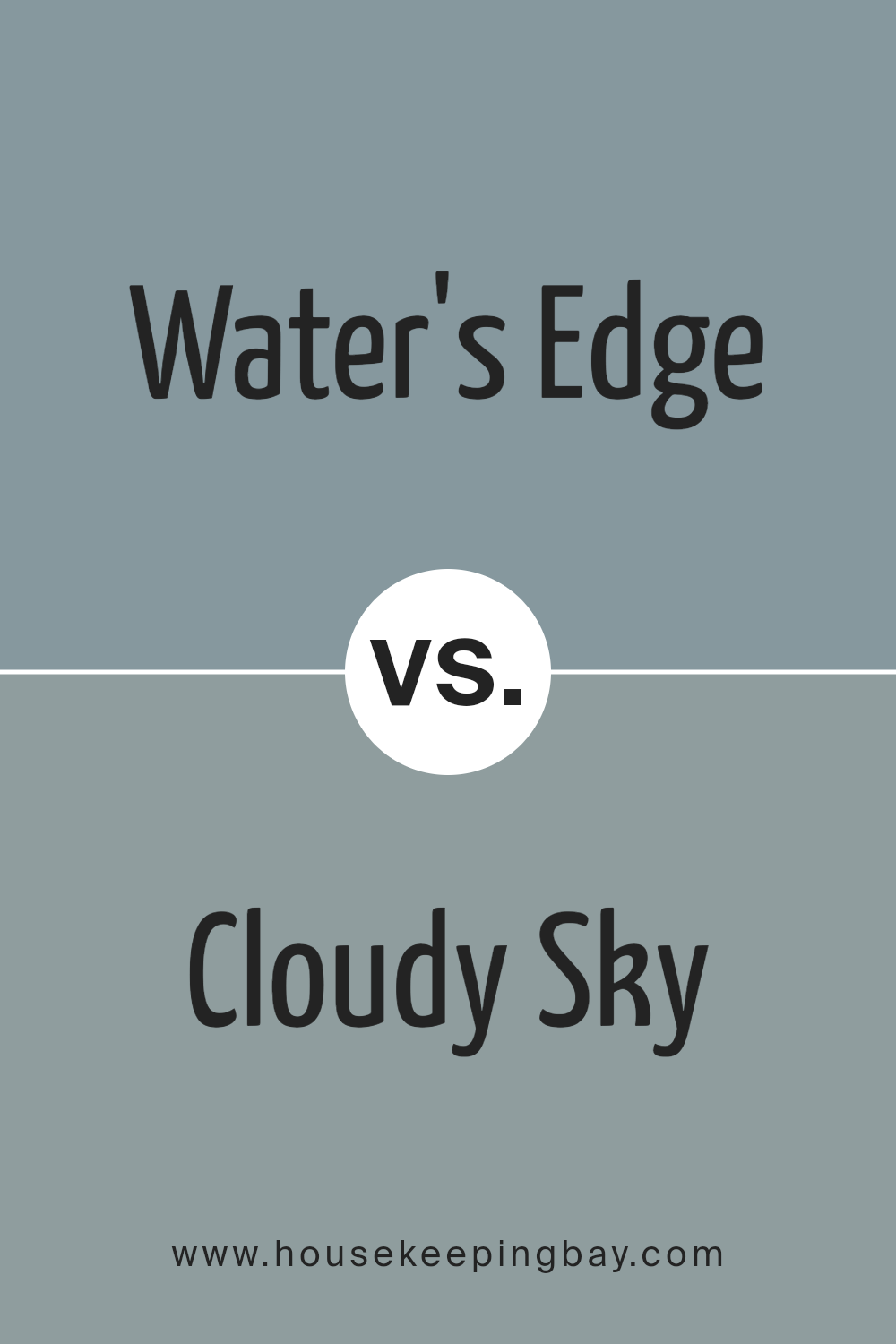
Water’s Edge 1635 by Benjamin Moore vs Cloudy Sky 2122-30 by Benjamin Moore
Water’s Edge 1635 by Benjamin Moore is a color that evokes a sense of calmness with its cool, light blue-gray tone. It’s like looking at a misty horizon where water meets sky, offering a subtle and soothing presence in any room. This color is perfect for creating a relaxed and airy environment, ideal for bedrooms or living spaces where you desire peace and quiet.
Cloudy Sky 2122-30 by Benjamin Moore, however, brings a deeper and more grounded feel with its medium gray-blue shade. It’s a bit more intense and moody compared to Water’s Edge, offering a touch of sophistication and depth.
This color can make a room feel cozy and inviting, making it suitable for spaces where you want a bit more character and warmth.
Both colors share blue-gray elements, yet Water’s Edge is lighter and softer, while Cloudy Sky is richer and more dramatic.
You can see recommended paint color below:
housekeepingbay.com
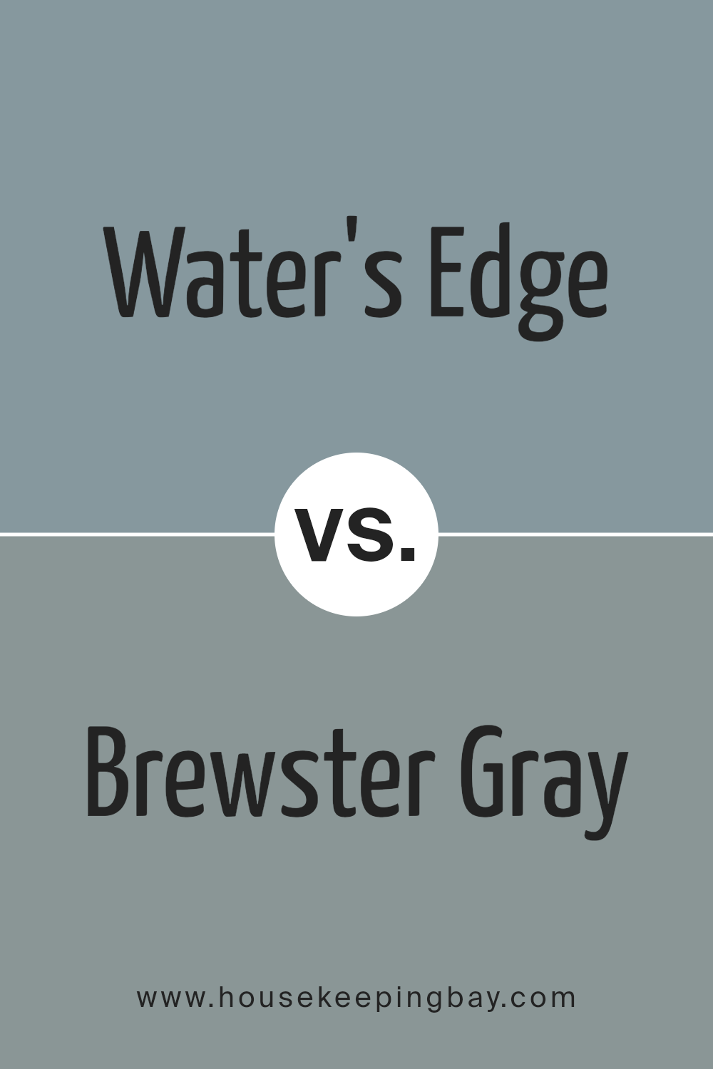
Water’s Edge 1635 by Benjamin Moore vs Brewster Gray HC-162 by Benjamin Moore
Water’s Edge 1635 by Benjamin Moore and Brewster Gray HC-162 are both soft, muted colors that create a calming atmosphere. Water’s Edge is a light blue with hints of gray, reminding one of a peaceful sea under a cloudy sky. It has a soothing effect, evoking a sense of relaxation and quiet. This color is great for bedrooms or spaces where tranquility is desired.
Brewster Gray HC-162, while also muted, leans more towards a warm gray with subtle blue undertones. This color is versatile, working well in both traditional and modern settings.
It has more depth compared to Water’s Edge, making it suitable for areas like living rooms or dining rooms where a bit more warmth and sophistication is needed.
Both colors pair nicely with whites and off-whites. Water’s Edge offers a cooler and lighter palette, while Brewster Gray provides a slightly warmer and cozier atmosphere.
You can see recommended paint color below:
- HC-162 Brewster Gray
housekeepingbay.com
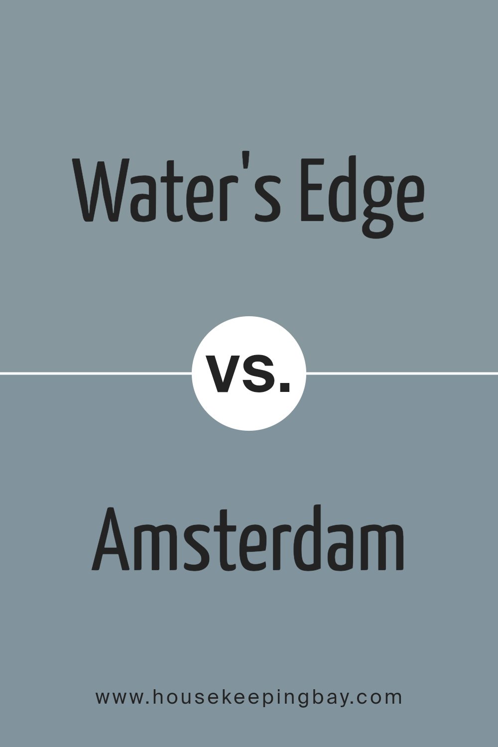
Water’s Edge 1635 by Benjamin Moore vs Amsterdam AF-550 by Benjamin Moore
Water’s Edge 1635 by Benjamin Moore is a soft, muted blue-gray, creating a calm and soothing atmosphere. It feels airy and fresh, ideal for spaces seeking a restful vibe. This color works well in bedrooms or bathrooms where relaxation is key. Its gentle tone pairs nicely with whites and creams, enhancing its subtle beauty without overpowering.
Amsterdam AF-550 by Benjamin Moore, though also a blue, is darker and more intense. It carries a deep, rich quality that adds depth to a room. This color suits spaces wanting a cozy, dramatic touch, like a study or a living room feature wall. Amsterdam’s boldness contrasts sharply with Water’s Edge’s light nature.
In summary, Water’s Edge offers a peaceful backdrop, while Amsterdam provides intensity and depth. Both bring unique qualities, allowing differing moods and styles depending on the space’s purpose and the owner’s preference.
You can see recommended paint color below:
- AF-550 Amsterdam
housekeepingbay.com
Water’s Edge 1635 by Benjamin Moore vs Province Blue 2135-40 by Benjamin Moore
Water’s Edge 1635 by Benjamin Moore offers a soft, muted blue with gray undertones. It feels calm, and its subtle tones make it versatile, fitting well in spaces where a gentle backdrop is needed. This color adapts to different lighting, sometimes showing more gray and sometimes more blue, creating a peaceful atmosphere.
Province Blue 2135-40, also by Benjamin Moore, presents a richer and deeper blue. It carries more vibrancy than Water’s Edge, bringing a stronger presence to a room. Province Blue tends to draw more attention, adding a bold touch to interiors.
Both colors work beautifully in home settings, though they serve different purposes. Water’s Edge suits areas needing a soft, neutral feel. Province Blue fits spaces where a lively, assertive hue is desired.
While Water’s Edge leans towards calmness, Province Blue injects energy, making it a striking choice when aiming to add depth and character to any area.
You can see recommended paint color below:
- 2135-40 Province Blue
housekeepingbay.com
Conclusion
This particular shade of blue carries a calming elegance, making it a great choice for areas where relaxation is important, like bedrooms or living rooms. It mirrors the gentle hues of the sea, bringing a sense of serenity indoors.
When considering design, this color offers versatility. It pairs well with both neutral tones and vibrant accents, providing flexibility in decorating. Whether aiming for a minimalist style or something more eclectic, Water’s Edge fits seamlessly.
It can serve as a subtle backdrop or take center stage, depending on how it’s used.
In terms of mood, I find this hue encourages peace and comfort, reducing stress and fostering quiet reflection. It’s like having a piece of the coastline’s calm, wherever it’s applied.
Overall, 1635 Water’s Edge stands out not just for its aesthetic value but also for the ambiance it creates, making spaces feel more inviting and restful.
housekeepingbay.com
Ever wished paint sampling was as easy as sticking a sticker? Guess what? Now it is! Discover Samplize's unique Peel & Stick samples. Get started now and say goodbye to the old messy way!
Get paint samples


