Vintage Pewter CSP-110 by Benjamin Moore
A Shade That Blends Classic Charm with Modern Appeal
Are you considering a fresh coat of paint for your space? Let me introduce you to CSP-110 Vintage Pewter by Benjamin Moore, a color choice that might be just what you need. When you first see Vintage Pewter, you’ll notice it has a unique charm, blending gray and taupe for a rich, neutral tone that fits well in various settings. Whether you want to freshen up your living room, bedroom, or study, this shade offers both warmth and sophistication, making any room feel more inviting.
With its balanced hue, Vintage Pewter pairs well with a wide range of decor styles, from rustic to modern. It also works beautifully as a base for layering contrasting colors or as a standalone statement. If you have furnishings in bold or saturated colors, you’ll find that Vintage Pewter provides a calm backdrop that makes those colors pop without overwhelming the space.
This paint isn’t just about looks; it’s also about quality. Benjamin Moore is known for its durable, high-quality paint that lasts for years, maintaining its color and finish even in busy rooms. Using Vintage Pewter in your home means you get both style and substance, ensuring that the effort you put into your decorating lasts.
If you’re ready to give your walls a new look, consider CSP-110 Vintage Peweter. It might just be the perfect shade to refresh your home and reflect your style.
via benjaminmoore.com
What Color Is Vintage Pewter CSP-110 by Benjamin Moore?
Table of Contents
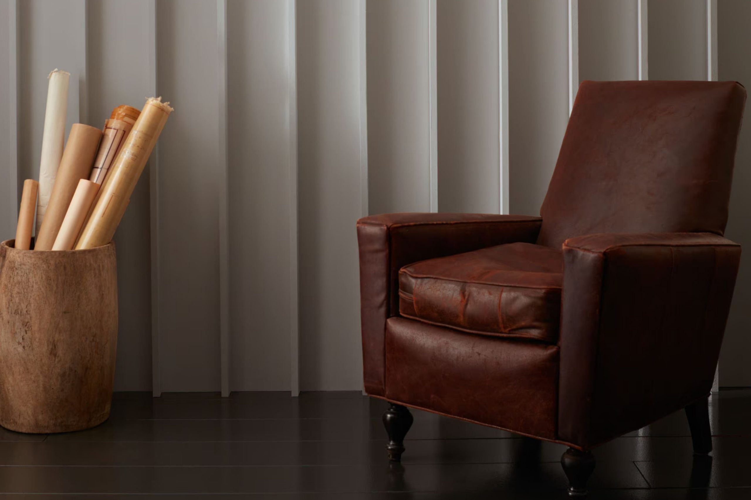
Vintage Pewter CSP-110 by Benjamin Moore is a rich, muted gray with subtle brown undertones, offering a warm and inviting backdrop for various interior settings. This versatile color blends seamlessly with classic and contemporary styles, functioning perfectly in spaces like living rooms, bedrooms, and modern kitchens. Its depth enhances architectural features and furniture, making it particularly effective for highlighting wood trims, mouldings, and built-in cabinetry.
This shade thrives in settings infused with natural materials such as wood, leather, and wool, enhancing their organic beauty. The warm undertones of Vintage Pewter complement the reds and browns in wood, making it an excellent choice for rooms with hardwood floors or wooden furniture. It also pairs well with leather furnishings, adding sophistication to a stately study or cozy den.
In terms of textures, Vintage Pewter works well with soft, plush textiles like velvet or chenille, which add contrast to its earthy base. Linen and cotton also match its understated elegance, especially in more casual or relaxed spaces.
For those who appreciate a bit of shine, incorporating metallic accents in copper or gold can add a touch of luxury without overpowering the room’s overall aesthetic. Overall, Vintage Pewter is a timeless choice that can anchor a room while highlighting the natural beauty of varied textures and materials.
housekeepingbay.com
Is Vintage Pewter CSP-110 by Benjamin Moore Warm or Cool color?
Vintage Pewter CSP-110 by Benjamin Moore is a rich, warm gray with hints of brown, giving it a soft, inviting feel. This versatile color functions well in many spaces, from living rooms and bedrooms to kitchens and bathrooms. Its subtle warmth allows it to pair effortlessly with both bright and muted colors, making it a great choice for those looking to create a cohesive look in their home.
Being a neutral shade, Vintage Pewter offers a timeless appeal that doesn’t overpower a room but rather enhances the space it occupies. It’s particularly effective in rooms with natural light, where the color can subtly shift and change throughout the day, offering a dynamic yet harmonious atmosphere.
As a backdrop, it supports various decor styles, from modern to rustic, and works well with natural materials like wood and stone. This flexibility makes it a smart pick for anyone updating their home interior, providing a reliable base that complements various design elements.
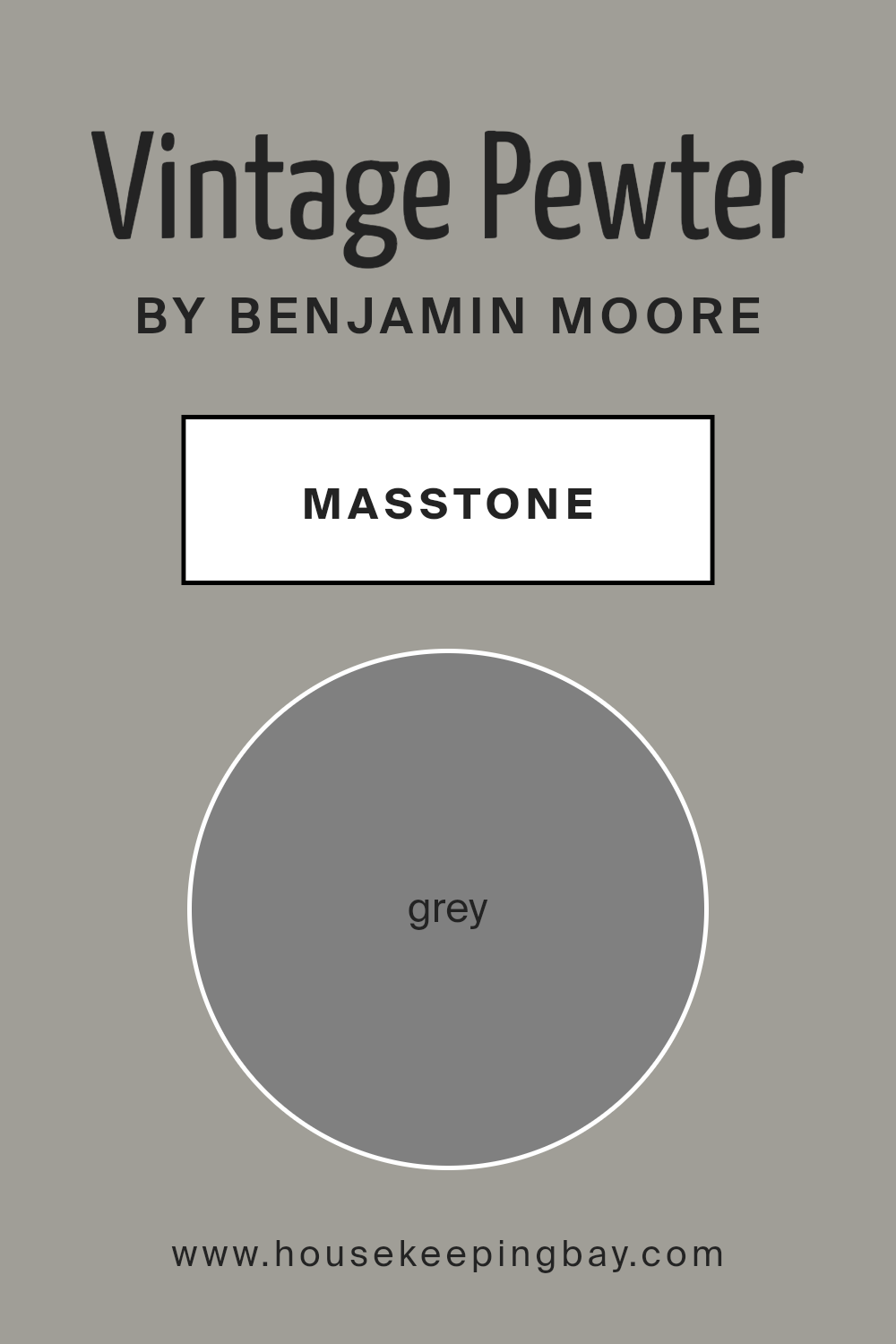
What is the Masstone of the Vintage Pewter CSP-110 by Benjamin Moore?
Vintage Pewter CSP-110 by Benjamin Moore has a masstone of grey (#808080), offering a neutral and versatile backdrop for most interior designs. This color is ideal for creating a soothing, consistent look in homes. Being a middle ground between black and white, this grey doesn’t dominate a space but instead complements other colors or decor pieces with ease.
Grey, like the shade in Vintage Pewter, works wonderfully in various home settings because it aligns well with both bold and pastel colors, giving homeowners flexibility in decorating choices. Whether paired with bright cushions or subtle wooden furniture, it maintains balance without clashing.
Moreover, it suits any room, from kitchens to bedrooms, adding depth and sophistication in spaces that need a touch of elegance without overpowering elements. Overall, Vintage Pewter’s adaptable grey shade makes it a practical choice, facilitating a calm and stylish environment that can handle the changing trends and personal tastes over time.
housekeepingbay.com
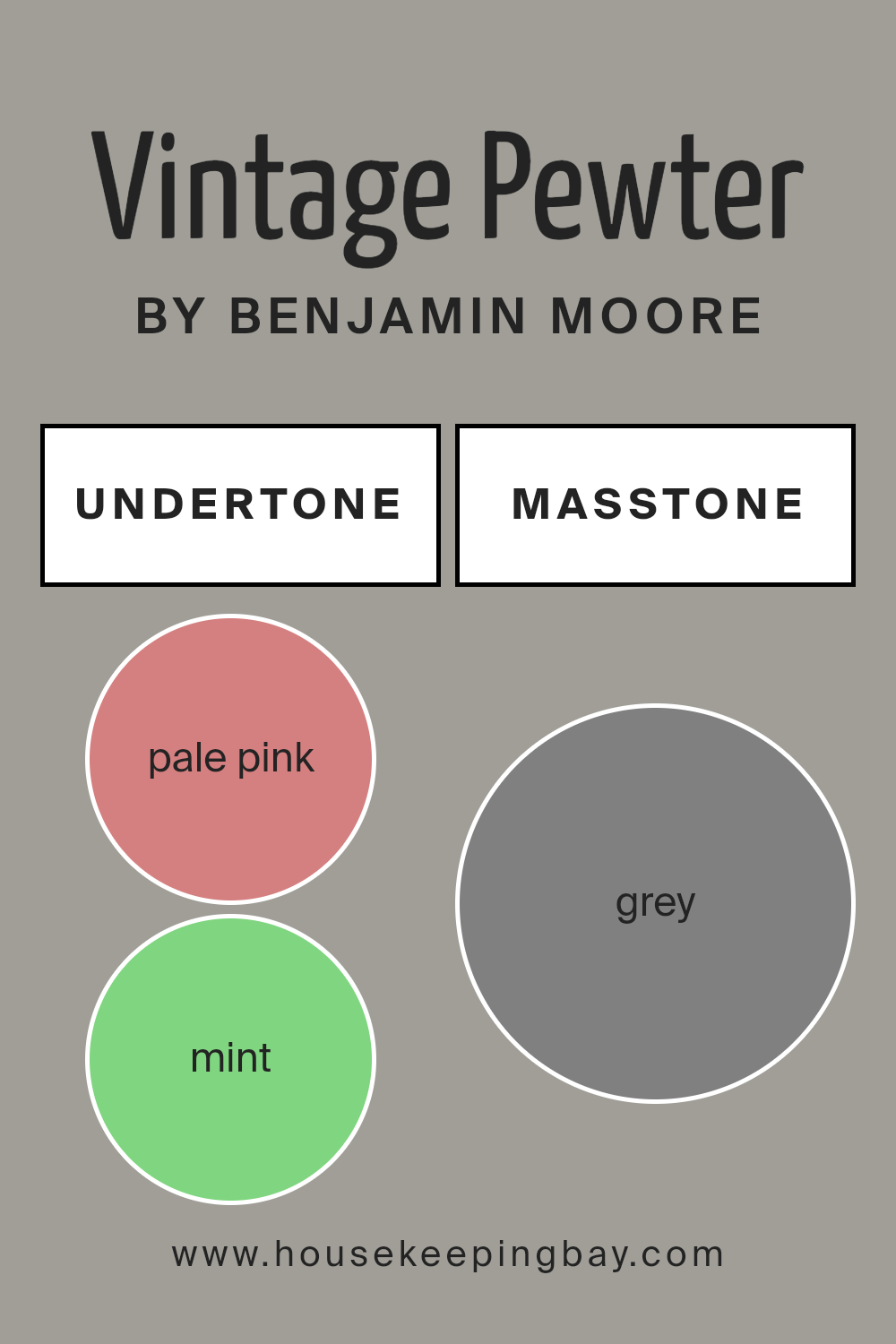
Undertones of Vintage Pewter CSP-110 by Benjamin Moore
Vintage Pewter CSP-110 by Benjamin Moore is a complex color with a variety of undertones that influence how it appears in different lighting and settings. Undertones are the subtle colors that lie beneath the surface of the main hue. They can affect the color’s warmth, depth, and how it complements other colors in a space.
Vintage Pewter has a spectrum of undertones including pale pink, mint, lilac, pale yellow, and several others. Each undertone can slightly alter the perception of the main grey hue. For instance, pale pink brings a soft warmth that makes the color more inviting, while mint adds a fresh and clean look. Lilac and light purple undertones give a hint of sophistication and depth.
On internal walls, these undertones play a significant role. In natural light, colors like light blue and light turquoise might make the walls seem cooler and more airy. In contrast, undertones like orange and brown can add warmth, making a room feel cozier.
The mixing of light and dark undertones, such as light gray with dark turquoise or navy, can affect the color’s intensity and how it interacts with furniture and decor. Lighter undertones can make the walls seem more spacious and open, while darker undertones can create a more grounded, secure feeling.
Overall, the diverse undertones in Benjamin Moore’s Vintage Pewter CSP-110 provide flexibility, making it suitable for various spaces depending on the desired mood and style. The choice of accompanying decor and lighting can either amplify or soften these undertones, substantially affecting the overall ambiance of the room.
housekeepingbay.com
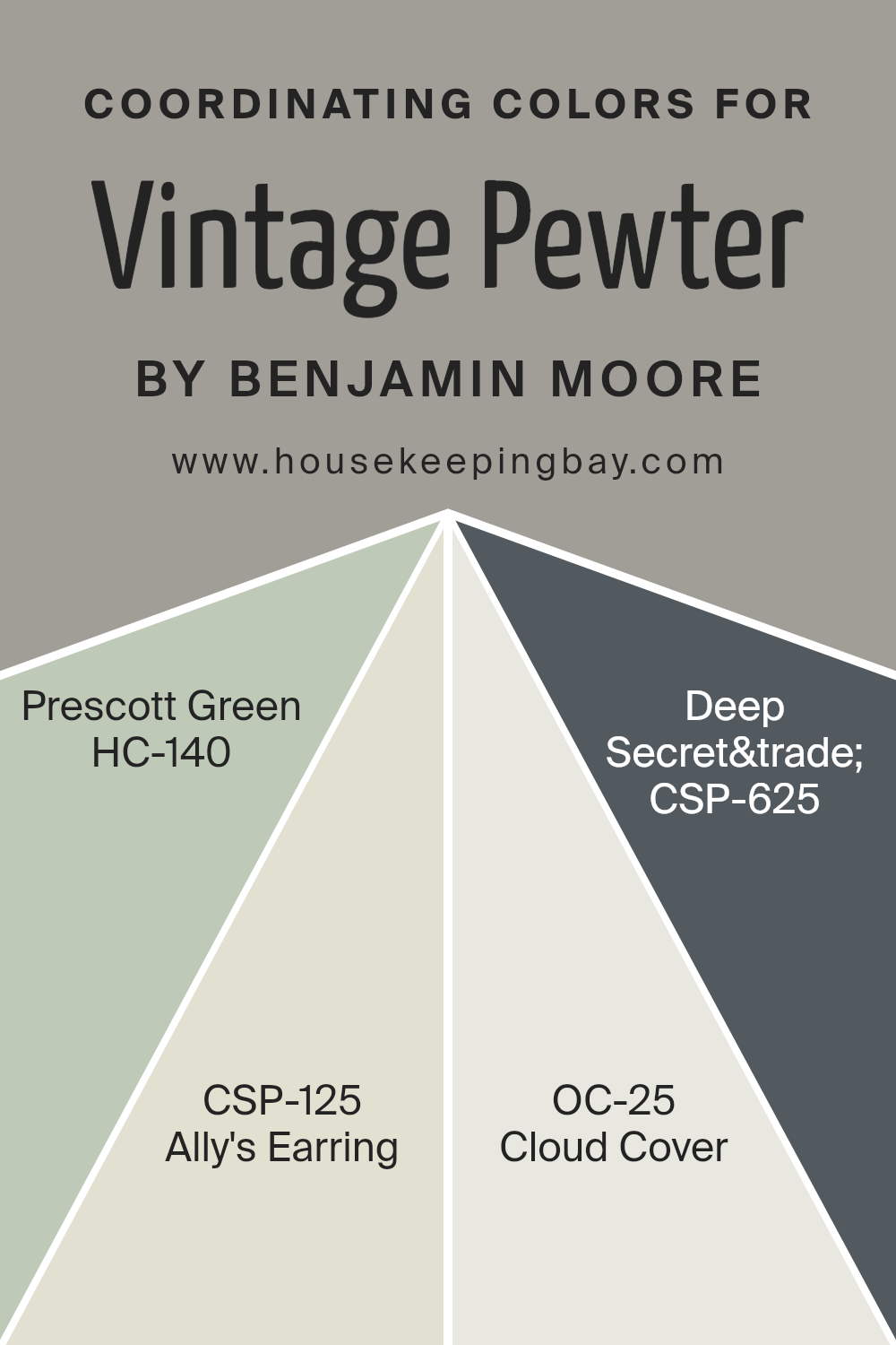
Coordinating Colors of Vintage Pewter CSP-110 by Benjamin Moore
Coordinating colors are selected hues that complement each other and work harmoniously within a design space to create a pleasing aesthetic. When used in conjunction with a base color, in this case, Vintage Pewter CSP-110 by Benjamin Moore, these coordinating shades can enhance the ambiance of a room without overwhelming the senses.
Each color serves as a means to bring out the best features of the other, ensuring that all elements of the decor blend seamlessly. The choice of coordinating colors involves considering factors like lighting, space, and intended atmosphere, making sure that all components of the interior design connect well.
For example, HC-140 Prescott Green is an earthy, muted green that lends a soft and soothing touch to the environment, making it ideal for spaces where calm is desired. CSP-125 Ally’s Earring is a subtle, airy gray with hints of lavender, giving it a gentle elegance that works well in serene settings.
OC-25 Cloud Cover is a versatile, light gray that can illuminate a room without being stark, perfect for a modern yet cozy feel. Lastly, CSP-625 Deep Secret™ is a bold navy blue that adds depth and sophistication, providing a dramatic contrast that can be used to draw attention to specific areas or features within a room. Together, these colors create a coordinated color scheme that complements Vintage Pewter effectively, enhancing the overall decor without creating visual discord.
You can see recommended paint colors below:
- HC-140 Prescott Green
- CSP-125 Ally’s Earring
- OC-25 Cloud Cover [
- CSP-625 Deep Secret
housekeepingbay.com
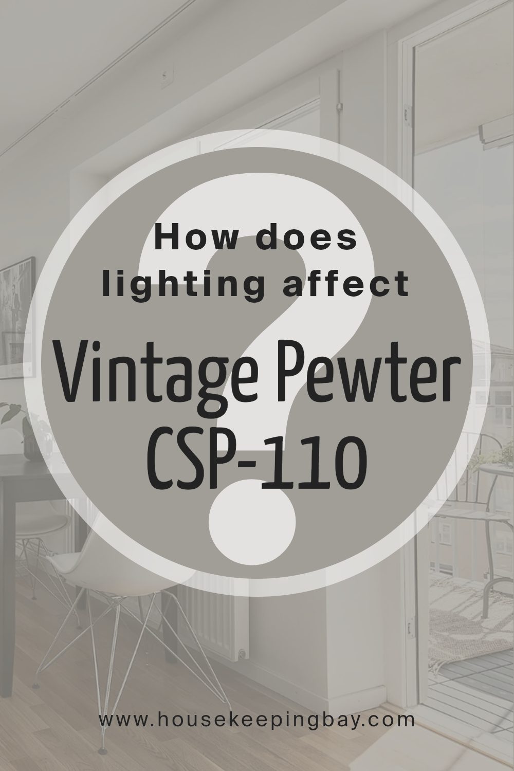
How Does Lighting Affect Vintage Pewter CSP-110 by Benjamin Moore?
Lighting plays a crucial role in how colors appear in a space. The type of light, whether artificial or natural, can significantly alter the perception of colors. For instance, Vintage Pewter CSP-110 by Benjamin Moore may look different under various lighting conditions.
Artificial Light: Under artificial lighting, such as LED or fluorescent bulbs, Vintage Pewter can appear slightly altered. Soft white or warm yellow light can make this color look warmer and more inviting, enhancing its gray tones. In contrast, a cooler, bluish light might bring out more of the color’s subtle blue undertones, making it appear sharper and more modern.
Natural Light: In natural lighting, the appearance of Vintage Peweter depends largely on the direction of the room’s windows.
- North-Faced Rooms: Rooms that face north often receive less direct sunlight, which can make colors look slightly cooler and more muted. Vintage Pewter in a north-facing room might appear more as a true deep gray, emphasizing its sleek and sophisticated qualities.
- South-Faced Rooms: South-facing rooms get plenty of direct and warm sunlight for most of the day, which can brighten up Vintage Peweter, making it look lighter and more dynamic. The gray may have a softer feel, creating a cozy atmosphere.
- East-Faced Rooms: With morning sunlight, east-facing rooms can make Vintage Peweter look very vibrant and fresh in the mornings but darker as the day progresses. This change can add a dynamic quality as the color shifts subtly from bright and airy in the morning to more of a profound gray later.
- West-Faced Rooms: In the afternoon and evening, west-facing rooms get a golden light that can warm up the color significantly, turning Vintage Peweter into a warmer shade of gray. This effect makes the room feel welcoming during the evening hours.
In conclusion, Vintage Peweter CSP-110’s versatility in different lighting makes it a popular choice, adaptable to various settings whether lit by lamp, overhead lighting, or through the windows across the day’s shift from dawn to dusk.
housekeepingbay.com
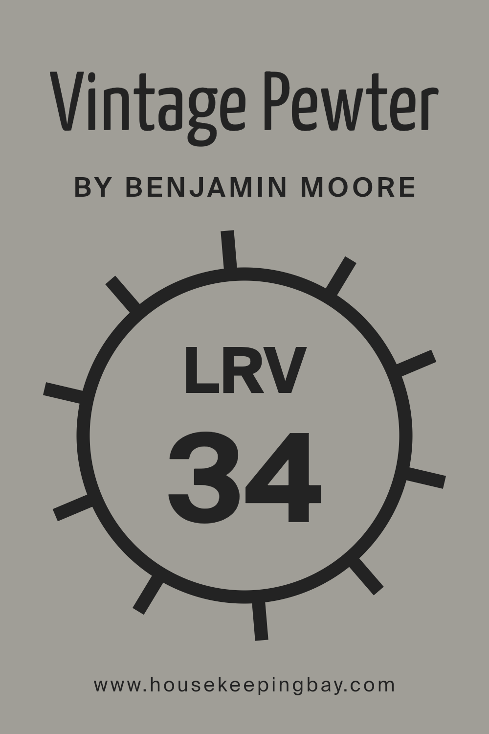
What is the LRV of Vintage Pewter CSP-110 by Benjamin Moore?
LRV, or Light Reflectance Value, is a measure used in the design industry to determine how much light a paint color reflects or absorbs. On a scale from 0 (absolute black, absorbing all light) to 100 (pure white, reflecting all light), LRV helps designers choose appropriate colors for various spaces based on how bright or dark they want the area to feel.
A higher LRV paint will make a room feel lighter and more open, as it reflects more light back into the room. Conversely, a lower LRV paint absorbs more light, which can make a space feel cozier but smaller and darker.
The LRV score for Vintage Pewter (CSP-110) by Benjamin Moore is 33.78, placing it in a mid-range category where it neither reflects nor absorbs light excessively. This moderate LRV means that Vintage Pewter will lend a certain warmth and neutrality to a room, without making it feel cramped or overly dark.
Since it does not reflect a lot of light, it’s excellent for spaces that you want to keep moderately lit, without the starkness that comes with higher LRV colors. The subdued gray tone of Vintage Pewter also provides a calm and soothing background, ideal for both living and workspaces, adding a sophisticated touch while maintaining a welcoming atmosphere.
housekeepingbay.com
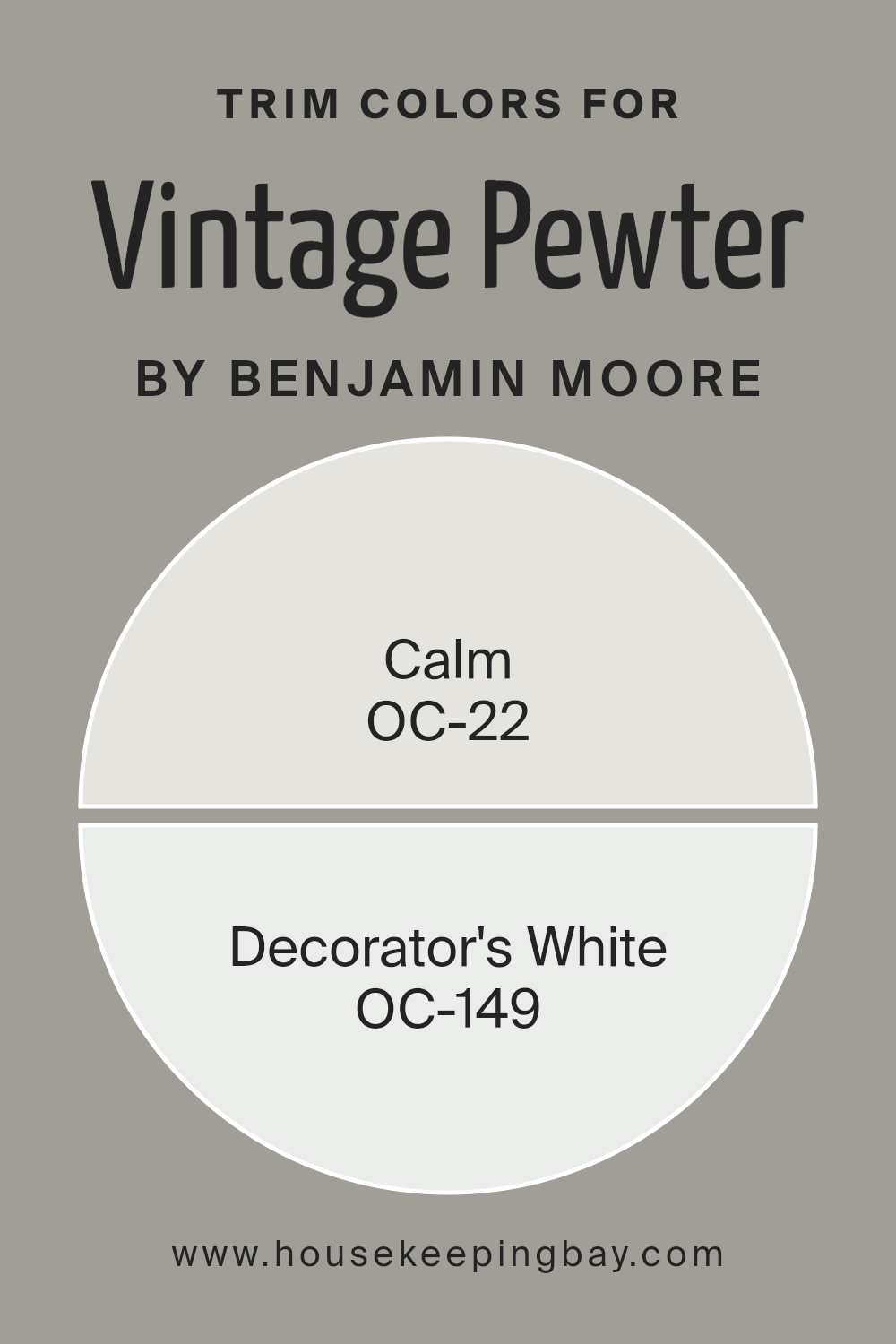
What are the Trim colors of Vintage Pewter CSP-110 by Benjamin Moore?
Trim colors are specific hues used to paint the architectural details of a room such as door frames, window frames, baseboards, and crown moldings. They play a crucial role in defining the space and highlighting the main wall colors. When paired with a color like Vintage Pewter CSP-110 by Benjamin Moore, choosing the right trim color becomes essential to achieving a cohesive and appealing look. Lighter or contrasting trim colors, for instance, can create a refined border that accentuates the elegant gray tones of Vintage Pewter.
For this particular shade, using trim colors like OC-22 Calm and OC-149 Decorator’s White by Benjamin Moore is highly effective. OC-22 Calm is a pale, soothing off-white that offers a subtle contrast, gently framing the walls without overpowering the depth of Vintage Pewter.
On the other hand, OC-149 Decorator’s White is a bright, clean white that provides a sharper contrast, giving a fresh and polished look that complements the cooler undertones of the pewter shade. Both trim options contribute to a well-balanced and professional finish, each enhancing the primary color in its unique way.
You can see recommended paint colors below:
housekeepingbay.com
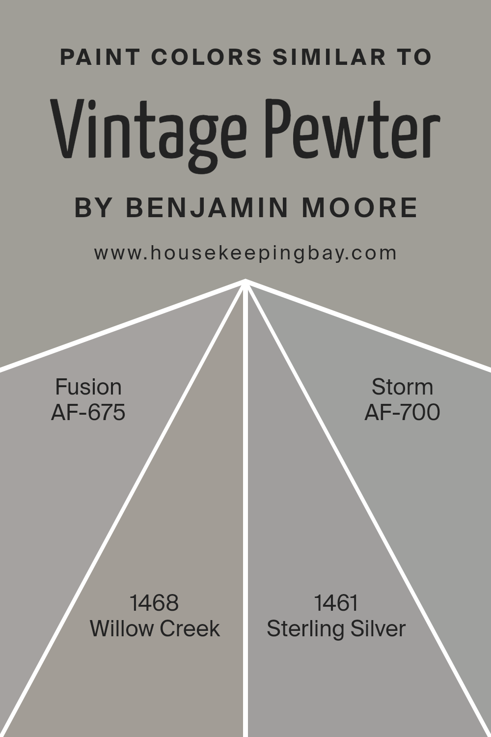
Colors Similar to Vintage Pewter CSP-110 by Benjamin Moore
Using similar colors in interior design can create a cohesive and visually appealing space. Colors that resemble each other, such as those similar to Vintage Pewter CSP-110 by Benjamin Moore, bring harmony and a sense of balance to a room. For instance, AF-675 Fusion is a subdued gray that merges subtly with more vivid tones, providing a grounded feel without overpowering other elements.
This makes it a versatile choice that pairs well in spaces seeking a blend of modern yet understated elegance. On the other hand, 1468 Willow Creek offers a slightly deeper gray, lending itself to creating a gentle depth and warmth in spaces that benefit from a richer palette without veering too far from a neutral base.
Similarly, 1461 Sterling Silver can illuminate a space with its lighter, almost silvery gray tone, reflecting light and adding a fresh, airy quality. This color works well in areas where you want to achieve an open and inviting atmosphere. Lastly, AF-700 Storm presents a bolder, more dramatic hue of gray that can act as a focal point or an accent in a room setup.
Its intensity is excellent for making statements yet remains in the gray spectrum, ensuring it does not clash with subtler gray shades. Altogether, these colors can fashion a space that feels both interconnected and aesthetically pleasing, due to their derived tones from the same family but diverse enough to create individual impacts.
You can see recommended paint colors below:
- AF-675 Fusion
- 1468 Willow Creek
- 1461 Sterling Silver
- AF-700 Storm
housekeepingbay.com
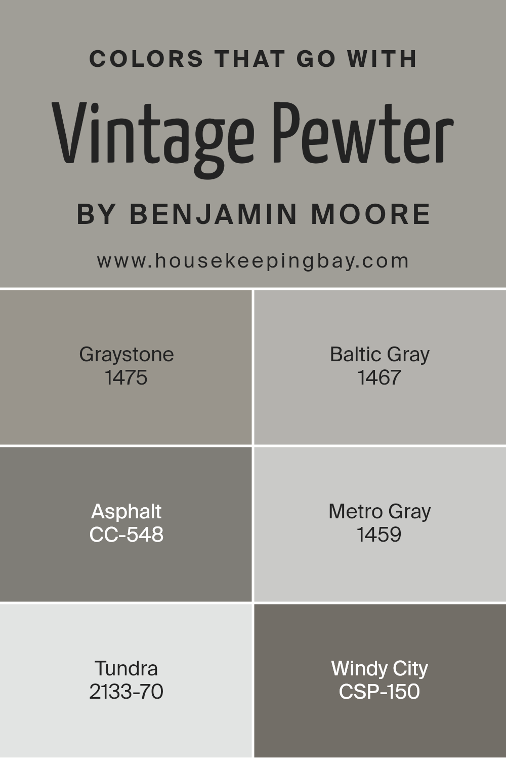
Colors that Go With Vintage Pewter CSP-110 by Benjamin Moore
Choosing colors that complement Vintage Pewter CSP-110 by Benjamin Moore is crucial to achieving a cohesive and appealing aesthetic in any space. Vintage Pewter is a versatile shade, and when paired with the right colors, it can create a sophisticated and harmonious look. For example, Graystone 1475, a deep gray with a hint of warmth, serves as a robust counterpart that enhances the muted tones of Vintage Pewter without overpowering it.
Another great companion is Baltic Gray 1467, which offers a lighter, airier feel and brings a soft contrast to the denser Vintage Pewter, brightening spaces while maintaining a fluid color scheme.On a darker note, Asphalt CC-548 is a rich, almost black gray that adds dramatic flair and depth, perfect for accent walls or furniture, creating an elegant contrast with the lighter Vintage Peweter.
Then, there’s Metro Gray 1459, a neutral gray with cool undertones, which ensures a smooth color flow and provides a serene backdrop to more dynamic decor elements. Tundra 2133-70 provides a refreshing break with its creamy, almost white appearance, offering a light touch that can open up a room and highlight the sophistication of Vintage Pewter.
Lastly, Windy City CSP-150 is a more earthy gray that grounds the palette, ensuring that the overall décor remains balanced and pleasing to the eye. These complementary colors allow for flexibility in design while keeping a seamless and polished look.
You can see recommended paint colors below:
- 1475 Graystone
- 1467 Baltic Gray
- CC-548 Asphalt
- 1459 Metro Gray
- 2133-70 Tundra
- CSP-150 Windy City
housekeepingbay.com
How to Use Vintage Pewter CSP-110 by Benjamin Moore In Your Home?
Vintage Pewter CSP-110 by Benjamin Moore is a versatile paint color that suits many areas in a home. This shade is a deep, warm grey that offers a cozy feel, making it perfect for living rooms and bedrooms.
Its subtle richness works well as a base color, allowing furnishings and artworks to stand out against its neutral backdrop. It pairs excellently with soft whites for trim and ceilings, creating a sophisticated, harmonious look. For a modern twist, combine it with vibrant colors like mustard yellow or teal for accents such as pillows or a feature wall.
In smaller spaces, such as a bathroom or hallway, this color can add depth and interest without overwhelming the senses. Using Vintage Pewter CSP-110 in home design provides an elegant, restful atmosphere, easily complementing various decorating styles, from contemporary to traditional. Whether updating a single room or the entire house, this shade provides a timeless canvas for personal expression.
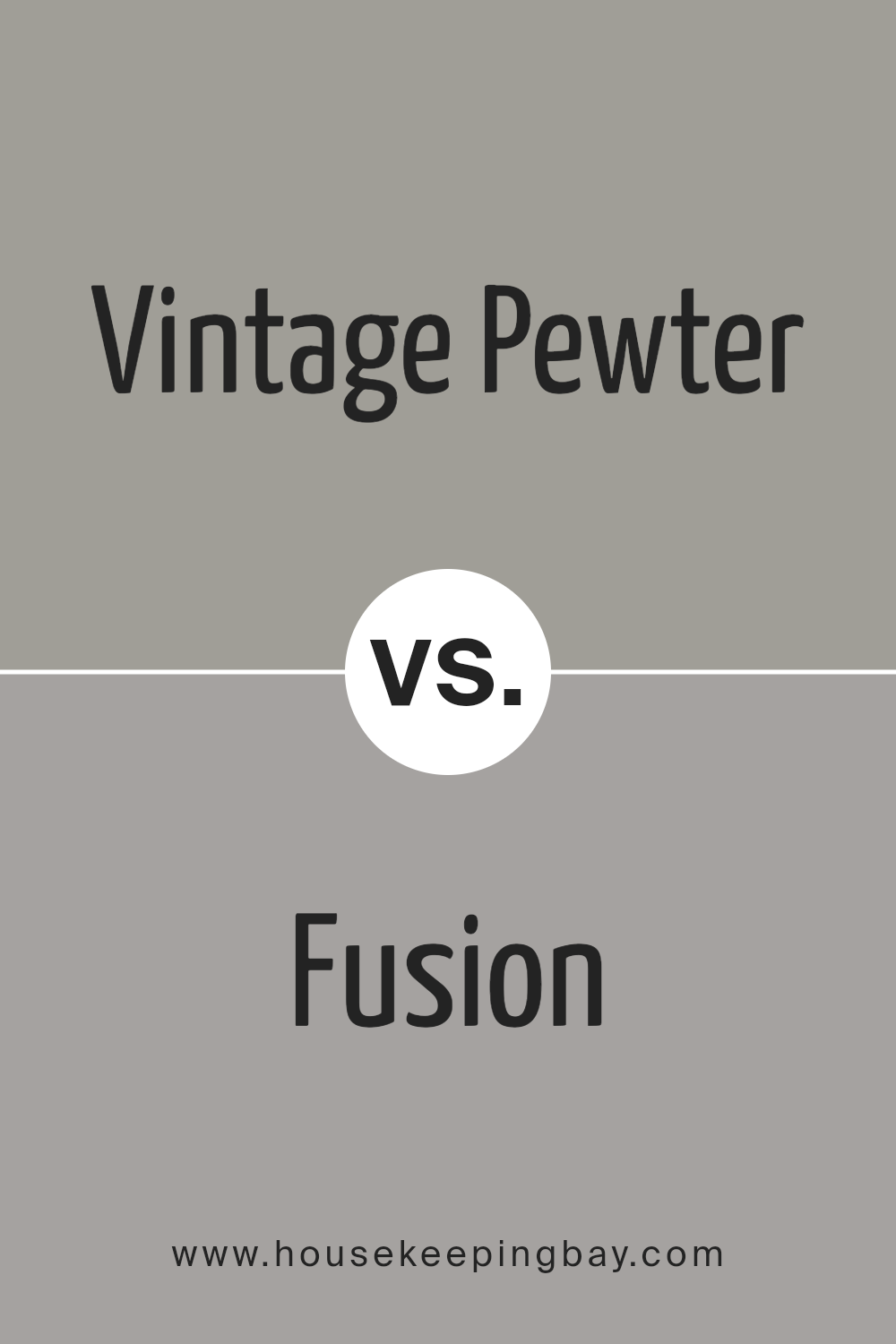
Vintage Pewter CSP-110 by Benjamin Moore vs Fusion AF-675 by Benjamin Moore
Vintage Pewter CSP-110 by Benjamin Moore is a soft, muted gray with warm undertones that give it a cozy, welcoming feel. It’s subtle enough to work as a neutral but has enough depth to make a statement on walls, cabinets, or furniture. This color pairs well with brighter colors or other neutrals, providing a soothing backdrop that isn’t overpowering.
Fusion AF-675, also by Benjamin Moore, is darker and richer than Vintage Pewter. It’s a bold, striking gray with deep blue undertones, creating a more dramatic and sophisticated look. Fusion AF-675 works well in spaces where you want to add some intensity and depth, like in accent walls or smaller, intimate spaces.
While both colors share gray bases, Vintage Pewter is lighter and warmer, making it more versatile for larger areas or spaces needing a soft touch. In contrast, Fusion’s deeper, cooler tone is better suited for creating focal points or enhancing modern decor styles.
You can see recommended paint color below:
- AF-675 Fusion
housekeepingbay.com
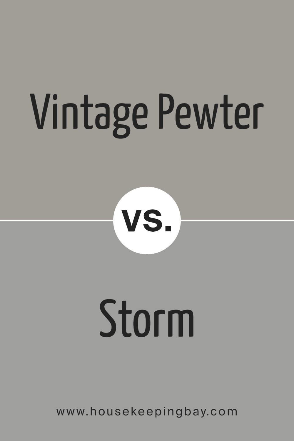
Vintage Pewter CSP-110 by Benjamin Moore vs Storm AF-700 by Benjamin Moore
Vintage Pewter CSP-110 by Benjamin Moore is a soft, warm gray with subtle brown undertones, giving it an inviting, cozy feel. This color works well in spaces where you want to create a soothing and comfortable atmosphere. It’s versatile enough to fit in with traditional and modern decor, making it a popular choice for living rooms and bedrooms.
In contrast, Storm AF-700 by Benjamin Moore is a deeper, bolder gray with blue undertones. This color provides a more dramatic and intense look, suitable for creating a strong presence in a room. It tends to work well in formal areas or spaces designed for focus, like home offices or libraries.
While both colors are gray, Vintage Pewter leans towards a warmer palette, making it feel more intimate, whereas Storm, with its cooler tones, offers a sharper, more striking vibe. Their uses depend largely on the mood and function you aim to achieve in a space.
You can see recommended paint color below:
- AF-700 Storm
housekeepingbay.com
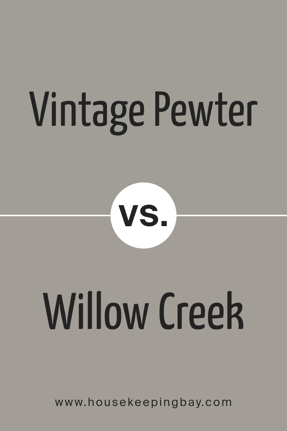
Vintage Pewter CSP-110 by Benjamin Moore vs Willow Creek 1468 by Benjamin Moore
Vintage Pewter CSP-110 and Willow Creek 1468, both by Benjamin Moore, offer distinct tones for different decor preferences. Vintage Pewter CSP-110 is a rich, deep gray with subtle brown undertones, offering a classic and sophisticated feel to any space. It works well in areas where a strong, yet warm presence is desired, and pairs nicely with both bold and muted color schemes.
Willow Creek 1468, by contrast, is a lighter gray with soft, green undertones. This color provides a more airy and gentle ambiance, making it ideal for creating a soothing environment. It’s particularly effective in spaces that aim for a natural, relaxed vibe.
Both colors are versatile and can complement various interior styles. While Vintage Pewter provides depth and warmth, Willow Creek introduces a lightness and freshness. Choosing between them depends on the desired mood and the specific characteristics of the room being painted.
You can see recommended paint color below:
- 1468 Willow Creek
housekeepingbay.com
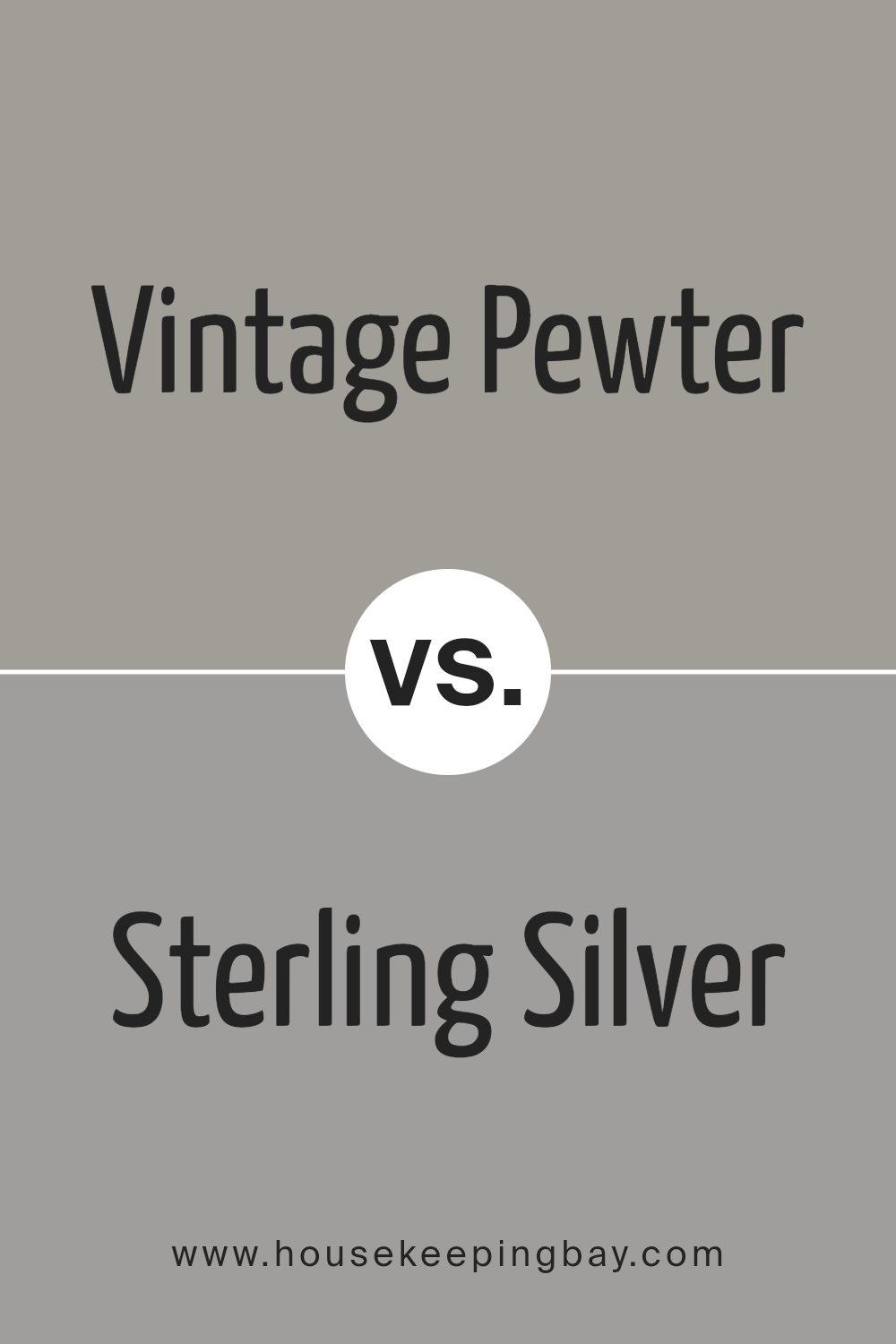
Vintage Pewter CSP-110 by Benjamin Moore vs Sterling Silver 1461 by Benjamin Moore
Vintage Pewter CSP-110 by Benjamin Moore is a rich, deep gray with a touch of warmth, making it quite versatile for different spaces in a home. It offers a subtle elegance that can work well in both traditional and contemporary settings. This color tends to create a cozy atmosphere and can make large rooms feel more intimate.
In contrast, Sterling Silver 1461 by Benjamin Moore is a lighter gray with slightly cooler undertones. It reflects more light, giving it a fresher, more airy feel. This shade is particularly effective in smaller spaces or rooms with less natural light, as it can help make the area seem larger and brighter.
Both colors provide a neutral backdrop, but Vintage Pewter adds warmth and depth, whereas Sterling Silver offers a sense of openness and light. Depending on your room’s size, natural lighting, and desired ambiance, you might prefer one over the other for achieving your specific design goals.
You can see recommended paint color below:
- 1461 Sterling Silver
housekeepingbay.com
Conclusion
The paint CSP-110 Vintage Pewter by Benjamin Moore has thoroughly impressed me. After careful analysis, I can certainly commend it for anyone looking to achieve a refined yet subtle ambiance in their space. The color’s sophisticated gray shade has a classic feel, making it a versatile choice suitable for various rooms, whether for a formal living area or a cozy study.
I particularly appreciate how Vintage Pewter works beautifully with different lighting conditions, adapting its tones from soft and warm in natural light to richer and deeper under artificial lights. This adaptability ensures that the color never feels out of place and maintains its aesthetic appeal throughout the day.
Furthermore, pairing it with contrasting colors or as part of a monochromatic scheme highlights its flexibility in design. Its ability to complement both contemporary and traditional decor adds to its charm and practicality. Therefore, for anyone considering a new paint color that offers both timeless elegance and functionality, CSP-110 Vintage Pewter should definitely be on the list. It truly meets the needs of those seeking a dependable and stylish choice for their decorating projects.
housekeepingbay.com
