Studio Mauve SW 0062 by Sherwin Williams
A Chic Hue for Modern Elegance
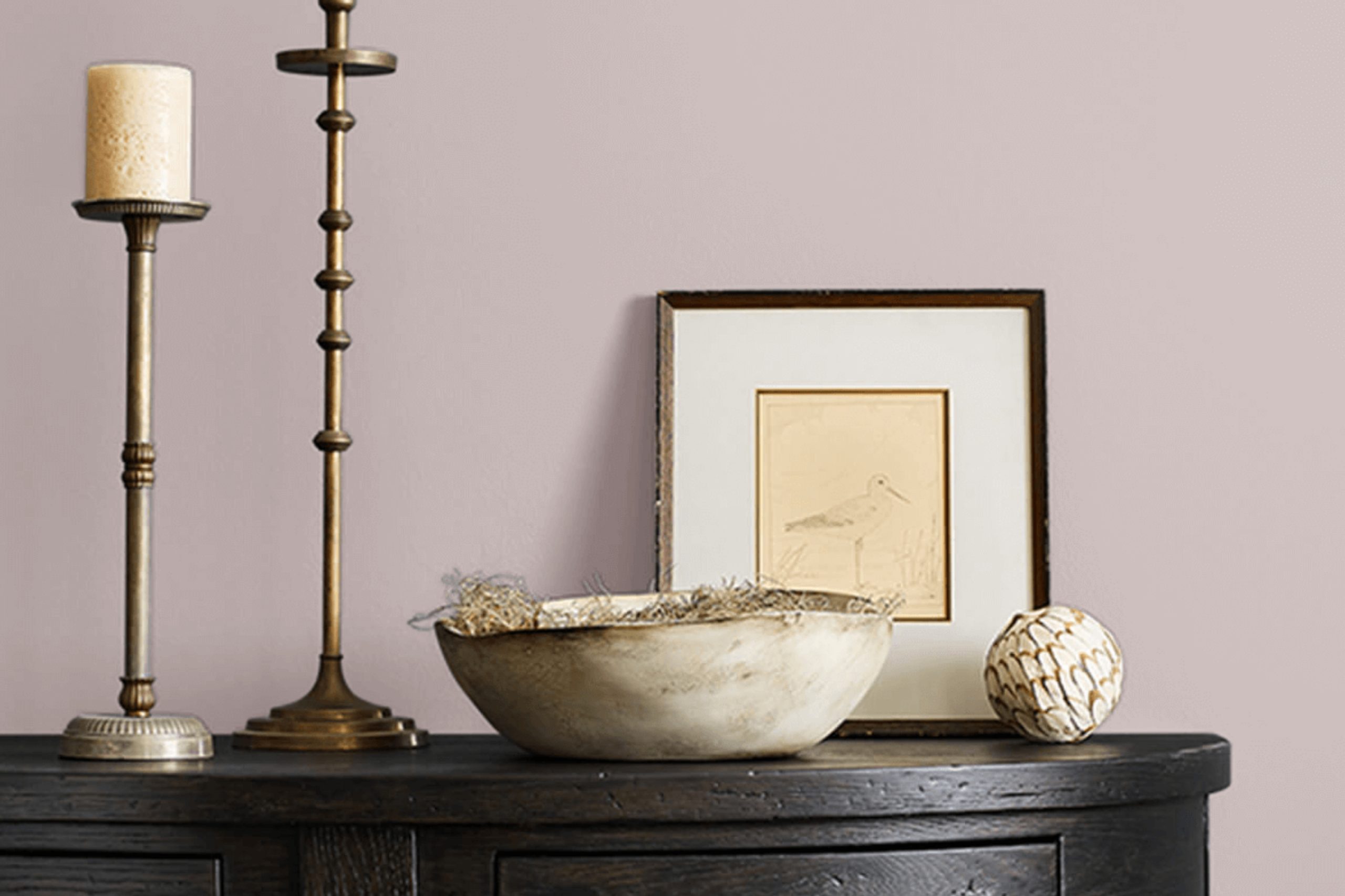
When you hear the name Studio Mauve by Sherwin Williams, what comes to mind? Maybe a soft lavender hue or perhaps a sophisticated gray with a hint of purple. Whatever your first thought, you’re beginning a journey into a world of color that can refresh a space with just a coat of paint.
Studio Mauve, also known by its code SW 0062, is not just any color. It offers a unique blend of calmness and elegance, suitable for a range of environments. Imagine stepping into a room where the walls are dressed in this gentle shade.
It can feel both welcoming and uplifting, providing a soothing atmosphere without being overwhelming.
In your living room, bedroom, or even a home office, Studio Mauve adapts easily to the mood you want to set. It pairs wonderfully with a variety of accent colors, allowing you to express your personal style.
Whether you prefer modern minimalist decor or something with more flourish, this shade can hold its own and enhance the overall look.
Try imagining Studio Mauve with different textures and finishes in your space. It offers a canvas on which to build a cozy, stylish environment. With this shade on your walls, you’re not just painting them; you’re creating a backdrop for your life’s moments.
via sherwin-williams.com/
What Color Is Studio Mauve SW 0062 by Sherwin Williams?
Studio Mauve SW 0062 by Sherwin Williams is a soft, muted purple hue with undertones of gray. This serene color creates a calming atmosphere in any space. It has a whisper of warmth, making it versatile enough for various interior styles.
In shabby chic interiors, Studio Mauve can enhance the aged charm with its gentle tone. It pairs well with distressed wood furniture and antique accents.
For modern or minimalist designs, this color brings a touch of softness to the sleek lines and can be paired with black or white furnishings for contrast. In traditional settings, it harmonizes beautifully with rich textures, such as velvet or silk.
Studio Mauve looks great with materials like natural wood, adding warmth and depth. It also complements metals, such as brushed nickel or gold, enhancing elegance. Pairing it with woven fabrics or jute rugs introduces natural elements, perfect for creating a cozy space.
The color suits bedrooms and living rooms, where its soft presence relaxes the mind. It can also serve as an accent wall in dining rooms, adding subtle drama without overwhelming the space. Overall, Studio Mauve is versatile and adaptable, making it a wonderful choice for interiors seeking understated elegance.
housekeepingbay.com
Is Studio Mauve SW 0062 by Sherwin Williams Warm or Cool color?
Studio Mauve SW 0062 by Sherwin Williams is a soft, muted mauve color that can give homes a gentle and cozy feel. This color blends purple and gray tones, creating a soothing background in any room. Its soft hue is ideal for bedrooms or living areas where relaxation is important.
The subtlety of Studio Mauve allows it to pair well with a variety of other colors, making it versatile for different decor styles. It works beautifully with whites or creams for a classic look, or can be matched with metallics for a more modern touch.
Lighting can affect how this color appears; in natural daylight, it may seem lighter and more airy, while in dimmer, artificial lighting, it can look deeper and more intimate. Overall, Studio Mauve SW 0062 offers a warm and welcoming atmosphere, helping to create serene and inviting spaces throughout the home.
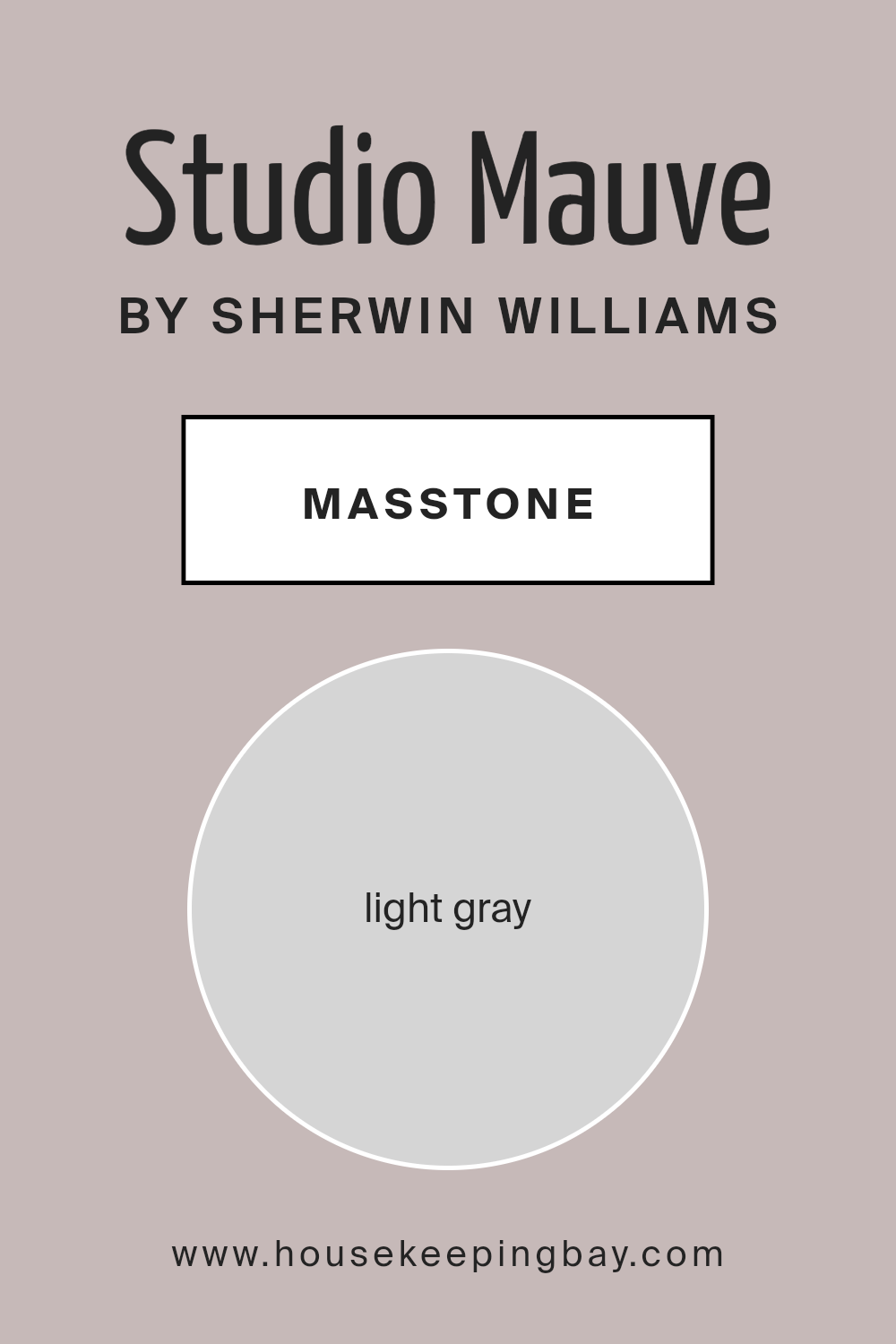
What is the Masstone of the Studio Mauve SW 0062 by Sherwin Williams?
Studio Mauve SW 0062 by Sherwin Williams is a light gray color with soft undertones. Its masstone is light gray (#D5D5D5), which creates a calm and soothing atmosphere in homes. This versatile color works well in many spaces, adding a gentle touch. It is not too bold, making it perfect for living rooms, bedrooms, or any area where relaxation is key.
The light gray tone pairs nicely with different styles, from modern to traditional. It also complements a variety of other colors, such as whites, blues, or even deeper shades like navy or charcoal.
Studio Mauve adds coherence and balance, allowing other design elements, like furniture or artwork, to stand out without overpowering them.
It reflects light softly, which can make rooms feel brighter and more open. Overall, Studio Mauve is a wonderful choice for those looking to create a peaceful and elegant environment at home.
housekeepingbay.com
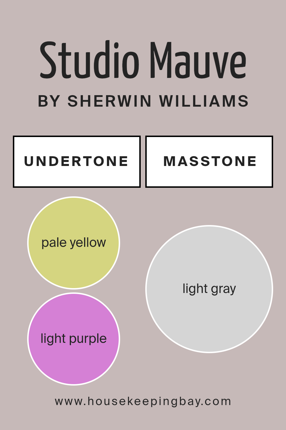
Undertones of Studio Mauve SW 0062 by Sherwin Williams
Studio Mauve SW 0062 by Sherwin Williams features a blend of complex undertones that influence its appearance. Understanding these undertones helps in predicting how this color interacts with lighting and the surrounding décor.
The undertones include hints of pale yellow, light purple, light blue, pale pink, mint, lilac, and grey. These subtle shades can affect how the paint looks on walls. For example, light plays a critical role; natural light can enhance the light purple and lilac hues, adding a gentle warmth to a room.
Meanwhile, artificial lighting can pull out grey undertones, providing a muted, sophisticated vibe.
The pale yellow adds a subtle brightness, ensuring the color doesn’t feel too heavy or cool. The light blue and mint tones contribute a refreshing touch, keeping it from feeling overly warm. Pale pink adds softness and a bit of romance, making spaces feel cozy and inviting.
Overall, the complexity of Studio Mauve’s undertones means that it is versatile. It can look warm and comforting or cool and refreshing depending on the lighting and other elements in the room. This makes it an interesting choice, adaptable to many interior styles, from modern to traditional.
housekeepingbay.com
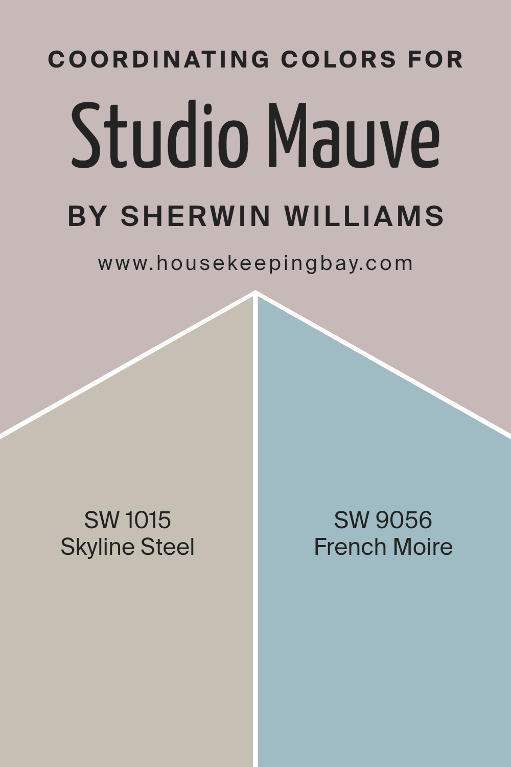
Coordinating Colors of Studio Mauve SW 0062 by Sherwin Williams
Coordinating colors are hues that work well together, creating a harmonious and balanced look in a space. With Studio Mauve SW 0062 by Sherwin Williams as the main color, teaming it with the right coordinating colors can bring out its true essence.
The goal is to find shades that complement the main color, highlighting its features without clashing. When you select coordinating colors, you’re creating a palette that feels cohesive and inviting.
This design approach helps in building a unified theme throughout a room or even a full home. By thoughtfully pairing Studio Mauve with other colors, you can achieve various moods—from cozy and warm to bright and airy.
One excellent coordinating color is SW 1015 – Skyline Steel. It is a light, cool gray that pairs beautifully with Studio Mauve. This shade has a sleek and modern vibe, adding a subtle contrast that keeps things interesting without overwhelming the space.
Another good choice is SW 9056 – French Moire. French Moire is a soft, muted blue with a gentle undertone, offering a fresh and calming presence next to the mauve. Together, these colors create a look that is both refined and welcoming, perfect for a variety of settings.
They harmonize well, offering depth and interest while maintaining a sense of unity.
You can see recommended paint colors below:
- SW 1015 Skyline Steel
- SW 9056 French Moire
housekeepingbay.com
How Does Lighting Affect Studio Mauve SW 0062 by Sherwin Williams?
Lighting plays a significant role in how we perceive colors. The type and angle of light can dramatically change the appearance of a color. Studio Mauve SW 0062 by Sherwin Williams is a sophisticated and muted shade that looks different under various lighting conditions.
In artificial light, Studio Mauve may appear cozier and warmer or cooler depending on whether the light is warm (yellowish) or cool (bluish). Warm artificial lighting gives Studio Mauve a slightly rosy glow, enhancing its softness.
In contrast, cool artificial light can make it look a bit more subdued and even slightly grayish.
Natural light, on the other hand, changes throughout the day and affects how colors appear. In north-facing rooms, where the light tends to be cooler and less intense, Studio Mauve might look more muted and cooler.
It may lean towards a muted lavender-gray, adding a subtle and calming effect to the space.
In south-facing rooms, which receive more direct and intense sunlight, Studio Mauve will look brighter and slightly warmer. This room gets light throughout the day, which makes the color appear more saturated and lively, showing off its depth.
East-facing rooms get bright, warm sunlight in the morning and cooler light in the afternoon. In the morning, Studio Mauve may look warm and fresh, while later in the day it might appear more neutral.
West-facing rooms receive warm light in the afternoon. In these rooms, Studio Mauve will have a richer and warmer appearance as the sun sets, providing a cozy and inviting atmosphere.
By considering light direction and type, you can better predict how Studio Mauve will appear in your space and make an informed decision based on your room’s orientation and lighting conditions.

housekeepingbay.com
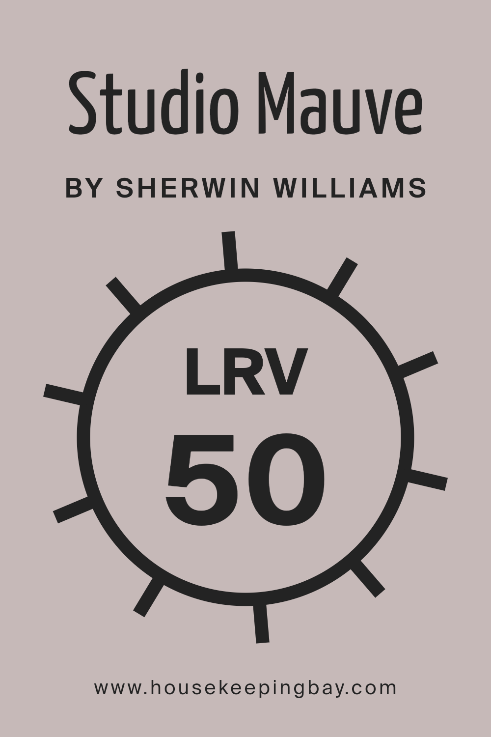
What is the LRV of Studio Mauve SW 0062 by Sherwin Williams?
LRV, or Light Reflectance Value, is a measure that tells us how much light a color reflects. The LRV scale goes from 0 to 100, where 0 is completely black, reflecting no light, and 100 is pure white, reflecting all the light. This measure is crucial for understanding how a paint color will look in a room.
High LRV numbers mean the color is lighter and reflects more light off the walls, making spaces feel more open and airy. On the other hand, colors with low LRV absorb more light, making rooms feel cozier and sometimes smaller.
Studio Mauve by Sherwin Williams has an LRV of 50.175, placing it near the middle of the LRV scale. This indicates that Studio Mauve will reflect a moderate amount of light. As a result, it offers a balanced feel in a room, neither too bright nor too dark.
In spaces with plenty of natural light, this color will maintain a soft, warm hue, while in dimmer areas, it might appear a little deeper or muted. This flexibility allows it to work well in different kinds of rooms, creating a pleasant and comfortable atmosphere.
housekeepingbay.com
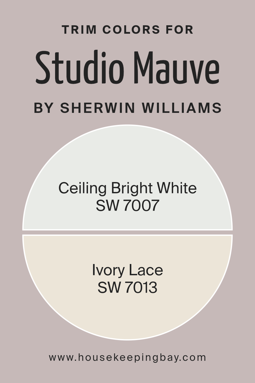
What are the Trim colors of Studio Mauve SW 0062 by Sherwin Williams?
Trim colors are the paints used on the edges and borders of rooms, such as baseboards, doors, and window frames, to create contrast or complement the main wall colors. They highlight the room’s architectural features and add depth and dimension.
Studio Mauve SW 0062 by Sherwin Williams is a unique shade that combines purple and gray tones, offering a calming and sophisticated look. Using the right trim colors can accentuate this lovely shade and bring harmony to any space.
Ceiling Bright White SW 7007 works well as a trim color, presenting a clean and crisp edge that contrasts with Studio Mauve, highlighting the mauve’s depth without overpowering it. This white has a bright, pure tone, perfect for creating clear lines on ceilings and trims.
Similarly, Ivory Lace SW 7013, with its soft, creamy appearance, gives a warm and elegant touch, complementing Studio Mauve by enhancing its muted purple undertones.
These trim colors, both white and off-white, offer versatility and style, making spaces feel balanced and inviting.
You can see recommended paint colors below:
housekeepingbay.com
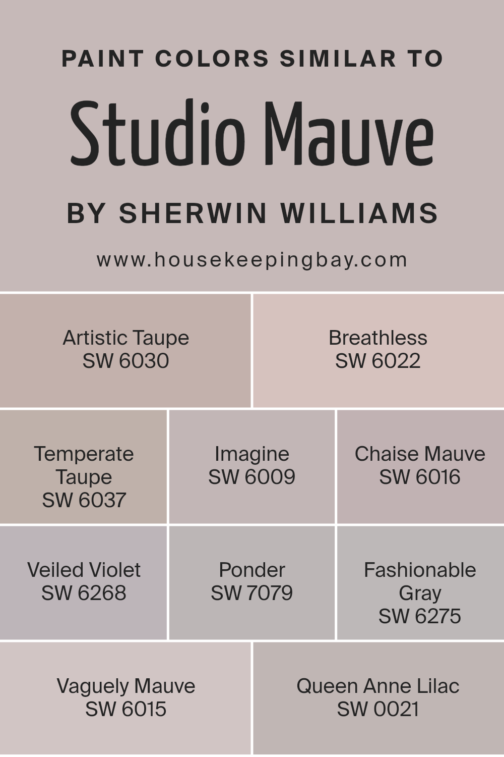
Colors Similar to Studio Mauve SW 0062 by Sherwin Williams
Similar colors are important in design and decoration as they create harmony and balance in a space. They help different elements in a room to blend and work well together. Studio Mauve by Sherwin Williams has several similar colors that complement its rich, muted tone.
SW 6030 Artistic Taupe offers a warm, earthy shade that adds depth without overpowering. SW 6022 Breathless is a soft, airy pink that brings a gentle, calming feel. SW 6037 Temperate Taupe provides a neutral balance, ideal for tying various colors together.
SW 6009 Imagine brings a subtle gray with a hint of violet, creating a sophisticated backdrop.
SW 6016 Chaise Mauve carries a delicate lavender tone, adding a touch of elegance. SW 6268 Veiled Violet, a light purple, is perfect for a whimsical touch. For a deeper accent, SW 7079 Ponder offers a moody gray that evokes contemplation. SW 6275 Fashionable Gray introduces a modern touch with its sleek and versatile appearance.
SW 6015 Vaguely Mauve hints at a subtle purple, perfect for a soft, romantic vibe, while SW 0021 Queen Anne Lilac combines history and charm in a gentle lavender hue.
These colors create a cohesive palette that enhances any environment, maintaining unity and interest without chaos.
You can see recommended paint colors below:
- SW 6030 Artistic Taupe
- SW 6022 Breathless
- SW 6037 Temperate Taupe
- SW 6009 Imagine
- SW 6016 Chaise Mauve
- SW 6268 Veiled Violet
- SW 7079 Ponder
- SW 6275 Fashionable Gray
- SW 6015 Vaguely Mauve
- SW 0021 Queen Anne Lilac
housekeepingbay.com
How to Use Studio Mauve SW 0062 by Sherwin Williams In Your Home?
Studio Mauve SW 0062 by Sherwin-Williams offers a soft, muted shade of purple that adds warmth and sophistication to any space. This gentle color works beautifully in a variety of rooms, bringing a touch of elegance without being overwhelming. In the bedroom, Studio Mauve can create a peaceful and cozy atmosphere, perfect for relaxation and rest. Pair it with light-colored bedding and curtains for a soothing effect.
In living areas, Studio Mauve serves as a lovely backdrop for both traditional and modern decor. It pairs well with neutral furnishings and metallic accents, adding depth to the room.
For those looking to add a bit of personality to their home office, this color can encourage creativity while maintaining a calm environment.
When used in a bathroom, Studio Mauve provides a spa-like feel, enhancing relaxation. Complement it with white towels and silver fixtures for a clean, fresh look. This versatile shade adds subtle character to any home.
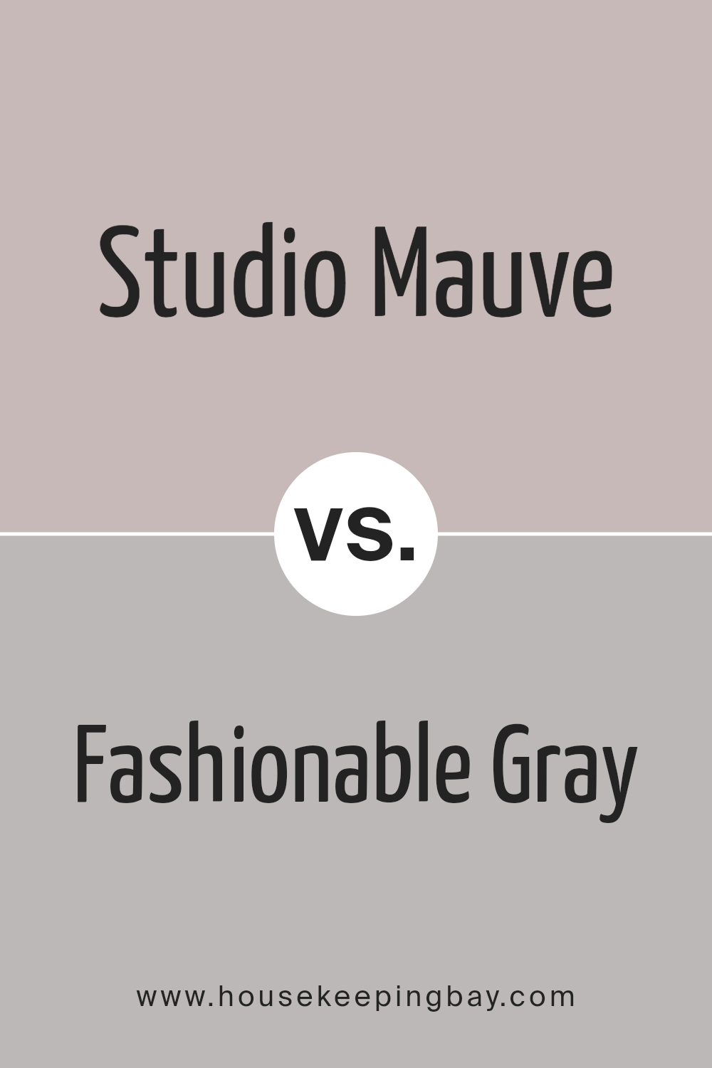
Studio Mauve SW 0062 by Sherwin Williams vs Fashionable Gray SW 6275 by Sherwin Williams
Studio Mauve SW 0062 by Sherwin Williams is a warm, muted purple with a gentle touch of gray. It creates a cozy, inviting atmosphere, making it a good choice for spaces where you want a comforting feel. The color leans more towards the red side of the spectrum, giving it a rich, velvety undertone.
Fashionable Gray SW 6275, meanwhile, is a soft, neutral gray with slight warm undertones. It offers a chic, modern look that fits well in contemporary spaces. This gray is versatile, pairing easily with many other colors, and it helps to create an elegant backdrop without overwhelming a room.
When comparing, Studio Mauve provides warmth and depth, adding character and a pop of color. Fashionable Gray offers a clean, understated appearance that enhances elegance. Each brings its own mood and character to a space: one cozy and inviting, the other sleek and modern.
You can see recommended paint color below:
- SW 6275 Fashionable Gray
housekeepingbay.com
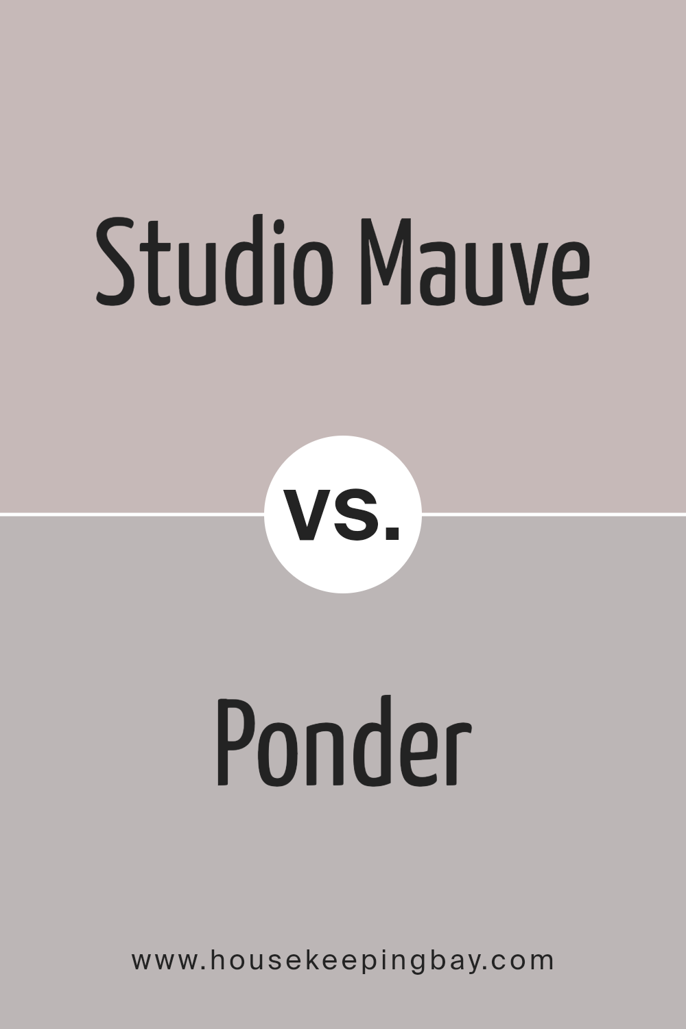
Studio Mauve SW 0062 by Sherwin Williams vs Ponder SW 7079 by Sherwin Williams
Studio Mauve SW 0062 by Sherwin Williams is a soft, muted shade of purple with undertones that give it a warm and inviting feel. It exudes sophistication and elegance, perfect for spaces where a gentle touch of color is desired. This color is versatile, complementing both modern and traditional décor. It works well in living rooms, bedrooms, or any space where warmth and subtle character are essential.
Ponder SW 7079, in contrast, is a cool, light gray with a hint of blue. It offers a calm, neutral backdrop, making it a great choice for those who prefer a more minimalist and understated look.
Ponder creates a soothing environment, enhancing spaces like bathrooms, kitchens, or offices where a restful atmosphere is key.
Both colors share a sense of calm, but while Studio Mauve feels warm and cozy, Ponder maintains a crisp and refreshing appearance.
You can see recommended paint color below:
- SW 7079 Ponder
housekeepingbay.com
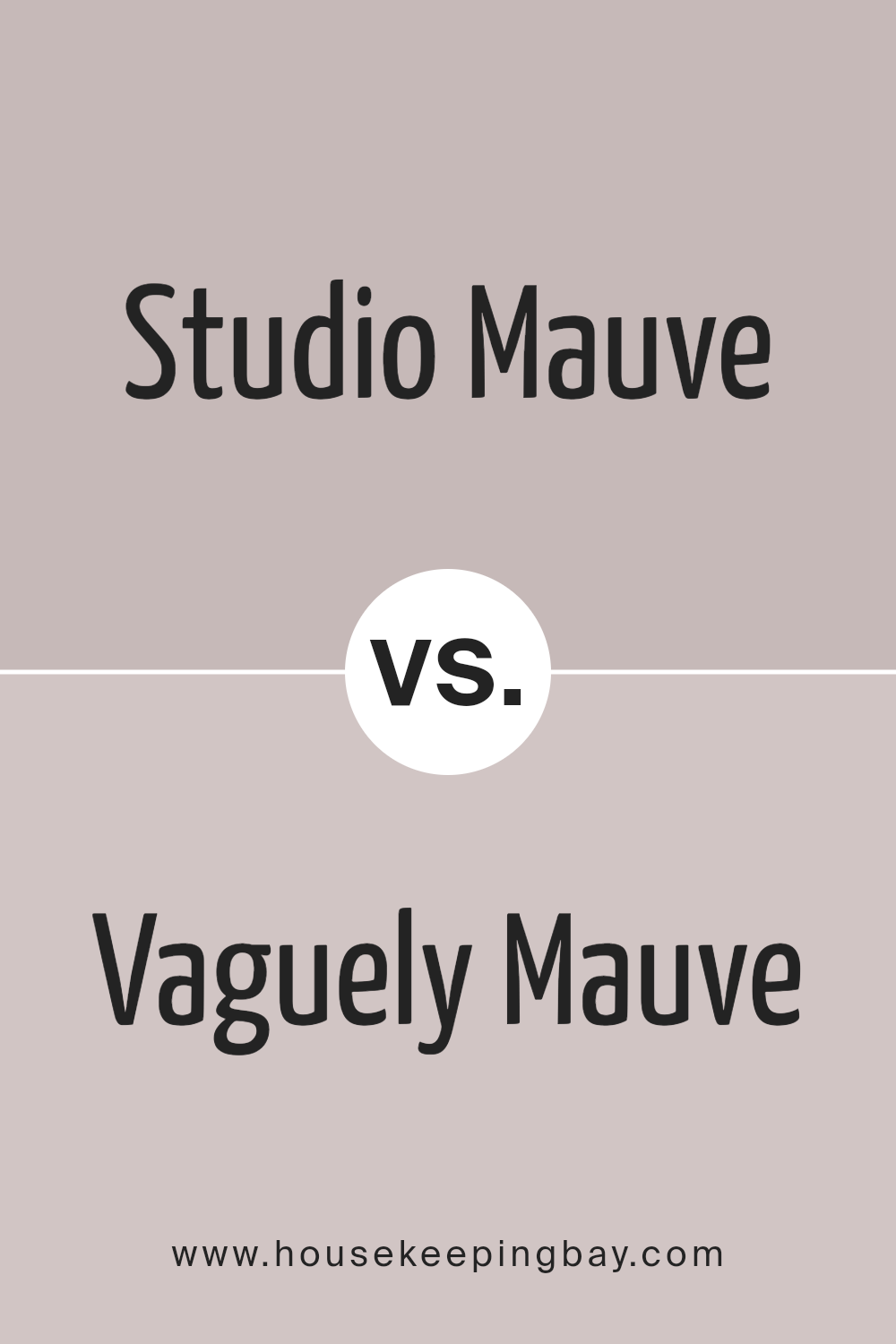
Studio Mauve SW 0062 by Sherwin Williams vs Vaguely Mauve SW 6015 by Sherwin Williams
Studio Mauve SW 0062 by Sherwin Williams and Vaguely Mauve SW 6015 share a mauve base but differ in tone and depth. Studio Mauve SW 0062 presents a warmer, richer tone with earthy undertones. It can create a cozy, comforting space, making it suitable for areas where warmth is desired, like living rooms or bedrooms.
Vaguely Mauve SW 6015, meanwhile, offers a softer, more muted hue. Its lightness lends an airy feel, suitable for spaces needing brightness without losing color character. Ideal for smaller rooms or areas that benefit from a touch of subtle color.
Both colors fit well in traditional and modern settings. When paired, they provide contrast without clashing. Studio Mauve’s boldness could anchor a room, while Vaguely Mauve provides a gentle backdrop. Choosing between them depends on whether a space requires warmth and coziness or a lighter, softer touch.
You can see recommended paint color below:
housekeepingbay.com
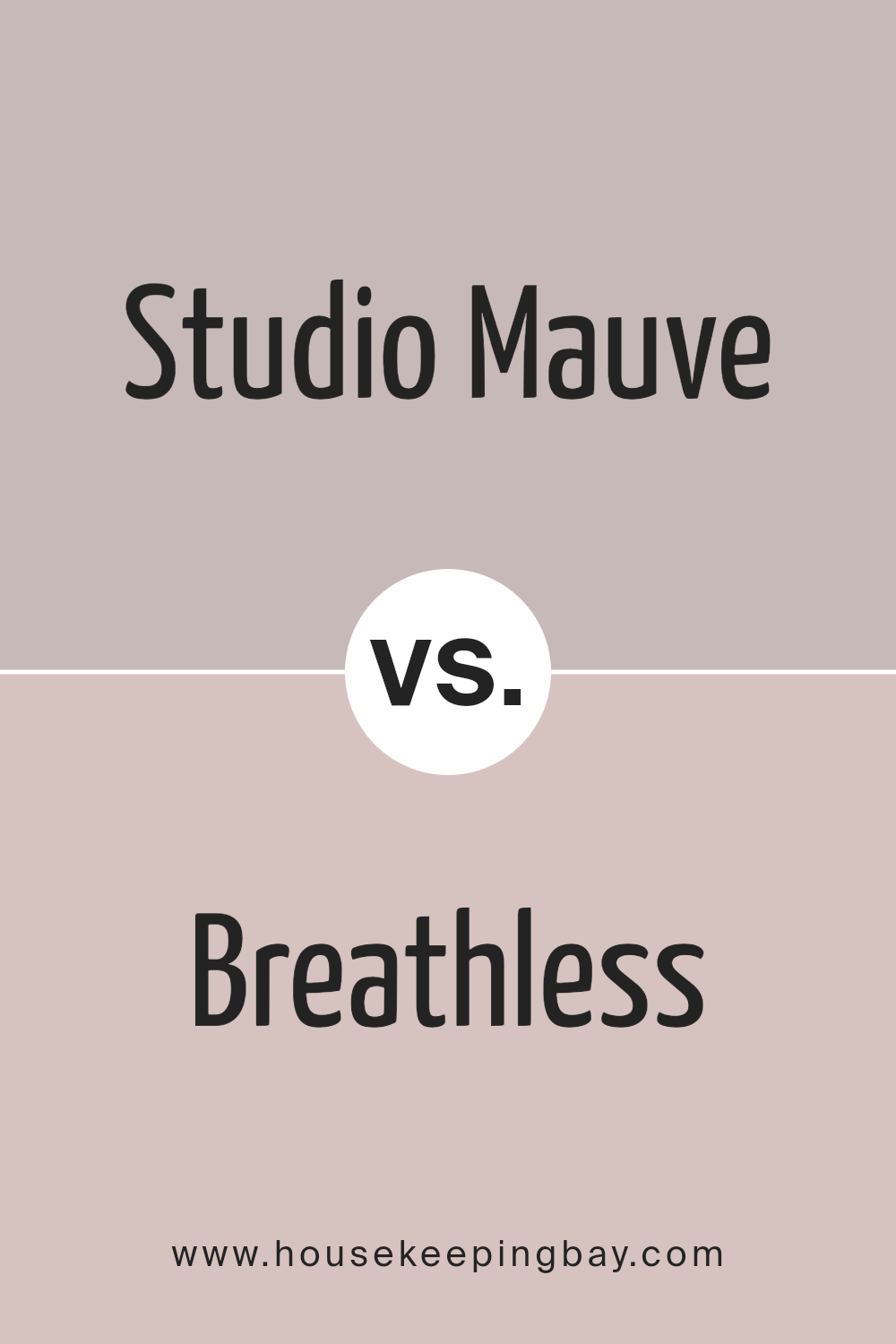
Studio Mauve SW 0062 by Sherwin Williams vs Breathless SW 6022 by Sherwin Williams
Studio Mauve SW 0062 by Sherwin Williams is a rich, muted mauve that carries a hint of purple and gray. It creates a sense of warmth and sophistication, making it suitable for cozy living spaces or intimate bedrooms. The color invites relaxation and has a classic vibe.
In contrast, Breathless SW 6022 presents a softer tone. This pale, almost ethereal pink leans towards pastel, providing a delicate and airy feel. It’s perfect for adding a touch of lightness to a room, ideal for nurseries or spaces that benefit from a gentle lift in atmosphere.
While Studio Mauve tends to feel more dramatic and subdued, Breathless offers a fresh and tender look. Studio Mauve pairs well with darker colors, adding depth, while Breathless complements neutral tones and brings brightness.
Each color serves a purpose: Studio Mauve for grounding and Breathless for brightening and uplifting.
You can see recommended paint color below:
- SW 6022 Breathless
housekeepingbay.com
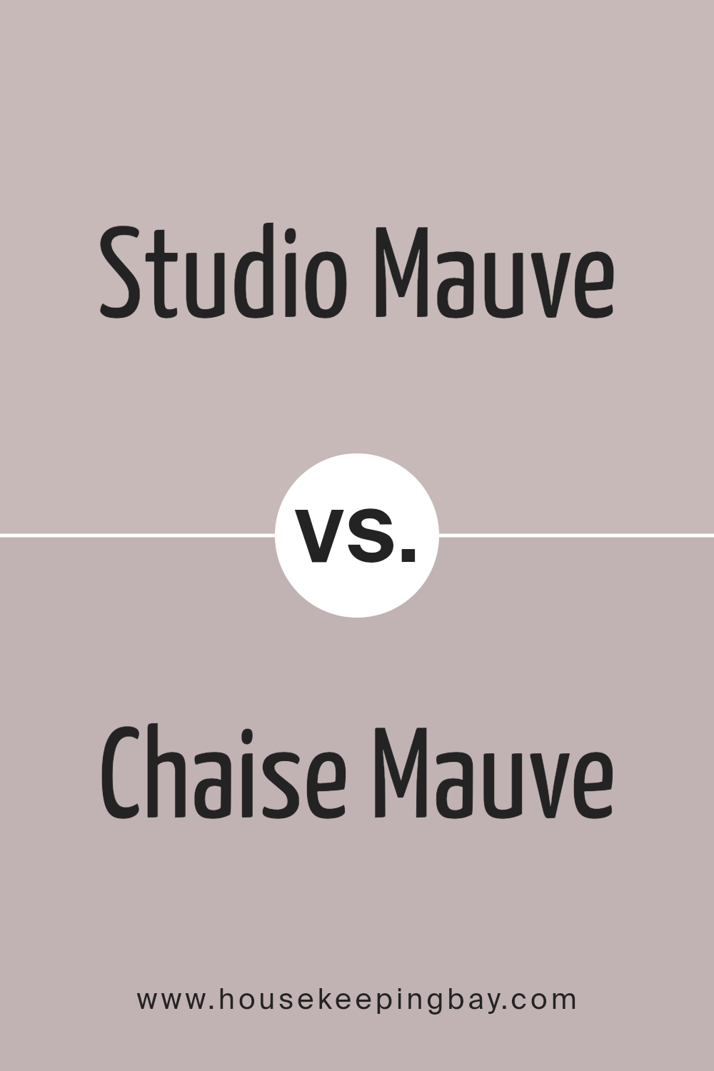
Studio Mauve SW 0062 by Sherwin Williams vs Chaise Mauve SW 6016 by Sherwin Williams
Studio Mauve SW 0062 and Chaise Mauve SW 6016, both from Sherwin Williams, offer subtle variations within the same color family. Studio Mauve presents as a warm, muted mauve with gentle undertones, lending itself well to creating a cozy, inviting atmosphere. Its subdued nature makes it versatile, balancing both traditional and contemporary spaces.
Chaise Mauve, by contrast, appears slightly cooler, with hints of gray. This gives it a more modern feel. Though both colors share a similar base, Chaise Mauve might suit those looking to introduce a touch of sophistication without moving to cooler blues or greens.
Studio Mauve fits where a bit more warmth is desired, while Chaise Mauve caters to spaces that benefit from a muted elegance. Together, they offer choices for those drawn to mauve but seeking distinct moods or styles.
Whether in a living room, bedroom, or office, each provides a unique touch complementary to different design aesthetics.
You can see recommended paint color below:
- SW 6016 Chaise Mauve
housekeepingbay.com
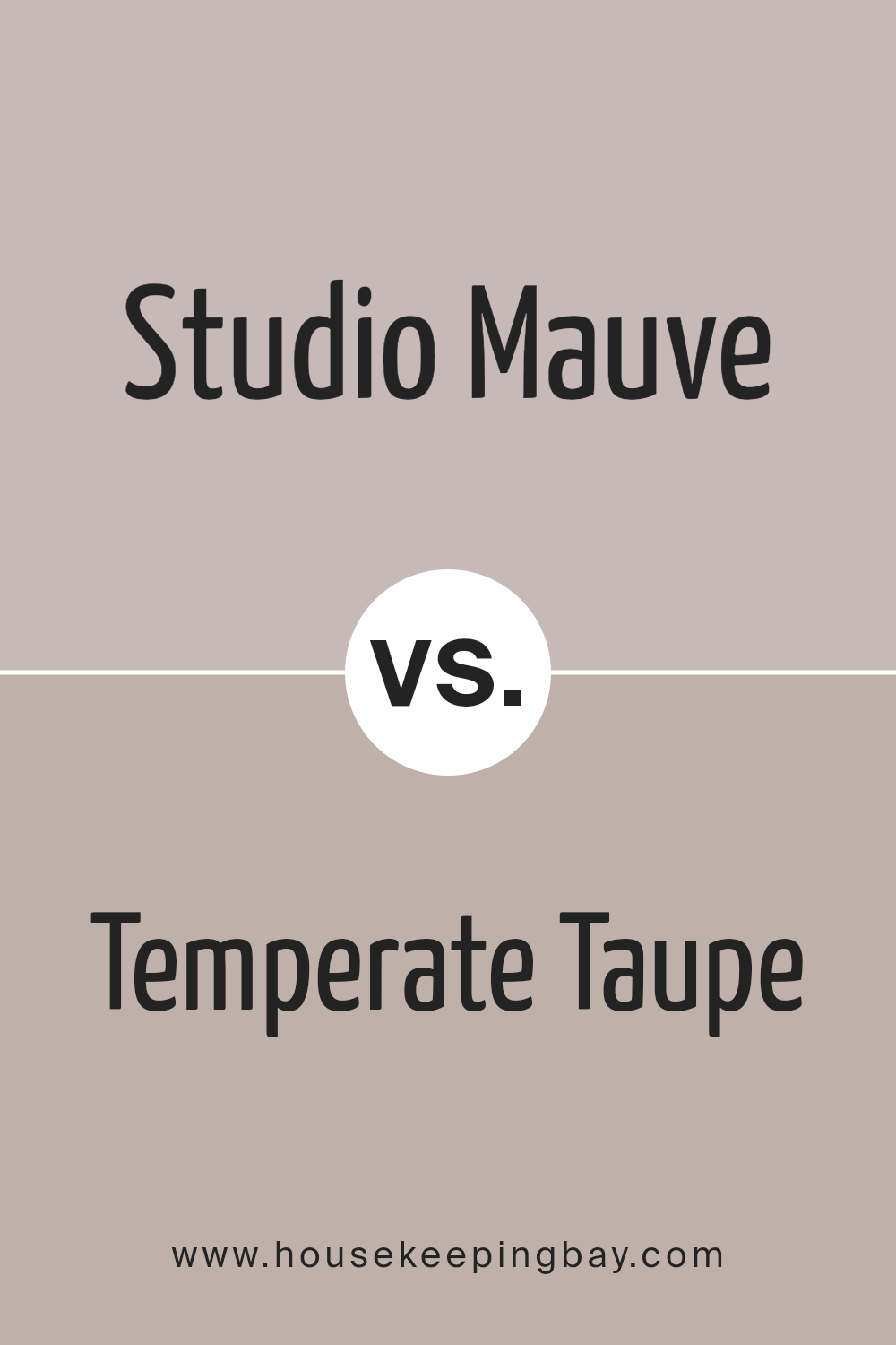
Studio Mauve SW 0062 by Sherwin Williams vs Temperate Taupe SW 6037 by Sherwin Williams
Studio Mauve SW 0062 and Temperate Taupe SW 6037 by Sherwin Williams each bring unique qualities to a space. Studio Mauve is a soft, muted purple with a hint of gray, providing a cozy and comforting feel. It can add a touch of elegance and sophistication without feeling overwhelming. The color pairs well with neutrals, offering versatility in design.
Temperate Taupe, meanwhile, is a warm, earthy brown with subtle undertones of gray. It offers a grounded and balanced look, ideal for creating a warm and inviting atmosphere. This color works seamlessly with other warm tones and can fit into both modern and traditional settings.
Together, Studio Mauve and Temperate Taupe could complement each other beautifully. Studio Mauve adds a touch of color and interest, while Temperate Taupe provides warmth and stability, resulting in a harmonious and cohesive design.
Both colors are understated yet effective, making them solid choices for various styles.
You can see recommended paint color below:
- SW 6037 Temperate Taupe
housekeepingbay.com
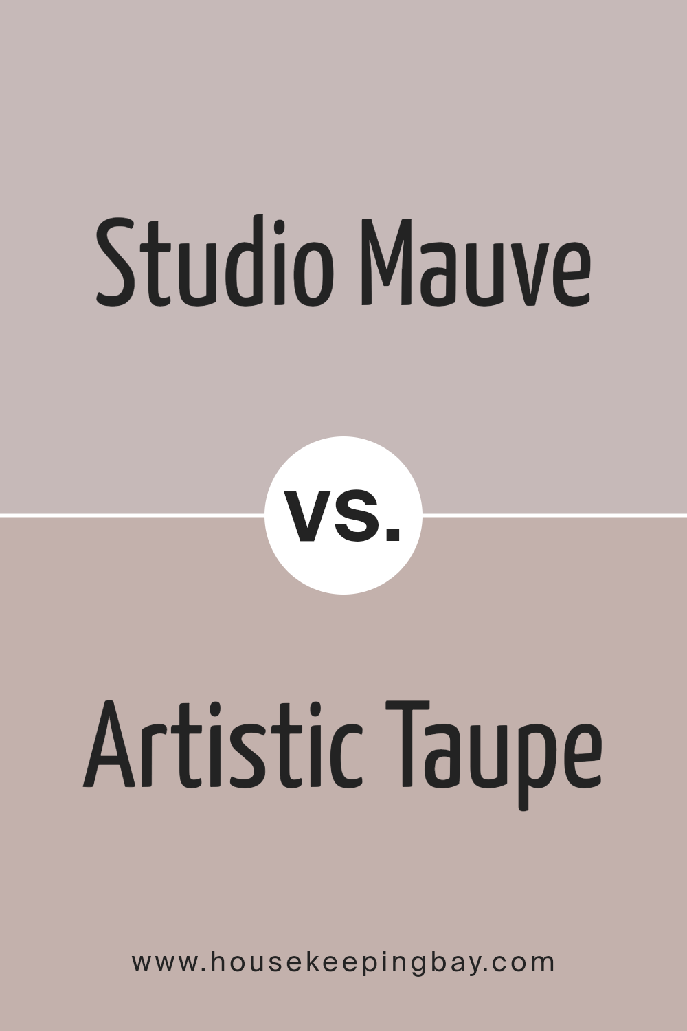
Studio Mauve SW 0062 by Sherwin Williams vs Artistic Taupe SW 6030 by Sherwin Williams
Studio Mauve SW 0062 and Artistic Taupe SW 6030, both from Sherwin Williams, offer unique characteristics. Studio Mauve is a soft, muted purple with a slight gray undertone. It exudes a calm and soothing vibe, making spaces feel cozy and inviting. This color works well in bedrooms or living areas where relaxation is key.
Artistic Taupe, SW 6030, is a warm, beige-like hue, carrying earthy tones which make it versatile. Its neutral quality allows it to complement a wide range of other colors, offering flexibility in design.
It’s an excellent choice for common areas like kitchens or living rooms, creating a warm and welcoming atmosphere.
Both colors infuse spaces with their distinct warmth, yet each provides a different ambiance. Studio Mauve offers a touch of elegance and softness, while Artistic Taupe brings warmth and versatility.
When combined, Studio Mauve’s subtlety can complement Artistic Taupe’s neutrality, creating a harmonious look.
You can see recommended paint color below:
- SW 6030 Artistic Taupe
housekeepingbay.com
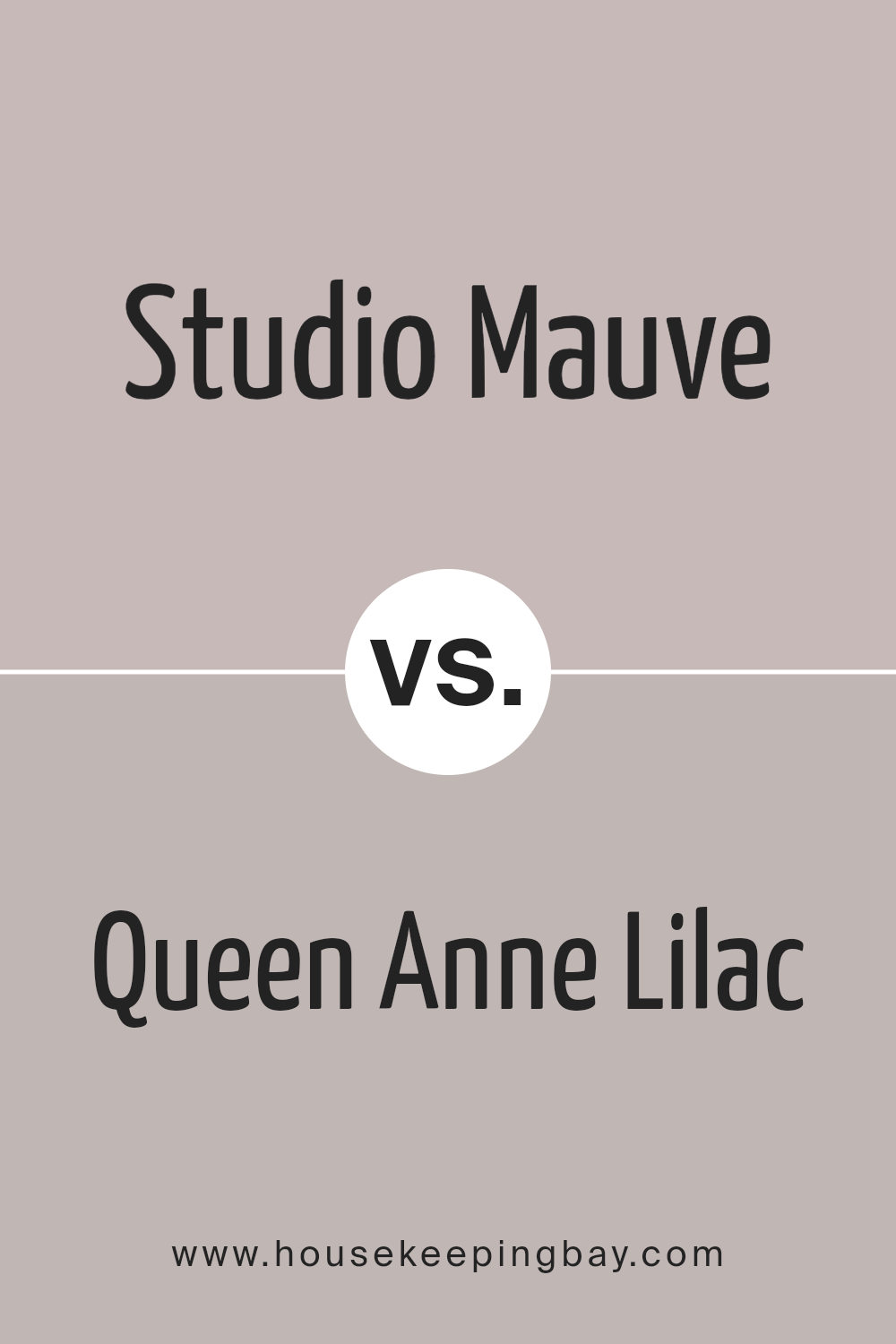
Studio Mauve SW 0062 by Sherwin Williams vs Queen Anne Lilac SW 0021 by Sherwin Williams
Studio Mauve SW 0062 and Queen Anne Lilac SW 0021 are two distinctive colors from Sherwin Williams. Studio Mauve has a warm, rich quality, blending purple with undertones of brown and gray. It brings a cozy, intimate feeling to a room, ideal for creating a warm atmosphere in living rooms or bedrooms.
Queen Anne Lilac, however, is a lighter, soft lilac shade with more noticeable pink and blue tones. It evokes a sense of calmness and grace, often making spaces feel airy and delicate. This make it a pleasant choice for bathrooms or nurseries, where light and openness enhance the room’s ambiance.
While both colors belong to the purple family, Studio Mauve leans toward the earthier side, fitting well in spaces with natural materials. Queen Anne Lilac, lighter and softer, contributes a lighthearted touch, perfect for rooms needing a gentle, uplifting color. Both colors offer unique styling possibilities for homes.
You can see recommended paint color below:
housekeepingbay.com
Studio Mauve SW 0062 by Sherwin Williams vs Veiled Violet SW 6268 by Sherwin Williams
Studio Mauve SW 0062 and Veiled Violet SW 6268, both by Sherwin Williams, offer two distinct takes on purple. Studio Mauve leans towards a warm, rosy hue with subtle undertones, creating a cozy and welcoming feel. It fits well in spaces meant for relaxation, such as living rooms or bedrooms, thanks to its comforting appearance.
Veiled Violet SW 6268, in contrast, presents a cooler, more muted purple. This color feels modern and understated, adding a touch of elegance to any room. It suits spaces where a more sophisticated or calm atmosphere is desired, such as studies or dining areas.
While Studio Mauve brings warmth and tenderness, Veiled Violet provides a gentle, serene vibe. Choosing between them depends on the mood you wish to create: the snug embrace of Studio Mauve or the quiet elegance of Veiled Violet. Both offer unique character while staying firmly within the purple family.
You can see recommended paint color below:
housekeepingbay.com
Studio Mauve SW 0062 by Sherwin Williams vs Imagine SW 6009 by Sherwin Williams
Studio Mauve SW 0062 is a muted shade of purple with a hint of gray, giving it a soft, sophisticated appearance. It’s a color that feels cozy and inviting, often used to create a calm and refined atmosphere. The gray undertones help it to balance well with both cool and warm colors, making it versatile for different spaces.
Imagine SW 6009, meanwhile, is a warm, dusty pink that feels gentle and comforting. This shade leans more towards a subtle, romantic vibe compared to the more elegant Studio Mauve. Its warmth can brighten up a room and give a sense of warmth and tenderness.
When comparing the two, Studio Mauve brings a more subdued elegance, while Imagine offers warmth and a touch of romance. Both colors work well as neutrals in a space, providing a gentle backdrop that complements various styles and decors. They pair beautifully with whites, creams, and dark browns.
You can see recommended paint color below:
- SW 6009 Imagine
housekeepingbay.com
Conclusion
SW 0062 Studio Mauve by Sherwin Williams offers an intriguing hue that brings warmth and depth to any space. After looking into its qualities, I find it to be a sophisticated and versatile paint choice. Studio Mauve’s subtle blend of gray and purple creates a gentle yet rich ambiance, making it suitable for various environments, from living rooms to bedrooms.
The color’s muted tone means it pairs seamlessly with a wide range of other shades, from soft neutrals to bold accents. This flexibility allows for easy customization of any room according to personal style needs. Its calming effect can create a welcoming atmosphere.
For those considering a change in decor, Studio Mauve provides a modern yet timeless option. It can form a lovely backdrop in both contemporary settings and more traditional spaces. The color’s understated elegance means it complements a wide array of furnishings and decor items.
I’m impressed by its ability to bring harmony and depth into a room without overwhelming the senses. Whether used on all walls or as an accent, Studio Mauve lends a sense of balance and refinement. It’s a choice that can truly enhance a home, providing both comfort and style.
housekeepingbay.com
Ever wished paint sampling was as easy as sticking a sticker? Guess what? Now it is! Discover Samplize's unique Peel & Stick samples. Get started now and say goodbye to the old messy way!
Get paint samples


