Stargazer SW 9635 by Sherwin Williams
Deep, muted navy blue that echoes the vastness of the night sky
This unique shade can give your room a fresh vibe without overwhelming the senses. It strikes a delightful balance, offering a subtle hint of color that’s perfect for those who appreciate understated beauty.
Stargazer works wonderfully in various settings, whether you’re updating your living room, bedroom, or even the kitchen. It pairs beautifully with both modern and traditional decor, adding a touch of uniqueness that complements your existing furnishings and style.
What makes it so special is its ability to adapt to different lighting conditions, revealing new facets of its shade throughout the day.
When choosing new paint, it’s not just about the color; it’s about how it makes your space feel. SW 9635 Stargazer has that gentle presence that can make any room feel more inviting.
If you want a subtle change that can still make a noticeable difference in your home, Stargazer might just be the perfect pick for you.
via sherwin-williams.com
What Color Is Stargazer SW 9635 by Sherwin Williams?
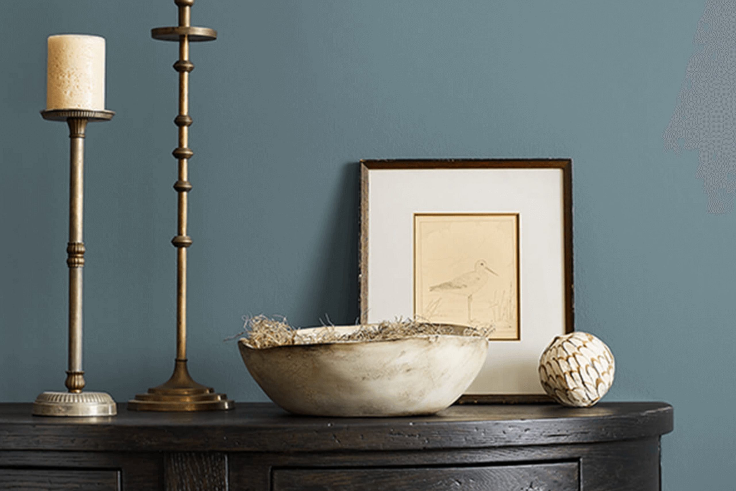
Stargazer SW 9635 by Sherwin Williams is a deep, muted navy blue that echoes the vastness of the night sky. This versatile shade brings a sense of sophistication and classic appeal to any space. It’s moderately dark tone allows it to pair well with a variety of interior styles, particularly modern farmhouse, traditional, and coastal.
Stargazer works excellently as an accent wall or for cabinetry, providing a nice contrast to lighter tones.
In terms of materials, Stargazer complements natural wood tones from light oak to rich walnut, enhancing their warmth. Metals like brushed nickel and aged brass provide a striking interplay with this shade, adding a touch of glam. For textures, think along the lines of soft, plush fabrics or crisp linens that help to balance its boldness.
Pairing Stargazer with creamy whites or soft grays maintains a fresh and airy atmosphere, preventing spaces from feeling too heavy. Accessories or furnishings in these lighter shades help to create a balanced visual impact.
This color also works harmoniously with muted greens or warm earth tones, making it ideal for spaces intended to feel cozy yet refined.

housekeepingbay.com
Is Stargazer SW 9635 by Sherwin Williams Warm or Cool color?
Stargazer SW 9635 by Sherwin Williams is a calm, soothing dark blue hue that makes spaces feel serene and balanced. It resembles a deep nighttime sky, providing a quiet backdrop perfect for relaxing. This versatile color seamlessly adjusts any room, making it cozy and inviting. It is especially effective in bedrooms and living rooms, where comfort is paramount.
When applied to walls, Stargazer can help make large rooms feel more intimate, while its rich depth adds sophistication without overwhelming the space. Furniture in light tones or natural wood stands out beautifully against it, creating a pleasing contrast.
In addition, it pairs well with many colors, including whites, grays, and even warmer tones like mustard or burnt orange. This allows for flexible choices in decor, depending on the desired mood and style.
Overall, Stargazer SW 9635 by Sherwin Williams offers a unique opportunity to set a peaceful, refined tone in homes.
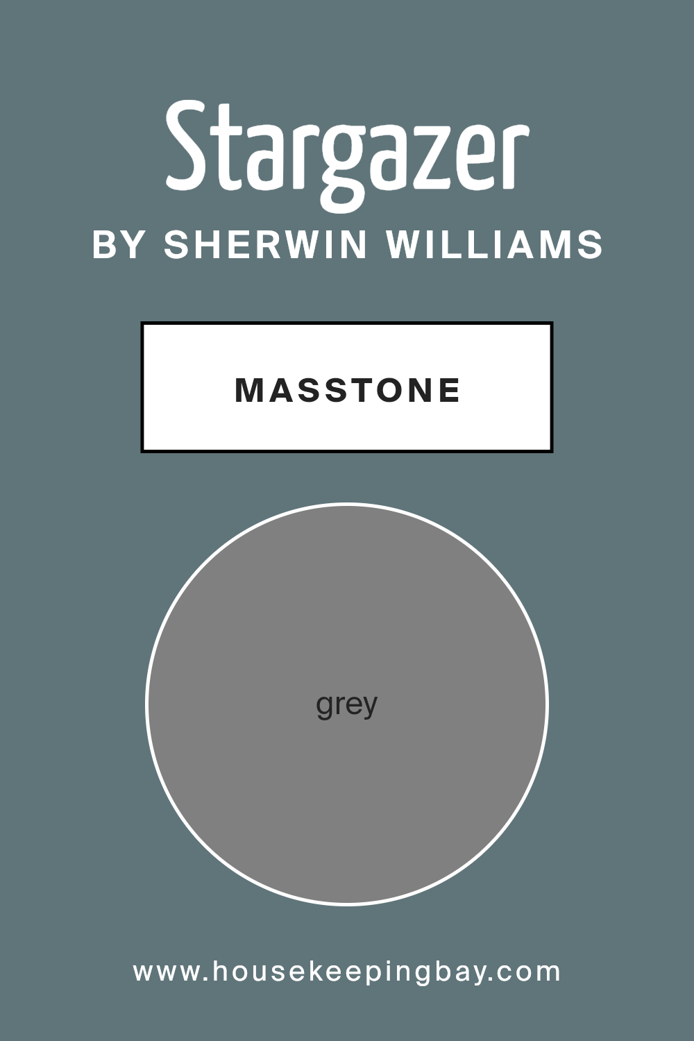
What is the Masstone of the Stargazer SW 9635 by Sherwin Williams?
StargazerSW 9635 by Sherwin Williams has a masstone of Grey (#808080), a balanced shade that fits well in various home settings. This neutral tone serves as a versatile backdrop for any style, from modern to traditional. Grey’s adaptability means it pairs easily with other colors, allowing homeowners to mix and match furniture and decor without clashes.
In smaller spaces, this shade can help make rooms appear larger and more open, while in well-lit areas, it can enhance the brightness of the space.
Grey walls bring a calm, subtle foundation to a room, setting a peaceful mood that’s neither too stark nor too bold. It’s a practical choice for high-traffic areas in the home like living rooms and hallways, as it hides minor imperfections and dirt better than lighter colors. Overall, StargazerSW 9635 provides a timeless aesthetic that can keep up with changing decor trends, making it a smart choice for long-term home design.
housekeepingbay.com
Undertones of Stargazer SW 9635 by Sherwin Williams
StargazerSW 9635 by Sherwin-Williams is a complex color with a base that might appear simply turquoise at first glance. However, its subtleties are revealed through its numerous undertones, which greatly influence how it is perceived in different settings.
This color includes undertones such as dark turquoise, purple, olive, and navy, which bring a depth and richness to the hue. In a well-lit room, for instance, the lighter undertones like mint, light turquoise, and light blue might stand out, giving the walls a vibrant, fresh look.
In contrast, in a dimly lit room, darker undertones like dark green, navy, and dark turquoise might become more noticeable, creating a more subdued and cozy atmosphere.
When used on interior walls, StargazerSW 9635 can make the space feel dynamic yet soothing, depending on the lighting and accompanying decor. The presence of both cool (like blue and mint) and warm undertones (like brown and olive) allows this color to adapt to various furniture colors and styles, making it versatile for different home settings.
Moreover, because this color has both dark and light undertones, it can also alter the perception of space. Lighter undertones can make a room feel larger and more open, while darker tones can make it feel smaller but also more intimate.

housekeepingbay.com
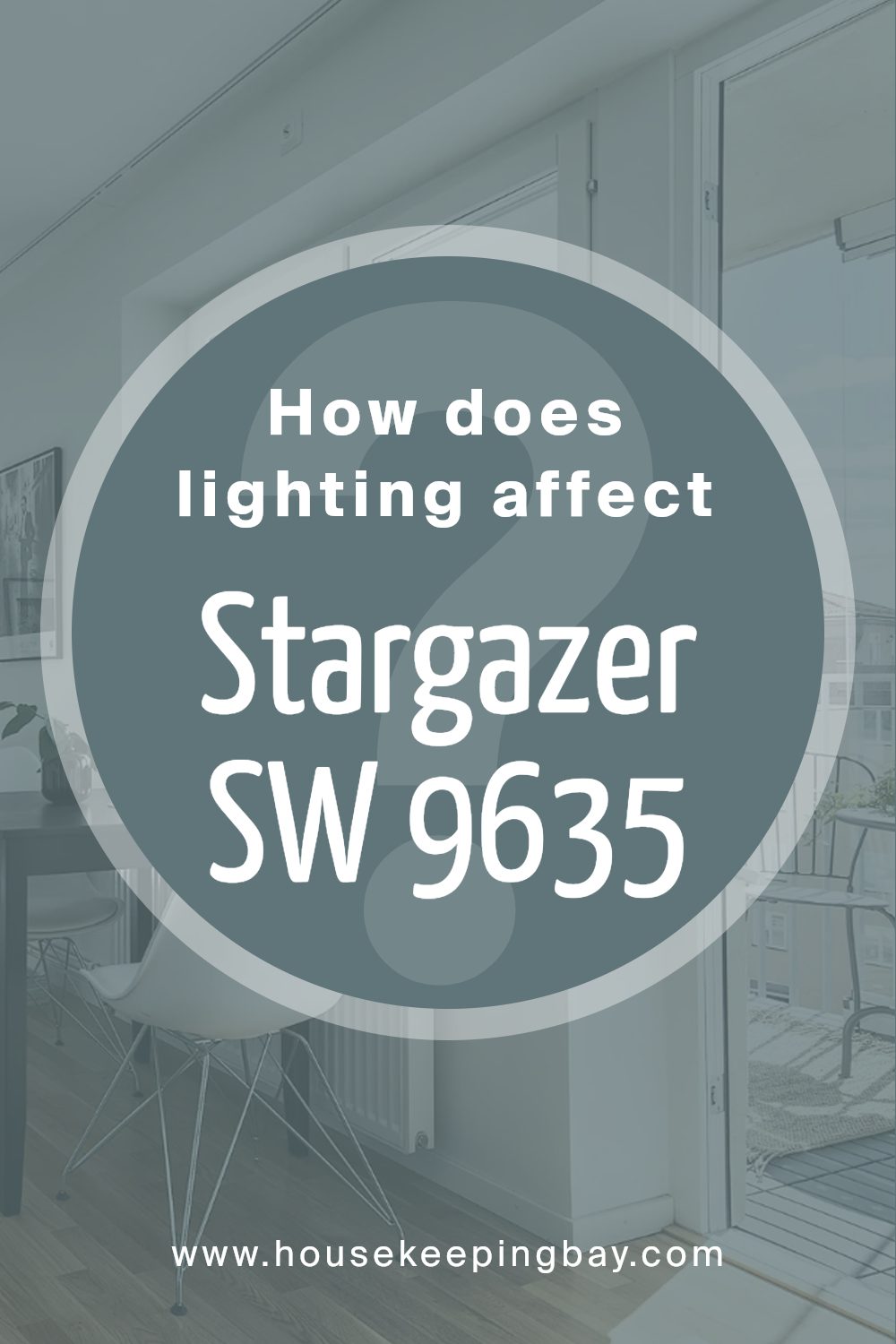
How Does Lighting Affect Stargazer SW 9635 by Sherwin Williams?
Lighting dramatically influences how colors appear in a space, impacting everything from mood to perceptions of size and cleanliness. Understanding this can help when choosing paint, such as StargazerSW 9635 by Sherwin Williams, a sophisticated hue that reacts distinctively under different lighting conditions.
In artificial light, StargazerSW 9635 tends to look warmer and deeper, making it ideal for creating a cozy and inviting atmosphere in evening settings. Different bulbs can vary the shade slightly; warm yellow lights enhance its richness, while cooler LEDs might pull it towards a slightly flatter, bluer tone.
Under natural light, colors can appear truer to their palette swatch. StargazerSW 9635, in the brightness of day, displays a vividness that’s more pronounced than in artificial light. The true depth and subtlety of the color are visible, showing off the paint’s potential to charm and add character to any room.
Room orientation further affects how StargazerSW 9635 is perceived. In north-facing rooms, which receive less direct sunlight and often have a cooler, softer quality of light, this color can appear more muted and shadowy. It might seem more austere but still retains a sense of soothing sophistication.
South-facing rooms, bathed in abundant sunlight, can make StargazerSW 9635 look brighter and more vibrant. This abundant light can enhance the color’s depth, making the room feel lively and energetic.
In east-facing rooms, morning light can make StargazerSW 9635 feel warm and welcoming. As the light changes throughout the day, the color transitions and reveals different aspects of its character, potentially appearing softer and more serene by afternoon.
Finally, west-facing rooms capture late afternoon and evening light, which might cast a golden glow on StargazerSW 9635, enriching its hue. As the sun sets, the color may take on a softer and richer tone, perfect for spaces used primarily in the evening.
Overall, StargazerSW 9635’s versatility in various lights and settings makes it a dynamic choice for many spaces, adapting uniquely to each environment’s specific lighting conditions.
housekeepingbay.com
What is the LRV of Stargazer SW 9635 by Sherwin Williams?
Light Reflectance Value (LRV) is a measure of the percentage of light a paint color reflects. Ranging from 0% (complete absorption, or true black) to 100% (total reflection, or pure white), this value helps you understand how light or dark a color will look in a space.
LRV is particularly useful when choosing paint colors, as it aids in predicting how a color will behave under various lighting conditions. A higher LRV means the color is lighter and will reflect more light, brightening a room, while a lower LRV means the color is darker and absorbs more light.
Considering Stargazer SW 9635 by Sherwin Williams, which has an LRV of 16.567, this is on the darker side of the scale. This means that it will absorb a lot of light rather than reflecting it. In practical terms, using this color on walls can make a room feel more enclosed or cozy, as the low LRV limits the amount of light reflected back into the room.
This darker shade is ideal for creating a focused or intimate atmosphere, but it’s important to ensure there is adequate lighting to balance the darkness of the walls and prevent the space from feeling too dim.

housekeepingbay.com
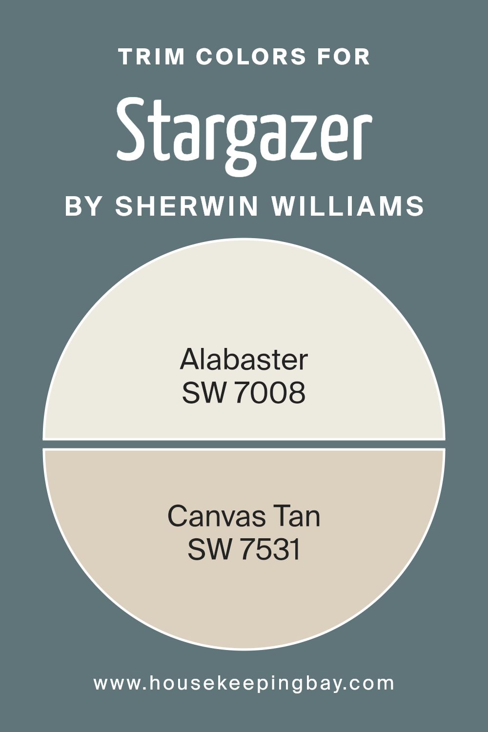
What are the Trim colors of Stargazer SW 9635 by Sherwin Williams?
Trim colors are used to accentuate the architectural features of a room, by providing contrast or cohesion with the wall paint. For example, the color Stargazer SW 9635 by Sherwin Williams, which is a deep and rich hue, is ideally complemented by trim colors.
Trim colors like SW 7008 – Alabaster and SW 7531 – Canvas Tan highlight the intricate details such as moldings, door frames, and window sills, enhancing the overall impression of the space. The chosen trim colors should balance well with the main paint color to create a harmonious look that delineates different elements within a room, making the space aesthetically pleasing.
Alabaster SW 7008 is a soft, white shade that brings a bright and fresh look to any space, offering a sharp contrast against darker tones like Stargazer SW 9635, thereby accentuating the room’s features with its crisp finish. Canvas Tan SW 7531, on the other hand, is a warmer, neutral tone that blends smoothly into settings that feature earthier, deeper colors, facilitating a seamless transition between wall and trim without stark contrasts, but still providing subtle differentiation to highlight architectural details.
You can see recommended paint colors below:
housekeepingbay.com
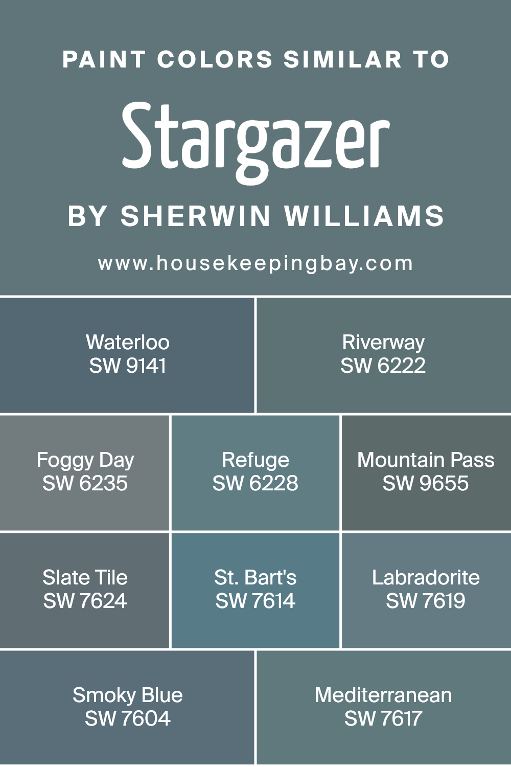
Colors Similar to Stargazer SW 9635 by Sherwin Williams
In interior design, the importance of selecting similar colors cannot be overstated, as they help create a harmonious and cohesive ambiance. Similar colors, like those akin to Stargazer SW 9635 by Sherwin Williams, have subtle differences that add depth and complexity to a space without creating stark contrasts.
This palette allows for a smooth visual transition from one area to another, enhancing the overall aesthetic continuity within a room or throughout a home. When colors like Waterloo SW 9141, a moody gray-blue, or the darker Riverway SW 6222, which brings a deep teal vibe, are used together, they unify the environment while allowing unique aspects of each hue to stand out gently.
Colors such as Foggy Day SW 6235 provide a muted, sophisticated gray backdrop that complements darker shades like Refuge SW 6228, a rich navy blue, or the lush green of Mountain Pass SW 9655, allowing for versatile design choices. Slate Tile SW 7624 gives a balanced, steely gray that pairs well with vivid tones like St. Bart’s SW 7614, a cheerful ocean blue.
Adding intrigue are shades like Labradorite SW 7619, a deep, earthy gray with blue undertones, and Smoky Blue SW 7604, a subdued blue with a hint of gray, which work impressively well to build a refined yet inviting space.
Lastly, the subtle green of Mediterranean SW 7617 links these colors in a seamless narrative of style and subtlety.
Using these similar hues helps maintain a theme that is both visually appealing and thoroughly thought out, ensuring each room feels connected yet distinct.
You can see recommended paint colors below:
- SW 9141 Waterloo
- SW 6222 Riverway
- SW 6235 Foggy Day
- SW 6228 Refuge
- SW 9655 Mountain Pass
- SW 7624 Slate Tile
- SW 7614 St. Bart’s
- SW 7619 Labradorite
- SW 7604 Smoky Blue
- SW 7617 Mediterranean
housekeepingbay.com
How to Use Stargazer SW 9635 by Sherwin Williams In Your Home?
Stargazer SW 9635 by Sherwin Williams is a soothing dark blue color that’s perfect for adding a sense of calm and sophistication to any room. It’s a versatile shade that works well in various areas of your home, such as bedrooms, living rooms, or bathrooms. If you’re thinking of repainting, Stargazer can create a peaceful atmosphere, ideal for spaces where relaxation is key.
Using it on a feature wall will add a lovely depth to your space, making it a focal point without overwhelming other design elements. Pairing this hue with light furniture or decor helps maintain balance and ensures the room remains airy and bright. In bathrooms, consider Stargazer for cabinet or vanity updates, complementing it with neutral tiles and fixtures for a fresh, modern look.
For those who enjoy DIY projects, updating furniture with Stargazer paint can totally renew the look of older pieces. Whether it’s bookshelves or nightstands, it could give them a charming yet contemporary edge.
Stargazer SW 9635 by Sherwin Williams vs Refuge SW 6228 by Sherwin Williams
Stargazer SW 9635 by Sherwin Williams is a deep, celestial navy blue that evokes the vastness of the night sky. It’s a strong color that adds sophistication and depth to spaces. Being a darker shade, it’s ideal for creating a cozy, intimate atmosphere in a room, making it perfect for bedrooms or living rooms.
Refuge SW 6228, on the other hand, is a softer, mid-tone blue with green undertones. It yields a calm and soothing feel, suitable for spaces where relaxation is key, like bathrooms or bedrooms. The lighter, fresher tone of Refuge offers a more airy and open vibe, which can make smaller spaces appear larger.
Both colors bring unique moods and aesthetics to interiors. Stargazer, with its darker tone, provides a robust, dramatic look, while Refuge offers a lighter, refreshing feel, helping to brighten up spaces. Depending on what ambiance you want to achieve, each color has its distinct advantages for different environments and design tastes.
You can see recommended paint color below:
- SW 6228 Refuge

housekeepingbay.com
Stargazer SW 9635 by Sherwin Williams vs Waterloo SW 9141 by Sherwin Williams
Stargazer SW 9635 by Sherwin Williams is a deep, rich blue with a vibrant intensity, ideal for creating a bold and impactful ambiance in any room. This color has a dynamic quality that stands out on walls, making it a great choice for focal points or accent areas in a home.
Waterloo SW 9141, also by Sherwin Williams, is a softer, smoky blue with grey undertones. It offers a more subdued appearance, making it perfect for a calming and soothing environment. This color works well in spaces where relaxation is a key aspect, such as bedrooms and bathrooms.
While both colors share a blue base, Stargazer is brighter and more eye-catching, whereas Waterloo is more muted and understated. The choice between them depends on the desired mood and style of the room. Stargazer draws attention and adds energy, while Waterloo promotes a sense of calm and serenity.
You can see recommended paint color below:

housekeepingbay.com
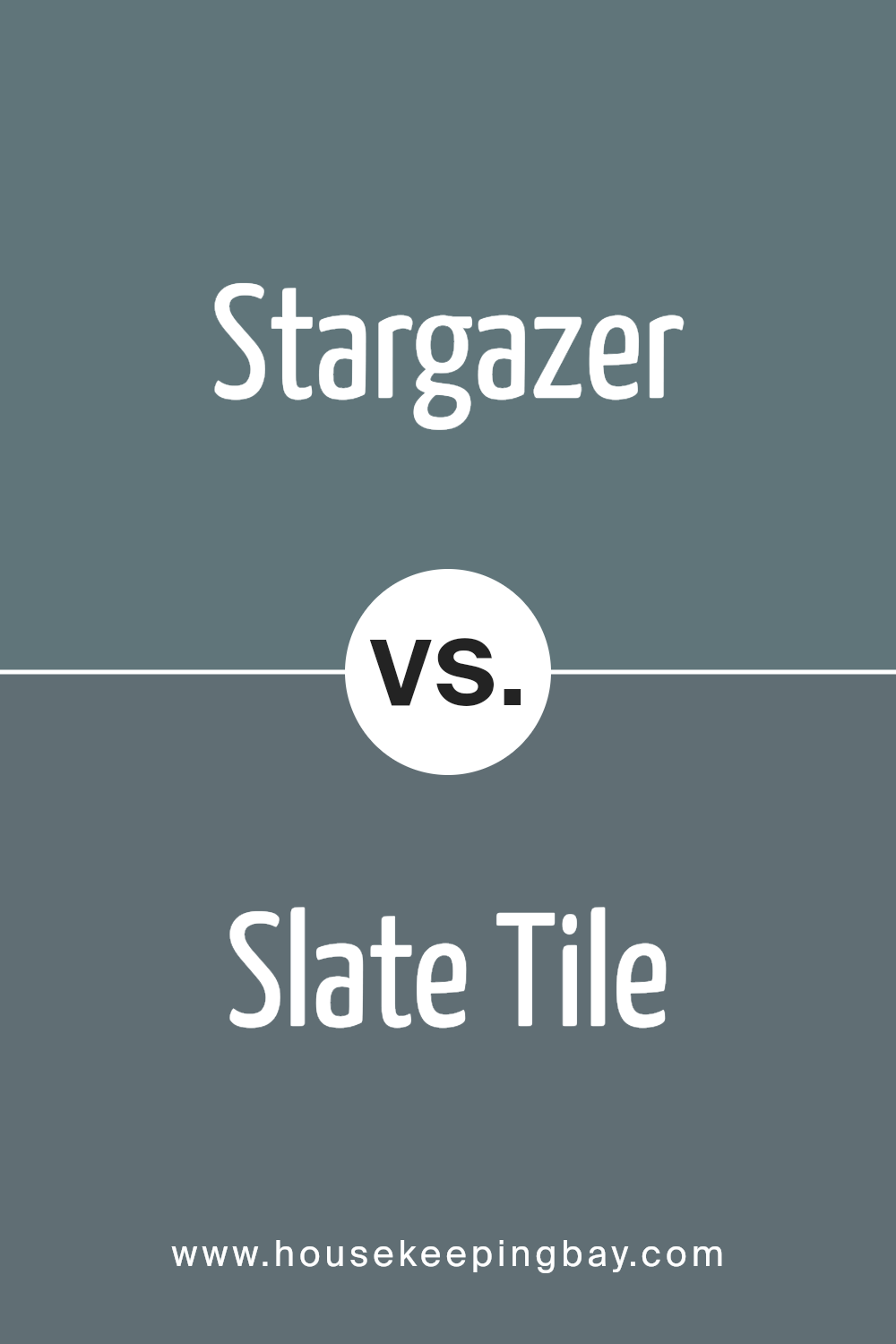
Stargazer SW 9635 by Sherwin Williams vs Slate Tile SW 7624 by Sherwin Williams
Stargazer SW 9635 by Sherwin-Williams is a deep, vibrant teal that pairs a sense of sophistication with a dash of boldness. This shade feels cozy yet stands out, making it suitable for a feature wall or as an accent in accessories and furniture.
In contrast, Slate Tile SW 7624 is a cooler, darker blue-gray, reminiscent of the color of its namesake. This color offers a more subdued and neutral backdrop, perfect for creating a serene atmosphere in rooms where calm is key, such as bedrooms and bathrooms.
While Stargazer brings life and energy to a space with its rich teal hue, Slate Tile lends a more understated and versatile touch. The latter works well in various settings due to its neutral tone, supporting a range of design styles from modern to traditional. Depending on your decor goals, each color offers unique attributes: Stargazer adds vibrancy, and Slate Tile provides a calming presence.
You can see recommended paint color below:
- SW 7624 Slate Tile
housekeepingbay.com
Stargazer SW 9635 by Sherwin Williams vs Foggy Day SW 6235 by Sherwin Williams
Stargazer SW 9635 by Sherwin Williams is a vibrant blue with an energetic vibe, ideal for adding a splash of color to a space. It’s bold and noticeable, perfect for a focal point in a room. In contrast, Foggy Day SW 6235 is a subdued, gray shade that provides a calm and soothing effect.
This makes it excellent for creating a peaceful, restful environment. Stargazer could be the better choice for lively areas like a home office or a playroom, where energy is welcome. Meanwhile, Foggy Day works well in spaces designed for relaxation, like bedrooms or living areas.
The brightness of Stargazer might make a room feel smaller, while the neutrality of Foggy Day can make spaces appear larger, reflecting light subtly. Both colors offer distinct moods and can serve different functional or aesthetic needs in a home decorating plan.
You can see recommended paint color below:

housekeepingbay.com
Stargazer SW 9635 by Sherwin Williams vs Labradorite SW 7619 by Sherwin Williams
Stargazer SW 9635 by Sherwin Williams is a deep, rich navy blue that evokes a sense of calmness and solidity. This color is perfect for creating a strong but serene backdrop in rooms, making spaces feel more intimate and cozy. It works well in bedrooms or offices where a peaceful environment is desired.
Labradorite SW 7619, from the same brand, offers a lighter, muted gray-blue shade. This color is versatile and subtle, making it an excellent choice for living areas and bathrooms where a more relaxed mood is preferred. It pairs well with a wide range of décor styles, from modern to rustic.
In comparing the two, Stargazer is decidedly bolder and more dramatic, best suited for creating focal points or emphasizing cozy nooks. Labradorite, meanwhile, is softer and more adaptable, functioning beautifully as a neutral backdrop for various interior elements. Both colors have their unique appeal, whether you want depth and drama or gentle and soothing vibes.
You can see recommended paint color below:
- SW 7619 Labradorite

housekeepingbay.com
Stargazer SW 9635 by Sherwin Williams vs Mountain Pass SW 9655 by Sherwin Williams
Stargazer SW 9635 by Sherwin Williams is a deep, vibrant teal that feels both energetic and calming. It’s a bold color that can create a sense of coziness and focus in a space. This would suit areas where a strong, but not overpowering, presence is needed. It pairs well with neutral tones and wood finishes, bringing a natural balance to the environment.
Mountain Pass SW 9655, by contrast, is a dark, earthy green. It gives a room a grounding, serene vibe, perfect for spaces meant for relaxation or quiet concentration. This color works especially well in personal spaces like bedrooms or studies, where the darker tone helps in making the space feel secure and enclosed.
Both colors provide unique atmospheres: Stargazer adds a punch of color while maintaining sophistication, whereas Mountain Pass offers a more subtle, nature-inspired feel. Both are versatile and can be used effectively to create specific moods in interior decorating.
You can see recommended paint color below:
- SW 9655 Mountain Pass

housekeepingbay.com
Stargazer SW 9635 by Sherwin Williams vs St. Bart’s SW 7614 by Sherwin Williams
Stargazer SW 9635 by Sherwin Williams is a deep, intense blue with a vibrant quality that adds a bold touch to any space. It is inspired by the night sky and carries a strong presence, making it perfect for focal points or accent walls in a room.
St. Bart’s SW 7614 by Sherwin Williams, in contrast, is a softer, calmer shade of blue. It has a greenish tint that softens its appearance, lending it a more relaxed and soothing vibe. This color works well in spaces meant for relaxation, such as bedrooms or bathrooms.
While Stargazer stands out and commands attention with its richness, St. Bart’s offers a gentle backdrop that encourages a peaceful environment. Choosing between them depends on the atmosphere you wish to create, whether vibrant and dynamic with Stargazer or serene and gentle with St. Bart’s. Both colors provide distinct but equally harmonious options for updating a space.
You can see recommended paint color below:
- SW 7614 St. Bart’s

housekeepingbay.com
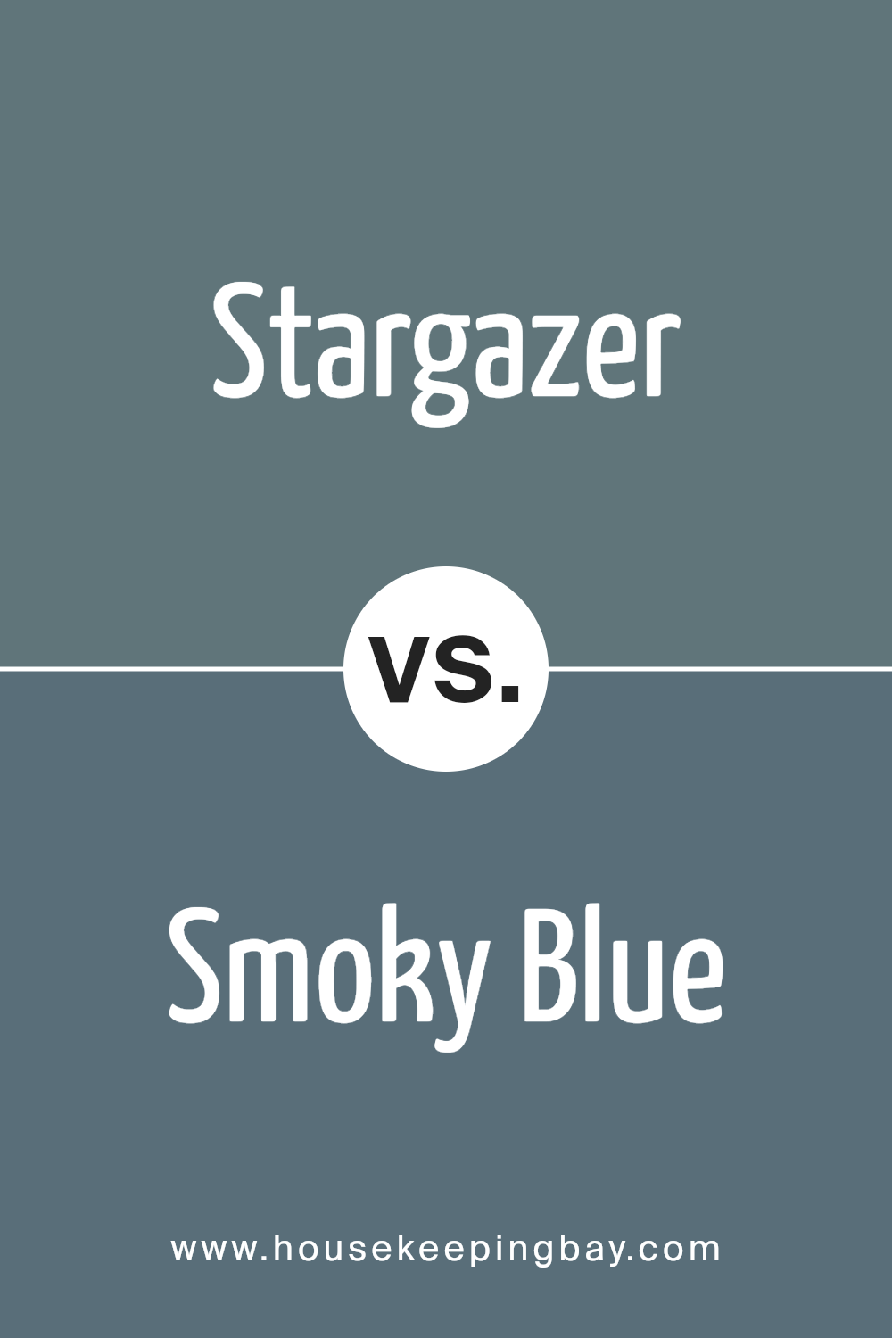
Stargazer SW 9635 by Sherwin Williams vs Smoky Blue SW 7604 by Sherwin Williams
The main color, Stargazer SW 9635 from Sherwin-Williams, is a rich navy blue with a deep, cosmic vibe. It suggests a clear night sky, offering a sense of depth and serenity to any space. This color is ideal for bringing a strong, yet soothing presence to rooms, especially when used on accent walls or in cozy nooks.
In contrast, Smoky Blue SW 7604, is a softer, more muted blue with gray undertones. This shade is lighter and leans towards a more understated, gentle appearance. It’s perfect for creating a peaceful atmosphere in spaces like bedrooms or bathrooms, where a calm, gentle feel is desired.
Both colors share a blue base, but Stargazer is much bolder and darker, creating a more dramatic effect. Smoky Blue, meanwhile, is subtler and blends easily with various decor styles, providing a versatile backdrop. Depending on your room’s purpose and the mood you want to set, either color can enhance the space beautifully with their unique tones.
You can see recommended paint color below:
housekeepingbay.com
Stargazer SW 9635 by Sherwin Williams vs Mediterranean SW 7617 by Sherwin Williams
Stargazer SW 9635 by Sherwin Williams is a rich navy blue that brings a sense of sophistication and depth to spaces. It works well in both traditional and modern decor, providing a strong backdrop that highlights decor items or furniture. This color is particularly effective in creating a cozy, inviting atmosphere, ideal for living rooms or bedrooms.
Mediterranean SW 7617, by contrast, is a vibrant teal shade that feels fresh and lively. It mimics the cheerful essence of oceanic hues, making it perfect for bathrooms or kitchens where a bright, clean look is desired. It pairs beautifully with whites and grays to maintain a light and airy ambiance.
While both colors bring unique vibes to a room, Stargazer leans towards a formal, elegant look, whereas Mediterranean is more casual and refreshing. Depending on the mood you want to set, either color offers a beautiful option for transforming a space.
You can see recommended paint color below:
- SW 7617 Mediterranean

housekeepingbay.com
Stargazer SW 9635 by Sherwin Williams vs Riverway SW 6222 by Sherwin Williams
Stargazer SW 9635 by Sherwin Williams is a deep, vibrant teal that brings a sense of freshness and energy to any space. It’s a bold choice, perfect for adding a splash of color to rooms that need a lift. This color can make a strong statement when used on accent walls or furniture.
Riverway SW 6222, also by Sherwin Williams, is a darker shade of teal. It leans more towards a soothing green-blue, offering a grounded, serene feel. It’s more subtle than Stargazer and works well in larger areas or as a primary room color, providing a calming backdrop that’s easy on the eyes.
Both colors share a teal base, but their impact and mood differ significantly. Stargazer leans towards a brighter, more energetic teal, while Riverway offers a deeper, cozier feel. Choosing between them depends on the desired effect: vibrant and lively with Stargazer, or soothing and tranquil with Riverway.
You can see recommended paint color below:

housekeepingbay.com
Conclusion
Sherwin Williams SW 9635 Stargazer is a rich, deep navy with subtle green undertones that feels both bold and approachable. It’s one of those colors that can completely transform a space without feeling overbearing. In bedrooms, it creates a cozy and calm atmosphere, perfect for unwinding. In living rooms or dining areas, it brings a sense of sophistication and depth, especially when paired with warm woods or brass accents.
Stargazer also works beautifully for kitchen or bathroom cabinets, giving them a modern yet timeless look. It’s a color that holds its own in natural light but also shines in moodier, low-light spaces, making it versatile for different styles and rooms.
If you’re someone who loves experimenting with deeper tones but still wants a shade that’s versatile and easy to coordinate, Stargazer could be a fantastic choice. Pair it with crisp whites for contrast, soft grays for balance, or even earthy greens or tans for a harmonious palette. It’s a color that feels thoughtful and adds a bit of character to any room.

housekeepingbay.com
Ever wished paint sampling was as easy as sticking a sticker? Guess what? Now it is! Discover Samplize's unique Peel & Stick samples. Get started now and say goodbye to the old messy way!
Get paint samples


