Silver Satin OC-26 by Benjamin Moore
Simple Elegance in Every Stroke
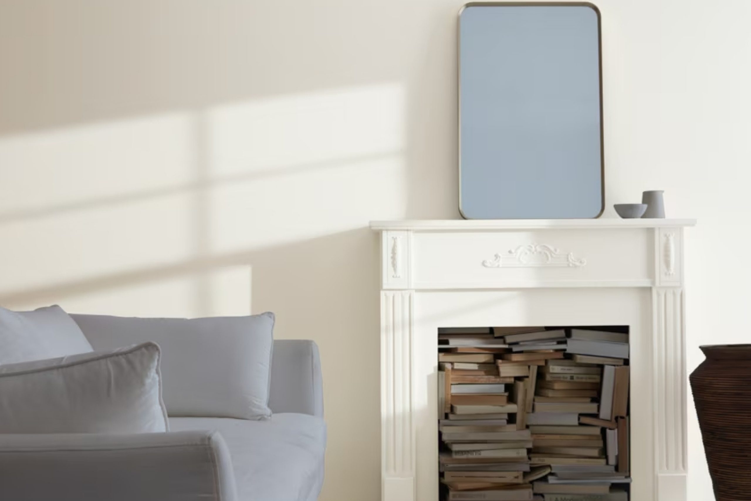
Imagine a color that brings a sense of calm and elegance to your living space. OC-26 Silver Satin by Benjamin Moore does just that. As a soft, neutral shade, it offers a perfect balance between warmth and coolness. You might find that it effortlessly complements a variety of interior styles, from modern to traditional.
With its subtle sophistication, Silver Satin can create a serene atmosphere in any room. It gently reflects light, enhancing the space without overwhelming it. Whether you’re considering a complete home makeover or just refreshing a single room, this shade provides a timeless and versatile choice.
By opting for Silver Satin, you allow other elements in the room—furniture, art, and textures—to stand out, creating a harmonious environment that feels both welcoming and refined.
So, delve into the possibilities Silver Satin offers, and let it lend its understated charm to your walls.
via benjaminmoore.com
What Color Is Silver Satin OC-26 by Benjamin Moore?
Silver Satin OC-26 by Benjamin Moore is a gentle, light gray with soft undertones. It provides a refined and subtle backdrop that suits various interior styles. Its versatile nature allows it to adapt to both modern and traditional settings seamlessly. Being a light gray, it works perfectly in spaces where you wish to create a serene and calm atmosphere.
In minimalist interiors, Silver Satin provides a clean, neutral base that complements sleek furniture and modern décor.
Pair it with natural materials for a harmonious look. It looks striking next to light woods, enhancing the warm tones of oak or birch. For a more contemporary edge, combine it with metals like brushed nickel or stainless steel. Silver Satin also plays well with textures like linen and cotton, adding a soft, cozy touch to living rooms or bedrooms.
In Scandinavian-inspired interiors, it aligns beautifully with white furniture and simple lines, keeping the overall look fresh and airy. In coastal themes, match it with blue and sandy tones to bring a breezy feel.
Silver Satin’s adaptability also makes it a fine option for transitional styles, where it can balance traditional elements with modern accents, creating a well-coordinated space.
housekeepingbay.com
Is Silver Satin OC-26 by Benjamin Moore Warm or Cool color?
Silver Satin OC-26 by Benjamin Moore is a versatile and soft shade that offers a light, airy feel in homes. This color, with its pale gray undertones, reflects light well, making spaces appear larger and brighter. Its subtle warmth helps it blend seamlessly with various design styles, from modern to traditional.
In living rooms, Silver Satin can create a calm, inviting atmosphere, especially when paired with white trim or natural wood accents. In bedrooms, it provides a soothing backdrop for relaxation, where soft textiles and muted tones can enhance its calming effect.
Kitchens benefit from its clean, fresh look, particularly when contrasted with stainless steel appliances or marble countertops. Bathrooms feel more spacious and serene with this gentle hue on the walls. Overall, Silver Satin OC-26 can enhance interiors by providing a neutral, elegant base that complements a wide range of furnishings and decor elements.
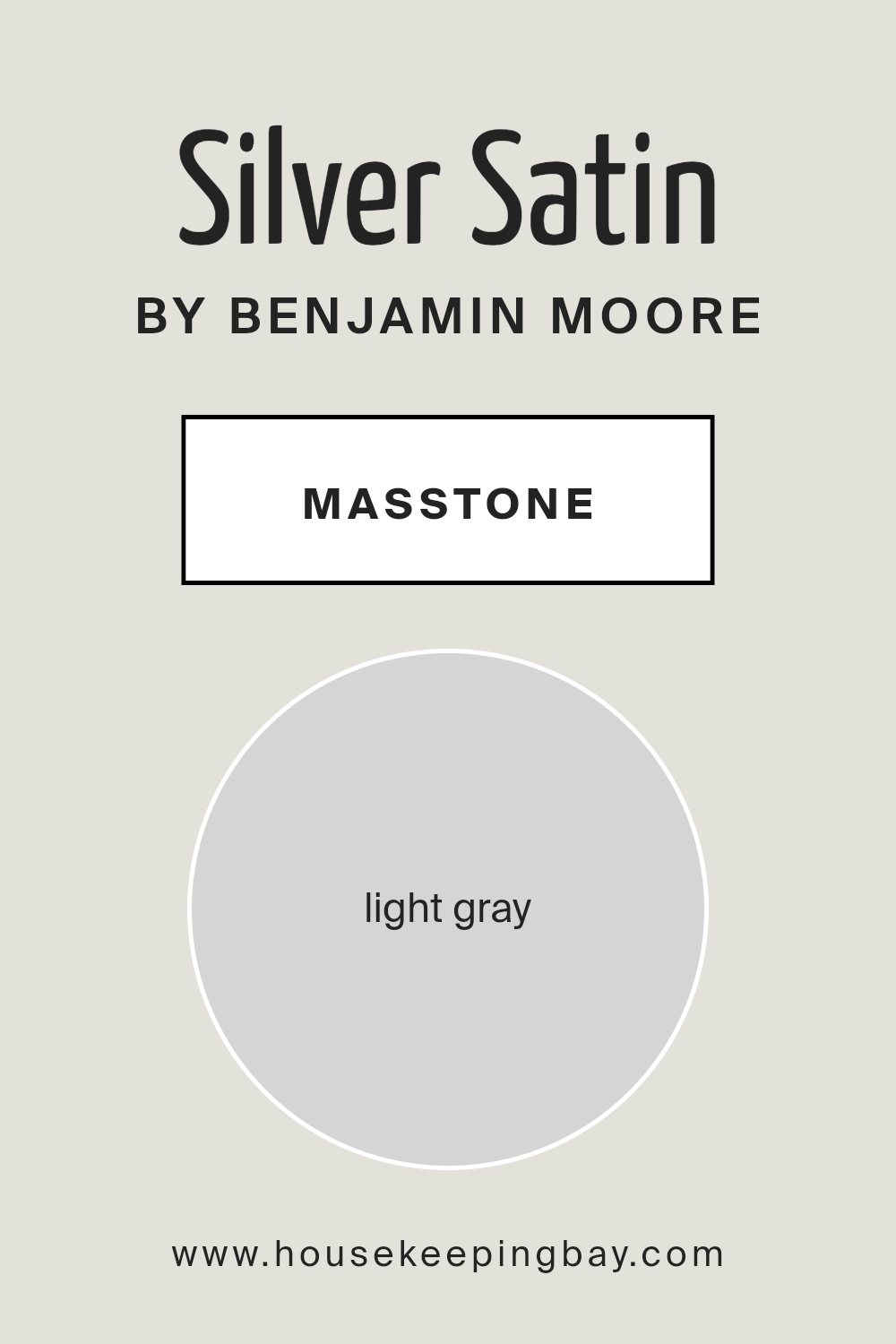
What is the Masstone of the Silver Satin OC-26 by Benjamin Moore?
Silver Satin OC-26 by Benjamin Moore is a light gray color that can bring a soft and airy feel to any home. With its masstone of light gray (#D5D5D5), this color offers a subtle and sophisticated touch, perfect for various spaces.
The lightness of the shade helps in making rooms feel more open and spacious. It reflects natural light beautifully, creating a bright and welcoming atmosphere. This makes Silver Satin a great choice for small rooms or areas where natural light might be limited.
In living rooms or bedrooms, Silver Satin can serve as a neutral backdrop that complements other colors and textures. It pairs well with bolder accents, allowing artwork, furniture, or decor pieces to stand out without overwhelming the space.
This hue also works well in kitchens or bathrooms, contributing to a clean and modern look. Its versatility and calming effect make Silver Satin OC-26 a timeless choice for any home setting.
housekeepingbay.com
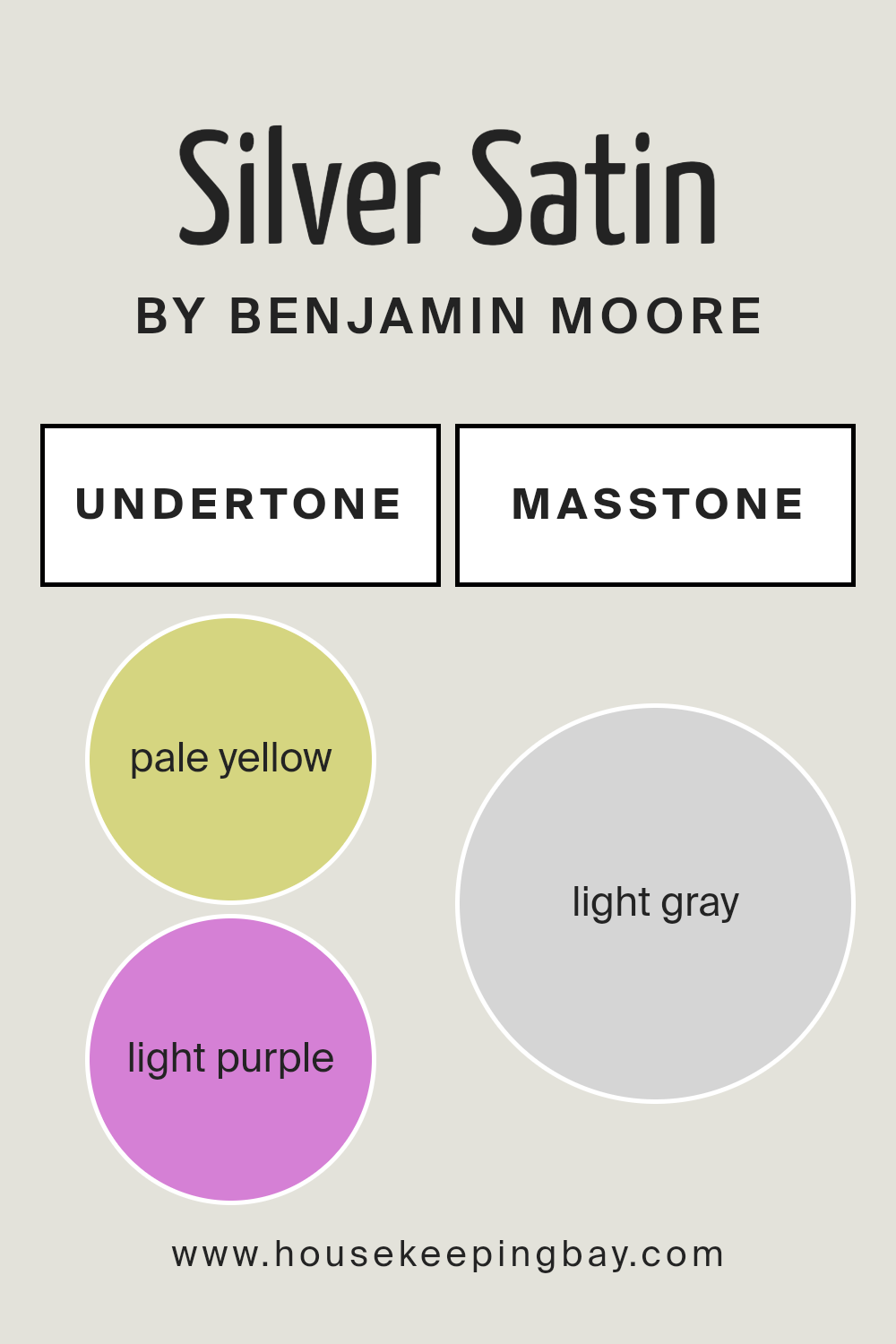
Undertones of Silver Satin OC-26 by Benjamin Moore
Silver Satin OC-26 by Benjamin Moore is a versatile and elegant paint color often used in interiors. It might seem simple at first, but it has several subtle undertones that add to its charm. The undertones of Silver Satin include pale yellow, light purple, light blue, pale pink, mint, lilac, and grey. These undertones can change the way the color appears, depending on the lighting and surrounding colors in a room.
When a color like Silver Satin has many undertones, it can adapt to different environments. In natural daylight, the color may look cooler because the blue and grey undertones become more noticeable.
In contrast, under warm artificial lighting, the pale yellow, pink, or mint undertones can add warmth, making the space feel cozy.
On interior walls, Silver Satin’s undertones create a subtle and sophisticated atmosphere. In rooms with lots of natural light, the walls might look light and airy. In spaces with less light or warmer artificial lighting, the paint can have a warmer, more inviting appearance.
Overall, these undertones allow Silver Satin OC-26 to work well with a variety of decor styles and color schemes, making it a popular choice for many homeowners.
housekeepingbay.com
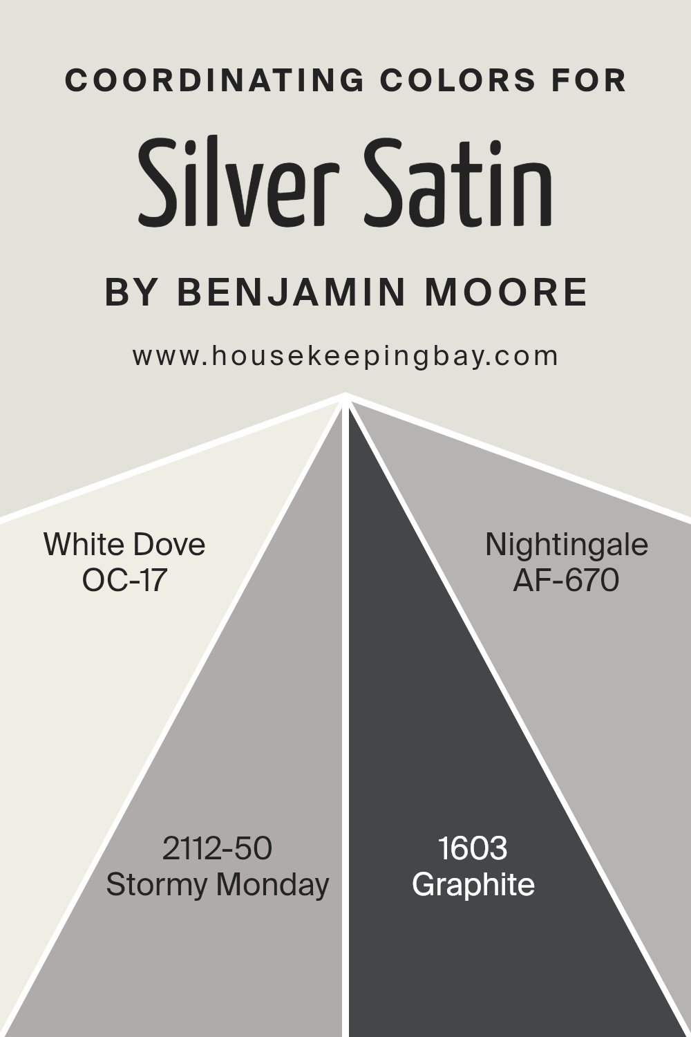
Coordinating Colors of Silver Satin OC-26 by Benjamin Moore
Coordinating colors are hues that work well together to create a pleasing and harmonious look. When choosing coordinating colors, it’s important to consider undertones and the overall mood you want to achieve in a space. For the elegant Silver Satin OC-26 by Benjamin Moore, there are several colors that complement and enhance its beauty.
White Dove OC-17 is a soft, warm white that provides a gentle contrast, ideal for creating a bright and airy feel. It’s versatile and works well as a trim or ceiling color with Silver Satin.
Stormy Monday 2112-50 introduces a muted, moody gray with purple hints, adding depth and sophistication. This color provides a sophisticated backdrop, especially in living areas or bedrooms where a cozy atmosphere is desired. Graphite 1603, a deep, rich charcoal, offers a bold contrast, providing grounding elements to the palette.
It is perfect for accent walls or furniture pieces, adding a touch of drama. Nightingale AF-670 brings in a subtle taupe that softens the overall palette, giving a serene and balanced look. This color is excellent for creating a calm and neutral space, enhancing the elegance of Silver Satin.
Together, these colors create a cohesive and inviting environment without overwhelming the senses.
You can see recommended paint colors below:
- OC-17 White Dove
- 2112-50 Stormy Monday
- 1603 Graphite
- AF-670 Nightingale
housekeepingbay.com
How Does Lighting Affect Silver Satin OC-26 by Benjamin Moore?
Lighting significantly impacts how we perceive colors. It can change their tone, depth, and brightness. Silver Satin OC-26 by Benjamin Moore is a light, soft gray with a hint of warmth, making it versatile for various lighting conditions.
In natural light, Silver Satin tends to show its true color. This means you’ll see a balanced gray with slight undertones that shift subtly depending on the room’s direction. In artificial lighting, the hue can change based on the type of bulbs used.
Warm bulbs can make it appear creamy and soft, while cool bulbs can bring more of a crisp, gray feel to the forefront.
In north-facing rooms, light tends to be cooler and more indirect, which can make Silver Satin appear slightly more blue or gray. Its warmth might be subdued, giving it a cooler, modern look. In south-facing rooms, the light is warmer and more direct for much of the day. This enhances the warm undertones of Silver Satin, causing it to appear more inviting and soft.
East-facing rooms receive cool, morning light and warmer, afternoon tones. In the morning, Silver Satin might look cooler, enhancing any gray or blue undertones. As the day progresses, those creamy undertones may become more pronounced.
In west-facing rooms, the opposite occurs. The light in the afternoon and evening tends to be warmer, highlighting any warm aspects of the color.
Choosing Silver Satin means considering how lighting influences its appearance based on the room’s orientation. By understanding how various lighting affects it, you can make better decisions about where to use this color effectively.
Whether for a calming bedroom or a welcoming living room, Silver Satin’s adaptable nature suits varied spaces, depending on the light available.
housekeepingbay.com
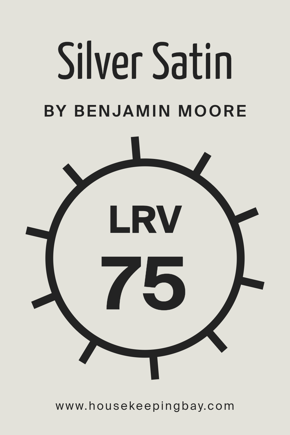
What is the LRV of Silver Satin OC-26 by Benjamin Moore?
LRV, or Light Reflectance Value, measures the percentage of light a paint color reflects. This scale ranges from 0% to 100%, where 0% means complete absorption (pure black), and 100% indicates full reflection (pure white).
When a color has a high LRV, like Benjamin Moore’s Silver Satin OC-26 with its value of 74.9, it reflects a lot of light. This can make spaces feel brighter and more open, as high-LRV colors bounce sunlight and artificial light around the room.
Designers often use colors with higher LRV to make smaller areas feel larger or to infuse dim rooms with more light.
For Silver Satin OC-26, its LRV of 74.9 means it reflects a substantial amount of light, making it an excellent choice to add brightness to any room. This color leans towards a light, soft gray with subtle warmth, which helps it work in a variety of settings.
Due to its high LRV, Silver Satin can make a modest space appear more open and inviting. It’s versatile, as it enhances natural light during the day and responds well to indoor lighting at night, ensuring spaces always feel airy.
This makes it a popular choice for living rooms, bedrooms, and even kitchens, where a clean, bright look is often desired.
housekeepingbay.com
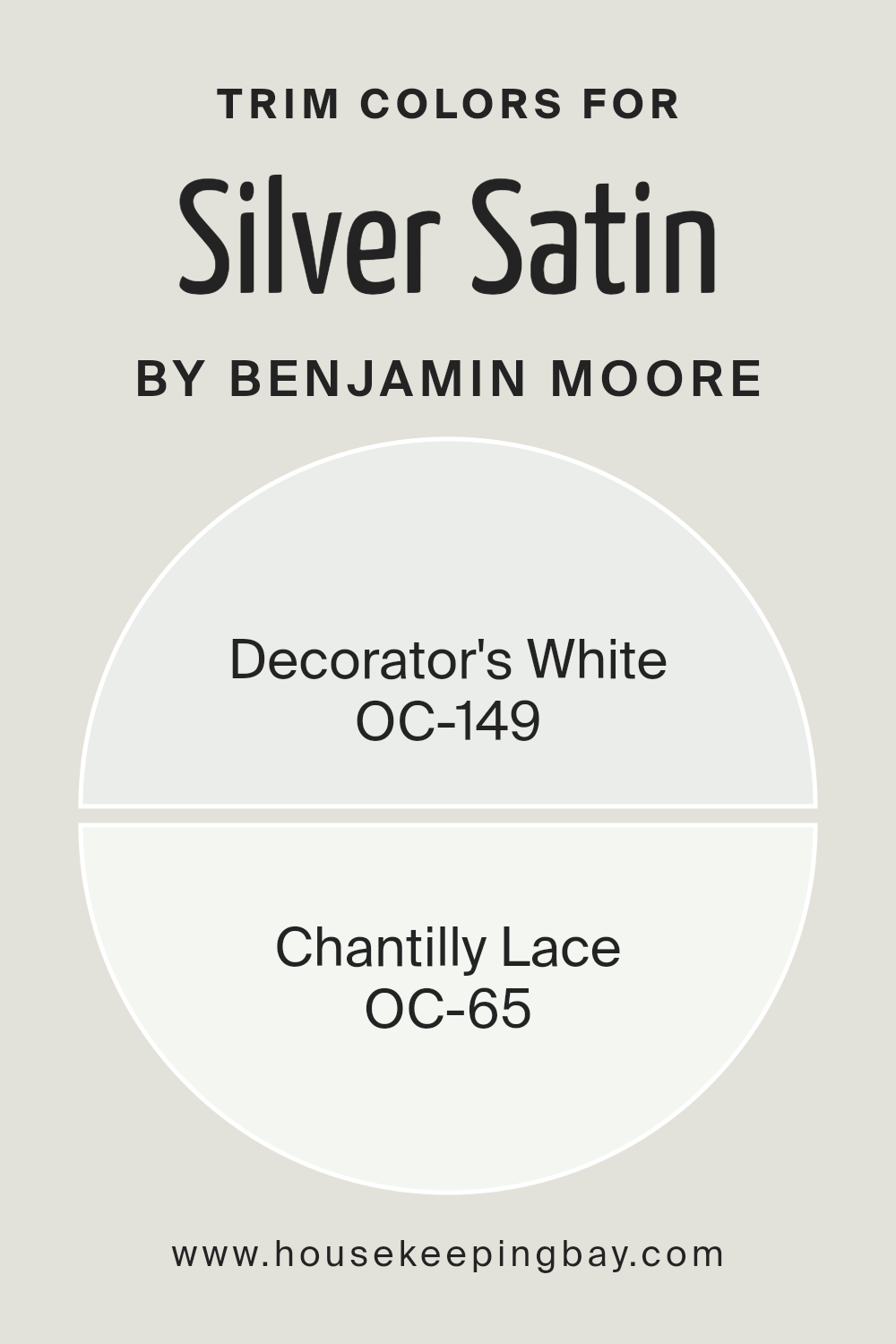
What are the Trim colors of Silver Satin OC-26 by Benjamin Moore?
Trim colors refer to the shades used for the edges and details of a room, such as baseboards, moldings, and door frames. They’re crucial for creating a contrast or harmony with the primary wall color, enhancing the room’s overall appearance.
For Benjamin Moore’s Silver Satin OC-26, which is a soft, light gray with subtle undertones, choosing the right trim color is important to achieve the desired look. Silver Satin has a gentle, calming presence, so pairing it with the right trim can either highlight its softness or add a crisp finish to the overall design.
Using Decorator’s White OC-149 or Chantilly Lace OC-65 as trim colors can bring out the beauty of Silver Satin and give a room a clean and sophisticated feel.
Decorator’s White OC-149 is a versatile white that complements most colors, including Silver Satin. It offers a clean, bright edge without harshness, making spaces feel airy and open. Chantilly Lace OC-65 provides a similar brightening effect but with a purer white tone.
It has a simple elegance that can add a fresh, polished look to any space. Both of these trim colors create a clear definition against the softer Silver Satin walls, resulting in a visually pleasing and tidy appearance.
Using such trim colors can make the overall space feel more cohesive and elegantly framed, enhancing both the primary wall color and the room’s architecture.
You can see recommended paint colors below:
housekeepingbay.com
Colors Similar to Silver Satin OC-26 by Benjamin Moore
Colors play a crucial role in creating harmonious spaces. When decorating with Silver Satin OC-26 by Benjamin Moore, selecting similar colors like OC-23 Classic Gray can bring balance and unity to a room’s design. Similar colors, also known as analogous colors, sit next to each other on the color wheel.
They work well together because they share common undertones, creating a cohesive and soothing look. Using similar colors helps maintain a consistent visual flow, allowing different elements in a space to blend seamlessly.
This technique is particularly effective in open floor plans or when connecting various rooms, as it subtly guides the eye and provides a gentle transition between spaces.
Classic Gray OC-23, another color by Benjamin Moore, offers a soft and warm undertone. Its gentle hue can add a touch of warmth to a space, pairing beautifully with the cooler undertones of Silver Satin. Classic Gray is versatile, working well in both traditional and modern settings.
When these colors are used together, they create a gentle, inviting atmosphere. This combination can enhance the overall aesthetic of a space, creating a sense of comfort and elegance.
By pairing these shades, one can achieve a sophisticated yet understated look that appeals to a wide range of tastes and styles.
You can see recommended paint color below:
housekeepingbay.com
How to Use Silver Satin OC-26 by Benjamin Moore In Your Home?
Silver Satin OC-26 by Benjamin Moore is a popular paint color choice for those who enjoy soft, neutral tones. This color is a light gray with a hint of warmth, making it versatile for different spaces in a home. It works particularly well in living rooms, bedrooms, and kitchens, providing a soothing backdrop that complements various furniture styles and color schemes.
Homeowners can use Silver Satin to make smaller spaces feel more open and airy. Its subtle tone enhances natural light without overpowering the room.
Pairing it with white trim creates a clean, classic look, while adding darker accents can offer a touch of contrast and depth. In bedrooms, Silver Satin helps create a restful atmosphere, promoting relaxation at the end of a long day.
It also works beautifully in kitchens, matching stainless steel appliances and modern finishes. For a cohesive look throughout your home, consider using this color in multiple rooms.
Silver Satin OC-26 by Benjamin Moore vs Classic Gray OC-23 by Benjamin Moore
Silver Satin OC-26 and Classic Gray OC-23 by Benjamin Moore are two popular paint colors, each with its own unique character.
Silver Satin OC-26 is a soft and refined shade of off-white. It carries a hint of warmth, making spaces feel cozy without overwhelming them. This color has a slight cool undertone, providing a crisp and fresh look, ideal for brightening rooms. It’s perfect for those who enjoy a modern yet inviting ambiance.
Classic Gray OC-23, while also a light neutral, leans slightly more towards gray than beige. It offers a gentle warmth that works well in most rooms, creating a serene and calming atmosphere. Its understated nature makes it versatile, blending effortlessly with various decor styles and providing a subtle backdrop.
Both colors exhibit a timeless elegance, but Silver Satin’s slightly cooler tone suits modern, sleek designs, while Classic Gray’s warmth fits traditional, cozy spaces. Both are excellent choices, offering flexibility and sophistication to any room.
You can see recommended paint color below:
housekeepingbay.com
This soft, neutral gray holds great versatility, adapting to any design scheme with ease. It brings a sense of calm and comfort, making spaces feel more open and inviting.
Whether used in living rooms, kitchens, or bedrooms, Silver Satin provides a perfect backdrop that highlights both bold and subtle decor choices. It balances natural light beautifully, adding a gentle brightness to any room without overwhelming the senses.
I appreciate how it works harmoniously with both warm and cool tones, making it a reliable choice for varied design styles. Choosing OC-26 Silver Satin means opting for a timeless, elegant look that remains fresh and relevant, no matter the trends.
housekeepingbay.com
Ever wished paint sampling was as easy as sticking a sticker? Guess what? Now it is! Discover Samplize's unique Peel & Stick samples. Get started now and say goodbye to the old messy way!
Get paint samples


