Seahorse 2028-70 by Benjamin Moore
A Splash of Charm to Brighten Your Space
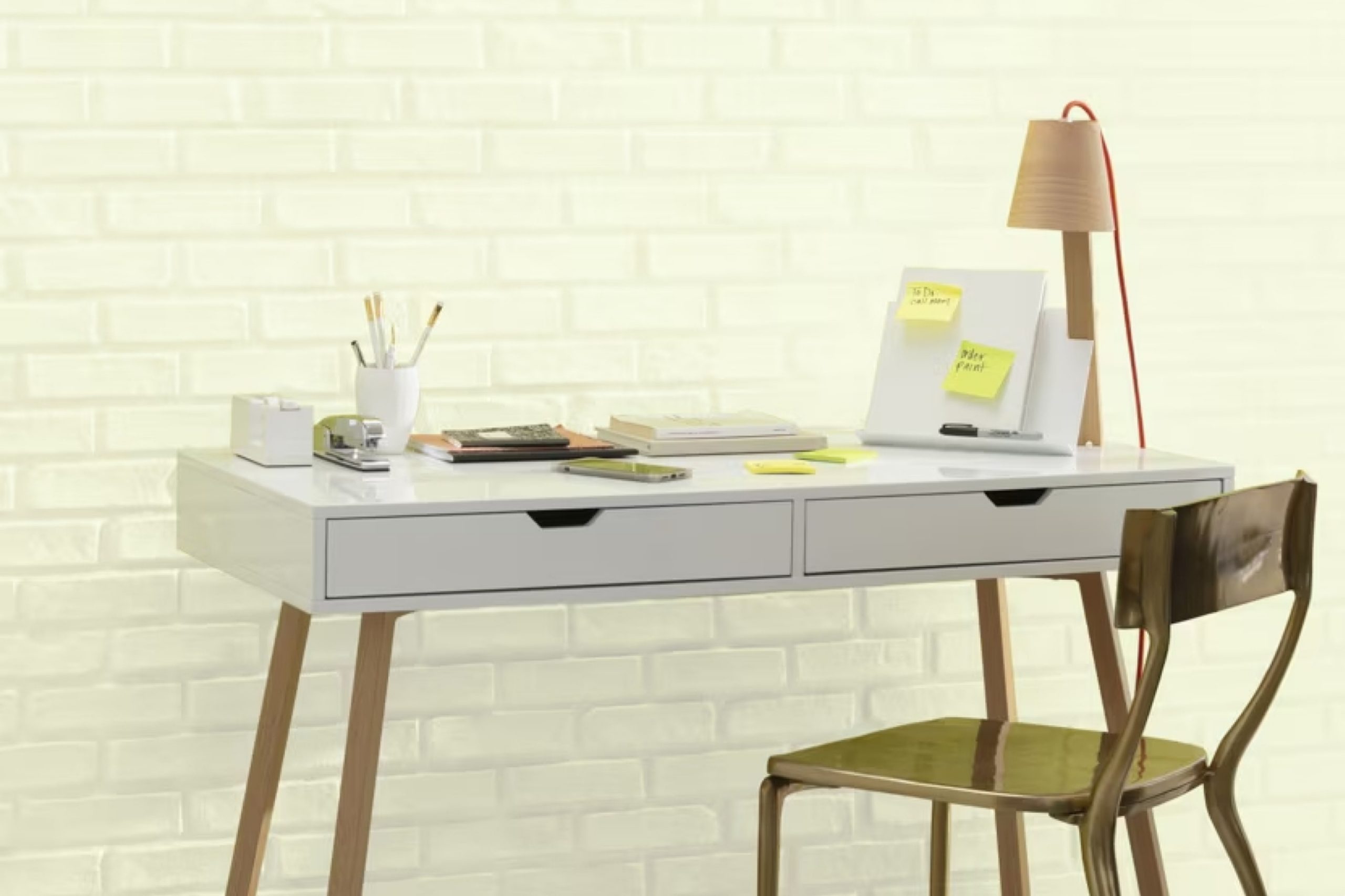
Seahorse by Benjamin Moore, strikes a perfect balance between style and tranquility. With its lovely shade of soft, muted blue, Seahorse adds a fresh and calming touch to any room. It’s gentle and welcoming, ideal for spaces meant to relax and feel at home.
Picture a serene coastal getaway, where the sea gently laps against the shore under a clear blue sky, and you’ll start to understand the essence of Seahorse.
Using Seahorse, you can create a space that feels open and peaceful, providing comfort and a sense of ease. It works beautifully in living rooms, bedrooms, or anywhere you aim to cultivate a soothing atmosphere. You may find that this particular color can enhance your surroundings without overwhelming them.
Consider pairing Seahorse with whites or soft greys for a look that is both clean and comforting.
Or use it against natural textures like wood and stone to bring out its earthy undertones. Whether as a main color or an accent, Seahorse promotes a refreshing vibe and helps produce that calm space where you can truly relax.
Plus, it complements various decor styles, making it a valuable choice for anyone looking to refresh their home.
via benjaminmoore.com
What Color Is Seahorse 2028-70 by Benjamin Moore?
Table of Contents
Seahorse 2028-70 by Benjamin Moore is a soft, muted green that brings to mind gentle ocean waves and calm environments. This color has a calming quality that makes it perfect for spaces where relaxation is key. It’s great for bedrooms, bathrooms, or any room where you want a sense of calm.
This shade works exceptionally well with coastal or beach-inspired interiors. It pairs beautifully with light, natural materials, such as rattan or light oak, enhancing the sea-inspired aesthetic. It also combines well with textured linens and cottons, adding a cozy and inviting feel to the space.
Seahorse pairs well with white or cream trims to create clean and refreshing contrasts. Additionally, it complements warm-toned metals like brass or gold and adds an elegant touch when incorporated into light fixtures or hardware. In terms of pattern, Seahorse looks great with subtle stripes or delicate floral designs, which aligns with its gentle vibe.
Whether in a living area with light wood accents or a serene bedroom with soft textiles, Seahorse 2028-70 offers a versatile color that fits naturally in serene, comfortable settings. Its muted beauty allows for a harmonious and balanced interior atmosphere.
housekeepingbay.com
Is Seahorse 2028-70 by Benjamin Moore Warm or Cool color?
Seahorse 2028-70 by Benjamin Moore is a soft, muted green with hints of gray. This calming color brings a sense of peace and simplicity to homes. Its gentle tone pairs well with natural materials like wood or stone, making it a great choice for rooms where relaxation is key, such as bedrooms or living areas.
Seahorse blends effortlessly with a variety of color palettes. It complements bright white trims and ceilings, allowing the room to feel airy and open. When combined with earthy browns and beiges, it creates a warm, inviting atmosphere.
This hue also works nicely with other pastels or soft blues and pinks, adding to a serene, cohesive look.
The understated nature of Seahorse 2028-70 makes it suitable for both modern and traditional interiors. It offers versatility, ensuring it adapts to changing styles over time, while maintaining a soothing and timeless appeal in any space.
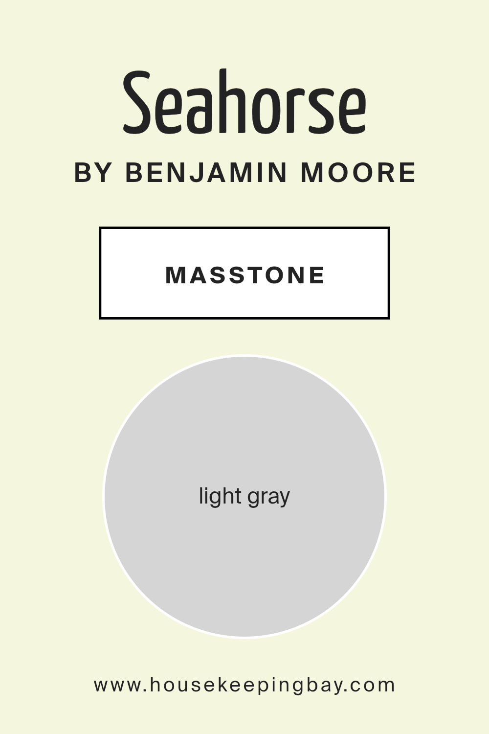
What is the Masstone of the Seahorse 2028-70 by Benjamin Moore?
Seahorse2028-70 by Benjamin Moore is a light gray color. The masstone, #D5D5D5, gives it a soft, gentle look. This shade of gray is ideal for creating a calm and welcoming atmosphere in homes. Its light tone makes spaces appear larger and more open, allowing rooms to feel airy and spacious. It is a versatile color that works well in any room, from living rooms to bedrooms to kitchens.
The neutral nature of Seahorse2028-70 means it pairs nicely with almost any other color. It blends well with bright colors, making them pop without overwhelming the space. It also complements softer, pastel tones, creating a soothing and peaceful environment.
This light gray is a wonderful backdrop for both modern and classic design styles. It’s a color that reflects light beautifully, providing a gentle brightness that enhances the ambiance of any home without being too bold.
housekeepingbay.com
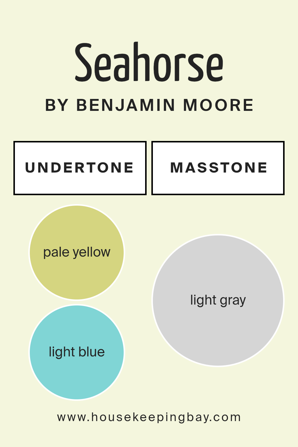
Undertones of Seahorse 2028-70 by Benjamin Moore
Seahorse2028-70 by Benjamin Moore is a color blend that creates a unique and soothing ambiance. The undertones within this hue, such as pale yellow and light blue, add warmth and calmness respectively. Pale yellow creates a soft, sunny feel, often making spaces appear welcoming and cheerful. Light blue, on the other hand, introduces a refreshing and serene vibe.
Light purple contributes a subtle elegance, bringing a hint of sophistication. Mint influences the color with its fresh, invigorating quality, while pale pink adds a gentle, nurturing touch. Lilac introduces a deeper richness, often associated with creativity and inspiration.
Finally, grey adds balance, grounding the other colors and preventing the palette from becoming too vivid or overwhelming.
Undertones are crucial in how we perceive color. They can change the mood and appearance of a space based on lighting, nearby colors, and even time of day.
For Seahorse2028-70, these undertones work together to create a versatile paint option for interiors. This blend allows the paint to adapt easily to different environments. It might feel fresh and airy in natural light, or cozy and inviting with dimmer lighting.
Despite these variations, Seahorse2028-70 always ensures a harmonious atmosphere, making it a great choice for both contemporary and classic interiors.
housekeepingbay.com
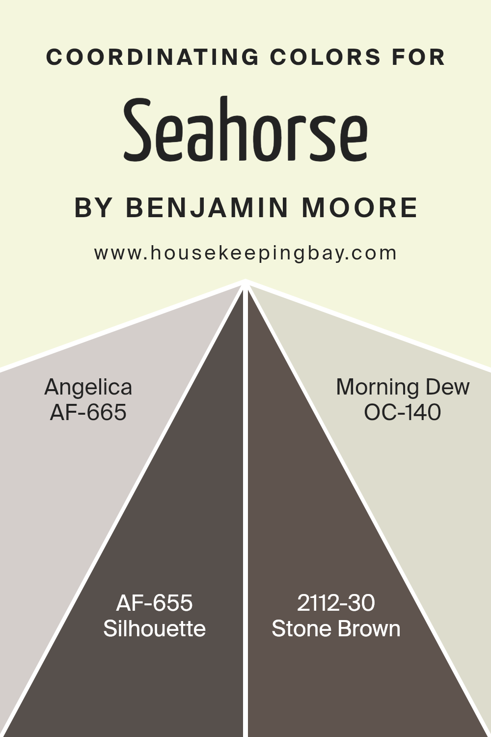
Coordinating Colors of Seahorse 2028-70 by Benjamin Moore
Coordinating colors are hues that complement each other, creating a harmonious look in a space. When you use these colors together, they balance each other out and create a pleasing visual experience. For the paint color Seahorse by Benjamin Moore, four coordinating shades enhance its appeal: Angelica, Silhouette, Stone Brown, and Morning Dew.
Angelica is a soft, muted lavender with a gentle touch, bringing a calming essence to the surroundings. It’s the kind of color that whispers calmness into a room, making it feel warm and inviting.
Silhouette, on the other hand, is a deep, rich charcoal hue, perfect for adding depth and drama. Its dark tones provide a sophisticated backdrop that complements lighter shades beautifully. Stone Brown is a warm, earthy mocha color, adding an element of coziness and stability.
It works seamlessly in any space, adding a grounding presence. Morning Dew, a light, airy white with a hint of green, brings freshness and a breath of light to any room.
These colors together provide a balanced palette, each contributing its own unique character to create a cohesive and inviting space. Using them allows you to maintain a balanced and harmonious aesthetic throughout your home.
You can see recommended paint colors below:
- AF-665 Angelica
- AF-655 Silhouette
- 2112-30 Stone Brown
- OC-140 Morning Dew
housekeepingbay.com
How Does Lighting Affect Seahorse 2028-70 by Benjamin Moore?
Lighting plays a crucial role in how we perceive colors. The color Seahorse 2028-70 by Benjamin Moore can shift its appearance depending on the type of lighting and the room’s orientation.
In artificial light, colors often look different than they do in natural light. For Seahorse 2028-70, which is a soft seafoam green, warm artificial lighting can bring out more yellow undertones, making it look warmer.
On the other hand, cool artificial lighting (like LEDs with a blue tint) can enhance its cooler, greener tones, giving the room a fresher vibe.
When considering natural light, the direction a room faces can greatly influence how Seahorse 2028-70 appears:
- 1. North-facing rooms: These rooms generally receive soft, consistent light that can be quite cool. In these spaces, Seahorse 2028-70 may appear more muted and reveal its cooler tones. The light in these rooms can sometimes feel a bit gray, so the color might come off as more subdued.
- 2.South-facing rooms: These spaces enjoy bright, warm light for most of the day. Seahorse 2028-70 will showcase its warmest undertones, appearing lively and cheerful. The abundance of natural light can boost the color’s vibrancy, creating a bright, welcoming atmosphere.
- 3.East-facing rooms: Morning light here is warm and then gradually cools. Seahorse 2028-70 will appear rich and warm in the morning, complementing the sunrise glow. As the day progresses, the color will transition slightly cooler but still remain refreshing and inviting.
- 4.West-facing rooms: These rooms get warm light in the late afternoon and evening. During these times, Seahorse 2028-70 might deepen, displaying more of its green warmth. Earlier in the day, when the light is cooler, the color could look more muted.
Overall, understanding how lighting affects Seahorse 2028-70 helps in choosing where to use it. Testing paint samples in various lighting conditions before making a decision can ensure the desired outcome.
housekeepingbay.com
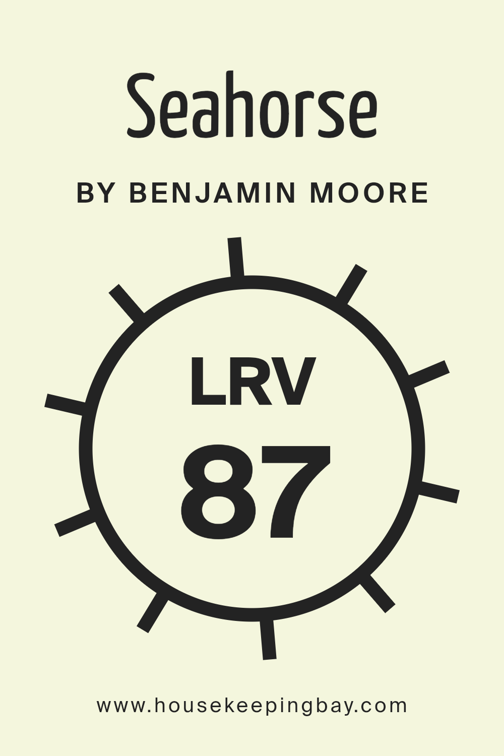
What is the LRV of Seahorse 2028-70 by Benjamin Moore?
LRV stands for Light Reflectance Value. It measures how much light a color reflects or absorbs, on a scale from 0 to 100. A color with an LRV of 0 absorbs all light and reflects none (pure black), while a color with an LRV of 100 reflects all light and absorbs none (pure white).
The LRV of a color affects how bright or dark it appears in a space. Colors with higher LRVs generally make a room feel larger and more open, as they reflect more light, brightening the area. Lower LRV colors, by contrast, make spaces feel cozier and more intimate by absorbing more light.
For Seahorse2028-70 by Benjamin Moore, with an LRV of 87.08, the color is on the lighter end of the spectrum. This high LRV means that Seahorse2028-70 will reflect a lot of light, making it a bright choice for walls.
Using Seahorse2028-70 in a room can help create a sense of spaciousness and openness, as the color will bounce light around the space effectively.
It can make dimmer rooms feel more airy and vibrant and ensure brighter rooms maintain a light, refreshing atmosphere. The high LRV of Seahorse2028-70 means it is well-suited for areas where you want a clean, uplifting feel.
housekeepingbay.com
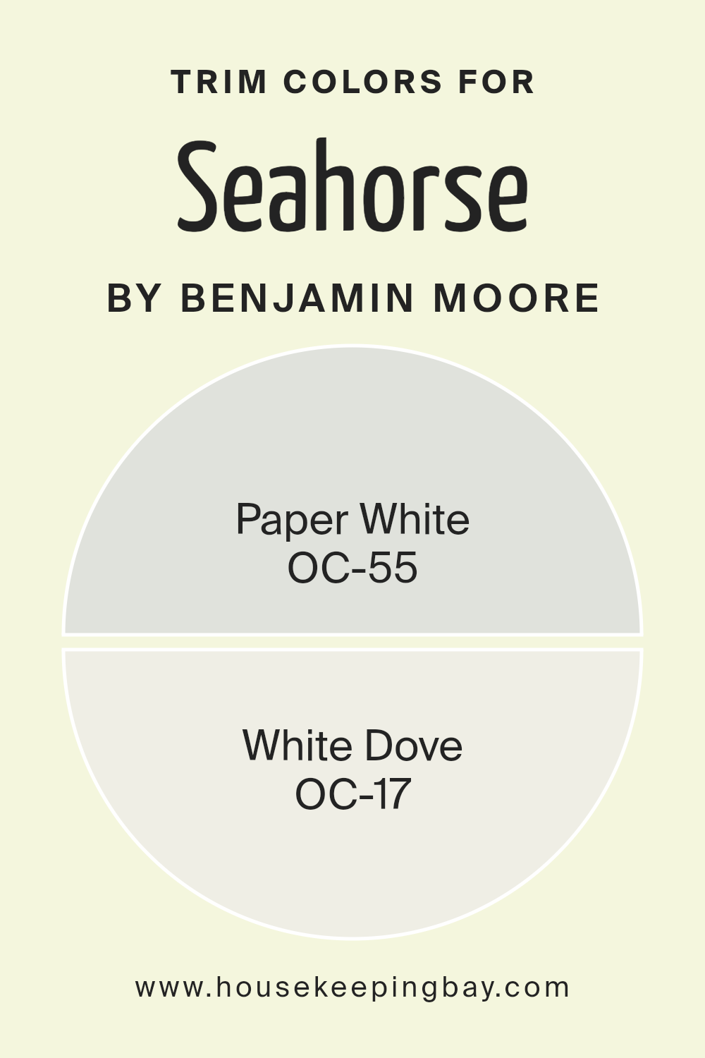
What are the Trim colors of Seahorse 2028-70 by Benjamin Moore?
Trim colors are the accents of a room that define the edges and add character to the design. Used around windows, doors, baseboards, and ceilings, they create a sharp contrast or a smooth transition from the walls.
When choosing a trim color for a shade like Seahorse 2028-70 by Benjamin Moore, which is a vibrant and lively color, selecting the right trim is essential to balance the atmosphere and enhance the overall appearance of the space.
Using OC-55 Paper White as a trim color can provide a gentle, subtle frame that offsets bolder colors. Its light grayish undertone offers a clean and crisp look without overpowering the main color.
Meanwhile, White Dove OC-17, with its creamy and soft white finish, serves as another excellent trim option.
It provides warmth that can make a space feel inviting, while still maintaining a classic and elegant aura. This ability to subtly complement a room’s aesthetic gives trim colors an important role in interior decorating.
They not only help define the lines within a space but also enhance the primary paint selection by adding depth and contrast or providing a seamless flow, depending on the desired effect.
You can see recommended paint colors below:
housekeepingbay.com
Colors Similar to Seahorse 2028-70 by Benjamin Moore
Similar colors play a crucial role in creating a harmonious and balanced space by maintaining a consistent visual theme. These colors help to gently blend different elements of a room, making the overall design feel more unified and soothing.
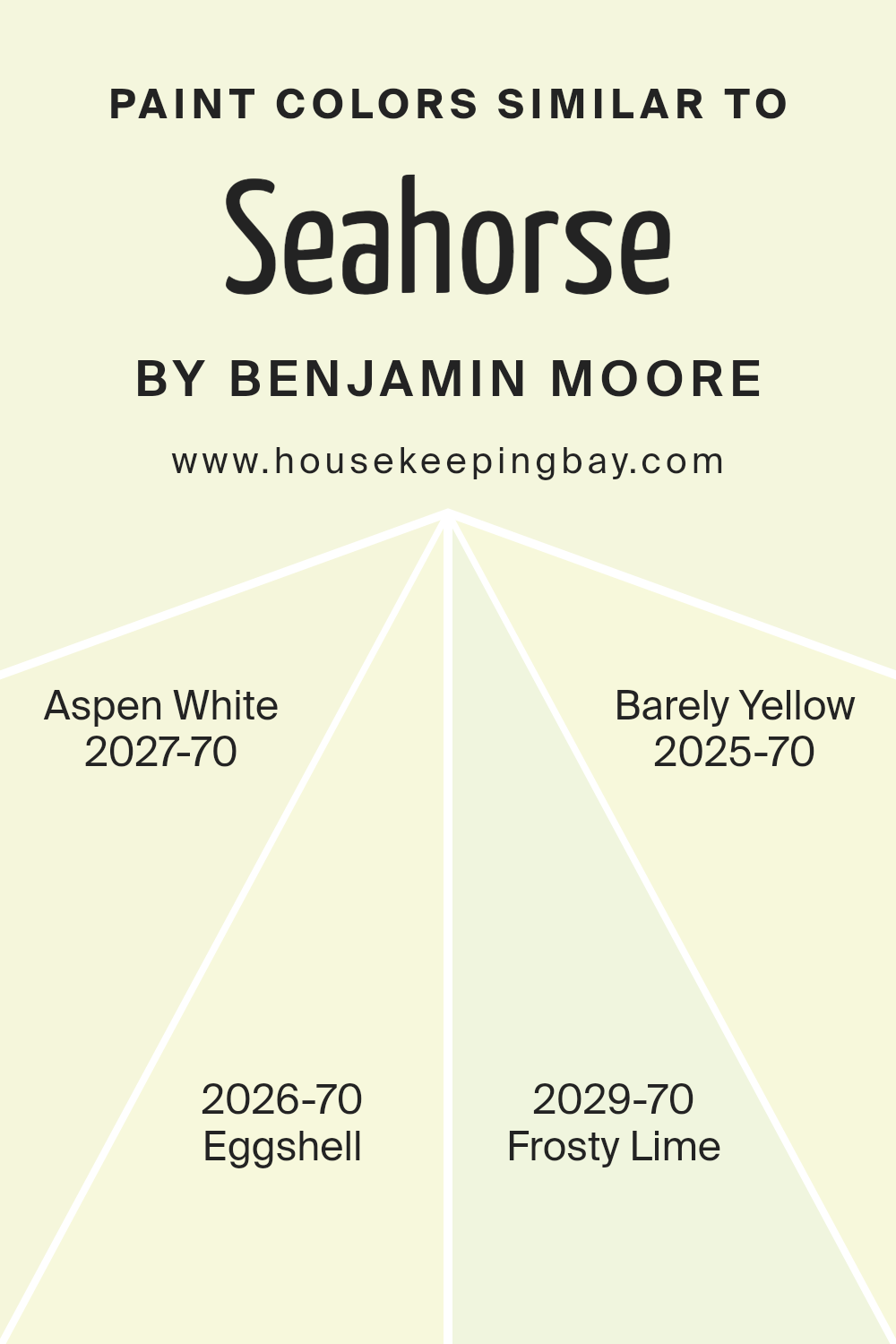
Seahorse 2028-70 by Benjamin Moore is a delicate hue with a soft mint vibe, making it versatile for a variety of settings. Surrounding it with similar colors like Aspen White, Eggshell, Frosty Lime, and Barely Yellow can enhance the overall ambiance by subtly complementing each other.
Aspen White has a clean and crisp appearance, which pairs nicely with the light and airy feel of Seahorse.
It can brighten a room, adding a sense of freshness and openness. Eggshell offers a warm, creamy touch, gently softening the space, creating a cozy and welcoming atmosphere.
Frosty Lime, with its subtle hint of green, adds a whisper of color that keeps things interesting and fresh without overpowering.
Barely Yellow infuses a light, cheerful undertone that can lift the mood of the room, bringing in a bit of warmth and sunshine.
Together, these similar colors cultivate a serene and cohesive environment, making any space feel complete and well-composed.
You can see recommended paint colors below:
- 2027-70 Aspen White
- 2026-70 Eggshell
- 2029-70 Frosty Lime
- 2025-70 Barely Yellow
housekeepingbay.com
Colors that Go With Seahorse 2028-70 by Benjamin Moore
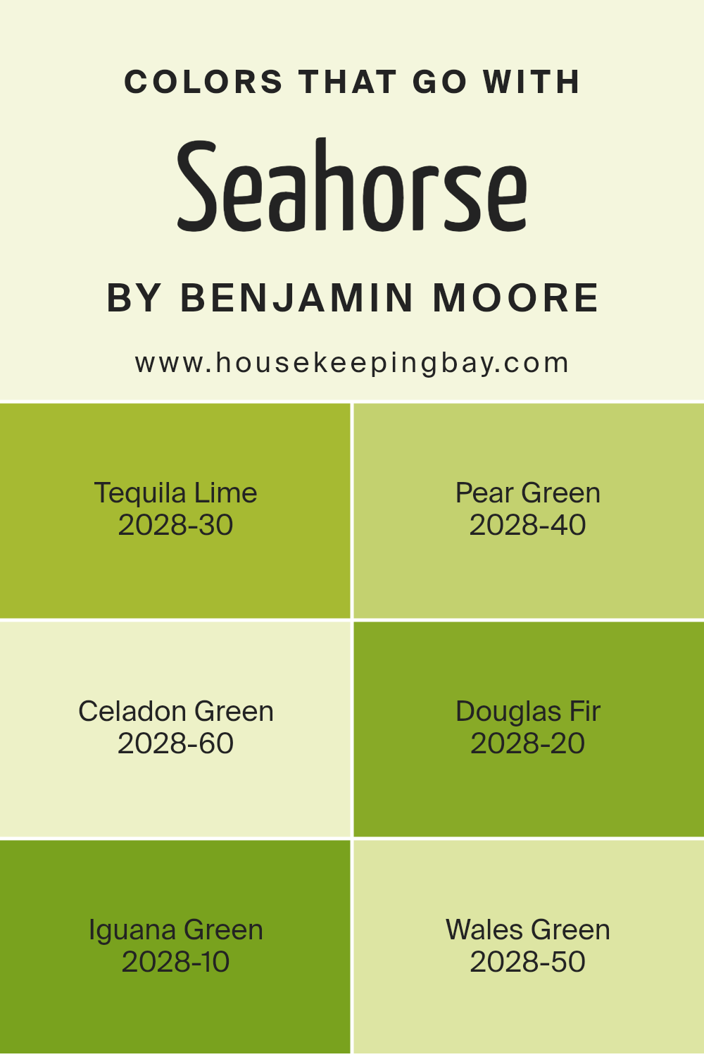
Choosing colors like Tequila Lime, Pear Green, Celadon Green, Douglas Fir, Iguana Green, and Wales Green alongside Seahorse 2028-70 by Benjamin Moore can create a harmonious and vibrant space. These colors are important because they each add unique qualities that enhance the calming and refreshing feel of Seahorse.
For instance, Tequila Lime is a lively, bold green with a hint of citrus zest, bringing energy and brightness to a room.
Pear Green offers a softer, more subdued hue that complements Seahorse’s tranquil vibe while adding a touch of warmth. Celadon Green is a cooler, muted tone, perfect for creating a serene and peaceful atmosphere. Together with Seahorse, these colors can transform any room into a lively yet calming space.
Douglas Fir presents a rich, deep green that introduces an element of nature and balance, offering depth and contrast to the lighter Seahorse.
Iguana Green stands out with its fresh, lively appeal, imbuing the area with a sense of vitality and youth. Finally, Wales Green is a gentle, earthy shade that balances out the brighter tones, providing a cohesive and soothing environment. Each of these colors interacts with Seahorse in its own way, enriching the ambiance and creating a visually pleasing palette that feels natural and inviting.
You can see recommended paint colors below:
- 2028-30 Tequila Lime
- 2028-40 Pear Green
- 2028-60 Celadon Green
- 2028-20 Douglas Fir
- 2028-10 Iguana Green
- 2028-50 Wales Green
housekeepingbay.com
How to Use Seahorse 2028-70 by Benjamin Moore In Your Home?
Seahorse 2028-70 by Benjamin Moore is a gentle and refreshing shade of blue-green. This calming color can be a great choice for various spaces in a home. In a living room, it can encourage a peaceful and relaxing atmosphere, perfect for unwinding after a long day.
When used in a bedroom, Seahorse 2028-70 can create a soothing environment conducive to better rest and relaxation.
In the kitchen, this color can bring a touch of freshness and modernity to the walls or cabinetry. Pairing it with white or neutral tones can create a clean and inviting space. Seahorse 2028-70 can also be used in a bathroom to evoke a sense of calmness akin to a spa experience.
Accessories like towels or rugs in matching or complementary colors can enhance the aesthetic. It can easily complement nature-themed decorations such as plants, adding a touch of serenity and balance to any room.
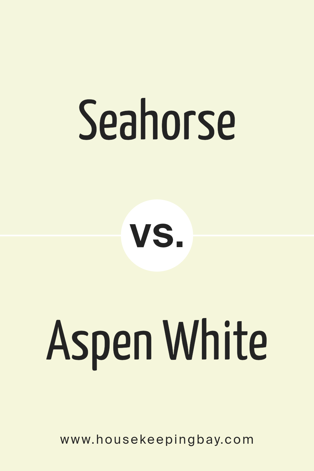
Seahorse 2028-70 by Benjamin Moore vs Aspen White 2027-70 by Benjamin Moore
Seahorse 2028-70 by Benjamin Moore is a soft, muted green that evokes a calm and natural vibe. This color feels like a gentle touch of nature inside your home. It works well in spaces where you want to create a relaxed and soothing atmosphere. Seahorse pairs nicely with natural wood tones and other earth-inspired colors.
Aspen White 2027-70, also by Benjamin Moore, presents a clean, crisp white. This shade brings brightness and clarity into a space, making it feel open and airy. Aspen White offers versatility, matching well with almost any color or design style.
It’s perfect for creating a clean backdrop that allows other colors or elements in the room to stand out.
While Seahorse brings warmth and calmness, Aspen White offers brightness and versatility.
Together, these colors create a balanced, harmonious environment—ideal for those seeking serenity with a touch of modern freshness.
You can see recommended paint color below:
- 2027-70 Aspen White
housekeepingbay.com
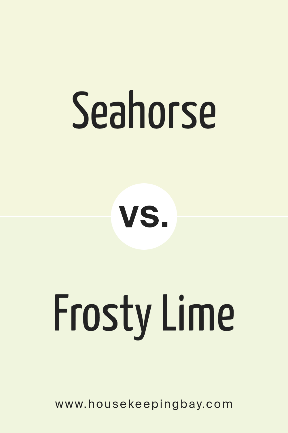
Seahorse 2028-70 by Benjamin Moore vs Frosty Lime 2029-70 by Benjamin Moore
Seahorse 2028-70 by Benjamin Moore is a soft, muted green with a gentle, calming tone. It evokes a sense of serenity and nature, making it a good choice for spaces looking to invite calmness and peace. It’s versatile, working well with both light and dark colors, and can add a touch of freshness to any room.
Frosty Lime 2029-70, also by Benjamin Moore, is a brighter, livelier green. It brings a sense of energy and liveliness to a space. Frosty Lime has a more vibrant and cheerful feel, making it suitable for areas that need a pop of color or a fresh, lively vibe.
While Seahorse creates an atmosphere of calm and natural ease, Frosty Lime injects brightness and life. Choosing between them depends on the mood and energy you want to convey in a room—relaxed and soothing with Seahorse or vibrant and refreshing with Frosty Lime.
You can see recommended paint color below:
- 2029-70 Frosty Lime
housekeepingbay.com
Seahorse 2028-70 by Benjamin Moore vs Barely Yellow 2025-70 by Benjamin Moore
Seahorse 2028-70 and Barely Yellow 2025-70, both by Benjamin Moore, offer distinct vibes. Seahorse brings a soft, muted turquoise, reminiscent of calming sea waves or mint tones. It feels serene and gentle, providing a refreshing touch without overpowering a space. It pairs well with whites, creams, or even darker blues to create a balanced aesthetic.
Barely Yellow 2025-70 presents a pale, delicate yellow, like sunlight peeking through sheer curtains. It adds warmth and brightness to any room, making spaces feel more inviting and cheerful.
This color works nicely with soft grays, whites, or muted greens, allowing for a light and airy atmosphere.
Comparing these two, Seahorse leans cooler and tranquil, whereas Barely Yellow radiates warmth and light.
Choosing between them depends on the mood you wish to set—seaside calm with Seahorse or a sunny glow with Barely Yellow.
You can see recommended paint color below:
- 2025-70 Barely Yellow
housekeepingbay.com
Seahorse 2028-70 by Benjamin Moore vs Eggshell 2026-70 by Benjamin Moore
Seahorse 2028-70 by Benjamin Moore is a soft, muted green with a hint of gray, giving it a calm and soothing look. This color can remind people of nature, offering a gentle touch to spaces, making rooms feel peaceful and inviting. It’s versatile, suitable for bedrooms or living rooms where relaxation is essential.
Eggshell 2026-70 by Benjamin Moore, however, is a light, creamy off-white with warm undertones. It provides a clean, simple backdrop that can brighten and open up spaces. Perfect for hallways, kitchens, or bathrooms, it adds a touch of warmth without overwhelming.
Comparing the two, Seahorse offers a more organic, earthy feel, fitting for those wanting to bring an element of nature into their home.
Eggshell provides a classic, neutral base that harmonizes well with various decor styles and color accents.
Both colors possess unique qualities, ensuring they fit different needs and preferences in any home setting.
You can see recommended paint color below:
- 2026-70 Eggshell
housekeepingbay.com
I could see how Seahorse can fit in different settings, whether in a cozy living room or a restful bedroom. Its versatility means you can pair it with many other colors, enhancing the beauty of any space.
What captivated me was the way it can change a room’s energy without being overwhelming. It seems perfect for anyone who wants a touch of elegance without overpowering the senses.
What stood out is how Seahorse complements both contemporary and classic designs.
It’s a timeless choice, adaptable to varied styles and preferences. After learning about this particular shade, I realized its potential to refresh and energize a home, creating a serene yet stylish environment anyone can enjoy.
housekeepingbay.com
Ever wished paint sampling was as easy as sticking a sticker? Guess what? Now it is! Discover Samplize's unique Peel & Stick samples. Get started now and say goodbye to the old messy way!
Get paint samples


