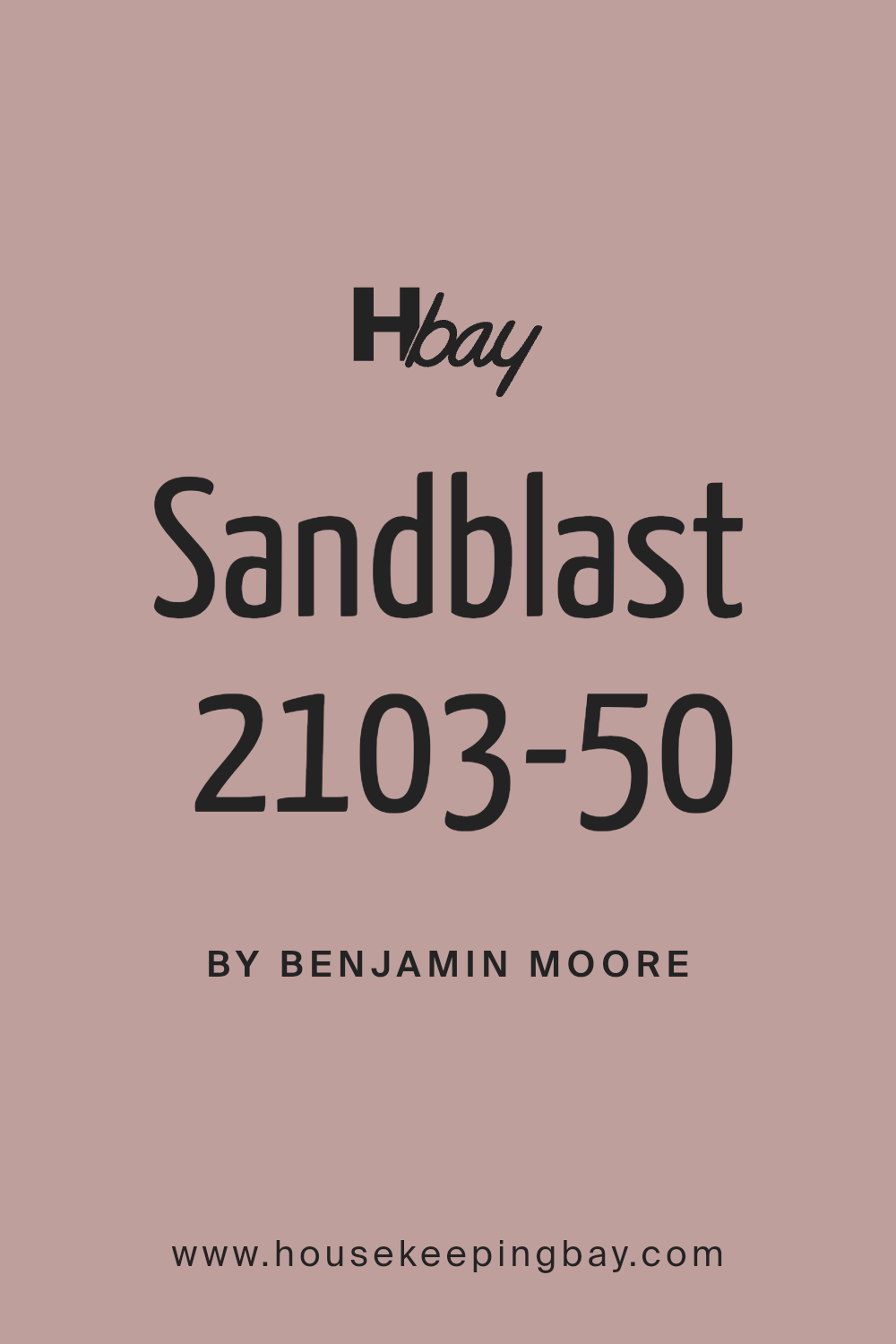
Sandblast 2103-50 by Benjamin Moore
Warm Hues for a Cozy Home
When selecting the perfect paint color for your home, it’s essential to consider both style and mood. One option you might find appealing is Benjamin Moore’s 2103-50 Sandblast. This paint shade offers a warm, inviting tone that can make any room feel cozy and serene.
Sandblast falls in the category of neutral earth tones, making it easy to coordinate with various decor styles and furniture colors. Whether you want to freshen up your living room, bedroom, or even your kitchen, Sandblast provides a gentle backdrop that enhances other design elements without overwhelming them.
Additionally, the durability and high quality of Benjamin Moore paints ensure that your chosen color looks great over time, even in high-traffic areas of your home.
So if you are thinking about giving your space a new look, consider how Sandblast might contribute to the atmosphere you wish to create. It’s soft, subtle, and might just be the change you need.
via benjaminmoore.com
What Color Is Sandblast 2103-50 by Benjamin Moore?
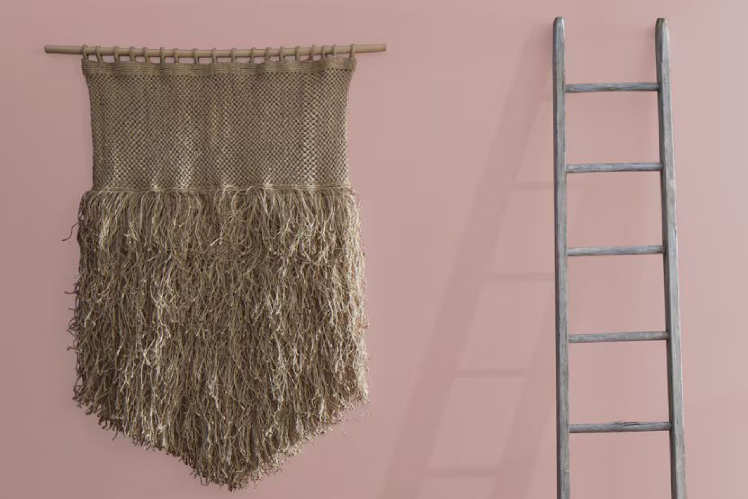
Sandblast 2103-50 by Benjamin Moore is a warm, inviting beige with subtle undertones of yellow and orange. This color radiates a soft, cozy vibe and adapts easily to various spaces, making it versatile for any home. Due to its earthy and natural hue, Sandblast offers a seamless integration into styles such as rustic, farmhouse, and Scandinavian, where a sense of calm and simplicity is key. Its gentle warmth also makes it suitable for modern and contemporary interiors, providing a clean, neutral background that allows furniture and art to shine.
When it comes to pairing materials and textures, Sandblast 2103-50 works wonderfully with natural wood, enhancing its rich grains and organic feel. It also pairs beautifully with soft linen, crisp cotton, and textured wool, making spaces feel more layered and cozy.
For a touch of elegance, marble or polished metals like brass and copper can be introduced, which contrast splendidly against its earthy backdrop. This color supports a harmonious blend of soft and luxurious textures, enabling a balanced and inviting atmosphere in any room.
Perfect for living rooms, bedrooms, and kitchens, Sandblast can help create a serene yet sophisticated space.
housekeepingbay.com
Is Sandblast 2103-50 by Benjamin Moore Warm or Cool color?
Sandblast2103-50 by Benjamin Moore is a warm, earthy tone that belongs to their neutral color palette. Its unique hue resembles the subtle shades of sand, providing a solid foundation for various interior styles, from modern to rustic.
This color’s versatility allows homeowners to pair it with dark accents for a cozy, anchored feel or lighter whites and creams to maintain a breezy, airy room atmosphere. The calming nature of Sandblast2103-50 makes it suitable for bedrooms, living rooms, and even kitchens, where it can create a soothing environment conducive to relaxation and family gathering.
Because of its understated elegance, this color can complement wooden furniture and natural elements like stone or plants, enhancing the inherent beauty of diverse textures and materials within a space. Overall, Sandblast2103-50 facilitates a warm backdrop that integrates seamlessly into homes, promoting a harmonious balance between color and living space functionality.
What is the Masstone of the Sandblast 2103-50 by Benjamin Moore?
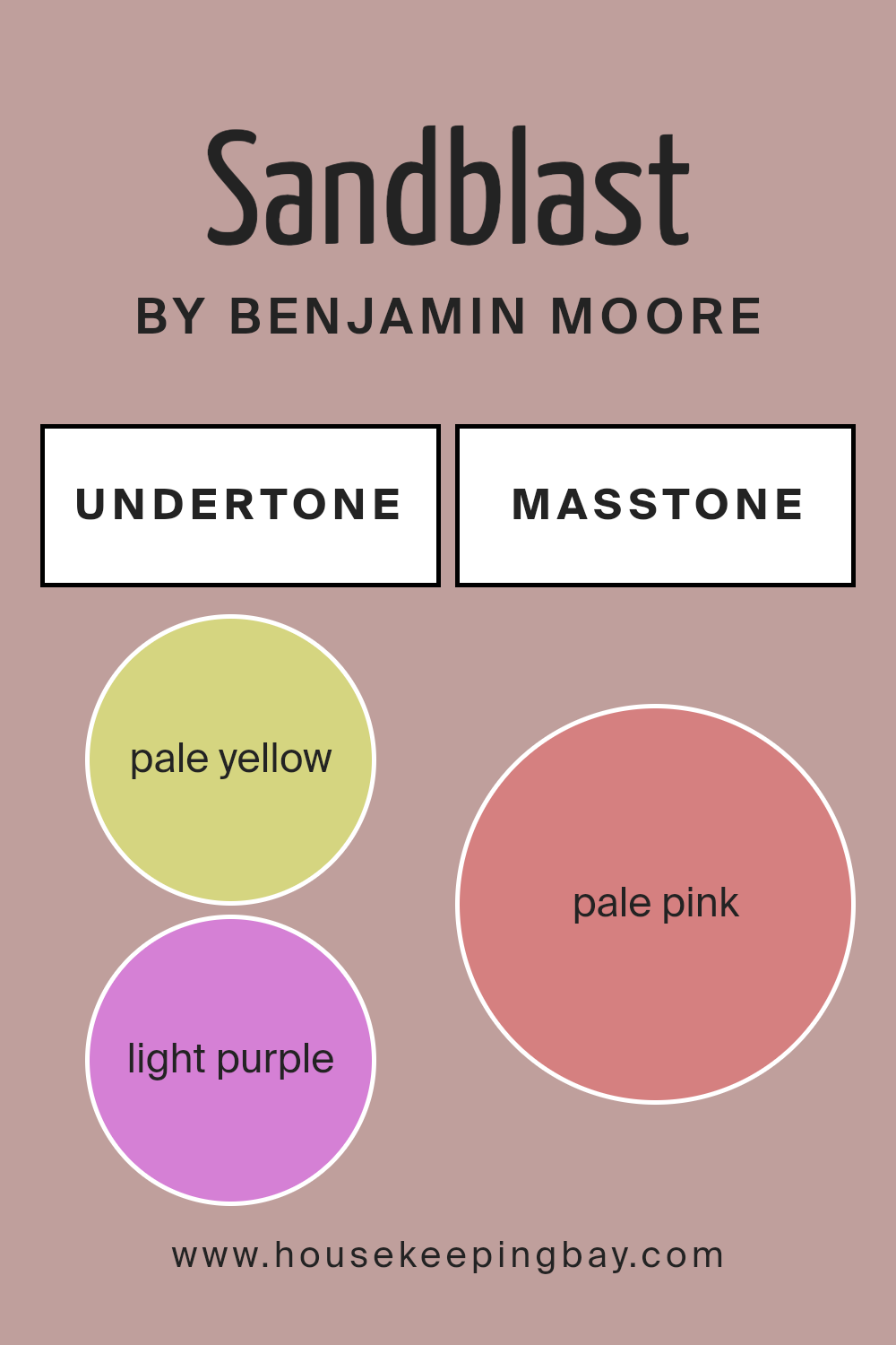
Sandblast2103-50 by Benjamin Moore features a masstone of pale pink, coded as #D58080. This gentle shade of pink brings a soft, soothing presence to any room. Being a lighter and softer color, it has the ability to make spaces feel more open and airy. This characteristic is particularly useful in smaller rooms or areas with limited natural light, as it can help to visually expand the space and make it feel less cramped.
Additionally, the subtle warmth of the pale pink hue injects a sense of calm and comfort into a home, making it a great choice for bedrooms and living areas where relaxation is key. Since this color is not overpowering, it pairs well with a wide range of décor styles and colors, offering flexibility in design choices.
From contemporary to traditional homes, Sandblast2103-50 can integrate seamlessly, providing a background that complements wood, metal accents, and various fabric textures. This versatility is why many homeowners find it appealing for creating a cozy, welcoming environment.

housekeepingbay.com
Undertones of Sandblast 2103-50 by Benjamin Moore
Sandblast 2103-50 by Benjamin Moore is a versatile color with a complex blend of undertones that can subtly influence the ambiance of a room. Undertones are the colors lurking beneath the surface of the main color, affecting how it appears under different lighting conditions and when juxtaposed with other colors. For Sandblast 2103-50, these undertones range across a broad spectrum including pale yellow, light purple, grey, light gray, and more vibrant shades like orange and red.
In an interior setting, these undertones can make the walls appear differently depending on the light and surrounding colors. For instance, in a room with ample natural light, pale yellow or light blue undertones might make the space feel airy and open, whereas the grey or light gray could lend a more subdued and neutral look under artificial lighting.
Furthermore, because it includes lively undertones like orange or pink, Sandblast 2103-50 can add a subtle vibrancy to a room without overwhelming it with color. This makes it a good choice for someone wanting to inject some personality into their space without committing to a bold wall color.
The presence of cooler undertones like mint, lilac, and violet helps balance the warmth of yellow and orange, making Sandblast 2103-50 adaptable to various decor styles and color schemes. This adaptability is particularly useful in spaces that serve multiple purposes or need to transition between moods and functions throughout the day.
Overall, the undertone variety in Sandblast 2103-50 allows it to interact dynamically with different interior elements, thus impacting the overall perception of the space. This paint can be a smart choice for anyone looking to enhance their interiors subtly yet effectively.
housekeepingbay.com
Coordinating Colors of Sandblast 2103-50 by Benjamin Moore
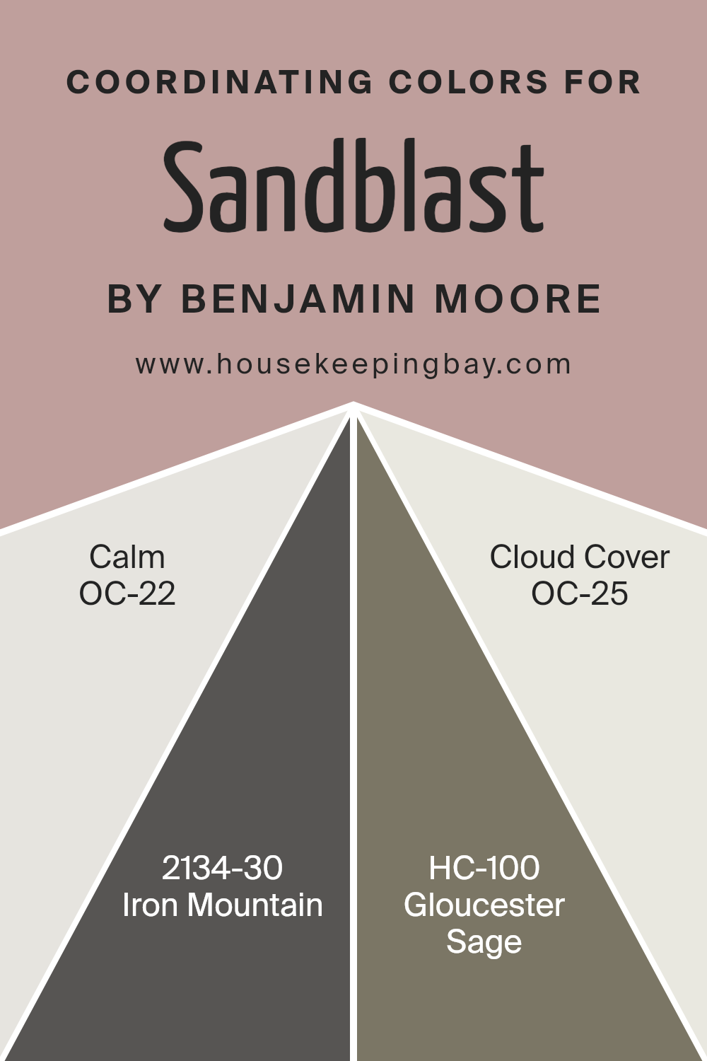
Coordinating colors are selected to complement a primary color in a way that creates a harmonious and pleasing palette. When using Sandblast 2103-50 by Benjamin Moore, a light and warm beige, specific coordinating colors can help achieve a balanced look. The choice of coordinating colors, such as OC-22 – Calm, 2134-30 – Iron Mountain, HC-100 – Gloucester Sage, and OC-25 – Cloud Cover, provides a range of options that can either contrast or continue the softness of the main shade.
OC-22 – Calm is a soft and muted gray, perfect for giving spaces a serene and gentle backdrop. It pairs well with the sandy tones of Sandblast for a low-key and refined appearance. Iron Mountain 2134-30 is much stronger and darker; its deep gray with hints of blue offers a dramatic contrast to Sandblast, ideal for accent features or furniture.
Gloucester Sage HC-100 offers a natural, earthy green that complements the neutrality of Sandblast, suitable for bringing a touch of nature indoors. Lastly, OC-25 – Cloud Cover is a subtle off-white that creates a light and airy feel, helping to keep interiors feeling open and bright. Together, these colors work cohesively to enrich and balance the atmosphere of any room.
You can see recommended paint colors below:
- OC-22 Calm
- 2134-30 Iron Mountain
- HC-100 Gloucester Sage
- OC-25 Cloud Cover
housekeepingbay.com
How Does Lighting Affect Sandblast 2103-50 by Benjamin Moore?
Lighting plays a crucial role in how we perceive colors, altering their appearance and the ambiance they create in a room. For instance, the color Sandblast 2103-50 by Benjamin Moore can appear differently under various lighting conditions due to changes in illumination intensity and color temperature.
In artificial lighting, such as from incandescent bulbs or LEDs, the appearance of Sandblast 2103-50 can shift based on the light’s tone.
Incandescent lighting generally makes this color look warmer, enhancing its beige undertones and giving the room a cozy feel. LED or fluorescent lighting, cooler in tone, might make Sandblast 2103-50 appear slightly more muted, emphasizing its gray aspects.
Under natural light, Sandblast 2103-50 displays its true color but shifts throughout the day with the changing sun.
In north-facing rooms, which receive less direct sunlight and have cooler light, this color can look more subdued, with its gray tones becoming more pronounced, lending a serene and soothing feel to the space. In contrast, south-facing rooms bathed in abundant, warm sunlight throughout the day can make Sandblast 2103-50 warmer and brighter, enhancing its beige qualities, and making the space feel more inviting.
For east-facing rooms, the morning light can make Sandblast 2103-50 look soft and warm, ideal for bedrooms to help start the day with a gentle mood. As east-facing rooms lose light in the afternoon, the color will shift back to its more neutral stance.
Conversely, in west-facing rooms, the color will appear more neutral in the morning and gain warmth in the evening as the sun sets, sometimes bringing out a golden hue, perfect for living spaces used more often during the evening. By understanding how lighting affects Sandblast 2103-50, homeowners can choose the best room orientations and artificial lighting types to enhance this paint color’s natural beauty.
housekeepingbay.com
What is the LRV of Sandblast 2103-50 by Benjamin Moore?
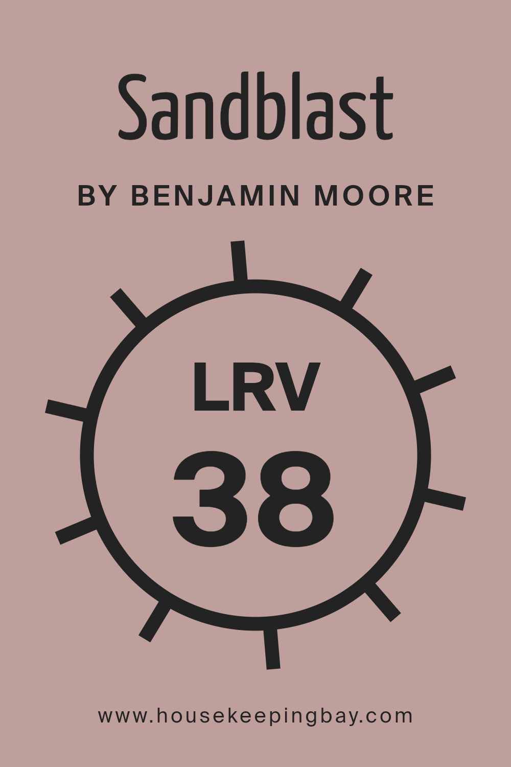
LRV, or Light Reflectance Value, measures the percentage of light a paint color reflects back into a room. This value ranges from 0 to 100, where 0 is completely black, absorbing all light, and 100 is pure white, reflecting all light. LRV is important because it helps determine how light or dark a color will appear once applied to the walls and how it will affect the overall ambiance of a space. Colors with a higher LRV make rooms feel airier and more open, whereas darker LRVs can make spaces appear cozier but smaller.
The color Sandblast 2103-50 by Benjamin Moore, with an LRV of 38.3, falls in the middle range. This means it neither reflects light extensively nor absorbs it heavily. In rooms with moderate to abundant natural light, Sandblast will look warm and inviting without overpowering the space.
However, in poorly lit areas, this color might appear slightly darker, influencing the room to feel more enclosed. The balance of 38.3 LRV makes Sandblast versatile, capable of achieving a harmonious look that isn’t too stark or overly dim, making it suitable for various lighting situations and room sizes.
housekeepingbay.com
What are the Trim colors of Sandblast 2103-50 by Benjamin Moore?
Trim colors are used to highlight and define the edges and contours of walls, doors, windows, and other architectural features in a space. For Sandblast 2103-50 by Benjamin Moore, a soft and warm neutral hue, selecting the right trim color can subtly enhance the main color’s presence in a room without overwhelming it.
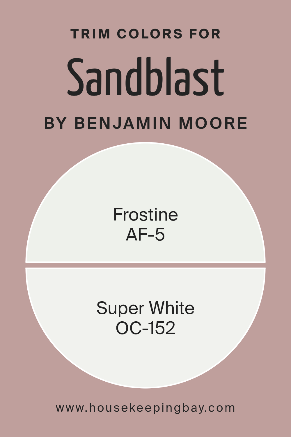
By using AF-5 Frostine or OC-152 Super White as trim colors against Sandblast 2103-50, the overall aesthetic shifts towards a cleaner and more refined look. These choices of trim colors help frame the main wall color, giving the room a polished appearance while ensuring that the subtleties of Sandblast 2103-50 stand out in a balanced manner.
AF-5 Frostine is a mild off-white with a hint of gray that can create a seamless transition between the trim and the wall, offering a slight contrast to softly outline room features without creating a stark divide. On the other hand, OC-152 Super White is a crisper, pure white that provides a more pronounced outline, making it ideal for rooms where a brighter contrast is desired to highlight architectural details. Both colors support the base shade of Sandblast 2103-50 in ways that complement different room styles and lighting situations, making them versatile choices for various design needs.
You can see recommended paint colors below:
- AF-5 Frostine
- OC-152 Super White
housekeepingbay.com
Colors Similar to Sandblast 2103-50 by Benjamin Moore
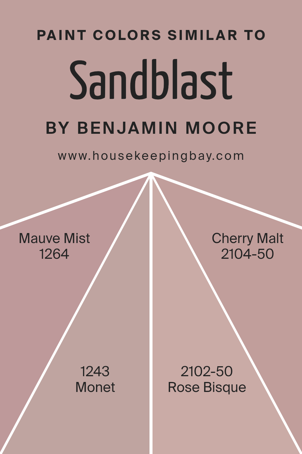
Choosing similar colors, like those close to Sandblast 2103-50 by Benjamin Moore, helps create a subtle and cohesive aesthetic in any space. When colors like Mauve Mist, Monet, Rose Bisque, and Cherry Malt are used together, they produce a harmonious look because their close tones blend seamlessly, allowing for a serene and appealing environment. This unity in color can enhance the visual flow from one room to another, making smaller spaces feel larger and more connected.
Mauve Mist 1264 is a soft lavender shade that adds a gentle touch of sophistication without overwhelming a space with bold color. Monet 1243 shifts slightly to embed more gray, offering a nuanced variation that is calming and easily pairs with a variety of decor styles.
Rose Bisque 2102-50 gives off a warm, inviting feel with its muted pink hue that works well in spaces meant for relaxation. Cherry Malt 2104-50 rounds out this palette with a deeper, rich tone resembling a subdued cherry wood, perfect for adding a bit of grounded elegance to any setting. Together, these colors support each other, creating a cohesive yet diverse aesthetic.
You can see recommended paint colors below:
- 1264 Mauve Mist
- 1243 Monet
- 2102-50 Rose Bisque
- 2104-50 Cherry Malt
housekeepingbay.com
Colors that Go With Sandblast 2103-50 by Benjamin Moore
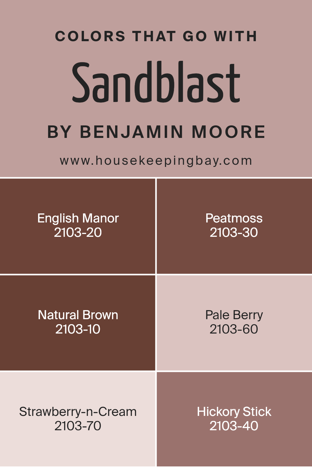
Understanding why certain colors harmonize well with Sandblast 2103-50 by Benjamin Moore can significantly enhance the aesthetic appeal of a space. Sandblast, a neutral tone, serves as an excellent base that blends seamlessly with other colors in its family. When choosing complementary colors, such as English Manor, Peatmoss, Natural Brown, Pale Berry, Strawberry-n-Cream, and Hickory Stick, it’s about creating a cohesive palette that enhances the mood and size of the room, making it feel more inviting and balanced.
English Manor 2103-20 is a deep, muted blue with a hint of gray, adding depth and sophistication to spaces. Peatmoss 2103-30, a dark, earthy green, grounds environments with its rich, organic feel. Both colors provide a striking contrast against the lighter Sandblast.
Natural Brown 2103-10 offers a warm, comforting brown that pairs naturally with Sandblast’s soft backdrop, perfect for creating a snug, cozy feel. On the lighter spectrum, Pale Berry 2103-60 and Strawberry-n-Cream 2103-70 introduce soft, gentle pinks that brighten a room and add a touch of softness and femininity without overwhelming the senses.
Lastly, Hickory Stick 2103-40, a strong, dark brown adds weight and definition to any space, ideal for accenting details or highlighting architectural elements alongside Sandblast’s versatility. These colors, when used together, facilitate a balanced, harmonious environment tailored to enhancing comfort and style.
You can see recommended paint colors below:
- 2103-20 English Manor
- 2103-30 Peatmoss
- 2103-10 Natural Brown
- 2103-60 Pale Berry
- 2103-70 Strawberry-n-Cream
- 2103-40 Hickory Stick
housekeepingbay.com
How to Use Sandblast 2103-50 by Benjamin Moore In Your Home?
Sandblast 2103-50 by Benjamin Moore is a warm, earthy beige paint color that brings a sense of calm and comfort to any room in your home. This versatile shade pairs beautifully with various color palettes, making it ideal for living rooms, bedrooms, and kitchens. Sandblast works well in spaces seeking a neutral backdrop that still offers a hint of color to add warmth and personality.
When using Sandblast 2103-50, consider it for large areas like walls to create a cozy, inviting atmosphere. It’s also suitable for accent features such as trim or cabinets for those who prefer a subtle contrast without overpowering the space. This color complements both modern and traditional decor, ensuring it fits seamlessly with most styles.
Overall, Sandblast 2103-50 by Benjamin Moore is perfect for homeowners looking to refresh their interiors with a timeless, soothing color that works well under various lighting conditions, enhancing the room’s appeal naturally.
Sandblast 2103-50 by Benjamin Moore vs Monet 1243 by Benjamin Moore
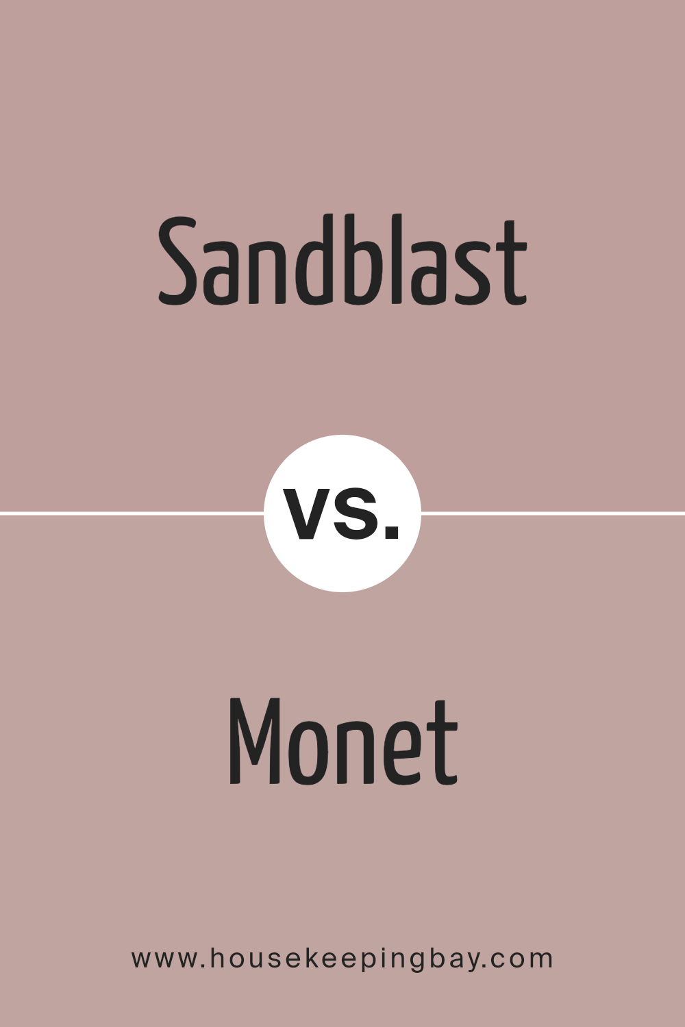
Sandblast 2103-50 by Benjamin Moore is a soothing, light, and neutral beige with a warm undertone. It carries the essence of sandy shores, making it perfect for creating a cozy and inviting atmosphere in any room. The warm tone makes it versatile for pairing with both bright and dark colors, offering flexibility in design choices.
In comparison, Monet 1243 by Benjamin Moore has a more distinctive character. It’s a muted lavender with a subtle gray undertone, providing a soft and calming effect. This color is ideal for spaces where a hint of color is desired without overwhelming the senses. It pairs well with other soft tones and can add a gentle splash of color to a neutral palette.
Both colors provide a base for creating a serene and welcoming space, though Sandblast leans towards warmth and traditional neutrals, while Monet offers a touch of color with its gentle lavender hue.
You can see recommended paint color below:
- 1243 Monet
housekeepingbay.com
Sandblast 2103-50 by Benjamin Moore vs Cherry Malt 2104-50 by Benjamin Moore
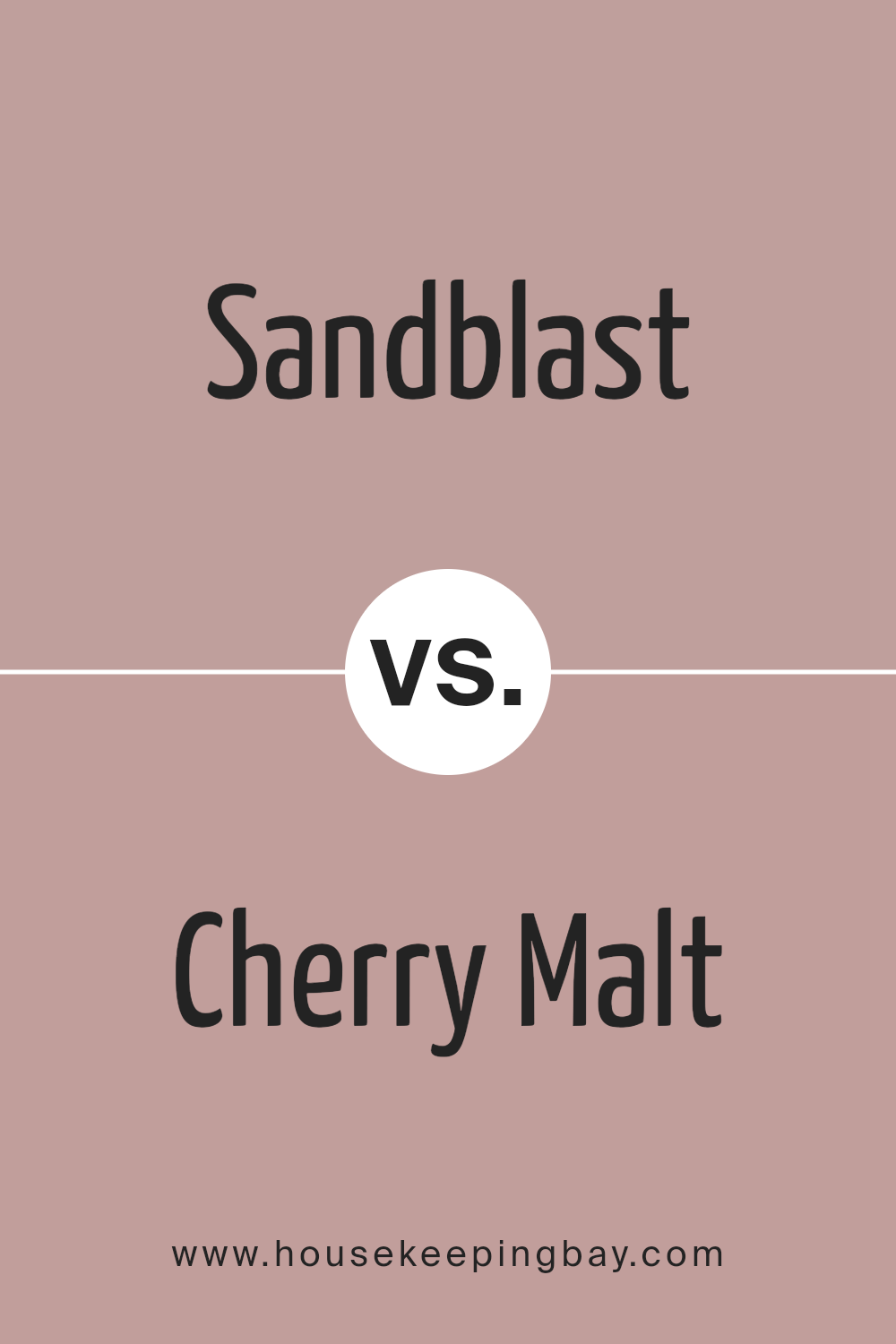
Sandblast 2103-50 by Benjamin Moore is a calm, light beige color that offers a sense of warmth and simplicity, making it a versatile choice for many spaces. It reflects a lot of light, which can make rooms look bigger and brighter. This color works well in living areas, bedrooms, or any space where a peaceful, neutral background is desired.
Cherry Malt 2104-50 by Benjamin Moore is a deeper hue, presenting a soft, friendly pink. This color adds a gentle touch of personality and warmth, creating a cozy and inviting atmosphere. It’s great for adding a subtle hint of color to a room without overwhelming it with brightness.
Both colors, being from similar spectrums, can complement each other nicely in a home. Sandblast provides a neutral backdrop, allowing Cherry Malt to stand out as an accent without clashing. This combination can be used to create a balanced and harmoniously decorated space.
You can see recommended paint color below:
- 2104-50 Cherry Malt
housekeepingbay.com
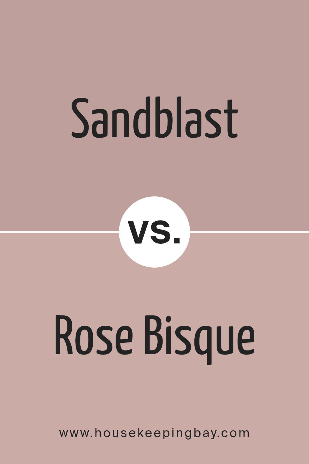
Sandblast 2103-50 by Benjamin Moore vs Rose Bisque 2102-50 by Benjamin Moore
Sandblast 2103-50 by Benjamin Moore is a soft, neutral beige with a warm undertone. It works well in spaces aiming for a calm and cozy atmosphere, and pairs nicely with a variety of colors, from bold to subdued hues. This makes Sandblast 2103-50 versatile for use in many rooms, enhancing natural light and adding a subtle warmth.
Rose Bisque 2102-50, also by Benjamin Moore, is slightly cooler compared to Sandblast. It leans towards a gentle pink, giving it a soft, inviting feel. This color is ideal for creating a soothing environment with a touch of warmth that’s not overly vibrant. It’s particularly effective in bedrooms or bathrooms where creating a peaceful, relaxing space is the goal.
Both colors offer a muted palette that supports a range of decorating styles. While Sandblast brings a traditional beige warmth, Rose Bisque introduces a hint of pink, presenting a fresh alternative without being overpowering.
You can see recommended paint color below:
- 2102-50 Rose Bisque
housekeepingbay.com
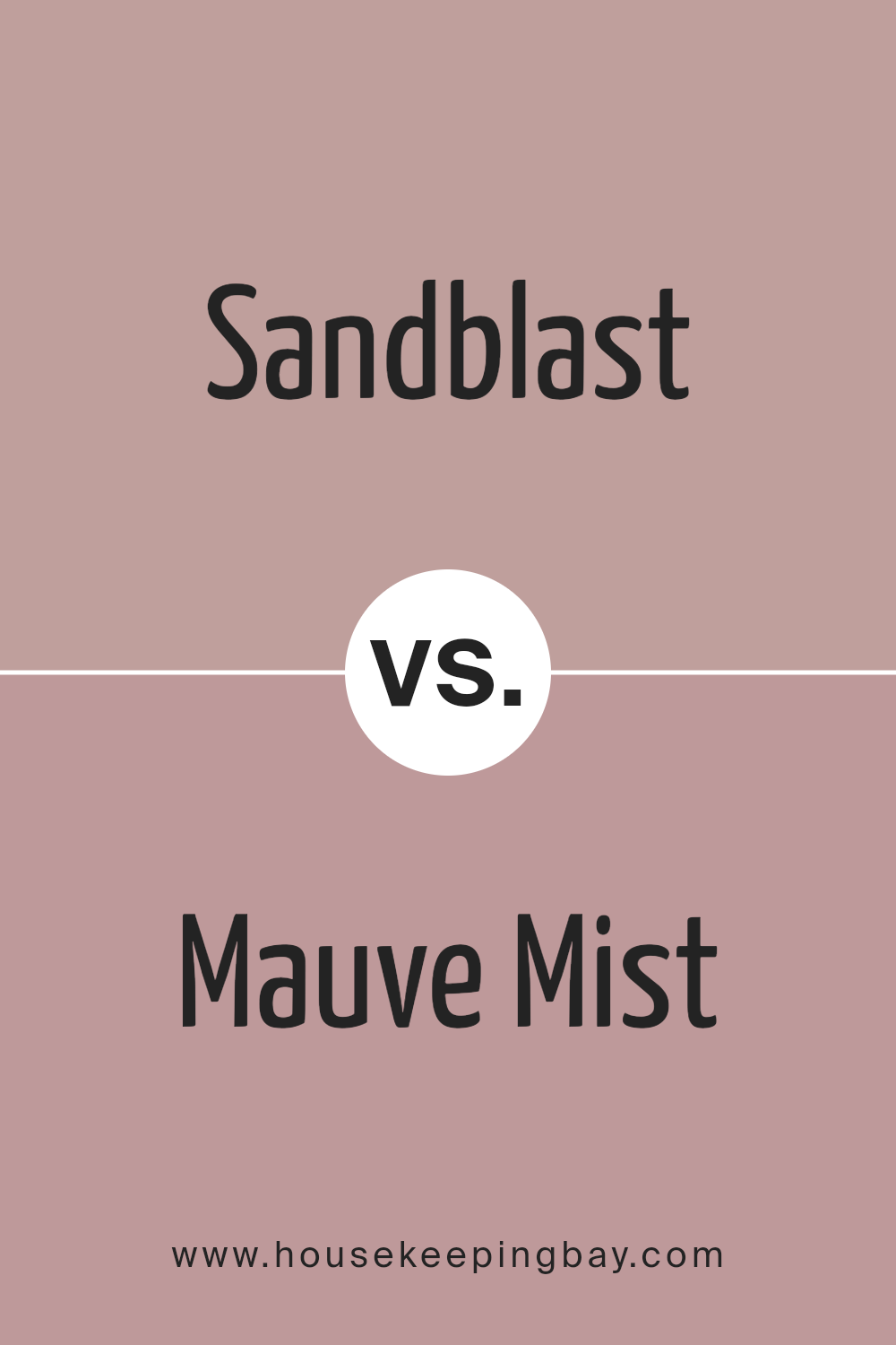
Sandblast 2103-50 by Benjamin Moore vs Mauve Mist 1264 by Benjamin Moore
Sandblast 2103-50 by Benjamin Moore is a gentle beige that has a warm, inviting tone. It reflects light well, making it a good choice for spaces where you want to create a cozy and bright atmosphere. The color has an earthy base, giving it a natural, unstressed feel which fits well in living rooms or bedrooms.
Mauve Mist 1264 by Benjamin Moore, in contrast, is a soft, muted pink with a subtle touch of lavender. This shade is more whimsical and romantic, ideal for creating a soothing and feminine ambiance. It’s perfect for spaces intended to be peaceful and delicate, such as nurseries or personal bathrooms.
While both colors offer warmth, Sandblast leans towards a neutral warmth, making it versatile across various decor styles. Mauve Mist, with its distinct pink hue, provides a specific character and mood that might not transcend as easily across different decorating themes. Both are excellent choices but serve different aesthetic purposes based on their particular shades.
You can see recommended paint color below:
- 1264 Mauve Mist
housekeepingbay.com
Conclusion
With its warm and inviting hue, Sandblast offers a perfect balance that works beautifully to create a serene and welcoming atmosphere in any space.
Through practical examination and real-world application, I’ve noticed that Sandblast not only enhances the aesthetic appeal of a room but also pairs seamlessly with various decor styles, from modern to traditional. This adaptability makes it an excellent choice for those looking to give their living spaces a gentle yet impactful facelift without overwhelming the existing design elements.
Moreover, the quality and coverage provided by Benjamin Moore ensure a smooth application process and a durable finish, making this color both a practical and charming option for busy households. It stands up well against daily wear and tear, maintaining its depth and richness over time.
In conclusion, my experience with 2103-50 Sandblast has been overwhelmingly positive. It effortlessly refreshes spaces while maintaining a calm, warm atmosphere. For anyone considering a new paint color, I would confidently recommend Sandblast as a reliable and fashionable choice that reliably performs while creating a cozy, inviting environment.
housekeepingbay.com
Ever wished paint sampling was as easy as sticking a sticker? Guess what? Now it is! Discover Samplize's unique Peel & Stick samples. Get started now and say goodbye to the old messy way!
Get paint samples
