Sage Wisdom CSP-775 by Benjamin Moore
Elegant Style in Every Brushstroke
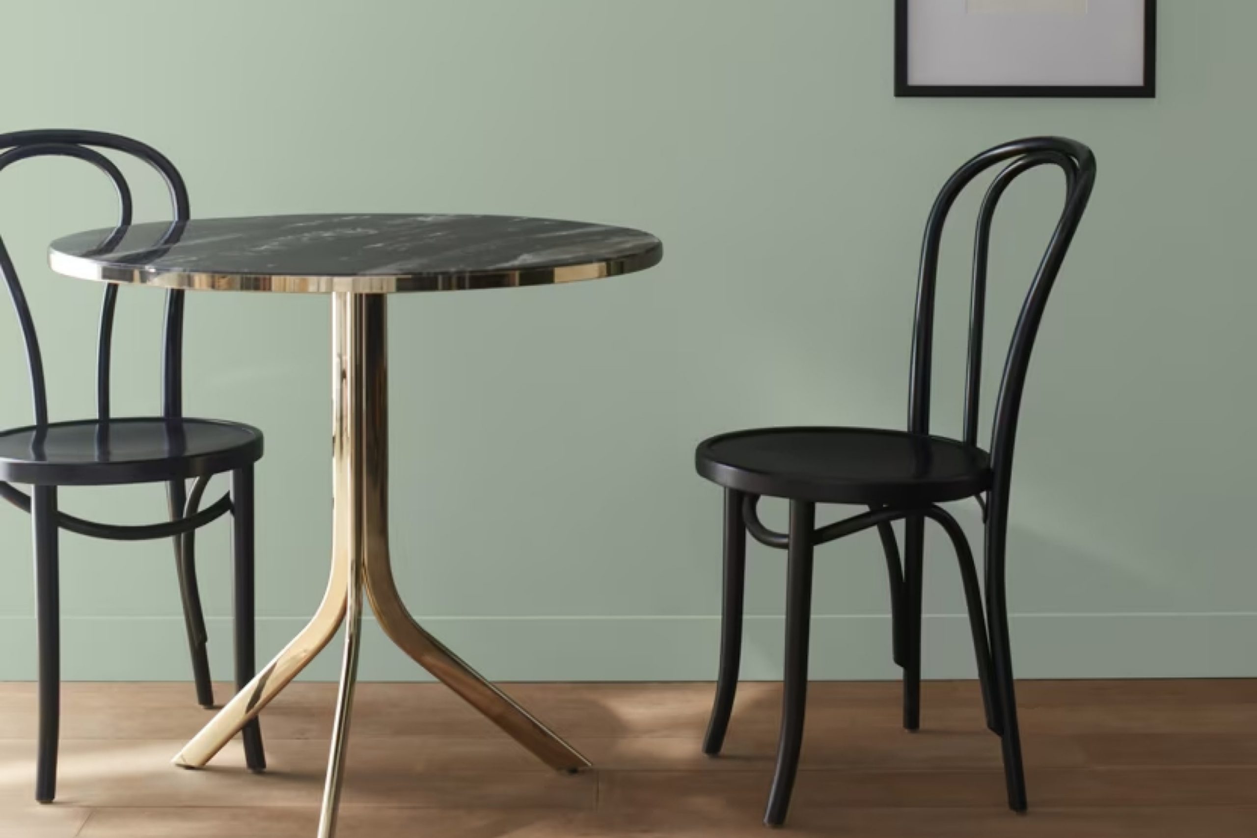
Are you searching for a paint color that brings both sophistication and warmth to your space? CSP-775 Sage Wisdom by Benjamin Moore might be just what you need. Its gentle blend of green and gray creates a calming and refined atmosphere, making it a favorite for both modern and traditional styles. This shade works well in any room, whether you’re refreshing your living room, kitchen, or bedroom.
Sage Wisdom offers versatility without overwhelming, providing a backdrop that allows your furniture and decor to stand out. It adapts beautifully to various lighting conditions, shifting subtly from a soft green to a muted gray as the light changes throughout the day.
Choosing the right color can seem daunting, but Sage Wisdom simplifies the process. Pair it with crisp whites for a clean, airy feel, or with rich woods to enhance its natural, earthy tone. This color harmonizes with a broad spectrum of hues, opening up endless possibilities for your home design.
Picture relaxing in a space painted with Sage Wisdom; it invites comfort and relaxation. Reimagine your walls and see how this color weaves tranquility into your everyday life.
Whether you aim for a fresh update or a whole new look, Sage Wisdom presents a timeless choice that balances elegance and understated beauty.
via benjaminmoore.com
What Color Is Sage Wisdom CSP-775 by Benjamin Moore?
Sage Wisdom CSP-775 by Benjamin Moore is a soft green that brings nature inside. This color has an earthy vibe and feels calming and grounded. It is a muted tone, which makes it versatile for many settings. It is an excellent choice for creating a peaceful atmosphere in various rooms.
In terms of interior styles, Sage Wisdom works well with Scandinavian designs, where simplicity and minimalism shine. It also pairs nicely with farmhouse or rustic styles, adding to the natural and cozy feel.
Mid-century modern interiors can also benefit from this shade, especially when paired with clean lines and wooden elements.
When considering materials, Sage Wisdom looks great next to natural wood, whether it’s oak, walnut, or pine. The combination of green and wood creates an organic, warm feeling. For textures, this color goes well with linen, cotton, and wool, bringing out a cozy and inviting atmosphere. Metals like copper and brass add a touch of sophistication when used with this color.
Accessories in cream or soft beige can highlight the room’s soothing ambiance. Sage Wisdom allows rooms to feel both fresh and relaxed, making it a smart choice for those wanting a calm yet stylish environment.

housekeepingbay.com
Is Sage Wisdom CSP-775 by Benjamin Moore Warm or Cool color?
Sage Wisdom CSP-775 by Benjamin Moore is a soft, muted green that adds a calm and earthy feel to any room. It brings the outside in, making spaces feel cozy and inviting. This gentle green works well in living rooms, bedrooms, or kitchens, providing a grounded, natural atmosphere. It acts like a neutral, pairing nicely with other colors and a range of furniture styles.
The color has a subtlety that adds sophistication without overwhelming the senses. It reflects light beautifully, creating a warm and welcoming glow in both small and large spaces. With Sage Wisdom CSP-775, any space can achieve a balanced and cohesive look.
Using this hue can also make other features, like wood accents or white trim, pop, highlighting architectural details. Overall, it’s a versatile color that can refresh interiors with a soothing yet polished touch. Whether used in a whole room or as an accent, it brings a peaceful and harmonious feel.
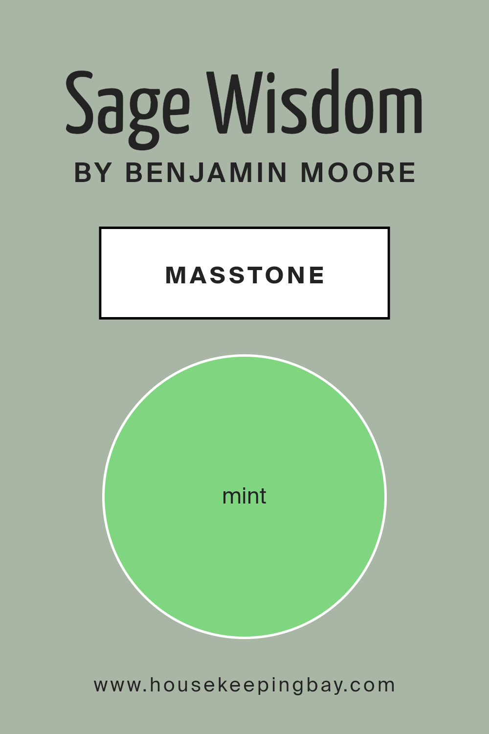
What is the Masstone of the Sage Wisdom CSP-775 by Benjamin Moore?
Sage Wisdom CSP-775 by Benjamin Moore, with its mint hue (#80D580), creates a calm and soothing atmosphere in homes. The light green color brings a touch of nature, making spaces feel fresh and inviting. It’s a versatile shade that works well in various rooms, from living rooms to bedrooms, adding a sense of peace and balance.
The mint masstone can brighten up a room without being overwhelming, offering a soft backdrop to different design styles.
In living rooms, the color makes spaces feel open and airy, complementing both modern and traditional furniture. In kitchens, it adds a hint of freshness, making the area welcoming and comfortable. Bathrooms gain a spa-like feel with this shade, creating a sense of relaxation. The color pairs well with neutrals, whites, and even bolder shades like navy or deep red, allowing for creative design choices. Its natural and serene vibe brings a pleasant and harmonious feel to any home.
housekeepingbay.com
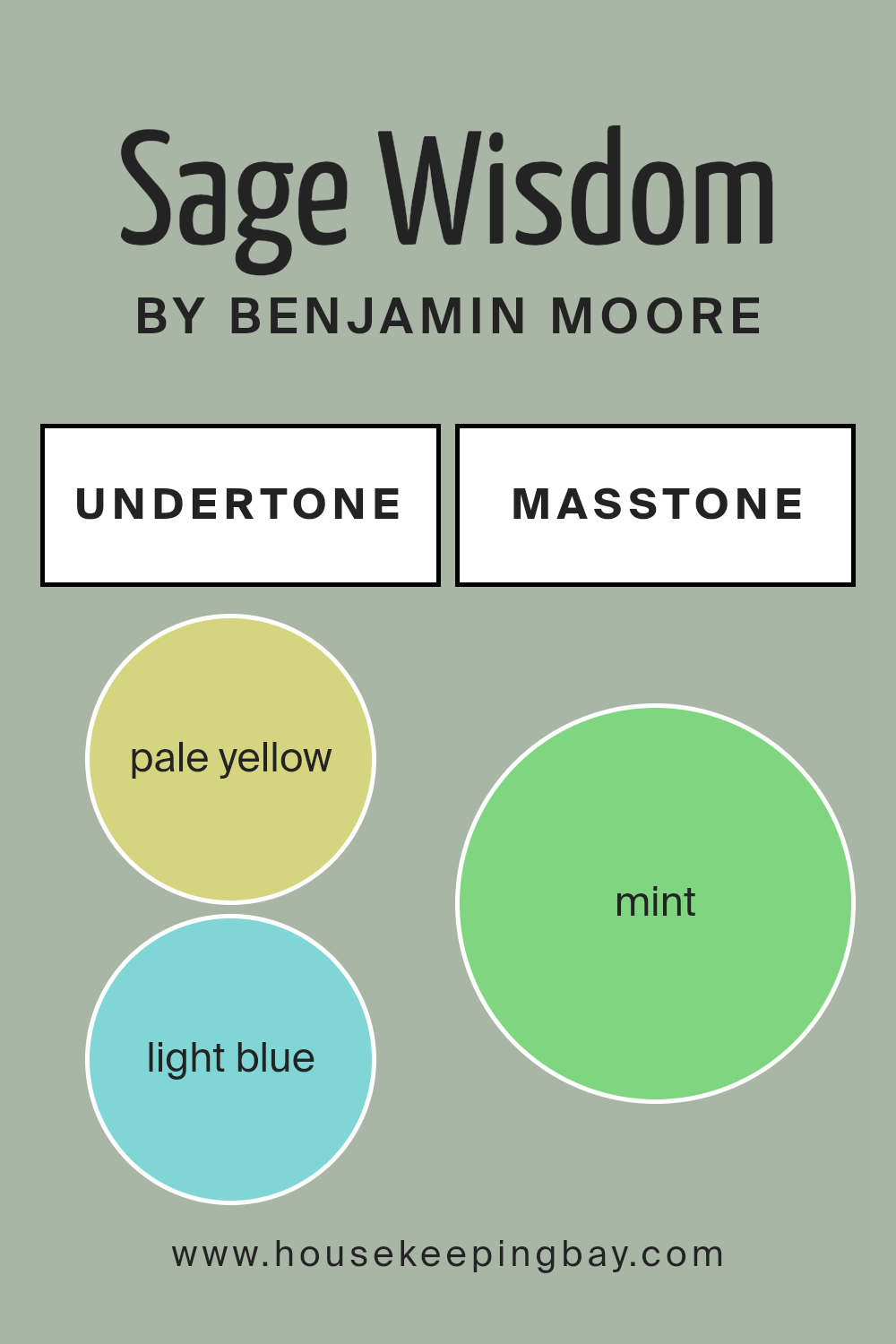
Undertones of Sage Wisdom CSP-775 by Benjamin Moore
Sage Wisdom CSP-775 by Benjamin Moore is a fascinating color. It has a mix of soft and muted shades, which makes it complex and interesting. The undertones give it a very unique character. When you look at Sage Wisdom, the pale yellow and light blue hint at warmth and coolness at the same time, making the color versatile for various settings.
Light gray and grey add a certain calmness, balancing the warmth with neutrality.
Pale pink and lilac undertones subtly soften Sage Wisdom, while light purple adds a gentle, elegant depth. The presence of light green and olive undertones introduces an earthy feel, connecting the color to natural elements. Turquoise, light turquoise, and blue undertones bring a refreshing quality, evoking a sense of open space or clear skies.
When used on interior walls, the pale pink and purple undertones can make a room feel cozy and inviting, perfect for living rooms or bedrooms. Light turquoise and blue add a hint of airiness, appropriate for kitchens or bathrooms.
Meanwhile, green and olive undertones help create a tranquil, nature-inspired setting, good for study areas. The mix of dark and light tones within Sage Wisdom offers flexibility, allowing it to adapt to different lighting and settings.
housekeepingbay.com
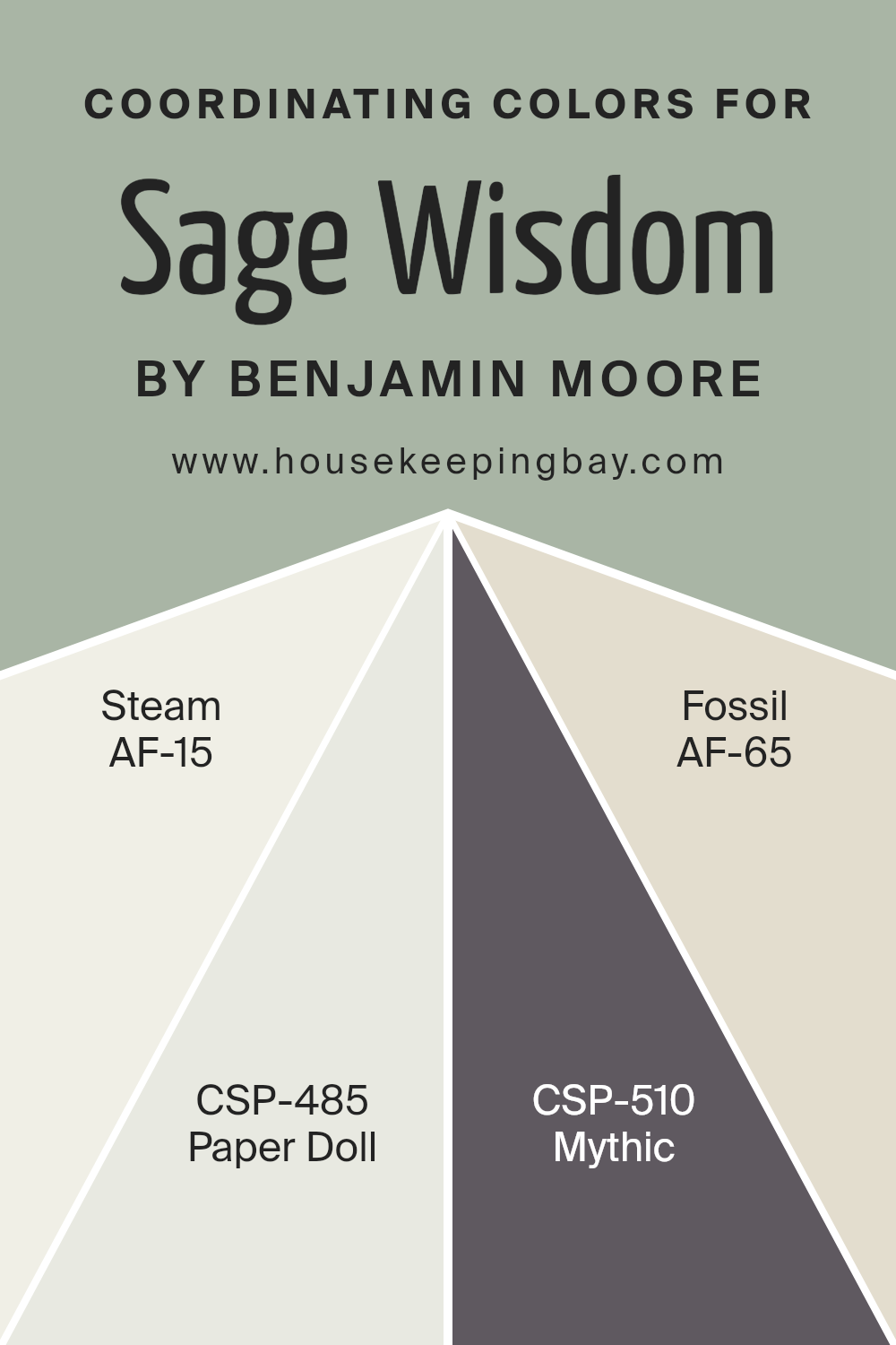
Coordinating Colors of Sage Wisdom CSP-775 by Benjamin Moore
Coordinating colors refer to hues that work harmoniously together to create a balanced and visually appealing space. Sage Wisdom CSP-775 by Benjamin Moore is a calming green that pairs beautifully with certain colors to enhance its natural tones.
One of its coordinating colors is Steam AF-15, a soft off-white that brings a sense of lightness and purity. Steam’s crispness can brighten up a room while maintaining a subdued elegance that complements the gentle green of Sage Wisdom.
Another matching hue is Paper Doll CSP-485, a gentle blush pink that adds a hint of warmth and softness. This shade offers a delicate contrast, adding warmth without overwhelming the subtle greenness.
Additionally, Mythic CSP-510 offers a muted, earthy taupe that adds depth and sophistication to any room.
It serves as a grounding element, balancing the lighter and more colorful tones. Lastly, Fossil AF-65 presents a light, warm beige that adds a natural, organic feel.
This shade provides a gentle backdrop, enhancing the other colors while allowing sage greens and gentle pinks to stand out.
Together, these coordinating colors create a well-rounded palette that brings depth, warmth, and harmony to any space.
You can see recommended paint colors below:
- AF-15 Steam
- CSP-485 Paper Doll
- CSP-510 Mythic
- AF-65 Fossil
housekeepingbay.com
How Does Lighting Affect Sage Wisdom CSP-775 by Benjamin Moore?
Lighting plays a significant role in how we perceive colors. The same color can appear quite different depending on the type of light it is exposed to. Sage WisdomCSP-775 by Benjamin Moore is a soft green that can change its appearance based on lighting conditions.
In natural light, Sage Wisdom can look different in each room of the house. In north-facing rooms, which often receive cooler, indirect sunlight, this color may appear more muted and cool. The light in these rooms has a soft, blue quality, which can make Sage Wisdom seem more subdued and even grayish.
In south-facing rooms, Sage Wisdom will often appear warmer and brighter. These rooms receive more direct sunlight throughout the day, especially during midday, which can enhance the warm undertones in the color. As a result, the green might look more vibrant and lively in these spaces.
East-facing rooms get warm, yellow-toned light in the morning, making Sage Wisdom appear a bit warmer and more welcoming at the start of the day. However, as the day progresses and the sunlight fades, the color might look cooler or more neutral.
In western-facing rooms, the color changes throughout the day as well. The morning light tends to be more subdued and cooler, which can make Sage Wisdom appear more muted. However, as the sun sets, the light becomes warmer and more orange, enhancing the warmth and depth of the color.
Artificial light also impacts how Sage Wisdom looks. Under warm artificial lights, like incandescent bulbs, the color may take on a cozier, more inviting tone. In contrast, under cool artificial lights, like fluorescent or certain LEDs, the color can appear cooler and less saturated.
Understanding these lighting effects can help in selecting complementary furnishings and decorations to match Sage Wisdom’s changing appearance throughout the day and in various lighting conditions.

housekeepingbay.com
What is the LRV of Sage Wisdom CSP-775 by Benjamin Moore?
LRV, or Light Reflectance Value, is a measure that tells you how much light a color reflects. It’s a scale from 0 to 100, where 0 means the color absorbs all light (like black), and 100 means it reflects all light (like white). LRV can help you predict how bright or dark a color will look on the walls.
A higher LRV means the color reflects more light, making a room feel brighter and more open. On the other hand, a lower LRV means the color absorbs more light, which can make a space feel cozy or smaller.
For Sage Wisdom CSP-775 by Benjamin Moore, with an LRV of 43.98, it falls in the middle of the scale. This means it reflects some light but also absorbs a fair amount. This mid-range LRV allows Sage Wisdom to appear as a balanced, medium tone. It won’t make a room incredibly bright, but it also won’t make it overly dark.
Sage Wisdom’s LRV is ideal for creating a balanced atmosphere—not too intense yet not too dull. This makes it suitable for various spaces where a calm and inviting ambiance is desired.

housekeepingbay.com
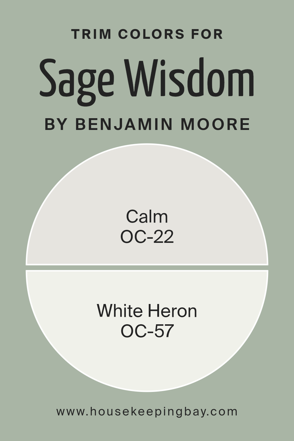
What are the Trim colors of Sage Wisdom CSP-775 by Benjamin Moore?
Trim colors are often used in painting projects to accentuate and complement the main wall color, enhancing the overall look of a room. They serve to highlight architectural features, such as windows, doors, and moldings, providing definition and contrast.
For Sage Wisdom CSP-775 by Benjamin Moore, using the right trim colors can make a significant difference. It is a soft, muted green, and incorporating carefully chosen trim colors can further draw out its soothing qualities.
Trim colors like OC-22 Calm and OC-57 White Heron work well because they are light and neutral, helping to frame Sage Wisdom without overwhelming or clashing with it.
OC-22 Calm is a light grey with warm undertones that can create a soft, inviting space around the areas it highlights.
This color adds a touch of warmth and harmony, complementing Sage Wisdom’s subtle green notes beautifully. On the other hand, OC-57 White Heron is a clean, crisp white with a hint of warm undertones.
It provides a clear, fresh edge that can give crispness to a room, contrasting with the muted quality of Sage Wisdom while maintaining an inviting atmosphere.
Together, these trim colors with Sage Wisdom can create a serene, balanced environment, ideal for relaxing spaces.
You can see recommended paint colors below:
- OC-22 Calm
- OC-57 White Heron
housekeepingbay.com
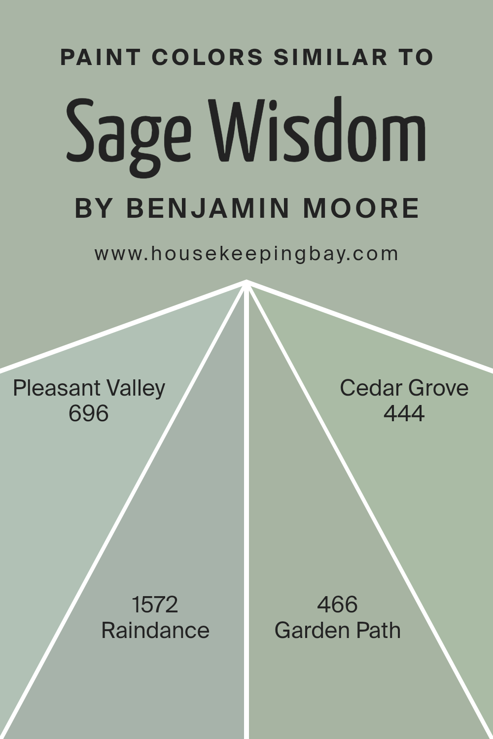
Colors Similar to Sage Wisdom CSP-775 by Benjamin Moore
Similar colors play an essential role in design and decoration because they create a cohesive and harmonious look. When you choose colors that are similar, like the calm tones related to Sage Wisdom by Benjamin Moore, they blend well together and make spaces feel united and pleasing to the eye.
Colors such as Pleasant Valley, Raindance, Garden Path, and Cedar Grove share gentle, earthy undertones that work seamlessly together. These colors are soothing, each bringing its unique mood and character while maintaining a sense of balance and continuity.
Pleasant Valley offers a soft, muted green that feels fresh and natural, evoking a sense of calm and comfort. Raindance, with its hint of blue, brings a light, airy feel to a space, reminiscent of early morning mist. Garden Path adds warmth with its subtle, earthy tone, making environments feel inviting and grounded.
Cedar Grove, with its deep, rich hue, introduces a touch of depth, adding a sense of stability and strength.
Together, these colors complement each other well, creating a serene atmosphere that invites relaxation and peace. By using similar colors, you can craft an environment that’s both appealing and cohesive, perfect for any setting wanting a gentle and connected look.
You can see recommended paint colors below:
- 696 Pleasant Valley
- 1572 Raindance
- 466 Garden Path
- 444 Cedar Grove
housekeepingbay.com
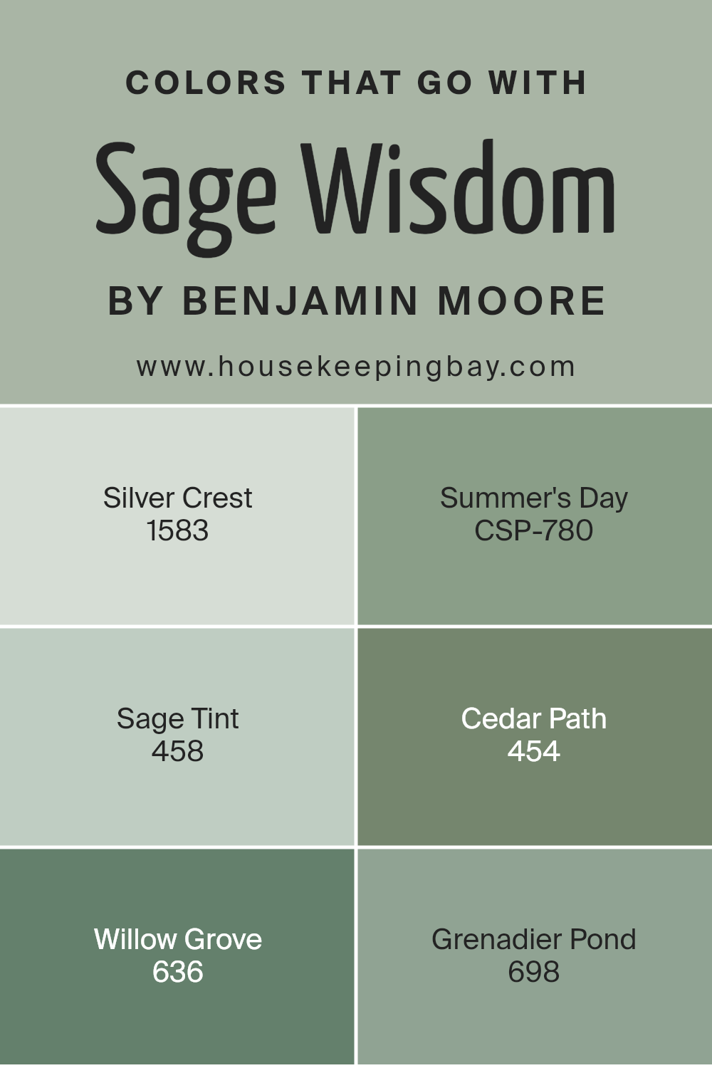
Colors that Go With Sage Wisdom CSP-775 by Benjamin Moore
Colors that pair with Sage Wisdom CSP-775 by Benjamin Moore create a balanced and harmonious environment. Silver Crest 1583 offers a soft, cool undertone that complements Sage Wisdom’s calmness, resulting in a soothing and elegant atmosphere.
Summer’s Day CSP-780 adds warmth and brightness, providing a cheerful contrast that invigorates the space. Sage Tint 458 mirrors the natural green tones of Sage Wisdom, enhancing the room’s cohesive and serene feel.
Cedar Path 454 brings in earthy browns that ground the design, offering a sense of stability and comfort.
Willow Grove 636 pairs beautifully with its muted green-gray shades, emphasizing sophistication. Lastly, Grenadier Pond 698, with its deep, moody undertones, provides depth and richness, creating dynamic visual interest.
These color combinations harmonize with Sage Wisdom CSP-775, adding layers of mood and style to any space without overwhelming it.
You can see recommended paint colors below:
- 1583 Silver Crest
- CSP-780 Summer’s Day
- 458 Sage Tint
- 454 Cedar Path
- 636 Willow Grove
- 698 Grenadier Pond
housekeepingbay.com
How to Use Sage Wisdom CSP-775 by Benjamin Moore In Your Home?
Sage Wisdom CSP-775 by Benjamin Moore is a versatile color choice for anyone looking to update their home. This calming green hue brings a touch of nature indoors, making spaces feel cozy and inviting. In living rooms, Sage Wisdom can offer a soothing backdrop for relaxation, adding warmth and harmony. Pair it with beige or cream-colored furniture for a balanced look.
In the kitchen, this color can complement wooden cabinets and stainless steel appliances, creating a fresh, clean ambiance. For a bedroom, Sage Wisdom provides a serene atmosphere, perfect for unwinding after a long day. Add white linens and soft lighting for a peaceful retreat.
In bathrooms, it contrasts beautifully with white tiles and natural accents like wicker baskets or wooden shelves.
This color also works well in home offices, as it promotes focus and calmness. Sage Wisdom is a great way to refine your space while keeping it stylish and comfortable.
Sage Wisdom CSP-775 by Benjamin Moore vs Pleasant Valley 696 by Benjamin Moore
Sage Wisdom CSP-775 and Pleasant Valley 696, both from Benjamin Moore, offer distinct personalities. Sage Wisdom is a gentle, muted green with gray undertones. It has a soft and calming effect, making it ideal for creating a serene environment in spaces like living rooms or bedrooms. This shade works well with neutral colors, adding a subtle touch without overpowering.
Pleasant Valley 696, however, presents a lighter, more vibrant green. It carries a fresh and inviting tone, perfect for adding a cheerful touch to kitchens or bathrooms. Pleasant Valley has a bit more brightness and is often used to inject energy into a space.
It pairs nicely with whites and natural wood tones, enhancing its lively nature.
While Sage Wisdom evokes a sense of quiet comfort, Pleasant Valley brings a sense of freshness and light. Both colors have their unique appeal, offering versatility for various design preferences.
You can see recommended paint color below:
- 696 Pleasant Valley

housekeepingbay.com
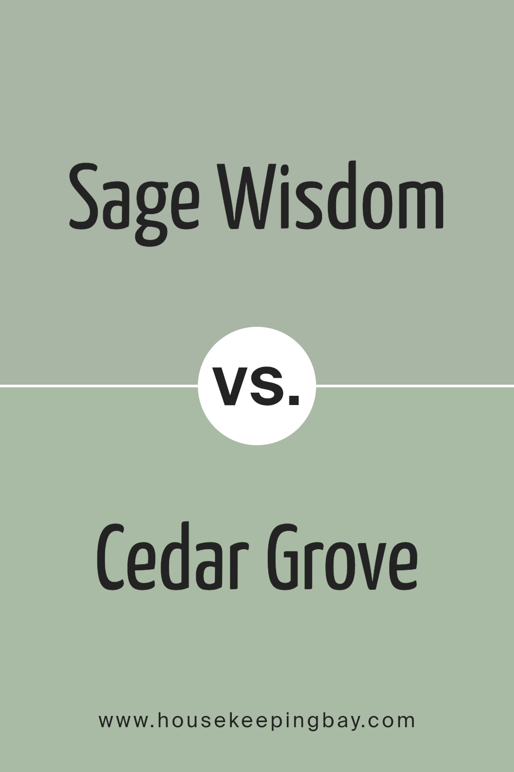
Sage Wisdom CSP-775 by Benjamin Moore vs Cedar Grove 444 by Benjamin Moore
Sage Wisdom CSP-775 and Cedar Grove 444 by Benjamin Moore both offer unique shades of green but create different feelings and styles. Sage Wisdom is a soft, muted green with a touch of gray, giving it a calming and sophisticated look. It’s a versatile color that complements many decor styles, from modern to traditional. This shade can create a peaceful atmosphere in any room without being overwhelming.
Cedar Grove 444, meanwhile, is a stronger, deeper green that brings a sense of richness and warmth. It has an earthy tone that feels more grounded and bold. This color can add depth to a space and works well with natural materials like wood and stone.
While both colors belong to the green family, Sage Wisdom is more subtle and neutral, making it ideal for creating a serene backdrop. Cedar Grove, being bolder, is perfect for making a statement or highlighting specific areas of a space.
You can see recommended paint color below:
- 444 Cedar Grove
housekeepingbay.com
Sage Wisdom CSP-775 by Benjamin Moore vs Garden Path 466 by Benjamin Moore
Sage Wisdom CSP-775 by Benjamin Moore is a gentle, calming green with subtle gray undertones. This color brings a sense of serenity and sophistication to any space. Its muted hue makes it versatile, suitable for living rooms, bedrooms, or even kitchens. Sage Wisdom works well as a neutral backdrop, allowing other decor elements to shine without overwhelming them.
Garden Path 466 by Benjamin Moore, however, is a bit more vibrant and earthy. It has warmer undertones compared to Sage Wisdom, giving it a richer, more natural feel.
With hints of brown mixed into its green base, Garden Path exudes a cozy, inviting atmosphere.
This color is perfect for spaces where you want to create a feeling of warmth and comfort.
While both colors offer a natural touch, Sage Wisdom leans towards a cooler, more understated look, while Garden Path provides a warmer, more grounded vibe. Each brings a different mood to a room, tailored to specific tastes and needs.
You can see recommended paint color below:
- 466 Garden Path
housekeepingbay.com
Sage Wisdom CSP-775 by Benjamin Moore vs Raindance 1572 by Benjamin Moore
Sage Wisdom CSP-775 and Raindance 1572 by Benjamin Moore offer distinct vibes that suit various settings. Sage Wisdom is a muted green with a touch of gray, creating a calm and grounded feel. It’s perfect for spaces needing a bit of sophistication, with earthy warmth and a soothing presence.
Raindance, however, boasts a soft blue tone that feels fresh and light. It’s ideal for areas where you want a cool, airy atmosphere. This color suggests serenity and works well in bathrooms or bedrooms, adding a touch of peacefulness.
While Sage Wisdom brings a sense of anchored calm, Raindance introduces a breezy, refreshing vibe. Both colors share a muted quality, making them versatile for different interiors. Combining them could balance warmth and coolness, allowing each shade to complement the other. Whether seeking warmth or calm, these colors can help create the desired ambiance.
You can see recommended paint color below:
- 1572 Raindance

housekeepingbay.com
Conclusion
Sage Wisdom by Benjamin Moore is an inspiring color, blending hints of gray with muted green undertones. This versatile choice brings a natural vibe into any space, offering a calming yet sophisticated look. With Sage Wisdom, rooms seem to breathe easier, inviting relaxation and a sense of balance.
Whether used on walls, trims, or accents, its subtle elegance complements various styles, from modern to traditional.
I find that its soft, earthy tone makes it perfect for living rooms, bedrooms, and kitchens. It pairs well with neutral palettes, enhancing their warmth, while also harmonizing with bolder shades, adding depth and interest. Sage Wisdom reflects a connection to nature, making interiors feel more grounded and serene.
From my perspective, Sage Wisdom offers more than just a trend; it creates a timeless atmosphere that feels both fresh and enduring.
Its adaptable quality allows for creative designs that can evolve over time. Whether one creates a cozy nook or an open, airy space, Sage Wisdom enriches the environment and promotes a peaceful ambience. It stands out as a thoughtful choice for those seeking a gentle touch of color that whispers calm and sophistication.

housekeepingbay.com
Ever wished paint sampling was as easy as sticking a sticker? Guess what? Now it is! Discover Samplize's unique Peel & Stick samples. Get started now and say goodbye to the old messy way!
Get paint samples


