Pumpkin Patch 055 by Benjamin Moore
Warm Up Your Space with Autumn’s Best
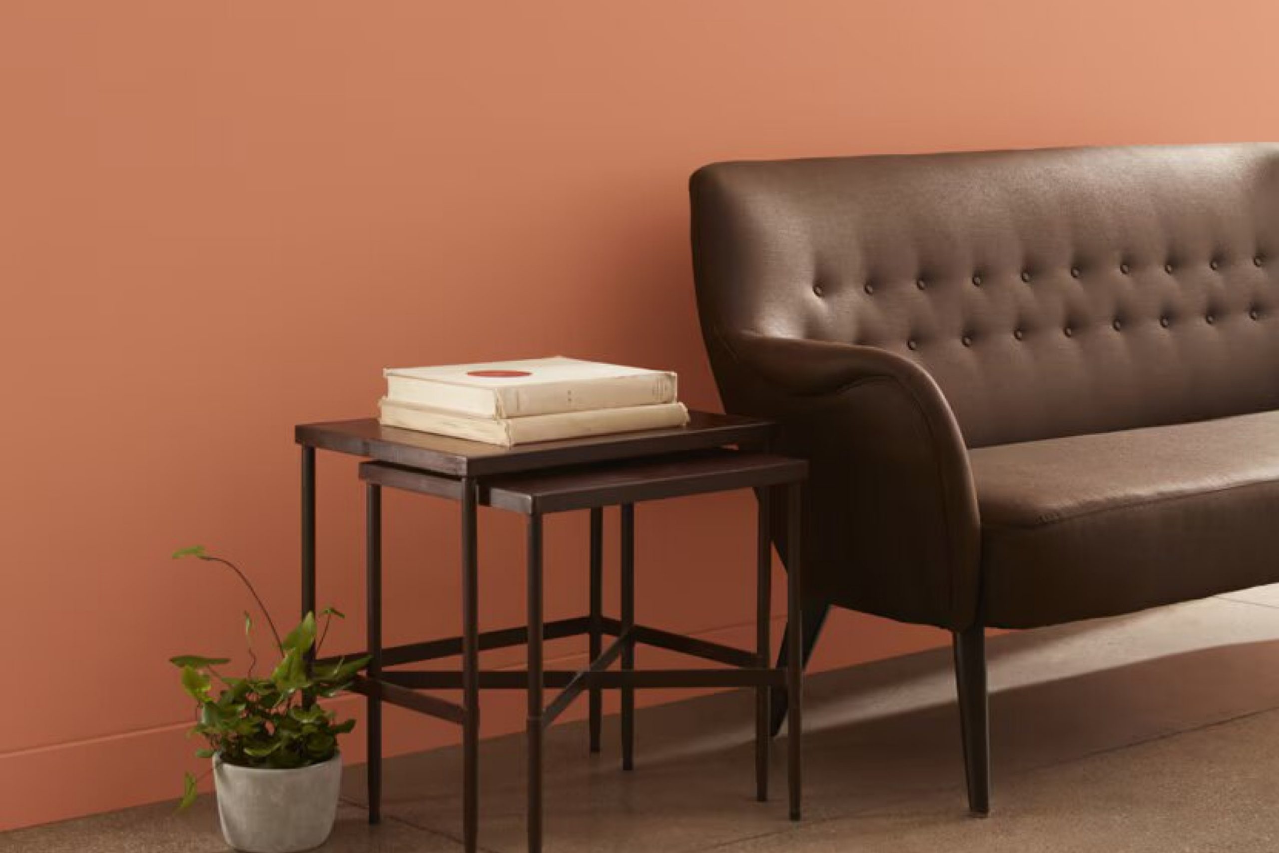
You might be wondering what makes 055 Pumpkin Patch by Benjamin Moore a great choice for your next painting project. Let’s talk about it! This paint color is a warm, welcoming orange that mimics the cozy feel of autumn. It’s perfect for creating a friendly and inviting atmosphere in any room of your home.
Whether you want to liven up your living room, dining area, or add a splash of color to your kitchen, 055 Pumpkin Patch brings a cheerful radiance. It particularly shines in spaces that benefit from a lot of natural light, enhancing the feeling of warmth and comfort. Plus, it pairs wonderfully with a variety of decor styles and complements wood tones beautifully.
Choosing the right color can sometimes be tricky, but 055 Pumpkin Patch has a unique charm that can help make your space feel just right. It’s not just a paint; it’s a way for you to add a personal touch to your home and make it more welcoming.
So, if you want a color that’s both warm and inviting, this might be the perfect pick for you!
via benjaminmoore.com
What Color Is Pumpkin Patch 055 by Benjamin Moore?
Pumpkin Patch 055 by Benjamin Moore is a warm, inviting orange hue with a vibrant base that hints of rich amber undertones, making it a perfect choice for creating a cozy, welcoming atmosphere. This color resonates with autumnal vibes, ideal for anyone looking to add a spirited splash of color to their living space.
In interior design, Pumpkin Patch 055 excels in styles that favor earth tones and natural elements. It works exceptionally well in rustic settings, featuring natural wood textures, which complement its warmth. It also pairs beautifully with farmhouse decor, where its earthy quality can be juxtaposed against materials like galvanized metal for a charming effect.
This shade also finds a place in eclectic interiors, where its boldness can be balanced with varied textures such as velvet, wool, and linen. These materials soften the intensity of the color, allowing it to blend smoothly within a space that combines many different stylistic elements.
Moreover, in rooms that need a touch of warmth, such as north-facing rooms that get less sunlight, Pumpkin Patch 055 can provide a feeling of warmth and coziness. Combine it with furniture in natural wood, textured throws, and pottery for a grounded, yet inviting look.

housekeepingbay.com
Is Pumpkin Patch 055 by Benjamin Moore Warm or Cool color?
Pumpkin Patch 055 by Benjamin Moore is a vibrant, warm shade of orange. This color brings a cozy, inviting feel to any room, making it ideal for living spaces where comfort is key. Because of its lively hue, Pumpkin Patch 055 adds a cheerful pop of color that can make smaller spaces seem more welcoming and lively.
It works particularly well in rooms that get lots of natural light, as the sunlight enhances its brightness and warmth, creating a pleasant, sunny atmosphere even on dull days.
When used in home decor, Pumpkin Patch 055 pairs nicely with neutral colors like whites and greys, which help balance its intensity. This makes it a fantastic choice for accent walls, or for accessories like cushions and throws if you prefer subtle color touches. It’s especially popular in autumn decor schemes but is versatile enough for year-round enjoyment. It’s a great way to add personality and warmth to your home without overwhelming your space with too much bold color.
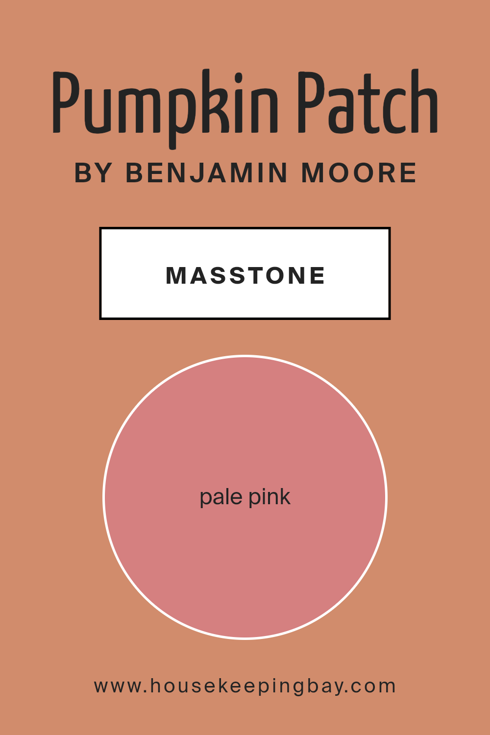
What is the Masstone of the Pumpkin Patch 055 by Benjamin Moore?
Pumpkin Patch 055 by Benjamin Moore in its masstone, Pale Pink (#D58080), offers a gentle and soothing hue that works wonderfully in homes. This particular shade of pink with its soft, subdued quality brings a warm and inviting atmosphere to any space.
Because it’s not overly bright or bold, it is versatile and easy to pair with different decor styles, from modern to vintage. It’s excellent for creating a cozy vibe in bedrooms or adding a touch of calm to living rooms. The pale pink tone also reflects light beautifully, making smaller rooms feel larger and more open.
Additionally, it pairs well with neutral colors like whites, grays, and tans, enhancing the overall aesthetic while keeping the environment peaceful and relaxed. Homeowners can confidently use this color to add a subtle yet impactful warmth to their interiors without overwhelming the space.
housekeepingbay.com
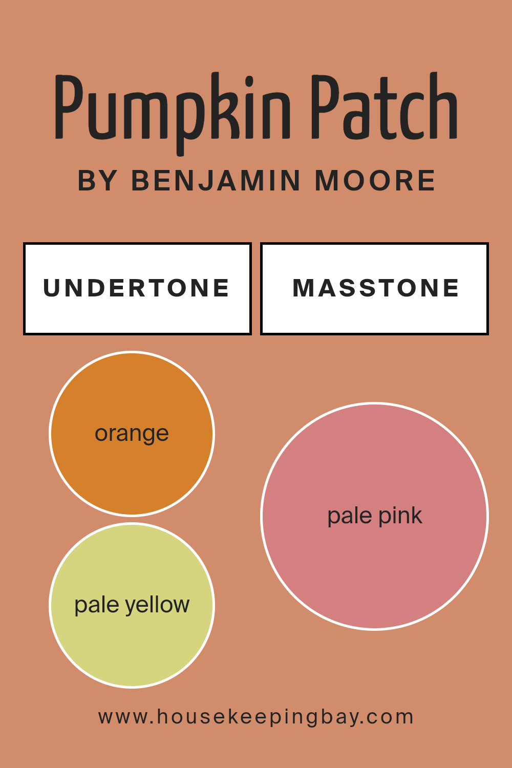
Undertones of Pumpkin Patch 055 by Benjamin Moore
Pumpkin Patch 055 by Benjamin Moore is a unique paint color with a complex blend of undertones that can significantly influence its appearance in different settings. The varied undertones like orange, pale yellow, grey, and others play a crucial role in how this color is perceived and can impact the mood and feel of a room.
The undertones of a color are subtle hues mixed into the main color, affecting how it looks under various lighting conditions and when paired with different décor elements. For instance, Pumpkin Patch 055 includes undertones such as orange and yellow, which can make the color warm and inviting. These warm undertones are perfect for creating a cozy atmosphere in living rooms or dining areas.
On the other hand, undertones like grey and light gray can soften the intensity, making Pumpkin Patch 055 more versatile and easier to integrate into different color schemes and design styles. This adaptability is beneficial for those who want a color that complements various furniture styles and accessories.
When used on interior walls, the complexity of Pumpkin Patch 055’s undertones will interact with both natural and artificial lighting. During the day, the lighter undertones like pale yellow and mint might become more prominent, enhancing the feeling of openness and light. In the evening, the deeper undertones such as brown and red might dominate, providing a warm and comforting ambiance.
In essence, the broad spectrum of undertones in Pumpkin Patch 055 makes it a dynamic option for interior painting, offering a rich depth that can harmonize with diverse themes and personal tastes. This complexity allows the color to adapt to different environments, making it a practical choice for those looking to enrich their living spaces.
housekeepingbay.com
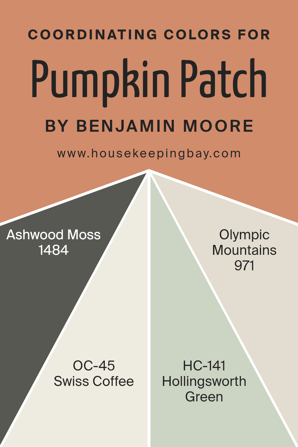
Coordinating Colors of Pumpkin Patch 055 by Benjamin Moore
Coordinating colors are hues that complement or enhance each other while sharing the same space. They are chosen to create a harmonious palette for any room or design project. These colors usually share similar tones or contrast in a way that brings balance and a pleasing aesthetic.
When you paint your walls with Pumpkin Patch 055 by Benjamin Moore, a vibrant and cheerful orange, finding the right coordinating colors helps achieve a balanced and welcoming ambiance.
1484 – Ashwood Moss is a deep, muted green with earthy undertones that grounds the brightness of Pumpkin Patch 055, adding a touch of nature-inspired serenity. OC-45 – Swiss Coffee offers a soft, creamy white that provides a clean, crisp background, making it ideal for trim or as an all-over color to offset more saturated hues.
HC-141 – Hollingsworth Green is a lighter, soothing green, which pairs nicely with Pumpkin Patch for a fresh and lively feel, especially in spaces seeking a touch of springtime. Lastly, 971 – Olympic Mountains gives a gentle beige with gray undertones, offering a subtle contrast that works well in providing a sophisticated neutral base that complements the warm tones of Pumpkin Patch perfectly.
You can see recommended paint colors below:
- 1484 Ashwood Moss
- OC-45 Swiss Coffee
- HC-141 Hollingsworth Green
- 971 Olympic Mountains
housekeepingbay.com
How Does Lighting Affect Pumpkin Patch 055 by Benjamin Moore?
Lighting plays a crucial role in how colors appear in different settings. The paint color Pumpkin Patch 055 by Benjamin Moore can look drastically different when seen in natural versus artificial light or in rooms with varied exposure to sunlight. Understanding this effect can help you choose the best application for this vibrant shade.
In artificial light—such as from LED or incandescent bulbs—Pumpkin Patch 055 can appear warmer and richer. Artifical lighting tends to enhance the yellow and orange undertones, making the walls feel cozy and inviting. This quality makes it a great choice for living spaces and areas where you want a sense of warmth, like dining areas or family rooms.
In natural light, Pumpkin Patch 055 transforms based on the direction of the sunlight. In north-facing rooms that receive less direct sunlight, this color can seem more muted and subtle. The cooler, softer light may slightly dull the warm tones, lending a more subdued feel to the room.
Conversely, in south-facing rooms bathed in ample sunlight for most of the day, Pumpkin Patch 055 sparkles with vibrancy. The ample light can intensify the color, enhancing its brightness and making the room feel lively and cheerful.
East-facing rooms get plenty of morning light, which is warm and welcoming. In the morning, Pumpkin Patch 055 will be bright and energetic, creating a cheerful ambiance perfect for starting the day. As the light fades, the color remains warm but becomes gentler, maintaining a mellow atmosphere in the afternoon and evening.
West-facing rooms receive the evening sun which throws a golden glow, intensifying the warm shades of Pumpkin Patch 055. This can make the space feel especially cozy and romantic as the sun sets, ideal for relaxing at the end of the day.
Ultimately, how Pumpkin Patch 055 looks in your home depends greatly on your room’s orientation and the type of lighting utilized, impacting the mood and feeling of the space.
housekeepingbay.com
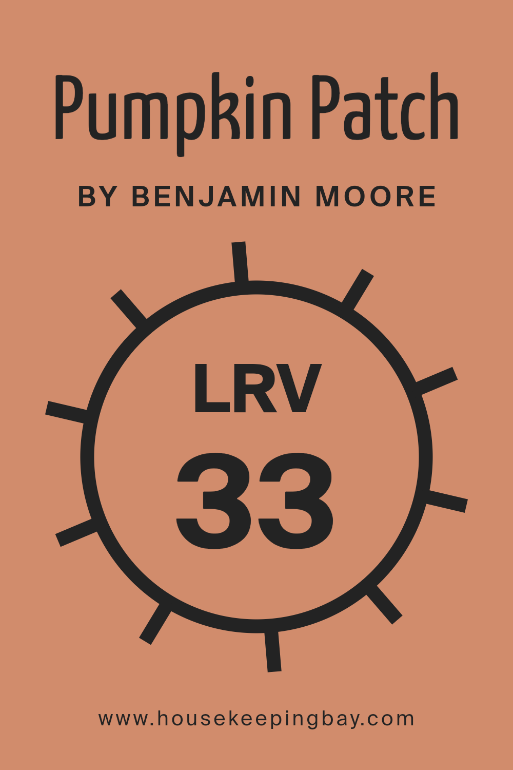
What is the LRV of Pumpkin Patch 055 by Benjamin Moore?
LRV stands for Light Reflectance Value, which is a measure of how much light a color reflects or absorbs. This number can range from 0 to 100, where 0 means it absorbs all light (completely black) and 100 reflects all light (pure white).
This value is crucial when choosing paint colors because it helps determine how light or dark a color will appear on your walls. A higher LRV means the color will look lighter, making rooms feel more open and airy, whereas a lower LRV means the color will look darker, which can make spaces feel cozier but smaller.
The LRV of Pumpkin Patch 055 by Benjamin Moore is 32.54, indicating it’s on the darker side of the scale. This means it will absorb more light than it reflects, creating a warmer and more intimate atmosphere in a room. In spaces with less natural light, this color might appear even darker and more pronounced.
However, in well-lit areas or when combined with good artificial lighting, Pumpkin Patch 055 can add a rich, warm hue to the space without making it feel too closed in. This makes it a versatile choice for areas where you want to add some depth and warmth to the decor.
housekeepingbay.com
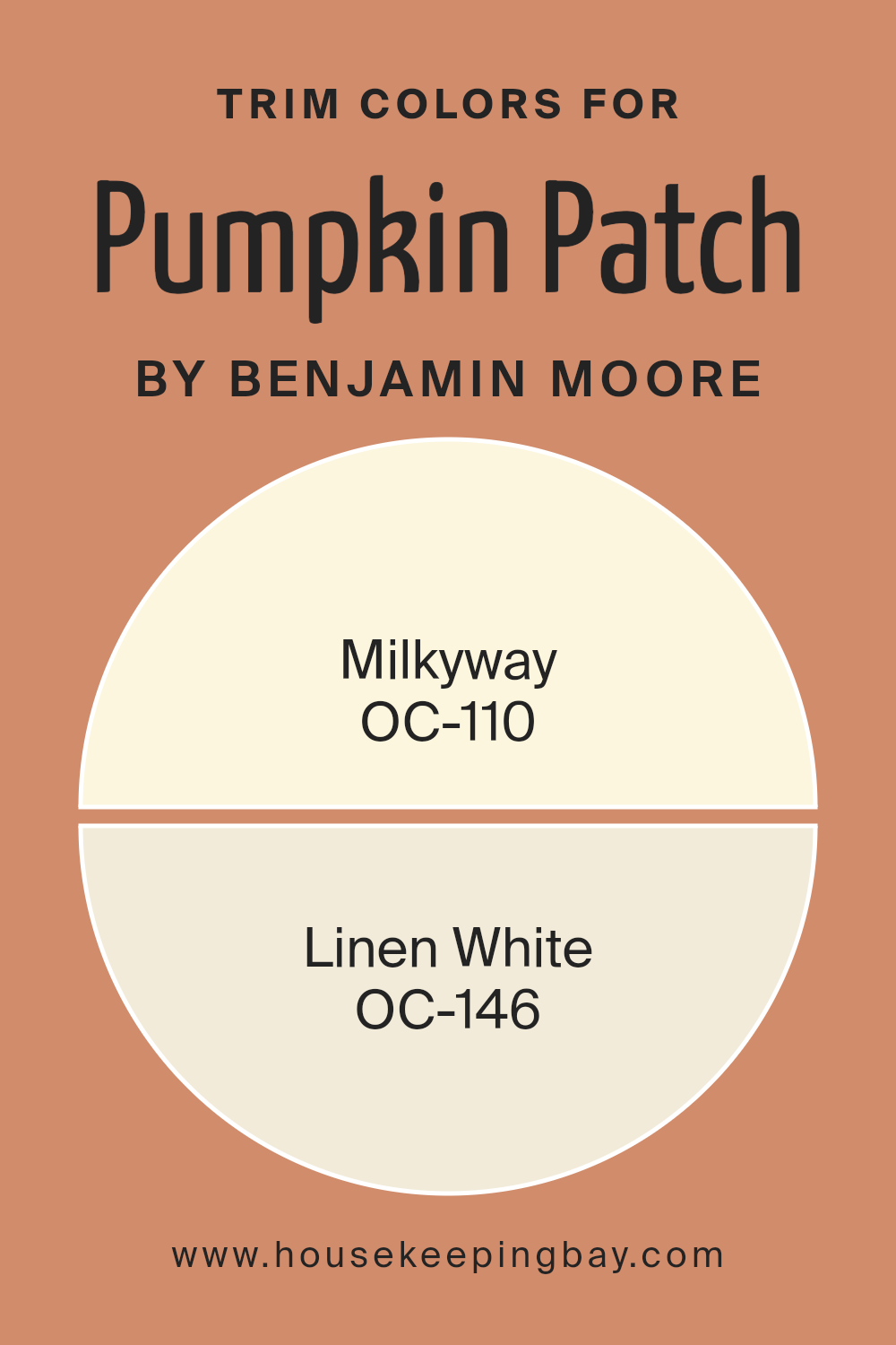
What are the Trim colors of Pumpkin Patch 055 by Benjamin Moore?
Trim colors are the hues used for accents in a room such as moldings, door frames, window frames, and baseboards. These colors, which are typically contrasting or complementary to the primary wall color, play a crucial role in enhancing architectural details and framing the spaces in your home effectively.
When applied thoughtfully like with Pumpkin Patch 055 by Benjamin Moore, a rich, autumnal orange, trim colors such as OC-110 Milkyway and OC-146 Linen White, enhance the warmth and continuity of the overall design, providing a subtle yet impactful visual bridge between walls and other elements.
OC-110 Milkyway is a gentle, creamy color that offers a soft contrast to more vivid shades like Pumpkin Patch 055, ensuring that transitions in a space feel smooth rather than jarring. OC-146 Linen White is a slightly warm white that has the versatility to complement both light and dark colors, ensuring it works harmoniously to balance the boldness of Pumpkin Patch 055 while adding a refined finish to any room. Both of these trim colors help in defining and finishing off spaces with a touch of elegance and a visually appealing neatness.
You can see recommended paint colors below:
- OC-110 Milkyway
- OC-146 Linen White
housekeepingbay.com
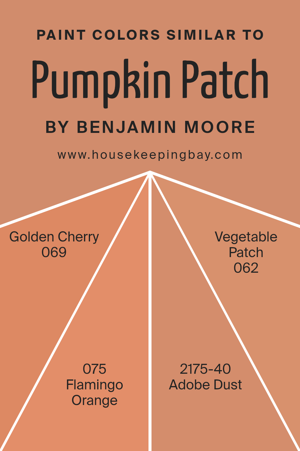
Colors Similar to Pumpkin Patch 055 by Benjamin Moore
Choosing similar colors, like those resembling Pumpkin Patch 055 by Benjamin Moore, can enhance the aesthetic cohesion of a space. When colors like Golden Cherry 069, Flamingo Orange 075, Adobe Dust 2175-40, and Vegetable Patch 062 are utilized, they create a subtle yet impactful visual harmony.
This similarity in hues allows for a seamless transition from one color to another across different elements in a room, contributing to a cohesive look that feels intentional and polished. The impact of using analogous colors is significant as it provides a balanced atmosphere that is pleasing to the eye, making the space more welcoming and comfortable.
Golden Cherry 069 is a vibrant, deep red that offers warmth and a touch of sophistication to interiors. Flamingo Orange 075 is a bright, lively color that injects playfulness and energy into any space. Adobe Dust 2175-40 brings a soft, earthy tone, resembling the natural color of clay, which can offer a grounded, calm feeling to a room. Vegetable Patch 062 is a deep green that suggests freshness and vitality, making it ideal for spaces meant to feel alive and organic. Together, these colors work harmoniously to achieve a balanced and inviting environment.
You can see recommended paint colors below:
- 069 Golden Cherry
- 075 Flamingo Orange
- 2175-40 Adobe Dust
- 062 Vegetable Patch
housekeepingbay.com
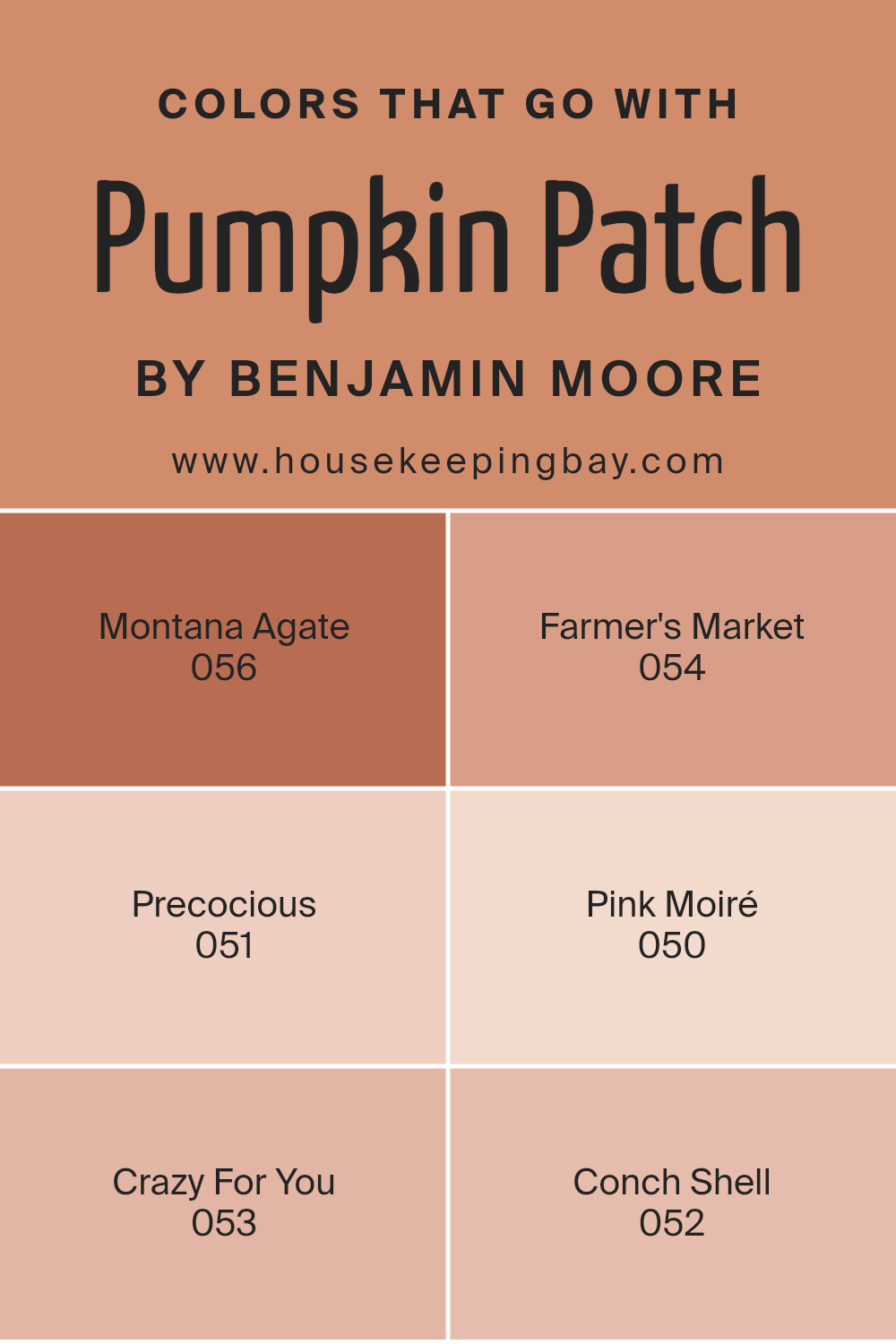
Colors that Go With Pumpkin Patch 055 by Benjamin Moore
Colors that complement Pumpkin Patch 055 by Benjamin Moore are essential for creating a cohesive and pleasant color scheme in any living space. When paired well, these colors can enhance the warmth and vibrancy of Pumpkin Patch 055, an inviting orange hue that can make spaces feel cozy and cheerful.
Montana Agate 056 lends a subtle, earthy backdrop that can soften the intensity of Pumpkin Patch 055. Think of it as a gentle gray with hints of brown, providing a solid foundation that allows brighter colors to pop without overwhelming the senses. Farmer’s Market 054 brings a deep green, reminiscent of lush vegetation, offering a natural contrast that highlights the orange tones beautifully.
Precocious 051 is a playful light blue that injects a fresh, airy feel into the mix, balancing the warmth of Pumpkin Patch 055 with its calm, soothing vibe. Pink Moiré 050 introduces a soft, romantic pink that lends a touch of sweetness, creating a delicate harmony with the bolder orange. Crazy For You 053 is a bold magenta that adds a burst of energy and personality, making the space feel lively and dynamic.
Lastly, Conch Shell 052 offers a muted peach that works harmoniously with Pumpkin Patch, enriching the overall palette with its subtle elegance and warmth. Together, these colors build a visually interesting space that feels balanced and welcoming.
You can see recommended paint colors below:
- 056 Montana Agate
- 054 Farmer’s Market
- 051 Precocious
- 050 Pink Moiré
- 053 Crazy For You
- 052 Conch Shell
housekeepingbay.com
How to Use Pumpkin Patch 055 by Benjamin Moore In Your Home?
Pumpkin Patch 055 by Benjamin Moore is a warm, vibrant orange paint color that brings a cozy and cheerful atmosphere to any room. This shade is perfect for those looking to add a pop of color without overwhelming the space. It works well in the kitchen or dining area where it encourages a friendly, social environment. This color can also liven up a playroom or a creative space, stimulating energy and creativity.
When used in small amounts, like on an accent wall or in decorative accents throughout the home, Pumpkin Patch 055 adds a playful touch without dominating the decor. It pairs beautifully with neutral tones like creamy whites, soft grays, and natural wood finishes, which help to balance its brightness.
Moreover, incorporating Pumpkin Patch 055 in seasonal decorations can also enhance the autumnal feel of your home, making spaces feel warm and inviting during the fall season. This color is versatile enough to be used in various ways, from painting walls to using it in fabrics and accessories, making it a great choice for those looking to refresh their home’s look with some lively color.
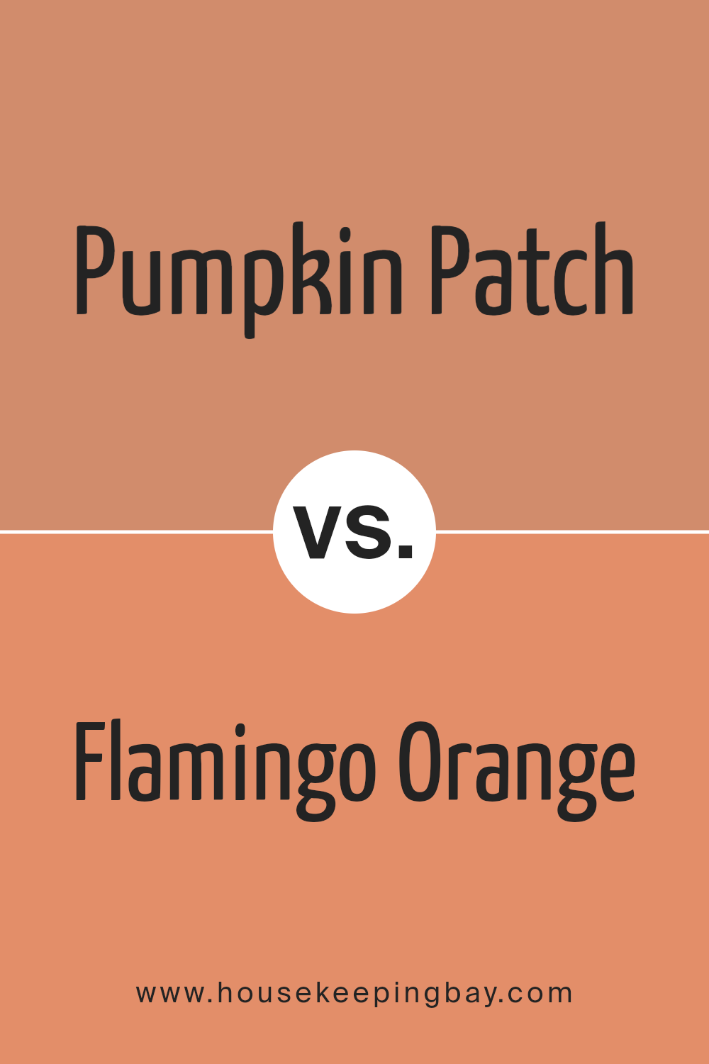
Pumpkin Patch 055 by Benjamin Moore vs Flamingo Orange 075 by Benjamin Moore
Both Pumpkin Patch 055 and Flamingo Orange 075 by Benjamin Moore are vibrant hues, perfect for adding energy to a space. Pumpkin Patch 055 is a rich, autumnal orange with a deep, warm undertone, making it ideal for cozy settings or rooms where you want a sense of comfort. It pairs well with natural colors and materials, enhancing areas that could benefit from a snug, inviting ambiance.
Flamingo Orange 075, in contrast, is a brighter, more playful shade. It has a zestier vibe with its vivid intensity. This color works wonders in spaces designed for fun and liveliness, such as playrooms or creative studios. Due to its bold character, Flamingo Orange can stimulate excitement and is best used in areas where you want to create an energetic, dynamic feel.
Both colors share an orange base, but their different tones impact the mood they create. While Pumpkin Patch leans towards a traditional, soothing environment, Flamingo Orange aims for an upbeat, spirited atmosphere.
You can see recommended paint color below:
- 075 Flamingo Orange
housekeepingbay.com
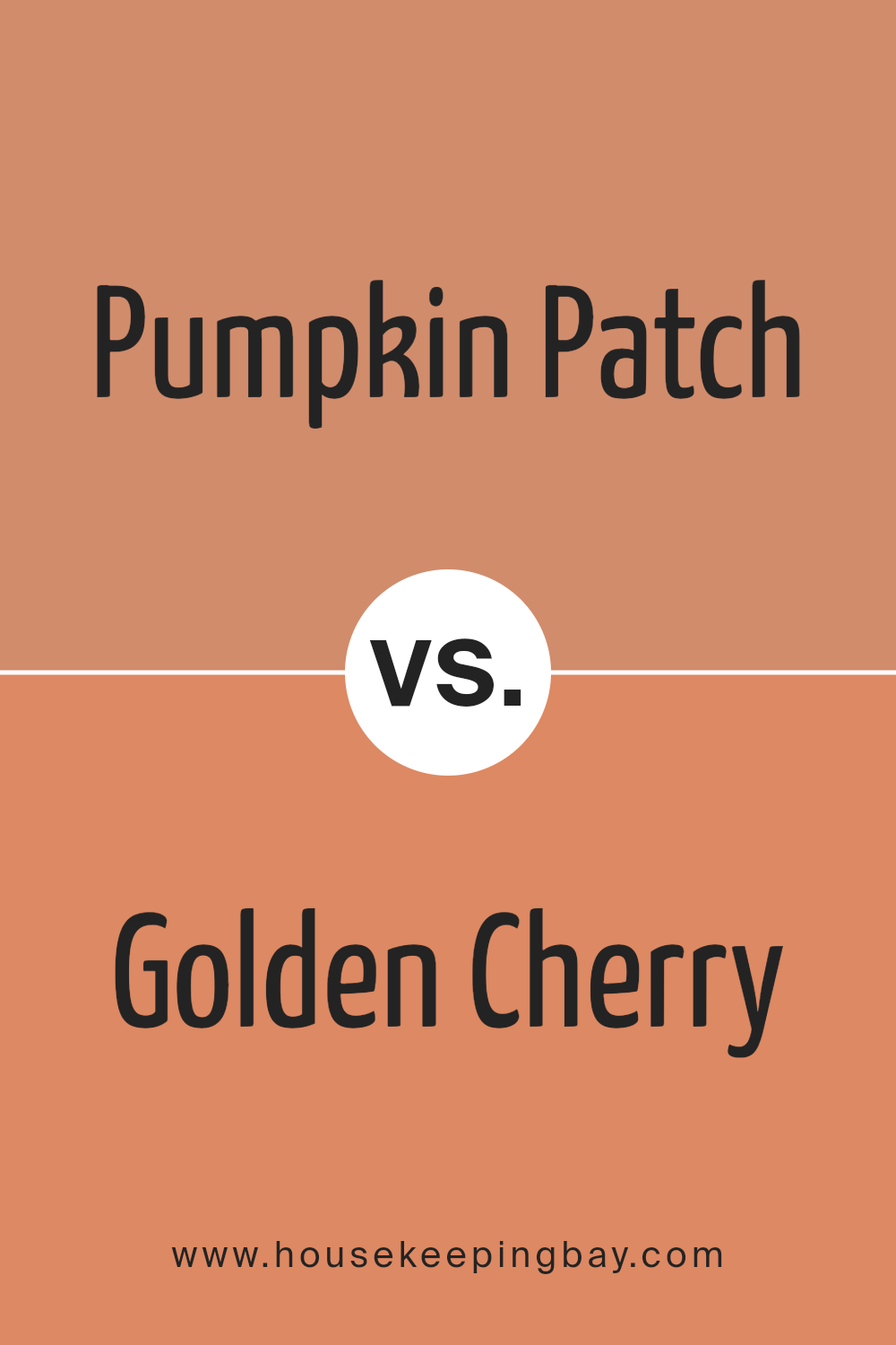
Pumpkin Patch 055 by Benjamin Moore vs Golden Cherry 069 by Benjamin Moore
“Pumpkin Patch 055” by Benjamin Moore is a warm, inviting orange hue that brings to mind the rich shades of autumn. This color is deep and vibrant, offering a cozy feel that works well in living spaces or any area that benefits from a touch of warmth.
In contrast, “Golden Cherry 069” also by Benjamin Moore, leans towards a cheerful yellow-orange, reminiscent of the bright and lively tones of early fall cherries. It’s lighter than Pumpkin Patch, providing a more airy and fresh vibe, perfect for brightening up a room.
While both colors fit wonderfully into a scheme that values warmth, Pumpkin Patch 055 is more intense and enveloping, making it a good choice for accent walls or decor elements. Golden Cherry 069, being lighter, is apt for larger wall spaces or rooms needing a splash of light without overwhelming the senses. Together, these colors could nicely balance each other in a space that wishes to feel warm yet spacious.
You can see recommended paint color below:
- 069 Golden Cherry
housekeepingbay.com
Pumpkin Patch 055 by Benjamin Moore vs Vegetable Patch 062 by Benjamin Moore
Pumpkin Patch 055 by Benjamin Moore is a vibrant, warm orange hue that brings a cozy, inviting feel to any space. It’s reminiscent of autumn leaves and has a cheerful energy that can brighten up rooms that receive less sunlight, making it great for living areas or dining rooms where a lively atmosphere is desired.
In contrast, Vegetable Patch 062 is a deeper, earthy green. This color mimics the lushness of a well-tended garden and offers a comforting, grounded sensation. It’s better suited for spaces where you want to create a serene, natural vibe, like bedrooms or studies where calm is appreciated.
Both colors, although distinct, bring a touch of nature indoors. Pumpkin Patch 055 adds warmth and energy, while Vegetable Patch 062 cultivates a relaxing, soothing environment. Each can be used to create specific moods in a home, depending on the room’s function and the ambiance one wishes to achieve.
You can see recommended paint color below:
- 062 Vegetable Patch

housekeepingbay.com
Pumpkin Patch 055 by Benjamin Moore vs Adobe Dust 2175-40 by Benjamin Moore
Main color Pumpkin Patch 055 by Benjamin Moore has a rich, vibrant orange hue, reminiscent of autumn pumpkins. It’s a warm, inviting color that brings to mind cozy fall settings. This color could make a statement in a room, especially when paired with neutral shades to balance its intensity.
In contrast, Adobe Dust 2175-40 by Benjamin Moore is a more subdued, earthy terracotta color. It’s less bold compared to Pumpkin Patch but offers a soft, soothing presence that easily blends with various decor styles. Adobe Dust could work well in spaces where a subtle, natural tone is desired, providing a calm and cohesive look.
Both colors share an earthy base, making them compatible if used together, yet each brings its own unique character to a space. Pumpkin Patch 055 is great for those who want a lively, energetic feel, while Adobe Dust 2175-40 suits a more understated, serene atmosphere.
You can see recommended paint color below:
- 2175-40 Adobe Dust

housekeepingbay.com
Known for its rich, deep orange hue, this paint color makes rooms feel more welcoming and can add a pleasant pop of vibrancy wherever applied. It works exceptionally well in living areas and kitchens where the heart of the home beats the loudest, fostering a setting that encourages gatherings and heartfelt conversations.
One of the key benefits of using “055 Pumpkin Patch” is its versatility. It pairs well with a wide array of decor styles, from rustic to modern, and coordinates nicely with both dark and light accents. Whether looking to refresh a single accent wall or planning a complete room makeover, “055 Pumpkin Patch” provides a reliable foundation that enhances the surrounding elements rather than overshadowing them.
Additionally, the quality of Benjamin Moore paints assures durability and a smooth application, which ensures long-lasting beauty and ease of maintenance. This makes “055 Pumpkin Patch” not only a visually appealing choice but also a practical one for transforming any living space.
Overall, if you’re in search of a paint color that adds warmth, character, and charm, “055 Pumpkin Patch” by Benjamin Moore could be your perfect match. I highly recommend giving it a try.
housekeepingbay.com
