Hollingsworth Green HC-141 by Benjamin Moore
A Fresh Twist on Classic Style
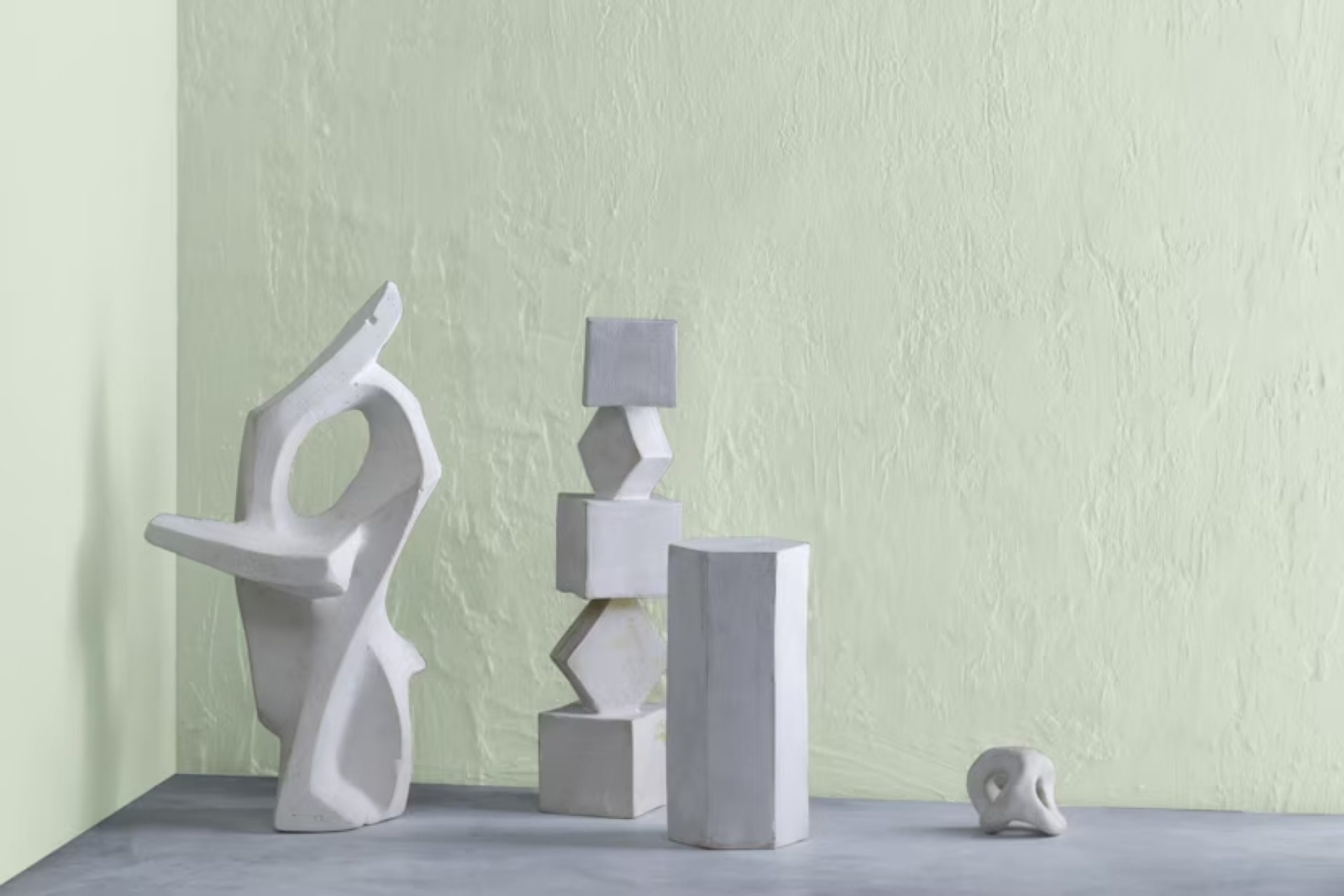
Choosing the right paint color for your home can be a challenging task, especially when you want something that’s both timeless and modern. HC-141 Hollingsworth Green by Benjamin Moore might be the solution you’ve been searching for.
This shade presents a gentle balance of sophistication and calmness without overpowering a room. Imagine a soft sage with the slightest touch of gray undertones. It can create a soothing atmosphere in your living space, kitchen, or even a home office.
Hollingsworth Green complements various design styles. Whether you’re working with a cozy cottage aesthetic or a sleek contemporary look, this color fits naturally. Pair it with whites or off-whites for a crisp combination, or add darker accents for a more grounded feel.
It’s perfect for those who appreciate a natural vibe but still want a touch of elegance.
With its subtle charm, Hollingsworth Green might just be the paint color that brings everything together in your home, making it feel more connected and harmonious.
via benjaminmoore.com
What Color Is Hollingsworth Green HC-141 by Benjamin Moore?
Hollingsworth Green HC-141 by Benjamin Moore is a soft, muted green with a timeless quality. This color sits comfortably between neutral and bold, offering a serene yet sophisticated ambiance. Its slight gray undertone balances the green, making it versatile for various settings.
Ideal for traditional and modern interiors, Hollingsworth Green works well in living rooms, bedrooms, or dining areas. It complements both classic and contemporary furniture pieces, bringing a touch of nature indoors.
This green offers a calm backdrop, allowing other design elements to stand out without overpowering the space.
In terms of materials, Hollingsworth Green pairs beautifully with natural wood tones, whether light oak or richer walnut. For textures, consider soft linens or wool fabrics, which enhance its cozy vibe. Complementary colors include whites, creams, and pastel shades.
Metal accents in brass or gold add warmth and contrast, while stainless steel or silver can give a more modern touch.
For added depth, combining Hollingsworth Green with textured wallpaper or patterned textiles offers a pleasing contrast. Plants with lush greenery, like ferns or succulents, blend beautifully with this color, making any room feel more lively and connected to nature.
housekeepingbay.com
Is Hollingsworth Green HC-141 by Benjamin Moore Warm or Cool color?
Hollingsworth Green HC-141 by Benjamin Moore is a versatile and refreshing color choice for homes. It presents a gentle, muted green that blends nicely with many styles and spaces. This shade has a soft, calming quality, making rooms feel more relaxed and inviting.
Its understated tone works well in living areas, bedrooms, or kitchens, adding a touch of nature without overwhelming the senses.
In homes, Hollingsworth Green pairs beautifully with both light and dark accents. It complements natural wood finishes, enhancing their warmth. Its balanced hue allows it to stand the test of time, never feeling too trendy or outdated. Additionally, this green can modify the ambiance of a room depending on the lighting.
In brighter spaces, it may appear slightly more vibrant, while in dimmer settings, it takes on a more subdued appearance. Overall, Hollingsworth Green creates a serene and comfortable atmosphere suitable for any home.
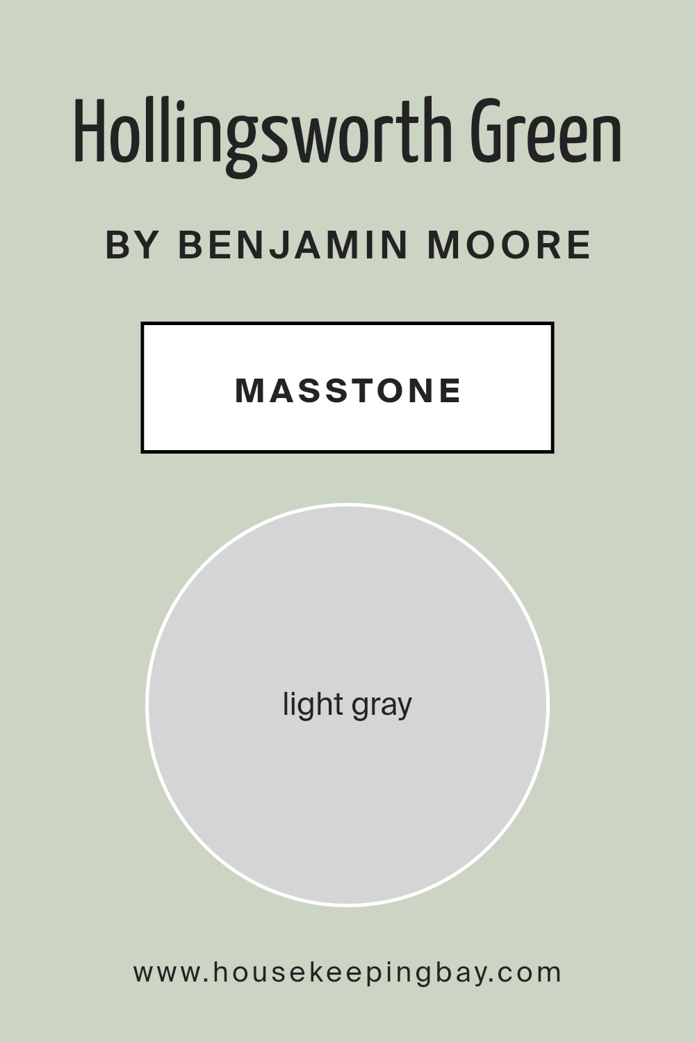
What is the Masstone of the Hollingsworth Green HC-141 by Benjamin Moore?
Hollingsworth Green HC-141 by Benjamin Moore is a versatile light gray with a masstone of #D5D5D5. This color works well in many home settings because it creates a neutral backdrop that complements various styles and furnishings.
Light gray has a soft, calming presence, making it an excellent choice for living rooms, bedrooms, or even kitchens. It reflects natural light beautifully, brightening up spaces without overpowering them.
Hollingsworth Green HC-141 has enough warmth to make rooms feel cozy yet remains crisp enough to add sophistication. This balance allows it to blend seamlessly with both warm and cool color palettes. You can pair it with vibrant colors for a lively atmosphere or combine it with other neutrals for a classic, timeless look.
Its adaptability means it works in both modern and traditional homes, providing a unified look that encourages comfort and relaxation. Overall, it is a flexible choice for any interior.
housekeepingbay.com
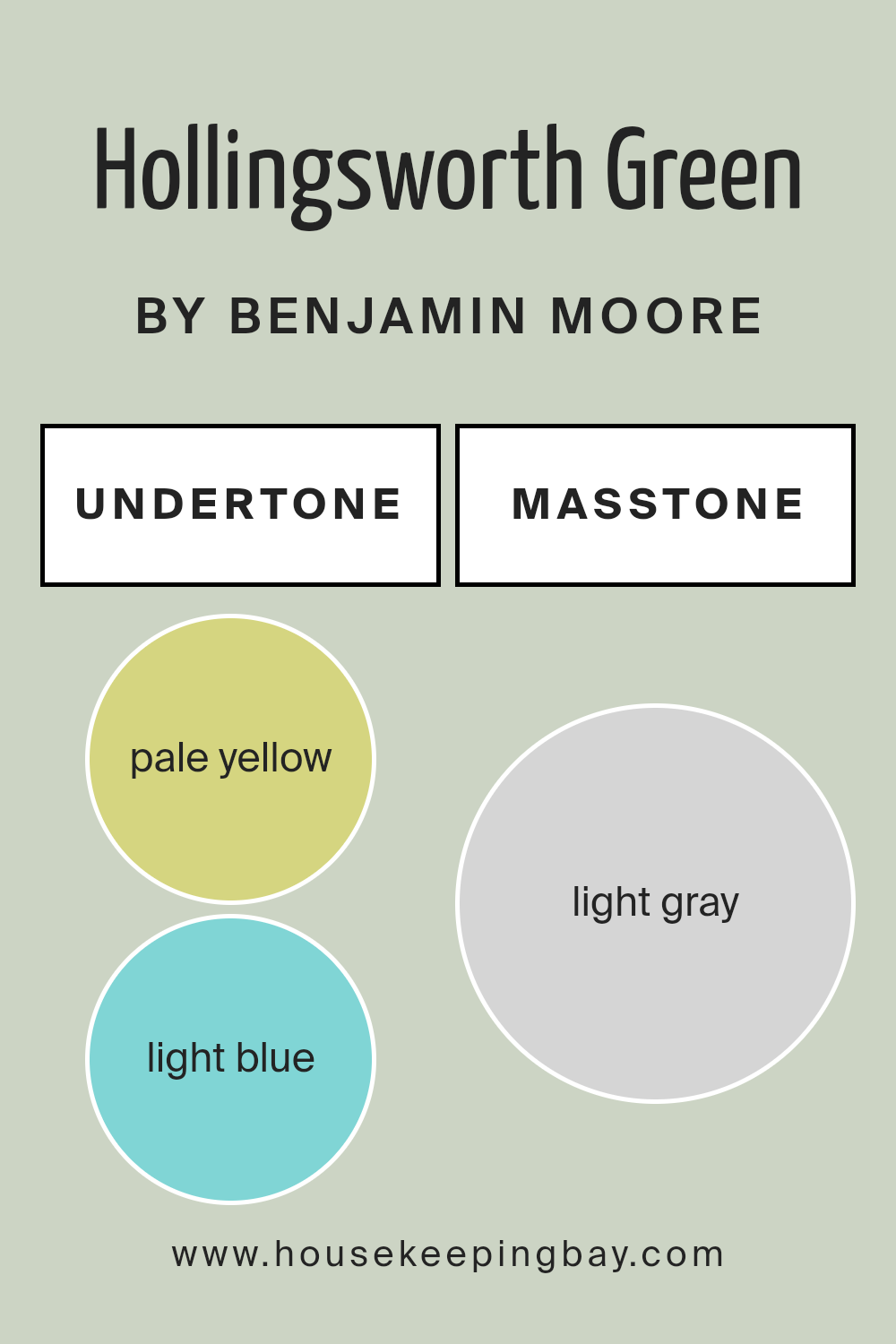
Undertones of Hollingsworth Green HC-141 by Benjamin Moore
Hollingsworth Green HC-141 by Benjamin Moore is a complex paint color that incorporates various subtle undertones, influencing its appearance in a room. These undertones include pale yellow, light blue, light purple, mint, pale pink, lilac, and grey.
Each undertone can affect how we perceive the main color, depending on lighting and surroundings.
Pale yellow undertones can bring a hint of warmth and sunlight to the color, making it feel more inviting and cozy. Light blue undertones may add a refreshing, airy quality, creating a sense of spaciousness. The hint of light purple can contribute a touch of elegance and sophistication.
Mint undertones often lend a fresh, clean feeling, reminiscent of nature and open spaces. Pale pink undertones might inject a subtle softness and warmth, lending a gentle and calming atmosphere to a room. Lilac can suggest creativity and depth, adding interest and complexity.
Grey undertones serve to tone down the vibrancy, offering a more muted, balanced feel.
When used on interior walls, Hollingsworth Green can adapt to many contexts, the undertones adjusting to different lighting.
In bright light, the warmer undertones may become more prominent, while in cooler, dimmer settings, the cooler tones might shine, significantly changing the ambiance and mood of the room.
housekeepingbay.com
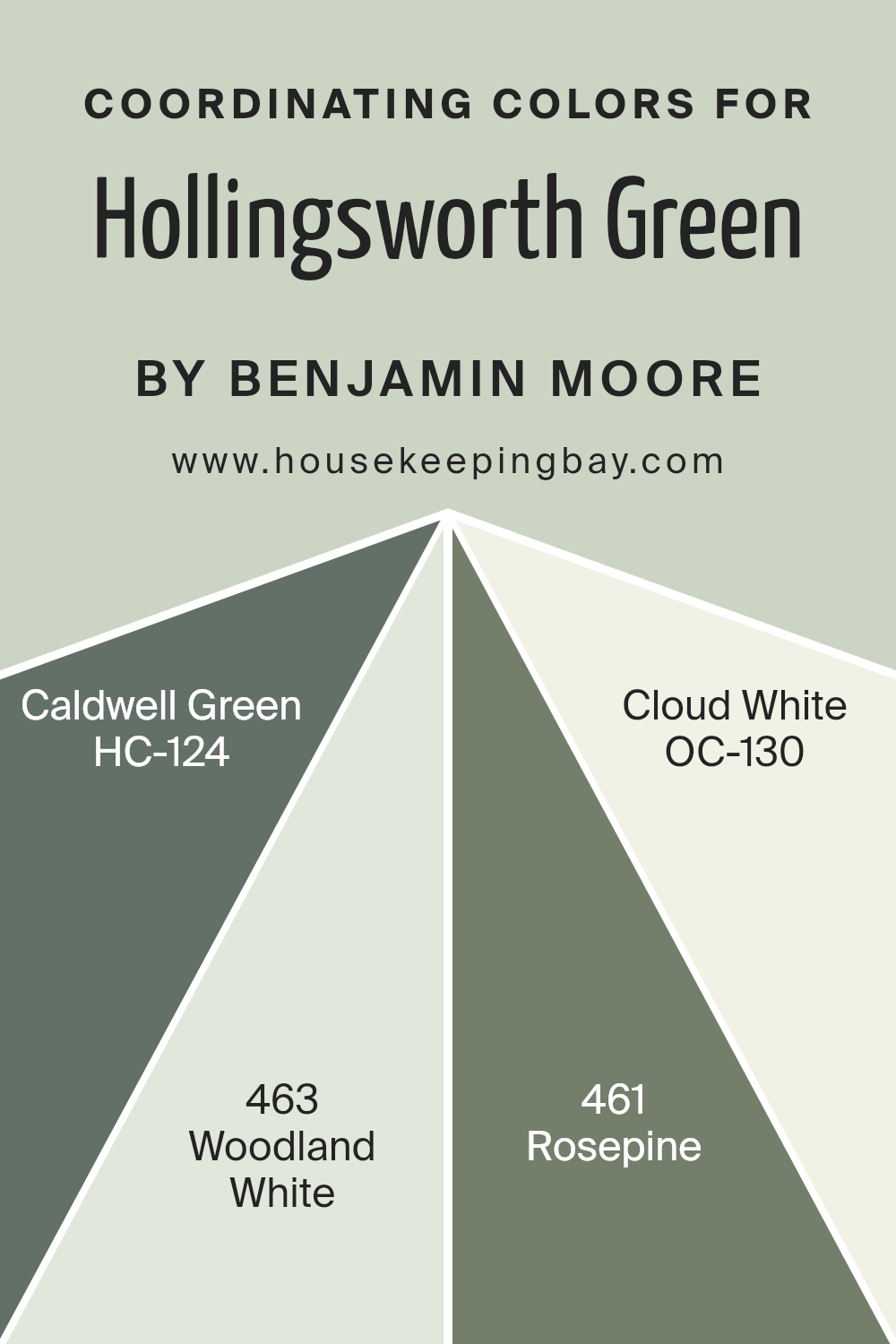
Coordinating Colors of Hollingsworth Green HC-141 by Benjamin Moore
Coordinating colors are shades that work well together in a space, creating a harmonious and cohesive look. They complement and balance each other, enhancing the visual appeal of an environment. For Hollingsworth Green HC-141 by Benjamin Moore, some excellent coordinating colors include Caldwell Green HC-124, Woodland White 463, Rosepine 461, and Cloud White OC-130.
Caldwell Green is a rich, deep teal that adds depth and sophistication, providing a striking yet complementary contrast to the softer green of Hollingsworth Green. Woodland White is a warm, soft off-white that adds a touch of brightness and warmth, making spaces feel inviting and cozy.
Rosepine, with its muted and earthy tones, provides a subtle touch of elegance and can help ground a space, offering a gentle contrast to the green hues. Meanwhile, Cloud White brings an airy and fresh feel, with its clean and crisp undertones, it’s a versatile neutral that seamlessly ties the palette together.
Together, these colors create a balanced and inviting atmosphere, allowing Hollingsworth Green to shine as the central hue while each coordinating color supports and enhances the overall look of the room.
Integrating these colors provides an appealing combination that can work well in various interior styles.
You can see recommended paint colors below:
- HC-124 Caldwell Green
- 463 Woodland White
- 461 Rosepine
- OC-130 Cloud White
housekeepingbay.com
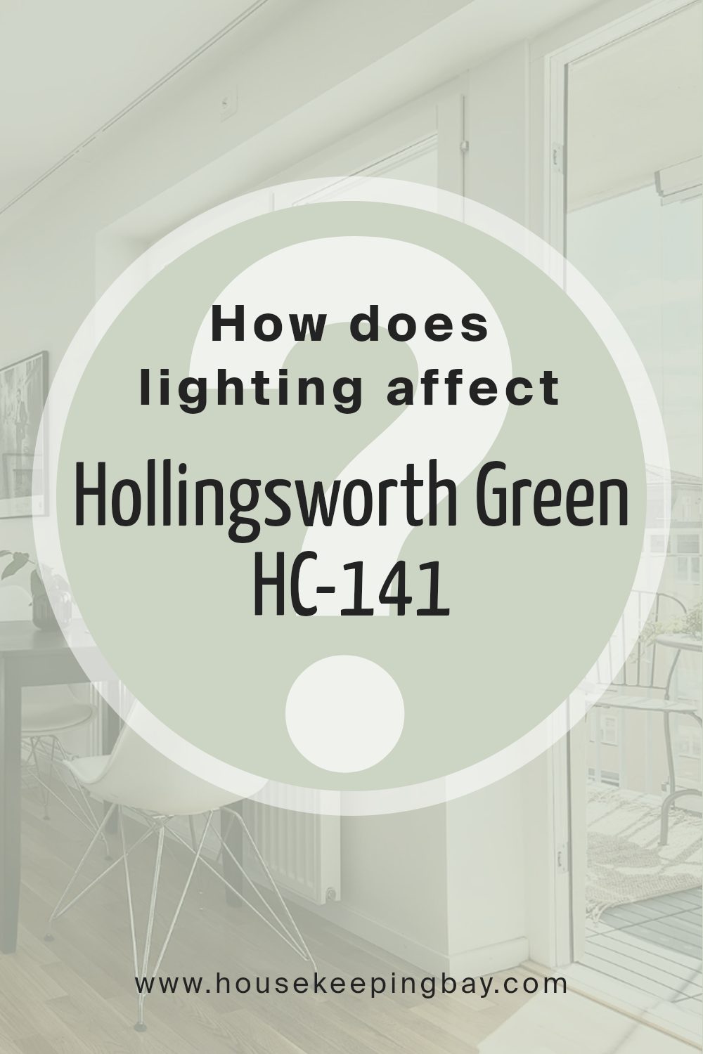
How Does Lighting Affect Hollingsworth Green HC-141 by Benjamin Moore?
Lighting plays a crucial role in how we perceive colors. Different lighting conditions can change the way colors appear, which is important when selecting paint for a room. Let’s discuss how Hollingsworth Green HC-141 by Benjamin Moore behaves under various lighting conditions.
In natural light, Hollingsworth Green can look different depending on its source. In a north-facing room, the light is typically cooler and softer, often making colors appear more muted. Hollingsworth Green might show a cooler tone, with more pronounced gray undertones. It may seem subdued yet sophisticated.
In a south-facing room, the light is usually warmer and more intense. Here, Hollingsworth Green can look warmer and more vibrant, bringing out the green more prominently. The color might feel lively and inviting due to the abundance of sunlight throughout the day.
An east-facing room receives bright, direct sunlight in the morning, which can make Hollingsworth Green look fresh and vibrant early in the day. As the day progresses and the sunlight fades, the color might appear more muted and cooler.
This changing light can offer a dynamic look as the day goes on.
In a west-facing room, the morning light is softer, which can make Hollingsworth Green appear subdued at the start of the day.
As the sun sets and the afternoon light comes in, the color may warm up and become more intense, making it a rich and cozy choice for rooms that are used more in the evening.
Under artificial lighting, such as LED or incandescent lights, Hollingsworth Green can change as well. Incandescent lights can add warmth and bring out yellow undertones in the green, giving it a cozy appearance. LED lights often have a cooler temperature, which might enhance the color’s gray or muted green aspects.
Understanding these lighting effects can help in choosing the right lighting and placement for Hollingsworth Green in any space.
housekeepingbay.com
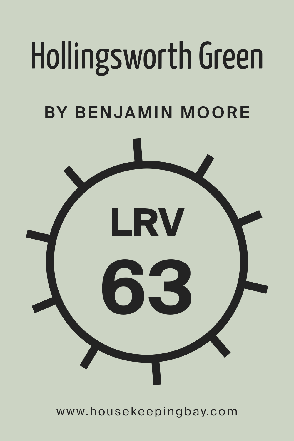
What is the LRV of Hollingsworth Green HC-141 by Benjamin Moore?
LRV, or Light Reflectance Value, is a measure that indicates how much light a color reflects. It ranges from 0 to 100, where 0 represents absolute black and reflects no light, while 100 represents pure white and reflects all light.
When you look at colors for your walls, LRV gives an idea of how light or dark the color will appear in your space. A higher LRV means the color will reflect more light back into the room, making it seem brighter and more spacious.
Conversely, a lower LRV means the color absorbs more light, making the room feel cozier or smaller.
For Hollingsworth Green HC-141 by Benjamin Moore, with an LRV of 63.25, you can expect a color that reflects a fair amount of light. This makes it a good choice for rooms where you want a light and airy feeling without it being overly stark or bright. The LRV of 63.25 indicates it has enough depth to provide warmth and color to your walls while still maintaining a lively appearance.
This makes Hollingsworth Green a versatile color that can work in various lighting conditions, whether you have a lot of natural light or rely more on artificial lighting.
housekeepingbay.com
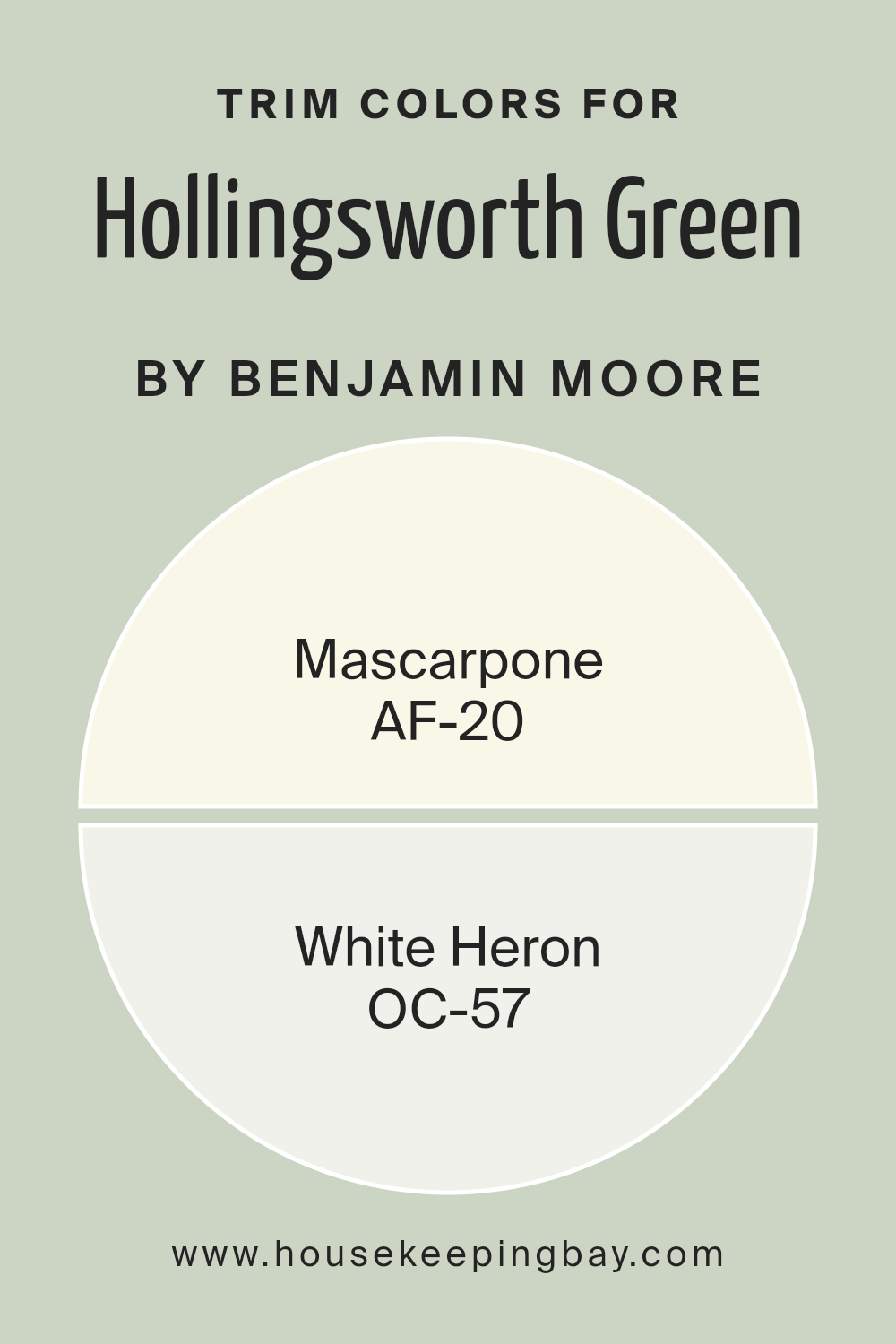
What are the Trim colors of Hollingsworth Green HC-141 by Benjamin Moore?
Trim colors refer to the paint colors used on the moldings, door frames, baseboards, and window trims in a room. These colors play a crucial role in defining and enhancing the look of a space, providing contrast or harmony with the wall colors.
For Hollingsworth Green HC-141 by Benjamin Moore, selecting the right trim color can significantly impact the overall aesthetic of the room. Using a trim color like Mascarpone, a warm creamy white, or White Heron, a soft cool white, can complement the green hue by adding depth and brightness.
Mascarpone offers a cozy feel, making it an ideal choice for spaces where a touch of warmth is desired, while White Heron provides a crisp and clean contrast, helping rooms feel more airy and open.
The importance of choosing the right trim color cannot be overstated, as it can affect how colors and spaces are perceived. For instance, Mascarpone on trims brings a subtle, inviting glow, enhancing the appeal of Hollingsworth Green by accentuating its natural warmth and earthiness.
On the other hand, White Heron lends a fresh, contemporary twist, its neutral shade balancing the richness of the green and making spaces appear larger and more refined.
Whether opting for the warmth of Mascarpone or the coolness of White Heron, selecting the right trim color allows for a cohesive and pleasing visual experience, highlighting the unique qualities of Hollingsworth Green.
You can see recommended paint colors below:
- AF-20 Mascarpone
- OC-57 White Heron
housekeepingbay.com
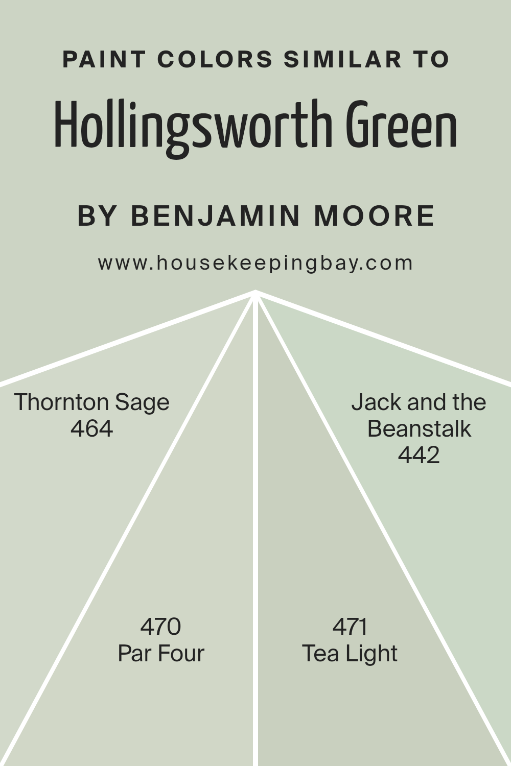
Colors Similar to Hollingsworth Green HC-141 by Benjamin Moore
Similar colors are important in design and decor because they create harmony and a cohesive look. When used together, they can make a space feel more balanced and put together. Similar colors to Hollingsworth Green HC-141 by Benjamin Moore, such as Thornton Sage, Par Four, Tea Light, and Jack and the Beanstalk, work well to enhance this effect.
Each of these colors shares a certain earthy or muted green tone, which ensures they complement rather than clash with one another.
Thornton Sage is a muted, soft green that feels like a gentle breeze on a cool day, bringing a cozy and welcoming vibe to any room. Par Four carries a slightly darker tone, with a rich undertone that speaks of classic elegance and subtle refinement. Tea Light features a light and airy touch, offering a fresh and uplifting feel, perfect for spaces meant to rejuvenate.
Jack and the Beanstalk, meanwhile, is a bolder, deeper green that adds a touch of whimsy and adventure without overwhelming the senses. Together, these colors create a palette that can give rooms a sense of flow while letting each shade bring its character and warmth.
Using similar colors in this way helps design a space that feels unified and pleasant.
You can see recommended paint colors below:
- 464 Thornton Sage
- 470 Par Four
- 471 Tea Light
- 442 Jack and the Beanstalk
housekeepingbay.com
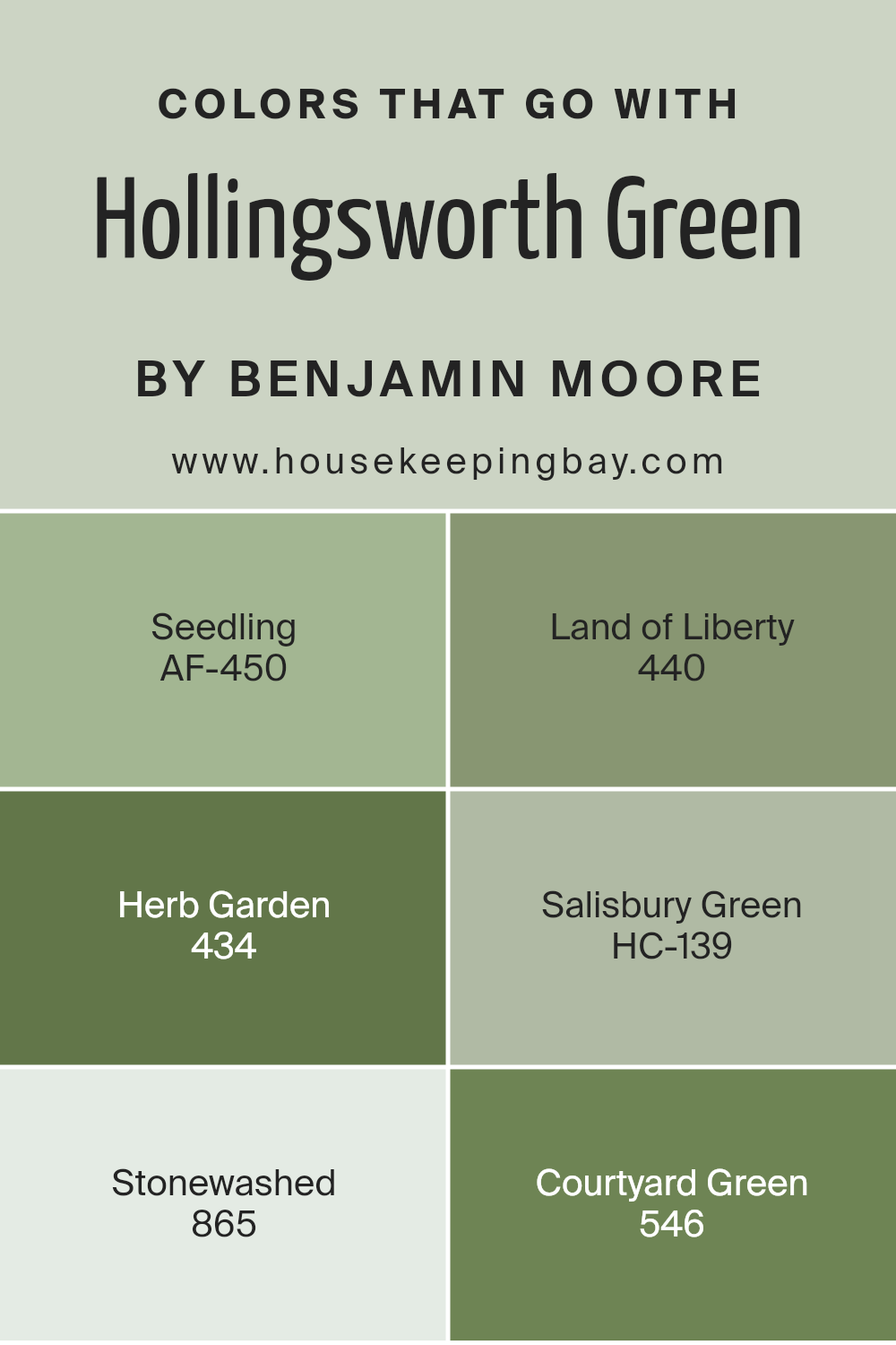
Colors that Go With Hollingsworth Green HC-141 by Benjamin Moore
Hollingsworth Green HC-141 by Benjamin Moore is a versatile shade that brings a subtle, muted quality to any space. Colors that complement Hollingsworth Green are crucial because they can enhance its natural beauty and create a harmonious environment.
These complementary colors help to balance the cool undertones of Hollingsworth Green with warmth and earthiness. One such color is AF-450 Seedling, a fresh, light green that adds a sense of vitality and liveliness, making any room feel more vibrant and open.
Another perfect match is 440 Land of Liberty, a deep, historical green that adds richness and depth, enhancing the stately nature of Hollingsworth Green.
434 Herb Garden introduces a soothing, muted green that feels like a breath of fresh air, creating a peaceful and inviting ambiance. HC-139 Salisbury Green is a warm, yellow-green that pairs beautifully by bringing a sunny and subtle vibrancy.
Then we have 865 Stonewashed, a soft, neutral tone that balances the greens while adding a touch of comforting warmth. Lastly, 546 Courtyard Green, a lush, medium green with hints of blue, lends a natural and timeless feel to any room.
Together, these colors create a cohesive and balanced palette that works seamlessly with Hollingsworth Green HC-141, resulting in a stylish and grounded look.
You can see recommended paint colors below:
- AF-450 Seedling
- 440 Land of Liberty
- 434 Herb Garden
- HC-139 Salisbury Green
- 865 Stonewashed
- 546 Courtyard Green
housekeepingbay.com
How to Use Hollingsworth Green HC-141 by Benjamin Moore In Your Home?
Hollingsworth Green HC-141 by Benjamin Moore is a versatile paint color that can add character to any home. This soft green shade blends well with many styles, creating a calm and inviting atmosphere. Its earthy undertone fits perfectly in living rooms, providing a cozy backdrop for furniture and artwork.
In kitchens, it complements white cabinets or wooden finishes, adding a touch of freshness to the space. Bedrooms painted in Hollingsworth Green feel restful, promoting a sense of relaxation. This color works well in nurseries and children’s rooms, offering a gentle environment.
Paired with neutral accents like beige or gray, it maintains a balanced look. To make a statement, consider adding pops of color with accessories in darker greens or mustard yellows. For an elegant look, use it in hallways or entryways, creating a warm welcome.
Lighting plays a crucial role, so ensure good natural or soft white lighting to enhance its beauty.
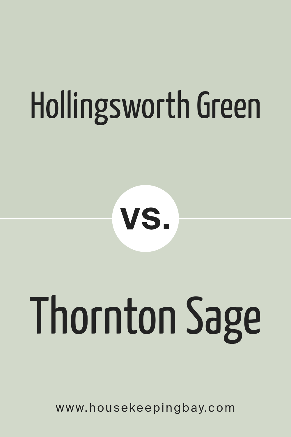
Hollingsworth Green HC-141 by Benjamin Moore vs Thornton Sage 464 by Benjamin Moore
Hollingsworth Green HC-141 and Thornton Sage 464, both by Benjamin Moore, offer unique green hues suitable for diverse interior designs. Hollingsworth Green is a soft, muted green with a hint of gray, lending a calm, sophisticated feel to any space. This color works well in rooms where a subtle yet refined look is desired. It blends effortlessly with neutral tones, wood accents, and natural light, creating a harmonious setting.
Thornton Sage 464, while also a green, features a slightly warmer tone with more depth. It brings an earthy, organic vibe to a room, making it feel cozier and more inviting. This shade pairs nicely with rich browns, deep blues, and cream accents, adding warmth to a space.
In summary, Hollingsworth Green offers a more understated, elegant look, whereas Thornton Sage provides a richer, earthy touch. Both colors have their own charm, offering versatile options for different design needs.
You can see recommended paint color below:
- 464 Thornton Sage
housekeepingbay.com
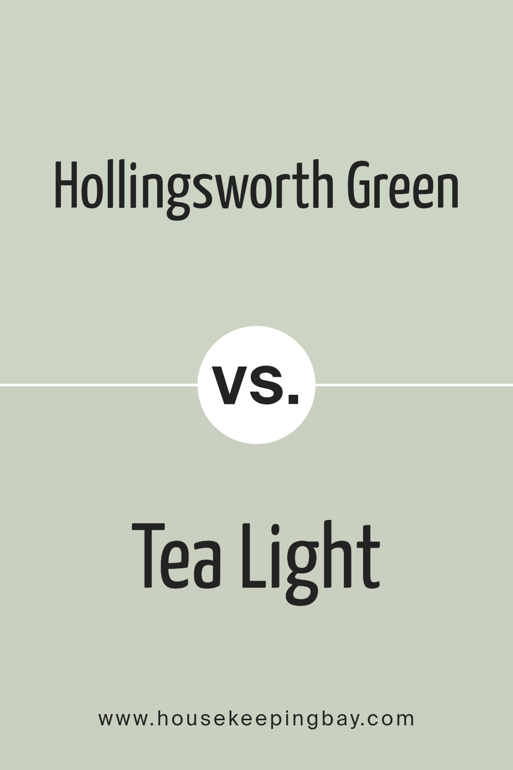
Hollingsworth Green HC-141 by Benjamin Moore vs Tea Light 471 by Benjamin Moore
Hollingsworth Green HC-141 by Benjamin Moore is a rich, deep green that brings a sense of nature into any space. It’s a shade that feels both classic and refreshing, offering a grounded and sophisticated backdrop. This color can create a serene and calming atmosphere, making rooms feel connected to the outdoors.
Tea Light 471, also by Benjamin Moore, presents a softer, more muted palette. This delicate, pale shade leans towards a creamy, warm tone, adding lightness and warmth to interior spaces. It’s perfect for creating airy and open environments, bringing a gentle glow to any room.
When comparing the two, Hollingsworth Green stands out for its boldness and earthy depth, suitable for those who want a strong but tasteful color. Tea Light, with its subtlety, suits those who prefer a gentle and inviting ambiance. Both colors, though different in intensity, can complement each other beautifully when used together.
You can see recommended paint color below:
- 471 Tea Light
housekeepingbay.com
Hollingsworth Green HC-141 by Benjamin Moore vs Jack and the Beanstalk 442 by Benjamin Moore
Hollingsworth Green HC-141 by Benjamin Moore is a classic, muted green with a subtle, earthy undertone. It offers a timeless and soothing presence, making it a versatile choice for various spaces. The color works well with traditional or modern decor, providing a natural feel that can easily blend with other elements like wood or neutral tones.
Jack and the Beanstalk 442, also by Benjamin Moore, is a more vibrant and playful green. It carries a lively, energetic vibe, perfect for adding a splash of brightness and cheer to a room. This color can invigorate a space, making it a great choice for a lively kitchen or a child’s room.
While Hollingsworth Green is subdued and calming, Jack and the Beanstalk brings boldness and energy. Both greens can enhance a space, but their differing intensities set unique moods, one calm and grounding, the other fresh and lively.
You can see recommended paint color below:
- 442 Jack and the Beanstalk
housekeepingbay.com
Hollingsworth Green HC-141 by Benjamin Moore vs Par Four 470 by Benjamin Moore
Hollingsworth Green HC-141 by Benjamin Moore is a classic, muted green with a subtle grayish undertone. It offers a sophisticated and calming vibe, perfect for creating a serene atmosphere in a space. Its muted nature makes it adaptable, working well with neutral palettes or as a soft contrast to bolder colors.
Par Four 470, also by Benjamin Moore, showcases a brighter, more vibrant shade of green. It’s energetic and lively, bringing a sense of freshness and vitality to any room. This color can act as a focal point, drawing attention and adding a touch of playfulness to a space.
Both greens have their unique charm. Hollingsworth Green provides a more subdued, timeless look, while Par Four injects life with its vivid hue. Depending on the mood one wishes to achieve, Hollingsworth Green suits more traditional, calm settings, whereas Par Four suits modern, dynamic environments. Each color offers a different feel, enhancing room character in diverse ways.
You can see recommended paint color below:
- 470 Par Four
housekeepingbay.com
Conclusion
HC-141 Hollingsworth Green by Benjamin Moore offers a unique shade that brings warmth and versatility to any space. I’ve come to appreciate how it balances both natural and artificial light, adapting beautifully throughout the day. Its earthy tone creates a harmonious atmosphere, making it suitable for various settings, whether it’s a cozy living room or a serene bedroom.
In my space, I found that Hollingsworth Green pairs wonderfully with both neutral and bold accents, allowing for flexibility in design choices. This adaptability makes it a favorite among designers and homeowners alike, as it complements a wide range of palettes.
Using it on walls or cabinetry can effortlessly update the look of a room, giving it a fresh yet timeless appeal.
From my experience, HC-141 Hollingsworth Green stands out because of its ability to add character without overwhelming the senses. It’s the kind of color that welcomes you home, grounding you with its subtle elegance.
Whether you’re looking to refresh a space or complete a new design vision, Hollingsworth Green serves as a reliable choice that consistently delivers charm and sophistication.
housekeepingbay.com
Ever wished paint sampling was as easy as sticking a sticker? Guess what? Now it is! Discover Samplize's unique Peel & Stick samples. Get started now and say goodbye to the old messy way!
Get paint samples


