Papaya 957 by Benjamin Moore
Warm Hues, Cool Vibes: How to Make Your Space Sunny and Bright
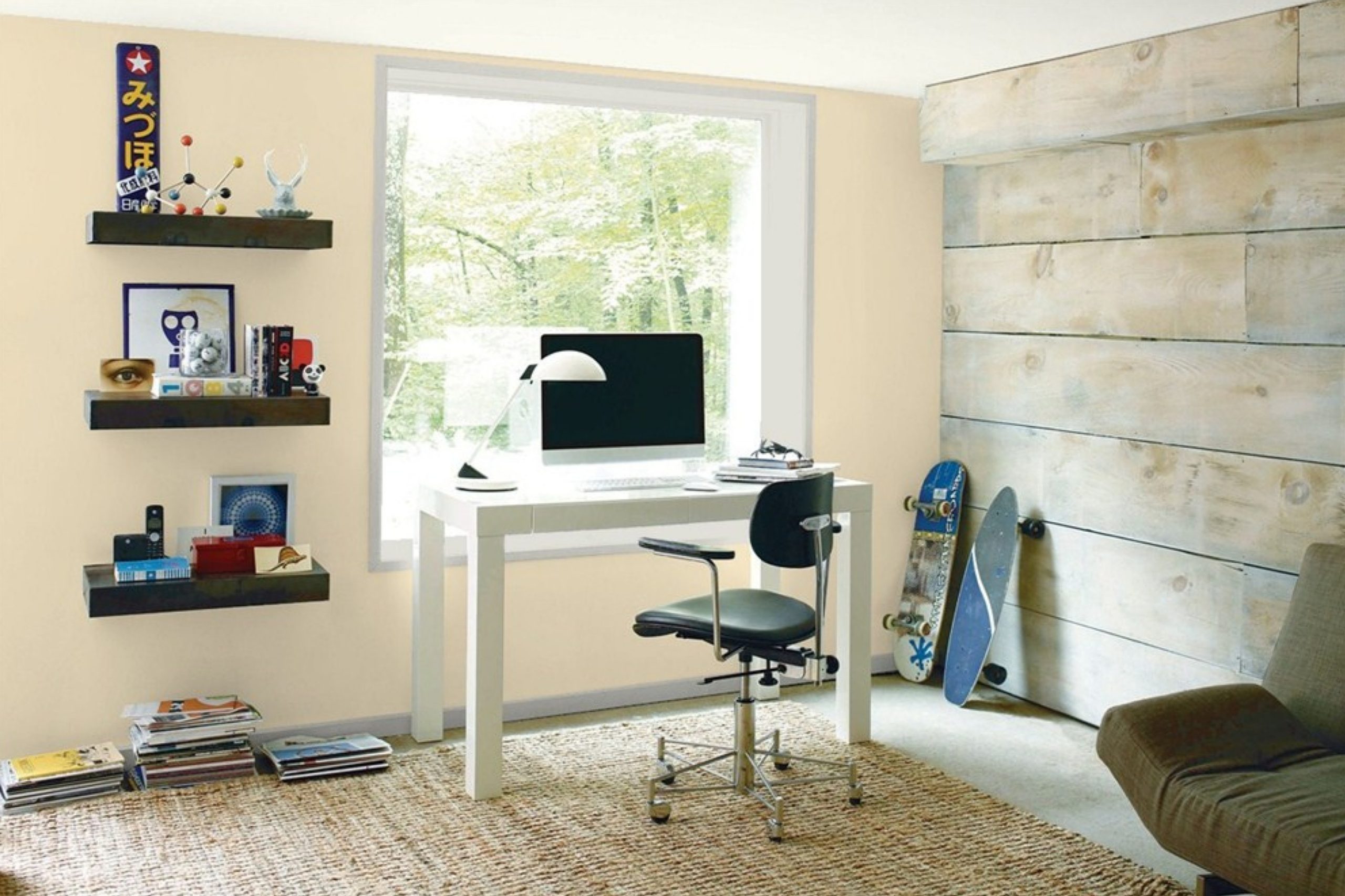
Are you thinking about giving your space a fresh coat of paint? Choosing the right color can be a big decision. Let me introduce you to 957 Papaya by Benjamin Moore. This shade is a warm, inviting orange that can lighten up any room, making it feel cozy and cheerful. It’s perfect if you want to add a splash of color without it being too overwhelming.
957 Papaya works beautifully in living areas, kitchens, and even bedrooms, providing a soothing yet bright atmosphere. This color pairs well with neutral tones like whites and grays, which helps balance its warmth and ensures it doesn’t overpower the room. It’s also a great choice for accent walls if you’re not ready to commit to painting the entire room.
Whether you plan to update a single room or repaint your entire home, 957 Papaya could be the refreshing change you need. It’s a color that can brighten up your day just by walking into a room painted in this beautiful shade.
So, if you’re ready for a change, why not consider this delightful option?
via benjaminmoore.md
What Color Is Papaya 957 by Benjamin Moore?
Table of Contents
Papaya957 by Benjamin Moore is a warm, creamy orange hue that radiates coziness and welcoming vibes. Its softness is versatile, making it an excellent choice for many living spaces. This color adds a gentle pop of personality without overwhelming sensory details, ideal for creating a comforting atmosphere.
Papaya957 works beautifully in styles where warmth and rustic charm are key, such as farmhouse, bohemian, and Scandinavian interiors. It also complements modern and minimalist designs, providing a splash of color while maintaining a sleek look. In rooms with a lot of natural light, this color softly glows, enhancing the space with its cheerful warmth.
For materials, Papaya957 pairs well with natural wood, helping to highlight its organic grains and textures. It is also compatible with soft, textured fabrics like cotton and linen, which can soften the overall feel of a room. In addition, matte black or dark metal finishes contrast nicely with this color, creating a balanced and harmonious appearance. In terms of textures, consider combining it with plush throws or rugs to introduce comfort and depth, making the space more inviting.
housekeepingbay.com
Is Papaya 957 by Benjamin Moore Warm or Cool color?
Papaya957 by Benjamin Moore is a warm, inviting shade of orange that adds a cozy, cheerful feel to any room. This color is versatile, working well in many different home spaces such as living rooms, kitchens, and guest rooms. Its brightness brings a sense of happiness and energy, ideal for areas where families gather or engage in creative activities.
Unlike darker colors that might make a space feel smaller or more confined, Papaya957 can actually make a room feel more open and airy, especially when paired with good natural light. It complements a variety of decor styles and works beautifully with natural elements like wood or stone.
This shade is also very effective in creating a focal point in a room without overwhelming other design elements. When used in smaller doses, such as an accent wall or decorative accessories, it provides a perfect pop of color. Overall, Papaya957 by Benjamin Moore offers a wonderful balance of warmth and brightness, making it a great choice for anyone looking to add a touch of cheerfulness to their home.
What is the Masstone of the Papaya 957 by Benjamin Moore?
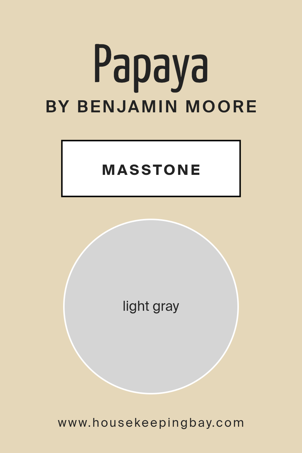
Papaya957 by Benjamin Moore has a masstone of light gray, coded as #D5D5D5. This shade of light gray brings a soft and subtle mood to any room, making it ideal for those seeking a peaceful and simple atmosphere in their home. The neutrality of light gray allows it to act as a versatile backdrop. It meshes well with a wide range of decorating styles, from modern minimalist to cozy rustic.
This color’s understated tone is perfect for spaces where you want to promote a sense of calm and order, like bedrooms and living rooms. It doesn’t overpower the senses, which means it also works well in smaller spaces, helping them appear larger and more open.
The light gray tone of Papaya957 also gives homeowners the flexibility to add colorful accents such as pillows, artworks, or furniture pieces to personalize the space without clashing with the walls. This makes it a practical choice for those wanting a neutral color that still offers the possibility for personal flair.
housekeepingbay.com
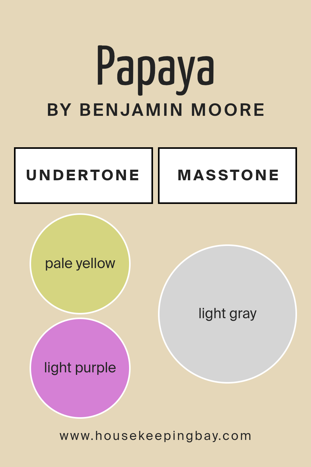
Undertones of Papaya 957 by Benjamin Moore
Papaya957 by Benjamin Moore is a versatile paint color that can subtly shift its appearance depending on its environment due to the variety of undertones it possesses. Undertones like pale yellow, light purple, light blue, pale pink, mint, lilac, and grey play a significant role in how this color is perceived in different settings and lighting conditions.
In essence, undertones are the underlying hues that, while not always immediately noticeable, affect the overall look of the color once applied. For instance, a pale yellow undertone can make a wall feel warmer and more inviting, while a light blue undertone might give a cooler, calmer feel. This complexity allows Papaya957 to adapt beautifully to various interior styles and pair well with a wide range of decor elements.
When applied to interior walls, the combination of these undertones in Papaya957 means that the color can appear differently based on factors like natural light, surrounding colors, and even the time of day. In a room with ample sunlight, the pale yellow and pink undertones might make the space feel brighter and cozier. In artificial light, the grey or lilac undertones could become more dominant, giving the room a more subdued or sophisticated tone.
Overall, the unique blend of undertones in Papaya957 gives it a dynamic quality that can enhance the aesthetic of any room without overwhelming it. It’s an excellent choice for those looking to add a subtle depth and complexity to their living spaces.
housekeepingbay.com
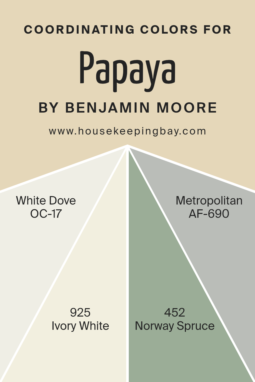
Coordinating Colors of Papaya 957 by Benjamin Moore
Coordinating colors are shades that complement each other when used together in design, creating a harmonious and balanced look. For instance, Papaya 957 by Benjamin Moore can be paired with several coordinating colors to enhance its warm, energetic hue.
One such coordinating color is OC-17 White Dove, a soft and creamy white that provides a clean backdrop, making it a versatile partner for brighter tones. Similarly, 925 Ivory White, which has a slightly warmer tone than White Dove, offers a subtle contrast that helps in softening environments without dulling the vibrancy of Papaya 957.
Another excellent coordinating color is 452 Norway Spruce, a deep, forest green that adds a natural, grounding element to the vivacious Papaya 957, perfect for creating a more sophisticated palette.
Lastly, AF-690 Metropolitan is a subtle gray that bridges the gap between neutral and statement, allowing it to support and balance the brightness of Papaya 957 without overshadowing it. These shades collectively provide a range of options that work together to enhance the overall aesthetics of a space, making each color choice purposeful and impactful in its own right.
You can see recommended paint colors below:
- OC-17 White Dove
- 925 Ivory White
- 452 Norway Spruce
- AF-690 Metropolitan
housekeepingbay.com
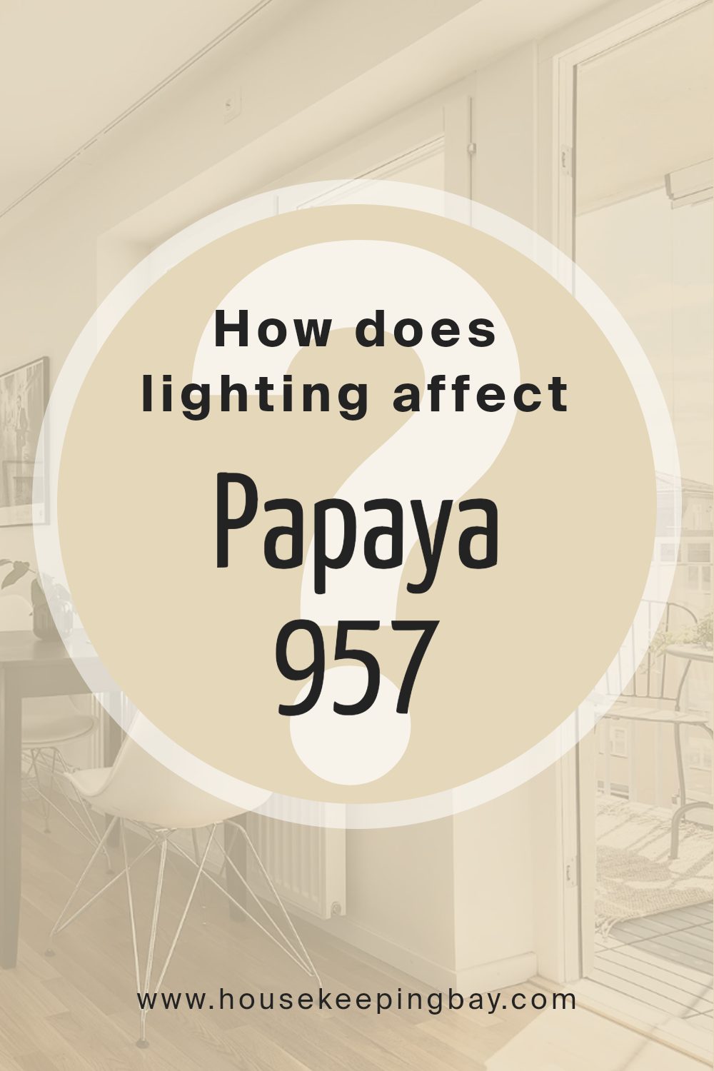
How Does Lighting Affect Papaya 957 by Benjamin Moore?
Lighting significantly influences how colors appear in different environments. The type of light, whether natural or artificial, and even the direction a room faces can alter the perception of color.
Papaya957 by Benjamin Moore is a vibrant shade that reacts uniquely under various lighting conditions. In artificial light, such as that from LED or fluorescent bulbs, this color tends to look slightly more intense and warmer. This makes the space feel cozy and welcoming when illuminated during nighttime or in spaces without natural light.
In natural light, Papaya957 shifts subtly depending on the time of day and the amount of sunlight entering the room. Natural sunlight tends to bring out the truest hue of this color, highlighting its depth and brightness. The color can appear lively and dynamic, perfect for spaces used during the day.
Room orientation affects how Papaya957 is seen:
– North-faced rooms: These rooms receive less direct sunlight, which can make colors appear cooler and slightly muted. Papaya957 may seem more subdued in a north-facing room, with a gentle, soft warmth that is soothing yet not overly vibrant.
– South-faced rooms: With ample sunlight, south-facing rooms highlight the brightness and warmth of Papaya957. Here, the color feels energetic and vivid, ideal for creating a cheerful and inviting atmosphere.
– East-faced rooms: Morning light in east-facing rooms gives Papaya957 a bright, crisp look. The morning sunlight makes the color appear fresh and vibrant, perfect for rooms used primarily in the morning.
– West-faced rooms: In the afternoon, west-facing rooms bathe Papaya957 in warm, golden tones. As the sun sets, the color deepens, providing a comforting, warm glow that is perfect for evening relaxation.
Each setting brings out a different facet of Papaya957, making it a versatile choice for various spaces and lighting conditions.
housekeepingbay.com
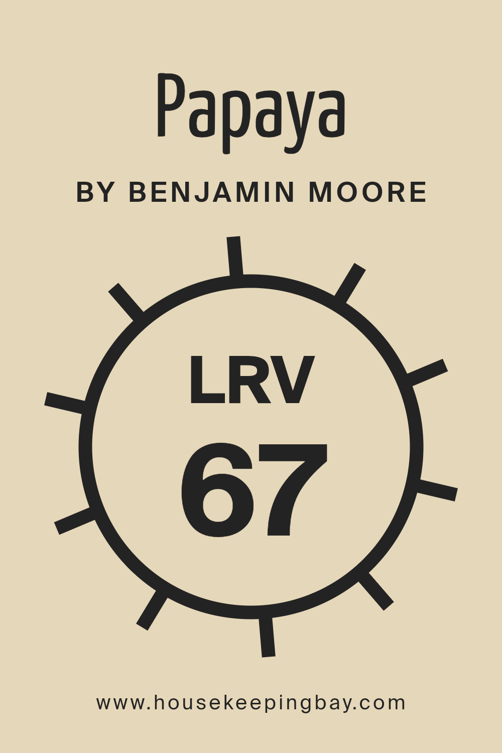
What is the LRV of Papaya 957 by Benjamin Moore?
LRV stands for Light Reflectance Value, which measures the percentage of light a paint color reflects. The scale ranges from 0 to 100, where 0 absorbs all light and 100 reflects all light. This value is crucial in choosing paint colors because it affects how bright or dark a space appears once the color is applied.
Higher LRVs make a room feel more open and airy as they reflect more light, while lower LRVs create a cozier and potentially more subdued atmosphere, absorbing more light. In the case of Papaya957 by Benjamin Moore with an LRV of 67.4, this color is relatively light and will reflect a good amount of light.
This makes it a suitable choice for spaces that could benefit from a brightness boost, such as smaller rooms or areas with limited natural light. Its warm hue will add a gentle, uplifting ambiance without overwhelming the space with brightness, providing a balanced and welcoming environment. This moderate LRV makes Papaya957 versatile, fitting both well-lit areas and those needing light enhancement.
housekeepingbay.com
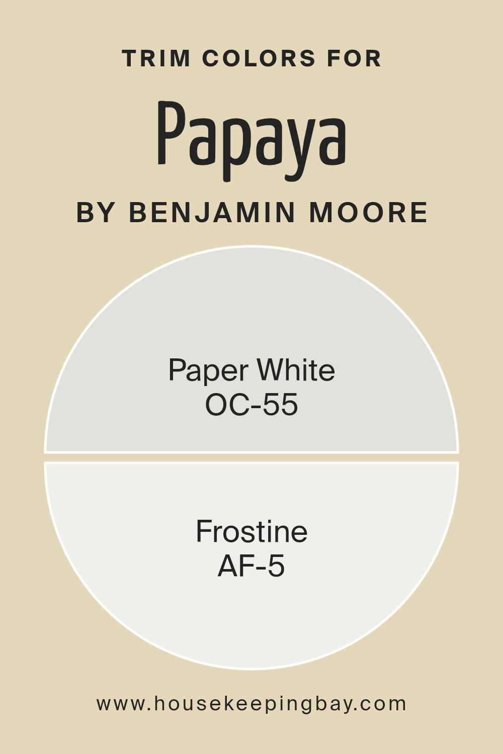
What are the Trim colors of Papaya 957 by Benjamin Moore?
Trim colors are specific shades used to highlight the architectural features of a room, such as door frames, window casings, and baseboards. By selecting the right trim color, you can effectively enhance the overall aesthetic of a space and create a cohesive look. For example, utilizing trim colors like OC-55 Paper.
White and AF-5 Frostine by Benjamin Moore in a design scheme can provide a subtle yet impactful contrast that defines and adds character to room boundaries and features without overpowering the main wall colors. This technique helps in defining spaces and making decorative details pop, leading to a more tailored and polished appearance.
OC-55 Paper White is a soft, airy white that exudes a sense of cleanliness and simplicity. This color is ideal for trims as it offers a fresh and subtle boundary that can lighten up any space, making it feel more open and inviting.
On the other hand, AF-5 Frostine is also a gentle white, but with a hint of warmth that brings a cozy and soothing atmosphere to interiors. Utilizing Frostine as a trim color adds a touch of warmth to the edges that can soften sharper contrasts in a room, blending effortlessly with a variety of decor styles and palettes.
You can see recommended paint colors below:
- OC-55 Paper White
- AF-5 Frostine
housekeepingbay.com
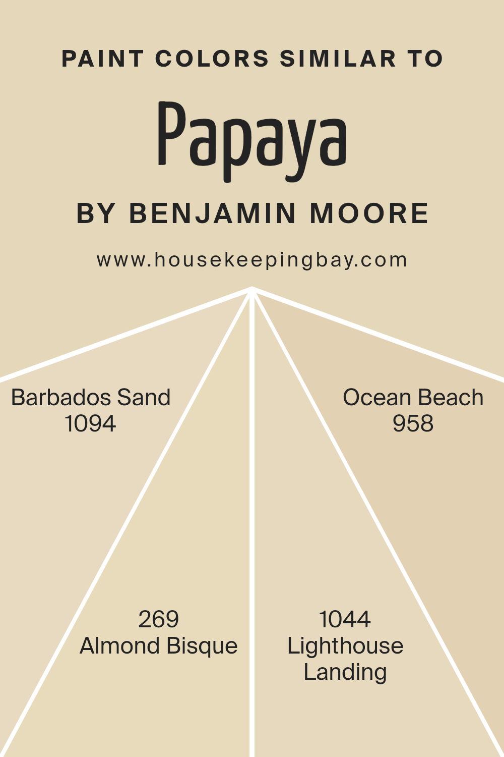
Colors Similar to Papaya 957 by Benjamin Moore
Choosing similar colors like those close to Papaya 957 by Benjamin Moore is essential for creating a cohesive and harmonious look in your space. These shades share undertones that naturally complement each other, providing a seamless transition from one area to another within a room. Using similar colors can enhance the aesthetic continuity and balance, making your decorating process more straightforward and ensuring that colors flow beautifully without clashing.
Barbados Sand 1094 suggests warmth and comfort, reminiscent of a sunny, sandy beach, while Almond Bisque 269 offers a soft, creamy feel that can brighten a room and give it a calm, welcoming vibe.
Lighthouse Landing 1044 carries a muted, earthy quality that brings a sense of grounding and stability, perfect for creating a focused or restful area. Ocean Beach 958 reflects the colors of a foggy shoreline, giving spaces a muted, serene atmosphere that helps in creating a more relaxed environment. Each color complements Papaya 957, contributing to a natural, fluid color scheme that enhances the appeal of both enclosed and open spaces.
You can see recommended paint colors below:
- 1094 Barbados Sand
- 269 Almond Bisque
- 1044 Lighthouse Landing
- 958 Ocean Beach
housekeepingbay.com
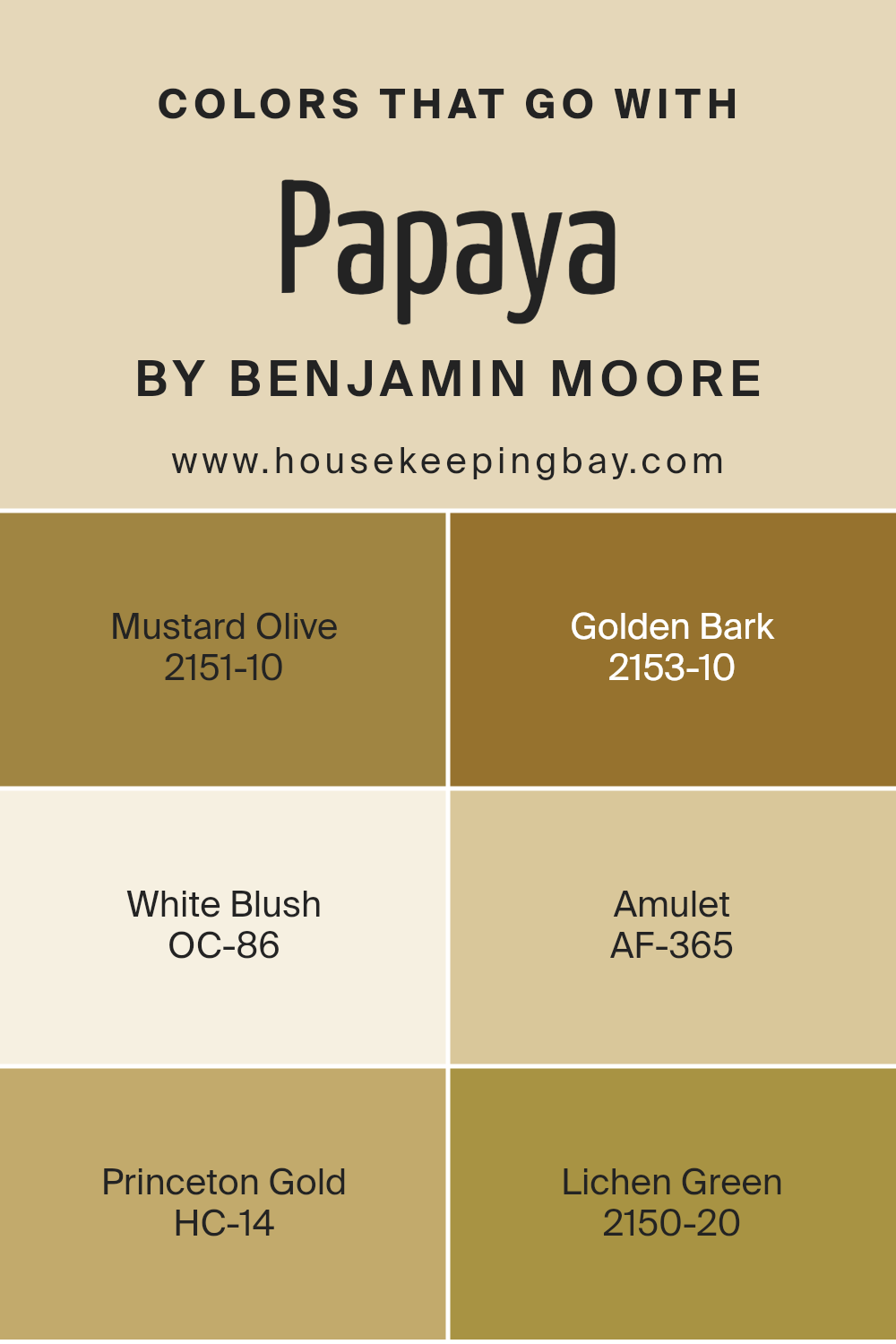
Colors that Go With Papaya 957 by Benjamin Moore
Choosing the right colors to complement Papaya 957 by Benjamin Moore can significantly impact the feel and aesthetic of any space. Colors like Mustard Olive 2151-10, a deep, earthy yellow, infuses a room with a sense of grounded energy, similar to a forest floor rich in muted golds. Then there’s Golden Bark 2153-10, which has a darker, almost spicy tone that suggests sophistication and warmth, reminiscent of tree bark at sunset.
White Blush OC-86 offers a soft, mild white that adds a gentle breath of freshness to balance the intensity of more dominant hues. Amulet AF-365 presents as a muted sage, perfect for creating a soothing atmosphere with a natural vibe, helping the vividness of Papaya 957 stand out yet harmonize beautifully.
Princeton Gold HC-14 has a robust, honeyed hue that brightens spaces with its vivacious yet cozy glow, making it a great choice for living areas or dining rooms. Lastly, Lichen Green 2150-20, with its subtle, mossy appearance, brings an organic feel, ideal for spaces intended to feel calm and restorative.
Using these colors together facilitates a harmonious yet dynamic palette that enriches the living environment without overwhelming the senses. Understanding how these shades interact and complement each other can help achieve a balanced and pleasing home decor.
You can see recommended paint colors below:
- 2151-10 Mustard Olive
- 2153-10 Golden Bark
- OC-86 White Blush
- AF-365 Amulet
- HC-14 Princeton Gold
- 2150-20 Lichen Green
housekeepingbay.com
How to Use Papaya 957 by Benjamin Moore In Your Home?
Papaya 957 by Benjamin Moore is a warm and gentle orange color that adds a cozy feel to any room. This shade is versatile, making it perfect for painting walls in a living room or kitchen to create a welcoming atmosphere.
The soft orange hue of Papaya 957 pairs well with natural wood finishes, creamy whites, or even deep blues for a balanced look. It’s ideal for those wanting to add a touch of warmth without overwhelming their space with too bright colors. Applying this paint color in a smaller room or on an accent wall can also make the area seem more inviting and cozy.
Additionally, incorporating Papaya 957 in home decor elements like cushions or curtains can harmonize the overall decorative theme of your home. This color is particularly effective in spaces where you want to promote comfort and a relaxed environment.
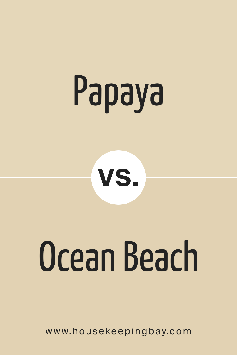
Papaya 957 by Benjamin Moore vs Ocean Beach 958 by Benjamin Moore
Papaya 957 by Benjamin Moore is a warm, inviting shade that closely resembles the soft, sweet flesh of its namesake fruit. It has a cheerful and cozy vibe, making it perfect for living spaces or kitchens where a welcoming atmosphere is desired. This color pairs well with both dark and light furnishings, offering flexibility in home decor.
In contrast, Ocean Beach 958 hints at the calm and soothing essence of a foggy seashore. It’s a cool gray that provides a neutral backdrop, ideal for spaces intended to be relaxing retreats like bathrooms or bedrooms. This color tends to pair well with modern and minimalist designs, complementing metallic fixtures and blue accents.
While Papaya 957 adds warmth and brightness to a room, Ocean Beach 958 offers a serene, subdued canvas. Both hues have their unique appeal depending on the mood and function you’re aiming for in a space.
You can see recommended paint color below:
- 958 Ocean Beach
housekeepingbay.com
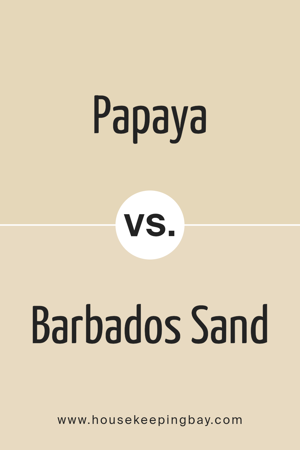
Papaya 957 by Benjamin Moore vs Barbados Sand 1094 by Benjamin Moore
The color Papaya 957 by Benjamin Moore is a vibrant, warm shade that gives off an energetic yet cozy vibe. It leans towards an orange hue, capturing the cheerful essence of the papaya fruit. This color can be a great choice for spaces intended to foster lively conversations and activities.
In contrast, Barbados Sand 1094 by Benjamin Moore offers a softer, more subdued look. It resembles the calming colors of a sandy beach, with its beige tones providing a neutral backdrop that can easily complement various decor styles. This color suits areas where a peaceful, relaxing atmosphere is desired.
When choosing between these two, consider the mood you want to set in your space. Papaya 957 energizes, while Barbados Sand 1094 calms, making them suitable for different types of rooms depending on the intended ambience.
You can see recommended paint color below:
housekeepingbay.com
Papaya 957 by Benjamin Moore vs Almond Bisque 269 by Benjamin Moore
Papaya 957 by Benjamin Moore is a vibrant, warm hue that adds a fresh, cheerful touch to any space. It’s a bright orange with some red undertones, which makes it pop and bring energy into a room. This color works well in spaces where you want to instill a sense of excitement or creativity, like a kitchen, playroom, or a creative studio.
Almond Bisque 269, also by Benjamin Moore, is a much softer, more neutral tone. It’s a light beige that leans slightly towards pink, giving it a warm, inviting quality without being overpowering. This color is versatile and pairs well with almost any decor, making it suitable for living rooms, bedrooms, or halls where a calm and serene atmosphere is desired.
When comparing the two, Papaya 957 is decidedly more vibrant and attention-grabbing, while Almond Bisque 269 is subtle and blends more seamlessly with other design elements. Each serves different purposes based on the mood and function you aim to achieve in a space.
You can see recommended paint color below:
- 269 Almond Bisque
housekeepingbay.com
Papaya 957 by Benjamin Moore vs Lighthouse Landing 1044 by Benjamin Moore
Papaya 957 by Benjamin Moore is a warm, inviting shade that leans towards a cheerful orange hue. This color is vibrant and can make any space feel cozy and welcoming. It works well in areas that benefit from a pop of brightness, such as kitchens or living rooms.
Lighthouse Landing 1044, also by Benjamin Moore, offers a subtler aesthetic. This color is a soft, muted gray with hints of beige, making it versatile and easy to coordinate with various decor styles. It’s an excellent choice for creating a calm, neutral backdrop in any room, allowing other elements to stand out.
Both colors have their unique appeal. Papaya 957 adds energy and warmth, suitable for spaces where you want to generate a lively, inviting atmosphere. In contrast, Lighthouse Landing 1044 is perfect for those looking for a subdued, elegant, and timeless look that complements rather than dominates a space. Whether you choose the cheerfulness of Papaya or the understated elegance of Lighthouse Landing depends on the mood and functionality you desire for your room.
You can see recommended paint color below:
- 1044 Lighthouse Landing

housekeepingbay.com
Conclusion
In finishing up my discussion on 957 Papaya by Benjamin Moore, I have shared the distinctive qualities and uses of this vibrant paint color. As someone who appreciates home decor and design, I find 957 Papaya both refreshing and versatile. This hue stands out for its ability to inject warmth into a space without overwhelming it, making it perfect for those desiring a subtle yet impactful change in their environment.
I’ve also gone over how this shade pairs beautifully with various decor styles, from contemporary to rustic, providing flexibility for all kinds of projects. For anyone considering a paint update, whether it’s for a full room or just an accent wall, 957 Papaya can be an excellent choice that adds a liveliness to your home that is welcoming and cheerful.
Finally, I encourage anyone looking to refresh their living space to consider Benjamin Moore’s 957 Papaya. It’s not just about changing a color; it’s about creating a warmer, more inviting home where you can feel comfortable and joyful.
housekeepingbay.com
